Remember that you will die, but your vacation photos live on.
Looking back takes a measure of imagination. Even if it was you back then, time and distance change the story. The past isn’t exactly what we remember, especially when the memories aren’t even ours.
What happens when the evidence is all that is left?
Today’s time travel includes names, exact dates, even a Greyhound itinerary. In the collection, we’ll see images of two women with young children who may be grandparents now. If you’re familiar with California and its famous redwoods, this might look like a photo album of your own. Travel ephemera include maps, tickets and brochures, the lunch menu from Camp Curry, and a tiny recipe book from Fisherman’s Wharf.
This isn’t a family vacation, at least not ours. The genealogy is discoverable, but that’s not our aim. The arms-length context gives us another way to look back, a wander through the American West by bus in late summer 1955.
If you know these two, send me a note!
These photos were carefully fixed into a well-organized keepsake album documenting the fun-filled vacation, a roundtrip bus ride from Phoenix to San Francisco with a stayover at Camp Curry in Yosemite and a tour of Chinatown nightlife in the city.
Miss Betty, maybe.
Betty and Margaret with the kids.
Cute kids.
Love each other.
Stick together.
Even through this.
Even through this.
Also an adventure.
Yosemite!
Outdoor dining at Camp Curry.
Arriving home, but to the same place?
We’re not sure.
Here’s to old familiar furniture.
A meticulous hand-penciled numbering system helped me put the trip timeline together and the photo locations in order. Zooming in added more connections, including two images by Moulin, the famous photographer of San Francisco and its surrounds.
No doubt this collection came to us because of the postcards, which provides a lovely windows-down cruise up the West Coast with all the scenic stops.
Days of California Dreaming.
Signal Hill, Long Beach
Bixby Park, Long Beach
Redondo, Hermosa, and Manhattan beaches from Palos Verdes Estates view.
Union Station in Los Angeles
Los Angeles International Airport, circa 1955.
Los Angeles freeway interchange, circa 1955.
Merced, CA, looking west on Seventh Street.
Lake Yosemite, near Merced, California.
Arch Rock at Yosemite National Park
Yosemite national Park Entrance Gates and Ranger Station on Highway 140
Yosemite national Park, Half Dome and Sentinel Bridge over Merced River.
Yosemite National Park, panorama view from Wawona Tunnel.
El Capitan, Yosemite National Park.
Yosemite National Park, the Four Falls: Nevada, Yosemite, Vernal, and Bridal Veil.
Yosemite National Park, Upper and Lower Yosemite Falls.
Sequoia in the Mariposa Grove in the south entrance, Yosemite National Park.
Yosemite National Park, Big Trees Lodge.
Yosemite National Park, Wawona Tunnel Tree.
Nevada Fall with rainbow.
Yosemite National Park, Yosemite Lodge.
Yosemite National Park, the beautiful Ahwanee Hotel.
The Firefall that flares from light hitting Glacier Point.
Oakland Bay Bridge opened in 1936.
San Francisco City Hall, modeled after the US Capitol.
Mission Dolores in San Francisco, founded in 1776.
Panorama of San Francisco from Twin Peaks.
Golden Gate Park Conservatory, San Francisco
Portals of the Past, a relic from the great fire of 1906.
Palace of the Legion of Honor in Lincoln Park
Steinhart Aquarium, circa 1955.
Fishing Fleet, photo by Gabriel Moulin,
Alcatraz Island, photo by Gabriel Moulin.
Union Square, San Francisco, circa 1955.
Mission Santa Barbara founded in 1786
Coit Memorial Tower on Telegraph Hill in San Francisco.
Included is a night in Chinatown, as the itinerary promised. These rare, real photo postcards signed front and back may require more research.
For the summer of 1955 (and for many years after, I hope) these mementos stood in for all the laughter, mystery, and adventure that two gals can gather in a lifetime. Though the photos and memories are not our own, the little joys of summer still shine through. After all these years, the collection still reminds us to get on the bus and go.
Imagine all the reasons a man might vanish. Illness, catastrophe, bad deeds. Did our man Navarro step into the volcano itself? The less we know, the more his story unfolds.
In the early 1940s, Frida Kahlo was painting in the blue house in Coyoacán, building a self-image out of indigenous dress, pre-Columbian imagery, and a dramatic interiority of devotion and suffering. A few miles from there, tourists floated around the Xochimilco canals, waiting to have their photos taken aboard the flower boats.
In 1943, on those same canals, Emilio Fernández was filming María Candelaria starring Dolores Del Rio with the cinematographer Gabriel Figueroa. The film would win the Palme d’Or that year and launch the golden age of Mexican cinema with a story that revered the nation’s indigenous origins.
André Breton had come and gone, calling Mexico the most surrealist country in the world. The Louvre bought a work by Kahlo, an unprecedented purchase for the artist and also for its political prowess. The exiled Trotsky was an honored guest, at Diego Rivera’s request. President Lázaro Cárdenas had nationalized the oil industries and redistributed land, putting the state in the middle of an global argument with communism on one side and capitalism on the other. Then Mexico and the United States became WWII allies, and the floes of attention and resources became even more complicated.
Despite the war, Paricutín’s spectacular smoke clouds commanded global coverage. Life sent photographers. Newsreels carried the footage everywhere. Pan American detoured its flights so passengers could see the new volcano from the air.
Navarro passed quietly through it all, camera in hand, one day taking pictures of modernist architecture rising in glass and concrete, and the next documenting the earth itself splitting open in a cornfield.
Navarro pointed his lens at the same indigenous Mexico in the same moment, with the same seriousness. Kahlo’s name and artwork is now symbolic of her culture and synonymous with her city. Navarro vanished entirely, except for one folder in someone else’s archive in Washington, DC.
I exited the Green Line at L’Enfant station, passed quickly through security screening, got a visitor’s badge, and was escorted to the third floor by everyone’s secret best friend, the staff archivist. My bag checked into a locker, and with only my phone, paper, and a pencil, I entered the glass-walled room. Two other researchers had their places set out. My cart of materials was waiting for me near a sunny window with a view onto the leafy street below.
The cart held five Smithsonian manuscript boxes from the William F. Foshag Papers. Careful preparation had led me to order several boxes before and after Box 9. Correspondence was alphabetical, so I asked for the N folders. I also wanted to look through a large sample of images from other photographers, including Bill Foshag and his Mexican collaborators, mostly fellow mineralogists.
To summarize, these guys were into rocks and attribution. Most of the letters contained precise language about the rock samples collected, observed, and lent out by the Smithsonian under Foshag’s direction. Also, who should get credit, and thus funding and the opportunity to travel for further study. Foshag was an administrator by title, but his personal photos and travels in the Southern Hemisphere tell the story of an adventurous life.
Regarding Paricutín, Ambassador George S. Messersmith wrote to the Secretary of State on March 10, 1943, with the story that would later become the official news report and the synopsis we know now. A Tarascan farmer plowing his field saw smoke coming from a furrow, then a wall of molten lava rose a hundred feet high. The Mexican government bought the land and charged spectators twenty-five centavos to fund a new highway, eventually issuing the commemorative stamp that is fortuitously fixed on the back on one of Navarro’s postcards. Quite a clue, and an indelible time marker.
In his memo, the ambassador notes that pictures, movies, and stills are being taken and will be transmitted in due course. Later, pages of Foshag correspondence lament the poor condition of the only moving images, a short film documentary was made of the volcanic eruption but had not survived the reproduction process at home.
In early March, the Office of Naval Intelligence sent an attaché to Uruapan, who drove the rough road out to the volcano and reported back in detail. A camp had sprung up at a distance from the cone, which had to be moved several times in the early weeks. Lava advanced sixteen meters per hour, he calculated. Then, this line that now sounds like an outright lie: no photographer was seen, either in the day or at night.
A Smithsonian paleontologist drove down with two colleagues in June. His field narrative is almost literary, describing lava of “the consistency of stiff molasses,” and “the birth agonies of a new flow.” In closing, he remarked that they had been one of the fortunate few to witness the travail and anguish of one night in Paricutín’s life. The sole, spare, irrefutable fact we know is that Navarro was there, too.
The United States Committee for the Study of Paricutin Volcano tracked every project and every dollar, in order to report in triplicate to their funders at the U.S. Geological Survey, the State Department, and the Geological Society of America. For example, Celedonio Gutiérrez, a local man, was paid sixty pesos a week, later raised to eighty-five, to maintain the camp and keep the record. How did Celedonio miss Navarro?
The committee’s annual reports name every paper published: Krauskopf on eruption mechanics, Barnes and Romberg on gravity determinations, the Foshag-González history of the first two years, and the photographic record being prepared for the National Archives. It is the very same meticulously catalogued photographic record I was thumbing through that day.
Next, I opened a leather-bound album of careful black-and-white prints entitled, Photographs of Paricutin Volcano taken during the first three years of its activity. Selected from the Collection of Ezequiel Ordóñez.
Ordóñez was the dean of Mexican geology. The album was assembled and presented through the official Mexican research-coordination commission. A named, curated, institutional photographic record of Mexican origin to match the Foshag record. The credited gaze of two nations, on two sides of a border, doing the same careful work of attribution.
Finally I opened Folder 7, still fairly crisp tan cardstock with a tab hand-lettered in pencil. Only a surname, a question mark, and the content label: Navarro, ? Photographs of Paricutín, 1943–1944.
Inside, a stack of black-and-white prints in clear archival sleeves. The top print was instantly recognizable as Navarro, though I hadn’t seen it before. A great dark eruption column rising over the cone, a small bare tree silhouetted in the foreground, and the tiny block letters NAVARRO FOT. just legible at the lower right. The stack included twenty photos altogether, only five overlapping with mine.
Navarro seems to have worked exclusively in Kodak Mexicana materials. All of his cards are stamped with the EKC indicia, which was standard professional postcard stock of the day. He was not a hobbyist with a box camera, but more likely a commercial photographer running a business. Most of the scientific images in other folders were printed on regular photo paper, probably by means of institutional production houses. Navarro was printing locally, the same inky contrasts of a real photo, but with the variable frames and exposures found onsite.
We know his territory was wider than the volcano by virtue of the Hotel Virrey de Mendoza in Morelia and the unidentified sanatorium presumed to be in Uruapan. Draw lines between Morelia, Uruapan, and the volcano and you get the tight triangle of a working photographer’s range, anchored east in the state capital and west in the lava.
The most critical contrast between Navarro’s images and the scientific record are the visual content of the images themselves. Bless them, the scientists pointed the camera at the ground, caught the low refractions of an entirely static rock, and labeled it. Navarro captured a nation’s indigenous and religious history being consumed back into the earth.
The Fototeca Nacional del INAH holds regional negatives and studio collections that have never been digitized. The municipal archives in Morelia might have kept studio registrations and business permits from the 1940s. There are other archives to visit like Biblioteca Michoacana, and a few private collections now held at university libraries like Princeton. Occasionally, there are still Navarro cards for sale on eBay. Kodak has extensive business archives that could shed light on the places and people involved in the burgeoning photo film industry far south of Rochester, NY.
The glass-walled sanatorium may belong to the wave of modernist health architecture built under Mexico’s 1942 National Hospital Plan, all the transparency, light, and air needed for the treatment of tuberculosis. Tracing his actual footsteps to that building might place Navarro on a specific hillside or with a known client. Or, it might lead to a pile of rubble.
Some answers are not in any archive. Perhaps they are with a family in Morelia who remember a grandfather with a camera and a tall tale of a fire-breathing dragon emerging from the earth. His picture-proofs held an the old leather bound album that gets passed around at a kitchen table alongside stories that were never written down.
In one of the boxes, I found a small black-and-white photograph of a Purépecha family, four women and three men, seated and standing on a wooden porch in San Juan Parangaricutiro. Pressed above the photograph on an onionskin slip was a handwritten caption from Jenaro González.
A typical Tarascan family, photographed at their home. Aurora Cuaro, lower left. One of the few people in history who have attended the birth of a volcano. A very intelligent woman, one of our best and most reliable sources of information.
A second photograph in the folder showed Aurora alone, standing in front of a wooden building in a white blouse and a long embroidered skirt, smiling straight at the camera. My photo of the photo is terrible, but you can still see her. Clear-eyed. At ease.
Aurora Cuaro lived inside the eruption. It happened in her cornfield, her parish, her sky. Foshag and González knew this and credited her, in writing, by name.
What the archive does not hold is what she knew. The Purépecha had lived in this volcanic landscape for centuries, and they had ways of reading the ground that did not begin in February 1943 and did not end when Paricutín went dormant in 1952. Aurora and her neighbors brought a lived intelligence of their own to the encounter with the era. This is the deeper kind of absence. Undoubtedly, the Cuaro family knew Navarro.
We will probably never know his first name or see his face. I once thought I had a photograph of him, and it turned out to be a man with surveying equipment, not a camera. Was he born in Michoacán or came from somewhere else? Was he twenty-five or fifty in 1943? What did he know of Frida Kahlo, and what did he think about war? After all this time, where is Navarro now?
Dionicio Pulido, the farmer whose cornfield erupted, and whose face will never be forgotten.
With special thanks to the staff of the Smithsonian Institution Archives.
In 1943, director Emilio Fernández was filming a scene much like this one on the flower canals of Xochimilco in Mexico City. His film, María Candelaria, would win the Palme d’Or at Cannes that year and launch the golden age of Mexican cinema, introducing a spare and stylized visual landscape that rested in reverence for the country’s Purépecha past.
This flower boat image is another to emerge from an album of old black and white photographs from mid-century in the Michoacán region of Mexico. The photos may or may not belong to the same set. Only a few spare clues suggest any connection at all.
Tomorrow, I head down to the National Archives Reading Room at L’Enfant Plaza in Washington, DC, to finally open Folder 7 in Box 9, the trove of Navarro materials that I hope may reveal more about our enigmatic photographer.
I’ve order an additional five boxes of materials from the Foshag archives, correspondence and comparative images that may give us more context for the post-war decade that brought intense global attention to an otherwise quiet region of the world.
Political foment, modern artistic aspirations, scientific discovery, and the earth itself churning below. Let’s follow where Navarro goes next.
I’m a fan of research that never reveals its source or finds the answer. There are still archives to explore, and a feeling that the story itself refuses to resolve.
A year ago, I wrote about the mysterious photographer Navarro who meticulously documented the birth of a volcano. This week, I found three additional Navarro images in an album full of Mexican real photo postcards. One image is directly related to Parícutin; a haunting black and white photo of the inside of the church before it burned.
The other two images will take more time to discover their origins. Now, I’m motivated to go digging for the one file folder in the Smithsonian archives that may finally tell us about this enigmatic soul.
Until then, enjoy the tragic beauty and extraordinary drama of these moments from long ago, and stay with me one more day in the mystery of it all.
A stash of Petley postcards shows Arizona at its mid-century most.
Bob Petley launched Petley Studios in 1945 with twelve comic postcards. Then, he spent the next four decades photographing the mid-century Southwest from behind a windshield. As I catalogue our Arizona collection, it seems every other card is a Petley production.
Bob Petley was born in 1912 in Akron, Ohio. His father developed products for Goodrich Tire and Rubber, including an early balloon tire. Bob drew posters, threw javelin, and boxed. Arthritis brought him to Arizona in 1943. He took a job in display advertising at the Arizona Republic and left it two years later. In 1945, with wartime travel restrictions lifting, he launched Petley Studios, Inc. from his home.
The first cards sold fast, and Petley had wanderlust. He loaded a station wagon with camera equipment and stopped at hotels, restaurants, motor lodges, civic buildings, desert overlooks, and canyon rims. He met people and made deals along the way. He later traded the wagon for a Lincoln Continental, but the method stayed the same: one man, a camera, every road in Arizona.
Petley Studios and mid-century Arizona grew up together. Bob started shooting in 1945. Over the next four decades, Arizona’s population tripled. New hotels opened in Phoenix and Scottsdale. Civic buildings went up in Tucson. Motor courts lined the highway approaches to every city. Petley photographed all of it. At its peak, the company sold more than 25,000,000 cards annually through roughly 3,500 dealers across Arizona, New Mexico, West Texas, southwestern Colorado, and eastern California. The catalog reached more than 1,100 known designs for Arizona alone.
Petley was the first postcard publisher to use a Kodak Kodachrome negative for production. Those burnt oranges, deep turquoises, and brilliant blues are not retouched. Kodachrome produced them. A Petley scenic held next to a competing card from the same decade is warmer and more saturated.
The small set here is just the beginning of the sorting and sifting ahead. It’s a short stack by Arizona city. Indian Pipe Cactus National Monument visitor center shows a a flat-roofed brick federal building with breeze-block detailing and 1960s cars in the lot. A Tucson pool scene with the saturated horizontals of a resort afternoon. A Slo-Motion golf cart, straight from the promotional playbook of Sunbelt leisure culture. Hotels, restaurants, and scenic views fill the rest.
Petley sold the business in 1984. He died in Scottsdale in 2006 at 93. Several of his original comic cards are now in the permanent collection of the Smithsonian Institution. Individual cards regularly trade for their enduring content and collectible nature, but no single institution holds a comprehensive set. In 1994, the Tucson Post Card Exchange Club arrived at just over 160 designs, but never the definitive collection.
Petley Studios catalog at CardCow.com — More than 2,000 catalogued designs, browsable by subject, city, and era; the most comprehensive online reference.
Each of us hangs onto the bits and pieces of our own stories, and sometimes we write them down or snap a photo. Memories we share between family and friends get saved on phones, tucked away in drawers, and tossed into boxes. Shuffling through old memories is a way to stay in touch with ourselves, our people, and our past from time to time. On my loneliest days, sitting amidst these postcards, I have everywhere to turn.
The family collection is well into the six digits in terms of volume and value. Neatly ordered albums, they are sometimes curated by geography or theme. A few also left untidy, just as one should never leave a page blank at night.
Once, I asked Dad why he collected them.
“For you,” he said.
I’m certain he meant us.
A postcard of a building that has been torn down is worth more than one of a building that still stands. I like that logic. The building is gone. The card remains. Suddenly it is not a souvenir. It becomes a rare record, and a potent place to put other remembrances.
Who is responsible for these palettes of history? Museums, libraries, archives. Institutions, we tend to think. They are built for it, with catalogued and climate-controlled cases. Open to registered researchers on Tuesdays and Thursdays.
But history first accumulates in attics, basements, and estate sales. Boxes get donated, dispersed, sold, or simply lost. Private collectors have always been a first line of preservation. They stalk the sales looking for bargains, and more.
Dad was one, and he made this collection a life’s work far beyond his profession. Turns out, I have to follow these clues, too. Probably genetic.
New this month, our fresh retro designs are for sale at Hackett House in downtown Tempe. Built in 1888, the oldest fired brick building in Tempe, it’s now the home of an Arizona-themed gift shop. Hackett House also serves as headquarters for Tempe Sister Cities, a group dedicated to shrinking the distance between people across the world. Postcards have always been in that business. Read more about Tempe’s postcard history at Tempe in Time.
Another big shift is coming this summer. The Posted Past is moving our image collection database in-house. What began as an experimental eBay site is turning into curated collections of rare postcards presented with provenance. My essays give the cards historical and cultural context. You, lovely readers, renew them with memory and meaning. Thank you!
Every Wednesday, I publish an essay about a rare postcard or set. Most have been a brief but detailed description of the postcards as objects, along with anything I might surmise from the evidence or lack of it.
Now with some trusted AI support, I am able to catalogue and query those images at a technical level never before possible. As suspected, the new capacities make me work harder as a writer and researcher, and greatly motivate my interests. Also, the image metadata extends The Posted Past’s reach, especially the alt text.
It’s an expanded aim as I stay on mission to trade loneliness for connection, and find the right places to put the history we hold.
Dignitaries and honor guard at an Antwerp train station, 1920 Summer Olympics.
Healing Ward A matched pair of British WWI RPPCs showing a military hospital ward at Christmas, circa 1915–1918. Paired cards from this period are uncommon. Someone kept them together for more than a century.
Susanna’s Suitors Fröken Susanna Pettersson of Sunnansjö, Sweden received romantic postcards in 1903. She kept them. We have them. Her name, her village, her suitors — all of it intact. Personal provenance.
Shakespearean Soap In the 1880s, someone decided Shakespeare had the perfect verse for selling soap. The Dobbins’ Electric Soap Shakespeare set is a named Victorian trade card series with documented manufacturer and known print run. Material culture, advertising history, and print history, all in one small set.
Trade Card Tricks Three cards slipped into a box of laundry powder in 1882. The Victorian collecting impulse worked then, and it still does. This essay traces what those three cards reveal about the era that produced them.
The Last Summer A Hoenisch photogravure portrait of composer Edvard Grieg at Troldhaugen, dated July 25, 1907. Six weeks after this photograph was made, Grieg was gone. The card is a named subject, a documented location, a specific date. Where should it stay forever?
RMS Berengaria The story of a mail-carrying ship named after a queen who never arrived. This postcard sits at the intersection of maritime history, social history, and the mechanics of moving correspondence across an ocean.
Lens on Coblenz, 1918 A Swedish-German photography team documented America’s occupation of Coblenz after World War I. The RPPCs are rare on their own terms. The photographers — a married couple — makes this story come alive.
Coblenz Continued After the first Coblenz essay published, research revealed more. The trove is larger and the record of the postwar occupation continues to grow.
The story of a mail-carrying ship named after a queen who never arrived.
RARE CARD
Art Deco promotional postcard, printed in U.S.A., circa 1923
Front: A bold Art Deco illustration in four colors: burnt amber, deep navy, black, and red-orange. The ship Berengaria fills the frame. The black hull dominates the lower half. Three banded funnels plume smoky blue-purple into the amber sky. The ship’s name is lettered in copper on the hull. The Cunard lion sits in a red medallion at upper left. At lower left, a stylized New York skyline recedes into amber, a bridge suggested behind it. The waves are geometric. The image mirrors a popular poster style, compressed into an elongated postcard.
Reverse: The left panel carries a printed ship description: 919 feet, 52,022 gross tons, Pompeian swimming pool, gymnasium, Turkish and electric baths, special ballroom. Divided format, publisher code A. & P. 47850, printed in the U.S.A. The address side is blank. The card was never sent.
“The R.M.S. Berengaria, the largest ship in the Cunard fleet and one of the three largest ships in the world, has a length of 919 feet, and a tonnage of 52,022 gross tons. Her passenger accommodation includes a Pompeian swimming pool, gymnasium, Turkish and electric baths, and a special ballroom.”
Production: Cunard distributed promotional postcards like this one aboard ship and at its offices. This example uses offset lithography with a guilloche-style mechanical tint screen giving it the graphic quality of a travel poster. The colors are rich and regal. The card shows its age: deep crease lines, foxing, staining, with a bent lower left corner.
Collectibility: Ship postcards from the great transatlantic liners are a well-established collecting category. The Berengaria appears frequently. This example stands out for its Art Deco illustrative style over the more common photographic format. The design quality is high, but condition limits its value.
RMS Berengaria, Cunard Line postcard — reverse. Publisher A. & P. no. 47850, printed in U.S.A.
Samuel Cunard began his shipping empire on a government mail contract in 1839. As a Royal Mail Ship, the RMS prefix was baked into Cunard’s identity from the start. It meant a contractual obligation to carry post, and to sail on schedule whether the ship was full or nearly empty. Cunard told his captains: “Ship, passengers and mail — bring them safely over, and safely back.”
The ship’s name came from a medieval English queen. Berengaria of Navarre married Richard the Lionheart in Cyprus during a Crusade, was widowed without an heir, and spent her remaining decades in Le Mans petitioning by letter for the pension King John refused to pay. She appealed to popes and argued with bishops. Her entire widowhood was conducted through correspondence, written from afar, addressed to courts that largely ignored her. She is most remembered as the English queen who never set foot in England.
The ship started out as the SS Imperator, built in Hamburg for the Hamburg America Line and launched in 1912 as the largest passenger ship in the world. The war intervened and the ship was seized as a reparation and sailed briefly as a U.S. Navy transport. In 1921, it was renamed Berengaria and handed to Cunard. Much like its namesake, the ship never returned to its homeland.
The Berengaria served as Cunard’s flagship through the 1920s, then declined into Prohibition-dodging cruises that passengers nicknamed Bargainaria. Aging wiring sparked electrical fires. Cunard retired the vessel in 1938.
Sir John Jarvis, a Surrey MP, bought Berengaria for scrap and sent her to the River Tyne in a deliberate act of charity. Jarrow had lost its main shipyard, Palmer’s, in 1934. Unemployment topped 70 percent. Two years before the Berengaria arrived, 200 of Jarrow’s men had marched 300 miles to London to petition Parliament for work. Parliament offered nothing. Jarvis purchased the Berengaria and the Olympic to give the town’s idle shipyard workers something to dismantle. Men who had built destroyers and passenger liners cut the ship apart with blowtorches. The work was interrupted by the Second World War, but the last of the ship was gone in 1946.
Sometime in the 1980s, a family on North Magnolia in Santee, California, received an oil change reminder in the mail. Postwar housing tracts had filled in the San Diego suburb and a car was not optional. As much as new hot rods were in style, it was a nostalgic moment for vintage automobiles.
The card from John Horsman’s Chevron station showed a 1908 Benz. Drew Ford in La Mesa sent another with a 1911 Coey Flyer. On the back: a service reminder. Your oil is due. Come in soon.
1911 Coey Flyer
The cards arrived with calculated regularity. Each addressed to the same house, each featuring a different antique automobile on the front. Curated from private collections and museums, these postcards were reproduced by the millions as stock advertising for companies across the country. Depicting automobiles from a bygone era, the trade cards themselves were designed to be collectible.
1903 Cadillac, 1908 Maxwell, 1904 Zimmerman1926 Franklin Boattail RoadsterVintage automobile dealer trade card (front)1913 Stanley Steamer1912 Flanders Roadster1910 Warren-Detroit “30”
The man most responsible for preserving those automobiles was born in Venice, California, in 1911. Bill Harrah opened a bingo parlor there as a young man, moved to Reno in 1937, and built a casino empire that made him one of the wealthiest men in Nevada. He was meticulous about his clothes, his restaurants, and especially his cars.
His first collector car was a 1911 Maxwell, and Harrah bought, restored, and accumulated automobiles for the rest of his life. He acquired Winthrop Rockefeller’s extensive collection for $947,000, including 68 motorized vehicles and three horse-drawn carriages in a single transaction. It was a passion he pursued, and almost couldn’t contain.
By 1962, Harrah rented a huge brick building in Sparks to display around 150 cars. The cars moved in convoys. His mechanics restored them to running condition. When the restorations were finished, they test-drove the vehicles up and down Glendale Boulevard in Sparks, sometimes dressed in the clothing of the era.
The Harrah’s postcards in this set were produced from his collection’s photographs, shot when the restoration program was at its height. A glass company in Detroit printed them. An auto glass distributor in Phoenix mailed them to customers in the state. Though lovingly housed in Sparks, this 1913 Garford traveled through the postal system to Prescott, Arizona, tucked into a stack of bills and circulars.
The collection eventually spread across thirteen warehouses. His executive Lloyd Dyer put it plainly, “We owned thirteen hundred automobiles at that time. Bill wanted to have a perfect museum to show his cars.”
Harrah never finished that museum. He died in 1978. Holiday Inn purchased his hotels, casinos, and automobile collection in 1980 and announced plans to sell everything. Harrah friends and fans pushed back hard. Holiday Inn agreed to donate 175 cars if money could be raised for a museum.
The National Automobile Museum opened in downtown Reno on November 5, 1989, and is still operating with more than 225 cars on display. That gift became the largest corporate philanthropic donation in the nation’s history at the time.
1903 Thomas Tonneau1933 Franklin Pirate Phaeton1931 Ford Model A Deluxe Roadster1926 Pierce Arrow “80” Runabout1922 Mercer Raceabout1921 Dodge Doctor’s Coupe1913 Garford1913 Stutz Bearcat1911 Empire “20” Roadster1910 Brush Runabout1908 Packard “30”1909 Black Motor Buggy1907 Thomas Touring1904 Peerless1903 Autocar Mark VIII
In a small Michigan town called Hickory Corners, another collector built a museum for different reasons. Donald S. Gilmore ran the Upjohn Company, the pharmaceutical firm his family had founded in Kalamazoo in 1886. As the story goes, one day his wife told him he needed a hobby. Most people know what that means.
She gave him his first project car in 1963 as a retirement gift, a 1920 Pierce-Arrow. Within three years he had accumulated 37 cars, a steamboat, a steam tractor, and a biplane.
Eventually, he bought a farm up the road and the Gilmore Car Museum opened to the public on July 31, 1966, with 35 cars on display. That farm now covers 90 acres. The museum exhibits over 400 vehicles and motorcycles from all eras in several vintage buildings. A staggering scale for an effort that began because a his wife wanted him out of the house.
Then there’s Burton H. Upjohn, whose name appears on the backs of multiple cards in this collection. From a different branch of the same Kalamazoo family, he collected cars of his own. In the cards we see here, he loaned the 1908 Packard, 1911 Empire Racy Roadster, and the 1931 Ford Model A to Henry Clark for photography.
Henry Austin Clark Jr. started buying cars at Harvard in the late 1930s. After naval service during World War II, he and family settled in Southampton, New York, into a life of collecting, rallies and tours. The cars outgrew his sheds. He opened the Long Island Automotive Museum in 1948, in large part to house his collection.
He also photographed nearly every notable collector car in America. That’s not quite an exaggeration. Clark comprehensively and precisely documented a vanishing world with attention to what would matter later. He co-authored the Standard Catalog of American Cars with Beverly Rae Kimes. He participated in Glidden Tours for decades. He served as vice president of the Bridgehampton race circuit. He rescued the Thomas Flyer that won the 1908 New York-to-Paris race from a junkyard.
By the late 1970s, the museum’s operating losses forced him to begin selling. In 1979, over two hundred automobiles were auctioned. A year later, the museum closed. Clark died on December 15, 1991, the day after his collection of automotive history began to move to the Benson Ford Research Center at The Henry Ford in Dearborn.
1966 Duesenberg Sedan (Prototype)1937 Cord Beverly Sedan1936 Cord “Armchair” Beverly Sedan1956 Ford Thunderbird1952 Ferrari Berlinetta 340 Mexico1948 Tucker
The Auburn Cord Duesenberg Automobile Museum opened in 1974 after community leaders and volunteers spent years raising funds to restore the company’s old showroom and factory in Auburn, Indiana. The National Park Service designated it a National Historic Landmark in 2005. It holds the cars photographed by Nicky Wright for the 1991 postcard set in this collection.
A network of institutions now hold what these private collectors assembled, including the Petersen Automotive Museum in Los Angeles, The Henry Ford in Dearborn, the Revs Institute in Naples, the Gilmore in Hickory Corners, and the LeMay in Tacoma.
We can see in this collection where the credit lines overlap. These men likely knew each other, and certainly inhabited a postwar American world of inherited wealth, mechanical passion, and enough acreage to store what they acquired. Though the original collectors have passed, the images, trade cards, archives, museums, and the cars themselves are evidence of an American pastime that lives on today.
To Read More
National Automobile Museum (The Harrah Collection), Reno, Nevada — automuseum.org
Three cards were slipped into a box of laundry powder in 1882. Someone kept them. The Victorian collecting impulse worked then, and it still does.
These three Victorian trade cards were issued in 1882 by J.D. Larkin & Co. of Buffalo, New York, and printed by Cosack & Co., one of the most accomplished chromolithography firms in the country at the time. Two cards advertise Boraxine, a borax-based laundry powder; the third promotes Creme Oatmeal Toilet Soap. Premiums slipped into product packages, these trade cards were designed to be collected.
Though selling soap and cleaning powder, none of the three shows domestic labor. Instead, each presents an aspirational female figure representing a Victorian version of beauty, cleanliness, and high design. The cards are notable for the printing mastery, expensive gilding, and their confident use of Aesthetic Movement and Japonisme design conventions.
Both the Larkin Company and Cosack & Co. went on to significant histories. Buffalo’s industrial power in that era were remarkable, and the craft of chromolithography was at its height. The cards survive as evidence of the Gilded Age and still hold their value a century later.
Chromolithography had transformed commercial advertising in the decade following the Philadelphia Centennial Exposition of 1876. The technique required drawing each color separately onto a flat limestone plate, then passing the paper through the press once per color, building the image in successive transparent layers. A finished card of this complexity required a dozen or more passes. The result was a depth and saturation of color that earlier printing processes could not achieve.
Cosack & Co. was among the firms that defined the standard. Founded in Buffalo in 1864 by Hugh Clay and Herman Cosack, the firm described itself as “The Most Complete Lithographic Establishment in the United States” and maintained offices in New York, Chicago, Cincinnati, Philadelphia, Pittsburgh, Hartford, and Boston. Buffalo’s position at the intersection of the Great Lakes and the Erie Canal made it a center for manufacturing and commerce. Printing follows industry, and the company produced trade cards, baseball cards, railroad promotions, Civil War memorial prints, and sporting prints.
None of the three cards depicts domestic work. The women shown are not laundering, scrubbing, or cleaning. Victorian soap manufacturers consistently presented their products through images of the comfort and refinement that cleanliness was understood to produce, rather than images of the labor it required. Cleanliness carried significant moral and social weight in this era. Advertising positioned soap not merely as a cleaning agent but as a indicator of respectable domestic life.
Boraxine was Larkin’s second product, introduced shortly after the company’s founding in 1875. Its advertising copy addressed practical concerns obliquely, but the trade cards operated on a different value system. The cards were premium collectibles in the trade card collection craze that preceded postcards. Their purpose was to be kept, collected, and admired as objects themselves.
The collectible strategy belonged to Elbert Hubbard, Larkin’s brother-in-law and advertising partner from 1878 onward. Hubbard recognized that inserting a chromolithograph into a box of laundry powder gave the customer a reason to purchase routinely. The marketing strategy was driven by the collecting impulse and was itself an object that affirmed the class status of buyers.
In 1885, Hubbard formalized this approach into what he called “The Larkin Idea”. Factory direct sales with valuable premiums bundled into combination boxes at the original price of the soap. The strategy transformed Larkin from a regional manufacturer into one of the largest mail-order businesses in the country, eventually employing 4,000 people with annual sales of $28 million. In 1903, Larkin commissioned Frank Lloyd Wright to design a headquarters building on Seneca Street. It was Wright’s first commercial commission, completed in 1906.
The Victorian trade card era ran from roughly 1876 to the late 1890s, when improvements in magazine color printing reduced the novelty and the format declined. At its peak in the 1880s, trade cards were the most prevalent form of advertising in American commercial life. They were distributed at store counters, tucked into product packages, and carried by traveling salesmen. The collecting culture around them was substantial. Parlor albums were produced specifically to hold them, and publications offered guidance on arrangement and display.
Cosack & Co. continued operating under successive partnerships through the early twentieth century. The Larkin Company closed in the 1940s. Sadly, the Larkin Administration Building was demolished in 1950.
These 1882 cards predate “The Larkin Idea” by three years. The contemporary collecting impulse that Hubbard designed them to provoke also preserved them for more than a century. These three cards survive because they were kept long after the product was gone. They are evidence of a printing firm, a soap company, and a city at a confident moment when quality communication was rightly presumed to outlast its commercial purpose.
To Read More
The Larkin Company — Buffalo Stories Archives offers solid documentation of Larkin’s rise, buffalostories.com
Chromolithography and Trade Cards — The Winterthur Museum holds one of the foremost collections of Victorian trade cards and published research on lithography production, digitalcollections.winterthur.org
The Larkin Administration Building — The Frank Lloyd Wright Foundation maintains records of the 1903 building, demolished in 1950, franklloydwright.org
Borax in the 1880s — The Borax/Death Valley history is well documented at the Borax Museum, Furnace Creek, California, nps.gov/deva
“The Larkin Idea” — The Henry Ford Museum blog tells this story, thehenryford.org
Herman T. Koerner and Cosack & Co. — Western New York History is a good source for more, wnyhistory.org
Trade Cards — A Short History at Cornell University, Waxman Collection, rmc.library.cornell.edu
Robert Jay, The Trade Card in Nineteenth-Century America. University of Missouri Press, 1987.
Jay T. Last, The Colour Explosion: Nineteenth-Century American Lithography. Hillcrest Press, 2005.
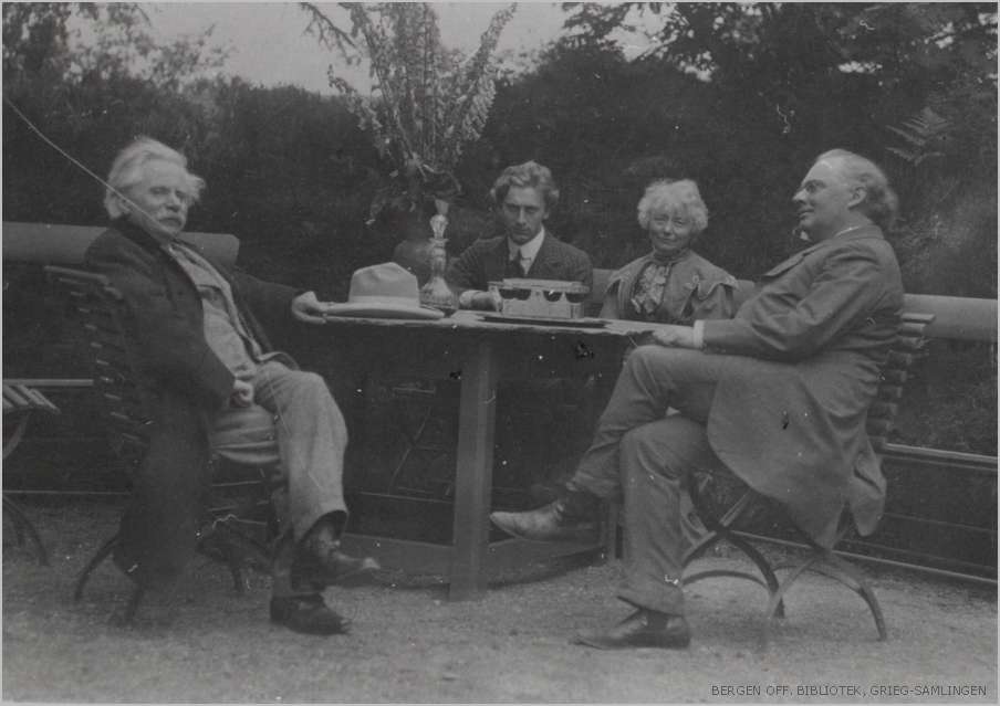
A Hoenisch Portrait of composer Edvard Grieg at Troldhaugen, July 25, 1907. Six weeks after this photograph was made, Edvard Grieg was gone.
The front of the card is a photogravure portrait in deep black and glowing white, printed full bleed with slightly rounded corners on stiff card stock. A man sits outdoors in a wooden chair, holding the lapel of his dark overcoat, loosely arranged to show a full suit, waistcoat, and bowtie. A white hat sits lightly on a head of wild silver hair. His mustache is full, his gaze lifted and distant. He looks content, a man six weeks from death.
Stylized script in the upper left identifies the subject and moment: Dr. Ed. Grieg / Troldhougen 25.7.07. The photographer’s credit in the lower right reads: E. Hoenisch Phat. 1907. The back carries the publisher’s imprint: Breitkopf & Härtel, 51 Great Marlborough Street London W. A stamp box reads Printed in Germany. The card is unposted and unwritten, with amber flocking on the reverse and damage to the lower left corner.
The photogravure production quality is exceptional, revealing the highlights of Grieg’s white hat and the deep shadows of his coat, detail and dimensionality from century’s old technology. Breitkopf & Härtel were not postcard publishers. They were Grieg’s music publisher, one of the oldest and most prestigious houses in Europe, with Leipzig roots and a London office at the address printed on this card’s back. Their choice of photogravure signals deliberate intent. This is a prestige object, a rare souvenir of a celebrated composer.
Troldhaugen, Troll Hill, sits on a small wooded peninsula jutting into Nordåsvannet, a freshwater lake south of Bergen. Grieg built his pale wooden villa there in 1885, with a panoramic tower and large windows opening onto the water. He called it his best opus so far. By 1891 he had added a small composing hut at the lake’s edge: a piano, a desk, a rocking chair, a view over the water that he described as essential to his work. When he left it for the day he placed a handwritten note on the desk, a humble request.
If anyone should break in here, please leave the musical scores, since they have no value to anyone except Edvard Grieg.
Late July in Bergen is the city’s warmest season, though warm is a relative term. Long northern light persisting until nearly ten at night, the lake surface holding the soft diffuse luminescence of a Bergen summer afternoon.
Nina Grieg, Edvard’s wife and the foremost interpreter of his songs, presided over evenings in the living room around the 1892 Steinway. The house was full that summer. Julius Röntgen was there, the Dutch-German composer who had been Grieg’s closest musical confidant for twenty-four years. Their friendship is exhibited through more than two hundred letters, a deep enough connection that Grieg composed a short piece the previous year titled Sehnsucht nach Julius.
Percy Grainger, twenty-four years old and already an electrifying pianist, had arrived for what would become ten extraordinary days. Grieg had encountered Grainger in London the previous year and noted it in his diary.
I had to become sixty-four years old to hear Norwegian piano music interpreted so understandingly and brilliantly. He breaks new ground for himself, for me, and for Norway.
Ernst Hoenisch was thirty-two years old and already the leading musical photographer in Leipzig. He opened his atelier in 1903, and held the designation Hoffotograf, a court photographer’s appointment conferred by royal warrant. His roster of subjects over the following decades includes masters of musical life: Max Reger, Zoltán Kodály, and a young Kurt Weill.
The publishers Breitkopf & Härtel were also a Leipzig institution. The city’s musical world was compact and interconnected, its photographers, publishers, and performers in continuous orbit around one another. Hoenisch was almost certainly sent through the publisher to document Grieg in his final summer at the home where so much of his music had been written. He arrived into one of the most extraordinary musical gatherings of the era.
From the National Library of Norway Bergen Library Grieg Archives
On July 25, that light fell across the garden where Hoenisch set up his camera. Edvard and Nina Grieg, Röntgen, and Grainger gathered at a garden table. An image from the National Library of Norway Bergen Library Grieg Archives captures them together. Grieg is wearing the identical suit, overcoat, and white hat that is visible on our card. Perhaps Hoenisch made the casual group image and then later captured the iconic portrait. A man alone and at rest in the place he loved most, surrounded by the people who understood his music best.
Grieg had been ill for years. A collapsed lung from tuberculosis contracted as a teenager at the Leipzig Conservatory shadowed his entire adult life. By 1907 his condition had deteriorated into combined lung and heart failure, with repeated hospitalizations. When Röntgen said his final farewell at Troldhaugen that summer, he knew they may not meet again.
In September, Grieg prepared to travel to England, where Grainger was to perform his Piano Concerto at the Leeds Festival. He collapsed in Bergen on the way to the ferry, was admitted to hospital, and died the following morning, September 4, 1907. His last words were: Well, if it must be so.
Forty thousand people filled the streets of Bergen for his funeral. His ashes were interred in a grotto in the cliff face above Nordåsvannet, at a spot he had chosen years earlier while fishing with a friend, where the last light of the day touched the rock. Here I want to rest forever, he said.