On any given day, a postcard can emerge from the collection that takes you back unexpectedly. Let’s return to Redcar.
My aim this week was to alphabetize an album of vintage English postcards, shuffling and sorting a large stack with an ally at my side who knows the geography infinitely better than me. English place names always elicit a story. Only a properly-schooled person can place Norton-on-Tees without at least a few context questions.
These two real photo postcards depict Coatham Road and the seaside pier, both of which are described in the previous article. Shortly, I’ll go back and add these to the original. There’s an even more interesting quest to learn more about Nurse Aird, her charges, and her surrounds.
This week these two cards provide a sweet reminder to keep going though we often don’t know what is ahead or around the corner. I am happy to make a short trip back to Redcar to remember the seaside, the donkeys, and how we keep up these traditions for everybody who comes after.
Who do you tell when disaster strikes? Despite their cheery reputation, postcards delivered the bad news, too.
One of seven tornados cut a swath through Omaha at 5:30pm on Easter Sunday, March 23, 1913. More than a hundred people perished with many more injured and the city’s infrastructure in ruin. A century later, scars of the event are still palpable in the story, architecture, and photographic memory of the city.
Devil Clouds is worth the watch. This hour-long documentary made around the 100th anniversary explores the event and its aftermath. I found it while researching the two stray postcards here. Digging through the Nebraska State Historical Society Archives, I got the tragic news more than a century late.
Disaster images fill in what words can’t describe. In the immediate response, their visual details and captions become coordinates for streets that no longer have familiar signs and recognizable landmarks. Soon, commercial postcards are for sale and news gets out to concerned family and friends. In Omaha, before-and-after pictures of restored homes and businesses appeared in less than a year. Even today, the moral story of the town is built on that rubble and their can-do recovery effort.
The vintage images help us contextualize world events then and now. Their lore of community resilience gives us clues about what to do when fortune fails us. We pool resources, stay connected, and get crafty. In Omaha, the ‘Hello Girls’ kept the few working telephone lines staffed right through the storm, then turned their building into a hospital in the days after.
Disaster postcards are a substantial niche in the much larger scene of collecting postcards that document historic events. As we discovered last year, the birth of a volcano in Mexico was global news in 1943. For a small village it was pure tragedy. For collectors, these images are rare finds.
June 1908 Kansas City – Santa Fe StreetJune Flood 1908 Kansas City
Though the timing is coincidental, comparing nature’s wrath with man-made disaster is also telling. Omaha was in a moment of rebirth as the fog of WWI descended on Europe. The Parícutin volcano plumes briefly stole the newsreel spotlight from wartime food-rationing in March 1943.
Why do we cause each other such suffering, knowing what life already has in store? The evidence is brutal, shouldn’t it also be obvious? It is best to prepare for tornado season, and avoid war.
Remember that you will die, but your vacation photos live on.
Looking back takes a measure of imagination. Even if it was you back then, time and distance change the story. The past isn’t exactly what we remember, especially when the memories aren’t even ours.
What happens when the evidence is all that is left?
Today’s time travel includes names, exact dates, even a Greyhound itinerary. In the collection, we’ll see images of two women with young children who may be grandparents now. If you’re familiar with California and its famous redwoods, this might look like a photo album of your own. Travel ephemera include maps, tickets and brochures, the lunch menu from Camp Curry, and a tiny recipe book from Fisherman’s Wharf.
This isn’t a family vacation, at least not ours. The genealogy is discoverable, but that’s not our aim. The arms-length context gives us another way to look back, a wander through the American West by bus in late summer 1955.
If you know these two, send me a note!
These photos were carefully fixed into a well-organized keepsake album documenting the fun-filled vacation, a roundtrip bus ride from Phoenix to San Francisco with a stayover at Camp Curry in Yosemite and a tour of Chinatown nightlife in the city.
Miss Betty, maybe.
Betty and Margaret with the kids.
Cute kids.
Love each other.
Stick together.
Even through this.
Even through this.
Also an adventure.
Yosemite!
Outdoor dining at Camp Curry.
Arriving home, but to the same place?
We’re not sure.
Here’s to old familiar furniture.
A meticulous hand-penciled numbering system helped me put the trip timeline together and the photo locations in order. Zooming in added more connections, including two images by Moulin, the famous photographer of San Francisco and its surrounds.
No doubt this collection came to us because of the postcards, which provides a lovely windows-down cruise up the West Coast with all the scenic stops.
Days of California Dreaming.
Signal Hill, Long Beach
Bixby Park, Long Beach
Redondo, Hermosa, and Manhattan beaches from Palos Verdes Estates view.
Union Station in Los Angeles
Los Angeles International Airport, circa 1955.
Los Angeles freeway interchange, circa 1955.
Merced, CA, looking west on Seventh Street.
Lake Yosemite, near Merced, California.
Arch Rock at Yosemite National Park
Yosemite national Park Entrance Gates and Ranger Station on Highway 140
Yosemite national Park, Half Dome and Sentinel Bridge over Merced River.
Yosemite National Park, panorama view from Wawona Tunnel.
El Capitan, Yosemite National Park.
Yosemite National Park, the Four Falls: Nevada, Yosemite, Vernal, and Bridal Veil.
Yosemite National Park, Upper and Lower Yosemite Falls.
Sequoia in the Mariposa Grove in the south entrance, Yosemite National Park.
Yosemite National Park, Big Trees Lodge.
Yosemite National Park, Wawona Tunnel Tree.
Nevada Fall with rainbow.
Yosemite National Park, Yosemite Lodge.
Yosemite National Park, the beautiful Ahwanee Hotel.
The Firefall that flares from light hitting Glacier Point.
Oakland Bay Bridge opened in 1936.
San Francisco City Hall, modeled after the US Capitol.
Mission Dolores in San Francisco, founded in 1776.
Panorama of San Francisco from Twin Peaks.
Golden Gate Park Conservatory, San Francisco
Portals of the Past, a relic from the great fire of 1906.
Palace of the Legion of Honor in Lincoln Park
Steinhart Aquarium, circa 1955.
Fishing Fleet, photo by Gabriel Moulin,
Alcatraz Island, photo by Gabriel Moulin.
Union Square, San Francisco, circa 1955.
Mission Santa Barbara founded in 1786
Coit Memorial Tower on Telegraph Hill in San Francisco.
Included is a night in Chinatown, as the itinerary promised. These rare, real photo postcards signed front and back may require more research.
For the summer of 1955 (and for many years after, I hope) these mementos stood in for all the laughter, mystery, and adventure that two gals can gather in a lifetime. Though the photos and memories are not our own, the little joys of summer still shine through. After all these years, the collection still reminds us to get on the bus and go.
Imagine all the reasons a man might vanish. Illness, catastrophe, bad deeds. Did our man Navarro step into the volcano itself? The less we know, the more his story unfolds.
In the early 1940s, Frida Kahlo was painting in the blue house in Coyoacán, building a self-image out of indigenous dress, pre-Columbian imagery, and a dramatic interiority of devotion and suffering. A few miles from there, tourists floated around the Xochimilco canals, waiting to have their photos taken aboard the flower boats.
In 1943, on those same canals, Emilio Fernández was filming María Candelaria starring Dolores Del Rio with the cinematographer Gabriel Figueroa. The film would win the Palme d’Or that year and launch the golden age of Mexican cinema with a story that revered the nation’s indigenous origins.
André Breton had come and gone, calling Mexico the most surrealist country in the world. The Louvre bought a work by Kahlo, an unprecedented purchase for the artist and also for its political prowess. The exiled Trotsky was an honored guest, at Diego Rivera’s request. President Lázaro Cárdenas had nationalized the oil industries and redistributed land, putting the state in the middle of an global argument with communism on one side and capitalism on the other. Then Mexico and the United States became WWII allies, and the floes of attention and resources became even more complicated.
Despite the war, Paricutín’s spectacular smoke clouds commanded global coverage. Life sent photographers. Newsreels carried the footage everywhere. Pan American detoured its flights so passengers could see the new volcano from the air.
Navarro passed quietly through it all, camera in hand, one day taking pictures of modernist architecture rising in glass and concrete, and the next documenting the earth itself splitting open in a cornfield.
Navarro pointed his lens at the same indigenous Mexico in the same moment, with the same seriousness. Kahlo’s name and artwork is now symbolic of her culture and synonymous with her city. Navarro vanished entirely, except for one folder in someone else’s archive in Washington, DC.
I exited the Green Line at L’Enfant station, passed quickly through security screening, got a visitor’s badge, and was escorted to the third floor by everyone’s secret best friend, the staff archivist. My bag checked into a locker, and with only my phone, paper, and a pencil, I entered the glass-walled room. Two other researchers had their places set out. My cart of materials was waiting for me near a sunny window with a view onto the leafy street below.
The cart held five Smithsonian manuscript boxes from the William F. Foshag Papers. Careful preparation had led me to order several boxes before and after Box 9. Correspondence was alphabetical, so I asked for the N folders. I also wanted to look through a large sample of images from other photographers, including Bill Foshag and his Mexican collaborators, mostly fellow mineralogists.
To summarize, these guys were into rocks and attribution. Most of the letters contained precise language about the rock samples collected, observed, and lent out by the Smithsonian under Foshag’s direction. Also, who should get credit, and thus funding and the opportunity to travel for further study. Foshag was an administrator by title, but his personal photos and travels in the Southern Hemisphere tell the story of an adventurous life.
Regarding Paricutín, Ambassador George S. Messersmith wrote to the Secretary of State on March 10, 1943, with the story that would later become the official news report and the synopsis we know now. A Tarascan farmer plowing his field saw smoke coming from a furrow, then a wall of molten lava rose a hundred feet high. The Mexican government bought the land and charged spectators twenty-five centavos to fund a new highway, eventually issuing the commemorative stamp that is fortuitously fixed on the back on one of Navarro’s postcards. Quite a clue, and an indelible time marker.
In his memo, the ambassador notes that pictures, movies, and stills are being taken and will be transmitted in due course. Later, pages of Foshag correspondence lament the poor condition of the only moving images, a short film documentary was made of the volcanic eruption but had not survived the reproduction process at home.
In early March, the Office of Naval Intelligence sent an attaché to Uruapan, who drove the rough road out to the volcano and reported back in detail. A camp had sprung up at a distance from the cone, which had to be moved several times in the early weeks. Lava advanced sixteen meters per hour, he calculated. Then, this line that now sounds like an outright lie: no photographer was seen, either in the day or at night.
A Smithsonian paleontologist drove down with two colleagues in June. His field narrative is almost literary, describing lava of “the consistency of stiff molasses,” and “the birth agonies of a new flow.” In closing, he remarked that they had been one of the fortunate few to witness the travail and anguish of one night in Paricutín’s life. The sole, spare, irrefutable fact we know is that Navarro was there, too.
The United States Committee for the Study of Paricutin Volcano tracked every project and every dollar, in order to report in triplicate to their funders at the U.S. Geological Survey, the State Department, and the Geological Society of America. For example, Celedonio Gutiérrez, a local man, was paid sixty pesos a week, later raised to eighty-five, to maintain the camp and keep the record. How did Celedonio miss Navarro?
The committee’s annual reports name every paper published: Krauskopf on eruption mechanics, Barnes and Romberg on gravity determinations, the Foshag-González history of the first two years, and the photographic record being prepared for the National Archives. It is the very same meticulously catalogued photographic record I was thumbing through that day.
Next, I opened a leather-bound album of careful black-and-white prints entitled, Photographs of Paricutin Volcano taken during the first three years of its activity. Selected from the Collection of Ezequiel Ordóñez.
Ordóñez was the dean of Mexican geology. The album was assembled and presented through the official Mexican research-coordination commission. A named, curated, institutional photographic record of Mexican origin to match the Foshag record. The credited gaze of two nations, on two sides of a border, doing the same careful work of attribution.
Finally I opened Folder 7, still fairly crisp tan cardstock with a tab hand-lettered in pencil. Only a surname, a question mark, and the content label: Navarro, ? Photographs of Paricutín, 1943–1944.
Inside, a stack of black-and-white prints in clear archival sleeves. The top print was instantly recognizable as Navarro, though I hadn’t seen it before. A great dark eruption column rising over the cone, a small bare tree silhouetted in the foreground, and the tiny block letters NAVARRO FOT. just legible at the lower right. The stack included twenty photos altogether, only five overlapping with mine.
Navarro seems to have worked exclusively in Kodak Mexicana materials. All of his cards are stamped with the EKC indicia, which was standard professional postcard stock of the day. He was not a hobbyist with a box camera, but more likely a commercial photographer running a business. Most of the scientific images in other folders were printed on regular photo paper, probably by means of institutional production houses. Navarro was printing locally, the same inky contrasts of a real photo, but with the variable frames and exposures found onsite.
We know his territory was wider than the volcano by virtue of the Hotel Virrey de Mendoza in Morelia and the unidentified sanatorium presumed to be in Uruapan. Draw lines between Morelia, Uruapan, and the volcano and you get the tight triangle of a working photographer’s range, anchored east in the state capital and west in the lava.
The most critical contrast between Navarro’s images and the scientific record are the visual content of the images themselves. Bless them, the scientists pointed the camera at the ground, caught the low refractions of an entirely static rock, and labeled it. Navarro captured a nation’s indigenous and religious history being consumed back into the earth.
The Fototeca Nacional del INAH holds regional negatives and studio collections that have never been digitized. The municipal archives in Morelia might have kept studio registrations and business permits from the 1940s. There are other archives to visit like Biblioteca Michoacana, and a few private collections now held at university libraries like Princeton. Occasionally, there are still Navarro cards for sale on eBay. Kodak has extensive business archives that could shed light on the places and people involved in the burgeoning photo film industry far south of Rochester, NY.
The glass-walled sanatorium may belong to the wave of modernist health architecture built under Mexico’s 1942 National Hospital Plan, all the transparency, light, and air needed for the treatment of tuberculosis. Tracing his actual footsteps to that building might place Navarro on a specific hillside or with a known client. Or, it might lead to a pile of rubble.
Some answers are not in any archive. Perhaps they are with a family in Morelia who remember a grandfather with a camera and a tall tale of a fire-breathing dragon emerging from the earth. His picture-proofs held an the old leather bound album that gets passed around at a kitchen table alongside stories that were never written down.
In one of the boxes, I found a small black-and-white photograph of a Purépecha family, four women and three men, seated and standing on a wooden porch in San Juan Parangaricutiro. Pressed above the photograph on an onionskin slip was a handwritten caption from Jenaro González.
A typical Tarascan family, photographed at their home. Aurora Cuaro, lower left. One of the few people in history who have attended the birth of a volcano. A very intelligent woman, one of our best and most reliable sources of information.
A second photograph in the folder showed Aurora alone, standing in front of a wooden building in a white blouse and a long embroidered skirt, smiling straight at the camera. My photo of the photo is terrible, but you can still see her. Clear-eyed. At ease.
Aurora Cuaro lived inside the eruption. It happened in her cornfield, her parish, her sky. Foshag and González knew this and credited her, in writing, by name.
What the archive does not hold is what she knew. The Purépecha had lived in this volcanic landscape for centuries, and they had ways of reading the ground that did not begin in February 1943 and did not end when Paricutín went dormant in 1952. Aurora and her neighbors brought a lived intelligence of their own to the encounter with the era. This is the deeper kind of absence. Undoubtedly, the Cuaro family knew Navarro.
We will probably never know his first name or see his face. I once thought I had a photograph of him, and it turned out to be a man with surveying equipment, not a camera. Was he born in Michoacán or came from somewhere else? Was he twenty-five or fifty in 1943? What did he know of Frida Kahlo, and what did he think about war? After all this time, where is Navarro now?
Dionicio Pulido, the farmer whose cornfield erupted, and whose face will never be forgotten.
With special thanks to the staff of the Smithsonian Institution Archives.
In 1943, director Emilio Fernández was filming a scene much like this one on the flower canals of Xochimilco in Mexico City. His film, María Candelaria, would win the Palme d’Or at Cannes that year and launch the golden age of Mexican cinema, introducing a spare and stylized visual landscape that rested in reverence for the country’s Purépecha past.
This flower boat image is another to emerge from an album of old black and white photographs from mid-century in the Michoacán region of Mexico. The photos may or may not belong to the same set. Only a few spare clues suggest any connection at all.
Tomorrow, I head down to the National Archives Reading Room at L’Enfant Plaza in Washington, DC, to finally open Folder 7 in Box 9, the trove of Navarro materials that I hope may reveal more about our enigmatic photographer.
I’ve order an additional five boxes of materials from the Foshag archives, correspondence and comparative images that may give us more context for the post-war decade that brought intense global attention to an otherwise quiet region of the world.
Political foment, modern artistic aspirations, scientific discovery, and the earth itself churning below. Let’s follow where Navarro goes next.
I’m a fan of research that never reveals its source or finds the answer. There are still archives to explore, and a feeling that the story itself refuses to resolve.
A year ago, I wrote about the mysterious photographer Navarro who meticulously documented the birth of a volcano. This week, I found three additional Navarro images in an album full of Mexican real photo postcards. One image is directly related to Parícutin; a haunting black and white photo of the inside of the church before it burned.
The other two images will take more time to discover their origins. Now, I’m motivated to go digging for the one file folder in the Smithsonian archives that may finally tell us about this enigmatic soul.
Until then, enjoy the tragic beauty and extraordinary drama of these moments from long ago, and stay with me one more day in the mystery of it all.
The story of a mail-carrying ship named after a queen who never arrived.
RARE CARD
Art Deco promotional postcard, printed in U.S.A., circa 1923
Front: A bold Art Deco illustration in four colors: burnt amber, deep navy, black, and red-orange. The ship Berengaria fills the frame. The black hull dominates the lower half. Three banded funnels plume smoky blue-purple into the amber sky. The ship’s name is lettered in copper on the hull. The Cunard lion sits in a red medallion at upper left. At lower left, a stylized New York skyline recedes into amber, a bridge suggested behind it. The waves are geometric. The image mirrors a popular poster style, compressed into an elongated postcard.
Reverse: The left panel carries a printed ship description: 919 feet, 52,022 gross tons, Pompeian swimming pool, gymnasium, Turkish and electric baths, special ballroom. Divided format, publisher code A. & P. 47850, printed in the U.S.A. The address side is blank. The card was never sent.
“The R.M.S. Berengaria, the largest ship in the Cunard fleet and one of the three largest ships in the world, has a length of 919 feet, and a tonnage of 52,022 gross tons. Her passenger accommodation includes a Pompeian swimming pool, gymnasium, Turkish and electric baths, and a special ballroom.”
Production: Cunard distributed promotional postcards like this one aboard ship and at its offices. This example uses offset lithography with a guilloche-style mechanical tint screen giving it the graphic quality of a travel poster. The colors are rich and regal. The card shows its age: deep crease lines, foxing, staining, with a bent lower left corner.
Collectibility: Ship postcards from the great transatlantic liners are a well-established collecting category. The Berengaria appears frequently. This example stands out for its Art Deco illustrative style over the more common photographic format. The design quality is high, but condition limits its value.
RMS Berengaria, Cunard Line postcard — reverse. Publisher A. & P. no. 47850, printed in U.S.A.
Samuel Cunard began his shipping empire on a government mail contract in 1839. As a Royal Mail Ship, the RMS prefix was baked into Cunard’s identity from the start. It meant a contractual obligation to carry post, and to sail on schedule whether the ship was full or nearly empty. Cunard told his captains: “Ship, passengers and mail — bring them safely over, and safely back.”
The ship’s name came from a medieval English queen. Berengaria of Navarre married Richard the Lionheart in Cyprus during a Crusade, was widowed without an heir, and spent her remaining decades in Le Mans petitioning by letter for the pension King John refused to pay. She appealed to popes and argued with bishops. Her entire widowhood was conducted through correspondence, written from afar, addressed to courts that largely ignored her. She is most remembered as the English queen who never set foot in England.
The ship started out as the SS Imperator, built in Hamburg for the Hamburg America Line and launched in 1912 as the largest passenger ship in the world. The war intervened and the ship was seized as a reparation and sailed briefly as a U.S. Navy transport. In 1921, it was renamed Berengaria and handed to Cunard. Much like its namesake, the ship never returned to its homeland.
The Berengaria served as Cunard’s flagship through the 1920s, then declined into Prohibition-dodging cruises that passengers nicknamed Bargainaria. Aging wiring sparked electrical fires. Cunard retired the vessel in 1938.
Sir John Jarvis, a Surrey MP, bought Berengaria for scrap and sent her to the River Tyne in a deliberate act of charity. Jarrow had lost its main shipyard, Palmer’s, in 1934. Unemployment topped 70 percent. Two years before the Berengaria arrived, 200 of Jarrow’s men had marched 300 miles to London to petition Parliament for work. Parliament offered nothing. Jarvis purchased the Berengaria and the Olympic to give the town’s idle shipyard workers something to dismantle. Men who had built destroyers and passenger liners cut the ship apart with blowtorches. The work was interrupted by the Second World War, but the last of the ship was gone in 1946.
Three cards were slipped into a box of laundry powder in 1882. Someone kept them. The Victorian collecting impulse worked then, and it still does.
These three Victorian trade cards were issued in 1882 by J.D. Larkin & Co. of Buffalo, New York, and printed by Cosack & Co., one of the most accomplished chromolithography firms in the country at the time. Two cards advertise Boraxine, a borax-based laundry powder; the third promotes Creme Oatmeal Toilet Soap. Premiums slipped into product packages, these trade cards were designed to be collected.
Though selling soap and cleaning powder, none of the three shows domestic labor. Instead, each presents an aspirational female figure representing a Victorian version of beauty, cleanliness, and high design. The cards are notable for the printing mastery, expensive gilding, and their confident use of Aesthetic Movement and Japonisme design conventions.
Both the Larkin Company and Cosack & Co. went on to significant histories. Buffalo’s industrial power in that era were remarkable, and the craft of chromolithography was at its height. The cards survive as evidence of the Gilded Age and still hold their value a century later.
Chromolithography had transformed commercial advertising in the decade following the Philadelphia Centennial Exposition of 1876. The technique required drawing each color separately onto a flat limestone plate, then passing the paper through the press once per color, building the image in successive transparent layers. A finished card of this complexity required a dozen or more passes. The result was a depth and saturation of color that earlier printing processes could not achieve.
Cosack & Co. was among the firms that defined the standard. Founded in Buffalo in 1864 by Hugh Clay and Herman Cosack, the firm described itself as “The Most Complete Lithographic Establishment in the United States” and maintained offices in New York, Chicago, Cincinnati, Philadelphia, Pittsburgh, Hartford, and Boston. Buffalo’s position at the intersection of the Great Lakes and the Erie Canal made it a center for manufacturing and commerce. Printing follows industry, and the company produced trade cards, baseball cards, railroad promotions, Civil War memorial prints, and sporting prints.
None of the three cards depicts domestic work. The women shown are not laundering, scrubbing, or cleaning. Victorian soap manufacturers consistently presented their products through images of the comfort and refinement that cleanliness was understood to produce, rather than images of the labor it required. Cleanliness carried significant moral and social weight in this era. Advertising positioned soap not merely as a cleaning agent but as a indicator of respectable domestic life.
Boraxine was Larkin’s second product, introduced shortly after the company’s founding in 1875. Its advertising copy addressed practical concerns obliquely, but the trade cards operated on a different value system. The cards were premium collectibles in the trade card collection craze that preceded postcards. Their purpose was to be kept, collected, and admired as objects themselves.
The collectible strategy belonged to Elbert Hubbard, Larkin’s brother-in-law and advertising partner from 1878 onward. Hubbard recognized that inserting a chromolithograph into a box of laundry powder gave the customer a reason to purchase routinely. The marketing strategy was driven by the collecting impulse and was itself an object that affirmed the class status of buyers.
In 1885, Hubbard formalized this approach into what he called “The Larkin Idea”. Factory direct sales with valuable premiums bundled into combination boxes at the original price of the soap. The strategy transformed Larkin from a regional manufacturer into one of the largest mail-order businesses in the country, eventually employing 4,000 people with annual sales of $28 million. In 1903, Larkin commissioned Frank Lloyd Wright to design a headquarters building on Seneca Street. It was Wright’s first commercial commission, completed in 1906.
The Victorian trade card era ran from roughly 1876 to the late 1890s, when improvements in magazine color printing reduced the novelty and the format declined. At its peak in the 1880s, trade cards were the most prevalent form of advertising in American commercial life. They were distributed at store counters, tucked into product packages, and carried by traveling salesmen. The collecting culture around them was substantial. Parlor albums were produced specifically to hold them, and publications offered guidance on arrangement and display.
Cosack & Co. continued operating under successive partnerships through the early twentieth century. The Larkin Company closed in the 1940s. Sadly, the Larkin Administration Building was demolished in 1950.
These 1882 cards predate “The Larkin Idea” by three years. The contemporary collecting impulse that Hubbard designed them to provoke also preserved them for more than a century. These three cards survive because they were kept long after the product was gone. They are evidence of a printing firm, a soap company, and a city at a confident moment when quality communication was rightly presumed to outlast its commercial purpose.
To Read More
The Larkin Company — Buffalo Stories Archives offers solid documentation of Larkin’s rise, buffalostories.com
Chromolithography and Trade Cards — The Winterthur Museum holds one of the foremost collections of Victorian trade cards and published research on lithography production, digitalcollections.winterthur.org
The Larkin Administration Building — The Frank Lloyd Wright Foundation maintains records of the 1903 building, demolished in 1950, franklloydwright.org
Borax in the 1880s — The Borax/Death Valley history is well documented at the Borax Museum, Furnace Creek, California, nps.gov/deva
“The Larkin Idea” — The Henry Ford Museum blog tells this story, thehenryford.org
Herman T. Koerner and Cosack & Co. — Western New York History is a good source for more, wnyhistory.org
Trade Cards — A Short History at Cornell University, Waxman Collection, rmc.library.cornell.edu
Robert Jay, The Trade Card in Nineteenth-Century America. University of Missouri Press, 1987.
Jay T. Last, The Colour Explosion: Nineteenth-Century American Lithography. Hillcrest Press, 2005.
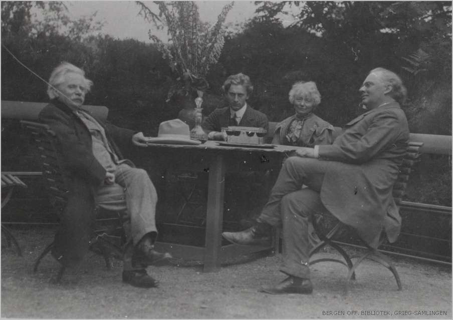
A Hoenisch Portrait of composer Edvard Grieg at Troldhaugen, July 25, 1907. Six weeks after this photograph was made, Edvard Grieg was gone.
The front of the card is a photogravure portrait in deep black and glowing white, printed full bleed with slightly rounded corners on stiff card stock. A man sits outdoors in a wooden chair, holding the lapel of his dark overcoat, loosely arranged to show a full suit, waistcoat, and bowtie. A white hat sits lightly on a head of wild silver hair. His mustache is full, his gaze lifted and distant. He looks content, a man six weeks from death.
Stylized script in the upper left identifies the subject and moment: Dr. Ed. Grieg / Troldhougen 25.7.07. The photographer’s credit in the lower right reads: E. Hoenisch Phat. 1907. The back carries the publisher’s imprint: Breitkopf & Härtel, 51 Great Marlborough Street London W. A stamp box reads Printed in Germany. The card is unposted and unwritten, with amber flocking on the reverse and damage to the lower left corner.
The photogravure production quality is exceptional, revealing the highlights of Grieg’s white hat and the deep shadows of his coat, detail and dimensionality from century’s old technology. Breitkopf & Härtel were not postcard publishers. They were Grieg’s music publisher, one of the oldest and most prestigious houses in Europe, with Leipzig roots and a London office at the address printed on this card’s back. Their choice of photogravure signals deliberate intent. This is a prestige object, a rare souvenir of a celebrated composer.
Troldhaugen, Troll Hill, sits on a small wooded peninsula jutting into Nordåsvannet, a freshwater lake south of Bergen. Grieg built his pale wooden villa there in 1885, with a panoramic tower and large windows opening onto the water. He called it his best opus so far. By 1891 he had added a small composing hut at the lake’s edge: a piano, a desk, a rocking chair, a view over the water that he described as essential to his work. When he left it for the day he placed a handwritten note on the desk, a humble request.
If anyone should break in here, please leave the musical scores, since they have no value to anyone except Edvard Grieg.
Late July in Bergen is the city’s warmest season, though warm is a relative term. Long northern light persisting until nearly ten at night, the lake surface holding the soft diffuse luminescence of a Bergen summer afternoon.
Nina Grieg, Edvard’s wife and the foremost interpreter of his songs, presided over evenings in the living room around the 1892 Steinway. The house was full that summer. Julius Röntgen was there, the Dutch-German composer who had been Grieg’s closest musical confidant for twenty-four years. Their friendship is exhibited through more than two hundred letters, a deep enough connection that Grieg composed a short piece the previous year titled Sehnsucht nach Julius.
Percy Grainger, twenty-four years old and already an electrifying pianist, had arrived for what would become ten extraordinary days. Grieg had encountered Grainger in London the previous year and noted it in his diary.
I had to become sixty-four years old to hear Norwegian piano music interpreted so understandingly and brilliantly. He breaks new ground for himself, for me, and for Norway.
Ernst Hoenisch was thirty-two years old and already the leading musical photographer in Leipzig. He opened his atelier in 1903, and held the designation Hoffotograf, a court photographer’s appointment conferred by royal warrant. His roster of subjects over the following decades includes masters of musical life: Max Reger, Zoltán Kodály, and a young Kurt Weill.
The publishers Breitkopf & Härtel were also a Leipzig institution. The city’s musical world was compact and interconnected, its photographers, publishers, and performers in continuous orbit around one another. Hoenisch was almost certainly sent through the publisher to document Grieg in his final summer at the home where so much of his music had been written. He arrived into one of the most extraordinary musical gatherings of the era.
From the National Library of Norway Bergen Library Grieg Archives
On July 25, that light fell across the garden where Hoenisch set up his camera. Edvard and Nina Grieg, Röntgen, and Grainger gathered at a garden table. An image from the National Library of Norway Bergen Library Grieg Archives captures them together. Grieg is wearing the identical suit, overcoat, and white hat that is visible on our card. Perhaps Hoenisch made the casual group image and then later captured the iconic portrait. A man alone and at rest in the place he loved most, surrounded by the people who understood his music best.
Grieg had been ill for years. A collapsed lung from tuberculosis contracted as a teenager at the Leipzig Conservatory shadowed his entire adult life. By 1907 his condition had deteriorated into combined lung and heart failure, with repeated hospitalizations. When Röntgen said his final farewell at Troldhaugen that summer, he knew they may not meet again.
In September, Grieg prepared to travel to England, where Grainger was to perform his Piano Concerto at the Leeds Festival. He collapsed in Bergen on the way to the ferry, was admitted to hospital, and died the following morning, September 4, 1907. His last words were: Well, if it must be so.
Forty thousand people filled the streets of Bergen for his funeral. His ashes were interred in a grotto in the cliff face above Nordåsvannet, at a spot he had chosen years earlier while fishing with a friend, where the last light of the day touched the rock. Here I want to rest forever, he said.
British WWI Hospital Ward RPPCs, a rare paired set, circa 1915–1918
These two real photo postcards document a British auxiliary hospital ward decorated for Christmas, sometime between 1915 and 1918. They are unused and in remarkably good condition. Together they form a matched pair, shot on the same day from opposite ends of the same large convalescence hall.
The architecture, nursing uniforms, iron bed frames, style of celebration, and the back of the cards all point to the same conclusion: a British ward during wartime Christmas, shot by a local photographer working with the same technical materials and conditions as those documented in well-respected the Wellcome Collection in London.
Front of Postcards
The room is large with high ceilings and tall windows running along both sides. Hardwood floors extend the full length of the ward. Iron-framed hospital beds line each wall in neat rows, their white linens crisp and turned. A series of small tables anchor the center aisle, dressed with lace edges and set with tiered decorations, small ornamental figures, and floral arrangements. Crepe paper garlands radiate among the hanging fixtures from the center toward the walls. Nurses in white dresses, bibbed aprons, and distinctive white caps stand at intervals among the beds. Male patients rest in several of the beds or sit up for the photograph.
The first card was shot from one end of the room, looking toward a grand arched window fitted with ornate leaded stained glass and flanking panels in a geometric floral pattern. The second shot looks back the other direction toward an interior archway.
The photographic quality of both cards is high. The tonal range is continuous, with a fine grain and deeply resolved shadows. The nurses in the first image are grouped more loosely near the central table, and a ghostly motion blur in their figures suggests a longer exposure time. The second image is darker and the poses are more formal.
Back of Postcards
The cards share the same markings on the reverse, confirming they came from the same stock and photographer. The back carries the words “Post Card” in a decorative serif typeface, and a clean t-shaped dividing line delineating spaces “For Correspondence” and “Address Only.” No stamp box, printer’s imprint, paper manufacturer mark, or country or origin. That makes this RPPC irrefutably British.
Britain pioneered the divided postcard back in 1902, five years before the United States adopted the format. American RPPCs of the same era almost universally carried manufacturer’s marks such as AZO or VELOX in a printed stamp box, used to identify the photographic paper brand. British cards of this period carried no such mark. The back of these cards places their manufacture firmly in the British tradition.
The absence of any commercial marker further suggests a staff or commercial photographer and local production. These were not mass-produced. They were made in small numbers, likely for official wartime documentation or as personal mementos of a meaningful Christmas.
Two complementary long shots on a memorable day. Paired RPPCs are less common. A matched set intact, from a wartime context more than a century later, is rarer still.
Wartime Convalescence
Britain entered the First World War in August 1914 with 297 trained military nurses. Nowhere near enough for what was coming. Within weeks, the Royal Army Medical Corps and the British Red Cross Society jointly activated the Voluntary Aid Detachment system, mobilizing thousands of civilian volunteers to staff a network of auxiliary hospitals across the country. By 1918, approximately 80,000 VAD members served in uniform. Twelve thousand worked directly in military hospitals. Sixty thousand staffed auxiliary hospitals of various kinds.
The buildings pressed into service ranged from country houses and public schools to civic halls and converted warehouses. The ward in these cards show Gothic Revival arched windows with Arts and Crafts stained glass. The architecture is distinguished with high ceilings and dark wood wainscoting. Perhaps this is a purpose-built civic or private building of Edwardian ambition, converted for wartime use.
The iron bed frames visible in these cards match the tubular iron hospital beds documented in the ward photographs of King George Hospital, the largest military hospital in Britain during the war. Converted from a newly built HM Stationery Office warehouse on Stamford Street, London, the hospital opened in May 1915 and treated some 71,000 men before closing in June 1919. The Wellcome Collection holds its ward photographs. They show the same head and foot rail design, the same lightweight iron construction, the same configuration of beds along the ward walls. This was standard British military hospital specification, and these cards meet it exactly.
Wartime Wardrobe
We can more precisely date these cards by the white caps worn by the nurses. By early 1915, untrained VAD nursing staff had begun adopting the triangular floating veil worn by trained military nurses. Professional nurses were already unhappy about working alongside civilian volunteers. By November 1915, the Joint War Committee introduced a standardized cap for VAD nurses, making distinctions of training and rank visible at a glance.
The caps in these cards match that post-1915 VAD style. They are not the earlier flat cap prior to 1915, nor the fully structured veil of the trained QAIMNS sister. The confidence of the nurses’ poses and the scale of the ward celebration suggest an established wartime routine rather than the improvised urgency of the war’s first Christmas. This may narrow the date to 1916, 1917, or 1918.
Wellcome’s Wartime Collection
The Wellcome Collection’s photographic holdings of The King George Hospital archives open a window onto wartime convalescence. From the start, its philosophy held that recovery from war’s trauma demanded more than medicine.
Each bed had an electric light and a pink and white quilt. Common rooms on each floor were set up for socializing, smoking, reading, and writing letters. A miniature Harrods-like gift shop kept the wards stocked with comforts to necessities. It ordered up to 60,000 cigarettes each week so every patient could have six or seven smokes a day.
Most remarkably, a Royal Academician designed a rooftop garden that eventually held 24 revolving shelters positioned so patients could take in the air and watch the River Thames in all weathers. Queen Alexandra visited in May 1915, and that September she sent the hospital a tripod telescope so patients could study the rooftop view across London. On Christmas Day 1916, King George V and Queen Mary toured every ward in person, and presented each patient with a copy of the Queen’s Gift Book.
The decorated ward in these postcards belongs to that same time period, patriotic conviction, and palliative approach. The lace tablecloth, tiered cake stands, crepe paper garlands, and nurses standing at attention in their best uniforms were elements of organized care for men who had survived the Western Front, deserved a memorable Christmas, and needed more than the doctor’s orders.