The Last Summer

A Hoenisch Portrait of composer Edvard Grieg at Troldhaugen, July 25, 1907. Six weeks after this photograph was made, Edvard Grieg was gone.

The front of the card is a photogravure portrait in deep black and glowing white, printed full bleed with slightly rounded corners on stiff card stock. A man sits outdoors in a wooden chair, holding the lapel of his dark overcoat, loosely arranged to show a full suit, waistcoat, and bowtie. A white hat sits lightly on a head of wild silver hair. His mustache is full, his gaze lifted and distant. He looks content, a man six weeks from death.

Stylized script in the upper left identifies the subject and moment: Dr. Ed. Grieg / Troldhougen 25.7.07. The photographer’s credit in the lower right reads: E. Hoenisch Phat. 1907. The back carries the publisher’s imprint: Breitkopf & Härtel, 51 Great Marlborough Street London W. A stamp box reads Printed in Germany. The card is unposted and unwritten, with amber flocking on the reverse and damage to the lower left corner.

The photogravure production quality is exceptional, revealing the highlights of Grieg’s white hat and the deep shadows of his coat, detail and dimensionality from century’s old technology. Breitkopf & Härtel were not postcard publishers. They were Grieg’s music publisher, one of the oldest and most prestigious houses in Europe, with Leipzig roots and a London office at the address printed on this card’s back. Their choice of photogravure signals deliberate intent. This is a prestige object, a rare souvenir of a celebrated composer.

Troldhaugen, Troll Hill, sits on a small wooded peninsula jutting into Nordåsvannet, a freshwater lake south of Bergen. Grieg built his pale wooden villa there in 1885, with a panoramic tower and large windows opening onto the water. He called it his best opus so far. By 1891 he had added a small composing hut at the lake’s edge: a piano, a desk, a rocking chair, a view over the water that he described as essential to his work. When he left it for the day he placed a handwritten note on the desk, a humble request.

If anyone should break in here, please leave the musical scores, since they have no value to anyone except Edvard Grieg.

Late July in Bergen is the city’s warmest season, though warm is a relative term. Long northern light persisting until nearly ten at night, the lake surface holding the soft diffuse luminescence of a Bergen summer afternoon.

Nina Grieg, Edvard’s wife and the foremost interpreter of his songs, presided over evenings in the living room around the 1892 Steinway. The house was full that summer. Julius Röntgen was there, the Dutch-German composer who had been Grieg’s closest musical confidant for twenty-four years. Their friendship is exhibited through more than two hundred letters, a deep enough connection that Grieg composed a short piece the previous year titled Sehnsucht nach Julius.

Percy Grainger, twenty-four years old and already an electrifying pianist, had arrived for what would become ten extraordinary days. Grieg had encountered Grainger in London the previous year and noted it in his diary.

I had to become sixty-four years old to hear Norwegian piano music interpreted so understandingly and brilliantly. He breaks new ground for himself, for me, and for Norway.

Ernst Hoenisch was thirty-two years old and already the leading musical photographer in Leipzig. He opened his atelier in 1903, and held the designation Hoffotograf, a court photographer’s appointment conferred by royal warrant. His roster of subjects over the following decades includes masters of musical life: Max Reger, Zoltán Kodály, and a young Kurt Weill.

The publishers Breitkopf & Härtel were also a Leipzig institution. The city’s musical world was compact and interconnected, its photographers, publishers, and performers in continuous orbit around one another. Hoenisch was almost certainly sent through the publisher to document Grieg in his final summer at the home where so much of his music had been written. He arrived into one of the most extraordinary musical gatherings of the era.

From the National Library of Norway Bergen Library Grieg Archives

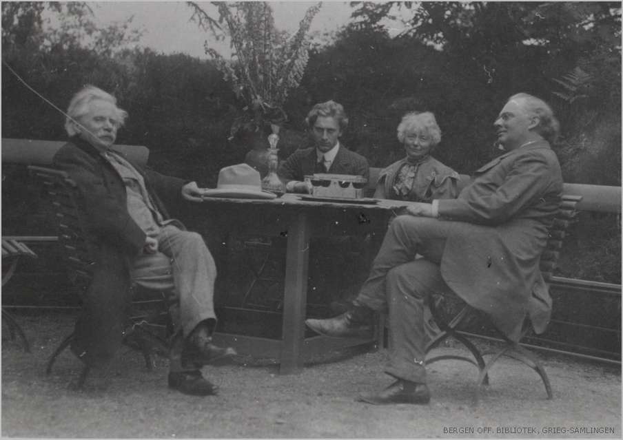
On July 25, that light fell across the garden where Hoenisch set up his camera. Edvard and Nina Grieg, Röntgen, and Grainger gathered at a garden table. An image from the National Library of Norway Bergen Library Grieg Archives captures them together. Grieg is wearing the identical suit, overcoat, and white hat that is visible on our card. Perhaps Hoenisch made the casual group image and then later captured the iconic portrait. A man alone and at rest in the place he loved most, surrounded by the people who understood his music best.

Grieg had been ill for years. A collapsed lung from tuberculosis contracted as a teenager at the Leipzig Conservatory shadowed his entire adult life. By 1907 his condition had deteriorated into combined lung and heart failure, with repeated hospitalizations. When Röntgen said his final farewell at Troldhaugen that summer, he knew they may not meet again.

In September, Grieg prepared to travel to England, where Grainger was to perform his Piano Concerto at the Leeds Festival. He collapsed in Bergen on the way to the ferry, was admitted to hospital, and died the following morning, September 4, 1907. His last words were: Well, if it must be so.

Forty thousand people filled the streets of Bergen for his funeral. His ashes were interred in a grotto in the cliff face above Nordåsvannet, at a spot he had chosen years earlier while fishing with a friend, where the last light of the day touched the rock. Here I want to rest forever, he said.


To Read More

Edvard Grieg — Britannica: https://www.britannica.com/biography/Edvard-Grieg

Bergen Public Library Grieg Archive — Flickr collection: https://www.flickr.com/photos/bergen_public_library/collections/72157617382486774/

Bergen Public Library Grieg Archive catalog: https://mitt.bergenbibliotek.no/cgi-bin/websok-grieg

Röntgen and Grieg — Julius Röntgen Foundation: https://www.juliusrontgen.nl/en/life/rontgen-and-grieg/

Grieg and Grainger — Piano Concerto site: http://griegpianoconcerto.com/grainger/biog.cfm

Ernst Hoenisch — Deutsche Fotothek professional record: https://www.deutschefotothek.de/documents/kue/90056238

Healing Ward

British WWI Hospital Ward RPPCs, a rare paired set, circa 1915–1918

These two real photo postcards document a British auxiliary hospital ward decorated for Christmas, sometime between 1915 and 1918. They are unused and in remarkably good condition. Together they form a matched pair, shot on the same day from opposite ends of the same large convalescence hall.

The architecture, nursing uniforms, iron bed frames, style of celebration, and the back of the cards all point to the same conclusion: a British ward during wartime Christmas, shot by a local photographer working with the same technical materials and conditions as those documented in well-respected the Wellcome Collection in London.

Front of Postcards

The room is large with high ceilings and tall windows running along both sides. Hardwood floors extend the full length of the ward. Iron-framed hospital beds line each wall in neat rows, their white linens crisp and turned. A series of small tables anchor the center aisle, dressed with lace edges and set with tiered decorations, small ornamental figures, and floral arrangements. Crepe paper garlands radiate among the hanging fixtures from the center toward the walls. Nurses in white dresses, bibbed aprons, and distinctive white caps stand at intervals among the beds. Male patients rest in several of the beds or sit up for the photograph.

The first card was shot from one end of the room, looking toward a grand arched window fitted with ornate leaded stained glass and flanking panels in a geometric floral pattern. The second shot looks back the other direction toward an interior archway.

The photographic quality of both cards is high. The tonal range is continuous, with a fine grain and deeply resolved shadows. The nurses in the first image are grouped more loosely near the central table, and a ghostly motion blur in their figures suggests a longer exposure time. The second image is darker and the poses are more formal.

Back of Postcards

The cards share the same markings on the reverse, confirming they came from the same stock and photographer. The back carries the words “Post Card” in a decorative serif typeface, and a clean t-shaped dividing line delineating spaces “For Correspondence” and “Address Only.” No stamp box, printer’s imprint, paper manufacturer mark, or country or origin. That makes this RPPC irrefutably British.

Britain pioneered the divided postcard back in 1902, five years before the United States adopted the format. American RPPCs of the same era almost universally carried manufacturer’s marks such as AZO or VELOX in a printed stamp box, used to identify the photographic paper brand. British cards of this period carried no such mark. The back of these cards places their manufacture firmly in the British tradition.

The absence of any commercial marker further suggests a staff or commercial photographer and local production. These were not mass-produced. They were made in small numbers, likely for official wartime documentation or as personal mementos of a meaningful Christmas.

Two complementary long shots on a memorable day. Paired RPPCs are less common. A matched set intact, from a wartime context more than a century later, is rarer still.

Wartime Convalescence

Britain entered the First World War in August 1914 with 297 trained military nurses. Nowhere near enough for what was coming. Within weeks, the Royal Army Medical Corps and the British Red Cross Society jointly activated the Voluntary Aid Detachment system, mobilizing thousands of civilian volunteers to staff a network of auxiliary hospitals across the country. By 1918, approximately 80,000 VAD members served in uniform. Twelve thousand worked directly in military hospitals. Sixty thousand staffed auxiliary hospitals of various kinds.

The buildings pressed into service ranged from country houses and public schools to civic halls and converted warehouses. The ward in these cards show Gothic Revival arched windows with Arts and Crafts stained glass. The architecture is distinguished with high ceilings and dark wood wainscoting. Perhaps this is a purpose-built civic or private building of Edwardian ambition, converted for wartime use.

The iron bed frames visible in these cards match the tubular iron hospital beds documented in the ward photographs of King George Hospital, the largest military hospital in Britain during the war. Converted from a newly built HM Stationery Office warehouse on Stamford Street, London, the hospital opened in May 1915 and treated some 71,000 men before closing in June 1919. The Wellcome Collection holds its ward photographs. They show the same head and foot rail design, the same lightweight iron construction, the same configuration of beds along the ward walls. This was standard British military hospital specification, and these cards meet it exactly.

Wartime Wardrobe

We can more precisely date these cards by the white caps worn by the nurses. By early 1915, untrained VAD nursing staff had begun adopting the triangular floating veil worn by trained military nurses. Professional nurses were already unhappy about working alongside civilian volunteers. By November 1915, the Joint War Committee introduced a standardized cap for VAD nurses, making distinctions of training and rank visible at a glance.

The caps in these cards match that post-1915 VAD style. They are not the earlier flat cap prior to 1915, nor the fully structured veil of the trained QAIMNS sister. The confidence of the nurses’ poses and the scale of the ward celebration suggest an established wartime routine rather than the improvised urgency of the war’s first Christmas. This may narrow the date to 1916, 1917, or 1918.

Wellcome’s Wartime Collection

The Wellcome Collection’s photographic holdings of The King George Hospital archives open a window onto wartime convalescence. From the start, its philosophy held that recovery from war’s trauma demanded more than medicine.

Each bed had an electric light and a pink and white quilt. Common rooms on each floor were set up for socializing, smoking, reading, and writing letters. A miniature Harrods-like gift shop kept the wards stocked with comforts to necessities. It ordered up to 60,000 cigarettes each week so every patient could have six or seven smokes a day.

Most remarkably, a Royal Academician designed a rooftop garden that eventually held 24 revolving shelters positioned so patients could take in the air and watch the River Thames in all weathers. Queen Alexandra visited in May 1915, and that September she sent the hospital a tripod telescope so patients could study the rooftop view across London. On Christmas Day 1916, King George V and Queen Mary toured every ward in person, and presented each patient with a copy of the Queen’s Gift Book.

The decorated ward in these postcards belongs to that same time period, patriotic conviction, and palliative approach. The lace tablecloth, tiered cake stands, crepe paper garlands, and nurses standing at attention in their best uniforms were elements of organized care for men who had survived the Western Front, deserved a memorable Christmas, and needed more than the doctor’s orders.


To Read More

First World War photographs of military hospital at the Wellcome Collection.

History of King George Hospital at Lost Hospitals of London

Scarlet Finders research on VAD uniform dating guide

The British Red Cross and auxiliary hospitals during the First World War

Historic Hospitals on the broader history of auxiliary hospital use

Detailed guide to British military nursing services during the Great War

A Streetcar Back in Time

Room enough for all of us to go from here to there, and back again.

Featured Postcard~
New Orleans French Market A CENTURY AGO

An early 20th century scenic postcard showcases the iconic French Market in New Orleans’ French Quarter.

Front of the card: The photograph shows the vestibule of the historic French Market, featuring tall, weathered French/Creole Colonial columns supporting a slatted roof. Perspective draws the eye down the long corridor, emphasizing the market’s impressive scale. The covered walkway displays produce, baskets, and merchandise on tables and in crates. The image captures a rare moment when the hallway of vendors face the camera. Hand-colored rose tones reflect the market’s timeless atmosphere with pops of green and blue artfully applied. Caption: Vestibule, French Market, New Orleans, La.

Back details: The left panel explains the market’s history:

This card shows the interesting old columns erected, 1822. While the roof of the market has been repaired many times, the old columns have stood as originally put, without fire aid to the injured.

Published by Lipsher Specialty Co., 320 Magazine St., New Orleans. Standard divided back format with decorative script and postage rates listed: Domestic One Cent, Foreign Two Cents.

Historical significance: The postcard documents the French Market’s appearance in the early 20th century. Established in the 1790s, the market served as a vital commercial hub where vendors sold fresh produce and handcrafted goods. Instructions to “Take French Market car from Canal St.” reflects the streetcar system and emphasis on tourism. This postcard dates to 1922-1925, based on combined evidence of one-cent postage, the specific streetcar reference, and hybrid halftone-collotype printing (Aquatone process was patented in 1922).

Condition and Appeal: The card displays excellent color saturation, with clear and interesting details and minimal defects. Tiny nicks on two corners, with yellowing on the reverse typical of age. Image and text provide valuable historical context, appealing to collectors of New Orleans memorabilia, architectural history enthusiasts, and those interested in early 20th century American commerce. The French Market remains active today, making this postcard a fascinating glimpse into its enduring legacy as a cornerstone of New Orleans culture.

Today’s Art Card & Gallery

The gallery features Landscapes by Larry L’Ecuyer, and here is a fun art card from Anne this week. Winner, winner, chicken dinner!


open call for art cards!

The World’s Smallest Artist Retreat (our P.O. Box) is awaiting your art card submission. Details here!

Art card kits ~ gift or fun for you!

Our Art Card Kits are perfectly-packaged as a fun, creative activity for you and a friend to complete in as little as an hour or made into a lovely afternoon.

Something from Nothing

In her latest essay, Anne explains what we’re doing here 🙂

Still in the Ring

Here we go! The Posted Past heads into the fall season with rare cards, a new gallery, and a social mission to trade loneliness for connection.

featured postcard~
rare novelty card still holds a mystery

An early 20th century novelty postcard featuring humorous photography and personal correspondence from Missouri.

Front of the card: The photograph shows a young Black man in white shirt, suspenders, and dark trousers, grinning while holding a large broken umbrella overhead in a playful pose. Below reads the humorous caption “A little disfigured, but still in the ring”—typical novelty humor from the postcard craze era. A black border frames the photograph on cream cardstock.

Back details: The reverse bears “Carbon Photo Series No. 513” identifying the commercial publisher’s series. Addressed to Miss Grace Skillman in Pleasant Hill, Missouri, with a green 1-cent Franklin stamp and clear 1908 postmark. The handwritten message describes an exhausting early morning wait in Lee’s Summit for “Brother and Frank,” and promising a longer letter that evening.

“Still in L.S. haven’t slept but about ten minutes. My eyes looks like two burnt holes in a blanket. Brother and Frank hasn’t come yet. I will wait till 7.30 and then go home. Will write tonight. Just finished my breakfast. I will eat if not sleep. I got here ten till five.

Condition and Appeal: The sepia-toned image displays characteristic early photography with some age spots, and a nicked corner. The image and reverse side remain in good condition with clear photography and legible handwriting. The “Carbon Photo Series” indicates premium production using carbon-based printing methods prized for superior image quality and archival stability. Grace Andre Skillman was born in Pleasant Hill in 1889, making her nineteen when she received this card. The message and the lack of formal salutation and signature suggest this is casual ongoing family correspondence. As a result, the author of the postcard remains a mystery.

Vintage novelty postcards are increasingly collectible, especially numbered commercial series with documented recipients. Collectors of African-Americana may find the image appealing and relatively rare. The combination of carbon printing technology, humorous subject matter, and personal correspondence is of interest to collectors of vintage photography, postcard enthusiasts, genealogy researchers, and those focused on early 20th century American social history and communication.

Introducing~
The Posted Past Art Card Gallery

A selection of Larry L’Ecuyer’s watercolor landscapes are on display in our Online Art Card Gallery. Fitting as our first show. Enjoy!

Watercolor postcard showing a serene lake scene with mountains in the background and tall grasses in the foreground
Countdown to a Lakeside Getaway, 2025, Larry L’Ecuyer, watercolor on postcard

NEWS & UPDATES~
art card call for submissions is open

The World’s Smallest Artist Retreat (our P.O. Box) is awaiting your art card submission. Follow one rule to join the next open show. Details here!

Art card kits now in stock

Our Art Card Kits are perfectly-packaged as a fun, creative activity for you and a friend to complete in as little as an hour or made into a lovely afternoon.

The kit includes two postcard blanks, six vintage finds curated to the chosen theme, and a bundle of collage goodies for your whimsy. There is a free gift inside, too!

Once you’re done, surprise someone with an original art card in their mailbox. Or, send it back to us to include in the next online show. Either way, you’ll have cultivated a little joy in your garden.

Order your kit here 🙂

All of the Above

Words to heed and repeat, and a life’s work to regard.

George Washington Carver Educational Postcard

This vintage educational postcard (likely printed in the mid-1960s) features quotations from agricultural scientist George Washington Carver (1864-1943), displayed on an exhibit at George Washington Carver National Monument. The card presents Carver’s thoughts on success, preparation, and nature alongside his portrait. Carver, born into slavery, became a prominent botanist and inventor who developed hundreds of uses for crops like peanuts and sweet potatoes while teaching at Tuskegee Institute for 47 years.

I love to think of nature as an unlimited broadcasting system, through which God speaks to us every hour, if we will only tune in. — George Washington Carver

The George Washington Carver National Monument, established in 1943 near Diamond, Missouri, was the first U.S. national monument dedicated to an African American. Located at Carver’s birthplace, it preserves his legacy and the 1881 Moses Carver house where he lived as a child. The National Park Service now manages the 240-acre nature preserve and historic site.

To Read More:

• National Park Service – George Washington Carver National Monument: https://www.nps.gov/gwca/

• Tuskegee University Archives – George Washington Carver Collection: https://www.tuskegee.edu/

• Smithsonian National Museum of American History – George Washington Carver: https://americanhistory.si.edu/

• Library of Congress – George Washington Carver: https://www.loc.gov/

• Iowa State University – George Washington Carver Papers: https://www.library.iastate.edu/

Call for Submissions Open Now!

The summer slow-down is coming to a close, and The Posted Past is launching into a new phase as a social enterprise. On Wednesdays, you’ll still receive a weekly wander through postcard history, along with a new focus on rare cards, and a regular review of the art cards we receive at the World’s Smallest Artist Retreat (our P.O. Box). More inspiration as our circle expands. Wisdom, wisecracks, and butterfly wings. See you in September… next week!