Pandemic Post, 1918

During the 1918 pandemic, daily postcards were lifelines between farm and hospital for the Moss clan in Missouri. Their words remind us that love weaves a way between two worlds.

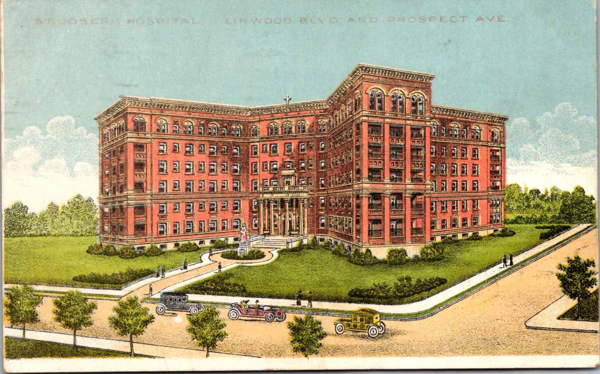
A postcard trembles in worried hands. On the front, St Joseph Hospital, Linwood & Prospect Streets in Kansas City, Missouri. Victorian landscaping, tree-shaded boulevards, a large, new hospital. It is a world of progress and prosperity frozen in glossy perfection.

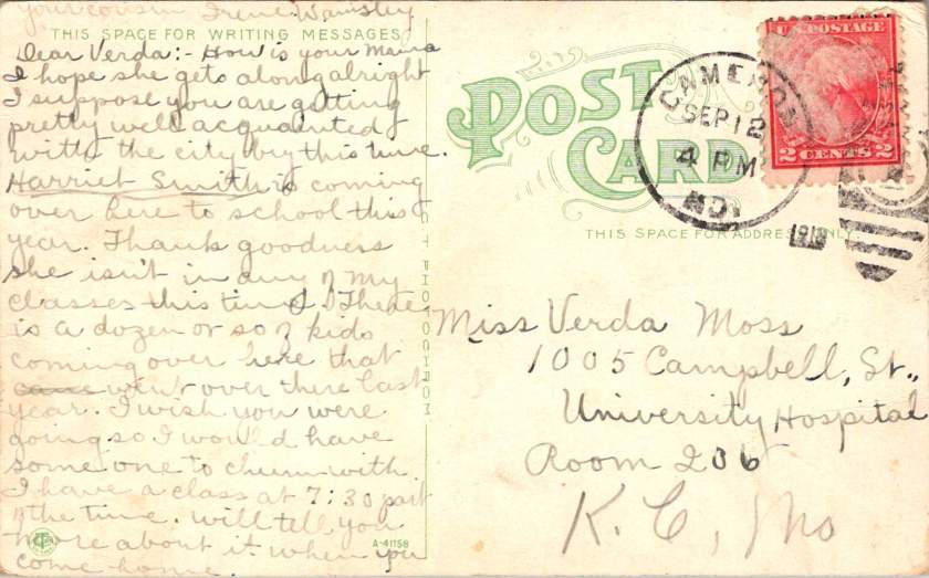
Turn the card over. Faded ink bleeds across cream paper. “Dear Verda Marie, Mama threw up all night and does not feel well this morning… only drank a cup of tea for breakfast.”

Two worlds exist on a single postcard. The front celebrates America’s gleaming cities and grand institutions. The back reveals a family torn apart by pandemic and war, working together and staying in touch every day.

The Spanish flu arrived in Missouri like a thief. It followed railroad lines and river valleys, spreading from military camps across the heartland. By September, Kansas City reported its first cases. By October, the city’s hospitals overflowed with the gravely sick and dying.

Mama Moss checked into University Hospital on Campbell Street, one of several small places on Hospital Hill, where Kansas City built its first medical facility in 1870. Now every building overflowed with sick and strapped families seeking any treatment that promised relief or protection.

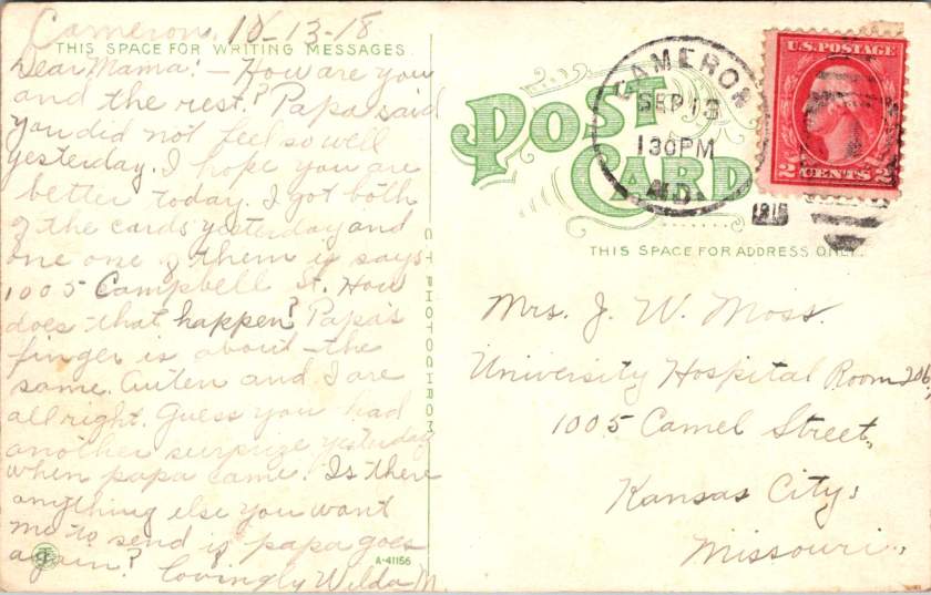
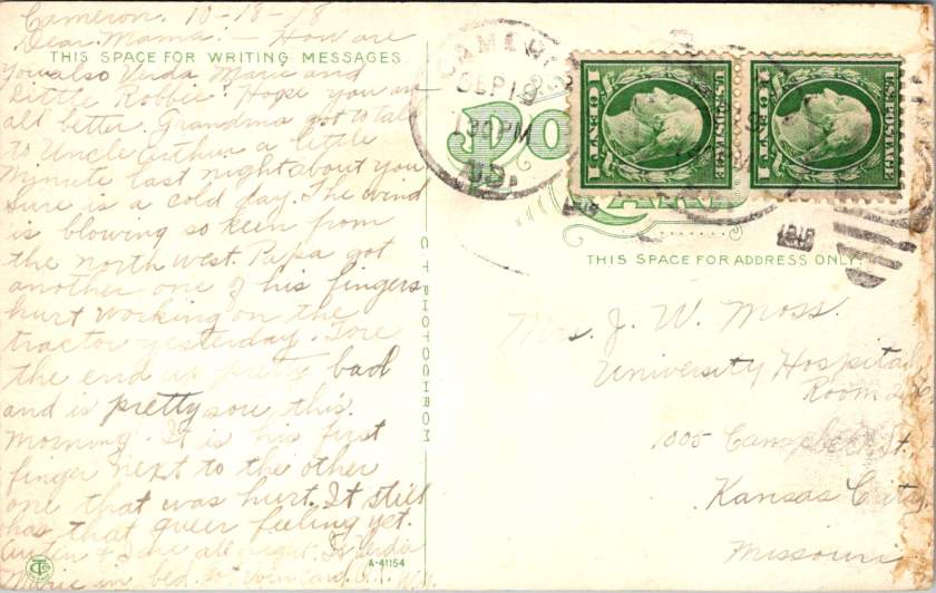
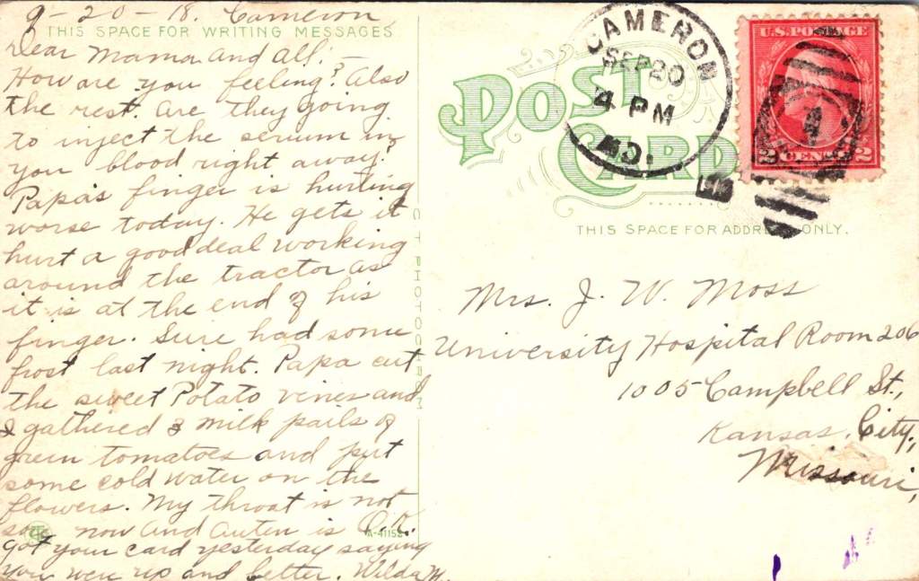
The postcards begin their daily journey between Cameron and Kansas City. Fifty miles of prairie separate farm from hospital, family from mother, routine from crisis. September 20th,Verda Marie writes from Cameron:

Dear Mama, and all. How are you feeling? And the rest. Are they going to inject the serum by your blood right away? Papa’s finger is hurting worse today. He gets it hurt a good deal working around the tractor.

The serum treatments represented medicine’s desperate gamble. Doctors extracted blood from recovered patients, believing their antibodies might save others. Transfusion methods were primitive—donor to patient through crude tubes, with minimal understanding of blood compatibility.

The front of her postcard shows Fourth Street looking west in Cameron—tree-lined and peaceful, houses with wraparound porches and manicured lawns. No hint of pandemic. No suggestion of families split between farm work and hospital vigils.

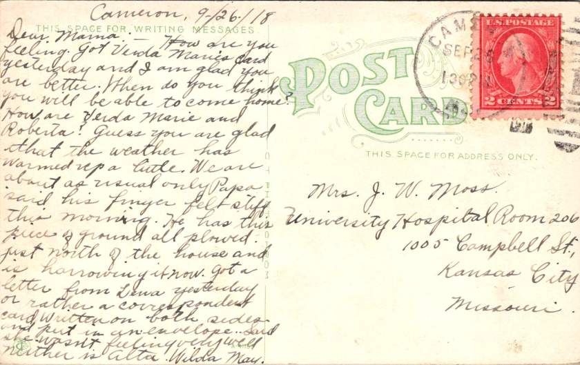
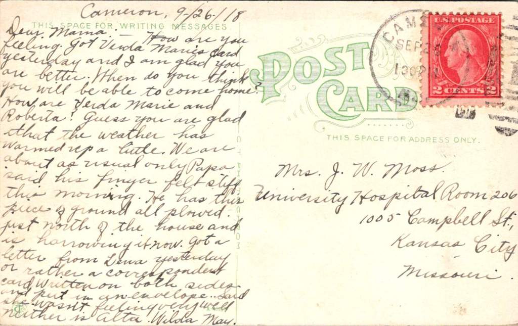
September 26, another postcard from daughter Wilda May in Cameron. Papa keeps working despite his damaged fingers. Farming cannot stop, even during plague, while war production and domestic demands for food are high. Families managed alone while the virus spread through communities like wildfire.

Dear Mama, got Verda Marie’s card yesterday. I am glad you are better. When do you think you will be able to come home? … Papa said his finger felt stiff this morning. He has this piece of ground plowed north of the house and is harrowing it now.

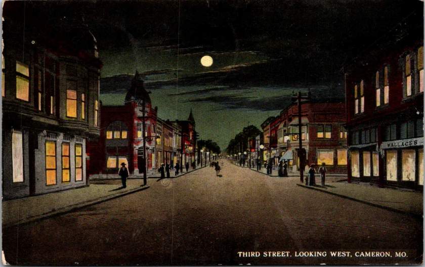
This card displays the Third Street business district looking East. The image suggests normalcy, prosperity, urban activity. The message tells a different story—injury, illness, fragmented family life.

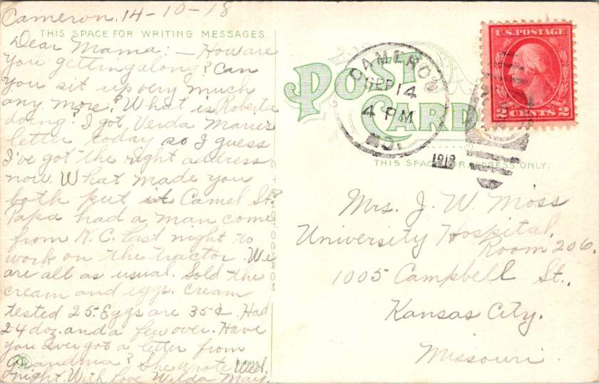
October 14th, from Cameron, Wilda May is writing to check in on Mama, Verda Marie, and little Roberta.

How are you getting along? Can you sit up very much any more? Papa had a man come from K.C. last night to work on the tractor. Sold the cream. Eggs are 35 cents. Had 24 dozen and a few left over.

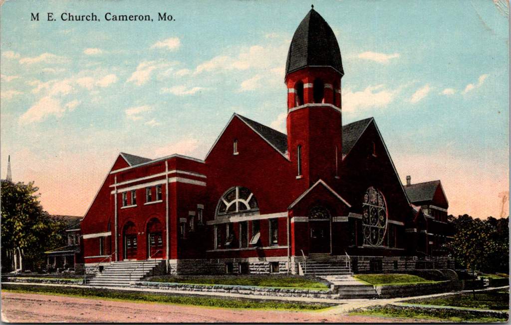
The dramatic red brick architecture of the M.E. Church is featured on the front. The bell tower, archways, and stained glass, no doubt concealing a community in a moment of great challenge.

November arrives with mixed signals. The Great War ends with armistice celebrations flooding city streets. Victory parades march through Kansas City while Hospital Hill counts mounting dead.

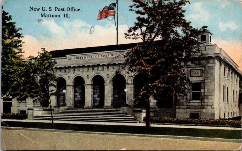
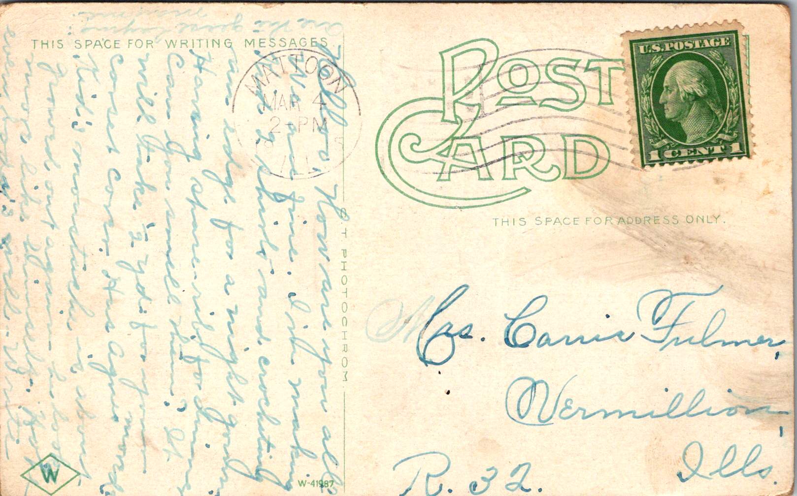
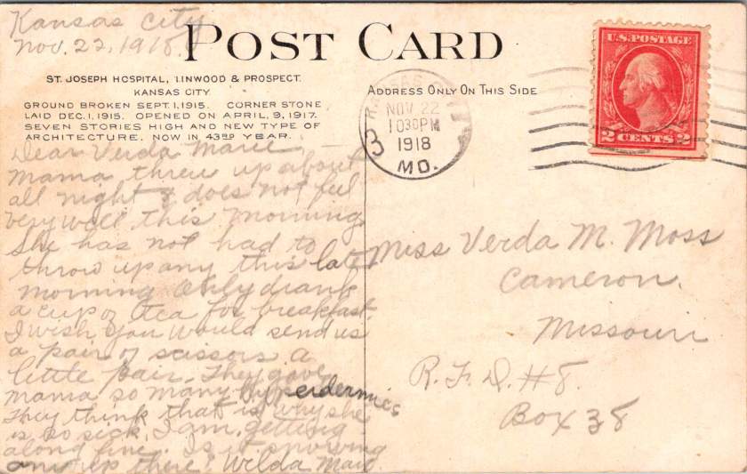
November 22nd, Wilda May is now in Kansas City and Verda Marie is back in Cameron. This is the card with St Joseph Hospital on the front and a report of Mama’s worsening condition on the back. Poignantly, a plea for simple materials.

I wish you would send us a pair of scissors, a little pair. They gave Mama so many hyperdermics (sic). They think that is why she is so sick.

The front shows St. Joseph Hospital—imposing, institutional, representing medical progress. The message reveals the grinding reality inside: nausea, sleepless nights, requests for basic supplies.


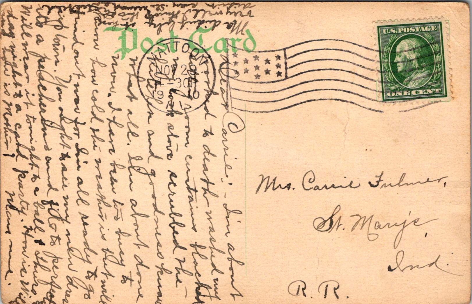
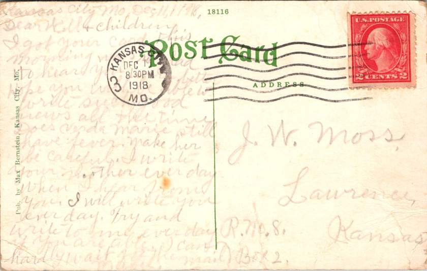
December 11, 1918. The last postcard in this series leaves Kansas City at 8:30 PM. Mabel Moss writes with exhaustion and desperate love.

Does Verda Marie still have a fever? Make her be careful. Write to your mother every day. I will write to you each day, too.

She repeats herself. Write every day. Every day, I will write to you.

These postcards have become more than communication. They serve as proof of life, wellness checks, emotional anchors in a world gone mad. Each delivery confirms another day fought forward, another family member still breathing.

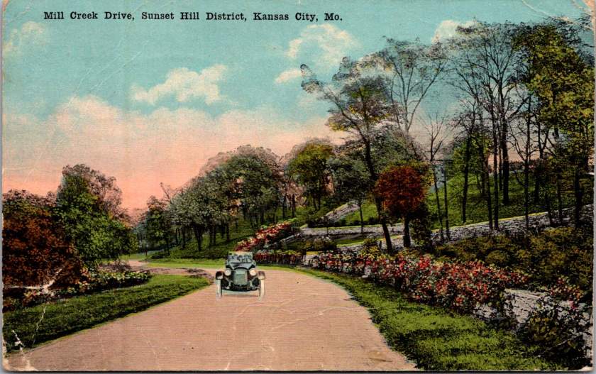
The front of the card features a swank soft top automobile on Mill Creek Drive, in the Sunset Hill district of Kansas City, Missouri. Lush foliage suggests it is a wonderful day to take in the fresh air.

Armistice brought celebration but not peace. Fighting continued in distant lands. The temporary ceasefire required renewal every thirty-six days. Victory was fragile, conditional, threatened by forces beyond control.

Also, influenza had no respect for borders. While diplomats negotiated peace terms, the 1918 pandemic waged its own relentless war. Families learned that health status changes cruelly and without warning. People woke well and died by nightfall.

These postcards preserve this tension between public aspiration and private desperation, helping us journey back to history as it happened. The fronts of the postcards celebrate civic pride—hospitals, colleges, tree-lined streets, architectural monuments. Their backs tell different stories. Experimental medical treatments. Daily fears about fever and death. Constant threat of injury from dangerous farm equipment. The grinding reality of families separated by crisis, held together by handwritten words.

This contrast defines the American experience during a period of dual catastrophes. Communities built beautiful institutions while individuals struggled for survival and missed hard earned opportunities. Cities planned grand boulevards while families split between hospital rooms and farm chores. America as it aspired to be, and as it actually existed for the Moss clan.

Just as her mother was getting sick, Verda Marie received a cheery postcard from a classmate with some gossip to share.

Harriet Smith is coming over here to school this year. Thank goodness she isn’t in any of my classes … I wish you were going so I would have someone to chum with…

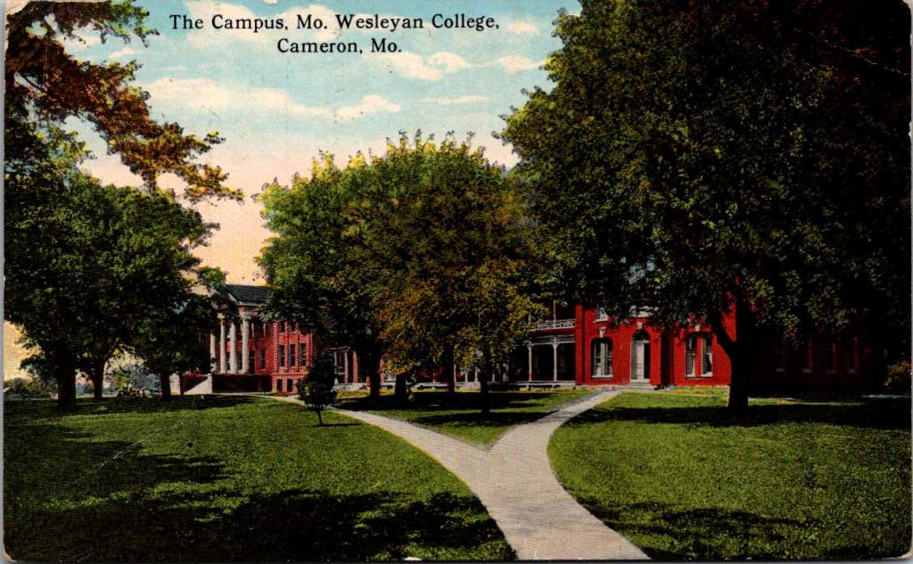
The postcard front featured Missouri Wesleyan College campus—red brick buildings set among autumn trees. The front speaks to knowledge, tradition, the future of young minds. We can read between the lines on the back. Verda Marie would not be in class that semester, sadly.

Like Lazarus rising from his tomb, the world emerged from pandemic death to discover life transformed. The 1920s roared with celebration and renewal, and time went on. Hospital Hill expanded into Kansas City’s premier medical district. The red brick buildings where Mama received her serum treatments evolved into modern towers serving new generations. A century later, technological and medical innovations advance but essential human needs persist, too: connection, communication, proof that loved ones survive another day.

These particular postcards survived in a family archive. Stories of courage, love, determination tucked away to find a century later. Each card represents a day won against the odds, a family bond that transcended distance and disease.

The Moss family’s story continues in everyone separated by illness, every community battling invisible enemies, every healthcare worker risking their life to save others. The beautiful facades combined with harrowing messages remind us that hope and suffering coexist, flipped back and forth in our hands, repeated in every generation.

Island Time Travel

Native Hawaiian wisdom, mainland capitalism, an LDS mission, and the birth of Pacific tourism. At the center, a banyan tree that has watched Hawaii transform for 120 years. This 1921 real photo postcard reveals the complexities of cultural exchange, migration, and travel over time.

In the photograph we are looking at today, the Moana Hotel rises like a palace from Waikiki Beach, its elegant wings stretching toward Diamond Head. A wooden pier extends into the Pacific. The building’s Victorian details hint at mainland American grandeur transplanted to the tropics. The “First Lady of Waikiki” opened as the territory’s first luxury resort, transforming a landscape once dotted with taro ponds and royal summer homes into the birthplace of Pacific tourism.

Built by wealthy landowner Walter Chamberlain Peacock and designed by architect Oliver G. Traphagen, the Moana opened on March 11, 1901, with 75 rooms featuring Hawaii’s first electric elevator and the unique amenity of private bathrooms. The first guests were a group of Shriners, who paid $1.50 per night—about $50 today—to experience what was then a very remote luxury destination.

Three years later, Jared Smith, Director of the Department of Agriculture Experiment Station, planted what seemed like a simple landscaping choice in the hotel’s courtyard: a young Indian banyan tree, nearly seven feet tall and about seven years old when planted. In the image, the tree is seventeen years old and already creating the shaded sanctuary that is the hotel’s heart even today.

As we flip the postcard over, another dimension is revealed. On November 29, 1921, a simple message sent to Mabel Moss in Longanoxie, Kansas with the usual greetings. But this isn’t a holiday for Aunt Olive. Her return address, “Route 4 – Box 46,” tells its own story of how communities were connecting between ancient and modern, sacred and commercial.

A Mormon Pioneer’s Island Home

Aunt Olive likely lived in Laie, thirty-five miles north of the Moana Hotel, where the Mormon Church had established its Pacific sanctuary. Her Route 4 address would have been served by one of the Rural Free Delivery routes radiating out from Honolulu—a detail that places her among the settlers who were building new communities beyond the city’s tourist corridor.

The Mormon settlement at Laie represented a unique form of cultural encounter. Beginning in 1865, when Church president Brigham Young received permission from King Kamehameha V to establish an agricultural colony, the Latter-Day Saints purchased 6,000 acres of traditional land—a pie-shaped division that provided for sustainable living. The Mormon community tried to honor Hawaiian land practices, giving each family a loi (water garden) to cultivate kalo (taro), the traditional sustenance crop.

The Hawaii Temple, dedicated in 1919, was the first Mormon temple outside continental North America. Built with crushed local lava and coral, its structure embodied the meeting of mainland pioneer culture and Pacific Island materials. Polynesian Saints from across the Pacific were gathering in Laie to receive temple ordinances, creating a multicultural religious community where Hawaiian, Samoan, Maori, and haole (white) families lived side by side.

The LDS approach to missionary work emphasizes learning local languages and customs—not merely as conversion strategy, but as theological principle. One of the early missionaries mastered Hawaiian so thoroughly that he produced the first non-English translation of the Book of Mormon in 1855. The missionaries married into Hawaiian families, adopted local foods and farming methods, and incorporated Polynesian cultural elements into their worship. Even as they openly sought converts, they also saw themselves as students of Hawaiian wisdom.

Paradise Shared

Captured in our image are at least a few conflicting visions of paradise. The Moana Hotel itself represents economic prosperity through the commodification of tropical beauty. Its guests paid premium rates to experience “the ultimate playground,” complete with hula shows and exotic imagery designed for mainland consumption. By the time of this photo, the hotel’s success had already inspired expansion; wings added in 1918 doubled its capacity.

However, the hotel was built where Hawaiian royalty had once gathered, in a place that embodied the Native Hawaiian principles, very different than Western concepts of land as commodity, beauty as product, and culture as entertainment. Look again at the Banyan tree. Where tourists saw scenery, Native Hawaiians understood kino lau—the gods manifested in every plant, animal, and natural feature. But, Hawaiian language had been banned in schools since 1896, and traditional practices were actively discouraged as territorial authorities promoted “Americanization.”

The Mormon community at Laie offered a third way that, despite its evangelical aims, required genuine cultural engagement. Unlike tourists who consumed Hawaiian imagery, or territorial officials who suppressed Hawaiian practices, Mormon missionaries made learning local ways a theological priority. They understood that successful evangelism required fluency not just in Hawaiian language, but in Hawaiian concepts of kinship, land, and spirituality.

This approach created communities that were simultaneously foreign settlements and island adaptations—places where pioneer traditions mixed with Polynesian extended family structures, where American church hymns were sung in native dialects, and where temple architecture incorporated local materials and building techniques.

Time Travel

The tensions that were at work in 1921 continue today, but so do the possibilities for meaningful cultural exchange. Today’s mālama Hawaii movement invites travelers to participate in coral restoration, native forest planting, and beach cleanups. Visitors can learn about places like Waimea Valley, where ancient cultural sites are preserved alongside environmental restoration. The principle of pono—righteous action—guides travelers to maintain respectful distances from endangered monk seals and sea turtles, to support Native Hawaiian-owned businesses, and to understand that they are guests in a living culture, not a theme park.

The island time we seek now isn’t the vacation fantasy of escape from responsibility, but the deeper rhythm of understanding our place within larger cycles of care and connection. When we travel with curiosity rather than conquest, we discover that the most valuable treasures are the stories and perspectives we gather. Over time, we come to know that every place on Earth is someone’s sacred ground.

In Hawaiian tradition, banyan trees serve as gathering places for spirits, bridges between the physical and spiritual worlds. Perhaps this ancient wisdom explains why the Moana Hotel’s banyan courtyard remains a place of peace amid Waikiki’s transformation—a living reminder that some forms of growth honor rather than diminish what came before.


To Read More

Postcard Road Trip

Mid-century postcards captured the wonder of American road trips in vivid color. This Phoenix to Grand Canyon collection reveals the story of car trips, roadside shops, and the natural landscape of Arizona.

Rural Route Arizona

The Phoenix to Grand Canyon route via Oak Creek Canyon carved through America’s most scenic territory. In the 1940s and 1950s, this remained wild, undeveloped country. Starting in Phoenix, travelers navigated winding two-lane roads through Wickenburg, Yarnell, Prescott, Jerome, Clarkdale, Cottonwood, Flagstaff, and Williams.

Each stop pulsed with its own character. Jerome clung to mountainsides, mining copper. Prescott sprawled as a ranching center and former territorial capital. Wickenburg lured visitors with dude ranch culture. Williams crowned itself “Gateway to the Grand Canyon.” These weren’t pit stops but destinations, each welcoming tourist dollars from America’s growing car culture.

Postcard Economy

These postcards bear the stamp of Curt Teich & Co., a Chicago printing giant that drove America’s postcard industry from the 1930s through 1960s. German immigrant Curt Teich founded the company in 1898 and revolutionized postcard production. His linen postcards introduced soft textures and blazing colors.

Teich built an industrial empire through local connections. Photographers roamed America, documenting main streets and natural wonders. In Chicago, artists hand-colored black and white photographs, enhancing reality to seduce buyers and ultimately define a social aesthetic.

Behind every postcard rack stood a web of relationships, too. Hotel owners, gas station attendants, and gift shop operators ordered cards from Teich’s catalog or commissioned custom designs featuring their establishments. Postcards advertised businesses, provided affordable souvenirs, and satisfied the social duty to send word home.

Long-distance calls cost fortunes. Letter-writing devoured time. Postcards offered quick connection and proof of adventure. They were quick and easy evidence that the sender had escaped ordinary life for landscapes of impossible beauty. For travelers, buying and mailing postcards proved both pretty and practical.

The typical buyer belonged to America’s emerging middle class, newly mobile through car ownership and paid vacations. Families drove from California to see the Grand Canyon. Retirees took first cross-country trips. Young couples honeymooned across the Southwest. Many experienced the American West for the first time. Postcards helped them process and share encounters with the sublime.

Selecting, writing, and mailing postcards became part of American vacation ritual. Weather beautiful, wish you were here—heartfelt sentiments that bridge extraordinary experience and ordinary communication.

These postcards transcend tourist kitsch. They document a pivotal moment when the West was packaged and sold as leisure destination. Enhanced colors and idealized compositions reflect not just Arizona’s appearance, but how Americans wanted to see it—as endless possibility, natural wonder, and escape from urban routine.

A Buffalo Soldier Mystery

A lone Buffalo Soldier on horseback captures a moment of dignity in African American military history.

Real Photo Postcards (RPPCs) offer tangible connections to history, yet they often emerge from a family photo album or shoebox collection entirely without context. Piecing together their stories requires careful observation and historical research, picking up valuable clues along the way.

Today’s case is an image of a lone Buffalo Soldier on horseback, printed sometime between 1904 and 1918. This postcard captures a moment of dignity in African American military history. The soldier sits tall in the saddle, wearing a formal military dress cap (rather than the campaign hat often associated with frontier service) and a meticulously maintained uniform. The setting—featuring a substantial brick building and cement sidewalk—suggests an established military installation rather than a frontier outpost.

The man is likely from the 9th or 10th Cavalry, and two military posts stand out: Fort Robinson in Nebraska and Fort Myer in Virginia, both important locations in Buffalo Soldier history.

Western Bastion

From 1887 to 1898, Fort Robinson served as Regimental Headquarters for Buffalo Soldier cavalry and infantry units. The 9th Cavalry Regiment made its headquarters there beginning in 1887, serving with distinction and boasting ten Medal of Honor winners from the Indian Wars. The Buffalo Soldiers at Fort Robinson earned a reputation for discipline and effectiveness that would later influence their assignments to more prestigious postings.

The 10th Cavalry Regiment maintained a significant presence at Fort Robinson during the early 1900s. The substantial brick buildings and newly constructed cement sidewalks visible in the photograph align with Fort Robinson’s infrastructure during this period, as the fort underwent significant modernization around this time. The formal dress uniform and cap in the photograph suggest this might have been a commissioned officer or a non-commissioned officer in a ceremonial or garrison role at the fort.

Nation’s Capital

Troop K of the 9th Cavalry served at Fort Myer in Virginia from May 25, 1891, to October 3, 1894, under the command of Major Guy Henry, a Medal of Honor recipient. This prestigious assignment bears a direct link to Fort Robinson. The selection of Troop K for this assignment was a recognition of the outstanding performance at Fort Robinson and other western posts.

The post at Fort Myer was the first time after the Civil War that an African American unit was stationed east of the Mississippi River near a major metropolitan area. The dignified formal pose and military dress cap would be consistent with a soldier stationed at this prestigious posting adjacent to Arlington Cemetery and Washington D.C., where ceremonial duties would have been part of their responsibilities. Both geographic and symbolic, the lauded post demonstrates how the Buffalo Soldiers earned respect through excellence despite pervasive racial prejudice.

While the AZO markings suggest a 1904-1918 printing date for this postcard, it’s possible the photograph itself was taken earlier. Many soldiers had formal portrait photographs taken to commemorate their service, which were later reproduced as postcards. If this soldier served at Fort Myer with Troop K (1891-1894), the image could have been reproduced on AZO stock years later. Alternatively, if the image dates to the 1904-1907 period, it likely shows a 10th Cavalry soldier at Fort Robinson. Without identifying marks or annotations, we can only speculate.

In either case, the photograph reveals a poignant moment during a complex era of American history. The soldier’s strong gaze suggest a person aware of his place in this important legacy. The Buffalo Soldiers’ contributions to American military history invite deeper study, recognition, and remembrance.

To Explore More

Buffalo Soldiers National Museum – https://buffalosoldiersmuseum.org/the-buffalo-soldiers/

The Proud Legacy of the Buffalo Soldiers – National Museum of African American History and Culture – https://nmaahc.si.edu/explore/stories/proud-legacy-buffalo-soldiers

National Archives: Exploring the Life and History of the “Buffalo Soldiers” – https://www.archives.gov/publications/record/1998/03/buffalo-soldiers.html

Buffalo Soldiers at Fort Myer Historical Marker – https://www.hmdb.org/m.asp?m=41108

Washington DC Chapter, 9th & 10th (Horse) Cavalry Association – http://www.buffalosoldiers-washington.com/Fort%20Myer.html

Panoramic Phoenix

Rare panoramic postcards from the Haines Photo Company capture Phoenix on the cusp of the century.

As American cities boomed in the early 1900s, panoramic postcards emerged to document their transformation. The Haines Photo Company of Conneaut, Ohio seized this opportunity, operating from about 1908 to 1917. Photographers crisscrossed the country capturing these distinctive wide-angle views of evolving American cityscapes, like Phoenix, a fledgling desert outpost poised for dramatic growth.

Phoenix in 1900 numbered just 5,554 residents. Though small, it already served as Arizona’s territorial capital with statehood just twelve years away. These panoramic postcards reveal a city establishing the foundation for its explosive future growth.

Washington and First Streets

The first panorama captures Phoenix’s commercial core at Washington and First Streets. Electric streetcar tracks cut through the unpaved road—these trolleys had replaced horse-drawn versions in 1893, modernizing city transit. Desert mountains loom in the distance while palm trees line parts of the street, evidence of successful irrigation in this arid landscape.

A prominent building with a tower dominates the background. Pedestrians stroll the sidewalks alongside horse-drawn carriages, as automobiles remained rare luxuries. Sturdy two and three-story commercial buildings reveal a city with ambitions beyond its frontier origins.

Residences at Center and McKinley

The second view shifts to Phoenix’s growing residential district at Center and McKinley. Here, successful merchants and professionals built impressive homes along wide, unpaved streets. Both palm trees and deciduous trees (some leafless in winter) frame the elegant residences.

These neighborhoods developed as streetcar suburbs, allowing prosperous residents to escape downtown congestion while maintaining business access. Homes display fashionable Colonial Revival and Craftsman styles with generous porches and elaborate details. Unlike cramped eastern cities, Phoenix boasted detached homes on spacious lots—a pattern that would define its future growth.

Washington and Second Avenues

The third panorama returns us to the commercial district. A substantial three-story building with multiple balconies dominates the left side. Was it a hotel or major retailer? Streetcar tracks again slice through the broad dirt roadway. A park or green space appears across the street, providing rare desert shade.

Notice the shadow intruding on the lower left? It’s the silhouette of our photographer with tripod-mounted camera. Was this F.J. Bandholtz, a prominent panoramic photographer who worked with Haines?

Washington and First Avenues

The fourth panorama captures Phoenix’s financial center. A four-story brick building with numerous arched windows dominates the scene. This building houses the Phoenix National Bank with law offices above, very likely belonging to Joseph H. Kibbey, a former Territorial Supreme Court Justice (1889-1893) and Arizona Territorial Governor (1905-1909).

Founded in 1892, the Phoenix National Bank had become Arizona’s largest by 1899, with deposits totaling $692,166. Telegraph and electrical poles with multiple crossbars line the street, demonstrating developing infrastructure. The dirt streets accommodate both pedestrians and horse-drawn vehicles, though automobiles were beginning to appear.

Capitol Grounds

The fifth panorama showcases Arizona’s territorial capitol. This impressive domed structure, completed in 1900 at a cost of $130,000, sits back from the road on a donated 10-acre plot at Washington Street’s western end. Formal gardens with cypress, palms, and ornamental plantings surround the building, irrigation transforming these arid landscapes.

Governor Murphy dedicated the building on February 25, 1901. At the time, the capitol complex embodied Phoenix’s civic ambitions and push toward statehood. Now the main building is home to the Arizona Capitol Museum, connecting present-day Phoenix to its territorial roots.

Phoenix Indian School

The final panorama depicts the Phoenix Indian School campus with its multiple buildings, some with smoking chimneys, surrounded by palm trees. Established in 1891, this federal boarding school implemented the government’s brutal and coercive Native American assimilation policies. Located on 160 acres north of downtown, the campus featured brick and frame buildings for classrooms, dormitories, workshops, and administration.

The school expanded rapidly from 42 students initially to 698 by 1900, representing 23 tribes from across the Southwest. Operating until 1990, the school’s complex history reflects the often painful relationship between the federal government and Native peoples, and Phoenix’s role in executing national policies.

The Haines Photo Company

These remarkable panoramic images came from the Haines Photo Company of Conneaut, Ohio. From 1908 for about a decade, they specialized in wide-angle photography of towns and cities across the United States. The Library of Congress preserves over 400 of their photographs documenting America’s evolving landscapes and cityscapes.

Technological innovations in cameras and film made panoramic photography possible. Companies like Haines used specialized equipment to capture expansive views with exceptional clarity. They printed these as postcards for both tourists and locals proud of their developing communities. The panoramic format perfectly suited sprawling western cities like Phoenix that grew horizontally rather than vertically.

Who actually pressed the shutter remains mysterious. The Library of Congress identifies F.J. Bandholtz (Frederick J. Bandholtz, born circa 1877) as a prominent panoramic photographer working with Haines. The shadow in the third image provides our only glimpse of the person behind the camera—a tantalizingly incomplete clue to their identity.

Fast Growth in Phoenix

The early 1900s transformed Phoenix through several key developments. Roosevelt Dam (completed 1911) secured reliable water and power for the Valley. The Santa Fe, Prescott and Phoenix Railway (1895) connected the city to northern Arizona while streetcars improved local mobility. Institutions like the Carnegie Free Library (1908) and Phoenix Union High School (1895) established cultural foundations. Economic activity diversified beyond the “Five Cs” (copper, cattle, climate, cotton, and citrus) to include banking, retail, and professional services.

Statehood on February 14, 1912 elevated Phoenix’s status as capital. These postcards hint at those century-old aspirations—a frontier town rapidly becoming a modern American city. Phoenix’s population doubled from 5,554 in 1900 to 11,134 by 1910, and surged to 29,053 by 1920, launching a growth trajectory that would eventually make it one of America’s largest cities.

Brutal Views

A wooden cross rises from churned earth, the inscription stark against weathered wood. A familiar image of a striking handmade monument to the son of a president who fell from the sky over France.

This photograph, captured by a U.S. Signal Corps photographer known only by the initials P.E.L., embodies the US vision of the first World War carefully curated by military officials. While this image evokes sacrifice, honor, and patriotism, the ones that follow emphasize air power and the ground fight.

The Signal Corps photographers worked with clear directives. Their images showcased military capacity and impact: a German observation balloon in flames over Verdun, captured enemy aircraft, and troops dug into the battlefield. These photos celebrated American military achievements while maintaining a safe emotional distance from war’s realities. They framed the conflict as a grand, heroic endeavor of machines and strategy, and no bodies.

Soldier photography told different stories.

World War I marked a pivotal shift in war photography. The conflict erupted during the democratization of the camera, when Kodak’s marketing promise—You press the button, we do the rest—had placed photography in ordinary hands. For the first time, soldiers carried their own cameras to the front. They documented their experiences without oversight, censorship, or propaganda objectives.

The images captured by troops and printed later at studios like Renfro & Jensen in Belmont, Arkansas reveal a more intimate perspective—the human cost of conflict. German officers’ quarters reduced to rubble by American artillery. The harsh conditions of a foxhole or a machine gun post.

These images weren’t composed for newspaper spreads or government reports. They were personal souvenirs, visual evidence of experiences too enormous to capture in words alone. They were captured on a new-fangled camera and carried home as silent witness.

Belmont, Arkansas transformed virtually overnight in 1917 from a quiet rural community into a bustling military training center. Soldiers flooded the region, bringing with them not just their uniforms and rifles, but their cameras. The town experienced a true boomtown effect as businesses sprang up to serve the influx of military personnel. Among these enterprises, the Renfro & Jensen photography studio established itself as a crucial link between soldiers’ experiences and their communication home.

Then, as demobilization began in 1918, returning soldiers sought ways to share or quietly remember what they had witnessed. Renfro & Jensen became unwitting archivists. They must have developed and printed thousands of soldier photographs—images far more frank and direct than anything appearing in newspapers or government publications. The studio workers were likely among the first civilians to confront warfare through this new technology. Each day, they processed images showing destruction, military achievements, and occasionally, the graphic aftermath of combat. Their commercial service inadvertently preserved a crucial alternative visual history of the conflict.

Two European-produced photographic postcards further document the war. These images, printed on distinctive European paper stock, emerged from a continent already numbed by years of destruction.

Another sixteen images — the most harrowing in the collection — can’t be shown here. The ethical boundaries of war photography persist today. What images should be shielded from casual viewing, and which realities deserve documentation regardless of their power to disturb?

Major institutional collections house millions of WWI photographs. The National Archives holds the largest repository of World War I material in the United States, with over 110,000 photographs digitized from two primary series: the American Unofficial Collection of World War I Photographs and the Photographs of American Military Activities. The Library of Congress maintains extensive collections, including the American National Red Cross Collection with over 18,000 digitized negatives showing wartime activities.

Beyond these institutional repositories exists a vibrant world of private collectors who often hold the most provocative and unfiltered images. These private collections sometimes reveal perspectives absent from official archives. Photographer Carl De Keyzer discovered approximately 10,000 archival glass plate and celluloid negatives from WWI scattered across Europe, many in private hands. From these, he selected 100 to reproduce in stunning detail, revealing aspects of the conflict previously unseen in such clarity. Some of the most compelling battlefield imagery exists in small personal collections—albums like this one that have been kept by families of veterans, passed down through generations, their contents rarely exhibited publicly.

The grave of Lieutenant Quentin Roosevelt is quite enough for many. It symbolizes loss while sparing us its visceral reality. But the full photographic record of the conflict includes truly heinous realities—corpses tangled in barbed wire, faces distorted by gas, bodies rendered unrecognizable by artillery.

While official photographers were tasked to frame narratives that supported war efforts, some soldier photographers refused to turn a blind eye. They captured what they witnessed, creating very personal views that continues to challenge our understanding of history. Their lenses documented what words alone could never convey—the irredeemable human cost of modern warfare.

Coblenz Continued

When I connected with European researchers writing a book on the married Swedish/German photographers, Lindstedt and Zimmermann, we discovered that last week’s trove of real photo postcards is quite rare. Even better, we found more.

New Discoveries from a Lost Archive

Last week’s essay examined the American occupation of Coblenz, a unique period of military history, through the photographic lens of Lindstedt & Zimmermann. The Lindstedt & Zimmermann studio was destroyed during Allied bombing in World War II, decimating their archive and rendering the surviving examples of their work as uncommon historical artifacts.

The exchange with the research team prompted another search through our postcard collection resulting in the discovery of 25 additional images. Most can be attributed to Lindstedt & Zimmermann based on stylistic elements, materials and subject matter. Some bear the mark of other photographers including Paul Stein, another Coblenz studio. Ten photographs document the catastrophic flood of the Rhine in January 1920 – images that likely haven’t been seen in a century.

The Great Flood of January 1920

The January 1920 flood represented one of the most significant natural disasters to impact the American occupation forces during their tenure in Germany. The handwritten note on one postcard reveals both the severity of the flood and its impact on the American presence. This mixed German-English description captures the cross-cultural nature of the occupation.

“Der Rhein hat über its banks geflowed und Uncle Sam’s autos gdamaged. The river is the highest in over a hundred years, almost beyond my memory!”

The photographs show numerous small boats navigating the water and automobiles partially submerged in floodwaters, with bridges and buildings visible in the background. These images provide rare documentation of a significant environmental event that temporarily disrupted occupation activities and required adaptation by both American forces and local residents.

Harlem Hellfighters

This very rare view shows what appears to be members of an African American regimental band with their instruments at Romagne, France. Black men served in segregated units during World War I, with regiments such as the 369th Infantry (the “Harlem Hellfighters”) earning recognition for their service. Their regimental bands played an important cultural role, introducing European audiences to American jazz and ragtime music. These musical ambassadors created cultural connections that transcended the military context of their presence. The inclusion of this photograph adds an important dimension to our understanding of the American military presence in post-war Europe, highlighting the contributions of African American servicemen whose stories have been marginalized in historical accounts.

YMCA Women

The expanded collection also includes two formal portraits of women in YMCA uniform, complete with the organization’s distinctive triangular insignia on hat and lapel. Sometimes called Y girls, female YMCA workers provided essential services for American soldiers stationed far from home. They operated canteens, organized recreational activities, offered educational programs, and provided a connection to American civilian life that helped maintain morale during the occupation period.

The YMCA was among the few organizations that deployed American women to work directly with troops overseas during this era. These women volunteers typically came from educated, middle or upper-class backgrounds and represented an early example of American women engaging in international service work. Their presence added a civilian dimension to the occupation and helped create environments where American soldiers could productively spend their off-duty hours.

Military Pageantry and Daily Operations

One striking photograph shows the 76th Field Artillery Regiment arranged in a “living insignia” formation, with soldiers positioned to create the unit’s distinctive diagonal striped insignia, surrounded by artillery pieces. This type of military display was meant to demonstrate American capacity while building unit cohesion and pride, and perhaps avert a little boredom.

In contrast to these ceremonial arrangements, other photographs document the practical transportation and logistical elements that supported daily operations. An image of a young driver with his heavy-duty truck along what appears to be the Rhine riverbank represents the essential supply operations that maintained the American presence. The vehicle’s utilitarian design with solid rubber tires, wooden spoke wheels, and large cargo bed illustrates the practical equipment used to transport supplies, equipment, and personnel throughout the occupation zone.

French Military Presence

The next image shows a group portrait of four French soldiers in their distinctive uniforms. Easily identified by their characteristic “Adrian” helmets with the prominent crest ridge along the top and the horizon blue (bleu horizon) uniform that became emblematic of French forces during World War I, these men represent the broader Allied presence in post-war Germany.

France maintained the largest occupation zone in the Rhineland, reflecting their particular security concerns regarding Germany. French forces occupied territories including Mainz, while American forces centered on Coblenz and British forces on Cologne. Later, French forces took over the Coblenz occupation.

The portrait format was typical of military mementos during this era, allowing soldiers to document their service and send images to family members. The survival of any images at all is due to this distribution by soldiers to their home countries.

Beyond Coblenz

Not all images in the collection were taken in Coblenz itself. One photograph shows American personnel in a touring car filled with passengers in what may be the French Riviera, identifiable by its distinctive palm trees and Mediterranean architecture. Dating to 1921-1923 based on the automobile’s style, this photograph represents the recreational opportunities available to some American personnel during leave periods from their occupation duties.

Europe allowed for cultural and recreational experiences that would have been impossible for most Americans of this era. For many young Americans serving in the occupation forces, this European assignment represented their first—and perhaps only—opportunity to experience the wider world beyond their home communities.

Visual Legacies

The survival of these photographs, particularly those documenting the 1920 flood, represents a remarkable preservation of visual history that might otherwise have been lost entirely. With the bombing of the Lindstedt & Zimmermann studio during World War II, the unique nature of real photo postcards, and the general fragility of materials from this era, each surviving image offers a rare window into this formative period in world relations.

Karl and Änne Zimmermann’s work, along with that of contemporaries like Paul Stein, provides an invaluable visual chronicle of the first American occupation of European territory—a precedent for the much larger American military presence that would emerge in Europe after World War II. Their photographs capture not just military operations and formal events but the daily reality of cross-cultural interaction between Americans, French, and Germans during this unique historical moment and place.

Our Need for Novelty

Copper maps. Wooden cards. Puzzle prints. Discover how obsolete technologies transform into art and craft, and explore why we can’t stop reinventing the perfect postcard.

In this age of instant digital communication, the persistence of physical postcards presents an intriguing contradiction. These rectangular pieces of cardstock—designed to carry both image and correspondence through postal systems without an envelope—serve as artifacts of a communication method that had its heyday a century ago. But rather than disappear entirely, postcards have evolved in novel ways that tell us even more about who we are.

Why We Seek the New

Humans have always been drawn to novelty. Our brains light up at the unfamiliar—it’s a survival mechanism that once helped our ancestors notice changes in their environment that might signal danger or opportunity. But our relationship with novelty runs deeper than vigilance. We seek out new experiences, objects, and sensations even when no practical threat or benefit is apparent.

This human attraction to novelty serves several purposes. First, it provides simple pleasure—the dopamine release that accompanies discovery keeps us engaged with our surroundings. Second, it helps us learn and adapt—new situations force us to develop new skills. Third, it offers social currency—being the first to discover, own, or report something novel (even if untrue!) gives us a kind of status within our communities.

Perhaps most fundamentally, novelty helps us fight against the deadening effect of habituation. We become blind to what remains constant around us, a psychological phenomenon called “sensory adaptation.” Think of how you stop noticing a persistent background sound, like traffic noise. Novelty jolts us back into conscious appreciation, like noticing the birdsong instead, making us sense the familiar differently.

With mass-produced consumer goods, we often pursue novelty through customization or unique variants—like these postcard alternatives. They satisfy our craving for something special while maintaining connection to recognizable forms. Even novelty doesn’t stray too far from the familiar.

Technology Becomes Art

As technologies age and are replaced by more efficient methods, something interesting happens—the displaced technology often shifts from the realm of utility to the realm of artistry and craft. What was once valued primarily for function becomes appreciated for form, precision, and the visible human touch.

Letterpress printing was an extraordinary innovation of its time and once the standard for all printed matter. It was largely replaced by offset printing in the 20th century and later the digital methods we use today. But rather than disappearing, letterpress evolved into a premium craft, prized for its tactile quality and visible impression on paper—characteristics that were originally just side effects of the technique, not its intended purpose.

The same transformation happens with many technologies: vinyl records, film photography, mechanical watches. As digital alternatives take over the functional role, the analog predecessors become vessels for history, craftsmanship, ritual, tactile pleasure. They move from being tools to being experiences.

This pattern helps explain our collection of novelty postcards. Somewhere in the middle of last century, the standard paper postcard was functionally superseded by digital communication, freeing it to evolve into these more elaborate, less practical forms. They represent a technology in its artistic phase—no longer bound by strict utility, but free to explore expressive and sensory possibilities, along with kitsch and commercialism.

Utah in Copper Relief

The copper-embossed Utah souvenir represents one of the more elaborate departures from traditional postcard design. The metallic rectangular plate features a raised topographic outline of the state with embossed illustrations of regional landmarks and attractions. The word UTAH is prominently displayed at the top, while places like Vernal, Provo, Cedar City, and St. George are labeled at their approximate locations. The copper medium gives the piece warmth, with a decorative scalloped border framing the state’s geography and securing the paper card below.

The manufacturing process likely involved die-stamping or embossing thin copper sheeting, a technique that dates back to the late 19th century and regained popularity in mid-20th century souvenirs. The tactile nature of the raised elements invites touch, creating a multisensory experience unavailable in traditional flat postcards. The utility of this object as actual correspondence is significantly diminished—the copper surface resists easy writing, and its weight requires additional postage and hand-canceling. It’s more a miniature commemorative plaque that happens to maintain postcard dimensions.

Woodsy Aesthetics

Let’s look closer now at a novelty postcard featuring a cabin in Salmon, Idaho, printed onto a thin wooden substrate and depicting a rustic cabin nestled among stylized pine trees. The scene employs a limited color palette—brown and black for the structure and green for the surrounding vegetation—lending it a deliberately simple aesthetic that echoes both woodcut prints and traditional lithography.

The simple text at the top identifies the location without intruding on the scene. The artwork itself employs minimal detail, capturing the essence of rural life rather than photographic accuracy. The manufacturing process of printing onto thin wood veneer allows for mass production, while adding a specific scene, location name, and ink color for customization.

This card’s rustic medium and subject matter work in harmony, creating a self-referential object where the material reinforces the message—a wooden card depicting a wooden structure set within a forested landscape. The medium becomes part of the message, suggesting authenticity through material consistency. Though mass-produced, it strongly evokes a rural sensibility.

Framed Vistas

Our souvenir from Yellowstone National Park adopts yet another approach. This card features a stylized illustration of Yellowstone’s grand canyon and waterfall printed on cardstock and mounted on a wooden backing.

The artwork employs a palette of oranges, purples, blues, and whites to capture the dramatic landscape, with the falls rendered as a white vertical streak against colorful canyon walls. Dark silhouettes of pine trees frame the scene, while puffy clouds hover in a light blue sky, held inside a purple border. The stylized typography echoes vintage travel posters from the early to mid-20th century. The entire image is mounted or printed on a natural wood base, visible as a frame around the illustration.

This card’s production combines offset printing with a wooden substrate—a look that recalls both traditional woodblock prints and mid-century travel advertisements. The design deliberately evokes an era of American national park tourism when artistic posters commissioned by the Works Progress Administration and the National Park Service established a distinctive aesthetic for natural landmarks.

Playful Puzzles

The Disney puzzle postcard introduces an element of interaction we haven’t seen before. This card features Mickey Mouse, Minnie Mouse, Donald Duck, Daisy Duck, Pluto, and Goofy arranged in a group pose against a blue-and-white checkered background. The message reading “Hi From The Whole Gang” in bubble text curves around the edge of the image.

This item turns a postcard into a simple jigsaw puzzle—die-cut pieces that can be jumbled and reassembled to reveal the printed image. The manufacturing process involved full-color printing followed by precision die-cutting to create interlocking puzzle pieces, then applying a thin adhesive film to maintaining the card’s overall integrity for mailing.

This souvenir represents a curious hybrid—a postcard that actively invites its own disassembly. The Disney characters themselves represent another layer of nostalgia, combining America’s animation icons with the traditional postcard format to create an object that references multiple forms of 20th-century popular culture simultaneously. But only modern technology could accomplish these manufacturing details, a playful combination of familiar and fresh.

Magnetic Memories

The Will’s Hardy Trees and Seeds magnetic card is the one in our set with the most layers of both meaning and making. See packets, postcards, fridge magnets, and agricultural Americana all combine in this take home treasure.

The 1909 seed catalog cover is a contemporary image inspired by the real-life Oscar H. Will & Co. of Bismarck, North Dakota. The vibrant illustration displays pansies in various colors—purple, yellow, orange, pink, and white—arranged in a bouquet. Text identifies the company’s 26th year of operation and describes their products as the “choicest and most beautiful on earth”.

A small purple circle overlay on the plastic film cover announces the item’s true nature: a magnetic postcard to send as a gift. Despite its historical appearance and postcard dimensions, the object is actually a refrigerator magnet that merely references seed catalog and postcard aesthetics. The production involved digital printing on magnetic sheet material, applying a printed paper backing, and slipping into a plastic cover with instructions to mail the gift in an envelope.

As a novelty item, it reveals a peculiar circularity. A reproduction of a commercial artifact (seed catalog) transformed into a correspondence medium (postcard) further transformed into a decorative household item (refrigerator magnet). Somehow, we love each iteration all the more.

Nostalgia Squared

What these examples share is a relationship with nostalgia that operates on multiple levels. They aren’t simply nostalgic; they engage in a looping nostalgia—nostalgic representations of already nostalgic forms.

The copper Utah relief draws upon mid-century tourist souvenirs, themselves designed to evoke frontier-era maps and territorial markers. The Salmon cabin employs modern production techniques to simulate traditional woodcuts nad print, which were themselves often romanticized depictions of rural life. The Yellowstone cards references mid-century national park posters that were already stylized interpretations of natural wonders. The Disney puzzle incorporates cartoon characters who have become nostalgic cultural icons, presented in the format of childhood games. The Will’s Seeds magnet reproduces early 20th-century commercial art that was, even in its original context, employing Victorian aesthetic sensibilities.

This layering of reference creates objects that are remarkably dense with cultural signifiers despite their modest physical dimensions. They offer not just a connection to place and time but to the ways we’ve represented ourselves and our interests through commercial souvenirs.

Our apparent need for novelty, then, might be better understood as a need for continual context. Each new postcard iteration doesn’t merely replace what came before; it absorbs and references it, creating objects that function as compact archives of our evolving relationship with the characters and places we cherish.

These novelty postcards sit at an interesting crossroads of commerce, craft, and communication. They represent what happens when a formerly utilitarian object—the humble postcard—is freed from its purely practical obligations and allowed to evolve along lines dictated by sentiment, aesthetics, and novelty.

In a world increasingly dominated by digital experiences, these physical novelties offer something screens cannot—texture, weight, presence. They satisfy our hunger for the tangible. Their quirky, sometimes impractical forms speak to a human need more fundamental than efficient communication: the need to hold something unique in our hands, and to feel a physical connection to places we’ve been and experiences we’ve had.

The postcard itself is and was a very simple concept and object that, over time, has become a medium for ongoing conversations about permanence and impermanence, about what we value over time, and about the tension between utility and sentiment. In their various novel forms, these more-than-postcards tell us about places we’ve been and how we’ve chosen to remember and delight in those places—a correspondence not just between people, but between past and present.

Mattoon through Mayme’s Eyes

Sisters Mayme and Carrie stay in touch as Mattoon IL grows from a creek-side town to a modern crossroads before the war, 1910-1918.

Between 1910 and 1918, a series of postcards traveled between Mattoon, Illinois, and St. Mary’s, Indiana. On one end was Mayme, the author, who had made her home in the bustling railroad town of Mattoon. Her sister Carrie, who remained in St. Mary’s, received and kept the cards, now more than a century old. These correspondence cards—adorned with images of Mattoon’s infrastructure and landmarks—captured more than just personal exchanges between siblings. They documented a profound moment in America’s transformation from a rural society to an industrialized nation, with small Midwestern cities like Mattoon serving as microcosms of this national metamorphosis.

Nature and Community

Mayme sent the first postcard on November 29, 1910, bearing an image of Riley Creek with its stone bridge arch—a glimpse of the natural landscape that surrounded the growing town of Mattoon. This serene view of the creek precedes the increasingly industrialized town that Mattoon was becoming. Founded in 1855 and named after William B. Mattoon, a partner in the construction firm that built the Illinois Central Railroad, the town served as a critical junction between the Illinois Central and the Terre Haute & Alton railroads.

The stone bridge spanning Riley Creek represents essential infrastructure that connected different parts of the community and facilitated transportation within and beyond the town. Such bridges were vital elements in expanding road networks that would eventually complement the railroad’s dominance in transportation.

Mayme wrote about burdensome domestic chores and a new dress for an upcoming ball that she would wear again to a Thursday card party. She was participating in the social life of a community that was growing from its natural surroundings into a prosperous small city.

I’m about worked to death, washed my sitting room curtains, blackened my cook stove, scrubbed the kitchen and goodness knows what all…

Industry and Infrastructure

By 1914, Mayme was sending postcards that highlighted Mattoon’s industrial development. One image showcased the substantial Clark Meter Box Factory, with its distinctive tower and solid brick construction. America’s industrial expansion was moving beyond major manufacturing centers into smaller towns and cities. The factory produced meter boxes for utilities—products essential to the electrification and modernization sweeping across America in the early 20th century.

While Mayme reported her handiwork at home like knitting, crocheting, and gardening, the meter box factory represented the industrial world that was transforming the American economy. Manufacturing facilities like this provided jobs that attracted workers and their families to communities like Mattoon, contributing to urban growth and economic diversification beyond traditional agricultural and railroad employment.

Also in 1914, Mayme sent a postcard showcasing Mattoon’s “New U.S. Post Office,” a stately neoclassical building with grand arches and an American flag prominently displayed. This wasn’t merely a functional building but a statement of federal presence and civic achievement. During this period, post offices in American towns weren’t just mail facilities—they were symbols of connection to the national government and markers of a community’s importance.

The grandeur of Mattoon’s post office reflected the federal government’s expanding role in American life—a time when postal services were being standardized and rural free delivery was connecting previously isolated communities. The building is a physical manifestation of the communication network that allowed Mayme’s postcards to travel to Carrie with such regularity.

Hospitality and Social Life

In 1915, Mayme’s postcard featured the lobby of the Hotel Byers, offering a glimpse into the social aspirations of Mattoon during this era. The elegant interior, with its decorative fireplace, ornate hanging lamps, and comfortable seating area, represented the town’s desire to provide metropolitan amenities. Hotels like the Byers served not just as lodging for travelers but as social centers for the community.

For Mayme, the hotel offered refined experiences and social mobility. The hotel’s ballroom would have served as the venue for the dances she mentioned, while its dining room hosted the card parties that figured prominently in middle-class social life. These gatherings provided opportunities for networking across class lines, connecting domestic and railroad workers’ families with merchants, professionals, and industry owners.

The “new” Hotel Byers replaced an older establishment of the same name that had served Mattoon since the late 19th century. This newer iteration, constructed around 1914, was a modern hotel that served as crucial infrastructure for a growing city with ambitions to attract business and industry. The hotel’s construction coincided with a period of economic optimism in Midwestern towns before America’s entry into World War I, when many similar communities were upgrading their commercial buildings as part of the broader Progressive Era emphasis on civic improvement.

Railroad Town

The last postcard featured the “Illinois Central Subway” in Mattoon, which wasn’t an underground transit system but a distinctive sunken railway passage that bisected the town. This engineering feature allowed trains to pass through without disrupting street-level traffic, a forward-thinking design that embodied the marriage of infrastructure and everyday life. The buildings lining the upper level of the postcard show Mattoon’s commercial district that grew directly alongside the railroad—their proximity a testament to the symbiotic relationship between commerce and transportation.

Hope everybody’s well. Let me know just as soon as Jerry is called…

War Shadows

By July 1918, Mayme’s tone had shifted. Her ominous request to let her know “as soon as Jerry is called” reveals the long shadow cast by World War I over these Midwestern communities. The United States had entered the war in April 1917, and the military draft was touching families across the nation.

The war accelerated many of the industrial and social changes already underway in towns like Mattoon. Labor shortages created by military service opened new employment opportunities, particularly for women. The focus on wartime production reshuffled economic priorities. And the specter of loss hung over families, even as daily life continued.

While Mattoon’s industrial capacity may have contributed to the war effort through manufacturing, the human cost was felt intensely in personal correspondence like this.

Two Sisters

Throughout these exchanges, we see two different life trajectories embodied by the sisters. Mayme chose life in a developing industrial town, participating in its social events and domestic economy while witnessing its physical transformation. Her postcards—featuring Mattoon’s architectural achievements and industrial facilities—suggest a certain pride in her adopted community.

Carrie eventually married a man named Earl, and they moved around a bit. Both sisters maintained domestic skills—knitting, crocheting, sewing, and food production—that connected them in conversation even as the world around them changed. Their correspondence across state lines preserved family bonds—a common experience as increased mobility dispersed American families. The railroad and postal service made this ongoing connection possible.

Green Space: Creative Tensions in Tertiary Tones

From the verdant hues of the rainforest to the toxic green pigments adorning Victorian wallpaper, green embodies our most profound contradictions. This single color represents both life and decay, wealth and envy, nature and artifice.

In the Amazon rainforest, vegetation thrives in countless green hues, symbolizing life’s abundance. Yet in Western art, sickly green often signifies death and corruption. How can one color embody such opposed concepts? This tension—between green as vitality and green as decay—forms the central paradox in humanity’s relationship with this enigmatic tertiary hue.

Green occupies a unique position in our visual lexicon. It bridges the cool tranquility of blue and the energetic warmth of yellow. This intermediate status perhaps explains its dual nature—a color of balance that simultaneously contains opposing forces.

Toxic Chemistry: From Wallpaper to Printer’s Ink

The story of green pigment drips with poison. For centuries, the most vibrant greens came from copper arsenite, creating infamous “Paris Green” that adorned Victorian wallpapers and allegedly contributed to Napoleon’s death through arsenic poisoning. Scheele’s Green, developed in the late 18th century, released deadly arsenic gas when dampened. Victorian walls literally “breathed” death through their verdant decorations.

This toxic history highlights a contradiction: the color most associated with natural life proved historically among the most unnatural and deadly to produce. Nineteenth century painters risked chronic arsenic poisoning for the perfect emerald tone.

Printing technology reveals another dimension of green’s complex nature. Traditional lithography treated green as a distinct entity. Master printers blended pigments to create precise green tones before applying them to printing stones. Toulouse-Lautrec’s lithographic posters featured carefully formulated green inks to capture the absinthe-tinged atmosphere of Parisian nightlife.

Modern CMYK printing creates green through optical mixing instead. Green isn’t a primary ink but emerges from combining yellow and cyan dots in precise patterns. This technique echoes Neo-Impressionist pointillism, where artists like Seurat placed distinct color dots side by side, allowing viewers’ eyes to blend them into a third color. A magazine’s solid green leaf reveals itself as an array of cyan and yellow dots under magnification.

This absence-made-present quality of green in modern printing mirrors its philosophical status: green exists at boundaries between colors and concepts. While our eyes perceive green as distinct (wavelength 495-570 nanometers), the printing process creates it through subtraction and combination—an illusion constructed from non-green components.

Green Means Go

One of green’s most recognized meanings emerged in the late 19th century with traffic signals. Green indicating “go” now transcends language barriers worldwide.

This standardization began with British railway signals in the 1830s, borrowing from maritime tradition where green lights indicated starboard. The first traffic light with red and green signals appeared outside London’s Parliament in 1868, predating automobiles. Gas-lit red and green lamps operated manually by police officers guided horse-drawn carriages.

The choice wasn’t arbitrary but built on psychological associations. Green’s connection to safety likely stems from evolutionary biology—natural green environments generally signal available food and absence of danger.

The 1949 Geneva Protocol formalized green’s role in traffic systems globally. Today, from Tokyo’s sophisticated networks to remote Indian intersections, green universally permits passage. This standardization extends to pedestrian crossings, airport runways, and maritime navigation.

This creates a fascinating contradiction: the color most associated with nature now primarily serves an urban, technological function. Times Square’s green traffic light and the Moscow Metro’s green signal represent perhaps green’s most recognized meaning—entirely disconnected from the natural world that gave the color its original significance.

Green’s role as “go” permeates language. “Getting the green light” implies permission and opportunity. Business reports use green to indicate positive metrics. This association with forward movement and progress creates another layer of meaning for this multivalent color.

Envy and Avarice

Perhaps nowhere is green’s paradoxical nature more evident than in its associations with money and envy. Shakespeare’s description of jealousy as “the green-eyed monster” in Othello connects the color to one of humanity’s most corrosive emotions. This association may stem from physiology—intense jealousy can produce a pallid, greenish complexion due to blood flow changes—the body manifesting emotion through color.

Currency, particularly American dollars, has become synonymous with green. “Greenback” entered common parlance as a synonym for money. The decision to print American currency in green stemmed from practical concerns—green ink resisted photographic counterfeiting and remained chemically stable. This pragmatic choice evolved into a powerful cultural symbol representing both opportunity and excess, freedom and materialism.

Medieval European art portrayed avarice through green-tinted figures clutching moneybags. Giotto’s 14th-century fresco “The Seven Deadly Sins” in Padua’s Scrovegni Chapel depicts Avarice with greenish skin, visually linking the color to unnatural desire for wealth.

Green Flags

Green features prominently in approximately 40 national flags, each instance carrying distinct cultural significance. Brazil’s verdant background represents the Amazon rainforest, directly linking national identity to landscape. Saudi Arabia’s entirely green flag connects the color to Islamic associations with paradise and the Prophet Muhammad.

Nigeria’s vertical bands with green on either side symbolize natural wealth and agricultural resources. Similarly, Pakistan’s predominantly green flag represents both Islamic heritage and agricultural prosperity. In Ireland, green in the tricolor evokes both the verdant landscape (“Emerald Isle”) and Catholic nationalist tradition.

Portugal’s green carries revolutionary significance, representing hope following the Republican revolution of 1910. The Italian tricolor uses green to complete its representation of the natural landscape—the Alps’ snow, Mount Etna’s lava, and the country’s fertile plains.

Green in many African nations’ flags—including Senegal, Cameroon, and Zimbabwe—often represents natural resources and agricultural wealth, while simultaneously nodding to Pan-African colors inspired by Ethiopia’s flag.

These varied uses in national symbolism show how green serves as canvas for diverse values: religious devotion, natural abundance, revolutionary hope, and cultural heritage—sometimes simultaneously within the same emblem.

Green Spaces

The concept of “green space” contains inherent tension. In urban planning, green spaces represent deliberate human interventions—parks and conservation areas that preserve nature within developed landscapes. New York’s High Line transforms an abandoned railway into a linear park, while Singapore’s Gardens by the Bay creates futuristic “supertrees” blending technology and nature.

In Bali’s rice terraces, agricultural practice created one of the world’s most striking green landscapes. These centuries-old terraced fields follow hillside contours, representing harmony between human needs and natural topography that has become iconic in travel photography.

“Greenwashing” introduces another tension—the superficial application of environmental imagery to mask environmentally harmful practices. The color once simply representing nature now carries political dimensions, conscripted into debates about sustainability and corporate responsibility.

Beyond Growth

The “green economy” represents perhaps the most significant modern appropriation of the color, embodying tension between environmental sustainability and economic development. Traditionally seen as opposing forces, the green economy concept attempts reconciliation, suggesting an economic system generating prosperity without degrading ecological systems.

This reconciliation attempts to resolve fundamental tension in green’s symbolism. The color representing both verdant growth and corruption of excess now stands for an economic model decoupling prosperity from environmental harm.

Yet the green economy concept contains internal contradictions. Critics argue “green growth” often represents contradiction in terms—attempting to maintain unsustainable consumption through marginal efficiency improvements. This criticism spawned more radical conceptions, including the circular economy model.

The circular economy transcends the linear “take-make-dispose” industrial model to envision economic activity mimicking natural cycles. In nature, nothing wastes—one organism’s decomposition nourishes another. Fallen leaves decay into soil feeding the next generation. This cyclical pattern contrasts with the ever-upward arrow of traditional economic growth charts.

Inspired by natural systems, circular economy advocates like Ellen MacArthur envision products designed for disassembly and reuse, with materials continuously circulated rather than discarded. The bright green growth arrow transforms into a green regeneration circle—emblematic in recycling symbols worldwide.

This shift from growth-as-expansion to growth-as-renewal reimagines green’s economic symbolism. Finland’s forests, supplying timber under strict regeneration requirements, exemplify this approach—harvested trees always replanted, creating sustainable cycles rather than mere extraction. This forest management system models how economic activity can align with natural regeneration.

The Color of Paradox

Green remains the color of paradox—simultaneously natural and artificial, life-giving and toxic, calming and unsettling, signifying unfettered growth and mindful circularity. This duality explains its enduring fascination. Unlike primary colors with straightforward associations, green exists in in-between spaces—a tertiary tone refusing simple categorization.

From deadly Victorian pigments to digital screens, from Islamic tradition to environmental movements, from envious emotions to regenerative economics, green continues evolving while maintaining fundamental tensions. In all its tertiary complexity, green continues defining spaces where human creativity engages with fundamental forces of growth, change, and renewal.