Science says gazing at adorable kitten pics can boost your mental health. But you don’t really need a reason, do you?
Life is tough. Bills pile up, deadlines loom, and some days it feels like the world is on fire. That’s precisely when we need something small, fuzzy, and adorable to remind us that not everything is terrible. First choice? Kitten photos, the internet’s gift to humanity’s collective mental health.
When the news cycle feels like a never-ending disaster movie, there’s something healing about a tiny fluffball curled up in a teacup or peering curiously from behind a houseplant. These miniature pouncers, with their disproportionate paws and earnest expressions, serve as nature’s meditation.
Scientific studies suggest that viewing cute animal content can improve focus, boost mood, and temporarily reduce anxiety. It’s a mental health break in fuzzy form—no prescription needed. Even better, we sent kitten postcards to each other long before the digital age. Proof that science is just catching up.
Cute kittens provide a guilt-free excuse to pause, smile, and recall that life’s greatest joys come in small packages. They remind us that it’s okay to be happy, and to hide toys in the couch.
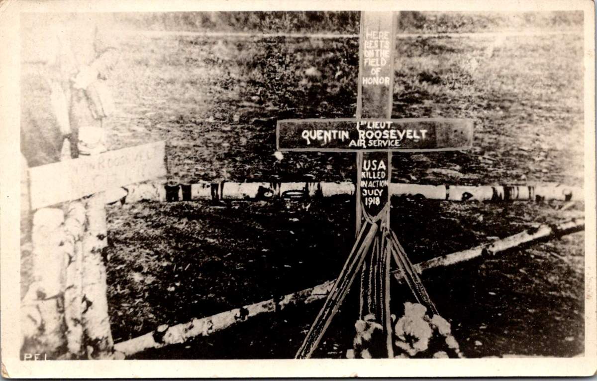
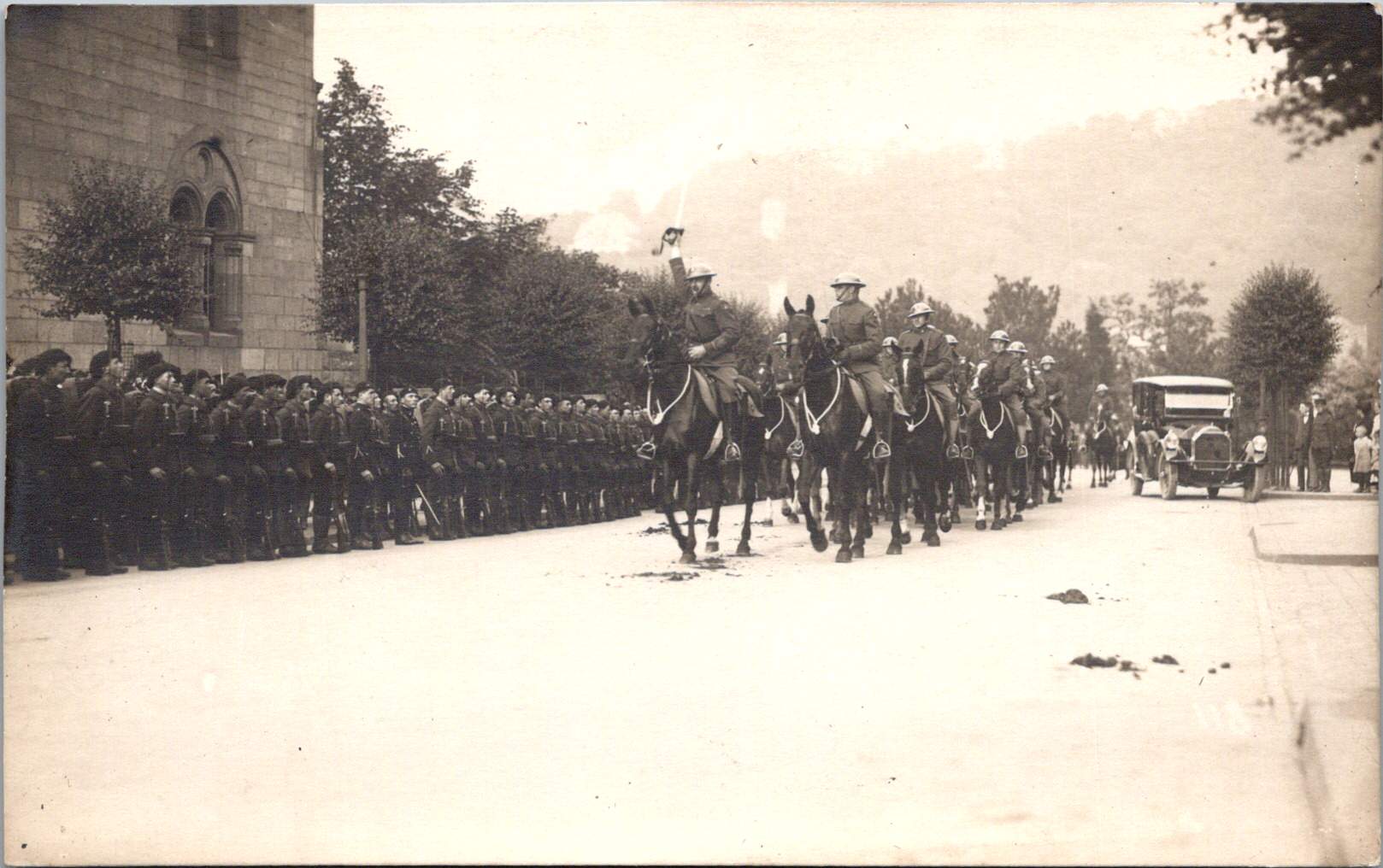
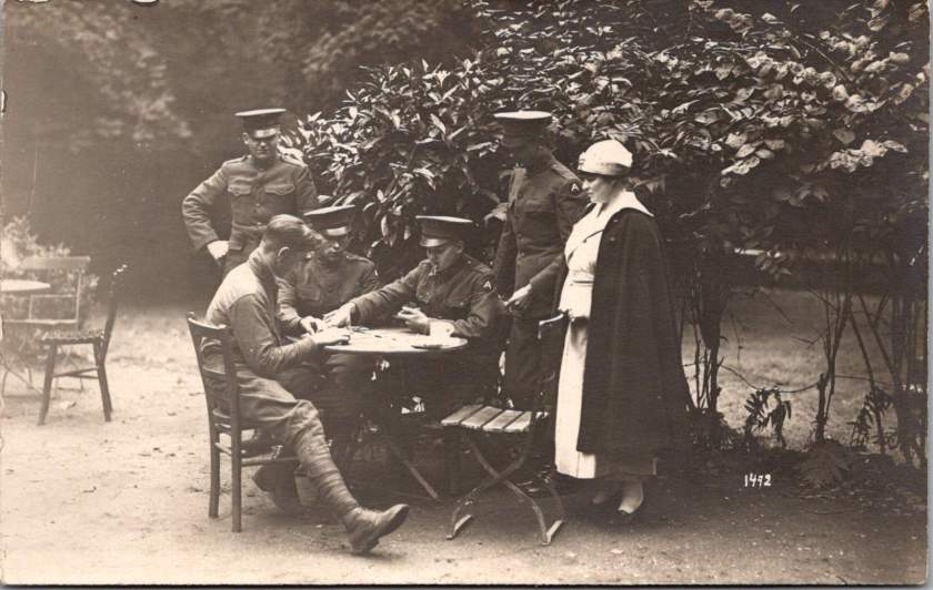
A wooden cross rises from churned earth, the inscription stark against weathered wood. A familiar image of a striking handmade monument to the son of a president who fell from the sky over France.
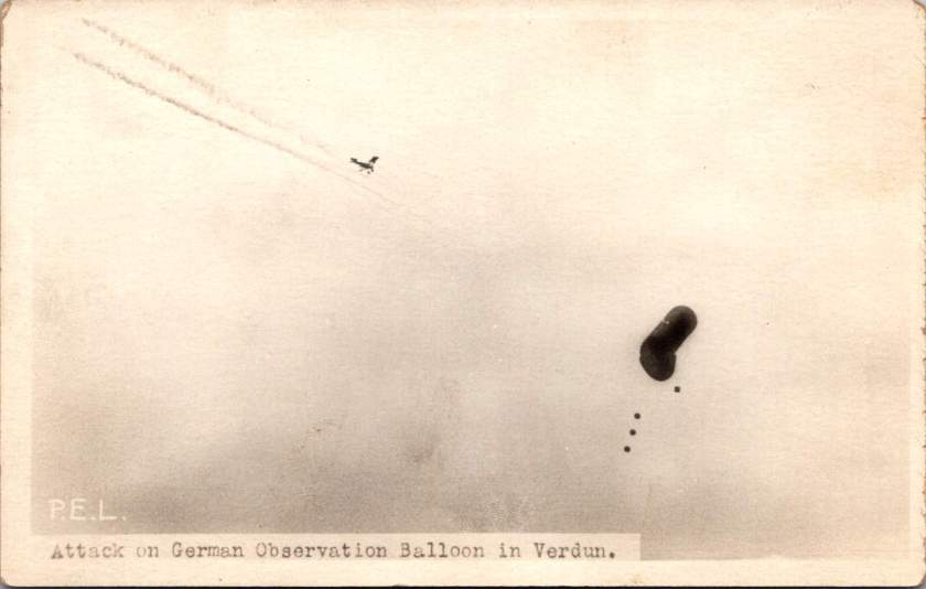
This photograph, captured by a U.S. Signal Corps photographer known only by the initials P.E.L., embodies the US vision of the first World War carefully curated by military officials. While this image evokes sacrifice, honor, and patriotism, the ones that follow emphasize air power and the ground fight.
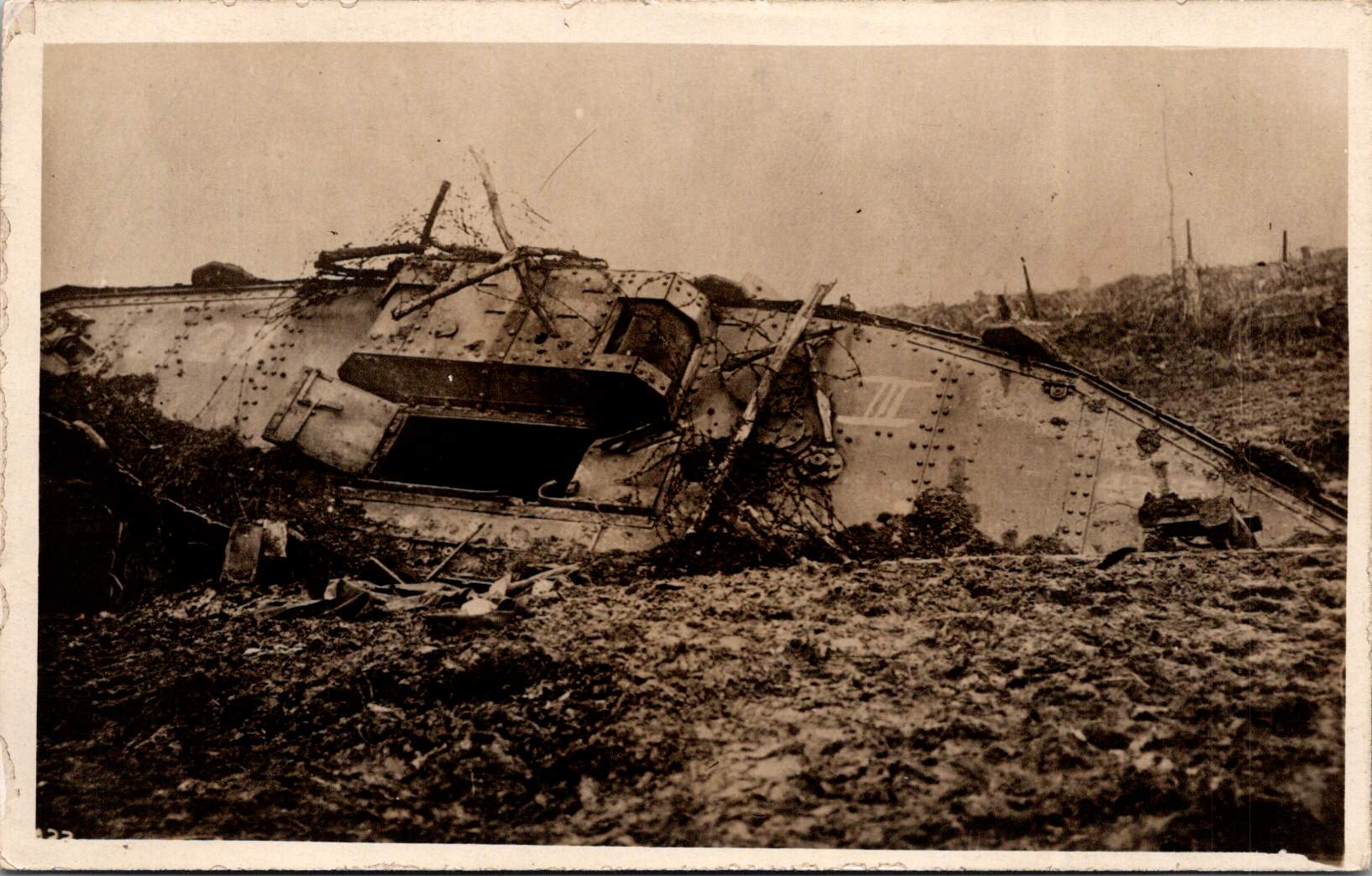
The Signal Corps photographers worked with clear directives. Their images showcased military capacity and impact: a German observation balloon in flames over Verdun, captured enemy aircraft, and troops dug into the battlefield. These photos celebrated American military achievements while maintaining a safe emotional distance from war’s realities. They framed the conflict as a grand, heroic endeavor of machines and strategy, and no bodies.
Soldier photography told different stories.
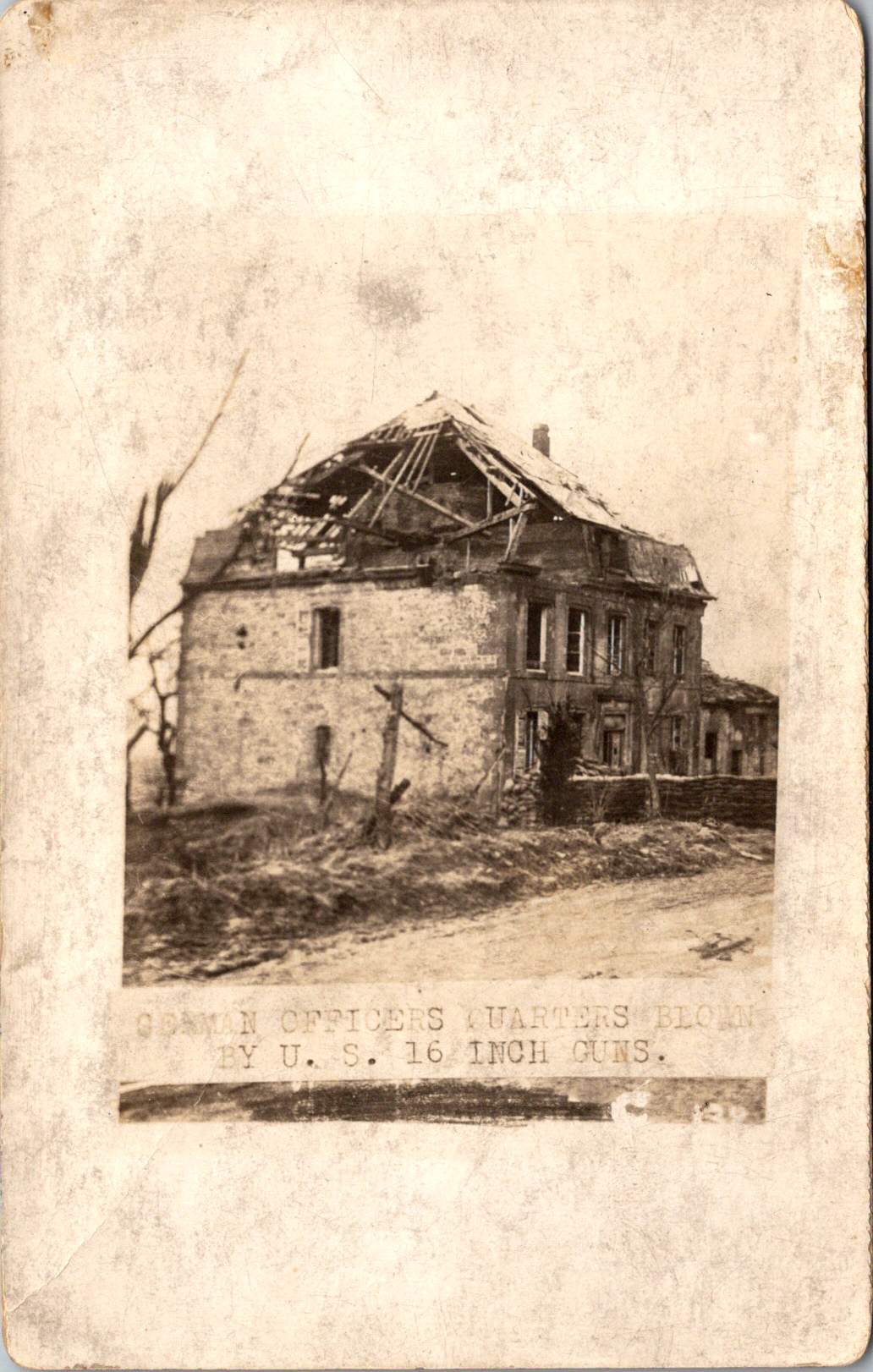
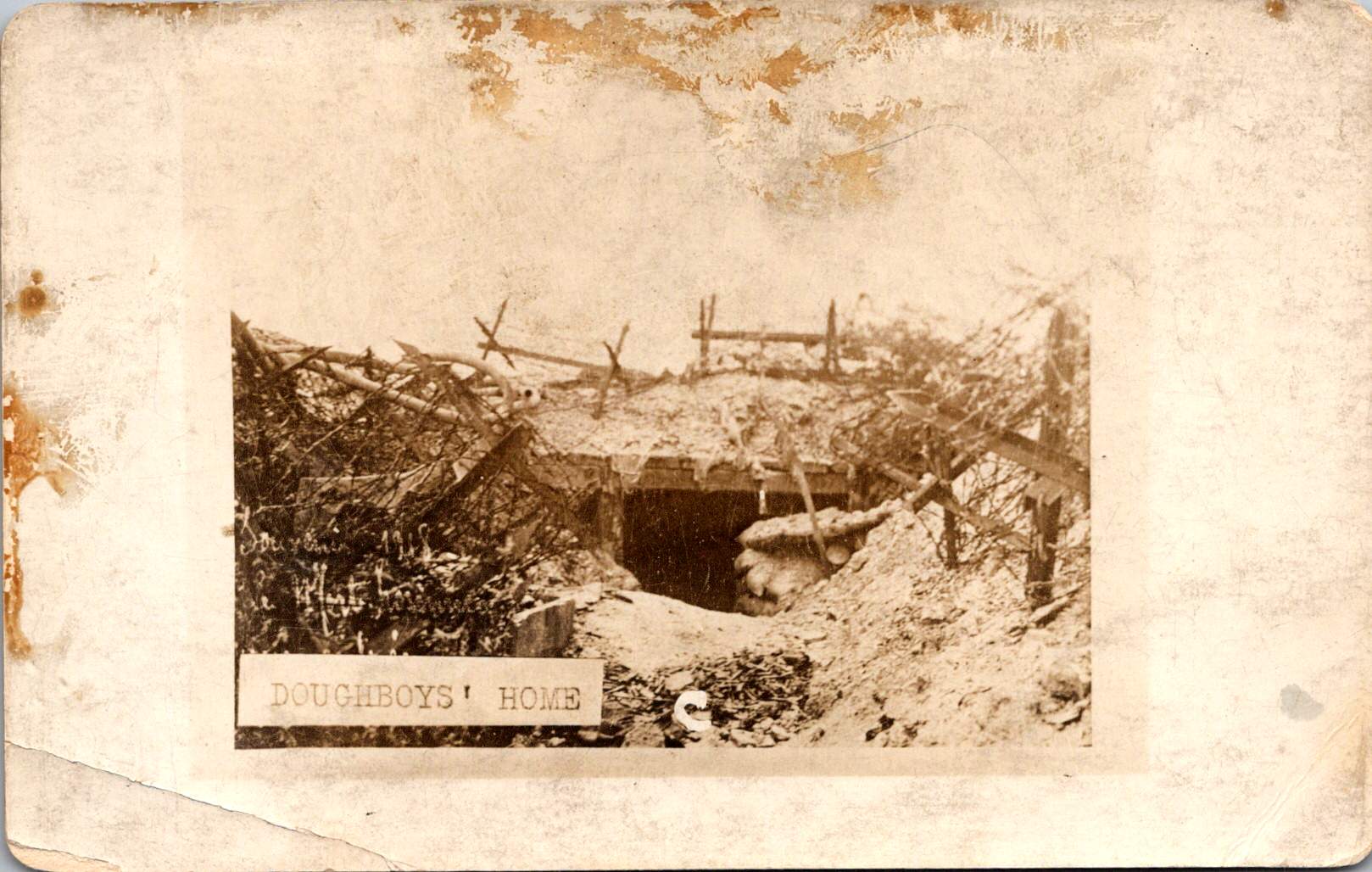
World War I marked a pivotal shift in war photography. The conflict erupted during the democratization of the camera, when Kodak’s marketing promise—You press the button, we do the rest—had placed photography in ordinary hands. For the first time, soldiers carried their own cameras to the front. They documented their experiences without oversight, censorship, or propaganda objectives.
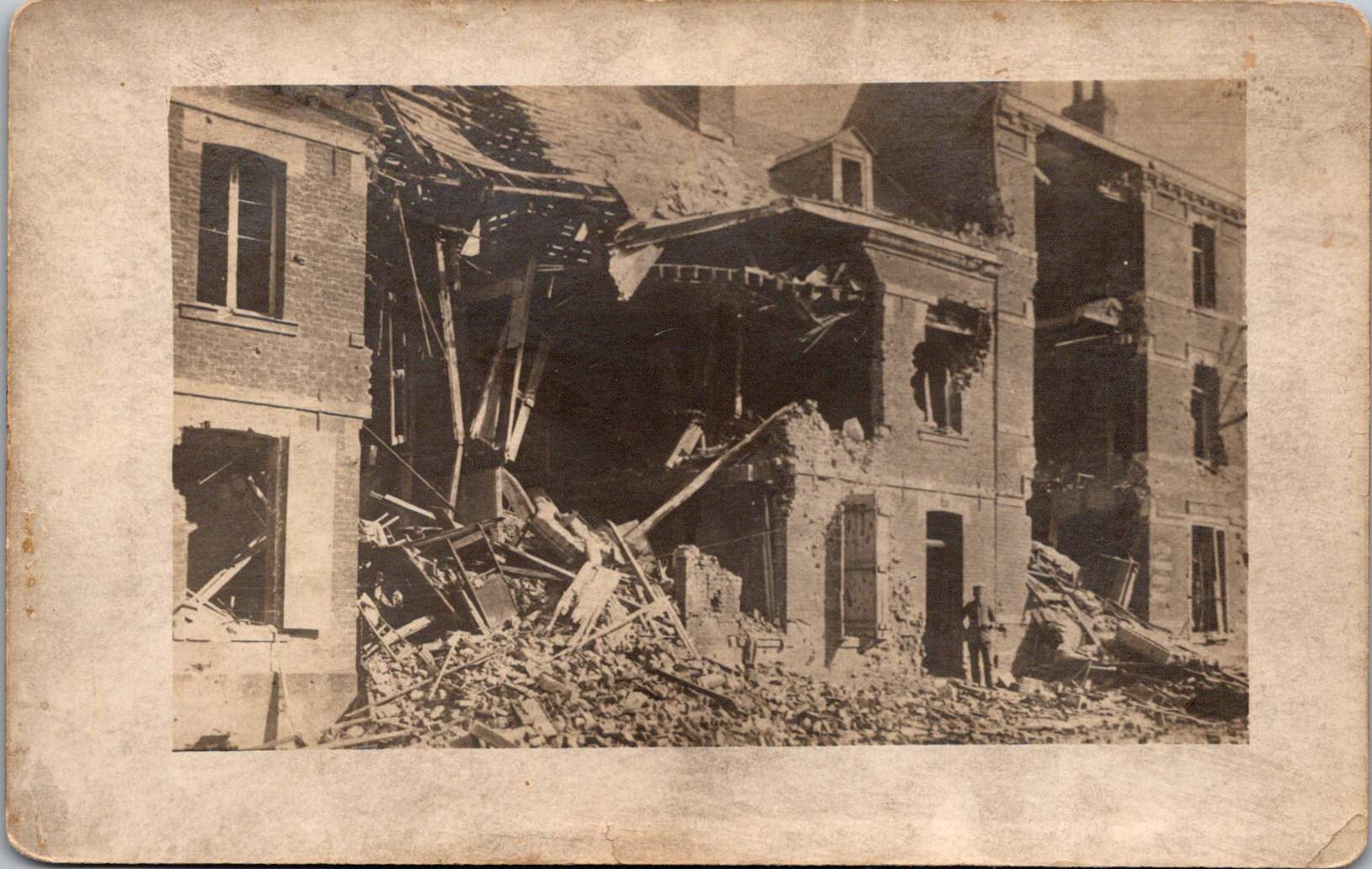
The images captured by troops and printed later at studios like Renfro & Jensen in Belmont, Arkansas reveal a more intimate perspective—the human cost of conflict. German officers’ quarters reduced to rubble by American artillery. The harsh conditions of a foxhole or a machine gun post.
These images weren’t composed for newspaper spreads or government reports. They were personal souvenirs, visual evidence of experiences too enormous to capture in words alone. They were captured on a new-fangled camera and carried home as silent witness.
Belmont, Arkansas transformed virtually overnight in 1917 from a quiet rural community into a bustling military training center. Soldiers flooded the region, bringing with them not just their uniforms and rifles, but their cameras. The town experienced a true boomtown effect as businesses sprang up to serve the influx of military personnel. Among these enterprises, the Renfro & Jensen photography studio established itself as a crucial link between soldiers’ experiences and their communication home.
Then, as demobilization began in 1918, returning soldiers sought ways to share or quietly remember what they had witnessed. Renfro & Jensen became unwitting archivists. They must have developed and printed thousands of soldier photographs—images far more frank and direct than anything appearing in newspapers or government publications. The studio workers were likely among the first civilians to confront warfare through this new technology. Each day, they processed images showing destruction, military achievements, and occasionally, the graphic aftermath of combat. Their commercial service inadvertently preserved a crucial alternative visual history of the conflict.
Two European-produced photographic postcards further document the war. These images, printed on distinctive European paper stock, emerged from a continent already numbed by years of destruction.
Another sixteen images — the most harrowing in the collection — can’t be shown here. The ethical boundaries of war photography persist today. What images should be shielded from casual viewing, and which realities deserve documentation regardless of their power to disturb?
Major institutional collections house millions of WWI photographs. The National Archives holds the largest repository of World War I material in the United States, with over 110,000 photographs digitized from two primary series: the American Unofficial Collection of World War I Photographs and the Photographs of American Military Activities. The Library of Congress maintains extensive collections, including the American National Red Cross Collection with over 18,000 digitized negatives showing wartime activities.
Beyond these institutional repositories exists a vibrant world of private collectors who often hold the most provocative and unfiltered images. These private collections sometimes reveal perspectives absent from official archives. Photographer Carl De Keyzer discovered approximately 10,000 archival glass plate and celluloid negatives from WWI scattered across Europe, many in private hands. From these, he selected 100 to reproduce in stunning detail, revealing aspects of the conflict previously unseen in such clarity. Some of the most compelling battlefield imagery exists in small personal collections—albums like this one that have been kept by families of veterans, passed down through generations, their contents rarely exhibited publicly.
The grave of Lieutenant Quentin Roosevelt is quite enough for many. It symbolizes loss while sparing us its visceral reality. But the full photographic record of the conflict includes truly heinous realities—corpses tangled in barbed wire, faces distorted by gas, bodies rendered unrecognizable by artillery.
While official photographers were tasked to frame narratives that supported war efforts, some soldier photographers refused to turn a blind eye. They captured what they witnessed, creating very personal views that continues to challenge our understanding of history. Their lenses documented what words alone could never convey—the irredeemable human cost of modern warfare.
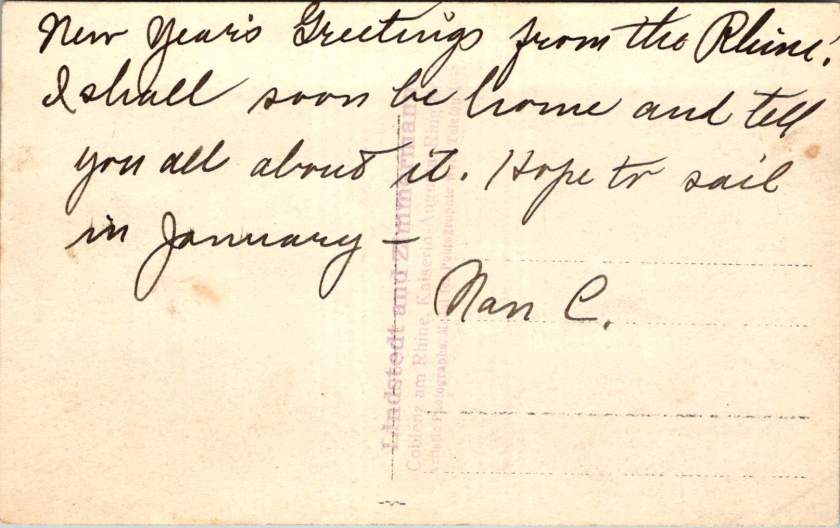
When I connected with European researchers writing a book on the married Swedish/German photographers, Lindstedt and Zimmermann, we discovered that last week’s trove of real photo postcards is quite rare. Even better, we found more.
New Discoveries from a Lost Archive
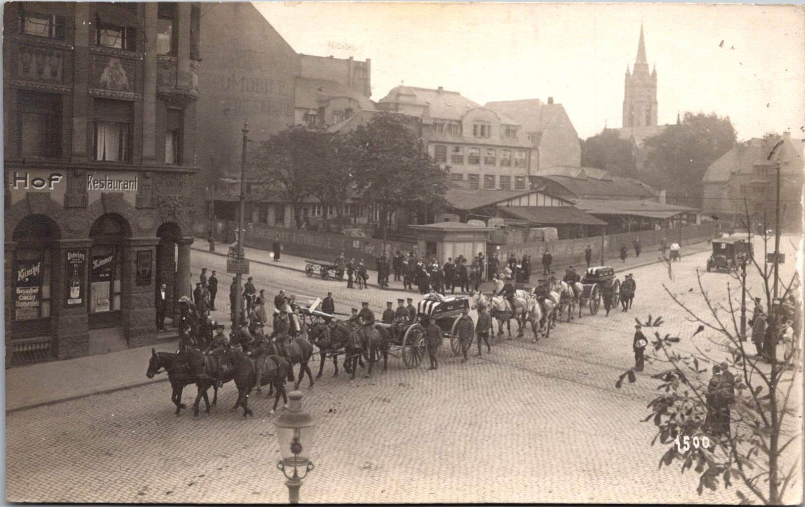
Last week’s essay examined the American occupation of Coblenz, a unique period of military history, through the photographic lens of Lindstedt & Zimmermann. The Lindstedt & Zimmermann studio was destroyed during Allied bombing in World War II, decimating their archive and rendering the surviving examples of their work as uncommon historical artifacts.
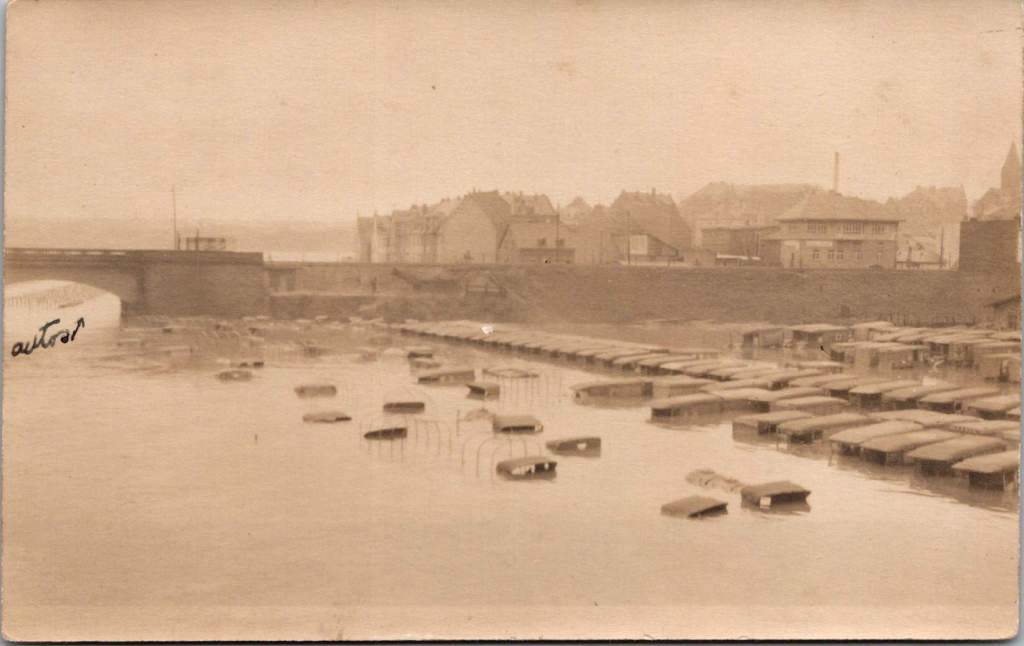
The exchange with the research team prompted another search through our postcard collection resulting in the discovery of 25 additional images. Most can be attributed to Lindstedt & Zimmermann based on stylistic elements, materials and subject matter. Some bear the mark of other photographers including Paul Stein, another Coblenz studio. Ten photographs document the catastrophic flood of the Rhine in January 1920 – images that likely haven’t been seen in a century.
The Great Flood of January 1920
The January 1920 flood represented one of the most significant natural disasters to impact the American occupation forces during their tenure in Germany. The handwritten note on one postcard reveals both the severity of the flood and its impact on the American presence. This mixed German-English description captures the cross-cultural nature of the occupation.
“Der Rhein hat über its banks geflowed und Uncle Sam’s autos gdamaged. The river is the highest in over a hundred years, almost beyond my memory!”
The photographs show numerous small boats navigating the water and automobiles partially submerged in floodwaters, with bridges and buildings visible in the background. These images provide rare documentation of a significant environmental event that temporarily disrupted occupation activities and required adaptation by both American forces and local residents.
Harlem Hellfighters
This very rare view shows what appears to be members of an African American regimental band with their instruments at Romagne, France. Black men served in segregated units during World War I, with regiments such as the 369th Infantry (the “Harlem Hellfighters”) earning recognition for their service. Their regimental bands played an important cultural role, introducing European audiences to American jazz and ragtime music. These musical ambassadors created cultural connections that transcended the military context of their presence. The inclusion of this photograph adds an important dimension to our understanding of the American military presence in post-war Europe, highlighting the contributions of African American servicemen whose stories have been marginalized in historical accounts.
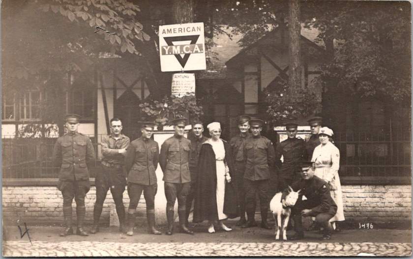
YMCA Women
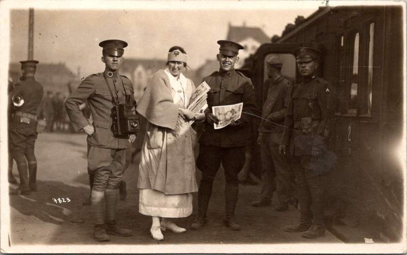
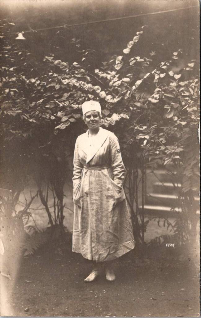
The expanded collection also includes two formal portraits of women in YMCA uniform, complete with the organization’s distinctive triangular insignia on hat and lapel. Sometimes called Y girls, female YMCA workers provided essential services for American soldiers stationed far from home. They operated canteens, organized recreational activities, offered educational programs, and provided a connection to American civilian life that helped maintain morale during the occupation period.
The YMCA was among the few organizations that deployed American women to work directly with troops overseas during this era. These women volunteers typically came from educated, middle or upper-class backgrounds and represented an early example of American women engaging in international service work. Their presence added a civilian dimension to the occupation and helped create environments where American soldiers could productively spend their off-duty hours.
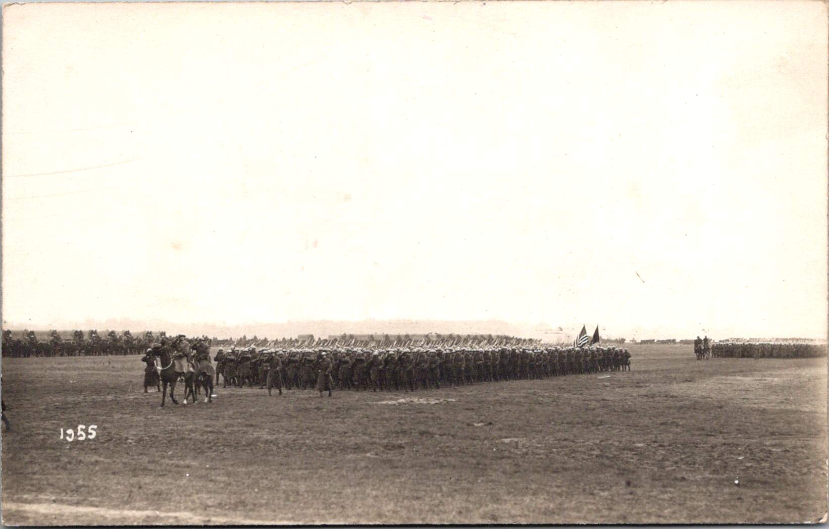
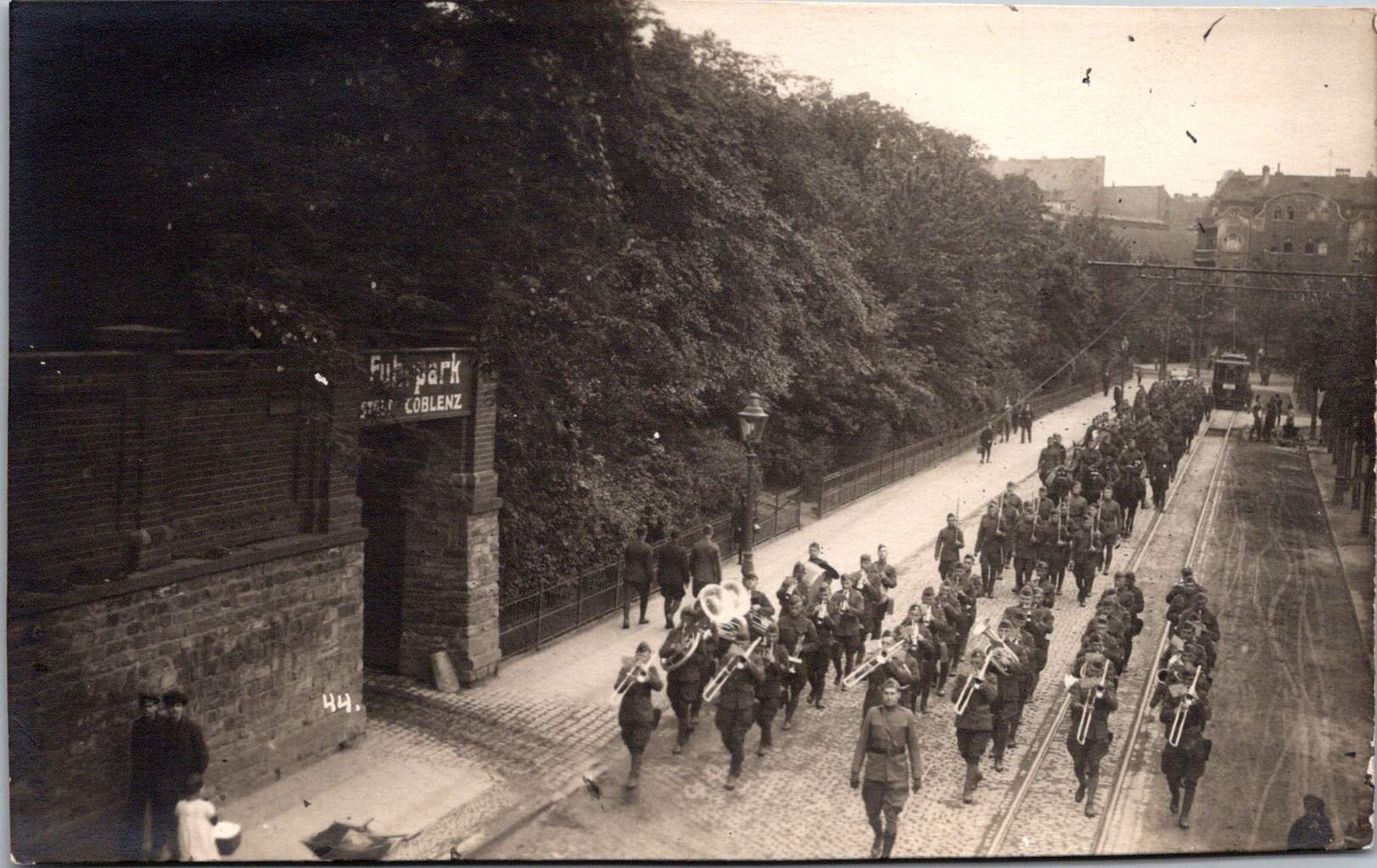
Military Pageantry and Daily Operations
One striking photograph shows the 76th Field Artillery Regiment arranged in a “living insignia” formation, with soldiers positioned to create the unit’s distinctive diagonal striped insignia, surrounded by artillery pieces. This type of military display was meant to demonstrate American capacity while building unit cohesion and pride, and perhaps avert a little boredom.
In contrast to these ceremonial arrangements, other photographs document the practical transportation and logistical elements that supported daily operations. An image of a young driver with his heavy-duty truck along what appears to be the Rhine riverbank represents the essential supply operations that maintained the American presence. The vehicle’s utilitarian design with solid rubber tires, wooden spoke wheels, and large cargo bed illustrates the practical equipment used to transport supplies, equipment, and personnel throughout the occupation zone.
French Military Presence
The next image shows a group portrait of four French soldiers in their distinctive uniforms. Easily identified by their characteristic “Adrian” helmets with the prominent crest ridge along the top and the horizon blue (bleu horizon) uniform that became emblematic of French forces during World War I, these men represent the broader Allied presence in post-war Germany.
France maintained the largest occupation zone in the Rhineland, reflecting their particular security concerns regarding Germany. French forces occupied territories including Mainz, while American forces centered on Coblenz and British forces on Cologne. Later, French forces took over the Coblenz occupation.
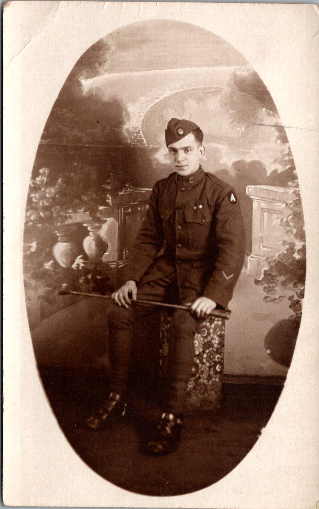
The portrait format was typical of military mementos during this era, allowing soldiers to document their service and send images to family members. The survival of any images at all is due to this distribution by soldiers to their home countries.
Beyond Coblenz
Not all images in the collection were taken in Coblenz itself. One photograph shows American personnel in a touring car filled with passengers in what may be the French Riviera, identifiable by its distinctive palm trees and Mediterranean architecture. Dating to 1921-1923 based on the automobile’s style, this photograph represents the recreational opportunities available to some American personnel during leave periods from their occupation duties.
Europe allowed for cultural and recreational experiences that would have been impossible for most Americans of this era. For many young Americans serving in the occupation forces, this European assignment represented their first—and perhaps only—opportunity to experience the wider world beyond their home communities.
Visual Legacies
The survival of these photographs, particularly those documenting the 1920 flood, represents a remarkable preservation of visual history that might otherwise have been lost entirely. With the bombing of the Lindstedt & Zimmermann studio during World War II, the unique nature of real photo postcards, and the general fragility of materials from this era, each surviving image offers a rare window into this formative period in world relations.
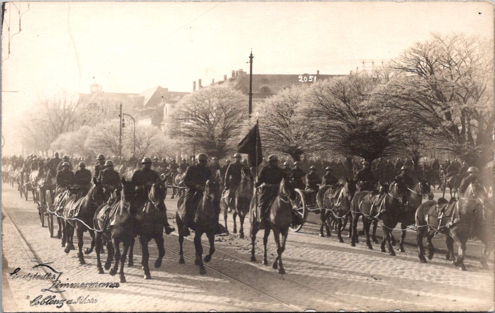
Karl and Änne Zimmermann’s work, along with that of contemporaries like Paul Stein, provides an invaluable visual chronicle of the first American occupation of European territory—a precedent for the much larger American military presence that would emerge in Europe after World War II. Their photographs capture not just military operations and formal events but the daily reality of cross-cultural interaction between Americans, French, and Germans during this unique historical moment and place.
A Swedish-German photography team documented America’s occupation in Coblenz after World War I.
Coblenz (now Koblenz), situated strategically at the confluence of the Rhine and Moselle rivers in Germany, has experienced numerous military occupations throughout its long history. The city’s geographic importance as a crossing point and defensive position made it a coveted location for military powers across the centuries.
Dating back to Roman times, when it was known as Confluentes, the settlement served as a military outpost securing Rome’s frontier. Through medieval and early modern periods, Coblenz changed hands repeatedly during Europe’s dynastic conflicts. However, the most significant pre-20th century occupation came during the French Revolutionary Wars and Napoleonic era (1794-1814), when French forces controlled the city for nearly two decades, incorporating it into the French First Empire.
After Napoleon’s defeat, the 1815 Congress of Vienna assigned Coblenz to Prussia. The Prussians recognized its strategic value and constructed the massive Fortress Ehrenbreitstein on the east bank of the Rhine, transforming the area into one of Europe’s strongest defensive positions. This began a century of Prussian, and later German, control that would last until the end of World War I.
US Occupation: December 1918
The American occupation of Coblenz emerged from the terms of the Armistice that ended World War I on November 11, 1918. The agreement stipulated that Allied forces would occupy the Rhineland, with the region divided into three primary zones: American, British, and French. This occupation was designed to ensure German compliance with armistice terms and provide leverage during peace negotiations.
On December 13, 1918, elements of the U.S. Army’s Third Army, commanded by Major General Joseph T. Dickman, crossed the Rhine and officially began the occupation of Coblenz and its surrounding area. By December 17, the American forces had fully established their headquarters in the city, with approximately 240,000 troops in the region, though this number would decrease significantly over time.
Major General Henry T. Allen later replaced Dickman as commander in July 1919, overseeing the majority of the occupation until American withdrawal in 1923.
Unlike France, which had suffered repeated German invasions and maintained historical animosities, American forces approached the occupation with less punitive attitudes. This pragmatic approach, combined with the economic resources American soldiers brought to the local economy, created a relatively stable, though still complex, occupation environment.
A Photographic Partnership
The American occupation of Coblenz coincided with a pivotal period in photographic history, and two photographers were perfectly positioned to document this unprecedented moment: Anna Victoria “Änne” Lindstedt and her husband Karl Zimmermann. By 1918, photography had evolved significantly from its mid-19th century origins, but still required considerable technical expertise. German and Swedish photography had developed along somewhat different paths.
Anna’s photographic journey began far from Germany, in southern Sweden. Born in 1883 in Hörby, Sweden, she was the daughter of J.M. Lindstedt, an established Swedish photographer. Photography in late 19th century Scandinavia was a growing professional field, with Swedish photographers making significant technical advancements. Anna grew up immersed in this environment, learning technical skills in her father’s studio during a period when photography was transitioning from a purely chemical process to a more refined art form. This Swedish background gave her a distinct perspective and technical foundation that would later influence her work in Germany. By the early 1900s, Anna had established her own photography studio in Lund, demonstrating her independence in a field still dominated by men.
Karl Zimmermann established a photography studio in Diez an der Lahn, Germany and was operating in 1914, at the outbreak of World War I. He had developed a reputation for documenting local events and creating portraits, building technical expertise during a period when German photography was gaining international recognition for its precision and artistic innovation.
The couple became engaged in 1916, in the midst of World War I. After the war ended, they merged their photography businesses in Coblenz, recognizing the unique historic and commercial opportunity presented by the American occupation.
The real photo postcard (RPPC) format that Lindstedt and Zimmermann utilized had emerged in the early 1900s, enabled by the development of the postcard backing paper with preprinted postage markings. These allowed photographers to create small edition prints that could be sold commercially and easily mailed.
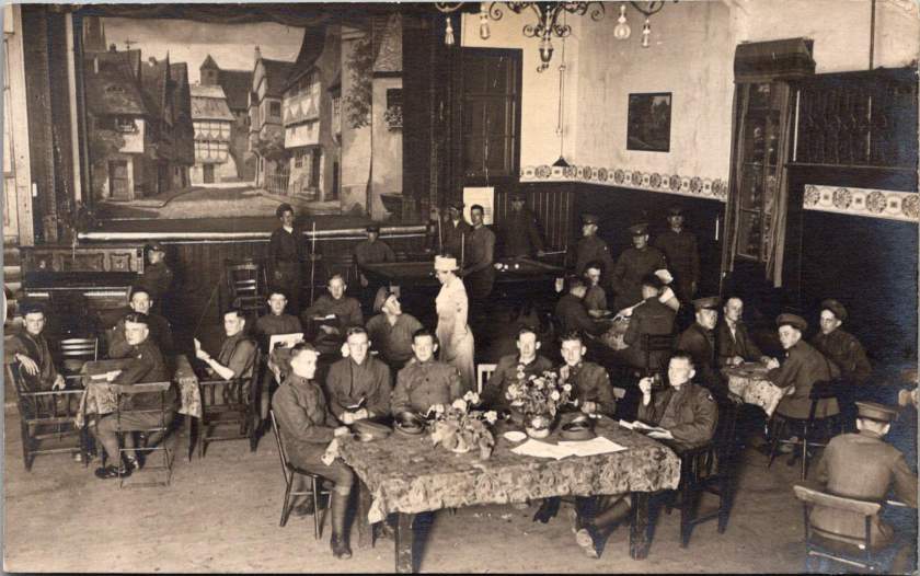
YMCA in the American Occupation
The Young Men’s Christian Association (YMCA) played a crucial role in supporting American troops during the Coblenz occupation. Within weeks of the American arrival, the YMCA established facilities throughout the occupation zone, with their main headquarters in Coblenz itself.
The YMCA’s presence in military zones had been established during the war, but the occupation presented new challenges. Rather than serving troops in active combat, the organization now needed to address the morale and welfare needs of an occupation force facing potential boredom and disciplinary challenges.
By 1920, the YMCA operated approximately 20 centers throughout the American zone. These facilities provided alternatives to less supervised entertainment, offering recreational spaces, reading rooms, educational programs, religious services, and organized athletics. The organization also facilitated cultural exchanges, including German language classes that helped improve relations between American troops and local residents.
YMCA centers became important social hubs for American forces, with thousands of soldiers visiting these facilities daily. The centers also employed a combination of American YMCA staff and local German civilians, creating a rare space for cultural integration during the occupation.
Soldiers’ Experiences
While the broad historical narrative of the American occupation focuses on military units and official policies, individual soldiers’ experiences varied widely. Some troops formed positive relationships with German civilians, while others remained isolated within American enclaves. Some embraced the opportunity to explore European culture; others counted days until their return home.
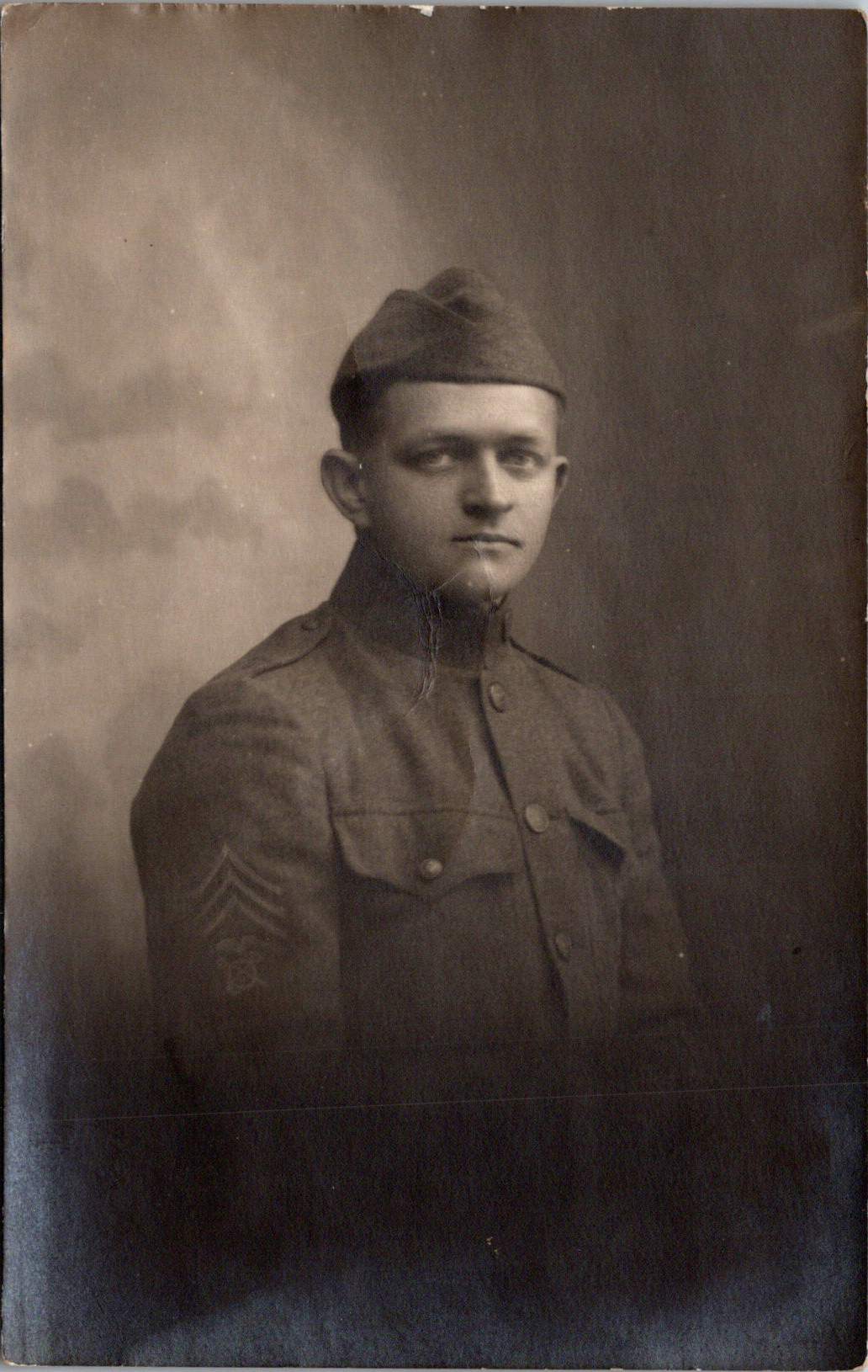
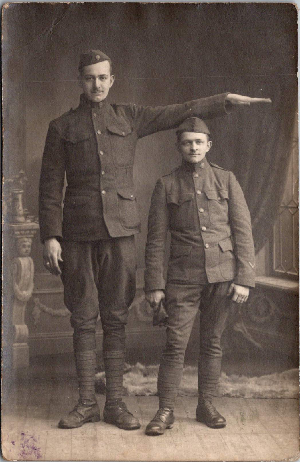
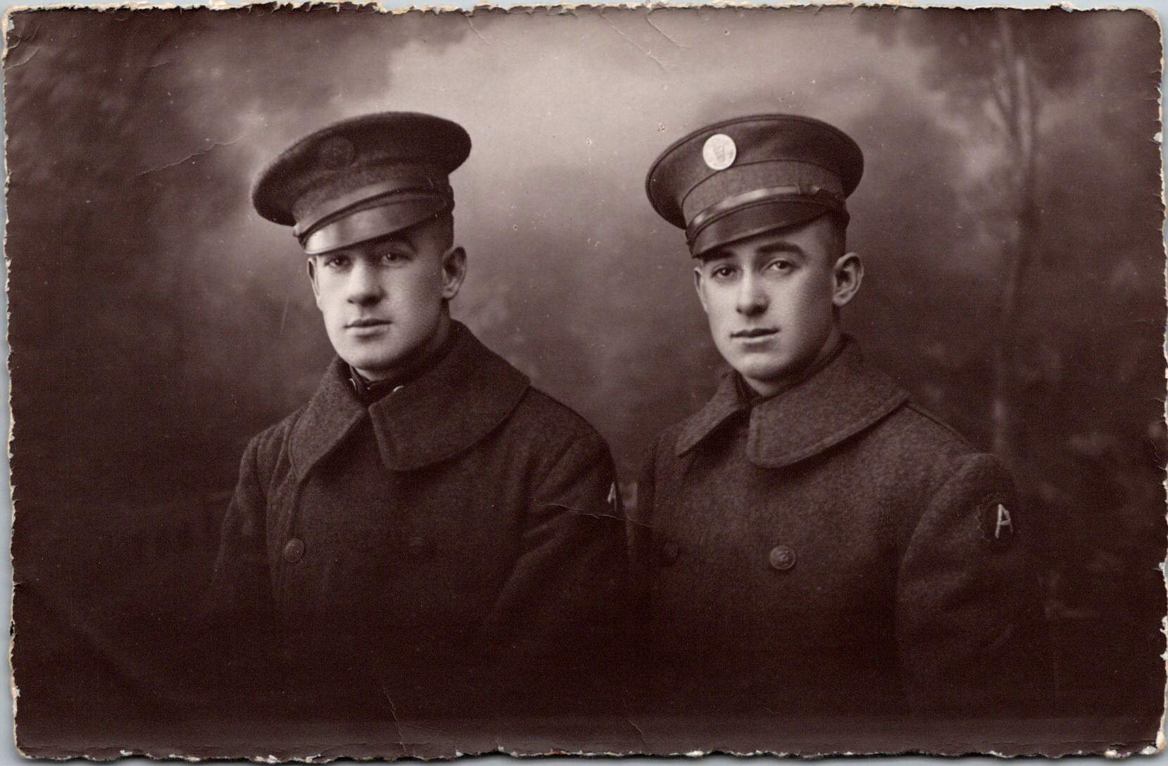
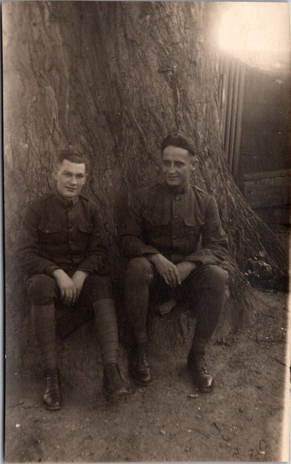
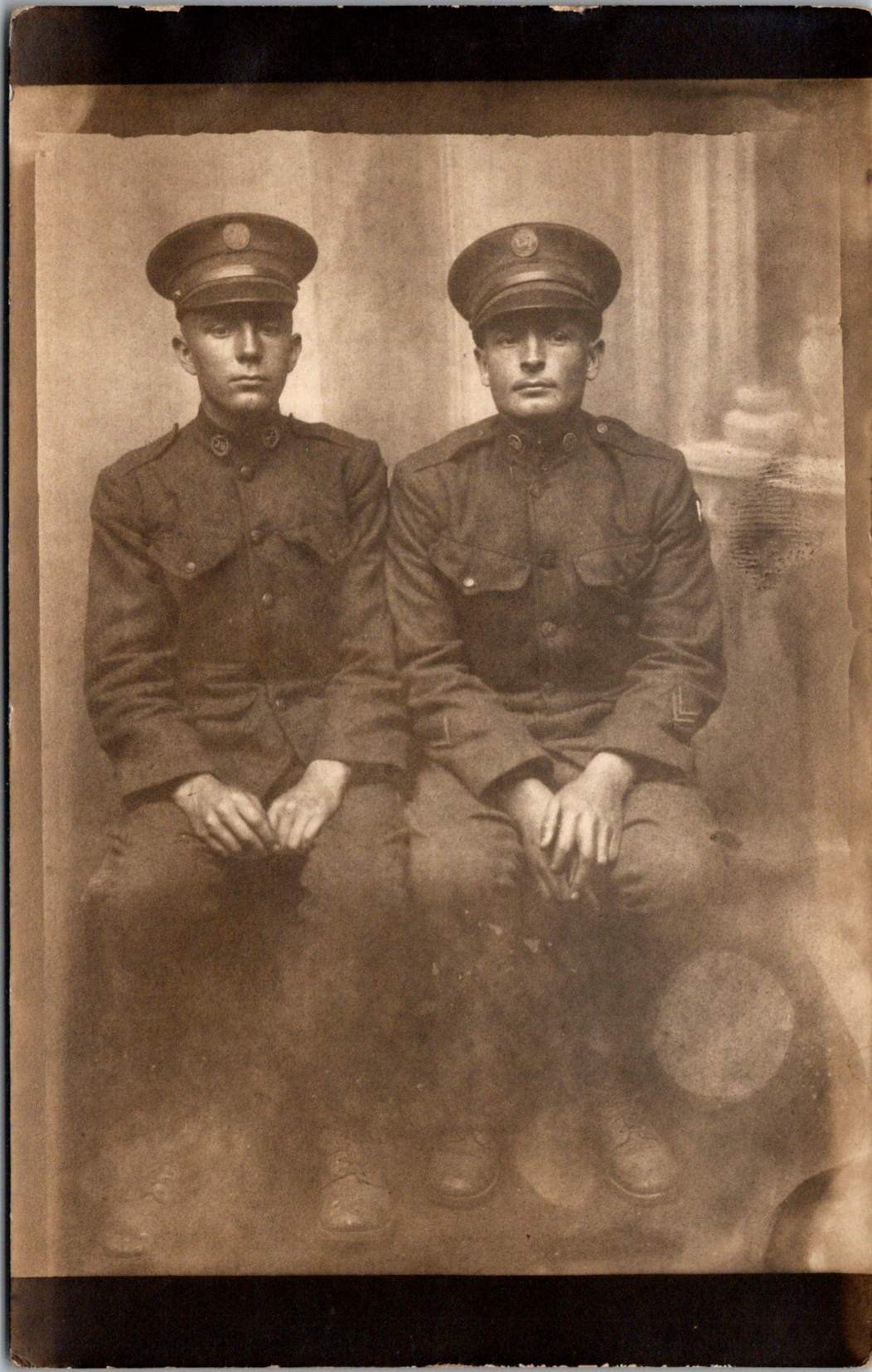
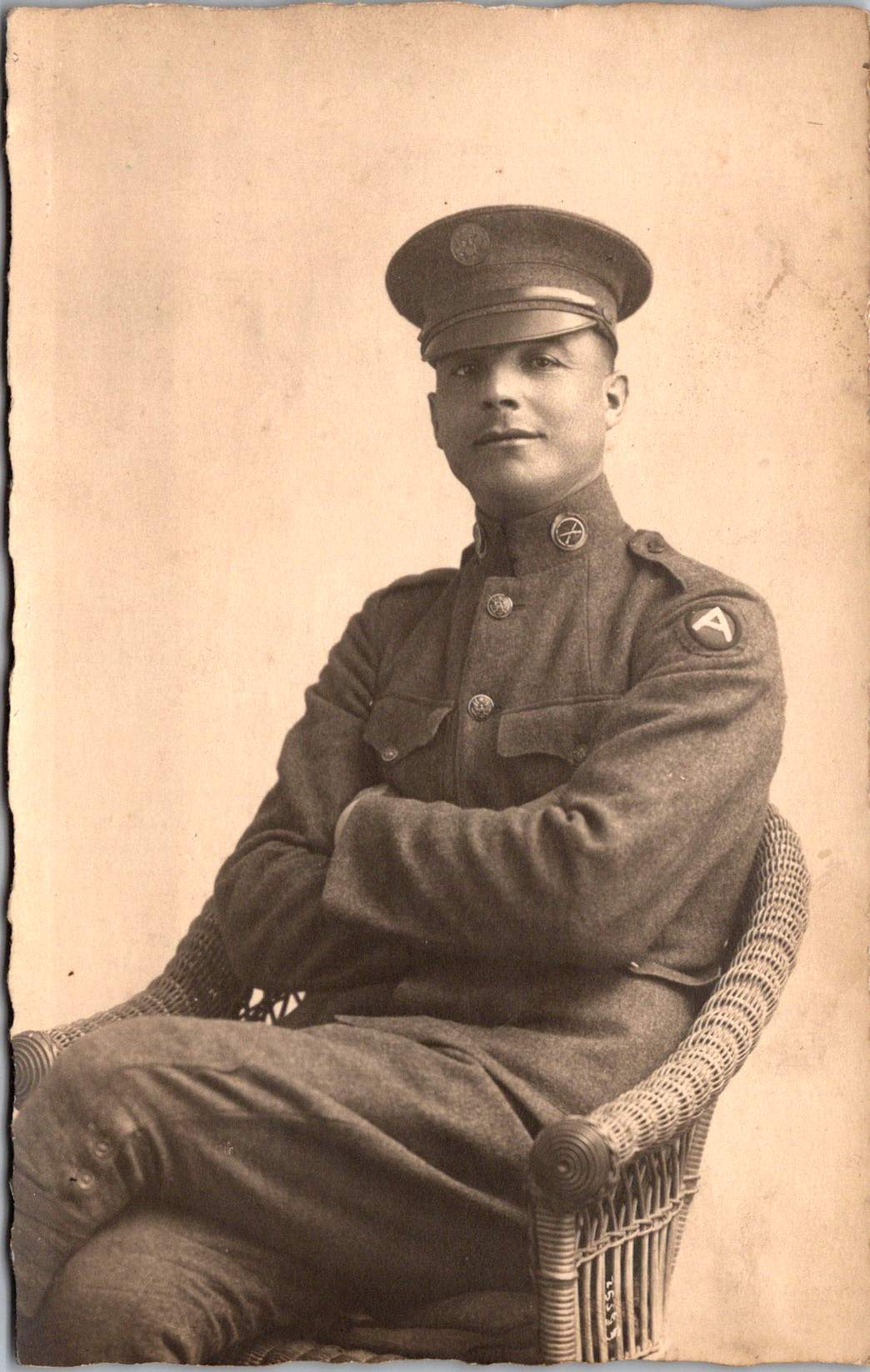
The convenience of real photo postcards can be a barrier in historical research. Only some cards were labeled with names of men — Charles E. Wilson Jr., Norman Page, and Donald Harris pictured here — who were among the thousands of American soldiers who had their portraits made in Coblenz during this period. Bethel Tatum appears in multiple images, as does another anonymous soldier. George Purcell’s military record confirms he received a silver medal for gallantry in action during World War I before serving in the occupation force.
One of the more curious connections involves 328 Chauncey Street in Brooklyn, New York, inscribed as the address for Charles Thomas, who appears in two photos. The same location later became famous as Jackie Gleason’s boyhood home and the fictional address in “The Honeymooners”. There are no known family connections, but this is how rumors begin. Soldier Charles Thomas bears an uncanny resemblance to the comedian star.
Olympic Connections
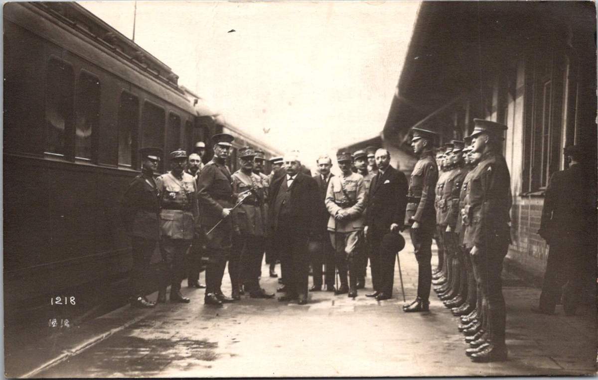
Pierre de Coubertin, founder of the modern Olympic movement, maintained a significant interest in post-war athletic events, including those organized by military forces. As president of the International Olympic Committee until 1925, he worked actively to revive international sporting competitions after the war’s disruption. He may have visited Coblenz on a tour of the Inter-Allied Games in the summer of 1919.
The 1920 Summer Olympics in Antwerp, Belgium—the first Games held after World War I—represented a significant milestone in de Coubertin’s efforts. Karl Zimmermann, who worked for both the US and French forces, may have traveled to Antwerp, and even photographed de Coubertin and General Pershing.
By 1928, Karl’s declining health forced changes to their business operations. Änne became managing director in 1930 and changed the business name to Welt-Foto-Koblenz, perhaps an attempt to broaden their commercial appeal and provide delicate cover for husband’s ailments. Karl’s mental health continued to deteriorate, ending his photojournalistic work by 1934. After his death in 1943 at the Hausen/Wied sanatorium, Änne managed to preserve aspects of their photographic legacy through the war years.
Änne’s post-war life included time between Koblenz and her native Sweden, maintaining connections to both the place where their most significant work was created and her homeland. She died on November 11, 1962, and was buried in the new cemetery in Åhus, Sweden, bringing her remarkable photographic journey full circle.
A Photographic Legacy
The Lindstedt and Zimmermann postcards documenting the American occupation of Coblenz represent an important visual historical record of this significant period. These images provide insight into a unique moment when American forces first occupied European soil—a preview of the much larger American military presence that would emerge in Europe after World War II.
Their work serves multiple historical functions: documenting military operations, capturing cultural exchanges, preserving individual experiences, and recording the physical environment of occupied Coblenz. This rare visual archive helps us understand what happened during the occupation, and how daily life unfolded.
Through the combined Swedish-German lens of Lindstedt and Zimmermann, we gain a more nuanced understanding of this complex chapter in American-European relations and the early development of American overseas military presence that would shape the 20th century.
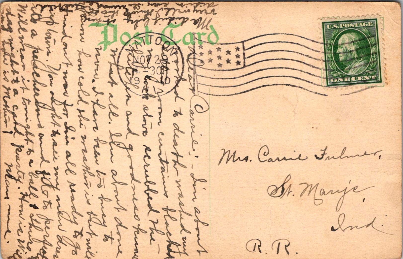
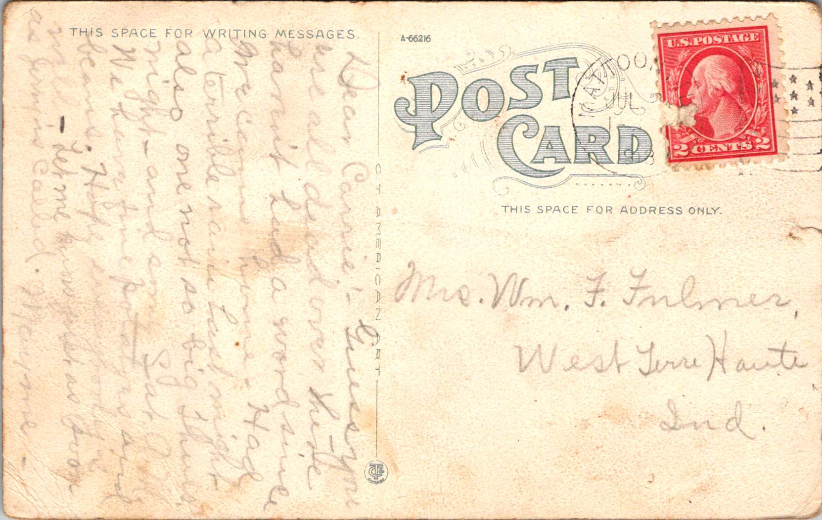
Sisters Mayme and Carrie stay in touch as Mattoon IL grows from a creek-side town to a modern crossroads before the war, 1910-1918.
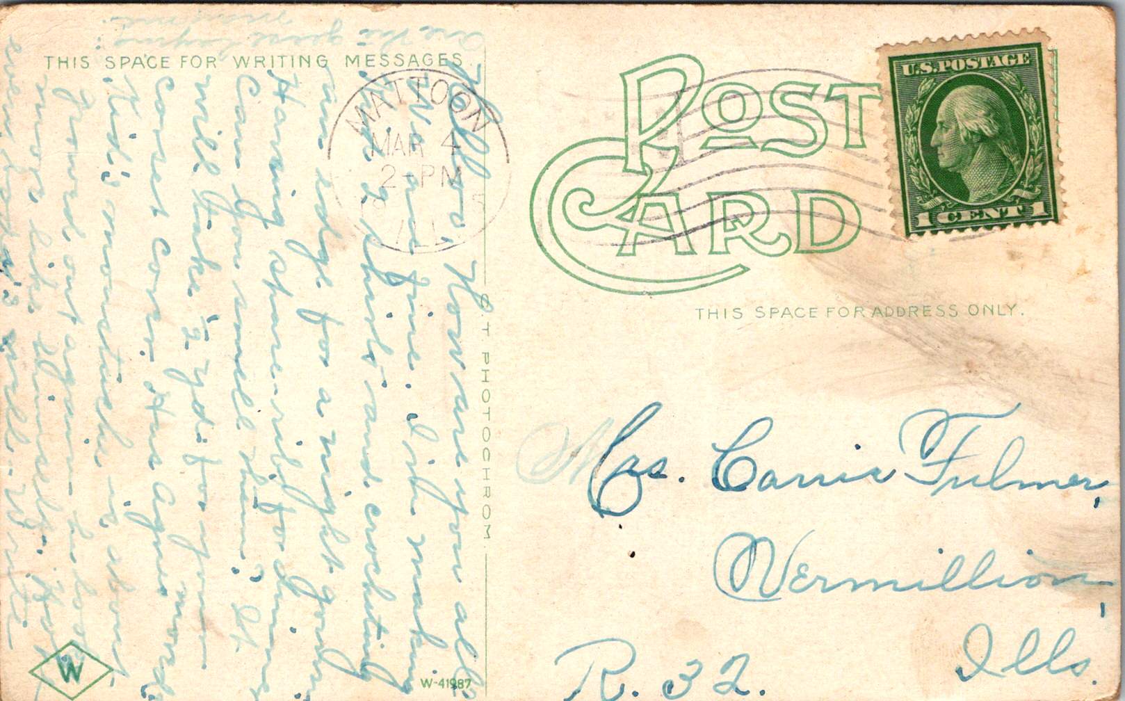
Between 1910 and 1918, a series of postcards traveled between Mattoon, Illinois, and St. Mary’s, Indiana. On one end was Mayme, the author, who had made her home in the bustling railroad town of Mattoon. Her sister Carrie, who remained in St. Mary’s, received and kept the cards, now more than a century old. These correspondence cards—adorned with images of Mattoon’s infrastructure and landmarks—captured more than just personal exchanges between siblings. They documented a profound moment in America’s transformation from a rural society to an industrialized nation, with small Midwestern cities like Mattoon serving as microcosms of this national metamorphosis.
Nature and Community
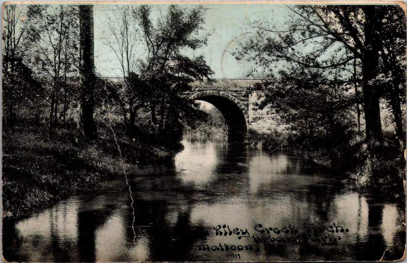
Mayme sent the first postcard on November 29, 1910, bearing an image of Riley Creek with its stone bridge arch—a glimpse of the natural landscape that surrounded the growing town of Mattoon. This serene view of the creek precedes the increasingly industrialized town that Mattoon was becoming. Founded in 1855 and named after William B. Mattoon, a partner in the construction firm that built the Illinois Central Railroad, the town served as a critical junction between the Illinois Central and the Terre Haute & Alton railroads.
The stone bridge spanning Riley Creek represents essential infrastructure that connected different parts of the community and facilitated transportation within and beyond the town. Such bridges were vital elements in expanding road networks that would eventually complement the railroad’s dominance in transportation.
Mayme wrote about burdensome domestic chores and a new dress for an upcoming ball that she would wear again to a Thursday card party. She was participating in the social life of a community that was growing from its natural surroundings into a prosperous small city.
I’m about worked to death, washed my sitting room curtains, blackened my cook stove, scrubbed the kitchen and goodness knows what all…
Industry and Infrastructure
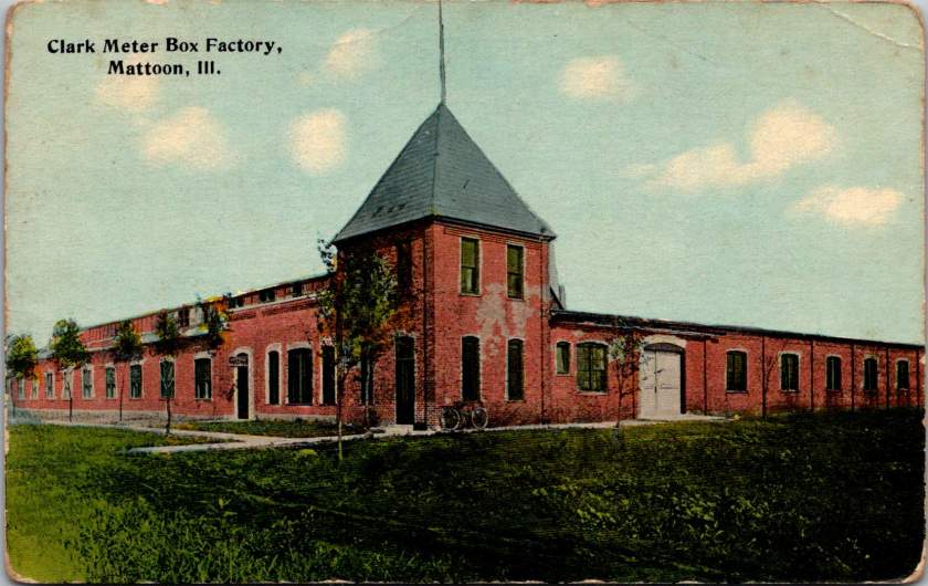
By 1914, Mayme was sending postcards that highlighted Mattoon’s industrial development. One image showcased the substantial Clark Meter Box Factory, with its distinctive tower and solid brick construction. America’s industrial expansion was moving beyond major manufacturing centers into smaller towns and cities. The factory produced meter boxes for utilities—products essential to the electrification and modernization sweeping across America in the early 20th century.
While Mayme reported her handiwork at home like knitting, crocheting, and gardening, the meter box factory represented the industrial world that was transforming the American economy. Manufacturing facilities like this provided jobs that attracted workers and their families to communities like Mattoon, contributing to urban growth and economic diversification beyond traditional agricultural and railroad employment.
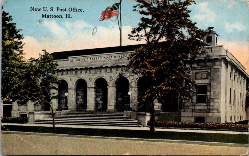
Also in 1914, Mayme sent a postcard showcasing Mattoon’s “New U.S. Post Office,” a stately neoclassical building with grand arches and an American flag prominently displayed. This wasn’t merely a functional building but a statement of federal presence and civic achievement. During this period, post offices in American towns weren’t just mail facilities—they were symbols of connection to the national government and markers of a community’s importance.
The grandeur of Mattoon’s post office reflected the federal government’s expanding role in American life—a time when postal services were being standardized and rural free delivery was connecting previously isolated communities. The building is a physical manifestation of the communication network that allowed Mayme’s postcards to travel to Carrie with such regularity.
Hospitality and Social Life
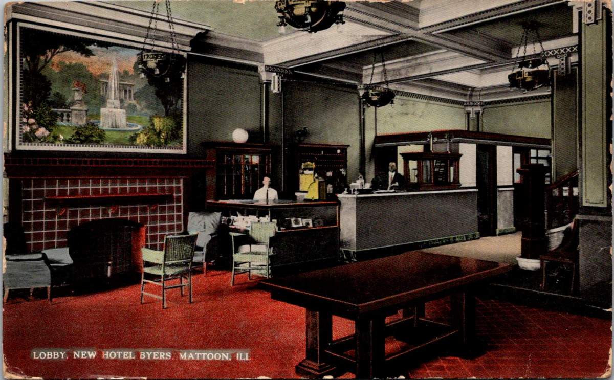
In 1915, Mayme’s postcard featured the lobby of the Hotel Byers, offering a glimpse into the social aspirations of Mattoon during this era. The elegant interior, with its decorative fireplace, ornate hanging lamps, and comfortable seating area, represented the town’s desire to provide metropolitan amenities. Hotels like the Byers served not just as lodging for travelers but as social centers for the community.
For Mayme, the hotel offered refined experiences and social mobility. The hotel’s ballroom would have served as the venue for the dances she mentioned, while its dining room hosted the card parties that figured prominently in middle-class social life. These gatherings provided opportunities for networking across class lines, connecting domestic and railroad workers’ families with merchants, professionals, and industry owners.
The “new” Hotel Byers replaced an older establishment of the same name that had served Mattoon since the late 19th century. This newer iteration, constructed around 1914, was a modern hotel that served as crucial infrastructure for a growing city with ambitions to attract business and industry. The hotel’s construction coincided with a period of economic optimism in Midwestern towns before America’s entry into World War I, when many similar communities were upgrading their commercial buildings as part of the broader Progressive Era emphasis on civic improvement.
Railroad Town
The last postcard featured the “Illinois Central Subway” in Mattoon, which wasn’t an underground transit system but a distinctive sunken railway passage that bisected the town. This engineering feature allowed trains to pass through without disrupting street-level traffic, a forward-thinking design that embodied the marriage of infrastructure and everyday life. The buildings lining the upper level of the postcard show Mattoon’s commercial district that grew directly alongside the railroad—their proximity a testament to the symbiotic relationship between commerce and transportation.
Hope everybody’s well. Let me know just as soon as Jerry is called…
War Shadows
By July 1918, Mayme’s tone had shifted. Her ominous request to let her know “as soon as Jerry is called” reveals the long shadow cast by World War I over these Midwestern communities. The United States had entered the war in April 1917, and the military draft was touching families across the nation.
The war accelerated many of the industrial and social changes already underway in towns like Mattoon. Labor shortages created by military service opened new employment opportunities, particularly for women. The focus on wartime production reshuffled economic priorities. And the specter of loss hung over families, even as daily life continued.
While Mattoon’s industrial capacity may have contributed to the war effort through manufacturing, the human cost was felt intensely in personal correspondence like this.
Two Sisters
Throughout these exchanges, we see two different life trajectories embodied by the sisters. Mayme chose life in a developing industrial town, participating in its social events and domestic economy while witnessing its physical transformation. Her postcards—featuring Mattoon’s architectural achievements and industrial facilities—suggest a certain pride in her adopted community.
Carrie eventually married a man named Earl, and they moved around a bit. Both sisters maintained domestic skills—knitting, crocheting, sewing, and food production—that connected them in conversation even as the world around them changed. Their correspondence across state lines preserved family bonds—a common experience as increased mobility dispersed American families. The railroad and postal service made this ongoing connection possible.
Early postcards represent a convergence of innovations in printing, photography, and postal delivery—each with its own players, craft, and history. The emergence of the simple picture postcard depended on a complex international network of industries, technologies, and regulations developed in the prior century.
Art for the Masses
The development of chromolithography in the late 19th century provided the technological foundation for colorful mass-produced postcards. Though lithography itself dated back to 1796, when Alois Senefelder developed the process in Munich, the refinement of color lithography reached new heights in the 1870s-90s, with different national styles emerging.
German printers particularly mastered the technique of creating separate limestone printing plates for each color, allowing for vibrant multi-color images that previously would have required expensive hand-coloring. A typical color postcard might require five to fifteen separate printing runs, with perfect registration between colors. This level of precision required specialized equipment and highly trained craftsmen.
German chemical industries produced superior inks and dyes, giving their postcards more vibrant and stable colors than competitors. Companies like BASF and Bayer, originally founded as dye manufacturers, provided innovative colorants specifically formulated for printing applications.
The German city of Leipzig emerged as a center of printing excellence, with firms like Meissner & Buch establishing international reputations for quality. German chromolithography was so superior that even American publishers would often have their designs sent to Germany for printing, then shipped back to the United States for distribution—at least until tariff changes in 1909 made this practice less economical. Publishers like Raphael Tuck & Sons maintained offices in Germany despite being headquartered in London, simply to access German printing expertise.
While Germany led in technical quality, French postcards developed a reputation for artistic sophistication. Paris publishers like Bergeret and Levy et Fils produced cards featuring Art Nouveau styles and artistic photographic techniques. The French market also developed distinctive “Fantaisie” postcards featuring elaborate designs with silk applications, mechanical elements, or attached novelties. These cards pushed the boundaries of what a postcard could be, turning functional communication into miniature works of art.
British publishers like Raphael Tuck & Sons, J. Valentine & Co., and Bamforth & Co. showed particular commercial acumen. While they didn’t match German printing quality or French artistic sensibility, British firms excelled at identifying market opportunities and consumer trends. The British pioneered specialized categories like the seaside postcard and led in developing postcards for specific holidays and occasions.
Photographic Reality
While lithographic postcards dominated the market, photography increasingly influenced postcard production. The collodion wet plate process (1851) and later the gelatin dry plate (1871) made photography more accessible. The development of halftone printing in the 1880s allowed photographs to be reproduced in print media without manual engraving, creating more realistic imagery.
A revolutionary moment came in 1903 when Eastman Kodak introduced “Velox” postcard paper. This pre-printed photographic paper had postcard markings on the back and a light-sensitive photo emulsion on the front. Combined with Kodak’s 3A Folding Pocket camera, which produced negatives exactly postcard size (3¼ × 5½ inches), this innovation created the Real Photo Postcard (RPPC).
The acquisition of Leo Baekeland’s Velox photographic paper company in 1899 for $1 million provided a crucial technological component. Velox paper could be developed in artificial light rather than requiring darkroom conditions, had faster developing times, and produced rich blacks and clear whites—all critical qualities for postcard production.
The RPPC format found particular success in America, where the vast geography meant many small towns would never appear on commercially printed postcards. Local photographers throughout the country created RPPCs of main streets, businesses, schools, and community events, documenting American life with unprecedented comprehensiveness.
International Postal Agreements
Even the most beautifully produced postcard would be meaningless without an efficient system to deliver it. The standardization of postal systems in the late 19th century created the infrastructure necessary for postcards to flourish.
A watershed moment for international mail came with the Treaty of Bern in 1874, establishing the General Postal Union (later renamed the Universal Postal Union or UPU). This organization created the first truly international postal agreement, initially signed by 22 countries, primarily European nations. The United States joined the UPU in July 1875, connecting the American postal system to the standardized European networks. The U.S. had introduced its own government-issued postal cards in 1873, but joining the UPU meant these could now be sent internationally under consistent regulations.
Several key UPU Congress developments shaped the postcard’s evolution. The 1878 Paris Congress renamed the organization to Universal Postal Union. The 1885 Lisbon Congress standardized the maximum size for postcards (9 × 14 cm). The 1897 Washington Congress set new international regulations for private postcards. The 1906 Rome Congress standardized the divided back format internationally.
Perhaps the most crucial postal development for postcard popularity was the divided back. Great Britain introduced this format in 1902, with France and Germany following in 1904, and the United States in 1907. Before the divided back, the entire reverse of a postcard was reserved for the address only, with messages having to be squeezed onto the front, often around the image. The new format allocated half the back for the address and half for a message, dramatically improving postcards’ utility as correspondence tools.
European Delivery Systems
European railway networks proved ideal for postal delivery, creating a remarkably efficient system. By the 1870s-80s, most European countries had developed comprehensive rail networks. Germany alone had over 24,000 miles of railway by 1895, despite having a land area smaller than Texas.
Railway mail cars (“bureaux ambulants” in France, “Bahnpost” in Germany) sorted mail en route. These mobile sorting offices made the system highly efficient, with mail sorted by destination while in transit. Railway timetables were coordinated to allow for mail transfers at junction points, creating an integrated system even across national borders.
Major routes often saw multiple mail trains per day. The Berlin-Cologne line, for example, had four daily postal services by 1900. This meant that postcards could be delivered between major cities within a day, creating a communication speed previously unimaginable.
For urban delivery, European cities developed even more innovative systems. Perhaps most remarkable were the pneumatic tube networks installed in several European capitals. Paris launched its “Pneumatique” in 1866, Vienna’s “Rohrpost” began in 1875, and Berlin built an extensive pneumatic network from 1865. These systems used compressed air pressure to propel cylindrical containers through networks of tubes. The carriers could hold several postcards or letters and traveled at speeds up to 35 kilometers per hour. Paris eventually developed a pneumatic tube network extending 467 kilometers, allowing for delivery times of under 30 minutes across the city. A morning postcard could receive an afternoon reply—creating a nearly conversational pace of written communication.
American Adaptations
The United States faced different geographical challenges. The vast distances between population centers meant that the same-day delivery common in Europe was impossible between major cities. Nevertheless, the American postal system developed impressive efficiency given these constraints.
The U.S. Railway Mail Service, officially established in 1869, became the backbone of American mail delivery. By 1900, more than 9,000 railway postal clerks were sorting mail on trains covering more than 175,000 miles of routes. While European countries measured mail routes in hundreds of miles, American routes stretched thousands of miles across the continent.
American cities also experimented with pneumatic tube systems, though they were less extensive than European counterparts. New York City’s system, operating from 1897 to 1953, eventually covered 27 miles with tubes connecting post offices in Manhattan and Brooklyn. At its peak, it transported 95,000 letters per day, or about 30% of all first-class mail in the city.
Within cities, frequent delivery became the norm. By 1900, many American urban areas offered at least four daily mail deliveries, with some business districts receiving up to seven deliveries per day. This made postcards a practical means of daily communication within city limits, much as they were in Europe.
The efficiency and economy of postcards made them ideal for routine business communications. Companies developed pre-printed postcards for order acknowledgments, shipping notifications, payment reminders, meeting confirmations, service calls, and appointment reminders. These standardized communications reduced clerical costs while providing a paper trail of business interactions. The divided back format was particularly valuable for business purposes, allowing for both a standardized message and customized details.
Perhaps no industry benefited more from postcards than tourism. Hotels, resorts, transportation companies, and local chambers of commerce all commissioned postcards that served as both souvenirs and advertisements. Visitor bureaus coordinated with publishers to ensure their destinations were well-represented in the marketplace. The economic impact was substantial—a scenic view postcard might cost a penny to produce, sell for a nickel, and generate hundreds of dollars in tourism revenue by inspiring visits. This multiplication effect made postcards perhaps the most cost-effective tourism marketing tool ever devised.
On the personal side, postcards fulfilled a spectrum of communication needs. In an era when the telephone was still a luxury and telegrams were expensive, postcards filled the gap between costly immediate communication and slower formal letters. Their affordability and efficiency made them ideal for routine messages. At half the postage rate of letters in many countries, postcards democratized written communication for working-class people who might otherwise limit correspondence due to cost. The postcard’s format encouraged brevity—a perfect medium for quick notes without the formality or length expected in a letter. In urban centers with multiple daily mail deliveries, postcards functioned almost like text messages, allowing people to make arrangements within hours.
Sending postcards from vacation destinations served as tangible proof of travel experiences. “Wish you were here” cards from resorts or tourist locations signaled social status and mobility. Recipients often displayed postcards on special racks or in parlor albums, using them as affordable decorative elements and evidence of their social connections. For people who rarely traveled, receiving postcards provided authentic glimpses of distant places through real photographs rather than artistic interpretations.
Perhaps most significantly for historical purposes, postcards—especially RPPCs—documented aspects of community life that would otherwise have gone unrecorded. Local events, buildings, streetscapes, and everyday activities were captured on postcards, creating a visual record of ordinary life at the turn of the century that has proven invaluable to historians. When natural disasters or significant events occurred, local photographers would quickly produce RPPCs documenting the situation. These cards spread visual news of floods, fires, celebrations, or notable visitors throughout the region, serving an early photojournalistic function.
While American postcard production initially lagged behind Europe in quality, US companies excelled at entrepreneurial adaptation. When the 1909 Payne-Aldrich Tariff Act increased import duties on foreign postcards, American firms rapidly expanded domestic production capabilities. When World War I cut off European imports entirely, American manufacturers stepped into the gap, developing new techniques and styles.
Beyond the Golden Age
Behind every seemingly simple postcard lies a complex history of industrial innovation, international cooperation, and social transformation—a paper-based predecessor to the digital networks that connect us today.
The Golden Age of postcards waned after World War I due to disruption of European production centers, rising postal rates, the growing popularity of telephones, and the emergence of new forms of mass media.
The era when postcards emerged was a crucial moment when ordinary people gained access to new visual communication tools. The democratization of image sharing pioneered by postcards foreshadowed later developments in visual communication. This visual history reminds us, from personal photographs to social media posts, the impulse to share visual snippets of our lives is a constant across time.
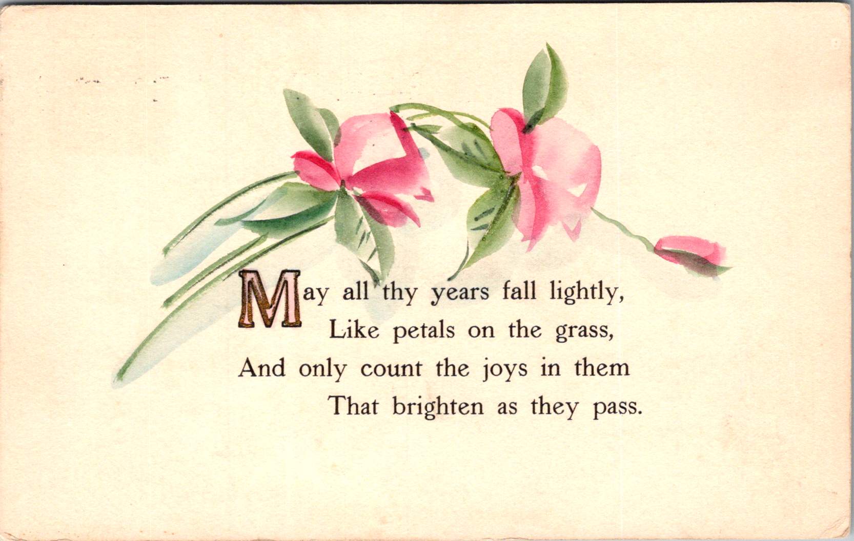
Vintage floral postcards—with golden backgrounds, symbolic flowers, and heartfelt messages—were a sophisticated social currency that connected people across distances.
At the intersection of the Victorian and Edwardian eras, the humble postcard emerged as a powerful medium for small aesthetic pleasures and meaningful social exchange. These postcards tell a story of artistic development and printing innovation, and how ordinary people wove beauty into the fabric of everyday communication.
Delicate Blooms
One card in this selection features pristine white lilies and fern fronds against a luminous gold background. The lilies—rendered in striking detail with their trumpet-shaped blooms and distinctive stamens—create dramatic contrast against the warm gold, the iridescent ink catching light as the recipient tilted the card in their hands. An elegant blessing accompanies the illustration.
“No thorn beset the path you tread, No shadows glance upon your way, But flowers spring beneath your feet, And sunshine crown your every day.”
These cards encapsulate a pivotal moment in design history—the transition from Victorian to Edwardian sensibilities. The Victorian era (1837-1901) embraced ornamentation, sentiment, and symbolic complexity. Every element carried meaning: white lilies represented purity and virtue; ferns symbolized sincerity and shelter; the gold background evoked trust and value. These layers of meaning reflected the Victorian preoccupation with moral improvement through beauty, a philosophy championed by influential figures like John Ruskin and William Morris.
As Queen Victoria’s reign ended and Edward VII took the throne (1901-1910), aesthetic preferences gradually shifted. The new Edwardian sensibility maintained Victorian symbolic richness but introduced more restrained layouts with increased white space and cleaner compositions. This particular card, with its strategic emptiness and focused arrangement, demonstrates this evolution. The gold field creates breathing room that earlier Victorian designs would have filled with additional decorative elements.
The technology behind these gold backgrounds represented industrial innovation. Using metallic powders and varnish printed in the desired pattern, these effects made previously elite decorative elements available to middle-class consumers. During the Industrial Revolution, technical advancements in printing had transformed what was once painstaking handwork into mechanized production. German printers in particular had mastered these techniques, producing cards with exceptional color registration and metallic effects that remained unmatched until their trade was disrupted by World War I.
Other sophisticated production methods like embossing—creating raised areas that added tactile pleasure to the visual experience—required specialized equipment and expertise. Metal dies created by skilled engravers would press the design into the card after printing was complete. The visual effect was enhanced by different dimensions, making these technically perfect cards a testament to industrial craftsmanship.
Gold’s association with luxury stemmed from both its intrinsic properties and historical significance. The aptly named Gilded Age celebrated opulence, with gold becoming a visual shorthand across design disciplines. International Expositions like the 1900 Paris Exposition showcased luxury goods incorporating gold elements, popularizing these aesthetics globally. Archaeological discoveries in Egypt renewed interest in gold in design, while the Ballets Russes featured costume and set designs by artists like Léon Bakst who used vibrant colors and gold accents.
Floral Features
A striking card in the next selection features white and red striped “peppermint” carnations against a gold background. The distinctive white petals dramatically streaked with vibrant red markings create bold visual contrast against the metallic wash. Three perfectly rendered blooms cluster together on dark stems, with bright green sword-like leaves framing the arrangement. The word “Carnations” appears in red script in the upper right corner, identifying the botanical subject with elegant simplicity.
This stark compositional approach—focusing entirely on the botanical subject against a uniform background—represents a more modern, stripped-down aesthetic that emerged in the early 1900s. While maintaining the Victorian fascination with floral symbolism, these designs eliminate extraneous decorative elements in favor of dramatic contrast and botanical precision. This shift toward simplification prefigured design trends that would gain momentum in the following decades, showing how postcard aesthetics tracked broader movements in visual culture.
The symbolism remained rich: striped carnations carried specific meaning in the Victorian language of flowers, often representing regret that a sentiment could not be shared or a refusal/inability to accept someone’s affection. This sophisticated “language of flowers” had become codified in popular Victorian publications like Kate Greenaway’s “Language of Flowers” (1884), ensuring that recipients would understand these botanical messages. The high contrast between the red-streaked white blooms and the gold background created a visual drama that emphasized the emotional complexity carnations represented.
During this period, social practices around correspondence were evolving. The penny post, established in Britain in 1840 and adopted with variations throughout Europe and America, had revolutionized communication by making it affordable across social classes. What was once an expensive privilege became commonplace, leading to a boom in correspondence. The “Golden Age of Postcards” (approximately 1898-1918) coincided with changing postal regulations that allowed privately printed cards and preceded the widespread adoption of telephones. During this period, billions of postcards circulated globally.
Rose to Crimson
The next group of cards represents another technological leap—an early photograph of light pink roses on a background of actual linen. The physical texture of the rough weave contrasts with the delicate subject matter—an open rose and two buds captured a new reality that only photography could provide. This mixed-media approach demonstrates how artists continued to experiment with both visual and tactile experiences.
The Victorian and Edwardian periods witnessed remarkable developments in image reproduction. Traditional chromolithography—where each color required a separate stone or plate—was being supplemented by photographic techniques. These innovations allowed the faithful reproduction of reality rather than artistic interpretation, though both approaches coexisted during this transitional period. The textures and images of this card created an interesting interplay between the natural subject and the material substrate, engaging multiple senses simultaneously.
Rose symbolism operated on a similarly subtle gradient. In Victorian floral language, the exact shade of a rose communicated specific intentions: light pink roses signified admiration and grace—appropriate for relationships in earlier stages or those requiring emotional restraint. Medium pink suggested appreciation, while deeper crimson conveyed self-conscious beauty and passionate love. This color gradient functioned as a sophisticated social shorthand, with increasing saturation indicating increasing emotional intensity.
This coding system proved particularly valuable in an era when direct expressions of emotion were constrained by elaborate social conventions. Etiquette books like those published by Emily Post outlined proper behavior in minute detail, including appropriate subjects for correspondence and proper forms of address. Against this background of social restriction, postcards offered a safe channel for emotional expression. The carefully chosen rose color allowed for communication that could either be acknowledged or tactfully ignored, providing a social safety mechanism for expressing feelings that might be improper to state directly.
For Victorian and Edwardian women especially, whose social freedom was often limited, postcard exchange offered acceptable connection. Young women could receive cards from admirers without compromising propriety, as the public nature of postcards (visible to postal workers and potentially family members) ensured messages remained discreet. This “public privacy” created a unique social space where relationships could develop within accepted boundaries.
Color Craft
The final featured card offers yellow roses against a silver background, that creates a cooler, more modern luminosity. The yellow blooms—rendered with botanical precision—grow naturally on their stems, emphasizing an organic composition that represents changing sensibilities as the Edwardian era progressed toward what would become Art Deco and modernism.
While Victorian design had favored warm, rich gold tones suggestive of historical richness, the newer aesthetic embraced clarity, brightness, and forward-looking optimism. Yellow—the color of sunshine and vitality—symbolized friendship and joy rather than romantic love, expanding the emotional palette of postcard communication.
These changes in design paralleled broader social transformations. The early 20th century witnessed significant shifts in social mobility, women’s roles, and technological adoption. The rise of department stores democratized consumption of decorative goods, while increasing literacy rates expanded the audience for visual and textual communication. The suffragette movement gained momentum, challenging Victorian gender restrictions. These postcards, with their evolving aesthetics, tracked these social changes in material form.
Technology continued advancing as well. The integration of photography with traditional printing techniques created hybrid visual forms. German printers had pioneered many of these innovations before World War I. American and British printers subsequently developed their own techniques.
The social function of these postcards remained central to everyday life. In major cities, postal deliveries occurred multiple times daily—sometimes up to 12 deliveries in London—creating a communication rhythm somewhat like today’s text messages. This frequent exchange helped maintain connections across the increasing distances created by urbanization and industrialization. As families dispersed geographically, these tangible tokens of remembrance became increasingly important.
Recipients collected their postcards in specialized albums that became objects for social sharing in parlors. These albums—elaborately decorated themselves—transformed private communication into a form of social performance. Visitors could be shown new additions, creating occasions for storytelling about relationships and experiences. A well-filled album demonstrated one’s social connections and cultural participation, serving as a physical social network long before digital versions existed.
Simple Beauties
These postcards survive as artifacts of a time when beauty was considered essential rather than superficial. The Victorian belief that exposure to beautiful things could elevate character and promote virtue gave postcard exchange deeper purpose beyond mere communication. They offered sensory richness—tactile embossing, visual color, and the symbolic associations of flowers—that counterbalanced the sometimes harsh realities of industrial urban environments.
Unlike earlier periods when beautiful objects were primarily reserved for the wealthy, mass-produced postcards allowed people across social classes to exchange and possess small works of art. This democratization of aesthetic experience represented a significant shift in how beauty was distributed socially. The contrast between the expense suggested by the gold backgrounds and elaborate printing and the actual affordability of the postcards was part of their appeal—beauty without extravagance, pleasure without guilt.
These simple beauties represent a unique cultural moment when industrial technology enhanced rather than replaced artistic sensibility, when mass production made aesthetic pleasure more accessible rather than less meaningful.
Their legacy invites us to reconsider how we might integrate beauty into our own communication practices. While we have gained immediacy in our digital exchanges, how might we also retain the sensory richness these physical exchanges provided—the anticipation of delivery, the tactile pleasure of holding a beautiful object, the visual delight of color and form, and the knowledge that someone selected this specific image with you in mind.
The Victorian and Edwardian postcard tradition suggests that communication is enhanced, when wrapped in layers of beauty, symbolism, and care—tangible gestures that engage not just the mind but the senses and the heart.
The circle is a shape and a solution. From the sun above to the atoms within, circular patterns hold sacred secrets for ourselves and society.
From the moment our ancestors gathered around campfires beneath the star-studded night sky, humanity has been captivated by circular forms. The sun and moon—those perfect celestial orbs—have guided our understanding of cycles, seasons, and the sacred geometries that shape our world. As our globe tilts and rotates through space, we return to the circle as a fundamental pattern, a shape that speaks to scientific understanding and spiritual intuition.
In nature, the circle demonstrates efficiency and strength. Consider the heliotropic motion of sunflowers, their faces tracking the sun across the sky, their seeds arranged in perfect spiral patterns. Deep within the earth’s core, circular motions generate magnetic fields, while occasional tremors ripple outward in concentric circles. At a microscopic level, the nucleus of each atom forms a dense center of energy, the foundation of nuclear physics and our modern understanding of matter itself.
Concentric Wisdom
Ancient cultures recognized the power of circular design. From the stone circles of Stonehenge to the round houses of indigenous peoples, circular architecture created spaces of communion and protection. These structures weren’t merely aesthetic choices—they were sophisticated responses to environmental forces, creating natural ventilation patterns and distributing structural loads evenly.
The Native American medicine wheel, the Buddhist mandala, and the Celtic spiral all speak to the circle’s role as an energy symbol, representing wholeness, unity, and the cyclical nature of existence, much like a gyroscope maintains stability through rotation.
Circular Scenes
Circular thinking extends to human organizations, too. Consider how people naturally gather in circles: from tribal councils to corporate roundtables, from community drum circles to academic seminar rooms. Social movements often begin with small circles of concerned citizens, expanding outward based on overlapping interests of place and purpose.
Underground music scenes, grassroots political groups, and mutual aid networks typically organize in decentralized circles, creating resilient structures that adapt and grow organically. Even in our digital age, social media platforms mimic circular patterns through circles of friends, spheres of influence, and interconnected networks.
Circles show up in team dynamics as well. Agile practitioners us “scrum circles” for project management, while “quality circles” in manufacturing bring workers together to solve problems collectively. Innovation hubs create intentional “innovation ecosystems” where ideas flow freely between participants who share offices, labs, and studios.
Circular principles also apply to how we organize our economic and social systems. The concept of a circular economy has emerged as a revolutionary approach to addressing environmental conservation. Unlike the traditional “take-make-waste” linear model, circular economics mirrors natural cycles where waste becomes a resource. In this system, products are designed for durability and reuse, materials flow in closed loops, and regenerative practices restore natural capital.
Architects like Frank Lloyd Wright incorporated organic architecture principles that emphasized circular and spiral forms. These structures don’t simply mimic nature; they function in harmony with it.
Civic design includes circular plazas, amphitheaters, and communal spaces that facilitate the natural human tendency to gather in rounds. These spaces often feature concentric circles of activity, from intimate inner gathering spaces to broader outer rings that welcome larger communities. Cities are networks of interconnected circular communities, each with its own center of gravity yet linked in ways that promote both local identity and broader urban cohesion.
Transit Circuits
Some neighborhoods are connected by circular transit systems—light rail loops that mirror (or transgress) the patterns of previous generations. These transportation networks are themselves powered by intricate electronics—microchip circuits that echo the larger orbital patterns they coordinate, ensuring trains run right on time.
The elegance of circular transportation extends beyond mechanized transit. Cities worldwide are rediscovering the bicycle—perhaps humanity’s most successful application of circular geometry to movement. Its wheels, gears, and chain drives demonstrate how nested circular systems amplify human power while minimizing energy loss. Bike-sharing programs create their own circular economies of movement, their docking stations arranged in rings throughout urban cores. These human-scaled transit networks reduce carbon emissions while strengthening community connections.
Digital Circles Take on Real Challenges
Digital platforms are evolving beyond simple virtual meeting rooms into immersive spaces that address pressing social challenges. Virtual and augmented reality technologies allow for mixed-reality circles where local communities can visualize, plan, and implement solutions to social issues in real time. For instance, AR overlays can reveal hidden resources within a community—from unused spaces for urban farming to underutilized buildings that could provide shelter. These technologies enable communities to map food deserts, build on existing distribution networks, and coordinate mutual aid efforts with greater precision than ever before.
The power of these tools lies in their ability to make needs and resources visible to more groups, and in greater visual detail. VR environments allow stakeholders to experience and refine potential solutions before implementation, while AR applications help coordinate real-world action. For example, some cities are experimenting with AR-enabled resource rings that connect those with excess (food, supplies, space) to those with needs and uses through intuitive visual interfaces. These systems help transform abstract social challenges into tangible solutions at the neighborhood level.
What makes these digital circles particularly powerful is their ability to collapse the distance between awareness and action. When a community sees problems and potential solutions mapped in their shared space, it becomes easier to make connections, mobilize resources, and coordinate responses. These tools don’t solve social challenges on their own, but they provide communities with powerful new ways to see, understand, and address local needs through coordinated circular action.
Full Circle Round Again
The circle’s power to unite and connect is perhaps best illustrated in the simple Venn diagram, where overlapping spheres reveal relationships and shared qualities. This mathematical tool reflects a deeper truth: that circles have the unique ability to represent both unity and multiplicity, the one and the many. Whether we look to the perfect geometry of a soap bubble, the ripples from a stone dropped in still water, or the orbits of electrons around their atomic center, we find that circular form and motion are fundamental to the universe’s operation.
As we face global challenges that require holistic thinking and unified action, the circle offers wisdom accumulated over millennia. It reminds us that everything is connected, that endings lead to beginnings, and that the most sustainable solutions often mirror the patterns we find in nature.
In embracing circular thinking and design, we honor both our ancestral wisdom and our future potential. The sky and wind above is a powerful reminder of the warm glow and flow inside. Turning (and churning) teaches us about the true nature of our universe and our place within it. The sacred sun and moon continue their ancient dance across the sky, inviting us to see ourselves as part of this grand design—not just observers of it, but active participants in its unfolding story.
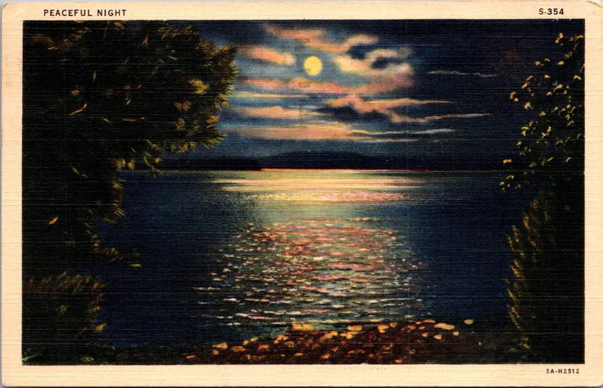
Moonlight dances across rippled water in a vintage postcard titled simply “Peaceful Night.” Nature lovers know that darkness transforms familiar landscapes into the mysterious and musical. The songs of the forest capture more than mere melody – they reveal the soul after sunset.
Lake Burton near Clayton, Georgia, mirrors the full moon in its still waters, surrounded by the dark masses of the mountains. As twilight deepens, the night chorus begins. Whip-poor-wills start their rhythmic chanting, a pulse that famous folklorist Alan Lomax once described as “nature’s metronome.”
In his 1959 field recordings from Georgia, Lomax captured not just the songs of mountain musicians, but also these ambient sounds – the chorus of frogs from the lake’s edge, the distant cry of a great horned owl, the rustling of wind through mountain laurel.
When Lomax made his landmark field recordings in the southern mountains, he often worked at night. The quality of sound was better then – less interference from human activity, and the natural acoustics of the mountains were more pronounced. In his field notes, he frequently commented on how the music emerged from the darkness itself, becoming part of the natural symphony of night sounds.
The ballad singers he recorded often chose songs that reflected this nocturnal environment. “The Night Visiting Song,” common in both Appalachian and Scottish tradition, captured the soundscape of a midnight journey through the mountains. “The False Knight Upon the Road,” with its mysterious midnight encounter, echoed with the very sounds these postcards capture visually – the rustle of wind through trees, the call of night birds, the subtle splash of water against shore.
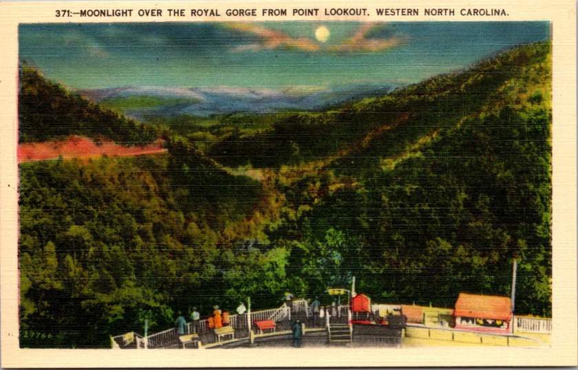
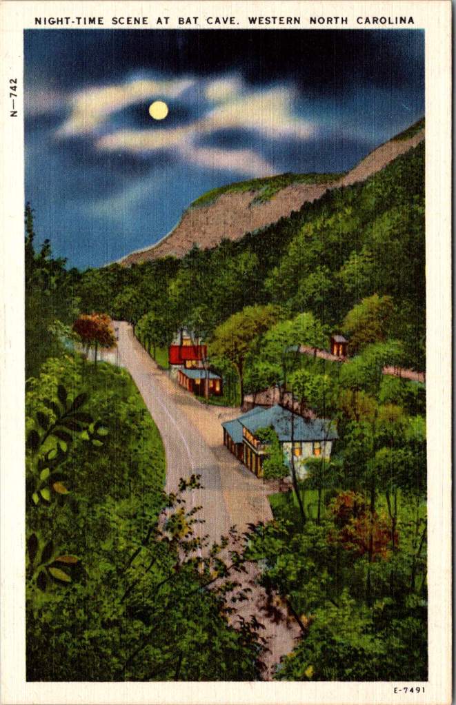
The Royal Gorge in Western North Carolina, from Point Lookout, one can gaze into the shadowed valley below. The mountains themselves seemed to be singing. The acoustic properties of these gorges shaped the development of mountain music – the way certain notes would carry across valleys while others were swallowed by the night air influenced everything from the tuning of instruments to the patterns of call-and-response singing.
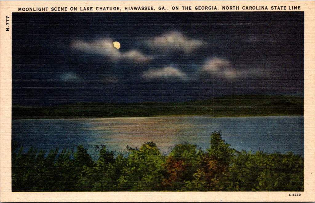
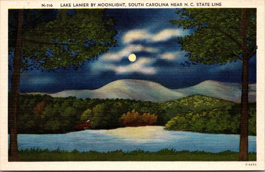
Lake Lanier, straddling the border between South Carolina and North Carolina, appears beneath a cloud-streaked moon. These mountain lakes created their own acoustics, too. Sound carries differently over water at night, when the air has settled and thermal currents have calmed. Mountain musicians knew this intuitively – lake shores became natural amphitheaters for evening gatherings, where ballads could drift across the water unimpeded.
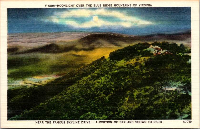
The high mountain lake near Pembroke, Virginia, at 4,000 feet above sea level, reminds us that elevation changes everything – both the quality of light and the character of sound. The thinner air at these altitudes creates distinct acoustic properties. It’s no coincidence that the high lonesome sound of Appalachian singing developed in these elevations, where the night air carries voices in unique ways.
The materials for traditional mountain instruments came from these same moonlit forests. Spruce for fiddle tops was harvested from high mountain slopes, often selected by ear – woodsmen would tap the living tree to judge its resonant qualities. White oak for banjo rims came from trees that had grown slowly in mountain soil, their dense grain providing the perfect material for shaping sound.
The night forest provided not just materials but inspiration for tuning. The modal tunings common in mountain music – often called “sawmill tunings” for the wind-like sound they produced – seemed to match the natural harmonies of the forest at night. A skilled player could make a fiddle sound like a bird call, or craft banjo runs that mimicked the cascade of mountain streams in darkness.
Today, these same landscapes are protected in various ways – as national forests, state parks, or nature preserves. The night sounds that inspired generations of musicians continue, though now sometimes competing with the intrusion of modern noise.
As darkness falls over these mountains tonight, some musician will likely sit on a porch or beside a lake, picking out tunes that have echoed through these valleys for generations. And in those tunes, if we listen carefully, we might hear what Lomax heard. The music of these mountains is inseparable from the chorus of the night forest itself.
Vintage postcards reveal America’s enduring love affair with wild spaces. Through war, depression, and social upheaval, we’ve preserved these sanctuaries of peace.
On an autumn morning in 1935, Eleanor Roosevelt walked alone through the woods at her personal retreat in Hyde Park, New York. The First Lady had just returned from touring poverty-stricken areas in West Virginia, where families struggled to survive the Great Depression.
These morning walks were her ritual for processing the weight of what she witnessed in her tireless work. The woods, she would later write, helped her find the clarity needed to transform empathy into action.
Decades earlier, John Muir had written to a friend. His words would become a rallying cry for the American conservation movement, adorning everything from park posters to backpack patches.
The mountains are calling and I must go.
But what exactly is this call we hear from nature? Why do we feel drawn to preserve wild spaces and to protect them for future generations? And what happens to us when we answer that call?
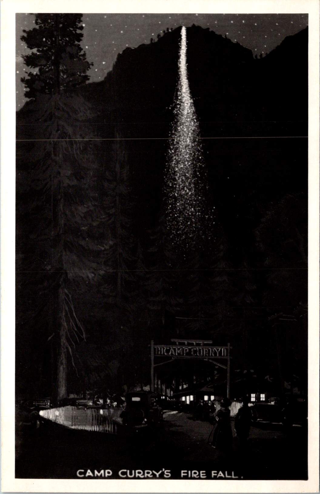
The ephemera spread across my desk capture America’s parks in saturated colors and earnest prose. Welcome to Yosemite and Camp Curry! The hope is that some special part of life is revealed.
These mass-produced mementos tell a story of democratic access to wilderness, of a shared heritage preserved through an unprecedented system of public lands. But they also hint at something deeper – our innate recognition that we need these spaces not just for recreation, but for restoration.
The same wisdom that guided Eleanor Roosevelt to seek solitude among the trees has been confirmed by modern science: nature calms us at a biological level.
Science of Serenity
When we step into a forest, our bodies respond immediately. Cortisol levels drop. Blood pressure decreases. Our parasympathetic nervous system – responsible for rest and recovery – becomes more active.
Even our visual processing changes: natural fractal patterns, like those found in tree branches and leaf veins, require less cognitive effort to process than the sharp angles and straight lines of human-made environments.
Trees release compounds called phytoncides that, when inhaled, enhance immune function and reduce stress hormones. Natural sounds – running water, rustling leaves, bird songs – engage our attention in a way that promotes neural restoration rather than fatigue.
Physiologically, exposure to diverse natural environments even affects our microbiome – the community of microorganisms living in and on our bodies. This microscopic ecosystem influences everything from mood regulation to stress response through the gut-brain axis. In a very literal sense, communion with nature changes who we are.
Preserving Peace
The story of how Americans came to preserve our wild spaces is, in many ways, a story about seeking peace – both personal and collective. The movement gained momentum after the Civil War, as a wounded nation looked westward not just for expansion, but for healing.
Frederick Law Olmsted, who fought depression throughout his life, designed public parks as democratic spaces where people of all classes could find restoration. His work on New York’s Central Park and other urban green spaces was guided by his belief that nature’s tranquility could help ease social tensions and promote civic harmony.
John Muir found his own peace in the Sierra Nevada after wandering the war-torn South as a young man. His passionate advocacy helped establish Yosemite National Park and inspired generations of conservationists.
But it was President Theodore Roosevelt, another seeker of nature’s consolation, who would transform individual inspiration into national policy. Roosevelt’s experience finding solace in the Dakota Territory after the deaths of his wife and mother shaped his approach to conservation. He understood viscerally that wilderness could heal, that it offered something essential to the human spirit.
During his presidency, he protected approximately 230 million acres of public land, establishing 150 national forests, 51 federal bird reservations, four national game preserves, five national parks, and 18 national monuments.
Women in the Woods
While Roosevelt’s dramatic expansion of public lands is well known, the role of women in American conservation deserves greater recognition.
Susan Fenimore Cooper, a student of her famous father, published Rural Hours in 1850 – a detailed natural history that influenced both Thoreau and the early conservation movement. Her careful observations helped Americans see local landscapes as worthy of preservation.
Marjory Stoneman Douglas fought to protect the Florida Everglades when most saw it as a worthless swamp. Her 1947 book The Everglades: River of Grass transformed public understanding of wetland ecosystems. She found that regular communion with nature sustained her through decades of advocacy work.
These leaders shared a practical approach to conservation, focusing on specific, achievable goals while maintaining remarkable equanimity in the face of opposition. Their work suggests that protecting nature and being protected by it can form a reciprocal relationship – the more we preserve wild spaces, the more they preserve something essential in us.
Dark Places
The path to peace often leads through our own shadows. While Americans preserve scenes of spectacular beauty, the relationship between nature and human resilience has been proven most powerfully in places of confinement and struggle. These dark places – prisons, exile, places of oppression – have paradoxically served as crucibles for some of humanity’s deepest insights about peace and connection to nature.
Nelson Mandela’s garden on Robben Island stands as a profound example. In the harsh environment of a maximum security prison, Mandela and his fellow prisoners created a garden in the courtyard where they crushed limestone. In his autobiography, he wrote: “A garden was one of the few things in prison that one could control. To plant a seed, watch it grow, to tend it and then harvest it, offered a simple but enduring satisfaction. The sense of being the custodian of this small patch of earth offered a small taste of freedom.”
This echoes the experience of Albie Sachs, who after surviving an assassination attempt that took his arm and the sight in one eye, found healing partly through his connection to the natural world. During his recovery, watching the ocean’s rhythms helped him develop the concept of his later book – Soft Vengeance – achieving justice through law rather than violence.
Martin Luther King Jr. often drew on natural imagery to maintain his equilibrium and express his vision during frequent detainment. From the Birmingham Jail, he wrote of the majestic heights of justice and used metaphors of storms and seasons to describe the civil rights struggle. His deep understanding of peace was shaped not just by moments of tranquility in nature, but by finding inner calm in places of confinement.
The Dalai Lama often speaks of how the Himalayas’ steady presence influenced Tibetan approaches to maintaining calm, even through decades of exile.
These experiences remind us that while we focus on America’s preserved wilderness spaces, the human need for connection to nature is universal. Peace is an American pursuit and a global birthright. When we protect natural spaces, we’re participating in something that transcends national boundaries – the preservation of humanity’s common sanctuary.
Paths to Peace
The leaders who shaped American conservation found different routes to and through nature. John Muir sought transcendent experiences, climbing trees in storms and walking thousands of miles in solitude. Gifford Pinchot, first chief of the U.S. Forest Service, took a more systematic approach, seeking balance between preservation and sustainable use. Rachel Carson combined meticulous scientific observation with poetic sensitivity to nature’s rhythms.
Their examples suggest there is no right way to find peace in nature. Some need solitude and silence. Others seek the raw tests of strengths and capacity, and find restoration in active engagement with the natural world. Some seek dramatic landscapes to ponder in awe, others find sufficient wonder in a city park or backyard garden.
Wild Wisdom
Ralph Waldo Emerson wrote in his essay on Nature, “…in the woods, we return to reason and faith.” His words point to something profound about nature’s effect on human consciousness – how it seems to restore us not just to calm, but to our truest selves.
Modern research into nature’s calming effects – the lowered cortisol, the enhanced immune function, the restored attention – helps explain the mechanisms behind what people have long intuited. For those who find great equanimity through connection with nature, there also seems to be an innate genius in each of us that emerges more fully in wild spaces.
We might experience this as artistic, spiritual, or intellectual – and perhaps even more fundamental – a capacity for presence, for wonder, for sensing our connection to something larger than ourselves. It’s what Eleanor Roosevelt accessed on her morning walks, what John Muir celebrated in his rhapsodic nature writing, what Jane Goodall tapped into during her patient observations of primates in Gombe.
The preservation of wild spaces represents more than conservation of natural resources or recreational opportunities. It preserves access to this deeper part of ourselves – the part that knows how to find peace, that remembers how to wonder, that recognizes our belonging in the larger community of life.
These vintage postcards capture more than just scenic views. They record moments when people felt called to share their experience of wonder, to say to friends and family that the experience mattered. The fact that we’ve preserved and share these places, despite constant pressure to exploit them, suggests we recognize they offer something essential to human flourishing.
Why the woods? Because something in us comes alive there. Because in preserving wild spaces, we preserve the possibility of encountering our own wild wisdom, and these revelations are too precious not to protect for future generations.
Each time we step into nature – whether it’s a national park or a neighborhood green space – we participate in this legacy of preservation. We join a long line of people who recognized that human flourishing depends on maintaining connection to places where we might find peace and that help us face whatever challenges await when we return.