In the photograph we are looking at today, the Moana Hotel rises like a palace from Waikiki Beach, its elegant wings stretching toward Diamond Head. A wooden pier extends into the Pacific. The building’s Victorian details hint at mainland American grandeur transplanted to the tropics. The “First Lady of Waikiki” opened as the territory’s first luxury resort, transforming a landscape once dotted with taro ponds and royal summer homes into the birthplace of Pacific tourism.
Built by wealthy landowner Walter Chamberlain Peacock and designed by architect Oliver G. Traphagen, the Moana opened on March 11, 1901, with 75 rooms featuring Hawaii’s first electric elevator and the unique amenity of private bathrooms. The first guests were a group of Shriners, who paid $1.50 per night—about $50 today—to experience what was then a very remote luxury destination.
Three years later, Jared Smith, Director of the Department of Agriculture Experiment Station, planted what seemed like a simple landscaping choice in the hotel’s courtyard: a young Indian banyan tree, nearly seven feet tall and about seven years old when planted. In the image, the tree is seventeen years old and already creating the shaded sanctuary that is the hotel’s heart even today.
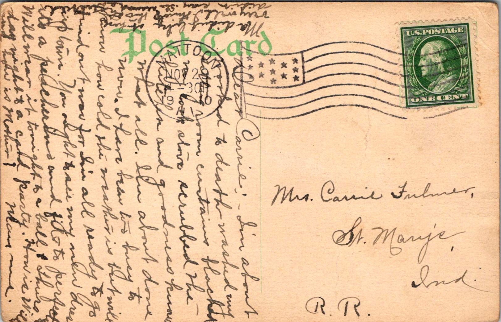
As we flip the postcard over, another dimension is revealed. On November 29, 1921, a simple message sent to Mabel Moss in Longanoxie, Kansas with the usual greetings. But this isn’t a holiday for Aunt Olive. Her return address, “Route 4 – Box 46,” tells its own story of how communities were connecting between ancient and modern, sacred and commercial.

A Mormon Pioneer’s Island Home
Aunt Olive likely lived in Laie, thirty-five miles north of the Moana Hotel, where the Mormon Church had established its Pacific sanctuary. Her Route 4 address would have been served by one of the Rural Free Delivery routes radiating out from Honolulu—a detail that places her among the settlers who were building new communities beyond the city’s tourist corridor.
The Mormon settlement at Laie represented a unique form of cultural encounter. Beginning in 1865, when Church president Brigham Young received permission from King Kamehameha V to establish an agricultural colony, the Latter-Day Saints purchased 6,000 acres of traditional land—a pie-shaped division that provided for sustainable living. The Mormon community tried to honor Hawaiian land practices, giving each family a loi (water garden) to cultivate kalo (taro), the traditional sustenance crop.
The Hawaii Temple, dedicated in 1919, was the first Mormon temple outside continental North America. Built with crushed local lava and coral, its structure embodied the meeting of mainland pioneer culture and Pacific Island materials. Polynesian Saints from across the Pacific were gathering in Laie to receive temple ordinances, creating a multicultural religious community where Hawaiian, Samoan, Maori, and haole (white) families lived side by side.
The LDS approach to missionary work emphasizes learning local languages and customs—not merely as conversion strategy, but as theological principle. One of the early missionaries mastered Hawaiian so thoroughly that he produced the first non-English translation of the Book of Mormon in 1855. The missionaries married into Hawaiian families, adopted local foods and farming methods, and incorporated Polynesian cultural elements into their worship. Even as they openly sought converts, they also saw themselves as students of Hawaiian wisdom.


Paradise Shared
Captured in our image are at least a few conflicting visions of paradise. The Moana Hotel itself represents economic prosperity through the commodification of tropical beauty. Its guests paid premium rates to experience “the ultimate playground,” complete with hula shows and exotic imagery designed for mainland consumption. By the time of this photo, the hotel’s success had already inspired expansion; wings added in 1918 doubled its capacity.
However, the hotel was built where Hawaiian royalty had once gathered, in a place that embodied the Native Hawaiian principles, very different than Western concepts of land as commodity, beauty as product, and culture as entertainment. Look again at the Banyan tree. Where tourists saw scenery, Native Hawaiians understood kino lau—the gods manifested in every plant, animal, and natural feature. But, Hawaiian language had been banned in schools since 1896, and traditional practices were actively discouraged as territorial authorities promoted “Americanization.”
The Mormon community at Laie offered a third way that, despite its evangelical aims, required genuine cultural engagement. Unlike tourists who consumed Hawaiian imagery, or territorial officials who suppressed Hawaiian practices, Mormon missionaries made learning local ways a theological priority. They understood that successful evangelism required fluency not just in Hawaiian language, but in Hawaiian concepts of kinship, land, and spirituality.
This approach created communities that were simultaneously foreign settlements and island adaptations—places where pioneer traditions mixed with Polynesian extended family structures, where American church hymns were sung in native dialects, and where temple architecture incorporated local materials and building techniques.
Time Travel
The tensions that were at work in 1921 continue today, but so do the possibilities for meaningful cultural exchange. Today’s mālama Hawaii movement invites travelers to participate in coral restoration, native forest planting, and beach cleanups. Visitors can learn about places like Waimea Valley, where ancient cultural sites are preserved alongside environmental restoration. The principle of pono—righteous action—guides travelers to maintain respectful distances from endangered monk seals and sea turtles, to support Native Hawaiian-owned businesses, and to understand that they are guests in a living culture, not a theme park.
The island time we seek now isn’t the vacation fantasy of escape from responsibility, but the deeper rhythm of understanding our place within larger cycles of care and connection. When we travel with curiosity rather than conquest, we discover that the most valuable treasures are the stories and perspectives we gather. Over time, we come to know that every place on Earth is someone’s sacred ground.
In Hawaiian tradition, banyan trees serve as gathering places for spirits, bridges between the physical and spiritual worlds. Perhaps this ancient wisdom explains why the Moana Hotel’s banyan courtyard remains a place of peace amid Waikiki’s transformation—a living reminder that some forms of growth honor rather than diminish what came before.
To Read More
- Moana Hotel History – Historic Hotels of America
- The Mormon Mission – Images of Old Hawaiʻi
- ʻĀinahau Estate – Images of Old Hawaiʻi
- Aloha ‘Āina: Love of the Land – The Trust for Public Land
- Hawaiian Values: Aloha ʻĀina – U.S. National Park Service
- Understanding Ahupuaʻa: Ancient Hawaiian Land Management
- Malama Hawaii – Go Hawaii
- Native Hawaiian Hospitality Association
- Protected Species – Go Hawaii
- Rural Free Delivery – About USPS