Science says gazing at adorable kitten pics can boost your mental health. But you don’t really need a reason, do you?
Life is tough. Bills pile up, deadlines loom, and some days it feels like the world is on fire. That’s precisely when we need something small, fuzzy, and adorable to remind us that not everything is terrible. First choice? Kitten photos, the internet’s gift to humanity’s collective mental health.
When the news cycle feels like a never-ending disaster movie, there’s something healing about a tiny fluffball curled up in a teacup or peering curiously from behind a houseplant. These miniature pouncers, with their disproportionate paws and earnest expressions, serve as nature’s meditation.
Scientific studies suggest that viewing cute animal content can improve focus, boost mood, and temporarily reduce anxiety. It’s a mental health break in fuzzy form—no prescription needed. Even better, we sent kitten postcards to each other long before the digital age. Proof that science is just catching up.
Cute kittens provide a guilt-free excuse to pause, smile, and recall that life’s greatest joys come in small packages. They remind us that it’s okay to be happy, and to hide toys in the couch.
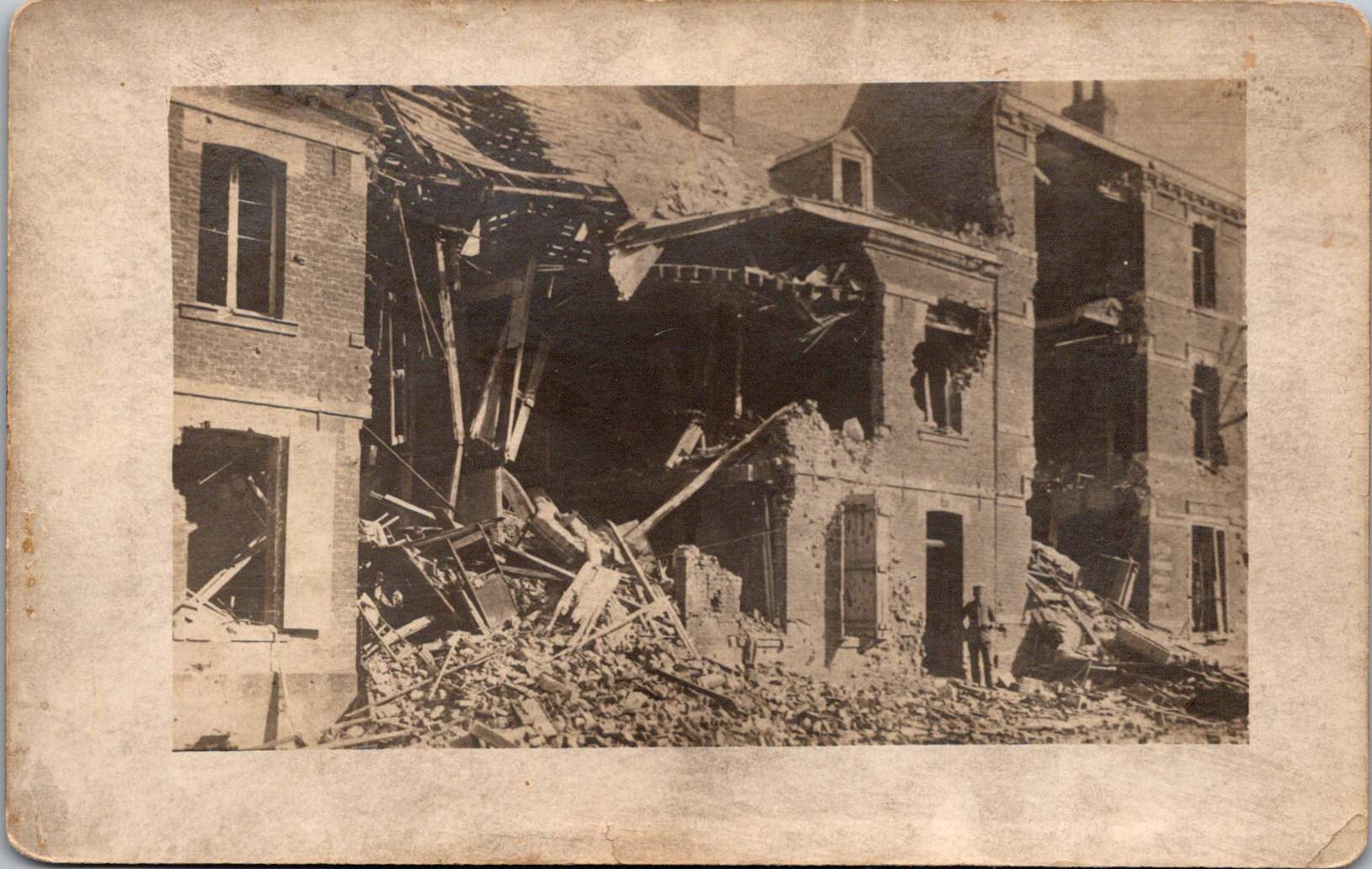
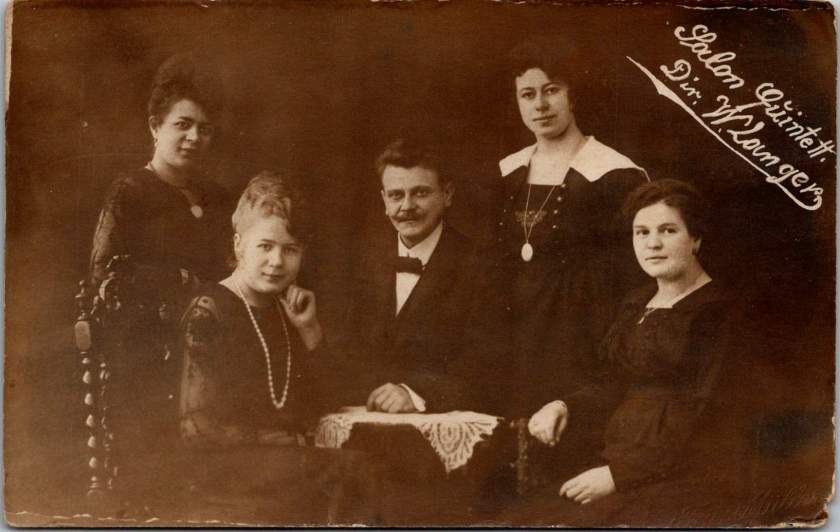
A wooden cross rises from churned earth, the inscription stark against weathered wood. A familiar image of a striking handmade monument to the son of a president who fell from the sky over France.
This photograph, captured by a U.S. Signal Corps photographer known only by the initials P.E.L., embodies the US vision of the first World War carefully curated by military officials. While this image evokes sacrifice, honor, and patriotism, the ones that follow emphasize air power and the ground fight.
The Signal Corps photographers worked with clear directives. Their images showcased military capacity and impact: a German observation balloon in flames over Verdun, captured enemy aircraft, and troops dug into the battlefield. These photos celebrated American military achievements while maintaining a safe emotional distance from war’s realities. They framed the conflict as a grand, heroic endeavor of machines and strategy, and no bodies.
Soldier photography told different stories.
World War I marked a pivotal shift in war photography. The conflict erupted during the democratization of the camera, when Kodak’s marketing promise—You press the button, we do the rest—had placed photography in ordinary hands. For the first time, soldiers carried their own cameras to the front. They documented their experiences without oversight, censorship, or propaganda objectives.
The images captured by troops and printed later at studios like Renfro & Jensen in Belmont, Arkansas reveal a more intimate perspective—the human cost of conflict. German officers’ quarters reduced to rubble by American artillery. The harsh conditions of a foxhole or a machine gun post.
These images weren’t composed for newspaper spreads or government reports. They were personal souvenirs, visual evidence of experiences too enormous to capture in words alone. They were captured on a new-fangled camera and carried home as silent witness.
Belmont, Arkansas transformed virtually overnight in 1917 from a quiet rural community into a bustling military training center. Soldiers flooded the region, bringing with them not just their uniforms and rifles, but their cameras. The town experienced a true boomtown effect as businesses sprang up to serve the influx of military personnel. Among these enterprises, the Renfro & Jensen photography studio established itself as a crucial link between soldiers’ experiences and their communication home.
Then, as demobilization began in 1918, returning soldiers sought ways to share or quietly remember what they had witnessed. Renfro & Jensen became unwitting archivists. They must have developed and printed thousands of soldier photographs—images far more frank and direct than anything appearing in newspapers or government publications. The studio workers were likely among the first civilians to confront warfare through this new technology. Each day, they processed images showing destruction, military achievements, and occasionally, the graphic aftermath of combat. Their commercial service inadvertently preserved a crucial alternative visual history of the conflict.
Two European-produced photographic postcards further document the war. These images, printed on distinctive European paper stock, emerged from a continent already numbed by years of destruction.
Another sixteen images — the most harrowing in the collection — can’t be shown here. The ethical boundaries of war photography persist today. What images should be shielded from casual viewing, and which realities deserve documentation regardless of their power to disturb?
Major institutional collections house millions of WWI photographs. The National Archives holds the largest repository of World War I material in the United States, with over 110,000 photographs digitized from two primary series: the American Unofficial Collection of World War I Photographs and the Photographs of American Military Activities. The Library of Congress maintains extensive collections, including the American National Red Cross Collection with over 18,000 digitized negatives showing wartime activities.
Beyond these institutional repositories exists a vibrant world of private collectors who often hold the most provocative and unfiltered images. These private collections sometimes reveal perspectives absent from official archives. Photographer Carl De Keyzer discovered approximately 10,000 archival glass plate and celluloid negatives from WWI scattered across Europe, many in private hands. From these, he selected 100 to reproduce in stunning detail, revealing aspects of the conflict previously unseen in such clarity. Some of the most compelling battlefield imagery exists in small personal collections—albums like this one that have been kept by families of veterans, passed down through generations, their contents rarely exhibited publicly.
The grave of Lieutenant Quentin Roosevelt is quite enough for many. It symbolizes loss while sparing us its visceral reality. But the full photographic record of the conflict includes truly heinous realities—corpses tangled in barbed wire, faces distorted by gas, bodies rendered unrecognizable by artillery.
While official photographers were tasked to frame narratives that supported war efforts, some soldier photographers refused to turn a blind eye. They captured what they witnessed, creating very personal views that continues to challenge our understanding of history. Their lenses documented what words alone could never convey—the irredeemable human cost of modern warfare.
When I connected with European researchers writing a book on the married Swedish/German photographers, Lindstedt and Zimmermann, we discovered that last week’s trove of real photo postcards is quite rare. Even better, we found more.
New Discoveries from a Lost Archive
Last week’s essay examined the American occupation of Coblenz, a unique period of military history, through the photographic lens of Lindstedt & Zimmermann. The Lindstedt & Zimmermann studio was destroyed during Allied bombing in World War II, decimating their archive and rendering the surviving examples of their work as uncommon historical artifacts.
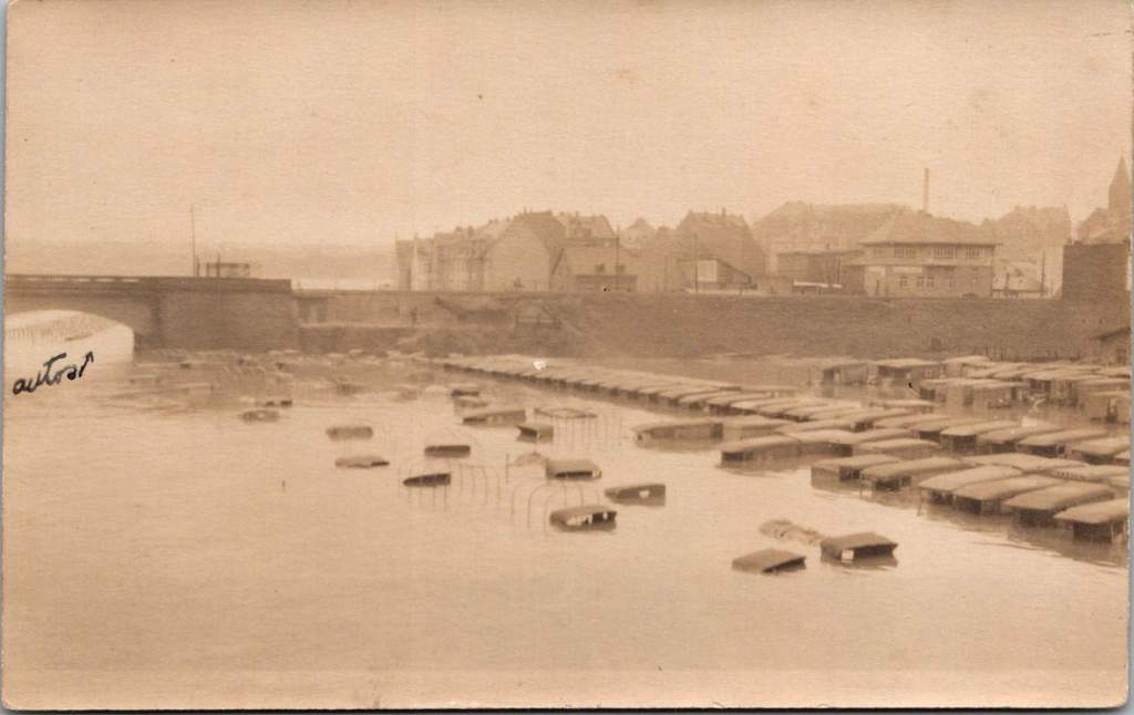
The exchange with the research team prompted another search through our postcard collection resulting in the discovery of 25 additional images. Most can be attributed to Lindstedt & Zimmermann based on stylistic elements, materials and subject matter. Some bear the mark of other photographers including Paul Stein, another Coblenz studio. Ten photographs document the catastrophic flood of the Rhine in January 1920 – images that likely haven’t been seen in a century.
The Great Flood of January 1920
The January 1920 flood represented one of the most significant natural disasters to impact the American occupation forces during their tenure in Germany. The handwritten note on one postcard reveals both the severity of the flood and its impact on the American presence. This mixed German-English description captures the cross-cultural nature of the occupation.
“Der Rhein hat über its banks geflowed und Uncle Sam’s autos gdamaged. The river is the highest in over a hundred years, almost beyond my memory!”
The photographs show numerous small boats navigating the water and automobiles partially submerged in floodwaters, with bridges and buildings visible in the background. These images provide rare documentation of a significant environmental event that temporarily disrupted occupation activities and required adaptation by both American forces and local residents.
Harlem Hellfighters
This very rare view shows what appears to be members of an African American regimental band with their instruments at Romagne, France. Black men served in segregated units during World War I, with regiments such as the 369th Infantry (the “Harlem Hellfighters”) earning recognition for their service. Their regimental bands played an important cultural role, introducing European audiences to American jazz and ragtime music. These musical ambassadors created cultural connections that transcended the military context of their presence. The inclusion of this photograph adds an important dimension to our understanding of the American military presence in post-war Europe, highlighting the contributions of African American servicemen whose stories have been marginalized in historical accounts.
YMCA Women
The expanded collection also includes two formal portraits of women in YMCA uniform, complete with the organization’s distinctive triangular insignia on hat and lapel. Sometimes called Y girls, female YMCA workers provided essential services for American soldiers stationed far from home. They operated canteens, organized recreational activities, offered educational programs, and provided a connection to American civilian life that helped maintain morale during the occupation period.
The YMCA was among the few organizations that deployed American women to work directly with troops overseas during this era. These women volunteers typically came from educated, middle or upper-class backgrounds and represented an early example of American women engaging in international service work. Their presence added a civilian dimension to the occupation and helped create environments where American soldiers could productively spend their off-duty hours.
Military Pageantry and Daily Operations
One striking photograph shows the 76th Field Artillery Regiment arranged in a “living insignia” formation, with soldiers positioned to create the unit’s distinctive diagonal striped insignia, surrounded by artillery pieces. This type of military display was meant to demonstrate American capacity while building unit cohesion and pride, and perhaps avert a little boredom.
In contrast to these ceremonial arrangements, other photographs document the practical transportation and logistical elements that supported daily operations. An image of a young driver with his heavy-duty truck along what appears to be the Rhine riverbank represents the essential supply operations that maintained the American presence. The vehicle’s utilitarian design with solid rubber tires, wooden spoke wheels, and large cargo bed illustrates the practical equipment used to transport supplies, equipment, and personnel throughout the occupation zone.
French Military Presence
The next image shows a group portrait of four French soldiers in their distinctive uniforms. Easily identified by their characteristic “Adrian” helmets with the prominent crest ridge along the top and the horizon blue (bleu horizon) uniform that became emblematic of French forces during World War I, these men represent the broader Allied presence in post-war Germany.
France maintained the largest occupation zone in the Rhineland, reflecting their particular security concerns regarding Germany. French forces occupied territories including Mainz, while American forces centered on Coblenz and British forces on Cologne. Later, French forces took over the Coblenz occupation.
The portrait format was typical of military mementos during this era, allowing soldiers to document their service and send images to family members. The survival of any images at all is due to this distribution by soldiers to their home countries.
Beyond Coblenz
Not all images in the collection were taken in Coblenz itself. One photograph shows American personnel in a touring car filled with passengers in what may be the French Riviera, identifiable by its distinctive palm trees and Mediterranean architecture. Dating to 1921-1923 based on the automobile’s style, this photograph represents the recreational opportunities available to some American personnel during leave periods from their occupation duties.
Europe allowed for cultural and recreational experiences that would have been impossible for most Americans of this era. For many young Americans serving in the occupation forces, this European assignment represented their first—and perhaps only—opportunity to experience the wider world beyond their home communities.
Visual Legacies
The survival of these photographs, particularly those documenting the 1920 flood, represents a remarkable preservation of visual history that might otherwise have been lost entirely. With the bombing of the Lindstedt & Zimmermann studio during World War II, the unique nature of real photo postcards, and the general fragility of materials from this era, each surviving image offers a rare window into this formative period in world relations.
Karl and Änne Zimmermann’s work, along with that of contemporaries like Paul Stein, provides an invaluable visual chronicle of the first American occupation of European territory—a precedent for the much larger American military presence that would emerge in Europe after World War II. Their photographs capture not just military operations and formal events but the daily reality of cross-cultural interaction between Americans, French, and Germans during this unique historical moment and place.
Copper maps. Wooden cards. Puzzle prints. Discover how obsolete technologies transform into art and craft, and explore why we can’t stop reinventing the perfect postcard.
In this age of instant digital communication, the persistence of physical postcards presents an intriguing contradiction. These rectangular pieces of cardstock—designed to carry both image and correspondence through postal systems without an envelope—serve as artifacts of a communication method that had its heyday a century ago. But rather than disappear entirely, postcards have evolved in novel ways that tell us even more about who we are.
Why We Seek the New
Humans have always been drawn to novelty. Our brains light up at the unfamiliar—it’s a survival mechanism that once helped our ancestors notice changes in their environment that might signal danger or opportunity. But our relationship with novelty runs deeper than vigilance. We seek out new experiences, objects, and sensations even when no practical threat or benefit is apparent.
This human attraction to novelty serves several purposes. First, it provides simple pleasure—the dopamine release that accompanies discovery keeps us engaged with our surroundings. Second, it helps us learn and adapt—new situations force us to develop new skills. Third, it offers social currency—being the first to discover, own, or report something novel (even if untrue!) gives us a kind of status within our communities.
Perhaps most fundamentally, novelty helps us fight against the deadening effect of habituation. We become blind to what remains constant around us, a psychological phenomenon called “sensory adaptation.” Think of how you stop noticing a persistent background sound, like traffic noise. Novelty jolts us back into conscious appreciation, like noticing the birdsong instead, making us sense the familiar differently.
With mass-produced consumer goods, we often pursue novelty through customization or unique variants—like these postcard alternatives. They satisfy our craving for something special while maintaining connection to recognizable forms. Even novelty doesn’t stray too far from the familiar.
Technology Becomes Art
As technologies age and are replaced by more efficient methods, something interesting happens—the displaced technology often shifts from the realm of utility to the realm of artistry and craft. What was once valued primarily for function becomes appreciated for form, precision, and the visible human touch.
Letterpress printing was an extraordinary innovation of its time and once the standard for all printed matter. It was largely replaced by offset printing in the 20th century and later the digital methods we use today. But rather than disappearing, letterpress evolved into a premium craft, prized for its tactile quality and visible impression on paper—characteristics that were originally just side effects of the technique, not its intended purpose.
The same transformation happens with many technologies: vinyl records, film photography, mechanical watches. As digital alternatives take over the functional role, the analog predecessors become vessels for history, craftsmanship, ritual, tactile pleasure. They move from being tools to being experiences.
This pattern helps explain our collection of novelty postcards. Somewhere in the middle of last century, the standard paper postcard was functionally superseded by digital communication, freeing it to evolve into these more elaborate, less practical forms. They represent a technology in its artistic phase—no longer bound by strict utility, but free to explore expressive and sensory possibilities, along with kitsch and commercialism.
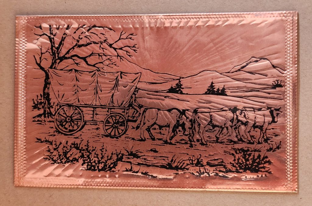
Utah in Copper Relief
The copper-embossed Utah souvenir represents one of the more elaborate departures from traditional postcard design. The metallic rectangular plate features a raised topographic outline of the state with embossed illustrations of regional landmarks and attractions. The word UTAH is prominently displayed at the top, while places like Vernal, Provo, Cedar City, and St. George are labeled at their approximate locations. The copper medium gives the piece warmth, with a decorative scalloped border framing the state’s geography and securing the paper card below.
The manufacturing process likely involved die-stamping or embossing thin copper sheeting, a technique that dates back to the late 19th century and regained popularity in mid-20th century souvenirs. The tactile nature of the raised elements invites touch, creating a multisensory experience unavailable in traditional flat postcards. The utility of this object as actual correspondence is significantly diminished—the copper surface resists easy writing, and its weight requires additional postage and hand-canceling. It’s more a miniature commemorative plaque that happens to maintain postcard dimensions.
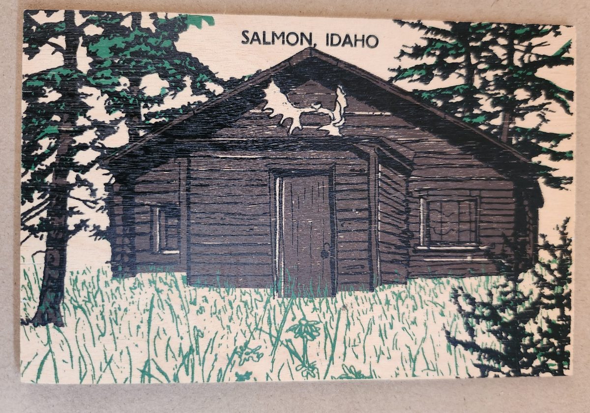
Woodsy Aesthetics
Let’s look closer now at a novelty postcard featuring a cabin in Salmon, Idaho, printed onto a thin wooden substrate and depicting a rustic cabin nestled among stylized pine trees. The scene employs a limited color palette—brown and black for the structure and green for the surrounding vegetation—lending it a deliberately simple aesthetic that echoes both woodcut prints and traditional lithography.
The simple text at the top identifies the location without intruding on the scene. The artwork itself employs minimal detail, capturing the essence of rural life rather than photographic accuracy. The manufacturing process of printing onto thin wood veneer allows for mass production, while adding a specific scene, location name, and ink color for customization.
This card’s rustic medium and subject matter work in harmony, creating a self-referential object where the material reinforces the message—a wooden card depicting a wooden structure set within a forested landscape. The medium becomes part of the message, suggesting authenticity through material consistency. Though mass-produced, it strongly evokes a rural sensibility.
Framed Vistas
Our souvenir from Yellowstone National Park adopts yet another approach. This card features a stylized illustration of Yellowstone’s grand canyon and waterfall printed on cardstock and mounted on a wooden backing.
The artwork employs a palette of oranges, purples, blues, and whites to capture the dramatic landscape, with the falls rendered as a white vertical streak against colorful canyon walls. Dark silhouettes of pine trees frame the scene, while puffy clouds hover in a light blue sky, held inside a purple border. The stylized typography echoes vintage travel posters from the early to mid-20th century. The entire image is mounted or printed on a natural wood base, visible as a frame around the illustration.
This card’s production combines offset printing with a wooden substrate—a look that recalls both traditional woodblock prints and mid-century travel advertisements. The design deliberately evokes an era of American national park tourism when artistic posters commissioned by the Works Progress Administration and the National Park Service established a distinctive aesthetic for natural landmarks.
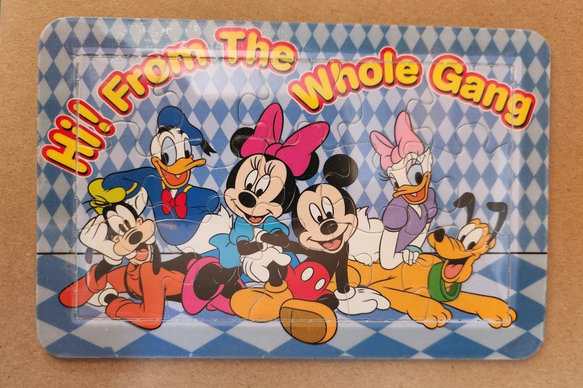
Playful Puzzles
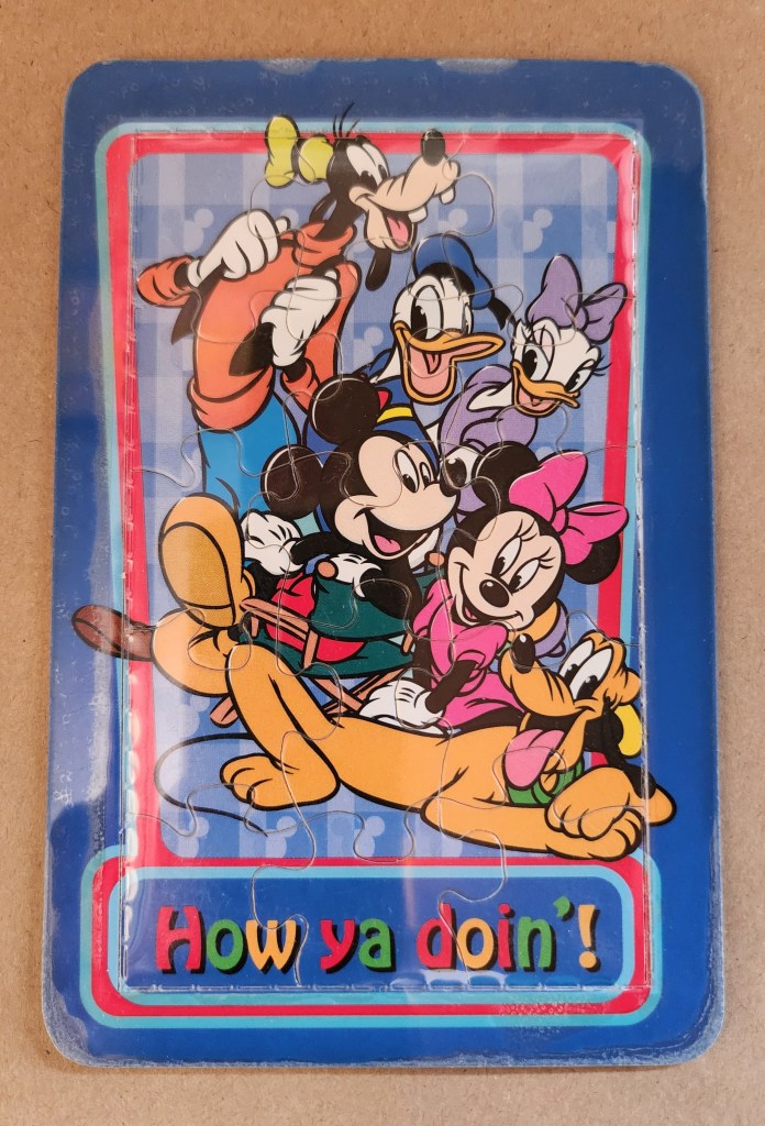
The Disney puzzle postcard introduces an element of interaction we haven’t seen before. This card features Mickey Mouse, Minnie Mouse, Donald Duck, Daisy Duck, Pluto, and Goofy arranged in a group pose against a blue-and-white checkered background. The message reading “Hi From The Whole Gang” in bubble text curves around the edge of the image.
This item turns a postcard into a simple jigsaw puzzle—die-cut pieces that can be jumbled and reassembled to reveal the printed image. The manufacturing process involved full-color printing followed by precision die-cutting to create interlocking puzzle pieces, then applying a thin adhesive film to maintaining the card’s overall integrity for mailing.
This souvenir represents a curious hybrid—a postcard that actively invites its own disassembly. The Disney characters themselves represent another layer of nostalgia, combining America’s animation icons with the traditional postcard format to create an object that references multiple forms of 20th-century popular culture simultaneously. But only modern technology could accomplish these manufacturing details, a playful combination of familiar and fresh.
Magnetic Memories
The Will’s Hardy Trees and Seeds magnetic card is the one in our set with the most layers of both meaning and making. See packets, postcards, fridge magnets, and agricultural Americana all combine in this take home treasure.
The 1909 seed catalog cover is a contemporary image inspired by the real-life Oscar H. Will & Co. of Bismarck, North Dakota. The vibrant illustration displays pansies in various colors—purple, yellow, orange, pink, and white—arranged in a bouquet. Text identifies the company’s 26th year of operation and describes their products as the “choicest and most beautiful on earth”.
A small purple circle overlay on the plastic film cover announces the item’s true nature: a magnetic postcard to send as a gift. Despite its historical appearance and postcard dimensions, the object is actually a refrigerator magnet that merely references seed catalog and postcard aesthetics. The production involved digital printing on magnetic sheet material, applying a printed paper backing, and slipping into a plastic cover with instructions to mail the gift in an envelope.
As a novelty item, it reveals a peculiar circularity. A reproduction of a commercial artifact (seed catalog) transformed into a correspondence medium (postcard) further transformed into a decorative household item (refrigerator magnet). Somehow, we love each iteration all the more.
Nostalgia Squared
What these examples share is a relationship with nostalgia that operates on multiple levels. They aren’t simply nostalgic; they engage in a looping nostalgia—nostalgic representations of already nostalgic forms.
The copper Utah relief draws upon mid-century tourist souvenirs, themselves designed to evoke frontier-era maps and territorial markers. The Salmon cabin employs modern production techniques to simulate traditional woodcuts nad print, which were themselves often romanticized depictions of rural life. The Yellowstone cards references mid-century national park posters that were already stylized interpretations of natural wonders. The Disney puzzle incorporates cartoon characters who have become nostalgic cultural icons, presented in the format of childhood games. The Will’s Seeds magnet reproduces early 20th-century commercial art that was, even in its original context, employing Victorian aesthetic sensibilities.
This layering of reference creates objects that are remarkably dense with cultural signifiers despite their modest physical dimensions. They offer not just a connection to place and time but to the ways we’ve represented ourselves and our interests through commercial souvenirs.
Our apparent need for novelty, then, might be better understood as a need for continual context. Each new postcard iteration doesn’t merely replace what came before; it absorbs and references it, creating objects that function as compact archives of our evolving relationship with the characters and places we cherish.
These novelty postcards sit at an interesting crossroads of commerce, craft, and communication. They represent what happens when a formerly utilitarian object—the humble postcard—is freed from its purely practical obligations and allowed to evolve along lines dictated by sentiment, aesthetics, and novelty.
In a world increasingly dominated by digital experiences, these physical novelties offer something screens cannot—texture, weight, presence. They satisfy our hunger for the tangible. Their quirky, sometimes impractical forms speak to a human need more fundamental than efficient communication: the need to hold something unique in our hands, and to feel a physical connection to places we’ve been and experiences we’ve had.
The postcard itself is and was a very simple concept and object that, over time, has become a medium for ongoing conversations about permanence and impermanence, about what we value over time, and about the tension between utility and sentiment. In their various novel forms, these more-than-postcards tell us about places we’ve been and how we’ve chosen to remember and delight in those places—a correspondence not just between people, but between past and present.
From the verdant hues of the rainforest to the toxic green pigments adorning Victorian wallpaper, green embodies our most profound contradictions. This single color represents both life and decay, wealth and envy, nature and artifice.
In the Amazon rainforest, vegetation thrives in countless green hues, symbolizing life’s abundance. Yet in Western art, sickly green often signifies death and corruption. How can one color embody such opposed concepts? This tension—between green as vitality and green as decay—forms the central paradox in humanity’s relationship with this enigmatic tertiary hue.
Green occupies a unique position in our visual lexicon. It bridges the cool tranquility of blue and the energetic warmth of yellow. This intermediate status perhaps explains its dual nature—a color of balance that simultaneously contains opposing forces.
Toxic Chemistry: From Wallpaper to Printer’s Ink
The story of green pigment drips with poison. For centuries, the most vibrant greens came from copper arsenite, creating infamous “Paris Green” that adorned Victorian wallpapers and allegedly contributed to Napoleon’s death through arsenic poisoning. Scheele’s Green, developed in the late 18th century, released deadly arsenic gas when dampened. Victorian walls literally “breathed” death through their verdant decorations.
This toxic history highlights a contradiction: the color most associated with natural life proved historically among the most unnatural and deadly to produce. Nineteenth century painters risked chronic arsenic poisoning for the perfect emerald tone.
Printing technology reveals another dimension of green’s complex nature. Traditional lithography treated green as a distinct entity. Master printers blended pigments to create precise green tones before applying them to printing stones. Toulouse-Lautrec’s lithographic posters featured carefully formulated green inks to capture the absinthe-tinged atmosphere of Parisian nightlife.
Modern CMYK printing creates green through optical mixing instead. Green isn’t a primary ink but emerges from combining yellow and cyan dots in precise patterns. This technique echoes Neo-Impressionist pointillism, where artists like Seurat placed distinct color dots side by side, allowing viewers’ eyes to blend them into a third color. A magazine’s solid green leaf reveals itself as an array of cyan and yellow dots under magnification.
This absence-made-present quality of green in modern printing mirrors its philosophical status: green exists at boundaries between colors and concepts. While our eyes perceive green as distinct (wavelength 495-570 nanometers), the printing process creates it through subtraction and combination—an illusion constructed from non-green components.
Green Means Go
One of green’s most recognized meanings emerged in the late 19th century with traffic signals. Green indicating “go” now transcends language barriers worldwide.
This standardization began with British railway signals in the 1830s, borrowing from maritime tradition where green lights indicated starboard. The first traffic light with red and green signals appeared outside London’s Parliament in 1868, predating automobiles. Gas-lit red and green lamps operated manually by police officers guided horse-drawn carriages.
The choice wasn’t arbitrary but built on psychological associations. Green’s connection to safety likely stems from evolutionary biology—natural green environments generally signal available food and absence of danger.
The 1949 Geneva Protocol formalized green’s role in traffic systems globally. Today, from Tokyo’s sophisticated networks to remote Indian intersections, green universally permits passage. This standardization extends to pedestrian crossings, airport runways, and maritime navigation.
This creates a fascinating contradiction: the color most associated with nature now primarily serves an urban, technological function. Times Square’s green traffic light and the Moscow Metro’s green signal represent perhaps green’s most recognized meaning—entirely disconnected from the natural world that gave the color its original significance.
Green’s role as “go” permeates language. “Getting the green light” implies permission and opportunity. Business reports use green to indicate positive metrics. This association with forward movement and progress creates another layer of meaning for this multivalent color.
Envy and Avarice
Perhaps nowhere is green’s paradoxical nature more evident than in its associations with money and envy. Shakespeare’s description of jealousy as “the green-eyed monster” in Othello connects the color to one of humanity’s most corrosive emotions. This association may stem from physiology—intense jealousy can produce a pallid, greenish complexion due to blood flow changes—the body manifesting emotion through color.
Currency, particularly American dollars, has become synonymous with green. “Greenback” entered common parlance as a synonym for money. The decision to print American currency in green stemmed from practical concerns—green ink resisted photographic counterfeiting and remained chemically stable. This pragmatic choice evolved into a powerful cultural symbol representing both opportunity and excess, freedom and materialism.
Medieval European art portrayed avarice through green-tinted figures clutching moneybags. Giotto’s 14th-century fresco “The Seven Deadly Sins” in Padua’s Scrovegni Chapel depicts Avarice with greenish skin, visually linking the color to unnatural desire for wealth.
Green Flags
Green features prominently in approximately 40 national flags, each instance carrying distinct cultural significance. Brazil’s verdant background represents the Amazon rainforest, directly linking national identity to landscape. Saudi Arabia’s entirely green flag connects the color to Islamic associations with paradise and the Prophet Muhammad.
Nigeria’s vertical bands with green on either side symbolize natural wealth and agricultural resources. Similarly, Pakistan’s predominantly green flag represents both Islamic heritage and agricultural prosperity. In Ireland, green in the tricolor evokes both the verdant landscape (“Emerald Isle”) and Catholic nationalist tradition.
Portugal’s green carries revolutionary significance, representing hope following the Republican revolution of 1910. The Italian tricolor uses green to complete its representation of the natural landscape—the Alps’ snow, Mount Etna’s lava, and the country’s fertile plains.
Green in many African nations’ flags—including Senegal, Cameroon, and Zimbabwe—often represents natural resources and agricultural wealth, while simultaneously nodding to Pan-African colors inspired by Ethiopia’s flag.
These varied uses in national symbolism show how green serves as canvas for diverse values: religious devotion, natural abundance, revolutionary hope, and cultural heritage—sometimes simultaneously within the same emblem.
Green Spaces
The concept of “green space” contains inherent tension. In urban planning, green spaces represent deliberate human interventions—parks and conservation areas that preserve nature within developed landscapes. New York’s High Line transforms an abandoned railway into a linear park, while Singapore’s Gardens by the Bay creates futuristic “supertrees” blending technology and nature.
In Bali’s rice terraces, agricultural practice created one of the world’s most striking green landscapes. These centuries-old terraced fields follow hillside contours, representing harmony between human needs and natural topography that has become iconic in travel photography.
“Greenwashing” introduces another tension—the superficial application of environmental imagery to mask environmentally harmful practices. The color once simply representing nature now carries political dimensions, conscripted into debates about sustainability and corporate responsibility.
Beyond Growth
The “green economy” represents perhaps the most significant modern appropriation of the color, embodying tension between environmental sustainability and economic development. Traditionally seen as opposing forces, the green economy concept attempts reconciliation, suggesting an economic system generating prosperity without degrading ecological systems.
This reconciliation attempts to resolve fundamental tension in green’s symbolism. The color representing both verdant growth and corruption of excess now stands for an economic model decoupling prosperity from environmental harm.
Yet the green economy concept contains internal contradictions. Critics argue “green growth” often represents contradiction in terms—attempting to maintain unsustainable consumption through marginal efficiency improvements. This criticism spawned more radical conceptions, including the circular economy model.
The circular economy transcends the linear “take-make-dispose” industrial model to envision economic activity mimicking natural cycles. In nature, nothing wastes—one organism’s decomposition nourishes another. Fallen leaves decay into soil feeding the next generation. This cyclical pattern contrasts with the ever-upward arrow of traditional economic growth charts.
Inspired by natural systems, circular economy advocates like Ellen MacArthur envision products designed for disassembly and reuse, with materials continuously circulated rather than discarded. The bright green growth arrow transforms into a green regeneration circle—emblematic in recycling symbols worldwide.
This shift from growth-as-expansion to growth-as-renewal reimagines green’s economic symbolism. Finland’s forests, supplying timber under strict regeneration requirements, exemplify this approach—harvested trees always replanted, creating sustainable cycles rather than mere extraction. This forest management system models how economic activity can align with natural regeneration.
The Color of Paradox
Green remains the color of paradox—simultaneously natural and artificial, life-giving and toxic, calming and unsettling, signifying unfettered growth and mindful circularity. This duality explains its enduring fascination. Unlike primary colors with straightforward associations, green exists in in-between spaces—a tertiary tone refusing simple categorization.
From deadly Victorian pigments to digital screens, from Islamic tradition to environmental movements, from envious emotions to regenerative economics, green continues evolving while maintaining fundamental tensions. In all its tertiary complexity, green continues defining spaces where human creativity engages with fundamental forces of growth, change, and renewal.
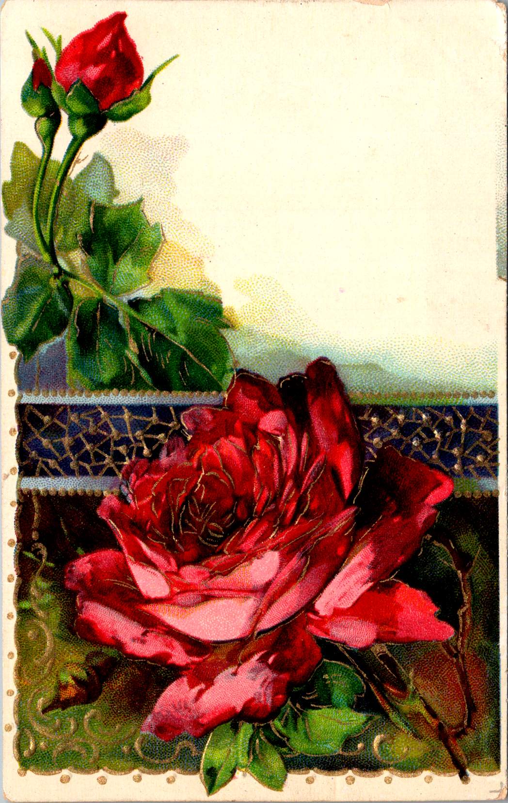
Vintage floral postcards—with golden backgrounds, symbolic flowers, and heartfelt messages—were a sophisticated social currency that connected people across distances.
At the intersection of the Victorian and Edwardian eras, the humble postcard emerged as a powerful medium for small aesthetic pleasures and meaningful social exchange. These postcards tell a story of artistic development and printing innovation, and how ordinary people wove beauty into the fabric of everyday communication.
Delicate Blooms
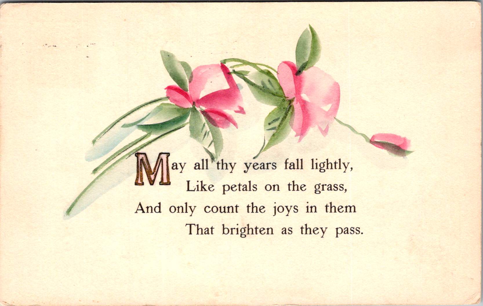
One card in this selection features pristine white lilies and fern fronds against a luminous gold background. The lilies—rendered in striking detail with their trumpet-shaped blooms and distinctive stamens—create dramatic contrast against the warm gold, the iridescent ink catching light as the recipient tilted the card in their hands. An elegant blessing accompanies the illustration.
“No thorn beset the path you tread, No shadows glance upon your way, But flowers spring beneath your feet, And sunshine crown your every day.”
These cards encapsulate a pivotal moment in design history—the transition from Victorian to Edwardian sensibilities. The Victorian era (1837-1901) embraced ornamentation, sentiment, and symbolic complexity. Every element carried meaning: white lilies represented purity and virtue; ferns symbolized sincerity and shelter; the gold background evoked trust and value. These layers of meaning reflected the Victorian preoccupation with moral improvement through beauty, a philosophy championed by influential figures like John Ruskin and William Morris.
As Queen Victoria’s reign ended and Edward VII took the throne (1901-1910), aesthetic preferences gradually shifted. The new Edwardian sensibility maintained Victorian symbolic richness but introduced more restrained layouts with increased white space and cleaner compositions. This particular card, with its strategic emptiness and focused arrangement, demonstrates this evolution. The gold field creates breathing room that earlier Victorian designs would have filled with additional decorative elements.
The technology behind these gold backgrounds represented industrial innovation. Using metallic powders and varnish printed in the desired pattern, these effects made previously elite decorative elements available to middle-class consumers. During the Industrial Revolution, technical advancements in printing had transformed what was once painstaking handwork into mechanized production. German printers in particular had mastered these techniques, producing cards with exceptional color registration and metallic effects that remained unmatched until their trade was disrupted by World War I.
Other sophisticated production methods like embossing—creating raised areas that added tactile pleasure to the visual experience—required specialized equipment and expertise. Metal dies created by skilled engravers would press the design into the card after printing was complete. The visual effect was enhanced by different dimensions, making these technically perfect cards a testament to industrial craftsmanship.
Gold’s association with luxury stemmed from both its intrinsic properties and historical significance. The aptly named Gilded Age celebrated opulence, with gold becoming a visual shorthand across design disciplines. International Expositions like the 1900 Paris Exposition showcased luxury goods incorporating gold elements, popularizing these aesthetics globally. Archaeological discoveries in Egypt renewed interest in gold in design, while the Ballets Russes featured costume and set designs by artists like Léon Bakst who used vibrant colors and gold accents.
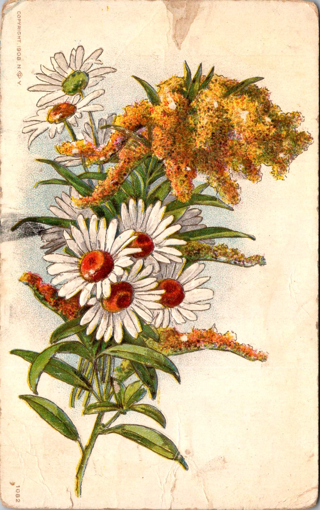
Floral Features
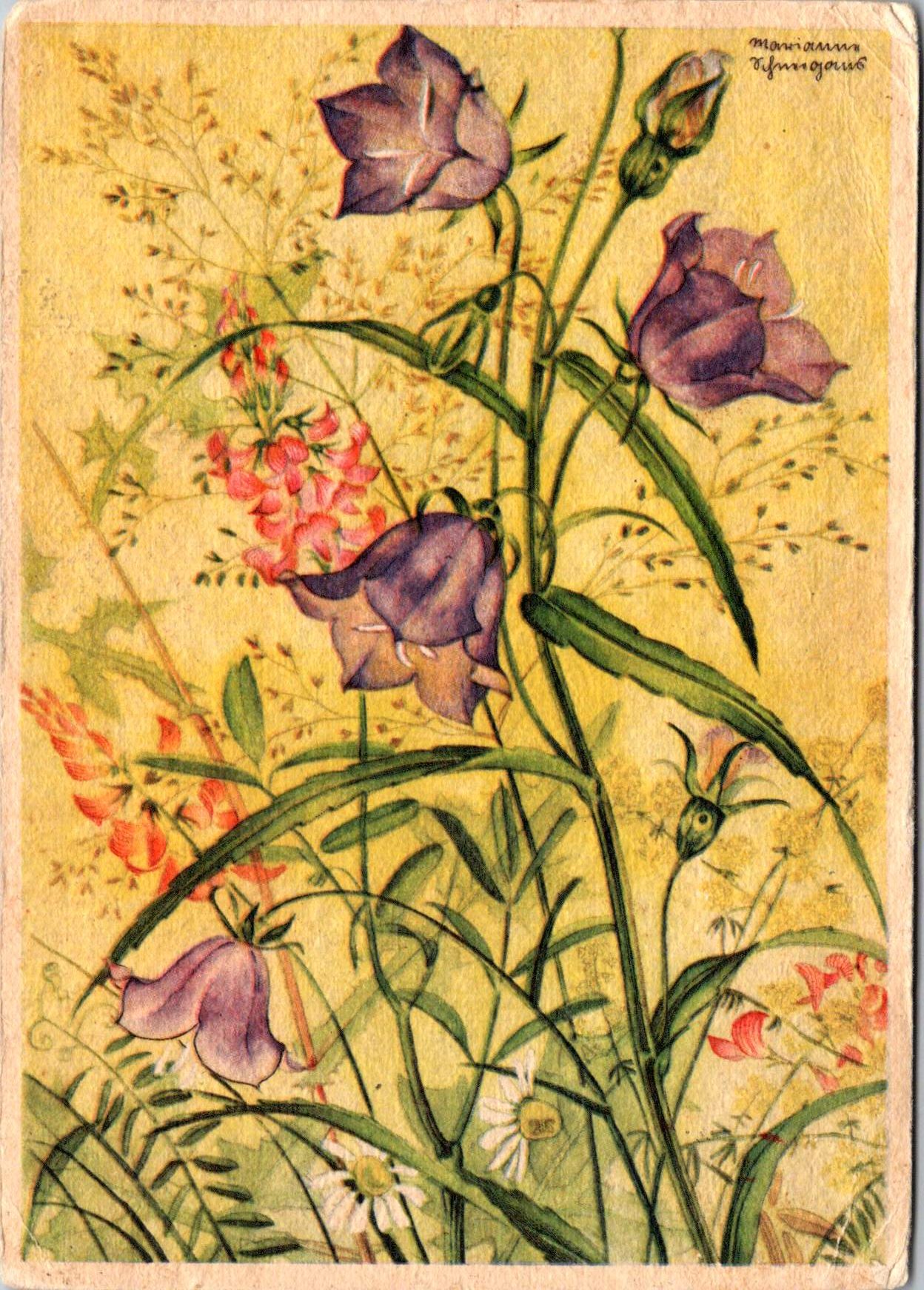
A striking card in the next selection features white and red striped “peppermint” carnations against a gold background. The distinctive white petals dramatically streaked with vibrant red markings create bold visual contrast against the metallic wash. Three perfectly rendered blooms cluster together on dark stems, with bright green sword-like leaves framing the arrangement. The word “Carnations” appears in red script in the upper right corner, identifying the botanical subject with elegant simplicity.
This stark compositional approach—focusing entirely on the botanical subject against a uniform background—represents a more modern, stripped-down aesthetic that emerged in the early 1900s. While maintaining the Victorian fascination with floral symbolism, these designs eliminate extraneous decorative elements in favor of dramatic contrast and botanical precision. This shift toward simplification prefigured design trends that would gain momentum in the following decades, showing how postcard aesthetics tracked broader movements in visual culture.
The symbolism remained rich: striped carnations carried specific meaning in the Victorian language of flowers, often representing regret that a sentiment could not be shared or a refusal/inability to accept someone’s affection. This sophisticated “language of flowers” had become codified in popular Victorian publications like Kate Greenaway’s “Language of Flowers” (1884), ensuring that recipients would understand these botanical messages. The high contrast between the red-streaked white blooms and the gold background created a visual drama that emphasized the emotional complexity carnations represented.
During this period, social practices around correspondence were evolving. The penny post, established in Britain in 1840 and adopted with variations throughout Europe and America, had revolutionized communication by making it affordable across social classes. What was once an expensive privilege became commonplace, leading to a boom in correspondence. The “Golden Age of Postcards” (approximately 1898-1918) coincided with changing postal regulations that allowed privately printed cards and preceded the widespread adoption of telephones. During this period, billions of postcards circulated globally.
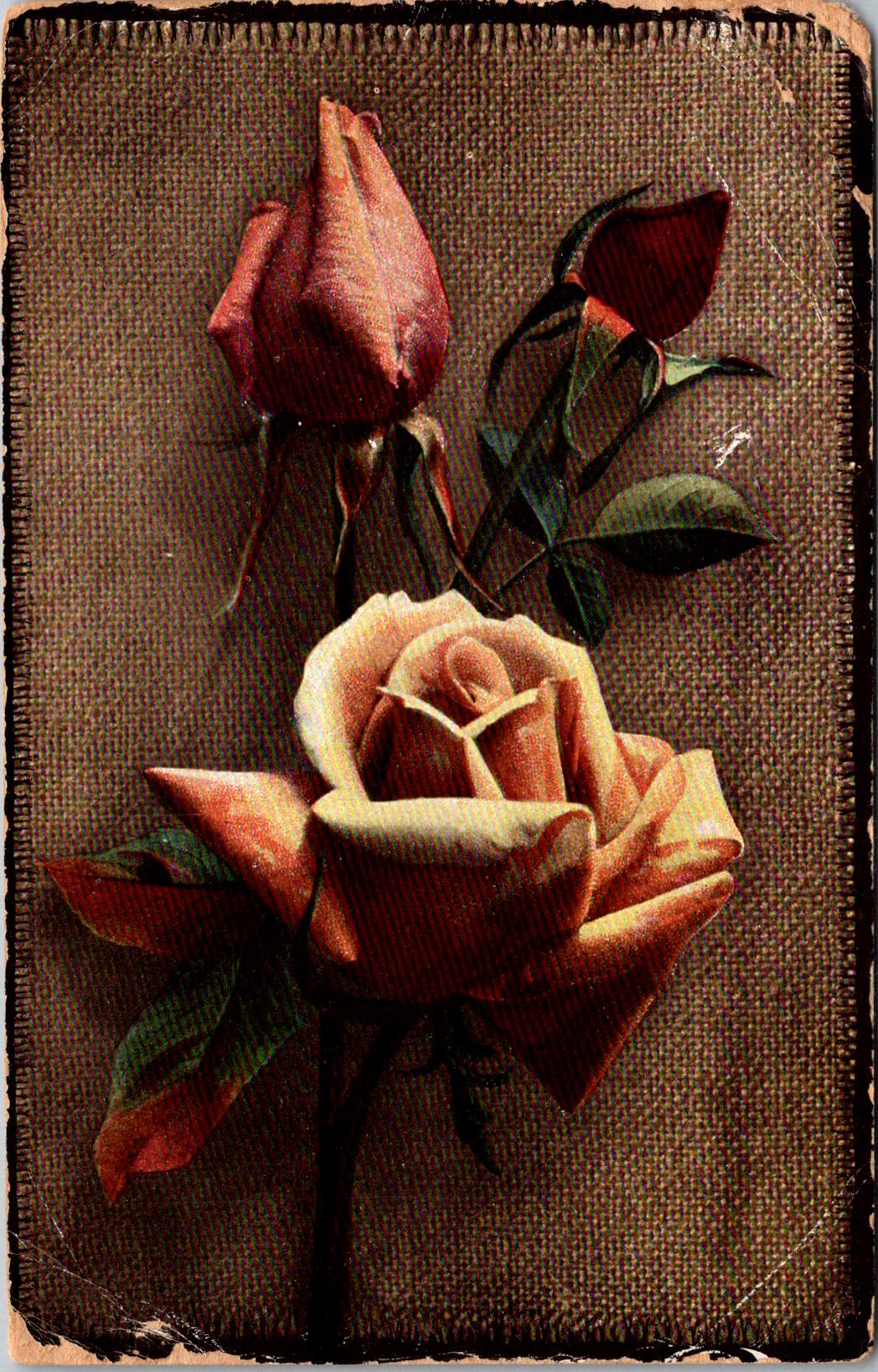
Rose to Crimson
The next group of cards represents another technological leap—an early photograph of light pink roses on a background of actual linen. The physical texture of the rough weave contrasts with the delicate subject matter—an open rose and two buds captured a new reality that only photography could provide. This mixed-media approach demonstrates how artists continued to experiment with both visual and tactile experiences.
The Victorian and Edwardian periods witnessed remarkable developments in image reproduction. Traditional chromolithography—where each color required a separate stone or plate—was being supplemented by photographic techniques. These innovations allowed the faithful reproduction of reality rather than artistic interpretation, though both approaches coexisted during this transitional period. The textures and images of this card created an interesting interplay between the natural subject and the material substrate, engaging multiple senses simultaneously.
Rose symbolism operated on a similarly subtle gradient. In Victorian floral language, the exact shade of a rose communicated specific intentions: light pink roses signified admiration and grace—appropriate for relationships in earlier stages or those requiring emotional restraint. Medium pink suggested appreciation, while deeper crimson conveyed self-conscious beauty and passionate love. This color gradient functioned as a sophisticated social shorthand, with increasing saturation indicating increasing emotional intensity.
This coding system proved particularly valuable in an era when direct expressions of emotion were constrained by elaborate social conventions. Etiquette books like those published by Emily Post outlined proper behavior in minute detail, including appropriate subjects for correspondence and proper forms of address. Against this background of social restriction, postcards offered a safe channel for emotional expression. The carefully chosen rose color allowed for communication that could either be acknowledged or tactfully ignored, providing a social safety mechanism for expressing feelings that might be improper to state directly.
For Victorian and Edwardian women especially, whose social freedom was often limited, postcard exchange offered acceptable connection. Young women could receive cards from admirers without compromising propriety, as the public nature of postcards (visible to postal workers and potentially family members) ensured messages remained discreet. This “public privacy” created a unique social space where relationships could develop within accepted boundaries.
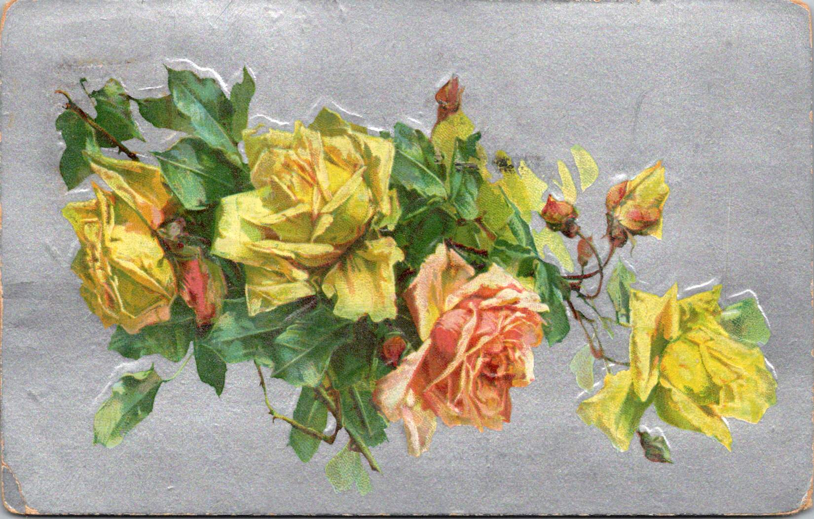
Color Craft
The final featured card offers yellow roses against a silver background, that creates a cooler, more modern luminosity. The yellow blooms—rendered with botanical precision—grow naturally on their stems, emphasizing an organic composition that represents changing sensibilities as the Edwardian era progressed toward what would become Art Deco and modernism.
While Victorian design had favored warm, rich gold tones suggestive of historical richness, the newer aesthetic embraced clarity, brightness, and forward-looking optimism. Yellow—the color of sunshine and vitality—symbolized friendship and joy rather than romantic love, expanding the emotional palette of postcard communication.
These changes in design paralleled broader social transformations. The early 20th century witnessed significant shifts in social mobility, women’s roles, and technological adoption. The rise of department stores democratized consumption of decorative goods, while increasing literacy rates expanded the audience for visual and textual communication. The suffragette movement gained momentum, challenging Victorian gender restrictions. These postcards, with their evolving aesthetics, tracked these social changes in material form.
Technology continued advancing as well. The integration of photography with traditional printing techniques created hybrid visual forms. German printers had pioneered many of these innovations before World War I. American and British printers subsequently developed their own techniques.
The social function of these postcards remained central to everyday life. In major cities, postal deliveries occurred multiple times daily—sometimes up to 12 deliveries in London—creating a communication rhythm somewhat like today’s text messages. This frequent exchange helped maintain connections across the increasing distances created by urbanization and industrialization. As families dispersed geographically, these tangible tokens of remembrance became increasingly important.
Recipients collected their postcards in specialized albums that became objects for social sharing in parlors. These albums—elaborately decorated themselves—transformed private communication into a form of social performance. Visitors could be shown new additions, creating occasions for storytelling about relationships and experiences. A well-filled album demonstrated one’s social connections and cultural participation, serving as a physical social network long before digital versions existed.
Simple Beauties
These postcards survive as artifacts of a time when beauty was considered essential rather than superficial. The Victorian belief that exposure to beautiful things could elevate character and promote virtue gave postcard exchange deeper purpose beyond mere communication. They offered sensory richness—tactile embossing, visual color, and the symbolic associations of flowers—that counterbalanced the sometimes harsh realities of industrial urban environments.
Unlike earlier periods when beautiful objects were primarily reserved for the wealthy, mass-produced postcards allowed people across social classes to exchange and possess small works of art. This democratization of aesthetic experience represented a significant shift in how beauty was distributed socially. The contrast between the expense suggested by the gold backgrounds and elaborate printing and the actual affordability of the postcards was part of their appeal—beauty without extravagance, pleasure without guilt.
These simple beauties represent a unique cultural moment when industrial technology enhanced rather than replaced artistic sensibility, when mass production made aesthetic pleasure more accessible rather than less meaningful.
Their legacy invites us to reconsider how we might integrate beauty into our own communication practices. While we have gained immediacy in our digital exchanges, how might we also retain the sensory richness these physical exchanges provided—the anticipation of delivery, the tactile pleasure of holding a beautiful object, the visual delight of color and form, and the knowledge that someone selected this specific image with you in mind.
The Victorian and Edwardian postcard tradition suggests that communication is enhanced, when wrapped in layers of beauty, symbolism, and care—tangible gestures that engage not just the mind but the senses and the heart.
The circle is a shape and a solution. From the sun above to the atoms within, circular patterns hold sacred secrets for ourselves and society.
From the moment our ancestors gathered around campfires beneath the star-studded night sky, humanity has been captivated by circular forms. The sun and moon—those perfect celestial orbs—have guided our understanding of cycles, seasons, and the sacred geometries that shape our world. As our globe tilts and rotates through space, we return to the circle as a fundamental pattern, a shape that speaks to scientific understanding and spiritual intuition.
In nature, the circle demonstrates efficiency and strength. Consider the heliotropic motion of sunflowers, their faces tracking the sun across the sky, their seeds arranged in perfect spiral patterns. Deep within the earth’s core, circular motions generate magnetic fields, while occasional tremors ripple outward in concentric circles. At a microscopic level, the nucleus of each atom forms a dense center of energy, the foundation of nuclear physics and our modern understanding of matter itself.
Concentric Wisdom
Ancient cultures recognized the power of circular design. From the stone circles of Stonehenge to the round houses of indigenous peoples, circular architecture created spaces of communion and protection. These structures weren’t merely aesthetic choices—they were sophisticated responses to environmental forces, creating natural ventilation patterns and distributing structural loads evenly.
The Native American medicine wheel, the Buddhist mandala, and the Celtic spiral all speak to the circle’s role as an energy symbol, representing wholeness, unity, and the cyclical nature of existence, much like a gyroscope maintains stability through rotation.
Circular Scenes
Circular thinking extends to human organizations, too. Consider how people naturally gather in circles: from tribal councils to corporate roundtables, from community drum circles to academic seminar rooms. Social movements often begin with small circles of concerned citizens, expanding outward based on overlapping interests of place and purpose.
Underground music scenes, grassroots political groups, and mutual aid networks typically organize in decentralized circles, creating resilient structures that adapt and grow organically. Even in our digital age, social media platforms mimic circular patterns through circles of friends, spheres of influence, and interconnected networks.
Circles show up in team dynamics as well. Agile practitioners us “scrum circles” for project management, while “quality circles” in manufacturing bring workers together to solve problems collectively. Innovation hubs create intentional “innovation ecosystems” where ideas flow freely between participants who share offices, labs, and studios.
Circular principles also apply to how we organize our economic and social systems. The concept of a circular economy has emerged as a revolutionary approach to addressing environmental conservation. Unlike the traditional “take-make-waste” linear model, circular economics mirrors natural cycles where waste becomes a resource. In this system, products are designed for durability and reuse, materials flow in closed loops, and regenerative practices restore natural capital.
Architects like Frank Lloyd Wright incorporated organic architecture principles that emphasized circular and spiral forms. These structures don’t simply mimic nature; they function in harmony with it.
Civic design includes circular plazas, amphitheaters, and communal spaces that facilitate the natural human tendency to gather in rounds. These spaces often feature concentric circles of activity, from intimate inner gathering spaces to broader outer rings that welcome larger communities. Cities are networks of interconnected circular communities, each with its own center of gravity yet linked in ways that promote both local identity and broader urban cohesion.
Transit Circuits
Some neighborhoods are connected by circular transit systems—light rail loops that mirror (or transgress) the patterns of previous generations. These transportation networks are themselves powered by intricate electronics—microchip circuits that echo the larger orbital patterns they coordinate, ensuring trains run right on time.
The elegance of circular transportation extends beyond mechanized transit. Cities worldwide are rediscovering the bicycle—perhaps humanity’s most successful application of circular geometry to movement. Its wheels, gears, and chain drives demonstrate how nested circular systems amplify human power while minimizing energy loss. Bike-sharing programs create their own circular economies of movement, their docking stations arranged in rings throughout urban cores. These human-scaled transit networks reduce carbon emissions while strengthening community connections.
Digital Circles Take on Real Challenges
Digital platforms are evolving beyond simple virtual meeting rooms into immersive spaces that address pressing social challenges. Virtual and augmented reality technologies allow for mixed-reality circles where local communities can visualize, plan, and implement solutions to social issues in real time. For instance, AR overlays can reveal hidden resources within a community—from unused spaces for urban farming to underutilized buildings that could provide shelter. These technologies enable communities to map food deserts, build on existing distribution networks, and coordinate mutual aid efforts with greater precision than ever before.
The power of these tools lies in their ability to make needs and resources visible to more groups, and in greater visual detail. VR environments allow stakeholders to experience and refine potential solutions before implementation, while AR applications help coordinate real-world action. For example, some cities are experimenting with AR-enabled resource rings that connect those with excess (food, supplies, space) to those with needs and uses through intuitive visual interfaces. These systems help transform abstract social challenges into tangible solutions at the neighborhood level.
What makes these digital circles particularly powerful is their ability to collapse the distance between awareness and action. When a community sees problems and potential solutions mapped in their shared space, it becomes easier to make connections, mobilize resources, and coordinate responses. These tools don’t solve social challenges on their own, but they provide communities with powerful new ways to see, understand, and address local needs through coordinated circular action.
Full Circle Round Again
The circle’s power to unite and connect is perhaps best illustrated in the simple Venn diagram, where overlapping spheres reveal relationships and shared qualities. This mathematical tool reflects a deeper truth: that circles have the unique ability to represent both unity and multiplicity, the one and the many. Whether we look to the perfect geometry of a soap bubble, the ripples from a stone dropped in still water, or the orbits of electrons around their atomic center, we find that circular form and motion are fundamental to the universe’s operation.
As we face global challenges that require holistic thinking and unified action, the circle offers wisdom accumulated over millennia. It reminds us that everything is connected, that endings lead to beginnings, and that the most sustainable solutions often mirror the patterns we find in nature.
In embracing circular thinking and design, we honor both our ancestral wisdom and our future potential. The sky and wind above is a powerful reminder of the warm glow and flow inside. Turning (and churning) teaches us about the true nature of our universe and our place within it. The sacred sun and moon continue their ancient dance across the sky, inviting us to see ourselves as part of this grand design—not just observers of it, but active participants in its unfolding story.
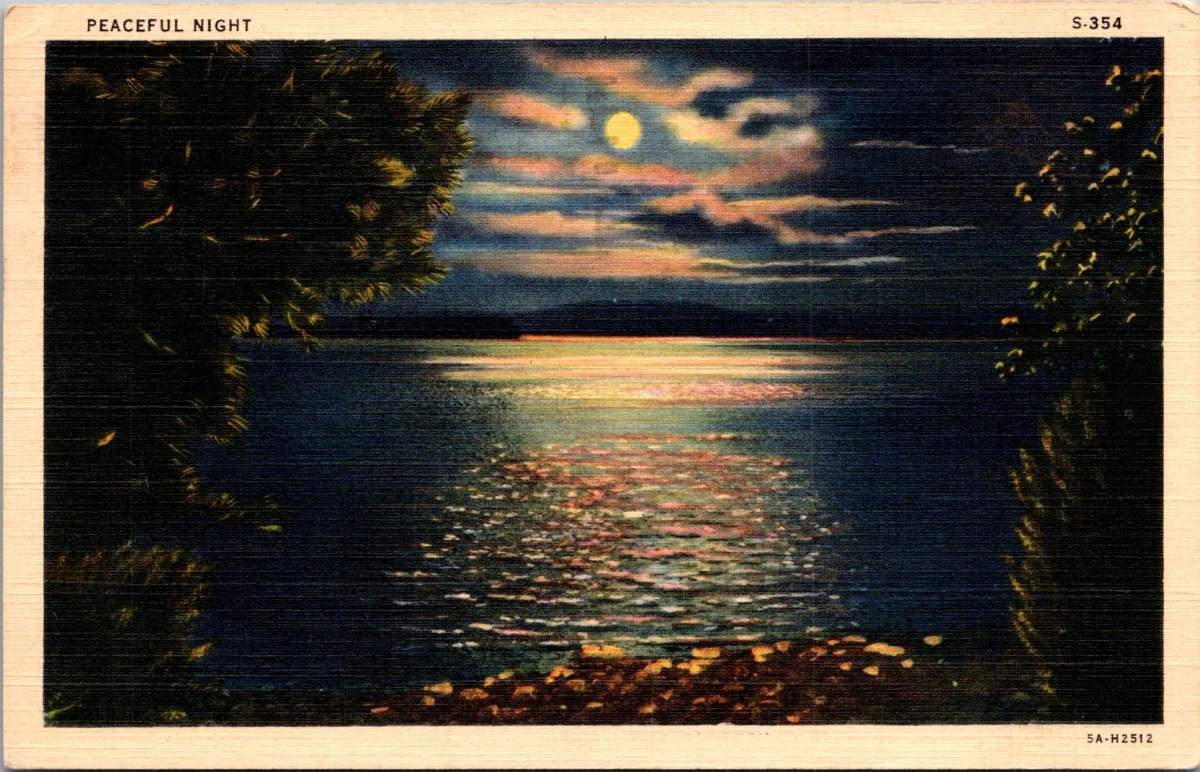
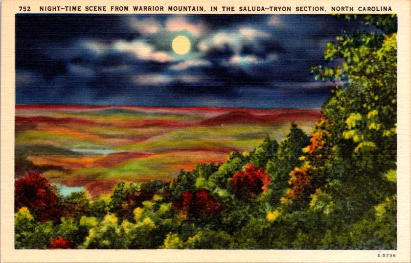
Moonlight dances across rippled water in a vintage postcard titled simply “Peaceful Night.” Nature lovers know that darkness transforms familiar landscapes into the mysterious and musical. The songs of the forest capture more than mere melody – they reveal the soul after sunset.
Lake Burton near Clayton, Georgia, mirrors the full moon in its still waters, surrounded by the dark masses of the mountains. As twilight deepens, the night chorus begins. Whip-poor-wills start their rhythmic chanting, a pulse that famous folklorist Alan Lomax once described as “nature’s metronome.”
In his 1959 field recordings from Georgia, Lomax captured not just the songs of mountain musicians, but also these ambient sounds – the chorus of frogs from the lake’s edge, the distant cry of a great horned owl, the rustling of wind through mountain laurel.
When Lomax made his landmark field recordings in the southern mountains, he often worked at night. The quality of sound was better then – less interference from human activity, and the natural acoustics of the mountains were more pronounced. In his field notes, he frequently commented on how the music emerged from the darkness itself, becoming part of the natural symphony of night sounds.
The ballad singers he recorded often chose songs that reflected this nocturnal environment. “The Night Visiting Song,” common in both Appalachian and Scottish tradition, captured the soundscape of a midnight journey through the mountains. “The False Knight Upon the Road,” with its mysterious midnight encounter, echoed with the very sounds these postcards capture visually – the rustle of wind through trees, the call of night birds, the subtle splash of water against shore.
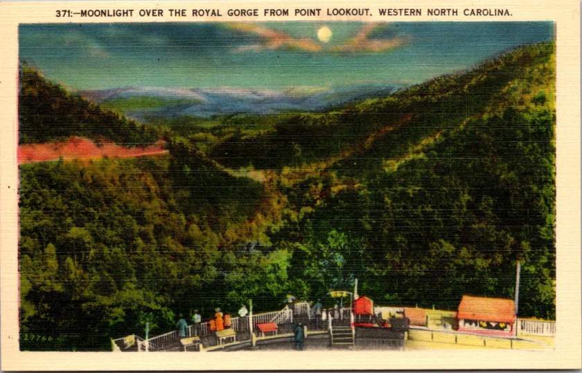
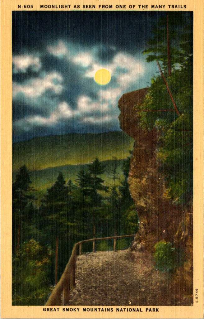
The Royal Gorge in Western North Carolina, from Point Lookout, one can gaze into the shadowed valley below. The mountains themselves seemed to be singing. The acoustic properties of these gorges shaped the development of mountain music – the way certain notes would carry across valleys while others were swallowed by the night air influenced everything from the tuning of instruments to the patterns of call-and-response singing.
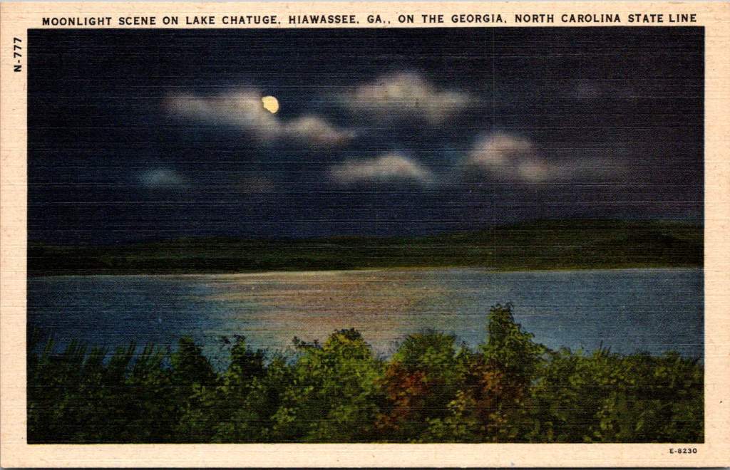
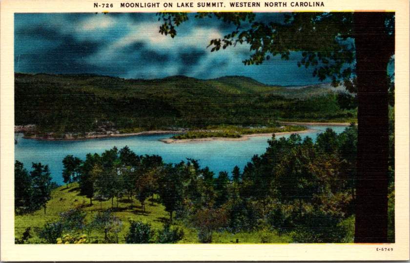
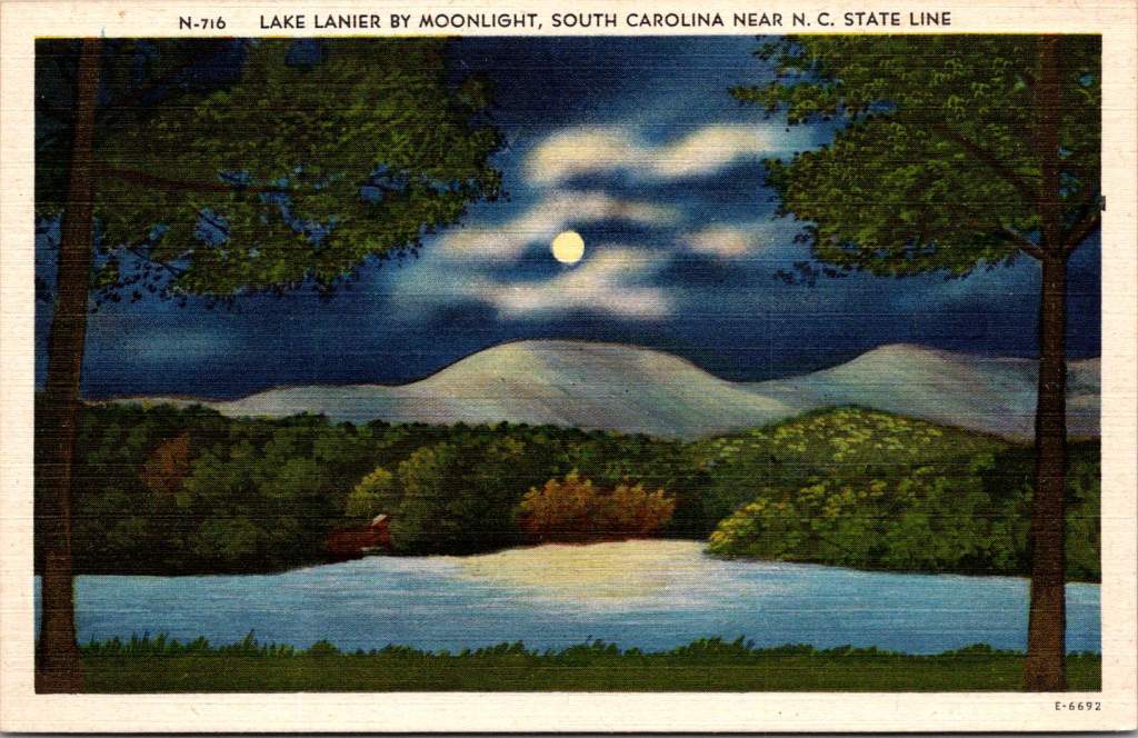
Lake Lanier, straddling the border between South Carolina and North Carolina, appears beneath a cloud-streaked moon. These mountain lakes created their own acoustics, too. Sound carries differently over water at night, when the air has settled and thermal currents have calmed. Mountain musicians knew this intuitively – lake shores became natural amphitheaters for evening gatherings, where ballads could drift across the water unimpeded.
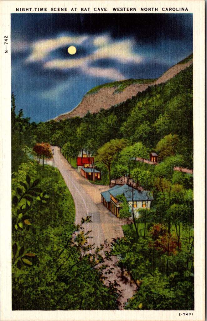
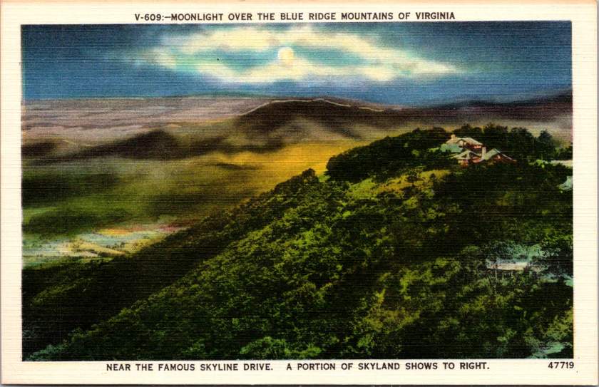
The high mountain lake near Pembroke, Virginia, at 4,000 feet above sea level, reminds us that elevation changes everything – both the quality of light and the character of sound. The thinner air at these altitudes creates distinct acoustic properties. It’s no coincidence that the high lonesome sound of Appalachian singing developed in these elevations, where the night air carries voices in unique ways.
The materials for traditional mountain instruments came from these same moonlit forests. Spruce for fiddle tops was harvested from high mountain slopes, often selected by ear – woodsmen would tap the living tree to judge its resonant qualities. White oak for banjo rims came from trees that had grown slowly in mountain soil, their dense grain providing the perfect material for shaping sound.
The night forest provided not just materials but inspiration for tuning. The modal tunings common in mountain music – often called “sawmill tunings” for the wind-like sound they produced – seemed to match the natural harmonies of the forest at night. A skilled player could make a fiddle sound like a bird call, or craft banjo runs that mimicked the cascade of mountain streams in darkness.
Today, these same landscapes are protected in various ways – as national forests, state parks, or nature preserves. The night sounds that inspired generations of musicians continue, though now sometimes competing with the intrusion of modern noise.
As darkness falls over these mountains tonight, some musician will likely sit on a porch or beside a lake, picking out tunes that have echoed through these valleys for generations. And in those tunes, if we listen carefully, we might hear what Lomax heard. The music of these mountains is inseparable from the chorus of the night forest itself.
In late May 1908, the Republican River forgot its modest nature. After days of relentless spring rains, the usually manageable waterway transformed into a destructive force that reshaped both the landscape and lives of north-central Kansas.
A collection of real photo postcards from this period captures these moments of crisis. One image shows the mill with its flooded surroundings, another the threatened railroad bridge. These weren’t just documentary photographs – they were messages sent between family members grappling with decisions about land and livelihood in the flood’s aftermath.
The Republican River, which meanders through Republic County past the iconic Table Rock formation, swelled beyond its banks, swallowing farmland, threatening towns, and severing the rail lines that served as lifelines for agricultural communities.
Concordia, the largest town along this stretch of the Republican River, watched as the waters rose. The town of 4,500 residents had built itself on agricultural promise, its grain elevators standing sentinel along the railroad tracks, its mill processing the bounty of surrounding farms. But the 1908 flood challenged this careful progress. Water lapped at the foundations of the mill, its twin smokestacks rising above the flood.
Railroad bridges proved vulnerable to the 1908 flood, too. The Chicago, Rock Island and Pacific Railroad, which had helped birth towns like Concordia and Republic City, found its tracks suspended over angry waters. Train service halted, leaving farmers isolated with their crops rotting and fields under water. The flood arrived at a particularly cruel time – late spring, when winter wheat was heavy with promise and corn was just reaching hopefully toward the Kansas sky.
The handwriting on one postcard tells of a man named Basil looking at land near Table Rock, that distinctive natural formation that had guided settlers for generations. What kind of optimism – or desperation – would drive someone to consider investing in farmland so soon after such devastating floods? Yet records suggest he wasn’t alone. Land transactions continued in Republic County through 1908 and 1909, some at distressed prices from farmers ready to seek fortune elsewhere, others at premium prices for higher ground.
The flood’s waters eventually receded, leaving behind debris and difficult deliberations. Farmers have always had to gamble with nature. The rich soils of river valleys are worth the risk of occasional flooding – until they’re not.
These brothers – the postcard photographers – couldn’t know that the 1908 flood was merely a prelude. The Republican River would prove its power again and again, most catastrophically in 1935, when a flood of biblical proportions would transform the valley once more. Families who chose to stay after 1908, who rebuilt and reinvested, would face nature’s judgment again.
Looking at these century-old images, we see more than just disaster photography. We see evidence of critical decisions made in the aftermath of catastrophe. Someone was behind that camera, documenting not just the destruction but the dilemma – to stay or go, to rebuild or retreat, to trust in the river’s bounty or fear its fury. The unknown photographer used the latest technology – AZO photo paper, a Kodak camera – to capture and distribute these images of nature’s disruption of human endeavor.
We don’t know if Basil bought that land near Table Rock. The brothers’ identities and their immediate choices are lost to history. But we know that farming continued and that people kept living along the Republican River despite all they had seen. Each generation seems to make its own peace with nature’s risks, balancing the promise of fertile valleys against a river’s wrath.