Here we go! The Posted Past heads into the fall season with rare cards, a new gallery, and a social mission to trade loneliness for connection.
featured postcard~ rare novelty card still holds a mystery
An early 20th century novelty postcard featuring humorous photography and personal correspondence from Missouri.
Front of the card: The photograph shows a young Black man in white shirt, suspenders, and dark trousers, grinning while holding a large broken umbrella overhead in a playful pose. Below reads the humorous caption “A little disfigured, but still in the ring”—typical novelty humor from the postcard craze era. A black border frames the photograph on cream cardstock.
Back details: The reverse bears “Carbon Photo Series No. 513” identifying the commercial publisher’s series. Addressed to Miss Grace Skillman in Pleasant Hill, Missouri, with a green 1-cent Franklin stamp and clear 1908 postmark. The handwritten message describes an exhausting early morning wait in Lee’s Summit for “Brother and Frank,” and promising a longer letter that evening.
“Still in L.S. haven’t slept but about ten minutes. My eyes looks like two burnt holes in a blanket. Brother and Frank hasn’t come yet. I will wait till 7.30 and then go home. Will write tonight. Just finished my breakfast. I will eat if not sleep. I got here ten till five.
Condition and Appeal: The sepia-toned image displays characteristic early photography with some age spots, and a nicked corner. The image and reverse side remain in good condition with clear photography and legible handwriting. The “Carbon Photo Series” indicates premium production using carbon-based printing methods prized for superior image quality and archival stability. Grace Andre Skillman was born in Pleasant Hill in 1889, making her nineteen when she received this card. The message and the lack of formal salutation and signature suggest this is casual ongoing family correspondence. As a result, the author of the postcard remains a mystery.
Vintage novelty postcards are increasingly collectible, especially numbered commercial series with documented recipients. Collectors of African-Americana may find the image appealing and relatively rare. The combination of carbon printing technology, humorous subject matter, and personal correspondence is of interest to collectors of vintage photography, postcard enthusiasts, genealogy researchers, and those focused on early 20th century American social history and communication.
Introducing~ The Posted Past Art Card Gallery
A selection of Larry L’Ecuyer’s watercolor landscapes are on display in our Online Art Card Gallery. Fitting as our first show. Enjoy!
Countdown to a Lakeside Getaway, 2025, Larry L’Ecuyer, watercolor on postcard
NEWS & UPDATES~ art card call for submissions is open
The World’s Smallest Artist Retreat (our P.O. Box) is awaiting your art card submission. Follow one rule to join the next open show. Details here!
Art card kits now in stock
Our Art Card Kits are perfectly-packaged as a fun, creative activity for you and a friend to complete in as little as an hour or made into a lovely afternoon.
The kit includes two postcard blanks, six vintage finds curated to the chosen theme, and a bundle of collage goodies for your whimsy. There is a free gift inside, too!
Once you’re done, surprise someone with an original art card in their mailbox. Or, send it back to us to include in the next online show. Either way, you’ll have cultivated a little joy in your garden.
Sweet readers, this is your pre-preview of something very fresh, and a long time coming…
Hold a vintage postcard in your hand and flip it front to back.
On the front, usually an idealized world. Sun-drenched beaches, pristine mountain vistas, city streets captured at their most photogenic moments. Designed to say, “Wish you were here!”
Flip it over, and you find something entirely different. The back reveals the personal, the quixotic, sometimes the magically mundane.
“Weather awful, hotel terrible, a bit bothered by a smelly seatmate on the plane, but having a wonderful time anyway.”
Postcards fascinate me precisely because they embody all of life. They’re both public and personal, both idealized and achingly real. They bring the past forward in time, making unexpected connections with family, friends, and special places—revealing who we have been along the way.
On a very old postcard, the handwriting of someone long gone comes alive again right before our eyes. A jotted note gives us a new view into their private world. Their words leap over the decades to reach us. There is a lush creative commons between now and then, a liminal green lawn to lounge on and take in the cool air.
I have lived happily in those in-between spaces for the last few years. Somewhere in the middle of my life and career and enjoying myself in the meantime. Not where I was before, and both curious and terrified about what comes next.
Well friends, like the best summer novel, the plot thickens.
Starting in September, The Posted Past officially launches a new phase as a social enterprise, inspired by the simple truth that we can trade loneliness for connection, one postcard at a time.
We have already done it, friends!
As one of my earliest subscribers, you have enjoyed (I hope!) an essay every Wednesday for the last year. Going forward, you’ll still get those delightful diversions that remind us we are more than we knew. I’ll also offer sneak peeks at rare postcard finds, each one a small treasure with its own story to tell.
Old or new, postcards have a job to do.
Along the way, I have fallen in love with making and receiving Art Cards. My brother started mailing the lovely landscape watercolors he does when insomnia strikes. A collage free-for-all at the local gallery had me re-inspired by the ‘ransom note’ style I used to do as a teenager. Blink-blink… I found myself dreaming up fabulous cards to make.
Art cards celebrate the artist in all of us. I particularly love collage and watercolor, but truly an art card can be made with scraps. Sometimes the most satisfying work comes from simple gestures, too. Slow down enough to make something with your hands, and then send it away to make someone’s day.
Coming this fall, The Posted Past will feature an online gallery where you can browse through handmade artwork that has traveled across time and space, carrying all the marks of love, adventure, and everyday life. Call for submissions now open, mail your art card to: The Posted Past, P.O. Box 24431, Tempe, AZ 85285.
Abundance can be overwhelming, and it’s not always easy. Right now, I feel both confident and queasy. But, I’m not alone. Here’s how you can help.
Become a paid subscriber—hit the button below to support the effort
Pre-order an Art Card Collage Kit (coming soon!) for your own creative fun
Make an art card and send it to us—be first in the online gallery show!
Though we revel in real life, the handmade, and the historic, The Posted Past is also meant to be super social. Excuse our dust, and help us get started!
Browse the collection of vintage postcards on eBay and follow the store
Both/and. Past and future. Solitude and connection. Cardboard curiosities and some larger-than-life dreams. Thank you for being here together. Keep an eye on your inbox and mailbox—September is full of surprises!
A vibrant Buff-Bellied Hummingbird hovering near a red tubular flower, showcasing its iridescent green head and back, rusty-orange belly, and needle-like bill in a classic feeding pose.
Detailed illustration of a Ferruginous Hawk perched on a branch, displaying its characteristic rusty-brown and white plumage with distinctive feathered legs and robust build typical of North America’s largest hawk.
Depicts a Gray Jay (now called Canada Jay) perched on a snow-dusted branch with small green lichens, showing its fluffy gray and white plumage, black cap, and compact songbird form.
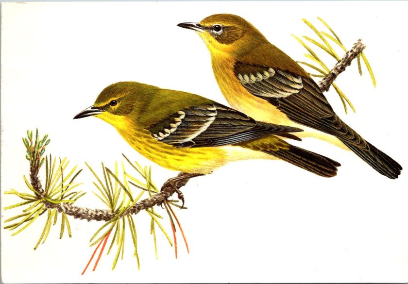
A pair of Pine Warblers on coniferous branches, displaying their olive-yellow plumage with white wing bars and the subtle dimorphism between the brighter male and more subdued female.
A Cattle Egret in breeding plumage with golden-buff crest and back feathers, bright orange-red bill and legs, posed in the elegant stance typical of these large birds.
A set of five Reader’s Digest Association postcards from their Book of North American Birds series. High-quality illustrations and professional production from the 1970s-1980s era of educational materials. Particularly appealing to birders and natural history enthusiasts. Good condition, unposted with no marks. See photos for actual condition. Vintage items – writing, stains, color changes, and wear are part of charm and provenance.
[Note: Summer focus is on detailed captions. Essays return in September!]
The news these days deserves a long silent stare. Here is one from a horse. A century or more later… still no.
[Note: Summer focus is on detailed captions. New essays return in September!]
A vintage real photo postcard shows a dappled gray horse standing in a farmyard setting. The well-built animal is wearing a halter and is positioned in profile to show its conformation. A person in a hat and dark clothing stands beside the horse, likely the owner or handler. The American rural backdrop includes wooden farm buildings and bare winter trees. The ground is packed earth typical of a working farm. The photograph has the characteristic appearance of an early 20th century image, with some evidence of a stylized border in the exposure. The postcard is in excellent condition front and back, unposted with no writing, and an AZO indicia dating the item between 1904 and 1918. The subject matter and production method suggest this is a unique image and object, with no known duplicate.
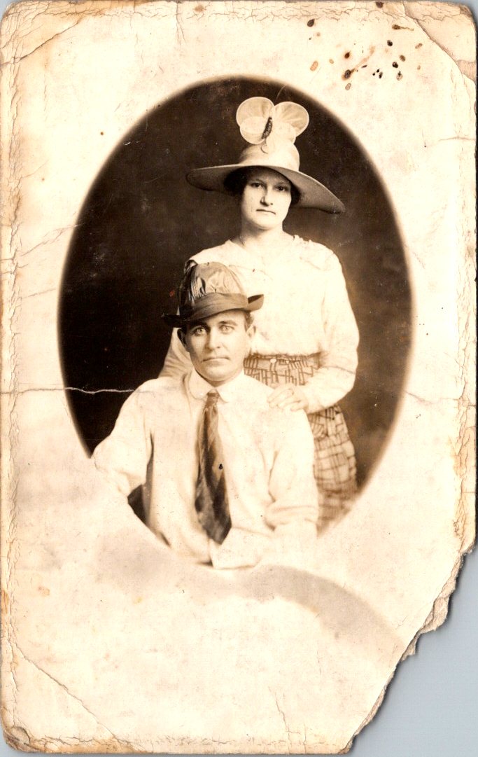
Is this a portrait of the couple or their hats? Feathers in the band. Fascinator with a wide brim. Stories behind their eyes and more clues in their clothes. The real photo postcard went unsent. Pasted inside an album once, and then lost for 100 years.
A sepia-toned oval portrait photograph from around 1910 showing a couple in formal attire. The woman stands behind the seated man, wearing a wide-brimmed hat decorated with a large bow or fabric flower. She’s dressed in a light-colored blouse with puffy sleeves and a geometric patterned skirt with a button at the waist. The man sits in front wearing a white long-sleeved collared shirt, striped tie, and a small hat with multiple feathers in the brim. Both subjects have neutral expressions typical of formal photography from this era. The real photo postcard shows significant age-related damage, with cracked and yellowed edges, stains, and deterioration around the borders, characteristic of an early 20th-century item previously collected in an album.
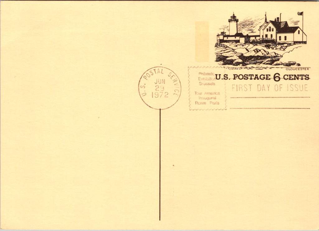
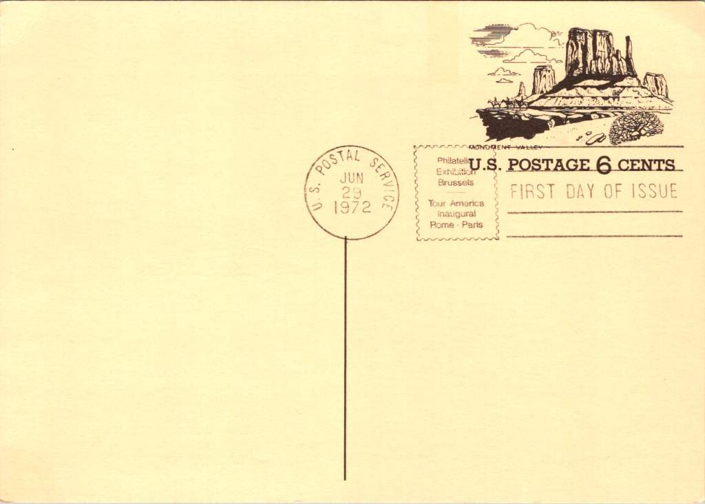
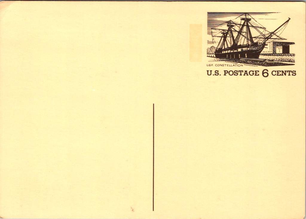
These vintage postcards from the 1972 Tourism Year of the Americas reveal fascinating questions about natural landscapes, heritage, monuments, and whose stories we remember and tell.
In summer 1972, the United States Postal Service issued commemorative postcards that would become enduring symbols of national identity. These postcards, part of the Tourism Year of the Americas campaign, featured iconic destinations with restrained elegance—their two-color printing was both artistic and economical. As America stood at a cultural crossroads, this postcard set tells a familiar American story. More than five decades later, they reveal even more about how a nation sees itself.
Commemorative Moments
First Day of Issue cancellations mark a special moment in time, and signal that an item is expected to be collectible. The postcards were cancelled on June 29, 1972, bearing the commemorative text “Philatelic Exhibition Brussels” and “Tour America Inaugural Rome – Paris.” These international exhibitions promoted American tourism during the Cold War, when cultural diplomacy served as essential soft power.
The carefully designed cancellation artwork includes USS Constellation (6¢), Gloucester (6¢), Monument Valley (6¢), and Niagara Falls (airmail 15¢). These rates reflected the newly reorganized United States Postal Service which had become its own entity the year prior. The 1972 Tourism Year of the Americas was an ambitious initiative from the new quasi-independent agency, emerging alongside Nixon’s opening to China and détente with the Soviet Union.
USS Constellation, the last sail-only warship built by the U.S. Navy (1853-1855), served as flagship of the Africa Squadron from 1859–1861. The ship captured three slave vessels, enabling liberation of 705 Africans. During the Civil War, Constellation deterred Confederate cruisers in the Mediterranean. The selection represented naval heritage and anti-slavery efforts, though it still centered the naval victory rather than those who gained freedom.
Niagara Falls has attracted visitors for 200 years, becoming the symbolic heart of American tourism. The 1883 Niagara Reservation became America’s first state park, influencing national park creation. Current visitor statistics show enduring appeal: 9.5 million tourists visited Niagara Falls State Park in 2023, with the region welcoming 12 million visitors yearly.
Monument Valley reflect the West’s central role in national identity by 1972, immortalized through Hollywood and environmentalism. Yet Monument Valley sits within Navajo Nation territory, while Grand Canyon encompasses land sacred to multiple tribes, including the Havasupai, whose reservation lies within park boundaries—reminders that park creation displaced Native communities.
Gloucester, America’s oldest seaport, sustained coastal communities for centuries. The lighthouse image evoked both practical maritime safety and romantic notions of New England’s rocky shores, while Gloucester’s working harbor embodied the intersection of heritage preservation and living tradition. By 1972, this historic fishing port faced the tension between maintaining its authentic maritime culture and adapting to tourism pressures—a challenge that made it a fitting symbol.
Artistic Vision
The front of the postcards render multiple iconic American locations in distinctive engravings in an economical two-color print run, an important factor for a the government printing office.
The collection showcases a deliberate balance. Yosemite represents natural power and America’s first national park. Missisippi Riverboats and the Rodeo embody western majesty central to national imagination. DC Monuments offer overt patriotism and Williamsburg and the Liberty Bell connect to the tremors and tolls of colonial democracy.
Even in 1972, these were selective narratives. All featured natural sites exist on traditional Indigenous lands, for example, while largely omitting Indigenous perspectives and enslaved people’s contributions to our cultural histories.
Many featured locations are sacred sites to Indigenous communities. Some of the most sacred places for American Indian nations are located in national parks, yet access to holy ground remains contentious. Park creation often involved displacing Native peoples from lands they had stewarded for millennia.
The year 1972 was tough in other ways: Vietnam War divisions, emerging Watergate scandal, and generational alienation over the military draft. These postcards presented a different kind of unity. Rather than contemporary political divisions, they emphasized natural wonders and historical sites that transcended partisan conflicts.
During the Cold War, these postcards served as miniature global ambassadors, too, often providing people’s first visual encounter with American landmarks. They projected America as worthy of visiting and learning about, countering negative impressions from political controversies.
The postcards themselves embody crucial democratic principles: making heritage accessible through affordable media; connecting tourism to conservation through revenue and public appreciation; and revealing how commemorative choices reflect national values. The geographic diversity suggests a desire for the fullest of American experiences, though these 1972 selections still privilege certain narratives.
New Memories
These postcards continue to offer insights into American values and heritage preservation evolution. USS Constellation still serves as a museum ship in Baltimore’s Inner Harbor. National parks have experienced tremendous visitation growth, raising questions about balancing access with preservation.
In what they don’t depict, the postcards show gaps in whose stories get told, whose lands get celebrated, whose experiences get centered. While 1972 selections emphasized traditional narratives, contemporary views increasingly include previously marginalized perspectives, acknowledging Indigenous heritage alongside colonial and national stories.
These artifacts remind us that commemorations reveal values and priorities. As our historical understandings evolve, it’s wise to look back and look again.
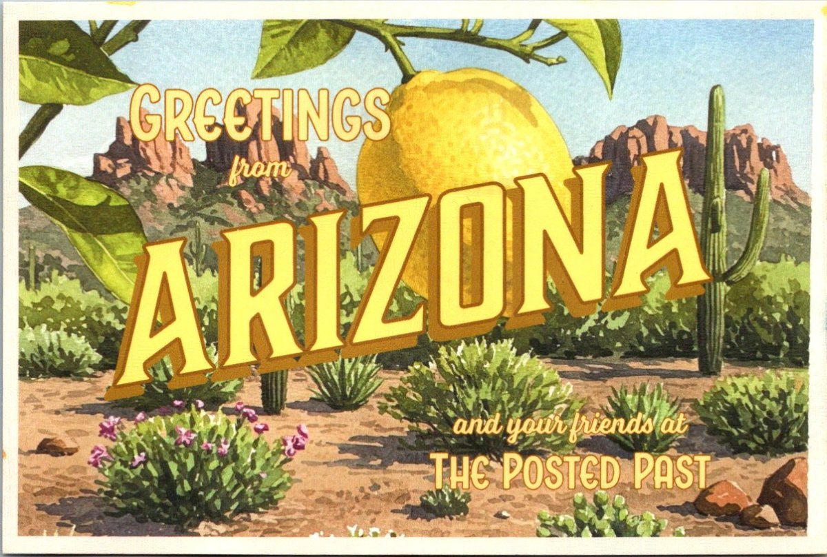
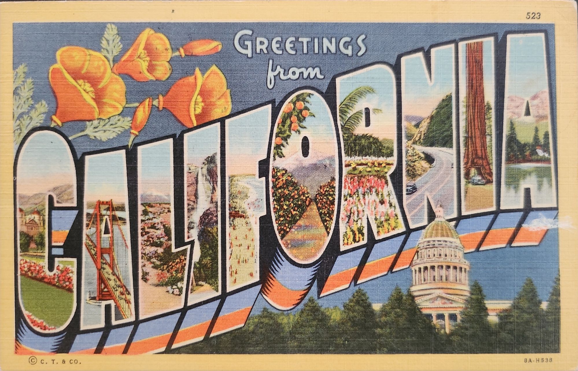
‘Greetings from…’ designs have rippled through visual culture for well over a century, telling the stories of how we see ourselves and our places.
A stone dropped into still water creates concentric circles that radiate outward. This physical phenomenon is a powerful metaphor for how cultural ideas spread through time and across media, especially visual motifs of place. Certain visual vocabularies persist, evolving with technologies while maintaining essential characteristics.
American statehood, regional identity, and natural heritage have rippled through various media over the past century. Iconic ‘large letter’ postcards, commemorative postal stamps, murals and more—all help us trace a fascinating journey of cultural transmission through the broader currents in American history, industrial development, and visual communication.
Gruss Aus… from Germany
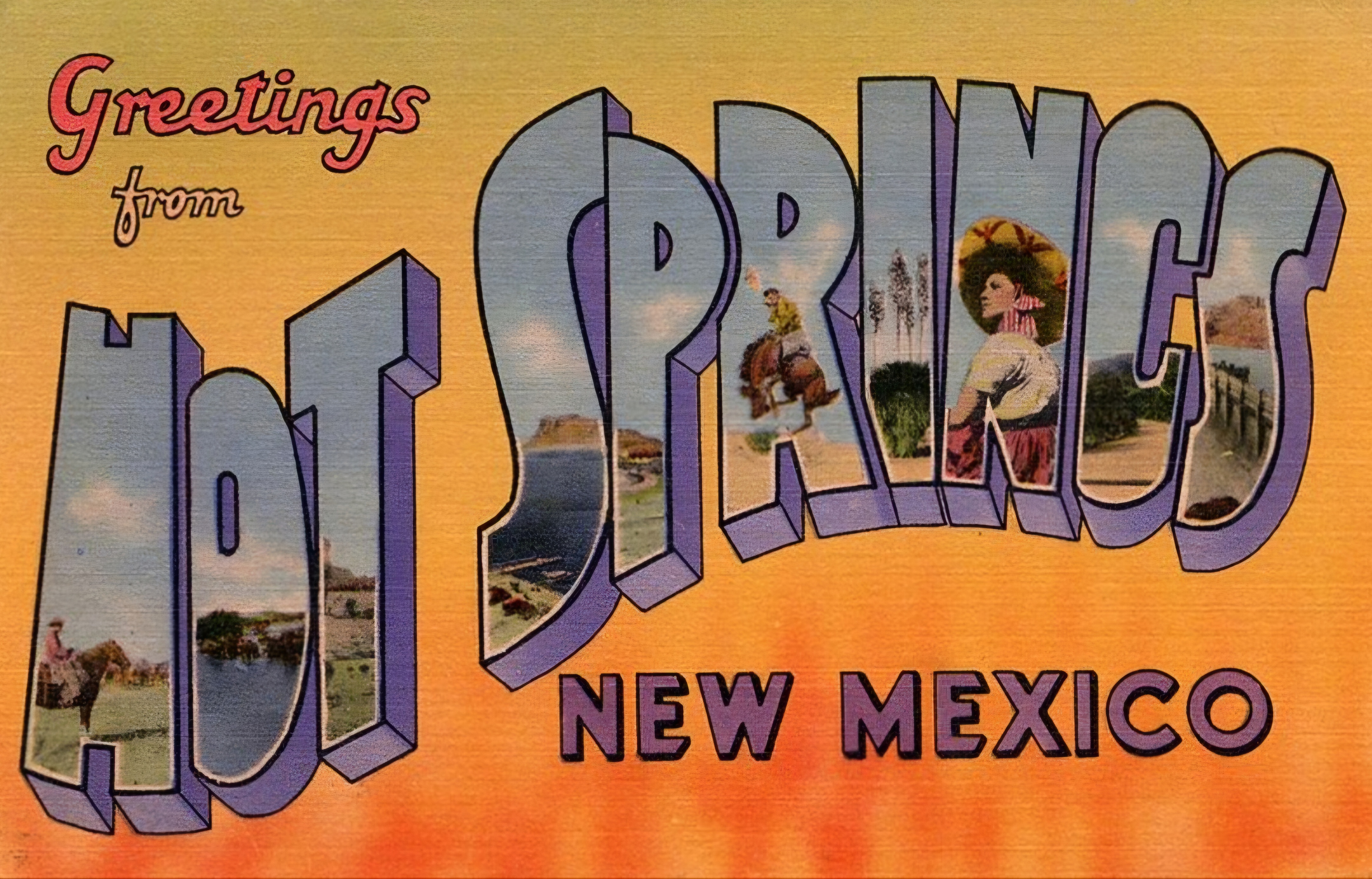
“Greetings From…” postcards emerged in 1890s Germany. The early examples of Gruss Aus cards featured the name of a location rendered in bold, three-dimensional letters with miniature scenes of local landmarks contained within. More common postcards of the day feature detailed illustrations of castles and later photographs. This new design cleverly packed maximum visual information into the limited space, creating an instantly recognizable format that would soon spread internationally.
New American Icons
The transmission of this visual language to America came through a German immigrant named Curt Teich, who arrived in the United States in 1895. After establishing his printing company in Chicago in 1898, Teich would transform American visual culture through the mass production of postcards. Following a visit to Germany in 1904, he successfully imported the Gruss Aus style to the American market, adapting it to suit American sensibilities and landscapes.
The true flowering of Teich’s vision came in 1931 with the introduction of his linen-textured postcards. Printed on high-quality paper with a distinctive fabric-like texture, these cards employed vibrant colors and airbrushing techniques that created a hyperreal aesthetic. The technical innovation of the linen card allowed for faster drying times and more saturated colors, resulting in postcards that depicted America in an optimistic, idealized light—a stark contrast to the harsh realities of the Great Depression era in which they first appeared.
Teich’s business savvy was as important as his technical innovations. He employed hundreds of traveling salesmen who photographed businesses and worked with owners to create idealized images for postcards. This approach not only generated business but also shaped how Americans visualized their own landscapes and communities. The Curt Teich Company would eventually produce over 45,000 different linen postcard subjects in just two decades.
The visual language of these postcards—bold lettering, vibrant colors, and idealized scenes—became firmly embedded in American visual culture during the 1930s through 1950s. As automobile ownership increased and the highway system expanded, these postcards played a crucial role in shaping Americans’ understanding of their own geography and national identity. They were both records of places visited and aspirational images of places to be seen.
State Birds and Flowers
Parallel to the development of the large letter postcard, another form of state-based visual identity was taking root—the formal designation of state birds and flowers. Most American states adopted these symbols between the 1920s and 1940s, often through campaigns involving schoolchildren, women’s clubs, and conservation organizations.
These officially designated natural symbols provided another vocabulary for expressing regional identity, one rooted in the natural world rather than the built environment. While large letter postcards typically highlighted human achievements—city skylines, hotels, roadways—state birds and flowers emphasized the distinctive natural heritage of each region. Together, these complementary systems of regional representation provided Americans with a rich visual language for their diverse nation.
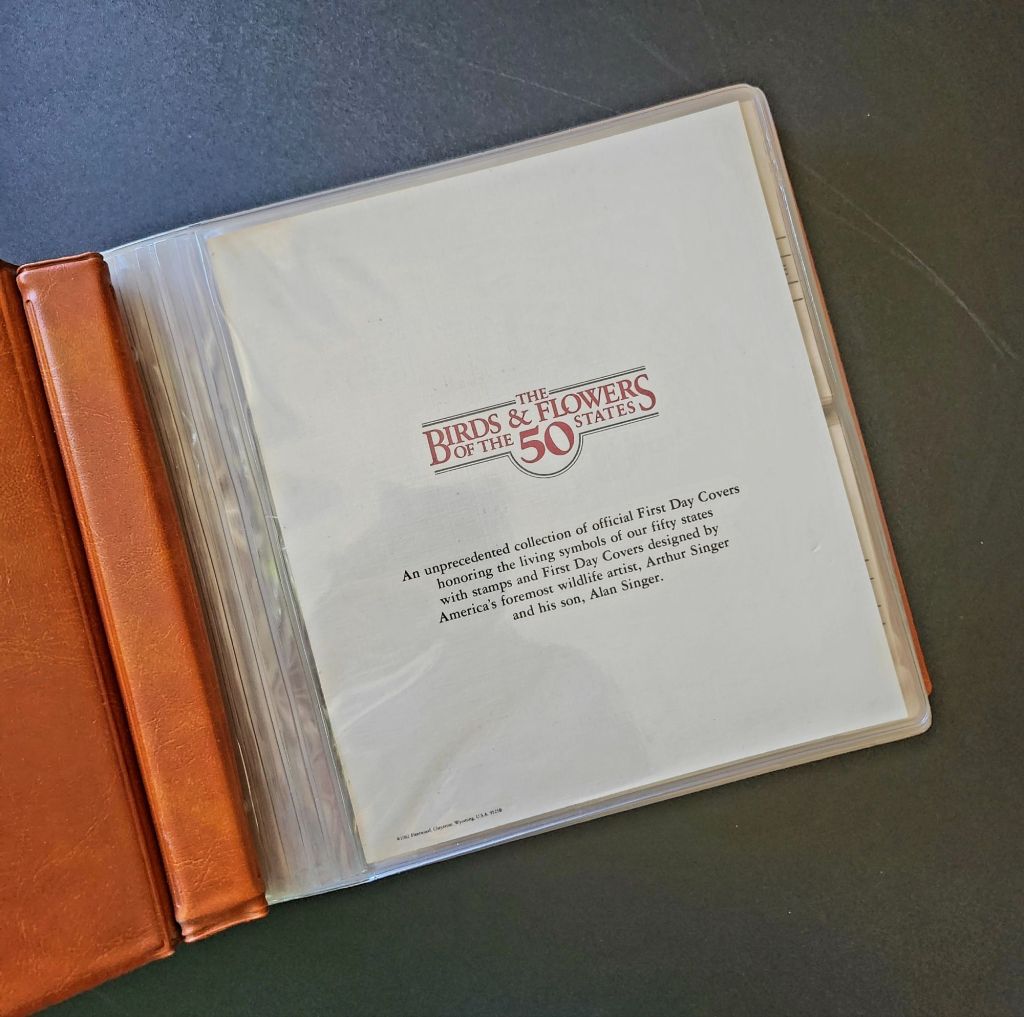
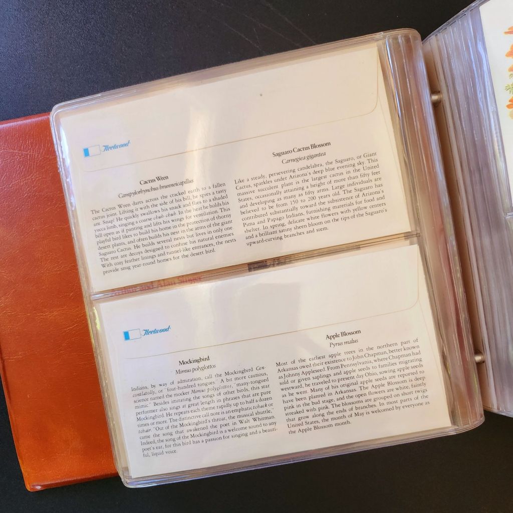
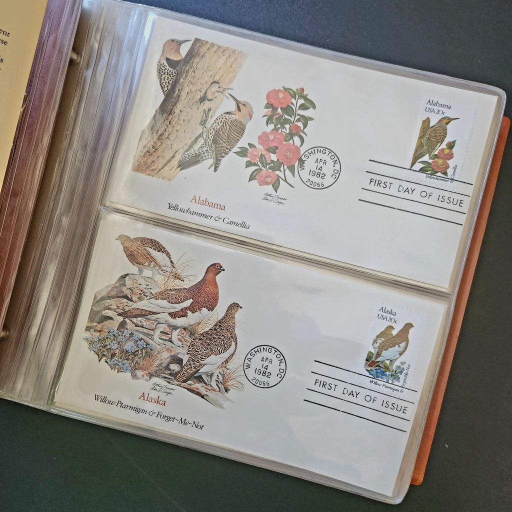
In 1978, the Fleetwood company commissioned father-son wildlife artists Arthur and Alan Singer to create 50 original paintings of state birds and flowers. These watercolor paintings caught the attention of U.S. Postal Service officials, who recognized their exceptional quality and decided to feature them on commemorative stamps. Released on April 14, 1982, the 20-cent State Birds and Flowers stamp collection was another big moment in the ripple effect.
Arthur Singer painted the birds while his son Alan rendered the flowers, creating unique artwork for each of the 50 stamps. The collaboration between father and son added another dimension to this cultural transmission—the passing of artistic traditions and approaches from one generation to the next.
The Fleetwood company published a complete album featuring First Day Covers of these stamps. These decorative envelopes included additional information about each state’s natural heritage, creating a beautifully bound volume that was both aesthetically pleasing and informative. The Birds & Flowers of the 50 States album is now a cherished collectible, a visual catalog of national natural heritage in a single, beautifully presented format.
Greetings from the Post Office
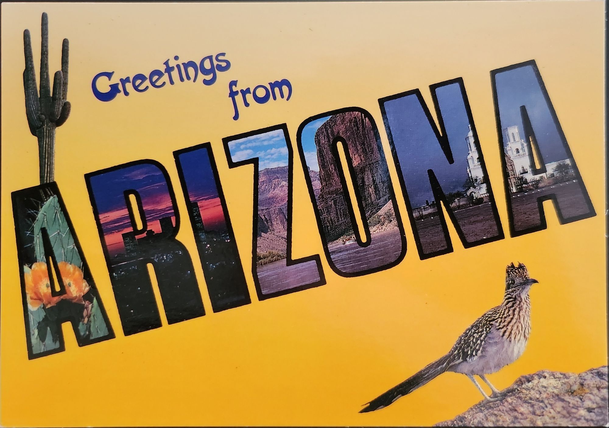
Twenty years later, the visual language of the large letter postcard experienced a revival through another stamp collection. On April 4, 2002, the USPS issued the ‘Greetings from America’ stamps, designed by Richard Sheaff and illustrated by Lonnie Busch. These stamps paid direct homage to the large letter postcards of the 1930s and 1940s, recreating their distinctive style for a new generation.
Each of the 50 stamps featured the name of a state in large, three-dimensional letters containing images of iconic landmarks and scenic vistas. The stamps were initially released as 34-cent denominations, but due to a rate change, they were reissued with 37-cent denominations on October 25, 2002. Here is another circular moment—a postal medium paying tribute to a postcard tradition that had itself been a popular means of commemorating places visited.
These stamps connected with older Americans who remembered the original postcards. Younger generations encountering the style for the first time recognized both the nostalgic and contemporary appeal. The vibrant colors and bold, three-dimensional lettering still effectively communicated a sense of place and regional pride, proving again the resilience of this visual vocabulary.
Even Larger Letters
Artists Victor Ving and Lisa Beggs took the large letter postcard to a whole new scale. Starting in 2015, the Greetings Tour has produced dozens of murals that transform the two-dimensional postcard design into monumental public art.
A grand dimensional leap—a design meant to be held in the hand scaled to the size of a building. The murals maintain the core visual elements of the large letter design while incorporating contemporary references and local touchstones. In a delightful twist, these murals have themselves become tourist attractions with visitors posing for social media. The postcard mural is now a backdrop for new images to be shared globally.
The artists also create custom digital designs for corporations, events, and retail spaces, maintaining the vintage aesthetic while adapting it to contemporary contexts. This commercialization represents another ripple in the cultural transmission of the large letter design, as it moves from public art back into the commercial realm that originally produced the linen postcards.
Digital Doppelgangers
As graphic design software became increasingly sophisticated and accessible in the late 20th and early 21st centuries, the visual language of large letter postcards found new life in digital recreations. Graphic design tools enable designers to quickly recreate the distinctive three-dimensional lettering and image-filled characters of the classic postcards.
AI Generation
Online design platforms have further opened access to this aesthetic, offering templates that approximate the large letter style without requiring specialized skills. Now small businesses, community organizations, and individuals can incorporate elements of this visual tradition into their communications, expanding the reach of this design vocabulary beyond professional designers.
With a phrase like “create an image of a vintage large letter postcard from Arizona,” most anyone can generate a decent design in seconds. Like the old days of digital clip-art, the initial attempts lack craftsmanship and historical accuracy. Still, they are a new democratization of this visual vocabulary, making it more accessible to professional designers and enthusiasts alike, though perhaps for different reasons.
This latest development completes a fascinating loop—from specialized industrial printing processes that required substantial investment and technical expertise, to digital design tools requiring professional training, to AI generation requiring only the ability to formulate a design concept and the text prompt. With each technological advancement, the barriers to producing these distinctive visual representations have lowered, while the core elements of the design has persisted.
Visual Persistence
From German Gruss Aus postcards to AI-generated images—our journey demonstrates the remarkable resilience of certain visual vocabularies across time, technologies, and cultural contexts. Despite dramatic changes in production methods, from specialized lithographic presses to neural networks, the essential visual grammar of these designs remains recognizable.
This persistence has a woven quality—the ability to render and replicate a sense of place over time. Whether in linen postcards, commemorative stamps, public murals, or digital images, the large letter design and state symbol motifs combine to convey regional identity and pride over time. Their continued relevance suggests that certain visual solutions, once discovered, become an architecture that generations continue to appreciate and adapt for new uses.
We also feel the ripple effect in the broader patterns of American history— immigrants bringing skills and technology to American shores, industrial innovation creating new visual possibilities, the automobile age changing how Americans experienced nature and themselves, and digital technology transforming how we create and share images. Through it all, the distinctive visual language pioneered by Curt Teich and others continues to evolve.
What new ripples lie ahead? Perhaps augmented reality will allow us to step into these designs. Or new materials and technologies will adapt them yet again for uses we don’t yet comprehend. Whatever comes next, we know that cultural transmission does have a distinguishing mark—it ripples outward in both calculable and unexpected ways, influenced by technology, economics, and human inspiration, creating patterns that can be traced across generations.
For Additional Reading
Meikle, Jeffrey L. (2016). Postcard America: Curt Teich and the Imaging of a Nation, 1931-1950. University of Texas Press. Publisher’s page
“The Immigrant Story Behind the Classic ‘Greetings From’ Postcards.” Smithsonian Magazine. (2018). Read online
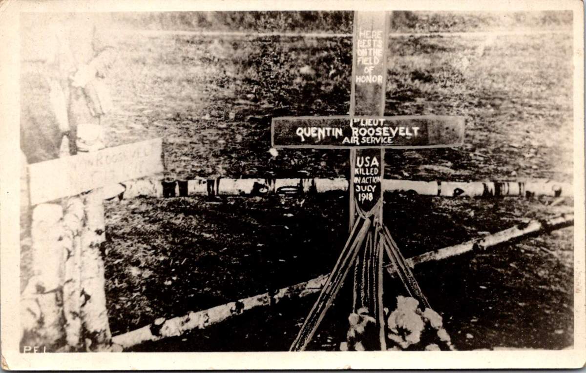
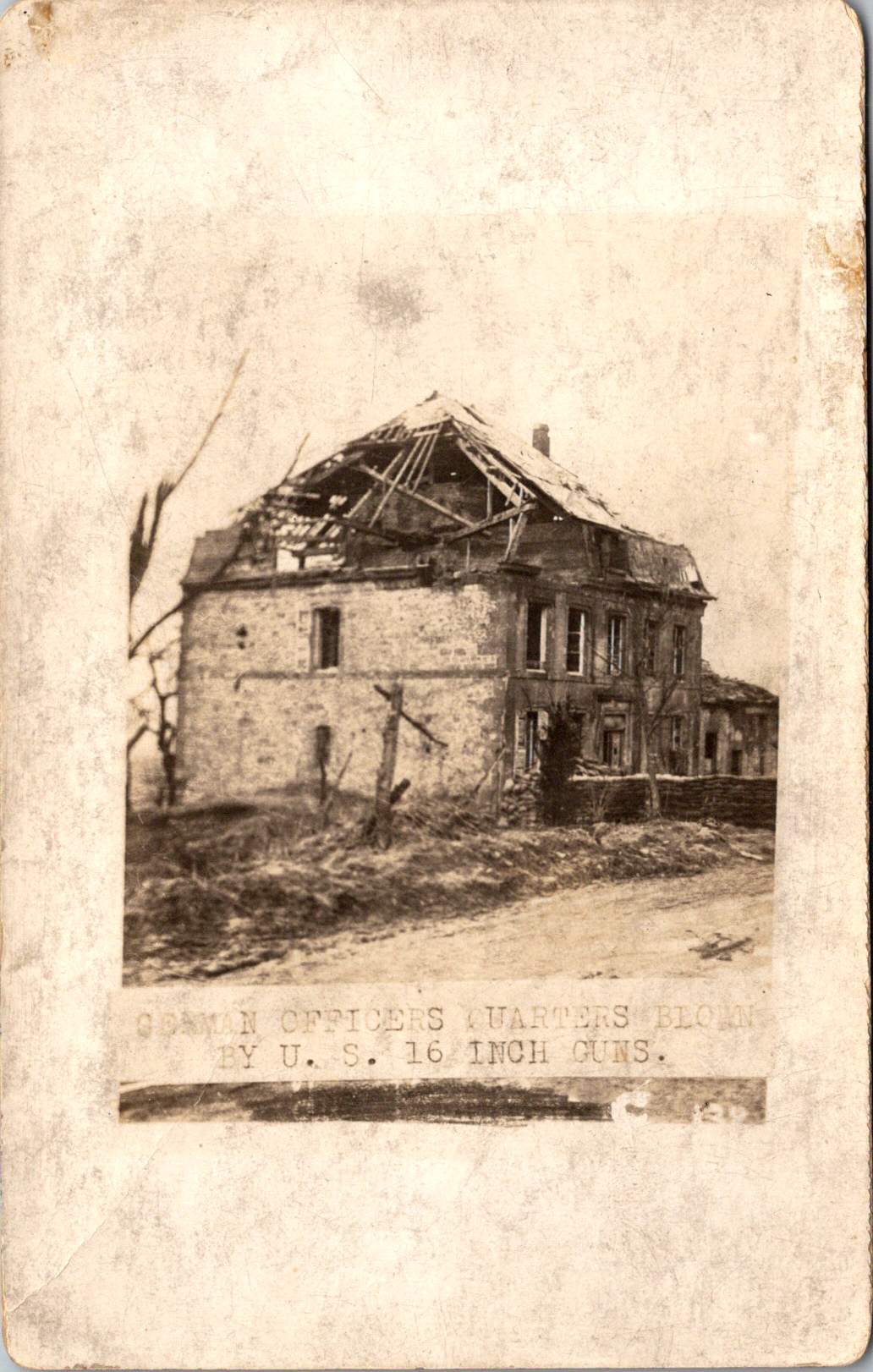
A wooden cross rises from churned earth, the inscription stark against weathered wood. A familiar image of a striking handmade monument to the son of a president who fell from the sky over France.
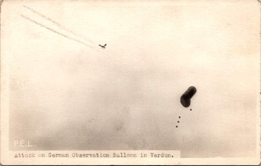
This photograph, captured by a U.S. Signal Corps photographer known only by the initials P.E.L., embodies the US vision of the first World War carefully curated by military officials. While this image evokes sacrifice, honor, and patriotism, the ones that follow emphasize air power and the ground fight.
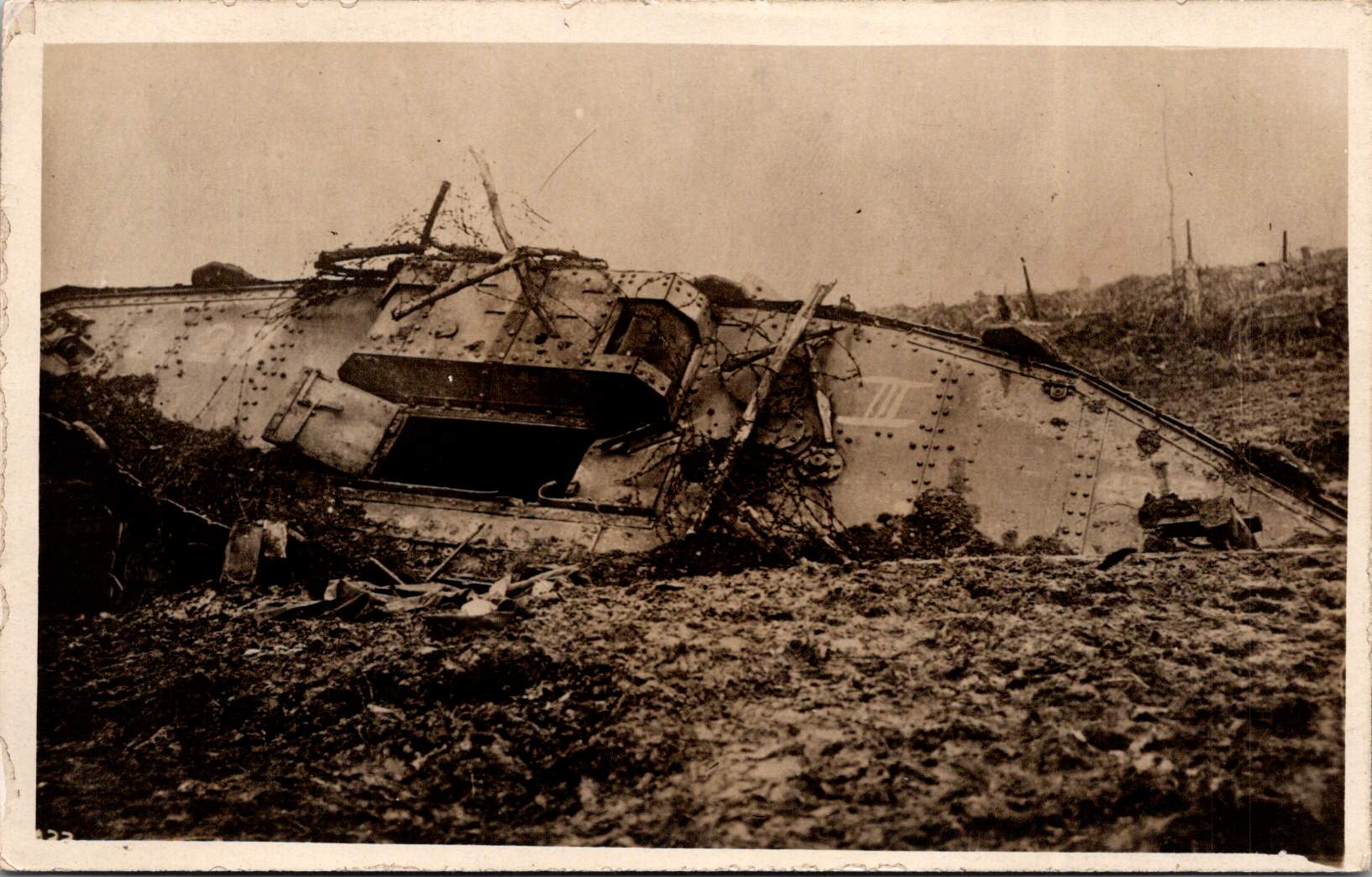
The Signal Corps photographers worked with clear directives. Their images showcased military capacity and impact: a German observation balloon in flames over Verdun, captured enemy aircraft, and troops dug into the battlefield. These photos celebrated American military achievements while maintaining a safe emotional distance from war’s realities. They framed the conflict as a grand, heroic endeavor of machines and strategy, and no bodies.
Soldier photography told different stories.
World War I marked a pivotal shift in war photography. The conflict erupted during the democratization of the camera, when Kodak’s marketing promise—You press the button, we do the rest—had placed photography in ordinary hands. For the first time, soldiers carried their own cameras to the front. They documented their experiences without oversight, censorship, or propaganda objectives.
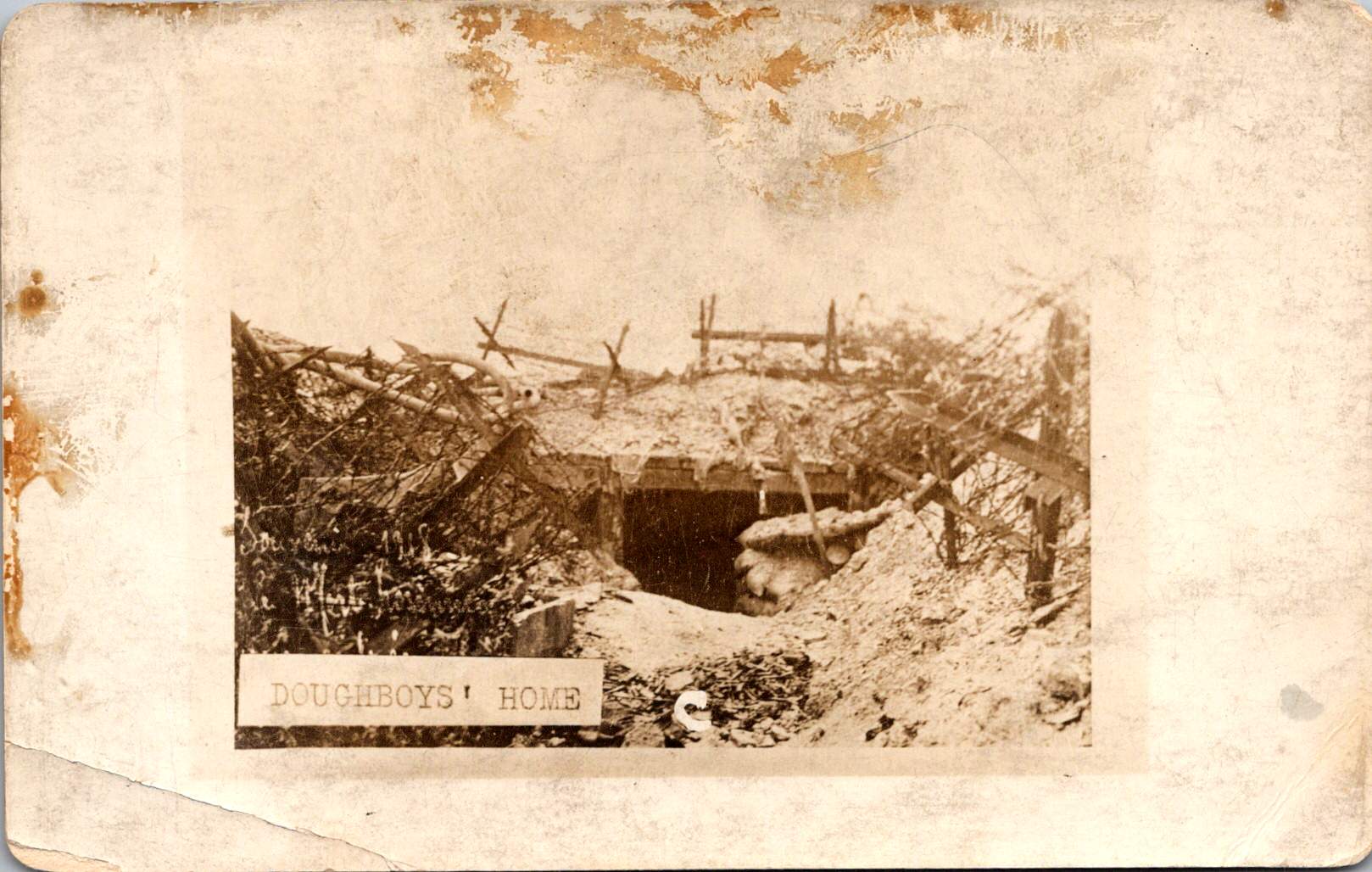
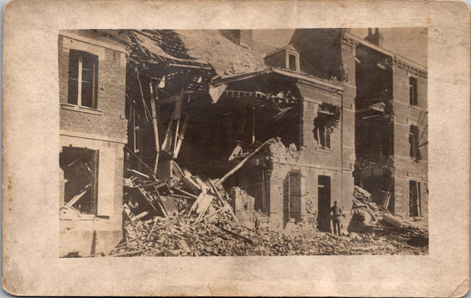
The images captured by troops and printed later at studios like Renfro & Jensen in Belmont, Arkansas reveal a more intimate perspective—the human cost of conflict. German officers’ quarters reduced to rubble by American artillery. The harsh conditions of a foxhole or a machine gun post.
These images weren’t composed for newspaper spreads or government reports. They were personal souvenirs, visual evidence of experiences too enormous to capture in words alone. They were captured on a new-fangled camera and carried home as silent witness.
Belmont, Arkansas transformed virtually overnight in 1917 from a quiet rural community into a bustling military training center. Soldiers flooded the region, bringing with them not just their uniforms and rifles, but their cameras. The town experienced a true boomtown effect as businesses sprang up to serve the influx of military personnel. Among these enterprises, the Renfro & Jensen photography studio established itself as a crucial link between soldiers’ experiences and their communication home.
Then, as demobilization began in 1918, returning soldiers sought ways to share or quietly remember what they had witnessed. Renfro & Jensen became unwitting archivists. They must have developed and printed thousands of soldier photographs—images far more frank and direct than anything appearing in newspapers or government publications. The studio workers were likely among the first civilians to confront warfare through this new technology. Each day, they processed images showing destruction, military achievements, and occasionally, the graphic aftermath of combat. Their commercial service inadvertently preserved a crucial alternative visual history of the conflict.
Two European-produced photographic postcards further document the war. These images, printed on distinctive European paper stock, emerged from a continent already numbed by years of destruction.
Another sixteen images — the most harrowing in the collection — can’t be shown here. The ethical boundaries of war photography persist today. What images should be shielded from casual viewing, and which realities deserve documentation regardless of their power to disturb?
Major institutional collections house millions of WWI photographs. The National Archives holds the largest repository of World War I material in the United States, with over 110,000 photographs digitized from two primary series: the American Unofficial Collection of World War I Photographs and the Photographs of American Military Activities. The Library of Congress maintains extensive collections, including the American National Red Cross Collection with over 18,000 digitized negatives showing wartime activities.
Beyond these institutional repositories exists a vibrant world of private collectors who often hold the most provocative and unfiltered images. These private collections sometimes reveal perspectives absent from official archives. Photographer Carl De Keyzer discovered approximately 10,000 archival glass plate and celluloid negatives from WWI scattered across Europe, many in private hands. From these, he selected 100 to reproduce in stunning detail, revealing aspects of the conflict previously unseen in such clarity. Some of the most compelling battlefield imagery exists in small personal collections—albums like this one that have been kept by families of veterans, passed down through generations, their contents rarely exhibited publicly.
The grave of Lieutenant Quentin Roosevelt is quite enough for many. It symbolizes loss while sparing us its visceral reality. But the full photographic record of the conflict includes truly heinous realities—corpses tangled in barbed wire, faces distorted by gas, bodies rendered unrecognizable by artillery.
While official photographers were tasked to frame narratives that supported war efforts, some soldier photographers refused to turn a blind eye. They captured what they witnessed, creating very personal views that continues to challenge our understanding of history. Their lenses documented what words alone could never convey—the irredeemable human cost of modern warfare.
Copper maps. Wooden cards. Puzzle prints. Discover how obsolete technologies transform into art and craft, and explore why we can’t stop reinventing the perfect postcard.
In this age of instant digital communication, the persistence of physical postcards presents an intriguing contradiction. These rectangular pieces of cardstock—designed to carry both image and correspondence through postal systems without an envelope—serve as artifacts of a communication method that had its heyday a century ago. But rather than disappear entirely, postcards have evolved in novel ways that tell us even more about who we are.
Why We Seek the New
Humans have always been drawn to novelty. Our brains light up at the unfamiliar—it’s a survival mechanism that once helped our ancestors notice changes in their environment that might signal danger or opportunity. But our relationship with novelty runs deeper than vigilance. We seek out new experiences, objects, and sensations even when no practical threat or benefit is apparent.
This human attraction to novelty serves several purposes. First, it provides simple pleasure—the dopamine release that accompanies discovery keeps us engaged with our surroundings. Second, it helps us learn and adapt—new situations force us to develop new skills. Third, it offers social currency—being the first to discover, own, or report something novel (even if untrue!) gives us a kind of status within our communities.
Perhaps most fundamentally, novelty helps us fight against the deadening effect of habituation. We become blind to what remains constant around us, a psychological phenomenon called “sensory adaptation.” Think of how you stop noticing a persistent background sound, like traffic noise. Novelty jolts us back into conscious appreciation, like noticing the birdsong instead, making us sense the familiar differently.
With mass-produced consumer goods, we often pursue novelty through customization or unique variants—like these postcard alternatives. They satisfy our craving for something special while maintaining connection to recognizable forms. Even novelty doesn’t stray too far from the familiar.
Technology Becomes Art
As technologies age and are replaced by more efficient methods, something interesting happens—the displaced technology often shifts from the realm of utility to the realm of artistry and craft. What was once valued primarily for function becomes appreciated for form, precision, and the visible human touch.
Letterpress printing was an extraordinary innovation of its time and once the standard for all printed matter. It was largely replaced by offset printing in the 20th century and later the digital methods we use today. But rather than disappearing, letterpress evolved into a premium craft, prized for its tactile quality and visible impression on paper—characteristics that were originally just side effects of the technique, not its intended purpose.
The same transformation happens with many technologies: vinyl records, film photography, mechanical watches. As digital alternatives take over the functional role, the analog predecessors become vessels for history, craftsmanship, ritual, tactile pleasure. They move from being tools to being experiences.
This pattern helps explain our collection of novelty postcards. Somewhere in the middle of last century, the standard paper postcard was functionally superseded by digital communication, freeing it to evolve into these more elaborate, less practical forms. They represent a technology in its artistic phase—no longer bound by strict utility, but free to explore expressive and sensory possibilities, along with kitsch and commercialism.
Utah in Copper Relief
The copper-embossed Utah souvenir represents one of the more elaborate departures from traditional postcard design. The metallic rectangular plate features a raised topographic outline of the state with embossed illustrations of regional landmarks and attractions. The word UTAH is prominently displayed at the top, while places like Vernal, Provo, Cedar City, and St. George are labeled at their approximate locations. The copper medium gives the piece warmth, with a decorative scalloped border framing the state’s geography and securing the paper card below.
The manufacturing process likely involved die-stamping or embossing thin copper sheeting, a technique that dates back to the late 19th century and regained popularity in mid-20th century souvenirs. The tactile nature of the raised elements invites touch, creating a multisensory experience unavailable in traditional flat postcards. The utility of this object as actual correspondence is significantly diminished—the copper surface resists easy writing, and its weight requires additional postage and hand-canceling. It’s more a miniature commemorative plaque that happens to maintain postcard dimensions.
Woodsy Aesthetics
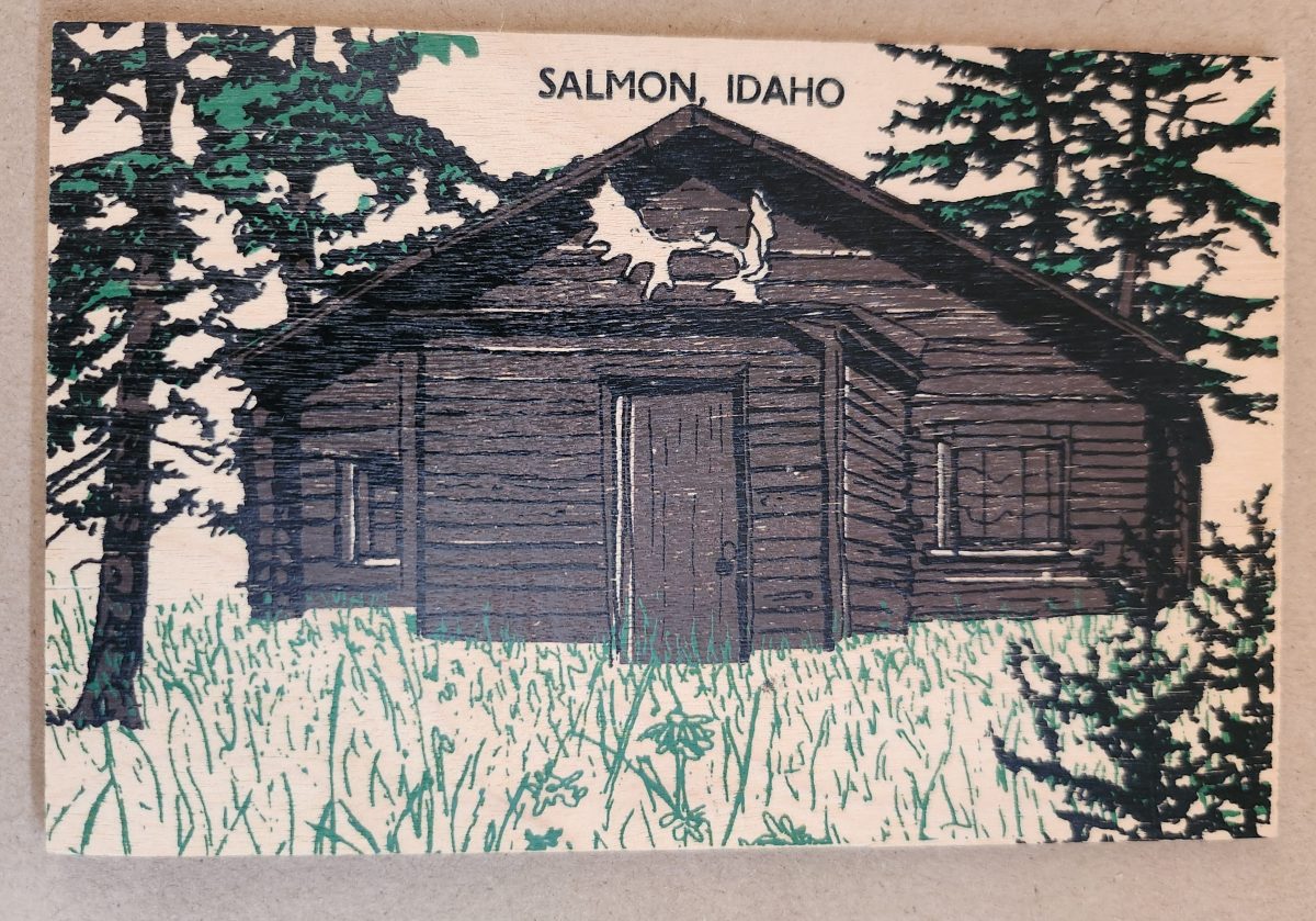
Let’s look closer now at a novelty postcard featuring a cabin in Salmon, Idaho, printed onto a thin wooden substrate and depicting a rustic cabin nestled among stylized pine trees. The scene employs a limited color palette—brown and black for the structure and green for the surrounding vegetation—lending it a deliberately simple aesthetic that echoes both woodcut prints and traditional lithography.
The simple text at the top identifies the location without intruding on the scene. The artwork itself employs minimal detail, capturing the essence of rural life rather than photographic accuracy. The manufacturing process of printing onto thin wood veneer allows for mass production, while adding a specific scene, location name, and ink color for customization.
This card’s rustic medium and subject matter work in harmony, creating a self-referential object where the material reinforces the message—a wooden card depicting a wooden structure set within a forested landscape. The medium becomes part of the message, suggesting authenticity through material consistency. Though mass-produced, it strongly evokes a rural sensibility.
Framed Vistas
Our souvenir from Yellowstone National Park adopts yet another approach. This card features a stylized illustration of Yellowstone’s grand canyon and waterfall printed on cardstock and mounted on a wooden backing.
The artwork employs a palette of oranges, purples, blues, and whites to capture the dramatic landscape, with the falls rendered as a white vertical streak against colorful canyon walls. Dark silhouettes of pine trees frame the scene, while puffy clouds hover in a light blue sky, held inside a purple border. The stylized typography echoes vintage travel posters from the early to mid-20th century. The entire image is mounted or printed on a natural wood base, visible as a frame around the illustration.
This card’s production combines offset printing with a wooden substrate—a look that recalls both traditional woodblock prints and mid-century travel advertisements. The design deliberately evokes an era of American national park tourism when artistic posters commissioned by the Works Progress Administration and the National Park Service established a distinctive aesthetic for natural landmarks.
Playful Puzzles
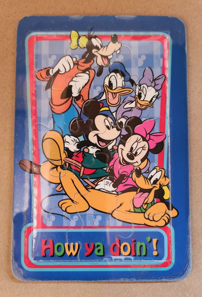
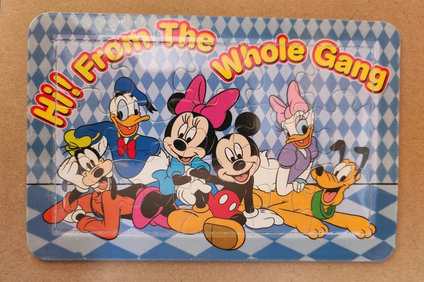
The Disney puzzle postcard introduces an element of interaction we haven’t seen before. This card features Mickey Mouse, Minnie Mouse, Donald Duck, Daisy Duck, Pluto, and Goofy arranged in a group pose against a blue-and-white checkered background. The message reading “Hi From The Whole Gang” in bubble text curves around the edge of the image.
This item turns a postcard into a simple jigsaw puzzle—die-cut pieces that can be jumbled and reassembled to reveal the printed image. The manufacturing process involved full-color printing followed by precision die-cutting to create interlocking puzzle pieces, then applying a thin adhesive film to maintaining the card’s overall integrity for mailing.
This souvenir represents a curious hybrid—a postcard that actively invites its own disassembly. The Disney characters themselves represent another layer of nostalgia, combining America’s animation icons with the traditional postcard format to create an object that references multiple forms of 20th-century popular culture simultaneously. But only modern technology could accomplish these manufacturing details, a playful combination of familiar and fresh.
Magnetic Memories
The Will’s Hardy Trees and Seeds magnetic card is the one in our set with the most layers of both meaning and making. See packets, postcards, fridge magnets, and agricultural Americana all combine in this take home treasure.
The 1909 seed catalog cover is a contemporary image inspired by the real-life Oscar H. Will & Co. of Bismarck, North Dakota. The vibrant illustration displays pansies in various colors—purple, yellow, orange, pink, and white—arranged in a bouquet. Text identifies the company’s 26th year of operation and describes their products as the “choicest and most beautiful on earth”.
A small purple circle overlay on the plastic film cover announces the item’s true nature: a magnetic postcard to send as a gift. Despite its historical appearance and postcard dimensions, the object is actually a refrigerator magnet that merely references seed catalog and postcard aesthetics. The production involved digital printing on magnetic sheet material, applying a printed paper backing, and slipping into a plastic cover with instructions to mail the gift in an envelope.
As a novelty item, it reveals a peculiar circularity. A reproduction of a commercial artifact (seed catalog) transformed into a correspondence medium (postcard) further transformed into a decorative household item (refrigerator magnet). Somehow, we love each iteration all the more.
Nostalgia Squared
What these examples share is a relationship with nostalgia that operates on multiple levels. They aren’t simply nostalgic; they engage in a looping nostalgia—nostalgic representations of already nostalgic forms.
The copper Utah relief draws upon mid-century tourist souvenirs, themselves designed to evoke frontier-era maps and territorial markers. The Salmon cabin employs modern production techniques to simulate traditional woodcuts nad print, which were themselves often romanticized depictions of rural life. The Yellowstone cards references mid-century national park posters that were already stylized interpretations of natural wonders. The Disney puzzle incorporates cartoon characters who have become nostalgic cultural icons, presented in the format of childhood games. The Will’s Seeds magnet reproduces early 20th-century commercial art that was, even in its original context, employing Victorian aesthetic sensibilities.
This layering of reference creates objects that are remarkably dense with cultural signifiers despite their modest physical dimensions. They offer not just a connection to place and time but to the ways we’ve represented ourselves and our interests through commercial souvenirs.
Our apparent need for novelty, then, might be better understood as a need for continual context. Each new postcard iteration doesn’t merely replace what came before; it absorbs and references it, creating objects that function as compact archives of our evolving relationship with the characters and places we cherish.
These novelty postcards sit at an interesting crossroads of commerce, craft, and communication. They represent what happens when a formerly utilitarian object—the humble postcard—is freed from its purely practical obligations and allowed to evolve along lines dictated by sentiment, aesthetics, and novelty.
In a world increasingly dominated by digital experiences, these physical novelties offer something screens cannot—texture, weight, presence. They satisfy our hunger for the tangible. Their quirky, sometimes impractical forms speak to a human need more fundamental than efficient communication: the need to hold something unique in our hands, and to feel a physical connection to places we’ve been and experiences we’ve had.
The postcard itself is and was a very simple concept and object that, over time, has become a medium for ongoing conversations about permanence and impermanence, about what we value over time, and about the tension between utility and sentiment. In their various novel forms, these more-than-postcards tell us about places we’ve been and how we’ve chosen to remember and delight in those places—a correspondence not just between people, but between past and present.