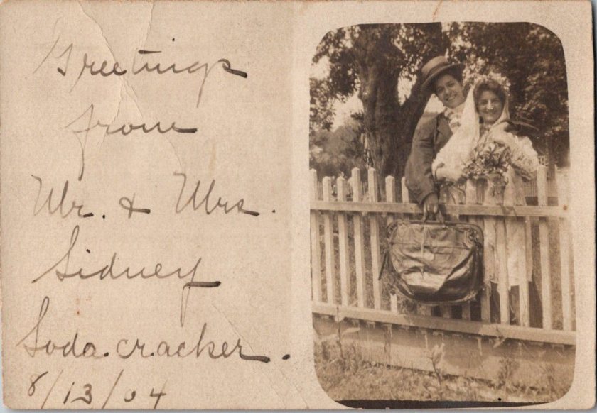
I don’t dare reveal the flipsides of the love-laced cards you’re about to see. What Ida, Minnie, or Gertrude sent or received isn’t for you or me.
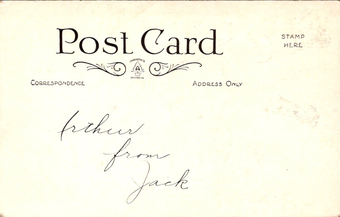
Hand-delivered to Arthur from Jack, this first example is our single exception. With a humble request and an elegant script, we can only hope the romance of a lifetime began, heated up, or settled in. Maybe it was placed on the pillow that morning, sometime before 1907 when postcards still featured undivided backs.
My own love is famously far afield. In the early days, our photograph appeared in a magazine alongside a short interview on the workings of our long-distance affair. We were an ocean away in those days, and on the adventure of a lifetime together. It could be a car drive now, albeit a very long one. Always tempting!
Obviously.
Yes, let’s do!
Finding here anywhere we meet.
Snowcrete!
Little Blue Carriage for Two
Future Flights
Love, Your Guardi-Anne.
Languages are a passion and a profession for my lady linguist. So a few more out of pure fun and fascination. Luf yah!
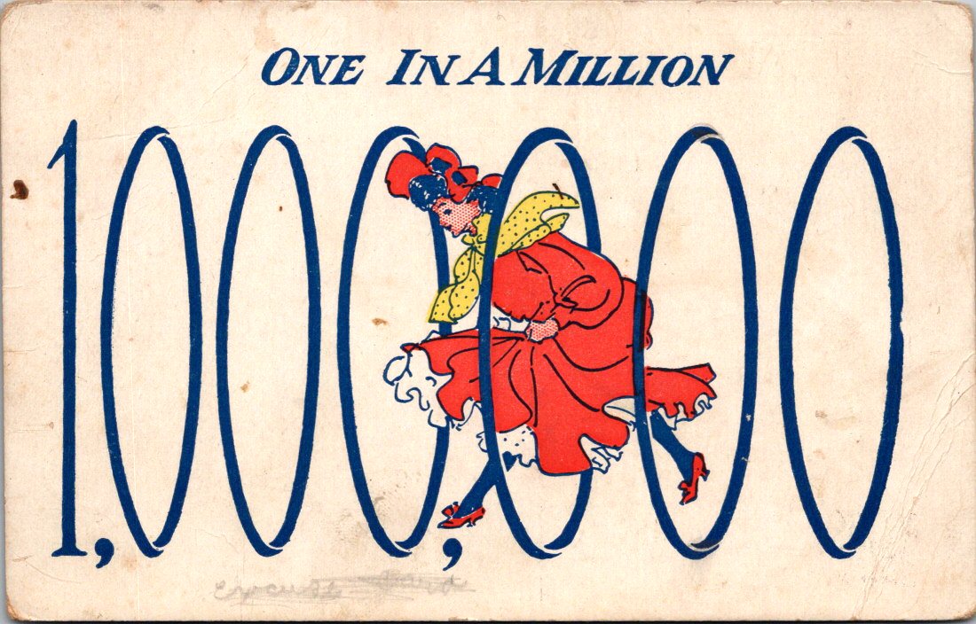
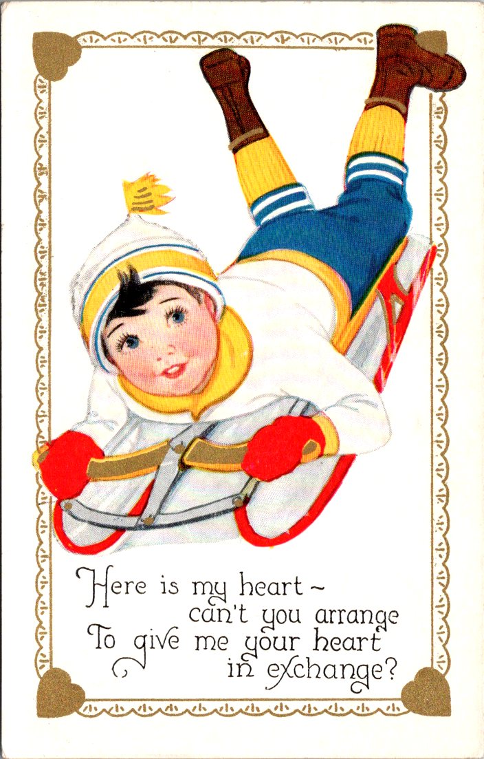
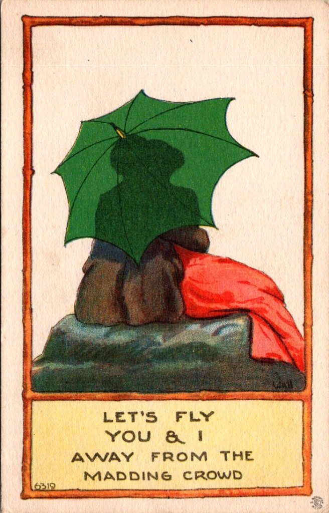
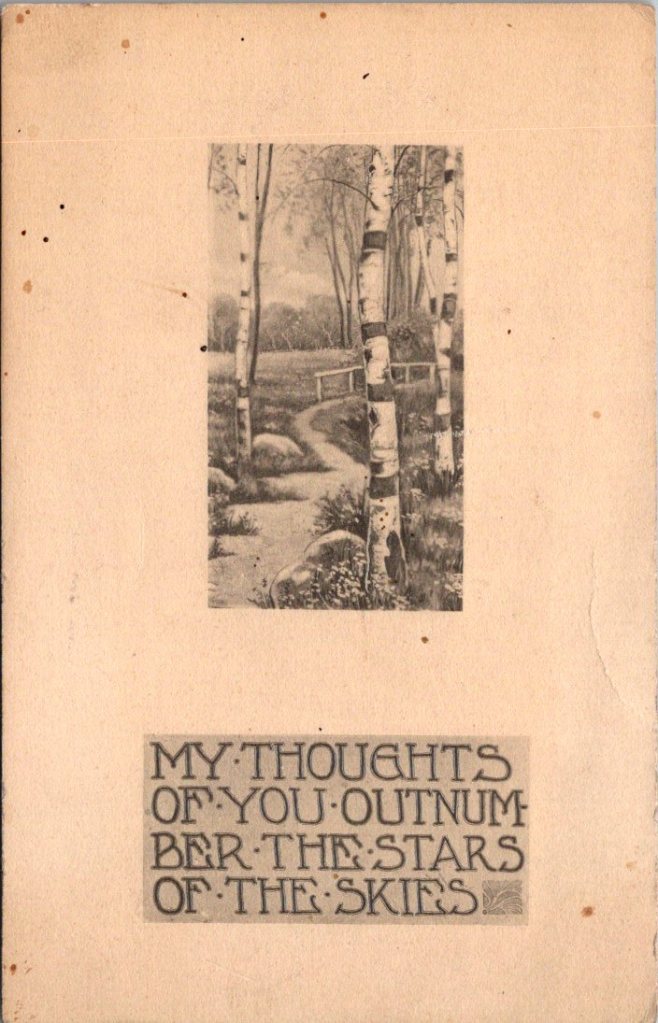
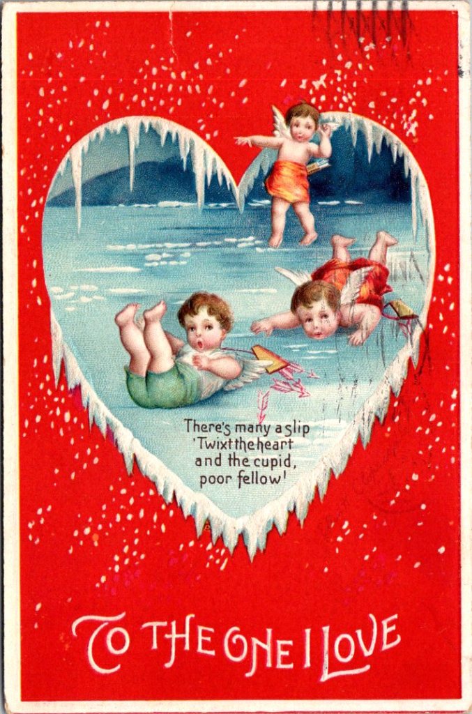
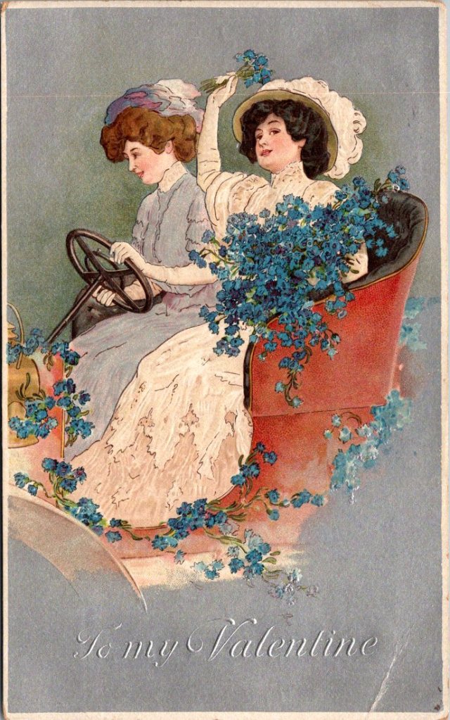
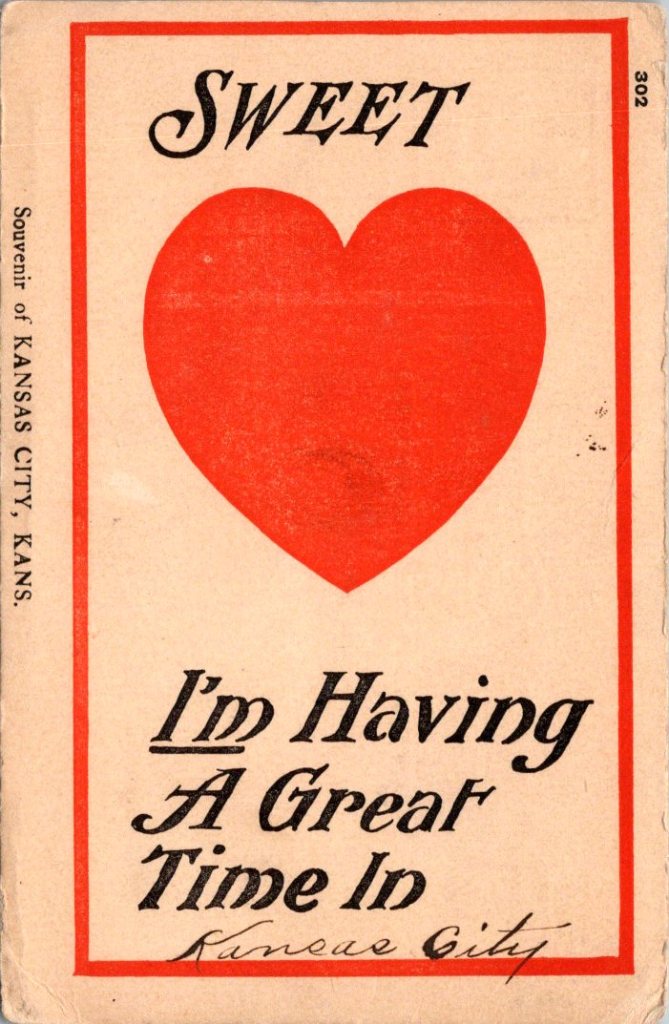
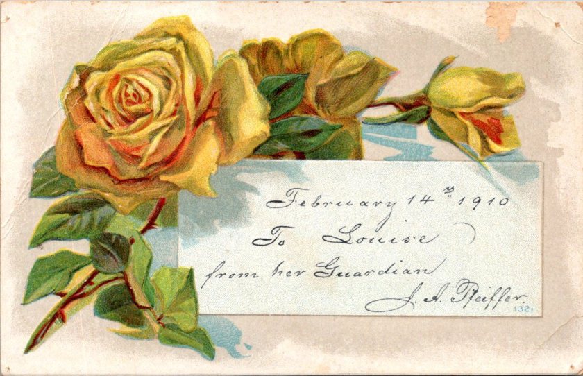
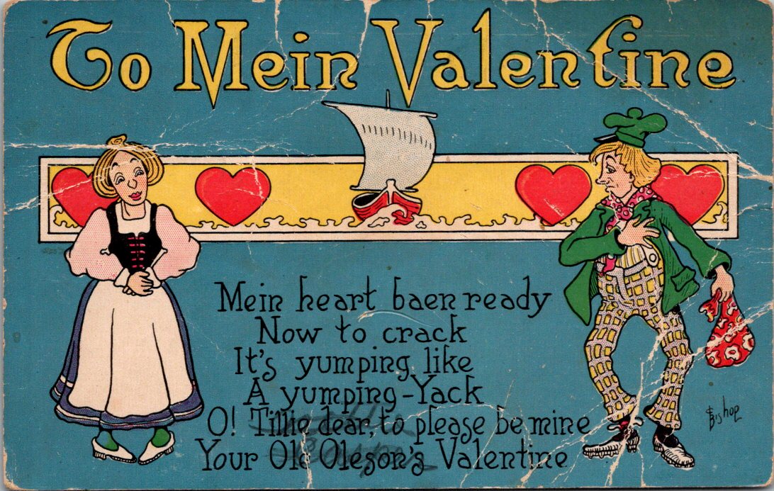
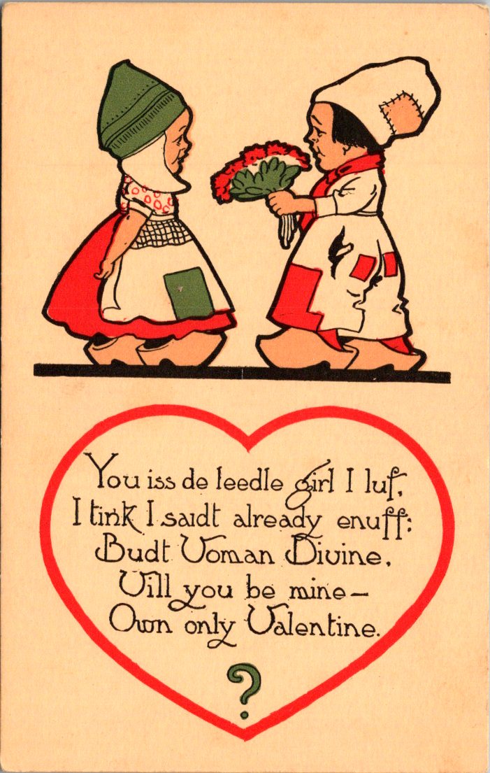
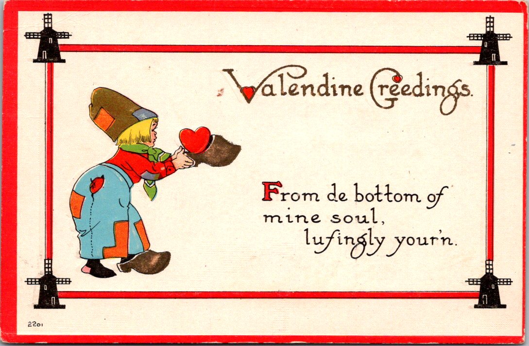
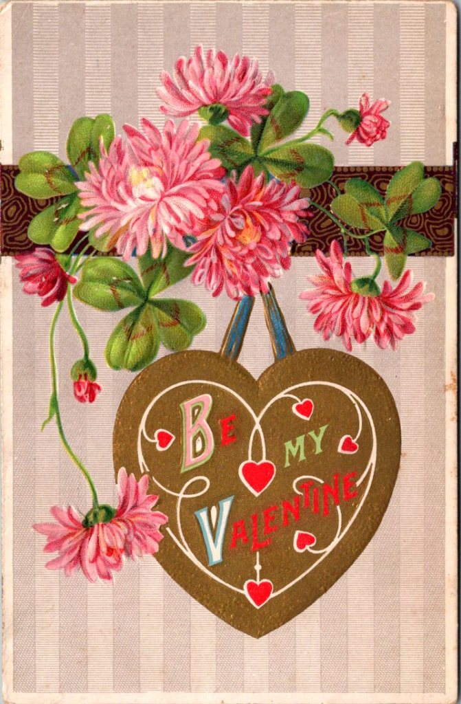
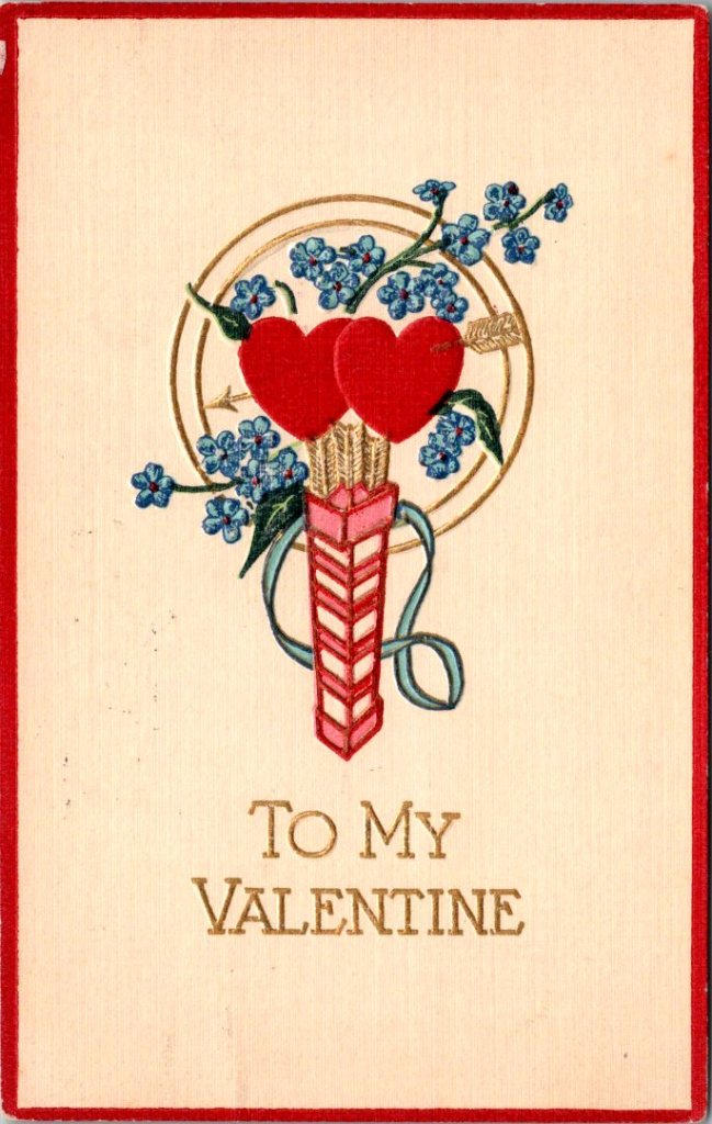
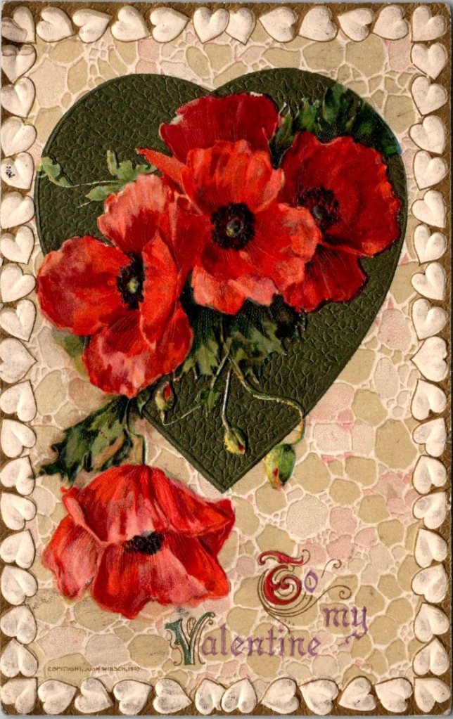
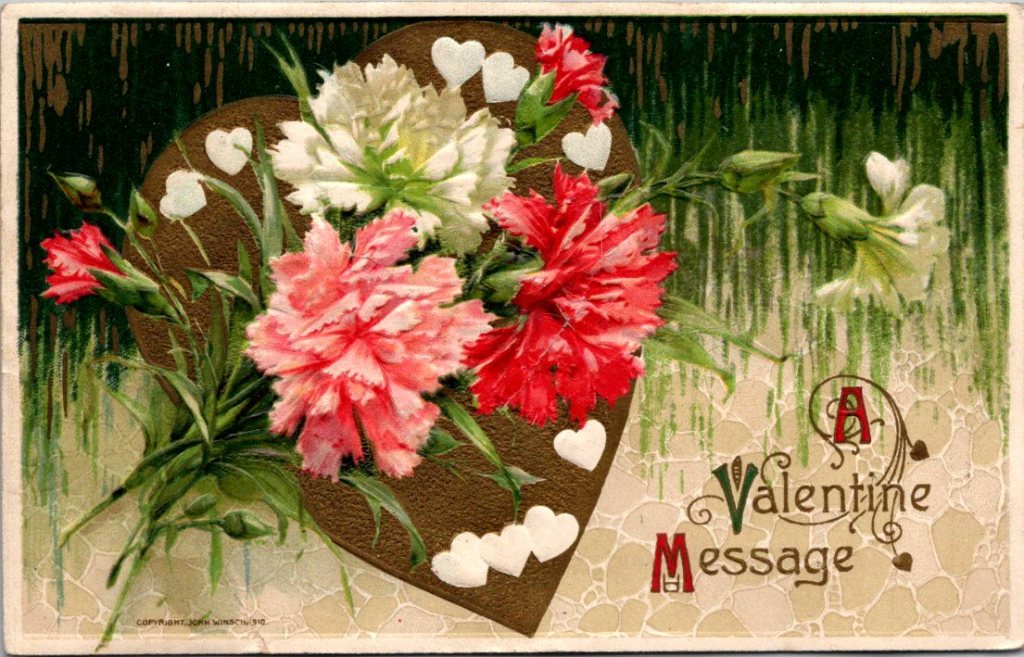
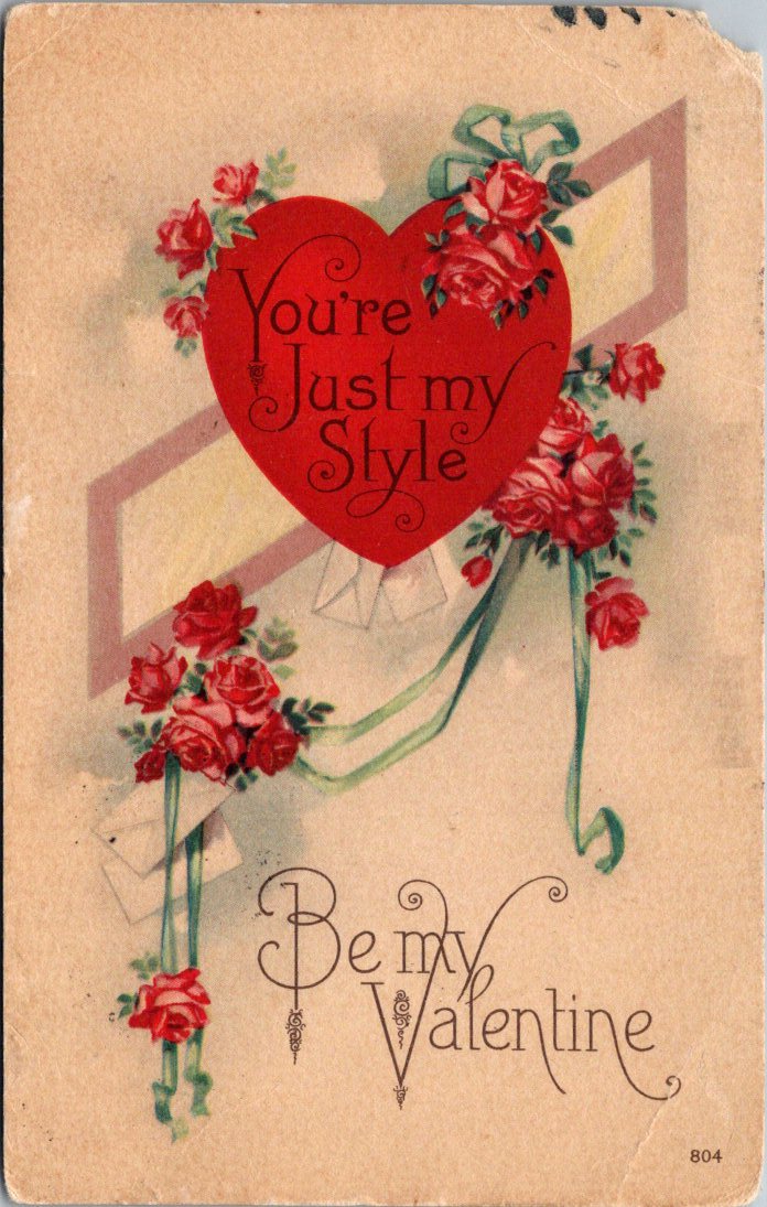
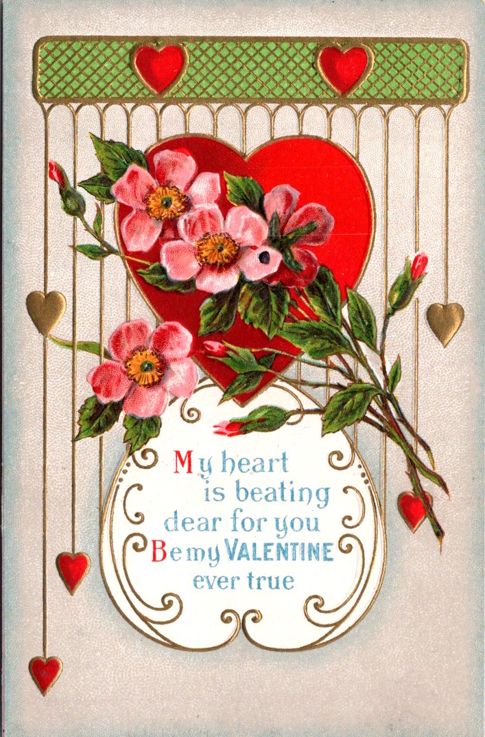
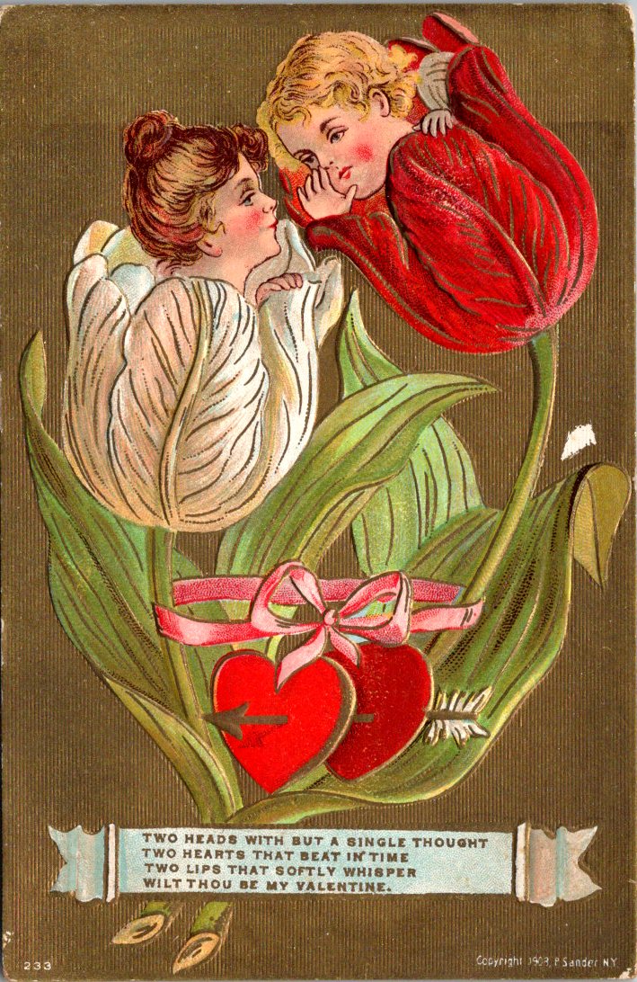
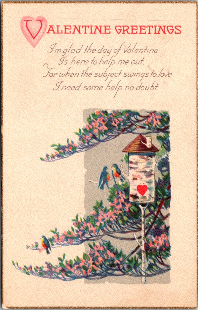
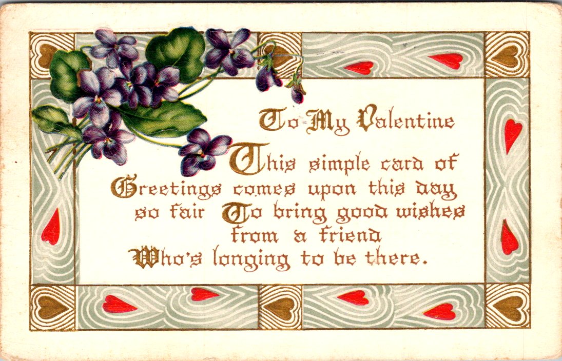
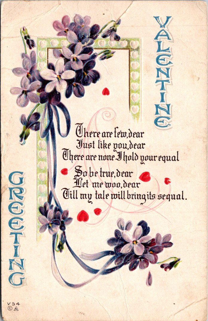
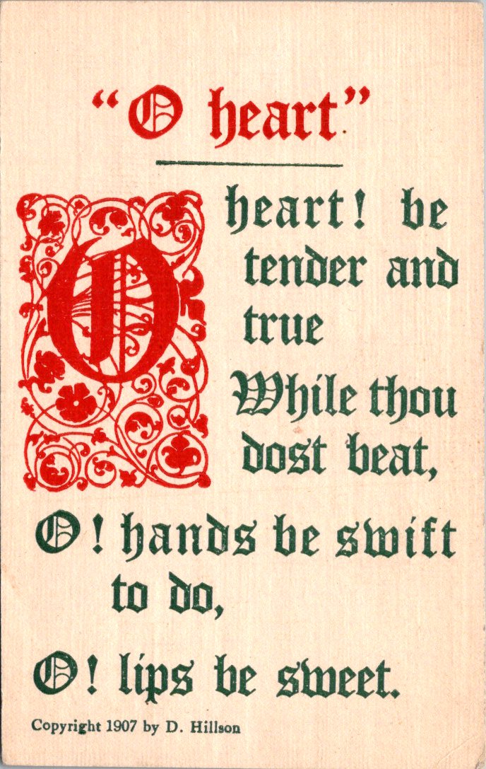
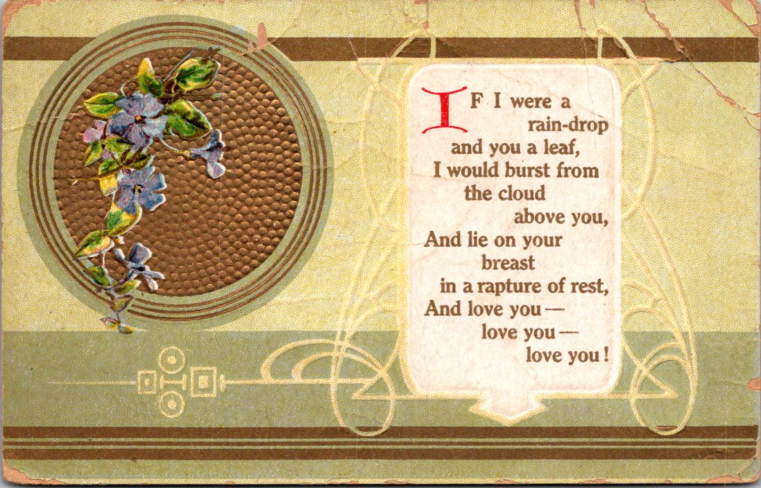
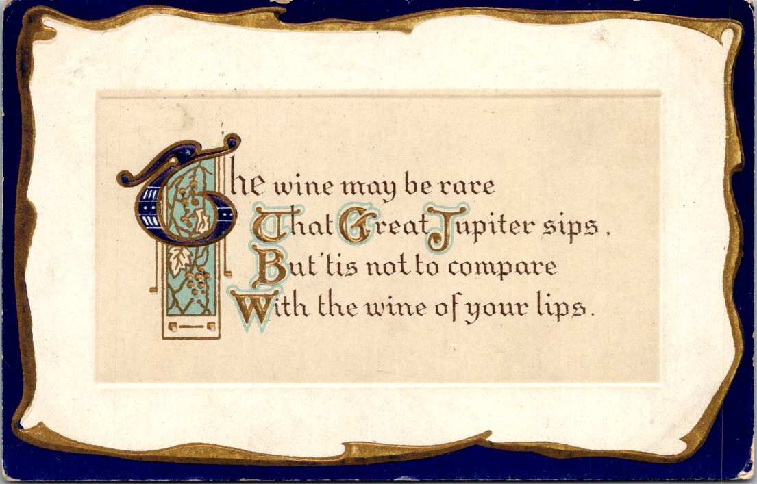
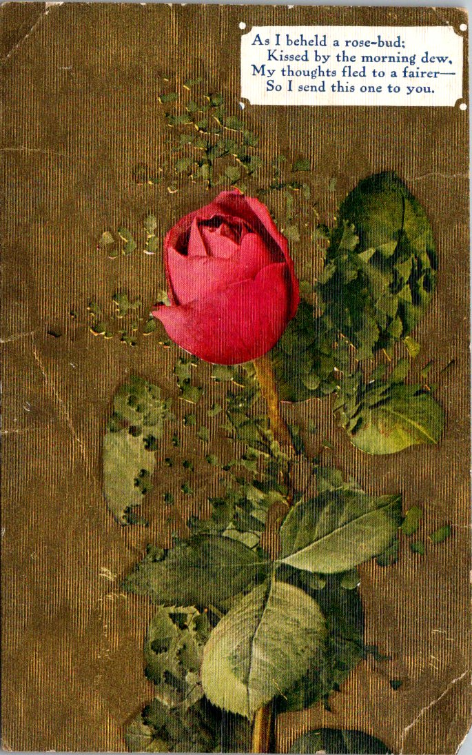
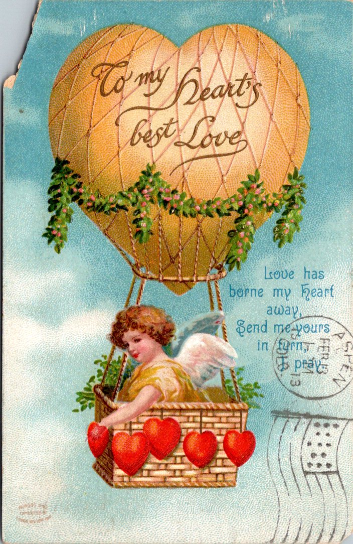
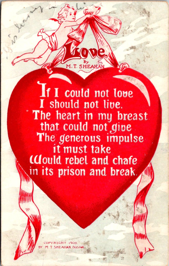
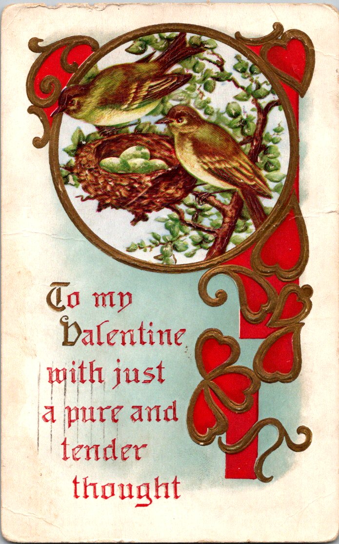
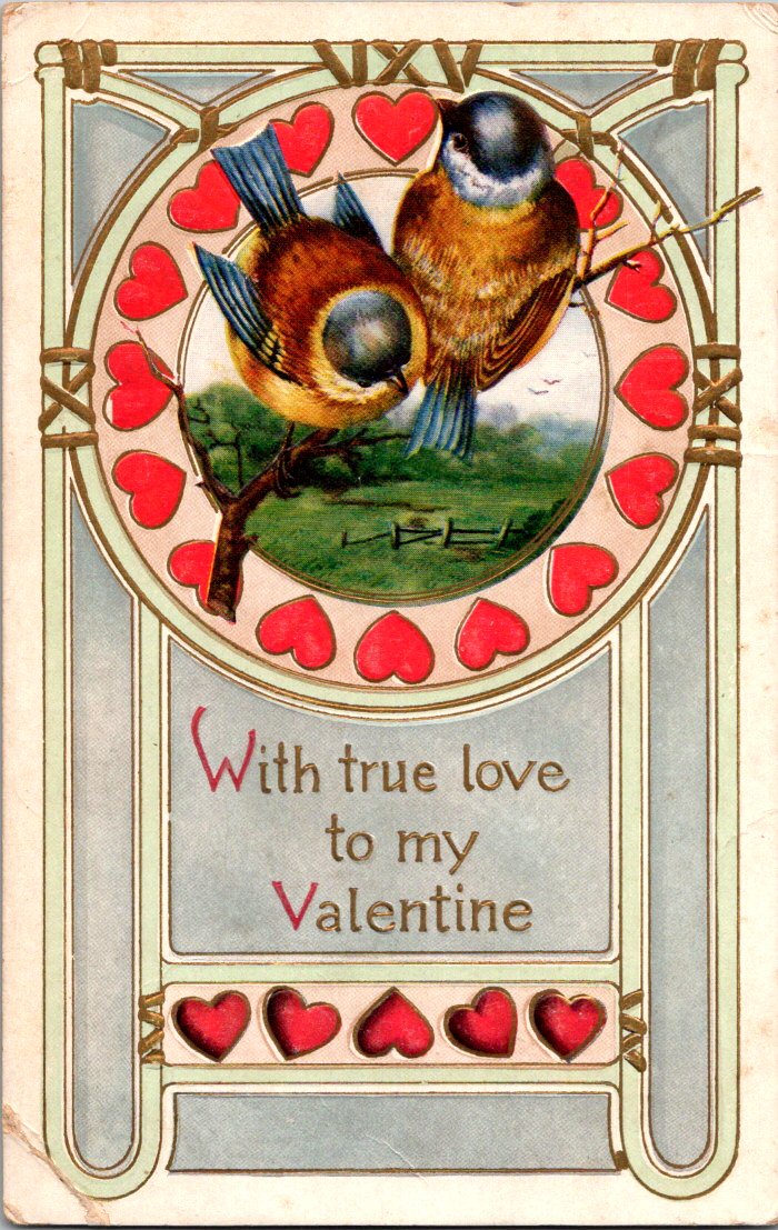
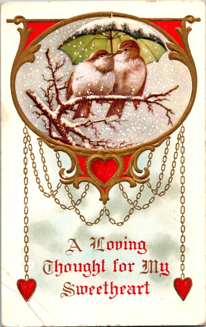
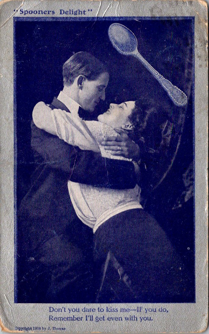
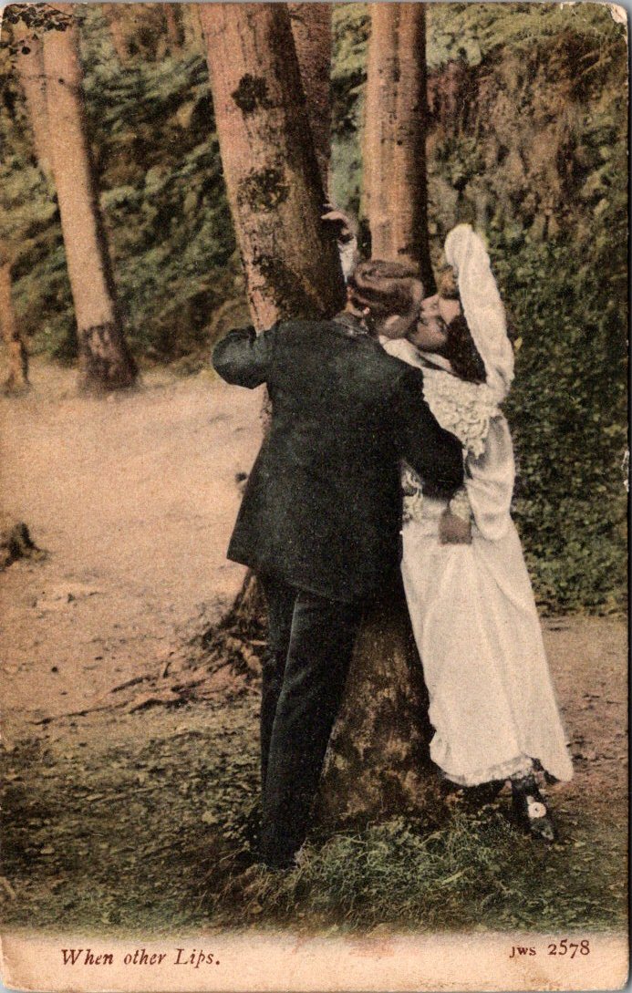
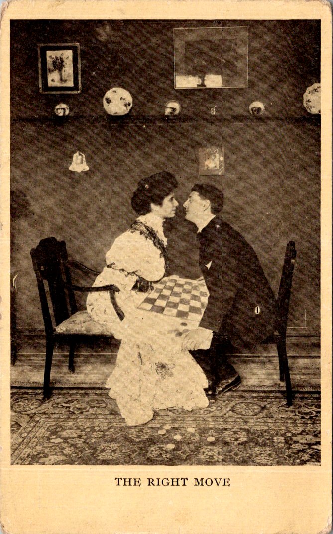
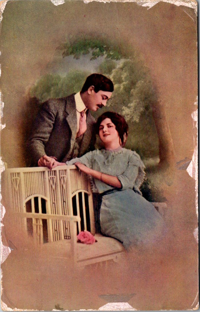
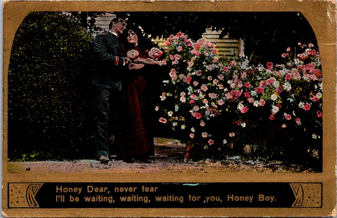
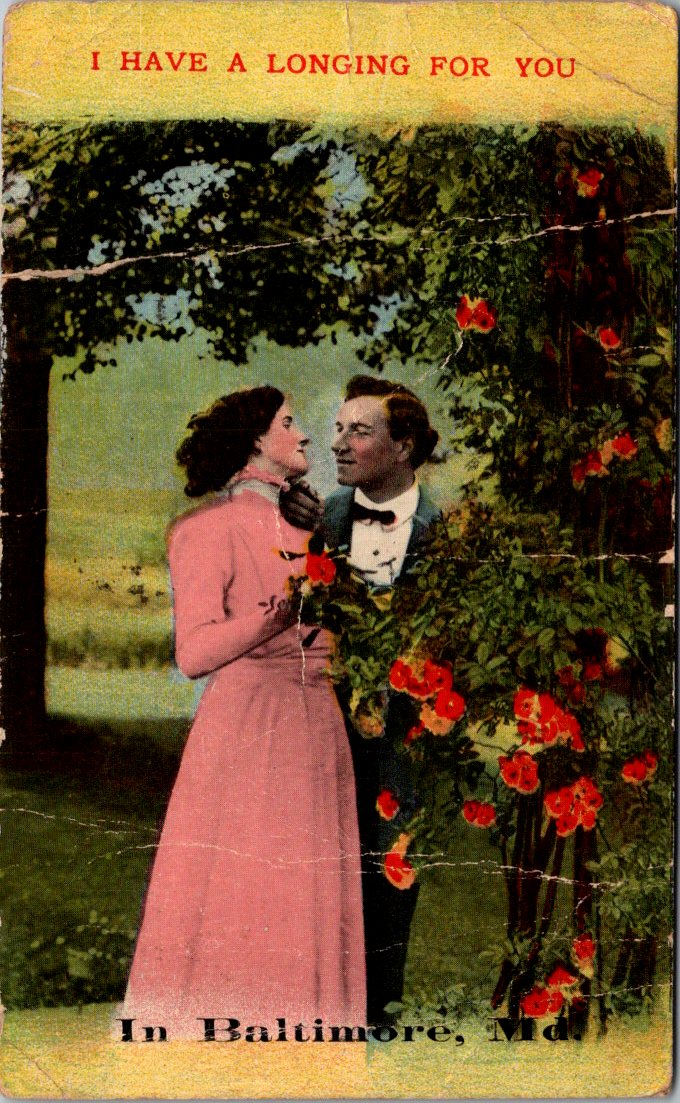
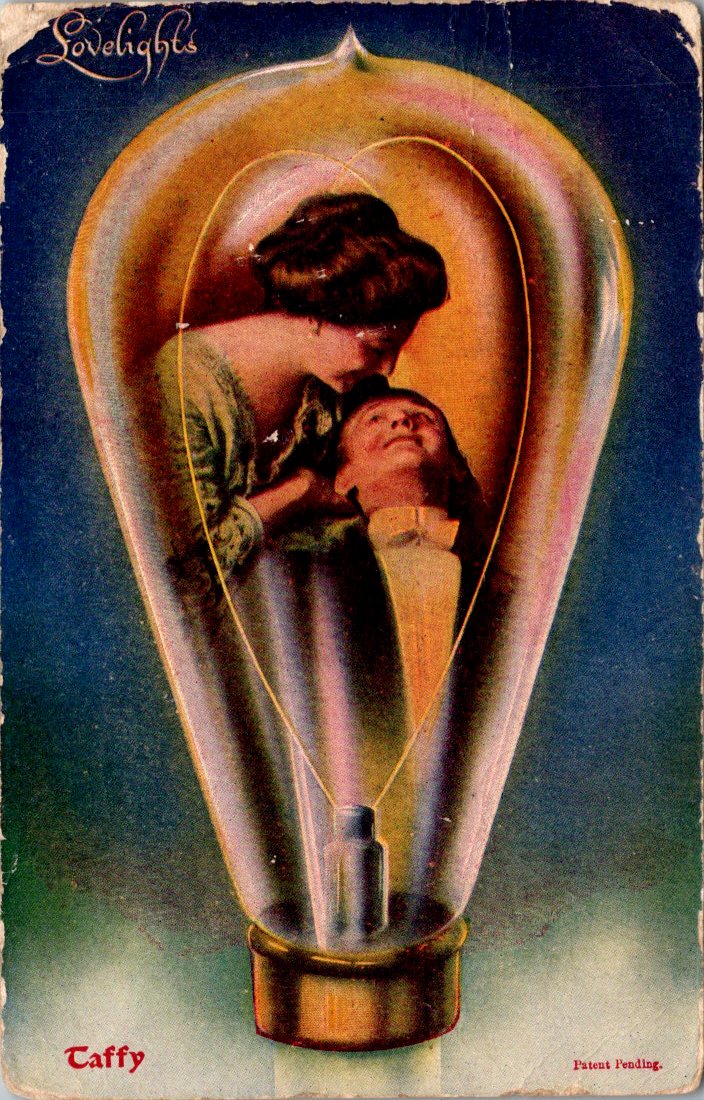
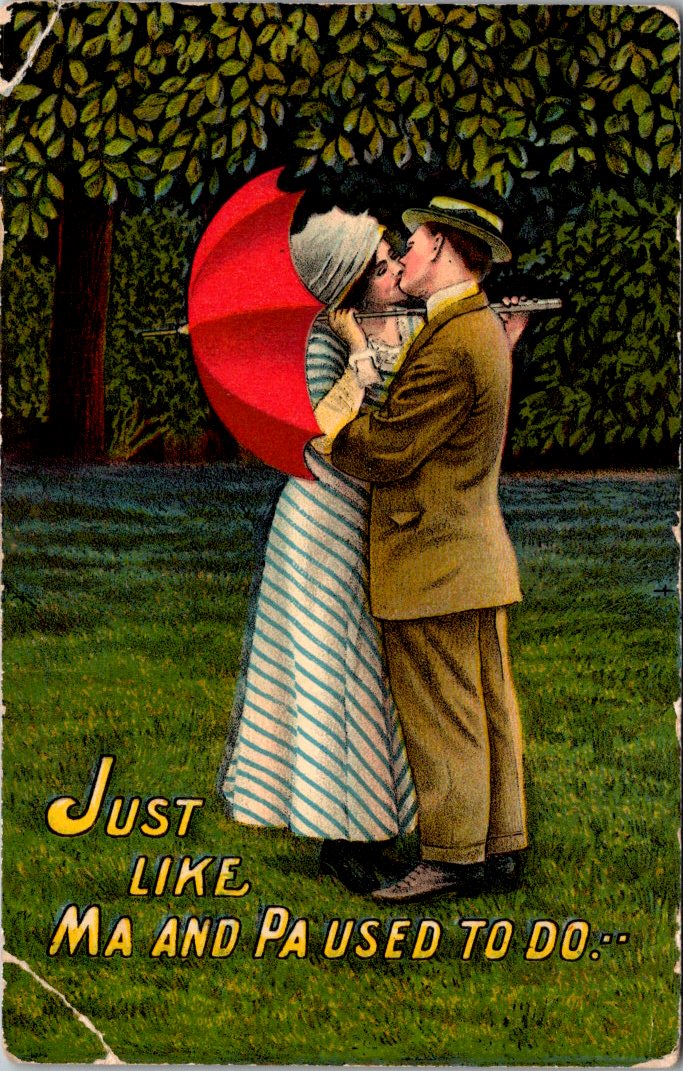
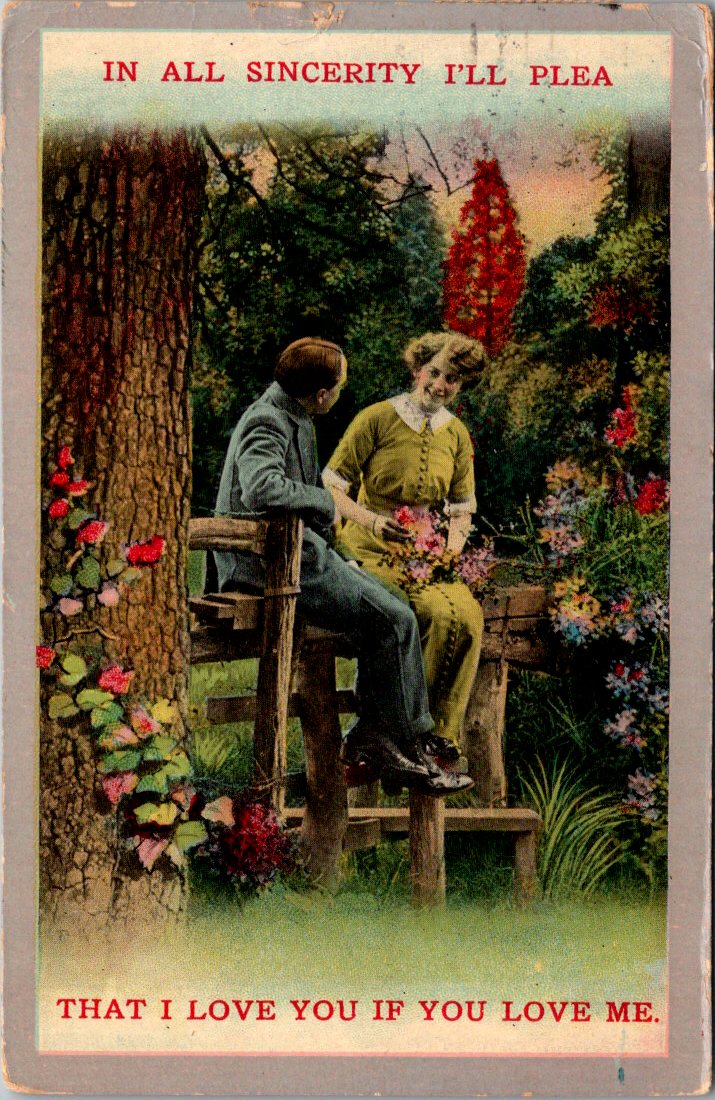
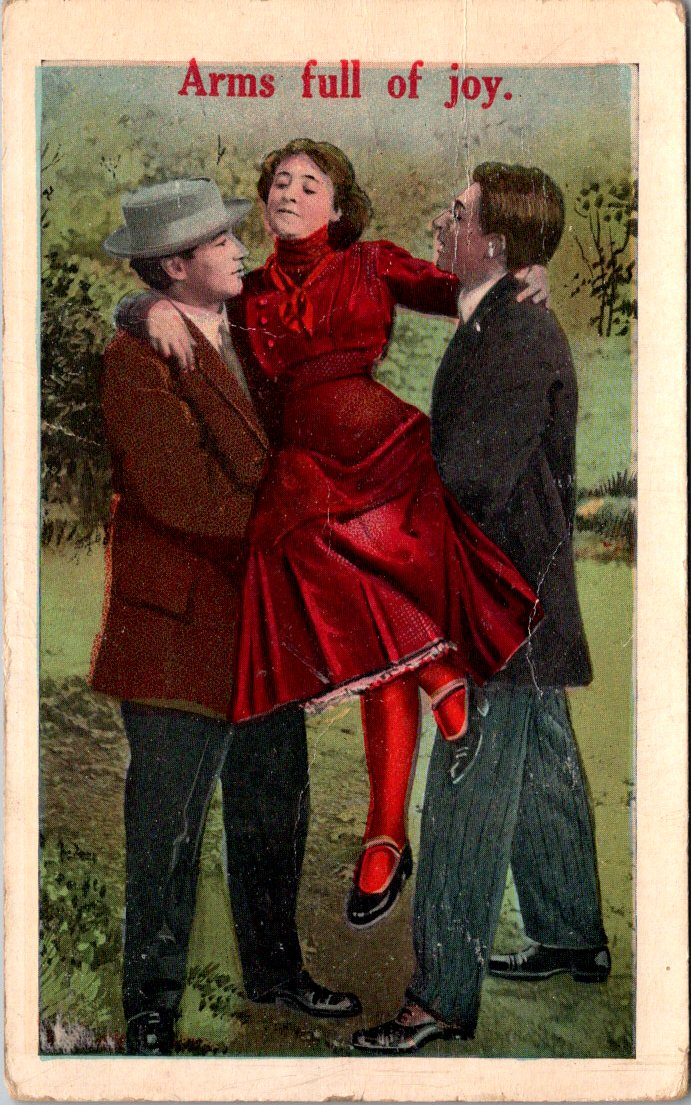
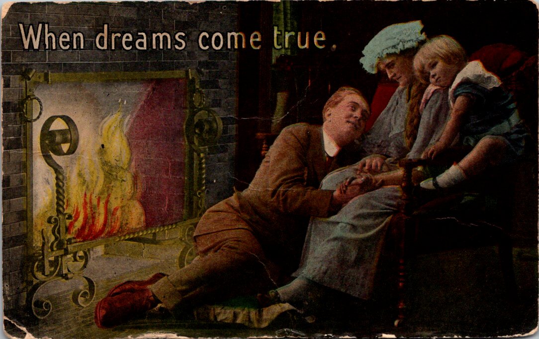
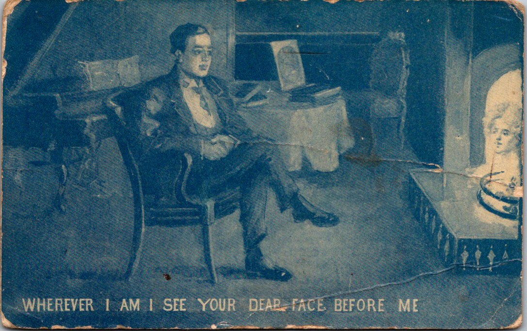
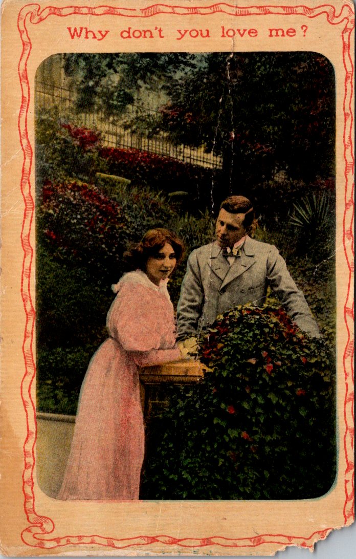
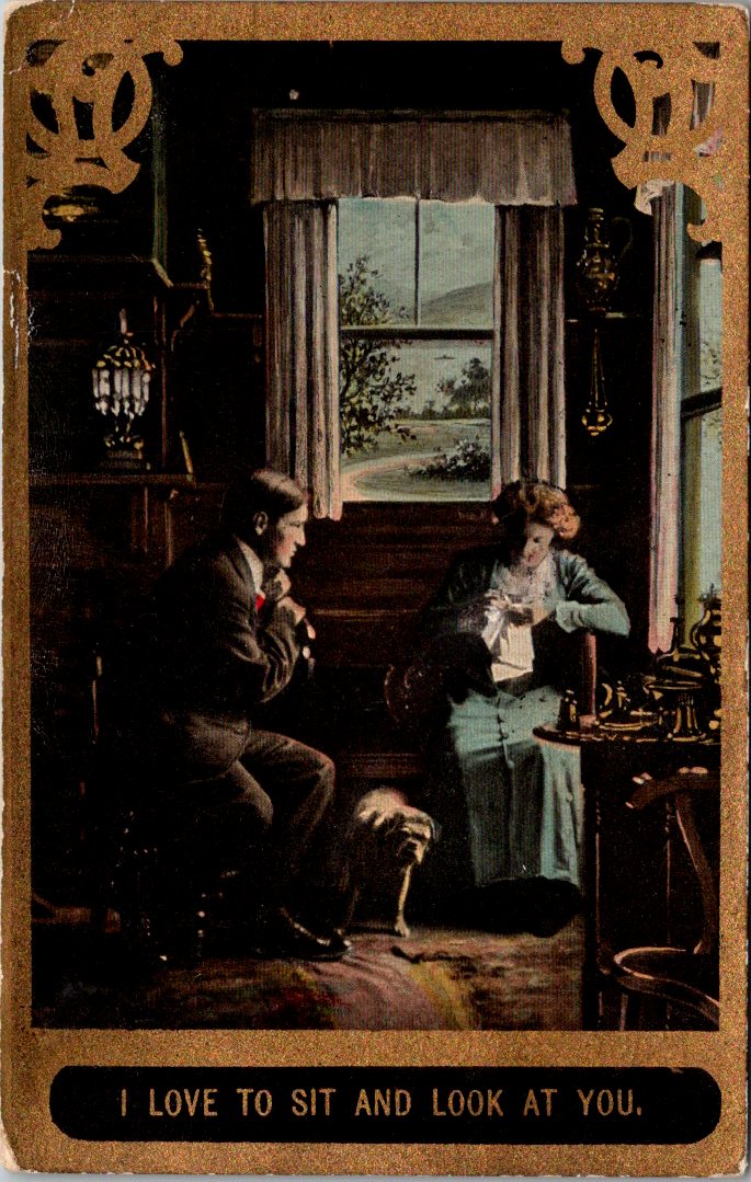
Dear readers, I promised you hearts and flowers after that awkward spell last week. First, a gallery carefully curated on the theme. Then, elucidations and another peek.
Made-for-you messages with showy sentiments on full view to your pa, your ma, and the mail carrier, too.
Some parts are still snowy, as love lamps flicker on in February. Hearts, words, and birds arrive in the quiet winter glow. Rest inside a circle of love. When you know, you know.
We’ll get to the hearts and flowers. But first, this is awkward.
It’s February. Congratulations if you have accomplished anything this year.
I spent the morning sorting through Valentine’s greetings. Love is in the air, and rest assured there are albums full of gorgeous arrangements and heartfelt sentiments in the weeks ahead.
But first, I need to bring up something awkward. Not everyone loves this sweetheart’s holiday. For the lovelorn, it’s excruciating. For the grieving, a sad set of reminders. For the wicked, a chance to lance the joy bubbles in the air.
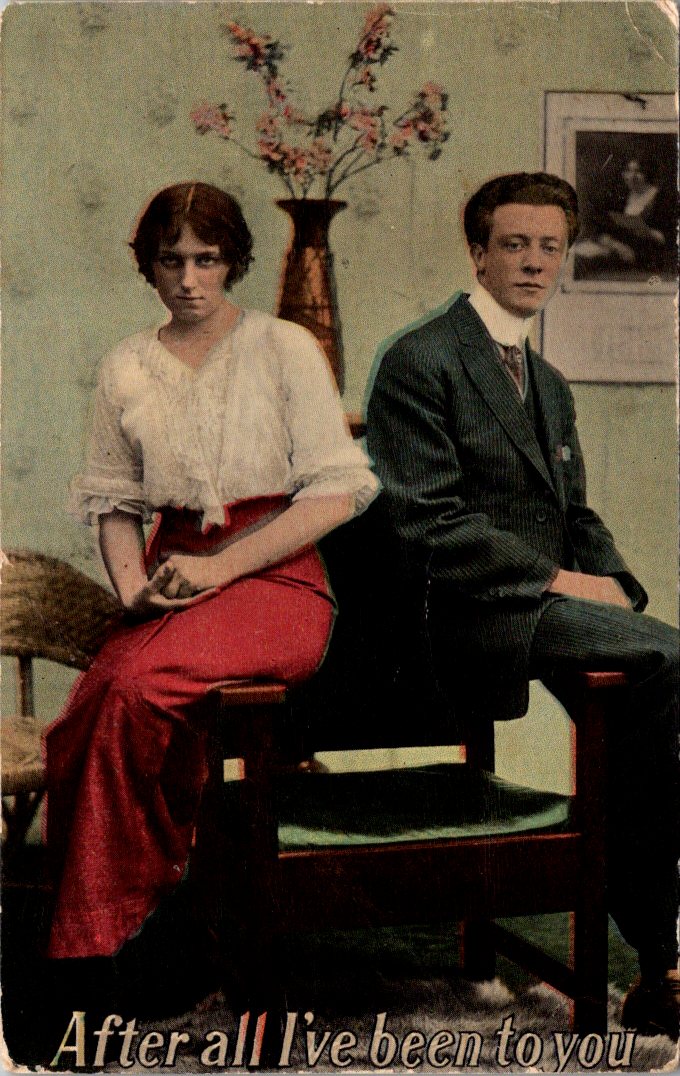
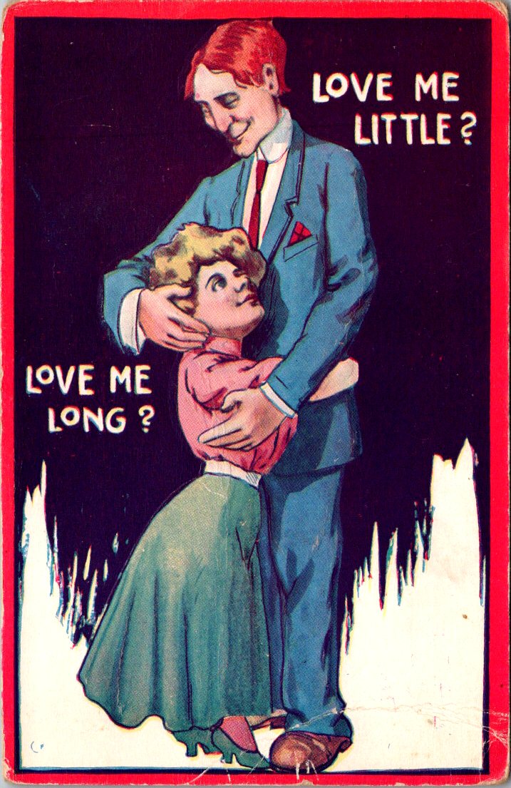
In postcards, we have to acknowledge the neck strain.
Also, captions that might have meant exactly what they suggest.
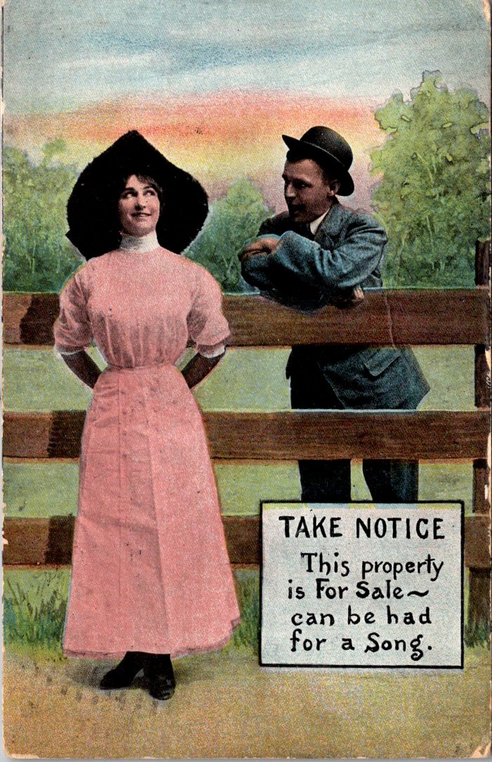
Lastly, those with an anti-Valentine vibe, a bad bargain, or even a threat!
We will return next week to the regular schedule of sweetness and light, heart and flowers, charm and chocolate, passion and promises. How… delightful!
Tom finally touches grass, and Lily paints impossible cats.
Tom’s rental car idled at a red light on University, three blocks from his apartment. He’d made it through Sky Harbor quickly, drove straight here without stopping for groceries or coffee or errands. Just land and figure out what’s next, he thought.
The apartment was small, on the second floor of a stucco complex built in the eighties. View of the parking lot. He’d signed the lease abruptly after Delia died. Left the house for Nina to handle. Since then—hotel rooms in Atlanta, crew bunks in Singapore, a fishing boat off Catalina.
He parked, climbed the stairs, unlocked the door to recycled air and silence, flipped through the mail piled on the counter from the last time he was here. He missed the last local election. There was a party in a park nearby. A local group is replacing trees that were damaged in the last freak storm.
He set his bag down, pulled out his phone, texted Nina before he could reconsider.
I’m in Tempe. Can we meet? That coffee shop you like?
Three dots appeared. Disappeared. Appeared again.
Yup, be up there tomorrow. 10am.
Tom exhaled. Opened the refrigerator, stared at nothing for a moment, and closed it. He sat on the couch, looked at the unpacked boxes, looked at the random furniture. Looked at his hands, and thought, tomorrow. Then he grabbed his keys to run out for a beer and a burrito.
At the coffee shop, Tom arrived early, ordered coffee he didn’t drink, watched the door. Nina came in exactly at ten. Saw him, hesitated, turned toward the line, but walked over to her dad instead.
“Hi.”
“Hi.”
Nina set her keys on the table and went to get her drink. A few minutes to breathe and focus while she waited in line. He was actually here. Wow.
Back at the table, Tom tried to start, stopped, and started again. Exasperated, he whispered a groan. “How do people do this?”
“Well, you always asked Mom.”
“Truth,” he conceded. “I keep getting on planes. Keep going up. Can’t figure out how to stay down.”
Nina’s face was careful, neutral. “I know. You send postcards.”
“Lonely postcards.”
“I like them.” She paused, a little surprised herself.
“This woman I know at work told me about her father. He came back from the internment camps different. Couldn’t talk about what he’d lost. Just went quiet. Disappeared into himself even when he was sitting right there.”
Tom blinked at her, stunned by the comparison. “I’m not—”
“I know you’re not. But you get away from a lot up there.”
Tom set his coffee down. “Look… I’m trying… to be present… more.”
“Okay.” Nina’s hands tightened around her cup.
“Let me know when you’re back, next,” she said slowly. “We could meet at your place. Maybe make it feel like home.”
“Sure. that’s good. It doesn’t feel like anything right now.”
They finished their coffee, scooted out of the booth, and hugged. Nina picked up her keys.
Tom drove back to the apartment. Stood in the doorway looking at the accumulation of a life he’d been avoiding.
He started with the kitchen. Unpacked Delia’s dishes, the set they’d used for at least thirty years. Put them in the cabinets. Drove to the grocery store, bought coffee and bread and eggs. Real food that would probably rot. Fine, that might actually be normal. Small steps. He’d try again tomorrow.
The knock came mid-morning. George opened the door to find Lily holding a canvas bag, Mai standing behind her with a patient smile.
Lily marched into the foyer, serious. “I brought MY paints.”
“She wanted to paint, here, with you,” Mai said.
“CATS! We want to paint cats,” she announced.
“Well then.” George stepped aside. “Come in.”
They set up at the kitchen table—Jennie’s old watercolor set now showing signs of use again. Lily arranged her brushes with care, filled a bowl with water, selected paper from the pad.
“Could you get the big book, Grandpa?” Lily asked.
George knew exactly the one she wanted. Large and heavy, and art book with full color illustrations. Yes, cats, and many more species with great examples of all variety to try one’s hand.
George pulled his chair to face the window. Lily pulled hers beside his. They worked together, silently, side by side. Lily’s brush moved in quick confident patterns. Bold strokes, loose shapes that captured moments more than detail.
George surprised himself by drawing with a sharp graphite pencil. His hands remembered motions he hadn’t used in years. Careful lines, patient shading, the disciplined attention that both he and Jennie loved.
Lily finished first. Held up her painting. “It’s not exactly right.”
“Tell me more…”
“The shape isn’t right. The lines don’t add up. It doesn’t look like a real cat.”
“Artists see differently than scientists,” George said. “Scientists measure. Artists feel. Both ways matter. Your colors are very bold.”
Lily considered this. Looked at his drawing, and said confident,”Yours is the scientist way.”
“Can I keep yours?”
“If I can keep yours.”
“Deal.”
Mai came back an hour later. Lily packed her supplies, carefully laying her paintings on the countertop to dry. At the door, she hugged George—quick, unselfconscious, generous.
After they left, George found a frame in the closet and mounted the entirely impossible animal—calm, loose, joyful. Hung it where he’d see it every morning.
The postcard arrived in Tucson ten days after Nora mailed it. Nina turned it over. Nora’s handwriting, smaller now, more compact.
Lunar New Year, red lanterns everywhere. The city transforms—fireworks, night markets, families. The work is good, the project is extending. Solitude still a gift.—N
Nina read it twice. Carried it inside. Pinned it to her wall beside the others. Seven postcards now, creating their own pattern. Different textiles, different messages, her same friend after all this time. She pulled out her phone, typed a response.
Got your latest. Glad you’re staying. Take your time.
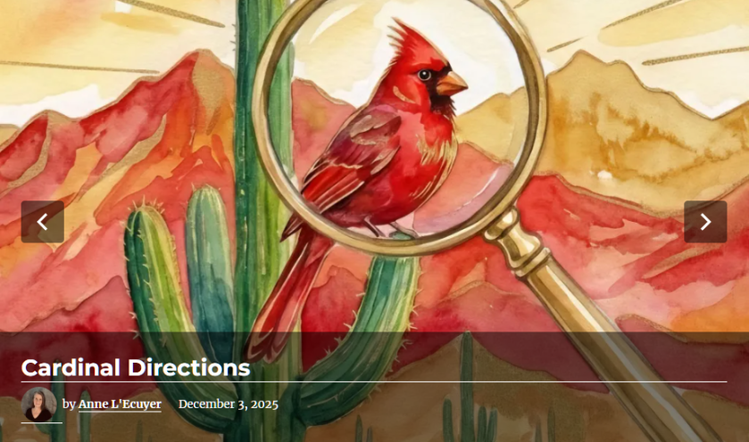
Like the flash of a red cardinal in the winter snow, both George and Nina suddenly see something that has been there all along.
George woke early in the day on New Year’s Eve. Light snow outside and the question he’d been turning over since Christmas: when to take Emma birding. He called before he could overthink it.
“Tomorrow morning?” Mai answered. “She’ll be ready at dawn.”
They met at Frontenac State Park at first light. Emma hopped out of Mai’s car already dressed for the cold—layers, boots, a hat George recognized as one of her mother’s favorites. Mai waved from the driver’s seat, smiled, pulled away.
“Just us?” George asked.
Emma’s eyes rolled slightly and smirked as she held up his binoculars. She’d already adjusted the strap. The green Audubon field guide was tucked under one arm, a new notebook in her other hand.
“Mom has to get ready for the party. Plus, she said it’s too cold.”
“Fair enough,” George smiled back and nodded toward the trailhead. “Binos up, move slowly, scan and listen. You go first.”
They walked the trail along the frozen river in tandem, as quietly and patiently as he had advised. Not looking for birds exactly, but for movement, for shapes that didn’t fit the pattern of branches and sky. Emma spotted the first cardinal.
“There,” she whispered.
George raised his older binoculars. He had kept them for Jennie on the rare occasion she wanted to come along.
“Tan body, red-orange bill, and a sort-of red crest,” Emma slowly described the bird.
“Good eye. Watch how she moves.”
The bird hopped branch to ground, ground to branch.
“How did you know it was female?” Emma asked.
“Colors and the song notes. Males are showier and louder. Females sing too. They’re just quieter about it.”
Emma opened her notebook.
Female cardinal. Frontenac State Park. New Year’s Day. Feeding on lower branches of sumac. Light song noted.
They found chickadees, a downy woodpecker, juncos, and stopped along the way to record and discuss each bird. Emma’s notes filled two pages. George watched her move through the stark and cold forest—confident, curious, at ease. Mai had been more careful at this age, tentative on the trails. Emma walked as though she belonged here. She did.
Driving her home, George said, “You’re a natural. Your mom was good, too. She could walk so slowly, make no noise at all.”
Emma smiled. “She says I get it from you.”
“Well, I got this for us,” George said as he pulled into the driveway.
He flashed his phone screen to reveal the app he had downloaded, the Audubon Society Field Guide to North American Birds but online and searchable. Right on the front, the very first photo was a male and female pair of Northern Cardinals.
Emma’s eyes lit up. Quietly, she imagined how many they’d find all over Minnesota in the days and weeks and (hopefully) years ahead.
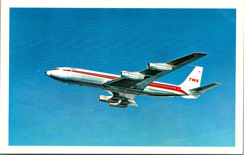
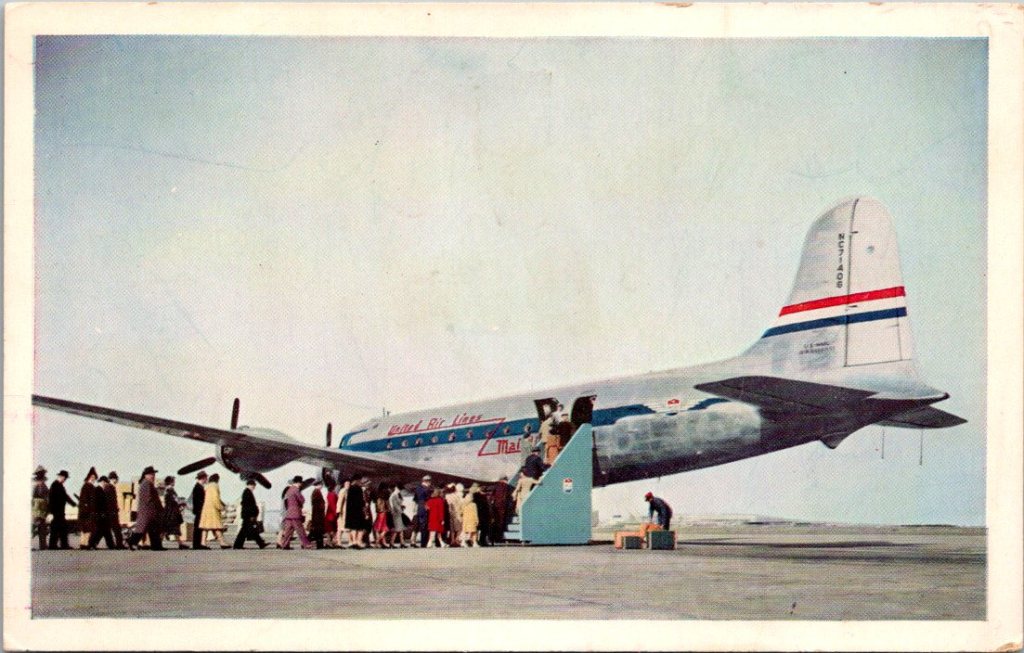
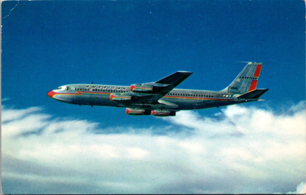
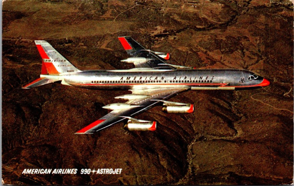
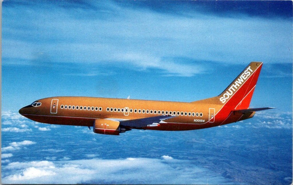
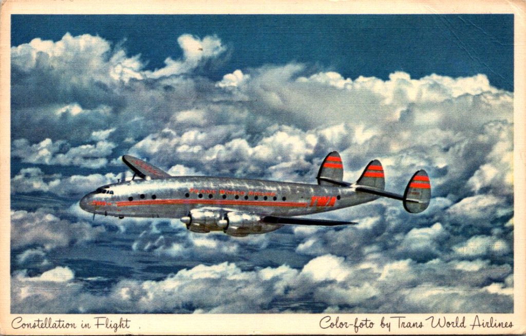
Back home, George leaned out of the window to pick up the mail before driving down the ice-packed drive. He tossed the stack on the seat. On top, a photo of an American Airlines plane. He knew who it was before he turned it over.
Flight delay. Thinking about you and Jennie. Can’t believe they’re both gone. —T
His younger brother, Tom, both of them widowers now. Their wives were gone within months of each other. At times, they both worried they would lose each other, too. Too much pain, way too much.
George had been waiting for Tom to call. He knew that constant work and distance was his way of coping, but how long was too long?
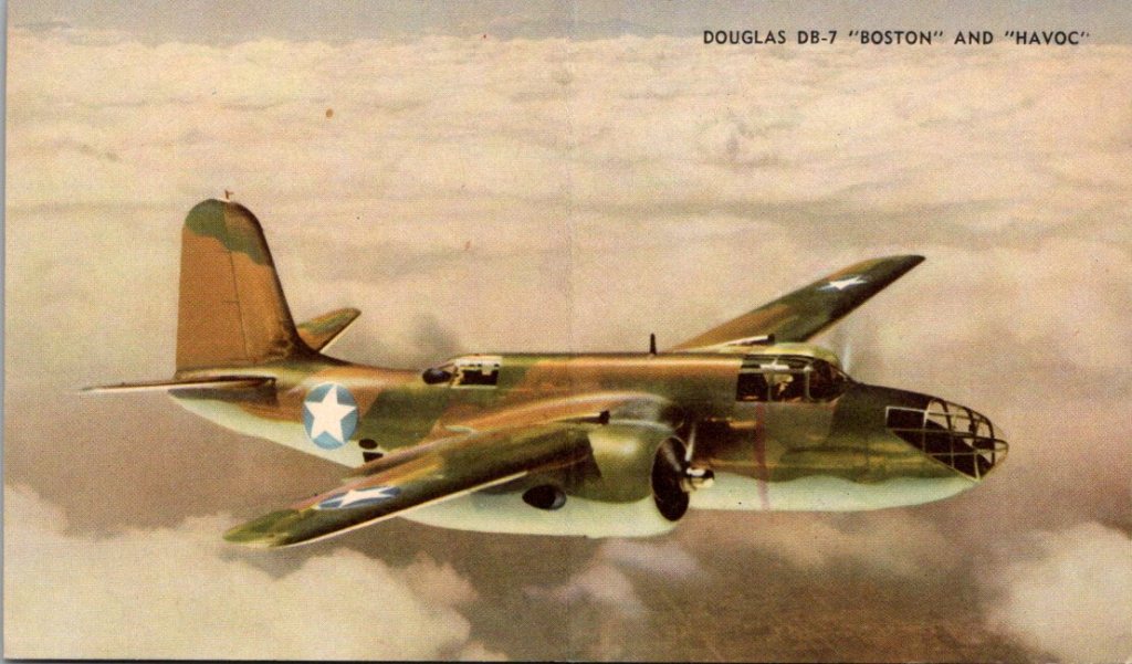
George looked at Tom’s card again, familiar but this time a sudden realization hit him. Tom sends postcards. He’d received at least a half a dozen over the years–all photos of old jets. George had never written back. Not once. He’d been waiting for the phone to ring. Now he remembered the little collection of airplanes in his desk drawer.
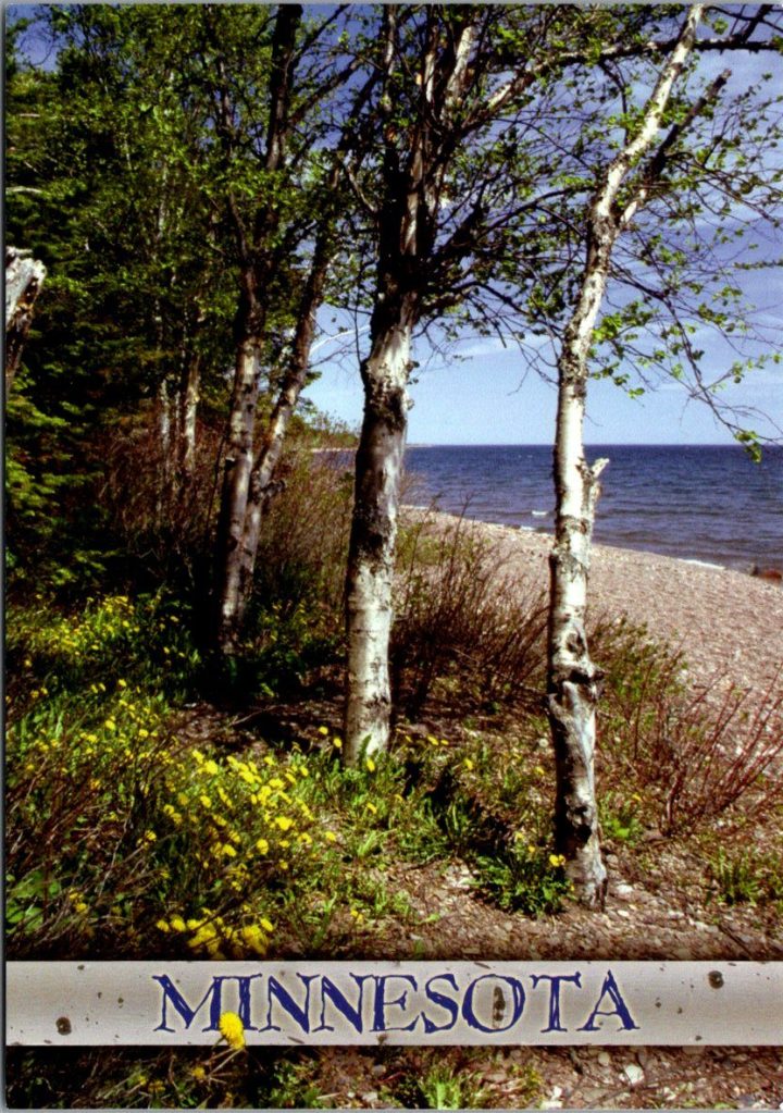
He sat down. Pulled a card from his own growing stack, a color photo of a trail like today’s but after the thaw. His message was short, with room for more later.
Got your card. Miss them every day. Miss talking to you. —George
He addressed it to Tom’s apartment in Phoenix, the one he’d moved to after Delia died, and rarely slept in. Stamped it. Put on his coat and walked back out to the mailbox, certain of what he’d been missing.
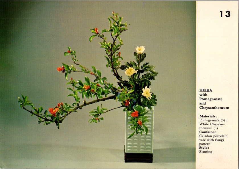
Nina found Mrs. Hanabusa arranging flowers in the common room—a small practical arrangement, simple stems in a shallow dish.
“For the holiday?” Nina asked.
“My own amusement.” Mrs. Hanabusa adjusted a branch. “Ikebana, flowers carry meaning. Not just pretty, it’s a message.”
“What does this one say?” Nina asked.
Mrs H pointed to the chrysanthemum. “This one means longevity, joy. Used in autumn arrangements and also at funerals. Pomegranate. Internal life, good luck, and natural cycles of life and death.”
Nina watched her work. The precise angles, the negative space.
Mrs. Hanabusa stood up and moved back to considered her creation. “New year. Endurance through winter. Joy waiting to flower. Life coming and going all the time.”
She looked at Nina. “What’s your story?”
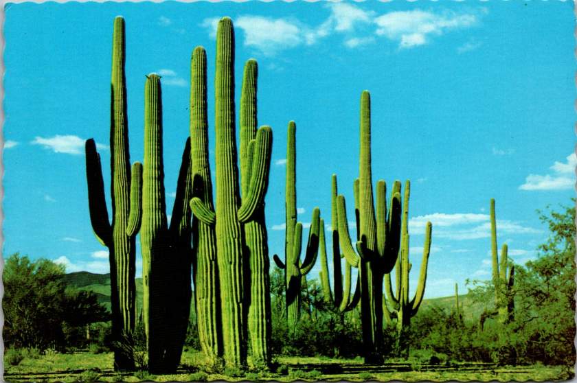
Nina placed her postcard on the table and sat down. A cluster of saguaro against a bright blue sky, blank on the other side.
“I don’t know what to say to him,” Nina whispered.
“Ikebana, we don’t fill all the space. We leave room. Leave room,” said Mrs. Hanabusa with some emphasis this time.
Nina thought for a moment, and wrote:
Got your note. Like the saguaro, I’m still here. Hug? —N
Not forgiveness. Not resolution. Presence and a little humor, with some room. She added her father’s address in Phoenix. Stamped it and set it by her keys, knowing that it still might take days to put it in the mail.
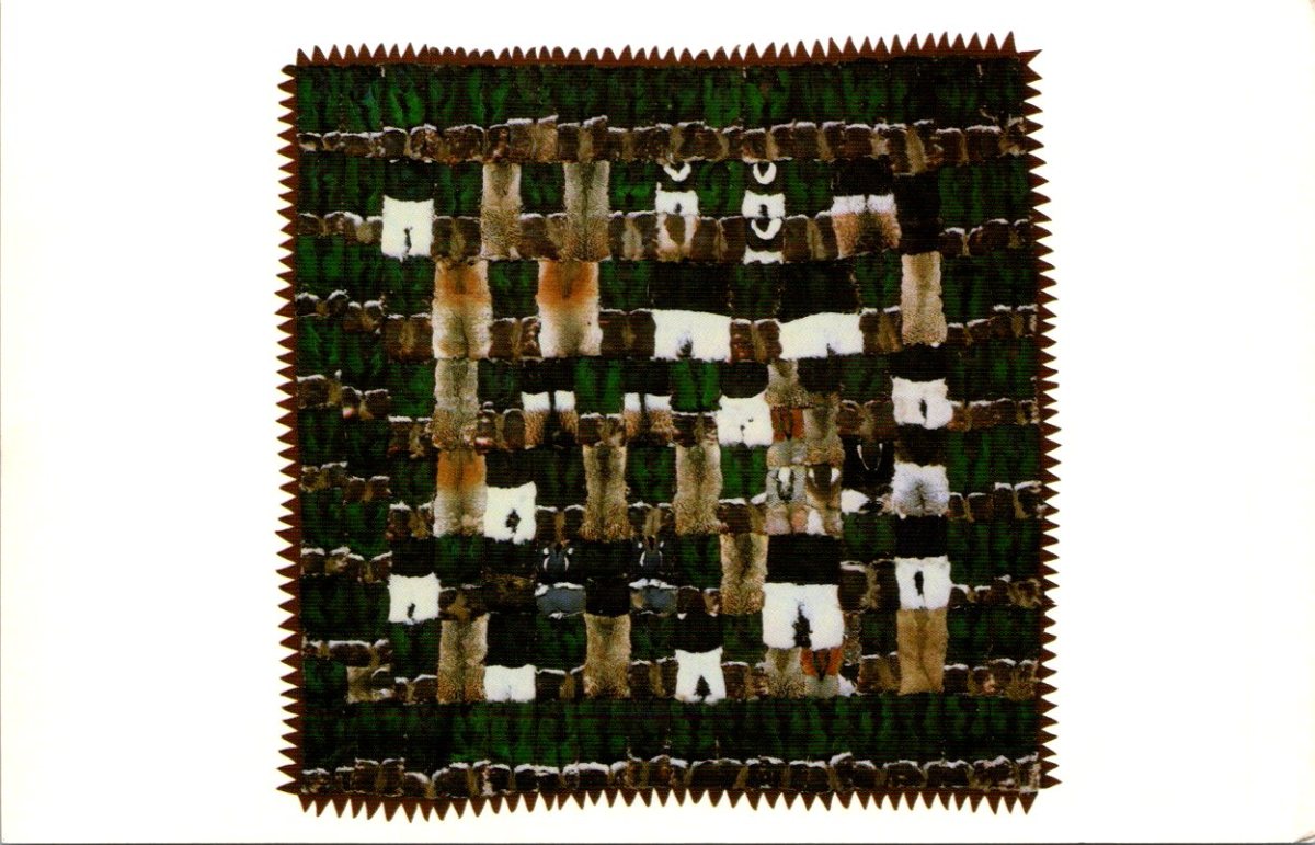
The next morning, a third card from Nora arrived—black and white geometric patterns, stark and beautiful. An Inuit quilt made of duck knecks.
Mrs. Hanabusa was at the window again when Nina came in. Nina showed her the card. Mrs. H studied the design, then turned it over to read the back.
Found a noodle shop I love. Made friends at work. Some days are hard, some surprise me by how easily I could stay longer. —N
Mrs. Hanabusa looked up. “She signs just ‘N.’ Like you do.”
Nina blinked. She’d never noticed.
“My sister and I had our own shorthand, too. Still do.” Mrs. Hanabusa handed the card back carefully. “Secret code.”
Nina looked at the card again. The simple N. The years of friendship.
On her way home, she stopped at the blue mailbox on the corner. Pulled out the cactus card she’d written to her father to look at how she’d signed it. Just N.
She dropped it in the slot, heard it fall, and said a humble prayer. What else had she not noticed along the way?
Sifting through the stacks this season, in search of levity and brevity.
Oh dear, a trove of kitschy postcard sets has appeared in The Posted Past studio. Careful opening boxes around here. I’ve been sorting and stocking the store this month, getting ready for the holidays.
Most of these vintage finds make thoughtful gifts for nature seekers, travelers, and art lovers. Some make for big belly laughs, too. Quit your job for two minutes and follow me.
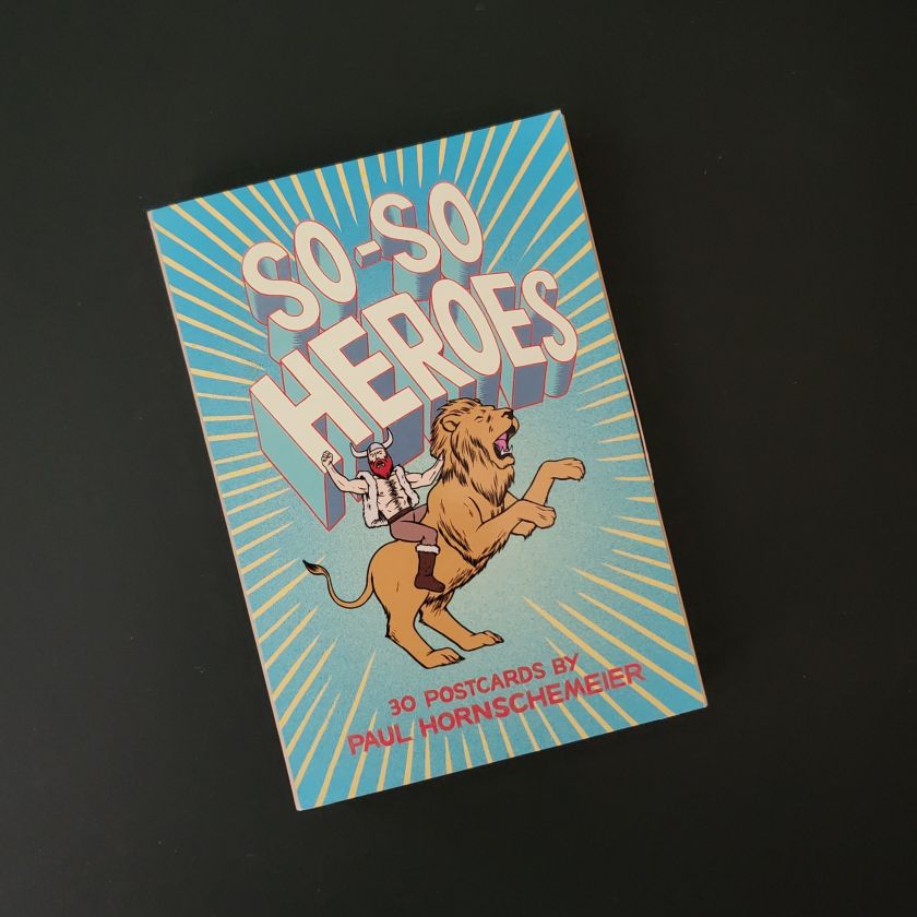
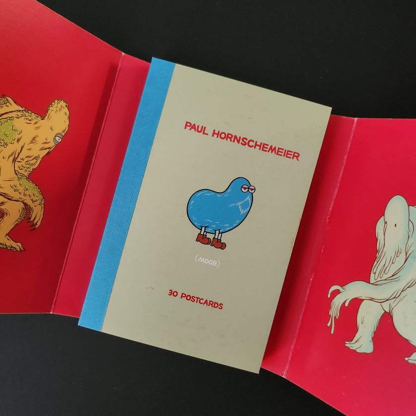
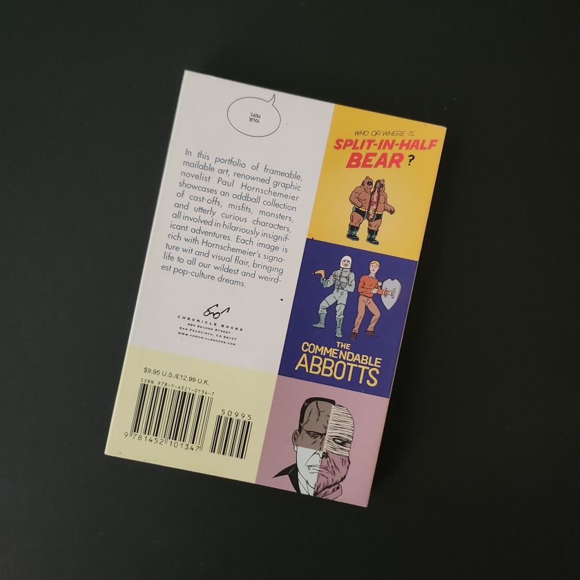
Graphic novelist Paul Hornschemeier gives us thirty So-So Heroes, like Amalgamonster and Biggeespeare, in a nicely packaged postcard set. Bound to scare your friends, a little.
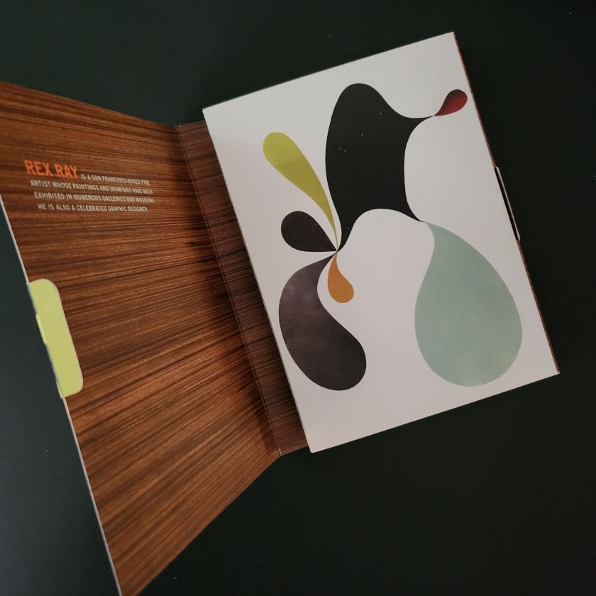
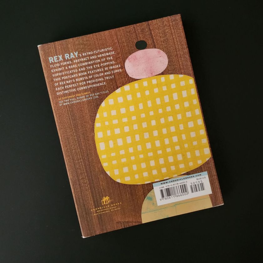
This next collection by fine artist and designer Rex Ray feels like a festive fondue party in a retro-future living room. Witty banter, wry smiles, and wood grain. Get your sweater sets.
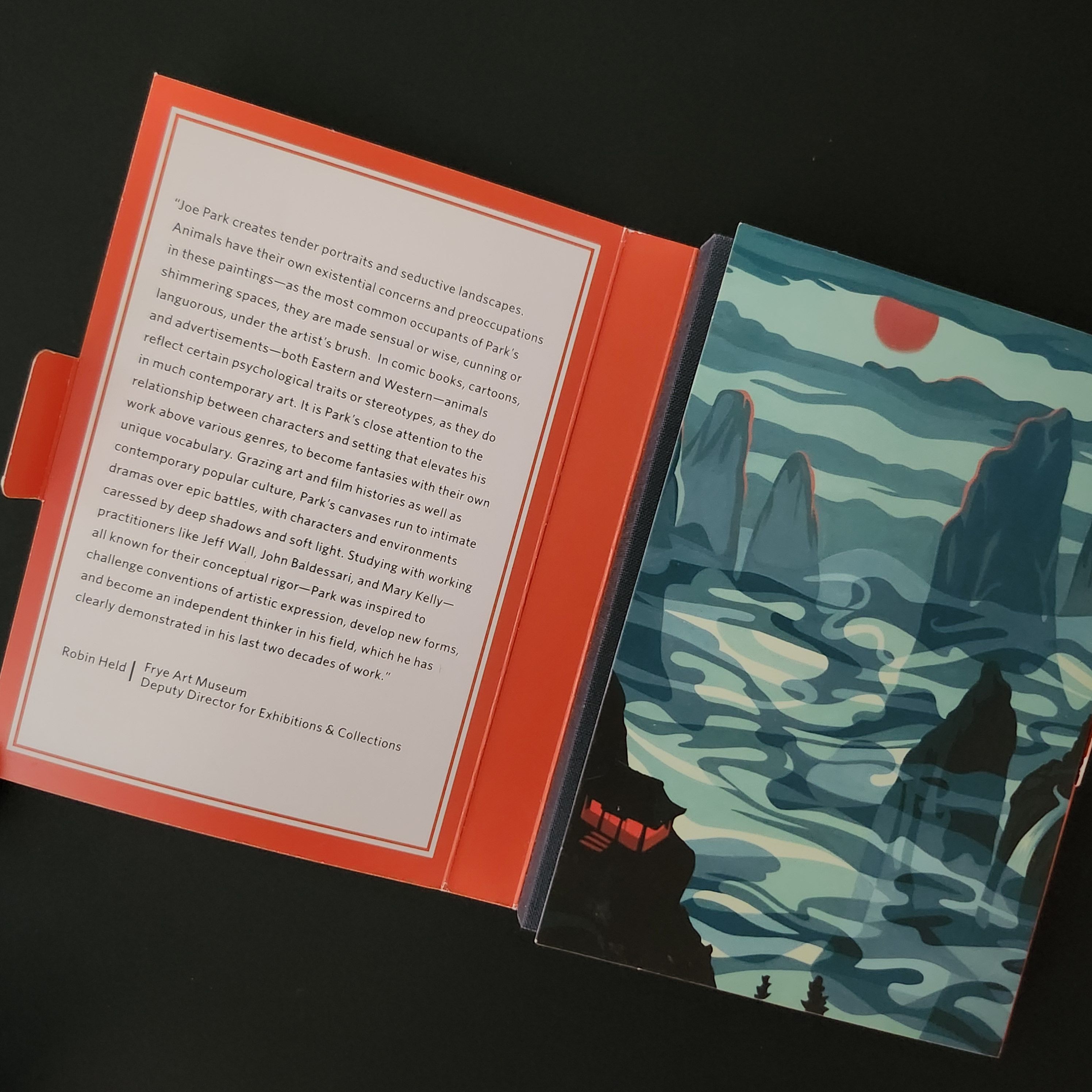
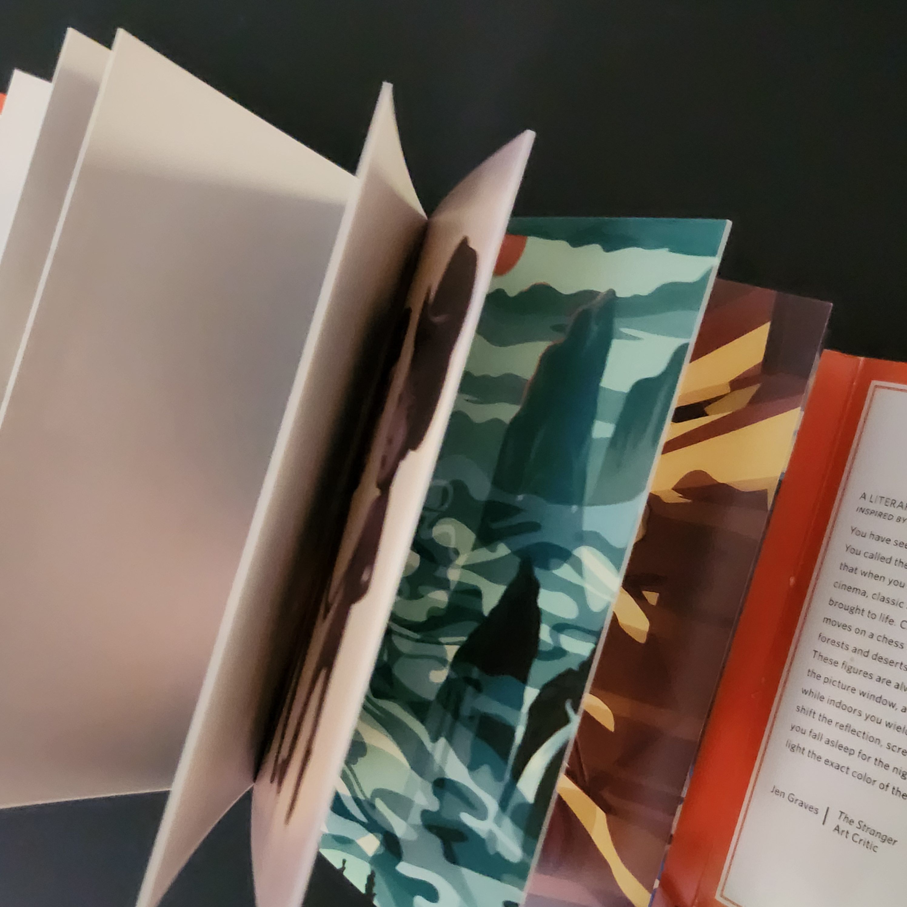
I am Yours from Seattle-based artist Joe Park comes with a neatly-placed curatorial note from Robin Held and a lovely literary sketch by Jen Graves.
“You have seen these folks before–even if you don’t know where”
The collection does feel like finding a tiny gallery all to yourself, and a weird world of bears and bunnies. Worth the trip!
Stay Tuned by Nathan Fox is a visual romp through the artist’s fantastical funhouse. Eye-frying colors and psyche-stained scenes will make you feel like you woke up on the other side of a paranormal universe.
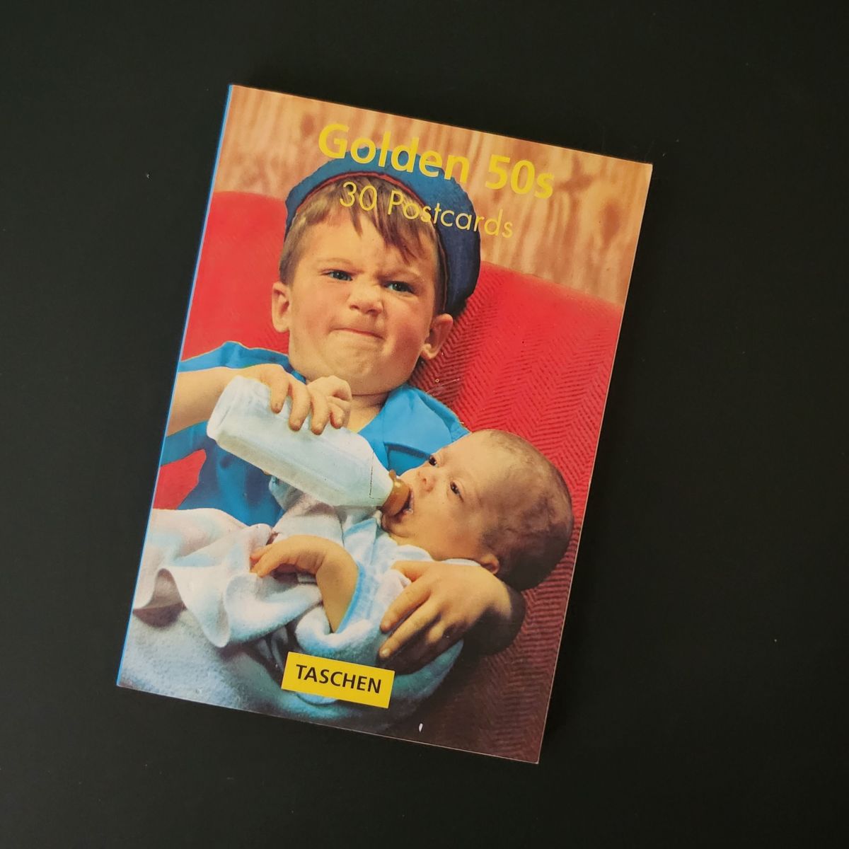
Anything pre-Y2K is officially vintage now. Not funny, I know. These Golden 50s throwback designs make it even worse. You’ll be thanking your lucky leg-warmers we made it out ok, mostly.
Dial into this easy listening station from your heart.
In the quiet hours after he died, I heard Dad’s voice clear as a bell inside me. Left chest, near my heart, broadcasting from a heavenly radio station.
He’s not an advice line. More like a tinkling piano in an airport lounge where it’s always sunset or sunrise somewhere.
It’s not just him. My grandmothers have a talk show, conspiring on our behalf from the front porch of a woodsy cabin. Some of my aunts are traveling the span of the universe on magic carpets, and sending back reports.
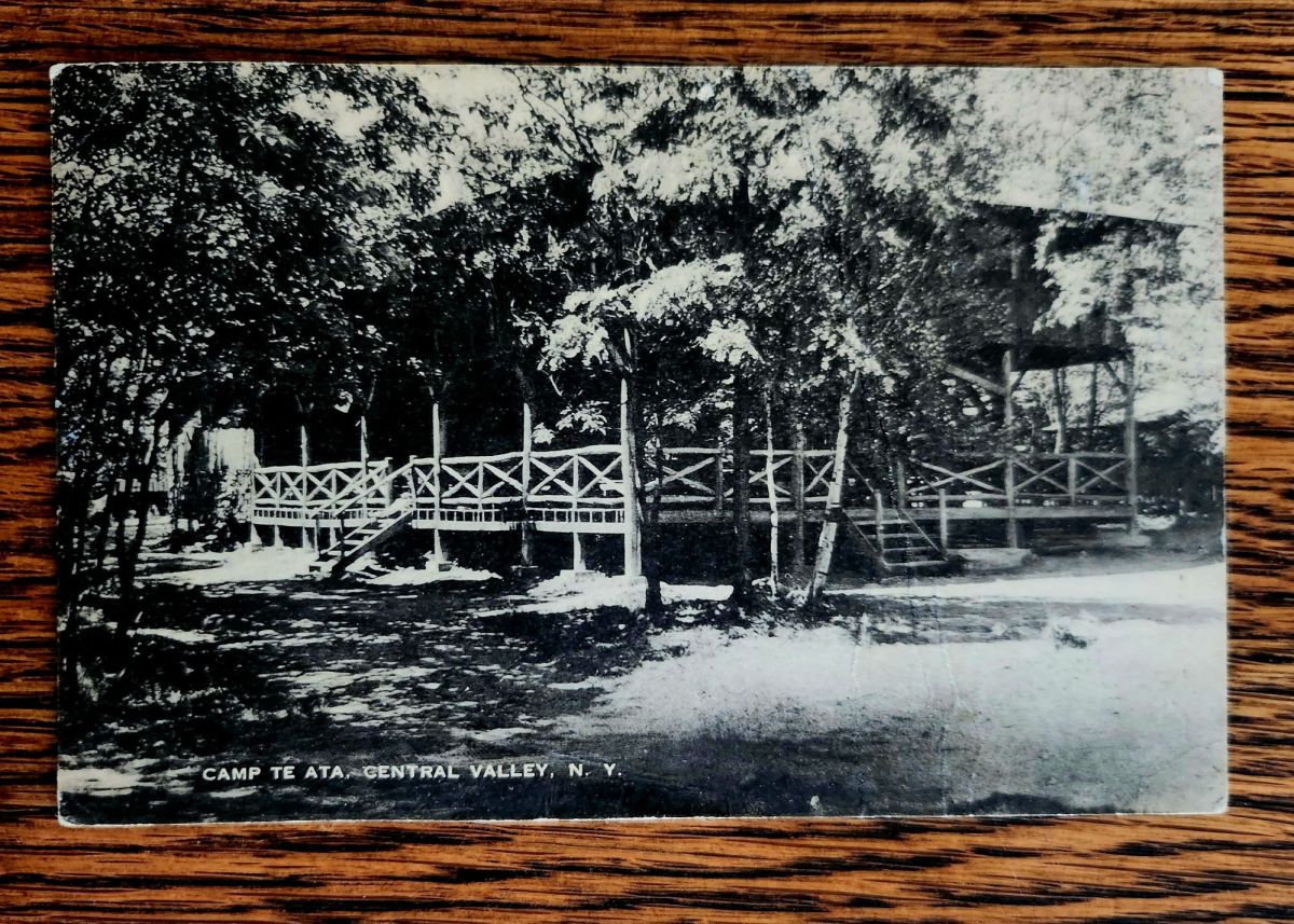
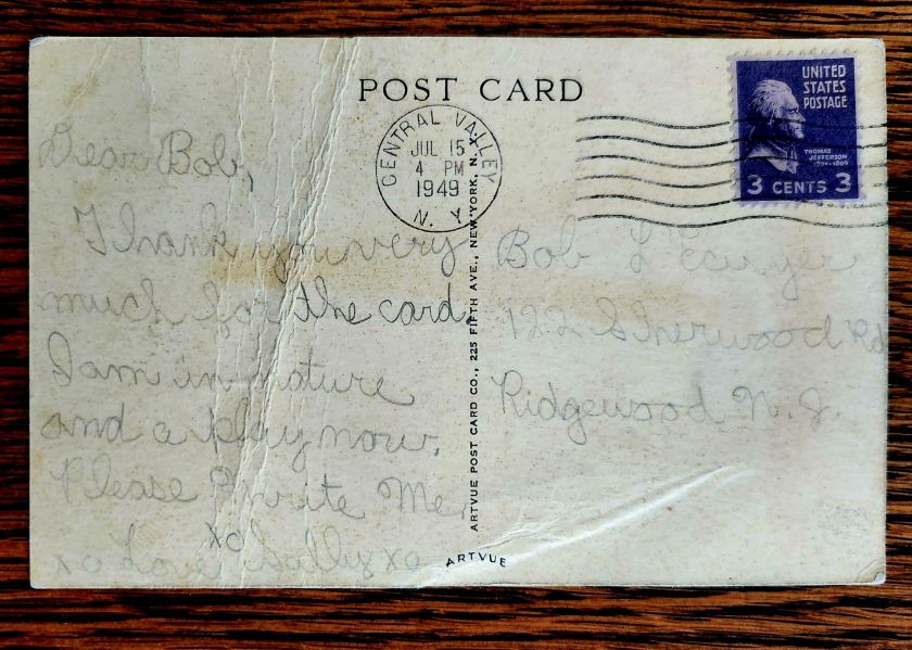
Dear Bob, Thank you very much for the card. I am in nature and a play now. Please Write Me. xo xo Love Sally xo
Sally writes to Bob from stayaway camp in upstate New York
Ancestors Radio is on in the background all the time. I put on piano music in the house to dial in. Humming along and half-listening, I grasp what I can, especially as it relates to family stories and postcards. Little magic carpet rides, too.
We’re into a new season of wonder, now. Awe is on the air. Stay tuned!
Holiday Gifts Under $15
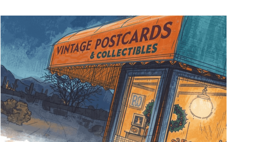
A Book of Postcards Makes a Great Gift!Send Love from AZ this Season!
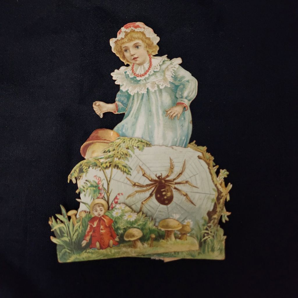
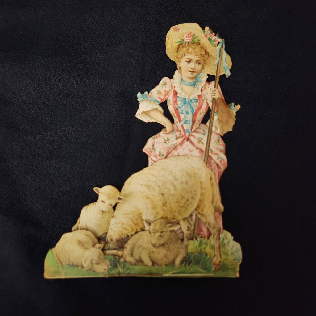
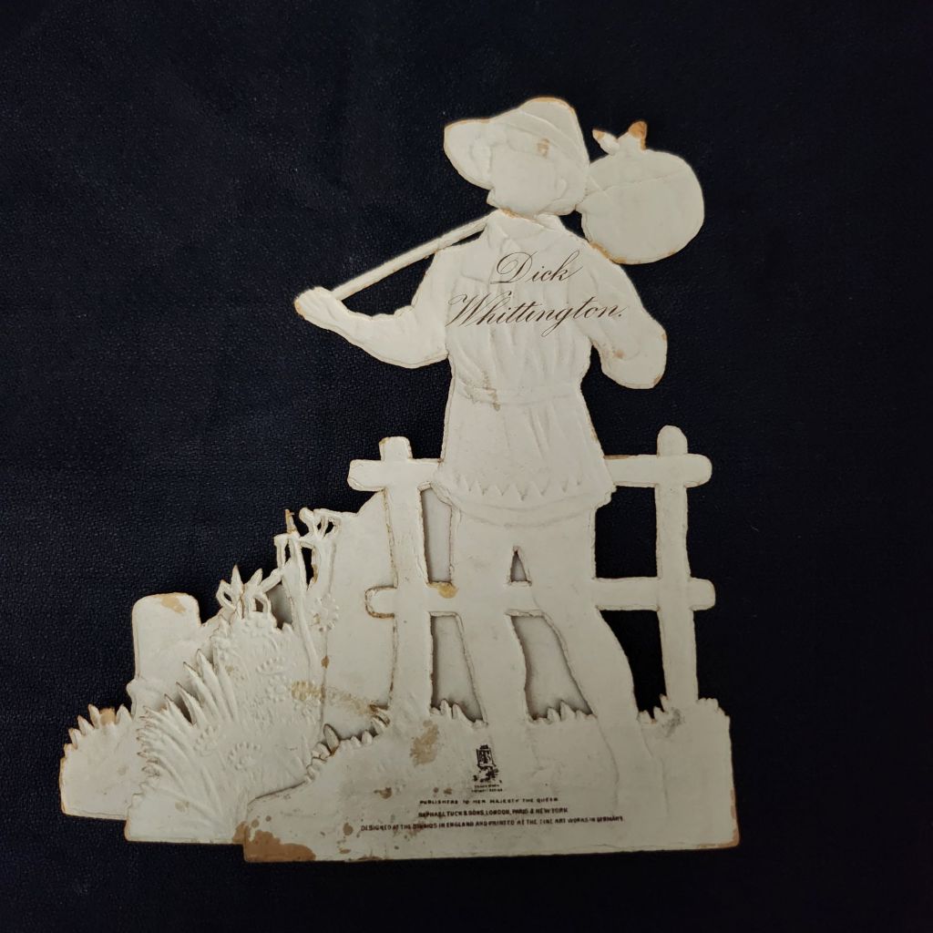
As the Harvest Moon wanes and the fall weather arrives, now is the time to cozy up with a few old nursery rhymes. These rare Raphael Tuck & Sons mechanical cards are an enchanting entrance to a magical season.
Published by Raphael Tuck & Sons of London, these elaborate die-cut pop-up cards feature beloved nursery rhymes and fairy tales including Little Bo Peep, Cinderella, Dick Whittington, and Three Little Kittens. Each piece showcases the exceptional craftsmanship and attention to detail that made Tuck one of the most prestigious names in Victorian publishing.
Vintage cards by raphael tuck & sons
Founded in the 1860s by German immigrant Raphael Tuck, the company quickly established itself as a leader in chromolithographic printing. By 1893, they had earned a Royal Warrant, becoming “Art Publishers to Her Majesty the Queen.” This royal endorsement reflected the superior quality of their work, which combined vibrant colors, intricate details, and innovative three-dimensional designs. These mechanical cards, likely produced between the 1880s and 1910s, represent the company at its creative peak.
In an era before mass media entertainment, these colorful, interactive pieces were technological marvels. The chromolithography process allowed for rich, multi-hued images that seemed almost magical to contemporary viewers. Their three-dimensional construction meant they weren’t merely viewed but displayed—transforming mantels into miniature theaters of beloved stories. Collecting and arranging these cards became a popular hobby. Many were preserved in elaborate scrapbooks, but relatively few have survived.
WWI widely disrupted the European paper and printing industries, and Raphael Tuck’s London facilities were destroyed during the WWII Blitz in 1940, losing 74 years of business records and thousands for illustrations and production files. Mid-century greeting card companies did continue to produce mechanical cards, but the more elaborate craft traditions largely faded in favor of modern design trends and less complicated manufacturing.
New technologies have revived the artform and inspired contemporary artists. Robert Sabuda elevated pop-up books and cards to fine art status with his extraordinary paper engineering. Lovepop creates elaborate 3D greeting cards for every occasion. The London company Roger la Borde produces wild and wonderful contemporary designs. Of course, independent artists worldwide create handcrafted die-cut cards that both honor and stretch well-beyond the Raphael Tuck legacy.
To Read More
The History of Raphael Tuck & Sons https://www.tuckdbpostcards.org/history Detailed company history from the TuckDB database, the premier online resource for Tuck collectors
Here we go! The Posted Past heads into the fall season with rare cards, a new gallery, and a social mission to trade loneliness for connection.
featured postcard~ rare novelty card still holds a mystery
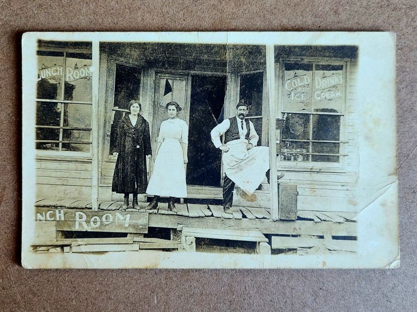
An early 20th century novelty postcard featuring humorous photography and personal correspondence from Missouri.
Front of the card: The photograph shows a young Black man in white shirt, suspenders, and dark trousers, grinning while holding a large broken umbrella overhead in a playful pose. Below reads the humorous caption “A little disfigured, but still in the ring”—typical novelty humor from the postcard craze era. A black border frames the photograph on cream cardstock.
Back details: The reverse bears “Carbon Photo Series No. 513” identifying the commercial publisher’s series. Addressed to Miss Grace Skillman in Pleasant Hill, Missouri, with a green 1-cent Franklin stamp and clear 1908 postmark. The handwritten message describes an exhausting early morning wait in Lee’s Summit for “Brother and Frank,” and promising a longer letter that evening.
“Still in L.S. haven’t slept but about ten minutes. My eyes looks like two burnt holes in a blanket. Brother and Frank hasn’t come yet. I will wait till 7.30 and then go home. Will write tonight. Just finished my breakfast. I will eat if not sleep. I got here ten till five.
Condition and Appeal: The sepia-toned image displays characteristic early photography with some age spots, and a nicked corner. The image and reverse side remain in good condition with clear photography and legible handwriting. The “Carbon Photo Series” indicates premium production using carbon-based printing methods prized for superior image quality and archival stability. Grace Andre Skillman was born in Pleasant Hill in 1889, making her nineteen when she received this card. The message and the lack of formal salutation and signature suggest this is casual ongoing family correspondence. As a result, the author of the postcard remains a mystery.
Vintage novelty postcards are increasingly collectible, especially numbered commercial series with documented recipients. Collectors of African-Americana may find the image appealing and relatively rare. The combination of carbon printing technology, humorous subject matter, and personal correspondence is of interest to collectors of vintage photography, postcard enthusiasts, genealogy researchers, and those focused on early 20th century American social history and communication.
Introducing~ The Posted Past Art Card Gallery
A selection of Larry L’Ecuyer’s watercolor landscapes are on display in our Online Art Card Gallery. Fitting as our first show. Enjoy!
Countdown to a Lakeside Getaway, 2025, Larry L’Ecuyer, watercolor on postcard
NEWS & UPDATES~ art card call for submissions is open
The World’s Smallest Artist Retreat (our P.O. Box) is awaiting your art card submission. Follow one rule to join the next open show. Details here!
Art card kits now in stock
Our Art Card Kits are perfectly-packaged as a fun, creative activity for you and a friend to complete in as little as an hour or made into a lovely afternoon.
The kit includes two postcard blanks, six vintage finds curated to the chosen theme, and a bundle of collage goodies for your whimsy. There is a free gift inside, too!
Once you’re done, surprise someone with an original art card in their mailbox. Or, send it back to us to include in the next online show. Either way, you’ll have cultivated a little joy in your garden.
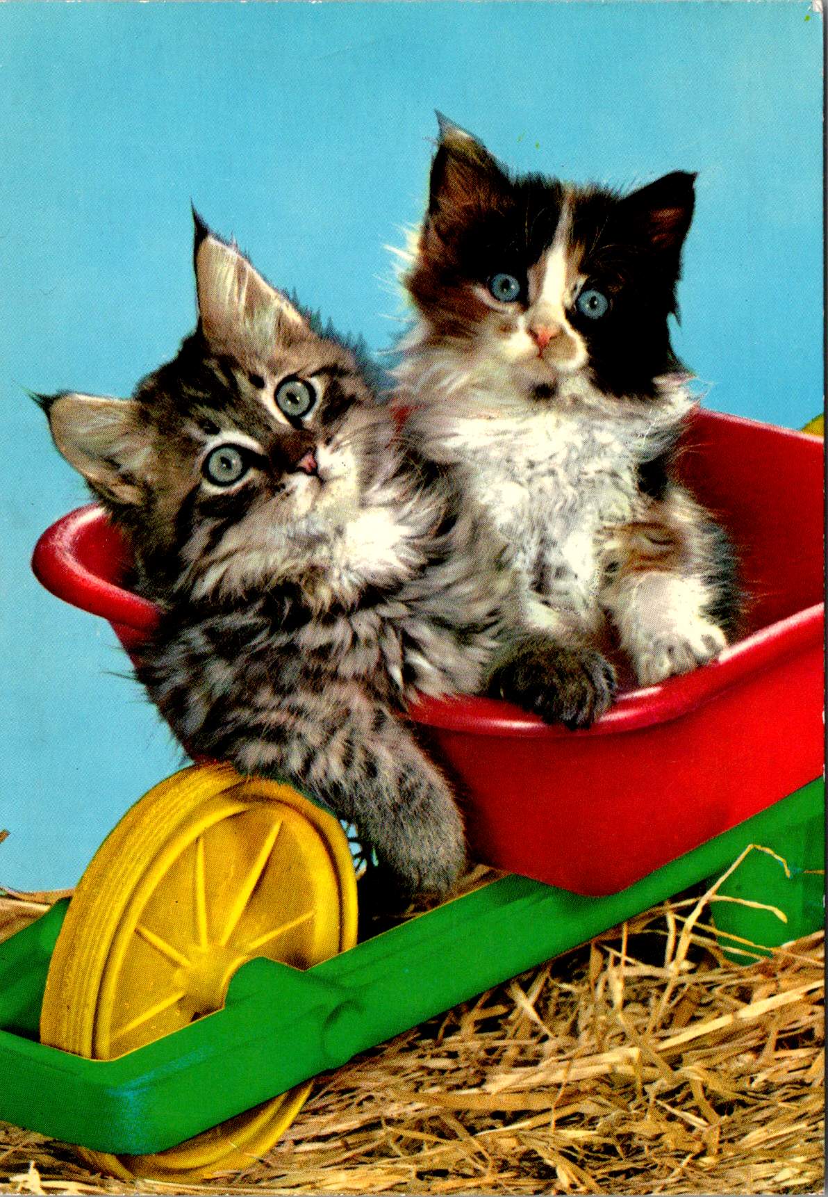
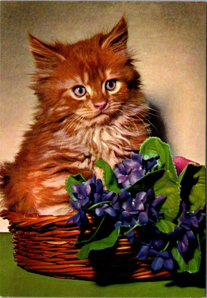
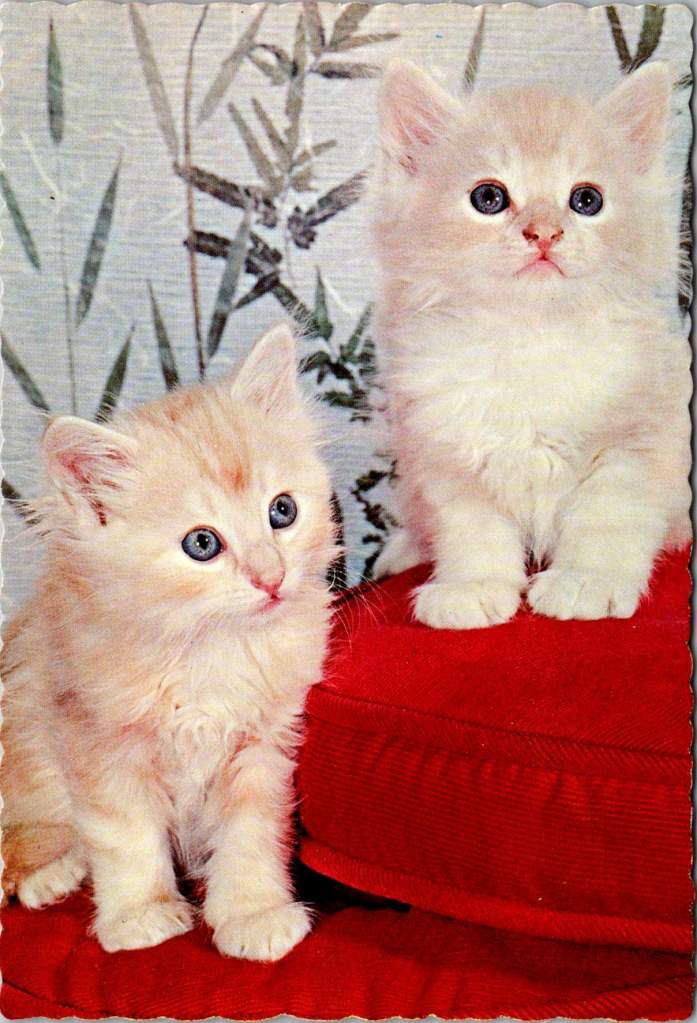
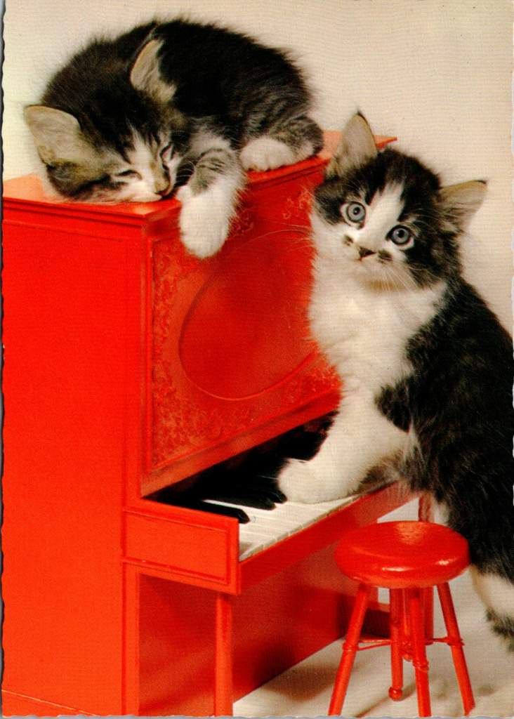
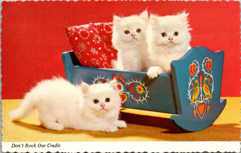
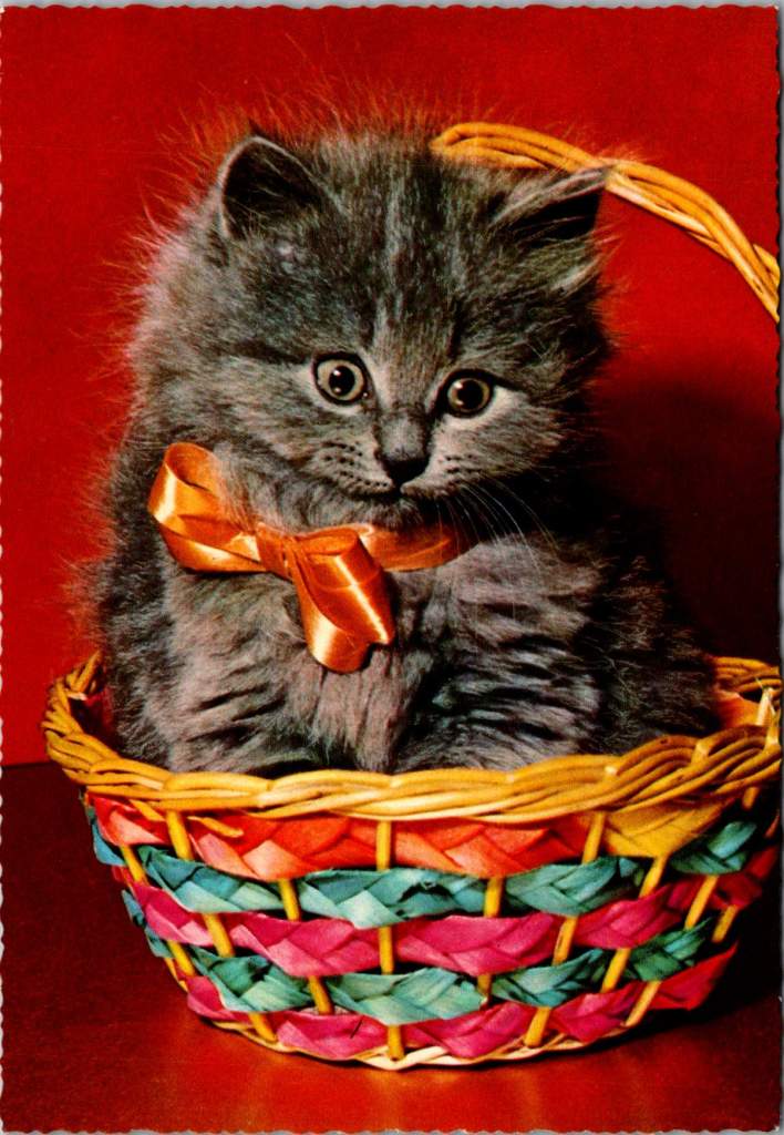
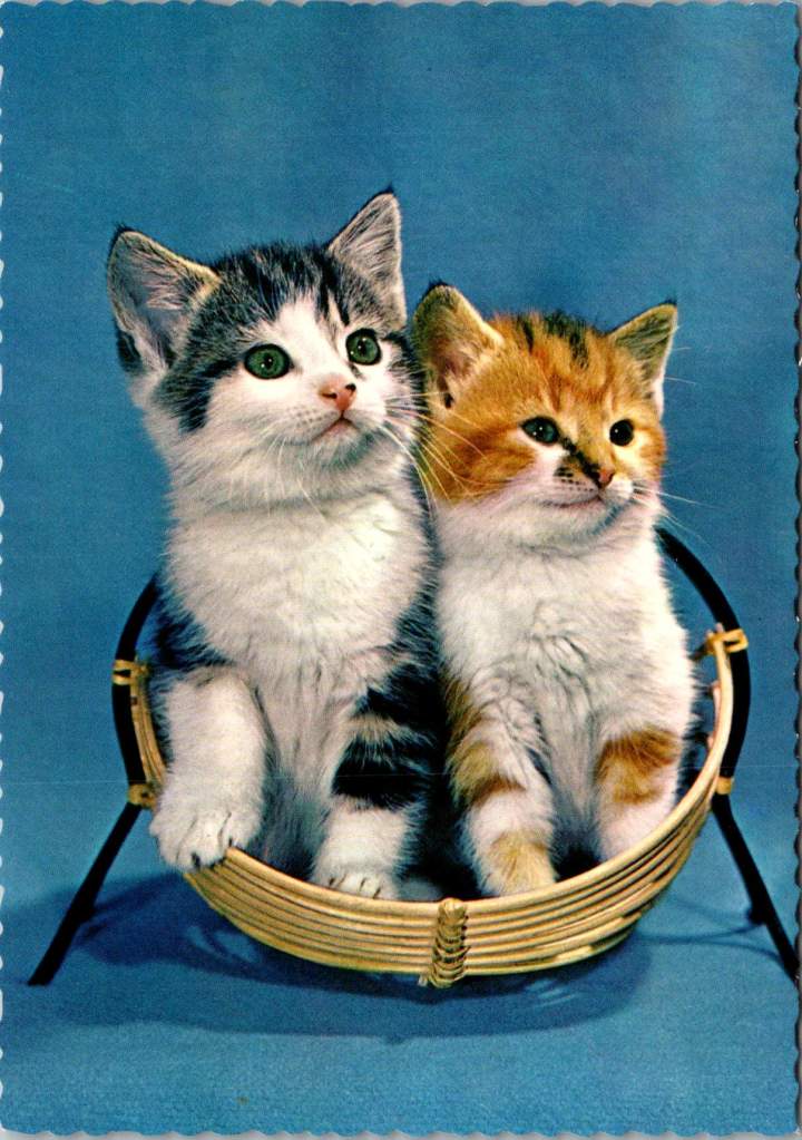
Science says gazing at adorable kitten pics can boost your mental health. But you don’t really need a reason, do you?
Life is tough. Bills pile up, deadlines loom, and some days it feels like the world is on fire. That’s precisely when we need something small, fuzzy, and adorable to remind us that not everything is terrible. First choice? Kitten photos, the internet’s gift to humanity’s collective mental health.
When the news cycle feels like a never-ending disaster movie, there’s something healing about a tiny fluffball curled up in a teacup or peering curiously from behind a houseplant. These miniature pouncers, with their disproportionate paws and earnest expressions, serve as nature’s meditation.
Scientific studies suggest that viewing cute animal content can improve focus, boost mood, and temporarily reduce anxiety. It’s a mental health break in fuzzy form—no prescription needed. Even better, we sent kitten postcards to each other long before the digital age. Proof that science is just catching up.
Cute kittens provide a guilt-free excuse to pause, smile, and recall that life’s greatest joys come in small packages. They remind us that it’s okay to be happy, and to hide toys in the couch.
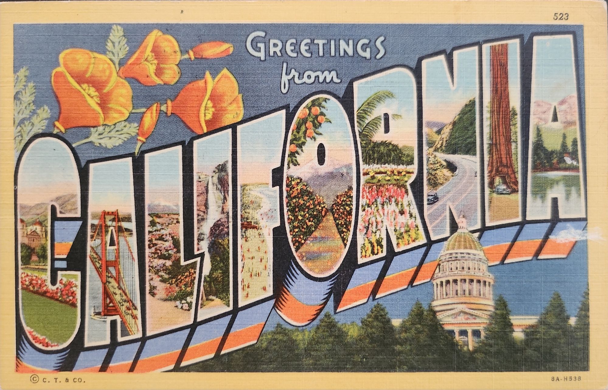
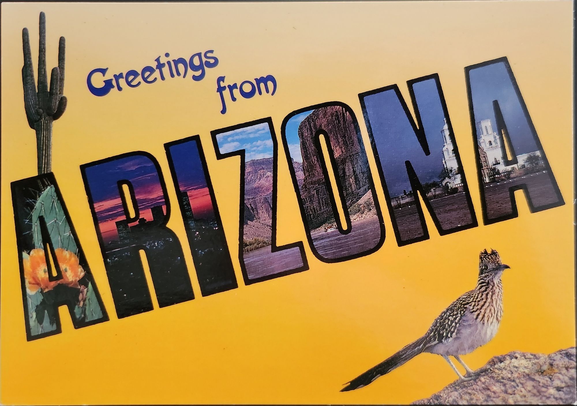
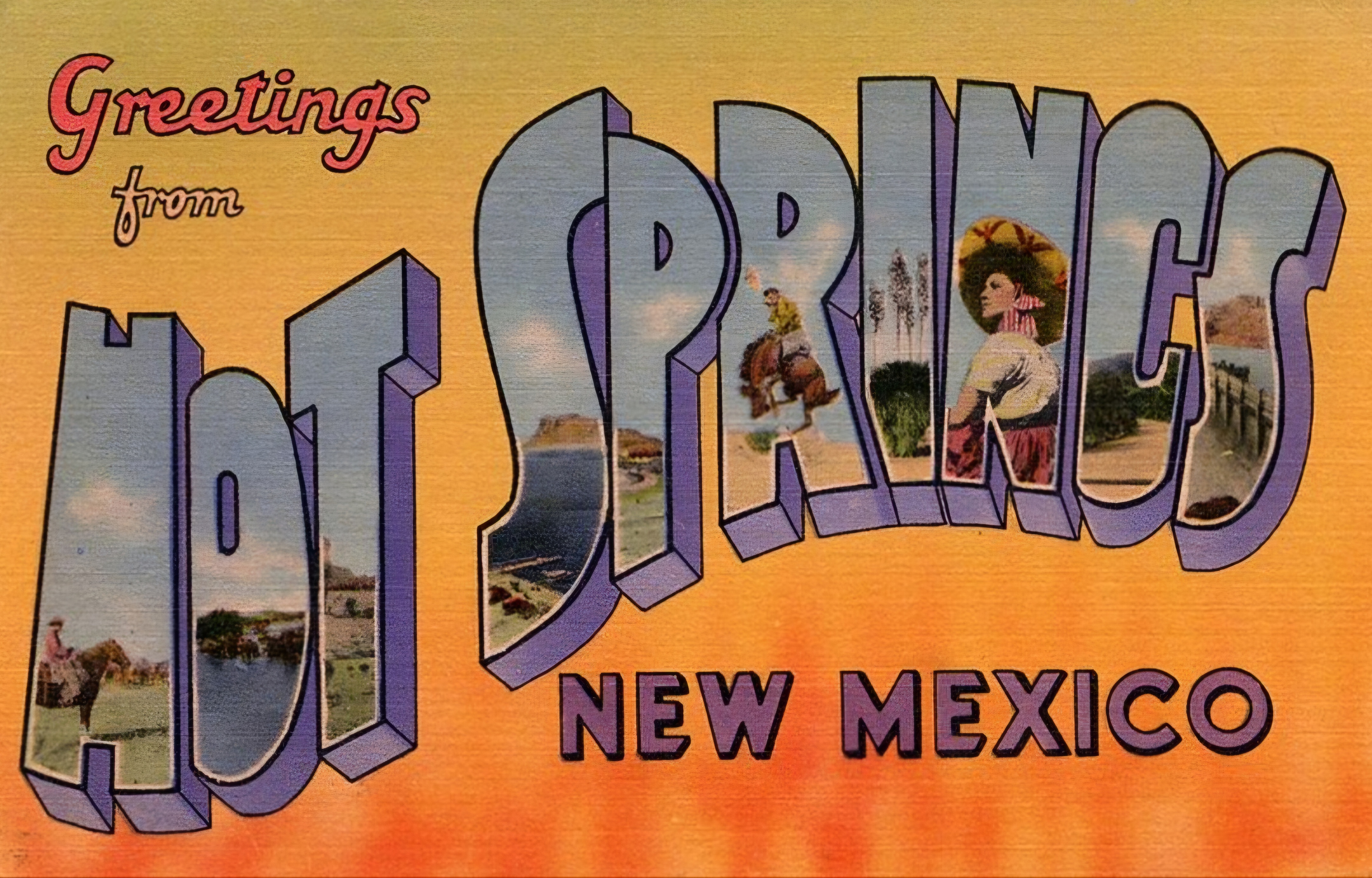
‘Greetings from…’ designs have rippled through visual culture for well over a century, telling the stories of how we see ourselves and our places.
A stone dropped into still water creates concentric circles that radiate outward. This physical phenomenon is a powerful metaphor for how cultural ideas spread through time and across media, especially visual motifs of place. Certain visual vocabularies persist, evolving with technologies while maintaining essential characteristics.
American statehood, regional identity, and natural heritage have rippled through various media over the past century. Iconic ‘large letter’ postcards, commemorative postal stamps, murals and more—all help us trace a fascinating journey of cultural transmission through the broader currents in American history, industrial development, and visual communication.
Gruss Aus… from Germany
“Greetings From…” postcards emerged in 1890s Germany. The early examples of Gruss Aus cards featured the name of a location rendered in bold, three-dimensional letters with miniature scenes of local landmarks contained within. More common postcards of the day feature detailed illustrations of castles and later photographs. This new design cleverly packed maximum visual information into the limited space, creating an instantly recognizable format that would soon spread internationally.
New American Icons
The transmission of this visual language to America came through a German immigrant named Curt Teich, who arrived in the United States in 1895. After establishing his printing company in Chicago in 1898, Teich would transform American visual culture through the mass production of postcards. Following a visit to Germany in 1904, he successfully imported the Gruss Aus style to the American market, adapting it to suit American sensibilities and landscapes.
The true flowering of Teich’s vision came in 1931 with the introduction of his linen-textured postcards. Printed on high-quality paper with a distinctive fabric-like texture, these cards employed vibrant colors and airbrushing techniques that created a hyperreal aesthetic. The technical innovation of the linen card allowed for faster drying times and more saturated colors, resulting in postcards that depicted America in an optimistic, idealized light—a stark contrast to the harsh realities of the Great Depression era in which they first appeared.
Teich’s business savvy was as important as his technical innovations. He employed hundreds of traveling salesmen who photographed businesses and worked with owners to create idealized images for postcards. This approach not only generated business but also shaped how Americans visualized their own landscapes and communities. The Curt Teich Company would eventually produce over 45,000 different linen postcard subjects in just two decades.
The visual language of these postcards—bold lettering, vibrant colors, and idealized scenes—became firmly embedded in American visual culture during the 1930s through 1950s. As automobile ownership increased and the highway system expanded, these postcards played a crucial role in shaping Americans’ understanding of their own geography and national identity. They were both records of places visited and aspirational images of places to be seen.
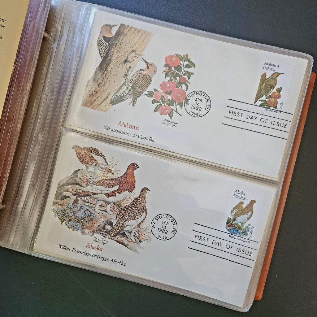
State Birds and Flowers
Parallel to the development of the large letter postcard, another form of state-based visual identity was taking root—the formal designation of state birds and flowers. Most American states adopted these symbols between the 1920s and 1940s, often through campaigns involving schoolchildren, women’s clubs, and conservation organizations.
These officially designated natural symbols provided another vocabulary for expressing regional identity, one rooted in the natural world rather than the built environment. While large letter postcards typically highlighted human achievements—city skylines, hotels, roadways—state birds and flowers emphasized the distinctive natural heritage of each region. Together, these complementary systems of regional representation provided Americans with a rich visual language for their diverse nation.
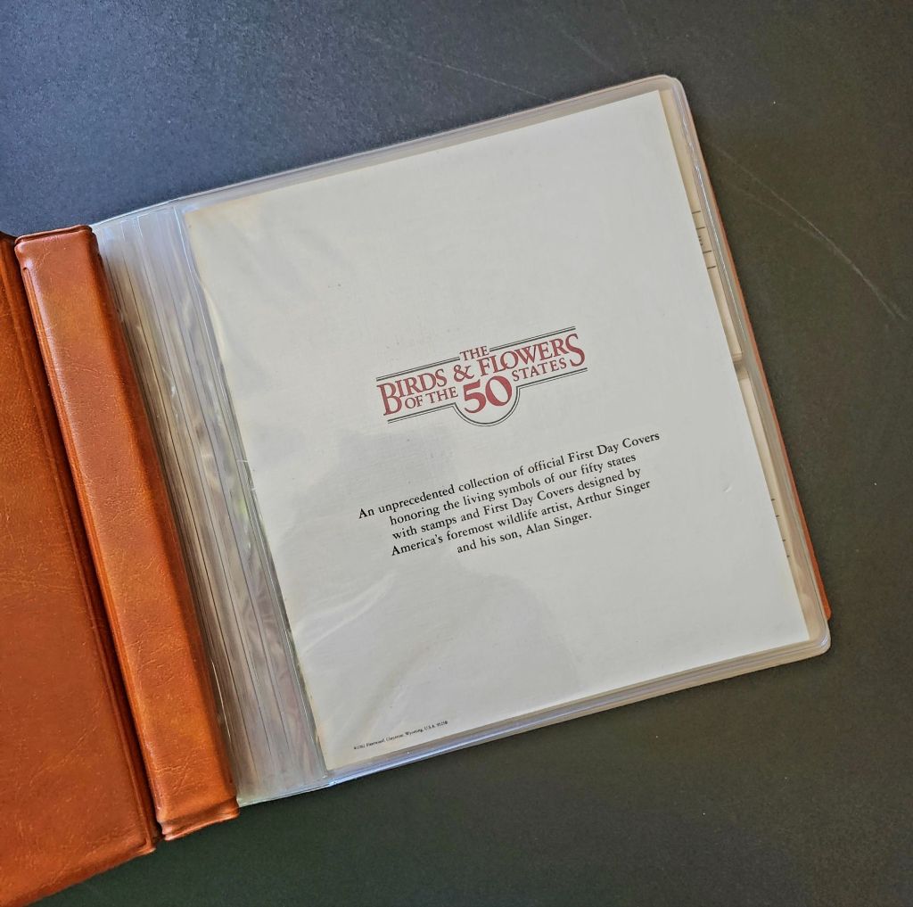
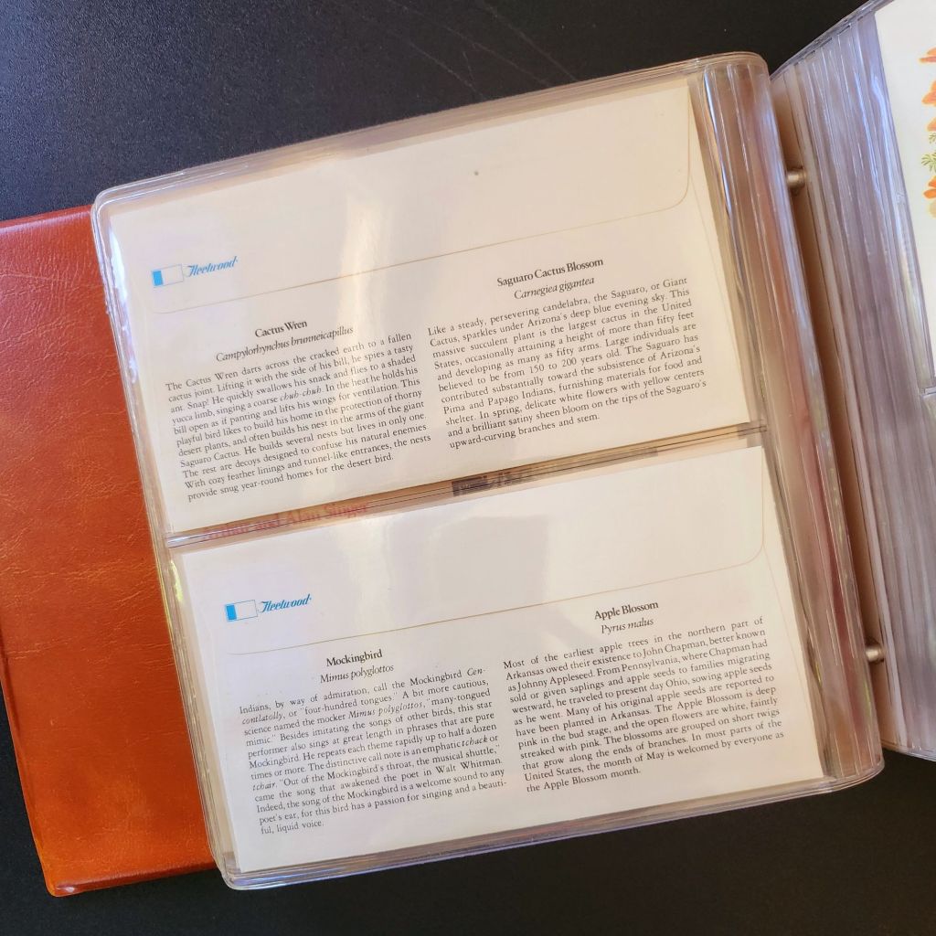
In 1978, the Fleetwood company commissioned father-son wildlife artists Arthur and Alan Singer to create 50 original paintings of state birds and flowers. These watercolor paintings caught the attention of U.S. Postal Service officials, who recognized their exceptional quality and decided to feature them on commemorative stamps. Released on April 14, 1982, the 20-cent State Birds and Flowers stamp collection was another big moment in the ripple effect.
Arthur Singer painted the birds while his son Alan rendered the flowers, creating unique artwork for each of the 50 stamps. The collaboration between father and son added another dimension to this cultural transmission—the passing of artistic traditions and approaches from one generation to the next.
The Fleetwood company published a complete album featuring First Day Covers of these stamps. These decorative envelopes included additional information about each state’s natural heritage, creating a beautifully bound volume that was both aesthetically pleasing and informative. The Birds & Flowers of the 50 States album is now a cherished collectible, a visual catalog of national natural heritage in a single, beautifully presented format.
Greetings from the Post Office
Twenty years later, the visual language of the large letter postcard experienced a revival through another stamp collection. On April 4, 2002, the USPS issued the ‘Greetings from America’ stamps, designed by Richard Sheaff and illustrated by Lonnie Busch. These stamps paid direct homage to the large letter postcards of the 1930s and 1940s, recreating their distinctive style for a new generation.
Each of the 50 stamps featured the name of a state in large, three-dimensional letters containing images of iconic landmarks and scenic vistas. The stamps were initially released as 34-cent denominations, but due to a rate change, they were reissued with 37-cent denominations on October 25, 2002. Here is another circular moment—a postal medium paying tribute to a postcard tradition that had itself been a popular means of commemorating places visited.
These stamps connected with older Americans who remembered the original postcards. Younger generations encountering the style for the first time recognized both the nostalgic and contemporary appeal. The vibrant colors and bold, three-dimensional lettering still effectively communicated a sense of place and regional pride, proving again the resilience of this visual vocabulary.
Even Larger Letters
Artists Victor Ving and Lisa Beggs took the large letter postcard to a whole new scale. Starting in 2015, the Greetings Tour has produced dozens of murals that transform the two-dimensional postcard design into monumental public art.
A grand dimensional leap—a design meant to be held in the hand scaled to the size of a building. The murals maintain the core visual elements of the large letter design while incorporating contemporary references and local touchstones. In a delightful twist, these murals have themselves become tourist attractions with visitors posing for social media. The postcard mural is now a backdrop for new images to be shared globally.
The artists also create custom digital designs for corporations, events, and retail spaces, maintaining the vintage aesthetic while adapting it to contemporary contexts. This commercialization represents another ripple in the cultural transmission of the large letter design, as it moves from public art back into the commercial realm that originally produced the linen postcards.
Digital Doppelgangers
As graphic design software became increasingly sophisticated and accessible in the late 20th and early 21st centuries, the visual language of large letter postcards found new life in digital recreations. Graphic design tools enable designers to quickly recreate the distinctive three-dimensional lettering and image-filled characters of the classic postcards.
AI Generation
Online design platforms have further opened access to this aesthetic, offering templates that approximate the large letter style without requiring specialized skills. Now small businesses, community organizations, and individuals can incorporate elements of this visual tradition into their communications, expanding the reach of this design vocabulary beyond professional designers.
With a phrase like “create an image of a vintage large letter postcard from Arizona,” most anyone can generate a decent design in seconds. Like the old days of digital clip-art, the initial attempts lack craftsmanship and historical accuracy. Still, they are a new democratization of this visual vocabulary, making it more accessible to professional designers and enthusiasts alike, though perhaps for different reasons.
This latest development completes a fascinating loop—from specialized industrial printing processes that required substantial investment and technical expertise, to digital design tools requiring professional training, to AI generation requiring only the ability to formulate a design concept and the text prompt. With each technological advancement, the barriers to producing these distinctive visual representations have lowered, while the core elements of the design has persisted.
Visual Persistence
From German Gruss Aus postcards to AI-generated images—our journey demonstrates the remarkable resilience of certain visual vocabularies across time, technologies, and cultural contexts. Despite dramatic changes in production methods, from specialized lithographic presses to neural networks, the essential visual grammar of these designs remains recognizable.
This persistence has a woven quality—the ability to render and replicate a sense of place over time. Whether in linen postcards, commemorative stamps, public murals, or digital images, the large letter design and state symbol motifs combine to convey regional identity and pride over time. Their continued relevance suggests that certain visual solutions, once discovered, become an architecture that generations continue to appreciate and adapt for new uses.
We also feel the ripple effect in the broader patterns of American history— immigrants bringing skills and technology to American shores, industrial innovation creating new visual possibilities, the automobile age changing how Americans experienced nature and themselves, and digital technology transforming how we create and share images. Through it all, the distinctive visual language pioneered by Curt Teich and others continues to evolve.
What new ripples lie ahead? Perhaps augmented reality will allow us to step into these designs. Or new materials and technologies will adapt them yet again for uses we don’t yet comprehend. Whatever comes next, we know that cultural transmission does have a distinguishing mark—it ripples outward in both calculable and unexpected ways, influenced by technology, economics, and human inspiration, creating patterns that can be traced across generations.
For Additional Reading
Meikle, Jeffrey L. (2016). Postcard America: Curt Teich and the Imaging of a Nation, 1931-1950. University of Texas Press. Publisher’s page
“The Immigrant Story Behind the Classic ‘Greetings From’ Postcards.” Smithsonian Magazine. (2018). Read online