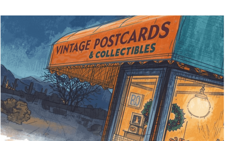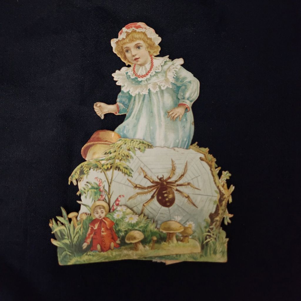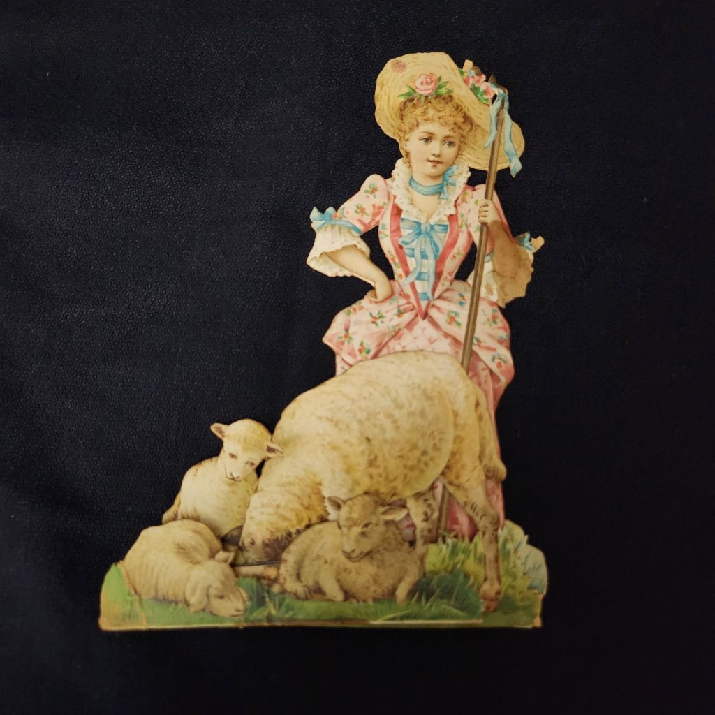
To start an art card, I pull together a collection of cards and ephemera related to a theme or style I want to explore. Gather tools, supplies, and a drink at my art board. Set my phone aside, and pick up an exacto knife. Then, I sit down, quiet down, and begin to make meaning out of the materials in front of me. I’m nowhere near my computer or journal, but making an art card now and then is part and parcel with my writing process.
The Posted Past Art Card Gallery is inspired by so many wonderful postcard projects over the years. Worth mentioning are PostSecret, which invites anyone to share an anonymous secret on a postcard, and PostCrossing, which makes it easy to send and receive postcards around the world.
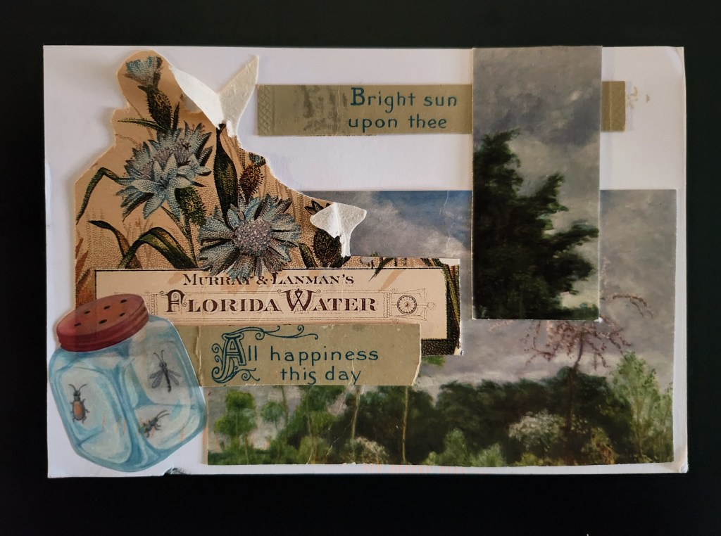
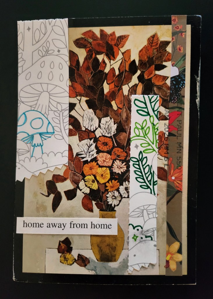
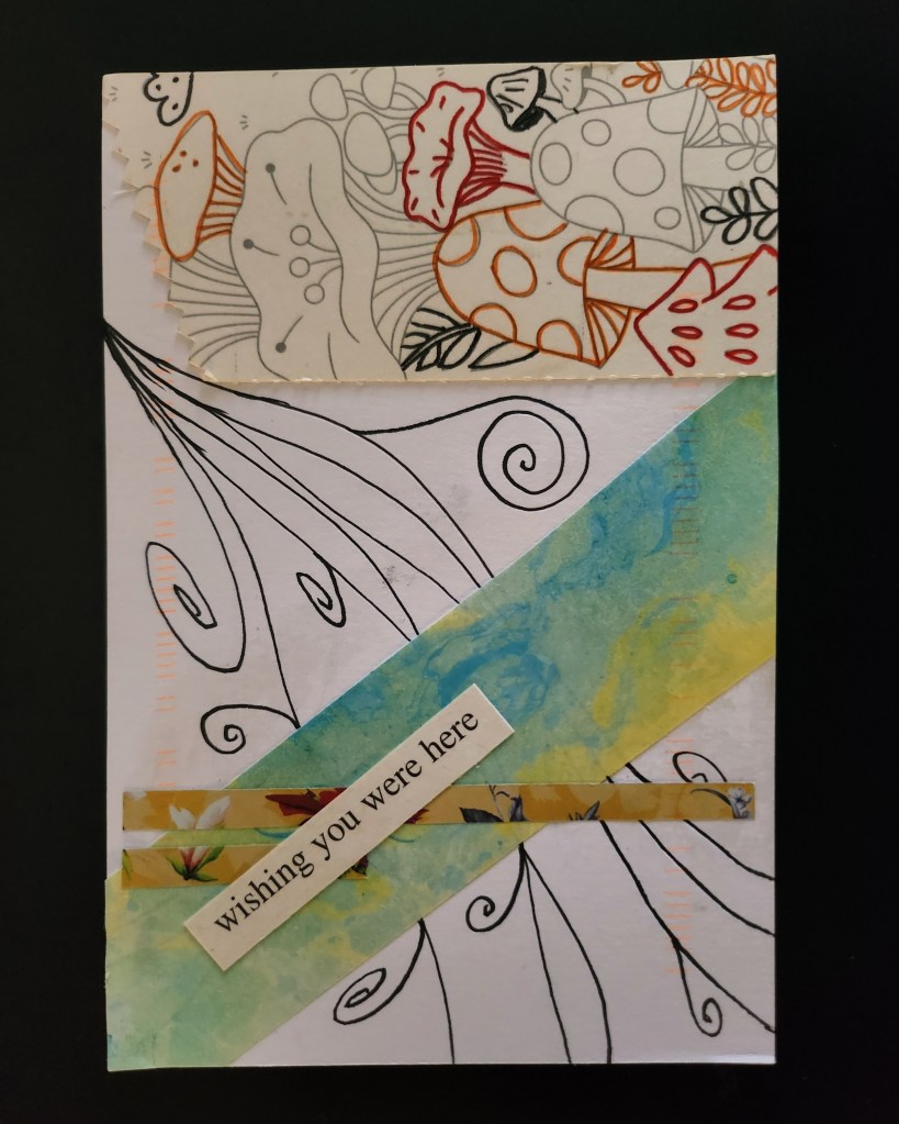
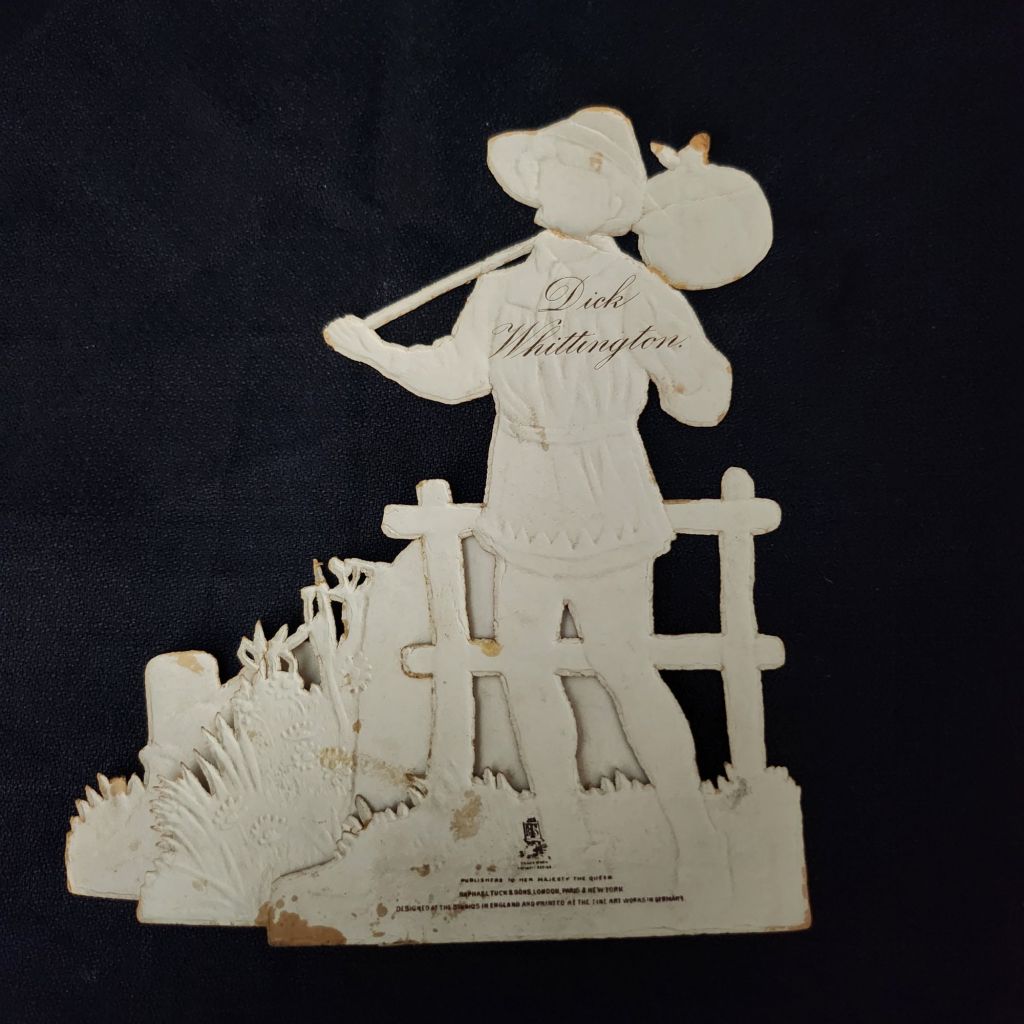
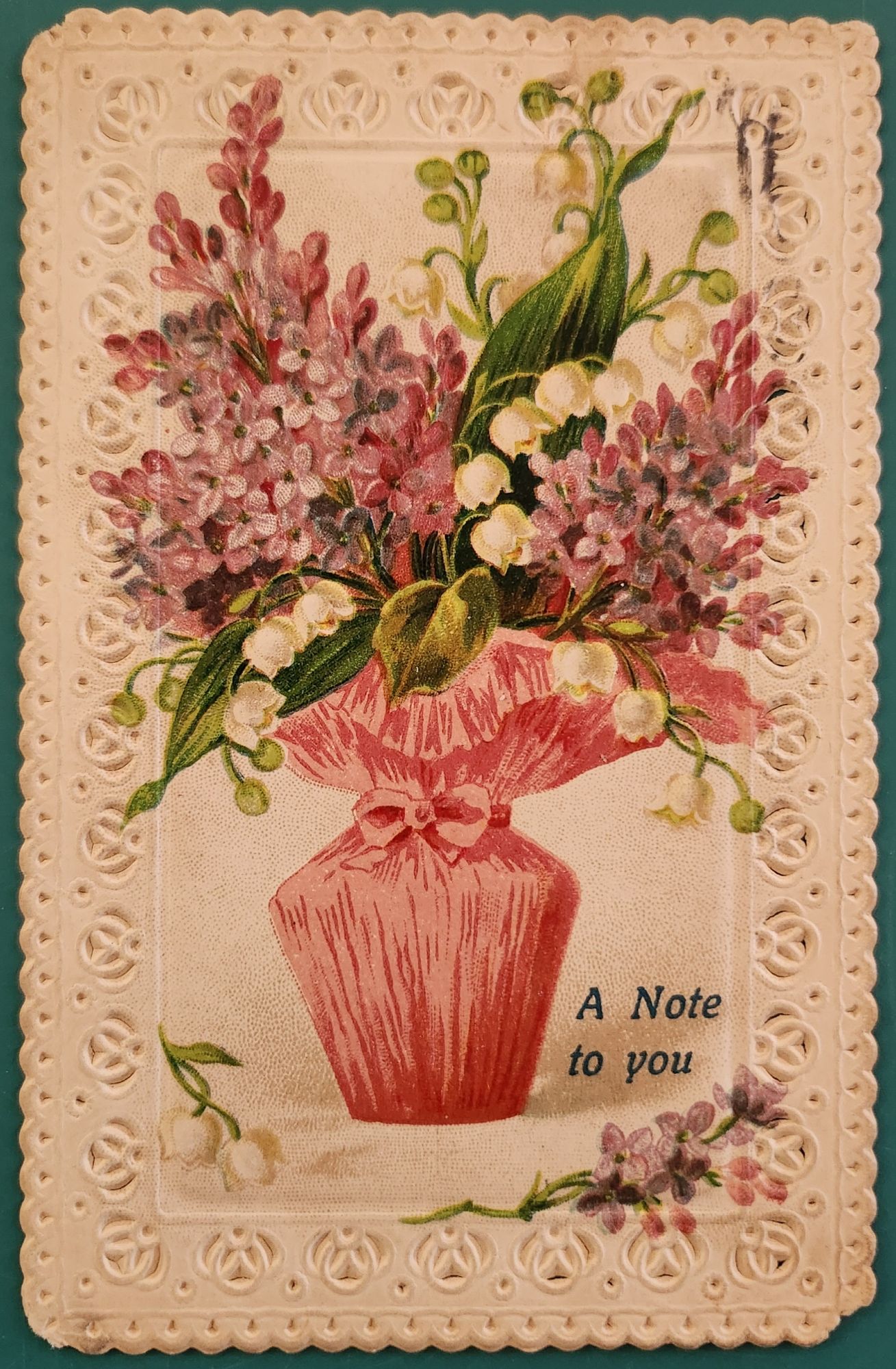
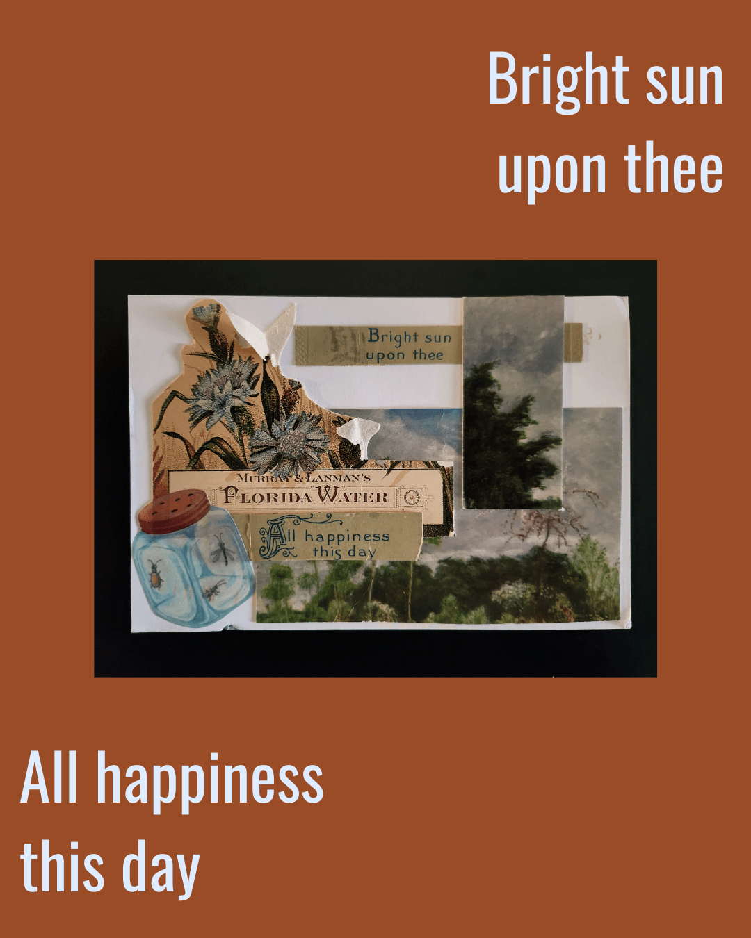
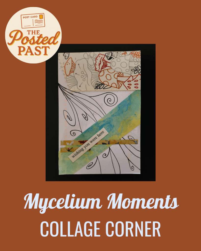
For our part, we collaborate with collage artists to make something small and special for everyone to enjoy. The artist requests a theme or two based on interests like, trees, farms, or portraits. We send an art card bundle and they create collage postcards with these materials. The postcard collages come back through the mail, celebrating the wear and tear of the postal service journey.
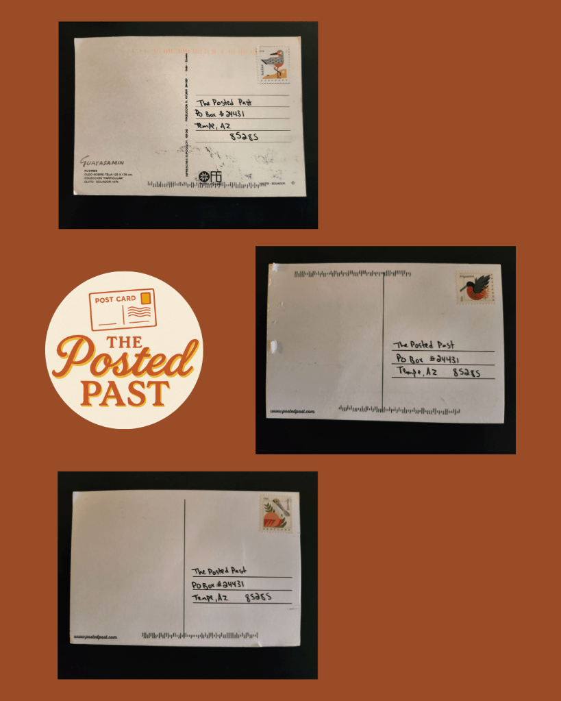
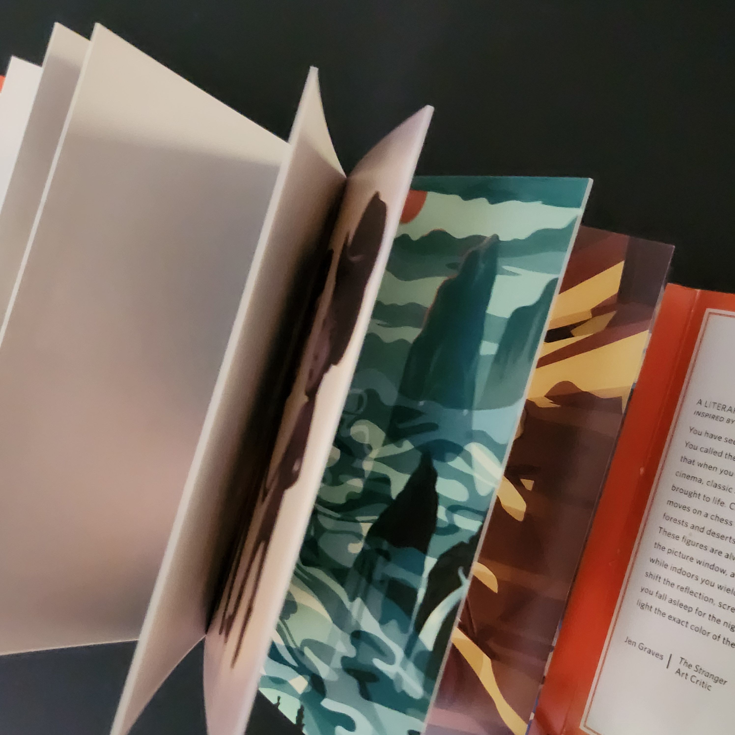
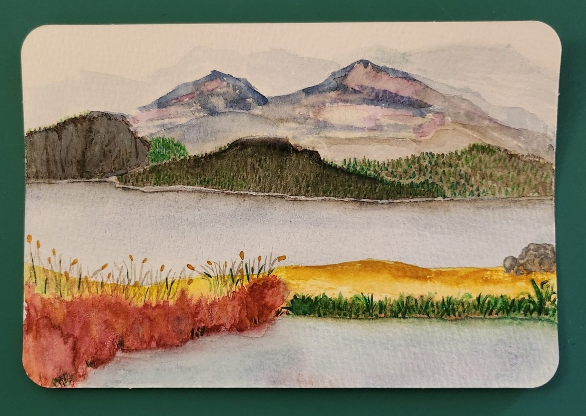
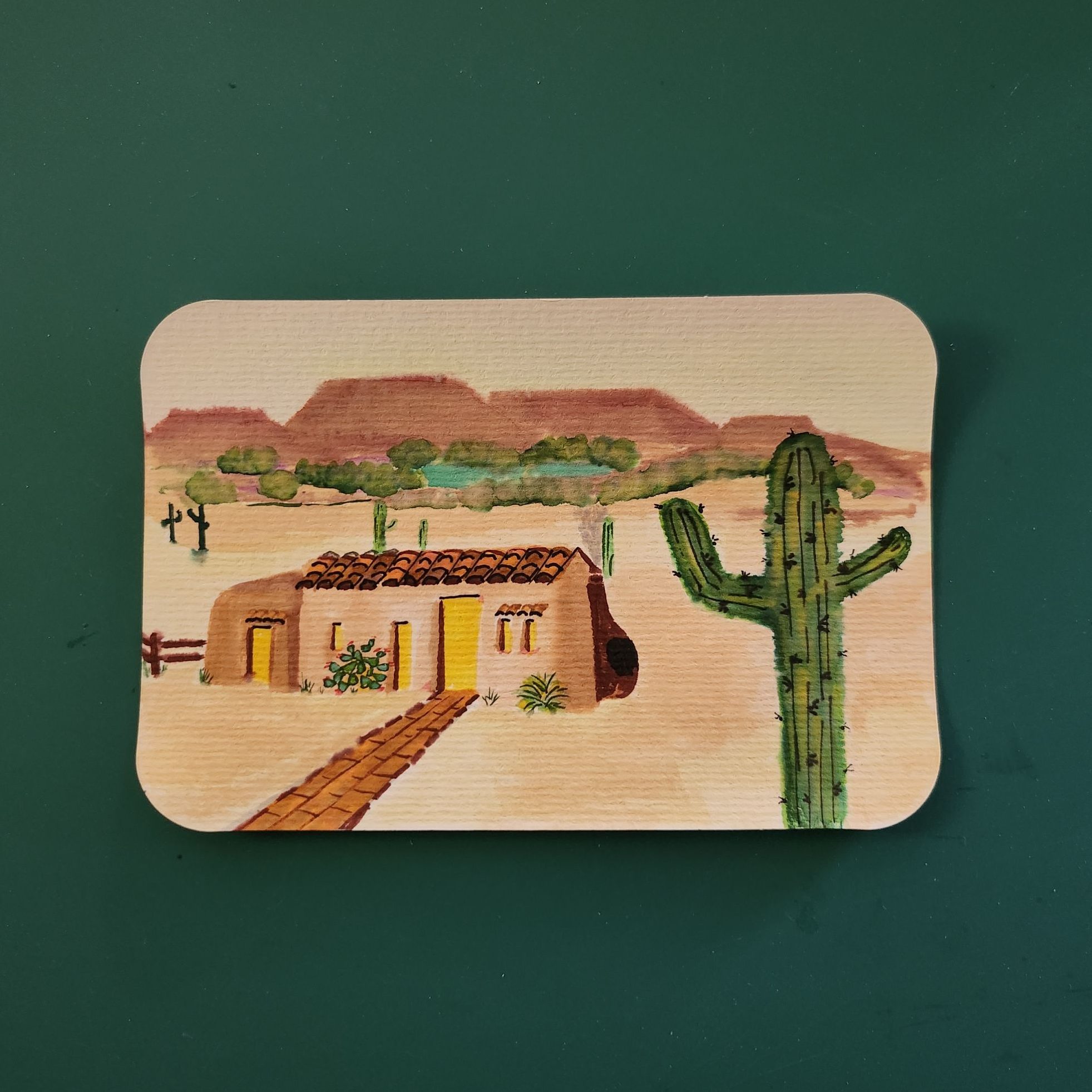
The Art Card Gallery is a place to see art card collages created by artists around the world.
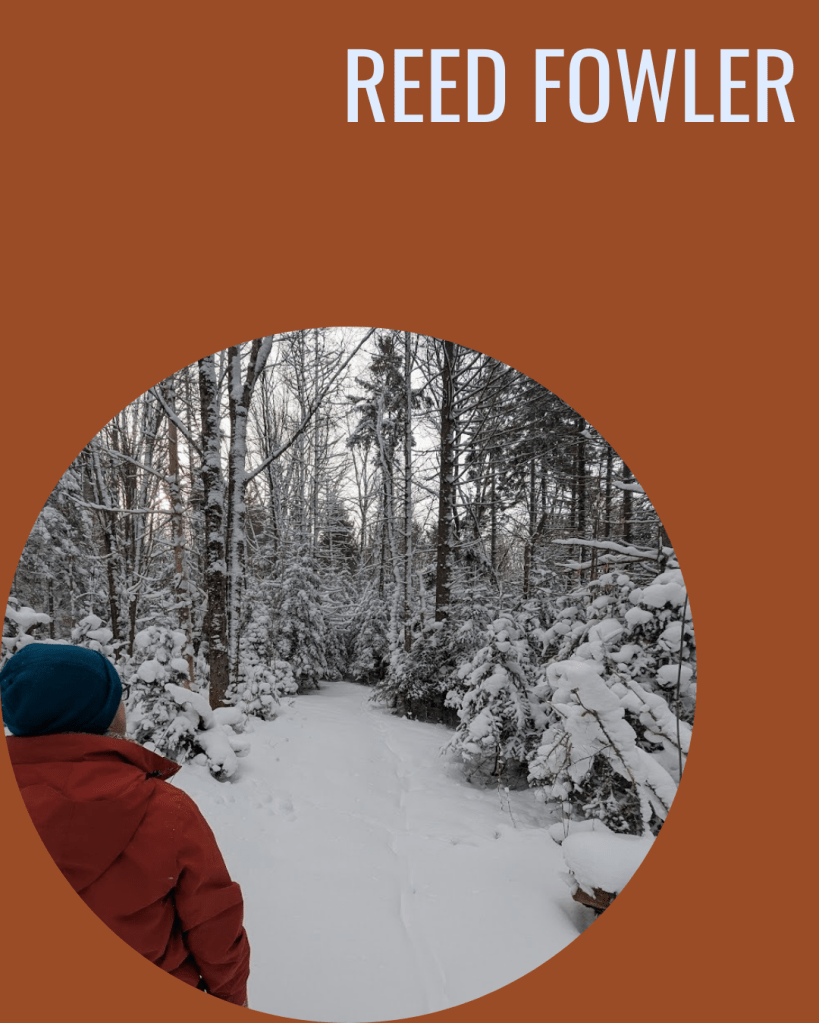
This month, meet Fiber Artist Reed Fowler!
WEDNESDAY WEEKLY READER
If you’re already a subscriber, bless you for hanging on as you do. You get a little note in your inbox each Wednesday. Most times it flits away like a red cardinal, down into the cold, thatched hinterland of your inbox scroll. I know.
Introducing the Wednesday Weekly Reader, a new place to catch up with a previous story series bundled in a way that is easier to read. If you love our national parks, wonder about where the past gets lost, or know a few lonely snowbirds, a story series may meet your fancy.