1972 Tourism Year of the Americas

These vintage postcards from the 1972 Tourism Year of the Americas reveal fascinating questions about natural landscapes, heritage, monuments, and whose stories we remember and tell.

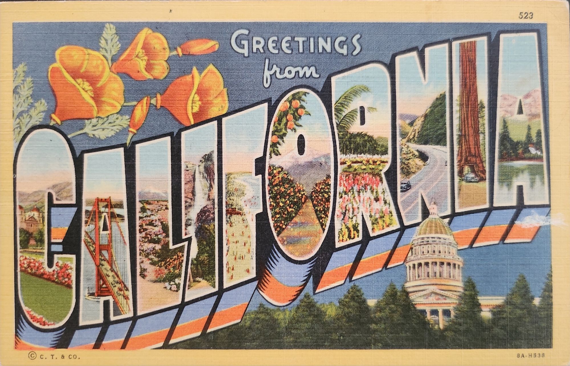
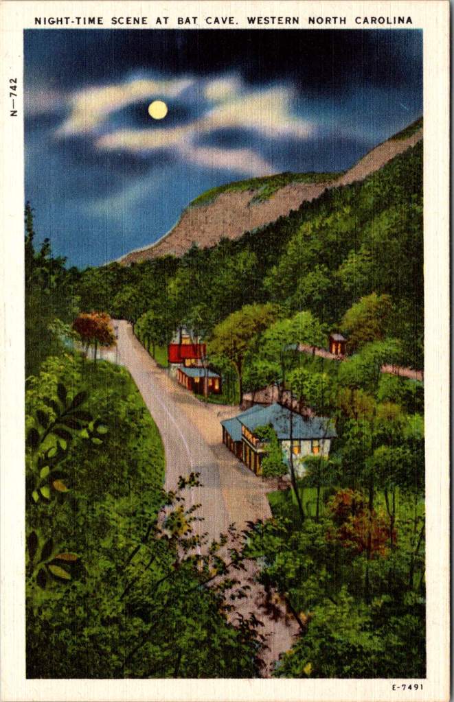
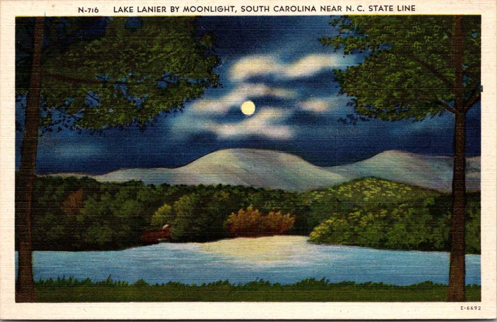
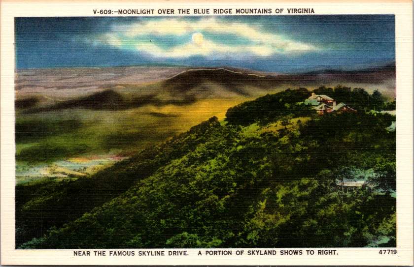
In summer 1972, the United States Postal Service issued commemorative postcards that would become enduring symbols of national identity. These postcards, part of the Tourism Year of the Americas campaign, featured iconic destinations with restrained elegance—their two-color printing was both artistic and economical. As America stood at a cultural crossroads, this postcard set tells a familiar American story. More than five decades later, they reveal even more about how a nation sees itself.

Commemorative Moments

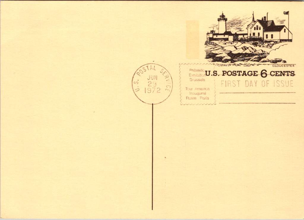
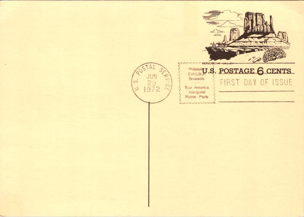
First Day of Issue cancellations mark a special moment in time, and signal that an item is expected to be collectible. The postcards were cancelled on June 29, 1972, bearing the commemorative text “Philatelic Exhibition Brussels” and “Tour America Inaugural Rome – Paris.” These international exhibitions promoted American tourism during the Cold War, when cultural diplomacy served as essential soft power.

The carefully designed cancellation artwork includes USS Constellation (6¢), Gloucester (6¢), Monument Valley (6¢), and Niagara Falls (airmail 15¢). These rates reflected the newly reorganized United States Postal Service which had become its own entity the year prior. The 1972 Tourism Year of the Americas was an ambitious initiative from the new quasi-independent agency, emerging alongside Nixon’s opening to China and détente with the Soviet Union.

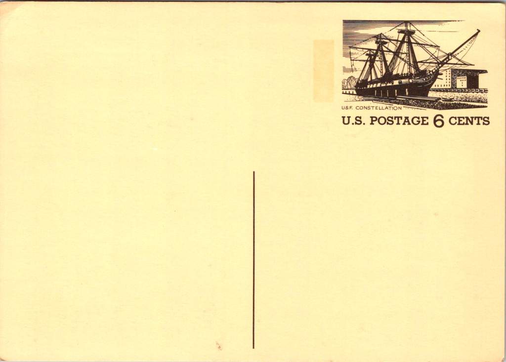
USS Constellation, the last sail-only warship built by the U.S. Navy (1853-1855), served as flagship of the Africa Squadron from 1859–1861. The ship captured three slave vessels, enabling liberation of 705 Africans. During the Civil War, Constellation deterred Confederate cruisers in the Mediterranean. The selection represented naval heritage and anti-slavery efforts, though it still centered the naval victory rather than those who gained freedom.

Niagara Falls has attracted visitors for 200 years, becoming the symbolic heart of American tourism. The 1883 Niagara Reservation became America’s first state park, influencing national park creation. Current visitor statistics show enduring appeal: 9.5 million tourists visited Niagara Falls State Park in 2023, with the region welcoming 12 million visitors yearly.

Monument Valley reflect the West’s central role in national identity by 1972, immortalized through Hollywood and environmentalism. Yet Monument Valley sits within Navajo Nation territory, while Grand Canyon encompasses land sacred to multiple tribes, including the Havasupai, whose reservation lies within park boundaries—reminders that park creation displaced Native communities.

Gloucester, America’s oldest seaport, sustained coastal communities for centuries. The lighthouse image evoked both practical maritime safety and romantic notions of New England’s rocky shores, while Gloucester’s working harbor embodied the intersection of heritage preservation and living tradition. By 1972, this historic fishing port faced the tension between maintaining its authentic maritime culture and adapting to tourism pressures—a challenge that made it a fitting symbol.

Artistic Vision

The front of the postcards render multiple iconic American locations in distinctive engravings in an economical two-color print run, an important factor for a the government printing office.

The collection showcases a deliberate balance. Yosemite represents natural power and America’s first national park. Missisippi Riverboats and the Rodeo embody western majesty central to national imagination. DC Monuments offer overt patriotism and Williamsburg and the Liberty Bell connect to the tremors and tolls of colonial democracy.

Even in 1972, these were selective narratives. All featured natural sites exist on traditional Indigenous lands, for example, while largely omitting Indigenous perspectives and enslaved people’s contributions to our cultural histories.

Many featured locations are sacred sites to Indigenous communities. Some of the most sacred places for American Indian nations are located in national parks, yet access to holy ground remains contentious. Park creation often involved displacing Native peoples from lands they had stewarded for millennia.

The year 1972 was tough in other ways: Vietnam War divisions, emerging Watergate scandal, and generational alienation over the military draft. These postcards presented a different kind of unity. Rather than contemporary political divisions, they emphasized natural wonders and historical sites that transcended partisan conflicts.

During the Cold War, these postcards served as miniature global ambassadors, too, often providing people’s first visual encounter with American landmarks. They projected America as worthy of visiting and learning about, countering negative impressions from political controversies.

The postcards themselves embody crucial democratic principles: making heritage accessible through affordable media; connecting tourism to conservation through revenue and public appreciation; and revealing how commemorative choices reflect national values. The geographic diversity suggests a desire for the fullest of American experiences, though these 1972 selections still privilege certain narratives.

New Memories

These postcards continue to offer insights into American values and heritage preservation evolution. USS Constellation still serves as a museum ship in Baltimore’s Inner Harbor. National parks have experienced tremendous visitation growth, raising questions about balancing access with preservation.

In what they don’t depict, the postcards show gaps in whose stories get told, whose lands get celebrated, whose experiences get centered. While 1972 selections emphasized traditional narratives, contemporary views increasingly include previously marginalized perspectives, acknowledging Indigenous heritage alongside colonial and national stories.

These artifacts remind us that commemorations reveal values and priorities. As our historical understandings evolve, it’s wise to look back and look again.


To Read More

Ripple Effect

‘Greetings from…’ designs have rippled through visual culture for well over a century, telling the stories of how we see ourselves and our places.

A stone dropped into still water creates concentric circles that radiate outward. This physical phenomenon is a powerful metaphor for how cultural ideas spread through time and across media, especially visual motifs of place. Certain visual vocabularies persist, evolving with technologies while maintaining essential characteristics.

American statehood, regional identity, and natural heritage have rippled through various media over the past century. Iconic ‘large letter’ postcards, commemorative postal stamps, murals and more—all help us trace a fascinating journey of cultural transmission through the broader currents in American history, industrial development, and visual communication.

Gruss Aus… from Germany

“Greetings From…” postcards emerged in 1890s Germany. The early examples of Gruss Aus cards featured the name of a location rendered in bold, three-dimensional letters with miniature scenes of local landmarks contained within. More common postcards of the day feature detailed illustrations of castles and later photographs. This new design cleverly packed maximum visual information into the limited space, creating an instantly recognizable format that would soon spread internationally.

New American Icons

The transmission of this visual language to America came through a German immigrant named Curt Teich, who arrived in the United States in 1895. After establishing his printing company in Chicago in 1898, Teich would transform American visual culture through the mass production of postcards. Following a visit to Germany in 1904, he successfully imported the Gruss Aus style to the American market, adapting it to suit American sensibilities and landscapes.

The true flowering of Teich’s vision came in 1931 with the introduction of his linen-textured postcards. Printed on high-quality paper with a distinctive fabric-like texture, these cards employed vibrant colors and airbrushing techniques that created a hyperreal aesthetic. The technical innovation of the linen card allowed for faster drying times and more saturated colors, resulting in postcards that depicted America in an optimistic, idealized light—a stark contrast to the harsh realities of the Great Depression era in which they first appeared.

Teich’s business savvy was as important as his technical innovations. He employed hundreds of traveling salesmen who photographed businesses and worked with owners to create idealized images for postcards. This approach not only generated business but also shaped how Americans visualized their own landscapes and communities. The Curt Teich Company would eventually produce over 45,000 different linen postcard subjects in just two decades.

The visual language of these postcards—bold lettering, vibrant colors, and idealized scenes—became firmly embedded in American visual culture during the 1930s through 1950s. As automobile ownership increased and the highway system expanded, these postcards played a crucial role in shaping Americans’ understanding of their own geography and national identity. They were both records of places visited and aspirational images of places to be seen.

State Birds and Flowers

Parallel to the development of the large letter postcard, another form of state-based visual identity was taking root—the formal designation of state birds and flowers. Most American states adopted these symbols between the 1920s and 1940s, often through campaigns involving schoolchildren, women’s clubs, and conservation organizations.

These officially designated natural symbols provided another vocabulary for expressing regional identity, one rooted in the natural world rather than the built environment. While large letter postcards typically highlighted human achievements—city skylines, hotels, roadways—state birds and flowers emphasized the distinctive natural heritage of each region. Together, these complementary systems of regional representation provided Americans with a rich visual language for their diverse nation.

In 1978, the Fleetwood company commissioned father-son wildlife artists Arthur and Alan Singer to create 50 original paintings of state birds and flowers. These watercolor paintings caught the attention of U.S. Postal Service officials, who recognized their exceptional quality and decided to feature them on commemorative stamps. Released on April 14, 1982, the 20-cent State Birds and Flowers stamp collection was another big moment in the ripple effect.

Arthur Singer painted the birds while his son Alan rendered the flowers, creating unique artwork for each of the 50 stamps. The collaboration between father and son added another dimension to this cultural transmission—the passing of artistic traditions and approaches from one generation to the next.

The Fleetwood company published a complete album featuring First Day Covers of these stamps. These decorative envelopes included additional information about each state’s natural heritage, creating a beautifully bound volume that was both aesthetically pleasing and informative. The Birds & Flowers of the 50 States album is now a cherished collectible, a visual catalog of national natural heritage in a single, beautifully presented format.

Greetings from the Post Office

Twenty years later, the visual language of the large letter postcard experienced a revival through another stamp collection. On April 4, 2002, the USPS issued the ‘Greetings from America’ stamps, designed by Richard Sheaff and illustrated by Lonnie Busch. These stamps paid direct homage to the large letter postcards of the 1930s and 1940s, recreating their distinctive style for a new generation.

Each of the 50 stamps featured the name of a state in large, three-dimensional letters containing images of iconic landmarks and scenic vistas. The stamps were initially released as 34-cent denominations, but due to a rate change, they were reissued with 37-cent denominations on October 25, 2002. Here is another circular moment—a postal medium paying tribute to a postcard tradition that had itself been a popular means of commemorating places visited.

These stamps connected with older Americans who remembered the original postcards. Younger generations encountering the style for the first time recognized both the nostalgic and contemporary appeal. The vibrant colors and bold, three-dimensional lettering still effectively communicated a sense of place and regional pride, proving again the resilience of this visual vocabulary.

Even Larger Letters

Artists Victor Ving and Lisa Beggs took the large letter postcard to a whole new scale. Starting in 2015, the Greetings Tour has produced dozens of murals that transform the two-dimensional postcard design into monumental public art.

A grand dimensional leap—a design meant to be held in the hand scaled to the size of a building. The murals maintain the core visual elements of the large letter design while incorporating contemporary references and local touchstones. In a delightful twist, these murals have themselves become tourist attractions with visitors posing for social media. The postcard mural is now a backdrop for new images to be shared globally.

The artists also create custom digital designs for corporations, events, and retail spaces, maintaining the vintage aesthetic while adapting it to contemporary contexts. This commercialization represents another ripple in the cultural transmission of the large letter design, as it moves from public art back into the commercial realm that originally produced the linen postcards.

Digital Doppelgangers

As graphic design software became increasingly sophisticated and accessible in the late 20th and early 21st centuries, the visual language of large letter postcards found new life in digital recreations. Graphic design tools enable designers to quickly recreate the distinctive three-dimensional lettering and image-filled characters of the classic postcards.

AI Generation

Online design platforms have further opened access to this aesthetic, offering templates that approximate the large letter style without requiring specialized skills. Now small businesses, community organizations, and individuals can incorporate elements of this visual tradition into their communications, expanding the reach of this design vocabulary beyond professional designers.

With a phrase like “create an image of a vintage large letter postcard from Arizona,” most anyone can generate a decent design in seconds. Like the old days of digital clip-art, the initial attempts lack craftsmanship and historical accuracy. Still, they are a new democratization of this visual vocabulary, making it more accessible to professional designers and enthusiasts alike, though perhaps for different reasons.

This latest development completes a fascinating loop—from specialized industrial printing processes that required substantial investment and technical expertise, to digital design tools requiring professional training, to AI generation requiring only the ability to formulate a design concept and the text prompt. With each technological advancement, the barriers to producing these distinctive visual representations have lowered, while the core elements of the design has persisted.

Visual Persistence

From German Gruss Aus postcards to AI-generated images—our journey demonstrates the remarkable resilience of certain visual vocabularies across time, technologies, and cultural contexts. Despite dramatic changes in production methods, from specialized lithographic presses to neural networks, the essential visual grammar of these designs remains recognizable.

This persistence has a woven quality—the ability to render and replicate a sense of place over time. Whether in linen postcards, commemorative stamps, public murals, or digital images, the large letter design and state symbol motifs combine to convey regional identity and pride over time. Their continued relevance suggests that certain visual solutions, once discovered, become an architecture that generations continue to appreciate and adapt for new uses.

We also feel the ripple effect in the broader patterns of American history— immigrants bringing skills and technology to American shores, industrial innovation creating new visual possibilities, the automobile age changing how Americans experienced nature and themselves, and digital technology transforming how we create and share images. Through it all, the distinctive visual language pioneered by Curt Teich and others continues to evolve.

What new ripples lie ahead? Perhaps augmented reality will allow us to step into these designs. Or new materials and technologies will adapt them yet again for uses we don’t yet comprehend. Whatever comes next, we know that cultural transmission does have a distinguishing mark—it ripples outward in both calculable and unexpected ways, influenced by technology, economics, and human inspiration, creating patterns that can be traced across generations.

For Additional Reading

Meikle, Jeffrey L. (2016). Postcard America: Curt Teich and the Imaging of a Nation, 1931-1950. University of Texas Press. Publisher’s page

“The Immigrant Story Behind the Classic ‘Greetings From’ Postcards.” Smithsonian Magazine. (2018). Read online

“Curt Teich & Co., est. 1898.” Made-in-Chicago Museum. (2020). Read online

“How Linen Postcards Transformed the Depression Era Into a Hyperreal Dreamland.” Collectors Weekly. Read online

“Curt Teich Postcard Archives Collection.” Newberry Library. Collection information

“1953-2002 – 1982 20c State Birds and Flowers.” Mystic Stamp Company. Product page

Singer, Paul and Alan Singer. (2017). Arthur Singer: The Wildlife Art of an American Master. RIT Press. Publisher’s page

“3696-3745 – 2002 37c Greetings From America.” Mystic Stamp Company. Product page

Greetings Tour – The Original Postcard Mural Artists. Official website

“How To Create a Vintage Style Large Letter Postcard Design.” Spoon Graphics. (2022). Tutorial

Night Songs in the Forest

Moonlight dances across rippled water in a vintage postcard titled simply “Peaceful Night.” Nature lovers know that darkness transforms familiar landscapes into the mysterious and musical. The songs of the forest capture more than mere melody – they reveal the soul after sunset.

Lake Burton near Clayton, Georgia, mirrors the full moon in its still waters, surrounded by the dark masses of the mountains. As twilight deepens, the night chorus begins. Whip-poor-wills start their rhythmic chanting, a pulse that famous folklorist Alan Lomax once described as “nature’s metronome.”

In his 1959 field recordings from Georgia, Lomax captured not just the songs of mountain musicians, but also these ambient sounds – the chorus of frogs from the lake’s edge, the distant cry of a great horned owl, the rustling of wind through mountain laurel.

When Lomax made his landmark field recordings in the southern mountains, he often worked at night. The quality of sound was better then – less interference from human activity, and the natural acoustics of the mountains were more pronounced. In his field notes, he frequently commented on how the music emerged from the darkness itself, becoming part of the natural symphony of night sounds.

The ballad singers he recorded often chose songs that reflected this nocturnal environment. “The Night Visiting Song,” common in both Appalachian and Scottish tradition, captured the soundscape of a midnight journey through the mountains. “The False Knight Upon the Road,” with its mysterious midnight encounter, echoed with the very sounds these postcards capture visually – the rustle of wind through trees, the call of night birds, the subtle splash of water against shore.

The Royal Gorge in Western North Carolina, from Point Lookout, one can gaze into the shadowed valley below. The mountains themselves seemed to be singing. The acoustic properties of these gorges shaped the development of mountain music – the way certain notes would carry across valleys while others were swallowed by the night air influenced everything from the tuning of instruments to the patterns of call-and-response singing.

Lake Lanier, straddling the border between South Carolina and North Carolina, appears beneath a cloud-streaked moon. These mountain lakes created their own acoustics, too. Sound carries differently over water at night, when the air has settled and thermal currents have calmed. Mountain musicians knew this intuitively – lake shores became natural amphitheaters for evening gatherings, where ballads could drift across the water unimpeded.

The high mountain lake near Pembroke, Virginia, at 4,000 feet above sea level, reminds us that elevation changes everything – both the quality of light and the character of sound. The thinner air at these altitudes creates distinct acoustic properties. It’s no coincidence that the high lonesome sound of Appalachian singing developed in these elevations, where the night air carries voices in unique ways.

The materials for traditional mountain instruments came from these same moonlit forests. Spruce for fiddle tops was harvested from high mountain slopes, often selected by ear – woodsmen would tap the living tree to judge its resonant qualities. White oak for banjo rims came from trees that had grown slowly in mountain soil, their dense grain providing the perfect material for shaping sound.

The night forest provided not just materials but inspiration for tuning. The modal tunings common in mountain music – often called “sawmill tunings” for the wind-like sound they produced – seemed to match the natural harmonies of the forest at night. A skilled player could make a fiddle sound like a bird call, or craft banjo runs that mimicked the cascade of mountain streams in darkness.

Today, these same landscapes are protected in various ways – as national forests, state parks, or nature preserves. The night sounds that inspired generations of musicians continue, though now sometimes competing with the intrusion of modern noise.

As darkness falls over these mountains tonight, some musician will likely sit on a porch or beside a lake, picking out tunes that have echoed through these valleys for generations. And in those tunes, if we listen carefully, we might hear what Lomax heard. The music of these mountains is inseparable from the chorus of the night forest itself.

Postcards, Presidents, and Perspectives

Gift shop postcards reveal how Americans get to know our presidents. Explore how pocket-sized portraits shape our understanding of leadership.

In the spring of 1865, Alexander Gardner made a series of photographs of Abraham Lincoln in a studio in Washington DC. Originally, the images were meant as source material for a later unremarkable oil portrait. Instead, one image would become a widely circulated presidential carte de visite (CDV, predecessor to the postcard) showing a contemplative Lincoln, his face bearing the weight of war.

This same series produced dozens of CDV variations, each emphasizing different aspects of Lincoln’s character – his determination, wisdom, and his ordinary humanity. These interpretations of presidential imagery etched his memory in time just after the assassination, have been reproduced in every decade since, and still shape our national memory today.

Consider how presidential postcards – those humble, democratic pieces of correspondence – have both reflected and shaped our understanding of presidential perspective and leadership. Looking at postcard collections from presidential libraries, let’s explore how these portable portraits reveal how certain leaders viewed the world and made decisions.

Memory Making in Presidential Libraries

The modern presidential library system began in 1939 when Franklin Roosevelt donated his papers to the federal government, establishing a revolutionary model for preserving presidential legacy. Before this, presidential papers were considered private property, often scattered, sold, or lost to history. Roosevelt’s innovation created a systematic approach to presidential preservation that transformed how Americans access their presidential past.

Today, fifteen presidential libraries, administered by the National Archives and Records Administration (NARA), serve multiple functions: archive, museum, research center, and public education facility. Each library manages large collections of documents, photographs, and artifacts, while their museums and visitor centers help interpret presidential legacies for millions annually.

These institutions also play a crucial role in postcard production and distribution. Their gift shops serve as primary retail outlets, while their archivists and curators help ensure historical accuracy in commemorative imagery. Tensions between history, educational mission, and commercial viability shape how presidential memory is packaged and sold.

Business of Memory

The story of presidential postcards is also the story of how American trades shape historical memory. In the late 19th century, innovations in printing technology coincided with the rise of mass tourism and the establishment of the postal service’s penny postcard rate. Companies like Curt Teich & Co. and the Detroit Publishing Company recognized an opportunity, creating catalogs of presidential imagery that would help standardize how Americans remember their leaders.

The economics were compelling: postcards could be produced for less than a cent, sold for 3-5 cents, and resold by retailers for 5-10 cents. This accessibility meant that average Americans could own and share pieces of presidential history. Later, the Presidential Libraries, the Smithsonian, and the National Park Service would become major distribution points, creating a government-private partnership in historical memory that continues today.

Postcard Power

Before diving into specific presidents, let’s remember why postcards matter. Unlike formal portraits or imposing statuary, postcards serve as intimate, portable connections to our leaders. Their very format – combining image with personal message, sold inexpensively and shared widely – makes them unique vehicles for democratic memory-making.

Consider the contrast: The Lincoln Memorial presents the 16th president as a marble deity, remote and perfect. But, period CDVs showed him in numerous human moments: reviewing troops, visiting battlefields, and playing with his sons. These cards, sold for pennies and passed hand to hand, helped Americans see their wartime leader as both extraordinary and approachable.

Lincoln: The Moral Realist

The Gardner series of photographs reveals Lincoln’s moral realist perspective in subtle ways. In one popular version, Lincoln’s gaze is directed slightly upward, suggesting moral vision, while his worn face acknowledges harsh realities. This duality perfectly captured Lincoln’s ability to hold fast to moral principles while grappling with very real human suffering.

Another influential series showed Lincoln visiting the Antietam battlefield. These cards, first published during the war and reprinted for decades after, highlighted his hands-on leadership style. One image shows him speaking with wounded soldiers from both sides – a visual representation of his “malice toward none” philosophy.

Theodore Roosevelt: The Progressive Naturalist

The postcards of Teddy Roosevelt present a striking contrast. The Detroit Publishing Company’s Yosemite series showed him with naturalist John Muir in various outdoor settings, emphasizing his connection to nature and physical vigor. These images perfectly aligned with his naturalistic-progressive worldview, which saw human advancement as part of natural evolution.

Perhaps most revealing were the Rough Rider postcards, mass-produced during and after his presidency. These action-oriented images showed Roosevelt leading charges, planning strategy, and bonding with his men. They captured his belief in the power of human will to shape both nature and society – a core tenet of his progressive philosophy.

Franklin Roosevelt: The Pragmatic Experimenter

FDR’s postcard imagery evolved significantly during his presidency, reflecting both personal and national transformation. Early cards showed him standing at podiums, emphasizing traditional presidential authority. But as the Depression deepened, a new style emerged.

Fireside Chat postcards, first released in 1933, showed Roosevelt in intimate settings, explaining complex policies to average Americans. These images matched the pragmatic instrumentalism they heard on the radio – his belief that truth and reality were tied to practical situations more than abstract principles.

The photographs from Warm Springs deserve special mention. While official imagery generally hid Roosevelt’s disability, these postcards showed him in the therapeutic pools, working to strengthen his legs. They humanized him while demonstrating his experimental, solution-oriented approach to problems, both personal and political.

Kennedy: The Dynamic Optimist

The Kennedy era revolutionized presidential imagery. Color photos from Hyannis Port show the president sailing or playing with his children, emphasizing youth and vitality. But more telling were the Space Race postcards, which showed Kennedy studying rocket models or meeting with astronauts. These captured his perspective of historical dynamism – his belief that reality itself was expandable through human initiative and technological advancement.

LBJ: Larger than Life

The LBJ Library’s postcard collection reveals another perspective entirely, showing Johnson’s complex relationship with power and persuasion. The collection captures Johnson in intimate conversations with civil rights leaders and in passionate speeches about poverty, reflecting his hands-on, domineering approach to domestic reform.

Carter: The Moral Engineer

Jimmy Carter’s postcard imagery often puzzled publishers. How to capture a president who combined technical expertise with moral conviction? The “Carter and Farmers” card showed him inspecting crops, and another shows him in front of solar panels on the White House roof. These images captured his unique moral-engineering perspective – his belief that problems required both technical solutions and ethical frameworks.

Reagan: The Moral Dualist

The Reagan Library’s postcard collections reflect his clear moral dualist worldview. The famous Brandenburg Gate series shows Reagan from multiple angles as he challenges Gorbachev to “tear down this wall.” These images emphasize his belief in clear moral absolutes – freedom versus tyranny, good versus evil.

Reagan’s unique gift for communication amplified the impact of these postcards. His ability to speak in accessible language while conveying profound ideas meant that the images resonated deeply with the public. When he spoke of America as a “shining city on a hill” or called the Soviet Union an “evil empire,” these phrases became powerful captions for postcard imagery, blending visual and verbal memory in the public mind.

George H. W. Bush – Institutional Security

The George H.W. Bush Library’s postcards emphasize his diplomatic achievements, particularly during the Gulf War. These images often show Bush in military context and related to large institutions. The contrast with Reagan’s more populist imagery is striking – where Reagan is clearly a personality, Bush’s postcards frequently make the man matter less than the magnitude of his role.

Clinton’s Casual Comport

The Clinton Library’s postcard collection breaks new ground in presidential imagery, showing Clinton with his daughter Chelsea, playing with Socks the cat, and capturing his forward-looking optimism in the post-Soviet era. These images demonstrate Clinton’s ability to relate to his constituents in casual terms, mirroring what Reagan had done with conservative principles.

The Persistence of Perspective

What emerges from this look at presidential postcards is the remarkable consistency with which each President projects his image in keeping with his worldview. Whether facing economic crisis, cold war, or civil war, these presidents tended to approach problems through a lens shaped by life circumstances as much as political philosophy. Lincoln’s moral realism helped him navigate both slavery and secession. FDR’s pragmatic experimentalism served him in depression and disability. Reagan’s moral dualism shaped his approach to both domestic policy and Soviet relations.

Yet the postcards reveal the human dimension of leadership, too. Through these small, shared images, Americans see their leaders as both exceptional and relatable. The very format of postcards – democratic, portable, personal – helps bridge the gap between presidential perspective and public understanding.

Presidential Perspective and Democratic Memory

Understanding presidential perspective remains crucial today. How leaders view reality shapes how they define problems, evaluate solutions, and make decisions. The enduring power of postcards lies in their ability to capture and communicate these perspectives in accessible ways.

Presidential postcards serve as more than souvenirs. They are vehicles of democratic memory, helping each generation understand not just what their leaders did, but who they were and how they thought. As we face contemporary challenges, these historical perspectives – preserved and transmitted through humble postcards – offer valuable insights into the relationship between worldview and leadership.

Look closer the next time you are in a museum shop or visitors center. In those mass-produced images lie clues to how our leaders view the world – and how they helped Americans see it too. Perspective is about how we view problems, and also how we view ourselves as a nation and a people.

Held to the Light: A 1943 Postcard’s Hidden Meaning

When held up to the light, this 1943 wartime postcard reveals a play on names and a hidden orchestra – but that’s just the beginning of its secrets.

On a dark December day in 1943, someone in Chicago mailed an extraordinary postcard. At first glance, it appears to be a silver gelatin photograph of sheet music and a pair of scissors, artfully arranged and lit. But when held to the light, the card transforms – silhouetted orchestra members emerge from the shadows, and the scissors become a conductor’s upraised arms, creating a miniature theater of light and shadow. The message at the top reads MAY THE MUSIC BE JUST THE WAY YOU WANT IT ALL THROUGH ’44, signed playfully by Glen Shears – a silly pun referencing Glenn Miller, America’s most popular bandleader, and the scissors in the image.

The technical sophistication of this artifact presents an intriguing mystery. Its foundation is a silver gelatin photographic print, created using the same process that Eastman Kodak had popularized with their 1903 postcard camera. But the card’s creator went further, adding to the photograph a second iridescent overlay to create the hidden orchestral scene – a remarkable innovation combining two distinct images. During wartime rationing, when the War Production Board strictly controlled access to photographic papers and printing supplies, the mere existence of such an experimental piece raises questions about its origins.

Two theories emerge: The card might be the work of an individual artist-photographer, one of the creative practitioners who had embraced Kodak’s democratization of the postcard medium. The careful composition, masterful lighting, and precise registration of the overlay suggest someone with both technical expertise and artistic vision.

Or, it could be an experimental piece from the American Colortype Company of Chicago (or one of a handful other production houses) known for innovative printing techniques and possessing both the technical capabilities and wartime authorization to access restricted materials.

But as we look closer, deeper historical resonances emerge. The card was postmarked December 15, 1943, and addressed to Staff Sergeant J.M. Ellison of the 937th Engineer Aviation Combat Battalion at Barksdale Field, Louisiana. The sender’s casual inquiry – “Does it look as if you’re going over?” – hints at the imminent deployment of Ellison’s specialized unit.

The 937th was part of the Army Air Forces’ engineering force tasked with rapidly constructing and maintaining combat airfields. These Aviation Engineer Battalions could build a 5,000-foot runway in as little as 15 days, creating the infrastructure that would support the Allied advance across Europe. Following D-Day, units like the 937th pushed forward with combat operations, often working under fire to establish the forward airfields necessary for tactical air support and troop transport.

The card’s musical theme and playful signature unknowingly connected to another Army Air Forces mission. By December 1943, Glenn Miller had transformed his career from civilian bandleader to Captain in the Army Air Forces, modernizing military music through his Training Command Orchestra. In June 1944, Miller brought his band to England, where they performed hundreds of concerts for Allied forces preparing for the invasion of Europe.

As Allied forces advanced across France in late 1944, Miller became determined to bring his music to the troops at forward bases. He began planning an ambitious series of concerts at the very airfields being constructed by the Aviation Engineers. The precise coordination required for these performances – ensuring runways were operational and facilities ready – meant that Miller’s musical mission and the work of units like the 937th were deeply intertwined.

Here the card’s hidden theater of light and shadow takes on new meaning. The sender could not have known that exactly one year after posting this cheerful greeting – on December 15, 1944 – Glenn Miller would board a small Norseman aircraft in England, bound for Paris to arrange performances at forward bases. His plane disappeared over the English Channel in poor weather, creating one of World War II’s enduring mysteries.

The card’s wish for music “all through ’44” became both prophecy and elegy. Somewhere in France, Sgt. Ellison and his fellow engineers might have been preparing the very airfields where Miller hoped to perform. The innovative combination of photography and theatrical lighting effect, created in Chicago a year earlier, had unknowingly captured the intersection of American technical ingenuity, cultural influence, and the human tragedies of war.

Today, this hold-to-light card stands as both artistic innovation and historical artifact. Whether created by an individual photographer or a commercial outfit, it demonstrates the creative adaptation of pre-war techniques to serve wartime needs for connection and morale. In its transformation from simple photo to magical light-show, it embodied the same spirit of innovation that characterized both Glenn Miller’s military music and the rapid-deployment airfield construction of the Aviation Engineers.

More than just a technological curiosity, the card captures a moment when American creativity – musical, photographic, and engineering – was being mobilized for war. The coincidence of the postmark date and Glenn Miller’s final flight reminds us how individual stories weave together to create the larger narrative of history, sometimes in ways that only become apparent when held up to the light.