The Past, in Particular

Over the past few weeks, a rare photo postcard album has revealed places, property, and people, along with our own ideas about what we see. We’ve gone from unmarked wilderness, to building structures and social life, to faces and a few names.

We look back at them, and they return the gaze. Their stories blend with our own memories and imagination. They begin to feel like someone’s ancestors, though the particulars remain elusive.

Rochester in Rearview

In 1877, photography required glass plates, wet chemicals, heavy equipment, and specialized knowledge. George Eastman, a frustrated bank clerk from a poor family in Rochester, taught himself the process in his mother’s kitchen.

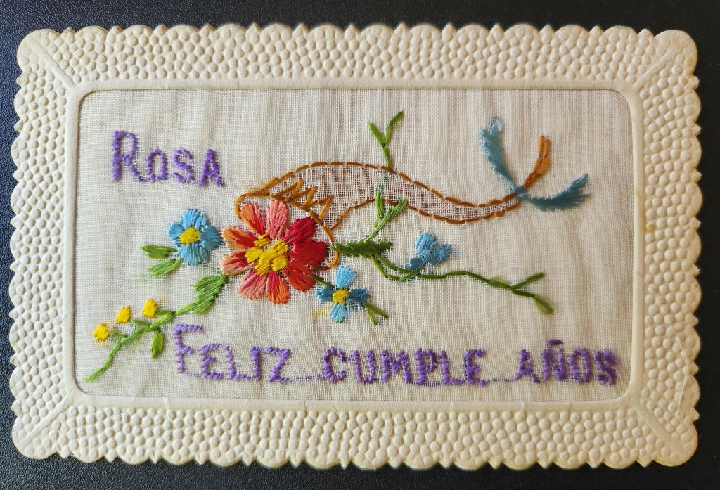
A decade later, Eastman had invented a simple camera pre-loaded with film for 100 exposures. By 1903, the Eastman Kodak Company released the 3A Folding Pocket Camera with 3¼ × 5½ inch film—exactly postcard size and pre-printed on the reverse. Local photographers and home enthusiasts could contact-print the negative directly onto postcard paper. No enlarger needed, and simplified processing equipment and chemicals.

Rochester became an ecosystem. Bausch & Lomb made the lenses. Kodak manufactured the cameras, bought the film company, and controlled the processing. Customers shipped the entire camera unit back to the factory, and received prints and a pre-loaded camera in return. “You press the button, we do the rest.” Factory workers were the first to witness an era of American life, as images of farms, houses, banks, theatre, and towns and their inhabitants poured in.

A quiet man, Eastman watched this unfold from the center, as his invention changed history and rippled through culture. By 1920, millions of Americans owned cameras. Eastman left a simple note when he ended his own life at 77 and in degenerative pain, “To my friends: My work is done. Why wait? GE”.

What We See

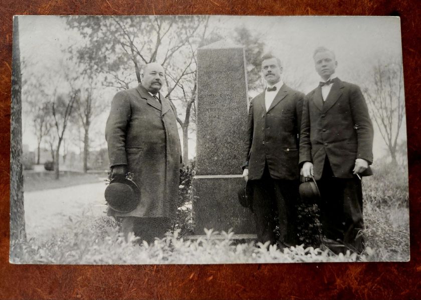
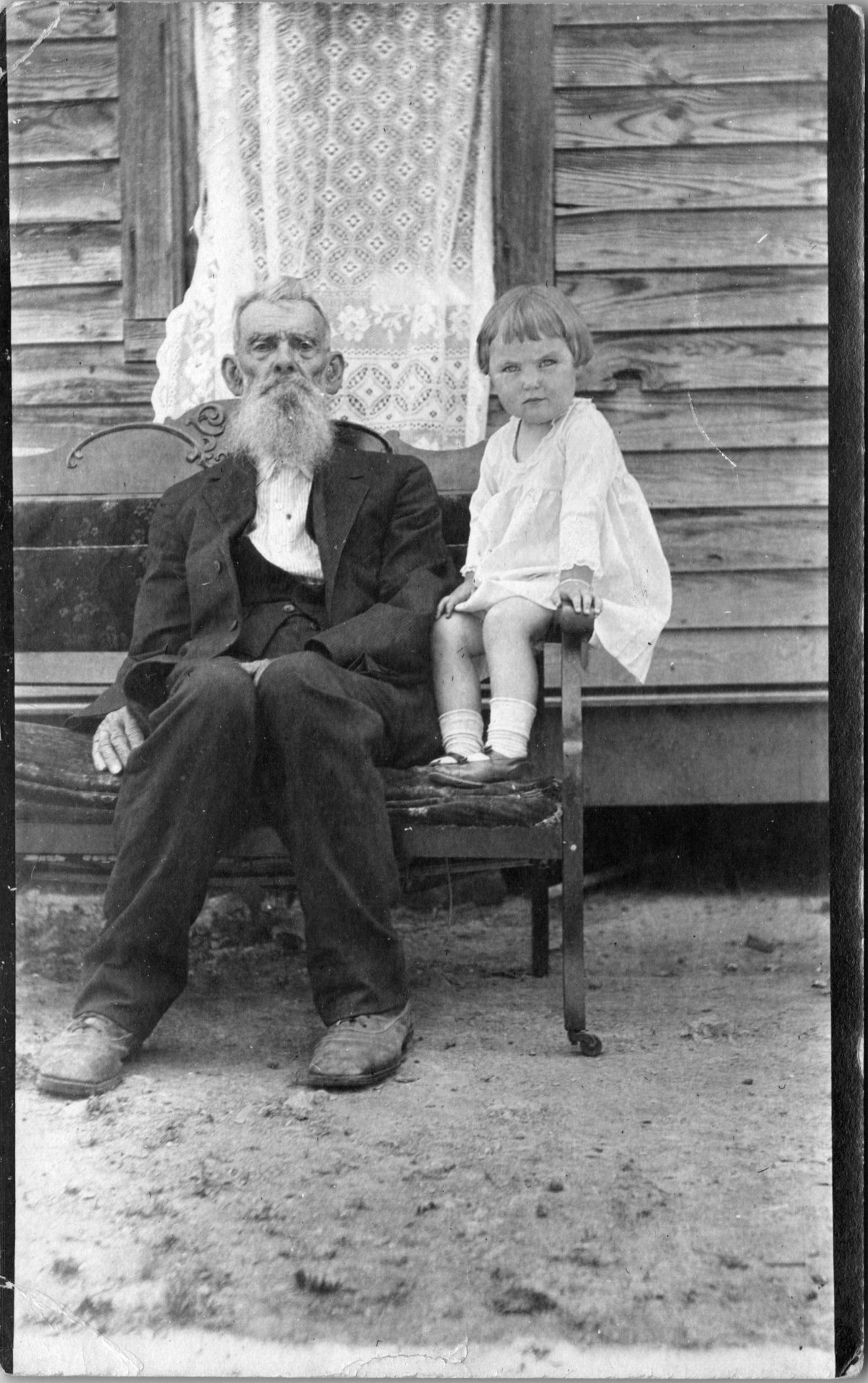
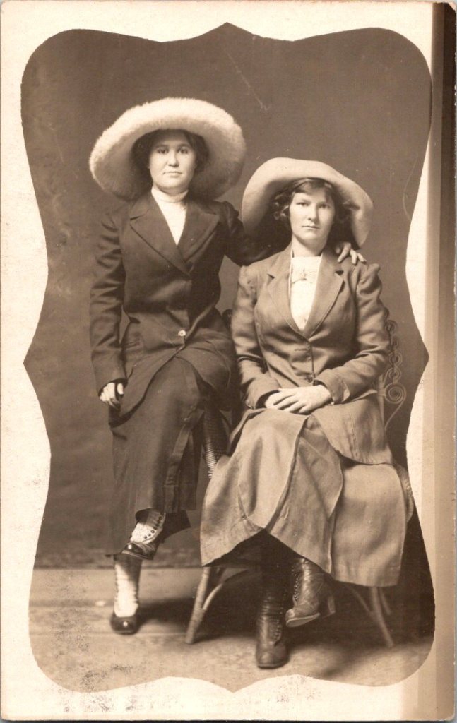
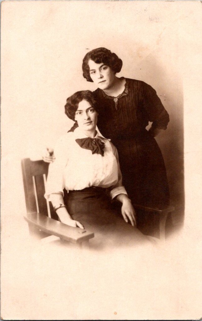
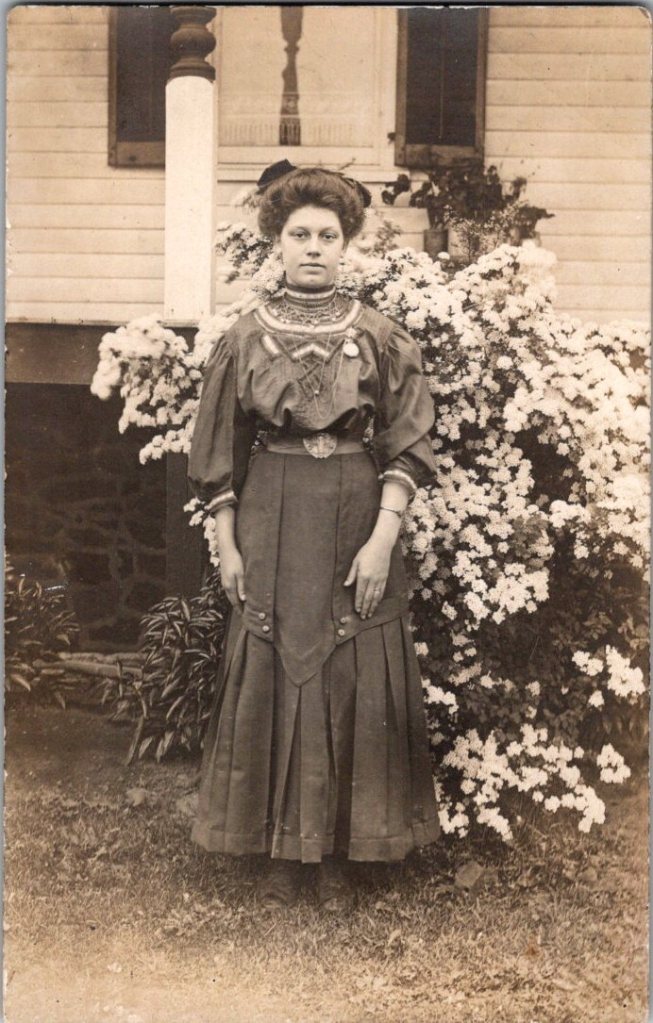
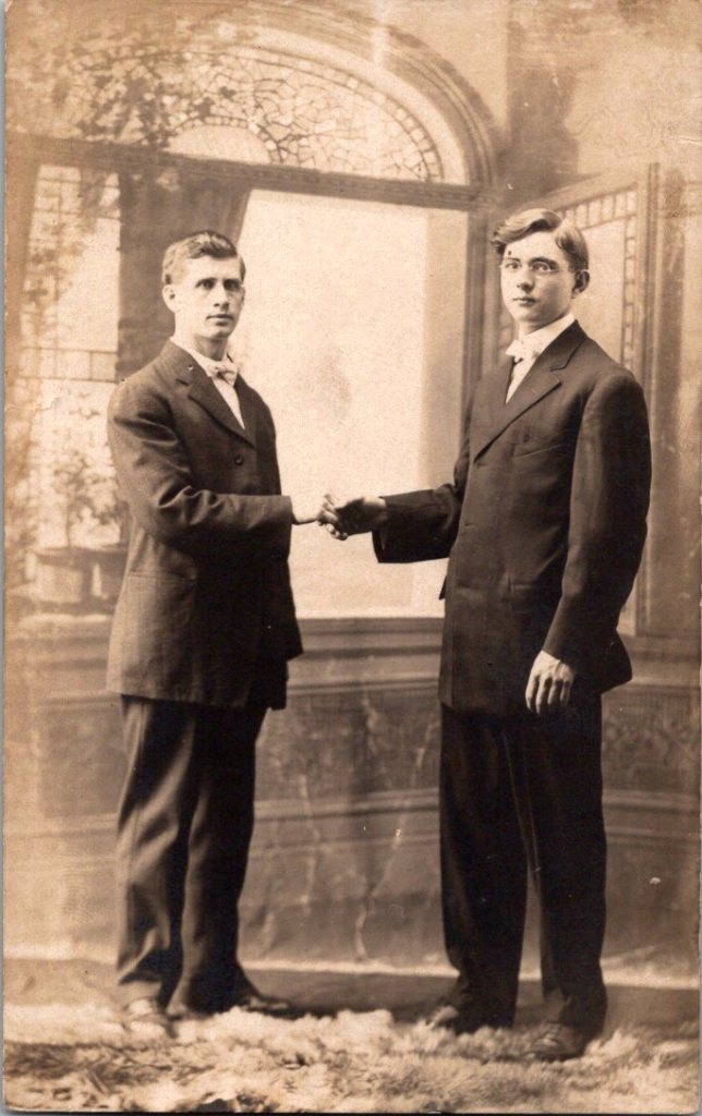
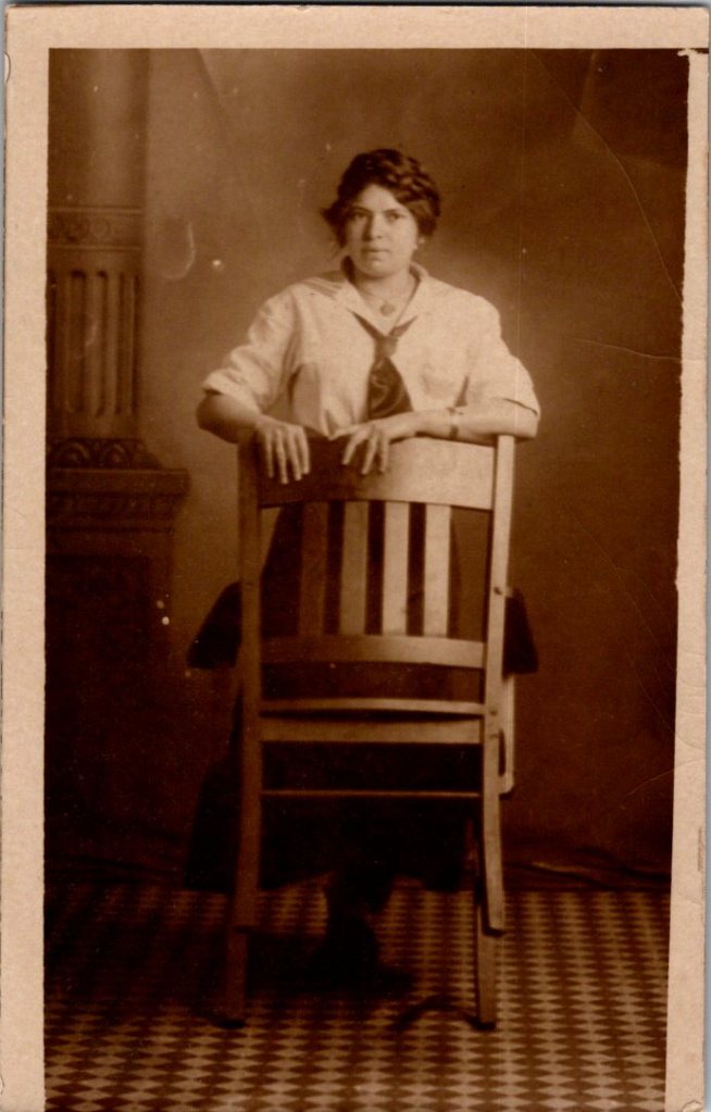
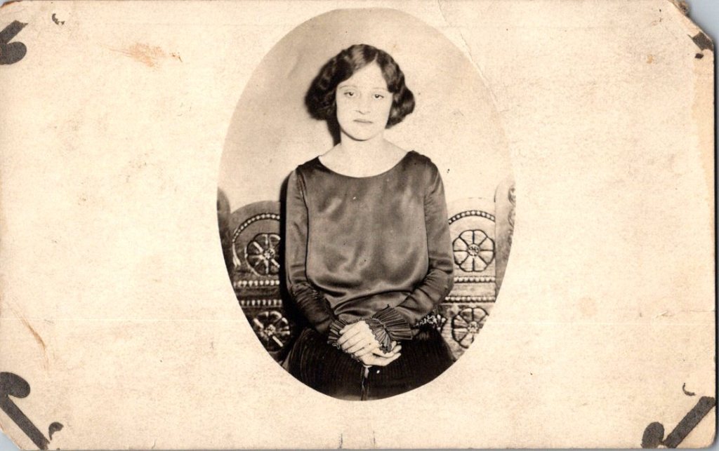
The studio portraits above show painted backdrops—ornamental arches, garden trellises. The lighting is controlled. Poses held steady. Technical quality consistent. These were made by professionals charging by the sitting.

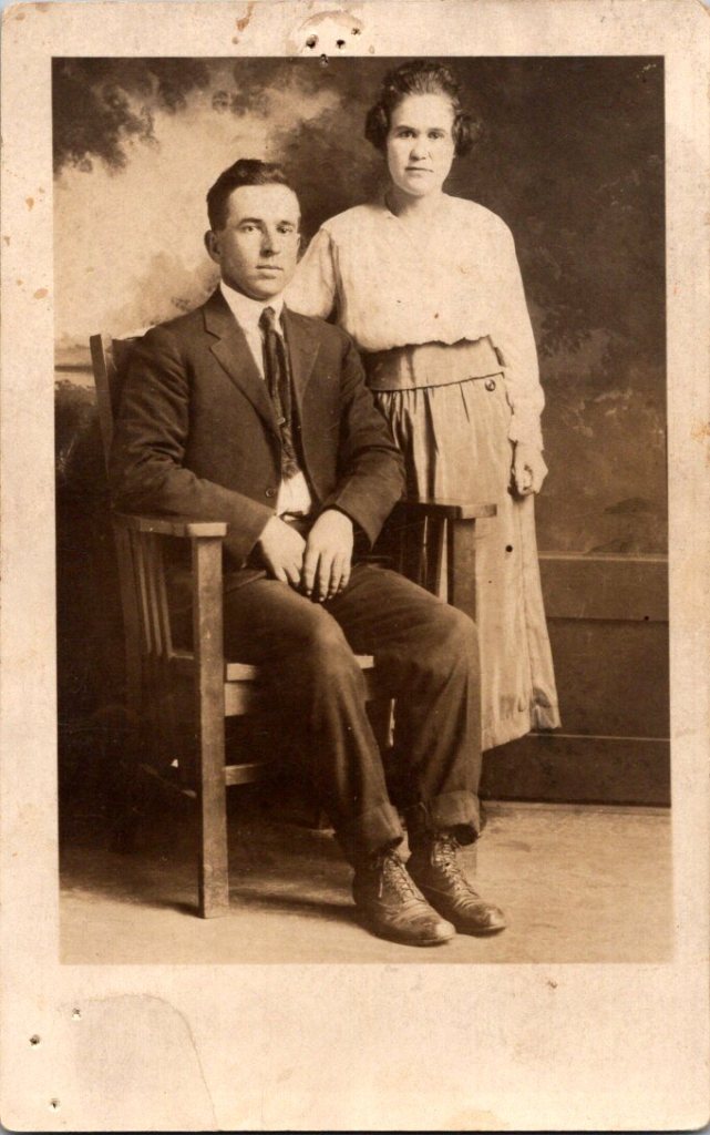
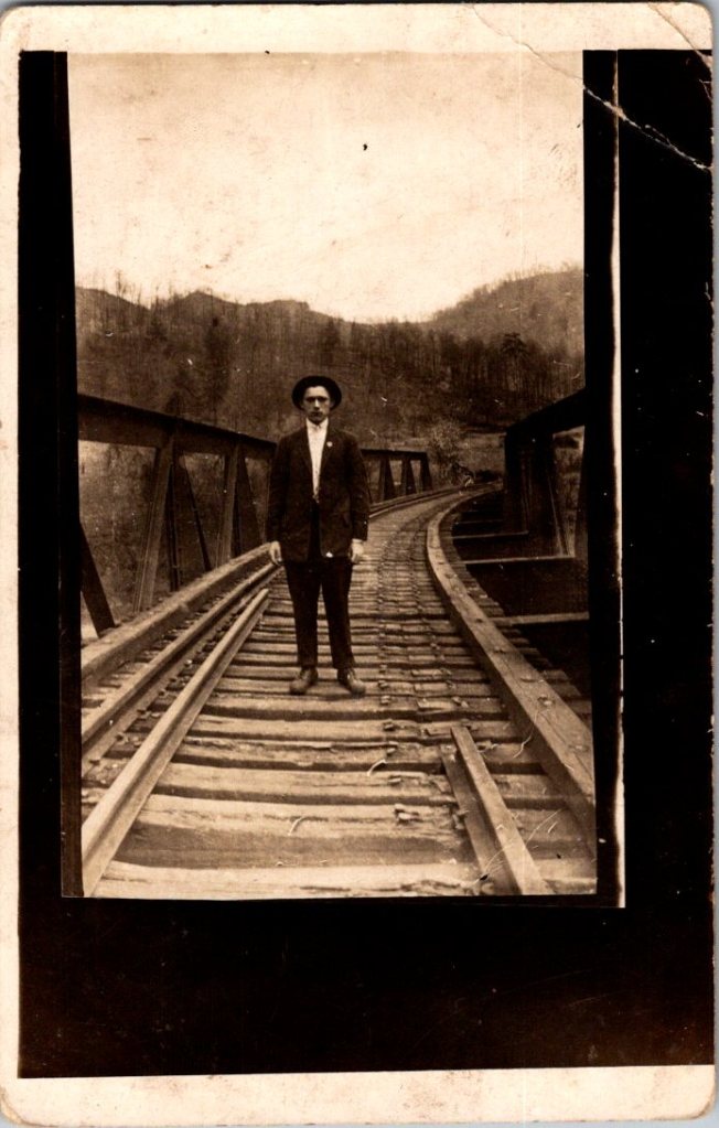
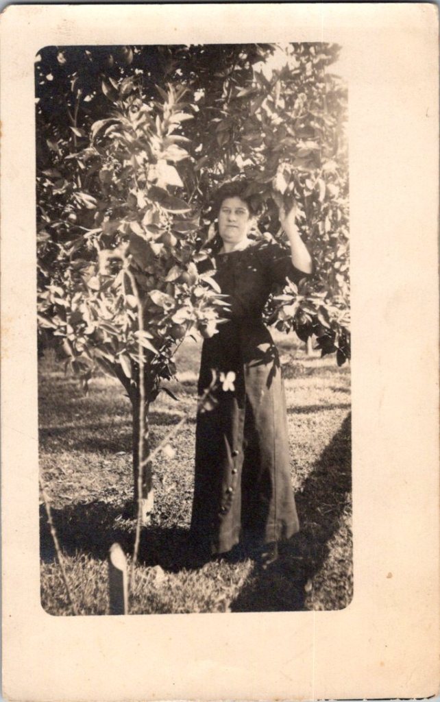
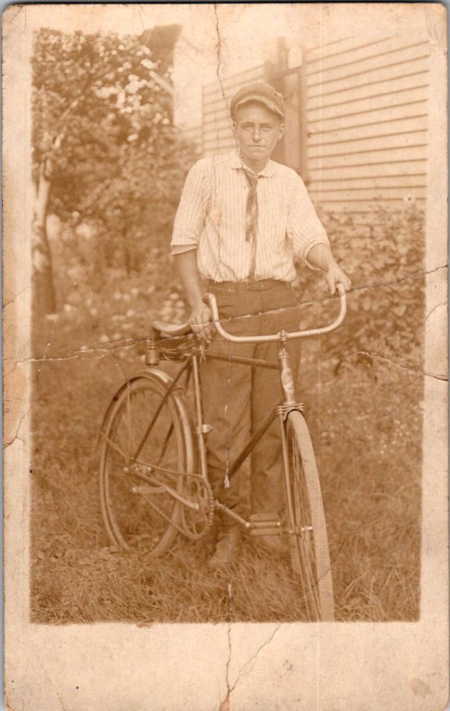
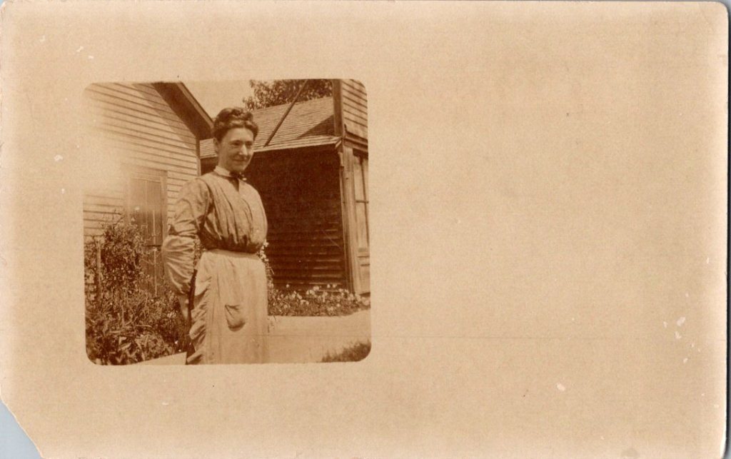
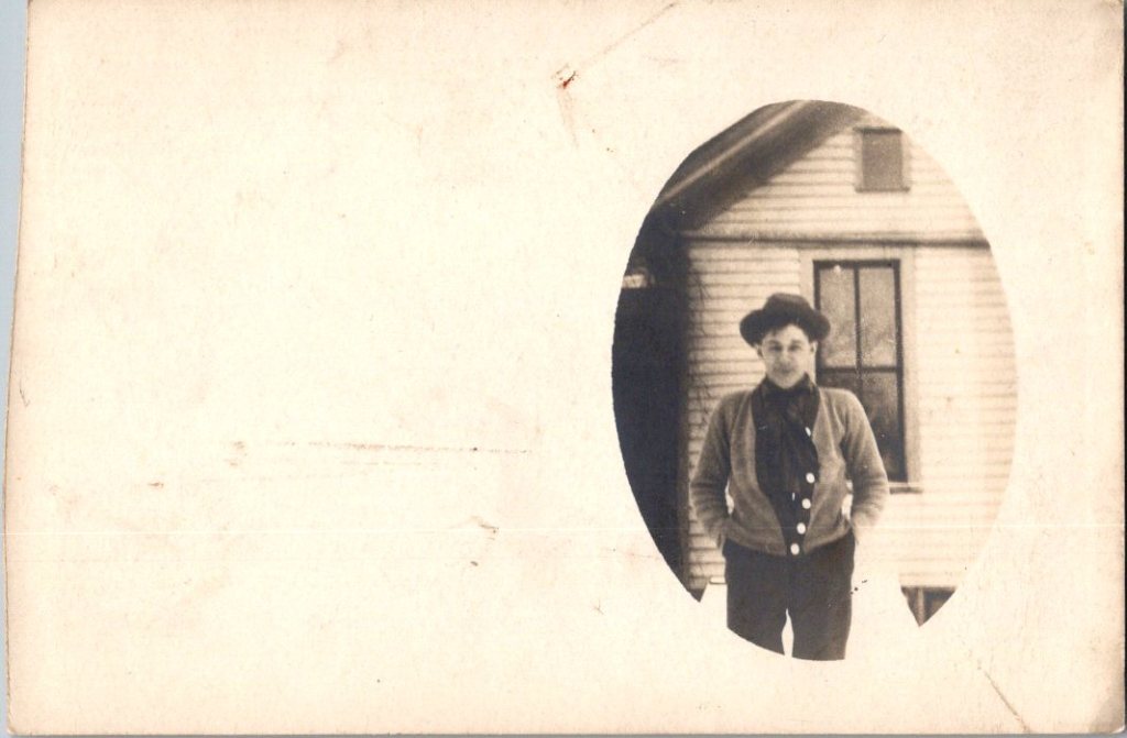
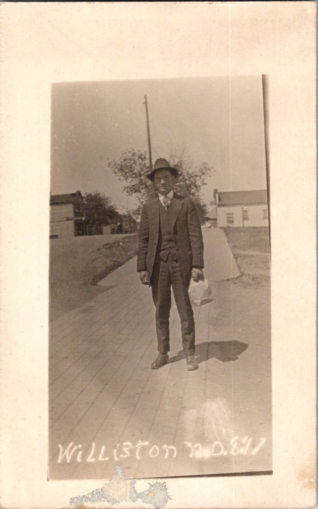
The outdoor snapshots show real places—porches, orchards, dirt roads. Natural lighting, sometimes harsh. Composition varies from confident to awkward. These came from camera owners of varying skill. The irregularities in frame and exposure suggest they were developed at home, too.


What We Don’t See

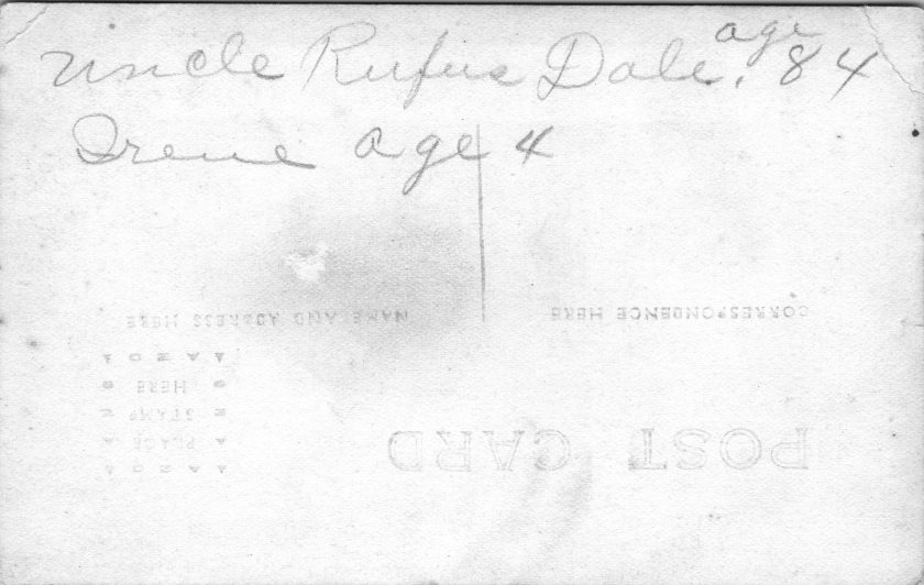
Despite the pre-printed paper and earnest intent, real photo postcards were rarely sent as such. A few have difficult script, cryptic addresses, faded cancellations, and worn stamps.

“Hello Fanni. Miss Fanni Moore, Panhuska, Okla.”

The remaining relics haven’t been labeled, addressed, or mailed. Most backs are blank, and they were often collected in photo albums. The manufacturing marks may have been quite incidental.

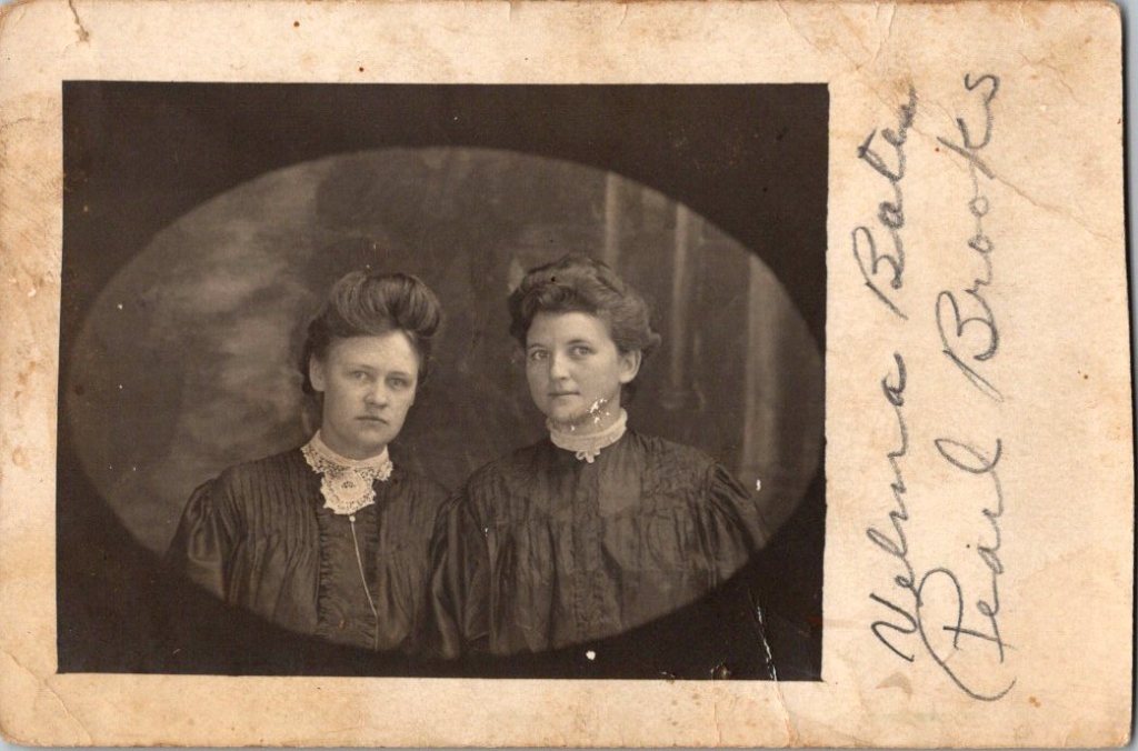
What’s missing from nearly all: names. Very few clues to subjects, locations, dates. The people who made these photographs knew who everyone was. They didn’t need labels. Or, perhaps they were accompanied by letters and mailed in envelopes for privacy and protection.

A century later, the faces remain potent but anonymous. We guess at relationships from physical similarity, from who stands near whom. Sometimes we’re right. Sometimes, we can’t believe our eyes.

Spaces in Between

The 3A Folding Pocket Kodak cost $20-30, equivalent to $600-900 today. An expensive hobby, but accessible to prosperous farmers, small business owners, middle-class families. Film cost about 50 cents per roll.

The investment meant something, whether it was the equipment or the studio session. People photographed what mattered—children, homes, gatherings. The images document their priorities, and their time passing.

Real People, Real Limits

These are real people who lived, worked, loved, died. Someone cared enough to preserve their images. They matter still, in part, because they mattered to someone before.

But our analysis stops here. We can describe what we see—the composition, the technical choices, the historical context. We can note patterns across the collection. We can explain how the technology worked and who had access.

The work of naming and placing, in particular, belongs to families searching their own histories, connecting faces to stories passed down, matching photographs to genealogical records. Those searches have their own purposes, their own meanings.

We are collectors examining patterns, not descendants reclaiming ancestors. Though, it is tempting.


Please Post, ASAP!

Did you know? October 1 is World Postcard Day! The celebration started in 2019, based on the grand old global pastime of simply staying in touch.

World Postcard Day was designated by Postcrossing as the first of October starting in 2019, including a new postcard design each year. We share a simple mission to keep postcards circulating, and their way of doing it is elegant and efficient. A wonderful illustrated history of the postcard is available to enjoy, as well. To celebrate the day, I’ll be requesting my first address and then happily duty-bound to get a postcard in the mail quickly. Maybe you will, too!


Featured Postcard~ MatToon Memories

Another mention of Mattoon, Illinois. This time, it is 1912, with a typical friendly update, winter weather commiserations, and gifts exchanged.

Dear Carrie, How is this for winter? I’m good and tired of it. Tell the folks I got a basket last Wed that tickled me mightily. Tell Stella, I will redeem my promise this week if this weather continues. I’ll look them up this P.M. & send at once. I’ve been too busy to do anything extra. Hope U are better. I weigh 154 and you will have to hurry or I’ll be way ahead of U. Mayme, March 11.

Front of the card: A delicate bouquet bursts from a pink gathered vase. Pink hyacinths and white lily of the valley dominate the arrangement. The flowers cascade naturally, their stems tied with fabric and matching bow. The text “A Note to you” appears in a blue decorative font at bottom right. Embossed rosettes frame the card in an ornate lace-like border.

Back details: Handwritten script fills the left side. A one-cent green Benjamin Franklin stamp sits in the upper right corner. The postmark reads “Mattoon, IL” with partial date visible, March 11, 1912, and a flag cancellation. The address shows “Mrs. Carrie Fulmer, St. Mary’s, Ind.”

Condition: The card shows minimal wear—crisp embossing, slight foxing, faded cancellation marks, minor corner softening. Colors remain vibrant. No tears or creases mar either side, though there is a minor cancellation mark on the front upper right. Very good condition for its age.

Rarity: This embossed, die-cut postcard represents German lithography’s golden age. Publishers used chromolithography to achieve the rich colors. The deep embossing required specialized presses. Early 1900s embossed postcards survive in quantity, but this example’s condition elevates its value. The Mattoon, IL postmark and readable message add historical context. Not museum-rare, but better than average.

Appeal: Collectors of Victorian and Edwardian ephemera may treasure this piece. Design enthusiasts might enjoy the embossed example. Genealogists ought to enjoy our meanderings through Mattoon and Mayme and Carrie’s perspectives. Botanical art lovers appreciate the detailed floral illustration and coded meanings. Stamp collectors note the Franklin one-cent issue and period-specific cancellations. Vintage greeting card dealers would display this prominently.

Would anyone cut it up to make an art card? Oh, the creative tension between past and future!

art card gallery

The gallery features Landscapes by Larry L’Ecuyer, and the World’s Smallest Artist Retreat (our P.O. Box) is awaiting your art card submission. Details here!

IN STORE! nEW POSTCARD DESIGN!

If you are nearby, come visit our very first postcard display at Tempe Yarn & Fiber. Grateful for the chance to get them out in the world. New designs and online sales coming soon!

A Streetcar Back in Time

Room enough for all of us to go from here to there, and back again.

Featured Postcard~
New Orleans French Market A CENTURY AGO

An early 20th century scenic postcard showcases the iconic French Market in New Orleans’ French Quarter.

Front of the card: The photograph shows the vestibule of the historic French Market, featuring tall, weathered French/Creole Colonial columns supporting a slatted roof. Perspective draws the eye down the long corridor, emphasizing the market’s impressive scale. The covered walkway displays produce, baskets, and merchandise on tables and in crates. The image captures a rare moment when the hallway of vendors face the camera. Hand-colored rose tones reflect the market’s timeless atmosphere with pops of green and blue artfully applied. Caption: Vestibule, French Market, New Orleans, La.

Back details: The left panel explains the market’s history:

This card shows the interesting old columns erected, 1822. While the roof of the market has been repaired many times, the old columns have stood as originally put, without fire aid to the injured.

Published by Lipsher Specialty Co., 320 Magazine St., New Orleans. Standard divided back format with decorative script and postage rates listed: Domestic One Cent, Foreign Two Cents.

Historical significance: The postcard documents the French Market’s appearance in the early 20th century. Established in the 1790s, the market served as a vital commercial hub where vendors sold fresh produce and handcrafted goods. Instructions to “Take French Market car from Canal St.” reflects the streetcar system and emphasis on tourism. This postcard dates to 1922-1925, based on combined evidence of one-cent postage, the specific streetcar reference, and hybrid halftone-collotype printing (Aquatone process was patented in 1922).

Condition and Appeal: The card displays excellent color saturation, with clear and interesting details and minimal defects. Tiny nicks on two corners, with yellowing on the reverse typical of age. Image and text provide valuable historical context, appealing to collectors of New Orleans memorabilia, architectural history enthusiasts, and those interested in early 20th century American commerce. The French Market remains active today, making this postcard a fascinating glimpse into its enduring legacy as a cornerstone of New Orleans culture.

Today’s Art Card & Gallery

The gallery features Landscapes by Larry L’Ecuyer, and here is a fun art card from Anne this week. Winner, winner, chicken dinner!


open call for art cards!

The World’s Smallest Artist Retreat (our P.O. Box) is awaiting your art card submission. Details here!

Art card kits ~ gift or fun for you!

Our Art Card Kits are perfectly-packaged as a fun, creative activity for you and a friend to complete in as little as an hour or made into a lovely afternoon.

Something from Nothing

In her latest essay, Anne explains what we’re doing here 🙂

Still in the Ring

Here we go! The Posted Past heads into the fall season with rare cards, a new gallery, and a social mission to trade loneliness for connection.

featured postcard~
rare novelty card still holds a mystery

An early 20th century novelty postcard featuring humorous photography and personal correspondence from Missouri.

Front of the card: The photograph shows a young Black man in white shirt, suspenders, and dark trousers, grinning while holding a large broken umbrella overhead in a playful pose. Below reads the humorous caption “A little disfigured, but still in the ring”—typical novelty humor from the postcard craze era. A black border frames the photograph on cream cardstock.

Back details: The reverse bears “Carbon Photo Series No. 513” identifying the commercial publisher’s series. Addressed to Miss Grace Skillman in Pleasant Hill, Missouri, with a green 1-cent Franklin stamp and clear 1908 postmark. The handwritten message describes an exhausting early morning wait in Lee’s Summit for “Brother and Frank,” and promising a longer letter that evening.

“Still in L.S. haven’t slept but about ten minutes. My eyes looks like two burnt holes in a blanket. Brother and Frank hasn’t come yet. I will wait till 7.30 and then go home. Will write tonight. Just finished my breakfast. I will eat if not sleep. I got here ten till five.

Condition and Appeal: The sepia-toned image displays characteristic early photography with some age spots, and a nicked corner. The image and reverse side remain in good condition with clear photography and legible handwriting. The “Carbon Photo Series” indicates premium production using carbon-based printing methods prized for superior image quality and archival stability. Grace Andre Skillman was born in Pleasant Hill in 1889, making her nineteen when she received this card. The message and the lack of formal salutation and signature suggest this is casual ongoing family correspondence. As a result, the author of the postcard remains a mystery.

Vintage novelty postcards are increasingly collectible, especially numbered commercial series with documented recipients. Collectors of African-Americana may find the image appealing and relatively rare. The combination of carbon printing technology, humorous subject matter, and personal correspondence is of interest to collectors of vintage photography, postcard enthusiasts, genealogy researchers, and those focused on early 20th century American social history and communication.

Introducing~
The Posted Past Art Card Gallery

A selection of Larry L’Ecuyer’s watercolor landscapes are on display in our Online Art Card Gallery. Fitting as our first show. Enjoy!

Watercolor postcard showing a serene lake scene with mountains in the background and tall grasses in the foreground
Countdown to a Lakeside Getaway, 2025, Larry L’Ecuyer, watercolor on postcard

NEWS & UPDATES~
art card call for submissions is open

The World’s Smallest Artist Retreat (our P.O. Box) is awaiting your art card submission. Follow one rule to join the next open show. Details here!

Art card kits now in stock

Our Art Card Kits are perfectly-packaged as a fun, creative activity for you and a friend to complete in as little as an hour or made into a lovely afternoon.

The kit includes two postcard blanks, six vintage finds curated to the chosen theme, and a bundle of collage goodies for your whimsy. There is a free gift inside, too!

Once you’re done, surprise someone with an original art card in their mailbox. Or, send it back to us to include in the next online show. Either way, you’ll have cultivated a little joy in your garden.

Order your kit here 🙂

Wise Eyes

Old Rufus Dale had seen a thing or two, and Irene had her suspicions.

An early 20th century real photo postcard (RPPC) showing a poignant intergenerational portrait.

Front of the card: The photograph captures an elderly man with a distinctive long white beard, dressed in a dark suit, seated on a dilapidated wooden loveseat or couch in front of a clapboard house. Beside him sits a young child in a white dress, perched on the arm of the furniture. Behind them a decorative lace curtain hangs outside the open window. The setting appears to be rural America.

Back details: The reverse shows the handwritten inscription in pencil, Uncle Rufus Dale, age 84 and Irene age 4. We can assume a family relationship, likely between grand-uncle and grand-niece.

Condition and Appeal: The real photo postcard is in excellent condition front and back, unposted with helpful writing, and an AZO indicia dating the item between 1904 and 1918. The subject matter and production method suggest this is a unique image and object, with no known duplicate.

RPPCs are quite collectible, especially those with interesting and clear photographic subjects. The rural American family setting, the age gap between subjects, and the excellent condition make this item more desirable, appealing to collectors of early photography, genealogy researchers, postcard collectors, and those interested in American family and social history from the early 1900s.

[Note: Summer focus is on detailed captions. Essays return in September!]

1972 Tourism Year of the Americas

These vintage postcards from the 1972 Tourism Year of the Americas reveal fascinating questions about natural landscapes, heritage, monuments, and whose stories we remember and tell.

In summer 1972, the United States Postal Service issued commemorative postcards that would become enduring symbols of national identity. These postcards, part of the Tourism Year of the Americas campaign, featured iconic destinations with restrained elegance—their two-color printing was both artistic and economical. As America stood at a cultural crossroads, this postcard set tells a familiar American story. More than five decades later, they reveal even more about how a nation sees itself.

Commemorative Moments

First Day of Issue cancellations mark a special moment in time, and signal that an item is expected to be collectible. The postcards were cancelled on June 29, 1972, bearing the commemorative text “Philatelic Exhibition Brussels” and “Tour America Inaugural Rome – Paris.” These international exhibitions promoted American tourism during the Cold War, when cultural diplomacy served as essential soft power.

The carefully designed cancellation artwork includes USS Constellation (6¢), Gloucester (6¢), Monument Valley (6¢), and Niagara Falls (airmail 15¢). These rates reflected the newly reorganized United States Postal Service which had become its own entity the year prior. The 1972 Tourism Year of the Americas was an ambitious initiative from the new quasi-independent agency, emerging alongside Nixon’s opening to China and détente with the Soviet Union.

USS Constellation, the last sail-only warship built by the U.S. Navy (1853-1855), served as flagship of the Africa Squadron from 1859–1861. The ship captured three slave vessels, enabling liberation of 705 Africans. During the Civil War, Constellation deterred Confederate cruisers in the Mediterranean. The selection represented naval heritage and anti-slavery efforts, though it still centered the naval victory rather than those who gained freedom.

Niagara Falls has attracted visitors for 200 years, becoming the symbolic heart of American tourism. The 1883 Niagara Reservation became America’s first state park, influencing national park creation. Current visitor statistics show enduring appeal: 9.5 million tourists visited Niagara Falls State Park in 2023, with the region welcoming 12 million visitors yearly.

Monument Valley reflect the West’s central role in national identity by 1972, immortalized through Hollywood and environmentalism. Yet Monument Valley sits within Navajo Nation territory, while Grand Canyon encompasses land sacred to multiple tribes, including the Havasupai, whose reservation lies within park boundaries—reminders that park creation displaced Native communities.

Gloucester, America’s oldest seaport, sustained coastal communities for centuries. The lighthouse image evoked both practical maritime safety and romantic notions of New England’s rocky shores, while Gloucester’s working harbor embodied the intersection of heritage preservation and living tradition. By 1972, this historic fishing port faced the tension between maintaining its authentic maritime culture and adapting to tourism pressures—a challenge that made it a fitting symbol.

Artistic Vision

The front of the postcards render multiple iconic American locations in distinctive engravings in an economical two-color print run, an important factor for a the government printing office.

The collection showcases a deliberate balance. Yosemite represents natural power and America’s first national park. Missisippi Riverboats and the Rodeo embody western majesty central to national imagination. DC Monuments offer overt patriotism and Williamsburg and the Liberty Bell connect to the tremors and tolls of colonial democracy.

Even in 1972, these were selective narratives. All featured natural sites exist on traditional Indigenous lands, for example, while largely omitting Indigenous perspectives and enslaved people’s contributions to our cultural histories.

Many featured locations are sacred sites to Indigenous communities. Some of the most sacred places for American Indian nations are located in national parks, yet access to holy ground remains contentious. Park creation often involved displacing Native peoples from lands they had stewarded for millennia.

The year 1972 was tough in other ways: Vietnam War divisions, emerging Watergate scandal, and generational alienation over the military draft. These postcards presented a different kind of unity. Rather than contemporary political divisions, they emphasized natural wonders and historical sites that transcended partisan conflicts.

During the Cold War, these postcards served as miniature global ambassadors, too, often providing people’s first visual encounter with American landmarks. They projected America as worthy of visiting and learning about, countering negative impressions from political controversies.

The postcards themselves embody crucial democratic principles: making heritage accessible through affordable media; connecting tourism to conservation through revenue and public appreciation; and revealing how commemorative choices reflect national values. The geographic diversity suggests a desire for the fullest of American experiences, though these 1972 selections still privilege certain narratives.

New Memories

These postcards continue to offer insights into American values and heritage preservation evolution. USS Constellation still serves as a museum ship in Baltimore’s Inner Harbor. National parks have experienced tremendous visitation growth, raising questions about balancing access with preservation.

In what they don’t depict, the postcards show gaps in whose stories get told, whose lands get celebrated, whose experiences get centered. While 1972 selections emphasized traditional narratives, contemporary views increasingly include previously marginalized perspectives, acknowledging Indigenous heritage alongside colonial and national stories.

These artifacts remind us that commemorations reveal values and priorities. As our historical understandings evolve, it’s wise to look back and look again.


To Read More

Island Time Travel

Native Hawaiian wisdom, mainland capitalism, an LDS mission, and the birth of Pacific tourism. At the center, a banyan tree that has watched Hawaii transform for 120 years. This 1921 real photo postcard reveals the complexities of cultural exchange, migration, and travel over time.

In the photograph we are looking at today, the Moana Hotel rises like a palace from Waikiki Beach, its elegant wings stretching toward Diamond Head. A wooden pier extends into the Pacific. The building’s Victorian details hint at mainland American grandeur transplanted to the tropics. The “First Lady of Waikiki” opened as the territory’s first luxury resort, transforming a landscape once dotted with taro ponds and royal summer homes into the birthplace of Pacific tourism.

Built by wealthy landowner Walter Chamberlain Peacock and designed by architect Oliver G. Traphagen, the Moana opened on March 11, 1901, with 75 rooms featuring Hawaii’s first electric elevator and the unique amenity of private bathrooms. The first guests were a group of Shriners, who paid $1.50 per night—about $50 today—to experience what was then a very remote luxury destination.

Three years later, Jared Smith, Director of the Department of Agriculture Experiment Station, planted what seemed like a simple landscaping choice in the hotel’s courtyard: a young Indian banyan tree, nearly seven feet tall and about seven years old when planted. In the image, the tree is seventeen years old and already creating the shaded sanctuary that is the hotel’s heart even today.

As we flip the postcard over, another dimension is revealed. On November 29, 1921, a simple message sent to Mabel Moss in Longanoxie, Kansas with the usual greetings. But this isn’t a holiday for Aunt Olive. Her return address, “Route 4 – Box 46,” tells its own story of how communities were connecting between ancient and modern, sacred and commercial.

A Mormon Pioneer’s Island Home

Aunt Olive likely lived in Laie, thirty-five miles north of the Moana Hotel, where the Mormon Church had established its Pacific sanctuary. Her Route 4 address would have been served by one of the Rural Free Delivery routes radiating out from Honolulu—a detail that places her among the settlers who were building new communities beyond the city’s tourist corridor.

The Mormon settlement at Laie represented a unique form of cultural encounter. Beginning in 1865, when Church president Brigham Young received permission from King Kamehameha V to establish an agricultural colony, the Latter-Day Saints purchased 6,000 acres of traditional land—a pie-shaped division that provided for sustainable living. The Mormon community tried to honor Hawaiian land practices, giving each family a loi (water garden) to cultivate kalo (taro), the traditional sustenance crop.

The Hawaii Temple, dedicated in 1919, was the first Mormon temple outside continental North America. Built with crushed local lava and coral, its structure embodied the meeting of mainland pioneer culture and Pacific Island materials. Polynesian Saints from across the Pacific were gathering in Laie to receive temple ordinances, creating a multicultural religious community where Hawaiian, Samoan, Maori, and haole (white) families lived side by side.

The LDS approach to missionary work emphasizes learning local languages and customs—not merely as conversion strategy, but as theological principle. One of the early missionaries mastered Hawaiian so thoroughly that he produced the first non-English translation of the Book of Mormon in 1855. The missionaries married into Hawaiian families, adopted local foods and farming methods, and incorporated Polynesian cultural elements into their worship. Even as they openly sought converts, they also saw themselves as students of Hawaiian wisdom.

Paradise Shared

Captured in our image are at least a few conflicting visions of paradise. The Moana Hotel itself represents economic prosperity through the commodification of tropical beauty. Its guests paid premium rates to experience “the ultimate playground,” complete with hula shows and exotic imagery designed for mainland consumption. By the time of this photo, the hotel’s success had already inspired expansion; wings added in 1918 doubled its capacity.

However, the hotel was built where Hawaiian royalty had once gathered, in a place that embodied the Native Hawaiian principles, very different than Western concepts of land as commodity, beauty as product, and culture as entertainment. Look again at the Banyan tree. Where tourists saw scenery, Native Hawaiians understood kino lau—the gods manifested in every plant, animal, and natural feature. But, Hawaiian language had been banned in schools since 1896, and traditional practices were actively discouraged as territorial authorities promoted “Americanization.”

The Mormon community at Laie offered a third way that, despite its evangelical aims, required genuine cultural engagement. Unlike tourists who consumed Hawaiian imagery, or territorial officials who suppressed Hawaiian practices, Mormon missionaries made learning local ways a theological priority. They understood that successful evangelism required fluency not just in Hawaiian language, but in Hawaiian concepts of kinship, land, and spirituality.

This approach created communities that were simultaneously foreign settlements and island adaptations—places where pioneer traditions mixed with Polynesian extended family structures, where American church hymns were sung in native dialects, and where temple architecture incorporated local materials and building techniques.

Time Travel

The tensions that were at work in 1921 continue today, but so do the possibilities for meaningful cultural exchange. Today’s mālama Hawaii movement invites travelers to participate in coral restoration, native forest planting, and beach cleanups. Visitors can learn about places like Waimea Valley, where ancient cultural sites are preserved alongside environmental restoration. The principle of pono—righteous action—guides travelers to maintain respectful distances from endangered monk seals and sea turtles, to support Native Hawaiian-owned businesses, and to understand that they are guests in a living culture, not a theme park.

The island time we seek now isn’t the vacation fantasy of escape from responsibility, but the deeper rhythm of understanding our place within larger cycles of care and connection. When we travel with curiosity rather than conquest, we discover that the most valuable treasures are the stories and perspectives we gather. Over time, we come to know that every place on Earth is someone’s sacred ground.

In Hawaiian tradition, banyan trees serve as gathering places for spirits, bridges between the physical and spiritual worlds. Perhaps this ancient wisdom explains why the Moana Hotel’s banyan courtyard remains a place of peace amid Waikiki’s transformation—a living reminder that some forms of growth honor rather than diminish what came before.


To Read More

Thread & Paper: A Century-Old Silk Embroidered Postcard

Imagine holding a piece of handmade history – a delicate blend of silk and paper that has traveled more than a century to tell its story.

This charming embroidered postcard from the early 20th century is a small and intricate greeting that speaks volumes about a bygone era. In the world of historical artifacts, sometimes a small stitch tells a rich story.

Burst of Blooms

The postcard we are examining today presents an interesting contrast to typical flat, printed cards. Its front features an embroidered design set within a scalloped, cream-colored frame. The embroidery displays a palette of purples, reds, blues, and greens against a light fabric background, forming a floral scene.

At the center is a red flower, its petals rendered in careful stitches to create a sense of depth. Blue blooms surround it, with green stems and leaves providing structure to the composition. Above the flowers, Rosa is embroidered in purple thread, while below, Feliz cumple años (Happy birthday in Spanish) completes the message.

The reverse side is more conventional, bearing the hallmarks of early 20th-century postcard design. “CARTE POSTALE” is printed at the top in both French and English, with the card divided for correspondence and address. A small line at the bottom reads “Printed in France « E.R. » Paris” – a clue to the card’s origins.

The card was produced by E. Rabus, a Parisian company founded in 1897. By the early 20th century, the company had become a leader in the French postcard industry, including active involvement in the Chambre Syndicale français des Editeurs de la Carte postale illustrée, the professional organization for French postcard publishers. In 1914, E. Rabus held the position of secretary-general in this organization, placing the company at the heart of the industry during a pivotal time.

Manufacturing Marvels

This particular postcard emerged during the postcard craze of the early 20th century, when millions of postcards of many great variety were produced and sent globally each year.

The postcard we’re examining likely dates between 1914 and 1920, a period that saw significant changes in the postcard industry. Creating this postcard involved a fascinating blend of traditional craftsmanship and industrial production techniques.

The silk thread may have been sourced from a renowned manufacturer like Dollfus-Mieg & Cie. DMC was a major producer of embroidery threads, founded in Mulhouse, Alsace in 1746. Thread may have also come from Lyon, France’s capital of silk, where workers known as Canuts supplied luxury goods markets. The use of high-quality silk thread indicates that this postcards was a premium product.

While hand embroidery was still practiced, the scale of postcard production in this era suggests that machine embroidery was more likely used. Skilled workers would have operated specialized machines manually set to create the intricate design.

Once complete, the embroidery needed to be affixed and sandwiched between two paper cards to create the final product. The distinctive scalloped edges on the front were created through embossing and die-cutting, a process using metal plates and a sharp blade to stamp and cut the card into its final shape, leaving a window for the fine fabric to show through. The reverse side was made using standard printing techniques of the era.

All of these processes – embroidery, backing, embossing, die-cutting, and printing – would have taken place at the E. Rabus factory in Nanterre, a suburb of Paris. The company’s ability to combine these various techniques in-house speaks to its sophistication as a manufacturer and helps explain its prominent position in the industry.

Messages for Global Markets

While this postcard was produced in France, its Spanish text hints at a broader marketplace and larger international relations. E. Rabus, like many successful companies of its time, was looking beyond French borders to sell its products.

The most likely target market for this Spanish-language card would have been Spain itself. Geographic proximity and cultural ties between France and Spain made this a natural choice. Spanish tourists visiting France might have purchased such cards as souvenirs, or French customers might have bought them to send to Spanish friends or relatives.

Another strong possibility is Argentina. In the early 20th century, Argentina had a significant French immigrant population and strong cultural ties with France. The Argentine upper classes, in particular, had an affinity for French culture and products. Or perhaps Cuba, a popular tourist destination for Europeans at the time.

It’s worth noting that World War I (1914-1918) had a significant impact on these global markets. The war disrupted trade routes and changed economic relationships. However, it also created new demands for postcards as a means of communication between soldiers and their loved ones. Spanish neutrality during WWI might have made Spain an even more important market for French postcard producers during this time.

Grand Greetings

Perhaps the most charming aspect of this postcard is the way it personalizes a mass-produced item. The name Rosa embroidered at the top of the card transforms it from a generic greeting to a personal message. We can appreciate the care in choosing this specific card with the recipient’s name woven into the birthday wish.

Postcards marry the universal with the personal. Paper and thread become a bridge – between industrial spaces and private life, between France and the Spanish-speaking world, and between the early 20th century and our own time. Human desire is to connect, to send our good wishes across distances, and to make even mass-produced items feel special and individual.

Feliz cumple años – in Spanish – reminds us that birthdays are celebrated across cultures and languages, and the wish for a happy birthday transcends borders and time.

As we examine this postcard today, we sense so many stories – the mysteriously named publisher, the factory workers in Nanterre, a birthday celebration, the joy of both the sender and the intended recipient. Every historical artifact, no matter how small, carries with it a web of human connections.

We send greetings with the tap of a screen today, and still we can appreciate the thought and effort that went into creating and choosing such a card. It invites us to consider how we express our good wishes today, and how modern methods carry the traditions forward from this centenarian birthday card.

This delicate embroidered postcard, with its silk threads and scalloped edges, its French origin and Spanish text, is a testament to human creativity, industrial ingenuity, and the enduring power of a simple wish for happiness, stitched in colored thread, preserved through time, and able to transcend borders.

The Past as Presence

A postal card from 1883 offers a window into the past, revealing much about the society it came from. Old details touch on universal stories, transporting us back and forth in time.

This humble artifact, an estate-related postal card from 1883, encapsulates significant historical information, touching on communication methods, postal services, business practices, and daily life in late 19th-century America.

Evolution of Postal Communication

The postal card we’re examining is a product of a revolution in communication that occurred in the United States in 1873. The U.S. Post Office Department introduced postal cards as a new, affordable means of correspondence. These cards, precursors to the picture postcards we know today, allowed people to send brief messages for just one cent, half the cost of a letter at the time. This innovation democratized written communication, making it more accessible to a broader segment of society and paving the way for more frequent and casual correspondence.

The card’s design is a testament to the aesthetic sensibilities of the late 19th century. The header, with its ornate POSTAL CARD lettering, showcases the intricate Victorian typography popular during this period. Below this, we find the instruction: NOTHING BUT THE ADDRESS CAN BE PLACED ON THIS SIDE, a rule that would later be relaxed to allow for the development of picture postcards. The pre-printed one-cent stamp features the profile of Liberty, a common motif in American postal design of the era, symbolizing the freedom of communication.

Postal Development in Small Towns

The postmark, which reads HARRISONVILLE MO. APR 12 1883, provides valuable historical and geographical context. It places our artifact in a specific time and place – Harrisonville, Missouri, in the spring of 1883. This was a period of rapid westward expansion and economic growth in the United States, and even this small town in Missouri was part of the nation’s burgeoning postal network.

Many such towns first received postal services through informal arrangements, often with a local store serving as a mail drop-off point along established routes. As towns grew, they typically gained official post office status. This progression usually coincided with the arrival of railroads, which revolutionized mail delivery speeds. Harrisonville would get its post office when local population growth, economic development, and transportation access added up. Local historical records or United States Postal Service archives would tell us more, especially how the town developed in the decades following the Civil War.

19th Century Business and Personal Affairs

The handwritten message on the reverse of the card offers a fascinating glimpse into 19th-century business practices and personal matters:

“Sir, The amount of Probate cost now due on the Estate of Jefferson Long deceased is $34.73. Please remit the amount. Resptly, J.T. Lisle”

This brief note reveals how postal cards were used for business communications, including matters as serious as estate settlements. The specific amount due, $34.73, gives us an idea of the costs involved in such proceedings at the time. Adjusting for inflation, this sum would be equivalent to approximately $950 in today’s dollars. This significant amount underscores the financial impact of settling an estate in the 19th century, a process that could be costly even for modest estates.

For the recipient, Fred Long, this card likely carried emotional weight. Maybe it signified the final administrative tasks in laying someone to rest, a tangible reminder of his loss and the responsibilities he had completed. But we don’t really know how Fred felt or what the card meant to him. The card’s preservation suggests its importance to Fred in some way. Was Jefferson his father, or perhaps his son?

Why do we keep such mundane mementos? These objects serve as anchors to our personal histories, tangible proof of lives lived and challenges overcome. It’s human nature to hold onto connections to our past, even when they represent difficult times. In a world of constant change, these small, unchanging artifacts provide a sense of continuity with our past selves and to those who came before us.

Hints in the Handwriting

In an age before typewriters were common and long before digital communication, handwriting was the primary means of written expression. The flowing script on this card is more than just words; it’s a personal mark of the writer, J.T. Lisle.

The handwritten text and signature remind us of a time when a person’s handwriting was as distinctive and personal as their face. The ability to write at all was a professional skill, evidence of education at a time when it was not provided for the many. Modern handwriting analysis would reveal more insights into the writer’s social class and personality, adding even more information and intrigue.

The fact that important business could be conducted via a simple handwritten note on a postal card speaks volumes about the trust placed in the postal system and the weight carried by a person’s handwriting.

Past in Present Time

While methods have changed dramatically, fundamental human practice remain the same. We still seek efficient ways to communicate, conduct business, and create legal records of our transactions. The postal card has evolved into emails, text messages, and digital documents, but the core purpose – to facilitate the facts – endures.

This humble postal card from 1883 serves as a time capsule, more than just a relic of a bygone era. It is a window into our past, a mirror reflecting our progress, and a reminder of the life experiences we all endure in one way or another no matter our age or era. In our fast-paced digital world, it is a poignant reminder of the value of slowing down, examining the details, and appreciating the significance in the everyday artifacts around us.