Over the past few weeks, a rare photo postcard album has revealed places, property, and people, along with our own ideas about what we see. We’ve gone from unmarked wilderness, to building structures and social life, to faces and a few names.
We look back at them, and they return the gaze. Their stories blend with our own memories and imagination. They begin to feel like someone’s ancestors, though the particulars remain elusive.
Rochester in Rearview
In 1877, photography required glass plates, wet chemicals, heavy equipment, and specialized knowledge. George Eastman, a frustrated bank clerk from a poor family in Rochester, taught himself the process in his mother’s kitchen.
A decade later, Eastman had invented a simple camera pre-loaded with film for 100 exposures. By 1903, the Eastman Kodak Company released the 3A Folding Pocket Camera with 3¼ × 5½ inch film—exactly postcard size and pre-printed on the reverse. Local photographers and home enthusiasts could contact-print the negative directly onto postcard paper. No enlarger needed, and simplified processing equipment and chemicals.
Rochester became an ecosystem. Bausch & Lomb made the lenses. Kodak manufactured the cameras, bought the film company, and controlled the processing. Customers shipped the entire camera unit back to the factory, and received prints and a pre-loaded camera in return. “You press the button, we do the rest.” Factory workers were the first to witness an era of American life, as images of farms, houses, banks, theatre, and towns and their inhabitants poured in.
A quiet man, Eastman watched this unfold from the center, as his invention changed history and rippled through culture. By 1920, millions of Americans owned cameras. Eastman left a simple note when he ended his own life at 77 and in degenerative pain, “To my friends: My work is done. Why wait? GE”.
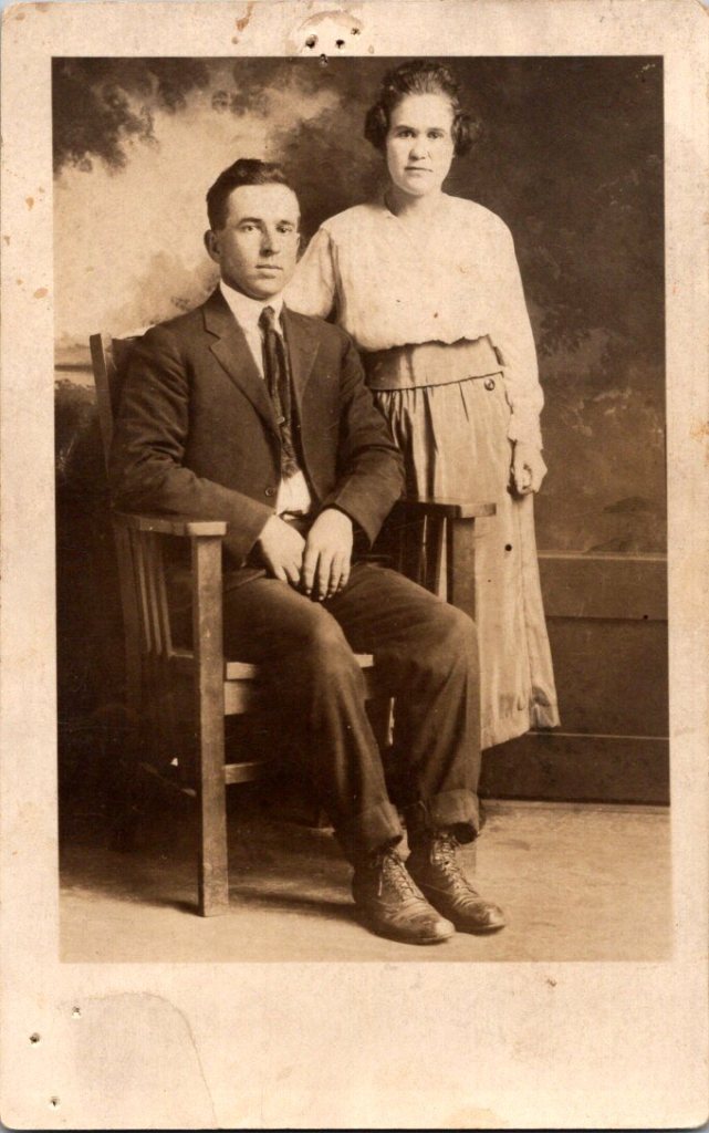
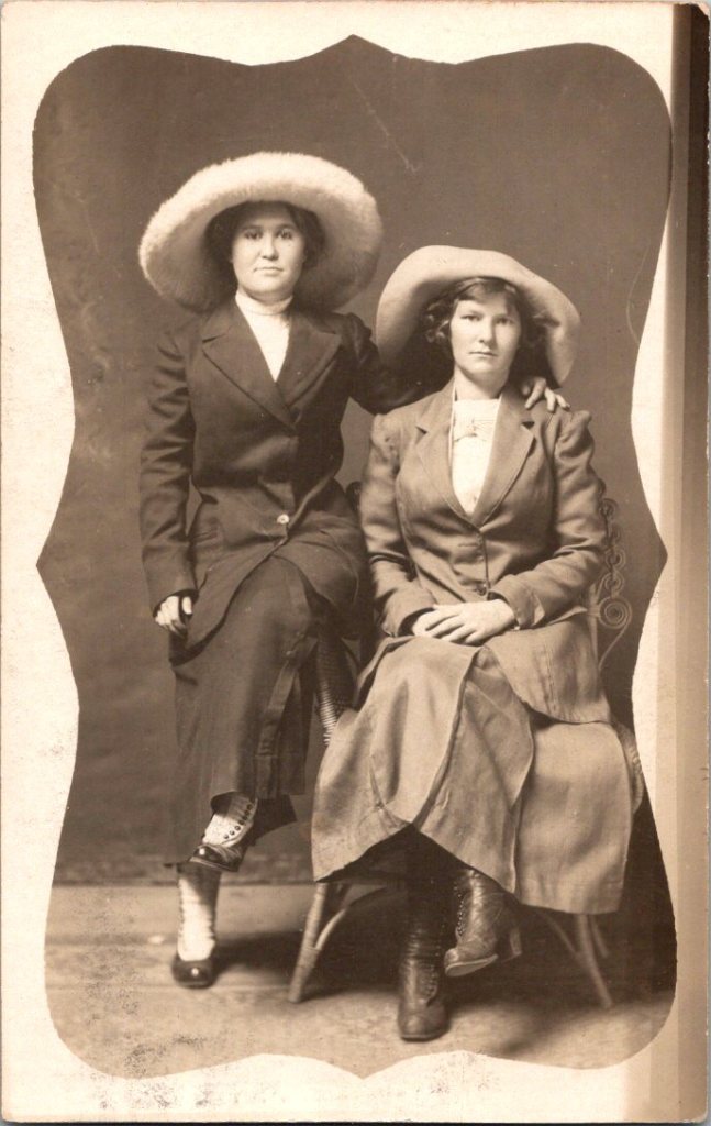
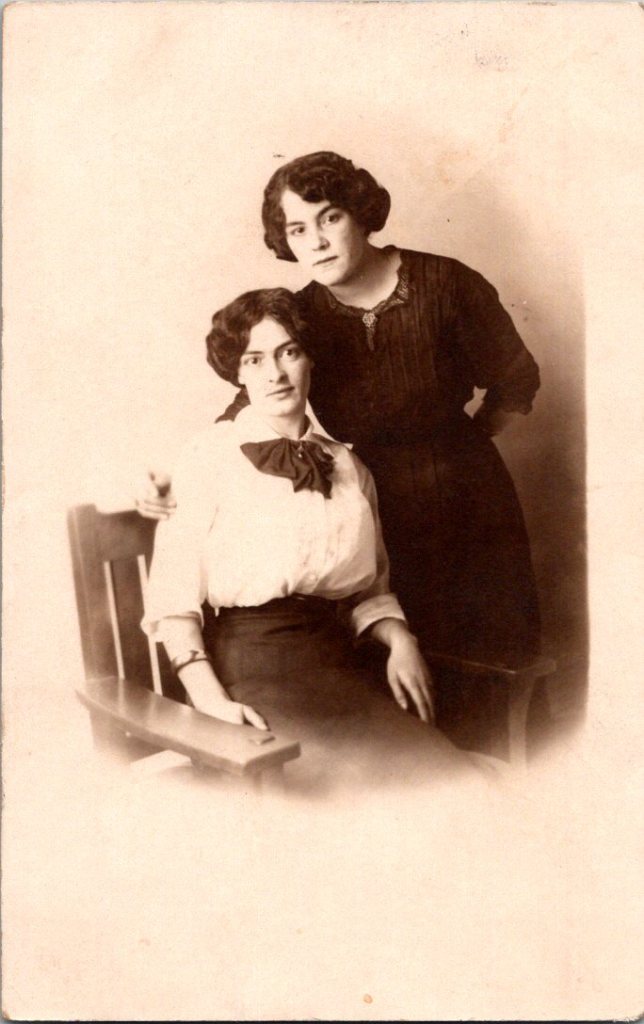
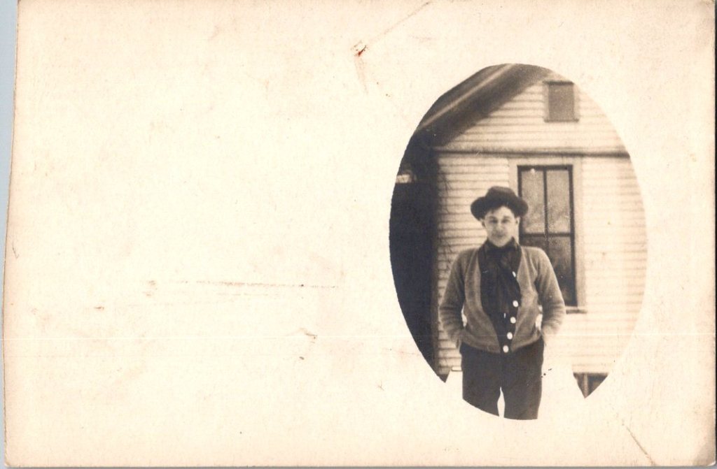
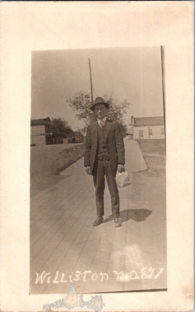
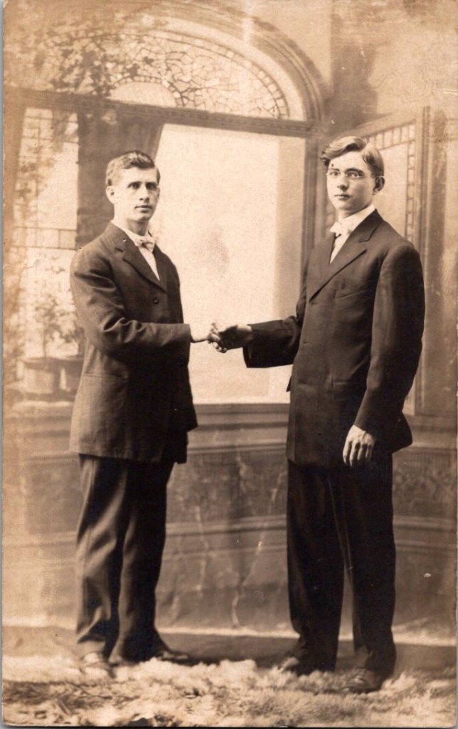
What We See
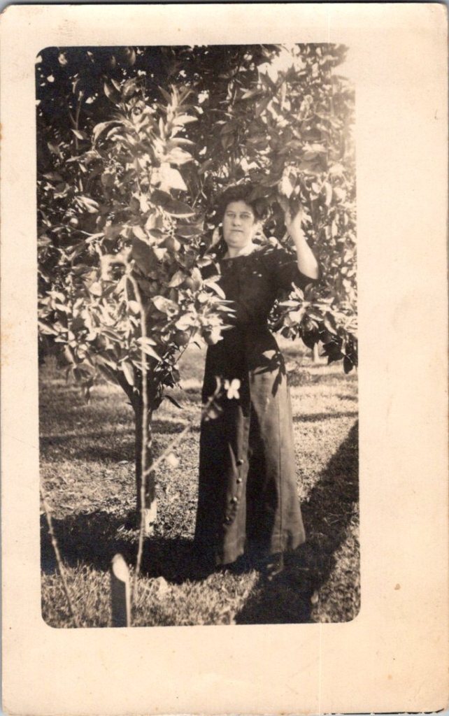
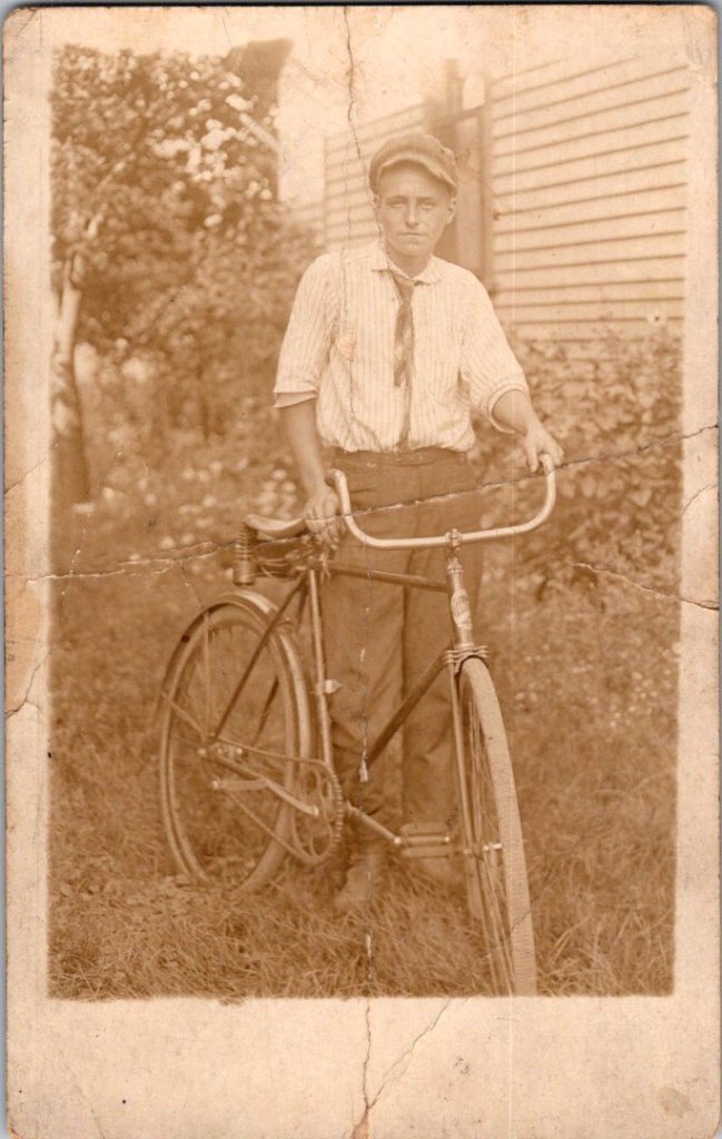
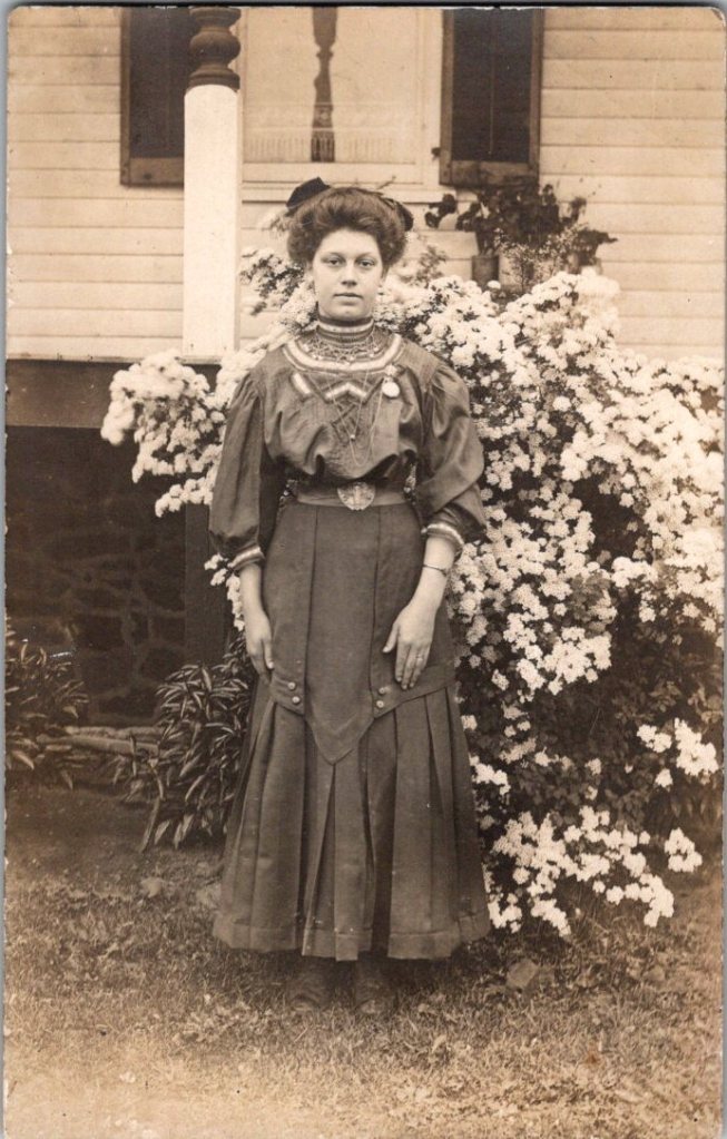
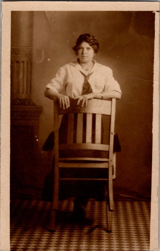
The studio portraits above show painted backdrops—ornamental arches, garden trellises. The lighting is controlled. Poses held steady. Technical quality consistent. These were made by professionals charging by the sitting.
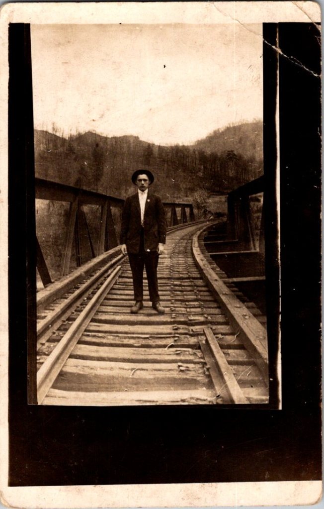
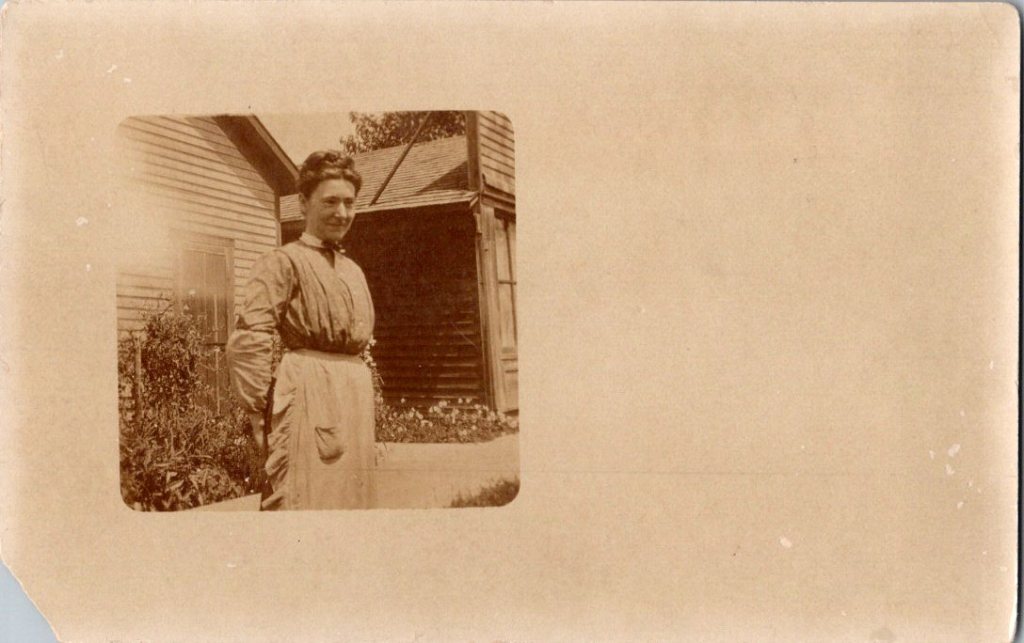
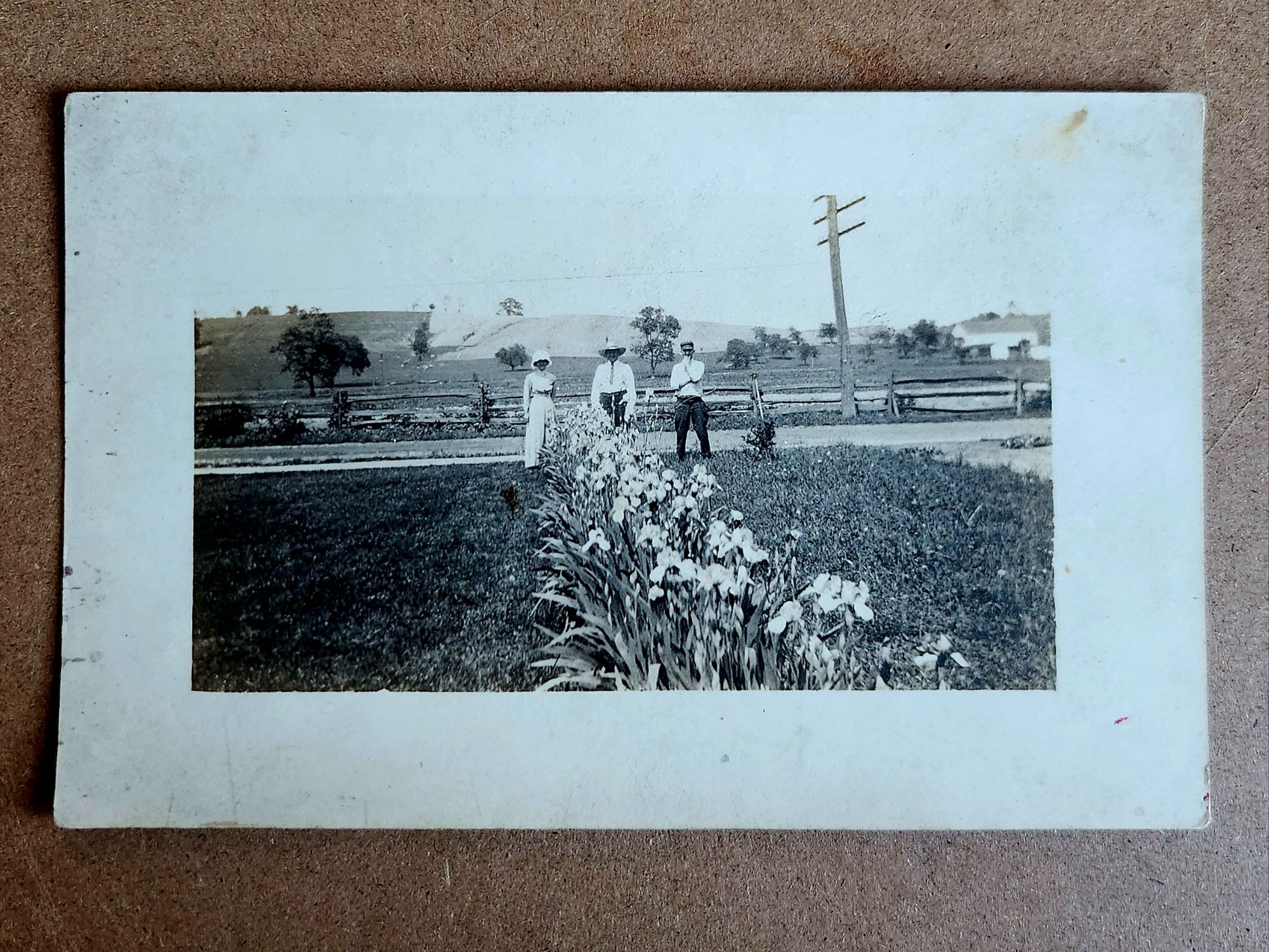
The outdoor snapshots show real places—porches, orchards, dirt roads. Natural lighting, sometimes harsh. Composition varies from confident to awkward. These came from camera owners of varying skill. The irregularities in frame and exposure suggest they were developed at home, too.
What We Don’t See
Despite the pre-printed paper and earnest intent, real photo postcards were rarely sent as such. A few have difficult script, cryptic addresses, faded cancellations, and worn stamps.
“Hello Fanni. Miss Fanni Moore, Panhuska, Okla.”
The remaining relics haven’t been labeled, addressed, or mailed. Most backs are blank, and they were often collected in photo albums. The manufacturing marks may have been quite incidental.
What’s missing from nearly all: names. Very few clues to subjects, locations, dates. The people who made these photographs knew who everyone was. They didn’t need labels. Or, perhaps they were accompanied by letters and mailed in envelopes for privacy and protection.
A century later, the faces remain potent but anonymous. We guess at relationships from physical similarity, from who stands near whom. Sometimes we’re right. Sometimes, we can’t believe our eyes.
Spaces in Between
The 3A Folding Pocket Kodak cost $20-30, equivalent to $600-900 today. An expensive hobby, but accessible to prosperous farmers, small business owners, middle-class families. Film cost about 50 cents per roll.
The investment meant something, whether it was the equipment or the studio session. People photographed what mattered—children, homes, gatherings. The images document their priorities, and their time passing.
Real People, Real Limits
These are real people who lived, worked, loved, died. Someone cared enough to preserve their images. They matter still, in part, because they mattered to someone before.
But our analysis stops here. We can describe what we see—the composition, the technical choices, the historical context. We can note patterns across the collection. We can explain how the technology worked and who had access.
The work of naming and placing, in particular, belongs to families searching their own histories, connecting faces to stories passed down, matching photographs to genealogical records. Those searches have their own purposes, their own meanings.
We are collectors examining patterns, not descendants reclaiming ancestors. Though, it is tempting.
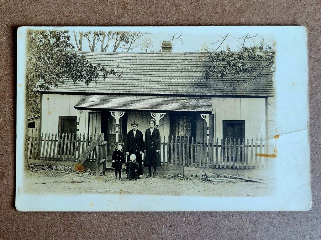
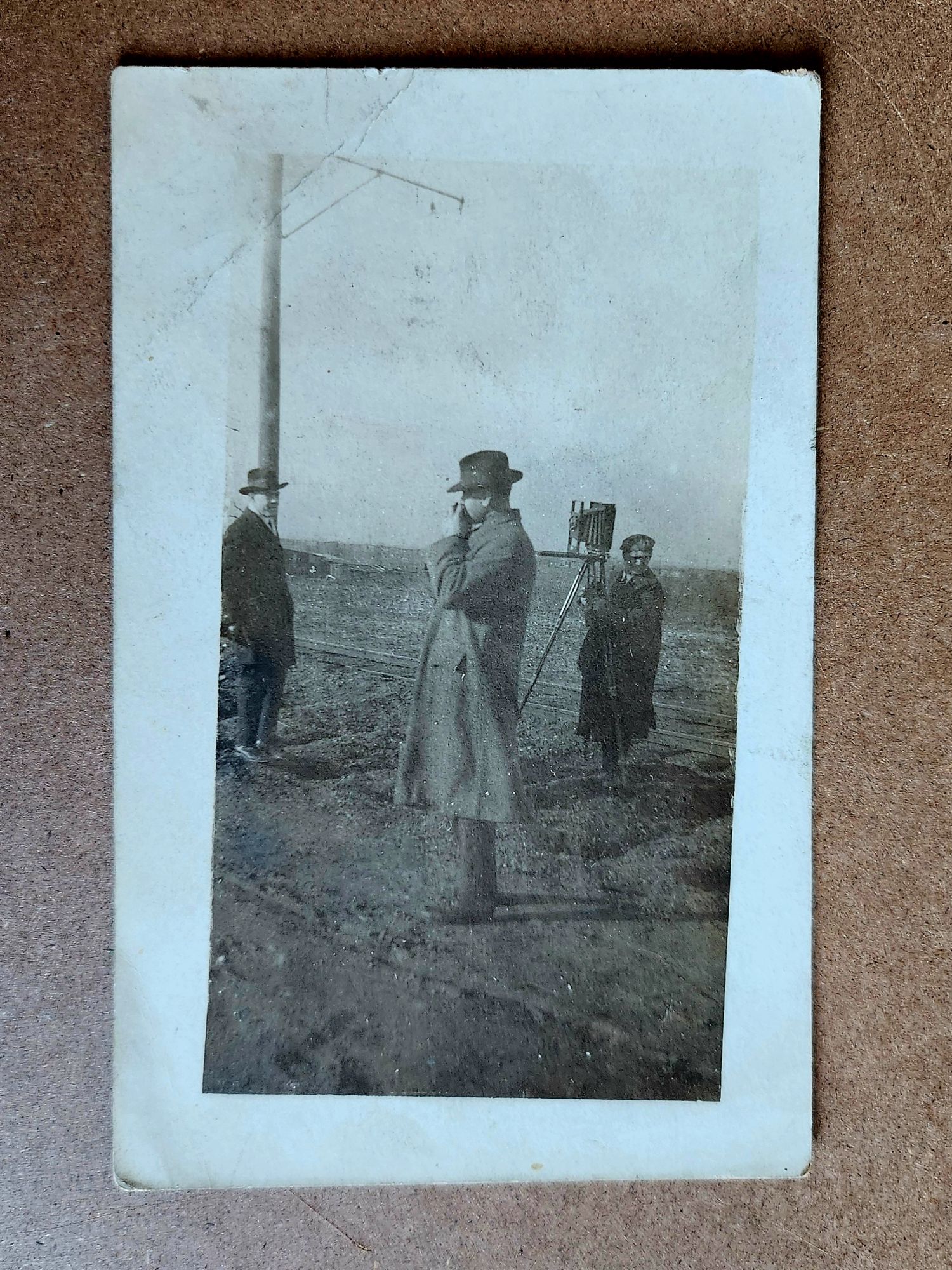
Last week, buildings emerged and oil derricks erupted. Evidence accumulated, context implied. An unknown town takes shape and we surmise. Now, people stare across a century and time flies.
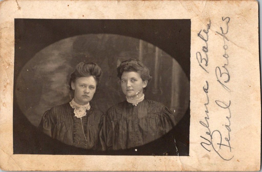
Seven adults carefully arranged on a rocky outcrop. Three men, four women. Two children in white dresses seated in front. Twins? Cousins? Someone operated the camera.
We see the composition and relational questions arise. Are they family? Kin? Friends on an outing? Do the poses suggest occasion, or documentation?
Evidence ends and story begins. We fill in by reading subtle cues in how they stand, who touches whom, which faces seem to fit together. Clues come quietly and mistakes, too. Always, we’re revealing ourselves.
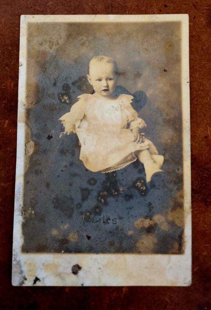
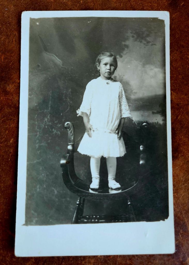
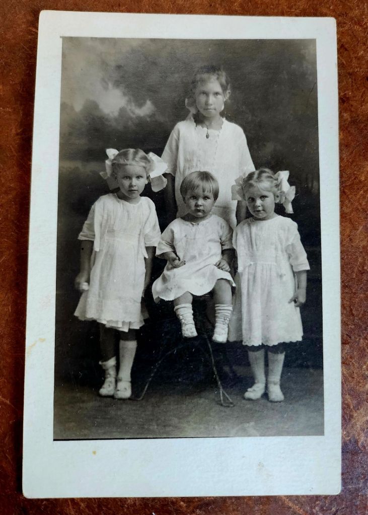
Here we see one girl, three moments, and years passing. The baby stares out with solemn intensity. Then she’s older, on a throne in white dress, commanding the frame. Finally she’s the eldest of four, and her protective gaze tells all.
The postcards show her time moving, roles shifting. She grows and gains presence. She becomes a big sister, then a bigger sister still.
The postcards show the sequence and the story intrudes. We can safely assume the scenario, the kinship, the birth order. But then we imagine her. She and her siblings stand as evidence. We provide the narrative.
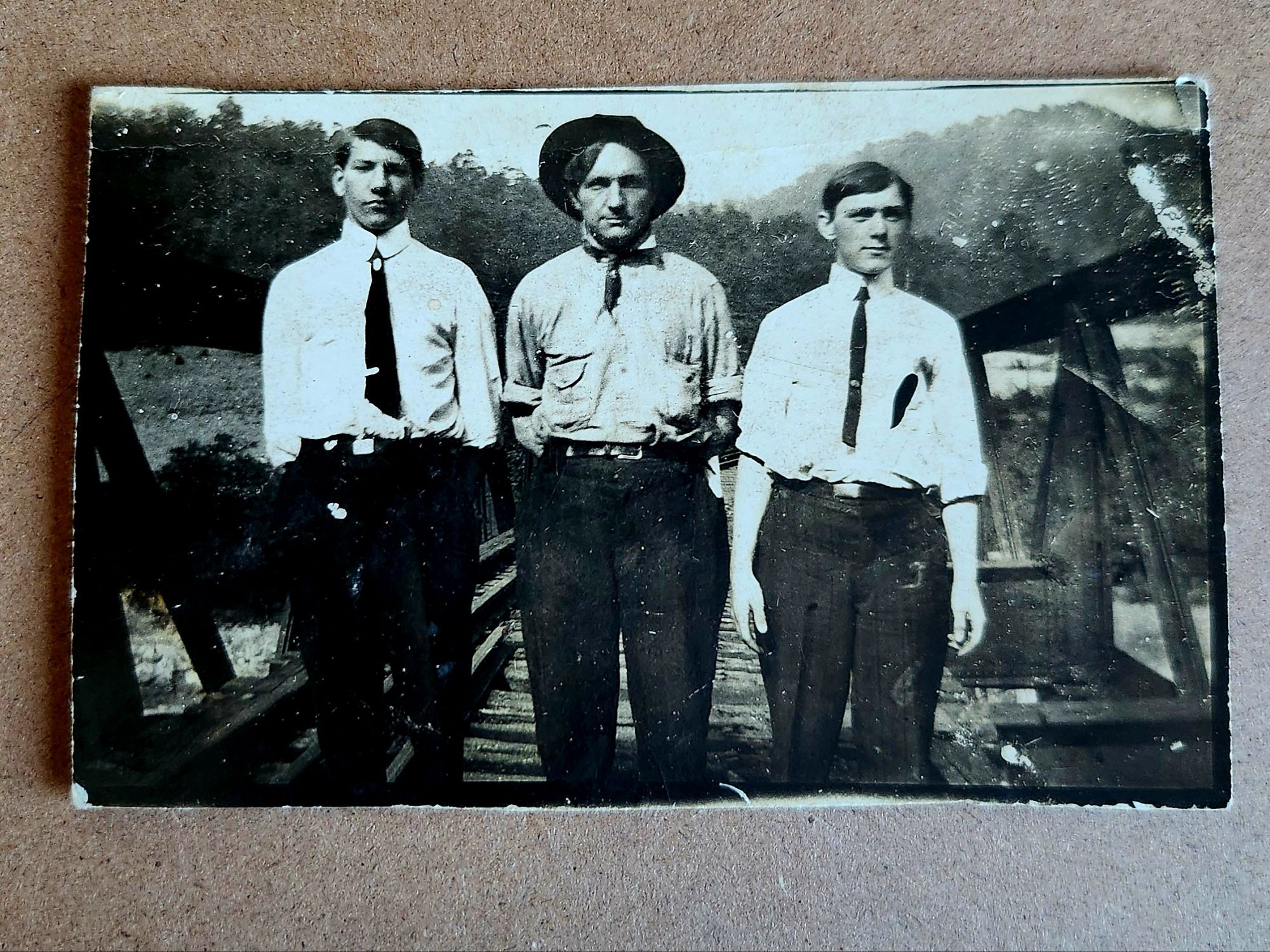
Now nine men, perched around a large rock on uneven ground in a forest, maybe a park. Hats, a variety of ties, white shirts in sunlight. Ages range. Some engage the camera. Others look away.
Compare this to the first photograph. Similar outdoor setting and careful arrangement. Same paper stock, same photographic quality. Do any faces repeat? That man in the center looking off to the distance—could he be the man on the back left of the family group?
We squint. The shape of a jaw, the set of shoulders, the tilt of a head. Errors lead us toward other observations. Misreads become clues. We’re searching, and trying out plausible connections.
A different girl and a similar progression (maybe). The baby carriage can be dated within a range, 1915-1925. Fashions shift slowly in some places, rapidly in others, but period details do show. Those bows!
However, uncertainties hover. Is this the eldest girl growing up? Or, are we forcing connection where none exists? The bobbed hairstyles might give it away. Or they might mislead entirely.
A particular stare, a nose ridge, an anomaly at the jawline, and we are on the pursuit again. The faces echo. Three generations, or two. We assign roles: son, mother, daughter. Sisters?
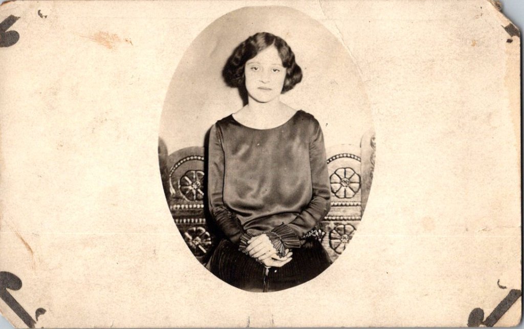
The oval portrait shows four women arranged in a formal cluster. Elaborate hairstyles, high collars, cameo brooch visible on the seated figure. More prosperous, perhaps. Different family entirely, or different branch? Is she at the center the same as the older woman below? We cannot know.
In between the guesses, a different story emerges entirely. Our own families, and that we belonged. Or, that we confidently walked on. In either case, we are humming with history.
We’re deep in assumption now. Building genealogies from facial features, paper stock, and similar poses. The archives encourage it. These cards traveled together. Someone kept them together. The connections existed, however disassembled.
Another baby carriage, different from the first. And on the back of the card, handwriting: this is Irene with Willie’s baby, sent to Aunt Fannie. We know Irene from when she was four, seated with Uncle Rufus Dale, 84.
What satisfaction, when a storyline clings together. Names accumulate. Groups delineate. Relationships clarify. The archive speaks back, and the story begins to imitate fact.
The search becomes research. The archive rewards our attention and budding accuracy. But, who doesn’t love Aunt Fannie? Even if we’ve never seen her.
Now, here is Irene amid two new figures who appear to have a strong bond. Sisters? Friends?
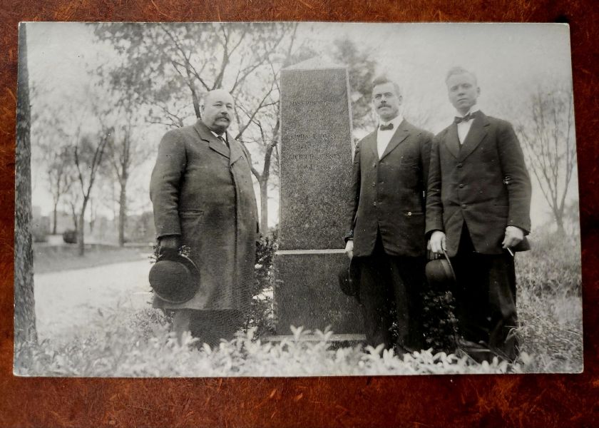
As we might expect, there is more to reveal. Next week, we’ll look at pairings in quite a variety, and even more merry misleads. Then portraits, and finally, a grave.
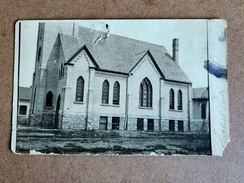
Tricky, sticky stories arise at the sight of buildings in the landscape. Evidence (or absence) of us along the way.
As landscapes, last week’s real photo postcards (RPPC) asked for nothing. Trees, frozen roads, animals burrowing in snow—they floated free of context. We could easily appreciate them without knowing where they might be.
Buildings are different. A structure says someone decided, planned, risked, and accomplished. They hauled materials, drove nails, painted trim. Buildings demand explanation in ways that hills might easily demure.
Reading postcards slowly reveals patterns. The undivided back means pre-1907. The real photo process suggests a local photographer, or maybe an itinerant professional documenting a place too remote to the reach of commercial postcard companies. Paper stock, indicia, stamps and cancellation, faded handwriting and previous labeling, even image placement and crop—these technical details narrow the place possibilities.
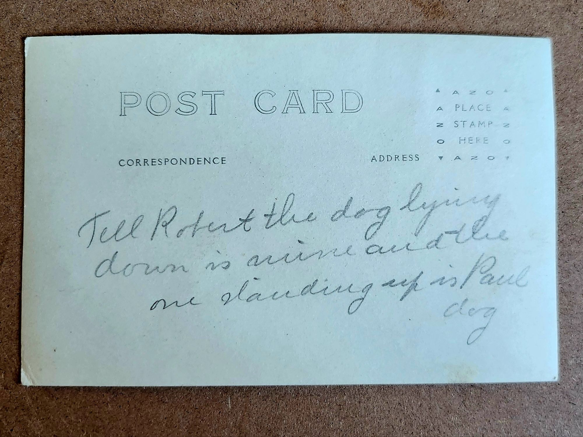
But they don’t yet answer another question: Who are Robert and Paul?
Tell Robert the dog lying down is mine and the one standing up is Paul dog
What We Might Know
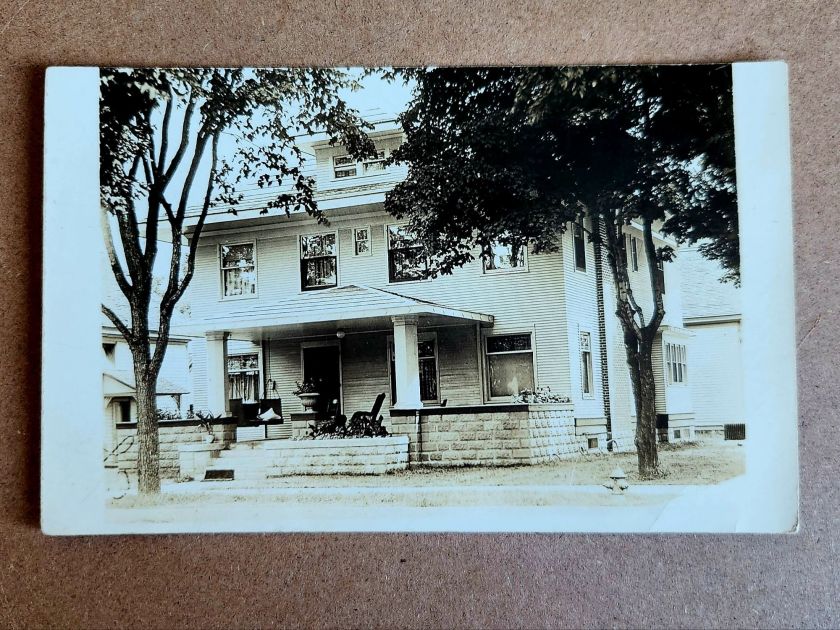
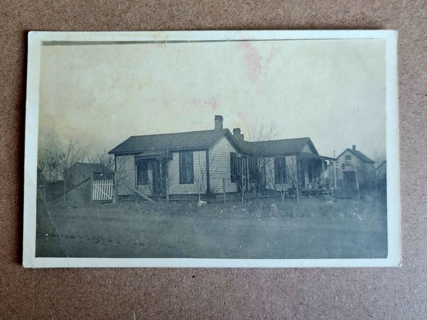
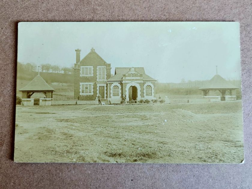
A two-story house with a generous porch is carefully centered in one photograph. Mature trees in the foreground. Curtains hang in the windows. Someone lived here and wanted to show their pride. Or, was it for sale?
The architectural details offer more clues. Clapboard siding, stone or brick foundation, decorative porch elements—not fancy, but intentional. It seems to be in a neighborhood with sidewalks. In an era between 1900-1920, somewhere in the Midwest or West judging by lot size. Also, a fire hydrant.
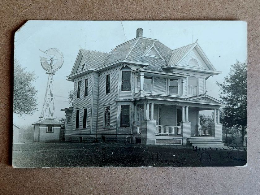
The windmill in another image dates itself. Windmills were an important utility and industry, and that style had a particular era. The house beneath it—elaborate Queen Anne with corner turret, ornamental shingles, and ornate columns—speaks to aspiration. Someone had big plans. This is visible evidence. When and where becomes roughly recognizable.
But, the people who stood on that porch remain absent and enigmatic. Who were they? What is happening here? A creative tension is mounting between the realm of evidence and the pull of story.
Sensing Stories
Two women stand in front of McMann Boarding House wearing identical striped dresses. The building is simple—board and batten, minimal trim, the kind of structure that goes up first and fast in a growing place.
The photograph has a vertical tear, the exposure is bad, and time has degraded it. But the sign remains legible: McMann Boarding House. Finally, a name.
Who was McMann? Who are these women? Employees? Vacationers? The photo is both casual and deliberately staged. What might the matching dresses mean? Pride? Subjugation?
Reading their faces, we fill in the narrative, almost immediately and sometimes inescapably. Relationships, motivations, futures take shape unbidden. This is exactly what we both invited and warned of last week—making it up. Always dangerous, sometimes worthwhile.
The impulse to story is nearly irresistible. A name on a building. Two women in matching dresses. The space around the postcard lights up. Are these their stories, or our own, or a magical projection that folds time?
When the Past Chats Back
Shuffling the stack, several cards in this collection start speaking to one another. Same photographic quality. Same paper stock. Similar landscape—flat, spare, newly broken. And most telling: similar structures in states of becoming.
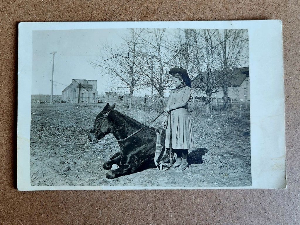
Laid out together, the pattern emerges. Houses with stone foundations and wraparound porches. An elaborate Queen Anne with a windmill. McMann Boarding House with its two women in matching stripes. A lunch room with an immaculately vernacular grand porch. Best-dressed proprietors standing proud. A girl and her horse, bare buildings behind her. A picnic under the canopy of a large tree.
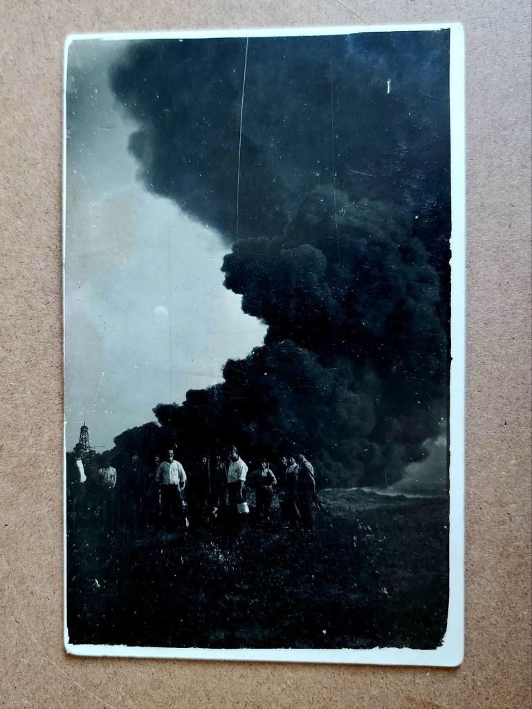
Also, a massive plume of black smoke billowing skyward, an oil derrick to the left, eight or nine men grinning toward the camera. The photograph stops everything cold. They struck liquid gold. A triumph worth documenting. Fine lines of the plumes etching through the darkest black.
These eleven images are a cluster from the same story—a town emerging around oil. Homesteaders and entrepreneurs arriving in a place that may have been open prairie five years earlier. Building homes, businesses, infrastructure for both industrial productivity and social life. Documenting the process with real photo postcards, for themselves or to send East. Their message: we have arrived safely and are in luck.
From Here to Now
This is a founding, the moment a place began and the stakes changed. These aren’t isolated buildings anymore and oddly they seem less like photos, too. We know there is a community taking shape and the evidentiary questions multiply. Who were they, by name? What brought them here? Did this place survive or vanish?
And harder, deeper, more consequential questions: Who lived here before? What animals and habitats were displaced? What did the derricks do? For them, and also to us.
Boom town logic. Extraction economy. Infrastructure dependencies and family injuries inherited. Cultural degradation, and environmental costs still being paid. This isn’t quaint history. This is the beginning of something we’re grappling with today.
Suddenly our imaginative stories contract and we now seek facts. The boarding house proprietor’s daily life can be imagined, but not separated from a place built on oil speculation. The architectural ambition of that Queen Anne deserves appreciation, but it went up in a town that might have lasted ten years or a hundred, depending on the wells. The buildings aren’t innocent, and we are implicated.
More in Store
Another stack of postcards might be related to this cluster—similar age, similar style, possibly the same region, likely at later dates. And then a few unrelated ones, probably European based on the architecture.
Not every fragment connects or resolves. Some buildings will remain singular, their stories unrecoverable. Churches and homes, beautiful structures, carefully photographed. Loved locally today as a memory or a ruin, perhaps.
Not everything needs a narrative. Some images can just be enigmatic. Evidence of care, of craftsmanship, of a moment someone thought worth preserving. These evocative details lead to fiction, which makes its own case for history and the preservation of minute detail.
But this cluster won’t let go. They connect to another stack, and soon we’ll know more. Next week we’ll meet the people themselves, looking back at us.
These vintage postcards from the 1972 Tourism Year of the Americas reveal fascinating questions about natural landscapes, heritage, monuments, and whose stories we remember and tell.
In summer 1972, the United States Postal Service issued commemorative postcards that would become enduring symbols of national identity. These postcards, part of the Tourism Year of the Americas campaign, featured iconic destinations with restrained elegance—their two-color printing was both artistic and economical. As America stood at a cultural crossroads, this postcard set tells a familiar American story. More than five decades later, they reveal even more about how a nation sees itself.
Commemorative Moments
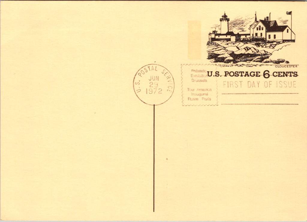
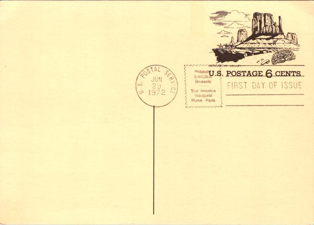
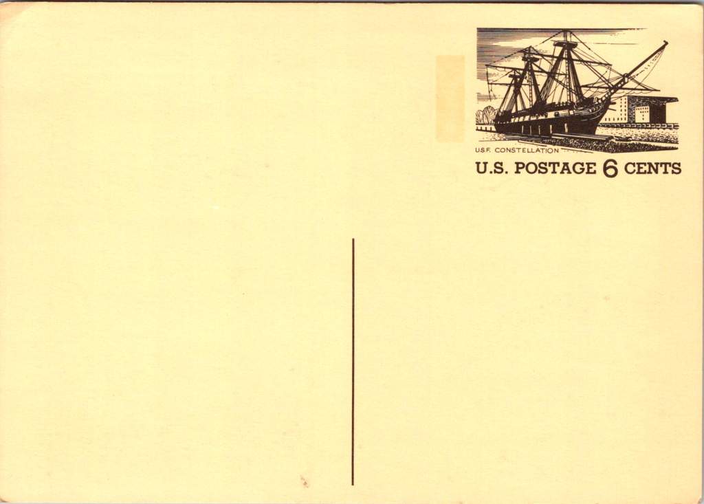
First Day of Issue cancellations mark a special moment in time, and signal that an item is expected to be collectible. The postcards were cancelled on June 29, 1972, bearing the commemorative text “Philatelic Exhibition Brussels” and “Tour America Inaugural Rome – Paris.” These international exhibitions promoted American tourism during the Cold War, when cultural diplomacy served as essential soft power.
The carefully designed cancellation artwork includes USS Constellation (6¢), Gloucester (6¢), Monument Valley (6¢), and Niagara Falls (airmail 15¢). These rates reflected the newly reorganized United States Postal Service which had become its own entity the year prior. The 1972 Tourism Year of the Americas was an ambitious initiative from the new quasi-independent agency, emerging alongside Nixon’s opening to China and détente with the Soviet Union.
USS Constellation, the last sail-only warship built by the U.S. Navy (1853-1855), served as flagship of the Africa Squadron from 1859–1861. The ship captured three slave vessels, enabling liberation of 705 Africans. During the Civil War, Constellation deterred Confederate cruisers in the Mediterranean. The selection represented naval heritage and anti-slavery efforts, though it still centered the naval victory rather than those who gained freedom.
Niagara Falls has attracted visitors for 200 years, becoming the symbolic heart of American tourism. The 1883 Niagara Reservation became America’s first state park, influencing national park creation. Current visitor statistics show enduring appeal: 9.5 million tourists visited Niagara Falls State Park in 2023, with the region welcoming 12 million visitors yearly.
Monument Valley reflect the West’s central role in national identity by 1972, immortalized through Hollywood and environmentalism. Yet Monument Valley sits within Navajo Nation territory, while Grand Canyon encompasses land sacred to multiple tribes, including the Havasupai, whose reservation lies within park boundaries—reminders that park creation displaced Native communities.
Gloucester, America’s oldest seaport, sustained coastal communities for centuries. The lighthouse image evoked both practical maritime safety and romantic notions of New England’s rocky shores, while Gloucester’s working harbor embodied the intersection of heritage preservation and living tradition. By 1972, this historic fishing port faced the tension between maintaining its authentic maritime culture and adapting to tourism pressures—a challenge that made it a fitting symbol.
Artistic Vision
The front of the postcards render multiple iconic American locations in distinctive engravings in an economical two-color print run, an important factor for a the government printing office.
The collection showcases a deliberate balance. Yosemite represents natural power and America’s first national park. Missisippi Riverboats and the Rodeo embody western majesty central to national imagination. DC Monuments offer overt patriotism and Williamsburg and the Liberty Bell connect to the tremors and tolls of colonial democracy.
Even in 1972, these were selective narratives. All featured natural sites exist on traditional Indigenous lands, for example, while largely omitting Indigenous perspectives and enslaved people’s contributions to our cultural histories.
Many featured locations are sacred sites to Indigenous communities. Some of the most sacred places for American Indian nations are located in national parks, yet access to holy ground remains contentious. Park creation often involved displacing Native peoples from lands they had stewarded for millennia.
The year 1972 was tough in other ways: Vietnam War divisions, emerging Watergate scandal, and generational alienation over the military draft. These postcards presented a different kind of unity. Rather than contemporary political divisions, they emphasized natural wonders and historical sites that transcended partisan conflicts.
During the Cold War, these postcards served as miniature global ambassadors, too, often providing people’s first visual encounter with American landmarks. They projected America as worthy of visiting and learning about, countering negative impressions from political controversies.
The postcards themselves embody crucial democratic principles: making heritage accessible through affordable media; connecting tourism to conservation through revenue and public appreciation; and revealing how commemorative choices reflect national values. The geographic diversity suggests a desire for the fullest of American experiences, though these 1972 selections still privilege certain narratives.
New Memories
These postcards continue to offer insights into American values and heritage preservation evolution. USS Constellation still serves as a museum ship in Baltimore’s Inner Harbor. National parks have experienced tremendous visitation growth, raising questions about balancing access with preservation.
In what they don’t depict, the postcards show gaps in whose stories get told, whose lands get celebrated, whose experiences get centered. While 1972 selections emphasized traditional narratives, contemporary views increasingly include previously marginalized perspectives, acknowledging Indigenous heritage alongside colonial and national stories.
These artifacts remind us that commemorations reveal values and priorities. As our historical understandings evolve, it’s wise to look back and look again.
Copper maps. Wooden cards. Puzzle prints. Discover how obsolete technologies transform into art and craft, and explore why we can’t stop reinventing the perfect postcard.
In this age of instant digital communication, the persistence of physical postcards presents an intriguing contradiction. These rectangular pieces of cardstock—designed to carry both image and correspondence through postal systems without an envelope—serve as artifacts of a communication method that had its heyday a century ago. But rather than disappear entirely, postcards have evolved in novel ways that tell us even more about who we are.
Why We Seek the New
Humans have always been drawn to novelty. Our brains light up at the unfamiliar—it’s a survival mechanism that once helped our ancestors notice changes in their environment that might signal danger or opportunity. But our relationship with novelty runs deeper than vigilance. We seek out new experiences, objects, and sensations even when no practical threat or benefit is apparent.
This human attraction to novelty serves several purposes. First, it provides simple pleasure—the dopamine release that accompanies discovery keeps us engaged with our surroundings. Second, it helps us learn and adapt—new situations force us to develop new skills. Third, it offers social currency—being the first to discover, own, or report something novel (even if untrue!) gives us a kind of status within our communities.
Perhaps most fundamentally, novelty helps us fight against the deadening effect of habituation. We become blind to what remains constant around us, a psychological phenomenon called “sensory adaptation.” Think of how you stop noticing a persistent background sound, like traffic noise. Novelty jolts us back into conscious appreciation, like noticing the birdsong instead, making us sense the familiar differently.
With mass-produced consumer goods, we often pursue novelty through customization or unique variants—like these postcard alternatives. They satisfy our craving for something special while maintaining connection to recognizable forms. Even novelty doesn’t stray too far from the familiar.
Technology Becomes Art
As technologies age and are replaced by more efficient methods, something interesting happens—the displaced technology often shifts from the realm of utility to the realm of artistry and craft. What was once valued primarily for function becomes appreciated for form, precision, and the visible human touch.
Letterpress printing was an extraordinary innovation of its time and once the standard for all printed matter. It was largely replaced by offset printing in the 20th century and later the digital methods we use today. But rather than disappearing, letterpress evolved into a premium craft, prized for its tactile quality and visible impression on paper—characteristics that were originally just side effects of the technique, not its intended purpose.
The same transformation happens with many technologies: vinyl records, film photography, mechanical watches. As digital alternatives take over the functional role, the analog predecessors become vessels for history, craftsmanship, ritual, tactile pleasure. They move from being tools to being experiences.
This pattern helps explain our collection of novelty postcards. Somewhere in the middle of last century, the standard paper postcard was functionally superseded by digital communication, freeing it to evolve into these more elaborate, less practical forms. They represent a technology in its artistic phase—no longer bound by strict utility, but free to explore expressive and sensory possibilities, along with kitsch and commercialism.
Utah in Copper Relief
The copper-embossed Utah souvenir represents one of the more elaborate departures from traditional postcard design. The metallic rectangular plate features a raised topographic outline of the state with embossed illustrations of regional landmarks and attractions. The word UTAH is prominently displayed at the top, while places like Vernal, Provo, Cedar City, and St. George are labeled at their approximate locations. The copper medium gives the piece warmth, with a decorative scalloped border framing the state’s geography and securing the paper card below.
The manufacturing process likely involved die-stamping or embossing thin copper sheeting, a technique that dates back to the late 19th century and regained popularity in mid-20th century souvenirs. The tactile nature of the raised elements invites touch, creating a multisensory experience unavailable in traditional flat postcards. The utility of this object as actual correspondence is significantly diminished—the copper surface resists easy writing, and its weight requires additional postage and hand-canceling. It’s more a miniature commemorative plaque that happens to maintain postcard dimensions.
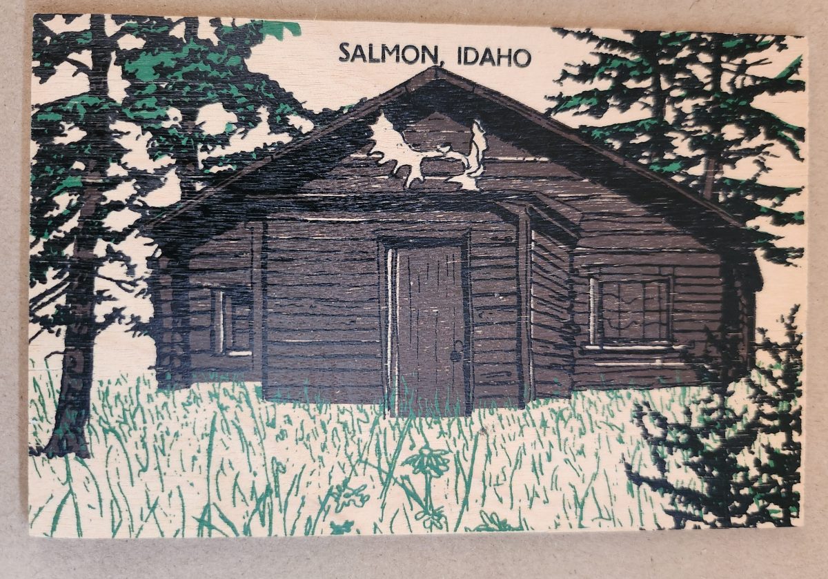
Woodsy Aesthetics
Let’s look closer now at a novelty postcard featuring a cabin in Salmon, Idaho, printed onto a thin wooden substrate and depicting a rustic cabin nestled among stylized pine trees. The scene employs a limited color palette—brown and black for the structure and green for the surrounding vegetation—lending it a deliberately simple aesthetic that echoes both woodcut prints and traditional lithography.
The simple text at the top identifies the location without intruding on the scene. The artwork itself employs minimal detail, capturing the essence of rural life rather than photographic accuracy. The manufacturing process of printing onto thin wood veneer allows for mass production, while adding a specific scene, location name, and ink color for customization.
This card’s rustic medium and subject matter work in harmony, creating a self-referential object where the material reinforces the message—a wooden card depicting a wooden structure set within a forested landscape. The medium becomes part of the message, suggesting authenticity through material consistency. Though mass-produced, it strongly evokes a rural sensibility.
Framed Vistas
Our souvenir from Yellowstone National Park adopts yet another approach. This card features a stylized illustration of Yellowstone’s grand canyon and waterfall printed on cardstock and mounted on a wooden backing.
The artwork employs a palette of oranges, purples, blues, and whites to capture the dramatic landscape, with the falls rendered as a white vertical streak against colorful canyon walls. Dark silhouettes of pine trees frame the scene, while puffy clouds hover in a light blue sky, held inside a purple border. The stylized typography echoes vintage travel posters from the early to mid-20th century. The entire image is mounted or printed on a natural wood base, visible as a frame around the illustration.
This card’s production combines offset printing with a wooden substrate—a look that recalls both traditional woodblock prints and mid-century travel advertisements. The design deliberately evokes an era of American national park tourism when artistic posters commissioned by the Works Progress Administration and the National Park Service established a distinctive aesthetic for natural landmarks.
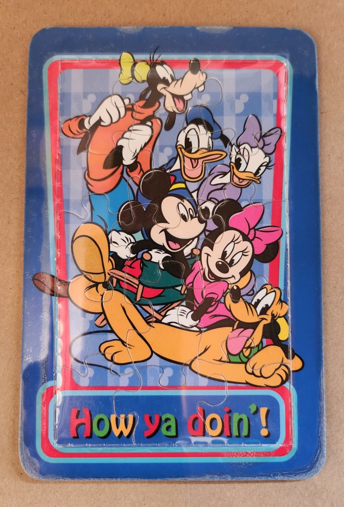
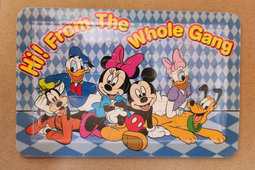
Playful Puzzles
The Disney puzzle postcard introduces an element of interaction we haven’t seen before. This card features Mickey Mouse, Minnie Mouse, Donald Duck, Daisy Duck, Pluto, and Goofy arranged in a group pose against a blue-and-white checkered background. The message reading “Hi From The Whole Gang” in bubble text curves around the edge of the image.
This item turns a postcard into a simple jigsaw puzzle—die-cut pieces that can be jumbled and reassembled to reveal the printed image. The manufacturing process involved full-color printing followed by precision die-cutting to create interlocking puzzle pieces, then applying a thin adhesive film to maintaining the card’s overall integrity for mailing.
This souvenir represents a curious hybrid—a postcard that actively invites its own disassembly. The Disney characters themselves represent another layer of nostalgia, combining America’s animation icons with the traditional postcard format to create an object that references multiple forms of 20th-century popular culture simultaneously. But only modern technology could accomplish these manufacturing details, a playful combination of familiar and fresh.
Magnetic Memories
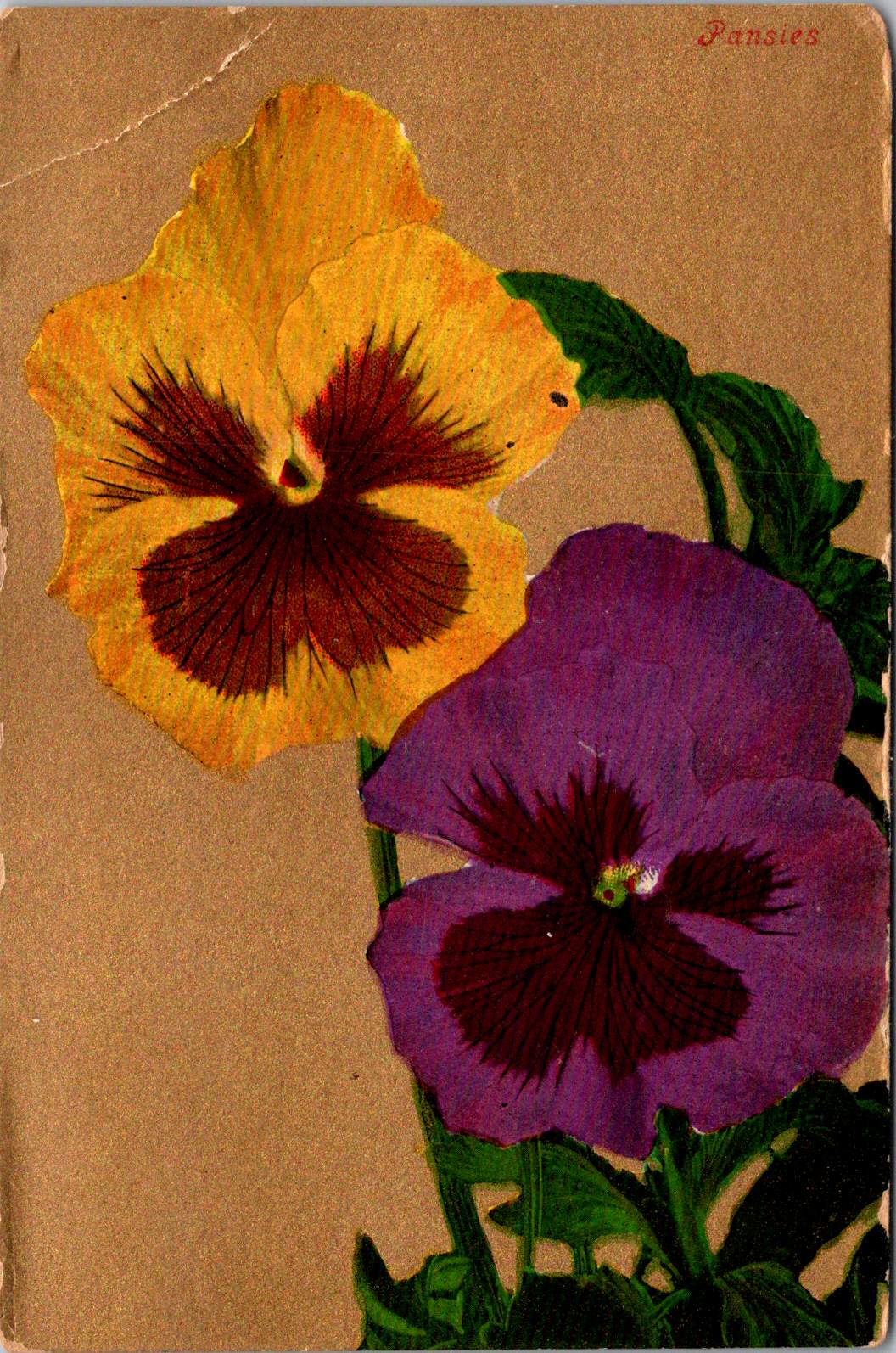
The Will’s Hardy Trees and Seeds magnetic card is the one in our set with the most layers of both meaning and making. See packets, postcards, fridge magnets, and agricultural Americana all combine in this take home treasure.
The 1909 seed catalog cover is a contemporary image inspired by the real-life Oscar H. Will & Co. of Bismarck, North Dakota. The vibrant illustration displays pansies in various colors—purple, yellow, orange, pink, and white—arranged in a bouquet. Text identifies the company’s 26th year of operation and describes their products as the “choicest and most beautiful on earth”.
A small purple circle overlay on the plastic film cover announces the item’s true nature: a magnetic postcard to send as a gift. Despite its historical appearance and postcard dimensions, the object is actually a refrigerator magnet that merely references seed catalog and postcard aesthetics. The production involved digital printing on magnetic sheet material, applying a printed paper backing, and slipping into a plastic cover with instructions to mail the gift in an envelope.
As a novelty item, it reveals a peculiar circularity. A reproduction of a commercial artifact (seed catalog) transformed into a correspondence medium (postcard) further transformed into a decorative household item (refrigerator magnet). Somehow, we love each iteration all the more.
Nostalgia Squared
What these examples share is a relationship with nostalgia that operates on multiple levels. They aren’t simply nostalgic; they engage in a looping nostalgia—nostalgic representations of already nostalgic forms.
The copper Utah relief draws upon mid-century tourist souvenirs, themselves designed to evoke frontier-era maps and territorial markers. The Salmon cabin employs modern production techniques to simulate traditional woodcuts nad print, which were themselves often romanticized depictions of rural life. The Yellowstone cards references mid-century national park posters that were already stylized interpretations of natural wonders. The Disney puzzle incorporates cartoon characters who have become nostalgic cultural icons, presented in the format of childhood games. The Will’s Seeds magnet reproduces early 20th-century commercial art that was, even in its original context, employing Victorian aesthetic sensibilities.
This layering of reference creates objects that are remarkably dense with cultural signifiers despite their modest physical dimensions. They offer not just a connection to place and time but to the ways we’ve represented ourselves and our interests through commercial souvenirs.
Our apparent need for novelty, then, might be better understood as a need for continual context. Each new postcard iteration doesn’t merely replace what came before; it absorbs and references it, creating objects that function as compact archives of our evolving relationship with the characters and places we cherish.
These novelty postcards sit at an interesting crossroads of commerce, craft, and communication. They represent what happens when a formerly utilitarian object—the humble postcard—is freed from its purely practical obligations and allowed to evolve along lines dictated by sentiment, aesthetics, and novelty.
In a world increasingly dominated by digital experiences, these physical novelties offer something screens cannot—texture, weight, presence. They satisfy our hunger for the tangible. Their quirky, sometimes impractical forms speak to a human need more fundamental than efficient communication: the need to hold something unique in our hands, and to feel a physical connection to places we’ve been and experiences we’ve had.
The postcard itself is and was a very simple concept and object that, over time, has become a medium for ongoing conversations about permanence and impermanence, about what we value over time, and about the tension between utility and sentiment. In their various novel forms, these more-than-postcards tell us about places we’ve been and how we’ve chosen to remember and delight in those places—a correspondence not just between people, but between past and present.
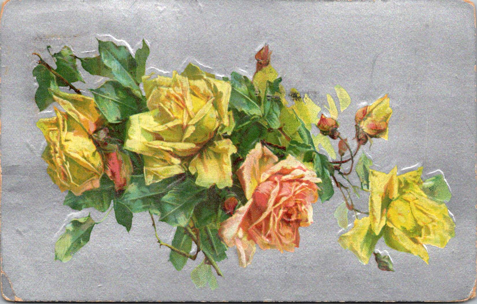
Vintage floral postcards—with golden backgrounds, symbolic flowers, and heartfelt messages—were a sophisticated social currency that connected people across distances.
At the intersection of the Victorian and Edwardian eras, the humble postcard emerged as a powerful medium for small aesthetic pleasures and meaningful social exchange. These postcards tell a story of artistic development and printing innovation, and how ordinary people wove beauty into the fabric of everyday communication.
Delicate Blooms
One card in this selection features pristine white lilies and fern fronds against a luminous gold background. The lilies—rendered in striking detail with their trumpet-shaped blooms and distinctive stamens—create dramatic contrast against the warm gold, the iridescent ink catching light as the recipient tilted the card in their hands. An elegant blessing accompanies the illustration.
“No thorn beset the path you tread, No shadows glance upon your way, But flowers spring beneath your feet, And sunshine crown your every day.”
These cards encapsulate a pivotal moment in design history—the transition from Victorian to Edwardian sensibilities. The Victorian era (1837-1901) embraced ornamentation, sentiment, and symbolic complexity. Every element carried meaning: white lilies represented purity and virtue; ferns symbolized sincerity and shelter; the gold background evoked trust and value. These layers of meaning reflected the Victorian preoccupation with moral improvement through beauty, a philosophy championed by influential figures like John Ruskin and William Morris.
As Queen Victoria’s reign ended and Edward VII took the throne (1901-1910), aesthetic preferences gradually shifted. The new Edwardian sensibility maintained Victorian symbolic richness but introduced more restrained layouts with increased white space and cleaner compositions. This particular card, with its strategic emptiness and focused arrangement, demonstrates this evolution. The gold field creates breathing room that earlier Victorian designs would have filled with additional decorative elements.
The technology behind these gold backgrounds represented industrial innovation. Using metallic powders and varnish printed in the desired pattern, these effects made previously elite decorative elements available to middle-class consumers. During the Industrial Revolution, technical advancements in printing had transformed what was once painstaking handwork into mechanized production. German printers in particular had mastered these techniques, producing cards with exceptional color registration and metallic effects that remained unmatched until their trade was disrupted by World War I.
Other sophisticated production methods like embossing—creating raised areas that added tactile pleasure to the visual experience—required specialized equipment and expertise. Metal dies created by skilled engravers would press the design into the card after printing was complete. The visual effect was enhanced by different dimensions, making these technically perfect cards a testament to industrial craftsmanship.
Gold’s association with luxury stemmed from both its intrinsic properties and historical significance. The aptly named Gilded Age celebrated opulence, with gold becoming a visual shorthand across design disciplines. International Expositions like the 1900 Paris Exposition showcased luxury goods incorporating gold elements, popularizing these aesthetics globally. Archaeological discoveries in Egypt renewed interest in gold in design, while the Ballets Russes featured costume and set designs by artists like Léon Bakst who used vibrant colors and gold accents.
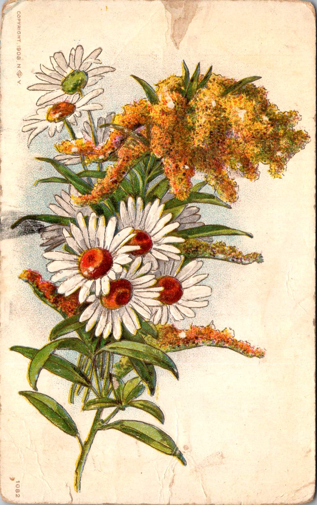
Floral Features
A striking card in the next selection features white and red striped “peppermint” carnations against a gold background. The distinctive white petals dramatically streaked with vibrant red markings create bold visual contrast against the metallic wash. Three perfectly rendered blooms cluster together on dark stems, with bright green sword-like leaves framing the arrangement. The word “Carnations” appears in red script in the upper right corner, identifying the botanical subject with elegant simplicity.
This stark compositional approach—focusing entirely on the botanical subject against a uniform background—represents a more modern, stripped-down aesthetic that emerged in the early 1900s. While maintaining the Victorian fascination with floral symbolism, these designs eliminate extraneous decorative elements in favor of dramatic contrast and botanical precision. This shift toward simplification prefigured design trends that would gain momentum in the following decades, showing how postcard aesthetics tracked broader movements in visual culture.
The symbolism remained rich: striped carnations carried specific meaning in the Victorian language of flowers, often representing regret that a sentiment could not be shared or a refusal/inability to accept someone’s affection. This sophisticated “language of flowers” had become codified in popular Victorian publications like Kate Greenaway’s “Language of Flowers” (1884), ensuring that recipients would understand these botanical messages. The high contrast between the red-streaked white blooms and the gold background created a visual drama that emphasized the emotional complexity carnations represented.
During this period, social practices around correspondence were evolving. The penny post, established in Britain in 1840 and adopted with variations throughout Europe and America, had revolutionized communication by making it affordable across social classes. What was once an expensive privilege became commonplace, leading to a boom in correspondence. The “Golden Age of Postcards” (approximately 1898-1918) coincided with changing postal regulations that allowed privately printed cards and preceded the widespread adoption of telephones. During this period, billions of postcards circulated globally.
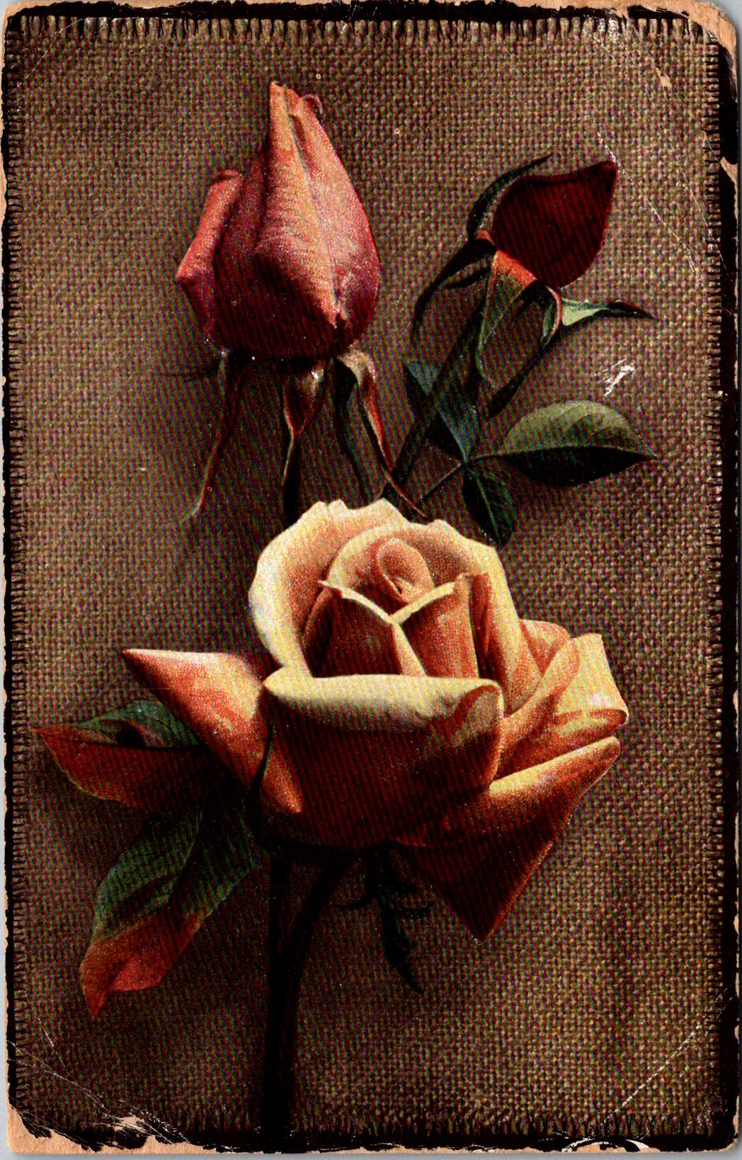
Rose to Crimson
The next group of cards represents another technological leap—an early photograph of light pink roses on a background of actual linen. The physical texture of the rough weave contrasts with the delicate subject matter—an open rose and two buds captured a new reality that only photography could provide. This mixed-media approach demonstrates how artists continued to experiment with both visual and tactile experiences.
The Victorian and Edwardian periods witnessed remarkable developments in image reproduction. Traditional chromolithography—where each color required a separate stone or plate—was being supplemented by photographic techniques. These innovations allowed the faithful reproduction of reality rather than artistic interpretation, though both approaches coexisted during this transitional period. The textures and images of this card created an interesting interplay between the natural subject and the material substrate, engaging multiple senses simultaneously.
Rose symbolism operated on a similarly subtle gradient. In Victorian floral language, the exact shade of a rose communicated specific intentions: light pink roses signified admiration and grace—appropriate for relationships in earlier stages or those requiring emotional restraint. Medium pink suggested appreciation, while deeper crimson conveyed self-conscious beauty and passionate love. This color gradient functioned as a sophisticated social shorthand, with increasing saturation indicating increasing emotional intensity.
This coding system proved particularly valuable in an era when direct expressions of emotion were constrained by elaborate social conventions. Etiquette books like those published by Emily Post outlined proper behavior in minute detail, including appropriate subjects for correspondence and proper forms of address. Against this background of social restriction, postcards offered a safe channel for emotional expression. The carefully chosen rose color allowed for communication that could either be acknowledged or tactfully ignored, providing a social safety mechanism for expressing feelings that might be improper to state directly.
For Victorian and Edwardian women especially, whose social freedom was often limited, postcard exchange offered acceptable connection. Young women could receive cards from admirers without compromising propriety, as the public nature of postcards (visible to postal workers and potentially family members) ensured messages remained discreet. This “public privacy” created a unique social space where relationships could develop within accepted boundaries.
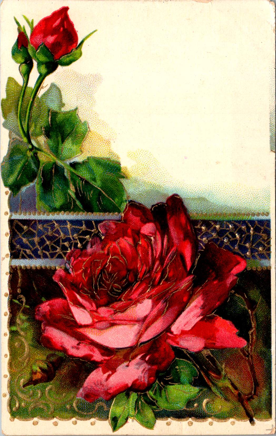
Color Craft
The final featured card offers yellow roses against a silver background, that creates a cooler, more modern luminosity. The yellow blooms—rendered with botanical precision—grow naturally on their stems, emphasizing an organic composition that represents changing sensibilities as the Edwardian era progressed toward what would become Art Deco and modernism.
While Victorian design had favored warm, rich gold tones suggestive of historical richness, the newer aesthetic embraced clarity, brightness, and forward-looking optimism. Yellow—the color of sunshine and vitality—symbolized friendship and joy rather than romantic love, expanding the emotional palette of postcard communication.
These changes in design paralleled broader social transformations. The early 20th century witnessed significant shifts in social mobility, women’s roles, and technological adoption. The rise of department stores democratized consumption of decorative goods, while increasing literacy rates expanded the audience for visual and textual communication. The suffragette movement gained momentum, challenging Victorian gender restrictions. These postcards, with their evolving aesthetics, tracked these social changes in material form.
Technology continued advancing as well. The integration of photography with traditional printing techniques created hybrid visual forms. German printers had pioneered many of these innovations before World War I. American and British printers subsequently developed their own techniques.
The social function of these postcards remained central to everyday life. In major cities, postal deliveries occurred multiple times daily—sometimes up to 12 deliveries in London—creating a communication rhythm somewhat like today’s text messages. This frequent exchange helped maintain connections across the increasing distances created by urbanization and industrialization. As families dispersed geographically, these tangible tokens of remembrance became increasingly important.
Recipients collected their postcards in specialized albums that became objects for social sharing in parlors. These albums—elaborately decorated themselves—transformed private communication into a form of social performance. Visitors could be shown new additions, creating occasions for storytelling about relationships and experiences. A well-filled album demonstrated one’s social connections and cultural participation, serving as a physical social network long before digital versions existed.
Simple Beauties
These postcards survive as artifacts of a time when beauty was considered essential rather than superficial. The Victorian belief that exposure to beautiful things could elevate character and promote virtue gave postcard exchange deeper purpose beyond mere communication. They offered sensory richness—tactile embossing, visual color, and the symbolic associations of flowers—that counterbalanced the sometimes harsh realities of industrial urban environments.
Unlike earlier periods when beautiful objects were primarily reserved for the wealthy, mass-produced postcards allowed people across social classes to exchange and possess small works of art. This democratization of aesthetic experience represented a significant shift in how beauty was distributed socially. The contrast between the expense suggested by the gold backgrounds and elaborate printing and the actual affordability of the postcards was part of their appeal—beauty without extravagance, pleasure without guilt.
These simple beauties represent a unique cultural moment when industrial technology enhanced rather than replaced artistic sensibility, when mass production made aesthetic pleasure more accessible rather than less meaningful.
Their legacy invites us to reconsider how we might integrate beauty into our own communication practices. While we have gained immediacy in our digital exchanges, how might we also retain the sensory richness these physical exchanges provided—the anticipation of delivery, the tactile pleasure of holding a beautiful object, the visual delight of color and form, and the knowledge that someone selected this specific image with you in mind.
The Victorian and Edwardian postcard tradition suggests that communication is enhanced, when wrapped in layers of beauty, symbolism, and care—tangible gestures that engage not just the mind but the senses and the heart.
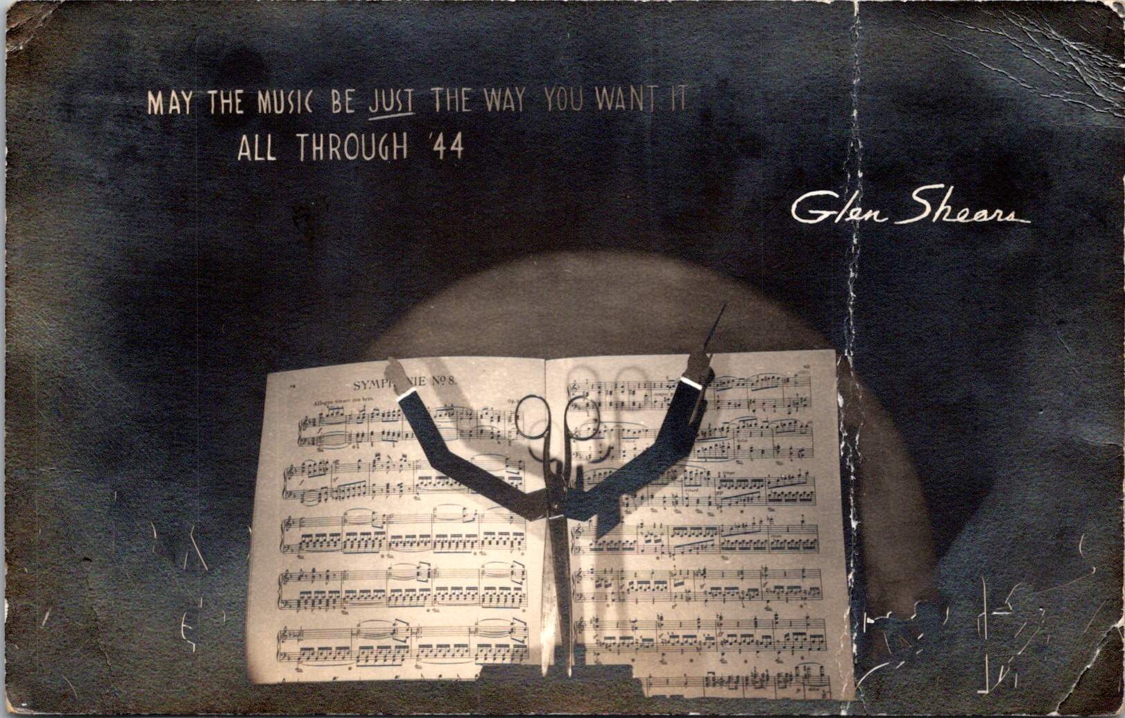
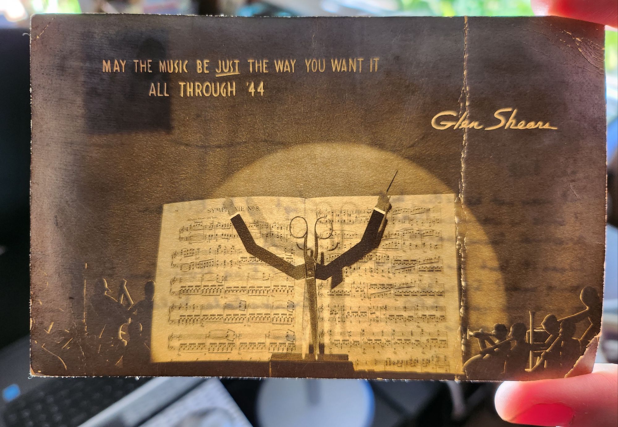
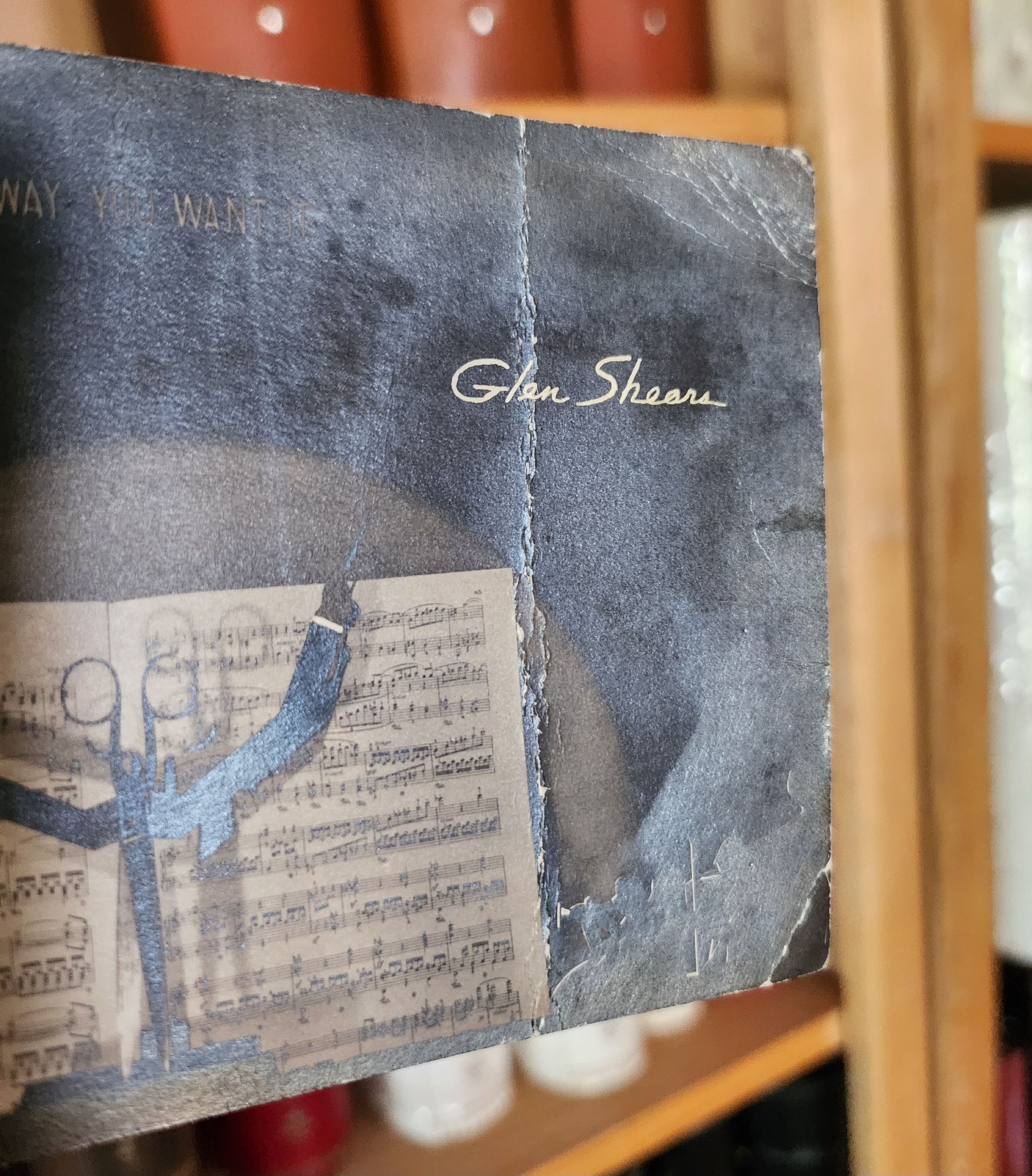
When held up to the light, this 1943 wartime postcard reveals a play on names and a hidden orchestra – but that’s just the beginning of its secrets.
On a dark December day in 1943, someone in Chicago mailed an extraordinary postcard. At first glance, it appears to be a silver gelatin photograph of sheet music and a pair of scissors, artfully arranged and lit. But when held to the light, the card transforms – silhouetted orchestra members emerge from the shadows, and the scissors become a conductor’s upraised arms, creating a miniature theater of light and shadow. The message at the top reads MAY THE MUSIC BE JUST THE WAY YOU WANT IT ALL THROUGH ’44, signed playfully by Glen Shears – a silly pun referencing Glenn Miller, America’s most popular bandleader, and the scissors in the image.
The technical sophistication of this artifact presents an intriguing mystery. Its foundation is a silver gelatin photographic print, created using the same process that Eastman Kodak had popularized with their 1903 postcard camera. But the card’s creator went further, adding to the photograph a second iridescent overlay to create the hidden orchestral scene – a remarkable innovation combining two distinct images. During wartime rationing, when the War Production Board strictly controlled access to photographic papers and printing supplies, the mere existence of such an experimental piece raises questions about its origins.
Two theories emerge: The card might be the work of an individual artist-photographer, one of the creative practitioners who had embraced Kodak’s democratization of the postcard medium. The careful composition, masterful lighting, and precise registration of the overlay suggest someone with both technical expertise and artistic vision.
Or, it could be an experimental piece from the American Colortype Company of Chicago (or one of a handful other production houses) known for innovative printing techniques and possessing both the technical capabilities and wartime authorization to access restricted materials.
But as we look closer, deeper historical resonances emerge. The card was postmarked December 15, 1943, and addressed to Staff Sergeant J.M. Ellison of the 937th Engineer Aviation Combat Battalion at Barksdale Field, Louisiana. The sender’s casual inquiry – “Does it look as if you’re going over?” – hints at the imminent deployment of Ellison’s specialized unit.
The 937th was part of the Army Air Forces’ engineering force tasked with rapidly constructing and maintaining combat airfields. These Aviation Engineer Battalions could build a 5,000-foot runway in as little as 15 days, creating the infrastructure that would support the Allied advance across Europe. Following D-Day, units like the 937th pushed forward with combat operations, often working under fire to establish the forward airfields necessary for tactical air support and troop transport.
The card’s musical theme and playful signature unknowingly connected to another Army Air Forces mission. By December 1943, Glenn Miller had transformed his career from civilian bandleader to Captain in the Army Air Forces, modernizing military music through his Training Command Orchestra. In June 1944, Miller brought his band to England, where they performed hundreds of concerts for Allied forces preparing for the invasion of Europe.
As Allied forces advanced across France in late 1944, Miller became determined to bring his music to the troops at forward bases. He began planning an ambitious series of concerts at the very airfields being constructed by the Aviation Engineers. The precise coordination required for these performances – ensuring runways were operational and facilities ready – meant that Miller’s musical mission and the work of units like the 937th were deeply intertwined.
Here the card’s hidden theater of light and shadow takes on new meaning. The sender could not have known that exactly one year after posting this cheerful greeting – on December 15, 1944 – Glenn Miller would board a small Norseman aircraft in England, bound for Paris to arrange performances at forward bases. His plane disappeared over the English Channel in poor weather, creating one of World War II’s enduring mysteries.
The card’s wish for music “all through ’44” became both prophecy and elegy. Somewhere in France, Sgt. Ellison and his fellow engineers might have been preparing the very airfields where Miller hoped to perform. The innovative combination of photography and theatrical lighting effect, created in Chicago a year earlier, had unknowingly captured the intersection of American technical ingenuity, cultural influence, and the human tragedies of war.
Today, this hold-to-light card stands as both artistic innovation and historical artifact. Whether created by an individual photographer or a commercial outfit, it demonstrates the creative adaptation of pre-war techniques to serve wartime needs for connection and morale. In its transformation from simple photo to magical light-show, it embodied the same spirit of innovation that characterized both Glenn Miller’s military music and the rapid-deployment airfield construction of the Aviation Engineers.
More than just a technological curiosity, the card captures a moment when American creativity – musical, photographic, and engineering – was being mobilized for war. The coincidence of the postmark date and Glenn Miller’s final flight reminds us how individual stories weave together to create the larger narrative of history, sometimes in ways that only become apparent when held up to the light.