A path appears underfoot every year around this time, with a slight softening of the ground and a change in the light. The road is old, but the way is new again.
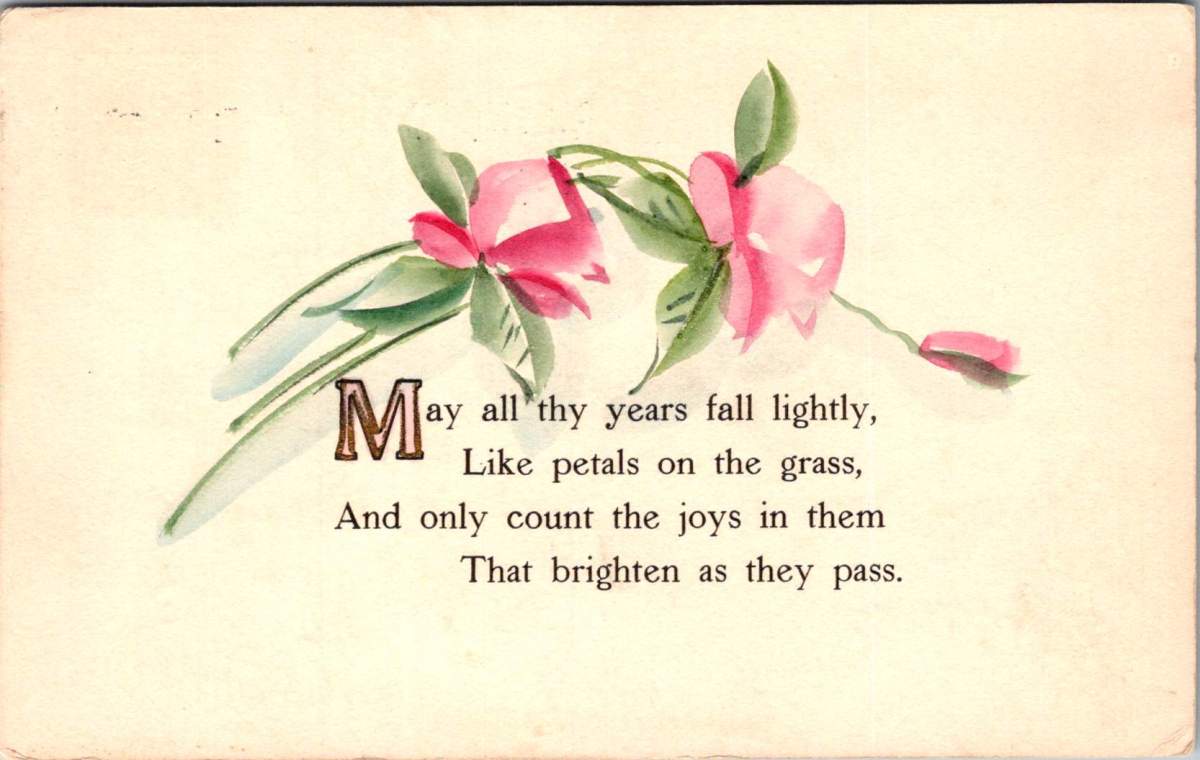
Spring equinox arrives in just a few days, another moment when day and night stand in perfect balance. Nowruz, one of the world’s oldest celebrations, falls on the equinox itself, marking the moment the earth turns toward renewal. Observed for at least three thousand years across Persia, Central Asia, the Caucasus, and the diaspora communities that carry it around the world, Nowruz means new day and it begins precisely at the moment of the spring equinox.
Preparations are meticulous. The house is cleaned from top to bottom in a practice called khane-tekani, shaking out the house, to release the accumulated weight of winter. A ceremonial table is set with sprouted wheat for rebirth, vinegar for patience, garlic for health, and a goldfish in a bowl for life against all odds.
In Chinese Lunar New Year, it is the year of the horse. All the teachings of Ramadan have been quietly observed this month. Christians are entering the heart of Lent, when liturgical colors shift from penitential purple to radiant rose, and the invitation is to rejoice. World traditions share this central wisdom. To walk forward, one must first prepare.
This morning my path runs along Sligo Creek near Washington DC, where the trail follows the water through an old urban forest. The snowdrops are done. Small and white and brave, they came and went in February. Crocuses are finishing now, purple and yellow scattered through the leaf litter. Daffodils line the path in both directions to proclaim the news of spring. Soon the cherry blossoms will arrive, carrying the Japanese mono no aware, bittersweet awareness as beautiful things pass.
For the next few weeks I’ll be traveling. Away from my desk and the collection. Being in motion feels at pace with the season. By early April I’ll be back in Arizona, where spring doesn’t linger the way it does in the East. The desert has its own brief, vivid version of the season. Sharp early light and cool mornings, palo verdes going yellow and the brittlebush blazing.
For me, it’s a time to toss off the heavy winter blankets, move furniture, dust out the corners, and feel all the motivations of the season. The Posted Past is making some new moves, too.
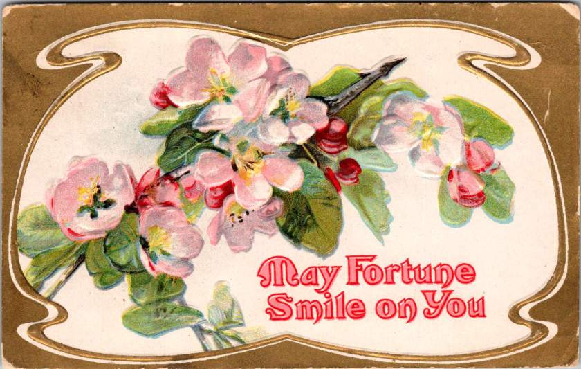
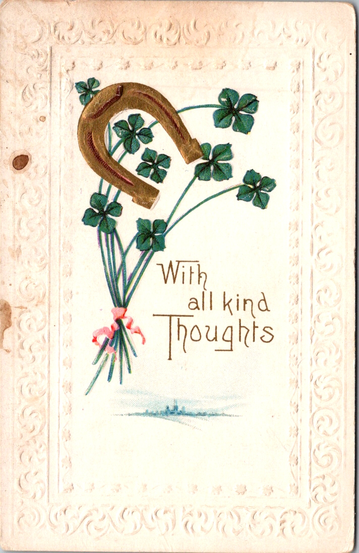
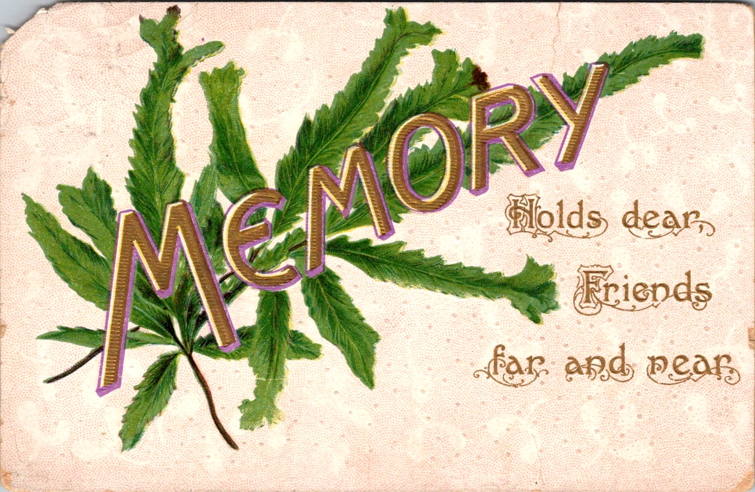
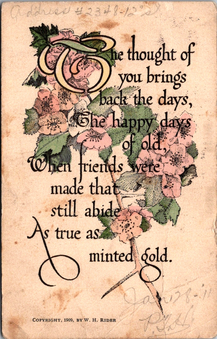
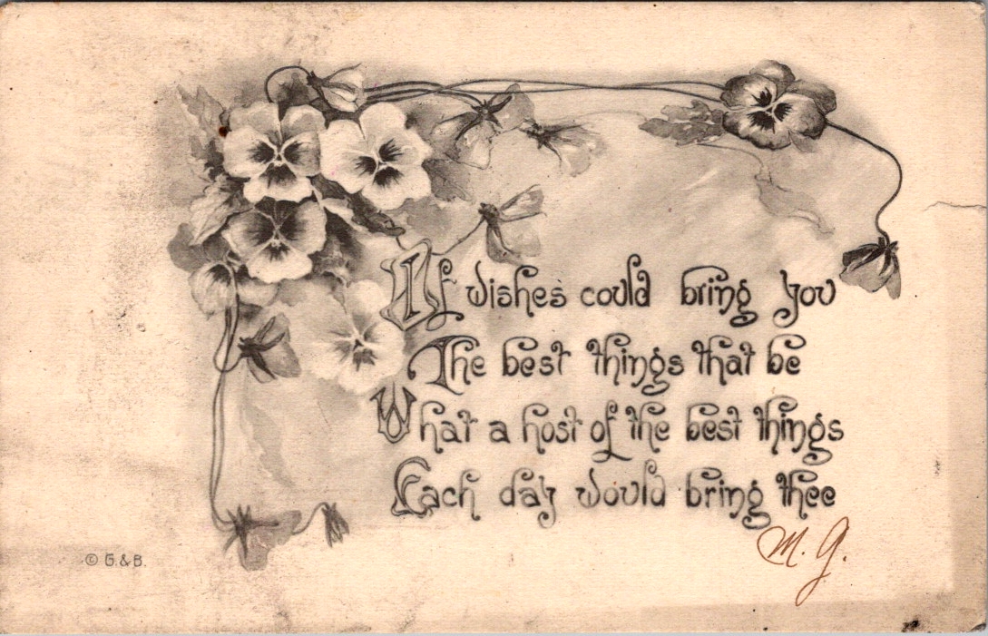
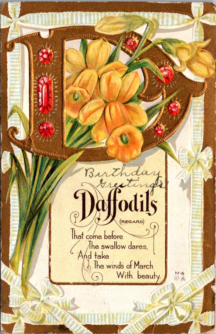
Spring greeting cards are full of flowers and fancy, and the messages give us gentle permission to start again. If you are grass-side up, count yourself among the living and the hopeful. Believe that what comes next might be better.
Take a walk this week, if you can. Clear an old task you’ve been putting off. Set the table. Notice what’s arising in your life. Greet the new day.
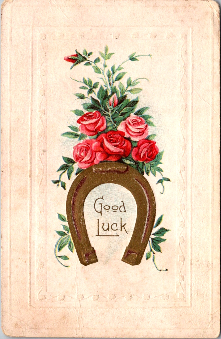
Romans advised that fortune favors the bold. In Sweden, luck never gives, it only lends. In the United States, the harder you work, the luckier you get. The Arabic proverb says, “Throw a lucky man into the sea and he’ll come up with a fish in his mouth.” A Brit might be lucky at cards, unlucky in love. In Japan, the day you decide to act is your lucky day.
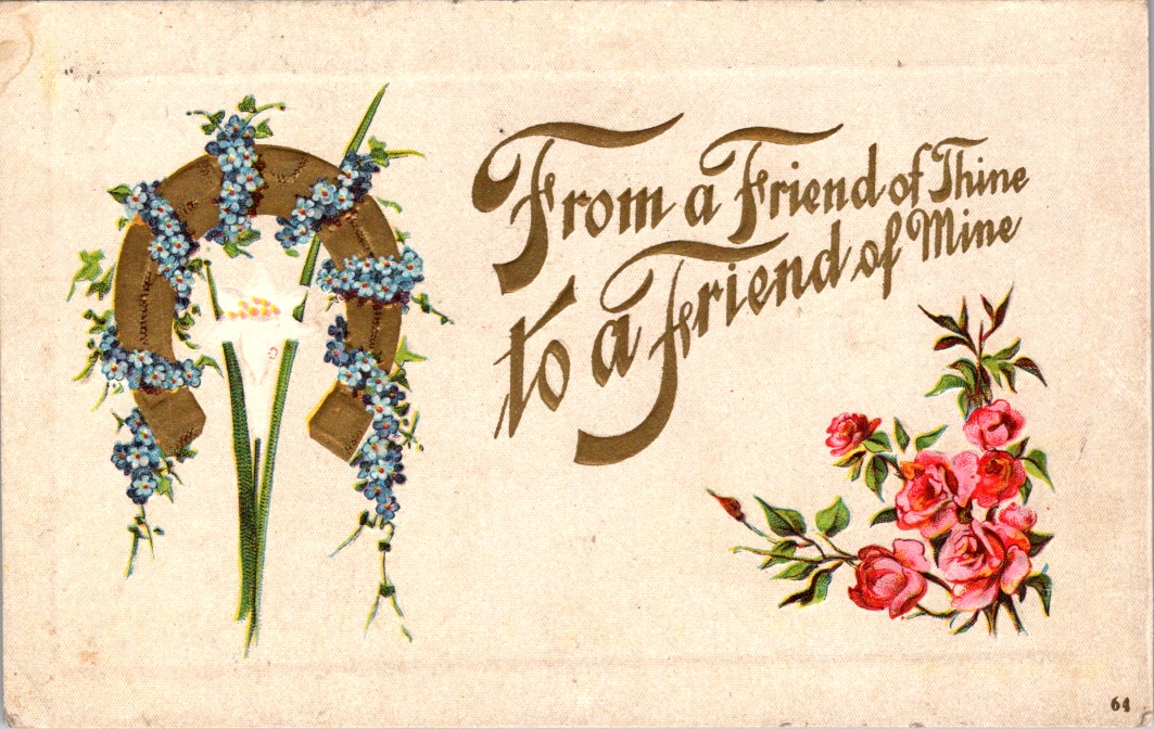
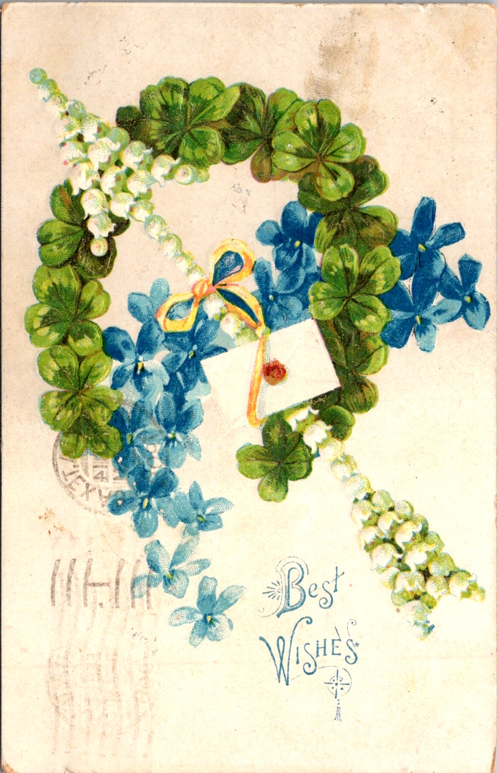
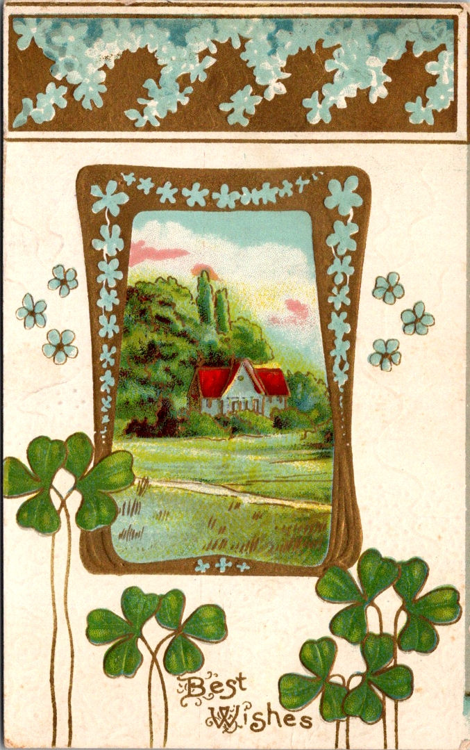
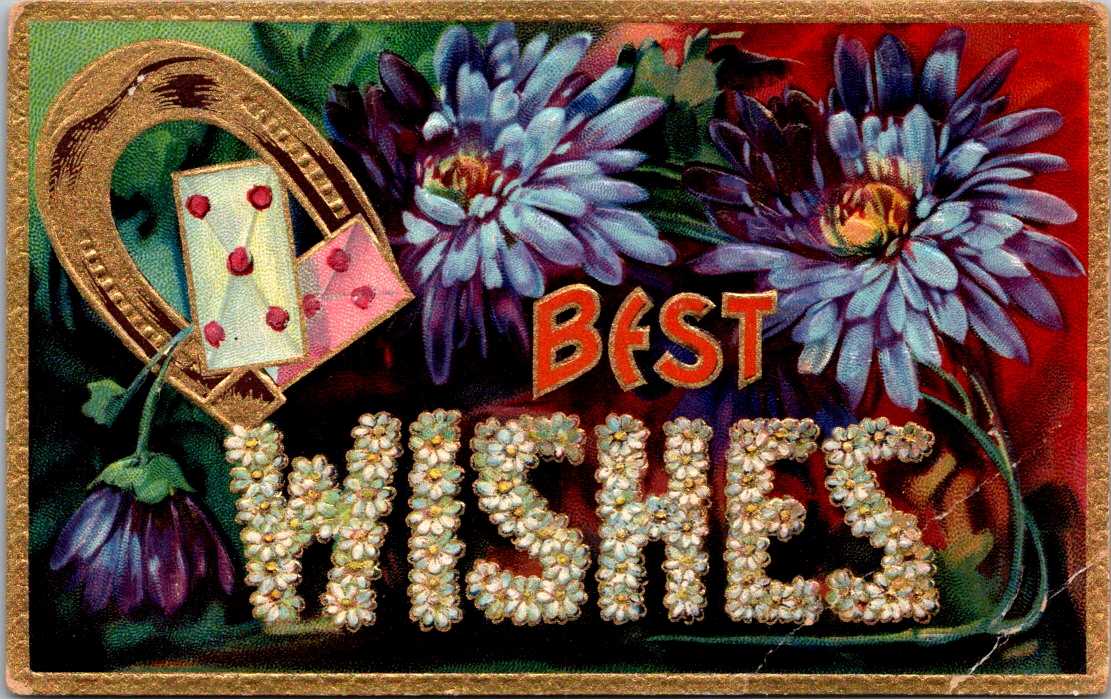
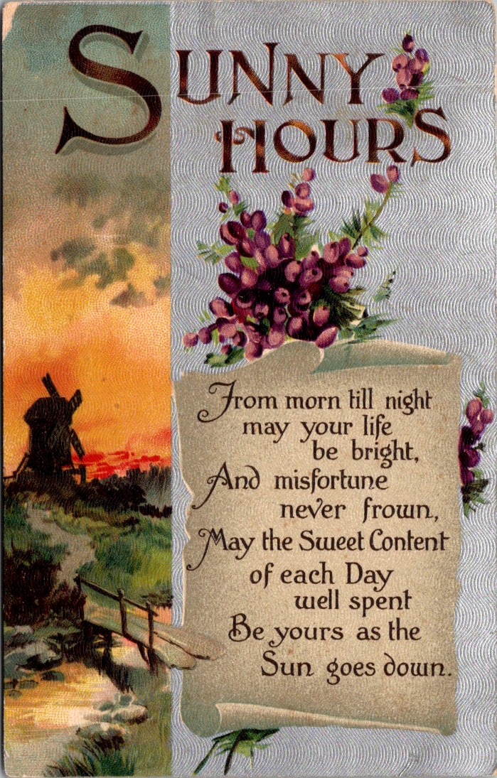
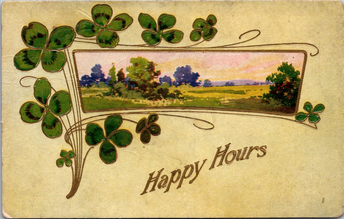
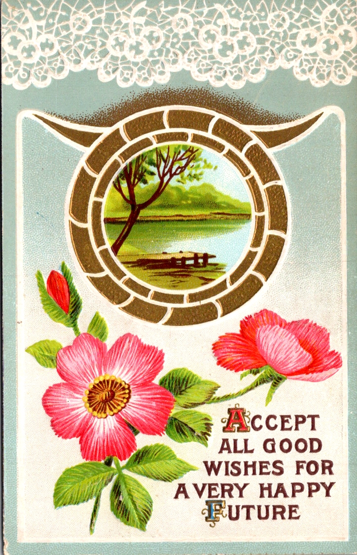
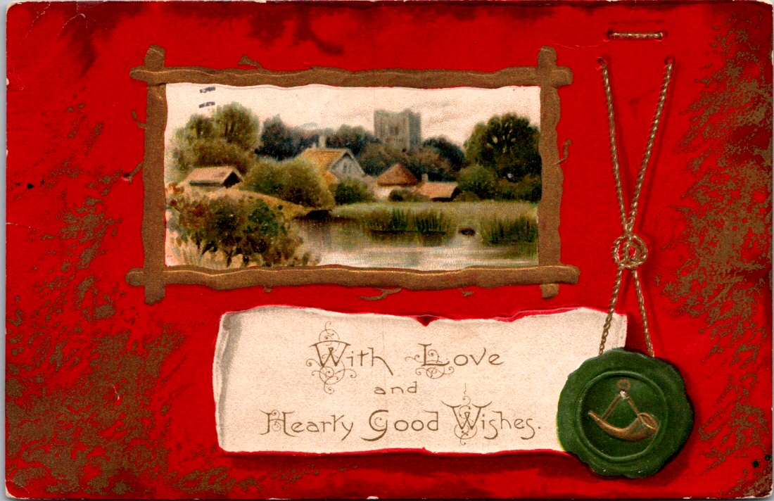
Edwardian postcards had a curious set of symbols to call forth fate and fortune. Horseshoes, shamrocks, roses, and playing cards. Small and slightly worn at the edges, these vintage greeting postcards have traveled more than a century carrying a providential wish.
Only one card in the collection actually says Good Luck. The rest offer best wishes, happy hours, and kind thoughts from me to you. As we’ll see, luck is borne of relationships (and circumstances) lifted by the charitable wish for health, wealth, and wisdom.
Some say that luck can be earned, but only a fool pursues it outright. We daydream about what fortunes may be in store, and sometimes ignore the simple sparkles that appear each day. We know, of course, that there are no free lunches. Yet, we are admonished to never look a gift horse in the mouth.
The bold assume they earned their lucky breaks. The humble suspect they’ve borrowed fortune temporarily. The superstitious are not entirely sure we should discuss it. Luck is where fate and intent find common cause, usually in the context of close friendships.
Old English had no luck. It used wyrd instead, which pointed to fate and destiny. Wyrd is the root of our word weird, which may indicate how people felt about fate. It was uncanny, inevitable, and perhaps divine. You didn’t pursue wyrd. You experienced it through awe and fear.
Somewhere around the 15th century, luk and gelucke drifted in from the Dutch and Low German. Luck was looser and more manual. Like weather, luck favored preparation and was possible to influence if you knew the right charms. The horseshoe went up above the door. The rock went in your pocket. If luck is not fate, if it is not fixed in advance, then perhaps you can do something about it. Perhaps it can be courted.
The lucky person is not the one who waits but the one who steps into the room. This is luck as a reward for courage, or at least for motion. Fate deals the cards, and we each have a hand to play.
Fortune favors the bold — fortes fortuna adiuvat ~ Terence, Roman playwright, around 151 BCE
Luck is what happens when preparation meets opportunity, and preparation is something you control. The solo pursuit of fortune is a genuine drive.
The harder I work, the luckier I get. ~ Samuel Goldwyn
But the shamrock gently disagrees. Four-leaf clovers are natural anomalies, not personal achievements. We can’t earn one, only discover it. Even if you can court luck, even if work and boldness can pull it toward you, it is never yours to fully command.
Luck never gives; it only lends. ~ Swedish proverb
Some people simply have it, inexplicably, in ways that have nothing to do with preparation or boldness or a rabbit’s foot.
Throw a lucky man into the sea, and he will come up with a fish in his mouth. ~ Arabic proverb
Some observe that luck is a finite resource and can be unwisely traded away. This may or may not be true, but as a matter of human priority it is clarifying. We each get chances to test our luck.
Lucky at cards, unlucky in love. ~ English proverb
The tension between fate and will, between earned luck and divine luck, is located in a moment of commitment. The lucky day is not the day something falls in your favor. It is the day you decide it might be worth the effort.
The day you decide to do it is your lucky day. ~ Japanese proverb
Whatever the senders intended and however the recipients replied, these cards demonstrate how providential language holds us together in anticipation of something wonderful just ahead. The possibility that things might go our way.
The symbols of luck nested together in relationship, in abundance, in the living world — a horseshoe wreathed in flowers, overflowing with roses, or flanked by shamrocks — is not an accident of Victorian design sensibility. It draws on the ancient wisdom that friends are the true source of life’s lucky breaks. Love does the work and luck gets the credit.
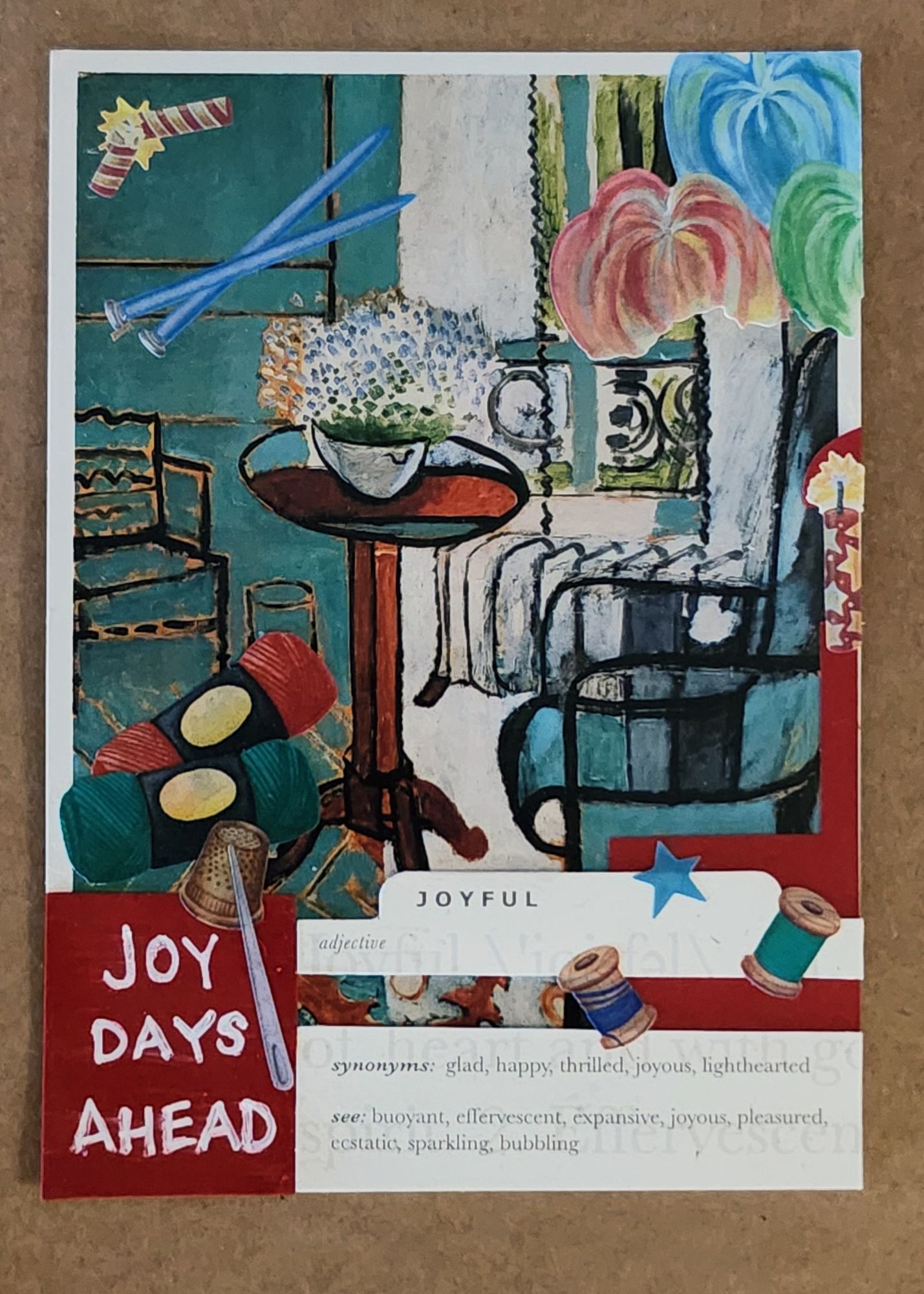
A picture is worth a thousand words, which can be tough news for a writer. Art cards are a peaceful place for me to be while sorting through storylines. Here for you with a link to the accompanying essays, as they come along.
Dial into this easy listening station from your heart.
In the quiet hours after he died, I heard Dad’s voice clear as a bell inside me. Left chest, near my heart, broadcasting from a heavenly radio station.
He’s not an advice line. More like a tinkling piano in an airport lounge where it’s always sunset or sunrise somewhere.
It’s not just him. My grandmothers have a talk show, conspiring on our behalf from the front porch of a woodsy cabin. Some of my aunts are traveling the span of the universe on magic carpets, and sending back reports.
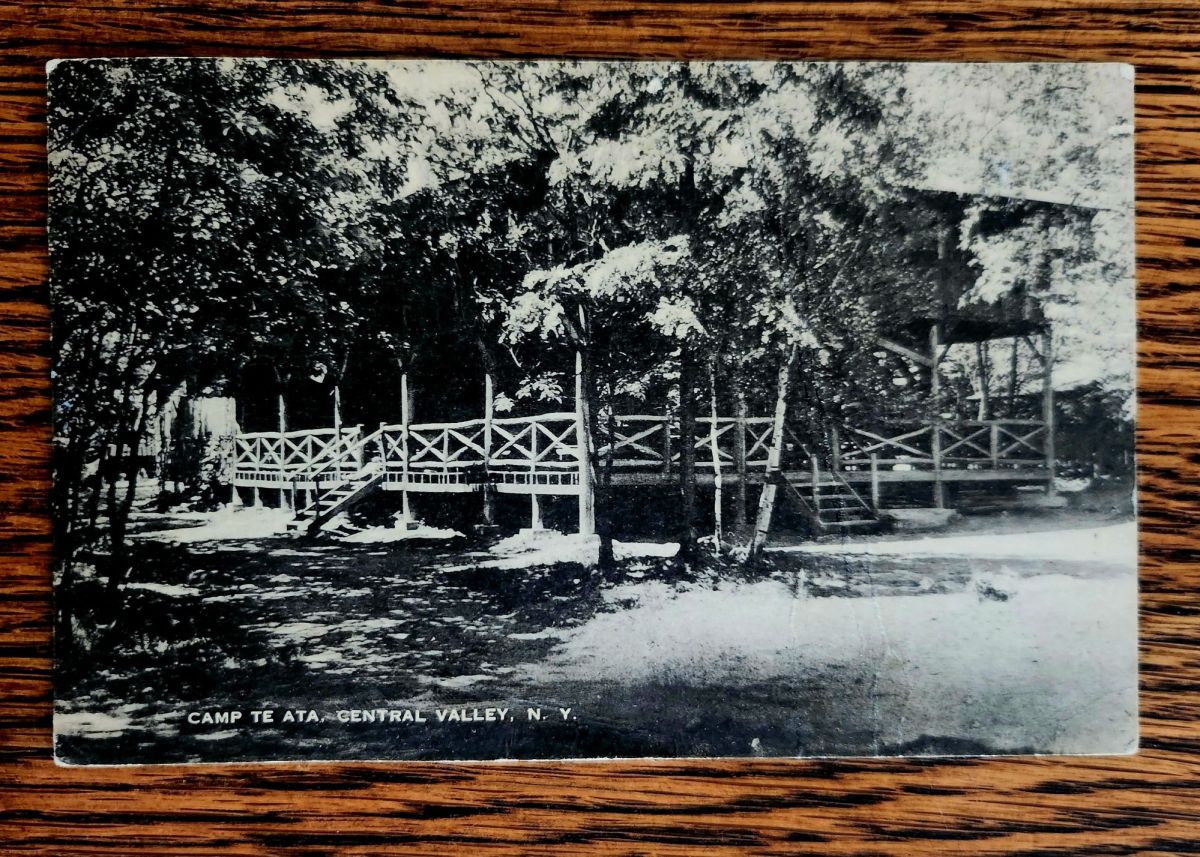
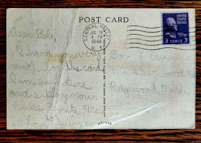
Dear Bob, Thank you very much for the card. I am in nature and a play now. Please Write Me. xo xo Love Sally xo
Sally writes to Bob from stayaway camp in upstate New York
Ancestors Radio is on in the background all the time. I put on piano music in the house to dial in. Humming along and half-listening, I grasp what I can, especially as it relates to family stories and postcards. Little magic carpet rides, too.
We’re into a new season of wonder, now. Awe is on the air. Stay tuned!
Holiday Gifts Under $15
A Book of Postcards Makes a Great Gift!Send Love from AZ this Season!
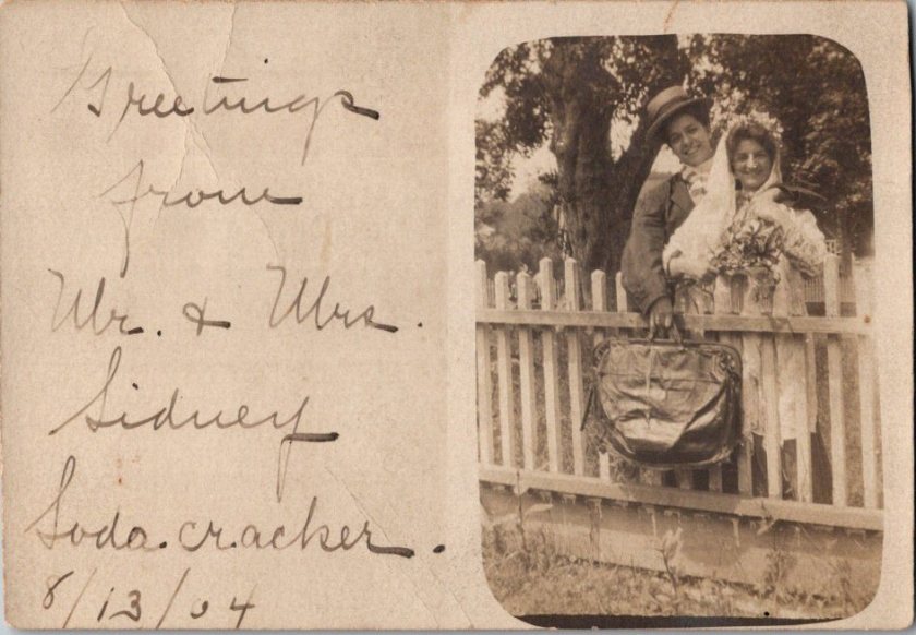
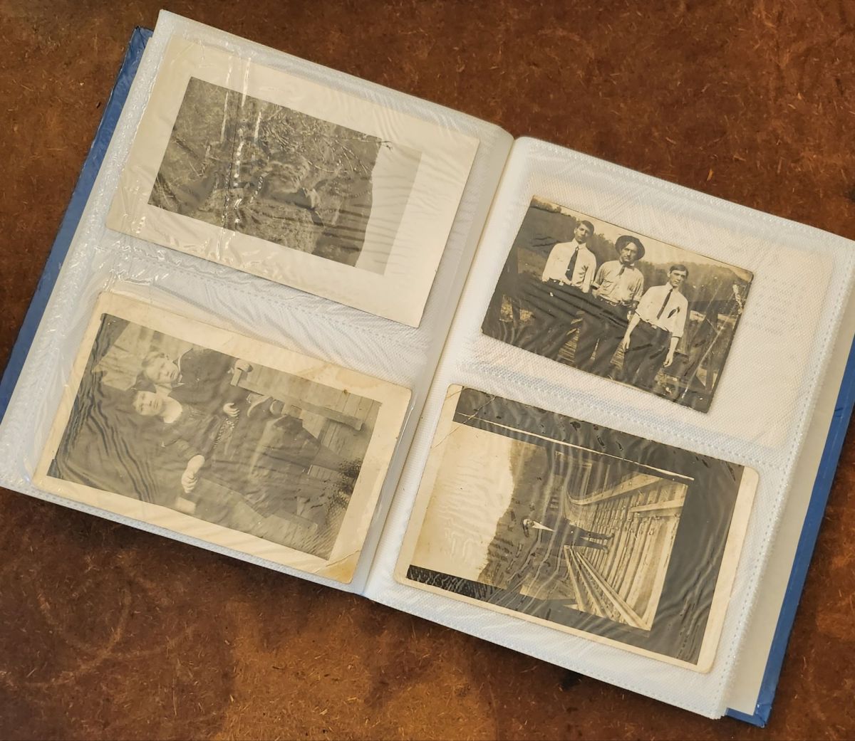
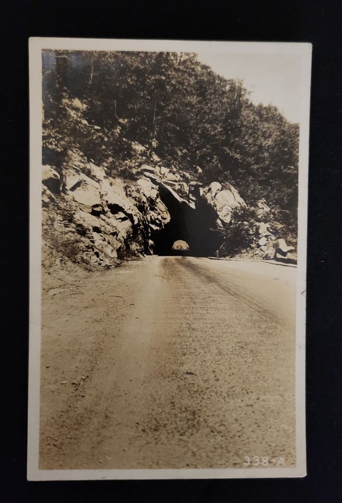
One enigmatic postcard album is my companion for the next three weeks. Pages of rare black & white photos tell of people, places, and property, but with scant details of who they are, where they are, or what is happening. The past is present in these images, but not at all reliable.
It may seem too obvious to point out, but postcards move around over time. Cherished memories first organized in a new, handsome album sit in the front room for a decade or more before migrating to a study drawer, a garage, or a dusty attic.
If the album is later unearthed or given away, a collector might save it as an artifact of a bygone time. Or, they could pull it apart (mercilessly) to be sorted again into categories by geography or historical era.
After one collector is gone, the sifting and sorting can be nonsensical and misleading. Storylines get separated, and suddenly history relies on little more than a few questionable clues.
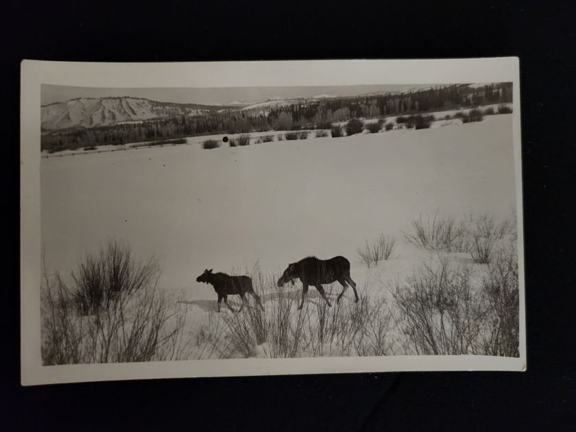
Landscapes get lost first, along with the creatures that inhabit them. The wolf, the moose, the fawn, and the prairie dogs in the snow were known only briefly to the soul who got the shot. To us, they are familiar ghosts.
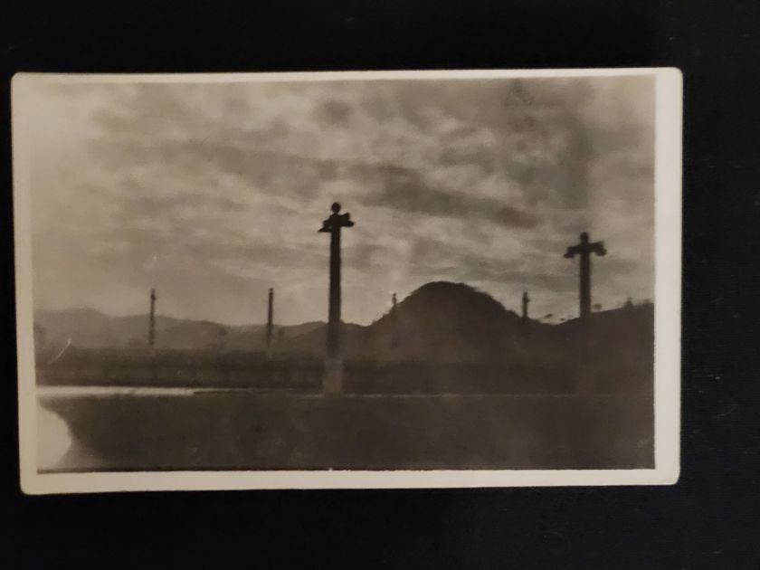
And, what about the trees, the lakes, the frozen road, and the sandstone tunnel? I know they were likely loved in their day. Still there? Maybe. The tunnel could elicit some belabored guesswork. But, why?
I’ll be walking in the trees quite a bit in the next three weeks, taking pictures that I will share liberally on social media and won’t label properly. I doubt it would bother you. After a century or so, we can live with anonymous scenery and abstract wildlife. A picture can lose its place.
But, there is a certain creative tension ahead when it comes to people and property. The desire for a real story gets stronger, to find the ‘where’ there. Who are they, and what can they say about us now? Despite the lack of evidence, we can’t help searching. Stay tuned.
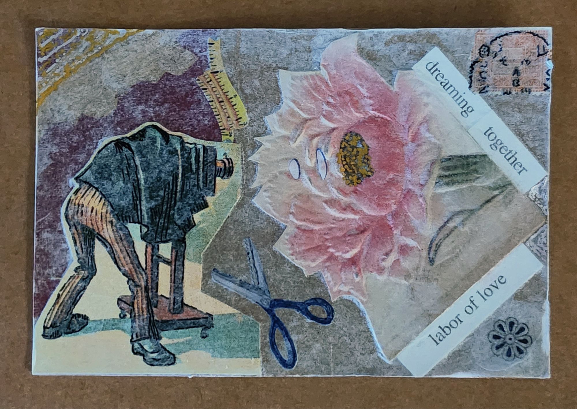
Dad is onto his new adventure in heaven, and an art card is just one way to say farewell.
Weeks like this are worth recording in words, and the promise still stands to write more about Dad. But the sweet relief of an art card is another way to grieve.
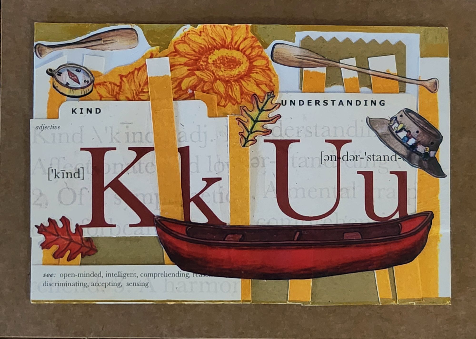
I made this card over at my brother’s place last weekend with close family and in comfy clothes. Different from the formal program or my remarks at his funeral today, this was a chance to love simply with heart and hands.
It’s true that Dad was kind and understanding, and I did pluck from the supply box some bits and bobs that would work. But the magic mashup happened there at the table, with the conversation zigzagging across the room, and a chance to say it all the Kansas colors he loved. I did take some creative license; he had a hat just like that but never a canoe.
While postcards are printed by the millions, an art card is only ever itself. Unique, like each of us. Admired, just as it is. Always a chance to find meaning in the odd remnants of this life we love.
Room enough for all of us to go from here to there, and back again.
Featured Postcard~ New Orleans French Market A CENTURY AGO
An early 20th century scenic postcard showcases the iconic French Market in New Orleans’ French Quarter.
Front of the card: The photograph shows the vestibule of the historic French Market, featuring tall, weathered French/Creole Colonial columns supporting a slatted roof. Perspective draws the eye down the long corridor, emphasizing the market’s impressive scale. The covered walkway displays produce, baskets, and merchandise on tables and in crates. The image captures a rare moment when the hallway of vendors face the camera. Hand-colored rose tones reflect the market’s timeless atmosphere with pops of green and blue artfully applied. Caption: Vestibule, French Market, New Orleans, La.
Back details: The left panel explains the market’s history:
This card shows the interesting old columns erected, 1822. While the roof of the market has been repaired many times, the old columns have stood as originally put, without fire aid to the injured.
Published by Lipsher Specialty Co., 320 Magazine St., New Orleans. Standard divided back format with decorative script and postage rates listed: Domestic One Cent, Foreign Two Cents.
Historical significance: The postcard documents the French Market’s appearance in the early 20th century. Established in the 1790s, the market served as a vital commercial hub where vendors sold fresh produce and handcrafted goods. Instructions to “Take French Market car from Canal St.” reflects the streetcar system and emphasis on tourism. This postcard dates to 1922-1925, based on combined evidence of one-cent postage, the specific streetcar reference, and hybrid halftone-collotype printing (Aquatone process was patented in 1922).
Condition and Appeal: The card displays excellent color saturation, with clear and interesting details and minimal defects. Tiny nicks on two corners, with yellowing on the reverse typical of age. Image and text provide valuable historical context, appealing to collectors of New Orleans memorabilia, architectural history enthusiasts, and those interested in early 20th century American commerce. The French Market remains active today, making this postcard a fascinating glimpse into its enduring legacy as a cornerstone of New Orleans culture.
Today’s Art Card & Gallery
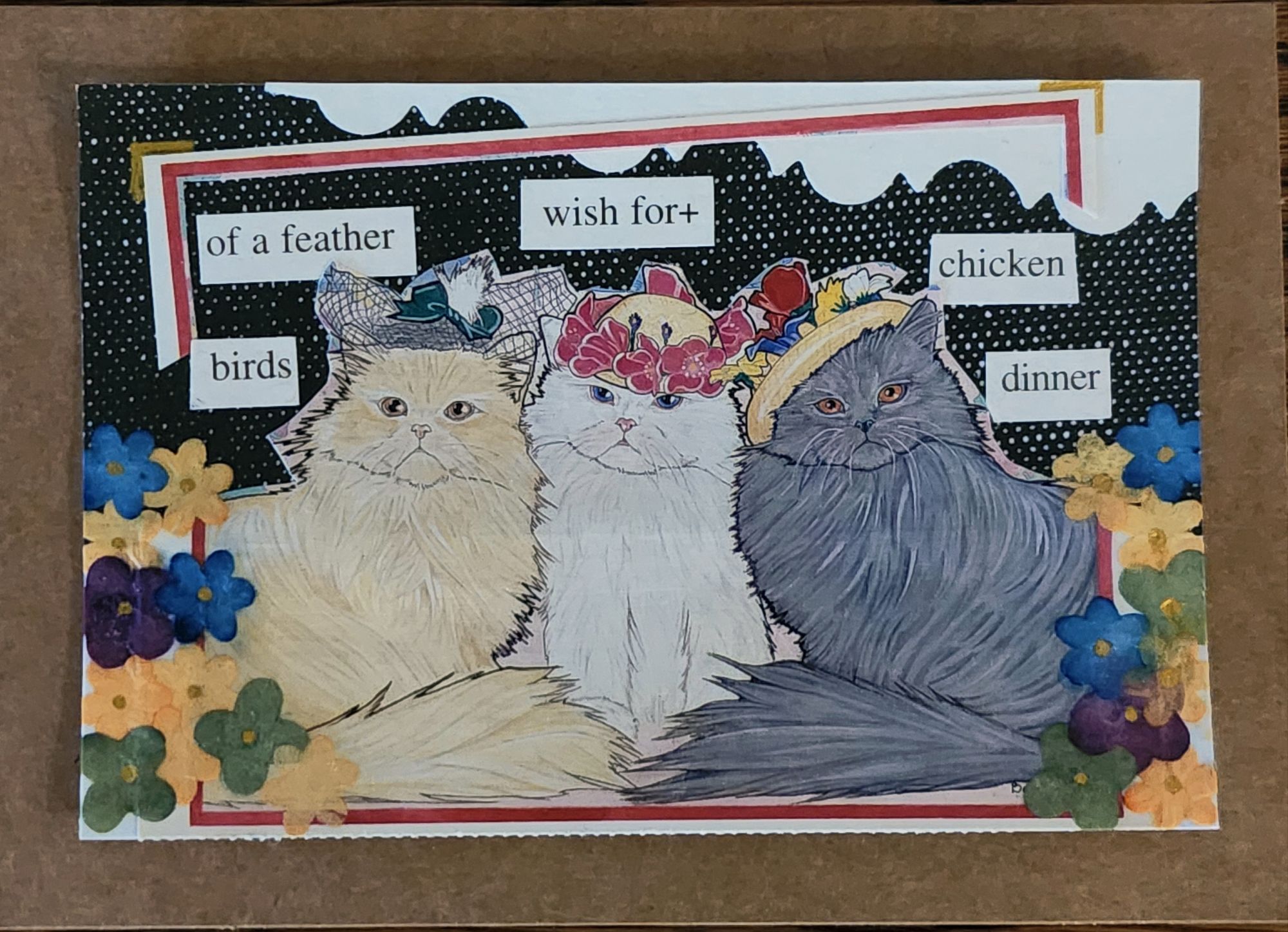
The gallery features Landscapes by Larry L’Ecuyer, and here is a fun art card from Anne this week. Winner, winner, chicken dinner!
open call for art cards!
The World’s Smallest Artist Retreat (our P.O. Box) is awaiting your art card submission. Details here!
Art card kits ~ gift or fun for you!
Our Art Card Kits are perfectly-packaged as a fun, creative activity for you and a friend to complete in as little as an hour or made into a lovely afternoon.
Here we go! The Posted Past heads into the fall season with rare cards, a new gallery, and a social mission to trade loneliness for connection.
featured postcard~ rare novelty card still holds a mystery
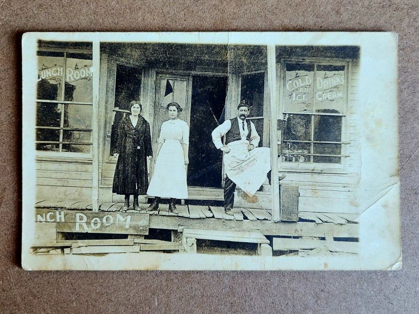
An early 20th century novelty postcard featuring humorous photography and personal correspondence from Missouri.
Front of the card: The photograph shows a young Black man in white shirt, suspenders, and dark trousers, grinning while holding a large broken umbrella overhead in a playful pose. Below reads the humorous caption “A little disfigured, but still in the ring”—typical novelty humor from the postcard craze era. A black border frames the photograph on cream cardstock.
Back details: The reverse bears “Carbon Photo Series No. 513” identifying the commercial publisher’s series. Addressed to Miss Grace Skillman in Pleasant Hill, Missouri, with a green 1-cent Franklin stamp and clear 1908 postmark. The handwritten message describes an exhausting early morning wait in Lee’s Summit for “Brother and Frank,” and promising a longer letter that evening.
“Still in L.S. haven’t slept but about ten minutes. My eyes looks like two burnt holes in a blanket. Brother and Frank hasn’t come yet. I will wait till 7.30 and then go home. Will write tonight. Just finished my breakfast. I will eat if not sleep. I got here ten till five.
Condition and Appeal: The sepia-toned image displays characteristic early photography with some age spots, and a nicked corner. The image and reverse side remain in good condition with clear photography and legible handwriting. The “Carbon Photo Series” indicates premium production using carbon-based printing methods prized for superior image quality and archival stability. Grace Andre Skillman was born in Pleasant Hill in 1889, making her nineteen when she received this card. The message and the lack of formal salutation and signature suggest this is casual ongoing family correspondence. As a result, the author of the postcard remains a mystery.
Vintage novelty postcards are increasingly collectible, especially numbered commercial series with documented recipients. Collectors of African-Americana may find the image appealing and relatively rare. The combination of carbon printing technology, humorous subject matter, and personal correspondence is of interest to collectors of vintage photography, postcard enthusiasts, genealogy researchers, and those focused on early 20th century American social history and communication.
Introducing~ The Posted Past Art Card Gallery
A selection of Larry L’Ecuyer’s watercolor landscapes are on display in our Online Art Card Gallery. Fitting as our first show. Enjoy!
Countdown to a Lakeside Getaway, 2025, Larry L’Ecuyer, watercolor on postcard
NEWS & UPDATES~ art card call for submissions is open
The World’s Smallest Artist Retreat (our P.O. Box) is awaiting your art card submission. Follow one rule to join the next open show. Details here!
Art card kits now in stock
Our Art Card Kits are perfectly-packaged as a fun, creative activity for you and a friend to complete in as little as an hour or made into a lovely afternoon.
The kit includes two postcard blanks, six vintage finds curated to the chosen theme, and a bundle of collage goodies for your whimsy. There is a free gift inside, too!
Once you’re done, surprise someone with an original art card in their mailbox. Or, send it back to us to include in the next online show. Either way, you’ll have cultivated a little joy in your garden.
Words to heed and repeat, and a life’s work to regard.
George Washington Carver Educational Postcard
This vintage educational postcard (likely printed in the mid-1960s) features quotations from agricultural scientist George Washington Carver (1864-1943), displayed on an exhibit at George Washington Carver National Monument. The card presents Carver’s thoughts on success, preparation, and nature alongside his portrait. Carver, born into slavery, became a prominent botanist and inventor who developed hundreds of uses for crops like peanuts and sweet potatoes while teaching at Tuskegee Institute for 47 years.
I love to think of nature as an unlimited broadcasting system, through which God speaks to us every hour, if we will only tune in. — George Washington Carver
The George Washington Carver National Monument, established in 1943 near Diamond, Missouri, was the first U.S. national monument dedicated to an African American. Located at Carver’s birthplace, it preserves his legacy and the 1881 Moses Carver house where he lived as a child. The National Park Service now manages the 240-acre nature preserve and historic site.
The summer slow-down is coming to a close, and The Posted Past is launching into a new phase as a social enterprise. On Wednesdays, you’ll still receive a weekly wander through postcard history, along with a new focus on rare cards, and a regular review of the art cards we receive at the World’s Smallest Artist Retreat (our P.O. Box). More inspiration as our circle expands. Wisdom, wisecracks, and butterfly wings. See you in September… next week!
These vintage postcards from the 1972 Tourism Year of the Americas reveal fascinating questions about natural landscapes, heritage, monuments, and whose stories we remember and tell.
In summer 1972, the United States Postal Service issued commemorative postcards that would become enduring symbols of national identity. These postcards, part of the Tourism Year of the Americas campaign, featured iconic destinations with restrained elegance—their two-color printing was both artistic and economical. As America stood at a cultural crossroads, this postcard set tells a familiar American story. More than five decades later, they reveal even more about how a nation sees itself.
Commemorative Moments
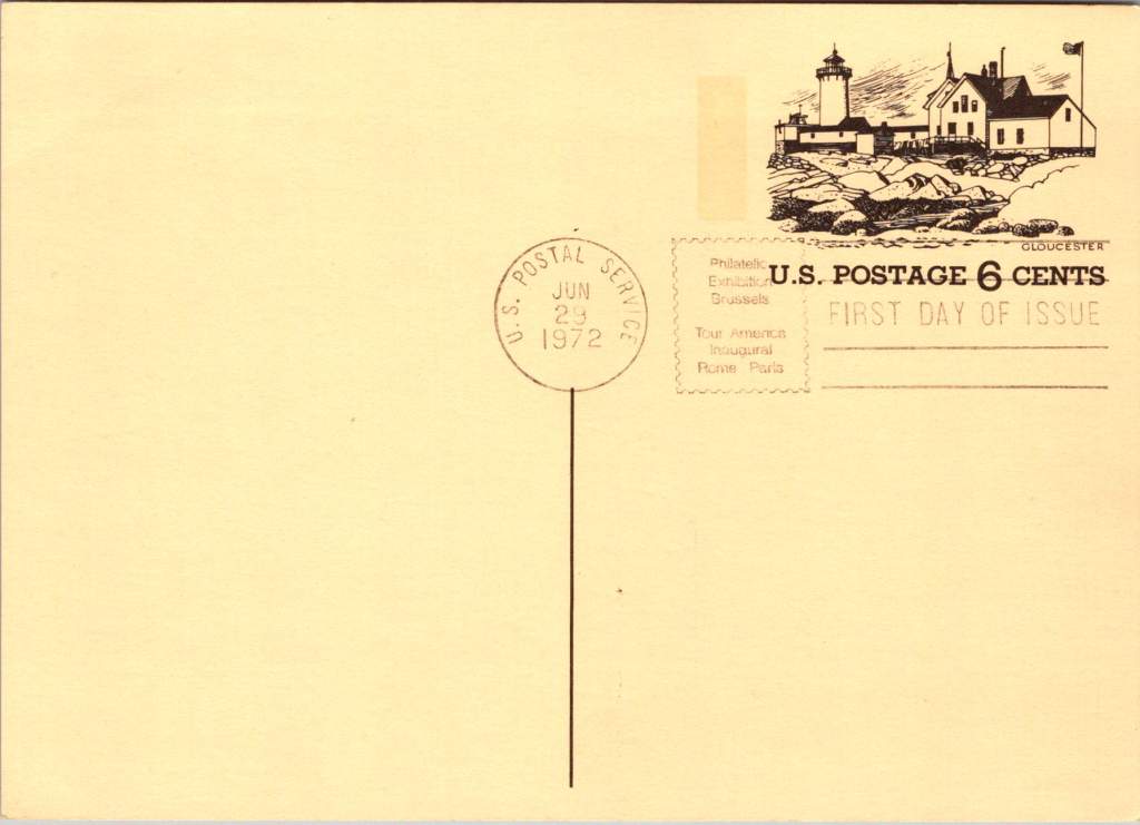
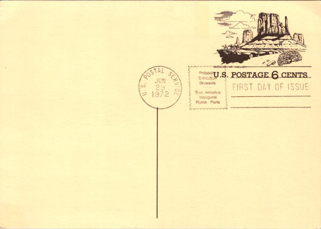
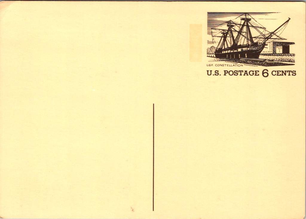
First Day of Issue cancellations mark a special moment in time, and signal that an item is expected to be collectible. The postcards were cancelled on June 29, 1972, bearing the commemorative text “Philatelic Exhibition Brussels” and “Tour America Inaugural Rome – Paris.” These international exhibitions promoted American tourism during the Cold War, when cultural diplomacy served as essential soft power.
The carefully designed cancellation artwork includes USS Constellation (6¢), Gloucester (6¢), Monument Valley (6¢), and Niagara Falls (airmail 15¢). These rates reflected the newly reorganized United States Postal Service which had become its own entity the year prior. The 1972 Tourism Year of the Americas was an ambitious initiative from the new quasi-independent agency, emerging alongside Nixon’s opening to China and détente with the Soviet Union.
USS Constellation, the last sail-only warship built by the U.S. Navy (1853-1855), served as flagship of the Africa Squadron from 1859–1861. The ship captured three slave vessels, enabling liberation of 705 Africans. During the Civil War, Constellation deterred Confederate cruisers in the Mediterranean. The selection represented naval heritage and anti-slavery efforts, though it still centered the naval victory rather than those who gained freedom.
Niagara Falls has attracted visitors for 200 years, becoming the symbolic heart of American tourism. The 1883 Niagara Reservation became America’s first state park, influencing national park creation. Current visitor statistics show enduring appeal: 9.5 million tourists visited Niagara Falls State Park in 2023, with the region welcoming 12 million visitors yearly.
Monument Valley reflect the West’s central role in national identity by 1972, immortalized through Hollywood and environmentalism. Yet Monument Valley sits within Navajo Nation territory, while Grand Canyon encompasses land sacred to multiple tribes, including the Havasupai, whose reservation lies within park boundaries—reminders that park creation displaced Native communities.
Gloucester, America’s oldest seaport, sustained coastal communities for centuries. The lighthouse image evoked both practical maritime safety and romantic notions of New England’s rocky shores, while Gloucester’s working harbor embodied the intersection of heritage preservation and living tradition. By 1972, this historic fishing port faced the tension between maintaining its authentic maritime culture and adapting to tourism pressures—a challenge that made it a fitting symbol.
Artistic Vision
The front of the postcards render multiple iconic American locations in distinctive engravings in an economical two-color print run, an important factor for a the government printing office.
The collection showcases a deliberate balance. Yosemite represents natural power and America’s first national park. Missisippi Riverboats and the Rodeo embody western majesty central to national imagination. DC Monuments offer overt patriotism and Williamsburg and the Liberty Bell connect to the tremors and tolls of colonial democracy.
Even in 1972, these were selective narratives. All featured natural sites exist on traditional Indigenous lands, for example, while largely omitting Indigenous perspectives and enslaved people’s contributions to our cultural histories.
Many featured locations are sacred sites to Indigenous communities. Some of the most sacred places for American Indian nations are located in national parks, yet access to holy ground remains contentious. Park creation often involved displacing Native peoples from lands they had stewarded for millennia.
The year 1972 was tough in other ways: Vietnam War divisions, emerging Watergate scandal, and generational alienation over the military draft. These postcards presented a different kind of unity. Rather than contemporary political divisions, they emphasized natural wonders and historical sites that transcended partisan conflicts.
During the Cold War, these postcards served as miniature global ambassadors, too, often providing people’s first visual encounter with American landmarks. They projected America as worthy of visiting and learning about, countering negative impressions from political controversies.
The postcards themselves embody crucial democratic principles: making heritage accessible through affordable media; connecting tourism to conservation through revenue and public appreciation; and revealing how commemorative choices reflect national values. The geographic diversity suggests a desire for the fullest of American experiences, though these 1972 selections still privilege certain narratives.
New Memories
These postcards continue to offer insights into American values and heritage preservation evolution. USS Constellation still serves as a museum ship in Baltimore’s Inner Harbor. National parks have experienced tremendous visitation growth, raising questions about balancing access with preservation.
In what they don’t depict, the postcards show gaps in whose stories get told, whose lands get celebrated, whose experiences get centered. While 1972 selections emphasized traditional narratives, contemporary views increasingly include previously marginalized perspectives, acknowledging Indigenous heritage alongside colonial and national stories.
These artifacts remind us that commemorations reveal values and priorities. As our historical understandings evolve, it’s wise to look back and look again.