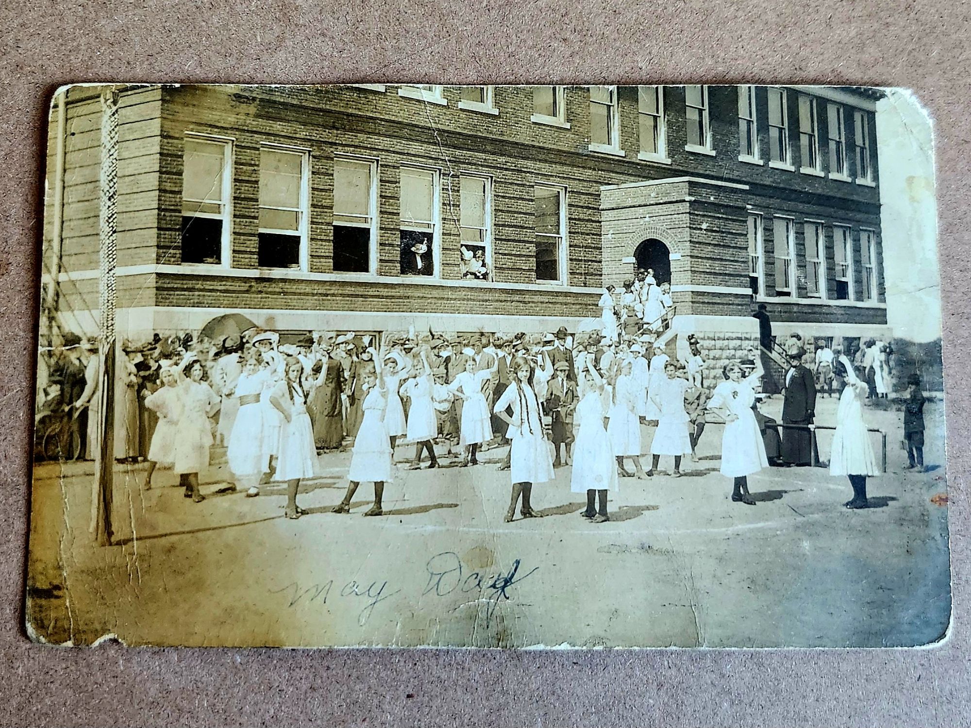
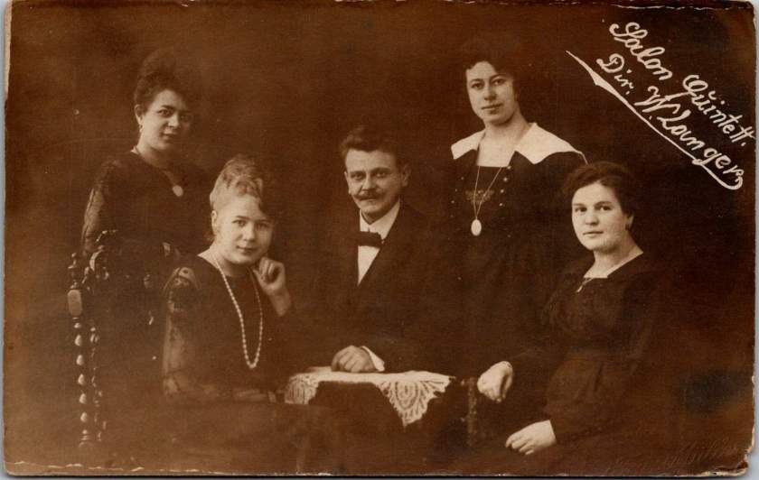
Last week, buildings emerged and oil derricks erupted. Evidence accumulated, context implied. An unknown town takes shape and we surmise. Now, people stare across a century and time flies.
Seven adults carefully arranged on a rocky outcrop. Three men, four women. Two children in white dresses seated in front. Twins? Cousins? Someone operated the camera.
We see the composition and relational questions arise. Are they family? Kin? Friends on an outing? Do the poses suggest occasion, or documentation?
Evidence ends and story begins. We fill in by reading subtle cues in how they stand, who touches whom, which faces seem to fit together. Clues come quietly and mistakes, too. Always, we’re revealing ourselves.
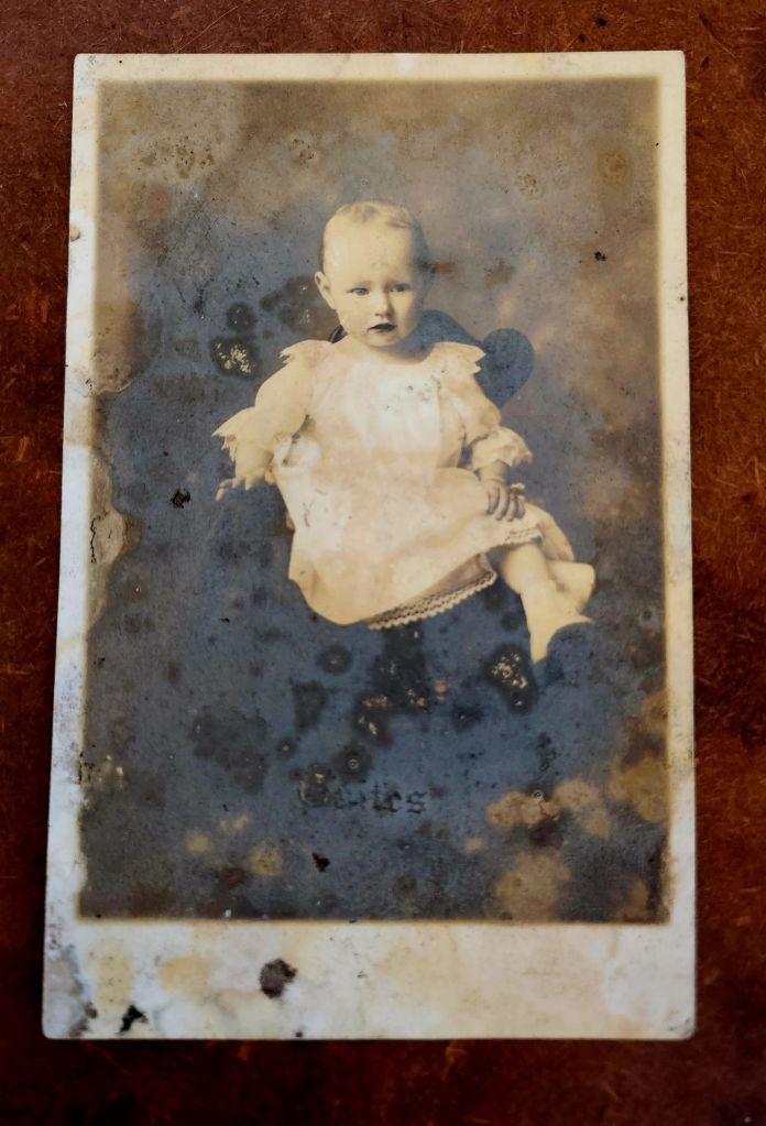
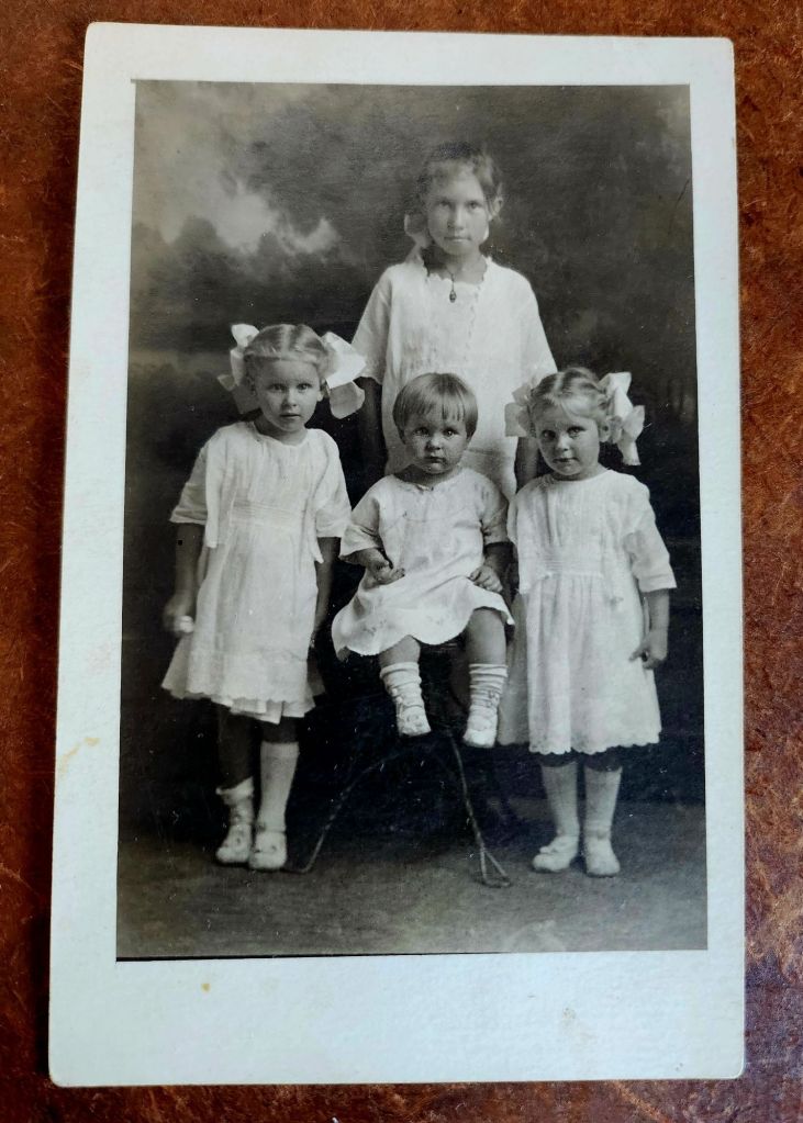
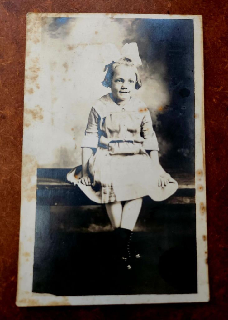
Here we see one girl, three moments, and years passing. The baby stares out with solemn intensity. Then she’s older, on a throne in white dress, commanding the frame. Finally she’s the eldest of four, and her protective gaze tells all.
The postcards show her time moving, roles shifting. She grows and gains presence. She becomes a big sister, then a bigger sister still.
The postcards show the sequence and the story intrudes. We can safely assume the scenario, the kinship, the birth order. But then we imagine her. She and her siblings stand as evidence. We provide the narrative.
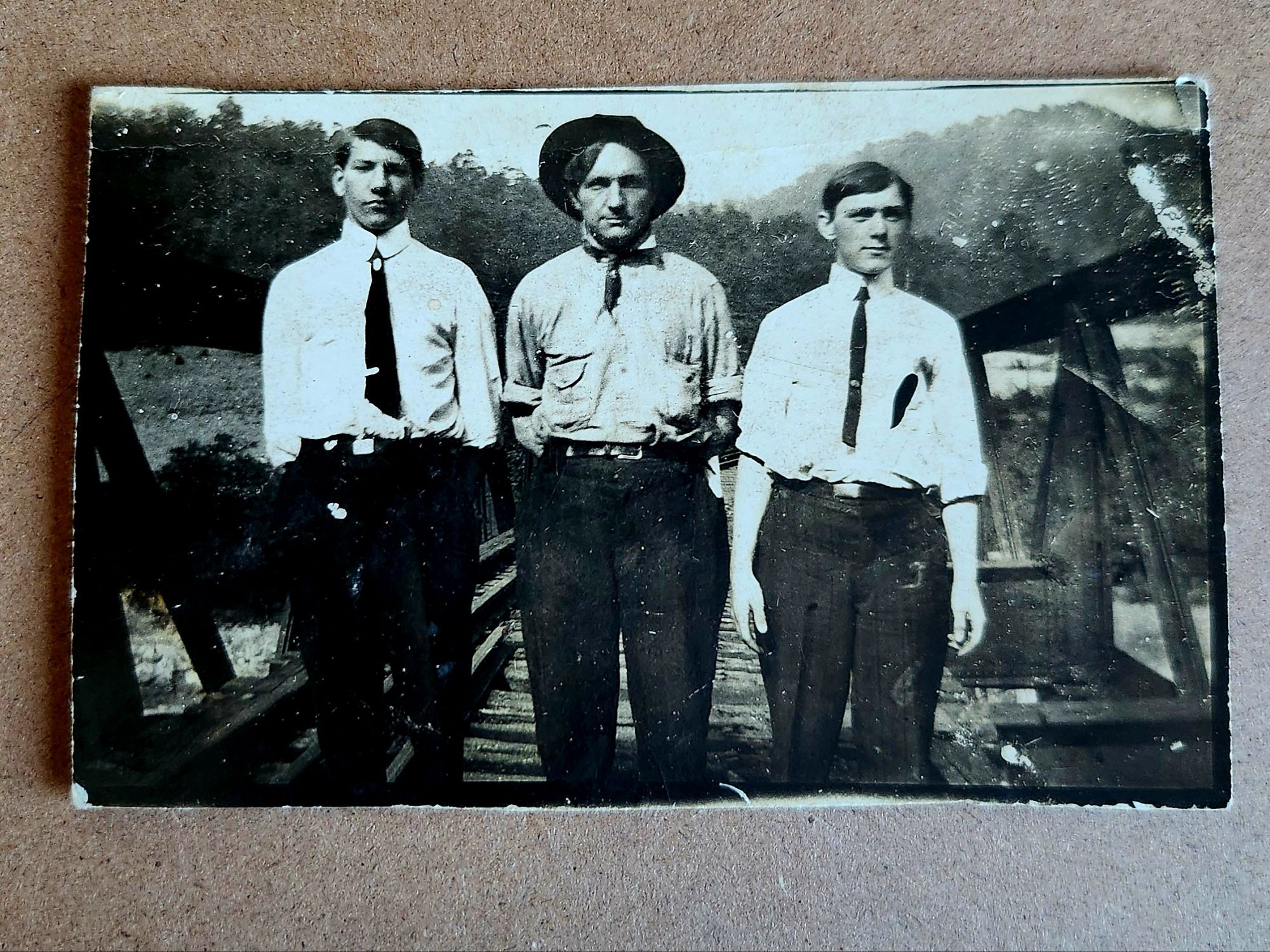
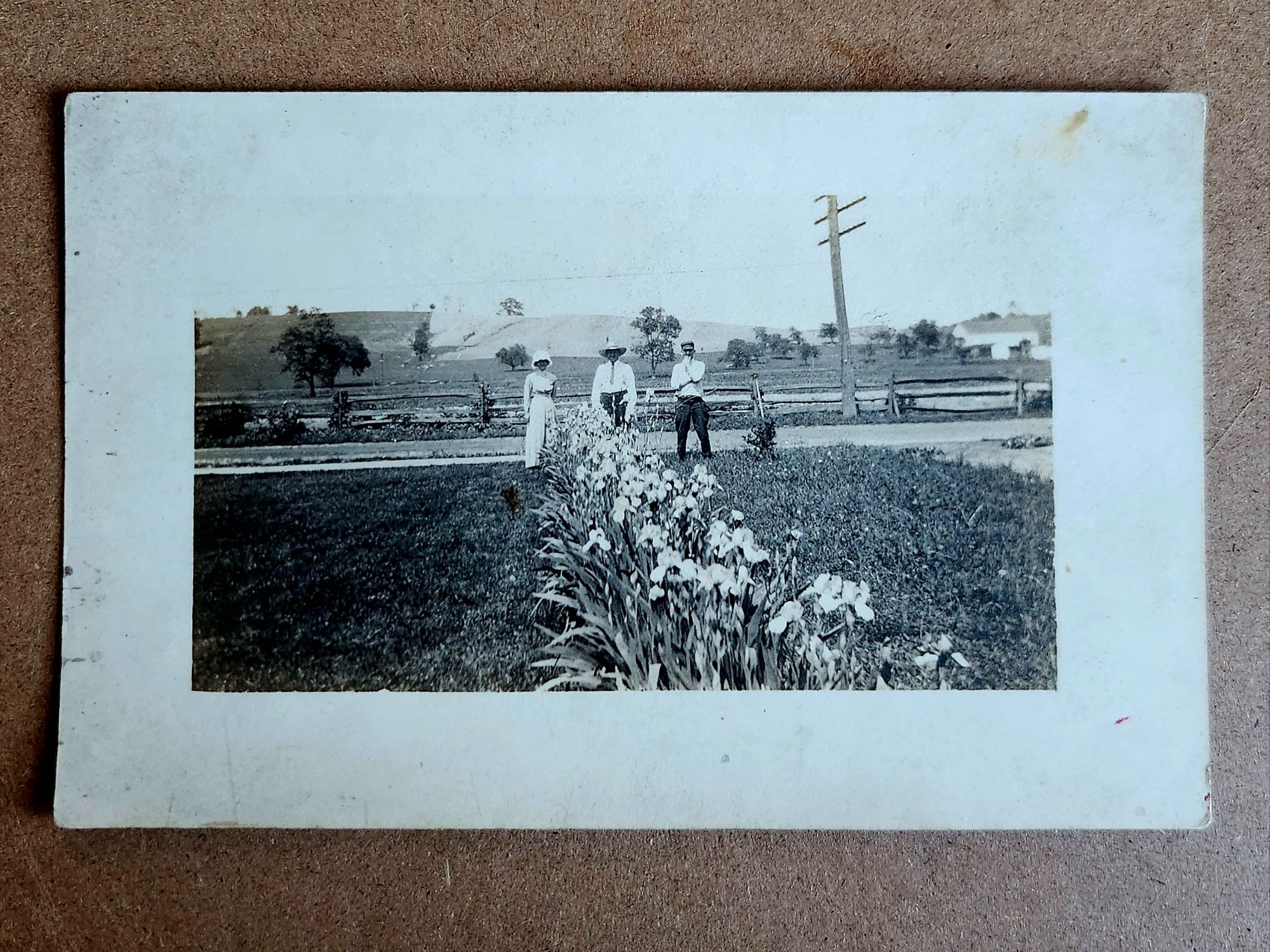
Now nine men, perched around a large rock on uneven ground in a forest, maybe a park. Hats, a variety of ties, white shirts in sunlight. Ages range. Some engage the camera. Others look away.
Compare this to the first photograph. Similar outdoor setting and careful arrangement. Same paper stock, same photographic quality. Do any faces repeat? That man in the center looking off to the distance—could he be the man on the back left of the family group?
We squint. The shape of a jaw, the set of shoulders, the tilt of a head. Errors lead us toward other observations. Misreads become clues. We’re searching, and trying out plausible connections.
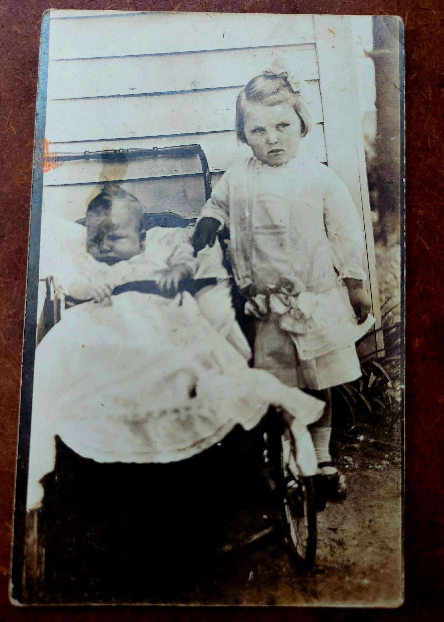
A different girl and a similar progression (maybe). The baby carriage can be dated within a range, 1915-1925. Fashions shift slowly in some places, rapidly in others, but period details do show. Those bows!
However, uncertainties hover. Is this the eldest girl growing up? Or, are we forcing connection where none exists? The bobbed hairstyles might give it away. Or they might mislead entirely.
A particular stare, a nose ridge, an anomaly at the jawline, and we are on the pursuit again. The faces echo. Three generations, or two. We assign roles: son, mother, daughter. Sisters?
The oval portrait shows four women arranged in a formal cluster. Elaborate hairstyles, high collars, cameo brooch visible on the seated figure. More prosperous, perhaps. Different family entirely, or different branch? Is she at the center the same as the older woman below? We cannot know.
In between the guesses, a different story emerges entirely. Our own families, and that we belonged. Or, that we confidently walked on. In either case, we are humming with history.
We’re deep in assumption now. Building genealogies from facial features, paper stock, and similar poses. The archives encourage it. These cards traveled together. Someone kept them together. The connections existed, however disassembled.
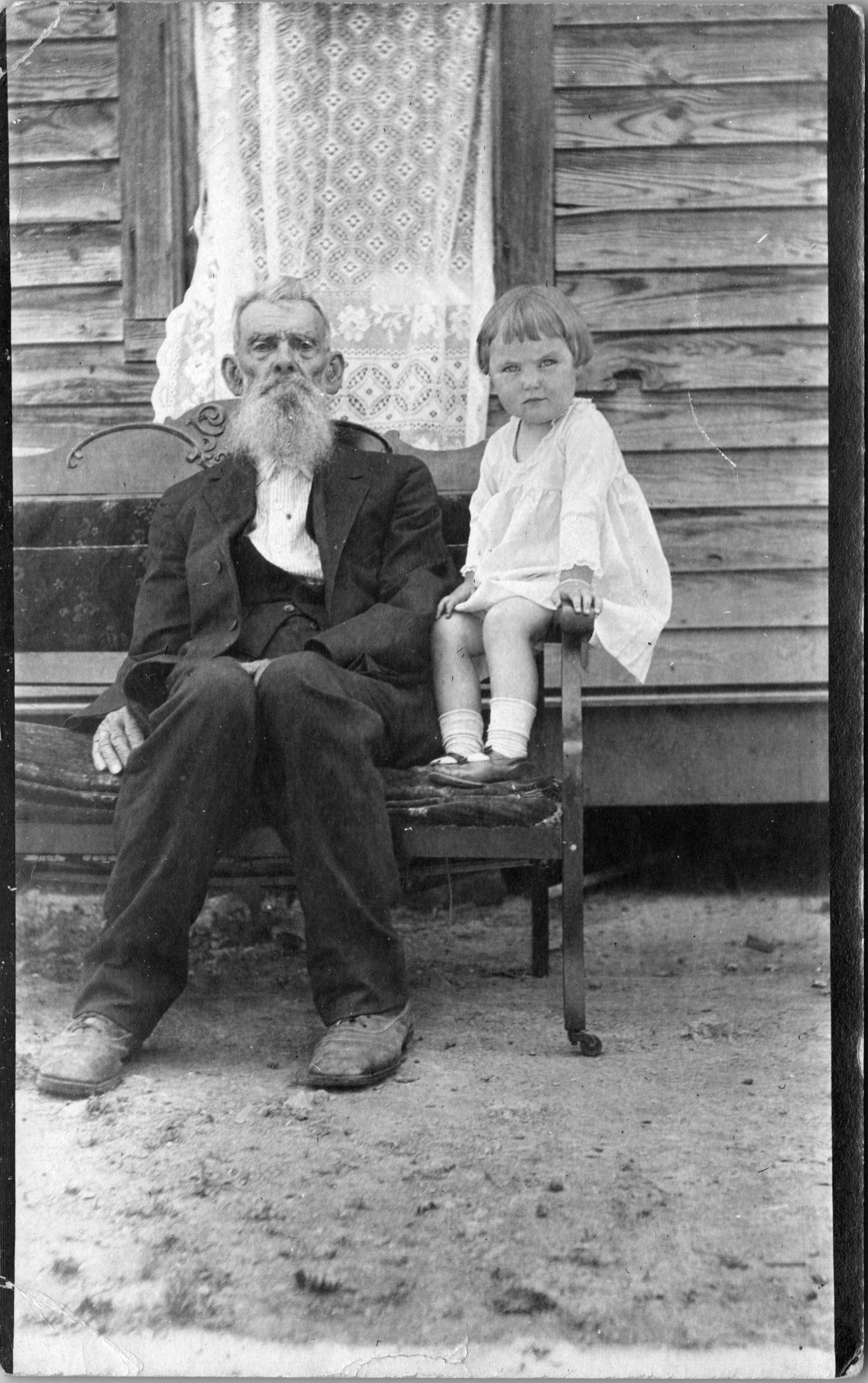
Another baby carriage, different from the first. And on the back of the card, handwriting: this is Irene with Willie’s baby, sent to Aunt Fannie. We know Irene from when she was four, seated with Uncle Rufus Dale, 84.
What satisfaction, when a storyline clings together. Names accumulate. Groups delineate. Relationships clarify. The archive speaks back, and the story begins to imitate fact.
The search becomes research. The archive rewards our attention and budding accuracy. But, who doesn’t love Aunt Fannie? Even if we’ve never seen her.
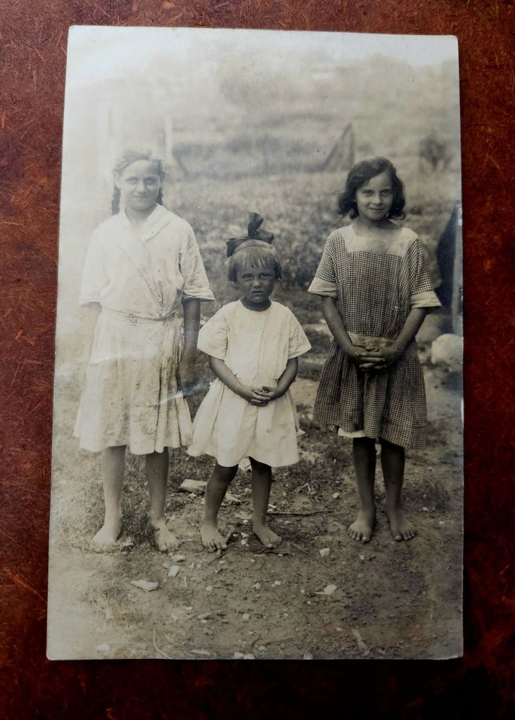
Now, here is Irene amid two new figures who appear to have a strong bond. Sisters? Friends?
As we might expect, there is more to reveal. Next week, we’ll look at pairings in quite a variety, and even more merry misleads. Then portraits, and finally, a grave.
Tricky, sticky stories arise at the sight of buildings in the landscape. Evidence (or absence) of us along the way.
As landscapes, last week’s real photo postcards (RPPC) asked for nothing. Trees, frozen roads, animals burrowing in snow—they floated free of context. We could easily appreciate them without knowing where they might be.
Buildings are different. A structure says someone decided, planned, risked, and accomplished. They hauled materials, drove nails, painted trim. Buildings demand explanation in ways that hills might easily demure.
Reading postcards slowly reveals patterns. The undivided back means pre-1907. The real photo process suggests a local photographer, or maybe an itinerant professional documenting a place too remote to the reach of commercial postcard companies. Paper stock, indicia, stamps and cancellation, faded handwriting and previous labeling, even image placement and crop—these technical details narrow the place possibilities.
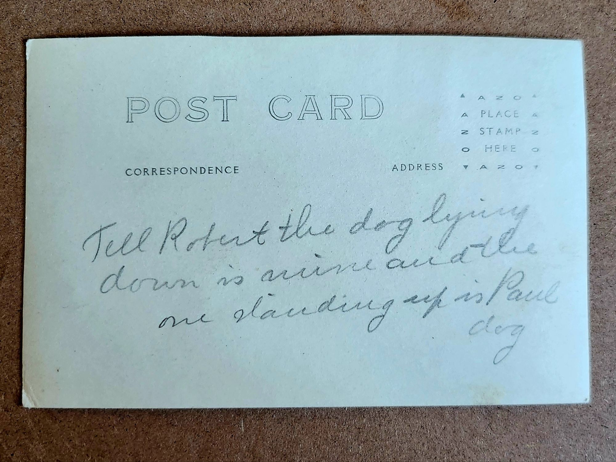
But they don’t yet answer another question: Who are Robert and Paul?
Tell Robert the dog lying down is mine and the one standing up is Paul dog
What We Might Know
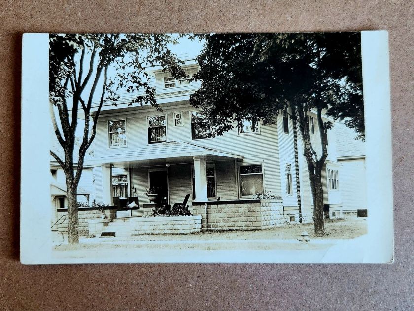
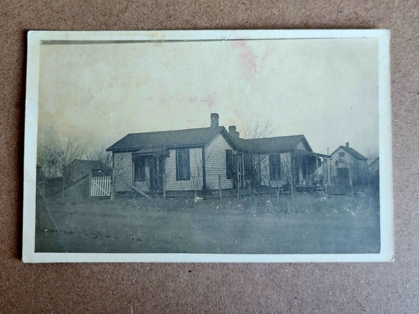
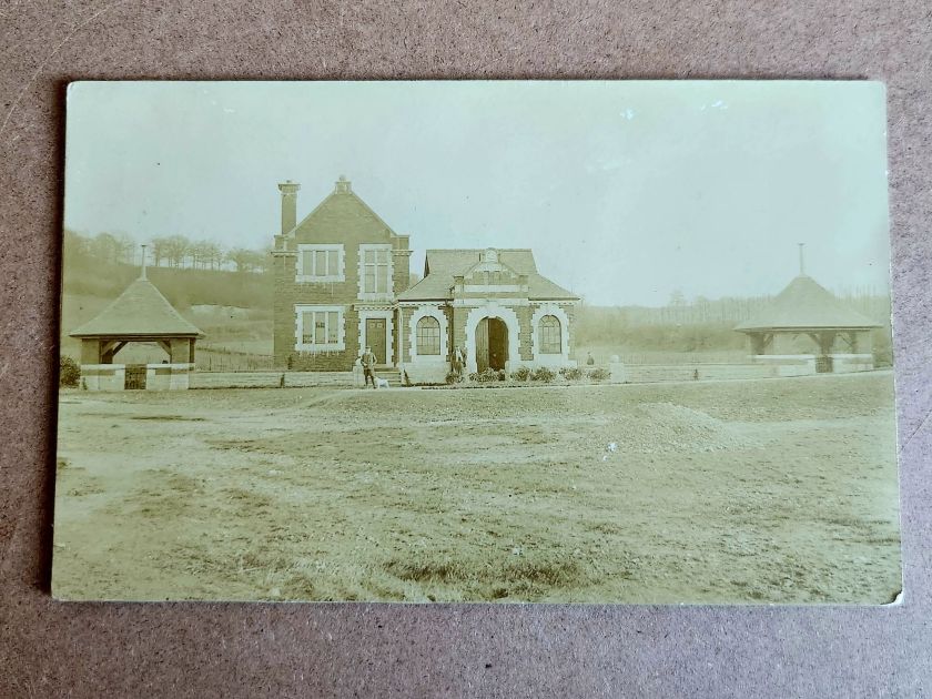
A two-story house with a generous porch is carefully centered in one photograph. Mature trees in the foreground. Curtains hang in the windows. Someone lived here and wanted to show their pride. Or, was it for sale?
The architectural details offer more clues. Clapboard siding, stone or brick foundation, decorative porch elements—not fancy, but intentional. It seems to be in a neighborhood with sidewalks. In an era between 1900-1920, somewhere in the Midwest or West judging by lot size. Also, a fire hydrant.
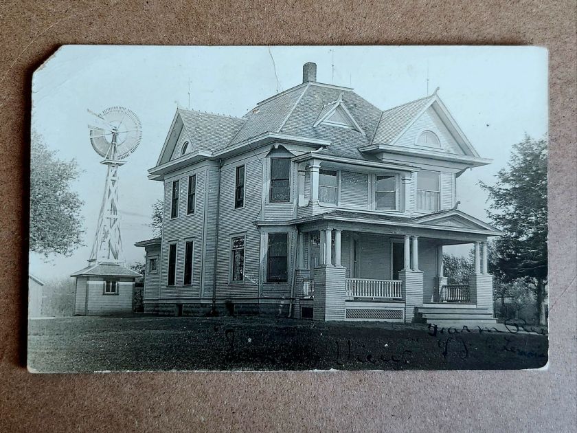
The windmill in another image dates itself. Windmills were an important utility and industry, and that style had a particular era. The house beneath it—elaborate Queen Anne with corner turret, ornamental shingles, and ornate columns—speaks to aspiration. Someone had big plans. This is visible evidence. When and where becomes roughly recognizable.
But, the people who stood on that porch remain absent and enigmatic. Who were they? What is happening here? A creative tension is mounting between the realm of evidence and the pull of story.
Sensing Stories
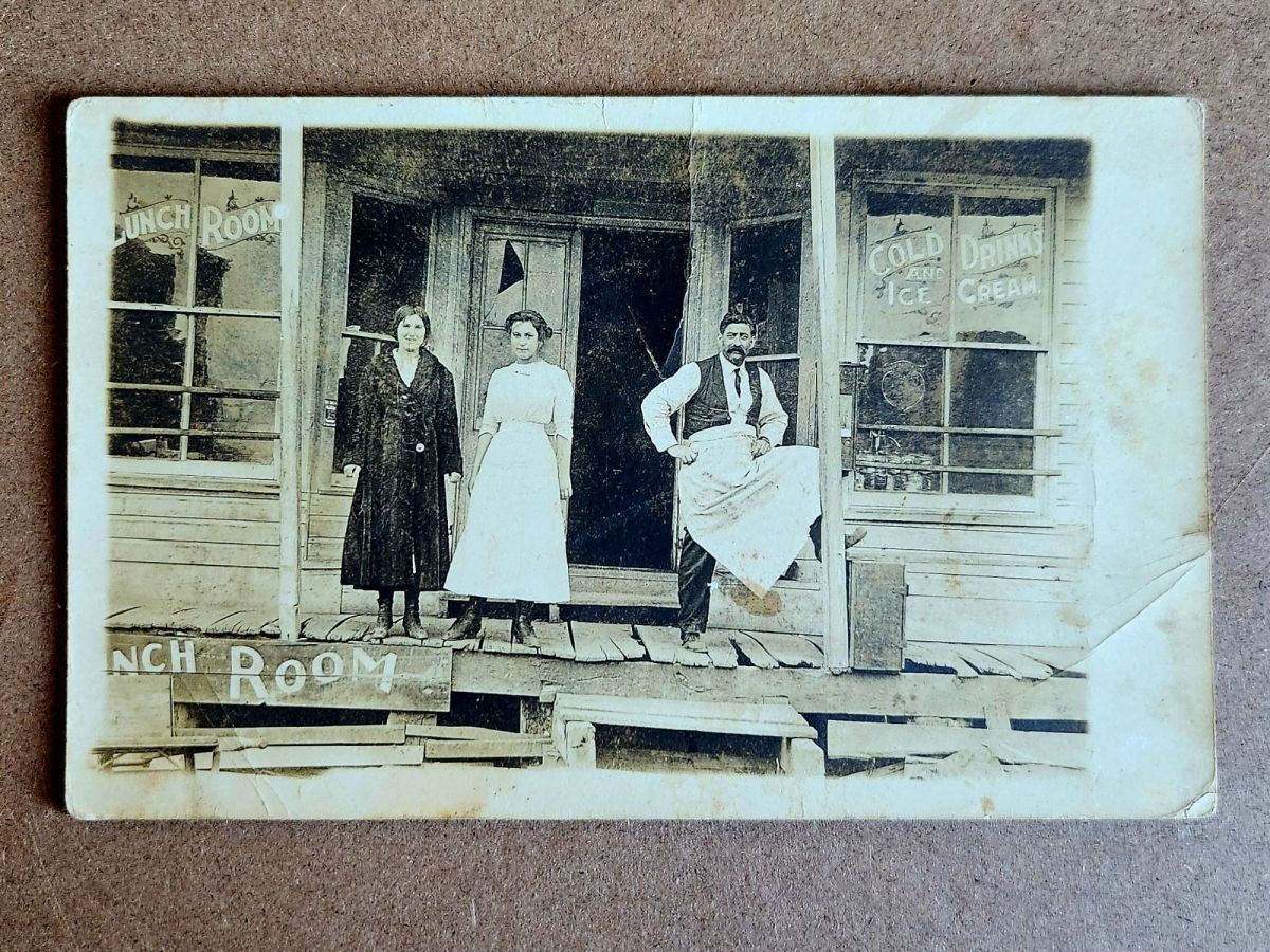
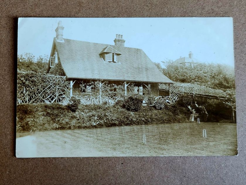
Two women stand in front of McMann Boarding House wearing identical striped dresses. The building is simple—board and batten, minimal trim, the kind of structure that goes up first and fast in a growing place.
The photograph has a vertical tear, the exposure is bad, and time has degraded it. But the sign remains legible: McMann Boarding House. Finally, a name.
Who was McMann? Who are these women? Employees? Vacationers? The photo is both casual and deliberately staged. What might the matching dresses mean? Pride? Subjugation?
Reading their faces, we fill in the narrative, almost immediately and sometimes inescapably. Relationships, motivations, futures take shape unbidden. This is exactly what we both invited and warned of last week—making it up. Always dangerous, sometimes worthwhile.
The impulse to story is nearly irresistible. A name on a building. Two women in matching dresses. The space around the postcard lights up. Are these their stories, or our own, or a magical projection that folds time?
When the Past Chats Back
Shuffling the stack, several cards in this collection start speaking to one another. Same photographic quality. Same paper stock. Similar landscape—flat, spare, newly broken. And most telling: similar structures in states of becoming.
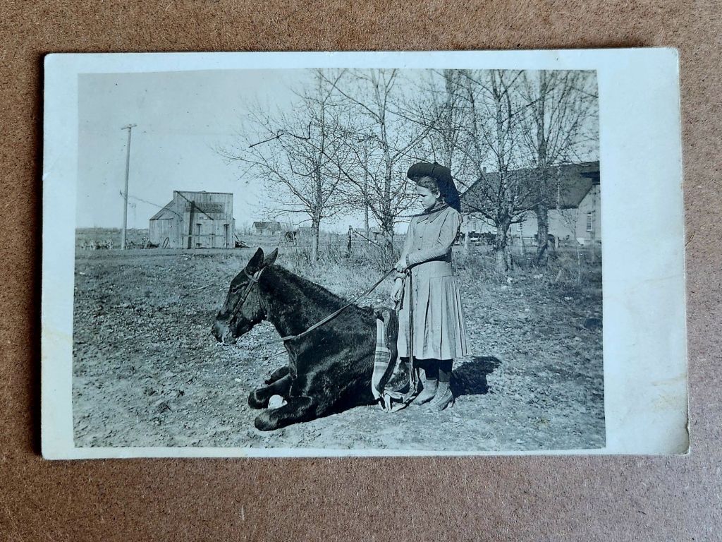
Laid out together, the pattern emerges. Houses with stone foundations and wraparound porches. An elaborate Queen Anne with a windmill. McMann Boarding House with its two women in matching stripes. A lunch room with an immaculately vernacular grand porch. Best-dressed proprietors standing proud. A girl and her horse, bare buildings behind her. A picnic under the canopy of a large tree.
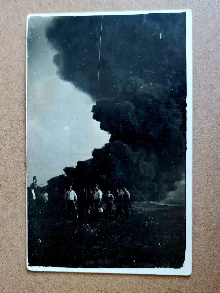
Also, a massive plume of black smoke billowing skyward, an oil derrick to the left, eight or nine men grinning toward the camera. The photograph stops everything cold. They struck liquid gold. A triumph worth documenting. Fine lines of the plumes etching through the darkest black.
These eleven images are a cluster from the same story—a town emerging around oil. Homesteaders and entrepreneurs arriving in a place that may have been open prairie five years earlier. Building homes, businesses, infrastructure for both industrial productivity and social life. Documenting the process with real photo postcards, for themselves or to send East. Their message: we have arrived safely and are in luck.
From Here to Now
This is a founding, the moment a place began and the stakes changed. These aren’t isolated buildings anymore and oddly they seem less like photos, too. We know there is a community taking shape and the evidentiary questions multiply. Who were they, by name? What brought them here? Did this place survive or vanish?
And harder, deeper, more consequential questions: Who lived here before? What animals and habitats were displaced? What did the derricks do? For them, and also to us.
Boom town logic. Extraction economy. Infrastructure dependencies and family injuries inherited. Cultural degradation, and environmental costs still being paid. This isn’t quaint history. This is the beginning of something we’re grappling with today.
Suddenly our imaginative stories contract and we now seek facts. The boarding house proprietor’s daily life can be imagined, but not separated from a place built on oil speculation. The architectural ambition of that Queen Anne deserves appreciation, but it went up in a town that might have lasted ten years or a hundred, depending on the wells. The buildings aren’t innocent, and we are implicated.
More in Store
Another stack of postcards might be related to this cluster—similar age, similar style, possibly the same region, likely at later dates. And then a few unrelated ones, probably European based on the architecture.
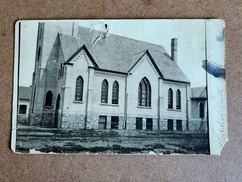
Not every fragment connects or resolves. Some buildings will remain singular, their stories unrecoverable. Churches and homes, beautiful structures, carefully photographed. Loved locally today as a memory or a ruin, perhaps.
Not everything needs a narrative. Some images can just be enigmatic. Evidence of care, of craftsmanship, of a moment someone thought worth preserving. These evocative details lead to fiction, which makes its own case for history and the preservation of minute detail.
But this cluster won’t let go. They connect to another stack, and soon we’ll know more. Next week we’ll meet the people themselves, looking back at us.
A vibrant Buff-Bellied Hummingbird hovering near a red tubular flower, showcasing its iridescent green head and back, rusty-orange belly, and needle-like bill in a classic feeding pose.
Detailed illustration of a Ferruginous Hawk perched on a branch, displaying its characteristic rusty-brown and white plumage with distinctive feathered legs and robust build typical of North America’s largest hawk.
Depicts a Gray Jay (now called Canada Jay) perched on a snow-dusted branch with small green lichens, showing its fluffy gray and white plumage, black cap, and compact songbird form.
A pair of Pine Warblers on coniferous branches, displaying their olive-yellow plumage with white wing bars and the subtle dimorphism between the brighter male and more subdued female.
A Cattle Egret in breeding plumage with golden-buff crest and back feathers, bright orange-red bill and legs, posed in the elegant stance typical of these large birds.
A set of five Reader’s Digest Association postcards from their Book of North American Birds series. High-quality illustrations and professional production from the 1970s-1980s era of educational materials. Particularly appealing to birders and natural history enthusiasts. Good condition, unposted with no marks. See photos for actual condition. Vintage items – writing, stains, color changes, and wear are part of charm and provenance.
[Note: Summer focus is on detailed captions. Essays return in September!]
During the 1918 pandemic, daily postcards were lifelines between farm and hospital for the Moss clan in Missouri. Their words remind us that love weaves a way between two worlds.
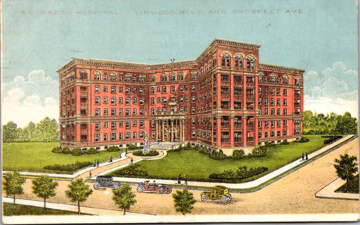
A postcard trembles in worried hands. On the front, St Joseph Hospital, Linwood & Prospect Streets in Kansas City, Missouri. Victorian landscaping, tree-shaded boulevards, a large, new hospital. It is a world of progress and prosperity frozen in glossy perfection.
Turn the card over. Faded ink bleeds across cream paper. “Dear Verda Marie, Mama threw up all night and does not feel well this morning… only drank a cup of tea for breakfast.”
Two worlds exist on a single postcard. The front celebrates America’s gleaming cities and grand institutions. The back reveals a family torn apart by pandemic and war, working together and staying in touch every day.
The Spanish flu arrived in Missouri like a thief. It followed railroad lines and river valleys, spreading from military camps across the heartland. By September, Kansas City reported its first cases. By October, the city’s hospitals overflowed with the gravely sick and dying.
Mama Moss checked into University Hospital on Campbell Street, one of several small places on Hospital Hill, where Kansas City built its first medical facility in 1870. Now every building overflowed with sick and strapped families seeking any treatment that promised relief or protection.
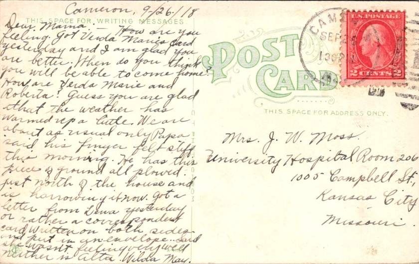
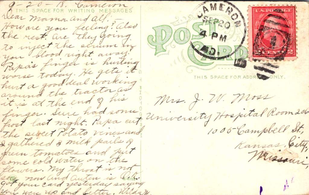
The postcards begin their daily journey between Cameron and Kansas City. Fifty miles of prairie separate farm from hospital, family from mother, routine from crisis. September 20th,Verda Marie writes from Cameron:
Dear Mama, and all. How are you feeling? And the rest. Are they going to inject the serum by your blood right away? Papa’s finger is hurting worse today. He gets it hurt a good deal working around the tractor.
The serum treatments represented medicine’s desperate gamble. Doctors extracted blood from recovered patients, believing their antibodies might save others. Transfusion methods were primitive—donor to patient through crude tubes, with minimal understanding of blood compatibility.
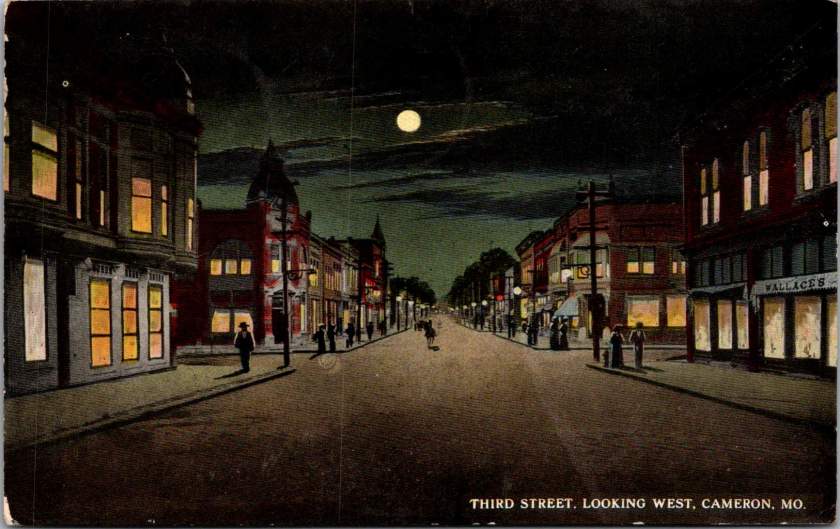
The front of her postcard shows Fourth Street looking west in Cameron—tree-lined and peaceful, houses with wraparound porches and manicured lawns. No hint of pandemic. No suggestion of families split between farm work and hospital vigils.
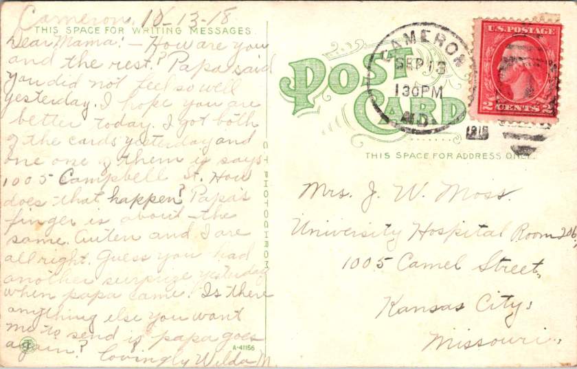
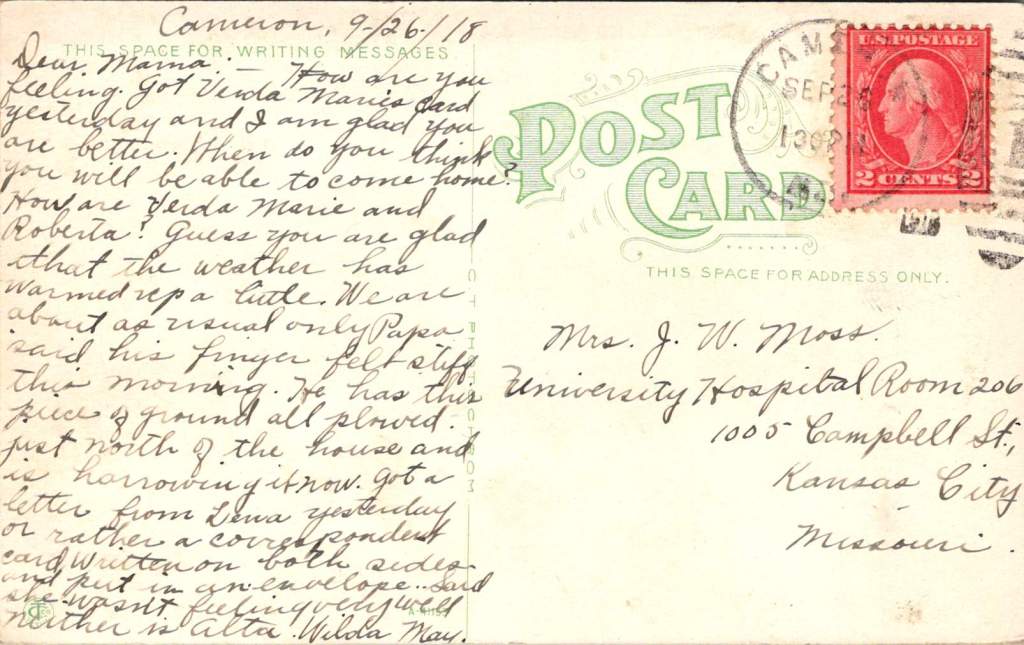
September 26, another postcard from daughter Wilda May in Cameron. Papa keeps working despite his damaged fingers. Farming cannot stop, even during plague, while war production and domestic demands for food are high. Families managed alone while the virus spread through communities like wildfire.
Dear Mama, got Verda Marie’s card yesterday. I am glad you are better. When do you think you will be able to come home? … Papa said his finger felt stiff this morning. He has this piece of ground plowed north of the house and is harrowing it now.
This card displays the Third Street business district looking East. The image suggests normalcy, prosperity, urban activity. The message tells a different story—injury, illness, fragmented family life.
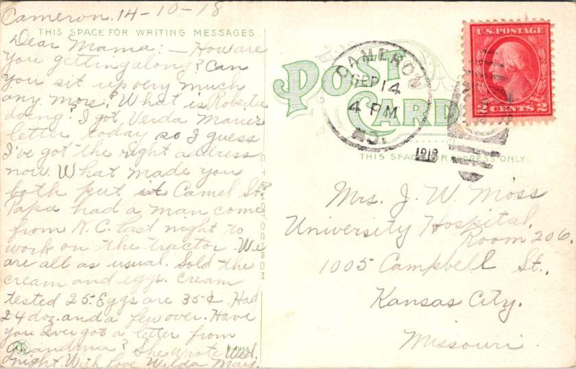
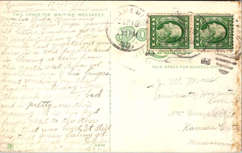
October 14th, from Cameron, Wilda May is writing to check in on Mama, Verda Marie, and little Roberta.
How are you getting along? Can you sit up very much any more? Papa had a man come from K.C. last night to work on the tractor. Sold the cream. Eggs are 35 cents. Had 24 dozen and a few left over.
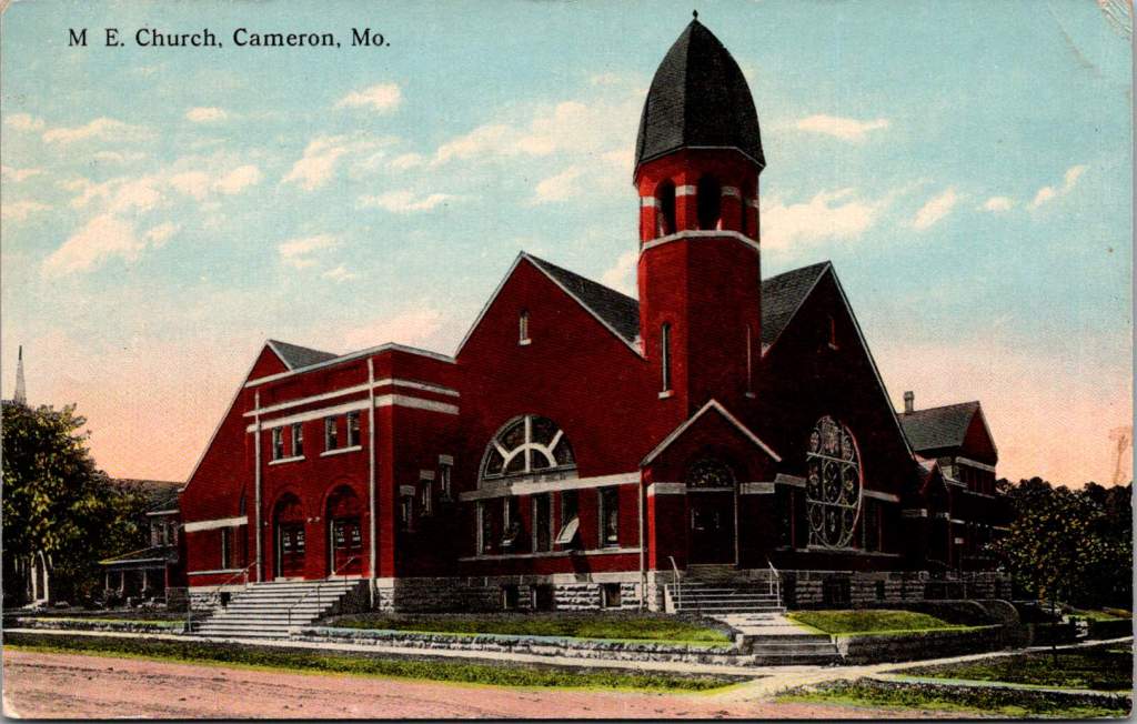
The dramatic red brick architecture of the M.E. Church is featured on the front. The bell tower, archways, and stained glass, no doubt concealing a community in a moment of great challenge.
November arrives with mixed signals. The Great War ends with armistice celebrations flooding city streets. Victory parades march through Kansas City while Hospital Hill counts mounting dead.
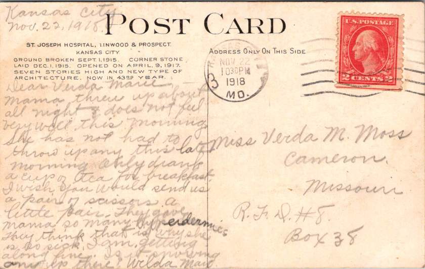
November 22nd, Wilda May is now in Kansas City and Verda Marie is back in Cameron. This is the card with St Joseph Hospital on the front and a report of Mama’s worsening condition on the back. Poignantly, a plea for simple materials.
I wish you would send us a pair of scissors, a little pair. They gave Mama so many hyperdermics (sic). They think that is why she is so sick.
The front shows St. Joseph Hospital—imposing, institutional, representing medical progress. The message reveals the grinding reality inside: nausea, sleepless nights, requests for basic supplies.
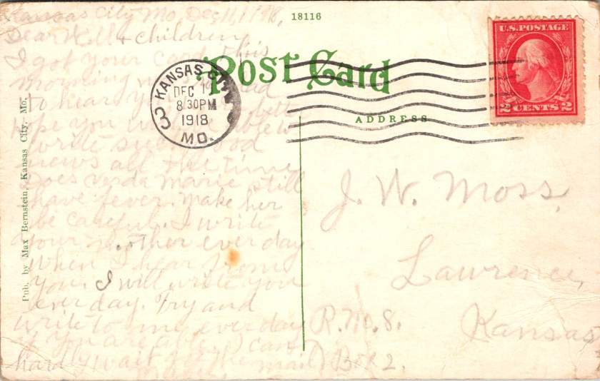
December 11, 1918. The last postcard in this series leaves Kansas City at 8:30 PM. Mabel Moss writes with exhaustion and desperate love.
Does Verda Marie still have a fever? Make her be careful. Write to your mother every day. I will write to you each day, too.
She repeats herself. Write every day. Every day, I will write to you.
These postcards have become more than communication. They serve as proof of life, wellness checks, emotional anchors in a world gone mad. Each delivery confirms another day fought forward, another family member still breathing.
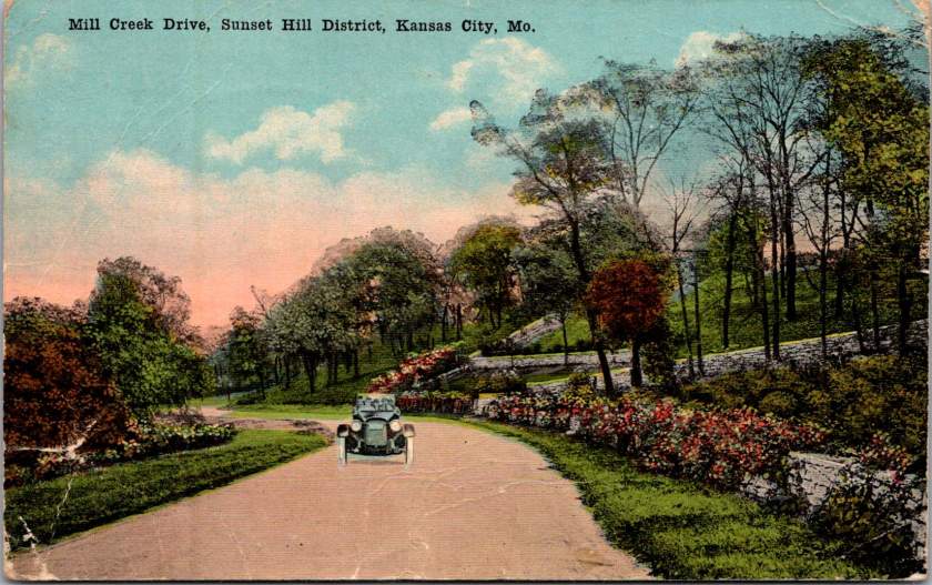
The front of the card features a swank soft top automobile on Mill Creek Drive, in the Sunset Hill district of Kansas City, Missouri. Lush foliage suggests it is a wonderful day to take in the fresh air.
Armistice brought celebration but not peace. Fighting continued in distant lands. The temporary ceasefire required renewal every thirty-six days. Victory was fragile, conditional, threatened by forces beyond control.
Also, influenza had no respect for borders. While diplomats negotiated peace terms, the 1918 pandemic waged its own relentless war. Families learned that health status changes cruelly and without warning. People woke well and died by nightfall.
These postcards preserve this tension between public aspiration and private desperation, helping us journey back to history as it happened. The fronts of the postcards celebrate civic pride—hospitals, colleges, tree-lined streets, architectural monuments. Their backs tell different stories. Experimental medical treatments. Daily fears about fever and death. Constant threat of injury from dangerous farm equipment. The grinding reality of families separated by crisis, held together by handwritten words.
This contrast defines the American experience during a period of dual catastrophes. Communities built beautiful institutions while individuals struggled for survival and missed hard earned opportunities. Cities planned grand boulevards while families split between hospital rooms and farm chores. America as it aspired to be, and as it actually existed for the Moss clan.
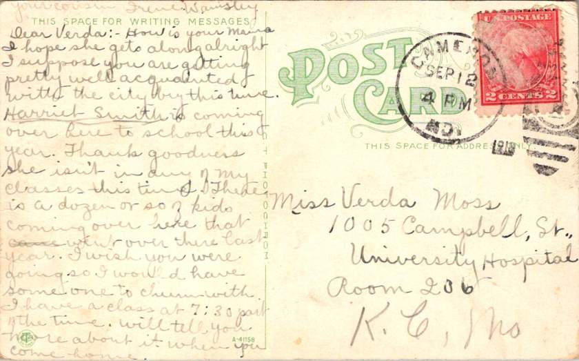
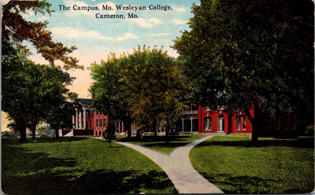
Just as her mother was getting sick, Verda Marie received a cheery postcard from a classmate with some gossip to share.
Harriet Smith is coming over here to school this year. Thank goodness she isn’t in any of my classes … I wish you were going so I would have someone to chum with…
The postcard front featured Missouri Wesleyan College campus—red brick buildings set among autumn trees. The front speaks to knowledge, tradition, the future of young minds. We can read between the lines on the back. Verda Marie would not be in class that semester, sadly.
Like Lazarus rising from his tomb, the world emerged from pandemic death to discover life transformed. The 1920s roared with celebration and renewal, and time went on. Hospital Hill expanded into Kansas City’s premier medical district. The red brick buildings where Mama received her serum treatments evolved into modern towers serving new generations. A century later, technological and medical innovations advance but essential human needs persist, too: connection, communication, proof that loved ones survive another day.
These particular postcards survived in a family archive. Stories of courage, love, determination tucked away to find a century later. Each card represents a day won against the odds, a family bond that transcended distance and disease.
The Moss family’s story continues in everyone separated by illness, every community battling invisible enemies, every healthcare worker risking their life to save others. The beautiful facades combined with harrowing messages remind us that hope and suffering coexist, flipped back and forth in our hands, repeated in every generation.
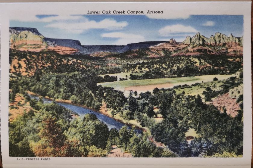
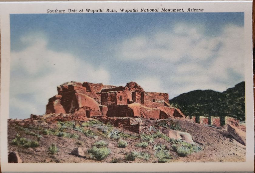
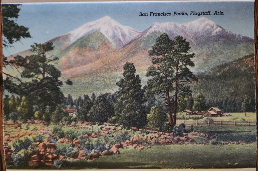
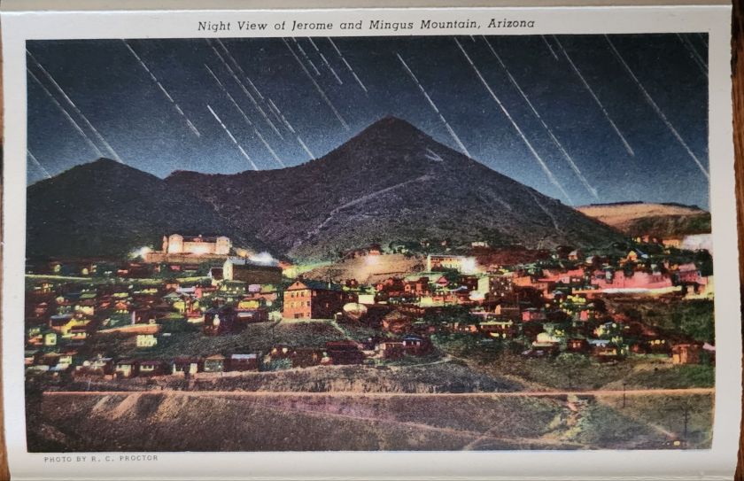
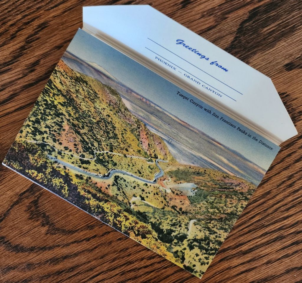
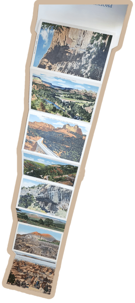
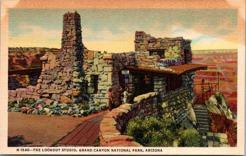
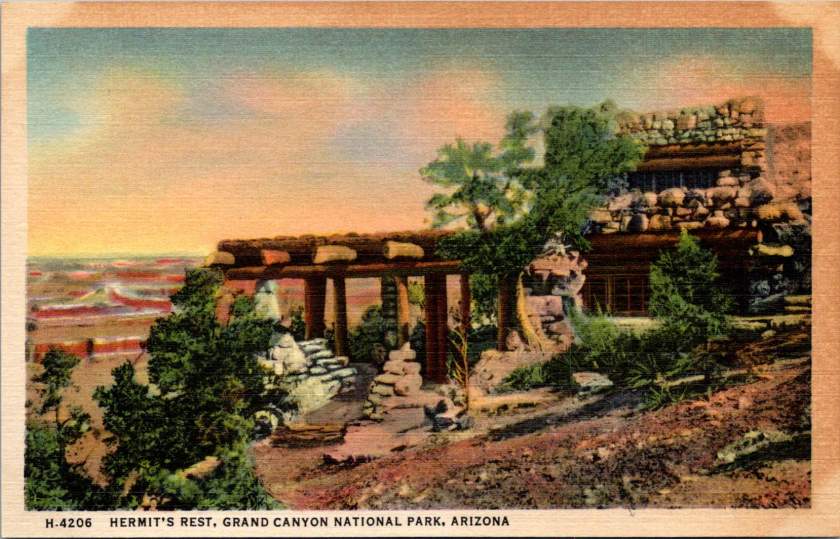
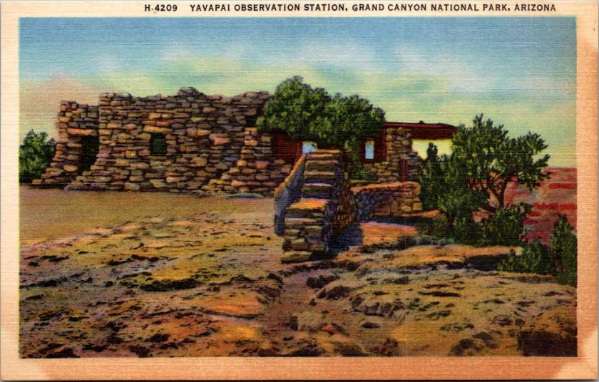
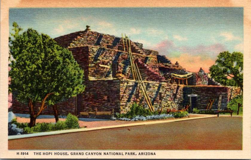
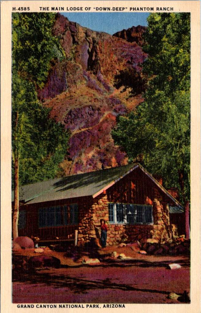
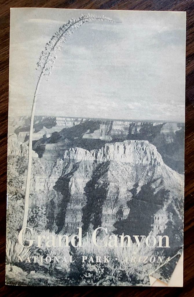
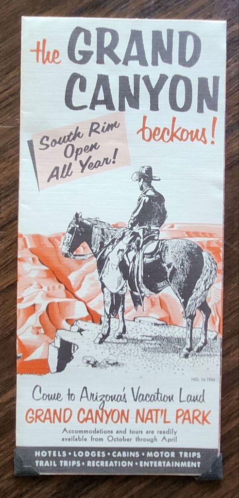
Mid-century postcards captured the wonder of American road trips in vivid color. This Phoenix to Grand Canyon collection reveals the story of car trips, roadside shops, and the natural landscape of Arizona.
Rural Route Arizona
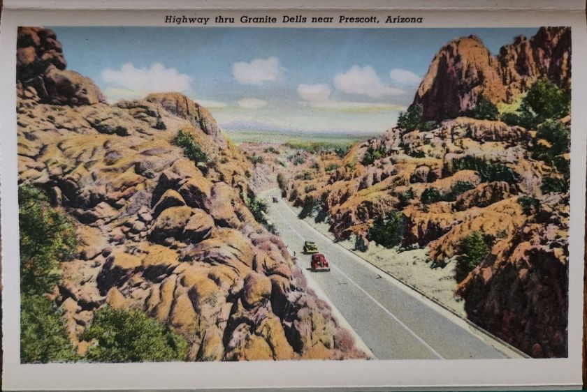
The Phoenix to Grand Canyon route via Oak Creek Canyon carved through America’s most scenic territory. In the 1940s and 1950s, this remained wild, undeveloped country. Starting in Phoenix, travelers navigated winding two-lane roads through Wickenburg, Yarnell, Prescott, Jerome, Clarkdale, Cottonwood, Flagstaff, and Williams.
Each stop pulsed with its own character. Jerome clung to mountainsides, mining copper. Prescott sprawled as a ranching center and former territorial capital. Wickenburg lured visitors with dude ranch culture. Williams crowned itself “Gateway to the Grand Canyon.” These weren’t pit stops but destinations, each welcoming tourist dollars from America’s growing car culture.
Postcard Economy
These postcards bear the stamp of Curt Teich & Co., a Chicago printing giant that drove America’s postcard industry from the 1930s through 1960s. German immigrant Curt Teich founded the company in 1898 and revolutionized postcard production. His linen postcards introduced soft textures and blazing colors.
Teich built an industrial empire through local connections. Photographers roamed America, documenting main streets and natural wonders. In Chicago, artists hand-colored black and white photographs, enhancing reality to seduce buyers and ultimately define a social aesthetic.
Behind every postcard rack stood a web of relationships, too. Hotel owners, gas station attendants, and gift shop operators ordered cards from Teich’s catalog or commissioned custom designs featuring their establishments. Postcards advertised businesses, provided affordable souvenirs, and satisfied the social duty to send word home.
Long-distance calls cost fortunes. Letter-writing devoured time. Postcards offered quick connection and proof of adventure. They were quick and easy evidence that the sender had escaped ordinary life for landscapes of impossible beauty. For travelers, buying and mailing postcards proved both pretty and practical.
The typical buyer belonged to America’s emerging middle class, newly mobile through car ownership and paid vacations. Families drove from California to see the Grand Canyon. Retirees took first cross-country trips. Young couples honeymooned across the Southwest. Many experienced the American West for the first time. Postcards helped them process and share encounters with the sublime.
Selecting, writing, and mailing postcards became part of American vacation ritual. Weather beautiful, wish you were here—heartfelt sentiments that bridge extraordinary experience and ordinary communication.
These postcards transcend tourist kitsch. They document a pivotal moment when the West was packaged and sold as leisure destination. Enhanced colors and idealized compositions reflect not just Arizona’s appearance, but how Americans wanted to see it—as endless possibility, natural wonder, and escape from urban routine.
Rare panoramic postcards from the Haines Photo Company capture Phoenix on the cusp of the century.
As American cities boomed in the early 1900s, panoramic postcards emerged to document their transformation. The Haines Photo Company of Conneaut, Ohio seized this opportunity, operating from about 1908 to 1917. Photographers crisscrossed the country capturing these distinctive wide-angle views of evolving American cityscapes, like Phoenix, a fledgling desert outpost poised for dramatic growth.
Phoenix in 1900 numbered just 5,554 residents. Though small, it already served as Arizona’s territorial capital with statehood just twelve years away. These panoramic postcards reveal a city establishing the foundation for its explosive future growth.
Washington and First Streets
The first panorama captures Phoenix’s commercial core at Washington and First Streets. Electric streetcar tracks cut through the unpaved road—these trolleys had replaced horse-drawn versions in 1893, modernizing city transit. Desert mountains loom in the distance while palm trees line parts of the street, evidence of successful irrigation in this arid landscape.
A prominent building with a tower dominates the background. Pedestrians stroll the sidewalks alongside horse-drawn carriages, as automobiles remained rare luxuries. Sturdy two and three-story commercial buildings reveal a city with ambitions beyond its frontier origins.
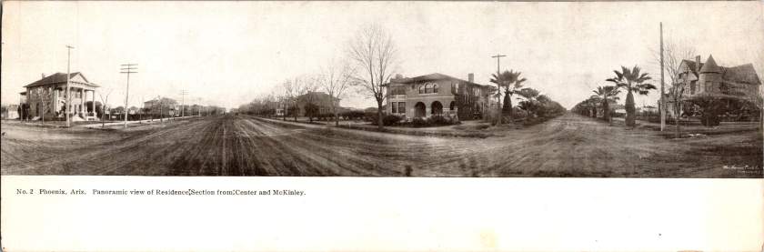
Residences at Center and McKinley
The second view shifts to Phoenix’s growing residential district at Center and McKinley. Here, successful merchants and professionals built impressive homes along wide, unpaved streets. Both palm trees and deciduous trees (some leafless in winter) frame the elegant residences.
These neighborhoods developed as streetcar suburbs, allowing prosperous residents to escape downtown congestion while maintaining business access. Homes display fashionable Colonial Revival and Craftsman styles with generous porches and elaborate details. Unlike cramped eastern cities, Phoenix boasted detached homes on spacious lots—a pattern that would define its future growth.
Washington and Second Avenues
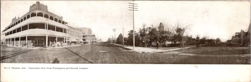
The third panorama returns us to the commercial district. A substantial three-story building with multiple balconies dominates the left side. Was it a hotel or major retailer? Streetcar tracks again slice through the broad dirt roadway. A park or green space appears across the street, providing rare desert shade.
Notice the shadow intruding on the lower left? It’s the silhouette of our photographer with tripod-mounted camera. Was this F.J. Bandholtz, a prominent panoramic photographer who worked with Haines?
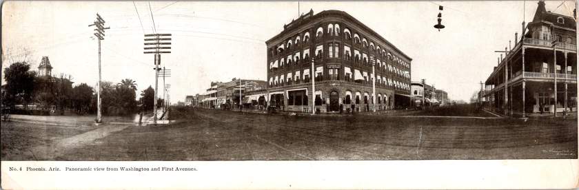
Washington and First Avenues
The fourth panorama captures Phoenix’s financial center. A four-story brick building with numerous arched windows dominates the scene. This building houses the Phoenix National Bank with law offices above, very likely belonging to Joseph H. Kibbey, a former Territorial Supreme Court Justice (1889-1893) and Arizona Territorial Governor (1905-1909).
Founded in 1892, the Phoenix National Bank had become Arizona’s largest by 1899, with deposits totaling $692,166. Telegraph and electrical poles with multiple crossbars line the street, demonstrating developing infrastructure. The dirt streets accommodate both pedestrians and horse-drawn vehicles, though automobiles were beginning to appear.
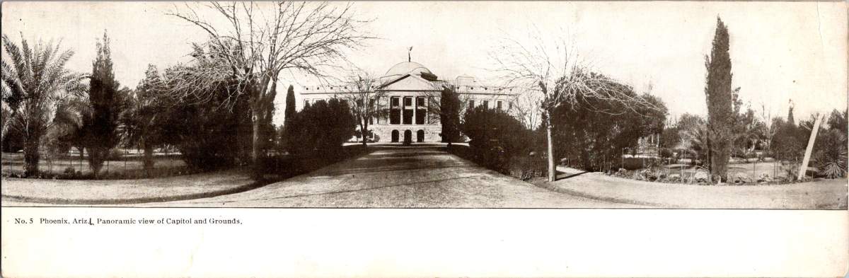
Capitol Grounds
The fifth panorama showcases Arizona’s territorial capitol. This impressive domed structure, completed in 1900 at a cost of $130,000, sits back from the road on a donated 10-acre plot at Washington Street’s western end. Formal gardens with cypress, palms, and ornamental plantings surround the building, irrigation transforming these arid landscapes.
Governor Murphy dedicated the building on February 25, 1901. At the time, the capitol complex embodied Phoenix’s civic ambitions and push toward statehood. Now the main building is home to the Arizona Capitol Museum, connecting present-day Phoenix to its territorial roots.
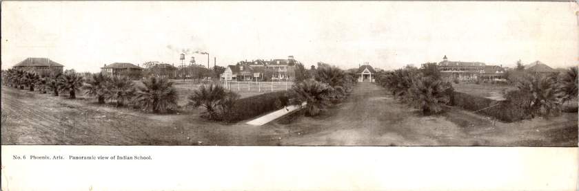
Phoenix Indian School
The final panorama depicts the Phoenix Indian School campus with its multiple buildings, some with smoking chimneys, surrounded by palm trees. Established in 1891, this federal boarding school implemented the government’s brutal and coercive Native American assimilation policies. Located on 160 acres north of downtown, the campus featured brick and frame buildings for classrooms, dormitories, workshops, and administration.
The school expanded rapidly from 42 students initially to 698 by 1900, representing 23 tribes from across the Southwest. Operating until 1990, the school’s complex history reflects the often painful relationship between the federal government and Native peoples, and Phoenix’s role in executing national policies.
The Haines Photo Company
These remarkable panoramic images came from the Haines Photo Company of Conneaut, Ohio. From 1908 for about a decade, they specialized in wide-angle photography of towns and cities across the United States. The Library of Congress preserves over 400 of their photographs documenting America’s evolving landscapes and cityscapes.
Technological innovations in cameras and film made panoramic photography possible. Companies like Haines used specialized equipment to capture expansive views with exceptional clarity. They printed these as postcards for both tourists and locals proud of their developing communities. The panoramic format perfectly suited sprawling western cities like Phoenix that grew horizontally rather than vertically.
Who actually pressed the shutter remains mysterious. The Library of Congress identifies F.J. Bandholtz (Frederick J. Bandholtz, born circa 1877) as a prominent panoramic photographer working with Haines. The shadow in the third image provides our only glimpse of the person behind the camera—a tantalizingly incomplete clue to their identity.
Fast Growth in Phoenix
The early 1900s transformed Phoenix through several key developments. Roosevelt Dam (completed 1911) secured reliable water and power for the Valley. The Santa Fe, Prescott and Phoenix Railway (1895) connected the city to northern Arizona while streetcars improved local mobility. Institutions like the Carnegie Free Library (1908) and Phoenix Union High School (1895) established cultural foundations. Economic activity diversified beyond the “Five Cs” (copper, cattle, climate, cotton, and citrus) to include banking, retail, and professional services.
Statehood on February 14, 1912 elevated Phoenix’s status as capital. These postcards hint at those century-old aspirations—a frontier town rapidly becoming a modern American city. Phoenix’s population doubled from 5,554 in 1900 to 11,134 by 1910, and surged to 29,053 by 1920, launching a growth trajectory that would eventually make it one of America’s largest cities.
When I connected with European researchers writing a book on the married Swedish/German photographers, Lindstedt and Zimmermann, we discovered that last week’s trove of real photo postcards is quite rare. Even better, we found more.
New Discoveries from a Lost Archive
Last week’s essay examined the American occupation of Coblenz, a unique period of military history, through the photographic lens of Lindstedt & Zimmermann. The Lindstedt & Zimmermann studio was destroyed during Allied bombing in World War II, decimating their archive and rendering the surviving examples of their work as uncommon historical artifacts.
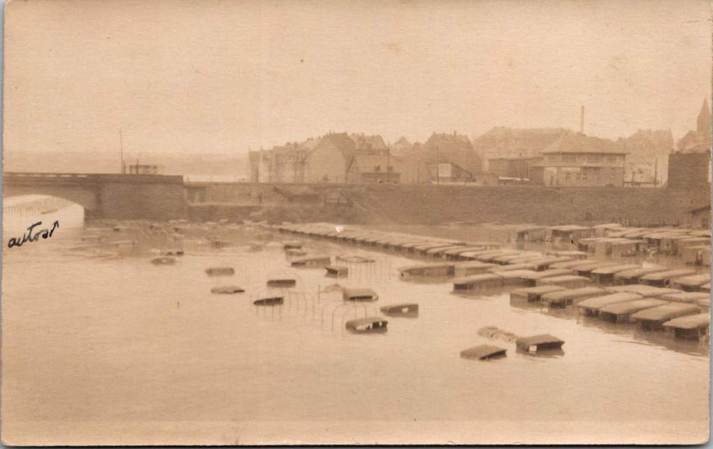
The exchange with the research team prompted another search through our postcard collection resulting in the discovery of 25 additional images. Most can be attributed to Lindstedt & Zimmermann based on stylistic elements, materials and subject matter. Some bear the mark of other photographers including Paul Stein, another Coblenz studio. Ten photographs document the catastrophic flood of the Rhine in January 1920 – images that likely haven’t been seen in a century.
The Great Flood of January 1920
The January 1920 flood represented one of the most significant natural disasters to impact the American occupation forces during their tenure in Germany. The handwritten note on one postcard reveals both the severity of the flood and its impact on the American presence. This mixed German-English description captures the cross-cultural nature of the occupation.
“Der Rhein hat über its banks geflowed und Uncle Sam’s autos gdamaged. The river is the highest in over a hundred years, almost beyond my memory!”
The photographs show numerous small boats navigating the water and automobiles partially submerged in floodwaters, with bridges and buildings visible in the background. These images provide rare documentation of a significant environmental event that temporarily disrupted occupation activities and required adaptation by both American forces and local residents.
Harlem Hellfighters
This very rare view shows what appears to be members of an African American regimental band with their instruments at Romagne, France. Black men served in segregated units during World War I, with regiments such as the 369th Infantry (the “Harlem Hellfighters”) earning recognition for their service. Their regimental bands played an important cultural role, introducing European audiences to American jazz and ragtime music. These musical ambassadors created cultural connections that transcended the military context of their presence. The inclusion of this photograph adds an important dimension to our understanding of the American military presence in post-war Europe, highlighting the contributions of African American servicemen whose stories have been marginalized in historical accounts.
YMCA Women
The expanded collection also includes two formal portraits of women in YMCA uniform, complete with the organization’s distinctive triangular insignia on hat and lapel. Sometimes called Y girls, female YMCA workers provided essential services for American soldiers stationed far from home. They operated canteens, organized recreational activities, offered educational programs, and provided a connection to American civilian life that helped maintain morale during the occupation period.
The YMCA was among the few organizations that deployed American women to work directly with troops overseas during this era. These women volunteers typically came from educated, middle or upper-class backgrounds and represented an early example of American women engaging in international service work. Their presence added a civilian dimension to the occupation and helped create environments where American soldiers could productively spend their off-duty hours.
Military Pageantry and Daily Operations
One striking photograph shows the 76th Field Artillery Regiment arranged in a “living insignia” formation, with soldiers positioned to create the unit’s distinctive diagonal striped insignia, surrounded by artillery pieces. This type of military display was meant to demonstrate American capacity while building unit cohesion and pride, and perhaps avert a little boredom.
In contrast to these ceremonial arrangements, other photographs document the practical transportation and logistical elements that supported daily operations. An image of a young driver with his heavy-duty truck along what appears to be the Rhine riverbank represents the essential supply operations that maintained the American presence. The vehicle’s utilitarian design with solid rubber tires, wooden spoke wheels, and large cargo bed illustrates the practical equipment used to transport supplies, equipment, and personnel throughout the occupation zone.
French Military Presence
The next image shows a group portrait of four French soldiers in their distinctive uniforms. Easily identified by their characteristic “Adrian” helmets with the prominent crest ridge along the top and the horizon blue (bleu horizon) uniform that became emblematic of French forces during World War I, these men represent the broader Allied presence in post-war Germany.
France maintained the largest occupation zone in the Rhineland, reflecting their particular security concerns regarding Germany. French forces occupied territories including Mainz, while American forces centered on Coblenz and British forces on Cologne. Later, French forces took over the Coblenz occupation.
The portrait format was typical of military mementos during this era, allowing soldiers to document their service and send images to family members. The survival of any images at all is due to this distribution by soldiers to their home countries.
Beyond Coblenz
Not all images in the collection were taken in Coblenz itself. One photograph shows American personnel in a touring car filled with passengers in what may be the French Riviera, identifiable by its distinctive palm trees and Mediterranean architecture. Dating to 1921-1923 based on the automobile’s style, this photograph represents the recreational opportunities available to some American personnel during leave periods from their occupation duties.
Europe allowed for cultural and recreational experiences that would have been impossible for most Americans of this era. For many young Americans serving in the occupation forces, this European assignment represented their first—and perhaps only—opportunity to experience the wider world beyond their home communities.
Visual Legacies
The survival of these photographs, particularly those documenting the 1920 flood, represents a remarkable preservation of visual history that might otherwise have been lost entirely. With the bombing of the Lindstedt & Zimmermann studio during World War II, the unique nature of real photo postcards, and the general fragility of materials from this era, each surviving image offers a rare window into this formative period in world relations.
Karl and Änne Zimmermann’s work, along with that of contemporaries like Paul Stein, provides an invaluable visual chronicle of the first American occupation of European territory—a precedent for the much larger American military presence that would emerge in Europe after World War II. Their photographs capture not just military operations and formal events but the daily reality of cross-cultural interaction between Americans, French, and Germans during this unique historical moment and place.
Vintage floral postcards—with golden backgrounds, symbolic flowers, and heartfelt messages—were a sophisticated social currency that connected people across distances.
At the intersection of the Victorian and Edwardian eras, the humble postcard emerged as a powerful medium for small aesthetic pleasures and meaningful social exchange. These postcards tell a story of artistic development and printing innovation, and how ordinary people wove beauty into the fabric of everyday communication.
Delicate Blooms
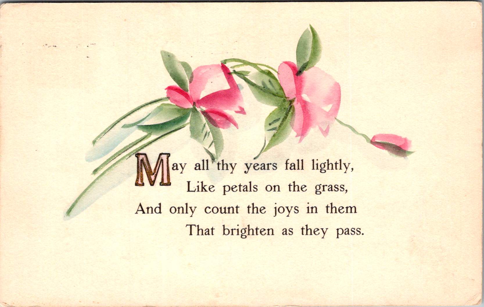
One card in this selection features pristine white lilies and fern fronds against a luminous gold background. The lilies—rendered in striking detail with their trumpet-shaped blooms and distinctive stamens—create dramatic contrast against the warm gold, the iridescent ink catching light as the recipient tilted the card in their hands. An elegant blessing accompanies the illustration.
“No thorn beset the path you tread, No shadows glance upon your way, But flowers spring beneath your feet, And sunshine crown your every day.”
These cards encapsulate a pivotal moment in design history—the transition from Victorian to Edwardian sensibilities. The Victorian era (1837-1901) embraced ornamentation, sentiment, and symbolic complexity. Every element carried meaning: white lilies represented purity and virtue; ferns symbolized sincerity and shelter; the gold background evoked trust and value. These layers of meaning reflected the Victorian preoccupation with moral improvement through beauty, a philosophy championed by influential figures like John Ruskin and William Morris.
As Queen Victoria’s reign ended and Edward VII took the throne (1901-1910), aesthetic preferences gradually shifted. The new Edwardian sensibility maintained Victorian symbolic richness but introduced more restrained layouts with increased white space and cleaner compositions. This particular card, with its strategic emptiness and focused arrangement, demonstrates this evolution. The gold field creates breathing room that earlier Victorian designs would have filled with additional decorative elements.
The technology behind these gold backgrounds represented industrial innovation. Using metallic powders and varnish printed in the desired pattern, these effects made previously elite decorative elements available to middle-class consumers. During the Industrial Revolution, technical advancements in printing had transformed what was once painstaking handwork into mechanized production. German printers in particular had mastered these techniques, producing cards with exceptional color registration and metallic effects that remained unmatched until their trade was disrupted by World War I.
Other sophisticated production methods like embossing—creating raised areas that added tactile pleasure to the visual experience—required specialized equipment and expertise. Metal dies created by skilled engravers would press the design into the card after printing was complete. The visual effect was enhanced by different dimensions, making these technically perfect cards a testament to industrial craftsmanship.
Gold’s association with luxury stemmed from both its intrinsic properties and historical significance. The aptly named Gilded Age celebrated opulence, with gold becoming a visual shorthand across design disciplines. International Expositions like the 1900 Paris Exposition showcased luxury goods incorporating gold elements, popularizing these aesthetics globally. Archaeological discoveries in Egypt renewed interest in gold in design, while the Ballets Russes featured costume and set designs by artists like Léon Bakst who used vibrant colors and gold accents.
Floral Features
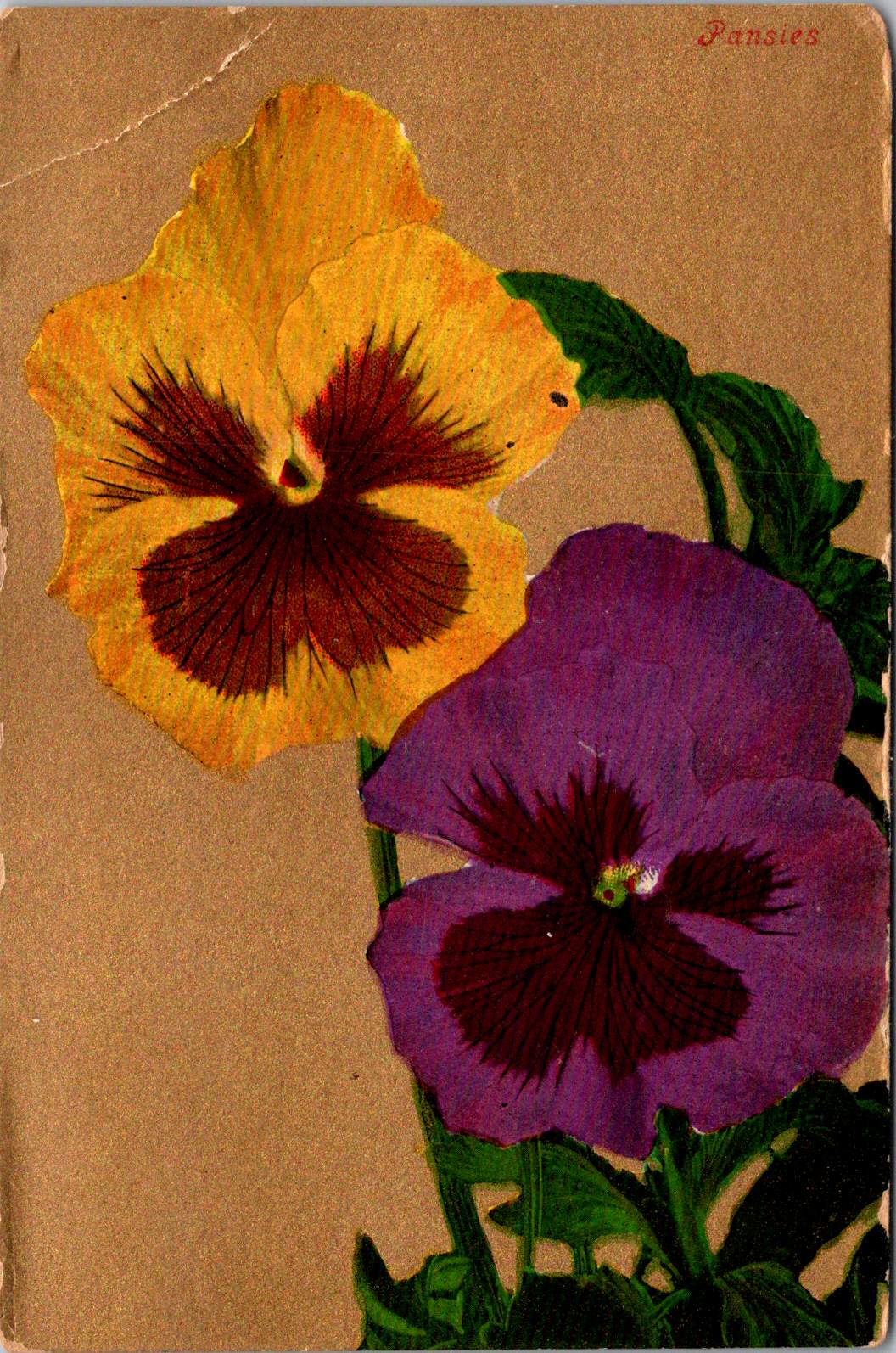
A striking card in the next selection features white and red striped “peppermint” carnations against a gold background. The distinctive white petals dramatically streaked with vibrant red markings create bold visual contrast against the metallic wash. Three perfectly rendered blooms cluster together on dark stems, with bright green sword-like leaves framing the arrangement. The word “Carnations” appears in red script in the upper right corner, identifying the botanical subject with elegant simplicity.
This stark compositional approach—focusing entirely on the botanical subject against a uniform background—represents a more modern, stripped-down aesthetic that emerged in the early 1900s. While maintaining the Victorian fascination with floral symbolism, these designs eliminate extraneous decorative elements in favor of dramatic contrast and botanical precision. This shift toward simplification prefigured design trends that would gain momentum in the following decades, showing how postcard aesthetics tracked broader movements in visual culture.
The symbolism remained rich: striped carnations carried specific meaning in the Victorian language of flowers, often representing regret that a sentiment could not be shared or a refusal/inability to accept someone’s affection. This sophisticated “language of flowers” had become codified in popular Victorian publications like Kate Greenaway’s “Language of Flowers” (1884), ensuring that recipients would understand these botanical messages. The high contrast between the red-streaked white blooms and the gold background created a visual drama that emphasized the emotional complexity carnations represented.
During this period, social practices around correspondence were evolving. The penny post, established in Britain in 1840 and adopted with variations throughout Europe and America, had revolutionized communication by making it affordable across social classes. What was once an expensive privilege became commonplace, leading to a boom in correspondence. The “Golden Age of Postcards” (approximately 1898-1918) coincided with changing postal regulations that allowed privately printed cards and preceded the widespread adoption of telephones. During this period, billions of postcards circulated globally.
Rose to Crimson
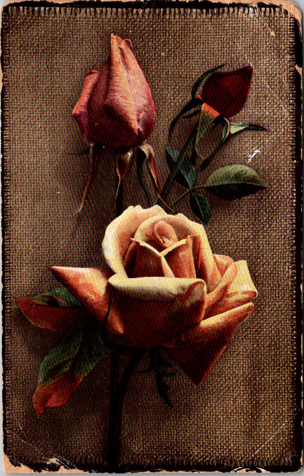
The next group of cards represents another technological leap—an early photograph of light pink roses on a background of actual linen. The physical texture of the rough weave contrasts with the delicate subject matter—an open rose and two buds captured a new reality that only photography could provide. This mixed-media approach demonstrates how artists continued to experiment with both visual and tactile experiences.
The Victorian and Edwardian periods witnessed remarkable developments in image reproduction. Traditional chromolithography—where each color required a separate stone or plate—was being supplemented by photographic techniques. These innovations allowed the faithful reproduction of reality rather than artistic interpretation, though both approaches coexisted during this transitional period. The textures and images of this card created an interesting interplay between the natural subject and the material substrate, engaging multiple senses simultaneously.
Rose symbolism operated on a similarly subtle gradient. In Victorian floral language, the exact shade of a rose communicated specific intentions: light pink roses signified admiration and grace—appropriate for relationships in earlier stages or those requiring emotional restraint. Medium pink suggested appreciation, while deeper crimson conveyed self-conscious beauty and passionate love. This color gradient functioned as a sophisticated social shorthand, with increasing saturation indicating increasing emotional intensity.
This coding system proved particularly valuable in an era when direct expressions of emotion were constrained by elaborate social conventions. Etiquette books like those published by Emily Post outlined proper behavior in minute detail, including appropriate subjects for correspondence and proper forms of address. Against this background of social restriction, postcards offered a safe channel for emotional expression. The carefully chosen rose color allowed for communication that could either be acknowledged or tactfully ignored, providing a social safety mechanism for expressing feelings that might be improper to state directly.
For Victorian and Edwardian women especially, whose social freedom was often limited, postcard exchange offered acceptable connection. Young women could receive cards from admirers without compromising propriety, as the public nature of postcards (visible to postal workers and potentially family members) ensured messages remained discreet. This “public privacy” created a unique social space where relationships could develop within accepted boundaries.
Color Craft
The final featured card offers yellow roses against a silver background, that creates a cooler, more modern luminosity. The yellow blooms—rendered with botanical precision—grow naturally on their stems, emphasizing an organic composition that represents changing sensibilities as the Edwardian era progressed toward what would become Art Deco and modernism.
While Victorian design had favored warm, rich gold tones suggestive of historical richness, the newer aesthetic embraced clarity, brightness, and forward-looking optimism. Yellow—the color of sunshine and vitality—symbolized friendship and joy rather than romantic love, expanding the emotional palette of postcard communication.
These changes in design paralleled broader social transformations. The early 20th century witnessed significant shifts in social mobility, women’s roles, and technological adoption. The rise of department stores democratized consumption of decorative goods, while increasing literacy rates expanded the audience for visual and textual communication. The suffragette movement gained momentum, challenging Victorian gender restrictions. These postcards, with their evolving aesthetics, tracked these social changes in material form.
Technology continued advancing as well. The integration of photography with traditional printing techniques created hybrid visual forms. German printers had pioneered many of these innovations before World War I. American and British printers subsequently developed their own techniques.
The social function of these postcards remained central to everyday life. In major cities, postal deliveries occurred multiple times daily—sometimes up to 12 deliveries in London—creating a communication rhythm somewhat like today’s text messages. This frequent exchange helped maintain connections across the increasing distances created by urbanization and industrialization. As families dispersed geographically, these tangible tokens of remembrance became increasingly important.
Recipients collected their postcards in specialized albums that became objects for social sharing in parlors. These albums—elaborately decorated themselves—transformed private communication into a form of social performance. Visitors could be shown new additions, creating occasions for storytelling about relationships and experiences. A well-filled album demonstrated one’s social connections and cultural participation, serving as a physical social network long before digital versions existed.
Simple Beauties
These postcards survive as artifacts of a time when beauty was considered essential rather than superficial. The Victorian belief that exposure to beautiful things could elevate character and promote virtue gave postcard exchange deeper purpose beyond mere communication. They offered sensory richness—tactile embossing, visual color, and the symbolic associations of flowers—that counterbalanced the sometimes harsh realities of industrial urban environments.
Unlike earlier periods when beautiful objects were primarily reserved for the wealthy, mass-produced postcards allowed people across social classes to exchange and possess small works of art. This democratization of aesthetic experience represented a significant shift in how beauty was distributed socially. The contrast between the expense suggested by the gold backgrounds and elaborate printing and the actual affordability of the postcards was part of their appeal—beauty without extravagance, pleasure without guilt.
These simple beauties represent a unique cultural moment when industrial technology enhanced rather than replaced artistic sensibility, when mass production made aesthetic pleasure more accessible rather than less meaningful.
Their legacy invites us to reconsider how we might integrate beauty into our own communication practices. While we have gained immediacy in our digital exchanges, how might we also retain the sensory richness these physical exchanges provided—the anticipation of delivery, the tactile pleasure of holding a beautiful object, the visual delight of color and form, and the knowledge that someone selected this specific image with you in mind.
The Victorian and Edwardian postcard tradition suggests that communication is enhanced, when wrapped in layers of beauty, symbolism, and care—tangible gestures that engage not just the mind but the senses and the heart.
The circle is a shape and a solution. From the sun above to the atoms within, circular patterns hold sacred secrets for ourselves and society.
From the moment our ancestors gathered around campfires beneath the star-studded night sky, humanity has been captivated by circular forms. The sun and moon—those perfect celestial orbs—have guided our understanding of cycles, seasons, and the sacred geometries that shape our world. As our globe tilts and rotates through space, we return to the circle as a fundamental pattern, a shape that speaks to scientific understanding and spiritual intuition.
In nature, the circle demonstrates efficiency and strength. Consider the heliotropic motion of sunflowers, their faces tracking the sun across the sky, their seeds arranged in perfect spiral patterns. Deep within the earth’s core, circular motions generate magnetic fields, while occasional tremors ripple outward in concentric circles. At a microscopic level, the nucleus of each atom forms a dense center of energy, the foundation of nuclear physics and our modern understanding of matter itself.
Concentric Wisdom
Ancient cultures recognized the power of circular design. From the stone circles of Stonehenge to the round houses of indigenous peoples, circular architecture created spaces of communion and protection. These structures weren’t merely aesthetic choices—they were sophisticated responses to environmental forces, creating natural ventilation patterns and distributing structural loads evenly.
The Native American medicine wheel, the Buddhist mandala, and the Celtic spiral all speak to the circle’s role as an energy symbol, representing wholeness, unity, and the cyclical nature of existence, much like a gyroscope maintains stability through rotation.
Circular Scenes
Circular thinking extends to human organizations, too. Consider how people naturally gather in circles: from tribal councils to corporate roundtables, from community drum circles to academic seminar rooms. Social movements often begin with small circles of concerned citizens, expanding outward based on overlapping interests of place and purpose.
Underground music scenes, grassroots political groups, and mutual aid networks typically organize in decentralized circles, creating resilient structures that adapt and grow organically. Even in our digital age, social media platforms mimic circular patterns through circles of friends, spheres of influence, and interconnected networks.
Circles show up in team dynamics as well. Agile practitioners us “scrum circles” for project management, while “quality circles” in manufacturing bring workers together to solve problems collectively. Innovation hubs create intentional “innovation ecosystems” where ideas flow freely between participants who share offices, labs, and studios.
Circular principles also apply to how we organize our economic and social systems. The concept of a circular economy has emerged as a revolutionary approach to addressing environmental conservation. Unlike the traditional “take-make-waste” linear model, circular economics mirrors natural cycles where waste becomes a resource. In this system, products are designed for durability and reuse, materials flow in closed loops, and regenerative practices restore natural capital.
Architects like Frank Lloyd Wright incorporated organic architecture principles that emphasized circular and spiral forms. These structures don’t simply mimic nature; they function in harmony with it.
Civic design includes circular plazas, amphitheaters, and communal spaces that facilitate the natural human tendency to gather in rounds. These spaces often feature concentric circles of activity, from intimate inner gathering spaces to broader outer rings that welcome larger communities. Cities are networks of interconnected circular communities, each with its own center of gravity yet linked in ways that promote both local identity and broader urban cohesion.
Transit Circuits
Some neighborhoods are connected by circular transit systems—light rail loops that mirror (or transgress) the patterns of previous generations. These transportation networks are themselves powered by intricate electronics—microchip circuits that echo the larger orbital patterns they coordinate, ensuring trains run right on time.
The elegance of circular transportation extends beyond mechanized transit. Cities worldwide are rediscovering the bicycle—perhaps humanity’s most successful application of circular geometry to movement. Its wheels, gears, and chain drives demonstrate how nested circular systems amplify human power while minimizing energy loss. Bike-sharing programs create their own circular economies of movement, their docking stations arranged in rings throughout urban cores. These human-scaled transit networks reduce carbon emissions while strengthening community connections.
Digital Circles Take on Real Challenges
Digital platforms are evolving beyond simple virtual meeting rooms into immersive spaces that address pressing social challenges. Virtual and augmented reality technologies allow for mixed-reality circles where local communities can visualize, plan, and implement solutions to social issues in real time. For instance, AR overlays can reveal hidden resources within a community—from unused spaces for urban farming to underutilized buildings that could provide shelter. These technologies enable communities to map food deserts, build on existing distribution networks, and coordinate mutual aid efforts with greater precision than ever before.
The power of these tools lies in their ability to make needs and resources visible to more groups, and in greater visual detail. VR environments allow stakeholders to experience and refine potential solutions before implementation, while AR applications help coordinate real-world action. For example, some cities are experimenting with AR-enabled resource rings that connect those with excess (food, supplies, space) to those with needs and uses through intuitive visual interfaces. These systems help transform abstract social challenges into tangible solutions at the neighborhood level.
What makes these digital circles particularly powerful is their ability to collapse the distance between awareness and action. When a community sees problems and potential solutions mapped in their shared space, it becomes easier to make connections, mobilize resources, and coordinate responses. These tools don’t solve social challenges on their own, but they provide communities with powerful new ways to see, understand, and address local needs through coordinated circular action.
Full Circle Round Again
The circle’s power to unite and connect is perhaps best illustrated in the simple Venn diagram, where overlapping spheres reveal relationships and shared qualities. This mathematical tool reflects a deeper truth: that circles have the unique ability to represent both unity and multiplicity, the one and the many. Whether we look to the perfect geometry of a soap bubble, the ripples from a stone dropped in still water, or the orbits of electrons around their atomic center, we find that circular form and motion are fundamental to the universe’s operation.
As we face global challenges that require holistic thinking and unified action, the circle offers wisdom accumulated over millennia. It reminds us that everything is connected, that endings lead to beginnings, and that the most sustainable solutions often mirror the patterns we find in nature.
In embracing circular thinking and design, we honor both our ancestral wisdom and our future potential. The sky and wind above is a powerful reminder of the warm glow and flow inside. Turning (and churning) teaches us about the true nature of our universe and our place within it. The sacred sun and moon continue their ancient dance across the sky, inviting us to see ourselves as part of this grand design—not just observers of it, but active participants in its unfolding story.
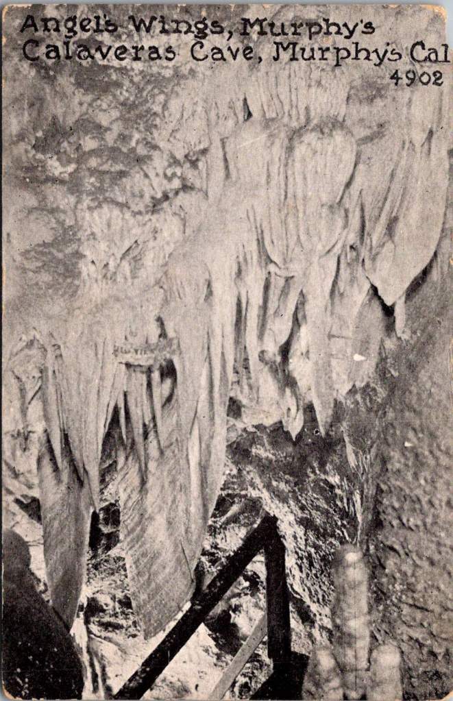
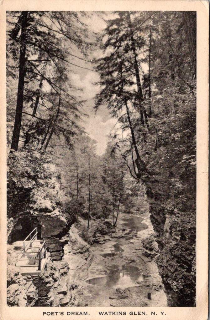
Vintage postcards reveal America’s enduring love affair with wild spaces. Through war, depression, and social upheaval, we’ve preserved these sanctuaries of peace.
On an autumn morning in 1935, Eleanor Roosevelt walked alone through the woods at her personal retreat in Hyde Park, New York. The First Lady had just returned from touring poverty-stricken areas in West Virginia, where families struggled to survive the Great Depression.
These morning walks were her ritual for processing the weight of what she witnessed in her tireless work. The woods, she would later write, helped her find the clarity needed to transform empathy into action.
Decades earlier, John Muir had written to a friend. His words would become a rallying cry for the American conservation movement, adorning everything from park posters to backpack patches.
The mountains are calling and I must go.
But what exactly is this call we hear from nature? Why do we feel drawn to preserve wild spaces and to protect them for future generations? And what happens to us when we answer that call?
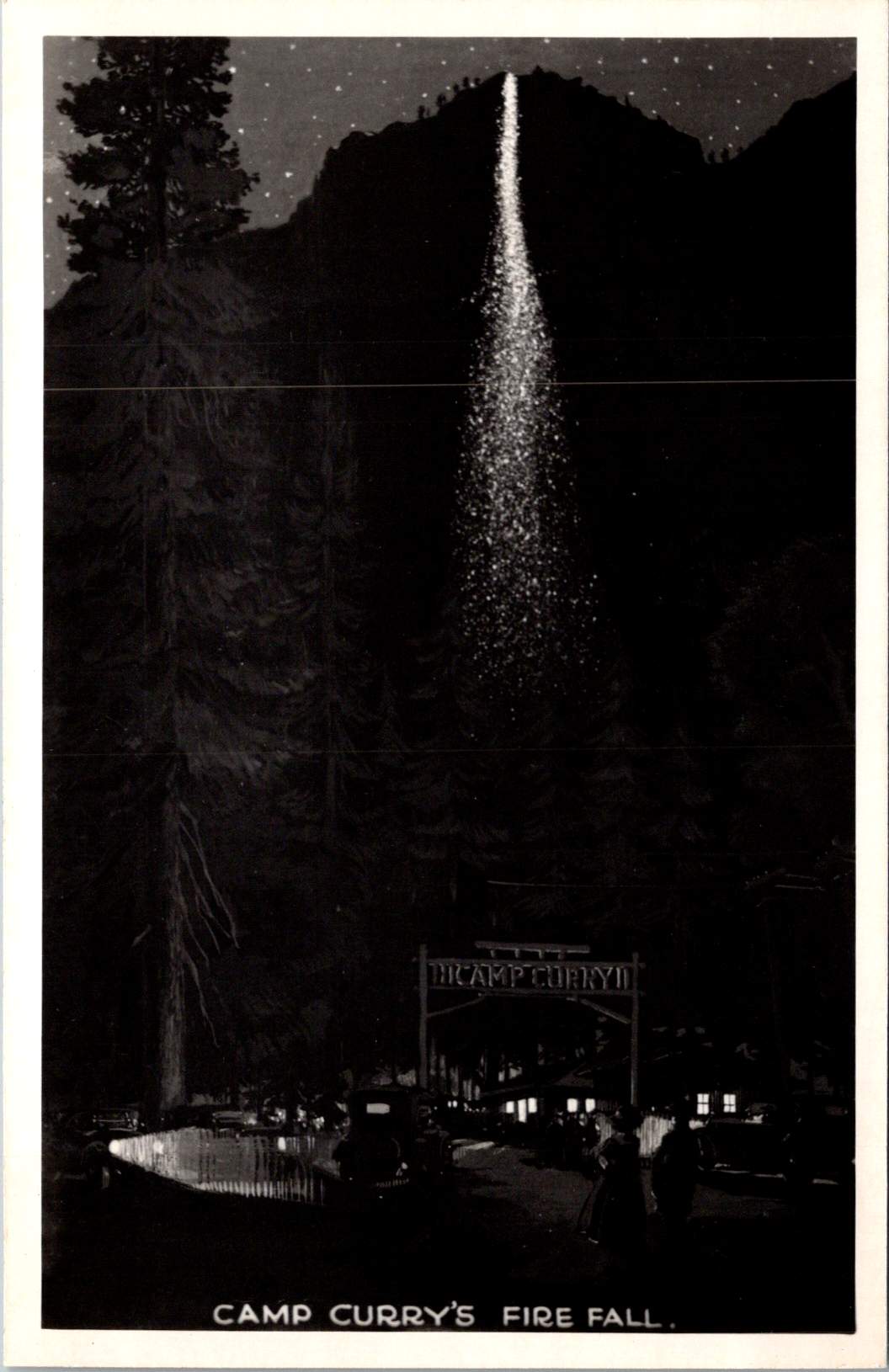
The ephemera spread across my desk capture America’s parks in saturated colors and earnest prose. Welcome to Yosemite and Camp Curry! The hope is that some special part of life is revealed.
These mass-produced mementos tell a story of democratic access to wilderness, of a shared heritage preserved through an unprecedented system of public lands. But they also hint at something deeper – our innate recognition that we need these spaces not just for recreation, but for restoration.
The same wisdom that guided Eleanor Roosevelt to seek solitude among the trees has been confirmed by modern science: nature calms us at a biological level.
Science of Serenity
When we step into a forest, our bodies respond immediately. Cortisol levels drop. Blood pressure decreases. Our parasympathetic nervous system – responsible for rest and recovery – becomes more active.
Even our visual processing changes: natural fractal patterns, like those found in tree branches and leaf veins, require less cognitive effort to process than the sharp angles and straight lines of human-made environments.
Trees release compounds called phytoncides that, when inhaled, enhance immune function and reduce stress hormones. Natural sounds – running water, rustling leaves, bird songs – engage our attention in a way that promotes neural restoration rather than fatigue.
Physiologically, exposure to diverse natural environments even affects our microbiome – the community of microorganisms living in and on our bodies. This microscopic ecosystem influences everything from mood regulation to stress response through the gut-brain axis. In a very literal sense, communion with nature changes who we are.
Preserving Peace
The story of how Americans came to preserve our wild spaces is, in many ways, a story about seeking peace – both personal and collective. The movement gained momentum after the Civil War, as a wounded nation looked westward not just for expansion, but for healing.
Frederick Law Olmsted, who fought depression throughout his life, designed public parks as democratic spaces where people of all classes could find restoration. His work on New York’s Central Park and other urban green spaces was guided by his belief that nature’s tranquility could help ease social tensions and promote civic harmony.
John Muir found his own peace in the Sierra Nevada after wandering the war-torn South as a young man. His passionate advocacy helped establish Yosemite National Park and inspired generations of conservationists.
But it was President Theodore Roosevelt, another seeker of nature’s consolation, who would transform individual inspiration into national policy. Roosevelt’s experience finding solace in the Dakota Territory after the deaths of his wife and mother shaped his approach to conservation. He understood viscerally that wilderness could heal, that it offered something essential to the human spirit.
During his presidency, he protected approximately 230 million acres of public land, establishing 150 national forests, 51 federal bird reservations, four national game preserves, five national parks, and 18 national monuments.
Women in the Woods
While Roosevelt’s dramatic expansion of public lands is well known, the role of women in American conservation deserves greater recognition.
Susan Fenimore Cooper, a student of her famous father, published Rural Hours in 1850 – a detailed natural history that influenced both Thoreau and the early conservation movement. Her careful observations helped Americans see local landscapes as worthy of preservation.
Marjory Stoneman Douglas fought to protect the Florida Everglades when most saw it as a worthless swamp. Her 1947 book The Everglades: River of Grass transformed public understanding of wetland ecosystems. She found that regular communion with nature sustained her through decades of advocacy work.
These leaders shared a practical approach to conservation, focusing on specific, achievable goals while maintaining remarkable equanimity in the face of opposition. Their work suggests that protecting nature and being protected by it can form a reciprocal relationship – the more we preserve wild spaces, the more they preserve something essential in us.
Dark Places
The path to peace often leads through our own shadows. While Americans preserve scenes of spectacular beauty, the relationship between nature and human resilience has been proven most powerfully in places of confinement and struggle. These dark places – prisons, exile, places of oppression – have paradoxically served as crucibles for some of humanity’s deepest insights about peace and connection to nature.
Nelson Mandela’s garden on Robben Island stands as a profound example. In the harsh environment of a maximum security prison, Mandela and his fellow prisoners created a garden in the courtyard where they crushed limestone. In his autobiography, he wrote: “A garden was one of the few things in prison that one could control. To plant a seed, watch it grow, to tend it and then harvest it, offered a simple but enduring satisfaction. The sense of being the custodian of this small patch of earth offered a small taste of freedom.”
This echoes the experience of Albie Sachs, who after surviving an assassination attempt that took his arm and the sight in one eye, found healing partly through his connection to the natural world. During his recovery, watching the ocean’s rhythms helped him develop the concept of his later book – Soft Vengeance – achieving justice through law rather than violence.
Martin Luther King Jr. often drew on natural imagery to maintain his equilibrium and express his vision during frequent detainment. From the Birmingham Jail, he wrote of the majestic heights of justice and used metaphors of storms and seasons to describe the civil rights struggle. His deep understanding of peace was shaped not just by moments of tranquility in nature, but by finding inner calm in places of confinement.
The Dalai Lama often speaks of how the Himalayas’ steady presence influenced Tibetan approaches to maintaining calm, even through decades of exile.
These experiences remind us that while we focus on America’s preserved wilderness spaces, the human need for connection to nature is universal. Peace is an American pursuit and a global birthright. When we protect natural spaces, we’re participating in something that transcends national boundaries – the preservation of humanity’s common sanctuary.
Paths to Peace
The leaders who shaped American conservation found different routes to and through nature. John Muir sought transcendent experiences, climbing trees in storms and walking thousands of miles in solitude. Gifford Pinchot, first chief of the U.S. Forest Service, took a more systematic approach, seeking balance between preservation and sustainable use. Rachel Carson combined meticulous scientific observation with poetic sensitivity to nature’s rhythms.
Their examples suggest there is no right way to find peace in nature. Some need solitude and silence. Others seek the raw tests of strengths and capacity, and find restoration in active engagement with the natural world. Some seek dramatic landscapes to ponder in awe, others find sufficient wonder in a city park or backyard garden.
Wild Wisdom
Ralph Waldo Emerson wrote in his essay on Nature, “…in the woods, we return to reason and faith.” His words point to something profound about nature’s effect on human consciousness – how it seems to restore us not just to calm, but to our truest selves.
Modern research into nature’s calming effects – the lowered cortisol, the enhanced immune function, the restored attention – helps explain the mechanisms behind what people have long intuited. For those who find great equanimity through connection with nature, there also seems to be an innate genius in each of us that emerges more fully in wild spaces.
We might experience this as artistic, spiritual, or intellectual – and perhaps even more fundamental – a capacity for presence, for wonder, for sensing our connection to something larger than ourselves. It’s what Eleanor Roosevelt accessed on her morning walks, what John Muir celebrated in his rhapsodic nature writing, what Jane Goodall tapped into during her patient observations of primates in Gombe.
The preservation of wild spaces represents more than conservation of natural resources or recreational opportunities. It preserves access to this deeper part of ourselves – the part that knows how to find peace, that remembers how to wonder, that recognizes our belonging in the larger community of life.
These vintage postcards capture more than just scenic views. They record moments when people felt called to share their experience of wonder, to say to friends and family that the experience mattered. The fact that we’ve preserved and share these places, despite constant pressure to exploit them, suggests we recognize they offer something essential to human flourishing.
Why the woods? Because something in us comes alive there. Because in preserving wild spaces, we preserve the possibility of encountering our own wild wisdom, and these revelations are too precious not to protect for future generations.
Each time we step into nature – whether it’s a national park or a neighborhood green space – we participate in this legacy of preservation. We join a long line of people who recognized that human flourishing depends on maintaining connection to places where we might find peace and that help us face whatever challenges await when we return.