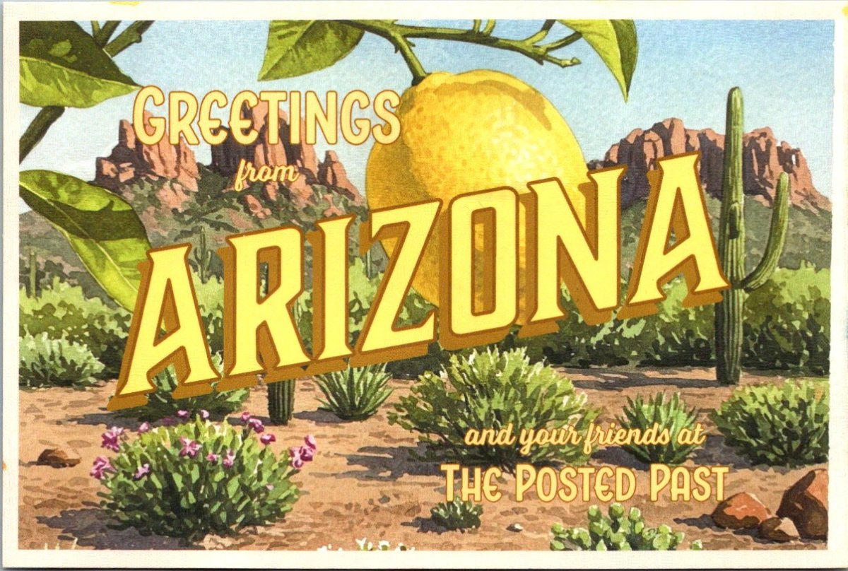
Here we go! The Posted Past heads into the fall season with rare cards, a new gallery, and a social mission to trade loneliness for connection.
featured postcard~ rare novelty card still holds a mystery
An early 20th century novelty postcard featuring humorous photography and personal correspondence from Missouri.
Front of the card: The photograph shows a young Black man in white shirt, suspenders, and dark trousers, grinning while holding a large broken umbrella overhead in a playful pose. Below reads the humorous caption “A little disfigured, but still in the ring”—typical novelty humor from the postcard craze era. A black border frames the photograph on cream cardstock.
Back details: The reverse bears “Carbon Photo Series No. 513” identifying the commercial publisher’s series. Addressed to Miss Grace Skillman in Pleasant Hill, Missouri, with a green 1-cent Franklin stamp and clear 1908 postmark. The handwritten message describes an exhausting early morning wait in Lee’s Summit for “Brother and Frank,” and promising a longer letter that evening.
“Still in L.S. haven’t slept but about ten minutes. My eyes looks like two burnt holes in a blanket. Brother and Frank hasn’t come yet. I will wait till 7.30 and then go home. Will write tonight. Just finished my breakfast. I will eat if not sleep. I got here ten till five.
Condition and Appeal: The sepia-toned image displays characteristic early photography with some age spots, and a nicked corner. The image and reverse side remain in good condition with clear photography and legible handwriting. The “Carbon Photo Series” indicates premium production using carbon-based printing methods prized for superior image quality and archival stability. Grace Andre Skillman was born in Pleasant Hill in 1889, making her nineteen when she received this card. The message and the lack of formal salutation and signature suggest this is casual ongoing family correspondence. As a result, the author of the postcard remains a mystery.
Vintage novelty postcards are increasingly collectible, especially numbered commercial series with documented recipients. Collectors of African-Americana may find the image appealing and relatively rare. The combination of carbon printing technology, humorous subject matter, and personal correspondence is of interest to collectors of vintage photography, postcard enthusiasts, genealogy researchers, and those focused on early 20th century American social history and communication.
Introducing~ The Posted Past Art Card Gallery
A selection of Larry L’Ecuyer’s watercolor landscapes are on display in our Online Art Card Gallery. Fitting as our first show. Enjoy!
Countdown to a Lakeside Getaway, 2025, Larry L’Ecuyer, watercolor on postcard
NEWS & UPDATES~ art card call for submissions is open
The World’s Smallest Artist Retreat (our P.O. Box) is awaiting your art card submission. Follow one rule to join the next open show. Details here!
Art card kits now in stock
Our Art Card Kits are perfectly-packaged as a fun, creative activity for you and a friend to complete in as little as an hour or made into a lovely afternoon.
The kit includes two postcard blanks, six vintage finds curated to the chosen theme, and a bundle of collage goodies for your whimsy. There is a free gift inside, too!
Once you’re done, surprise someone with an original art card in their mailbox. Or, send it back to us to include in the next online show. Either way, you’ll have cultivated a little joy in your garden.
Words to heed and repeat, and a life’s work to regard.
George Washington Carver Educational Postcard
This vintage educational postcard (likely printed in the mid-1960s) features quotations from agricultural scientist George Washington Carver (1864-1943), displayed on an exhibit at George Washington Carver National Monument. The card presents Carver’s thoughts on success, preparation, and nature alongside his portrait. Carver, born into slavery, became a prominent botanist and inventor who developed hundreds of uses for crops like peanuts and sweet potatoes while teaching at Tuskegee Institute for 47 years.
I love to think of nature as an unlimited broadcasting system, through which God speaks to us every hour, if we will only tune in. — George Washington Carver
The George Washington Carver National Monument, established in 1943 near Diamond, Missouri, was the first U.S. national monument dedicated to an African American. Located at Carver’s birthplace, it preserves his legacy and the 1881 Moses Carver house where he lived as a child. The National Park Service now manages the 240-acre nature preserve and historic site.
The summer slow-down is coming to a close, and The Posted Past is launching into a new phase as a social enterprise. On Wednesdays, you’ll still receive a weekly wander through postcard history, along with a new focus on rare cards, and a regular review of the art cards we receive at the World’s Smallest Artist Retreat (our P.O. Box). More inspiration as our circle expands. Wisdom, wisecracks, and butterfly wings. See you in September… next week!
Sweet readers, this is your pre-preview of something very fresh, and a long time coming…
Hold a vintage postcard in your hand and flip it front to back.
On the front, usually an idealized world. Sun-drenched beaches, pristine mountain vistas, city streets captured at their most photogenic moments. Designed to say, “Wish you were here!”
Flip it over, and you find something entirely different. The back reveals the personal, the quixotic, sometimes the magically mundane.
“Weather awful, hotel terrible, a bit bothered by a smelly seatmate on the plane, but having a wonderful time anyway.”
Postcards fascinate me precisely because they embody all of life. They’re both public and personal, both idealized and achingly real. They bring the past forward in time, making unexpected connections with family, friends, and special places—revealing who we have been along the way.
On a very old postcard, the handwriting of someone long gone comes alive again right before our eyes. A jotted note gives us a new view into their private world. Their words leap over the decades to reach us. There is a lush creative commons between now and then, a liminal green lawn to lounge on and take in the cool air.
I have lived happily in those in-between spaces for the last few years. Somewhere in the middle of my life and career and enjoying myself in the meantime. Not where I was before, and both curious and terrified about what comes next.
Well friends, like the best summer novel, the plot thickens.
Starting in September, The Posted Past officially launches a new phase as a social enterprise, inspired by the simple truth that we can trade loneliness for connection, one postcard at a time.
We have already done it, friends!
As one of my earliest subscribers, you have enjoyed (I hope!) an essay every Wednesday for the last year. Going forward, you’ll still get those delightful diversions that remind us we are more than we knew. I’ll also offer sneak peeks at rare postcard finds, each one a small treasure with its own story to tell.
Old or new, postcards have a job to do.
Along the way, I have fallen in love with making and receiving Art Cards. My brother started mailing the lovely landscape watercolors he does when insomnia strikes. A collage free-for-all at the local gallery had me re-inspired by the ‘ransom note’ style I used to do as a teenager. Blink-blink… I found myself dreaming up fabulous cards to make.
Art cards celebrate the artist in all of us. I particularly love collage and watercolor, but truly an art card can be made with scraps. Sometimes the most satisfying work comes from simple gestures, too. Slow down enough to make something with your hands, and then send it away to make someone’s day.
Coming this fall, The Posted Past will feature an online gallery where you can browse through handmade artwork that has traveled across time and space, carrying all the marks of love, adventure, and everyday life. Call for submissions now open, mail your art card to: The Posted Past, P.O. Box 24431, Tempe, AZ 85285.
Abundance can be overwhelming, and it’s not always easy. Right now, I feel both confident and queasy. But, I’m not alone. Here’s how you can help.
Become a paid subscriber—hit the button below to support the effort
Pre-order an Art Card Collage Kit (coming soon!) for your own creative fun
Make an art card and send it to us—be first in the online gallery show!
Though we revel in real life, the handmade, and the historic, The Posted Past is also meant to be super social. Excuse our dust, and help us get started!
Browse the collection of vintage postcards on eBay and follow the store
Both/and. Past and future. Solitude and connection. Cardboard curiosities and some larger-than-life dreams. Thank you for being here together. Keep an eye on your inbox and mailbox—September is full of surprises!
A vibrant Buff-Bellied Hummingbird hovering near a red tubular flower, showcasing its iridescent green head and back, rusty-orange belly, and needle-like bill in a classic feeding pose.
Detailed illustration of a Ferruginous Hawk perched on a branch, displaying its characteristic rusty-brown and white plumage with distinctive feathered legs and robust build typical of North America’s largest hawk.
Depicts a Gray Jay (now called Canada Jay) perched on a snow-dusted branch with small green lichens, showing its fluffy gray and white plumage, black cap, and compact songbird form.
A pair of Pine Warblers on coniferous branches, displaying their olive-yellow plumage with white wing bars and the subtle dimorphism between the brighter male and more subdued female.
A Cattle Egret in breeding plumage with golden-buff crest and back feathers, bright orange-red bill and legs, posed in the elegant stance typical of these large birds.
A set of five Reader’s Digest Association postcards from their Book of North American Birds series. High-quality illustrations and professional production from the 1970s-1980s era of educational materials. Particularly appealing to birders and natural history enthusiasts. Good condition, unposted with no marks. See photos for actual condition. Vintage items – writing, stains, color changes, and wear are part of charm and provenance.
[Note: Summer focus is on detailed captions. Essays return in September!]
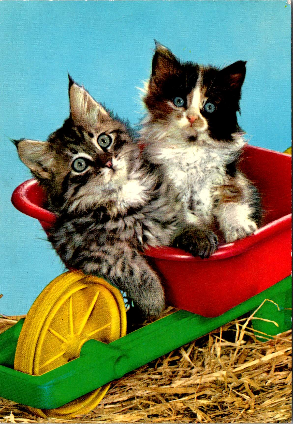
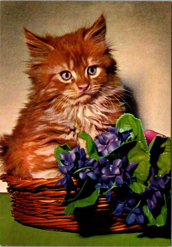
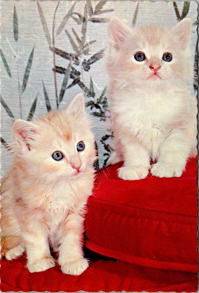
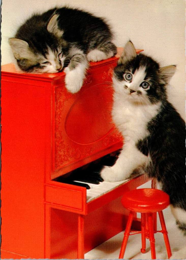
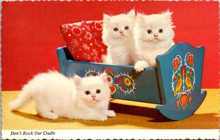
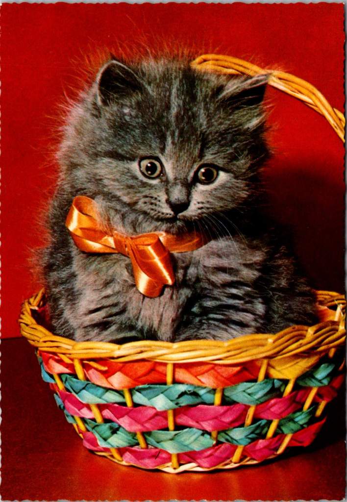
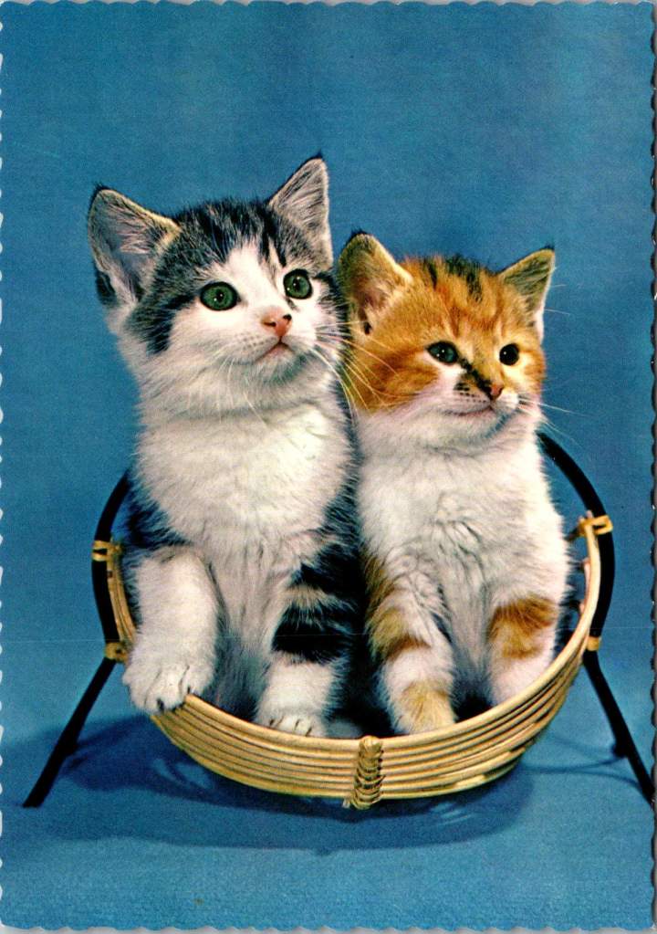
Science says gazing at adorable kitten pics can boost your mental health. But you don’t really need a reason, do you?
Life is tough. Bills pile up, deadlines loom, and some days it feels like the world is on fire. That’s precisely when we need something small, fuzzy, and adorable to remind us that not everything is terrible. First choice? Kitten photos, the internet’s gift to humanity’s collective mental health.
When the news cycle feels like a never-ending disaster movie, there’s something healing about a tiny fluffball curled up in a teacup or peering curiously from behind a houseplant. These miniature pouncers, with their disproportionate paws and earnest expressions, serve as nature’s meditation.
Scientific studies suggest that viewing cute animal content can improve focus, boost mood, and temporarily reduce anxiety. It’s a mental health break in fuzzy form—no prescription needed. Even better, we sent kitten postcards to each other long before the digital age. Proof that science is just catching up.
Cute kittens provide a guilt-free excuse to pause, smile, and recall that life’s greatest joys come in small packages. They remind us that it’s okay to be happy, and to hide toys in the couch.
Copper maps. Wooden cards. Puzzle prints. Discover how obsolete technologies transform into art and craft, and explore why we can’t stop reinventing the perfect postcard.
In this age of instant digital communication, the persistence of physical postcards presents an intriguing contradiction. These rectangular pieces of cardstock—designed to carry both image and correspondence through postal systems without an envelope—serve as artifacts of a communication method that had its heyday a century ago. But rather than disappear entirely, postcards have evolved in novel ways that tell us even more about who we are.
Why We Seek the New
Humans have always been drawn to novelty. Our brains light up at the unfamiliar—it’s a survival mechanism that once helped our ancestors notice changes in their environment that might signal danger or opportunity. But our relationship with novelty runs deeper than vigilance. We seek out new experiences, objects, and sensations even when no practical threat or benefit is apparent.
This human attraction to novelty serves several purposes. First, it provides simple pleasure—the dopamine release that accompanies discovery keeps us engaged with our surroundings. Second, it helps us learn and adapt—new situations force us to develop new skills. Third, it offers social currency—being the first to discover, own, or report something novel (even if untrue!) gives us a kind of status within our communities.
Perhaps most fundamentally, novelty helps us fight against the deadening effect of habituation. We become blind to what remains constant around us, a psychological phenomenon called “sensory adaptation.” Think of how you stop noticing a persistent background sound, like traffic noise. Novelty jolts us back into conscious appreciation, like noticing the birdsong instead, making us sense the familiar differently.
With mass-produced consumer goods, we often pursue novelty through customization or unique variants—like these postcard alternatives. They satisfy our craving for something special while maintaining connection to recognizable forms. Even novelty doesn’t stray too far from the familiar.
Technology Becomes Art
As technologies age and are replaced by more efficient methods, something interesting happens—the displaced technology often shifts from the realm of utility to the realm of artistry and craft. What was once valued primarily for function becomes appreciated for form, precision, and the visible human touch.
Letterpress printing was an extraordinary innovation of its time and once the standard for all printed matter. It was largely replaced by offset printing in the 20th century and later the digital methods we use today. But rather than disappearing, letterpress evolved into a premium craft, prized for its tactile quality and visible impression on paper—characteristics that were originally just side effects of the technique, not its intended purpose.
The same transformation happens with many technologies: vinyl records, film photography, mechanical watches. As digital alternatives take over the functional role, the analog predecessors become vessels for history, craftsmanship, ritual, tactile pleasure. They move from being tools to being experiences.
This pattern helps explain our collection of novelty postcards. Somewhere in the middle of last century, the standard paper postcard was functionally superseded by digital communication, freeing it to evolve into these more elaborate, less practical forms. They represent a technology in its artistic phase—no longer bound by strict utility, but free to explore expressive and sensory possibilities, along with kitsch and commercialism.
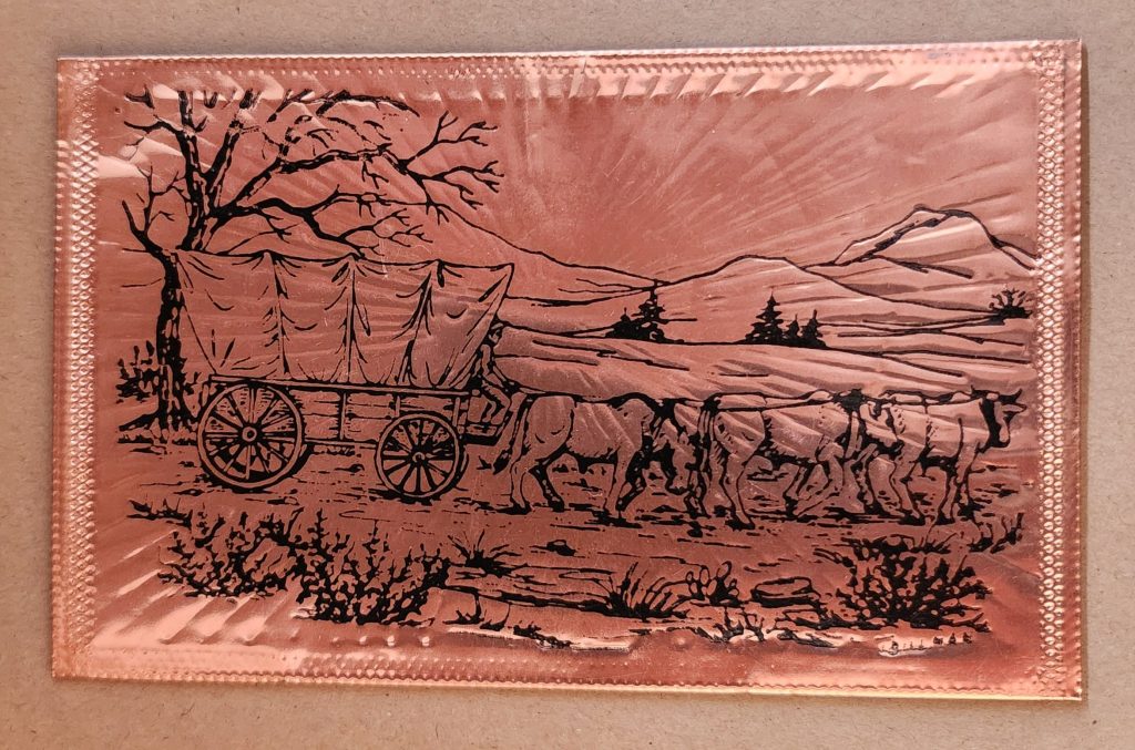
Utah in Copper Relief
The copper-embossed Utah souvenir represents one of the more elaborate departures from traditional postcard design. The metallic rectangular plate features a raised topographic outline of the state with embossed illustrations of regional landmarks and attractions. The word UTAH is prominently displayed at the top, while places like Vernal, Provo, Cedar City, and St. George are labeled at their approximate locations. The copper medium gives the piece warmth, with a decorative scalloped border framing the state’s geography and securing the paper card below.
The manufacturing process likely involved die-stamping or embossing thin copper sheeting, a technique that dates back to the late 19th century and regained popularity in mid-20th century souvenirs. The tactile nature of the raised elements invites touch, creating a multisensory experience unavailable in traditional flat postcards. The utility of this object as actual correspondence is significantly diminished—the copper surface resists easy writing, and its weight requires additional postage and hand-canceling. It’s more a miniature commemorative plaque that happens to maintain postcard dimensions.
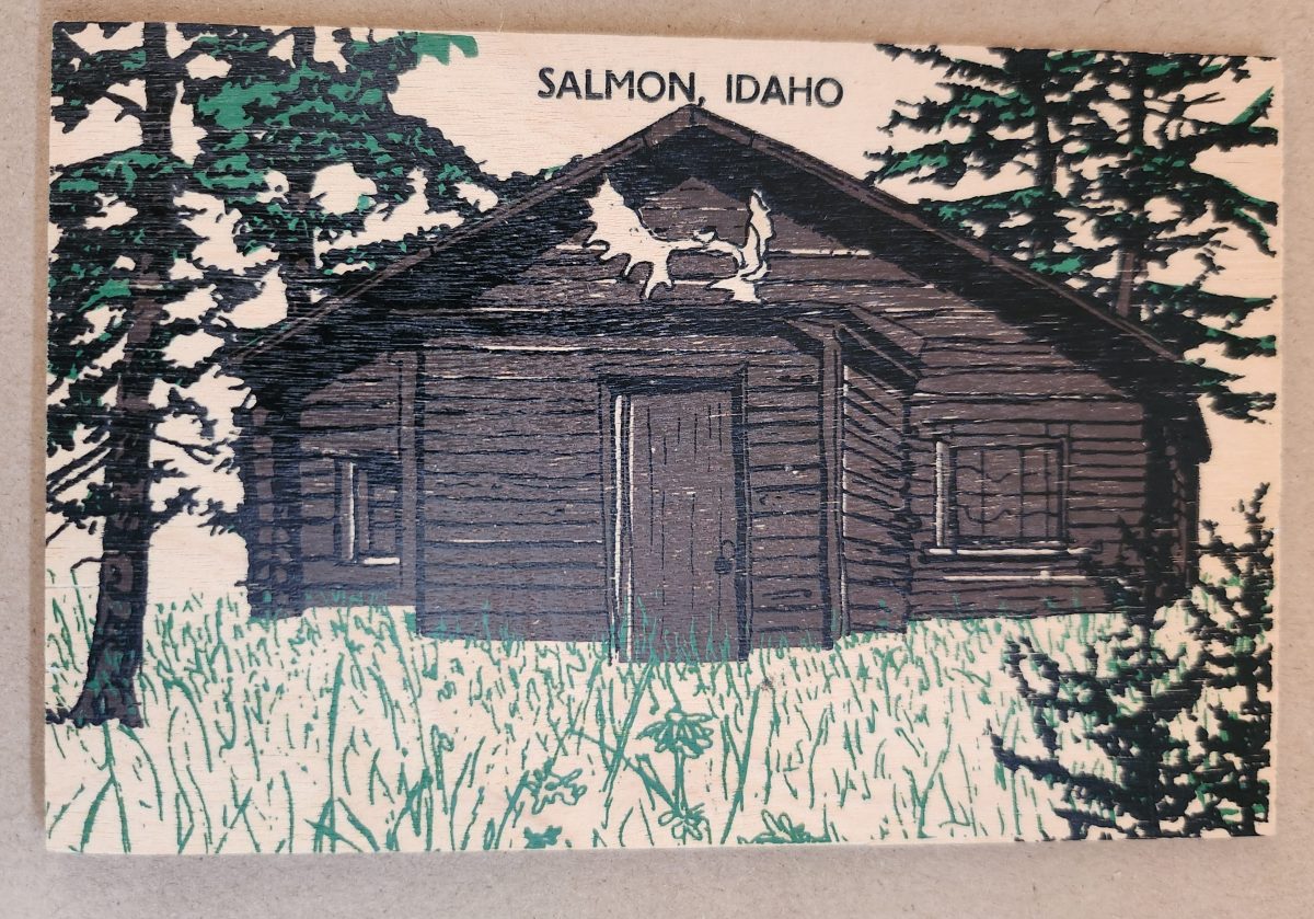
Woodsy Aesthetics
Let’s look closer now at a novelty postcard featuring a cabin in Salmon, Idaho, printed onto a thin wooden substrate and depicting a rustic cabin nestled among stylized pine trees. The scene employs a limited color palette—brown and black for the structure and green for the surrounding vegetation—lending it a deliberately simple aesthetic that echoes both woodcut prints and traditional lithography.
The simple text at the top identifies the location without intruding on the scene. The artwork itself employs minimal detail, capturing the essence of rural life rather than photographic accuracy. The manufacturing process of printing onto thin wood veneer allows for mass production, while adding a specific scene, location name, and ink color for customization.
This card’s rustic medium and subject matter work in harmony, creating a self-referential object where the material reinforces the message—a wooden card depicting a wooden structure set within a forested landscape. The medium becomes part of the message, suggesting authenticity through material consistency. Though mass-produced, it strongly evokes a rural sensibility.
Framed Vistas
Our souvenir from Yellowstone National Park adopts yet another approach. This card features a stylized illustration of Yellowstone’s grand canyon and waterfall printed on cardstock and mounted on a wooden backing.
The artwork employs a palette of oranges, purples, blues, and whites to capture the dramatic landscape, with the falls rendered as a white vertical streak against colorful canyon walls. Dark silhouettes of pine trees frame the scene, while puffy clouds hover in a light blue sky, held inside a purple border. The stylized typography echoes vintage travel posters from the early to mid-20th century. The entire image is mounted or printed on a natural wood base, visible as a frame around the illustration.
This card’s production combines offset printing with a wooden substrate—a look that recalls both traditional woodblock prints and mid-century travel advertisements. The design deliberately evokes an era of American national park tourism when artistic posters commissioned by the Works Progress Administration and the National Park Service established a distinctive aesthetic for natural landmarks.
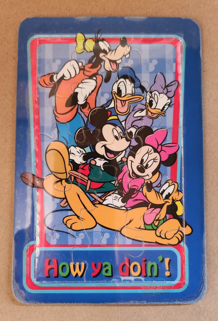
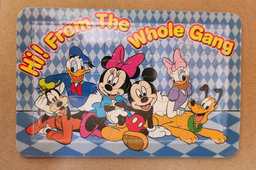
Playful Puzzles
The Disney puzzle postcard introduces an element of interaction we haven’t seen before. This card features Mickey Mouse, Minnie Mouse, Donald Duck, Daisy Duck, Pluto, and Goofy arranged in a group pose against a blue-and-white checkered background. The message reading “Hi From The Whole Gang” in bubble text curves around the edge of the image.
This item turns a postcard into a simple jigsaw puzzle—die-cut pieces that can be jumbled and reassembled to reveal the printed image. The manufacturing process involved full-color printing followed by precision die-cutting to create interlocking puzzle pieces, then applying a thin adhesive film to maintaining the card’s overall integrity for mailing.
This souvenir represents a curious hybrid—a postcard that actively invites its own disassembly. The Disney characters themselves represent another layer of nostalgia, combining America’s animation icons with the traditional postcard format to create an object that references multiple forms of 20th-century popular culture simultaneously. But only modern technology could accomplish these manufacturing details, a playful combination of familiar and fresh.
Magnetic Memories
The Will’s Hardy Trees and Seeds magnetic card is the one in our set with the most layers of both meaning and making. See packets, postcards, fridge magnets, and agricultural Americana all combine in this take home treasure.
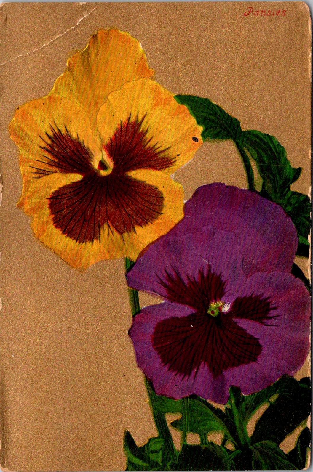
The 1909 seed catalog cover is a contemporary image inspired by the real-life Oscar H. Will & Co. of Bismarck, North Dakota. The vibrant illustration displays pansies in various colors—purple, yellow, orange, pink, and white—arranged in a bouquet. Text identifies the company’s 26th year of operation and describes their products as the “choicest and most beautiful on earth”.
A small purple circle overlay on the plastic film cover announces the item’s true nature: a magnetic postcard to send as a gift. Despite its historical appearance and postcard dimensions, the object is actually a refrigerator magnet that merely references seed catalog and postcard aesthetics. The production involved digital printing on magnetic sheet material, applying a printed paper backing, and slipping into a plastic cover with instructions to mail the gift in an envelope.
As a novelty item, it reveals a peculiar circularity. A reproduction of a commercial artifact (seed catalog) transformed into a correspondence medium (postcard) further transformed into a decorative household item (refrigerator magnet). Somehow, we love each iteration all the more.
Nostalgia Squared
What these examples share is a relationship with nostalgia that operates on multiple levels. They aren’t simply nostalgic; they engage in a looping nostalgia—nostalgic representations of already nostalgic forms.
The copper Utah relief draws upon mid-century tourist souvenirs, themselves designed to evoke frontier-era maps and territorial markers. The Salmon cabin employs modern production techniques to simulate traditional woodcuts nad print, which were themselves often romanticized depictions of rural life. The Yellowstone cards references mid-century national park posters that were already stylized interpretations of natural wonders. The Disney puzzle incorporates cartoon characters who have become nostalgic cultural icons, presented in the format of childhood games. The Will’s Seeds magnet reproduces early 20th-century commercial art that was, even in its original context, employing Victorian aesthetic sensibilities.
This layering of reference creates objects that are remarkably dense with cultural signifiers despite their modest physical dimensions. They offer not just a connection to place and time but to the ways we’ve represented ourselves and our interests through commercial souvenirs.
Our apparent need for novelty, then, might be better understood as a need for continual context. Each new postcard iteration doesn’t merely replace what came before; it absorbs and references it, creating objects that function as compact archives of our evolving relationship with the characters and places we cherish.
These novelty postcards sit at an interesting crossroads of commerce, craft, and communication. They represent what happens when a formerly utilitarian object—the humble postcard—is freed from its purely practical obligations and allowed to evolve along lines dictated by sentiment, aesthetics, and novelty.
In a world increasingly dominated by digital experiences, these physical novelties offer something screens cannot—texture, weight, presence. They satisfy our hunger for the tangible. Their quirky, sometimes impractical forms speak to a human need more fundamental than efficient communication: the need to hold something unique in our hands, and to feel a physical connection to places we’ve been and experiences we’ve had.
The postcard itself is and was a very simple concept and object that, over time, has become a medium for ongoing conversations about permanence and impermanence, about what we value over time, and about the tension between utility and sentiment. In their various novel forms, these more-than-postcards tell us about places we’ve been and how we’ve chosen to remember and delight in those places—a correspondence not just between people, but between past and present.
From the verdant hues of the rainforest to the toxic green pigments adorning Victorian wallpaper, green embodies our most profound contradictions. This single color represents both life and decay, wealth and envy, nature and artifice.
In the Amazon rainforest, vegetation thrives in countless green hues, symbolizing life’s abundance. Yet in Western art, sickly green often signifies death and corruption. How can one color embody such opposed concepts? This tension—between green as vitality and green as decay—forms the central paradox in humanity’s relationship with this enigmatic tertiary hue.
Green occupies a unique position in our visual lexicon. It bridges the cool tranquility of blue and the energetic warmth of yellow. This intermediate status perhaps explains its dual nature—a color of balance that simultaneously contains opposing forces.
Toxic Chemistry: From Wallpaper to Printer’s Ink
The story of green pigment drips with poison. For centuries, the most vibrant greens came from copper arsenite, creating infamous “Paris Green” that adorned Victorian wallpapers and allegedly contributed to Napoleon’s death through arsenic poisoning. Scheele’s Green, developed in the late 18th century, released deadly arsenic gas when dampened. Victorian walls literally “breathed” death through their verdant decorations.
This toxic history highlights a contradiction: the color most associated with natural life proved historically among the most unnatural and deadly to produce. Nineteenth century painters risked chronic arsenic poisoning for the perfect emerald tone.
Printing technology reveals another dimension of green’s complex nature. Traditional lithography treated green as a distinct entity. Master printers blended pigments to create precise green tones before applying them to printing stones. Toulouse-Lautrec’s lithographic posters featured carefully formulated green inks to capture the absinthe-tinged atmosphere of Parisian nightlife.
Modern CMYK printing creates green through optical mixing instead. Green isn’t a primary ink but emerges from combining yellow and cyan dots in precise patterns. This technique echoes Neo-Impressionist pointillism, where artists like Seurat placed distinct color dots side by side, allowing viewers’ eyes to blend them into a third color. A magazine’s solid green leaf reveals itself as an array of cyan and yellow dots under magnification.
This absence-made-present quality of green in modern printing mirrors its philosophical status: green exists at boundaries between colors and concepts. While our eyes perceive green as distinct (wavelength 495-570 nanometers), the printing process creates it through subtraction and combination—an illusion constructed from non-green components.
Green Means Go
One of green’s most recognized meanings emerged in the late 19th century with traffic signals. Green indicating “go” now transcends language barriers worldwide.
This standardization began with British railway signals in the 1830s, borrowing from maritime tradition where green lights indicated starboard. The first traffic light with red and green signals appeared outside London’s Parliament in 1868, predating automobiles. Gas-lit red and green lamps operated manually by police officers guided horse-drawn carriages.
The choice wasn’t arbitrary but built on psychological associations. Green’s connection to safety likely stems from evolutionary biology—natural green environments generally signal available food and absence of danger.
The 1949 Geneva Protocol formalized green’s role in traffic systems globally. Today, from Tokyo’s sophisticated networks to remote Indian intersections, green universally permits passage. This standardization extends to pedestrian crossings, airport runways, and maritime navigation.
This creates a fascinating contradiction: the color most associated with nature now primarily serves an urban, technological function. Times Square’s green traffic light and the Moscow Metro’s green signal represent perhaps green’s most recognized meaning—entirely disconnected from the natural world that gave the color its original significance.
Green’s role as “go” permeates language. “Getting the green light” implies permission and opportunity. Business reports use green to indicate positive metrics. This association with forward movement and progress creates another layer of meaning for this multivalent color.
Envy and Avarice
Perhaps nowhere is green’s paradoxical nature more evident than in its associations with money and envy. Shakespeare’s description of jealousy as “the green-eyed monster” in Othello connects the color to one of humanity’s most corrosive emotions. This association may stem from physiology—intense jealousy can produce a pallid, greenish complexion due to blood flow changes—the body manifesting emotion through color.
Currency, particularly American dollars, has become synonymous with green. “Greenback” entered common parlance as a synonym for money. The decision to print American currency in green stemmed from practical concerns—green ink resisted photographic counterfeiting and remained chemically stable. This pragmatic choice evolved into a powerful cultural symbol representing both opportunity and excess, freedom and materialism.
Medieval European art portrayed avarice through green-tinted figures clutching moneybags. Giotto’s 14th-century fresco “The Seven Deadly Sins” in Padua’s Scrovegni Chapel depicts Avarice with greenish skin, visually linking the color to unnatural desire for wealth.
Green Flags
Green features prominently in approximately 40 national flags, each instance carrying distinct cultural significance. Brazil’s verdant background represents the Amazon rainforest, directly linking national identity to landscape. Saudi Arabia’s entirely green flag connects the color to Islamic associations with paradise and the Prophet Muhammad.
Nigeria’s vertical bands with green on either side symbolize natural wealth and agricultural resources. Similarly, Pakistan’s predominantly green flag represents both Islamic heritage and agricultural prosperity. In Ireland, green in the tricolor evokes both the verdant landscape (“Emerald Isle”) and Catholic nationalist tradition.
Portugal’s green carries revolutionary significance, representing hope following the Republican revolution of 1910. The Italian tricolor uses green to complete its representation of the natural landscape—the Alps’ snow, Mount Etna’s lava, and the country’s fertile plains.
Green in many African nations’ flags—including Senegal, Cameroon, and Zimbabwe—often represents natural resources and agricultural wealth, while simultaneously nodding to Pan-African colors inspired by Ethiopia’s flag.
These varied uses in national symbolism show how green serves as canvas for diverse values: religious devotion, natural abundance, revolutionary hope, and cultural heritage—sometimes simultaneously within the same emblem.
Green Spaces
The concept of “green space” contains inherent tension. In urban planning, green spaces represent deliberate human interventions—parks and conservation areas that preserve nature within developed landscapes. New York’s High Line transforms an abandoned railway into a linear park, while Singapore’s Gardens by the Bay creates futuristic “supertrees” blending technology and nature.
In Bali’s rice terraces, agricultural practice created one of the world’s most striking green landscapes. These centuries-old terraced fields follow hillside contours, representing harmony between human needs and natural topography that has become iconic in travel photography.
“Greenwashing” introduces another tension—the superficial application of environmental imagery to mask environmentally harmful practices. The color once simply representing nature now carries political dimensions, conscripted into debates about sustainability and corporate responsibility.
Beyond Growth
The “green economy” represents perhaps the most significant modern appropriation of the color, embodying tension between environmental sustainability and economic development. Traditionally seen as opposing forces, the green economy concept attempts reconciliation, suggesting an economic system generating prosperity without degrading ecological systems.
This reconciliation attempts to resolve fundamental tension in green’s symbolism. The color representing both verdant growth and corruption of excess now stands for an economic model decoupling prosperity from environmental harm.
Yet the green economy concept contains internal contradictions. Critics argue “green growth” often represents contradiction in terms—attempting to maintain unsustainable consumption through marginal efficiency improvements. This criticism spawned more radical conceptions, including the circular economy model.
The circular economy transcends the linear “take-make-dispose” industrial model to envision economic activity mimicking natural cycles. In nature, nothing wastes—one organism’s decomposition nourishes another. Fallen leaves decay into soil feeding the next generation. This cyclical pattern contrasts with the ever-upward arrow of traditional economic growth charts.
Inspired by natural systems, circular economy advocates like Ellen MacArthur envision products designed for disassembly and reuse, with materials continuously circulated rather than discarded. The bright green growth arrow transforms into a green regeneration circle—emblematic in recycling symbols worldwide.
This shift from growth-as-expansion to growth-as-renewal reimagines green’s economic symbolism. Finland’s forests, supplying timber under strict regeneration requirements, exemplify this approach—harvested trees always replanted, creating sustainable cycles rather than mere extraction. This forest management system models how economic activity can align with natural regeneration.
The Color of Paradox
Green remains the color of paradox—simultaneously natural and artificial, life-giving and toxic, calming and unsettling, signifying unfettered growth and mindful circularity. This duality explains its enduring fascination. Unlike primary colors with straightforward associations, green exists in in-between spaces—a tertiary tone refusing simple categorization.
From deadly Victorian pigments to digital screens, from Islamic tradition to environmental movements, from envious emotions to regenerative economics, green continues evolving while maintaining fundamental tensions. In all its tertiary complexity, green continues defining spaces where human creativity engages with fundamental forces of growth, change, and renewal.
Early postcards represent a convergence of innovations in printing, photography, and postal delivery—each with its own players, craft, and history. The emergence of the simple picture postcard depended on a complex international network of industries, technologies, and regulations developed in the prior century.
Art for the Masses
The development of chromolithography in the late 19th century provided the technological foundation for colorful mass-produced postcards. Though lithography itself dated back to 1796, when Alois Senefelder developed the process in Munich, the refinement of color lithography reached new heights in the 1870s-90s, with different national styles emerging.
German printers particularly mastered the technique of creating separate limestone printing plates for each color, allowing for vibrant multi-color images that previously would have required expensive hand-coloring. A typical color postcard might require five to fifteen separate printing runs, with perfect registration between colors. This level of precision required specialized equipment and highly trained craftsmen.
German chemical industries produced superior inks and dyes, giving their postcards more vibrant and stable colors than competitors. Companies like BASF and Bayer, originally founded as dye manufacturers, provided innovative colorants specifically formulated for printing applications.
The German city of Leipzig emerged as a center of printing excellence, with firms like Meissner & Buch establishing international reputations for quality. German chromolithography was so superior that even American publishers would often have their designs sent to Germany for printing, then shipped back to the United States for distribution—at least until tariff changes in 1909 made this practice less economical. Publishers like Raphael Tuck & Sons maintained offices in Germany despite being headquartered in London, simply to access German printing expertise.
While Germany led in technical quality, French postcards developed a reputation for artistic sophistication. Paris publishers like Bergeret and Levy et Fils produced cards featuring Art Nouveau styles and artistic photographic techniques. The French market also developed distinctive “Fantaisie” postcards featuring elaborate designs with silk applications, mechanical elements, or attached novelties. These cards pushed the boundaries of what a postcard could be, turning functional communication into miniature works of art.
British publishers like Raphael Tuck & Sons, J. Valentine & Co., and Bamforth & Co. showed particular commercial acumen. While they didn’t match German printing quality or French artistic sensibility, British firms excelled at identifying market opportunities and consumer trends. The British pioneered specialized categories like the seaside postcard and led in developing postcards for specific holidays and occasions.
Photographic Reality
While lithographic postcards dominated the market, photography increasingly influenced postcard production. The collodion wet plate process (1851) and later the gelatin dry plate (1871) made photography more accessible. The development of halftone printing in the 1880s allowed photographs to be reproduced in print media without manual engraving, creating more realistic imagery.
A revolutionary moment came in 1903 when Eastman Kodak introduced “Velox” postcard paper. This pre-printed photographic paper had postcard markings on the back and a light-sensitive photo emulsion on the front. Combined with Kodak’s 3A Folding Pocket camera, which produced negatives exactly postcard size (3¼ × 5½ inches), this innovation created the Real Photo Postcard (RPPC).
The acquisition of Leo Baekeland’s Velox photographic paper company in 1899 for $1 million provided a crucial technological component. Velox paper could be developed in artificial light rather than requiring darkroom conditions, had faster developing times, and produced rich blacks and clear whites—all critical qualities for postcard production.
The RPPC format found particular success in America, where the vast geography meant many small towns would never appear on commercially printed postcards. Local photographers throughout the country created RPPCs of main streets, businesses, schools, and community events, documenting American life with unprecedented comprehensiveness.
International Postal Agreements
Even the most beautifully produced postcard would be meaningless without an efficient system to deliver it. The standardization of postal systems in the late 19th century created the infrastructure necessary for postcards to flourish.
A watershed moment for international mail came with the Treaty of Bern in 1874, establishing the General Postal Union (later renamed the Universal Postal Union or UPU). This organization created the first truly international postal agreement, initially signed by 22 countries, primarily European nations. The United States joined the UPU in July 1875, connecting the American postal system to the standardized European networks. The U.S. had introduced its own government-issued postal cards in 1873, but joining the UPU meant these could now be sent internationally under consistent regulations.
Several key UPU Congress developments shaped the postcard’s evolution. The 1878 Paris Congress renamed the organization to Universal Postal Union. The 1885 Lisbon Congress standardized the maximum size for postcards (9 × 14 cm). The 1897 Washington Congress set new international regulations for private postcards. The 1906 Rome Congress standardized the divided back format internationally.
Perhaps the most crucial postal development for postcard popularity was the divided back. Great Britain introduced this format in 1902, with France and Germany following in 1904, and the United States in 1907. Before the divided back, the entire reverse of a postcard was reserved for the address only, with messages having to be squeezed onto the front, often around the image. The new format allocated half the back for the address and half for a message, dramatically improving postcards’ utility as correspondence tools.
European Delivery Systems
European railway networks proved ideal for postal delivery, creating a remarkably efficient system. By the 1870s-80s, most European countries had developed comprehensive rail networks. Germany alone had over 24,000 miles of railway by 1895, despite having a land area smaller than Texas.
Railway mail cars (“bureaux ambulants” in France, “Bahnpost” in Germany) sorted mail en route. These mobile sorting offices made the system highly efficient, with mail sorted by destination while in transit. Railway timetables were coordinated to allow for mail transfers at junction points, creating an integrated system even across national borders.
Major routes often saw multiple mail trains per day. The Berlin-Cologne line, for example, had four daily postal services by 1900. This meant that postcards could be delivered between major cities within a day, creating a communication speed previously unimaginable.
For urban delivery, European cities developed even more innovative systems. Perhaps most remarkable were the pneumatic tube networks installed in several European capitals. Paris launched its “Pneumatique” in 1866, Vienna’s “Rohrpost” began in 1875, and Berlin built an extensive pneumatic network from 1865. These systems used compressed air pressure to propel cylindrical containers through networks of tubes. The carriers could hold several postcards or letters and traveled at speeds up to 35 kilometers per hour. Paris eventually developed a pneumatic tube network extending 467 kilometers, allowing for delivery times of under 30 minutes across the city. A morning postcard could receive an afternoon reply—creating a nearly conversational pace of written communication.
American Adaptations
The United States faced different geographical challenges. The vast distances between population centers meant that the same-day delivery common in Europe was impossible between major cities. Nevertheless, the American postal system developed impressive efficiency given these constraints.
The U.S. Railway Mail Service, officially established in 1869, became the backbone of American mail delivery. By 1900, more than 9,000 railway postal clerks were sorting mail on trains covering more than 175,000 miles of routes. While European countries measured mail routes in hundreds of miles, American routes stretched thousands of miles across the continent.
American cities also experimented with pneumatic tube systems, though they were less extensive than European counterparts. New York City’s system, operating from 1897 to 1953, eventually covered 27 miles with tubes connecting post offices in Manhattan and Brooklyn. At its peak, it transported 95,000 letters per day, or about 30% of all first-class mail in the city.
Within cities, frequent delivery became the norm. By 1900, many American urban areas offered at least four daily mail deliveries, with some business districts receiving up to seven deliveries per day. This made postcards a practical means of daily communication within city limits, much as they were in Europe.
The efficiency and economy of postcards made them ideal for routine business communications. Companies developed pre-printed postcards for order acknowledgments, shipping notifications, payment reminders, meeting confirmations, service calls, and appointment reminders. These standardized communications reduced clerical costs while providing a paper trail of business interactions. The divided back format was particularly valuable for business purposes, allowing for both a standardized message and customized details.
Perhaps no industry benefited more from postcards than tourism. Hotels, resorts, transportation companies, and local chambers of commerce all commissioned postcards that served as both souvenirs and advertisements. Visitor bureaus coordinated with publishers to ensure their destinations were well-represented in the marketplace. The economic impact was substantial—a scenic view postcard might cost a penny to produce, sell for a nickel, and generate hundreds of dollars in tourism revenue by inspiring visits. This multiplication effect made postcards perhaps the most cost-effective tourism marketing tool ever devised.
On the personal side, postcards fulfilled a spectrum of communication needs. In an era when the telephone was still a luxury and telegrams were expensive, postcards filled the gap between costly immediate communication and slower formal letters. Their affordability and efficiency made them ideal for routine messages. At half the postage rate of letters in many countries, postcards democratized written communication for working-class people who might otherwise limit correspondence due to cost. The postcard’s format encouraged brevity—a perfect medium for quick notes without the formality or length expected in a letter. In urban centers with multiple daily mail deliveries, postcards functioned almost like text messages, allowing people to make arrangements within hours.
Sending postcards from vacation destinations served as tangible proof of travel experiences. “Wish you were here” cards from resorts or tourist locations signaled social status and mobility. Recipients often displayed postcards on special racks or in parlor albums, using them as affordable decorative elements and evidence of their social connections. For people who rarely traveled, receiving postcards provided authentic glimpses of distant places through real photographs rather than artistic interpretations.
Perhaps most significantly for historical purposes, postcards—especially RPPCs—documented aspects of community life that would otherwise have gone unrecorded. Local events, buildings, streetscapes, and everyday activities were captured on postcards, creating a visual record of ordinary life at the turn of the century that has proven invaluable to historians. When natural disasters or significant events occurred, local photographers would quickly produce RPPCs documenting the situation. These cards spread visual news of floods, fires, celebrations, or notable visitors throughout the region, serving an early photojournalistic function.
While American postcard production initially lagged behind Europe in quality, US companies excelled at entrepreneurial adaptation. When the 1909 Payne-Aldrich Tariff Act increased import duties on foreign postcards, American firms rapidly expanded domestic production capabilities. When World War I cut off European imports entirely, American manufacturers stepped into the gap, developing new techniques and styles.
Beyond the Golden Age
Behind every seemingly simple postcard lies a complex history of industrial innovation, international cooperation, and social transformation—a paper-based predecessor to the digital networks that connect us today.
The Golden Age of postcards waned after World War I due to disruption of European production centers, rising postal rates, the growing popularity of telephones, and the emergence of new forms of mass media.
The era when postcards emerged was a crucial moment when ordinary people gained access to new visual communication tools. The democratization of image sharing pioneered by postcards foreshadowed later developments in visual communication. This visual history reminds us, from personal photographs to social media posts, the impulse to share visual snippets of our lives is a constant across time.
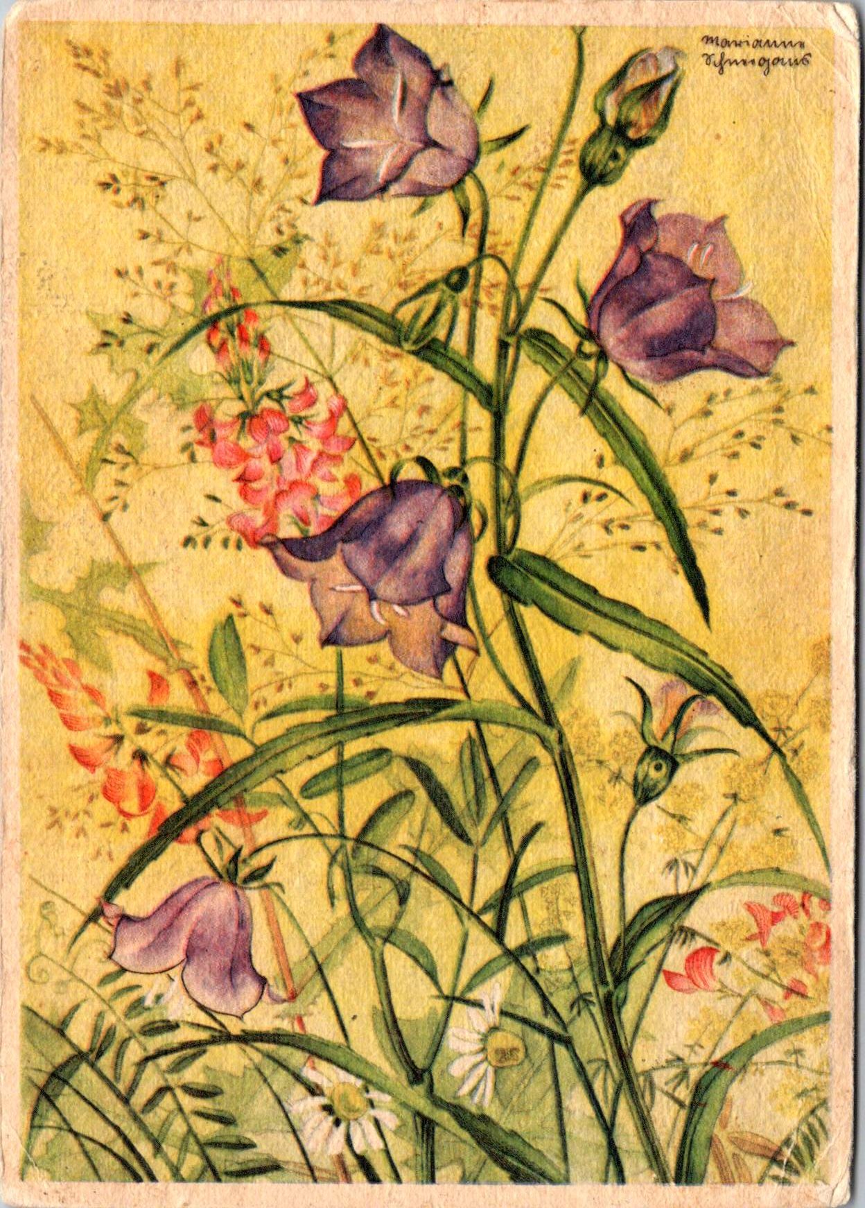
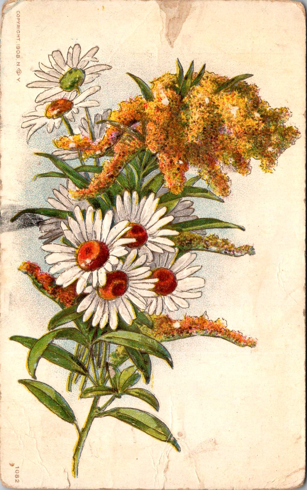
Vintage floral postcards—with golden backgrounds, symbolic flowers, and heartfelt messages—were a sophisticated social currency that connected people across distances.
At the intersection of the Victorian and Edwardian eras, the humble postcard emerged as a powerful medium for small aesthetic pleasures and meaningful social exchange. These postcards tell a story of artistic development and printing innovation, and how ordinary people wove beauty into the fabric of everyday communication.
Delicate Blooms
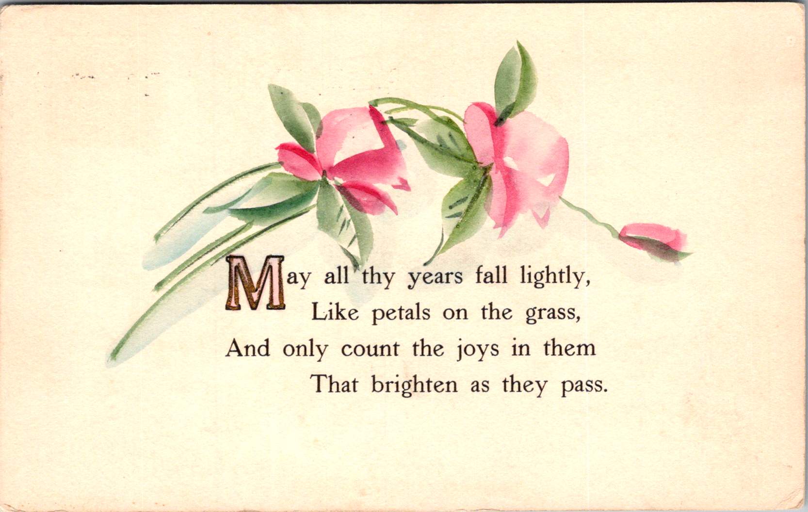
One card in this selection features pristine white lilies and fern fronds against a luminous gold background. The lilies—rendered in striking detail with their trumpet-shaped blooms and distinctive stamens—create dramatic contrast against the warm gold, the iridescent ink catching light as the recipient tilted the card in their hands. An elegant blessing accompanies the illustration.
“No thorn beset the path you tread, No shadows glance upon your way, But flowers spring beneath your feet, And sunshine crown your every day.”
These cards encapsulate a pivotal moment in design history—the transition from Victorian to Edwardian sensibilities. The Victorian era (1837-1901) embraced ornamentation, sentiment, and symbolic complexity. Every element carried meaning: white lilies represented purity and virtue; ferns symbolized sincerity and shelter; the gold background evoked trust and value. These layers of meaning reflected the Victorian preoccupation with moral improvement through beauty, a philosophy championed by influential figures like John Ruskin and William Morris.
As Queen Victoria’s reign ended and Edward VII took the throne (1901-1910), aesthetic preferences gradually shifted. The new Edwardian sensibility maintained Victorian symbolic richness but introduced more restrained layouts with increased white space and cleaner compositions. This particular card, with its strategic emptiness and focused arrangement, demonstrates this evolution. The gold field creates breathing room that earlier Victorian designs would have filled with additional decorative elements.
The technology behind these gold backgrounds represented industrial innovation. Using metallic powders and varnish printed in the desired pattern, these effects made previously elite decorative elements available to middle-class consumers. During the Industrial Revolution, technical advancements in printing had transformed what was once painstaking handwork into mechanized production. German printers in particular had mastered these techniques, producing cards with exceptional color registration and metallic effects that remained unmatched until their trade was disrupted by World War I.
Other sophisticated production methods like embossing—creating raised areas that added tactile pleasure to the visual experience—required specialized equipment and expertise. Metal dies created by skilled engravers would press the design into the card after printing was complete. The visual effect was enhanced by different dimensions, making these technically perfect cards a testament to industrial craftsmanship.
Gold’s association with luxury stemmed from both its intrinsic properties and historical significance. The aptly named Gilded Age celebrated opulence, with gold becoming a visual shorthand across design disciplines. International Expositions like the 1900 Paris Exposition showcased luxury goods incorporating gold elements, popularizing these aesthetics globally. Archaeological discoveries in Egypt renewed interest in gold in design, while the Ballets Russes featured costume and set designs by artists like Léon Bakst who used vibrant colors and gold accents.
Floral Features
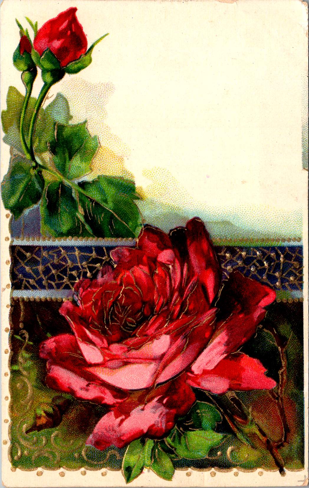
A striking card in the next selection features white and red striped “peppermint” carnations against a gold background. The distinctive white petals dramatically streaked with vibrant red markings create bold visual contrast against the metallic wash. Three perfectly rendered blooms cluster together on dark stems, with bright green sword-like leaves framing the arrangement. The word “Carnations” appears in red script in the upper right corner, identifying the botanical subject with elegant simplicity.
This stark compositional approach—focusing entirely on the botanical subject against a uniform background—represents a more modern, stripped-down aesthetic that emerged in the early 1900s. While maintaining the Victorian fascination with floral symbolism, these designs eliminate extraneous decorative elements in favor of dramatic contrast and botanical precision. This shift toward simplification prefigured design trends that would gain momentum in the following decades, showing how postcard aesthetics tracked broader movements in visual culture.
The symbolism remained rich: striped carnations carried specific meaning in the Victorian language of flowers, often representing regret that a sentiment could not be shared or a refusal/inability to accept someone’s affection. This sophisticated “language of flowers” had become codified in popular Victorian publications like Kate Greenaway’s “Language of Flowers” (1884), ensuring that recipients would understand these botanical messages. The high contrast between the red-streaked white blooms and the gold background created a visual drama that emphasized the emotional complexity carnations represented.
During this period, social practices around correspondence were evolving. The penny post, established in Britain in 1840 and adopted with variations throughout Europe and America, had revolutionized communication by making it affordable across social classes. What was once an expensive privilege became commonplace, leading to a boom in correspondence. The “Golden Age of Postcards” (approximately 1898-1918) coincided with changing postal regulations that allowed privately printed cards and preceded the widespread adoption of telephones. During this period, billions of postcards circulated globally.
Rose to Crimson
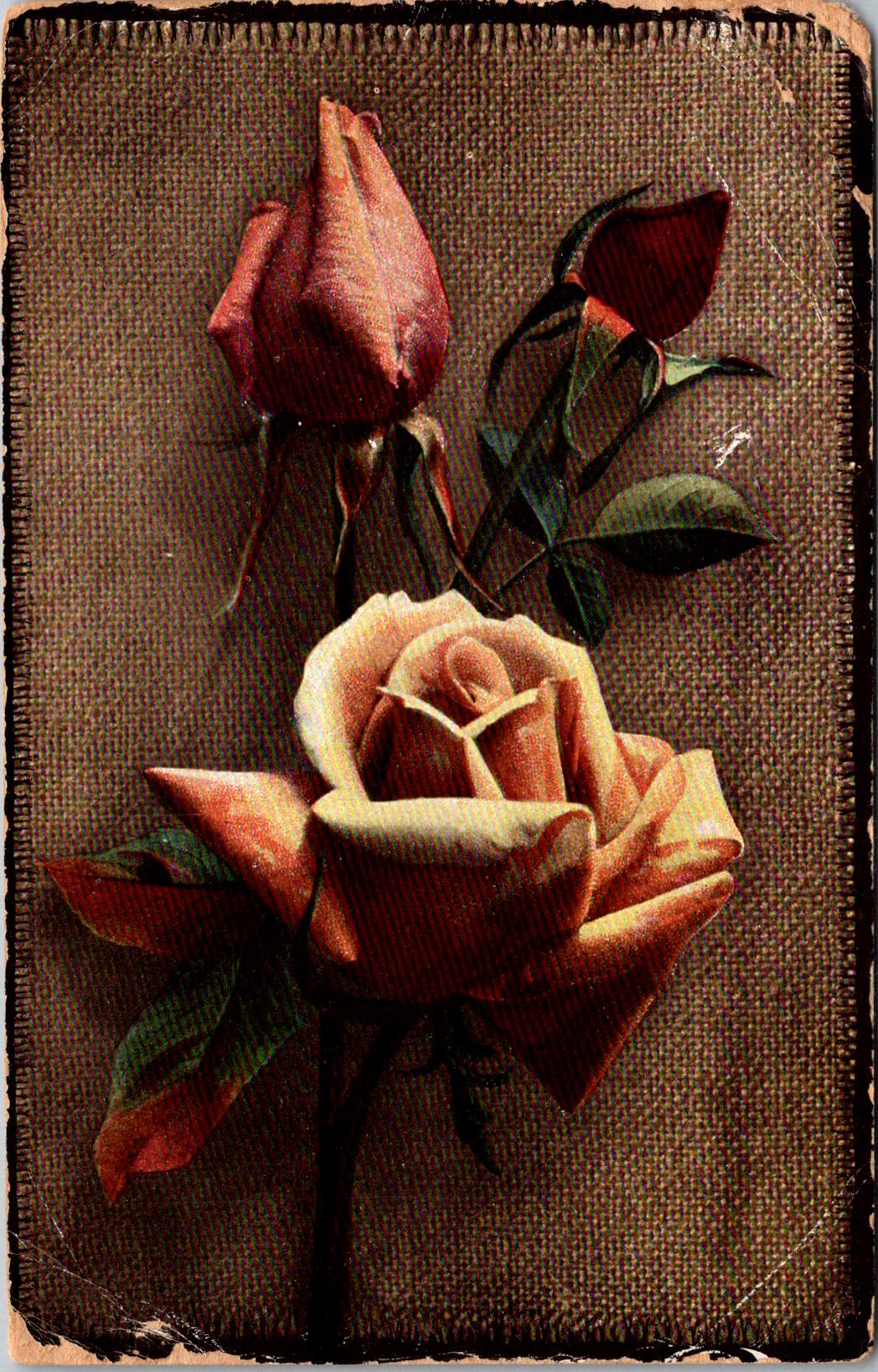
The next group of cards represents another technological leap—an early photograph of light pink roses on a background of actual linen. The physical texture of the rough weave contrasts with the delicate subject matter—an open rose and two buds captured a new reality that only photography could provide. This mixed-media approach demonstrates how artists continued to experiment with both visual and tactile experiences.
The Victorian and Edwardian periods witnessed remarkable developments in image reproduction. Traditional chromolithography—where each color required a separate stone or plate—was being supplemented by photographic techniques. These innovations allowed the faithful reproduction of reality rather than artistic interpretation, though both approaches coexisted during this transitional period. The textures and images of this card created an interesting interplay between the natural subject and the material substrate, engaging multiple senses simultaneously.
Rose symbolism operated on a similarly subtle gradient. In Victorian floral language, the exact shade of a rose communicated specific intentions: light pink roses signified admiration and grace—appropriate for relationships in earlier stages or those requiring emotional restraint. Medium pink suggested appreciation, while deeper crimson conveyed self-conscious beauty and passionate love. This color gradient functioned as a sophisticated social shorthand, with increasing saturation indicating increasing emotional intensity.
This coding system proved particularly valuable in an era when direct expressions of emotion were constrained by elaborate social conventions. Etiquette books like those published by Emily Post outlined proper behavior in minute detail, including appropriate subjects for correspondence and proper forms of address. Against this background of social restriction, postcards offered a safe channel for emotional expression. The carefully chosen rose color allowed for communication that could either be acknowledged or tactfully ignored, providing a social safety mechanism for expressing feelings that might be improper to state directly.
For Victorian and Edwardian women especially, whose social freedom was often limited, postcard exchange offered acceptable connection. Young women could receive cards from admirers without compromising propriety, as the public nature of postcards (visible to postal workers and potentially family members) ensured messages remained discreet. This “public privacy” created a unique social space where relationships could develop within accepted boundaries.
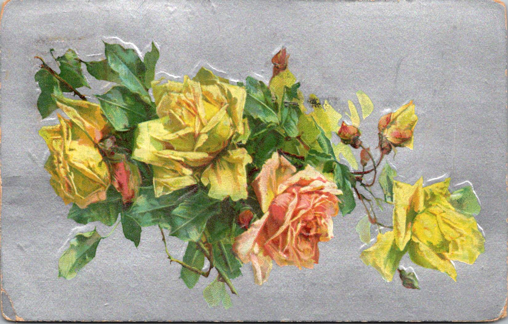
Color Craft
The final featured card offers yellow roses against a silver background, that creates a cooler, more modern luminosity. The yellow blooms—rendered with botanical precision—grow naturally on their stems, emphasizing an organic composition that represents changing sensibilities as the Edwardian era progressed toward what would become Art Deco and modernism.
While Victorian design had favored warm, rich gold tones suggestive of historical richness, the newer aesthetic embraced clarity, brightness, and forward-looking optimism. Yellow—the color of sunshine and vitality—symbolized friendship and joy rather than romantic love, expanding the emotional palette of postcard communication.
These changes in design paralleled broader social transformations. The early 20th century witnessed significant shifts in social mobility, women’s roles, and technological adoption. The rise of department stores democratized consumption of decorative goods, while increasing literacy rates expanded the audience for visual and textual communication. The suffragette movement gained momentum, challenging Victorian gender restrictions. These postcards, with their evolving aesthetics, tracked these social changes in material form.
Technology continued advancing as well. The integration of photography with traditional printing techniques created hybrid visual forms. German printers had pioneered many of these innovations before World War I. American and British printers subsequently developed their own techniques.
The social function of these postcards remained central to everyday life. In major cities, postal deliveries occurred multiple times daily—sometimes up to 12 deliveries in London—creating a communication rhythm somewhat like today’s text messages. This frequent exchange helped maintain connections across the increasing distances created by urbanization and industrialization. As families dispersed geographically, these tangible tokens of remembrance became increasingly important.
Recipients collected their postcards in specialized albums that became objects for social sharing in parlors. These albums—elaborately decorated themselves—transformed private communication into a form of social performance. Visitors could be shown new additions, creating occasions for storytelling about relationships and experiences. A well-filled album demonstrated one’s social connections and cultural participation, serving as a physical social network long before digital versions existed.
Simple Beauties
These postcards survive as artifacts of a time when beauty was considered essential rather than superficial. The Victorian belief that exposure to beautiful things could elevate character and promote virtue gave postcard exchange deeper purpose beyond mere communication. They offered sensory richness—tactile embossing, visual color, and the symbolic associations of flowers—that counterbalanced the sometimes harsh realities of industrial urban environments.
Unlike earlier periods when beautiful objects were primarily reserved for the wealthy, mass-produced postcards allowed people across social classes to exchange and possess small works of art. This democratization of aesthetic experience represented a significant shift in how beauty was distributed socially. The contrast between the expense suggested by the gold backgrounds and elaborate printing and the actual affordability of the postcards was part of their appeal—beauty without extravagance, pleasure without guilt.
These simple beauties represent a unique cultural moment when industrial technology enhanced rather than replaced artistic sensibility, when mass production made aesthetic pleasure more accessible rather than less meaningful.
Their legacy invites us to reconsider how we might integrate beauty into our own communication practices. While we have gained immediacy in our digital exchanges, how might we also retain the sensory richness these physical exchanges provided—the anticipation of delivery, the tactile pleasure of holding a beautiful object, the visual delight of color and form, and the knowledge that someone selected this specific image with you in mind.
The Victorian and Edwardian postcard tradition suggests that communication is enhanced, when wrapped in layers of beauty, symbolism, and care—tangible gestures that engage not just the mind but the senses and the heart.