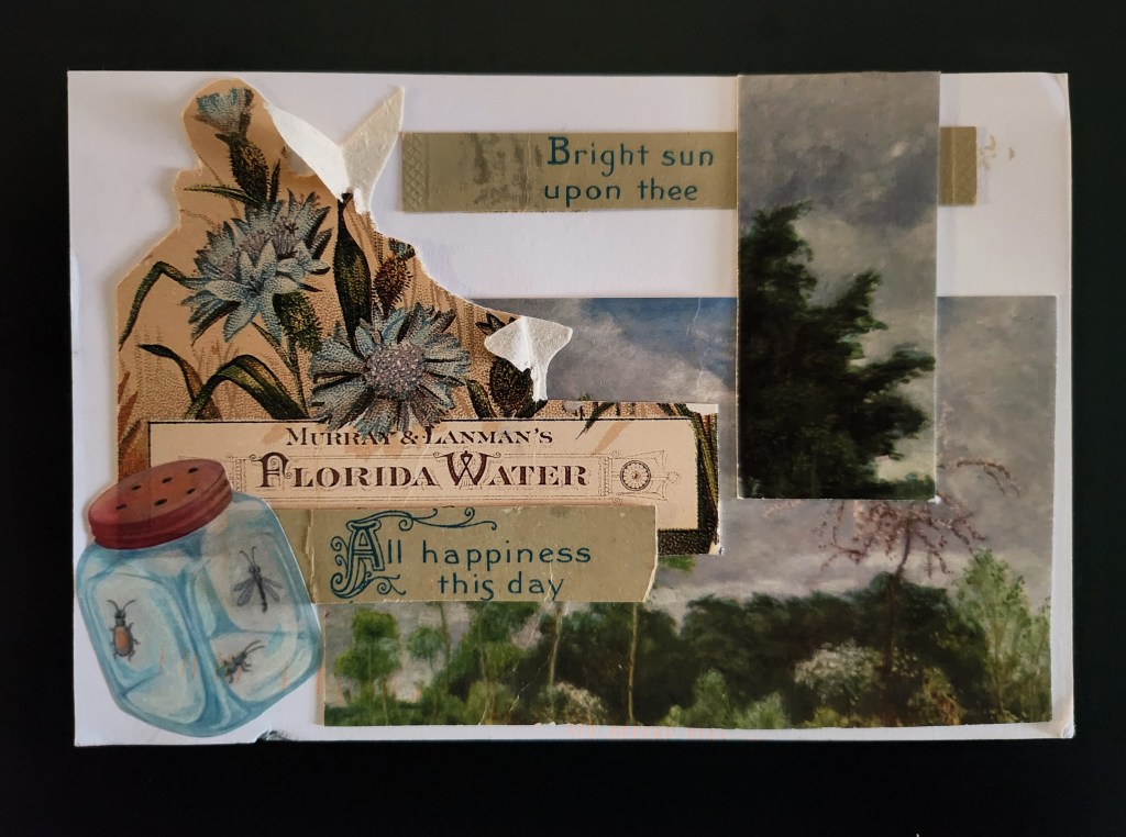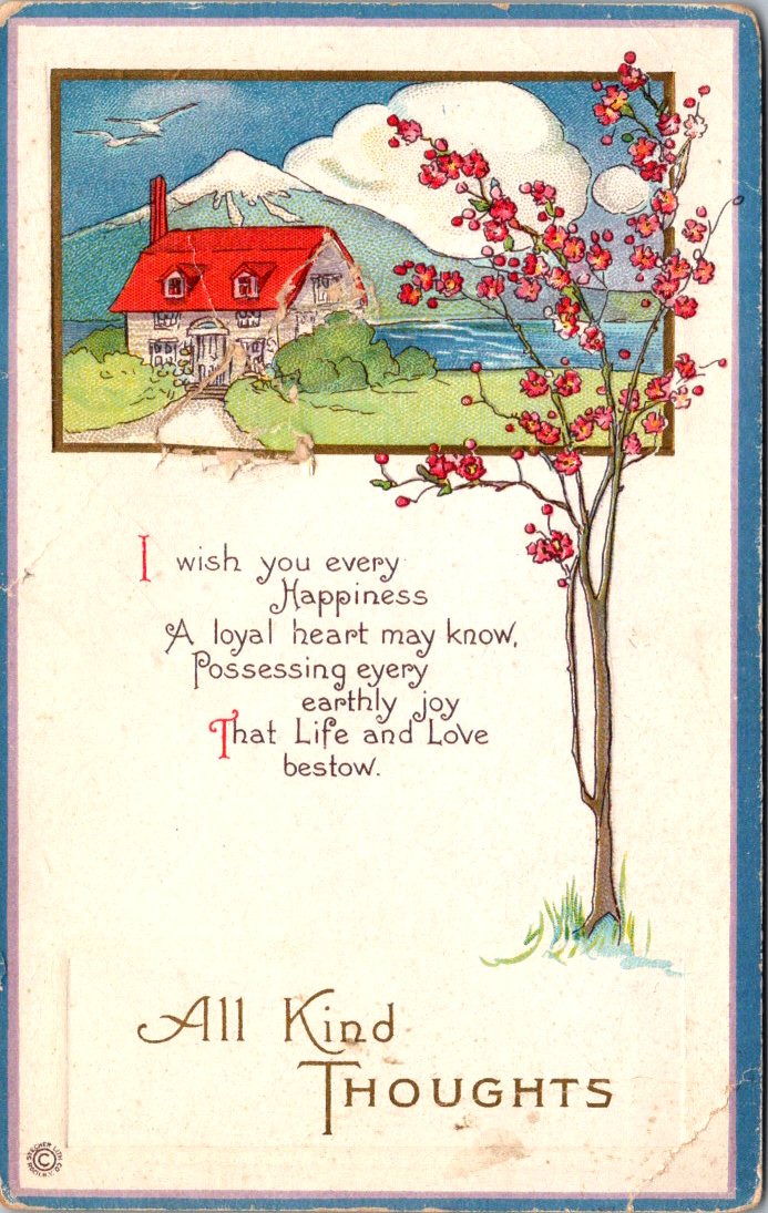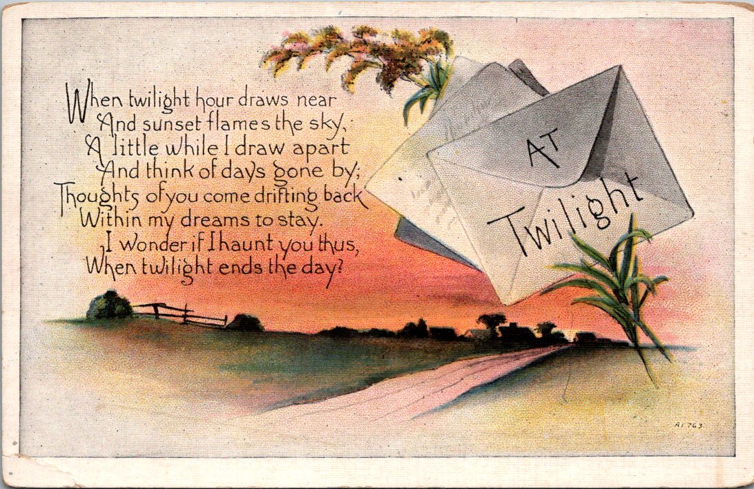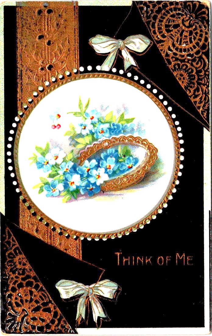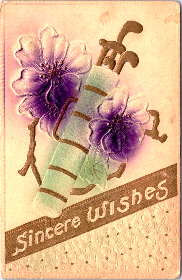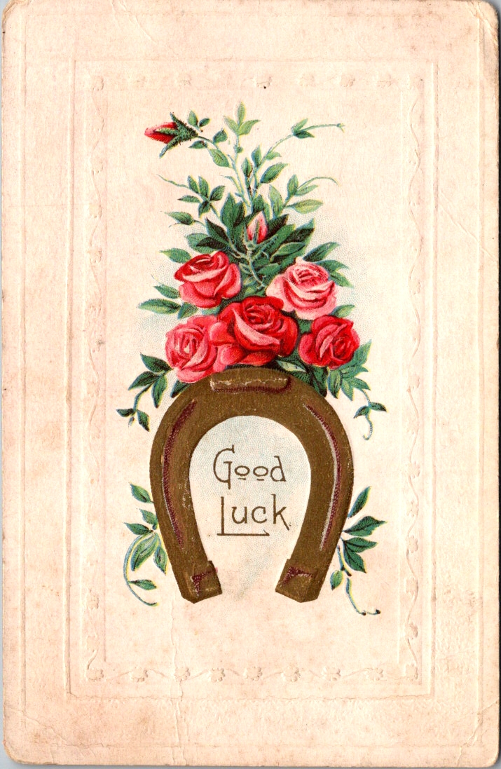
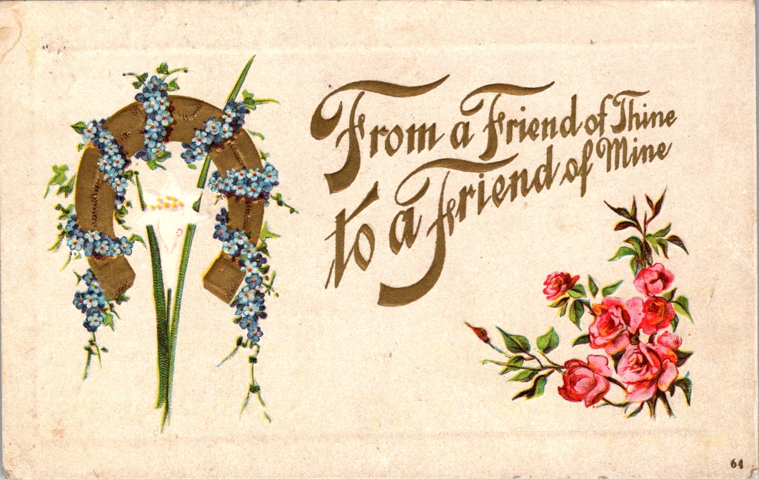
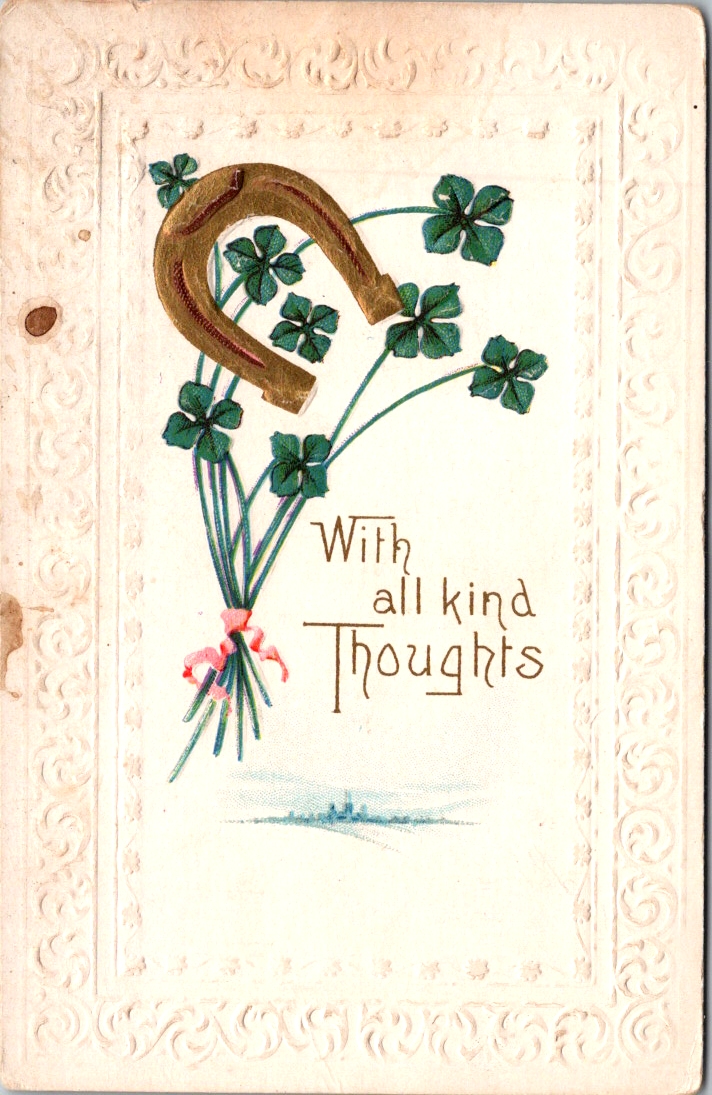
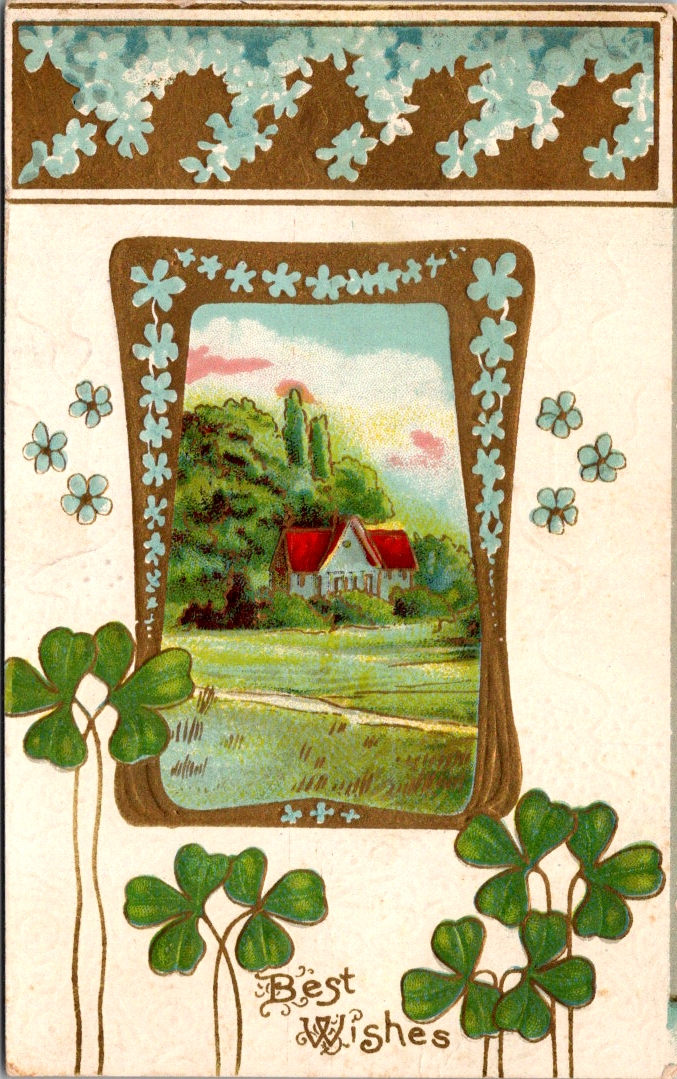
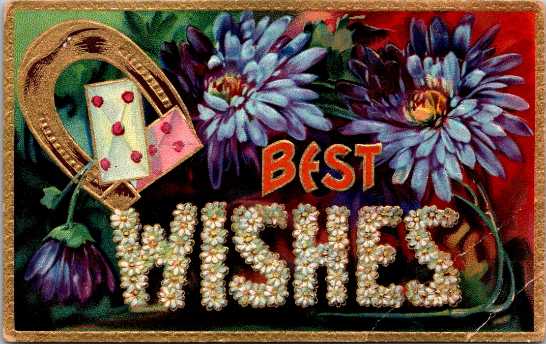
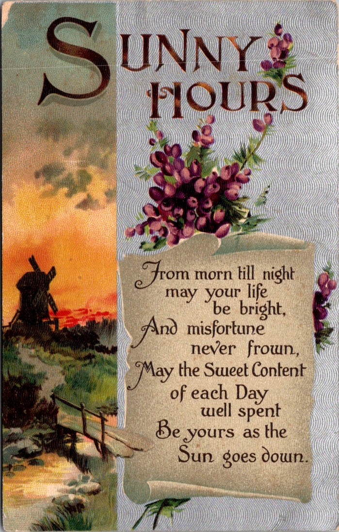
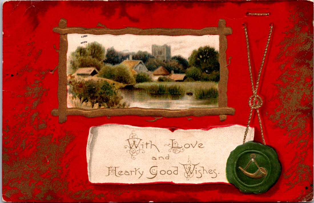
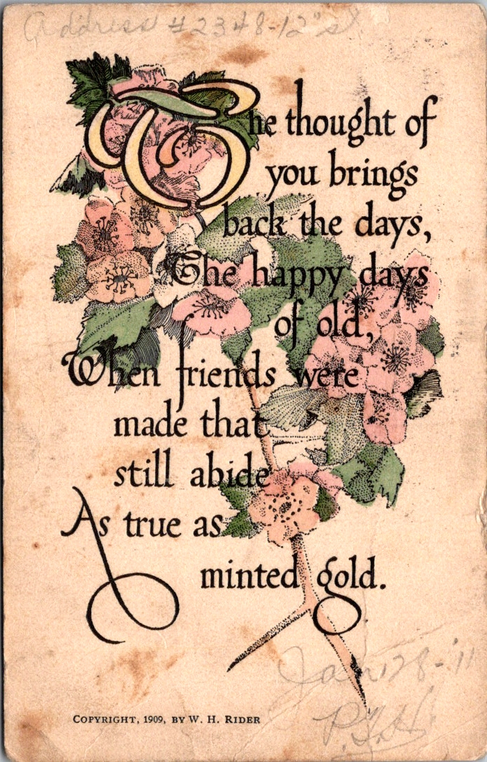
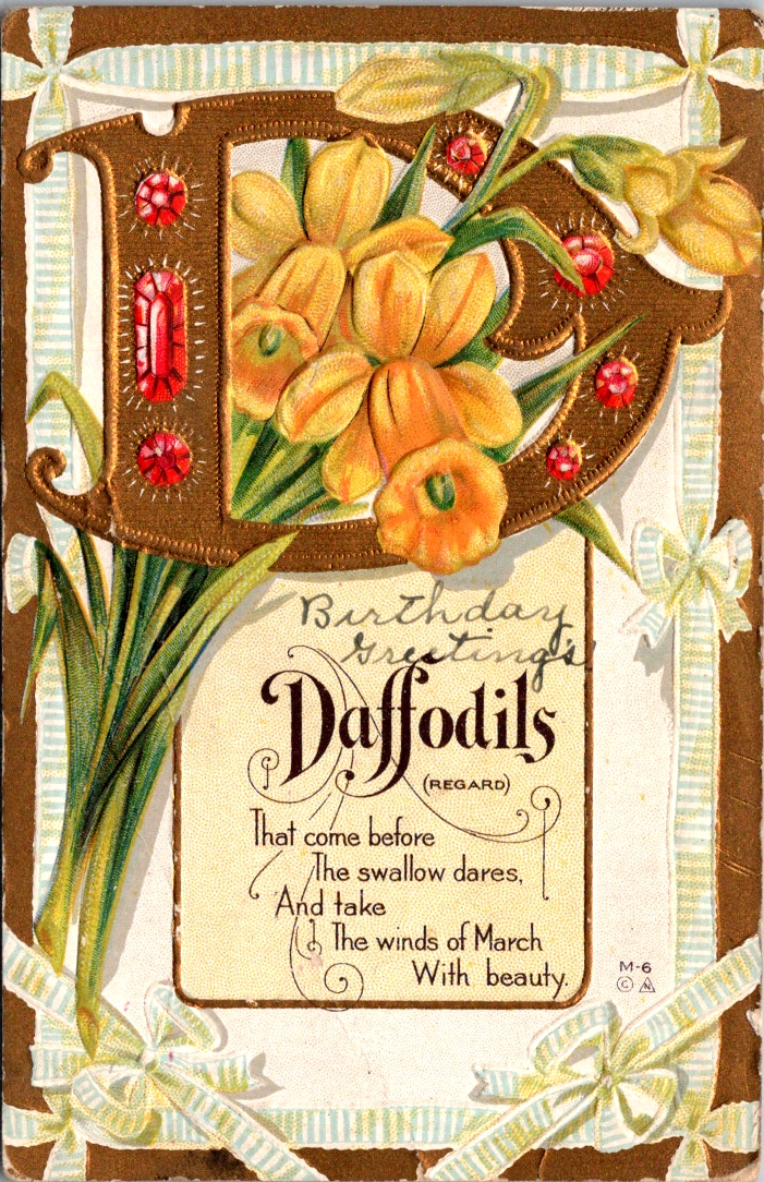
Edwardian postcards had a curious set of symbols to call forth fate and fortune. Horseshoes, shamrocks, roses, and playing cards. Small and slightly worn at the edges, these vintage greeting postcards have traveled more than a century carrying a providential wish.
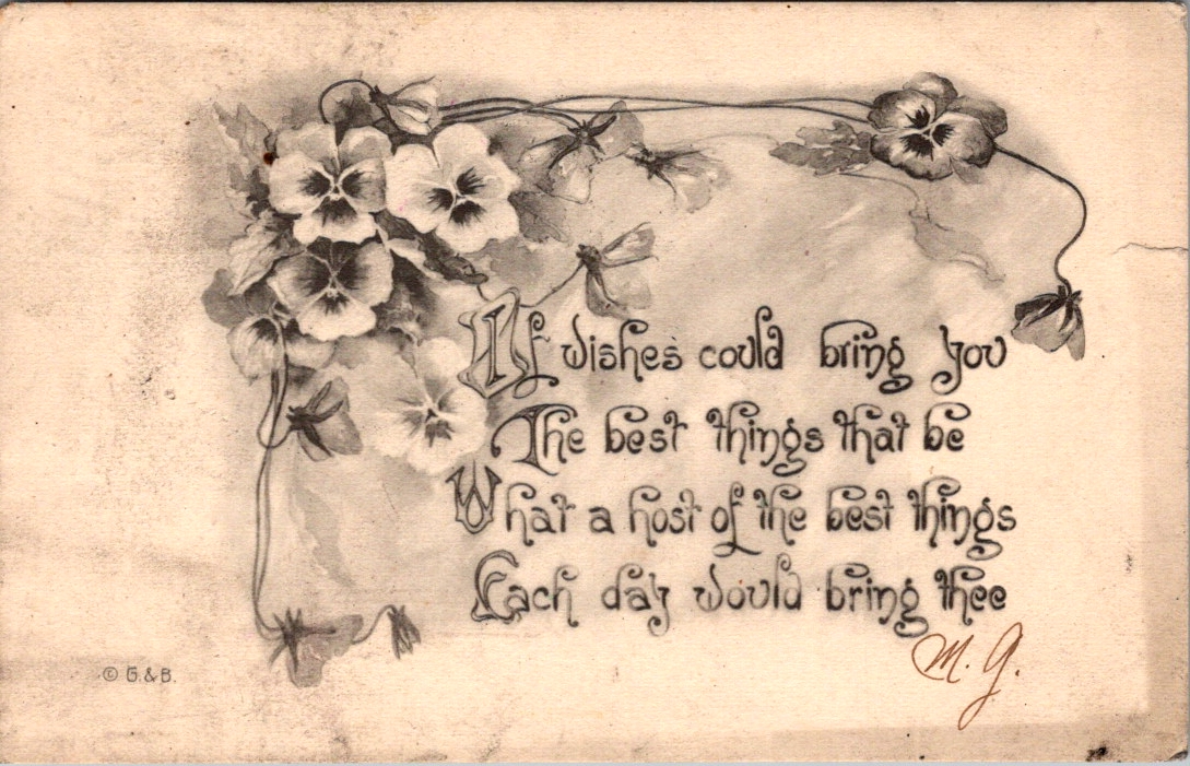
Only one card in the collection actually says Good Luck. The rest offer best wishes, happy hours, and kind thoughts from me to you. As we’ll see, luck is borne of relationships (and circumstances) lifted by the charitable wish for health, wealth, and wisdom.
Some say that luck can be earned, but only a fool pursues it outright. We daydream about what fortunes may be in store, and sometimes ignore the simple sparkles that appear each day. We know, of course, that there are no free lunches. Yet, we are admonished to never look a gift horse in the mouth.
The bold assume they earned their lucky breaks. The humble suspect they’ve borrowed fortune temporarily. The superstitious are not entirely sure we should discuss it. Luck is where fate and intent find common cause, usually in the context of close friendships.
Old English had no luck. It used wyrd instead, which pointed to fate and destiny. Wyrd is the root of our word weird, which may indicate how people felt about fate. It was uncanny, inevitable, and perhaps divine. You didn’t pursue wyrd. You experienced it through awe and fear.
Somewhere around the 15th century, luk and gelucke drifted in from the Dutch and Low German. Luck was looser and more manual. Like weather, luck favored preparation and was possible to influence if you knew the right charms. The horseshoe went up above the door. The rock went in your pocket. If luck is not fate, if it is not fixed in advance, then perhaps you can do something about it. Perhaps it can be courted.
The lucky person is not the one who waits but the one who steps into the room. This is luck as a reward for courage, or at least for motion. Fate deals the cards, and we each have a hand to play.
Fortune favors the bold — fortes fortuna adiuvat
~ Terence, Roman playwright, around 151 BCE
Luck is what happens when preparation meets opportunity, and preparation is something you control. The solo pursuit of fortune is a genuine drive.
The harder I work, the luckier I get.
~ Samuel Goldwyn
But the shamrock gently disagrees. Four-leaf clovers are natural anomalies, not personal achievements. We can’t earn one, only discover it. Even if you can court luck, even if work and boldness can pull it toward you, it is never yours to fully command.
Luck never gives; it only lends.
~ Swedish proverb
Some people simply have it, inexplicably, in ways that have nothing to do with preparation or boldness or a rabbit’s foot.
Throw a lucky man into the sea, and he will come up with a fish in his mouth.
~ Arabic proverb
Some observe that luck is a finite resource and can be unwisely traded away. This may or may not be true, but as a matter of human priority it is clarifying. We each get chances to test our luck.
Lucky at cards, unlucky in love.
~ English proverb
The tension between fate and will, between earned luck and divine luck, is located in a moment of commitment. The lucky day is not the day something falls in your favor. It is the day you decide it might be worth the effort.
The day you decide to do it is your lucky day.
~ Japanese proverb
Whatever the senders intended and however the recipients replied, these cards demonstrate how providential language holds us together in anticipation of something wonderful just ahead. The possibility that things might go our way.
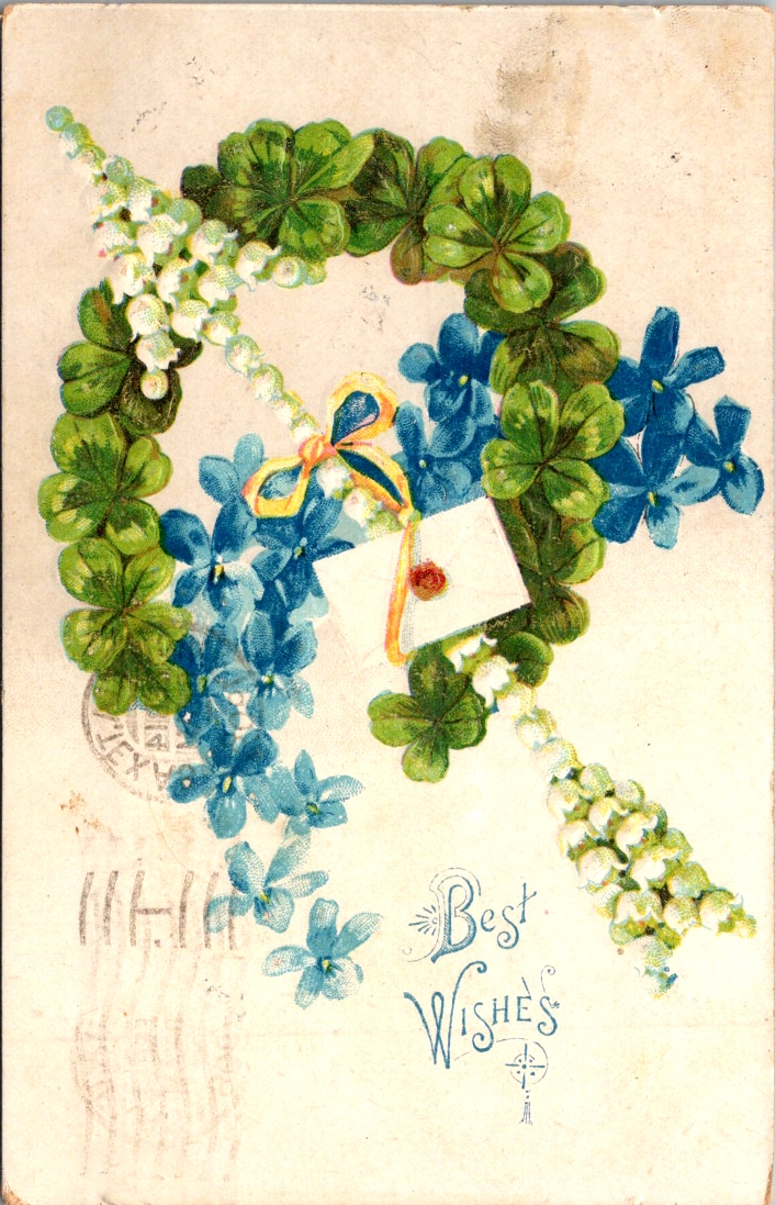
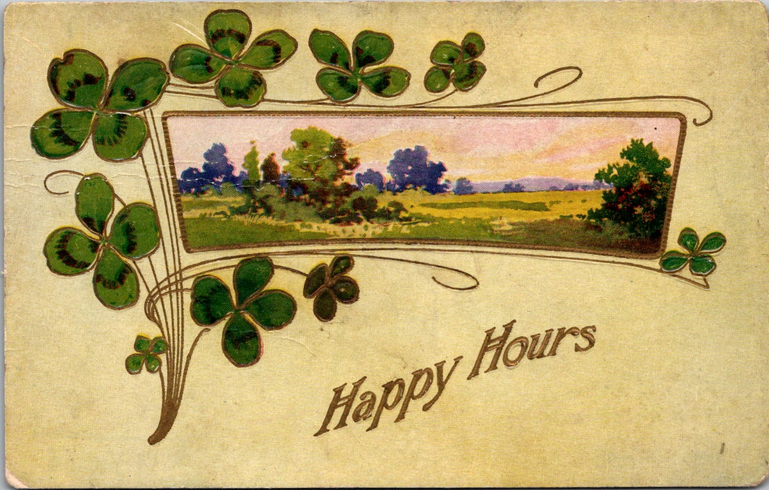
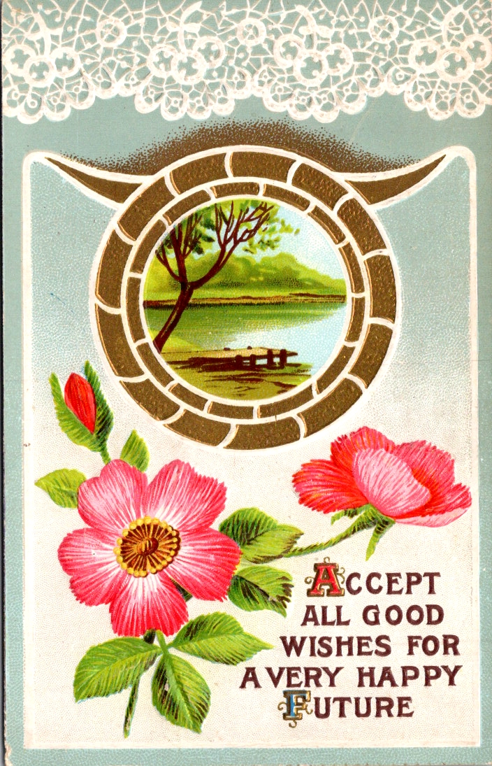
The symbols of luck nested together in relationship, in abundance, in the living world — a horseshoe wreathed in flowers, overflowing with roses, or flanked by shamrocks — is not an accident of Victorian design sensibility. It draws on the ancient wisdom that friends are the true source of life’s lucky breaks. Love does the work and luck gets the credit.