As the Harvest Moon wanes and the fall weather arrives, now is the time to cozy up with a few old nursery rhymes. These rare Raphael Tuck & Sons mechanical cards are an enchanting entrance to a magical season.
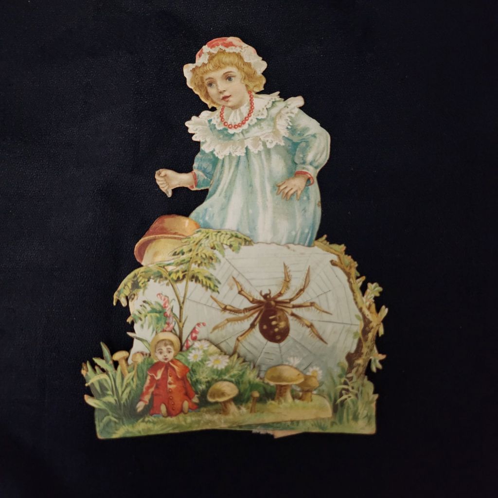
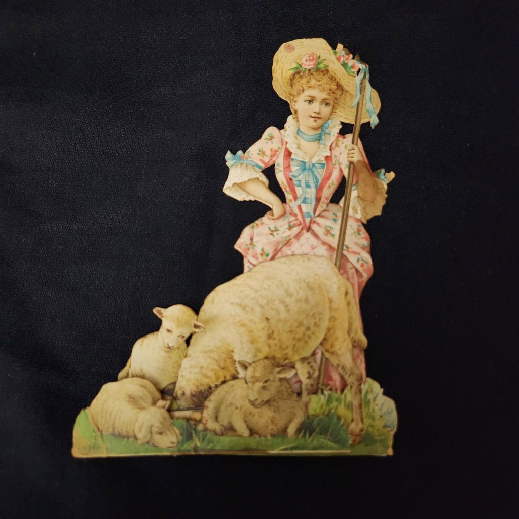
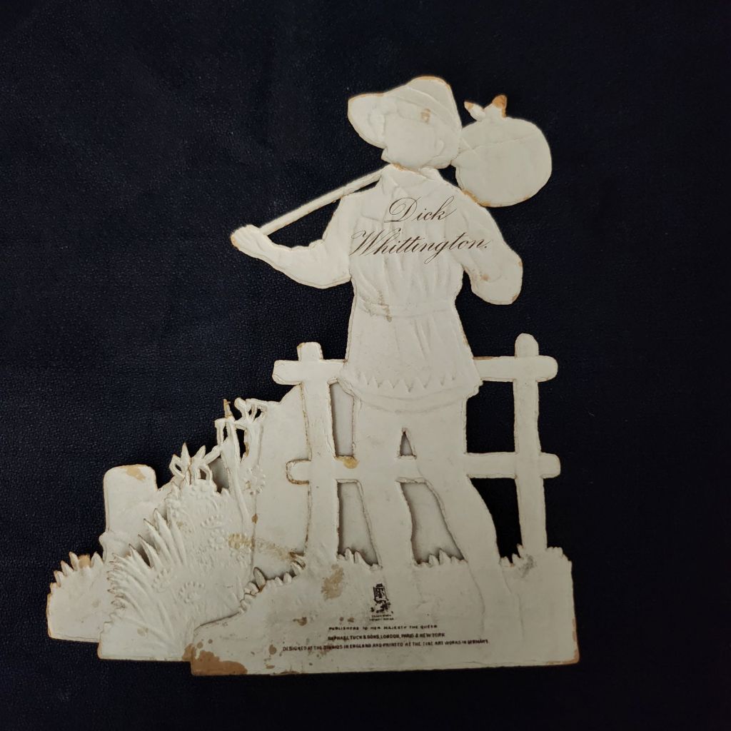
Published by Raphael Tuck & Sons of London, these elaborate die-cut pop-up cards feature beloved nursery rhymes and fairy tales including Little Bo Peep, Cinderella, Dick Whittington, and Three Little Kittens. Each piece showcases the exceptional craftsmanship and attention to detail that made Tuck one of the most prestigious names in Victorian publishing.
Vintage cards by raphael tuck & sons
Founded in the 1860s by German immigrant Raphael Tuck, the company quickly established itself as a leader in chromolithographic printing. By 1893, they had earned a Royal Warrant, becoming “Art Publishers to Her Majesty the Queen.” This royal endorsement reflected the superior quality of their work, which combined vibrant colors, intricate details, and innovative three-dimensional designs. These mechanical cards, likely produced between the 1880s and 1910s, represent the company at its creative peak.
In an era before mass media entertainment, these colorful, interactive pieces were technological marvels. The chromolithography process allowed for rich, multi-hued images that seemed almost magical to contemporary viewers. Their three-dimensional construction meant they weren’t merely viewed but displayed—transforming mantels into miniature theaters of beloved stories. Collecting and arranging these cards became a popular hobby. Many were preserved in elaborate scrapbooks, but relatively few have survived.
WWI widely disrupted the European paper and printing industries, and Raphael Tuck’s London facilities were destroyed during the WWII Blitz in 1940, losing 74 years of business records and thousands for illustrations and production files. Mid-century greeting card companies did continue to produce mechanical cards, but the more elaborate craft traditions largely faded in favor of modern design trends and less complicated manufacturing.
New technologies have revived the artform and inspired contemporary artists. Robert Sabuda elevated pop-up books and cards to fine art status with his extraordinary paper engineering. Lovepop creates elaborate 3D greeting cards for every occasion. The London company Roger la Borde produces wild and wonderful contemporary designs. Of course, independent artists worldwide create handcrafted die-cut cards that both honor and stretch well-beyond the Raphael Tuck legacy.
To Read More
The History of Raphael Tuck & Sons https://www.tuckdbpostcards.org/history Detailed company history from the TuckDB database, the premier online resource for Tuck collectors
Did you know? October 1 is World Postcard Day! The celebration started in 2019, based on the grand old global pastime of simply staying in touch.
World Postcard Day was designated by Postcrossing as the first of October starting in 2019, including a new postcard design each year. We share a simple mission to keep postcards circulating, and their way of doing it is elegant and efficient. A wonderful illustrated history of the postcard is available to enjoy, as well. To celebrate the day, I’ll be requesting my first address and then happily duty-bound to get a postcard in the mail quickly. Maybe you will, too!
Featured Postcard~ MatToon Memories
Another mention of Mattoon, Illinois. This time, it is 1912, with a typical friendly update, winter weather commiserations, and gifts exchanged.
Dear Carrie, How is this for winter? I’m good and tired of it. Tell the folks I got a basket last Wed that tickled me mightily. Tell Stella, I will redeem my promise this week if this weather continues. I’ll look them up this P.M. & send at once. I’ve been too busy to do anything extra. Hope U are better. I weigh 154 and you will have to hurry or I’ll be way ahead of U. Mayme, March 11.
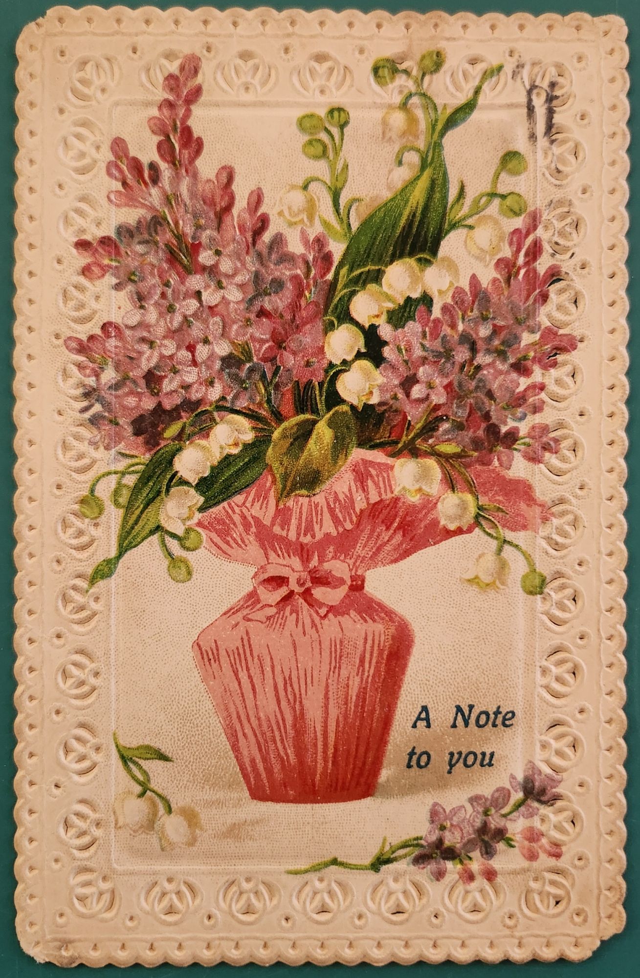
Front of the card: A delicate bouquet bursts from a pink gathered vase. Pink hyacinths and white lily of the valley dominate the arrangement. The flowers cascade naturally, their stems tied with fabric and matching bow. The text “A Note to you” appears in a blue decorative font at bottom right. Embossed rosettes frame the card in an ornate lace-like border.
Back details: Handwritten script fills the left side. A one-cent green Benjamin Franklin stamp sits in the upper right corner. The postmark reads “Mattoon, IL” with partial date visible, March 11, 1912, and a flag cancellation. The address shows “Mrs. Carrie Fulmer, St. Mary’s, Ind.”
Condition: The card shows minimal wear—crisp embossing, slight foxing, faded cancellation marks, minor corner softening. Colors remain vibrant. No tears or creases mar either side, though there is a minor cancellation mark on the front upper right. Very good condition for its age.
Rarity: This embossed, die-cut postcard represents German lithography’s golden age. Publishers used chromolithography to achieve the rich colors. The deep embossing required specialized presses. Early 1900s embossed postcards survive in quantity, but this example’s condition elevates its value. The Mattoon, IL postmark and readable message add historical context. Not museum-rare, but better than average.
Appeal: Collectors of Victorian and Edwardian ephemera may treasure this piece. Design enthusiasts might enjoy the embossed example. Genealogists ought to enjoy our meanderings through Mattoon and Mayme and Carrie’s perspectives. Botanical art lovers appreciate the detailed floral illustration and coded meanings. Stamp collectors note the Franklin one-cent issue and period-specific cancellations. Vintage greeting card dealers would display this prominently.
Would anyone cut it up to make an art card? Oh, the creative tension between past and future!
If you are nearby, come visit our very first postcard display at Tempe Yarn & Fiber. Grateful for the chance to get them out in the world. New designs and online sales coming soon!
Our very first art card online gallery show in September 2025, featuring the liminal landscapes of Larry L’Ecuyer.
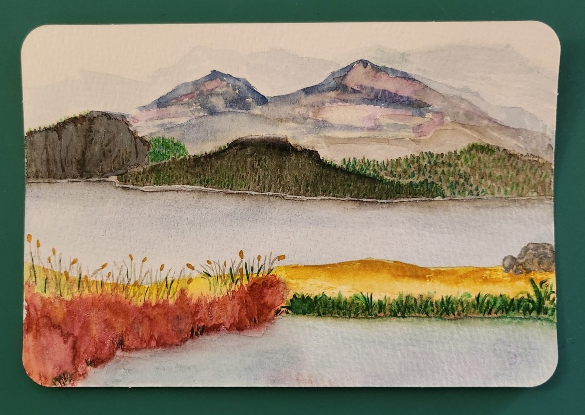
This watercolor postcard depicts a tranquil lakeside landscape rendered in soft, muted tones. The composition is divided into three distinct layers: the foreground features delicate tall grasses and reeds painted in warm golden and green hues that sway gently along the water’s edge. The middle ground shows a calm, reflective lake rendered in pale blue and gray washes that mirror the sky above. The background reveals a range of mountains painted in subtle purple and blue tones that fade into the misty distance.
Larry L’Ecuyer, the artist, has used the watercolor medium’s natural transparency to create atmospheric depth, with colors bleeding gently into one another. The overall mood is peaceful and contemplative, capturing the quiet beauty of a lakeside morning or evening.
Flip the card over and a quiet story unfolds. An adult son’s note to his mother in anticipation of a cool summer getaway.
Landscapes, by Larry L’Ecuyer
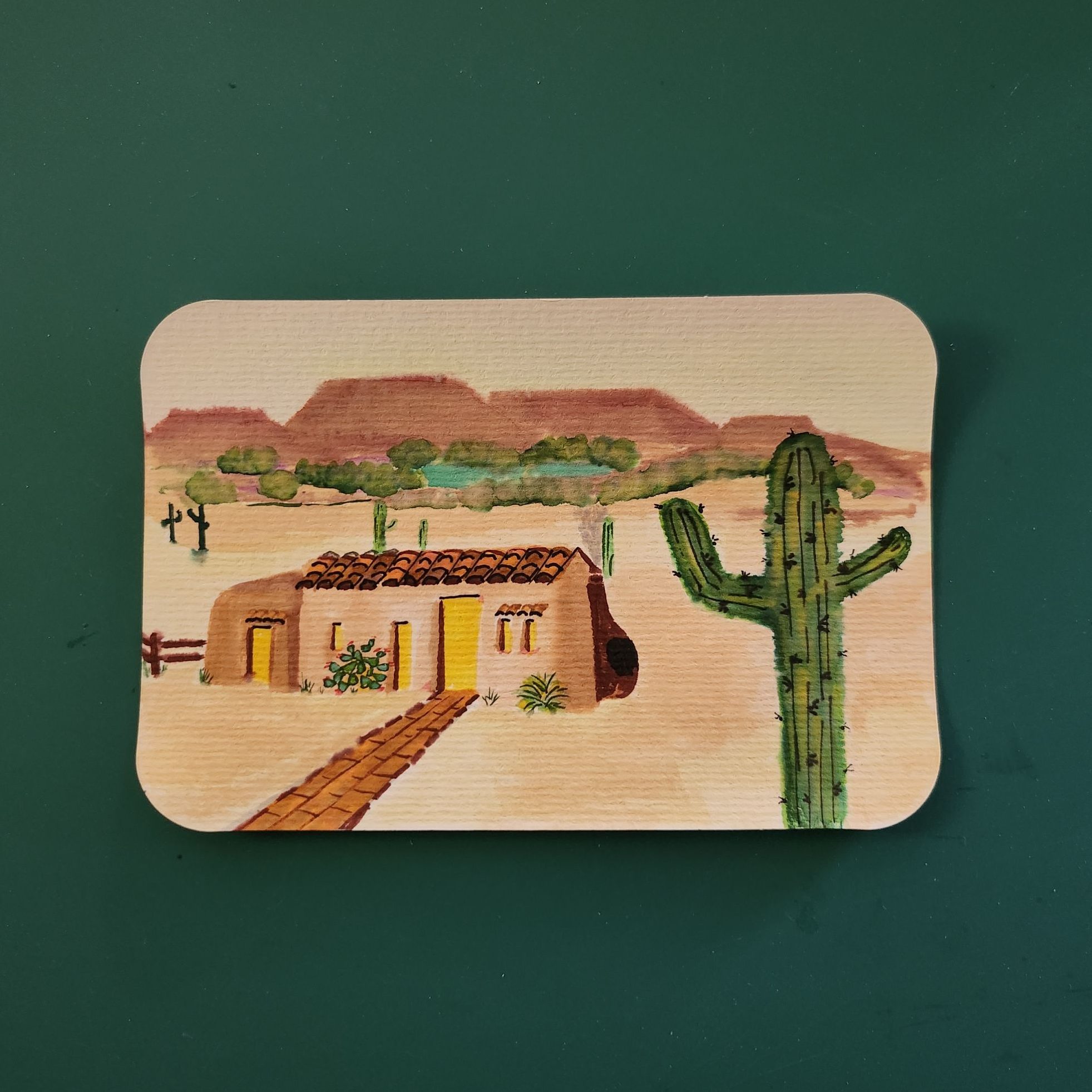
As I curated this show of my brother’s painted postcards, I found three facts about the artist that help to put this small selection of his work in context. One, Larry loves long distance bike rides. Two, he has always doodled. Three, sometimes he paints when he can’t sleep.
I suspect watercolor landscapes are a welcome choice for an outdoorsman. Beauty on the road whizzes by at miles per hour. Fish moving below the surface are mesmerizing in the moment. A chance to reflect comes later, with enough time to figure out light, color, and form in that same solo flow he finds on a bike or in a kayak.
Both the humor and graphic techniques of doodling show up in Larry’s houses, trees, and cacti, which almost always hint at a face, gesture, or mood. On the back, his notes to our parents include the puns and word play that are part of our family culture.
Larry’s art cards started arriving in Dad’s mailbox when discomfort and displacement were real worries for our elderly father. These painted palettes delivered smiles instead. We have learned a thousand times again that life’s difficulties (including insomnia) must be met with simple joys. He sends cards to Mom, too, and who knows all the other mailboxes he graces.
Larry’s cards are painted, mailed, and delivered to individual people, and they ripple out in countless ways. This Posted Past show is inspired by the reminder: Art has a sneaky way of getting right to you.
The Posted Past found its merry mission (and so much more) among the postcard albums that lined the office walls of Robert L’Ecuyer.
Postcards often stand in when more elaborate words fail. A passionate love that could barely tumble off the lips, makes itself clear in the symbol of a deep red rose. We are filled with pride, and a giant cheer bursts out of the mailbox just to say congratulations and hurrah! Also, when the sorrow is so deep, a sympathy card avoids the risks of intrusion and protects the sacred quiet that helps us heal.
It’s one of those days here at The Posted Past as we lay to rest Robert L’Ecuyer, our father. His love of travel, passion for genealogy, excellent listening skills, and long memory — combined with a truly epic postcard collection — were the makings of an extraordinary experience over the past few years.
I will write more about his wit and wisdom in the weeks ahead. For tonight, a selection of cards just to hold a space for all the gifts of his life.
Room enough for all of us to go from here to there, and back again.
Featured Postcard~ New Orleans French Market A CENTURY AGO
An early 20th century scenic postcard showcases the iconic French Market in New Orleans’ French Quarter.
Front of the card: The photograph shows the vestibule of the historic French Market, featuring tall, weathered French/Creole Colonial columns supporting a slatted roof. Perspective draws the eye down the long corridor, emphasizing the market’s impressive scale. The covered walkway displays produce, baskets, and merchandise on tables and in crates. The image captures a rare moment when the hallway of vendors face the camera. Hand-colored rose tones reflect the market’s timeless atmosphere with pops of green and blue artfully applied. Caption: Vestibule, French Market, New Orleans, La.
Back details: The left panel explains the market’s history:
This card shows the interesting old columns erected, 1822. While the roof of the market has been repaired many times, the old columns have stood as originally put, without fire aid to the injured.
Published by Lipsher Specialty Co., 320 Magazine St., New Orleans. Standard divided back format with decorative script and postage rates listed: Domestic One Cent, Foreign Two Cents.
Historical significance: The postcard documents the French Market’s appearance in the early 20th century. Established in the 1790s, the market served as a vital commercial hub where vendors sold fresh produce and handcrafted goods. Instructions to “Take French Market car from Canal St.” reflects the streetcar system and emphasis on tourism. This postcard dates to 1922-1925, based on combined evidence of one-cent postage, the specific streetcar reference, and hybrid halftone-collotype printing (Aquatone process was patented in 1922).
Condition and Appeal: The card displays excellent color saturation, with clear and interesting details and minimal defects. Tiny nicks on two corners, with yellowing on the reverse typical of age. Image and text provide valuable historical context, appealing to collectors of New Orleans memorabilia, architectural history enthusiasts, and those interested in early 20th century American commerce. The French Market remains active today, making this postcard a fascinating glimpse into its enduring legacy as a cornerstone of New Orleans culture.
Today’s Art Card & Gallery
The gallery features Landscapes by Larry L’Ecuyer, and here is a fun art card from Anne this week. Winner, winner, chicken dinner!
open call for art cards!
The World’s Smallest Artist Retreat (our P.O. Box) is awaiting your art card submission. Details here!
Art card kits ~ gift or fun for you!
Our Art Card Kits are perfectly-packaged as a fun, creative activity for you and a friend to complete in as little as an hour or made into a lovely afternoon.
Sweet readers, this is your pre-preview of something very fresh, and a long time coming…
Hold a vintage postcard in your hand and flip it front to back.
On the front, usually an idealized world. Sun-drenched beaches, pristine mountain vistas, city streets captured at their most photogenic moments. Designed to say, “Wish you were here!”
Flip it over, and you find something entirely different. The back reveals the personal, the quixotic, sometimes the magically mundane.
“Weather awful, hotel terrible, a bit bothered by a smelly seatmate on the plane, but having a wonderful time anyway.”
Postcards fascinate me precisely because they embody all of life. They’re both public and personal, both idealized and achingly real. They bring the past forward in time, making unexpected connections with family, friends, and special places—revealing who we have been along the way.
On a very old postcard, the handwriting of someone long gone comes alive again right before our eyes. A jotted note gives us a new view into their private world. Their words leap over the decades to reach us. There is a lush creative commons between now and then, a liminal green lawn to lounge on and take in the cool air.
I have lived happily in those in-between spaces for the last few years. Somewhere in the middle of my life and career and enjoying myself in the meantime. Not where I was before, and both curious and terrified about what comes next.
Well friends, like the best summer novel, the plot thickens.
Starting in September, The Posted Past officially launches a new phase as a social enterprise, inspired by the simple truth that we can trade loneliness for connection, one postcard at a time.
We have already done it, friends!
As one of my earliest subscribers, you have enjoyed (I hope!) an essay every Wednesday for the last year. Going forward, you’ll still get those delightful diversions that remind us we are more than we knew. I’ll also offer sneak peeks at rare postcard finds, each one a small treasure with its own story to tell.
Old or new, postcards have a job to do.
Along the way, I have fallen in love with making and receiving Art Cards. My brother started mailing the lovely landscape watercolors he does when insomnia strikes. A collage free-for-all at the local gallery had me re-inspired by the ‘ransom note’ style I used to do as a teenager. Blink-blink… I found myself dreaming up fabulous cards to make.
Art cards celebrate the artist in all of us. I particularly love collage and watercolor, but truly an art card can be made with scraps. Sometimes the most satisfying work comes from simple gestures, too. Slow down enough to make something with your hands, and then send it away to make someone’s day.
Coming this fall, The Posted Past will feature an online gallery where you can browse through handmade artwork that has traveled across time and space, carrying all the marks of love, adventure, and everyday life. Call for submissions now open, mail your art card to: The Posted Past, P.O. Box 24431, Tempe, AZ 85285.
Abundance can be overwhelming, and it’s not always easy. Right now, I feel both confident and queasy. But, I’m not alone. Here’s how you can help.
Become a paid subscriber—hit the button below to support the effort
Pre-order an Art Card Collage Kit (coming soon!) for your own creative fun
Make an art card and send it to us—be first in the online gallery show!
Though we revel in real life, the handmade, and the historic, The Posted Past is also meant to be super social. Excuse our dust, and help us get started!
Browse the collection of vintage postcards on eBay and follow the store
Both/and. Past and future. Solitude and connection. Cardboard curiosities and some larger-than-life dreams. Thank you for being here together. Keep an eye on your inbox and mailbox—September is full of surprises!
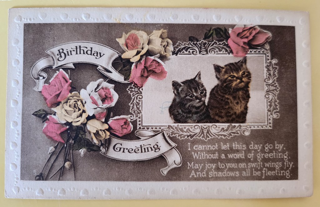
The Posted Past marks its one year anniversary with fun, facts, and cats!
A year ago, The Posted Past began with a simple quest—to explore the stories behind my family’s vintage postcard collection. These small windows into the past gave me the chance to be curious and brave as a writer. I wasn’t sure I could research and produce a short essay on a weekly schedule. Fifty-two weeks later, without a single miss, I am happily beyond those worries.
Thank you for joining me on this journey. Together, we’ve traveled from Osaka to Matoon. Looked at buffalos roaming in a Kansas field and donkeys on the English seaside. Iconic views of San Francisco came from its well-known chronicler, and we’ve been on a more recent search for a Mexican photographer who vanished in volcanic ash. Each postcard has taken us to unexpected corners of history—social movements, architectural trends, national parks, and the everyday lives of people who took the time to write, “Wish you were here.”
Today’s postcard reminds me why I love this work. The adorable kittens and lovely roses on the front never go out of style. On the flipside, Maude writes to her mum with a few sweet sentiments and concerns. In between lies a world of personal and cultural histories: the rise of the postcard era, the Victorian language of flowers, the printing techniques that made such colorful cards possible, and the universality of cats. Always, an exchange between people. What we’re really collecting are reminders of tender human connections across time.
What’s new for year two? July will bring a shift in weekly format while I take some vacation time—shorter Wednesday posts spotlighting single cards. After that, I’ll be expanding the eBay store, indulging in the nerdy work of adding captions and citations to old posts, and exploring how these weekly essays might become a book and a workshop series. Like any creative start-up, the first year came with a to-do list of dreams and ideas.
Before I sign off, may I ask: would you ever consider sending a vintage postcard as a gift? The mechanics are easy—choose the perfect card online, add a personal note, and we send it off with love through the post office. But is that something you’d enjoy giving or receiving? Leave me a note in the comments.
Thanks again, and meow for now 🙂 Enjoy the summer!
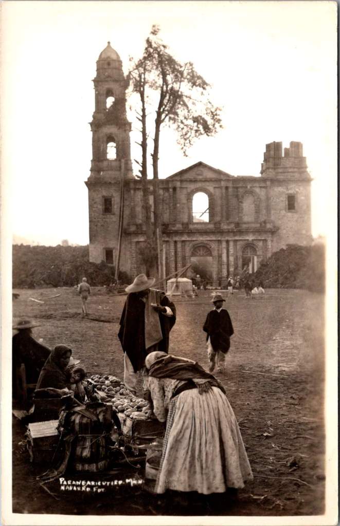
In February 1943, a photographer enigmatically known only as ‘Navarro’ documented Parícutin’s volcanic destruction of a Michoacán village and church, creating powerful postcards that circulated worldwide at the time and are highly collectible now. Then, Navarro vanished from history.
Parícutin erupted from Dionisio Pulido’s cornfield on February 20, 1943, becoming the first comprehensively documented volcanic birth in human history.
The response was immediate and international. Despite World War II, the Parícutin volcanic plumes commanded global coverage. The geological disruptions of fire and lava inspired scientific awe. Life Magazine dispatched photographers. Newsreels carried footage worldwide. Airlines altered flight paths for passenger viewing. By 1947, Hollywood used the still-active volcano as backdrop for the movie Captain from Castile, employing thousands of locals as extras.
In the extensive archives documenting Parícutin volcano’s nine-year life cycle, one name appears and vanishes: Navarro. His postcard images capture the most significant moment in the volcano’s terrifying story—when lava reached the 400-year-old church of San Juan Parangaricutiro. Despite meticulous record-keeping around this geological event, Navarro himself remains a mystery.
His photographs have more than survived. When story of the events at Parícutin are retold, one always finds a Navarro image. The photographer does appear in one other place: Folder 7 in Box 9 of the William F. Foshag archives.
The Day Lava Reached the Church
Navarro’s postcards document a sequence unfolding over a few crucial days in early 1943. For the year prior, the Purépecha community of San Juan Parangaricutiro had watched lava flows advance on their small village while praying their homes, farms, and colonial church would be spared.
Despite their pleas and processions, the lava flow had accelerated beyond divine intervention. President Lázaro Cárdenas and local priests convinced most residents to evacuate, carrying sacred objects and any moveable materials to the nearby town of Uruapan. One rare slice of film shows men removing clay tiles from a building roof.
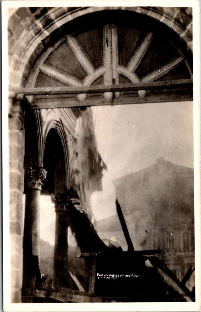
When the lava reached the church, Navarro was there to document the destruction. Black lava creeping around the church’s perimeter. Intense heat causing wooden elements to combust. Steady accumulation of cooled volcanic rock against the baroque stone façade, contrasting human craftsmanship with geological force.
Two striking images captures the church’s wooden elements on fire—ornate arched stonework and columns holding the structure up while everything else is consumed. Extending the mystery further, these two images bear exactly the same mark and style of the others, but a different name is entirely obscured. Perhaps it makes sense, Navarro and another photographer would go together. Better than alone.
Foshag and the Official Record
William Frederick Foshag of the Smithsonian Institution’s National Museum led Parícutin’s scientific research and systematic documentation. A respected mineralogist and curator, Foshag had already spent his career studying volcanic minerals and processes. When Parícutin erupted, he was uniquely positioned to lead the most comprehensive study of a volcano’s complete life cycle.
Foshag arrived within weeks of the initial eruption and remained involved until the volcano’s dormancy in 1952. Working with Mexican geologist Dr. Jenaro González Reyna, he established a research station documenting every phase of development. Their collaboration produced detailed maps, temperature measurements, chemical analyses, and thousands of photographs fundamental to volcanic research today.
Navarro’s church sequence suggests either remarkable intuition, access to local knowledge, or information coming from scientific observers. The Purépecha community, drawing on generations of volcanic experience, provided crucial insights about timing and the landscape. Navarro’s ability to be there for the church’s final moments indicates he was plugged in.
Foshag’s archives reveal an extensive network of colleagues contributing to this documentation. Box 9, Folder 7 bears Navarro’s name alongside numerous other photographers, artists, and local and international contacts. It seems Foshag recognized the value of different perspectives in creating a complete record.
The official scientific documentation benefited from all the independent photography produced at the time. Their paths very likely crossed with many others at work during critical days when the lava and ash threatened San Juan Parangaricutiro.
Kodak in Mexico
The real photo postcard industry supporting photographers like Navarro was sophisticated. Entrepreneurs traveled with complete darkroom setups in automobiles, developing film and producing finished postcards within hours. They sold to tourists, sent copies to newspapers, and maintained distribution networks across Mexico and the United States.
By 1943, Kodak had established a robust business providing both cameras and materials throughout Mexico. Navarro’s postcards bear the EKC (Eastman Kodak Company) indicia and are marked Kodak Mexicana, LTD. Navarro had access to standardized, high-quality photographic paper specifically designed for postcard production. This infrastructure allowed photographers to work with consistent materials as they traveled to remote locations.
This commercial system created a parallel archive to official scientific record, prioritizing dramatic visual impact and human interest. While Foshag documented systematic geological processes, Navarro captured moments resonating with public imagination: the church under siege, displaced communities, civilization meeting unstoppable natural forces.
The quality and consistency in images suggests professional training and equipment. His compositions demonstrate understanding of the landscape and evoke pathos. Combined with his access to Kodak’s professional-grade materials, we may assume Navarro was more than a concerned observer.
History’s Mysteries
Navarro’s fade from historical records reflects broader patterns in how scientific events get remembered. Official histories preserve institutional participants while quietly forgetting the names and stories of independent contributors. This is notable with Parícutin, where local Purépecha knowledge proved crucial to understanding volcanic behavior, yet indigenous voices were largely excluded from formal documentation.
Still, Navarro gives us another chance to go there ourselves for a glimpse of those extraordinary hours. His postcards circulated broadly through the popular means of the era—family correspondence, tourist collections, commercial distributors—and are highly collectible today.
As researchers study Foshag’s extensive archives, Navarro’s name remains a tantalizing fragment—present enough to suggest significance, absent enough to resist interpretation. His postcards survive in collections across North America, carrying their maker’s vision but not his story.
This persistence of mystery tells us something about how we remember extraordinary events. While institutions preserve official records with careful attribution, the broader network of individual contributors often dissolves into anonymity. Navarro represents countless others who showed up when history was being made, pointed cameras at crucial moments, contributed to our understanding of the world, and then vanished back into the crowd.
The photographs of the church’s destruction remain powerful because they capture something beyond ecological process—the moment when human scale met geological time and a community’s sacred center became a monument to forces beyond human control. Navarro was there to see it, and that’s a chance for us to remember the event and to admire him.
This essay was inspired by Elena, Maria, and Sandy – with gratitude.
These vintage postcards from the 1972 Tourism Year of the Americas reveal fascinating questions about natural landscapes, heritage, monuments, and whose stories we remember and tell.
In summer 1972, the United States Postal Service issued commemorative postcards that would become enduring symbols of national identity. These postcards, part of the Tourism Year of the Americas campaign, featured iconic destinations with restrained elegance—their two-color printing was both artistic and economical. As America stood at a cultural crossroads, this postcard set tells a familiar American story. More than five decades later, they reveal even more about how a nation sees itself.
Commemorative Moments
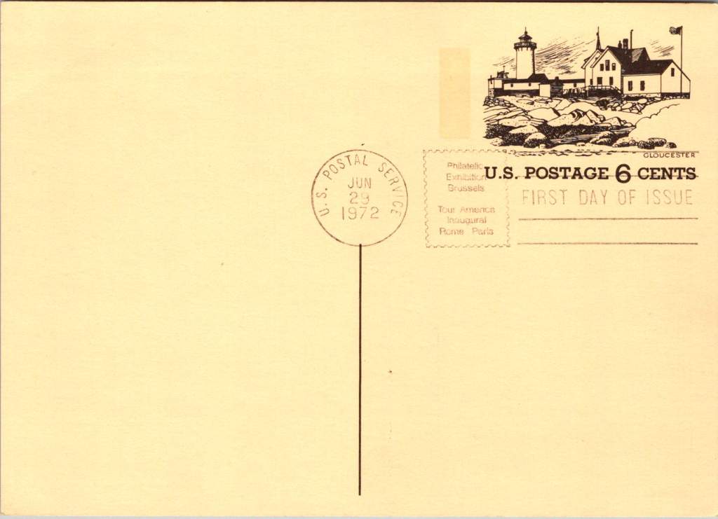
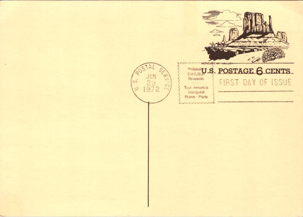
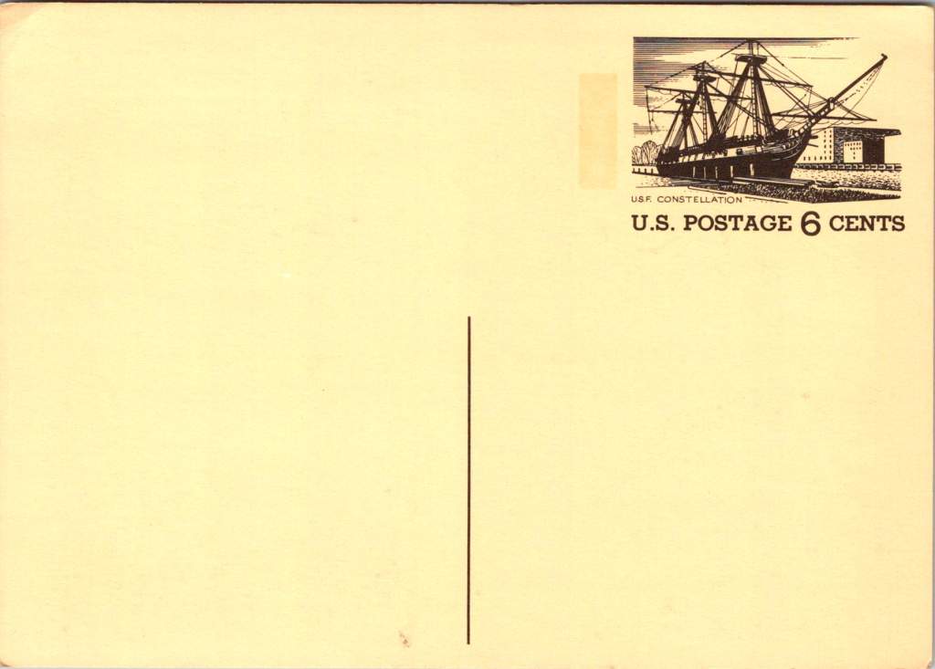
First Day of Issue cancellations mark a special moment in time, and signal that an item is expected to be collectible. The postcards were cancelled on June 29, 1972, bearing the commemorative text “Philatelic Exhibition Brussels” and “Tour America Inaugural Rome – Paris.” These international exhibitions promoted American tourism during the Cold War, when cultural diplomacy served as essential soft power.
The carefully designed cancellation artwork includes USS Constellation (6¢), Gloucester (6¢), Monument Valley (6¢), and Niagara Falls (airmail 15¢). These rates reflected the newly reorganized United States Postal Service which had become its own entity the year prior. The 1972 Tourism Year of the Americas was an ambitious initiative from the new quasi-independent agency, emerging alongside Nixon’s opening to China and détente with the Soviet Union.
USS Constellation, the last sail-only warship built by the U.S. Navy (1853-1855), served as flagship of the Africa Squadron from 1859–1861. The ship captured three slave vessels, enabling liberation of 705 Africans. During the Civil War, Constellation deterred Confederate cruisers in the Mediterranean. The selection represented naval heritage and anti-slavery efforts, though it still centered the naval victory rather than those who gained freedom.
Niagara Falls has attracted visitors for 200 years, becoming the symbolic heart of American tourism. The 1883 Niagara Reservation became America’s first state park, influencing national park creation. Current visitor statistics show enduring appeal: 9.5 million tourists visited Niagara Falls State Park in 2023, with the region welcoming 12 million visitors yearly.
Monument Valley reflect the West’s central role in national identity by 1972, immortalized through Hollywood and environmentalism. Yet Monument Valley sits within Navajo Nation territory, while Grand Canyon encompasses land sacred to multiple tribes, including the Havasupai, whose reservation lies within park boundaries—reminders that park creation displaced Native communities.
Gloucester, America’s oldest seaport, sustained coastal communities for centuries. The lighthouse image evoked both practical maritime safety and romantic notions of New England’s rocky shores, while Gloucester’s working harbor embodied the intersection of heritage preservation and living tradition. By 1972, this historic fishing port faced the tension between maintaining its authentic maritime culture and adapting to tourism pressures—a challenge that made it a fitting symbol.
Artistic Vision
The front of the postcards render multiple iconic American locations in distinctive engravings in an economical two-color print run, an important factor for a the government printing office.
The collection showcases a deliberate balance. Yosemite represents natural power and America’s first national park. Missisippi Riverboats and the Rodeo embody western majesty central to national imagination. DC Monuments offer overt patriotism and Williamsburg and the Liberty Bell connect to the tremors and tolls of colonial democracy.
Even in 1972, these were selective narratives. All featured natural sites exist on traditional Indigenous lands, for example, while largely omitting Indigenous perspectives and enslaved people’s contributions to our cultural histories.
Many featured locations are sacred sites to Indigenous communities. Some of the most sacred places for American Indian nations are located in national parks, yet access to holy ground remains contentious. Park creation often involved displacing Native peoples from lands they had stewarded for millennia.
The year 1972 was tough in other ways: Vietnam War divisions, emerging Watergate scandal, and generational alienation over the military draft. These postcards presented a different kind of unity. Rather than contemporary political divisions, they emphasized natural wonders and historical sites that transcended partisan conflicts.
During the Cold War, these postcards served as miniature global ambassadors, too, often providing people’s first visual encounter with American landmarks. They projected America as worthy of visiting and learning about, countering negative impressions from political controversies.
The postcards themselves embody crucial democratic principles: making heritage accessible through affordable media; connecting tourism to conservation through revenue and public appreciation; and revealing how commemorative choices reflect national values. The geographic diversity suggests a desire for the fullest of American experiences, though these 1972 selections still privilege certain narratives.
New Memories
These postcards continue to offer insights into American values and heritage preservation evolution. USS Constellation still serves as a museum ship in Baltimore’s Inner Harbor. National parks have experienced tremendous visitation growth, raising questions about balancing access with preservation.
In what they don’t depict, the postcards show gaps in whose stories get told, whose lands get celebrated, whose experiences get centered. While 1972 selections emphasized traditional narratives, contemporary views increasingly include previously marginalized perspectives, acknowledging Indigenous heritage alongside colonial and national stories.
These artifacts remind us that commemorations reveal values and priorities. As our historical understandings evolve, it’s wise to look back and look again.