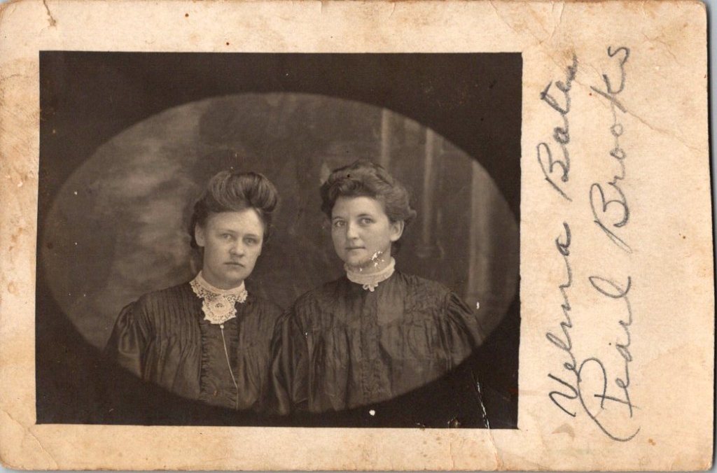
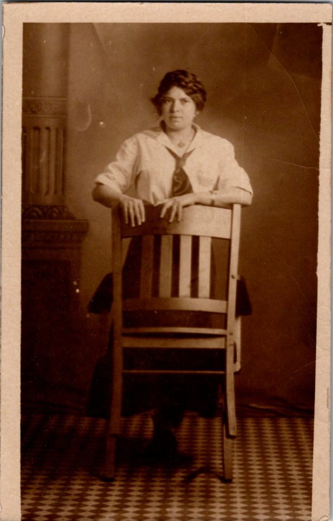
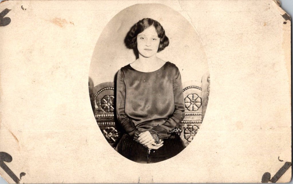
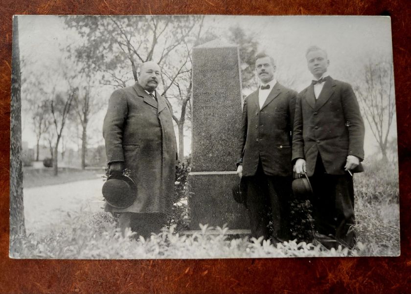
Over the past few weeks, a rare photo postcard album has revealed places, property, and people, along with our own ideas about what we see. We’ve gone from unmarked wilderness, to building structures and social life, to faces and a few names.
We look back at them, and they return the gaze. Their stories blend with our own memories and imagination. They begin to feel like someone’s ancestors, though the particulars remain elusive.
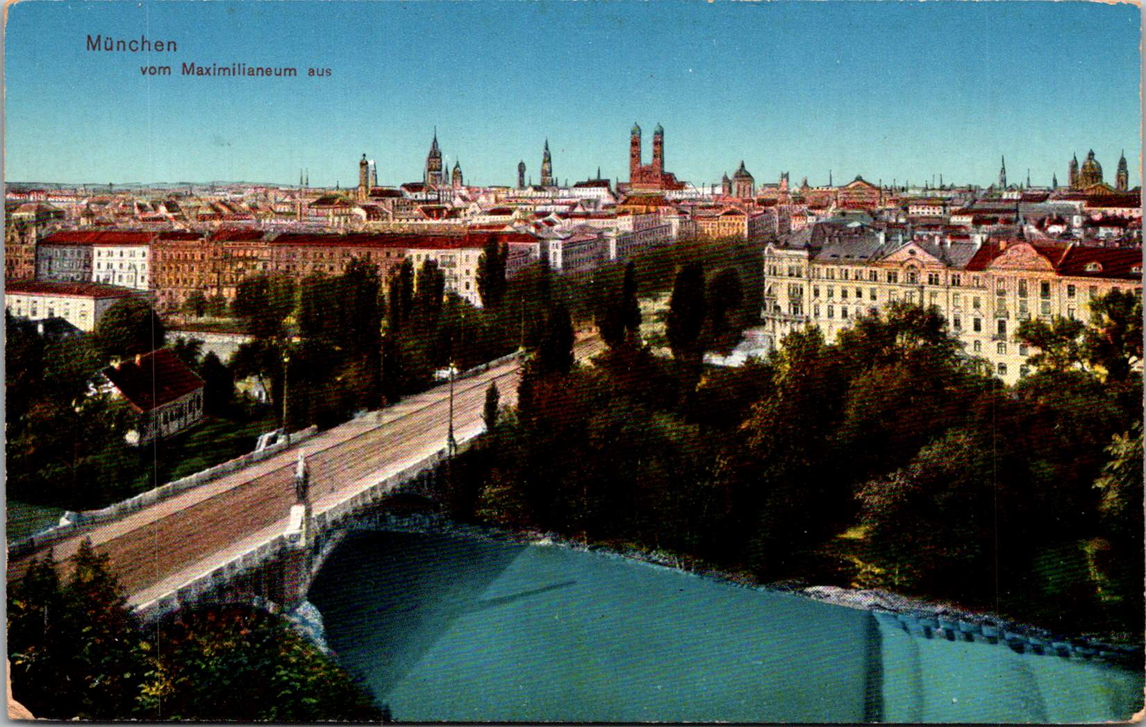
Rochester in Rearview
In 1877, photography required glass plates, wet chemicals, heavy equipment, and specialized knowledge. George Eastman, a frustrated bank clerk from a poor family in Rochester, taught himself the process in his mother’s kitchen.
A decade later, Eastman had invented a simple camera pre-loaded with film for 100 exposures. By 1903, the Eastman Kodak Company released the 3A Folding Pocket Camera with 3¼ × 5½ inch film—exactly postcard size and pre-printed on the reverse. Local photographers and home enthusiasts could contact-print the negative directly onto postcard paper. No enlarger needed, and simplified processing equipment and chemicals.
Rochester became an ecosystem. Bausch & Lomb made the lenses. Kodak manufactured the cameras, bought the film company, and controlled the processing. Customers shipped the entire camera unit back to the factory, and received prints and a pre-loaded camera in return. “You press the button, we do the rest.” Factory workers were the first to witness an era of American life, as images of farms, houses, banks, theatre, and towns and their inhabitants poured in.
A quiet man, Eastman watched this unfold from the center, as his invention changed history and rippled through culture. By 1920, millions of Americans owned cameras. Eastman left a simple note when he ended his own life at 77 and in degenerative pain, “To my friends: My work is done. Why wait? GE”.
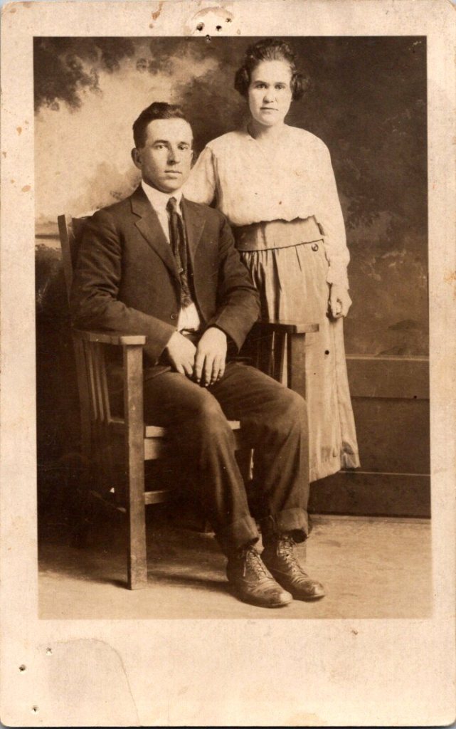
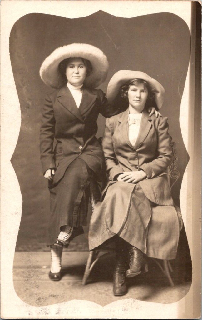
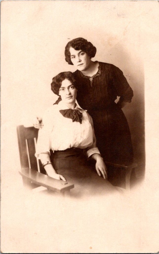
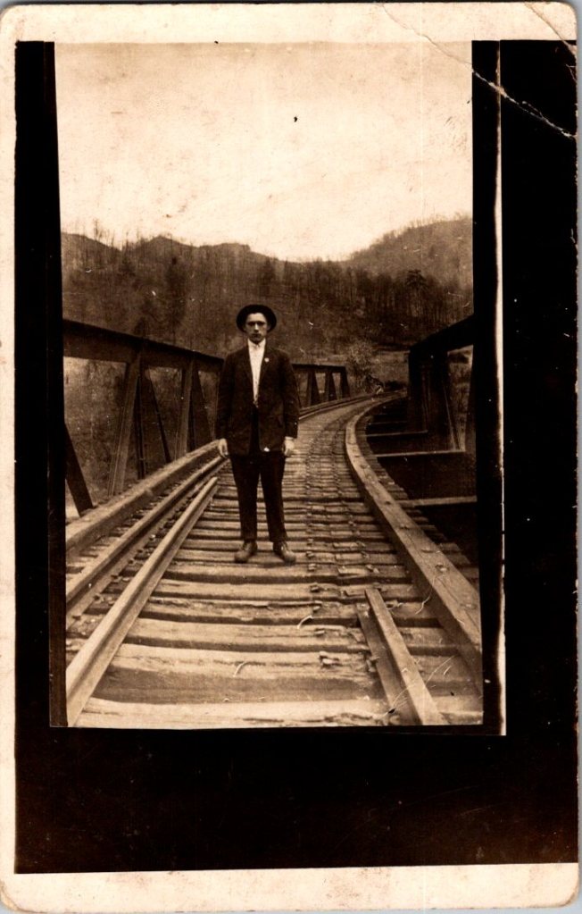
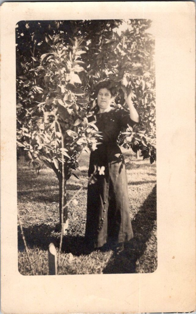
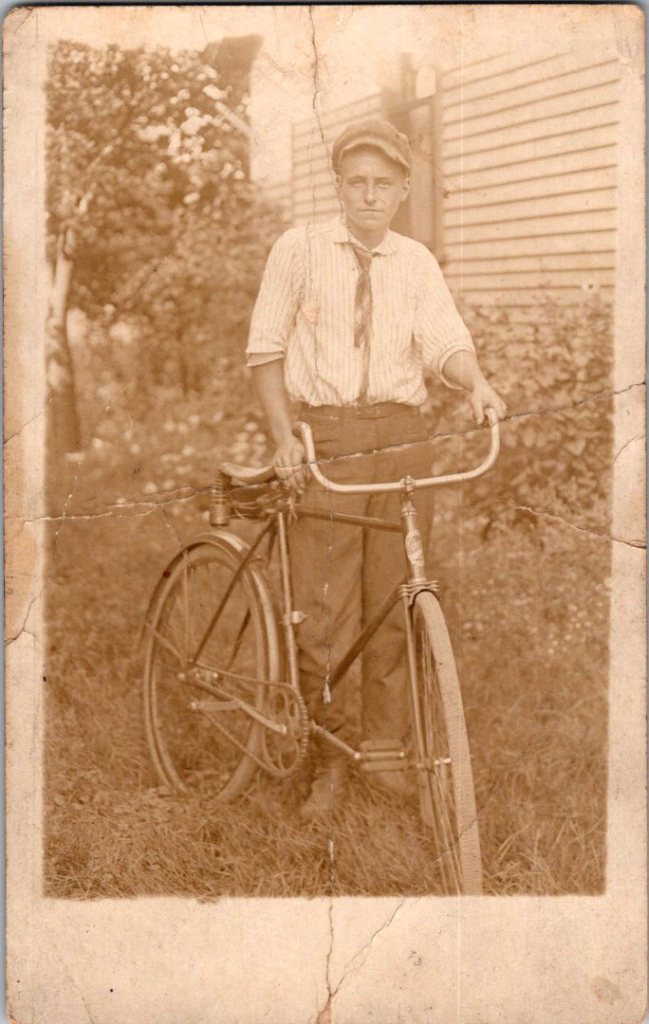
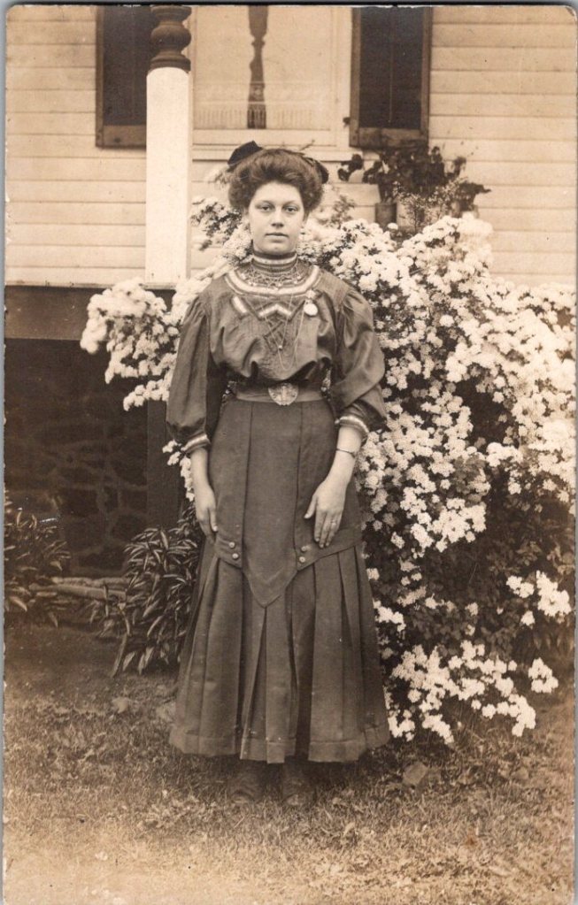
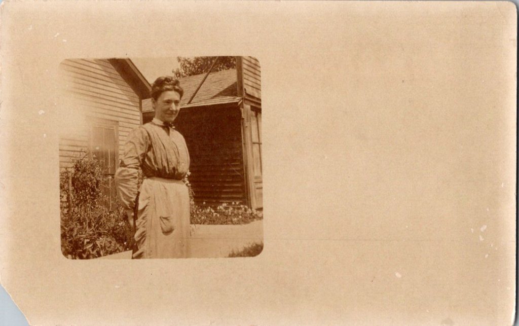
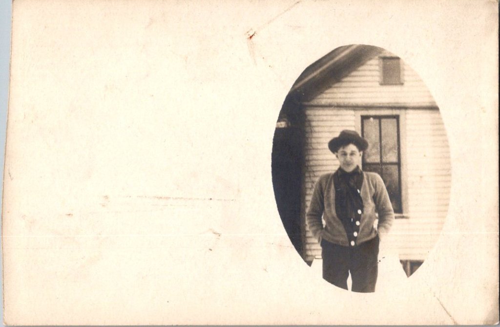
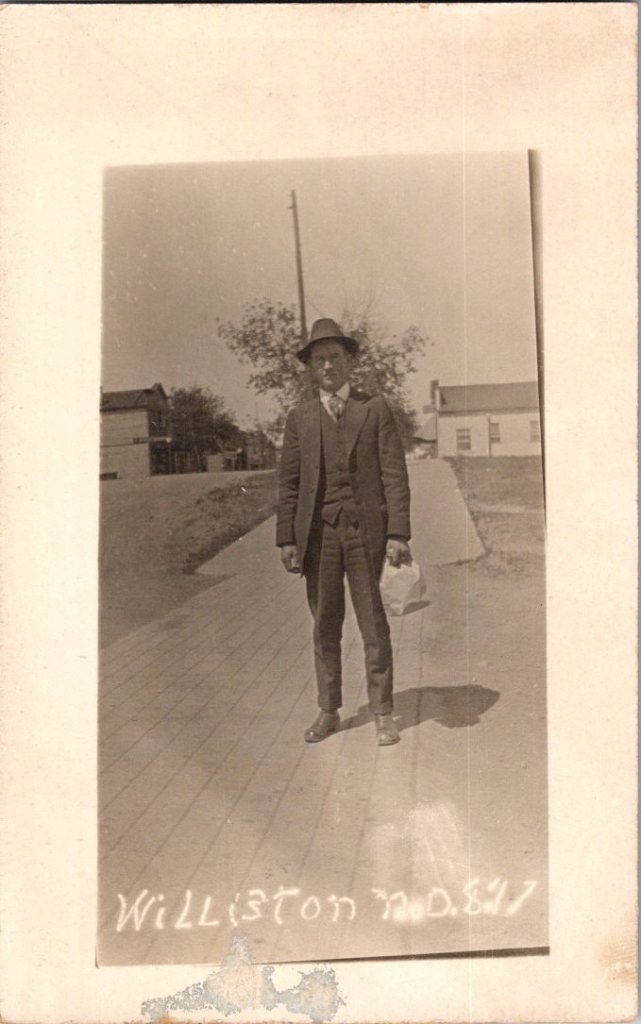
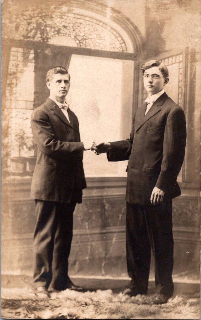
What We See
The studio portraits above show painted backdrops—ornamental arches, garden trellises. The lighting is controlled. Poses held steady. Technical quality consistent. These were made by professionals charging by the sitting.
The outdoor snapshots show real places—porches, orchards, dirt roads. Natural lighting, sometimes harsh. Composition varies from confident to awkward. These came from camera owners of varying skill. The irregularities in frame and exposure suggest they were developed at home, too.
What We Don’t See
Despite the pre-printed paper and earnest intent, real photo postcards were rarely sent as such. A few have difficult script, cryptic addresses, faded cancellations, and worn stamps.
“Hello Fanni. Miss Fanni Moore, Panhuska, Okla.”
The remaining relics haven’t been labeled, addressed, or mailed. Most backs are blank, and they were often collected in photo albums. The manufacturing marks may have been quite incidental.
What’s missing from nearly all: names. Very few clues to subjects, locations, dates. The people who made these photographs knew who everyone was. They didn’t need labels. Or, perhaps they were accompanied by letters and mailed in envelopes for privacy and protection.
A century later, the faces remain potent but anonymous. We guess at relationships from physical similarity, from who stands near whom. Sometimes we’re right. Sometimes, we can’t believe our eyes.
Spaces in Between
The 3A Folding Pocket Kodak cost $20-30, equivalent to $600-900 today. An expensive hobby, but accessible to prosperous farmers, small business owners, middle-class families. Film cost about 50 cents per roll.
The investment meant something, whether it was the equipment or the studio session. People photographed what mattered—children, homes, gatherings. The images document their priorities, and their time passing.
Real People, Real Limits
These are real people who lived, worked, loved, died. Someone cared enough to preserve their images. They matter still, in part, because they mattered to someone before.
But our analysis stops here. We can describe what we see—the composition, the technical choices, the historical context. We can note patterns across the collection. We can explain how the technology worked and who had access.
The work of naming and placing, in particular, belongs to families searching their own histories, connecting faces to stories passed down, matching photographs to genealogical records. Those searches have their own purposes, their own meanings.
We are collectors examining patterns, not descendants reclaiming ancestors. Though, it is tempting.
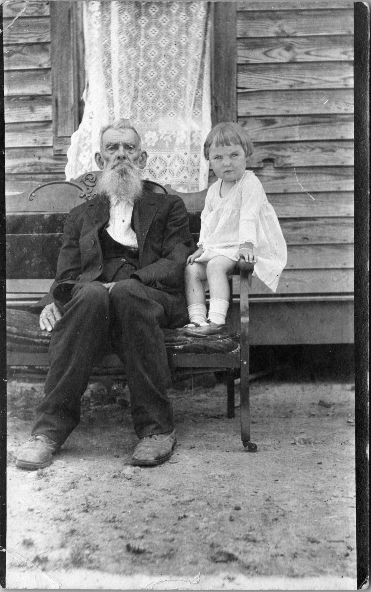
Old Rufus Dale had seen a thing or two, and Irene had her suspicions.
An early 20th century real photo postcard (RPPC) showing a poignant intergenerational portrait.
Front of the card: The photograph captures an elderly man with a distinctive long white beard, dressed in a dark suit, seated on a dilapidated wooden loveseat or couch in front of a clapboard house. Beside him sits a young child in a white dress, perched on the arm of the furniture. Behind them a decorative lace curtain hangs outside the open window. The setting appears to be rural America.
Back details: The reverse shows the handwritten inscription in pencil, Uncle Rufus Dale, age 84 and Irene age 4. We can assume a family relationship, likely between grand-uncle and grand-niece.
Condition and Appeal: The real photo postcard is in excellent condition front and back, unposted with helpful writing, and an AZO indicia dating the item between 1904 and 1918. The subject matter and production method suggest this is a unique image and object, with no known duplicate.
RPPCs are quite collectible, especially those with interesting and clear photographic subjects. The rural American family setting, the age gap between subjects, and the excellent condition make this item more desirable, appealing to collectors of early photography, genealogy researchers, postcard collectors, and those interested in American family and social history from the early 1900s.
[Note: Summer focus is on detailed captions. Essays return in September!]
Early postcards represent a convergence of innovations in printing, photography, and postal delivery—each with its own players, craft, and history. The emergence of the simple picture postcard depended on a complex international network of industries, technologies, and regulations developed in the prior century.
Art for the Masses
The development of chromolithography in the late 19th century provided the technological foundation for colorful mass-produced postcards. Though lithography itself dated back to 1796, when Alois Senefelder developed the process in Munich, the refinement of color lithography reached new heights in the 1870s-90s, with different national styles emerging.
German printers particularly mastered the technique of creating separate limestone printing plates for each color, allowing for vibrant multi-color images that previously would have required expensive hand-coloring. A typical color postcard might require five to fifteen separate printing runs, with perfect registration between colors. This level of precision required specialized equipment and highly trained craftsmen.
German chemical industries produced superior inks and dyes, giving their postcards more vibrant and stable colors than competitors. Companies like BASF and Bayer, originally founded as dye manufacturers, provided innovative colorants specifically formulated for printing applications.
The German city of Leipzig emerged as a center of printing excellence, with firms like Meissner & Buch establishing international reputations for quality. German chromolithography was so superior that even American publishers would often have their designs sent to Germany for printing, then shipped back to the United States for distribution—at least until tariff changes in 1909 made this practice less economical. Publishers like Raphael Tuck & Sons maintained offices in Germany despite being headquartered in London, simply to access German printing expertise.
While Germany led in technical quality, French postcards developed a reputation for artistic sophistication. Paris publishers like Bergeret and Levy et Fils produced cards featuring Art Nouveau styles and artistic photographic techniques. The French market also developed distinctive “Fantaisie” postcards featuring elaborate designs with silk applications, mechanical elements, or attached novelties. These cards pushed the boundaries of what a postcard could be, turning functional communication into miniature works of art.
British publishers like Raphael Tuck & Sons, J. Valentine & Co., and Bamforth & Co. showed particular commercial acumen. While they didn’t match German printing quality or French artistic sensibility, British firms excelled at identifying market opportunities and consumer trends. The British pioneered specialized categories like the seaside postcard and led in developing postcards for specific holidays and occasions.
Photographic Reality
While lithographic postcards dominated the market, photography increasingly influenced postcard production. The collodion wet plate process (1851) and later the gelatin dry plate (1871) made photography more accessible. The development of halftone printing in the 1880s allowed photographs to be reproduced in print media without manual engraving, creating more realistic imagery.
A revolutionary moment came in 1903 when Eastman Kodak introduced “Velox” postcard paper. This pre-printed photographic paper had postcard markings on the back and a light-sensitive photo emulsion on the front. Combined with Kodak’s 3A Folding Pocket camera, which produced negatives exactly postcard size (3¼ × 5½ inches), this innovation created the Real Photo Postcard (RPPC).
The acquisition of Leo Baekeland’s Velox photographic paper company in 1899 for $1 million provided a crucial technological component. Velox paper could be developed in artificial light rather than requiring darkroom conditions, had faster developing times, and produced rich blacks and clear whites—all critical qualities for postcard production.
The RPPC format found particular success in America, where the vast geography meant many small towns would never appear on commercially printed postcards. Local photographers throughout the country created RPPCs of main streets, businesses, schools, and community events, documenting American life with unprecedented comprehensiveness.
International Postal Agreements
Even the most beautifully produced postcard would be meaningless without an efficient system to deliver it. The standardization of postal systems in the late 19th century created the infrastructure necessary for postcards to flourish.
A watershed moment for international mail came with the Treaty of Bern in 1874, establishing the General Postal Union (later renamed the Universal Postal Union or UPU). This organization created the first truly international postal agreement, initially signed by 22 countries, primarily European nations. The United States joined the UPU in July 1875, connecting the American postal system to the standardized European networks. The U.S. had introduced its own government-issued postal cards in 1873, but joining the UPU meant these could now be sent internationally under consistent regulations.
Several key UPU Congress developments shaped the postcard’s evolution. The 1878 Paris Congress renamed the organization to Universal Postal Union. The 1885 Lisbon Congress standardized the maximum size for postcards (9 × 14 cm). The 1897 Washington Congress set new international regulations for private postcards. The 1906 Rome Congress standardized the divided back format internationally.
Perhaps the most crucial postal development for postcard popularity was the divided back. Great Britain introduced this format in 1902, with France and Germany following in 1904, and the United States in 1907. Before the divided back, the entire reverse of a postcard was reserved for the address only, with messages having to be squeezed onto the front, often around the image. The new format allocated half the back for the address and half for a message, dramatically improving postcards’ utility as correspondence tools.
European Delivery Systems
European railway networks proved ideal for postal delivery, creating a remarkably efficient system. By the 1870s-80s, most European countries had developed comprehensive rail networks. Germany alone had over 24,000 miles of railway by 1895, despite having a land area smaller than Texas.
Railway mail cars (“bureaux ambulants” in France, “Bahnpost” in Germany) sorted mail en route. These mobile sorting offices made the system highly efficient, with mail sorted by destination while in transit. Railway timetables were coordinated to allow for mail transfers at junction points, creating an integrated system even across national borders.
Major routes often saw multiple mail trains per day. The Berlin-Cologne line, for example, had four daily postal services by 1900. This meant that postcards could be delivered between major cities within a day, creating a communication speed previously unimaginable.
For urban delivery, European cities developed even more innovative systems. Perhaps most remarkable were the pneumatic tube networks installed in several European capitals. Paris launched its “Pneumatique” in 1866, Vienna’s “Rohrpost” began in 1875, and Berlin built an extensive pneumatic network from 1865. These systems used compressed air pressure to propel cylindrical containers through networks of tubes. The carriers could hold several postcards or letters and traveled at speeds up to 35 kilometers per hour. Paris eventually developed a pneumatic tube network extending 467 kilometers, allowing for delivery times of under 30 minutes across the city. A morning postcard could receive an afternoon reply—creating a nearly conversational pace of written communication.
American Adaptations
The United States faced different geographical challenges. The vast distances between population centers meant that the same-day delivery common in Europe was impossible between major cities. Nevertheless, the American postal system developed impressive efficiency given these constraints.
The U.S. Railway Mail Service, officially established in 1869, became the backbone of American mail delivery. By 1900, more than 9,000 railway postal clerks were sorting mail on trains covering more than 175,000 miles of routes. While European countries measured mail routes in hundreds of miles, American routes stretched thousands of miles across the continent.
American cities also experimented with pneumatic tube systems, though they were less extensive than European counterparts. New York City’s system, operating from 1897 to 1953, eventually covered 27 miles with tubes connecting post offices in Manhattan and Brooklyn. At its peak, it transported 95,000 letters per day, or about 30% of all first-class mail in the city.
Within cities, frequent delivery became the norm. By 1900, many American urban areas offered at least four daily mail deliveries, with some business districts receiving up to seven deliveries per day. This made postcards a practical means of daily communication within city limits, much as they were in Europe.
The efficiency and economy of postcards made them ideal for routine business communications. Companies developed pre-printed postcards for order acknowledgments, shipping notifications, payment reminders, meeting confirmations, service calls, and appointment reminders. These standardized communications reduced clerical costs while providing a paper trail of business interactions. The divided back format was particularly valuable for business purposes, allowing for both a standardized message and customized details.
Perhaps no industry benefited more from postcards than tourism. Hotels, resorts, transportation companies, and local chambers of commerce all commissioned postcards that served as both souvenirs and advertisements. Visitor bureaus coordinated with publishers to ensure their destinations were well-represented in the marketplace. The economic impact was substantial—a scenic view postcard might cost a penny to produce, sell for a nickel, and generate hundreds of dollars in tourism revenue by inspiring visits. This multiplication effect made postcards perhaps the most cost-effective tourism marketing tool ever devised.
On the personal side, postcards fulfilled a spectrum of communication needs. In an era when the telephone was still a luxury and telegrams were expensive, postcards filled the gap between costly immediate communication and slower formal letters. Their affordability and efficiency made them ideal for routine messages. At half the postage rate of letters in many countries, postcards democratized written communication for working-class people who might otherwise limit correspondence due to cost. The postcard’s format encouraged brevity—a perfect medium for quick notes without the formality or length expected in a letter. In urban centers with multiple daily mail deliveries, postcards functioned almost like text messages, allowing people to make arrangements within hours.
Sending postcards from vacation destinations served as tangible proof of travel experiences. “Wish you were here” cards from resorts or tourist locations signaled social status and mobility. Recipients often displayed postcards on special racks or in parlor albums, using them as affordable decorative elements and evidence of their social connections. For people who rarely traveled, receiving postcards provided authentic glimpses of distant places through real photographs rather than artistic interpretations.
Perhaps most significantly for historical purposes, postcards—especially RPPCs—documented aspects of community life that would otherwise have gone unrecorded. Local events, buildings, streetscapes, and everyday activities were captured on postcards, creating a visual record of ordinary life at the turn of the century that has proven invaluable to historians. When natural disasters or significant events occurred, local photographers would quickly produce RPPCs documenting the situation. These cards spread visual news of floods, fires, celebrations, or notable visitors throughout the region, serving an early photojournalistic function.
While American postcard production initially lagged behind Europe in quality, US companies excelled at entrepreneurial adaptation. When the 1909 Payne-Aldrich Tariff Act increased import duties on foreign postcards, American firms rapidly expanded domestic production capabilities. When World War I cut off European imports entirely, American manufacturers stepped into the gap, developing new techniques and styles.
Beyond the Golden Age
Behind every seemingly simple postcard lies a complex history of industrial innovation, international cooperation, and social transformation—a paper-based predecessor to the digital networks that connect us today.
The Golden Age of postcards waned after World War I due to disruption of European production centers, rising postal rates, the growing popularity of telephones, and the emergence of new forms of mass media.
The era when postcards emerged was a crucial moment when ordinary people gained access to new visual communication tools. The democratization of image sharing pioneered by postcards foreshadowed later developments in visual communication. This visual history reminds us, from personal photographs to social media posts, the impulse to share visual snippets of our lives is a constant across time.
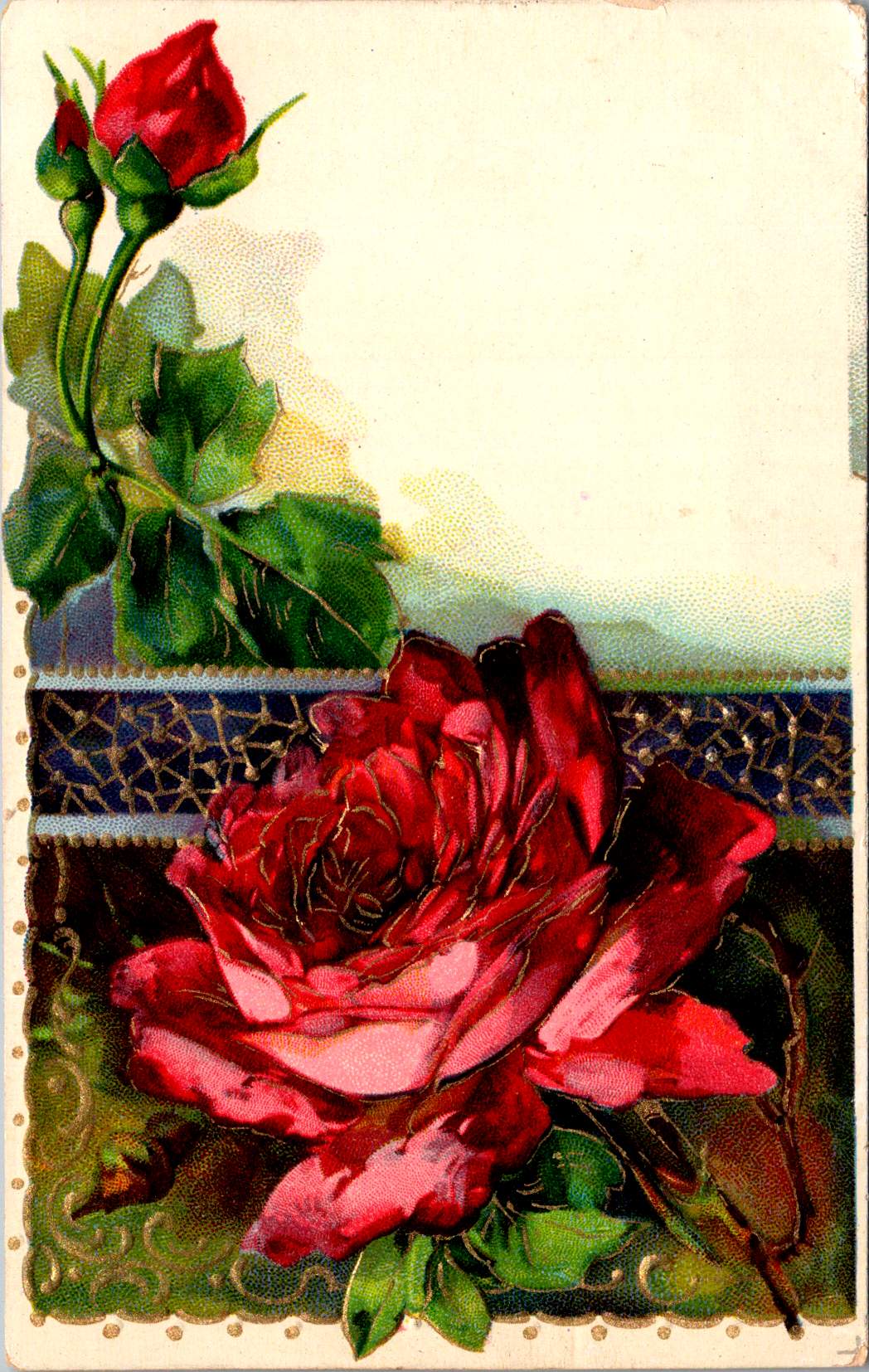
Vintage floral postcards—with golden backgrounds, symbolic flowers, and heartfelt messages—were a sophisticated social currency that connected people across distances.
At the intersection of the Victorian and Edwardian eras, the humble postcard emerged as a powerful medium for small aesthetic pleasures and meaningful social exchange. These postcards tell a story of artistic development and printing innovation, and how ordinary people wove beauty into the fabric of everyday communication.
Delicate Blooms
One card in this selection features pristine white lilies and fern fronds against a luminous gold background. The lilies—rendered in striking detail with their trumpet-shaped blooms and distinctive stamens—create dramatic contrast against the warm gold, the iridescent ink catching light as the recipient tilted the card in their hands. An elegant blessing accompanies the illustration.
“No thorn beset the path you tread, No shadows glance upon your way, But flowers spring beneath your feet, And sunshine crown your every day.”
These cards encapsulate a pivotal moment in design history—the transition from Victorian to Edwardian sensibilities. The Victorian era (1837-1901) embraced ornamentation, sentiment, and symbolic complexity. Every element carried meaning: white lilies represented purity and virtue; ferns symbolized sincerity and shelter; the gold background evoked trust and value. These layers of meaning reflected the Victorian preoccupation with moral improvement through beauty, a philosophy championed by influential figures like John Ruskin and William Morris.
As Queen Victoria’s reign ended and Edward VII took the throne (1901-1910), aesthetic preferences gradually shifted. The new Edwardian sensibility maintained Victorian symbolic richness but introduced more restrained layouts with increased white space and cleaner compositions. This particular card, with its strategic emptiness and focused arrangement, demonstrates this evolution. The gold field creates breathing room that earlier Victorian designs would have filled with additional decorative elements.
The technology behind these gold backgrounds represented industrial innovation. Using metallic powders and varnish printed in the desired pattern, these effects made previously elite decorative elements available to middle-class consumers. During the Industrial Revolution, technical advancements in printing had transformed what was once painstaking handwork into mechanized production. German printers in particular had mastered these techniques, producing cards with exceptional color registration and metallic effects that remained unmatched until their trade was disrupted by World War I.
Other sophisticated production methods like embossing—creating raised areas that added tactile pleasure to the visual experience—required specialized equipment and expertise. Metal dies created by skilled engravers would press the design into the card after printing was complete. The visual effect was enhanced by different dimensions, making these technically perfect cards a testament to industrial craftsmanship.
Gold’s association with luxury stemmed from both its intrinsic properties and historical significance. The aptly named Gilded Age celebrated opulence, with gold becoming a visual shorthand across design disciplines. International Expositions like the 1900 Paris Exposition showcased luxury goods incorporating gold elements, popularizing these aesthetics globally. Archaeological discoveries in Egypt renewed interest in gold in design, while the Ballets Russes featured costume and set designs by artists like Léon Bakst who used vibrant colors and gold accents.
Floral Features
A striking card in the next selection features white and red striped “peppermint” carnations against a gold background. The distinctive white petals dramatically streaked with vibrant red markings create bold visual contrast against the metallic wash. Three perfectly rendered blooms cluster together on dark stems, with bright green sword-like leaves framing the arrangement. The word “Carnations” appears in red script in the upper right corner, identifying the botanical subject with elegant simplicity.
This stark compositional approach—focusing entirely on the botanical subject against a uniform background—represents a more modern, stripped-down aesthetic that emerged in the early 1900s. While maintaining the Victorian fascination with floral symbolism, these designs eliminate extraneous decorative elements in favor of dramatic contrast and botanical precision. This shift toward simplification prefigured design trends that would gain momentum in the following decades, showing how postcard aesthetics tracked broader movements in visual culture.
The symbolism remained rich: striped carnations carried specific meaning in the Victorian language of flowers, often representing regret that a sentiment could not be shared or a refusal/inability to accept someone’s affection. This sophisticated “language of flowers” had become codified in popular Victorian publications like Kate Greenaway’s “Language of Flowers” (1884), ensuring that recipients would understand these botanical messages. The high contrast between the red-streaked white blooms and the gold background created a visual drama that emphasized the emotional complexity carnations represented.
During this period, social practices around correspondence were evolving. The penny post, established in Britain in 1840 and adopted with variations throughout Europe and America, had revolutionized communication by making it affordable across social classes. What was once an expensive privilege became commonplace, leading to a boom in correspondence. The “Golden Age of Postcards” (approximately 1898-1918) coincided with changing postal regulations that allowed privately printed cards and preceded the widespread adoption of telephones. During this period, billions of postcards circulated globally.
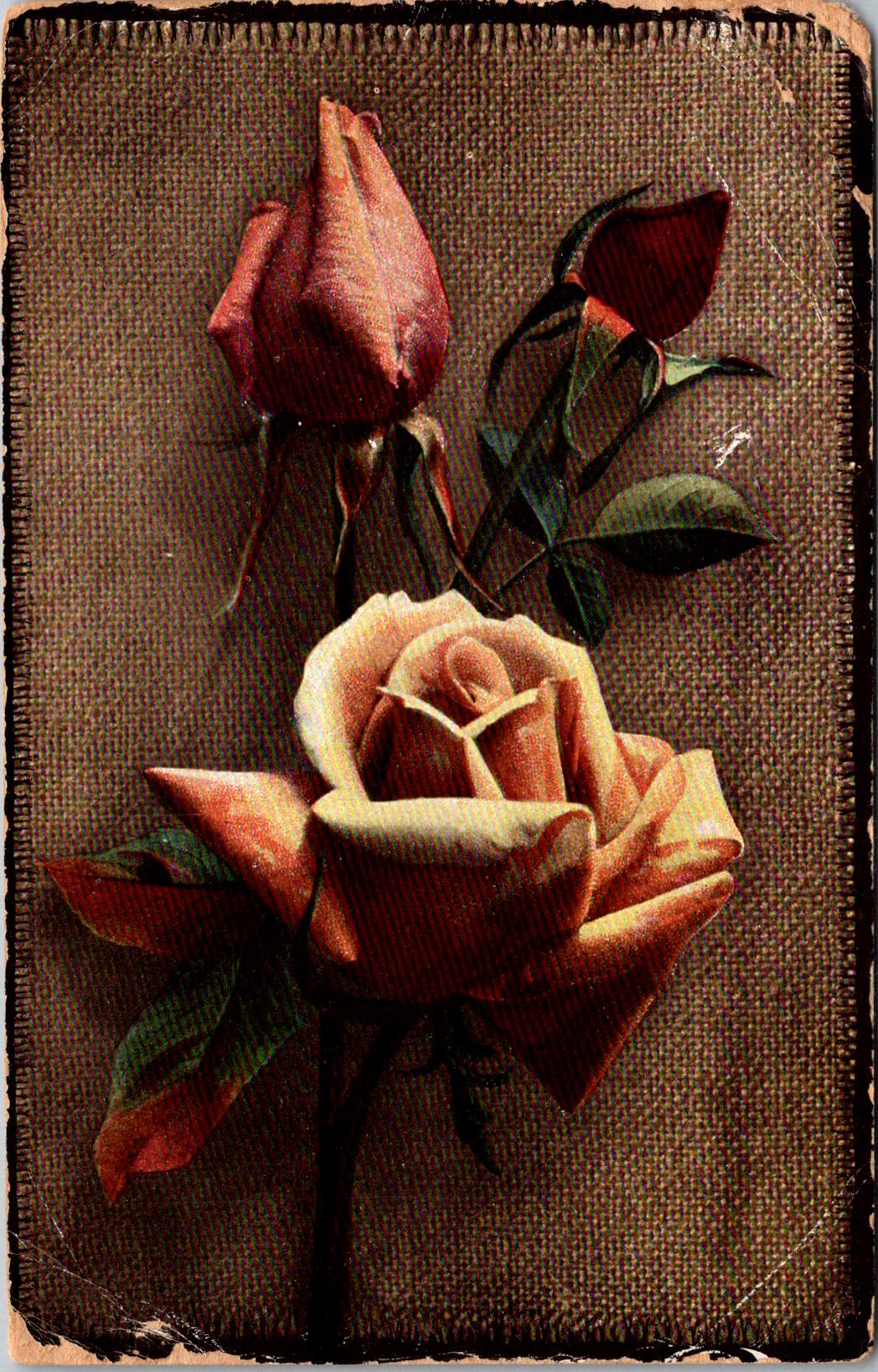
Rose to Crimson
The next group of cards represents another technological leap—an early photograph of light pink roses on a background of actual linen. The physical texture of the rough weave contrasts with the delicate subject matter—an open rose and two buds captured a new reality that only photography could provide. This mixed-media approach demonstrates how artists continued to experiment with both visual and tactile experiences.
The Victorian and Edwardian periods witnessed remarkable developments in image reproduction. Traditional chromolithography—where each color required a separate stone or plate—was being supplemented by photographic techniques. These innovations allowed the faithful reproduction of reality rather than artistic interpretation, though both approaches coexisted during this transitional period. The textures and images of this card created an interesting interplay between the natural subject and the material substrate, engaging multiple senses simultaneously.
Rose symbolism operated on a similarly subtle gradient. In Victorian floral language, the exact shade of a rose communicated specific intentions: light pink roses signified admiration and grace—appropriate for relationships in earlier stages or those requiring emotional restraint. Medium pink suggested appreciation, while deeper crimson conveyed self-conscious beauty and passionate love. This color gradient functioned as a sophisticated social shorthand, with increasing saturation indicating increasing emotional intensity.
This coding system proved particularly valuable in an era when direct expressions of emotion were constrained by elaborate social conventions. Etiquette books like those published by Emily Post outlined proper behavior in minute detail, including appropriate subjects for correspondence and proper forms of address. Against this background of social restriction, postcards offered a safe channel for emotional expression. The carefully chosen rose color allowed for communication that could either be acknowledged or tactfully ignored, providing a social safety mechanism for expressing feelings that might be improper to state directly.
For Victorian and Edwardian women especially, whose social freedom was often limited, postcard exchange offered acceptable connection. Young women could receive cards from admirers without compromising propriety, as the public nature of postcards (visible to postal workers and potentially family members) ensured messages remained discreet. This “public privacy” created a unique social space where relationships could develop within accepted boundaries.
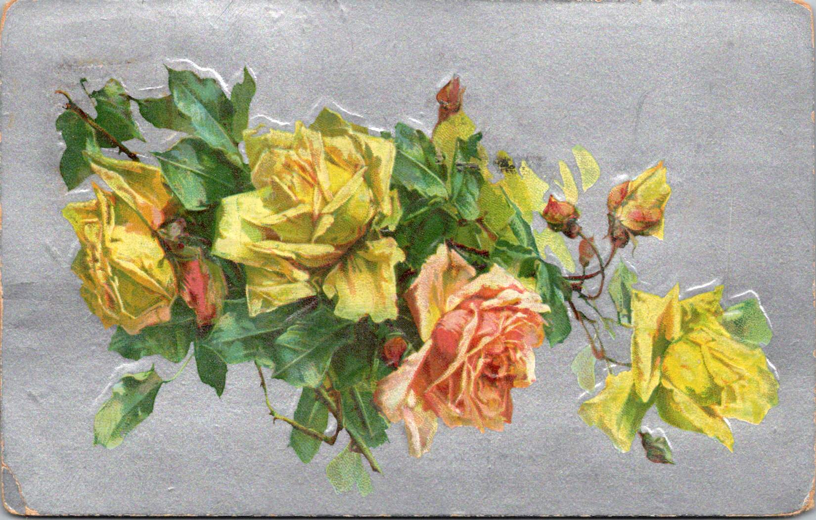
Color Craft
The final featured card offers yellow roses against a silver background, that creates a cooler, more modern luminosity. The yellow blooms—rendered with botanical precision—grow naturally on their stems, emphasizing an organic composition that represents changing sensibilities as the Edwardian era progressed toward what would become Art Deco and modernism.
While Victorian design had favored warm, rich gold tones suggestive of historical richness, the newer aesthetic embraced clarity, brightness, and forward-looking optimism. Yellow—the color of sunshine and vitality—symbolized friendship and joy rather than romantic love, expanding the emotional palette of postcard communication.
These changes in design paralleled broader social transformations. The early 20th century witnessed significant shifts in social mobility, women’s roles, and technological adoption. The rise of department stores democratized consumption of decorative goods, while increasing literacy rates expanded the audience for visual and textual communication. The suffragette movement gained momentum, challenging Victorian gender restrictions. These postcards, with their evolving aesthetics, tracked these social changes in material form.
Technology continued advancing as well. The integration of photography with traditional printing techniques created hybrid visual forms. German printers had pioneered many of these innovations before World War I. American and British printers subsequently developed their own techniques.
The social function of these postcards remained central to everyday life. In major cities, postal deliveries occurred multiple times daily—sometimes up to 12 deliveries in London—creating a communication rhythm somewhat like today’s text messages. This frequent exchange helped maintain connections across the increasing distances created by urbanization and industrialization. As families dispersed geographically, these tangible tokens of remembrance became increasingly important.
Recipients collected their postcards in specialized albums that became objects for social sharing in parlors. These albums—elaborately decorated themselves—transformed private communication into a form of social performance. Visitors could be shown new additions, creating occasions for storytelling about relationships and experiences. A well-filled album demonstrated one’s social connections and cultural participation, serving as a physical social network long before digital versions existed.
Simple Beauties
These postcards survive as artifacts of a time when beauty was considered essential rather than superficial. The Victorian belief that exposure to beautiful things could elevate character and promote virtue gave postcard exchange deeper purpose beyond mere communication. They offered sensory richness—tactile embossing, visual color, and the symbolic associations of flowers—that counterbalanced the sometimes harsh realities of industrial urban environments.
Unlike earlier periods when beautiful objects were primarily reserved for the wealthy, mass-produced postcards allowed people across social classes to exchange and possess small works of art. This democratization of aesthetic experience represented a significant shift in how beauty was distributed socially. The contrast between the expense suggested by the gold backgrounds and elaborate printing and the actual affordability of the postcards was part of their appeal—beauty without extravagance, pleasure without guilt.
These simple beauties represent a unique cultural moment when industrial technology enhanced rather than replaced artistic sensibility, when mass production made aesthetic pleasure more accessible rather than less meaningful.
Their legacy invites us to reconsider how we might integrate beauty into our own communication practices. While we have gained immediacy in our digital exchanges, how might we also retain the sensory richness these physical exchanges provided—the anticipation of delivery, the tactile pleasure of holding a beautiful object, the visual delight of color and form, and the knowledge that someone selected this specific image with you in mind.
The Victorian and Edwardian postcard tradition suggests that communication is enhanced, when wrapped in layers of beauty, symbolism, and care—tangible gestures that engage not just the mind but the senses and the heart.
Three postcards, yellowed with age, each capture a moment when someone paused in the middle of their story to reach out. Like a Venn diagram drawn in time, these missives overlap in that sacred space where human hearts seek connection across distances.
Through three preserved postcards from the early 1900s, we discover how every point of contact becomes a sacred center, a middle ground where hearts meet across distances both physical and emotional. Each yellowed card, with its carefully penned message, reminds us that we are all perpetually in the middle of things, reaching out across whatever distances separate us, making meaning in the spaces between hello and how are you?
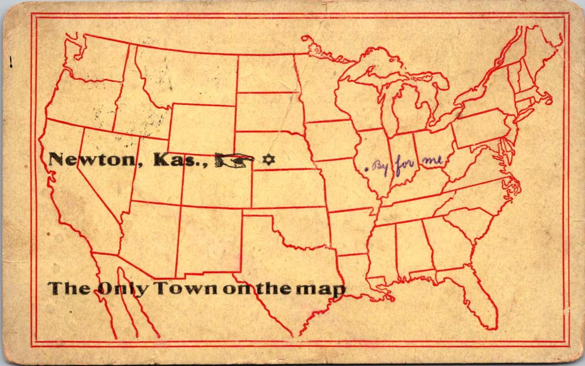
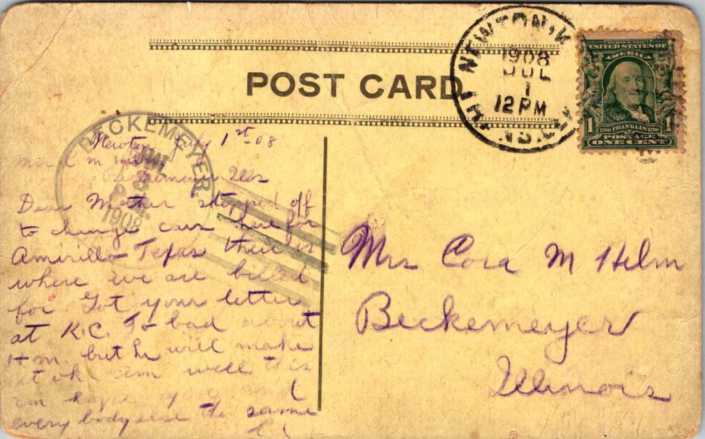
The Only Town on the Map
In Newton, Kansas, July 1908, Ed pauses between trains to write to his mother on playful postcard. A single dot on a stencil-drawn outline of the United States marks Newton as The Only Town on the map – a silly claim that also quietly captures a truth about human connection.
The humor lies in its absurdity – a blank continent save for this one dot in Kansas. Yet for Ed, in that moment, Newton truly is the center of everything, the pivot point between where he’s been and where he’s going.
Dear Mother, stopped off to change cars here for Amarillo Texas. There is where we are billed for. Got your letter at K.C. Too bad about him but he will make it ok. Am well this am, hope you and everybody else the same. Ed
He’s literally in the middle of the country, this railway town serving as his sacred center for just a few hours. There’s worry in his words about someone who’s unwell, balanced with reassurance about his own wellbeing. Even in transit, through immense uncertainty, he reaches for connection.
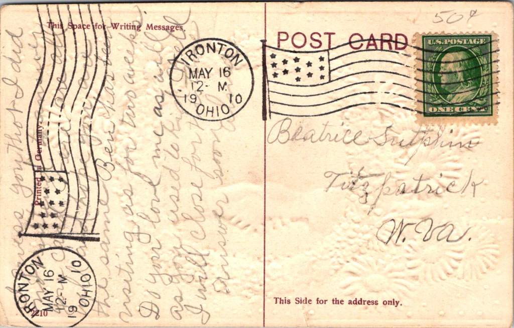
Long to Shake Your Hand Again
Two years later, in Ironton, Ohio, a young woman named Alma sends a card to Beatrice Sutphin in West Virginia. The card’s design speaks volumes: blue forget-me-nots and pink daisies frame a handshake, that polite, egalitarian gesture. Behind the clasped hands stretches a pastoral scene with water and a bridge – another symbol of connections that span distances.
“Do you love me as well as you used to, kid,” Alma writes, her playful tone reflecting the common courtesies of the day while masking a deeper yearning for reassurance. She’s navigating the creative tension of friendship across distance, using casual language and nudging humor to reach across the miles. The card itself becomes a bridge, a handshake in paper form.
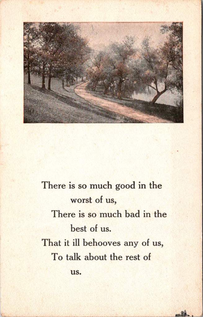
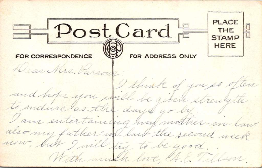
The Path Through the Trees
The third card, never mailed but carefully preserved, shows a winding path through trees, accompanied by verses about the complexity of human nature. A.E. Tillson writes to Mrs. Parsons with a note of formal sympathy, then adds a gentle joke about hosting in-laws. The message operates in that delicate middle ground between social obligation and genuine concern, between gravity and levity.
“I think of you so often,” she writes, “and hope you will be given strength to endure as the days go by.” Then, like a subtle change in musical key: “I am entertaining my mother-in-law and also my father-in-law for the second week now, but I will try to be good.”
All these years later, we are still inclined to gently inquire. Reading the messages between the lines, as they say. Do I sense a subtext here? What prevented her from sending this card? Why did she keep it long years on?
The Sacred Center
Something lies at the intersection of these three postcards, a sacred center they all circle around. It’s not serenity – each writer grapples with some form of creative tension. Ed worries about an unnamed “him” while trying to reassure his mother. Alma playfully demands affirmation of continuing friendship. A.E. Tillson balances sympathy with humor, formal phrases with personal asides.
The sacred center is the conversation itself – the eternal human drive to reach out, to connect, with even the most mundane facts. The center thrives on these noted perspectives, each writer offering their unique take, laden and layered with meaning though jotted out from a whistle stop.
These postcards are artifacts of appreciative inquiry in its most natural form. Each sender pauses in their own journey to ask: How are you? Are you well? Do you still care for me? Can I help you bear your burden? The questions themselves open up places where hearts meet and stories intertwine.
Some of us, like Ed in Newton, write from the middle of a physical journey. Others, like Alma, navigate the emotional journey of maintaining connections across distance. Still others, like A.E. Tillson, write from the complex shared ground of social obligations and genuine concerns, so often unspoken.
In Transit, In Place
Whatever the circumstance, we are always in the middle of things. There is always a before and after, always tension between where we’ve been and where we’re going, between who we were and who we hope to become. These postcards remind us that this center is not a void to be escaped but a sacred space packed with the very humble pieces of possibilities.
The verse on the unposted card speaks to this truth:
There is so much good in the worst of us, There is so much bad in the best of us, That it ill behooves any of us, To talk about the rest of us.
The middle is the best part – of our stories, of our journeys, of our complex relationships with others. As they say, if you’re not dead, it’s not over. The sacred center isn’t found in perfect serenity but in the creative tension of reaching out across whatever distances separate us, whether those distances are measured in railroad ties or handshakes.
These century-old postcards, with their careful penmanship and gentle inquiries, their jokes and worries and reassurances, remind us that the center holds not because it is static, but because it is constantly renewed through the sacred act of one person reaching out to another with a simple message. Here I am, in the middle of it all, thinking of you.
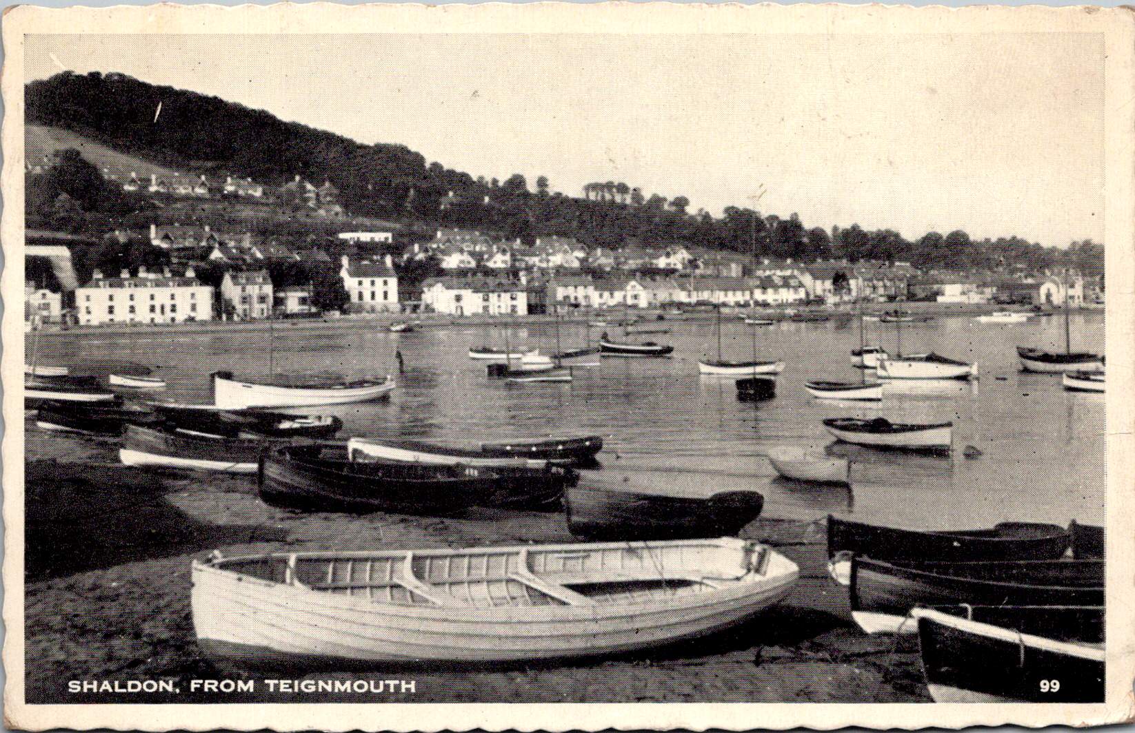
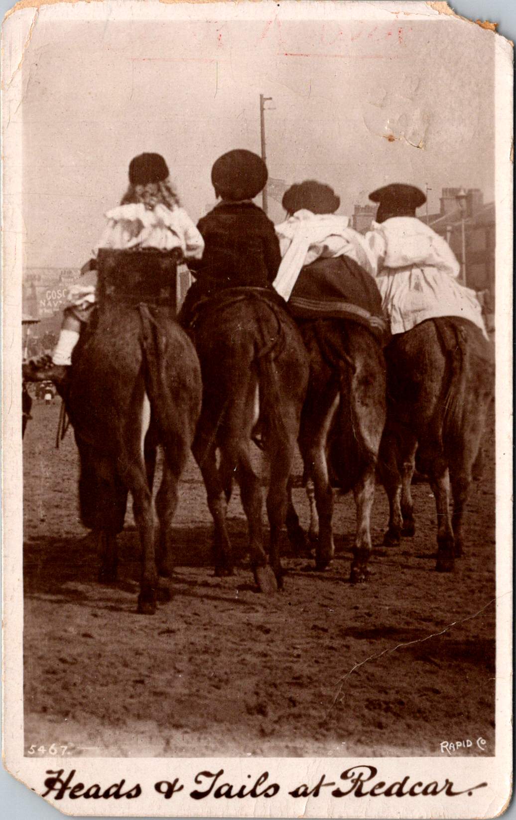
Four children are astride donkeys walking on the beach, clothed in Edwardian-style white blouses and all wearing caps. A century away (and still there today) kids on a delightful donkey ride near Redcar’s legendary seaside.
This real photo postcard with a memorable image bears the hand-scripted titled “Heads & Tails at Redcar.” One can still feel the April 18, 1910 embossed postmark on the card a century later. Addressed to Nurse Aird in Darlington from Redcar, the message is pragmatic.
Expect to arrive about 6.30 to-morrow evening. Love from Rennie
The seaside town of Redcar was transformed from a modest fishing village into a bustling resort town by the arrival of the railway in the mid-19th century, and became a beloved destination for working and middle-class families from throughout Britain’s industrial northeast.
In the 1910s, Redcar embodied the height of seaside grandeur. The impressive Coatham Hotel, built in 1871, dominated the seafront, its architecture expressing the optimism and ambition of the age. A pier stretched into the sea, its 1873 construction a testament to the engineering confidence of the era. Along the promenade, ornate gas lampposts cast their glow over evening strollers, while elaborate wooden shelters provided refuge from sudden showers.
The seafront architecture told a story of careful planning and civic pride. Victorian terraces, built of local sandstone or sturdy brick, were elegant facades looking at the sea. Behind them, a grid of streets housed seasonal workers, fishermen, and the growing permanent population drawn by the town’s prosperity. The Central Hall, opened in 1895, provided entertainment, while Methodist and Anglican churches with their reaching spires reminded visitors and residents alike of Victorian moral values.
Yet Redcar was never merely a tourist trap. The town’s proximity to mining linked it inextricably to Britain’s industrial might. The discovery of workable iron ore deposits in the Cleveland Hills in 1850 had sparked an industrial revolution in the region. By the 1910s, mines dotted the landscape, and the sight of industrial chimneys on the horizon reminded visitors of the region’s working heart. Many local people split their lives between seasonal tourist work and the demanding labor of the mines or ironworks.
This distinctive mixing of leisure and industry is part of Redcar’s character. Unlike some of Britain’s more exclusive seaside resorts, the community remained proudly connected to its working roots. The donkey rides captured in our postcard—a quintessential British seaside tradition—were an affordable pleasure for working families. The donkeys themselves, chosen for their gentle temperament and sturdy build, paralleled the town’s way: reliable, hardworking, and ready to provide joy to all comers.
On April 18, 1910, Rennie dashed off a quick note from Redcar to Nurse Aird, using one of Rapid Photo Company’s popular seaside postcards to announce a return to Darlington the following evening at 6:30pm. Such precise timing speaks to the reliability of the North Eastern Railway’s service between the coastal town and Darlington, where regular daily connections had become the lifeblood of the region.
The journey home would begin at Redcar’s Central Station, its Victorian architecture still relatively new and imposing in 1910. The late afternoon departure would catch the changing light over the North Sea, before the steam locomotive began its hour-long journey inland. As the train pulled through Middlesbrough and then west toward Darlington, the spring evening would be settling in, with the Cleveland Hills silhouetted against the dusk. Fellow passengers might have included ironworkers heading to night shifts, businessmen returning from coastal meetings, and perhaps other daytrippers who had enjoyed the seasonal pleasures of the seaside.
By evening, Rennie would step onto the platform at Darlington’s Bank Top station, the time at the coast already feeling like a distant memory. Perhaps a deliberate choice of train, selected to arrive after Nurse Aird’s duties were complete or to catch the end of visiting hours. Whatever prompted the journey, the postcard captures the easy mobility that the railway enabled, allowing residents of these northeastern towns to move between coast and country with a regularity that would have seemed remarkable just a generation earlier.
In 12 historic pictures: a day at the seaside at Redcar from The Northern Echo
The subsequent century would bring profound changes to Redcar. The pier, once a symbol of Victorian confidence, fell victim to storm damage and was demolished in 1981. The grand Central Hall disappeared. Many Victorian hotels were converted or demolished as tourism patterns changed. Most significantly, the industrial base that had provided much of the region’s wealth underwent dramatic transformation. The 2015 closure of the SSI steelworks marked the end of an era, dealing a devastating blow to the community.
Modern Redcar presents a complex picture of a community in transition. The Redcar Beacon opend in 2013 (locally dubbed the “Vertical Pier”) reaches skyward, its contemporary design contrasting with the Victorian architecture that remains. Victorian terraces continue to face the sea, their sandstone facades weathered but dignified. The Clock Tower, dating from 1913, remains a local landmark. The town center struggles with empty shops, a challenge faced by many British high streets. The loss of heavy industry has forced difficult economic adjustments.
The community’s response to these challenges reveals much about Redcar’s character. The Palace Hub, housed in a former amusement arcade, provides space for local artists and craftspeople. Local groups organize beach cleaning and heritage walks, maintaining the town’s connection with its past while protecting its future. Locally run kitchens and groceries address modern challenges of food poverty while building community connections.
Most remarkably, the donkeys still plod along the beach in summer months. The same gentle animals that carried kids a century ago now delight a new generation of visitors. Modern care standards ensure rest periods, weight limits, and veterinary checks, but the essential experience remains unchanged. Children still laugh with surprise at their first encounter with these patient beasts, parents still snap photographs (will box cameras make another comeback?) and the donkeys still take their slow and careful steps, connecting past and present.
Redcar reminds us that progress isn’t linear and that community change involves deep dynamics of loss and renewal. The town that grew wealthy on iron ore and Victorian tourism now seeks new paths forward in renewable energy and cultural heritage. What has remained is both quirky and reliable: a donkey ride on the beach on a summer’s day.
While the grand Victorian hotels and ore industries of the region have largely passed into history, the humble donkey ride endures. Sometimes the most modest traditions prove the most durable, and the true character of a place resides not only in grand achievements but also in simple, timeless pleasures.
Who indeed would have guessed that of all Redcar’s attractions, it would be the donkey rides we couldn’t live without? Perhaps it is fitting that these patient animals, who witnessed the town’s rise, decline, and ongoing reinvention, continue to reliably entertain (and endure) new generations.
A postal card from 1883 offers a window into the past, revealing much about the society it came from. Old details touch on universal stories, transporting us back and forth in time.
This humble artifact, an estate-related postal card from 1883, encapsulates significant historical information, touching on communication methods, postal services, business practices, and daily life in late 19th-century America.
Evolution of Postal Communication
The postal card we’re examining is a product of a revolution in communication that occurred in the United States in 1873. The U.S. Post Office Department introduced postal cards as a new, affordable means of correspondence. These cards, precursors to the picture postcards we know today, allowed people to send brief messages for just one cent, half the cost of a letter at the time. This innovation democratized written communication, making it more accessible to a broader segment of society and paving the way for more frequent and casual correspondence.
The card’s design is a testament to the aesthetic sensibilities of the late 19th century. The header, with its ornate POSTAL CARD lettering, showcases the intricate Victorian typography popular during this period. Below this, we find the instruction: NOTHING BUT THE ADDRESS CAN BE PLACED ON THIS SIDE, a rule that would later be relaxed to allow for the development of picture postcards. The pre-printed one-cent stamp features the profile of Liberty, a common motif in American postal design of the era, symbolizing the freedom of communication.
Postal Development in Small Towns
The postmark, which reads HARRISONVILLE MO. APR 12 1883, provides valuable historical and geographical context. It places our artifact in a specific time and place – Harrisonville, Missouri, in the spring of 1883. This was a period of rapid westward expansion and economic growth in the United States, and even this small town in Missouri was part of the nation’s burgeoning postal network.
Many such towns first received postal services through informal arrangements, often with a local store serving as a mail drop-off point along established routes. As towns grew, they typically gained official post office status. This progression usually coincided with the arrival of railroads, which revolutionized mail delivery speeds. Harrisonville would get its post office when local population growth, economic development, and transportation access added up. Local historical records or United States Postal Service archives would tell us more, especially how the town developed in the decades following the Civil War.
19th Century Business and Personal Affairs
The handwritten message on the reverse of the card offers a fascinating glimpse into 19th-century business practices and personal matters:
“Sir, The amount of Probate cost now due on the Estate of Jefferson Long deceased is $34.73. Please remit the amount. Resptly, J.T. Lisle”
This brief note reveals how postal cards were used for business communications, including matters as serious as estate settlements. The specific amount due, $34.73, gives us an idea of the costs involved in such proceedings at the time. Adjusting for inflation, this sum would be equivalent to approximately $950 in today’s dollars. This significant amount underscores the financial impact of settling an estate in the 19th century, a process that could be costly even for modest estates.
For the recipient, Fred Long, this card likely carried emotional weight. Maybe it signified the final administrative tasks in laying someone to rest, a tangible reminder of his loss and the responsibilities he had completed. But we don’t really know how Fred felt or what the card meant to him. The card’s preservation suggests its importance to Fred in some way. Was Jefferson his father, or perhaps his son?
Why do we keep such mundane mementos? These objects serve as anchors to our personal histories, tangible proof of lives lived and challenges overcome. It’s human nature to hold onto connections to our past, even when they represent difficult times. In a world of constant change, these small, unchanging artifacts provide a sense of continuity with our past selves and to those who came before us.
Hints in the Handwriting
In an age before typewriters were common and long before digital communication, handwriting was the primary means of written expression. The flowing script on this card is more than just words; it’s a personal mark of the writer, J.T. Lisle.
The handwritten text and signature remind us of a time when a person’s handwriting was as distinctive and personal as their face. The ability to write at all was a professional skill, evidence of education at a time when it was not provided for the many. Modern handwriting analysis would reveal more insights into the writer’s social class and personality, adding even more information and intrigue.
The fact that important business could be conducted via a simple handwritten note on a postal card speaks volumes about the trust placed in the postal system and the weight carried by a person’s handwriting.
Past in Present Time
While methods have changed dramatically, fundamental human practice remain the same. We still seek efficient ways to communicate, conduct business, and create legal records of our transactions. The postal card has evolved into emails, text messages, and digital documents, but the core purpose – to facilitate the facts – endures.
This humble postal card from 1883 serves as a time capsule, more than just a relic of a bygone era. It is a window into our past, a mirror reflecting our progress, and a reminder of the life experiences we all endure in one way or another no matter our age or era. In our fast-paced digital world, it is a poignant reminder of the value of slowing down, examining the details, and appreciating the significance in the everyday artifacts around us.