Property Past

Tricky, sticky stories arise at the sight of buildings in the landscape. Evidence (or absence) of us along the way.

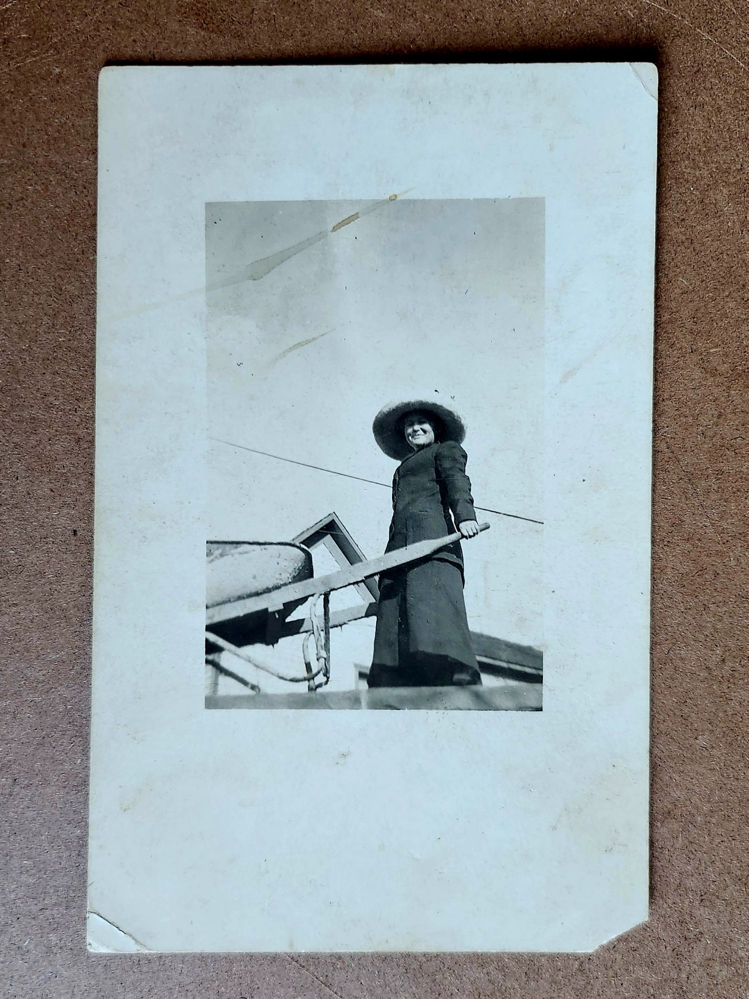
As landscapes, last week’s real photo postcards (RPPC) asked for nothing. Trees, frozen roads, animals burrowing in snow—they floated free of context. We could easily appreciate them without knowing where they might be.

Buildings are different. A structure says someone decided, planned, risked, and accomplished. They hauled materials, drove nails, painted trim. Buildings demand explanation in ways that hills might easily demure.

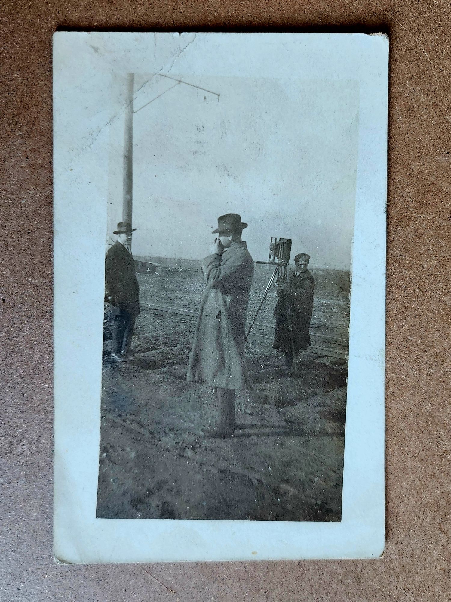
Reading postcards slowly reveals patterns. The undivided back means pre-1907. The real photo process suggests a local photographer, or maybe an itinerant professional documenting a place too remote to the reach of commercial postcard companies. Paper stock, indicia, stamps and cancellation, faded handwriting and previous labeling, even image placement and crop—these technical details narrow the place possibilities.

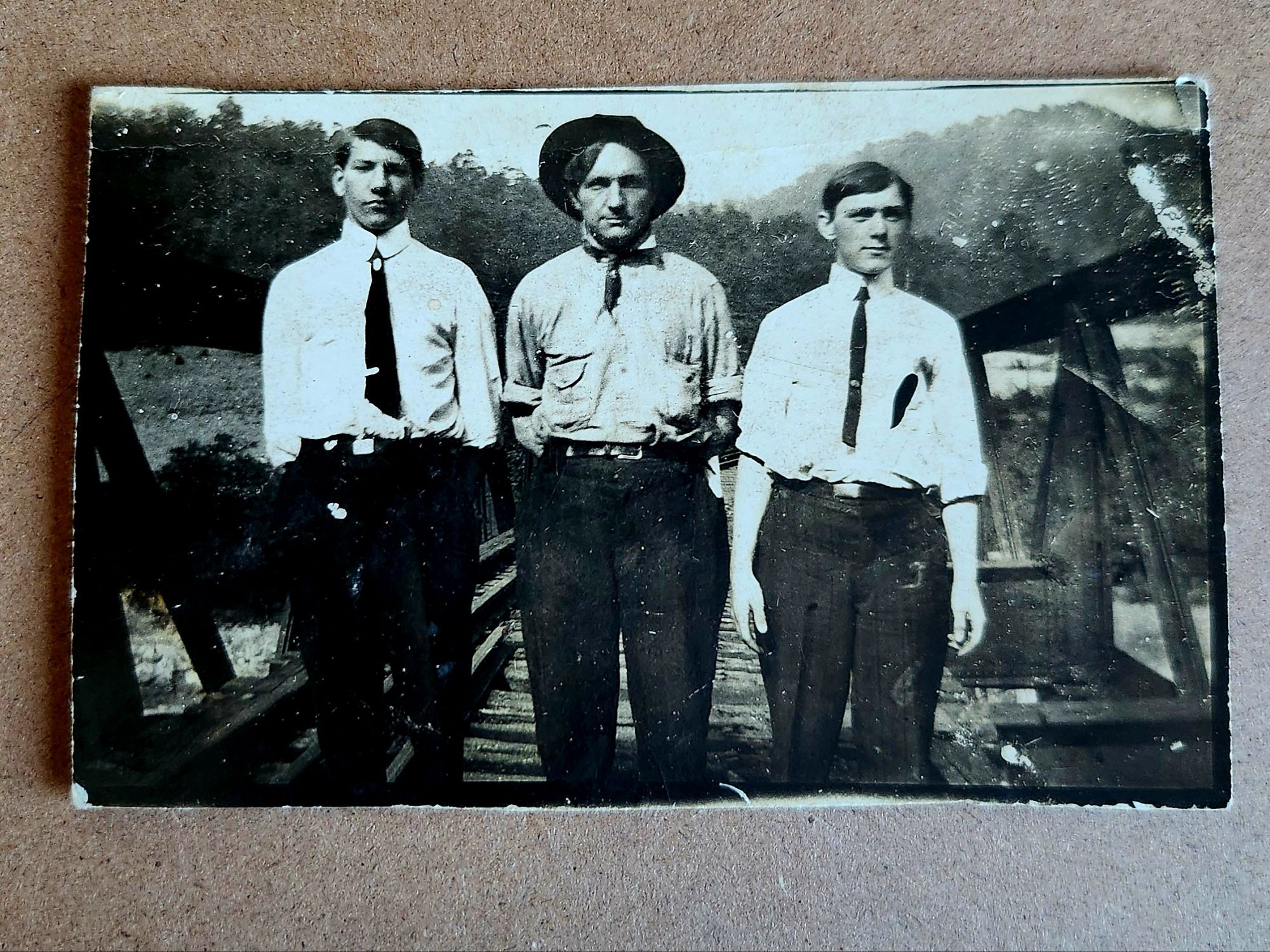
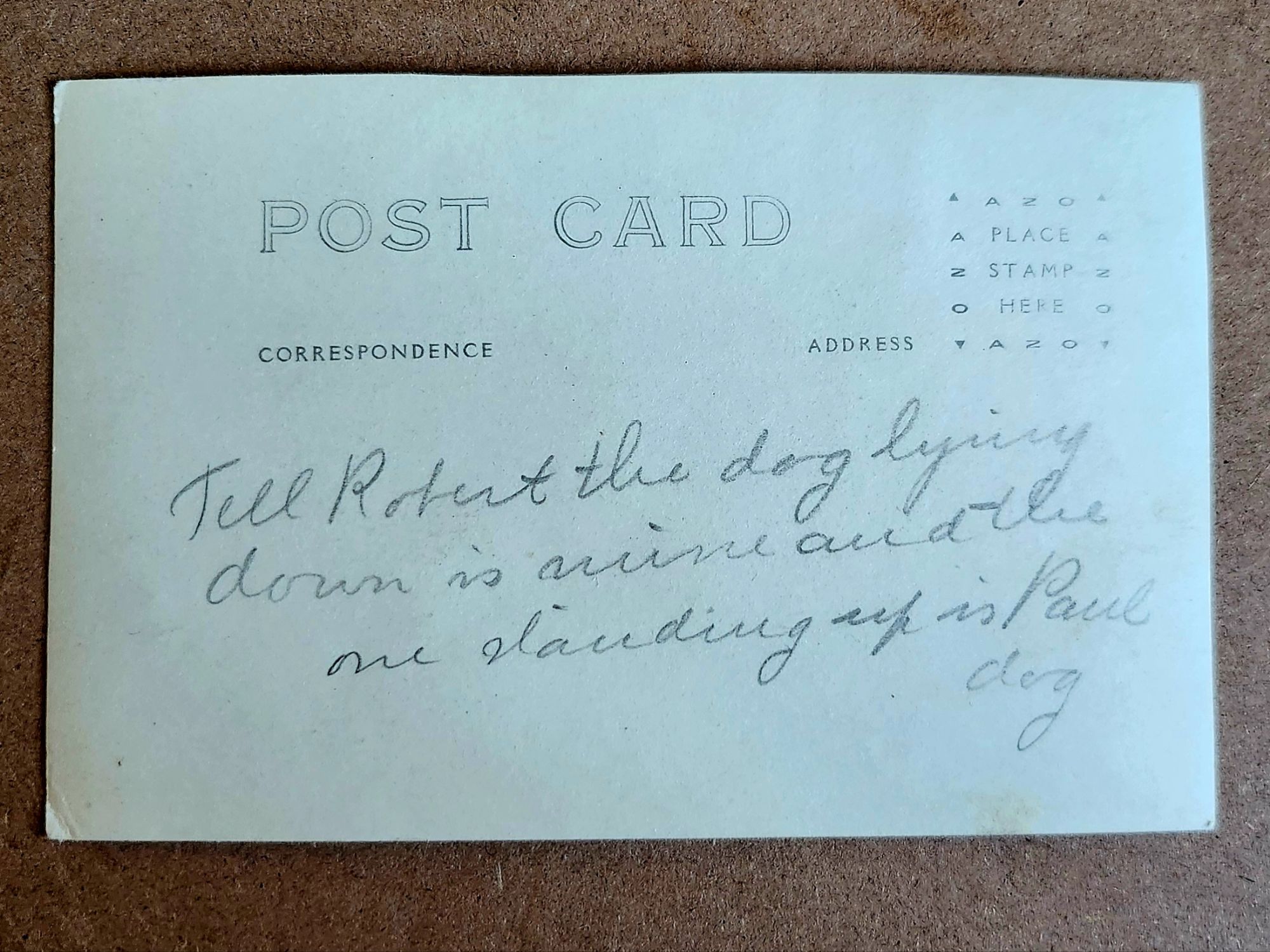
But they don’t yet answer another question: Who are Robert and Paul?

Tell Robert the dog lying down is mine and the one standing up is Paul dog

What We Might Know

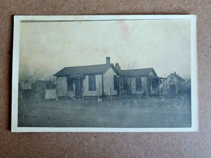
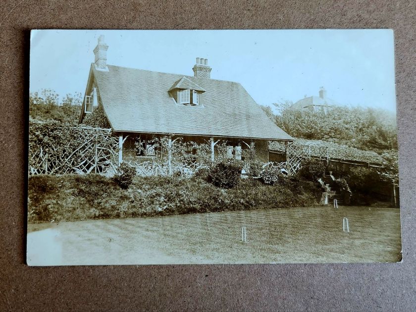
A two-story house with a generous porch is carefully centered in one photograph. Mature trees in the foreground. Curtains hang in the windows. Someone lived here and wanted to show their pride. Or, was it for sale?

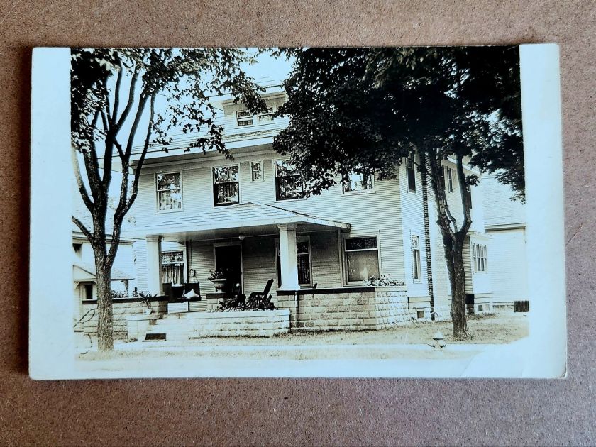
The architectural details offer more clues. Clapboard siding, stone or brick foundation, decorative porch elements—not fancy, but intentional. It seems to be in a neighborhood with sidewalks. In an era between 1900-1920, somewhere in the Midwest or West judging by lot size. Also, a fire hydrant.

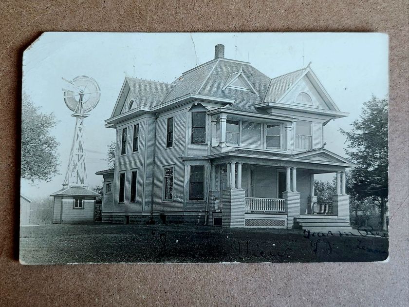
The windmill in another image dates itself. Windmills were an important utility and industry, and that style had a particular era. The house beneath it—elaborate Queen Anne with corner turret, ornamental shingles, and ornate columns—speaks to aspiration. Someone had big plans. This is visible evidence. When and where becomes roughly recognizable.

But, the people who stood on that porch remain absent and enigmatic. Who were they? What is happening here? A creative tension is mounting between the realm of evidence and the pull of story.

Sensing Stories

Two women stand in front of McMann Boarding House wearing identical striped dresses. The building is simple—board and batten, minimal trim, the kind of structure that goes up first and fast in a growing place.

The photograph has a vertical tear, the exposure is bad, and time has degraded it. But the sign remains legible: McMann Boarding House. Finally, a name.

Who was McMann? Who are these women? Employees? Vacationers? The photo is both casual and deliberately staged. What might the matching dresses mean? Pride? Subjugation?

Reading their faces, we fill in the narrative, almost immediately and sometimes inescapably. Relationships, motivations, futures take shape unbidden. This is exactly what we both invited and warned of last week—making it up. Always dangerous, sometimes worthwhile.

The impulse to story is nearly irresistible. A name on a building. Two women in matching dresses. The space around the postcard lights up. Are these their stories, or our own, or a magical projection that folds time?

When the Past Chats Back

Shuffling the stack, several cards in this collection start speaking to one another. Same photographic quality. Same paper stock. Similar landscape—flat, spare, newly broken. And most telling: similar structures in states of becoming.

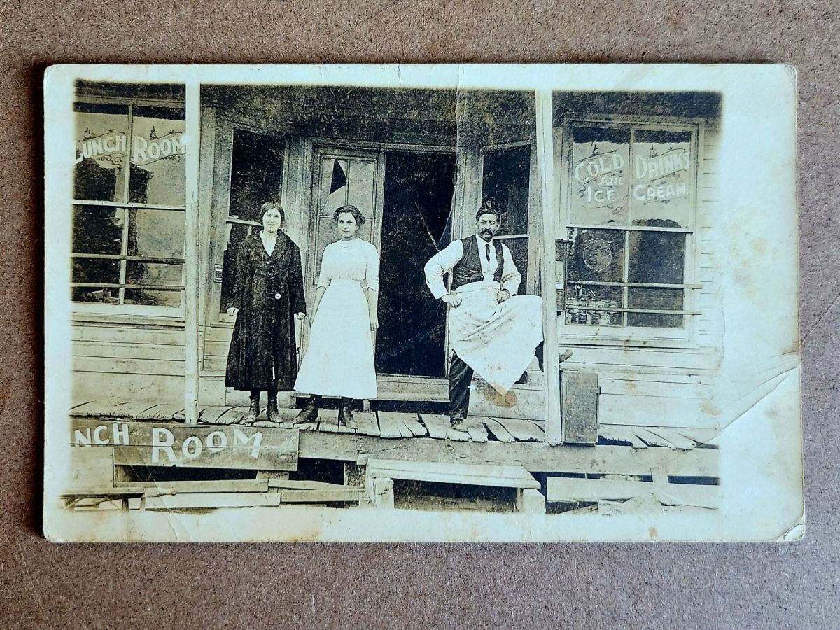
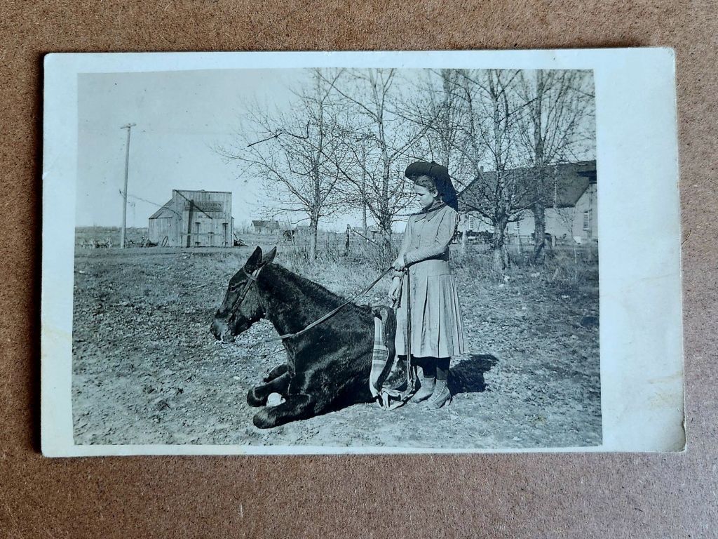
Laid out together, the pattern emerges. Houses with stone foundations and wraparound porches. An elaborate Queen Anne with a windmill. McMann Boarding House with its two women in matching stripes. A lunch room with an immaculately vernacular grand porch. Best-dressed proprietors standing proud. A girl and her horse, bare buildings behind her. A picnic under the canopy of a large tree.

Also, a massive plume of black smoke billowing skyward, an oil derrick to the left, eight or nine men grinning toward the camera. The photograph stops everything cold. They struck liquid gold. A triumph worth documenting. Fine lines of the plumes etching through the darkest black.

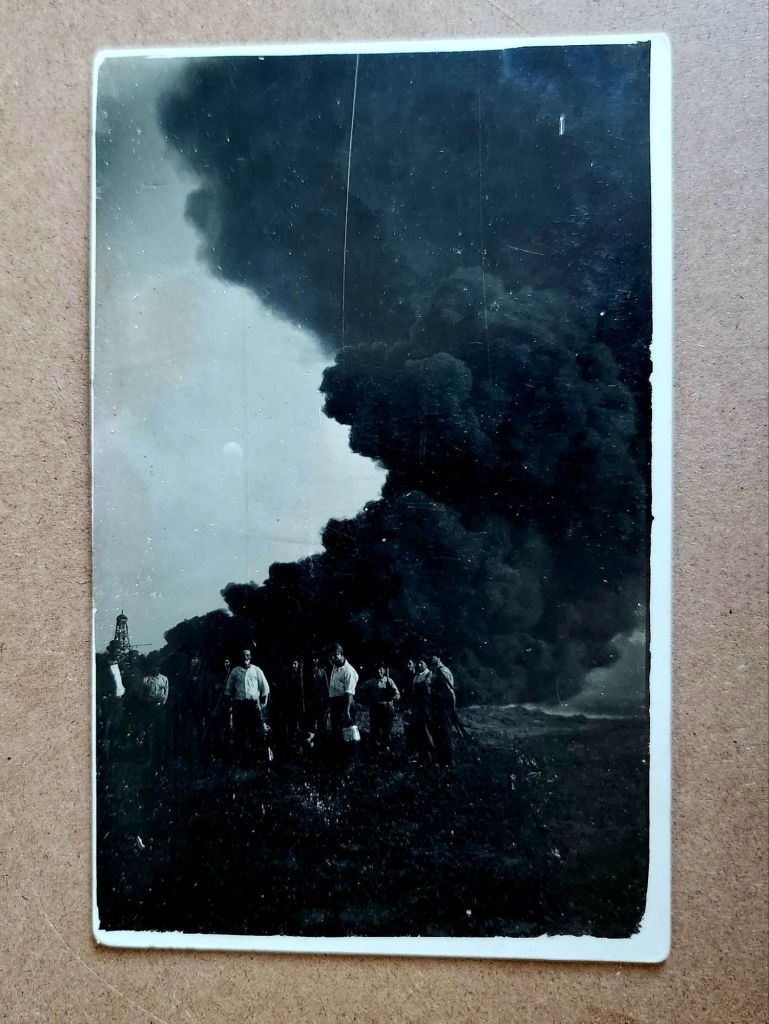
These eleven images are a cluster from the same story—a town emerging around oil. Homesteaders and entrepreneurs arriving in a place that may have been open prairie five years earlier. Building homes, businesses, infrastructure for both industrial productivity and social life. Documenting the process with real photo postcards, for themselves or to send East. Their message: we have arrived safely and are in luck.

From Here to Now

This is a founding, the moment a place began and the stakes changed. These aren’t isolated buildings anymore and oddly they seem less like photos, too. We know there is a community taking shape and the evidentiary questions multiply. Who were they, by name? What brought them here? Did this place survive or vanish?

And harder, deeper, more consequential questions: Who lived here before? What animals and habitats were displaced? What did the derricks do? For them, and also to us.

Boom town logic. Extraction economy. Infrastructure dependencies and family injuries inherited. Cultural degradation, and environmental costs still being paid. This isn’t quaint history. This is the beginning of something we’re grappling with today.

Suddenly our imaginative stories contract and we now seek facts. The boarding house proprietor’s daily life can be imagined, but not separated from a place built on oil speculation. The architectural ambition of that Queen Anne deserves appreciation, but it went up in a town that might have lasted ten years or a hundred, depending on the wells. The buildings aren’t innocent, and we are implicated.

More in Store

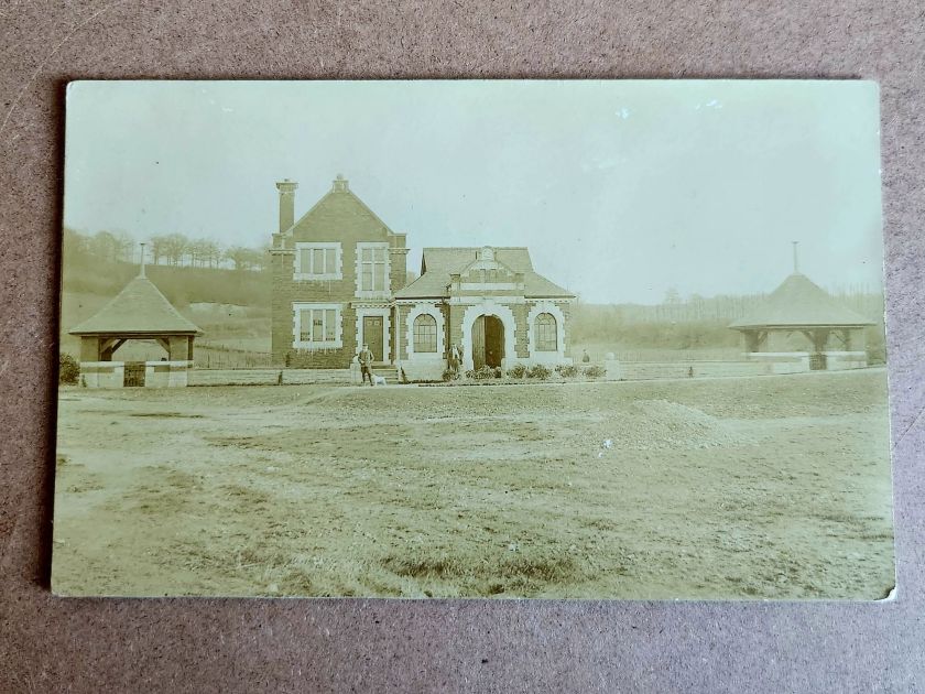
Another stack of postcards might be related to this cluster—similar age, similar style, possibly the same region, likely at later dates. And then a few unrelated ones, probably European based on the architecture.

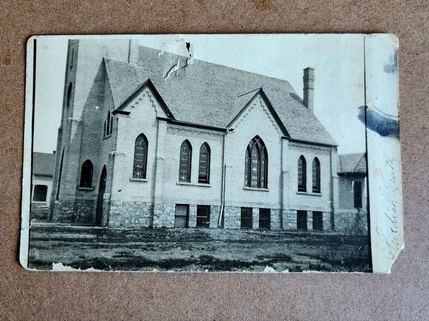
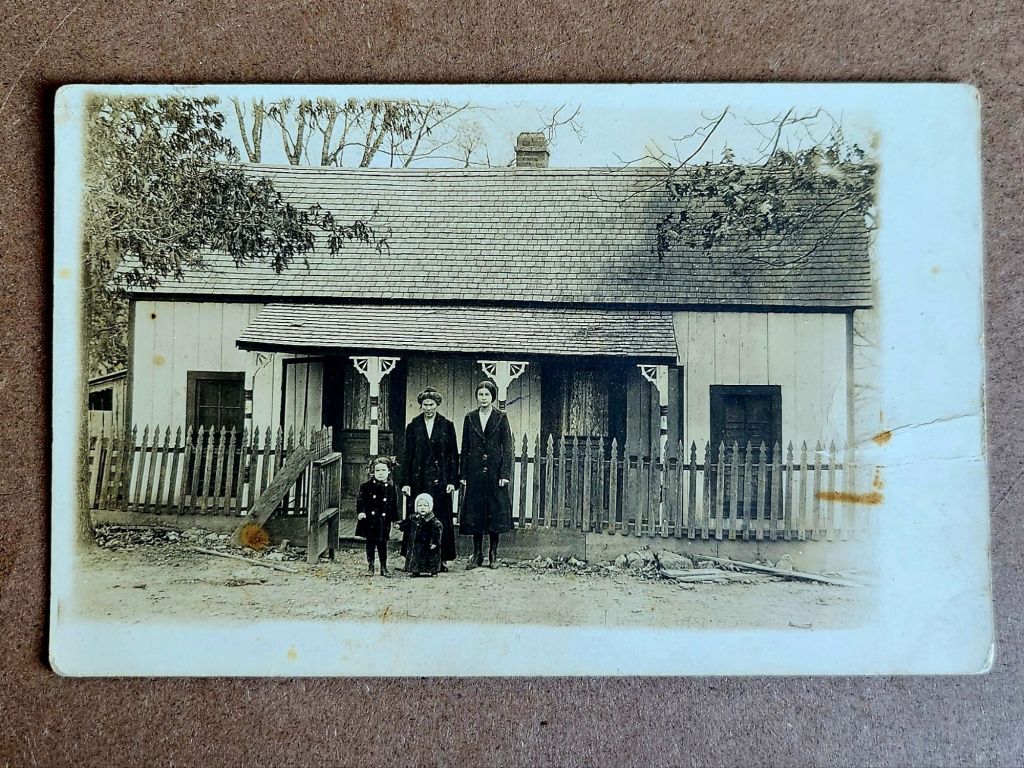
Not every fragment connects or resolves. Some buildings will remain singular, their stories unrecoverable. Churches and homes, beautiful structures, carefully photographed. Loved locally today as a memory or a ruin, perhaps.

Not everything needs a narrative. Some images can just be enigmatic. Evidence of care, of craftsmanship, of a moment someone thought worth preserving. These evocative details lead to fiction, which makes its own case for history and the preservation of minute detail.

But this cluster won’t let go. They connect to another stack, and soon we’ll know more. Next week we’ll meet the people themselves, looking back at us.

A Streetcar Back in Time

Room enough for all of us to go from here to there, and back again.

Featured Postcard~
New Orleans French Market A CENTURY AGO

An early 20th century scenic postcard showcases the iconic French Market in New Orleans’ French Quarter.

Front of the card: The photograph shows the vestibule of the historic French Market, featuring tall, weathered French/Creole Colonial columns supporting a slatted roof. Perspective draws the eye down the long corridor, emphasizing the market’s impressive scale. The covered walkway displays produce, baskets, and merchandise on tables and in crates. The image captures a rare moment when the hallway of vendors face the camera. Hand-colored rose tones reflect the market’s timeless atmosphere with pops of green and blue artfully applied. Caption: Vestibule, French Market, New Orleans, La.

Back details: The left panel explains the market’s history:

This card shows the interesting old columns erected, 1822. While the roof of the market has been repaired many times, the old columns have stood as originally put, without fire aid to the injured.

Published by Lipsher Specialty Co., 320 Magazine St., New Orleans. Standard divided back format with decorative script and postage rates listed: Domestic One Cent, Foreign Two Cents.

Historical significance: The postcard documents the French Market’s appearance in the early 20th century. Established in the 1790s, the market served as a vital commercial hub where vendors sold fresh produce and handcrafted goods. Instructions to “Take French Market car from Canal St.” reflects the streetcar system and emphasis on tourism. This postcard dates to 1922-1925, based on combined evidence of one-cent postage, the specific streetcar reference, and hybrid halftone-collotype printing (Aquatone process was patented in 1922).

Condition and Appeal: The card displays excellent color saturation, with clear and interesting details and minimal defects. Tiny nicks on two corners, with yellowing on the reverse typical of age. Image and text provide valuable historical context, appealing to collectors of New Orleans memorabilia, architectural history enthusiasts, and those interested in early 20th century American commerce. The French Market remains active today, making this postcard a fascinating glimpse into its enduring legacy as a cornerstone of New Orleans culture.

Today’s Art Card & Gallery

The gallery features Landscapes by Larry L’Ecuyer, and here is a fun art card from Anne this week. Winner, winner, chicken dinner!


open call for art cards!

The World’s Smallest Artist Retreat (our P.O. Box) is awaiting your art card submission. Details here!

Art card kits ~ gift or fun for you!

Our Art Card Kits are perfectly-packaged as a fun, creative activity for you and a friend to complete in as little as an hour or made into a lovely afternoon.

Something from Nothing

In her latest essay, Anne explains what we’re doing here 🙂

Still in the Ring

Here we go! The Posted Past heads into the fall season with rare cards, a new gallery, and a social mission to trade loneliness for connection.

featured postcard~
rare novelty card still holds a mystery

An early 20th century novelty postcard featuring humorous photography and personal correspondence from Missouri.

Front of the card: The photograph shows a young Black man in white shirt, suspenders, and dark trousers, grinning while holding a large broken umbrella overhead in a playful pose. Below reads the humorous caption “A little disfigured, but still in the ring”—typical novelty humor from the postcard craze era. A black border frames the photograph on cream cardstock.

Back details: The reverse bears “Carbon Photo Series No. 513” identifying the commercial publisher’s series. Addressed to Miss Grace Skillman in Pleasant Hill, Missouri, with a green 1-cent Franklin stamp and clear 1908 postmark. The handwritten message describes an exhausting early morning wait in Lee’s Summit for “Brother and Frank,” and promising a longer letter that evening.

“Still in L.S. haven’t slept but about ten minutes. My eyes looks like two burnt holes in a blanket. Brother and Frank hasn’t come yet. I will wait till 7.30 and then go home. Will write tonight. Just finished my breakfast. I will eat if not sleep. I got here ten till five.

Condition and Appeal: The sepia-toned image displays characteristic early photography with some age spots, and a nicked corner. The image and reverse side remain in good condition with clear photography and legible handwriting. The “Carbon Photo Series” indicates premium production using carbon-based printing methods prized for superior image quality and archival stability. Grace Andre Skillman was born in Pleasant Hill in 1889, making her nineteen when she received this card. The message and the lack of formal salutation and signature suggest this is casual ongoing family correspondence. As a result, the author of the postcard remains a mystery.

Vintage novelty postcards are increasingly collectible, especially numbered commercial series with documented recipients. Collectors of African-Americana may find the image appealing and relatively rare. The combination of carbon printing technology, humorous subject matter, and personal correspondence is of interest to collectors of vintage photography, postcard enthusiasts, genealogy researchers, and those focused on early 20th century American social history and communication.

Introducing~
The Posted Past Art Card Gallery

A selection of Larry L’Ecuyer’s watercolor landscapes are on display in our Online Art Card Gallery. Fitting as our first show. Enjoy!

Watercolor postcard showing a serene lake scene with mountains in the background and tall grasses in the foreground
Countdown to a Lakeside Getaway, 2025, Larry L’Ecuyer, watercolor on postcard

NEWS & UPDATES~
art card call for submissions is open

The World’s Smallest Artist Retreat (our P.O. Box) is awaiting your art card submission. Follow one rule to join the next open show. Details here!

Art card kits now in stock

Our Art Card Kits are perfectly-packaged as a fun, creative activity for you and a friend to complete in as little as an hour or made into a lovely afternoon.

The kit includes two postcard blanks, six vintage finds curated to the chosen theme, and a bundle of collage goodies for your whimsy. There is a free gift inside, too!

Once you’re done, surprise someone with an original art card in their mailbox. Or, send it back to us to include in the next online show. Either way, you’ll have cultivated a little joy in your garden.

Order your kit here 🙂

Wise Eyes

Old Rufus Dale had seen a thing or two, and Irene had her suspicions.

An early 20th century real photo postcard (RPPC) showing a poignant intergenerational portrait.

Front of the card: The photograph captures an elderly man with a distinctive long white beard, dressed in a dark suit, seated on a dilapidated wooden loveseat or couch in front of a clapboard house. Beside him sits a young child in a white dress, perched on the arm of the furniture. Behind them a decorative lace curtain hangs outside the open window. The setting appears to be rural America.

Back details: The reverse shows the handwritten inscription in pencil, Uncle Rufus Dale, age 84 and Irene age 4. We can assume a family relationship, likely between grand-uncle and grand-niece.

Condition and Appeal: The real photo postcard is in excellent condition front and back, unposted with helpful writing, and an AZO indicia dating the item between 1904 and 1918. The subject matter and production method suggest this is a unique image and object, with no known duplicate.

RPPCs are quite collectible, especially those with interesting and clear photographic subjects. The rural American family setting, the age gap between subjects, and the excellent condition make this item more desirable, appealing to collectors of early photography, genealogy researchers, postcard collectors, and those interested in American family and social history from the early 1900s.

[Note: Summer focus is on detailed captions. Essays return in September!]

Floods, Farms, and Fate in 1908

In late May 1908, the Republican River forgot its modest nature. After days of relentless spring rains, the usually manageable waterway transformed into a destructive force that reshaped both the landscape and lives of north-central Kansas.

A collection of real photo postcards from this period captures these moments of crisis. One image shows the mill with its flooded surroundings, another the threatened railroad bridge. These weren’t just documentary photographs – they were messages sent between family members grappling with decisions about land and livelihood in the flood’s aftermath.

The Republican River, which meanders through Republic County past the iconic Table Rock formation, swelled beyond its banks, swallowing farmland, threatening towns, and severing the rail lines that served as lifelines for agricultural communities.

Concordia, the largest town along this stretch of the Republican River, watched as the waters rose. The town of 4,500 residents had built itself on agricultural promise, its grain elevators standing sentinel along the railroad tracks, its mill processing the bounty of surrounding farms. But the 1908 flood challenged this careful progress. Water lapped at the foundations of the mill, its twin smokestacks rising above the flood.

Railroad bridges proved vulnerable to the 1908 flood, too. The Chicago, Rock Island and Pacific Railroad, which had helped birth towns like Concordia and Republic City, found its tracks suspended over angry waters. Train service halted, leaving farmers isolated with their crops rotting and fields under water. The flood arrived at a particularly cruel time – late spring, when winter wheat was heavy with promise and corn was just reaching hopefully toward the Kansas sky.

The handwriting on one postcard tells of a man named Basil looking at land near Table Rock, that distinctive natural formation that had guided settlers for generations. What kind of optimism – or desperation – would drive someone to consider investing in farmland so soon after such devastating floods? Yet records suggest he wasn’t alone. Land transactions continued in Republic County through 1908 and 1909, some at distressed prices from farmers ready to seek fortune elsewhere, others at premium prices for higher ground.

The flood’s waters eventually receded, leaving behind debris and difficult deliberations. Farmers have always had to gamble with nature. The rich soils of river valleys are worth the risk of occasional flooding – until they’re not.

These brothers – the postcard photographers – couldn’t know that the 1908 flood was merely a prelude. The Republican River would prove its power again and again, most catastrophically in 1935, when a flood of biblical proportions would transform the valley once more. Families who chose to stay after 1908, who rebuilt and reinvested, would face nature’s judgment again.

Looking at these century-old images, we see more than just disaster photography. We see evidence of critical decisions made in the aftermath of catastrophe. Someone was behind that camera, documenting not just the destruction but the dilemma – to stay or go, to rebuild or retreat, to trust in the river’s bounty or fear its fury. The unknown photographer used the latest technology – AZO photo paper, a Kodak camera – to capture and distribute these images of nature’s disruption of human endeavor.

We don’t know if Basil bought that land near Table Rock. The brothers’ identities and their immediate choices are lost to history. But we know that farming continued and that people kept living along the Republican River despite all they had seen. Each generation seems to make its own peace with nature’s risks, balancing the promise of fertile valleys against a river’s wrath.

Thread & Paper: A Century-Old Silk Embroidered Postcard

Imagine holding a piece of handmade history – a delicate blend of silk and paper that has traveled more than a century to tell its story.

This charming embroidered postcard from the early 20th century is a small and intricate greeting that speaks volumes about a bygone era. In the world of historical artifacts, sometimes a small stitch tells a rich story.

Burst of Blooms

The postcard we are examining today presents an interesting contrast to typical flat, printed cards. Its front features an embroidered design set within a scalloped, cream-colored frame. The embroidery displays a palette of purples, reds, blues, and greens against a light fabric background, forming a floral scene.

At the center is a red flower, its petals rendered in careful stitches to create a sense of depth. Blue blooms surround it, with green stems and leaves providing structure to the composition. Above the flowers, Rosa is embroidered in purple thread, while below, Feliz cumple años (Happy birthday in Spanish) completes the message.

The reverse side is more conventional, bearing the hallmarks of early 20th-century postcard design. “CARTE POSTALE” is printed at the top in both French and English, with the card divided for correspondence and address. A small line at the bottom reads “Printed in France « E.R. » Paris” – a clue to the card’s origins.

The card was produced by E. Rabus, a Parisian company founded in 1897. By the early 20th century, the company had become a leader in the French postcard industry, including active involvement in the Chambre Syndicale français des Editeurs de la Carte postale illustrée, the professional organization for French postcard publishers. In 1914, E. Rabus held the position of secretary-general in this organization, placing the company at the heart of the industry during a pivotal time.

Manufacturing Marvels

This particular postcard emerged during the postcard craze of the early 20th century, when millions of postcards of many great variety were produced and sent globally each year.

The postcard we’re examining likely dates between 1914 and 1920, a period that saw significant changes in the postcard industry. Creating this postcard involved a fascinating blend of traditional craftsmanship and industrial production techniques.

The silk thread may have been sourced from a renowned manufacturer like Dollfus-Mieg & Cie. DMC was a major producer of embroidery threads, founded in Mulhouse, Alsace in 1746. Thread may have also come from Lyon, France’s capital of silk, where workers known as Canuts supplied luxury goods markets. The use of high-quality silk thread indicates that this postcards was a premium product.

While hand embroidery was still practiced, the scale of postcard production in this era suggests that machine embroidery was more likely used. Skilled workers would have operated specialized machines manually set to create the intricate design.

Once complete, the embroidery needed to be affixed and sandwiched between two paper cards to create the final product. The distinctive scalloped edges on the front were created through embossing and die-cutting, a process using metal plates and a sharp blade to stamp and cut the card into its final shape, leaving a window for the fine fabric to show through. The reverse side was made using standard printing techniques of the era.

All of these processes – embroidery, backing, embossing, die-cutting, and printing – would have taken place at the E. Rabus factory in Nanterre, a suburb of Paris. The company’s ability to combine these various techniques in-house speaks to its sophistication as a manufacturer and helps explain its prominent position in the industry.

Messages for Global Markets

While this postcard was produced in France, its Spanish text hints at a broader marketplace and larger international relations. E. Rabus, like many successful companies of its time, was looking beyond French borders to sell its products.

The most likely target market for this Spanish-language card would have been Spain itself. Geographic proximity and cultural ties between France and Spain made this a natural choice. Spanish tourists visiting France might have purchased such cards as souvenirs, or French customers might have bought them to send to Spanish friends or relatives.

Another strong possibility is Argentina. In the early 20th century, Argentina had a significant French immigrant population and strong cultural ties with France. The Argentine upper classes, in particular, had an affinity for French culture and products. Or perhaps Cuba, a popular tourist destination for Europeans at the time.

It’s worth noting that World War I (1914-1918) had a significant impact on these global markets. The war disrupted trade routes and changed economic relationships. However, it also created new demands for postcards as a means of communication between soldiers and their loved ones. Spanish neutrality during WWI might have made Spain an even more important market for French postcard producers during this time.

Grand Greetings

Perhaps the most charming aspect of this postcard is the way it personalizes a mass-produced item. The name Rosa embroidered at the top of the card transforms it from a generic greeting to a personal message. We can appreciate the care in choosing this specific card with the recipient’s name woven into the birthday wish.

Postcards marry the universal with the personal. Paper and thread become a bridge – between industrial spaces and private life, between France and the Spanish-speaking world, and between the early 20th century and our own time. Human desire is to connect, to send our good wishes across distances, and to make even mass-produced items feel special and individual.

Feliz cumple años – in Spanish – reminds us that birthdays are celebrated across cultures and languages, and the wish for a happy birthday transcends borders and time.

As we examine this postcard today, we sense so many stories – the mysteriously named publisher, the factory workers in Nanterre, a birthday celebration, the joy of both the sender and the intended recipient. Every historical artifact, no matter how small, carries with it a web of human connections.

We send greetings with the tap of a screen today, and still we can appreciate the thought and effort that went into creating and choosing such a card. It invites us to consider how we express our good wishes today, and how modern methods carry the traditions forward from this centenarian birthday card.

This delicate embroidered postcard, with its silk threads and scalloped edges, its French origin and Spanish text, is a testament to human creativity, industrial ingenuity, and the enduring power of a simple wish for happiness, stitched in colored thread, preserved through time, and able to transcend borders.