Over the past few weeks, a rare photo postcard album has revealed places, property, and people, along with our own ideas about what we see. We’ve gone from unmarked wilderness, to building structures and social life, to faces and a few names.
We look back at them, and they return the gaze. Their stories blend with our own memories and imagination. They begin to feel like someone’s ancestors, though the particulars remain elusive.
Rochester in Rearview
In 1877, photography required glass plates, wet chemicals, heavy equipment, and specialized knowledge. George Eastman, a frustrated bank clerk from a poor family in Rochester, taught himself the process in his mother’s kitchen.
A decade later, Eastman had invented a simple camera pre-loaded with film for 100 exposures. By 1903, the Eastman Kodak Company released the 3A Folding Pocket Camera with 3¼ × 5½ inch film—exactly postcard size and pre-printed on the reverse. Local photographers and home enthusiasts could contact-print the negative directly onto postcard paper. No enlarger needed, and simplified processing equipment and chemicals.
Rochester became an ecosystem. Bausch & Lomb made the lenses. Kodak manufactured the cameras, bought the film company, and controlled the processing. Customers shipped the entire camera unit back to the factory, and received prints and a pre-loaded camera in return. “You press the button, we do the rest.” Factory workers were the first to witness an era of American life, as images of farms, houses, banks, theatre, and towns and their inhabitants poured in.
A quiet man, Eastman watched this unfold from the center, as his invention changed history and rippled through culture. By 1920, millions of Americans owned cameras. Eastman left a simple note when he ended his own life at 77 and in degenerative pain, “To my friends: My work is done. Why wait? GE”.
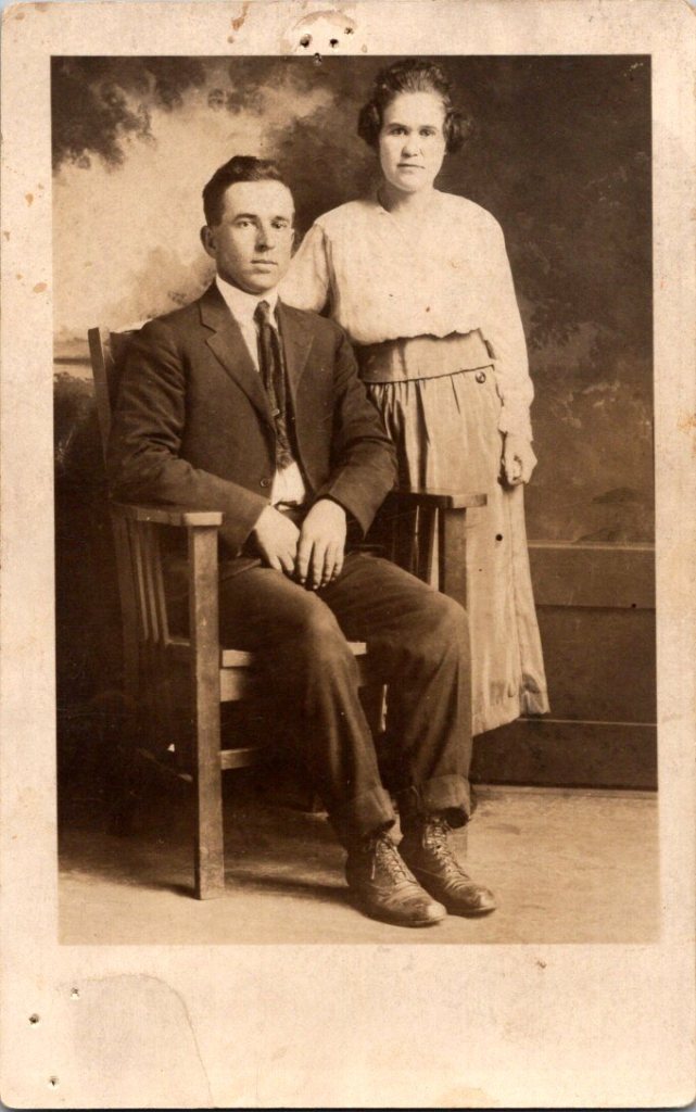
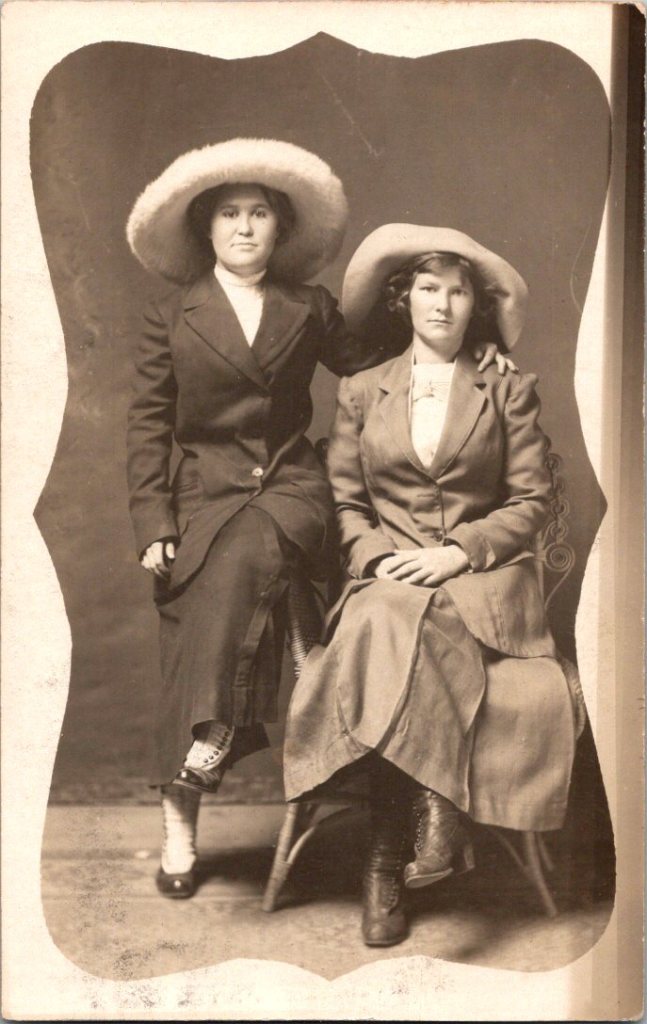
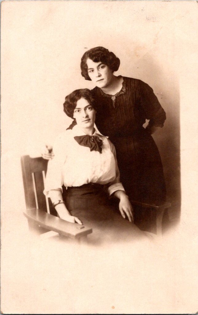
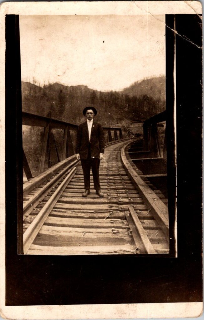
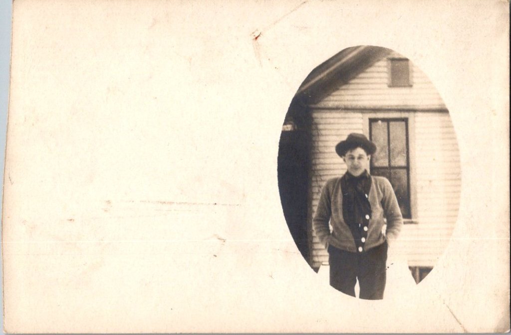
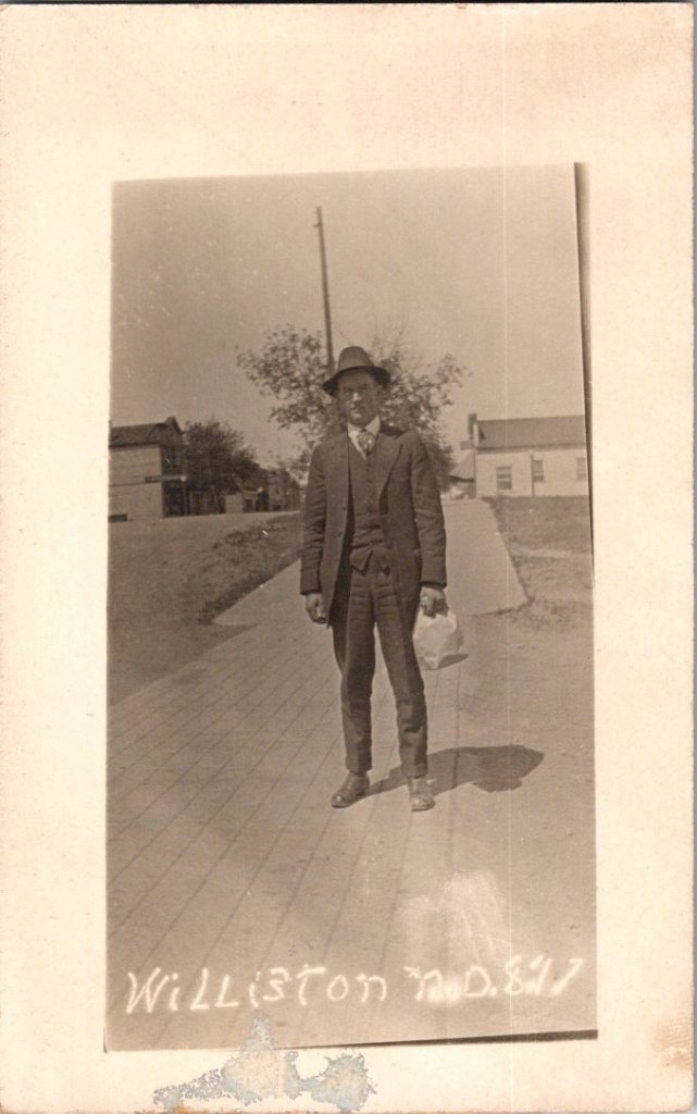
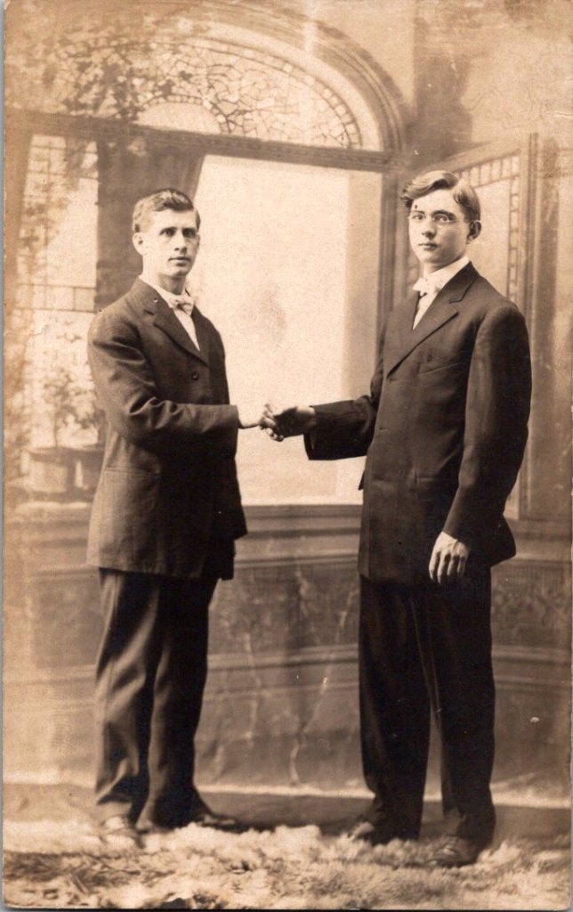
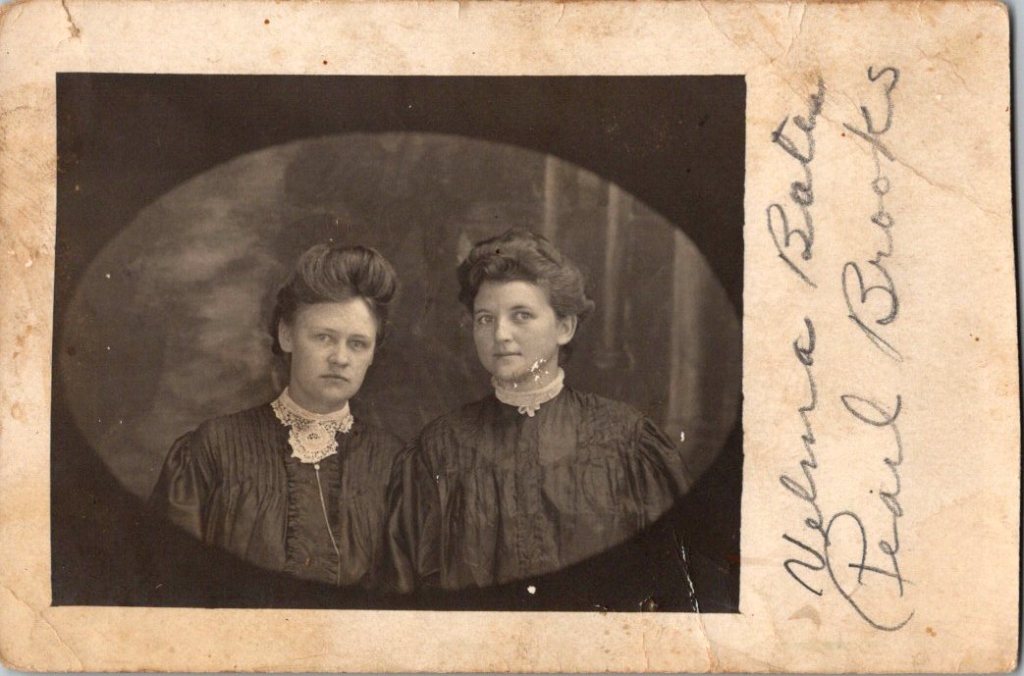
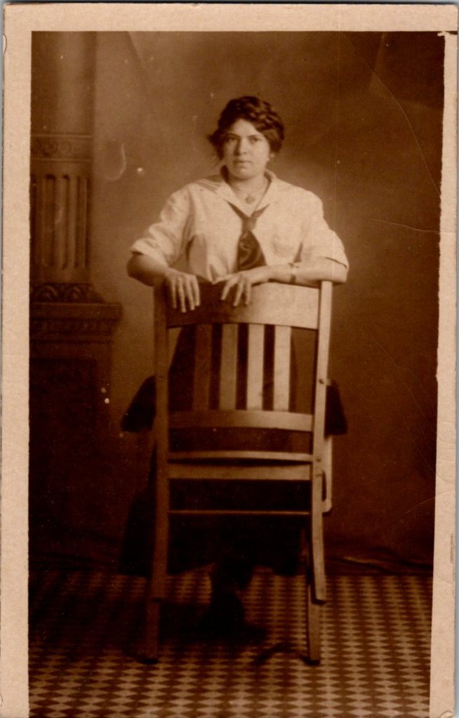
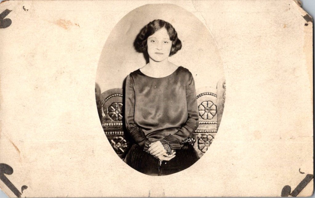
What We See
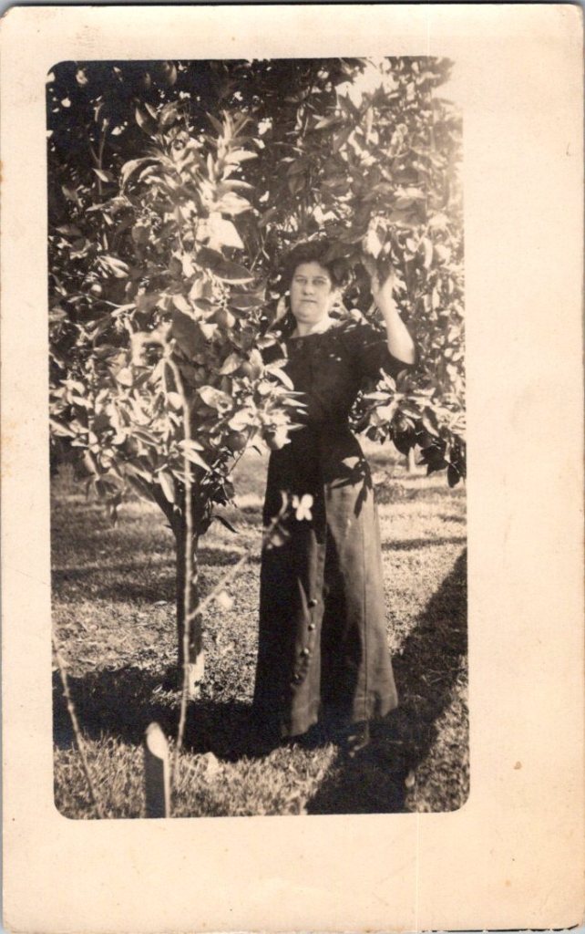
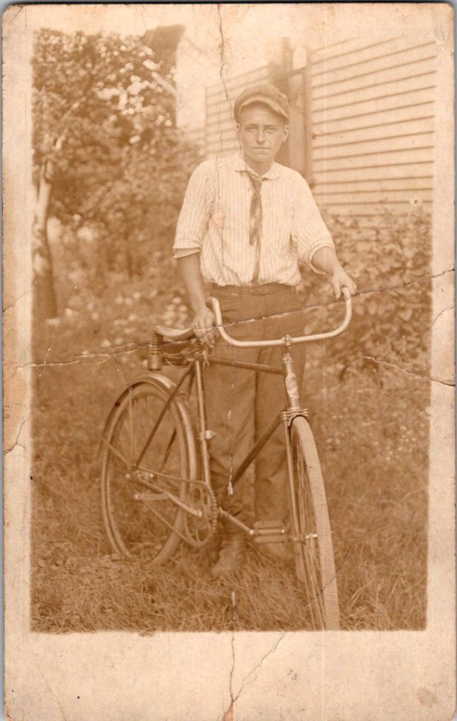
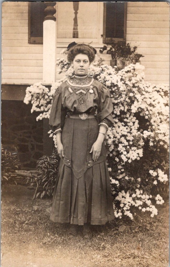
The studio portraits above show painted backdrops—ornamental arches, garden trellises. The lighting is controlled. Poses held steady. Technical quality consistent. These were made by professionals charging by the sitting.
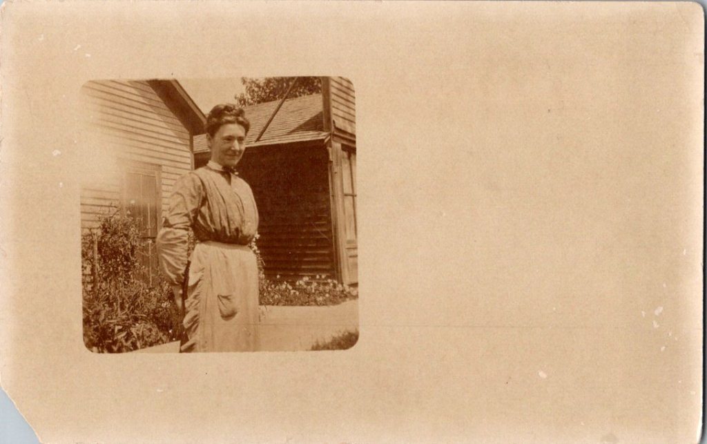
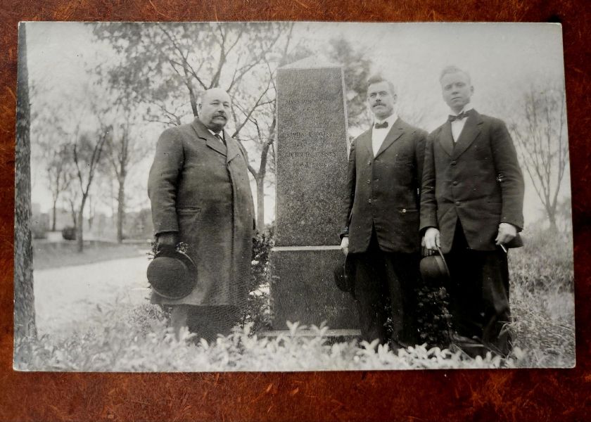
The outdoor snapshots show real places—porches, orchards, dirt roads. Natural lighting, sometimes harsh. Composition varies from confident to awkward. These came from camera owners of varying skill. The irregularities in frame and exposure suggest they were developed at home, too.
What We Don’t See
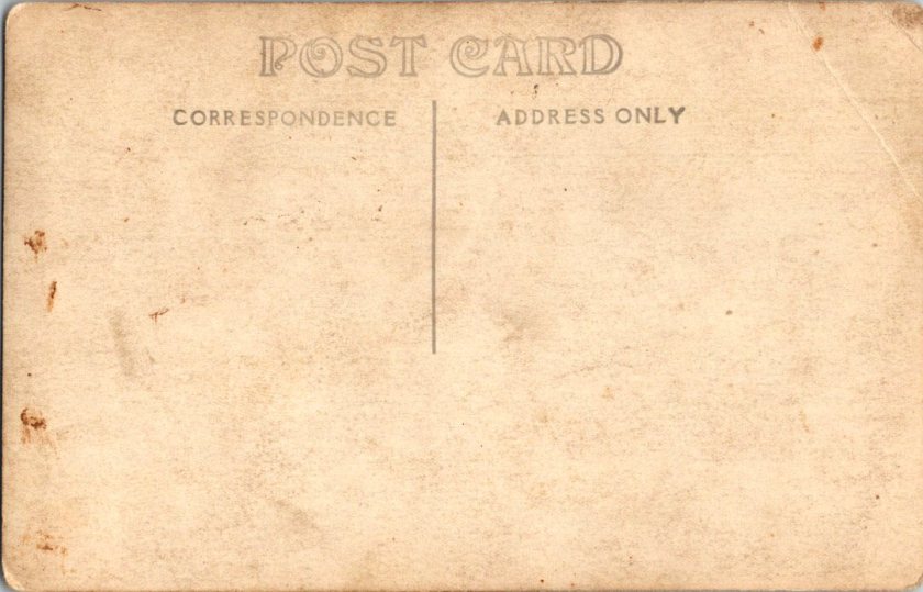
Despite the pre-printed paper and earnest intent, real photo postcards were rarely sent as such. A few have difficult script, cryptic addresses, faded cancellations, and worn stamps.
“Hello Fanni. Miss Fanni Moore, Panhuska, Okla.”
The remaining relics haven’t been labeled, addressed, or mailed. Most backs are blank, and they were often collected in photo albums. The manufacturing marks may have been quite incidental.
What’s missing from nearly all: names. Very few clues to subjects, locations, dates. The people who made these photographs knew who everyone was. They didn’t need labels. Or, perhaps they were accompanied by letters and mailed in envelopes for privacy and protection.
A century later, the faces remain potent but anonymous. We guess at relationships from physical similarity, from who stands near whom. Sometimes we’re right. Sometimes, we can’t believe our eyes.
Spaces in Between
The 3A Folding Pocket Kodak cost $20-30, equivalent to $600-900 today. An expensive hobby, but accessible to prosperous farmers, small business owners, middle-class families. Film cost about 50 cents per roll.
The investment meant something, whether it was the equipment or the studio session. People photographed what mattered—children, homes, gatherings. The images document their priorities, and their time passing.
Real People, Real Limits
These are real people who lived, worked, loved, died. Someone cared enough to preserve their images. They matter still, in part, because they mattered to someone before.
But our analysis stops here. We can describe what we see—the composition, the technical choices, the historical context. We can note patterns across the collection. We can explain how the technology worked and who had access.
The work of naming and placing, in particular, belongs to families searching their own histories, connecting faces to stories passed down, matching photographs to genealogical records. Those searches have their own purposes, their own meanings.
We are collectors examining patterns, not descendants reclaiming ancestors. Though, it is tempting.
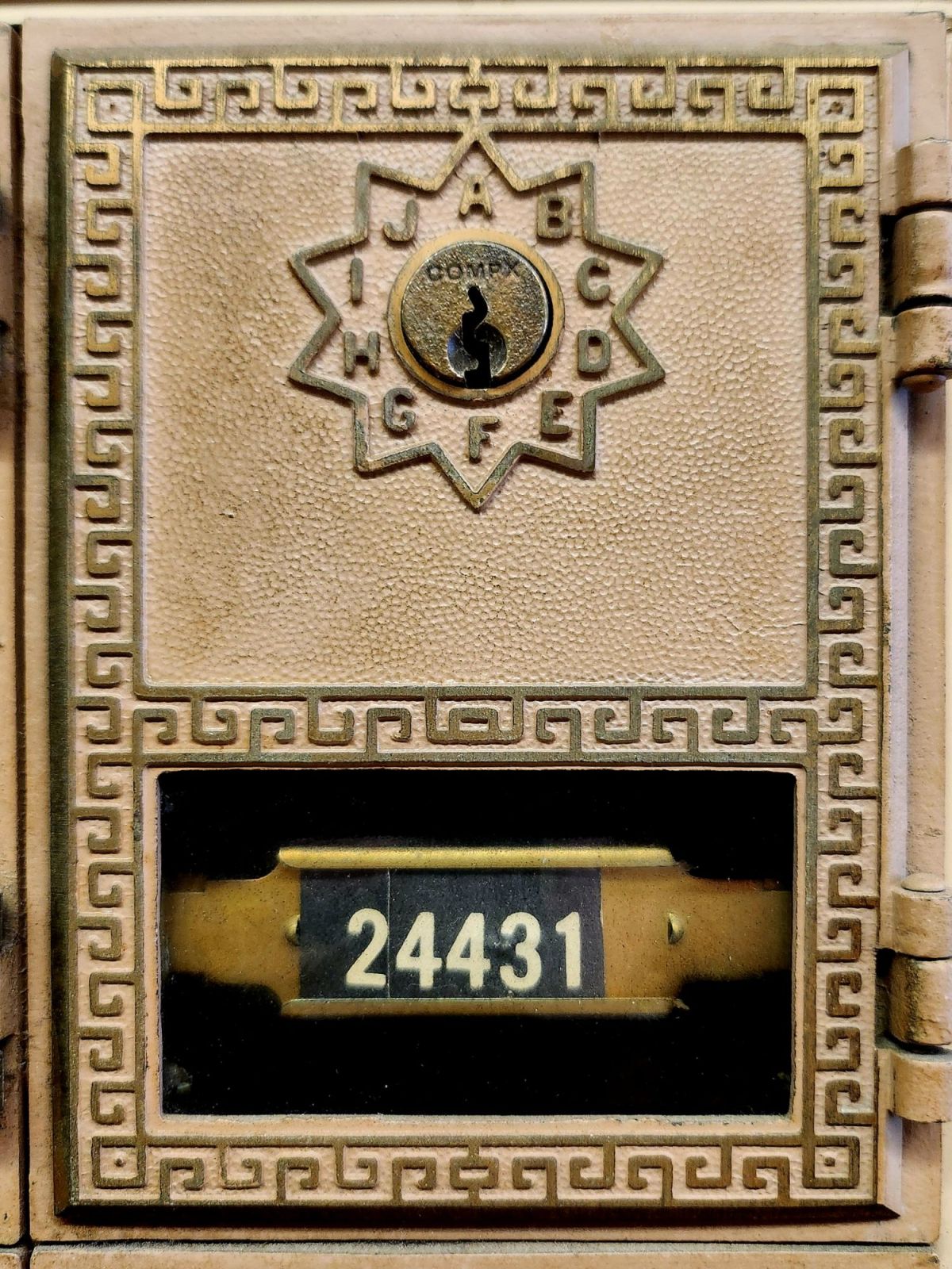
This is my new front door. Think of it as a study, a garden, a music room, and a studio. My aim is to make it the world’s smallest artist’s retreat.
Box #24431 measures only 3 x 5.5 inches. But like the best spaces, it’s about what happens inside. This little metal door represents a vision I have kept tucked away for a very long time.
Make a place where people want to be and become creative.
A place where creative lives unfold slowly, where stories accumulate over time, where the daily practice of writing becomes a way of being present to the world. In other words, I want to make a place for you (and me).
Maybe you have a book in you. Maybe your life feels like a book being written right around you. Maybe what is calling isn’t a workshop or deadline, but simply the habit of putting words on paper and sending them to someone who will read them with care and respond. Sometimes the most important writing happens in the margins of our days, in postcards and texts, in the small mechanics of turning experience into language and expressing it.
I love that place between sending and receiving, writing and reading, and the exchange of thoughts among people. It’s about circulation. Our stories are the lifeblood feeding and fueling our times. Cultural movements are made through the messages exchanged between us, much more than the headlines would have us believe. Word-of-mouth, greeting cards that travel door-to-door, book reviews, weather reports, hotel recommendations, and the whispered news—crossing distances for us, even over generations and through the delicate spaces of relationships as they go.
Writing is a practice. Like meditation, walking, and tending a garden, it is one way we examine our lives unfolding, sentence by sentence, year by year. Every little missive you write becomes part of that practice—a way of paying attention to what matters, of noticing the small moments strung together. Meanings that can be folded up like origami and written in haiku.
What kind of spaces do writers need? Spots to sit comfortably for a while, suitable room temperature, good lighting, and forgiving technology. Writers also lean on insight, desire, intention, or motivation, and before that, a well-worn habit or behavior. The daily practice of showing up to the page, even when the page is just a postcard.
I say, let’s start there. You handle the writing setup and the ideal conditions—I don’t have that kind of room yet! I’m here for the correspondence. Both of us engaged in noticing, finding the words (or not), and reaching out every so often.
Send me a postcard—the older and odd, please! Your card will be added to my collection and I’ll keep your particulars on file. No digital list here, just a vintage recipe card box on my desk where handwriting lives.
And, if you plan to finish that book? Yes, I am prepared to serve as your humble first reader. Use a typewriter or your finest small script, and you may need more than one postcard. Your story (or any moment from it) is welcome here.
Write to me at: The Posted Past, P.O. Box 24431, Tempe, AZ, 85285.
Include your address and I will respond in kind.
+++
We’re not Luddites 🙂 You can also hit the SUBSCRIBE button on this page to receive The Posted Past every Wednesday in your inbox. Your generosity is the difference between the free and the $5/month options. Thank you! New essays begin in September.
Copper maps. Wooden cards. Puzzle prints. Discover how obsolete technologies transform into art and craft, and explore why we can’t stop reinventing the perfect postcard.
In this age of instant digital communication, the persistence of physical postcards presents an intriguing contradiction. These rectangular pieces of cardstock—designed to carry both image and correspondence through postal systems without an envelope—serve as artifacts of a communication method that had its heyday a century ago. But rather than disappear entirely, postcards have evolved in novel ways that tell us even more about who we are.
Why We Seek the New
Humans have always been drawn to novelty. Our brains light up at the unfamiliar—it’s a survival mechanism that once helped our ancestors notice changes in their environment that might signal danger or opportunity. But our relationship with novelty runs deeper than vigilance. We seek out new experiences, objects, and sensations even when no practical threat or benefit is apparent.
This human attraction to novelty serves several purposes. First, it provides simple pleasure—the dopamine release that accompanies discovery keeps us engaged with our surroundings. Second, it helps us learn and adapt—new situations force us to develop new skills. Third, it offers social currency—being the first to discover, own, or report something novel (even if untrue!) gives us a kind of status within our communities.
Perhaps most fundamentally, novelty helps us fight against the deadening effect of habituation. We become blind to what remains constant around us, a psychological phenomenon called “sensory adaptation.” Think of how you stop noticing a persistent background sound, like traffic noise. Novelty jolts us back into conscious appreciation, like noticing the birdsong instead, making us sense the familiar differently.
With mass-produced consumer goods, we often pursue novelty through customization or unique variants—like these postcard alternatives. They satisfy our craving for something special while maintaining connection to recognizable forms. Even novelty doesn’t stray too far from the familiar.
Technology Becomes Art
As technologies age and are replaced by more efficient methods, something interesting happens—the displaced technology often shifts from the realm of utility to the realm of artistry and craft. What was once valued primarily for function becomes appreciated for form, precision, and the visible human touch.
Letterpress printing was an extraordinary innovation of its time and once the standard for all printed matter. It was largely replaced by offset printing in the 20th century and later the digital methods we use today. But rather than disappearing, letterpress evolved into a premium craft, prized for its tactile quality and visible impression on paper—characteristics that were originally just side effects of the technique, not its intended purpose.
The same transformation happens with many technologies: vinyl records, film photography, mechanical watches. As digital alternatives take over the functional role, the analog predecessors become vessels for history, craftsmanship, ritual, tactile pleasure. They move from being tools to being experiences.
This pattern helps explain our collection of novelty postcards. Somewhere in the middle of last century, the standard paper postcard was functionally superseded by digital communication, freeing it to evolve into these more elaborate, less practical forms. They represent a technology in its artistic phase—no longer bound by strict utility, but free to explore expressive and sensory possibilities, along with kitsch and commercialism.
Utah in Copper Relief
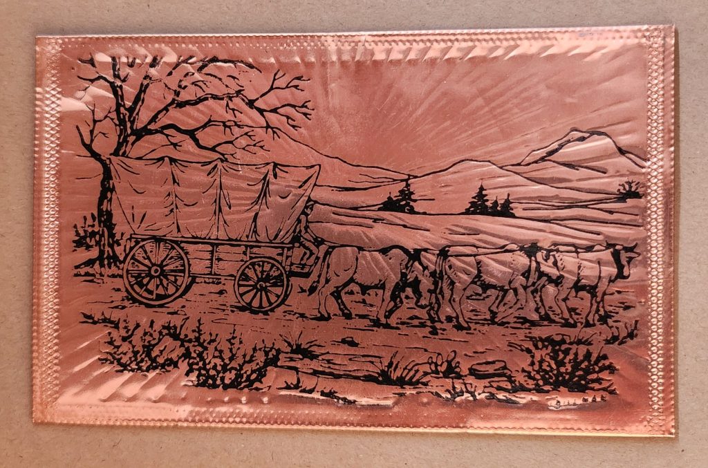
The copper-embossed Utah souvenir represents one of the more elaborate departures from traditional postcard design. The metallic rectangular plate features a raised topographic outline of the state with embossed illustrations of regional landmarks and attractions. The word UTAH is prominently displayed at the top, while places like Vernal, Provo, Cedar City, and St. George are labeled at their approximate locations. The copper medium gives the piece warmth, with a decorative scalloped border framing the state’s geography and securing the paper card below.
The manufacturing process likely involved die-stamping or embossing thin copper sheeting, a technique that dates back to the late 19th century and regained popularity in mid-20th century souvenirs. The tactile nature of the raised elements invites touch, creating a multisensory experience unavailable in traditional flat postcards. The utility of this object as actual correspondence is significantly diminished—the copper surface resists easy writing, and its weight requires additional postage and hand-canceling. It’s more a miniature commemorative plaque that happens to maintain postcard dimensions.
Woodsy Aesthetics
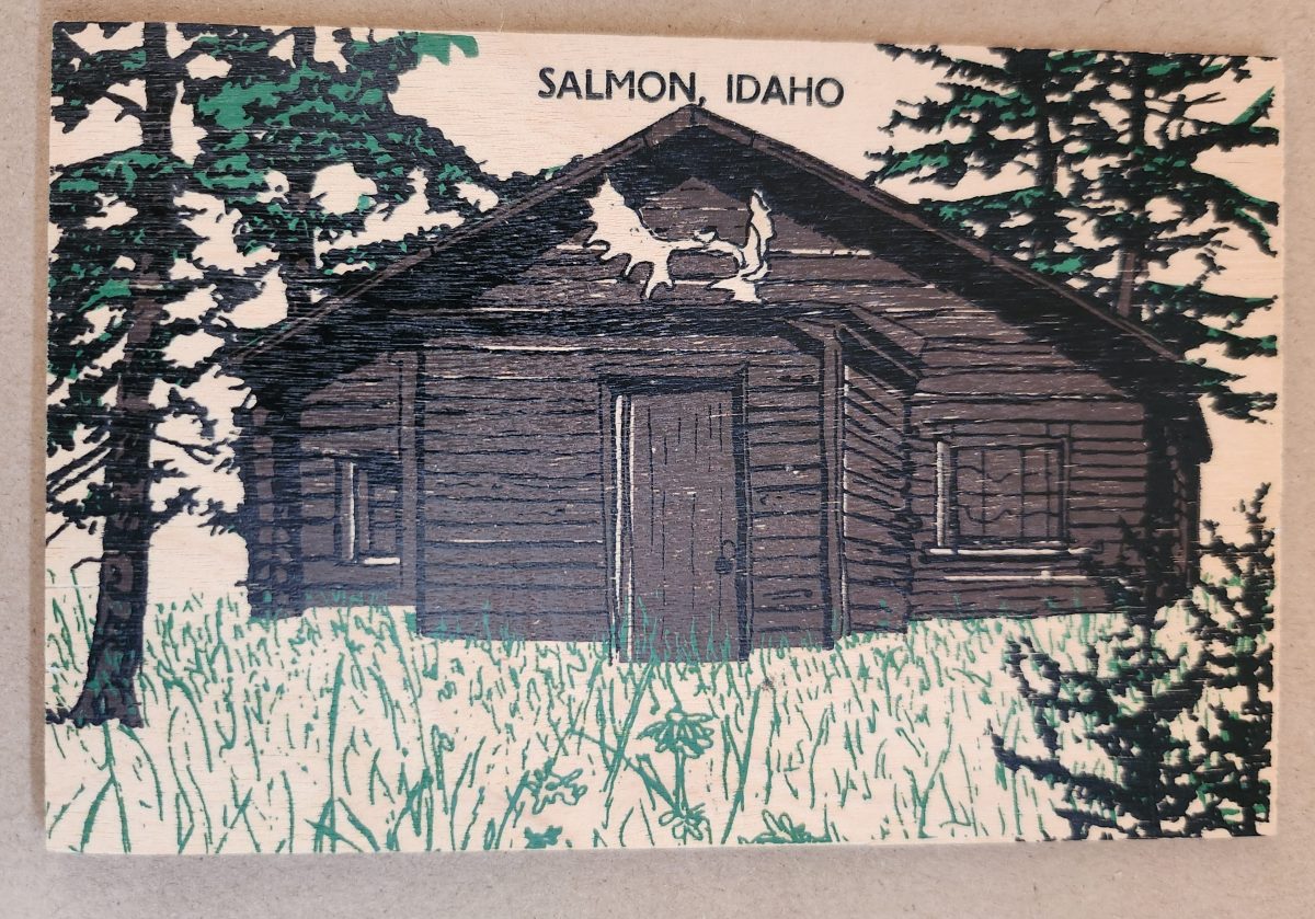
Let’s look closer now at a novelty postcard featuring a cabin in Salmon, Idaho, printed onto a thin wooden substrate and depicting a rustic cabin nestled among stylized pine trees. The scene employs a limited color palette—brown and black for the structure and green for the surrounding vegetation—lending it a deliberately simple aesthetic that echoes both woodcut prints and traditional lithography.
The simple text at the top identifies the location without intruding on the scene. The artwork itself employs minimal detail, capturing the essence of rural life rather than photographic accuracy. The manufacturing process of printing onto thin wood veneer allows for mass production, while adding a specific scene, location name, and ink color for customization.
This card’s rustic medium and subject matter work in harmony, creating a self-referential object where the material reinforces the message—a wooden card depicting a wooden structure set within a forested landscape. The medium becomes part of the message, suggesting authenticity through material consistency. Though mass-produced, it strongly evokes a rural sensibility.
Framed Vistas
Our souvenir from Yellowstone National Park adopts yet another approach. This card features a stylized illustration of Yellowstone’s grand canyon and waterfall printed on cardstock and mounted on a wooden backing.
The artwork employs a palette of oranges, purples, blues, and whites to capture the dramatic landscape, with the falls rendered as a white vertical streak against colorful canyon walls. Dark silhouettes of pine trees frame the scene, while puffy clouds hover in a light blue sky, held inside a purple border. The stylized typography echoes vintage travel posters from the early to mid-20th century. The entire image is mounted or printed on a natural wood base, visible as a frame around the illustration.
This card’s production combines offset printing with a wooden substrate—a look that recalls both traditional woodblock prints and mid-century travel advertisements. The design deliberately evokes an era of American national park tourism when artistic posters commissioned by the Works Progress Administration and the National Park Service established a distinctive aesthetic for natural landmarks.
Playful Puzzles
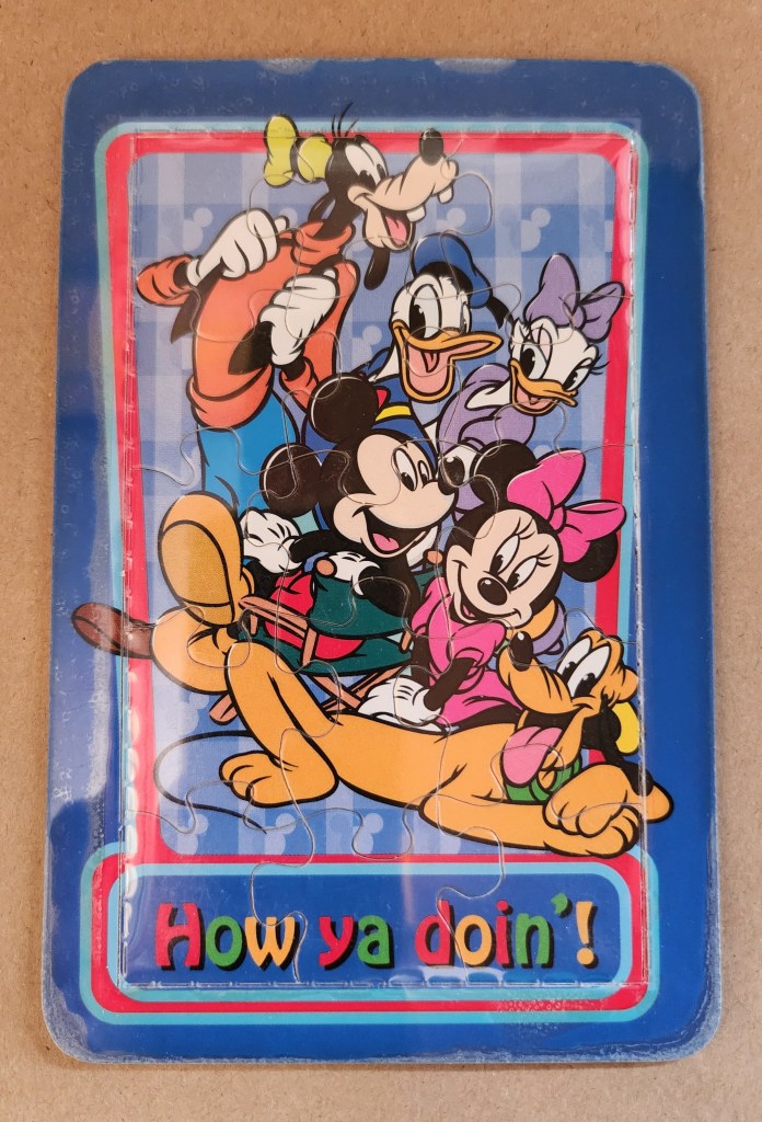
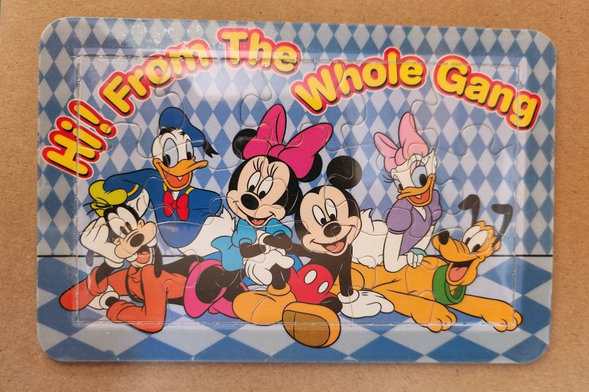
The Disney puzzle postcard introduces an element of interaction we haven’t seen before. This card features Mickey Mouse, Minnie Mouse, Donald Duck, Daisy Duck, Pluto, and Goofy arranged in a group pose against a blue-and-white checkered background. The message reading “Hi From The Whole Gang” in bubble text curves around the edge of the image.
This item turns a postcard into a simple jigsaw puzzle—die-cut pieces that can be jumbled and reassembled to reveal the printed image. The manufacturing process involved full-color printing followed by precision die-cutting to create interlocking puzzle pieces, then applying a thin adhesive film to maintaining the card’s overall integrity for mailing.
This souvenir represents a curious hybrid—a postcard that actively invites its own disassembly. The Disney characters themselves represent another layer of nostalgia, combining America’s animation icons with the traditional postcard format to create an object that references multiple forms of 20th-century popular culture simultaneously. But only modern technology could accomplish these manufacturing details, a playful combination of familiar and fresh.
Magnetic Memories
The Will’s Hardy Trees and Seeds magnetic card is the one in our set with the most layers of both meaning and making. See packets, postcards, fridge magnets, and agricultural Americana all combine in this take home treasure.
The 1909 seed catalog cover is a contemporary image inspired by the real-life Oscar H. Will & Co. of Bismarck, North Dakota. The vibrant illustration displays pansies in various colors—purple, yellow, orange, pink, and white—arranged in a bouquet. Text identifies the company’s 26th year of operation and describes their products as the “choicest and most beautiful on earth”.
A small purple circle overlay on the plastic film cover announces the item’s true nature: a magnetic postcard to send as a gift. Despite its historical appearance and postcard dimensions, the object is actually a refrigerator magnet that merely references seed catalog and postcard aesthetics. The production involved digital printing on magnetic sheet material, applying a printed paper backing, and slipping into a plastic cover with instructions to mail the gift in an envelope.
As a novelty item, it reveals a peculiar circularity. A reproduction of a commercial artifact (seed catalog) transformed into a correspondence medium (postcard) further transformed into a decorative household item (refrigerator magnet). Somehow, we love each iteration all the more.
Nostalgia Squared
What these examples share is a relationship with nostalgia that operates on multiple levels. They aren’t simply nostalgic; they engage in a looping nostalgia—nostalgic representations of already nostalgic forms.
The copper Utah relief draws upon mid-century tourist souvenirs, themselves designed to evoke frontier-era maps and territorial markers. The Salmon cabin employs modern production techniques to simulate traditional woodcuts nad print, which were themselves often romanticized depictions of rural life. The Yellowstone cards references mid-century national park posters that were already stylized interpretations of natural wonders. The Disney puzzle incorporates cartoon characters who have become nostalgic cultural icons, presented in the format of childhood games. The Will’s Seeds magnet reproduces early 20th-century commercial art that was, even in its original context, employing Victorian aesthetic sensibilities.
This layering of reference creates objects that are remarkably dense with cultural signifiers despite their modest physical dimensions. They offer not just a connection to place and time but to the ways we’ve represented ourselves and our interests through commercial souvenirs.
Our apparent need for novelty, then, might be better understood as a need for continual context. Each new postcard iteration doesn’t merely replace what came before; it absorbs and references it, creating objects that function as compact archives of our evolving relationship with the characters and places we cherish.
These novelty postcards sit at an interesting crossroads of commerce, craft, and communication. They represent what happens when a formerly utilitarian object—the humble postcard—is freed from its purely practical obligations and allowed to evolve along lines dictated by sentiment, aesthetics, and novelty.
In a world increasingly dominated by digital experiences, these physical novelties offer something screens cannot—texture, weight, presence. They satisfy our hunger for the tangible. Their quirky, sometimes impractical forms speak to a human need more fundamental than efficient communication: the need to hold something unique in our hands, and to feel a physical connection to places we’ve been and experiences we’ve had.
The postcard itself is and was a very simple concept and object that, over time, has become a medium for ongoing conversations about permanence and impermanence, about what we value over time, and about the tension between utility and sentiment. In their various novel forms, these more-than-postcards tell us about places we’ve been and how we’ve chosen to remember and delight in those places—a correspondence not just between people, but between past and present.
Three postcards, yellowed with age, each capture a moment when someone paused in the middle of their story to reach out. Like a Venn diagram drawn in time, these missives overlap in that sacred space where human hearts seek connection across distances.
Through three preserved postcards from the early 1900s, we discover how every point of contact becomes a sacred center, a middle ground where hearts meet across distances both physical and emotional. Each yellowed card, with its carefully penned message, reminds us that we are all perpetually in the middle of things, reaching out across whatever distances separate us, making meaning in the spaces between hello and how are you?
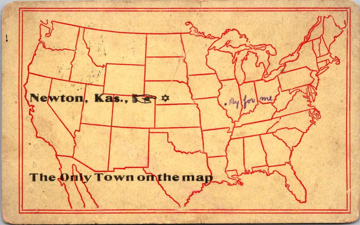
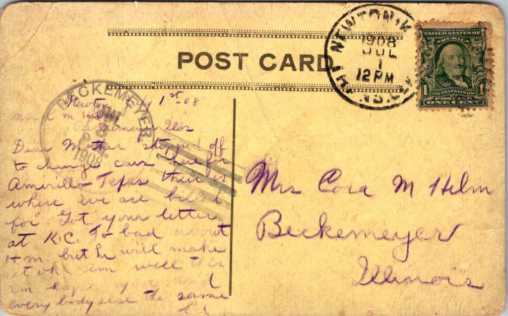
The Only Town on the Map
In Newton, Kansas, July 1908, Ed pauses between trains to write to his mother on playful postcard. A single dot on a stencil-drawn outline of the United States marks Newton as The Only Town on the map – a silly claim that also quietly captures a truth about human connection.
The humor lies in its absurdity – a blank continent save for this one dot in Kansas. Yet for Ed, in that moment, Newton truly is the center of everything, the pivot point between where he’s been and where he’s going.
Dear Mother, stopped off to change cars here for Amarillo Texas. There is where we are billed for. Got your letter at K.C. Too bad about him but he will make it ok. Am well this am, hope you and everybody else the same. Ed
He’s literally in the middle of the country, this railway town serving as his sacred center for just a few hours. There’s worry in his words about someone who’s unwell, balanced with reassurance about his own wellbeing. Even in transit, through immense uncertainty, he reaches for connection.
Long to Shake Your Hand Again
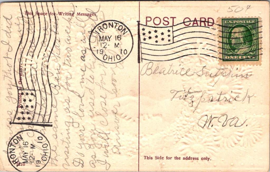
Two years later, in Ironton, Ohio, a young woman named Alma sends a card to Beatrice Sutphin in West Virginia. The card’s design speaks volumes: blue forget-me-nots and pink daisies frame a handshake, that polite, egalitarian gesture. Behind the clasped hands stretches a pastoral scene with water and a bridge – another symbol of connections that span distances.
“Do you love me as well as you used to, kid,” Alma writes, her playful tone reflecting the common courtesies of the day while masking a deeper yearning for reassurance. She’s navigating the creative tension of friendship across distance, using casual language and nudging humor to reach across the miles. The card itself becomes a bridge, a handshake in paper form.
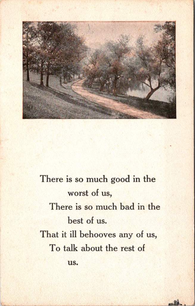
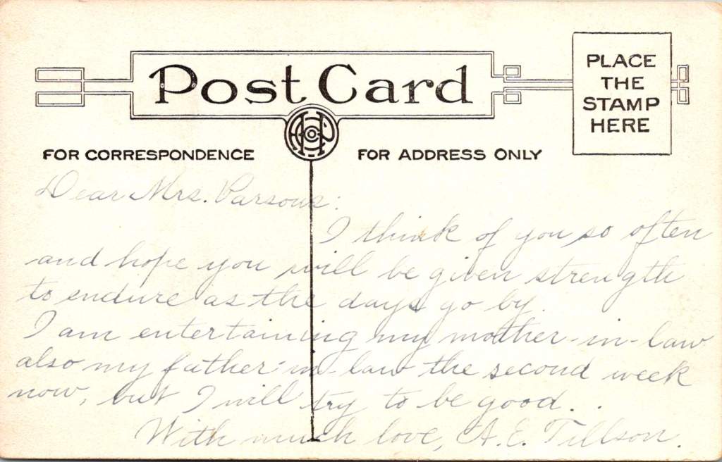
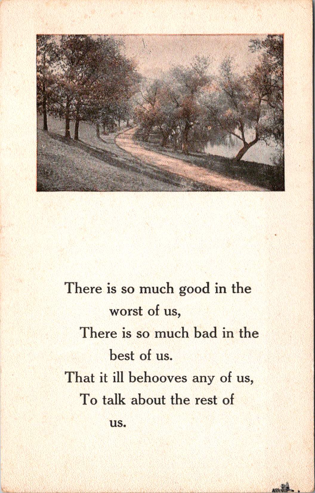
The Path Through the Trees
The third card, never mailed but carefully preserved, shows a winding path through trees, accompanied by verses about the complexity of human nature. A.E. Tillson writes to Mrs. Parsons with a note of formal sympathy, then adds a gentle joke about hosting in-laws. The message operates in that delicate middle ground between social obligation and genuine concern, between gravity and levity.
“I think of you so often,” she writes, “and hope you will be given strength to endure as the days go by.” Then, like a subtle change in musical key: “I am entertaining my mother-in-law and also my father-in-law for the second week now, but I will try to be good.”
All these years later, we are still inclined to gently inquire. Reading the messages between the lines, as they say. Do I sense a subtext here? What prevented her from sending this card? Why did she keep it long years on?
The Sacred Center
Something lies at the intersection of these three postcards, a sacred center they all circle around. It’s not serenity – each writer grapples with some form of creative tension. Ed worries about an unnamed “him” while trying to reassure his mother. Alma playfully demands affirmation of continuing friendship. A.E. Tillson balances sympathy with humor, formal phrases with personal asides.
The sacred center is the conversation itself – the eternal human drive to reach out, to connect, with even the most mundane facts. The center thrives on these noted perspectives, each writer offering their unique take, laden and layered with meaning though jotted out from a whistle stop.
These postcards are artifacts of appreciative inquiry in its most natural form. Each sender pauses in their own journey to ask: How are you? Are you well? Do you still care for me? Can I help you bear your burden? The questions themselves open up places where hearts meet and stories intertwine.
Some of us, like Ed in Newton, write from the middle of a physical journey. Others, like Alma, navigate the emotional journey of maintaining connections across distance. Still others, like A.E. Tillson, write from the complex shared ground of social obligations and genuine concerns, so often unspoken.
In Transit, In Place
Whatever the circumstance, we are always in the middle of things. There is always a before and after, always tension between where we’ve been and where we’re going, between who we were and who we hope to become. These postcards remind us that this center is not a void to be escaped but a sacred space packed with the very humble pieces of possibilities.
The verse on the unposted card speaks to this truth:
There is so much good in the worst of us, There is so much bad in the best of us, That it ill behooves any of us, To talk about the rest of us.
The middle is the best part – of our stories, of our journeys, of our complex relationships with others. As they say, if you’re not dead, it’s not over. The sacred center isn’t found in perfect serenity but in the creative tension of reaching out across whatever distances separate us, whether those distances are measured in railroad ties or handshakes.
These century-old postcards, with their careful penmanship and gentle inquiries, their jokes and worries and reassurances, remind us that the center holds not because it is static, but because it is constantly renewed through the sacred act of one person reaching out to another with a simple message. Here I am, in the middle of it all, thinking of you.