George woke early in the day on New Year’s Eve. Light snow outside and the question he’d been turning over since Christmas: when to take Emma birding. He called before he could overthink it.
“Tomorrow morning?” Mai answered. “She’ll be ready at dawn.”
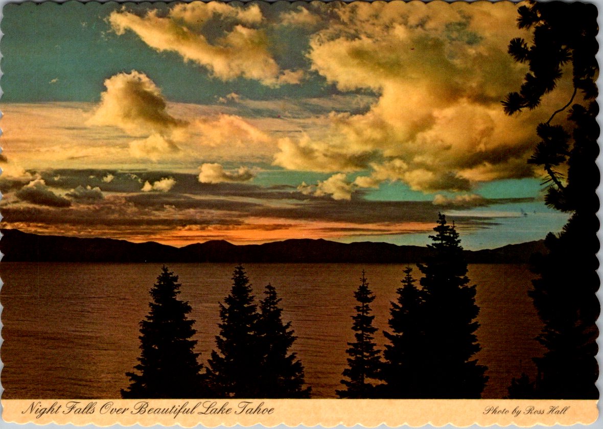
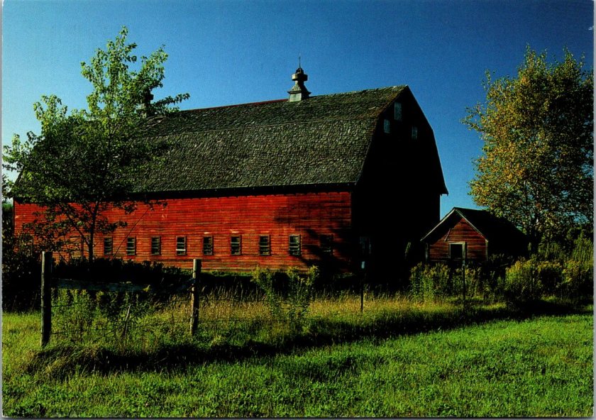
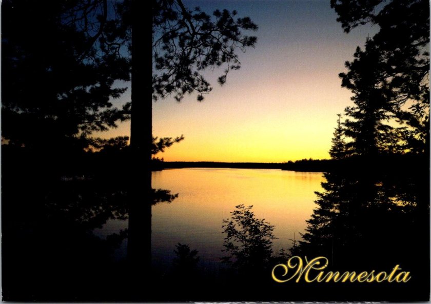
They met at Frontenac State Park at first light. Emma hopped out of Mai’s car already dressed for the cold—layers, boots, a hat George recognized as one of her mother’s favorites. Mai waved from the driver’s seat, smiled, pulled away.
“Just us?” George asked.
Emma’s eyes rolled slightly and smirked as she held up his binoculars. She’d already adjusted the strap. The green Audubon field guide was tucked under one arm, a new notebook in her other hand.
“Mom has to get ready for the party. Plus, she said it’s too cold.”
“Fair enough,” George smiled back and nodded toward the trailhead. “Binos up, move slowly, scan and listen. You go first.”
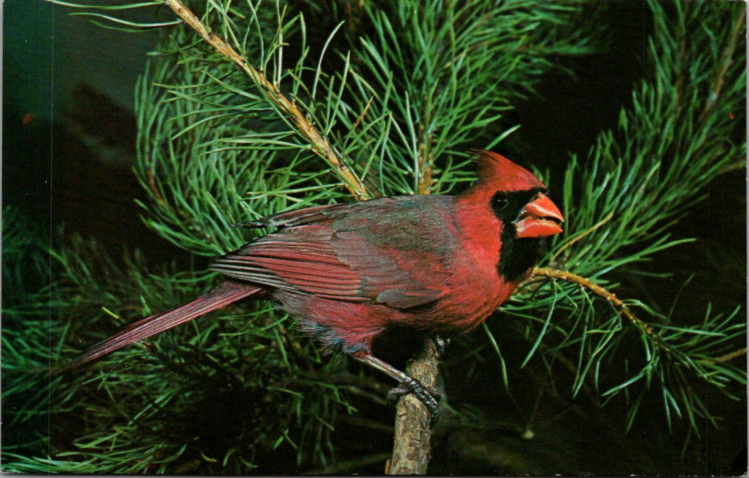
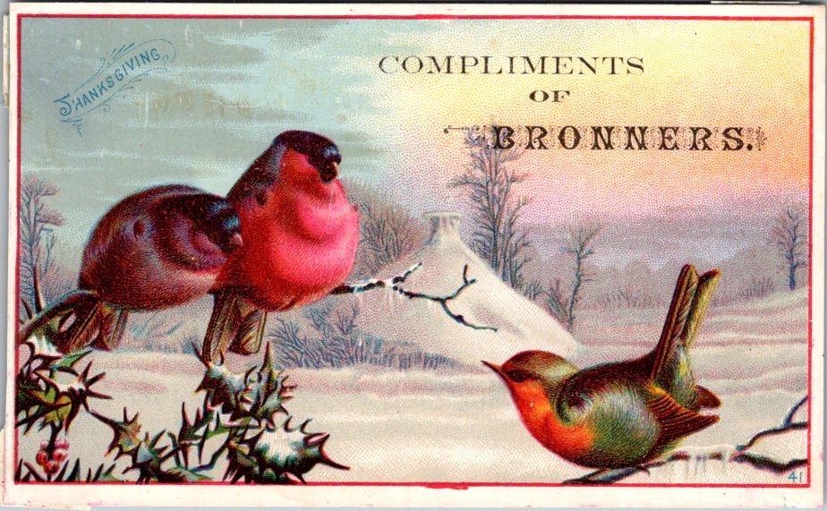
They walked the trail along the frozen river in tandem, as quietly and patiently as he had advised. Not looking for birds exactly, but for movement, for shapes that didn’t fit the pattern of branches and sky. Emma spotted the first cardinal.
“There,” she whispered.
George raised his older binoculars. He had kept them for Jennie on the rare occasion she wanted to come along.
“Tan body, red-orange bill, and a sort-of red crest,” Emma slowly described the bird.
“Good eye. Watch how she moves.”
The bird hopped branch to ground, ground to branch.
“How did you know it was female?” Emma asked.
“Colors and the song notes. Males are showier and louder. Females sing too. They’re just quieter about it.”
Emma opened her notebook.
Female cardinal. Frontenac State Park. New Year’s Day. Feeding on lower branches of sumac. Light song noted.
They found chickadees, a downy woodpecker, juncos, and stopped along the way to record and discuss each bird. Emma’s notes filled two pages. George watched her move through the stark and cold forest—confident, curious, at ease. Mai had been more careful at this age, tentative on the trails. Emma walked as though she belonged here. She did.
Driving her home, George said, “You’re a natural. Your mom was good, too. She could walk so slowly, make no noise at all.”
Emma smiled. “She says I get it from you.”
“Well, I got this for us,” George said as he pulled into the driveway.
He flashed his phone screen to reveal the app he had downloaded, the Audubon Society Field Guide to North American Birds but online and searchable. Right on the front, the very first photo was a male and female pair of Northern Cardinals.
Emma’s eyes lit up. Quietly, she imagined how many they’d find all over Minnesota in the days and weeks and (hopefully) years ahead.


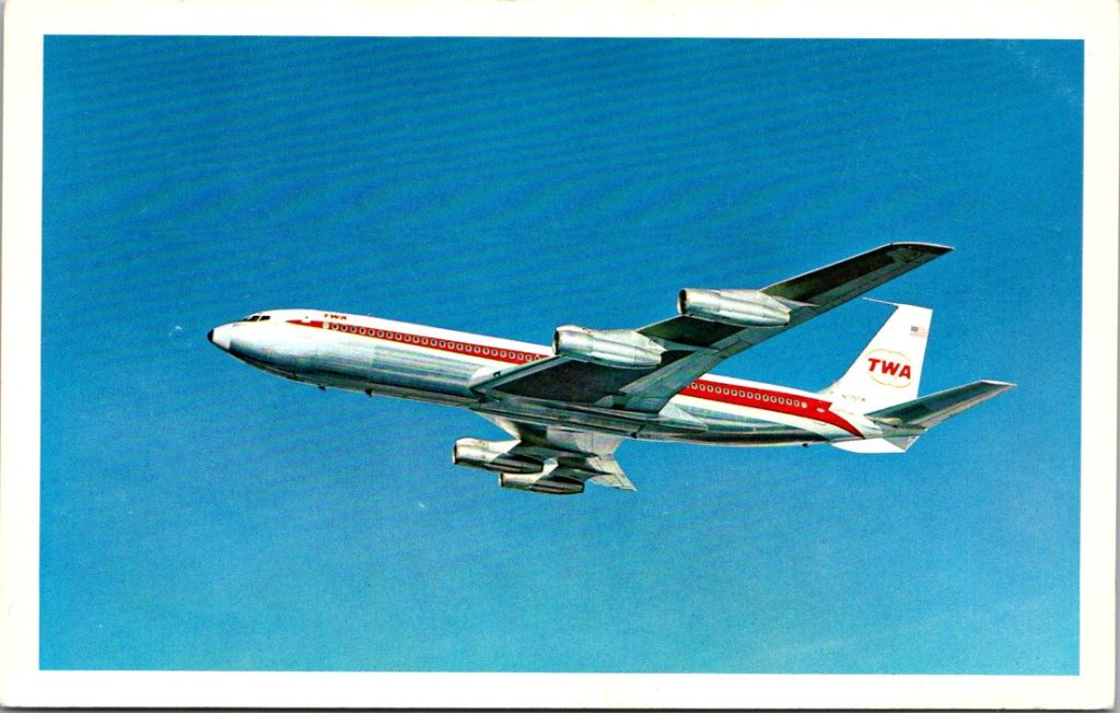
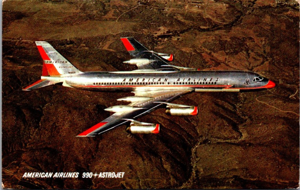
Back home, George leaned out of the window to pick up the mail before driving down the ice-packed drive. He tossed the stack on the seat. On top, a photo of an American Airlines plane. He knew who it was before he turned it over.
Flight delay. Thinking about you and Jennie. Can’t believe they’re both gone. —T
His younger brother, Tom, both of them widowers now. Their wives were gone within months of each other. At times, they both worried they would lose each other, too. Too much pain, way too much.
George had been waiting for Tom to call. He knew that constant work and distance was his way of coping, but how long was too long?
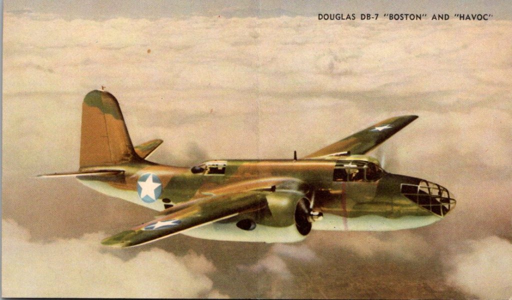
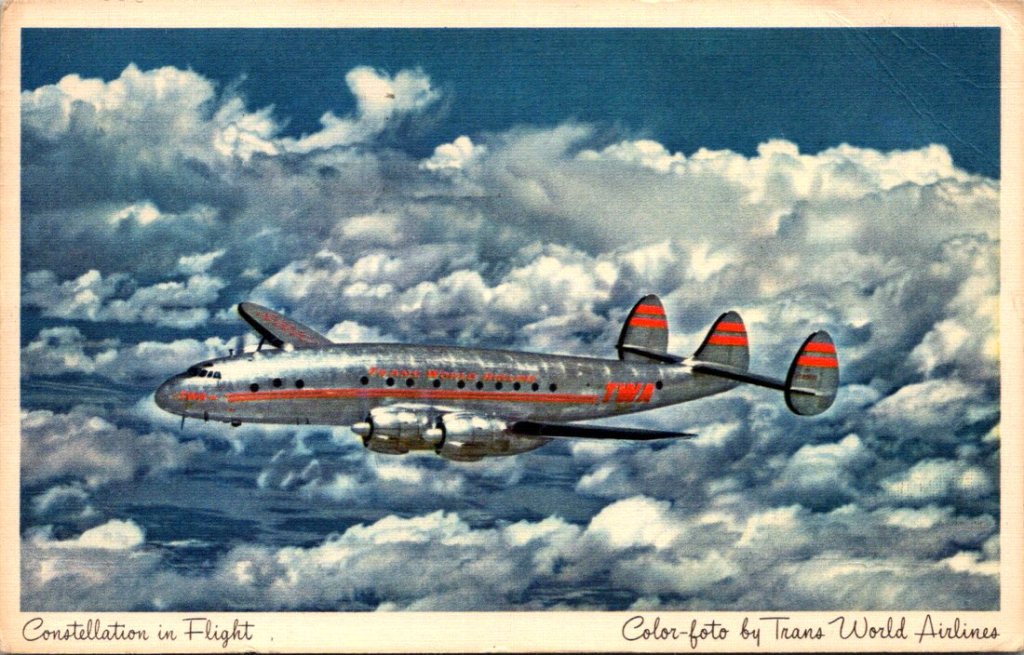
George looked at Tom’s card again, familiar but this time a sudden realization hit him. Tom sends postcards. He’d received at least a half a dozen over the years–all photos of old jets. George had never written back. Not once. He’d been waiting for the phone to ring. Now he remembered the little collection of airplanes in his desk drawer.
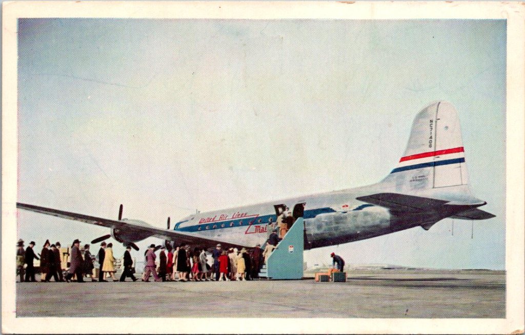


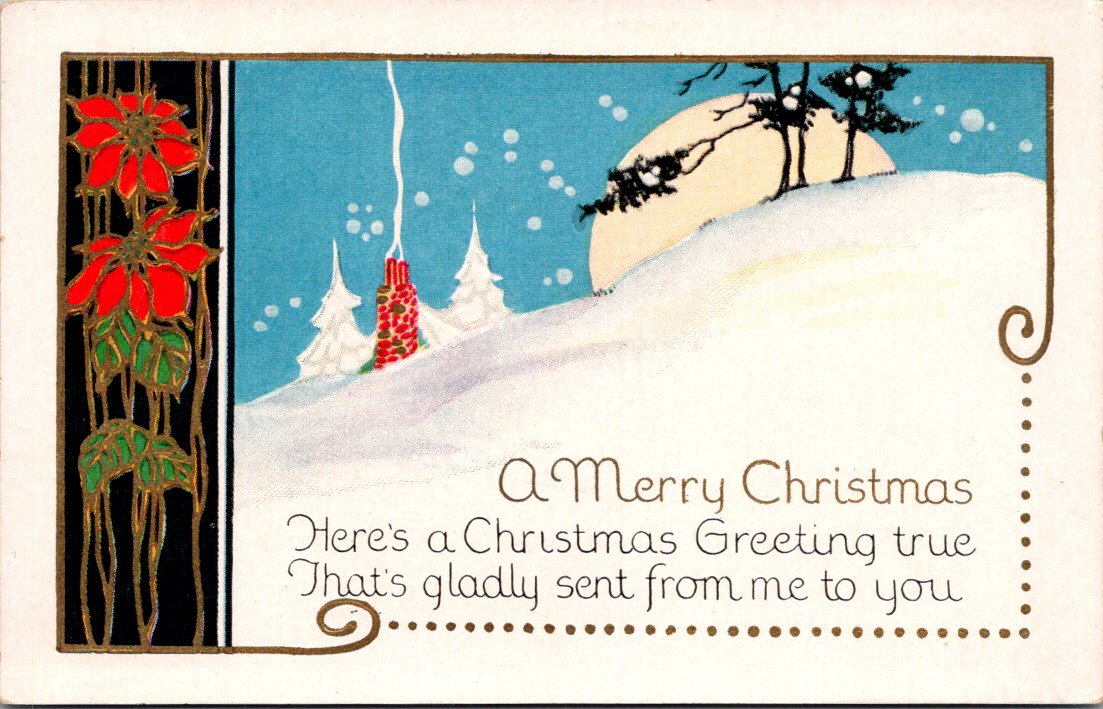
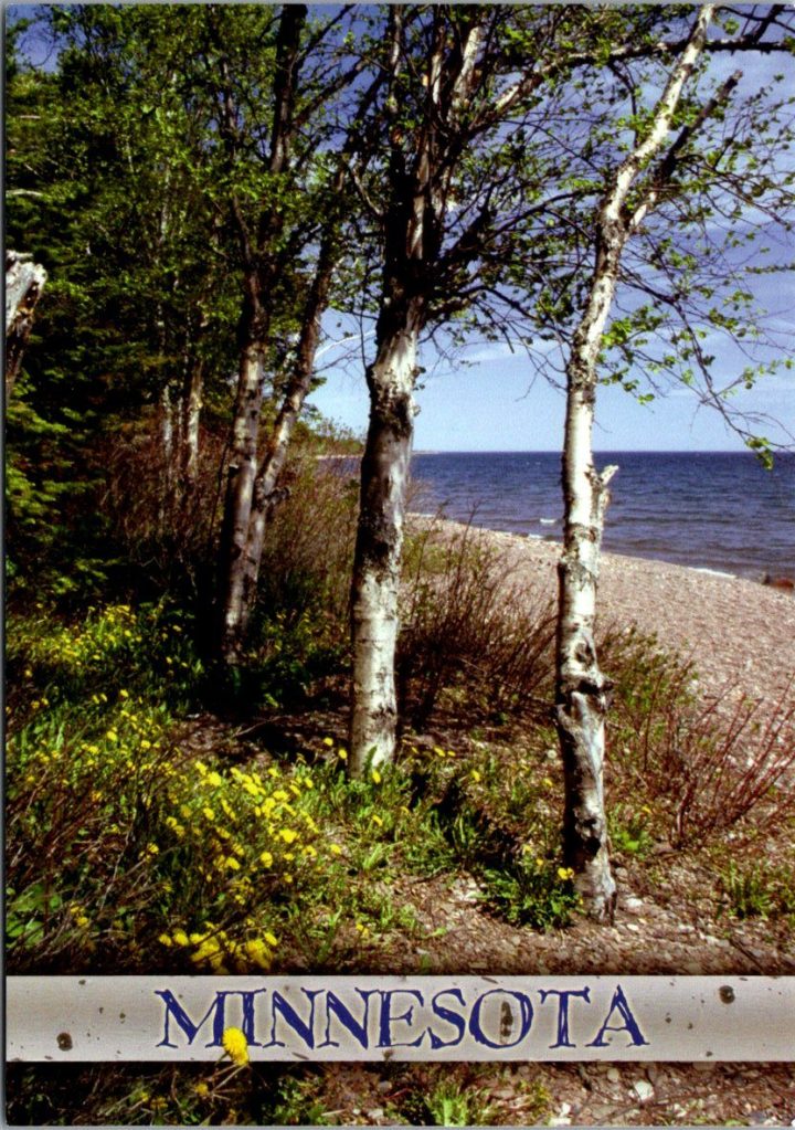
He sat down. Pulled a card from his own growing stack, a color photo of a trail like today’s but after the thaw. His message was short, with room for more later.
Got your card. Miss them every day. Miss talking to you. —George
He addressed it to Tom’s apartment in Phoenix, the one he’d moved to after Delia died, and rarely slept in. Stamped it. Put on his coat and walked back out to the mailbox, certain of what he’d been missing.
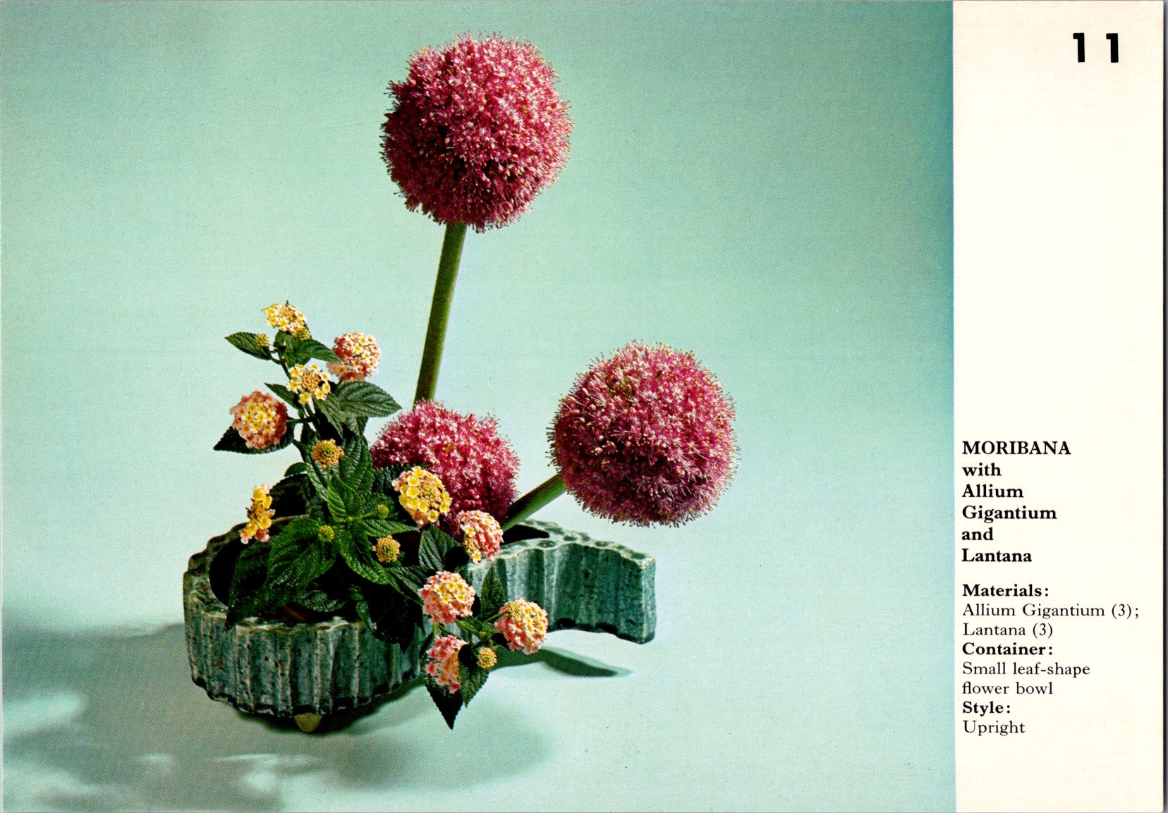
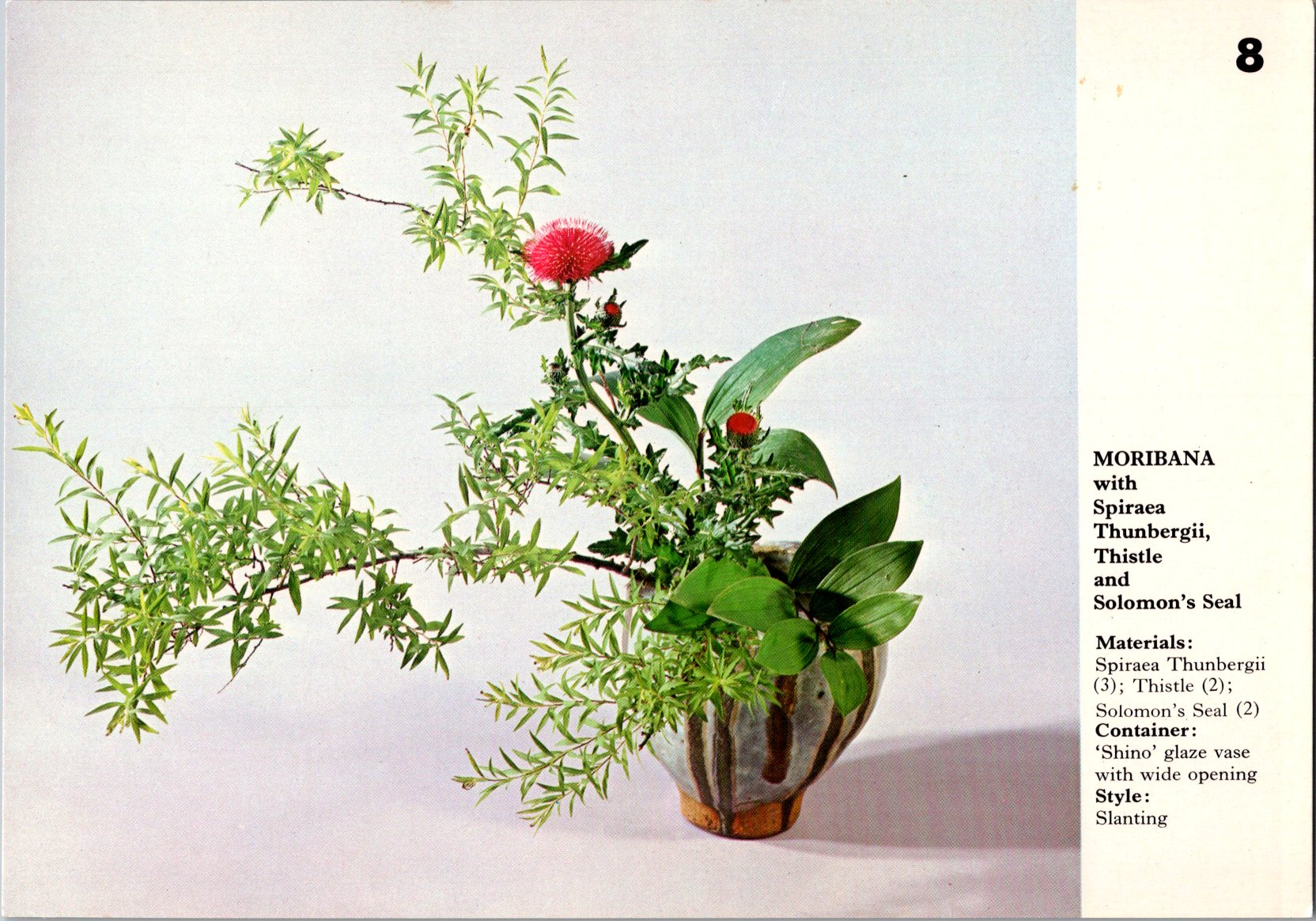
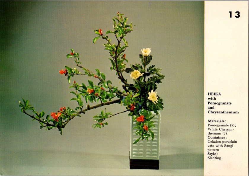
Nina found Mrs. Hanabusa arranging flowers in the common room—a small practical arrangement, simple stems in a shallow dish.
“For the holiday?” Nina asked.
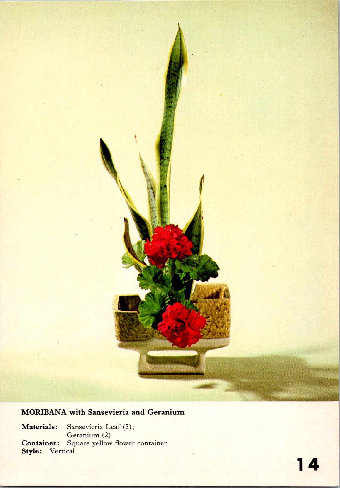
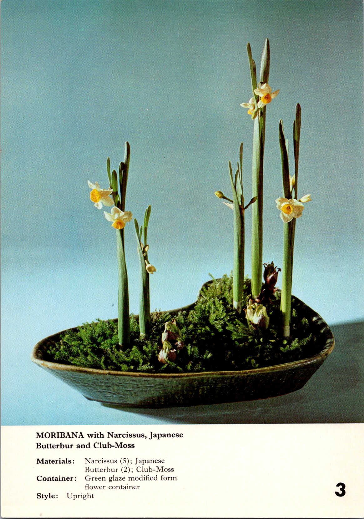
“My own amusement.” Mrs. Hanabusa adjusted a branch. “Ikebana, flowers carry meaning. Not just pretty, it’s a message.”
“What does this one say?” Nina asked.
Mrs H pointed to the chrysanthemum. “This one means longevity, joy. Used in autumn arrangements and also at funerals. Pomegranate. Internal life, good luck, and natural cycles of life and death.”
Nina watched her work. The precise angles, the negative space.
Mrs. Hanabusa stood up and moved back to considered her creation. “New year. Endurance through winter. Joy waiting to flower. Life coming and going all the time.”
She looked at Nina. “What’s your story?”
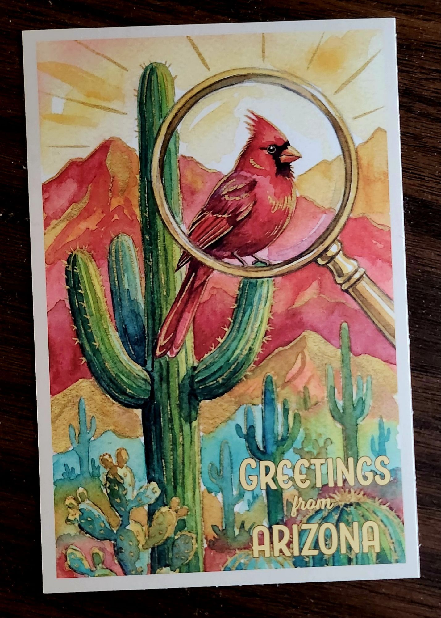
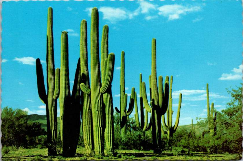
Nina placed her postcard on the table and sat down. A cluster of saguaro against a bright blue sky, blank on the other side.
“I don’t know what to say to him,” Nina whispered.
“Ikebana, we don’t fill all the space. We leave room. Leave room,” said Mrs. Hanabusa with some emphasis this time.
Nina thought for a moment, and wrote:
Got your note. Like the saguaro, I’m still here. Hug? —N
Not forgiveness. Not resolution. Presence and a little humor, with some room. She added her father’s address in Phoenix. Stamped it and set it by her keys, knowing that it still might take days to put it in the mail.
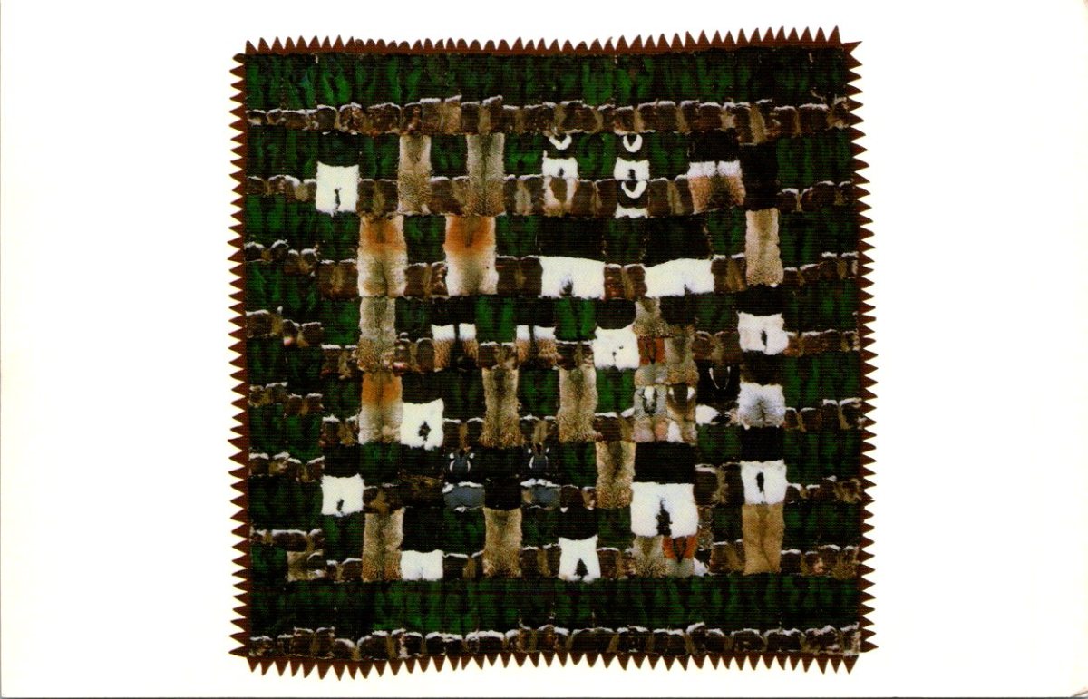
The next morning, a third card from Nora arrived—black and white geometric patterns, stark and beautiful. An Inuit quilt made of duck knecks.
Mrs. Hanabusa was at the window again when Nina came in. Nina showed her the card. Mrs. H studied the design, then turned it over to read the back.
Found a noodle shop I love. Made friends at work. Some days are hard, some surprise me by how easily I could stay longer. —N
Mrs. Hanabusa looked up. “She signs just ‘N.’ Like you do.”
Nina blinked. She’d never noticed.
“My sister and I had our own shorthand, too. Still do.” Mrs. Hanabusa handed the card back carefully. “Secret code.”
Nina looked at the card again. The simple N. The years of friendship.
On her way home, she stopped at the blue mailbox on the corner. Pulled out the cactus card she’d written to her father to look at how she’d signed it. Just N.
She dropped it in the slot, heard it fall, and said a humble prayer. What else had she not noticed along the way?