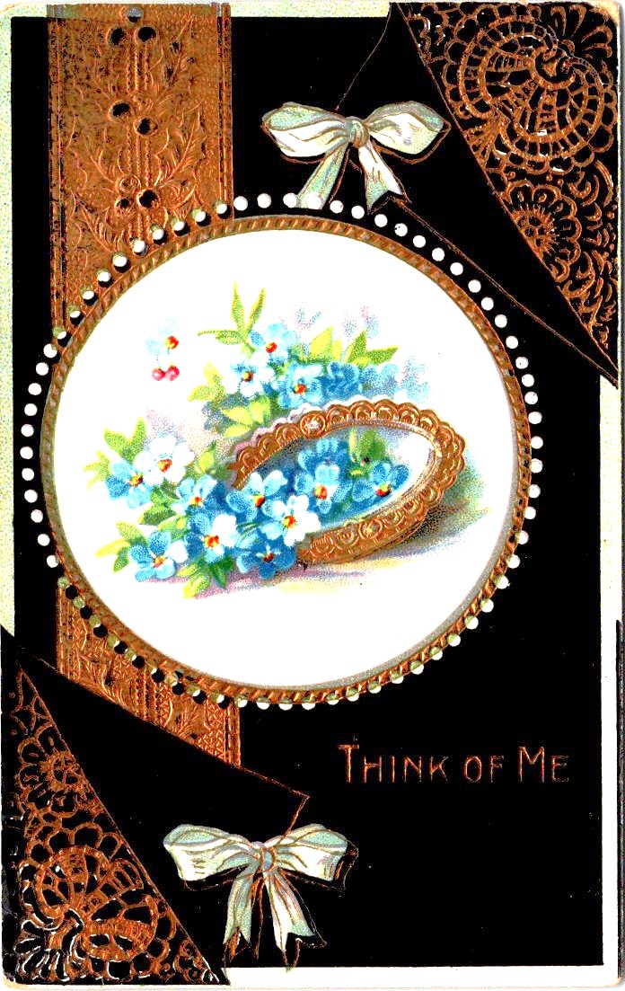
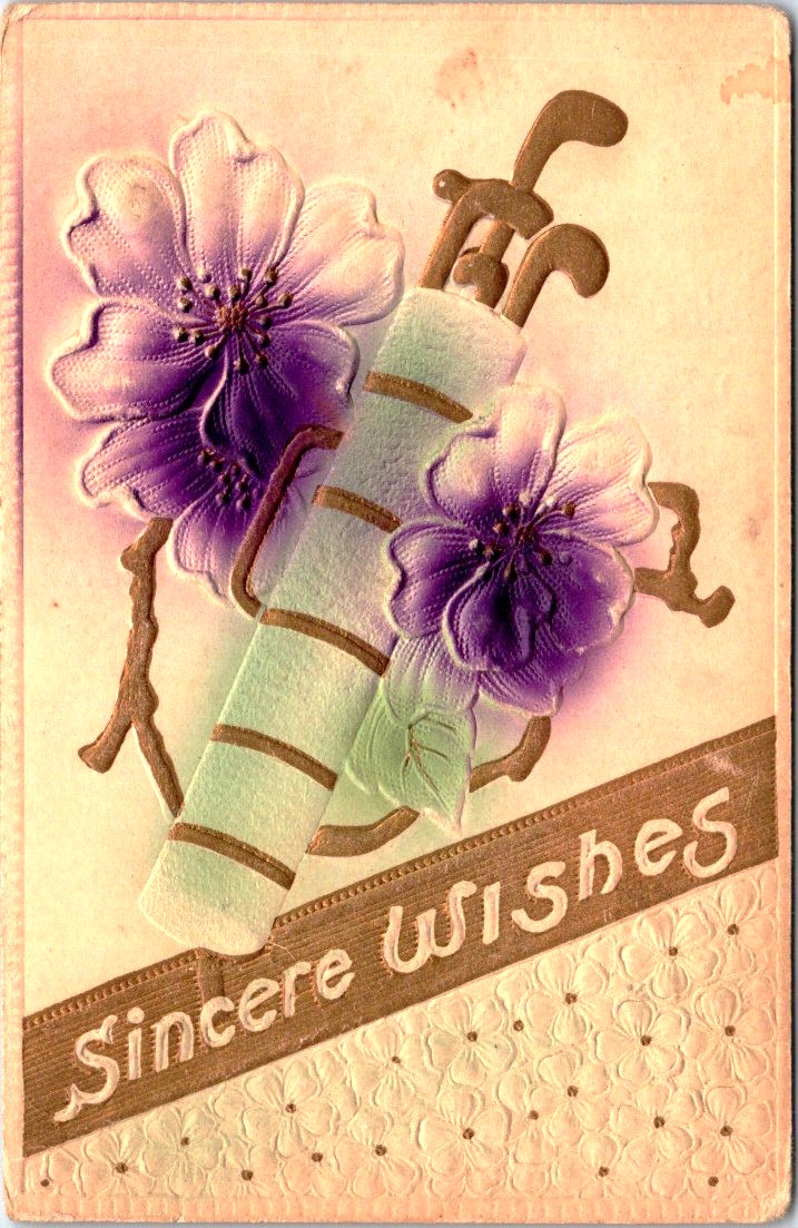
Published by Raphael Tuck & Sons of London, these elaborate die-cut pop-up cards feature beloved nursery rhymes and fairy tales including Little Bo Peep, Cinderella, Dick Whittington, and Three Little Kittens. Each piece showcases the exceptional craftsmanship and attention to detail that made Tuck one of the most prestigious names in Victorian publishing.
Vintage cards by raphael tuck & sons


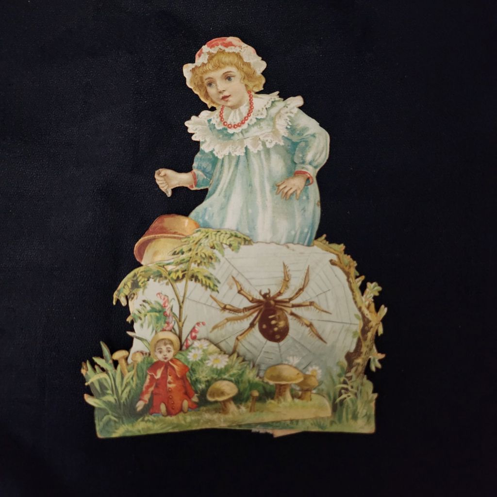


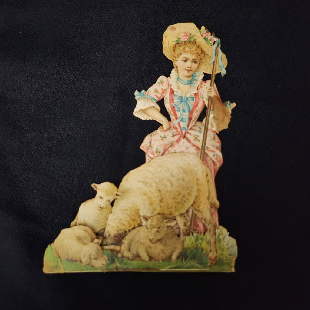


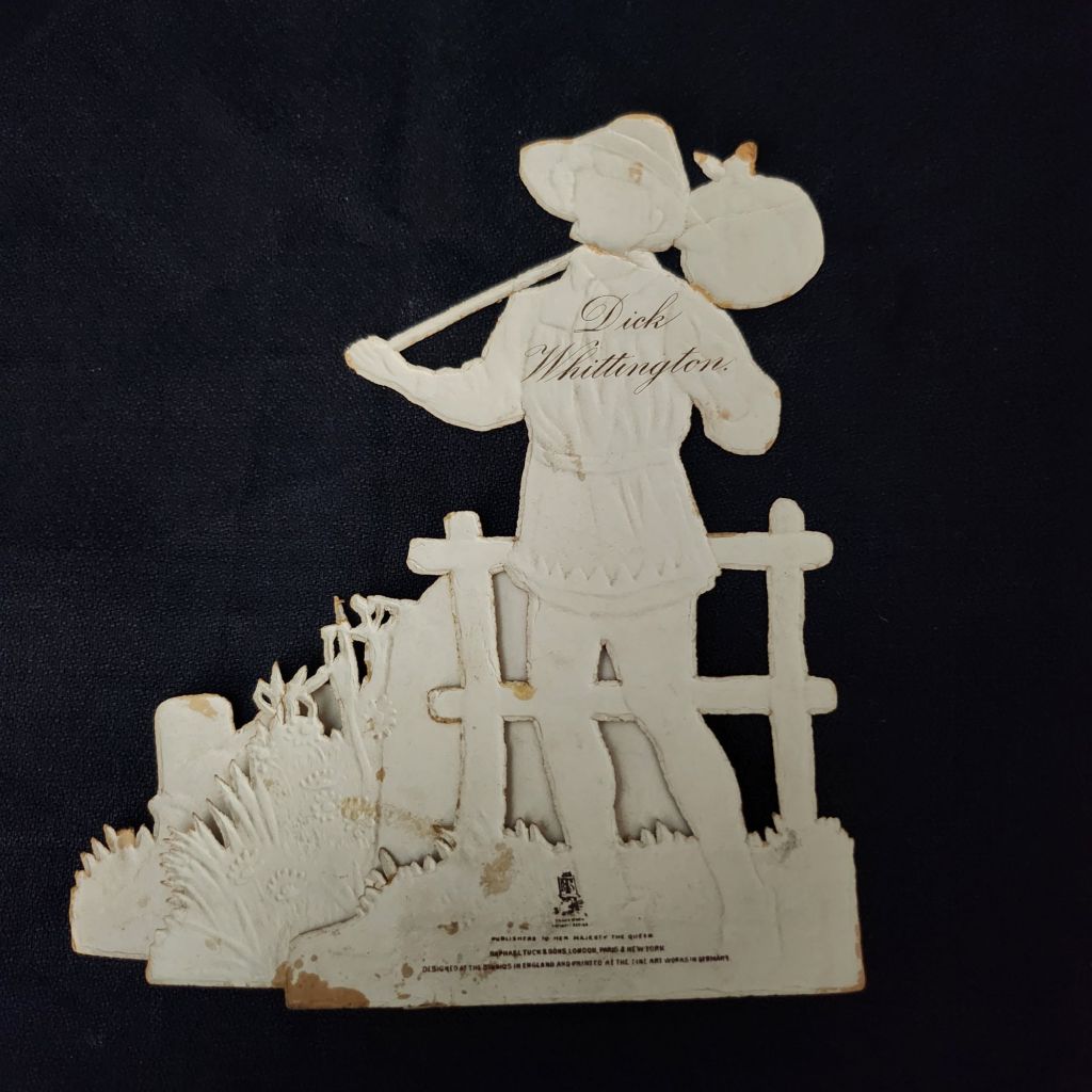
Founded in the 1860s by German immigrant Raphael Tuck, the company quickly established itself as a leader in chromolithographic printing. By 1893, they had earned a Royal Warrant, becoming “Art Publishers to Her Majesty the Queen.” This royal endorsement reflected the superior quality of their work, which combined vibrant colors, intricate details, and innovative three-dimensional designs. These mechanical cards, likely produced between the 1880s and 1910s, represent the company at its creative peak.
In an era before mass media entertainment, these colorful, interactive pieces were technological marvels. The chromolithography process allowed for rich, multi-hued images that seemed almost magical to contemporary viewers. Their three-dimensional construction meant they weren’t merely viewed but displayed—transforming mantels into miniature theaters of beloved stories. Collecting and arranging these cards became a popular hobby. Many were preserved in elaborate scrapbooks, but relatively few have survived.
WWI widely disrupted the European paper and printing industries, and Raphael Tuck’s London facilities were destroyed during the WWII Blitz in 1940, losing 74 years of business records and thousands for illustrations and production files. Mid-century greeting card companies did continue to produce mechanical cards, but the more elaborate craft traditions largely faded in favor of modern design trends and less complicated manufacturing.
New technologies have revived the artform and inspired contemporary artists. Robert Sabuda elevated pop-up books and cards to fine art status with his extraordinary paper engineering. Lovepop creates elaborate 3D greeting cards for every occasion. The London company Roger la Borde produces wild and wonderful contemporary designs. Of course, independent artists worldwide create handcrafted die-cut cards that both honor and stretch well-beyond the Raphael Tuck legacy.
To Read More
The History of Raphael Tuck & Sons
https://www.tuckdbpostcards.org/history
Detailed company history from the TuckDB database, the premier online resource for Tuck collectors
Pop-up and Movable Books: In the Context of History
https://popuplady.com/about-pop-ups/pop-up-and-movable-books-in-the-context-of-history/
Excellent illustrated timeline from 13th century volvelles to contemporary artists like Robert Sabuda
Victorian Christmas Cards: An Everyday Work of Art
https://victorianweb.org/technology/letters/christmascards.html
Explores chromolithography technology and the cultural impact of Victorian greeting cards
Raphael Tuck Postcards | The World’s Most Famous Postcards
https://www.britannicauctions.com/blog/raphael-tuck-postcards/
Collector’s guide covering history, famous series, and current market values