Mid-century postcards captured the wonder of American road trips in vivid color. This Phoenix to Grand Canyon collection reveals the story of car trips, roadside shops, and the natural landscape of Arizona.
Rural Route Arizona
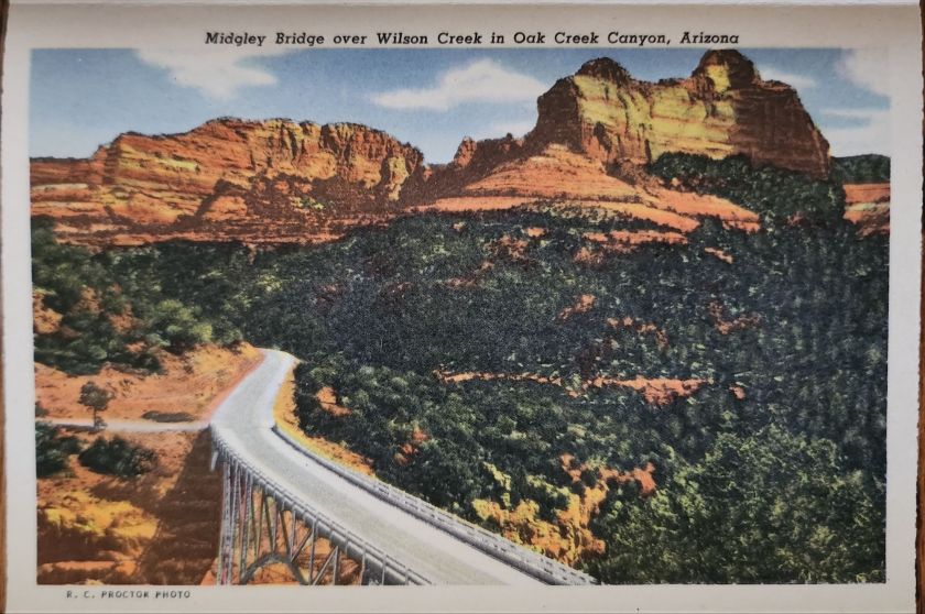
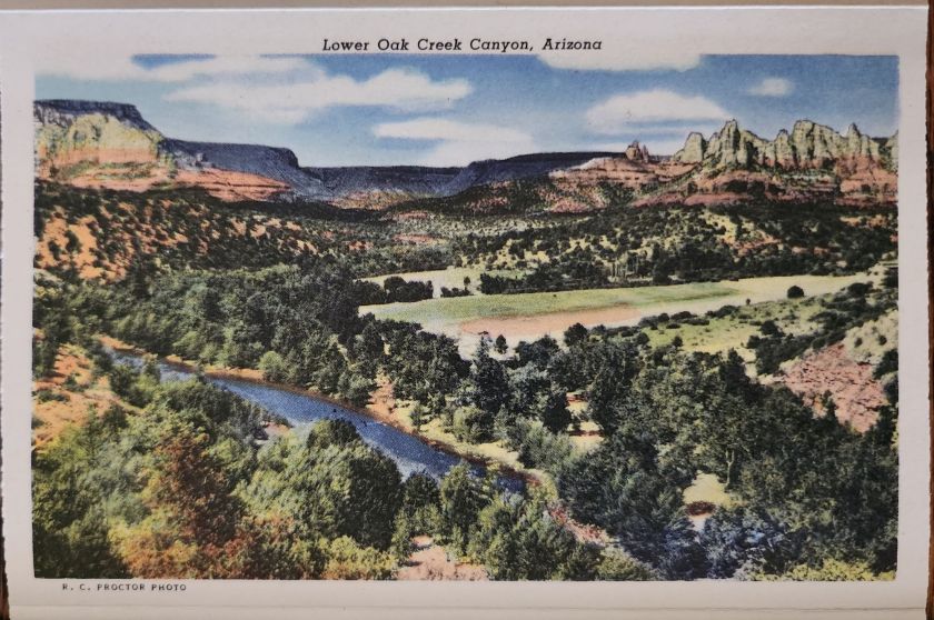
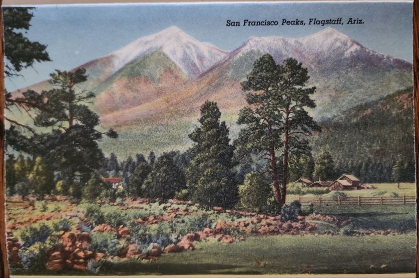
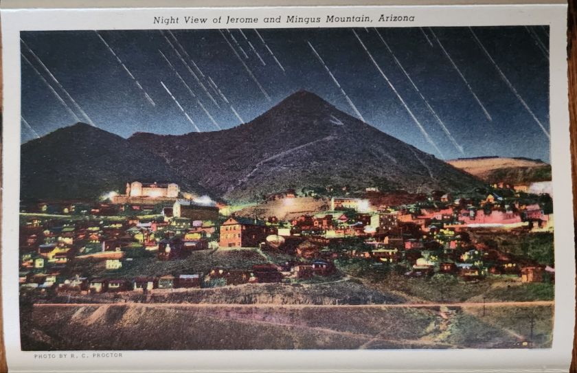
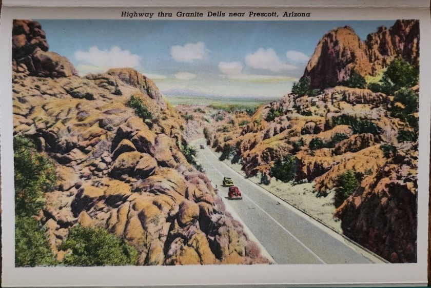
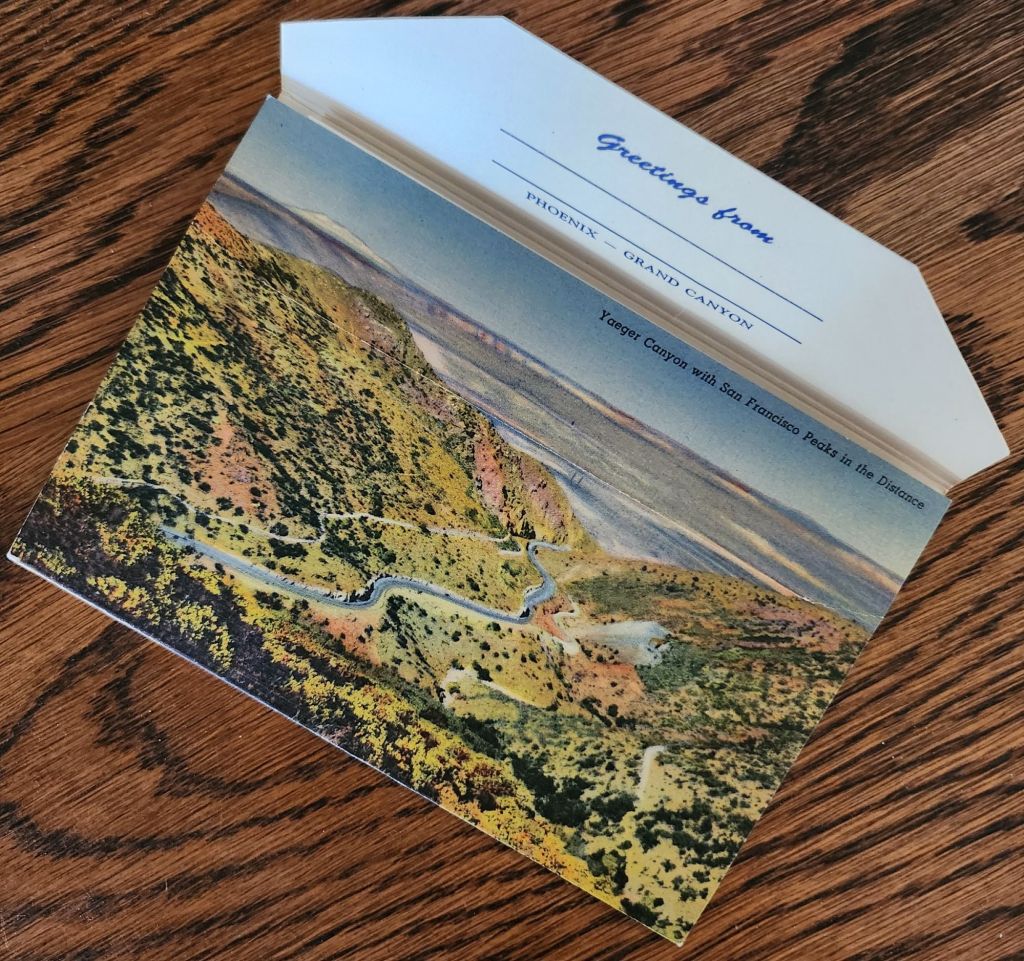
The Phoenix to Grand Canyon route via Oak Creek Canyon carved through America’s most scenic territory. In the 1940s and 1950s, this remained wild, undeveloped country. Starting in Phoenix, travelers navigated winding two-lane roads through Wickenburg, Yarnell, Prescott, Jerome, Clarkdale, Cottonwood, Flagstaff, and Williams.
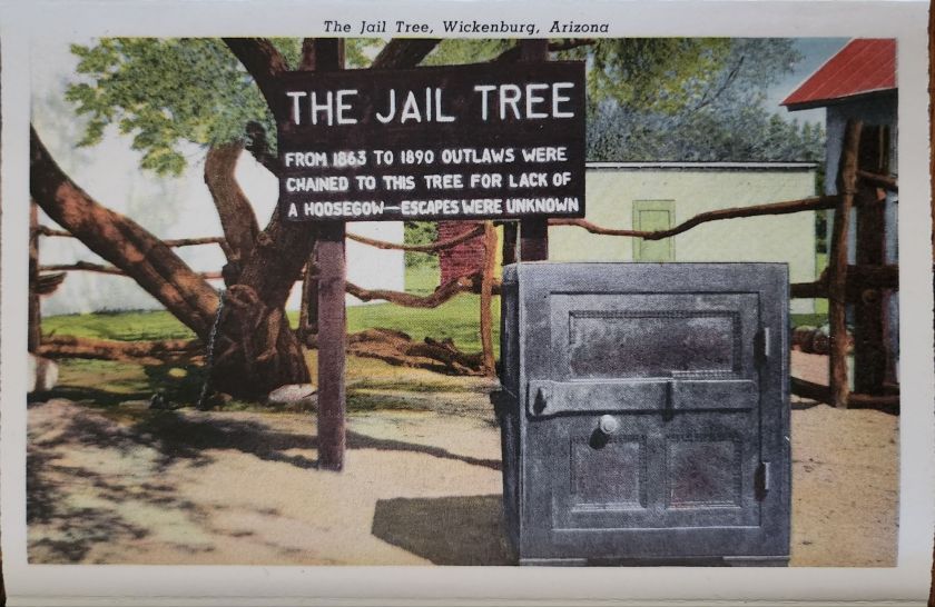
Each stop pulsed with its own character. Jerome clung to mountainsides, mining copper. Prescott sprawled as a ranching center and former territorial capital. Wickenburg lured visitors with dude ranch culture. Williams crowned itself “Gateway to the Grand Canyon.” These weren’t pit stops but destinations, each welcoming tourist dollars from America’s growing car culture.
Postcard Economy
These postcards bear the stamp of Curt Teich & Co., a Chicago printing giant that drove America’s postcard industry from the 1930s through 1960s. German immigrant Curt Teich founded the company in 1898 and revolutionized postcard production. His linen postcards introduced soft textures and blazing colors.
Teich built an industrial empire through local connections. Photographers roamed America, documenting main streets and natural wonders. In Chicago, artists hand-colored black and white photographs, enhancing reality to seduce buyers and ultimately define a social aesthetic.
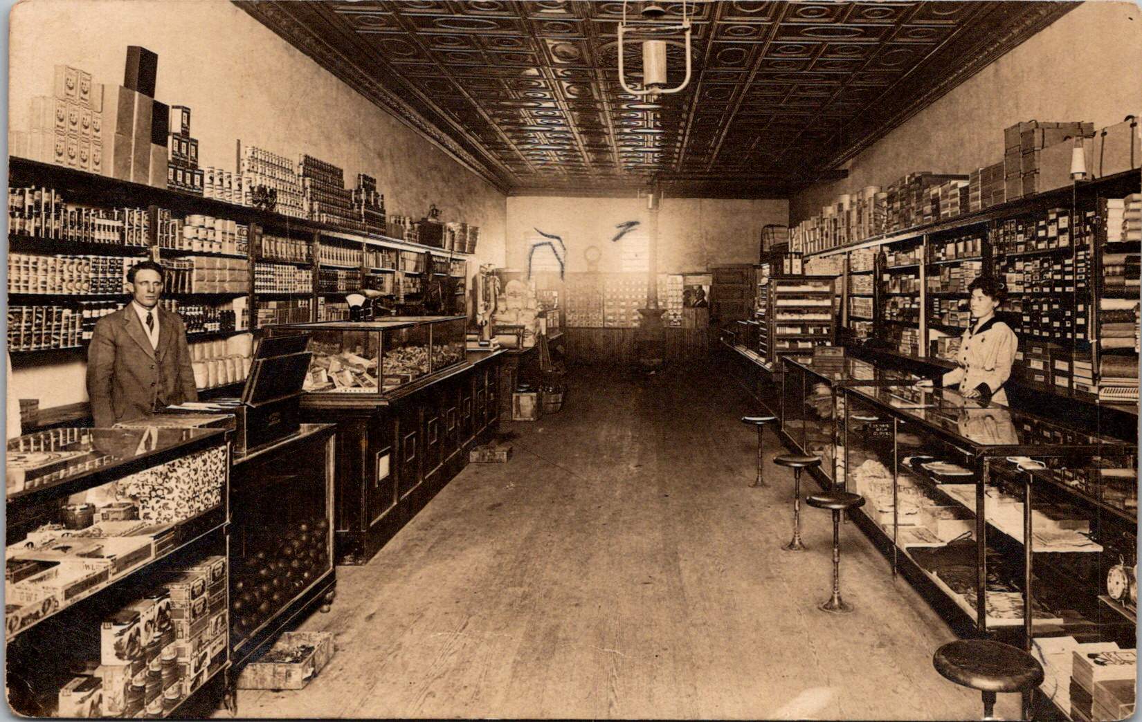
Behind every postcard rack stood a web of relationships, too. Hotel owners, gas station attendants, and gift shop operators ordered cards from Teich’s catalog or commissioned custom designs featuring their establishments. Postcards advertised businesses, provided affordable souvenirs, and satisfied the social duty to send word home.
Long-distance calls cost fortunes. Letter-writing devoured time. Postcards offered quick connection and proof of adventure. They were quick and easy evidence that the sender had escaped ordinary life for landscapes of impossible beauty. For travelers, buying and mailing postcards proved both pretty and practical.
The typical buyer belonged to America’s emerging middle class, newly mobile through car ownership and paid vacations. Families drove from California to see the Grand Canyon. Retirees took first cross-country trips. Young couples honeymooned across the Southwest. Many experienced the American West for the first time. Postcards helped them process and share encounters with the sublime.
Selecting, writing, and mailing postcards became part of American vacation ritual. Weather beautiful, wish you were here—heartfelt sentiments that bridge extraordinary experience and ordinary communication.
These postcards transcend tourist kitsch. They document a pivotal moment when the West was packaged and sold as leisure destination. Enhanced colors and idealized compositions reflect not just Arizona’s appearance, but how Americans wanted to see it—as endless possibility, natural wonder, and escape from urban routine.
‘Greetings from…’ designs have rippled through visual culture for well over a century, telling the stories of how we see ourselves and our places.
A stone dropped into still water creates concentric circles that radiate outward. This physical phenomenon is a powerful metaphor for how cultural ideas spread through time and across media, especially visual motifs of place. Certain visual vocabularies persist, evolving with technologies while maintaining essential characteristics.
American statehood, regional identity, and natural heritage have rippled through various media over the past century. Iconic ‘large letter’ postcards, commemorative postal stamps, murals and more—all help us trace a fascinating journey of cultural transmission through the broader currents in American history, industrial development, and visual communication.
Gruss Aus… from Germany
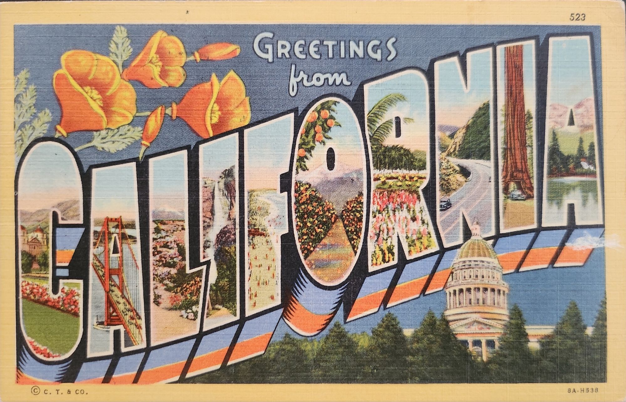
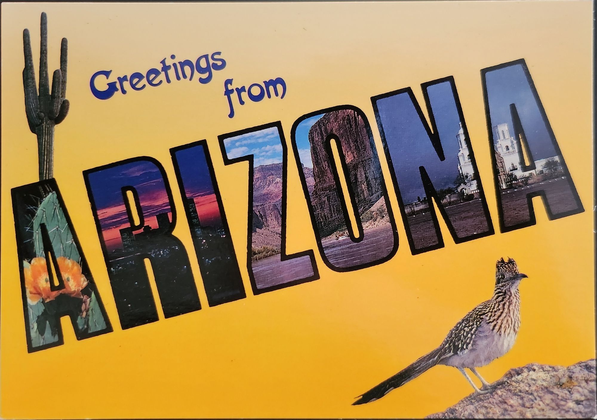
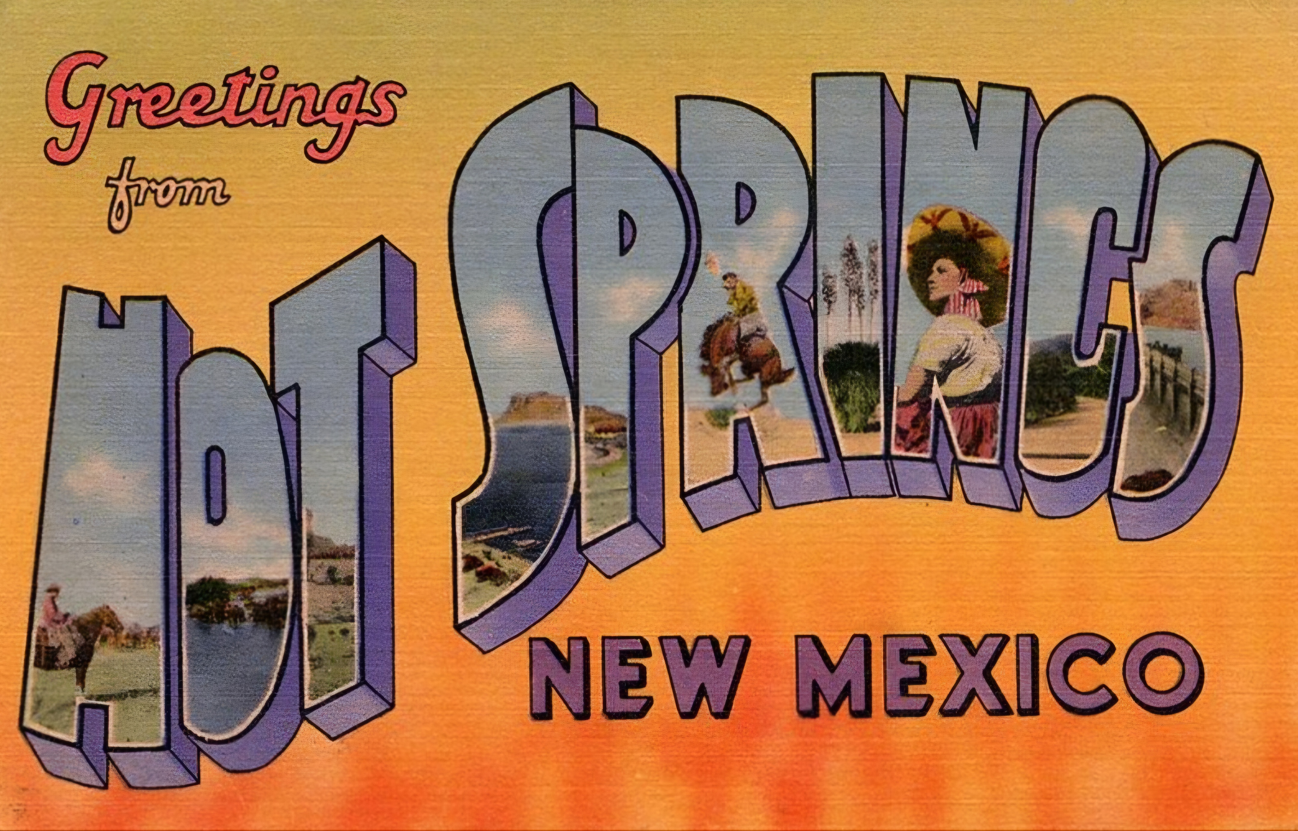
“Greetings From…” postcards emerged in 1890s Germany. The early examples of Gruss Aus cards featured the name of a location rendered in bold, three-dimensional letters with miniature scenes of local landmarks contained within. More common postcards of the day feature detailed illustrations of castles and later photographs. This new design cleverly packed maximum visual information into the limited space, creating an instantly recognizable format that would soon spread internationally.
New American Icons
The transmission of this visual language to America came through a German immigrant named Curt Teich, who arrived in the United States in 1895. After establishing his printing company in Chicago in 1898, Teich would transform American visual culture through the mass production of postcards. Following a visit to Germany in 1904, he successfully imported the Gruss Aus style to the American market, adapting it to suit American sensibilities and landscapes.
The true flowering of Teich’s vision came in 1931 with the introduction of his linen-textured postcards. Printed on high-quality paper with a distinctive fabric-like texture, these cards employed vibrant colors and airbrushing techniques that created a hyperreal aesthetic. The technical innovation of the linen card allowed for faster drying times and more saturated colors, resulting in postcards that depicted America in an optimistic, idealized light—a stark contrast to the harsh realities of the Great Depression era in which they first appeared.
Teich’s business savvy was as important as his technical innovations. He employed hundreds of traveling salesmen who photographed businesses and worked with owners to create idealized images for postcards. This approach not only generated business but also shaped how Americans visualized their own landscapes and communities. The Curt Teich Company would eventually produce over 45,000 different linen postcard subjects in just two decades.
The visual language of these postcards—bold lettering, vibrant colors, and idealized scenes—became firmly embedded in American visual culture during the 1930s through 1950s. As automobile ownership increased and the highway system expanded, these postcards played a crucial role in shaping Americans’ understanding of their own geography and national identity. They were both records of places visited and aspirational images of places to be seen.
State Birds and Flowers
Parallel to the development of the large letter postcard, another form of state-based visual identity was taking root—the formal designation of state birds and flowers. Most American states adopted these symbols between the 1920s and 1940s, often through campaigns involving schoolchildren, women’s clubs, and conservation organizations.
These officially designated natural symbols provided another vocabulary for expressing regional identity, one rooted in the natural world rather than the built environment. While large letter postcards typically highlighted human achievements—city skylines, hotels, roadways—state birds and flowers emphasized the distinctive natural heritage of each region. Together, these complementary systems of regional representation provided Americans with a rich visual language for their diverse nation.
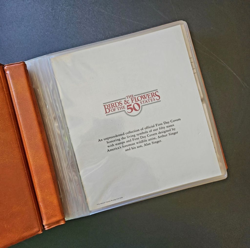
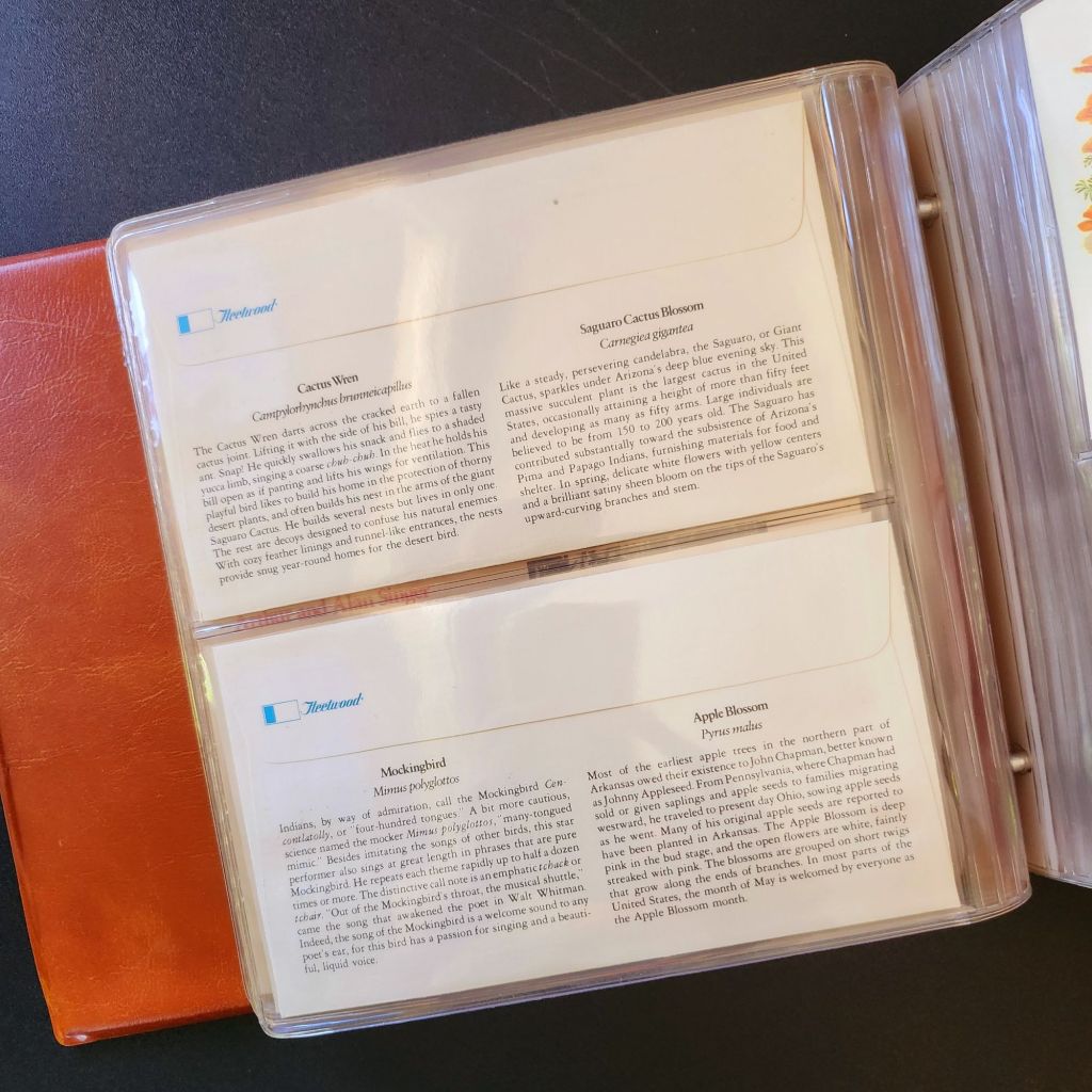
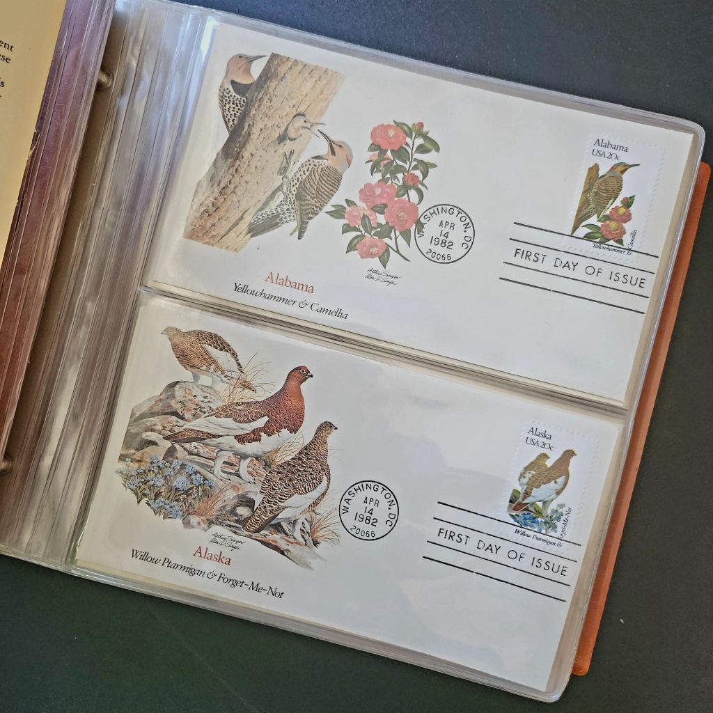
In 1978, the Fleetwood company commissioned father-son wildlife artists Arthur and Alan Singer to create 50 original paintings of state birds and flowers. These watercolor paintings caught the attention of U.S. Postal Service officials, who recognized their exceptional quality and decided to feature them on commemorative stamps. Released on April 14, 1982, the 20-cent State Birds and Flowers stamp collection was another big moment in the ripple effect.
Arthur Singer painted the birds while his son Alan rendered the flowers, creating unique artwork for each of the 50 stamps. The collaboration between father and son added another dimension to this cultural transmission—the passing of artistic traditions and approaches from one generation to the next.
The Fleetwood company published a complete album featuring First Day Covers of these stamps. These decorative envelopes included additional information about each state’s natural heritage, creating a beautifully bound volume that was both aesthetically pleasing and informative. The Birds & Flowers of the 50 States album is now a cherished collectible, a visual catalog of national natural heritage in a single, beautifully presented format.
Greetings from the Post Office
Twenty years later, the visual language of the large letter postcard experienced a revival through another stamp collection. On April 4, 2002, the USPS issued the ‘Greetings from America’ stamps, designed by Richard Sheaff and illustrated by Lonnie Busch. These stamps paid direct homage to the large letter postcards of the 1930s and 1940s, recreating their distinctive style for a new generation.
Each of the 50 stamps featured the name of a state in large, three-dimensional letters containing images of iconic landmarks and scenic vistas. The stamps were initially released as 34-cent denominations, but due to a rate change, they were reissued with 37-cent denominations on October 25, 2002. Here is another circular moment—a postal medium paying tribute to a postcard tradition that had itself been a popular means of commemorating places visited.
These stamps connected with older Americans who remembered the original postcards. Younger generations encountering the style for the first time recognized both the nostalgic and contemporary appeal. The vibrant colors and bold, three-dimensional lettering still effectively communicated a sense of place and regional pride, proving again the resilience of this visual vocabulary.
Even Larger Letters
Artists Victor Ving and Lisa Beggs took the large letter postcard to a whole new scale. Starting in 2015, the Greetings Tour has produced dozens of murals that transform the two-dimensional postcard design into monumental public art.
A grand dimensional leap—a design meant to be held in the hand scaled to the size of a building. The murals maintain the core visual elements of the large letter design while incorporating contemporary references and local touchstones. In a delightful twist, these murals have themselves become tourist attractions with visitors posing for social media. The postcard mural is now a backdrop for new images to be shared globally.
The artists also create custom digital designs for corporations, events, and retail spaces, maintaining the vintage aesthetic while adapting it to contemporary contexts. This commercialization represents another ripple in the cultural transmission of the large letter design, as it moves from public art back into the commercial realm that originally produced the linen postcards.
Digital Doppelgangers
As graphic design software became increasingly sophisticated and accessible in the late 20th and early 21st centuries, the visual language of large letter postcards found new life in digital recreations. Graphic design tools enable designers to quickly recreate the distinctive three-dimensional lettering and image-filled characters of the classic postcards.
AI Generation
Online design platforms have further opened access to this aesthetic, offering templates that approximate the large letter style without requiring specialized skills. Now small businesses, community organizations, and individuals can incorporate elements of this visual tradition into their communications, expanding the reach of this design vocabulary beyond professional designers.
With a phrase like “create an image of a vintage large letter postcard from Arizona,” most anyone can generate a decent design in seconds. Like the old days of digital clip-art, the initial attempts lack craftsmanship and historical accuracy. Still, they are a new democratization of this visual vocabulary, making it more accessible to professional designers and enthusiasts alike, though perhaps for different reasons.
This latest development completes a fascinating loop—from specialized industrial printing processes that required substantial investment and technical expertise, to digital design tools requiring professional training, to AI generation requiring only the ability to formulate a design concept and the text prompt. With each technological advancement, the barriers to producing these distinctive visual representations have lowered, while the core elements of the design has persisted.
Visual Persistence
From German Gruss Aus postcards to AI-generated images—our journey demonstrates the remarkable resilience of certain visual vocabularies across time, technologies, and cultural contexts. Despite dramatic changes in production methods, from specialized lithographic presses to neural networks, the essential visual grammar of these designs remains recognizable.
This persistence has a woven quality—the ability to render and replicate a sense of place over time. Whether in linen postcards, commemorative stamps, public murals, or digital images, the large letter design and state symbol motifs combine to convey regional identity and pride over time. Their continued relevance suggests that certain visual solutions, once discovered, become an architecture that generations continue to appreciate and adapt for new uses.
We also feel the ripple effect in the broader patterns of American history— immigrants bringing skills and technology to American shores, industrial innovation creating new visual possibilities, the automobile age changing how Americans experienced nature and themselves, and digital technology transforming how we create and share images. Through it all, the distinctive visual language pioneered by Curt Teich and others continues to evolve.
What new ripples lie ahead? Perhaps augmented reality will allow us to step into these designs. Or new materials and technologies will adapt them yet again for uses we don’t yet comprehend. Whatever comes next, we know that cultural transmission does have a distinguishing mark—it ripples outward in both calculable and unexpected ways, influenced by technology, economics, and human inspiration, creating patterns that can be traced across generations.
For Additional Reading
Meikle, Jeffrey L. (2016). Postcard America: Curt Teich and the Imaging of a Nation, 1931-1950. University of Texas Press. Publisher’s page
“The Immigrant Story Behind the Classic ‘Greetings From’ Postcards.” Smithsonian Magazine. (2018). Read online
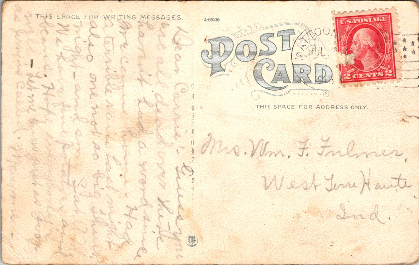
Sisters Mayme and Carrie stay in touch as Mattoon IL grows from a creek-side town to a modern crossroads before the war, 1910-1918.
Between 1910 and 1918, a series of postcards traveled between Mattoon, Illinois, and St. Mary’s, Indiana. On one end was Mayme, the author, who had made her home in the bustling railroad town of Mattoon. Her sister Carrie, who remained in St. Mary’s, received and kept the cards, now more than a century old. These correspondence cards—adorned with images of Mattoon’s infrastructure and landmarks—captured more than just personal exchanges between siblings. They documented a profound moment in America’s transformation from a rural society to an industrialized nation, with small Midwestern cities like Mattoon serving as microcosms of this national metamorphosis.
Nature and Community
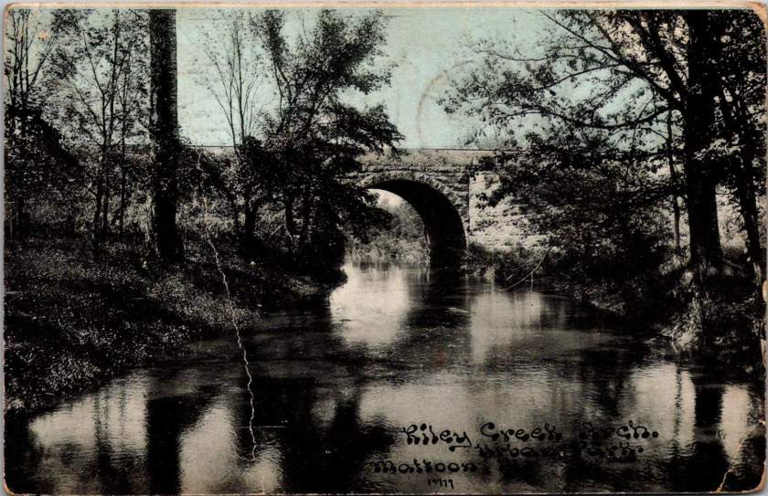
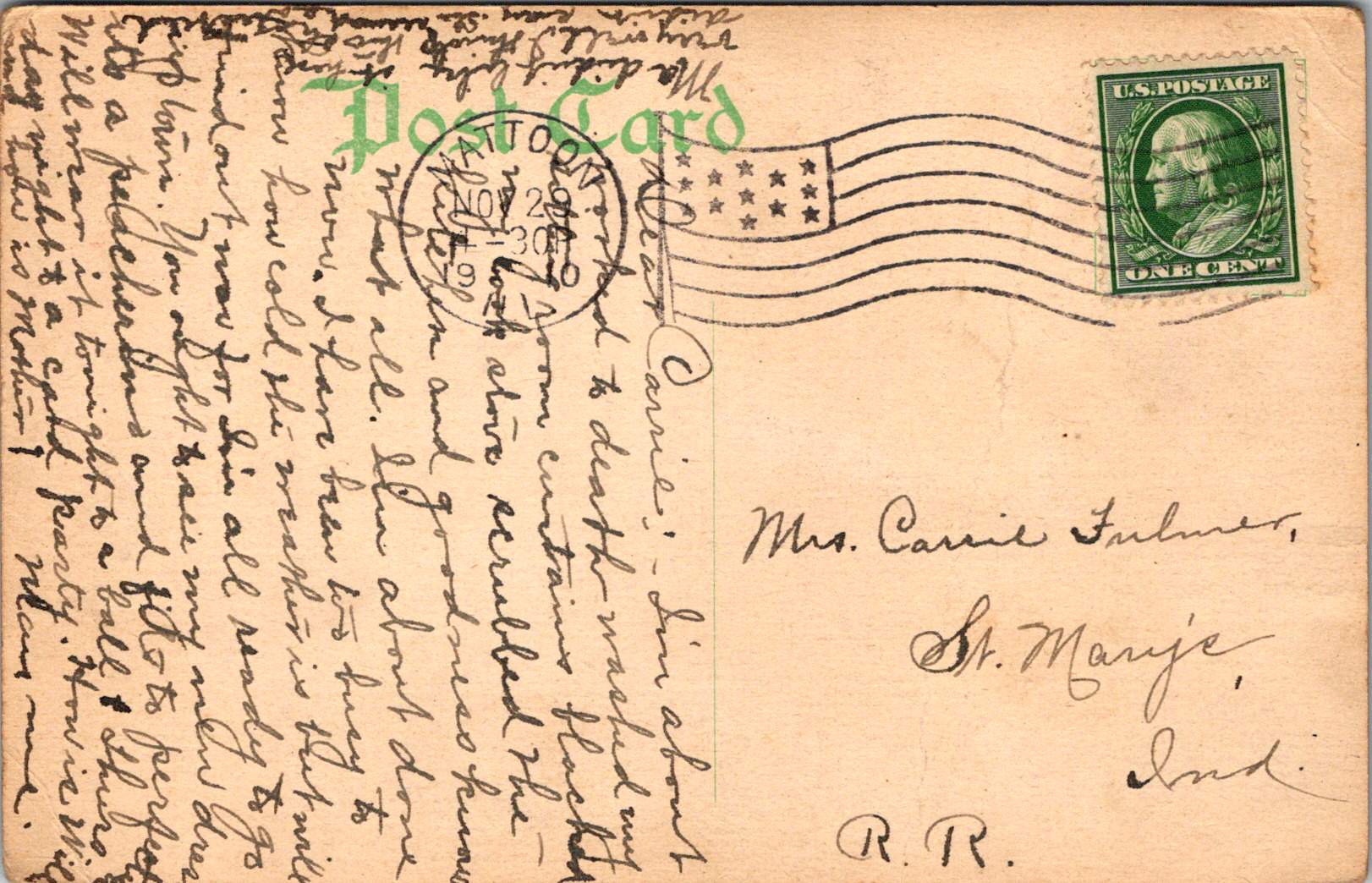
Mayme sent the first postcard on November 29, 1910, bearing an image of Riley Creek with its stone bridge arch—a glimpse of the natural landscape that surrounded the growing town of Mattoon. This serene view of the creek precedes the increasingly industrialized town that Mattoon was becoming. Founded in 1855 and named after William B. Mattoon, a partner in the construction firm that built the Illinois Central Railroad, the town served as a critical junction between the Illinois Central and the Terre Haute & Alton railroads.
The stone bridge spanning Riley Creek represents essential infrastructure that connected different parts of the community and facilitated transportation within and beyond the town. Such bridges were vital elements in expanding road networks that would eventually complement the railroad’s dominance in transportation.
Mayme wrote about burdensome domestic chores and a new dress for an upcoming ball that she would wear again to a Thursday card party. She was participating in the social life of a community that was growing from its natural surroundings into a prosperous small city.
I’m about worked to death, washed my sitting room curtains, blackened my cook stove, scrubbed the kitchen and goodness knows what all…
Industry and Infrastructure
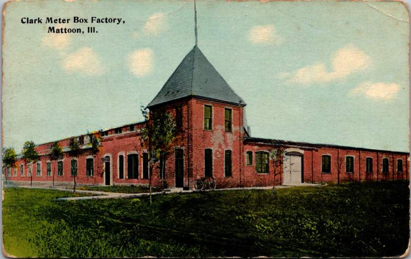
By 1914, Mayme was sending postcards that highlighted Mattoon’s industrial development. One image showcased the substantial Clark Meter Box Factory, with its distinctive tower and solid brick construction. America’s industrial expansion was moving beyond major manufacturing centers into smaller towns and cities. The factory produced meter boxes for utilities—products essential to the electrification and modernization sweeping across America in the early 20th century.
While Mayme reported her handiwork at home like knitting, crocheting, and gardening, the meter box factory represented the industrial world that was transforming the American economy. Manufacturing facilities like this provided jobs that attracted workers and their families to communities like Mattoon, contributing to urban growth and economic diversification beyond traditional agricultural and railroad employment.
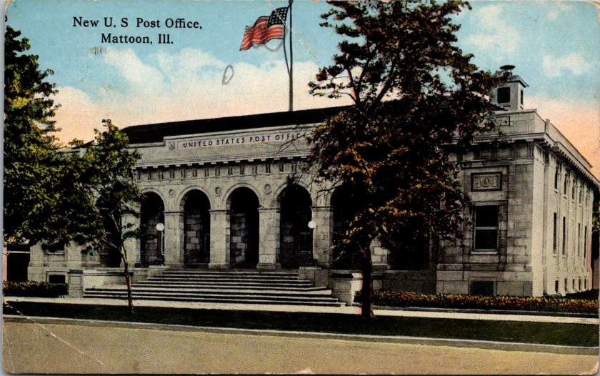
Also in 1914, Mayme sent a postcard showcasing Mattoon’s “New U.S. Post Office,” a stately neoclassical building with grand arches and an American flag prominently displayed. This wasn’t merely a functional building but a statement of federal presence and civic achievement. During this period, post offices in American towns weren’t just mail facilities—they were symbols of connection to the national government and markers of a community’s importance.
The grandeur of Mattoon’s post office reflected the federal government’s expanding role in American life—a time when postal services were being standardized and rural free delivery was connecting previously isolated communities. The building is a physical manifestation of the communication network that allowed Mayme’s postcards to travel to Carrie with such regularity.
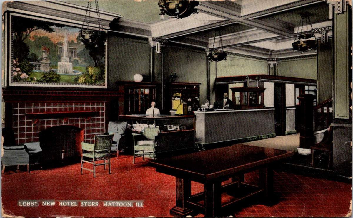
Hospitality and Social Life
In 1915, Mayme’s postcard featured the lobby of the Hotel Byers, offering a glimpse into the social aspirations of Mattoon during this era. The elegant interior, with its decorative fireplace, ornate hanging lamps, and comfortable seating area, represented the town’s desire to provide metropolitan amenities. Hotels like the Byers served not just as lodging for travelers but as social centers for the community.
For Mayme, the hotel offered refined experiences and social mobility. The hotel’s ballroom would have served as the venue for the dances she mentioned, while its dining room hosted the card parties that figured prominently in middle-class social life. These gatherings provided opportunities for networking across class lines, connecting domestic and railroad workers’ families with merchants, professionals, and industry owners.
The “new” Hotel Byers replaced an older establishment of the same name that had served Mattoon since the late 19th century. This newer iteration, constructed around 1914, was a modern hotel that served as crucial infrastructure for a growing city with ambitions to attract business and industry. The hotel’s construction coincided with a period of economic optimism in Midwestern towns before America’s entry into World War I, when many similar communities were upgrading their commercial buildings as part of the broader Progressive Era emphasis on civic improvement.
Railroad Town
The last postcard featured the “Illinois Central Subway” in Mattoon, which wasn’t an underground transit system but a distinctive sunken railway passage that bisected the town. This engineering feature allowed trains to pass through without disrupting street-level traffic, a forward-thinking design that embodied the marriage of infrastructure and everyday life. The buildings lining the upper level of the postcard show Mattoon’s commercial district that grew directly alongside the railroad—their proximity a testament to the symbiotic relationship between commerce and transportation.
Hope everybody’s well. Let me know just as soon as Jerry is called…
War Shadows
By July 1918, Mayme’s tone had shifted. Her ominous request to let her know “as soon as Jerry is called” reveals the long shadow cast by World War I over these Midwestern communities. The United States had entered the war in April 1917, and the military draft was touching families across the nation.
The war accelerated many of the industrial and social changes already underway in towns like Mattoon. Labor shortages created by military service opened new employment opportunities, particularly for women. The focus on wartime production reshuffled economic priorities. And the specter of loss hung over families, even as daily life continued.
While Mattoon’s industrial capacity may have contributed to the war effort through manufacturing, the human cost was felt intensely in personal correspondence like this.
Two Sisters
Throughout these exchanges, we see two different life trajectories embodied by the sisters. Mayme chose life in a developing industrial town, participating in its social events and domestic economy while witnessing its physical transformation. Her postcards—featuring Mattoon’s architectural achievements and industrial facilities—suggest a certain pride in her adopted community.
Carrie eventually married a man named Earl, and they moved around a bit. Both sisters maintained domestic skills—knitting, crocheting, sewing, and food production—that connected them in conversation even as the world around them changed. Their correspondence across state lines preserved family bonds—a common experience as increased mobility dispersed American families. The railroad and postal service made this ongoing connection possible.
Early postcards represent a convergence of innovations in printing, photography, and postal delivery—each with its own players, craft, and history. The emergence of the simple picture postcard depended on a complex international network of industries, technologies, and regulations developed in the prior century.
Art for the Masses
The development of chromolithography in the late 19th century provided the technological foundation for colorful mass-produced postcards. Though lithography itself dated back to 1796, when Alois Senefelder developed the process in Munich, the refinement of color lithography reached new heights in the 1870s-90s, with different national styles emerging.
German printers particularly mastered the technique of creating separate limestone printing plates for each color, allowing for vibrant multi-color images that previously would have required expensive hand-coloring. A typical color postcard might require five to fifteen separate printing runs, with perfect registration between colors. This level of precision required specialized equipment and highly trained craftsmen.
German chemical industries produced superior inks and dyes, giving their postcards more vibrant and stable colors than competitors. Companies like BASF and Bayer, originally founded as dye manufacturers, provided innovative colorants specifically formulated for printing applications.
The German city of Leipzig emerged as a center of printing excellence, with firms like Meissner & Buch establishing international reputations for quality. German chromolithography was so superior that even American publishers would often have their designs sent to Germany for printing, then shipped back to the United States for distribution—at least until tariff changes in 1909 made this practice less economical. Publishers like Raphael Tuck & Sons maintained offices in Germany despite being headquartered in London, simply to access German printing expertise.
While Germany led in technical quality, French postcards developed a reputation for artistic sophistication. Paris publishers like Bergeret and Levy et Fils produced cards featuring Art Nouveau styles and artistic photographic techniques. The French market also developed distinctive “Fantaisie” postcards featuring elaborate designs with silk applications, mechanical elements, or attached novelties. These cards pushed the boundaries of what a postcard could be, turning functional communication into miniature works of art.
British publishers like Raphael Tuck & Sons, J. Valentine & Co., and Bamforth & Co. showed particular commercial acumen. While they didn’t match German printing quality or French artistic sensibility, British firms excelled at identifying market opportunities and consumer trends. The British pioneered specialized categories like the seaside postcard and led in developing postcards for specific holidays and occasions.
Photographic Reality
While lithographic postcards dominated the market, photography increasingly influenced postcard production. The collodion wet plate process (1851) and later the gelatin dry plate (1871) made photography more accessible. The development of halftone printing in the 1880s allowed photographs to be reproduced in print media without manual engraving, creating more realistic imagery.
A revolutionary moment came in 1903 when Eastman Kodak introduced “Velox” postcard paper. This pre-printed photographic paper had postcard markings on the back and a light-sensitive photo emulsion on the front. Combined with Kodak’s 3A Folding Pocket camera, which produced negatives exactly postcard size (3¼ × 5½ inches), this innovation created the Real Photo Postcard (RPPC).
The acquisition of Leo Baekeland’s Velox photographic paper company in 1899 for $1 million provided a crucial technological component. Velox paper could be developed in artificial light rather than requiring darkroom conditions, had faster developing times, and produced rich blacks and clear whites—all critical qualities for postcard production.
The RPPC format found particular success in America, where the vast geography meant many small towns would never appear on commercially printed postcards. Local photographers throughout the country created RPPCs of main streets, businesses, schools, and community events, documenting American life with unprecedented comprehensiveness.
International Postal Agreements
Even the most beautifully produced postcard would be meaningless without an efficient system to deliver it. The standardization of postal systems in the late 19th century created the infrastructure necessary for postcards to flourish.
A watershed moment for international mail came with the Treaty of Bern in 1874, establishing the General Postal Union (later renamed the Universal Postal Union or UPU). This organization created the first truly international postal agreement, initially signed by 22 countries, primarily European nations. The United States joined the UPU in July 1875, connecting the American postal system to the standardized European networks. The U.S. had introduced its own government-issued postal cards in 1873, but joining the UPU meant these could now be sent internationally under consistent regulations.
Several key UPU Congress developments shaped the postcard’s evolution. The 1878 Paris Congress renamed the organization to Universal Postal Union. The 1885 Lisbon Congress standardized the maximum size for postcards (9 × 14 cm). The 1897 Washington Congress set new international regulations for private postcards. The 1906 Rome Congress standardized the divided back format internationally.
Perhaps the most crucial postal development for postcard popularity was the divided back. Great Britain introduced this format in 1902, with France and Germany following in 1904, and the United States in 1907. Before the divided back, the entire reverse of a postcard was reserved for the address only, with messages having to be squeezed onto the front, often around the image. The new format allocated half the back for the address and half for a message, dramatically improving postcards’ utility as correspondence tools.
European Delivery Systems
European railway networks proved ideal for postal delivery, creating a remarkably efficient system. By the 1870s-80s, most European countries had developed comprehensive rail networks. Germany alone had over 24,000 miles of railway by 1895, despite having a land area smaller than Texas.
Railway mail cars (“bureaux ambulants” in France, “Bahnpost” in Germany) sorted mail en route. These mobile sorting offices made the system highly efficient, with mail sorted by destination while in transit. Railway timetables were coordinated to allow for mail transfers at junction points, creating an integrated system even across national borders.
Major routes often saw multiple mail trains per day. The Berlin-Cologne line, for example, had four daily postal services by 1900. This meant that postcards could be delivered between major cities within a day, creating a communication speed previously unimaginable.
For urban delivery, European cities developed even more innovative systems. Perhaps most remarkable were the pneumatic tube networks installed in several European capitals. Paris launched its “Pneumatique” in 1866, Vienna’s “Rohrpost” began in 1875, and Berlin built an extensive pneumatic network from 1865. These systems used compressed air pressure to propel cylindrical containers through networks of tubes. The carriers could hold several postcards or letters and traveled at speeds up to 35 kilometers per hour. Paris eventually developed a pneumatic tube network extending 467 kilometers, allowing for delivery times of under 30 minutes across the city. A morning postcard could receive an afternoon reply—creating a nearly conversational pace of written communication.
American Adaptations
The United States faced different geographical challenges. The vast distances between population centers meant that the same-day delivery common in Europe was impossible between major cities. Nevertheless, the American postal system developed impressive efficiency given these constraints.
The U.S. Railway Mail Service, officially established in 1869, became the backbone of American mail delivery. By 1900, more than 9,000 railway postal clerks were sorting mail on trains covering more than 175,000 miles of routes. While European countries measured mail routes in hundreds of miles, American routes stretched thousands of miles across the continent.
American cities also experimented with pneumatic tube systems, though they were less extensive than European counterparts. New York City’s system, operating from 1897 to 1953, eventually covered 27 miles with tubes connecting post offices in Manhattan and Brooklyn. At its peak, it transported 95,000 letters per day, or about 30% of all first-class mail in the city.
Within cities, frequent delivery became the norm. By 1900, many American urban areas offered at least four daily mail deliveries, with some business districts receiving up to seven deliveries per day. This made postcards a practical means of daily communication within city limits, much as they were in Europe.
The efficiency and economy of postcards made them ideal for routine business communications. Companies developed pre-printed postcards for order acknowledgments, shipping notifications, payment reminders, meeting confirmations, service calls, and appointment reminders. These standardized communications reduced clerical costs while providing a paper trail of business interactions. The divided back format was particularly valuable for business purposes, allowing for both a standardized message and customized details.
Perhaps no industry benefited more from postcards than tourism. Hotels, resorts, transportation companies, and local chambers of commerce all commissioned postcards that served as both souvenirs and advertisements. Visitor bureaus coordinated with publishers to ensure their destinations were well-represented in the marketplace. The economic impact was substantial—a scenic view postcard might cost a penny to produce, sell for a nickel, and generate hundreds of dollars in tourism revenue by inspiring visits. This multiplication effect made postcards perhaps the most cost-effective tourism marketing tool ever devised.
On the personal side, postcards fulfilled a spectrum of communication needs. In an era when the telephone was still a luxury and telegrams were expensive, postcards filled the gap between costly immediate communication and slower formal letters. Their affordability and efficiency made them ideal for routine messages. At half the postage rate of letters in many countries, postcards democratized written communication for working-class people who might otherwise limit correspondence due to cost. The postcard’s format encouraged brevity—a perfect medium for quick notes without the formality or length expected in a letter. In urban centers with multiple daily mail deliveries, postcards functioned almost like text messages, allowing people to make arrangements within hours.
Sending postcards from vacation destinations served as tangible proof of travel experiences. “Wish you were here” cards from resorts or tourist locations signaled social status and mobility. Recipients often displayed postcards on special racks or in parlor albums, using them as affordable decorative elements and evidence of their social connections. For people who rarely traveled, receiving postcards provided authentic glimpses of distant places through real photographs rather than artistic interpretations.
Perhaps most significantly for historical purposes, postcards—especially RPPCs—documented aspects of community life that would otherwise have gone unrecorded. Local events, buildings, streetscapes, and everyday activities were captured on postcards, creating a visual record of ordinary life at the turn of the century that has proven invaluable to historians. When natural disasters or significant events occurred, local photographers would quickly produce RPPCs documenting the situation. These cards spread visual news of floods, fires, celebrations, or notable visitors throughout the region, serving an early photojournalistic function.
While American postcard production initially lagged behind Europe in quality, US companies excelled at entrepreneurial adaptation. When the 1909 Payne-Aldrich Tariff Act increased import duties on foreign postcards, American firms rapidly expanded domestic production capabilities. When World War I cut off European imports entirely, American manufacturers stepped into the gap, developing new techniques and styles.
Beyond the Golden Age
Behind every seemingly simple postcard lies a complex history of industrial innovation, international cooperation, and social transformation—a paper-based predecessor to the digital networks that connect us today.
The Golden Age of postcards waned after World War I due to disruption of European production centers, rising postal rates, the growing popularity of telephones, and the emergence of new forms of mass media.
The era when postcards emerged was a crucial moment when ordinary people gained access to new visual communication tools. The democratization of image sharing pioneered by postcards foreshadowed later developments in visual communication. This visual history reminds us, from personal photographs to social media posts, the impulse to share visual snippets of our lives is a constant across time.
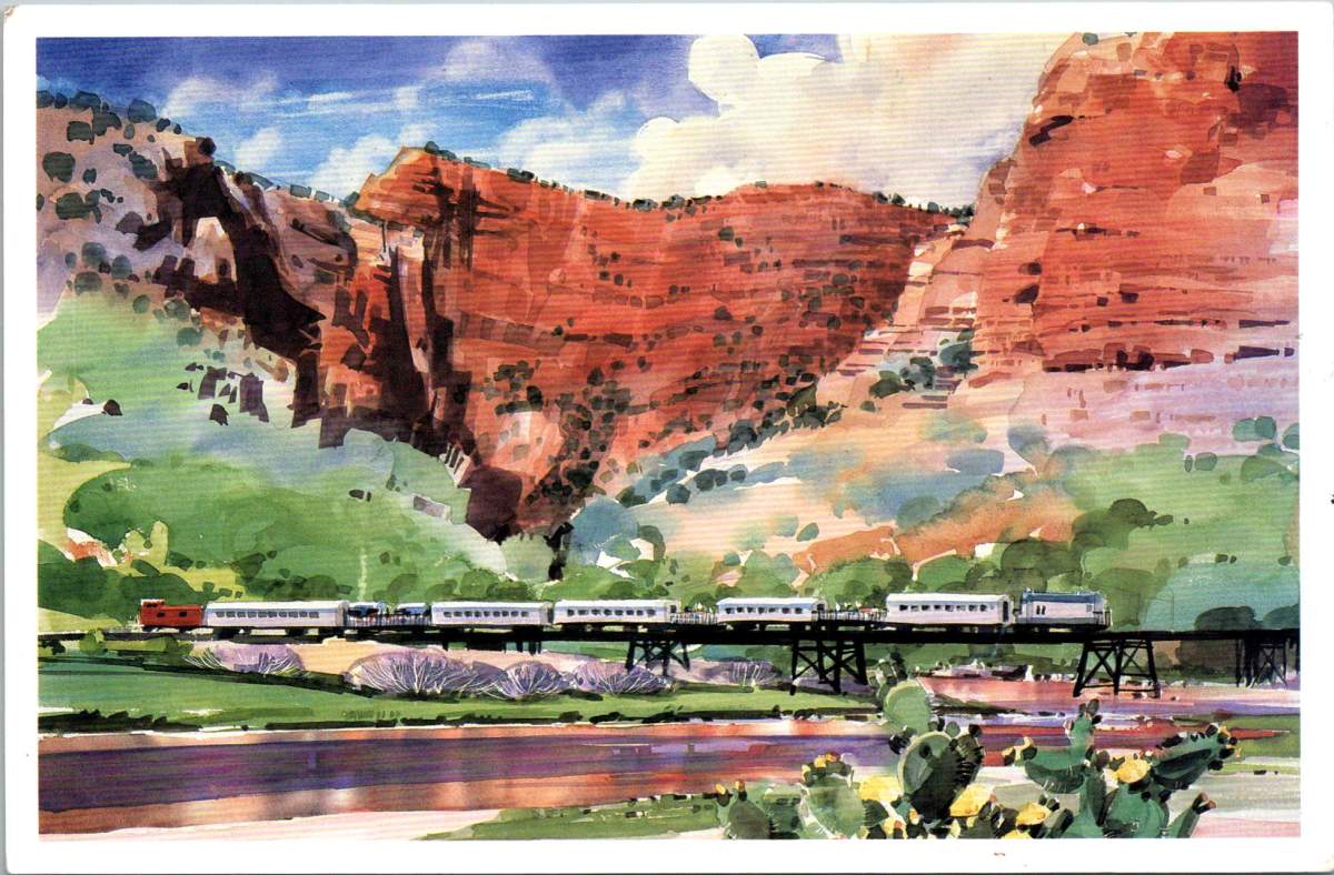
Arizona’s Verde Valley has inspired generations. Journey through this dramatic landscape where red cliffs greet green river valleys, and where an old mining railway now carries visitors through one of the Southwest’s most stunning canyons.
A striking watercolor dominates the front of a vintage postcard. The scene captures the essence of Arizona’s high desert: massive red rock canyon walls rise dramatically against a blue sky dotted with billowing clouds, while a silver passenger train glides across a trestle bridge below. The unknown artist’s watercolor brushwork renders the desert vegetation in soft greens, with prickly pear cactus dotting the foreground. The painting masterfully conveys both the monumental scale of the landscape and the delicate play of light across the rocky surfaces.
When the Verde Canyon Railroad winds through the high desert country of central Arizona, it follows ancient pathways. The Verde River carved this dramatic landscape over millennia, creating a riparian corridor that has attracted humans for thousands of years. Today’s passengers on the scenic railway see much the same view as the Sinagua people who built cliff dwellings here between 600 and 1400 CE, though the comfortable rail cars are a far cry from the precarious edges those early inhabitants deftly defied.
The river remains one of Arizona’s few perennial waterways, sustaining a complex ecosystem where desert meets riverbank. Towering cottonwoods and velvet ash trees create a canopy over the water, while sycamores and willows cluster along the banks. Native grape vines twist through the understory, and prickly pear cactus dot the rising canyon walls. This environment supports a rich variety of wildlife, from yellow-billed cuckoos and great blue herons to river otters and mule deer. Native fish species like the razorback sucker still navigate the waters their ancestors swam for millennia.
The human history of the valley reflects waves of settlement and industry. After the Sinagua, Yavapai and Apache peoples made their homes here. Spanish explorers gave the river its name – “verde” meaning green – marking the stark contrast between the river corridor and the surrounding desert. The late 1800s brought miners seeking copper, gold, and silver, transforming places like Jerome into boom towns. The railroad itself was built in 1912 to service the United Verde Copper Company’s mining operations, an engineering feat that mirrors our ancient ancestors.
Notable Arizona artists have interpreted this landscape. Ed Mell’s geometric, modernist approach emphasizes the monumental character of the canyon walls. Early pioneer Kate Cory combined artistic and ethnographic interests, documenting both landscape and culture during her years living among the Hopi. Merrill Mahaffey mastered the challenging medium of watercolor to capture the desert’s subtle light and atmosphere, teaching and inspiring so many along the way.
The artistic legacy of the region is inextricably linked to its unique quality of light. The clear, dry air creates what painters describe as crystalline clarity, especially during the “golden hours” of early morning and late afternoon. Artists employ various techniques to capture these effects: watercolorists leave areas of white paper untouched to suggest intense sunlight on rock faces, while building up transparent layers to show subtle color variations in shadowed canyon walls. The phrase ‘purple mountain majesties’ from Katharine Lee Bates’s “America the Beautiful” finds visual truth here, where the red rocks shift to deep purple at dawn and dusk, challenging artists to capture these dramatic transformations.
These artistic traditions remain vibrant today through institutions like the Sedona Arts Center, which hosts workshops, exhibitions, and the annual Sedona Plein Air Festival. These events draw artists from around the country to paint the red rock landscapes, continuing a legacy of artistic response to this unique environment.
The Verde Canyon Railroad itself represents a remarkable transformation from industrial resource to cultural attraction. When mining operations declined in the 1950s, the railroad continued operating for freight until the late 1980s. Its reinvention as a scenic railway in 1990 preserved both the industrial heritage and access to the canyon’s natural beauty, offering new generations a chance to experience this remarkable landscape where nature, history, and art converge.
In recent decades, the Verde Valley has emerged as a significant wine and food-producing region, adding another layer to its cultural landscape. The same mineral-rich soil that once yielded copper now nurtures vineyards, while ancient irrigation techniques inform modern water management practices. Local wineries have revived the area’s agricultural traditions, some of which reflect Spanish and Mexican heritage. The region’s restaurants increasingly reflect Native American heritage, too, combining indigenous ingredients with contemporary techniques. Native foods like prickly pear, mesquite, and local herbs appear on menus alongside wines produced from vineyards visible from the train’s windows.
Tourism in Arizona has evolved beyond simple sightseeing to embrace the complex tapestry of the region’s heritage. Visitors to the Verde Valley today might start their morning at an art gallery in Jerome, taste wines produced from hillside vineyards at lunch, and end their day watching the sunset paint the canyon walls from a vintage train car. This integration of historical preservation, artistic tradition, and culinary innovation exemplifies how the creative spirit that first drew people to these dramatic landscapes continues to evolve. The Verde Valley is home to each generation, who find new ways to interpret and celebrate the enduring connections between people and place.
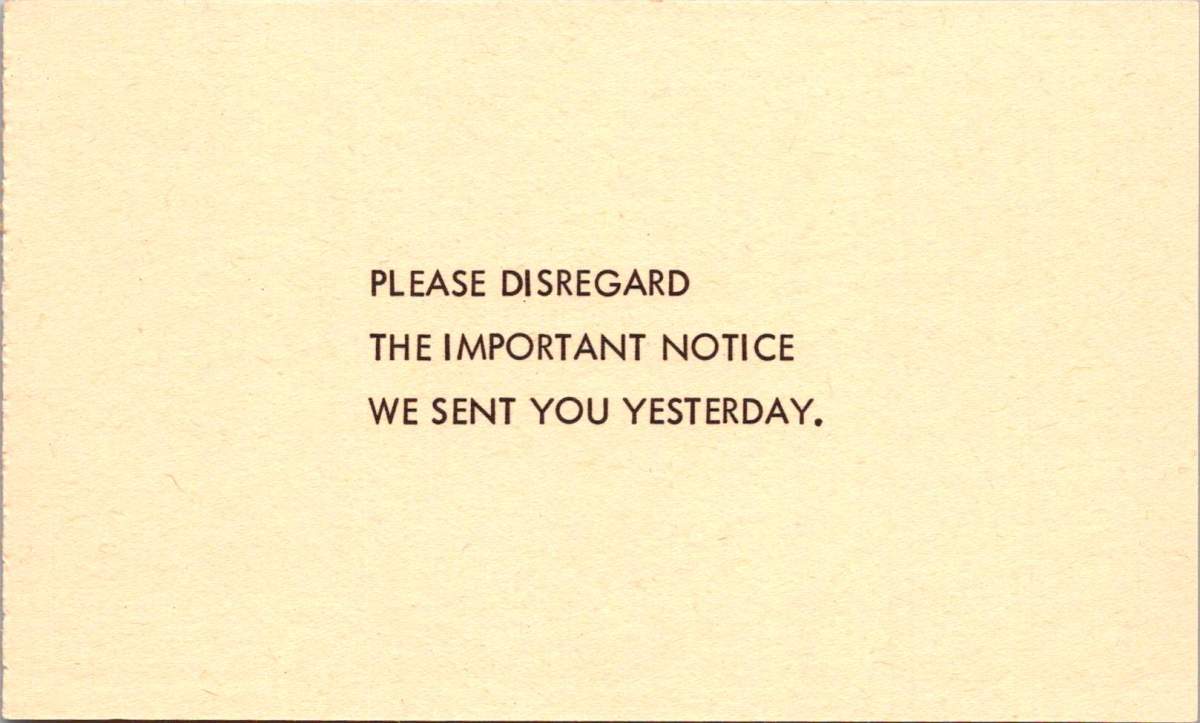
With just nine words, this 1964 parody postcard captures an era of bureaucratic absurdity. The genius lies in its perfect circularity: you can’t disregard a notice you never received. A logical paradox delivered in the stern capital letters of official communication.
This masterpiece of meta-humor was the centerpiece of “Nutty Notices,” a collection of satirical postcards published by Philadelphia’s GEM Publishing in 1964. The series went on to skewer everything from traffic enforcement to mattress tags, each card delivering bureaucratic absurdity like a stage clown wielding a rubber chicken.
Perfect for the spooky season, the next notice solemnly announces the recipient has won in an “Imminent Danger Sweepstakes” sponsored by a “Black Cat Society,” reassuring that previous recipients survived their subsequent accidents.
The collection unfolds like a greatest hits of paperwork problems. Another, from the stern-sounding “Bureau of Upholstery Tag Security,” threatens dawn raids over a removed mattress tag. A mock inheritance notice dangles a too-good-to-be-true fortune from a conveniently deceased fifth cousin, key details lost to a faulty typewriter.
These parodies emerged during a period of notable government expansion. The Great Society legislation of the Kennedy and Johnson administrations had launched numerous new agencies and programs, from the Peace Corps to Medicare. While many of these programs were popular, and have endured, they also generated unprecedented levels of paperwork and official communications in Americans’ daily lives.
The notices cleverly played on specific anxieties of the era: fear of government surveillance, concerns about traffic enforcement in the new Interstate era, and awareness of inheritance scams in an increasingly connected society.
The traffic violation notice, featuring President Lyndon B. Johnson, plays on LBJ’s notorious driving habits. The President was known for terrifying guests at his Texas ranch by driving his Amphicar (a German-made civilian amphibious vehicle) at high speeds toward the ranch’s lake, screaming about brake failure as his car plunged into the water. The vehicle was designed to float, but his unsuspecting passengers didn’t know that. This well-known presidential prank made the postcard’s joke particularly resonant with 1960s readers.
A good pun is still a kind of social capital, as all deadpanning dads know. The card below suggests an incredible win. The 1964 Plymouth Barracuda was a coveted car model, though overshadowed that year by the introduction of the Ford Mustang. The Barracuda featured a sloped fastback roofline and fold-down rear seats that created a large cargo area, making it both sporty and practical. The standard engine was a Slant-6, but buyers could opt for a more powerful V8 engine. Prices started at around $2,500 (approximately $22,000 in today’s dollars). By the end of the card, though, it’s all a bit fishy.
What makes these 1964 parodies fundamentally different from today’s deceptive communications is their clear satirical intent. The notices were obviously humorous, from their outlandish premises to their absurd escalations. They never attempted to deceive. The parodies didn’t seek to extract money, personal information, or action from recipients. The joke was the endpoint, and publishers and recipients understood these as entertainment, part of a broader tradition of bureaucratic satire.
Today’s deceptive communications often weaponize the same official-looking formats and bureaucratic language that these postcards once parodied. But modern scams aim to deceive rather than amuse, exploiting digital tools to create ever more convincing forgeries. Contemporary examples like phishing emails represent a darker evolution of institutional mimicry. While the 1964 notices laughed at authority’s pomposities, today’s deceptive communications abuse institutional authority for malicious purposes.
Long before memes spread political humor online, postcards served as a democratic medium for both serious political discourse and satirical commentary. During the Golden Age of postcards before World War I, suffragettes used them to promote women’s voting rights. The famous “Vinegar Valentines” of the Victorian era delivered stinging social critique through the mail. During World War II, patriotic postcards boosted morale while propaganda postcards spread messages both noble and nefarious.
These vintage parodies remind us that healthy skepticism toward official communications isn’t new—but the stakes have changed dramatically. In 1964, Americans could laugh at mock notices because real ones, while annoying, generally came through trusted channels with clear verification methods. Today’s digital landscape requires a more sophisticated type of visual and contextual literacy. We must balance healthy skepticism with the ability to recognize legitimate communications, while remaining alert to increasingly sophisticated forms of deception.
The “Nutty Notices” stand as charming artifacts of a time when bureaucratic busy-ness seemed worthy of laughter rather than alarm—when the worst thing a notice might do was create a paradox, not steal your identity. In an era of digital manipulation, we can look back nostalgically at a time when the most threatening official communication you might receive was a tongue-in-cheek warning about your mattress tags.
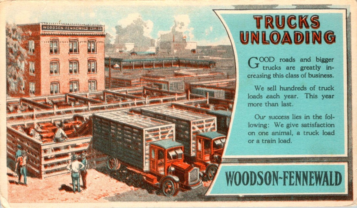
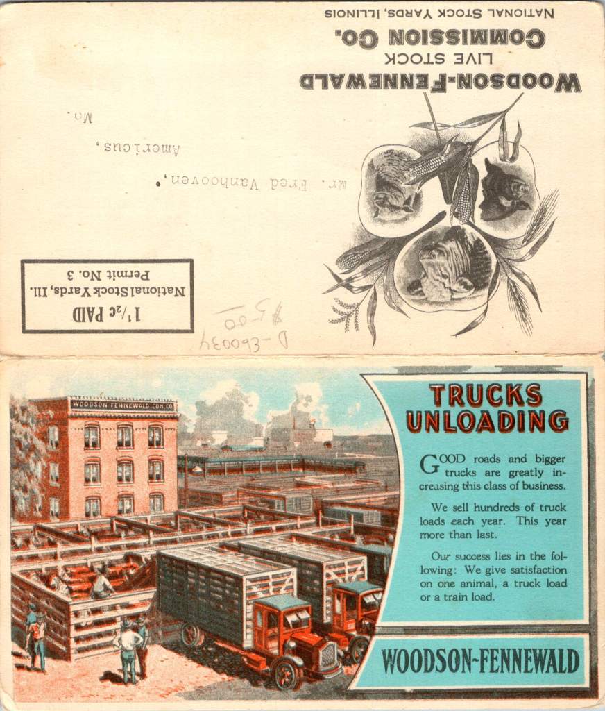
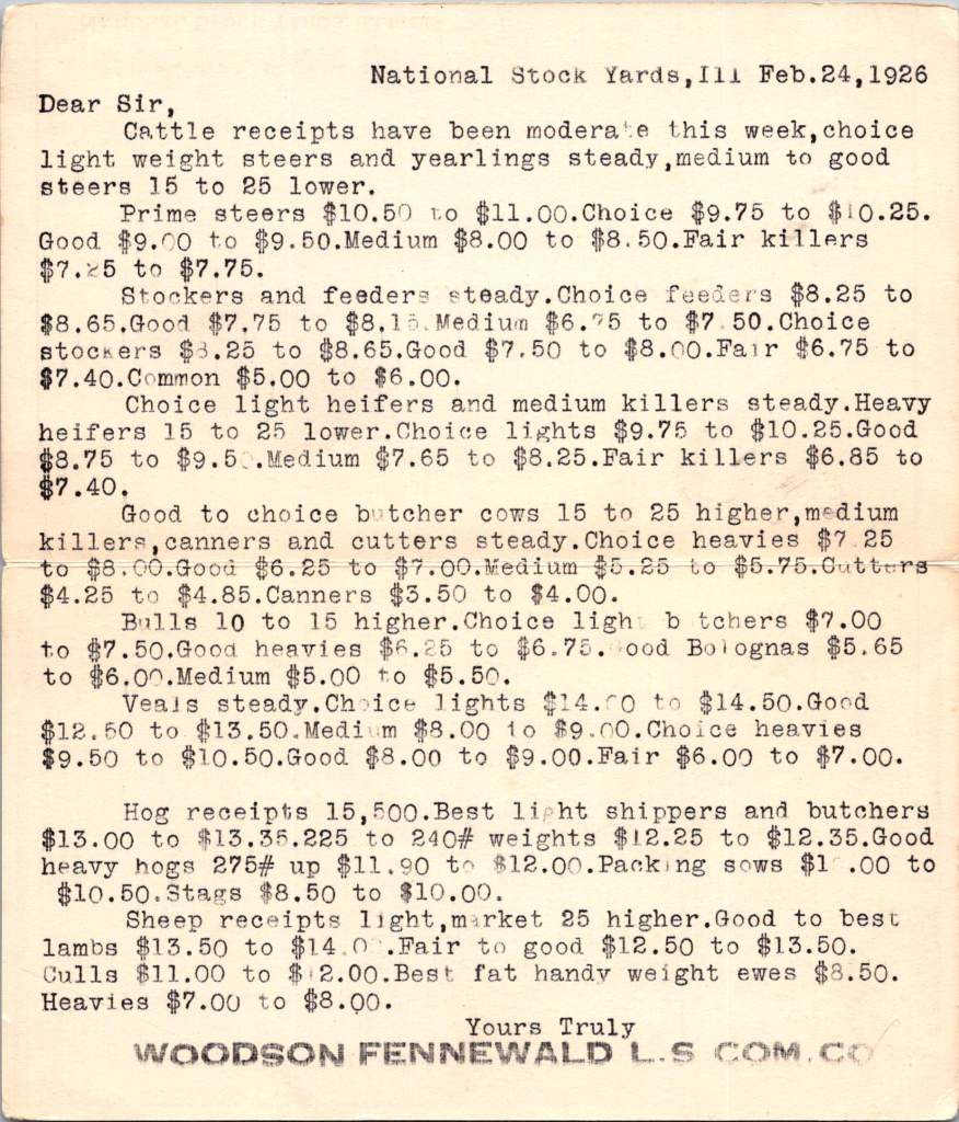
On a crisp February morning in 1926, Fred Van Hooven of Americus, Missouri, reached into his mailbox to find a postcard. His calloused hands grasp the card, his eyes lit up at the news: “Prime steers $10.50 to $11.00. Choice $9.75 to $10.25.”
The postcard is colorful, smartly-designed and professionally printed, but it’s not a scenic view or a greeting from a distant relative. It’s a fold-over commercial mailer. Inside is a detailed cattle market report from Woodson-Fennewald Company at the National Stock Yards in Illinois.
For rural farmers and ranchers like Van Hooven, this small mailed card represented opportunity and prosperity. Today, it’s a window into a complex economic ecosystem that stretches from a small ranch in eastern central Missouri to the bustling stockyards of Chicago and beyond. This postcard and another one received a decade later bookend a period of dramatic change in rural America.
Van Hooven’s address in Americus draws us to a small community in in the eastern central part of Missouri. Founded in the 1860s Americus grew from a pre-Civil War settlement into a bustling village. By 1884, it boasted a dry goods store, a drug store, two blacksmith shops, a wagon shop, and a steam-powered saw and grist mill.
The town’s very existence was cemented when it gained its own post office, initially called Dry Fork Mills before town residents objected. The nobly-named Americus post office was a vital link to the outside world, enabling the flow of information that savvy rural ranchers relied on.
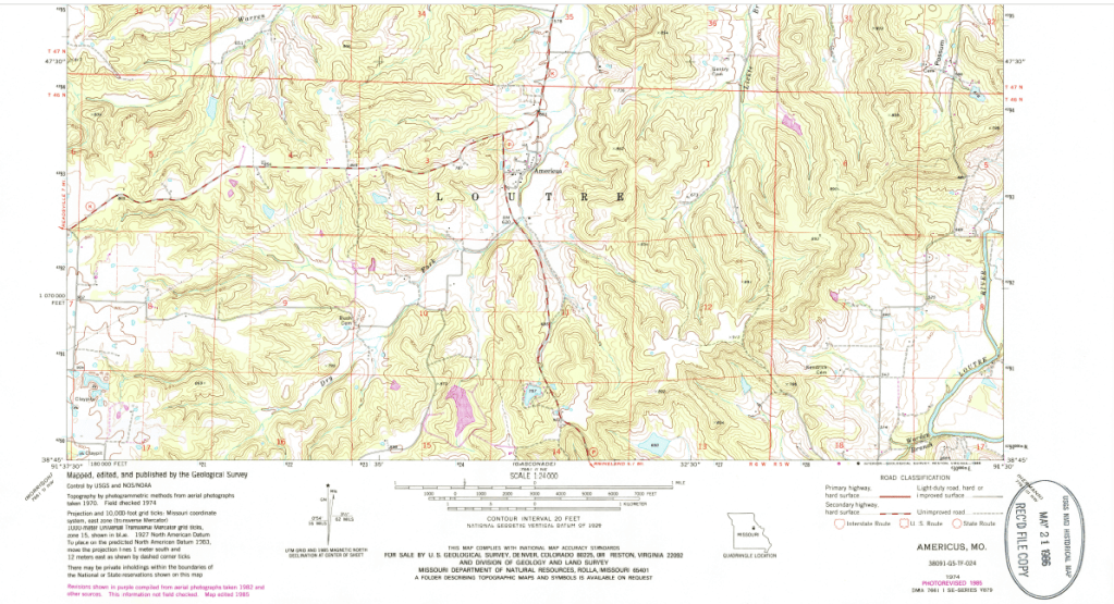
Van Hooven’s property likely sat in a landscape perfectly suited for a variety of livestock and farming operations. Nestled in the rolling hills near the Loutre River, his land would have been a patchwork of forests, streams, and fertile valleys. In this varied terrain, he may have run a sizable cattle herd while also providing habitat for a variety of wildlife – a fact that will prove crucial in the years to come.
A topographic map from 1974 shows this diverse landscape. Americus sits in a relatively flat area surrounded by hills, with numerous streams creating a dendritic pattern, like branching trees across the region. It’s easy to imagine cattle grazing in the lush river bottoms, while the forested hills provide shelter and resources.
Roaring Twenties on the Ranch
As Van Hooven studied the 1926 cattle prices, perhaps he was feeling his good fortune. The Roaring Twenties were in full swing, and the prosperity had reached even small towns like Americus. If he had invested in quality breeding stock, those “choice light weight steers and yearlings” were commanding premium prices. If he also had hogs and sheep, the the Woodson-Fennewald report would have mattered even more.
The postcard hints at the changing nature of transportation: “Good roads and bigger trucks” are increasing business. Maybe he should buy a truck? Despite the postcard’s offer, he could bypass middlemen and transport his cattle directly to the stockyards, increasing his profits.
This era of prosperity had allowed rural entrepreneurs to expand operations, explore new sources of revenue, and adopt new trades. Van Hooven and those like him were in a rapidly changing economic climate, keenly attuned to market forces. Subscribing to agricultural journals and almanacs, attending county fairs, and experimenting with new breeds of cattle would improve herd quality and potentially one’s livelihood.
As the 1920s progress, many rural farms and ranches began to feel the pinch of falling agricultural prices. The postwar boom that had inflated crop and livestock prices was ending, and rural people struggled with debt taken on during the good years.
Then came the stock market crash of 1929, sending shockwaves through the American economy. Rural communities like Americus were hit hard. Cattle prices plummet, and many farmers found themselves unable to make mortgage payments on land and equipment.
A conservative approach and diverse operations may have insulated ranching operations somewhat. But if not himself, Fred Van Hooven certainly would have seen his neighbors begin to struggle.
Rural Adaptation and Survival
Fast forward to a frosty January morning in 1936. Van Hooven, now a decade older and wiser, shuffled through his mail. Another postcard caught his eye, this one from David Blustein & Bro. in New York City. It’s a detailed price list for animal furs. Wolf pelts were fetching $8 for large, prime specimens, while muskrats, abundant in the streams around Americus, are listed at $1.40 for the best quality.
As the Great Depression deepens, Van Hooven’s adaptability must come to the fore. Years of reports and price lists have taught him to read the markets. While his cattle operation suffered, he must have looked for other opportunities.
The forests and streams around Americus, once seen mainly as grazing land, now represent a different kind of potential. Farmers and ranchers could supplement their income through trapping, a grueling work that involves checking traplines in the freezing pre-dawn hours. Van Hooven may have learned from older members of the community, who remembered the days when fur trading was a major part of Missouri’s economy.
For everyone in Americus, successful adaptation to the harsh realities of the Depression was required in one way or another. Expert trappers built upon older trapping techniques and learned how to properly prepare and grade furs to fetch the best prices. Chilled railcars brought the trade back for a while and made way for greater livestock shipping, too. The Blustein postcard listed nine different animal furs, each with three grade levels. Mink, marten, and beaver commanded the highest prices, but even the humble muskrat and possum contributed to the bottom line.
Changing Economic Ecosystems
Both postcards – the 1926 cattle report and the 1936 fur price list – highlight the surprisingly global nature of rural commerce in early 20th century America. From his small farm in central Missouri, Van Hooven was connected to markets in Chicago, New York, and beyond. The prices he received for his cattle or furs were influenced by national and international demand, linking the economy of Americus to the broader world.
This interconnectedness was facilitated by a complex communications network. Regular market reports and price lists delivered by mail kept rural entrepreneurs informed of distant market conditions. The level of detail in these reports – from specific cattle grades to fur sizes – shows the sophistication expected of ranchers, farmers and trappers.
The story behind these postcards is more than just a tale of one farmer’s adaptability woven out of the clues we have here. It’s a testament to the resilience and entrepreneurial spirit that has long characterized rural America. We would have to do more genealogical research to truly understand Fred Van Hooven’s story. For us, his name and address is just a place to start.
But we can assume that Van Hooven faced some of the same challenges confronting rural communities today. He would have had to navigate the boom of the 1920s and the bust of the 1930s. Van Hooven’s move from solely cattle ranching to include fur trapping highlights the ongoing need for rural businesses to diversify and adapt to changing markets. The shift from rail to road transport in Van Hooven’s time echoes the digital revolution of today, presenting both challenges and opportunities for rural businesses.
The postcards show how even in the 1920s and 1930s, rural businesses were connected to global markets. Today’s rural entrepreneurs face a rapidly changing economic landscape, from globalized markets to the impacts of climate change.
Enduring Spirit in Rural America
Today, Americus still appears on maps, a testament to the enduring spirit of rural communities. While fur trading and lone cattle drives have largely faded into history, the legacy of adaptability and connection to broader markets lives on. Modern farmers and rural entrepreneurs face their own set of challenges, but they approach these obstacles with the same resilience and ingenuity that characterized prior generations.
The humble business postcards that once delivered vital market information have been replaced by smartphones and real-time digital updates. Yet the essential skills they represent – market awareness, adaptability, and entrepreneurial spirit – remain as crucial as ever for rural success.
As we face the economic uncertainties ahead, let’s remember the lessons embodied in these postal relics. Rural America has always been a place of innovation and resilience where hard work and adaptability can turn challenges into opportunities. Next time you pass through a small Midwestern town, remember the papers and pricing that was once news traveling from the nation’s bustling cities to quiet rural routes – and consider how those connections continue to evolve and shape rural life today.