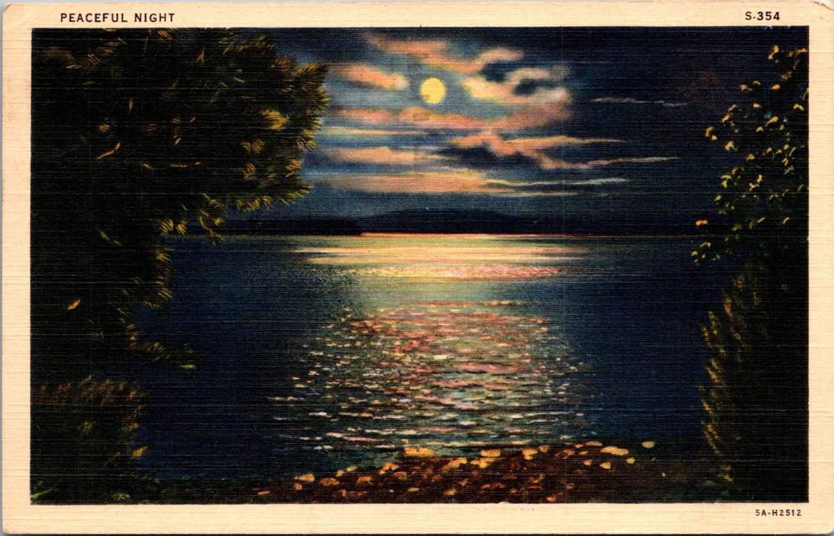
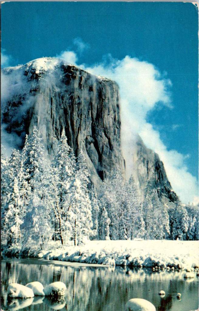
Moonlight dances across rippled water in a vintage postcard titled simply “Peaceful Night.” Nature lovers know that darkness transforms familiar landscapes into the mysterious and musical. The songs of the forest capture more than mere melody – they reveal the soul after sunset.
Lake Burton near Clayton, Georgia, mirrors the full moon in its still waters, surrounded by the dark masses of the mountains. As twilight deepens, the night chorus begins. Whip-poor-wills start their rhythmic chanting, a pulse that famous folklorist Alan Lomax once described as “nature’s metronome.”
In his 1959 field recordings from Georgia, Lomax captured not just the songs of mountain musicians, but also these ambient sounds – the chorus of frogs from the lake’s edge, the distant cry of a great horned owl, the rustling of wind through mountain laurel.
When Lomax made his landmark field recordings in the southern mountains, he often worked at night. The quality of sound was better then – less interference from human activity, and the natural acoustics of the mountains were more pronounced. In his field notes, he frequently commented on how the music emerged from the darkness itself, becoming part of the natural symphony of night sounds.
The ballad singers he recorded often chose songs that reflected this nocturnal environment. “The Night Visiting Song,” common in both Appalachian and Scottish tradition, captured the soundscape of a midnight journey through the mountains. “The False Knight Upon the Road,” with its mysterious midnight encounter, echoed with the very sounds these postcards capture visually – the rustle of wind through trees, the call of night birds, the subtle splash of water against shore.
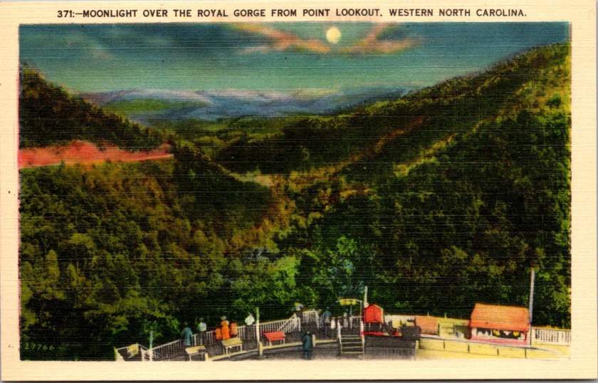
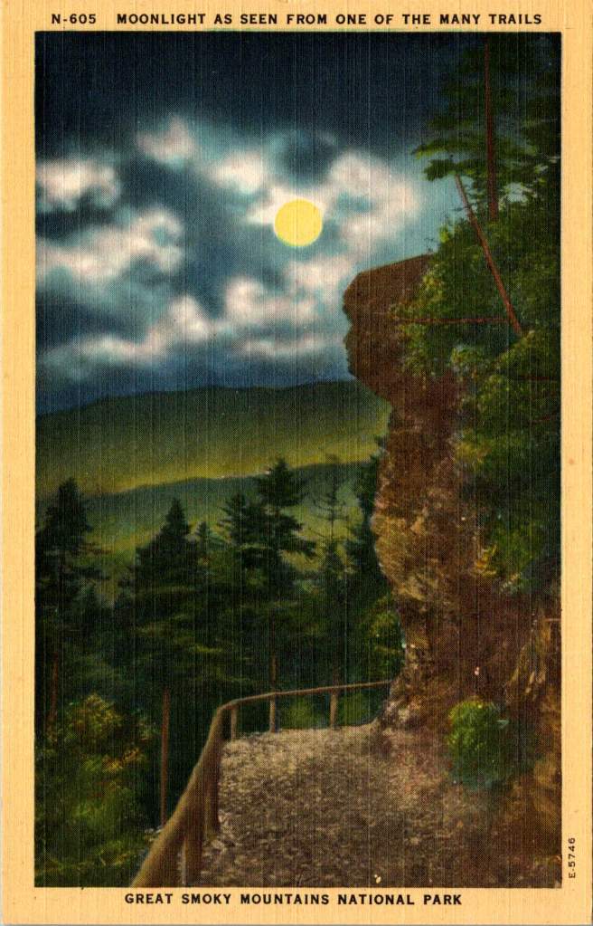
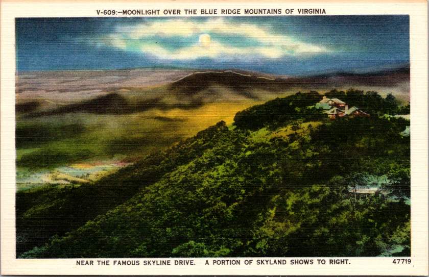
The Royal Gorge in Western North Carolina, from Point Lookout, one can gaze into the shadowed valley below. The mountains themselves seemed to be singing. The acoustic properties of these gorges shaped the development of mountain music – the way certain notes would carry across valleys while others were swallowed by the night air influenced everything from the tuning of instruments to the patterns of call-and-response singing.
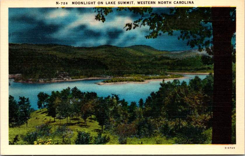
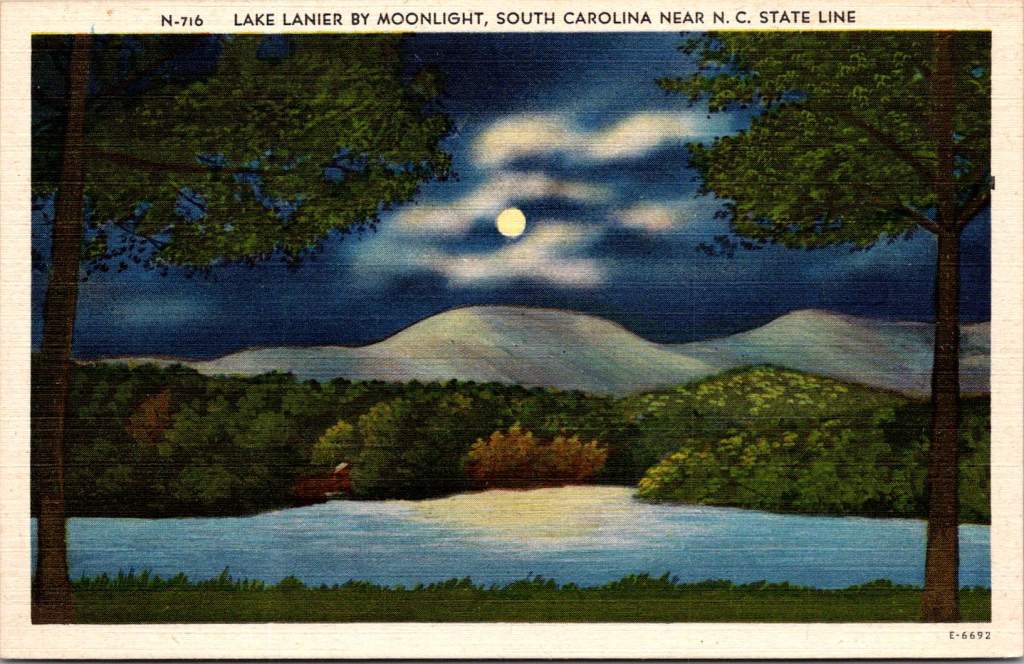
Lake Lanier, straddling the border between South Carolina and North Carolina, appears beneath a cloud-streaked moon. These mountain lakes created their own acoustics, too. Sound carries differently over water at night, when the air has settled and thermal currents have calmed. Mountain musicians knew this intuitively – lake shores became natural amphitheaters for evening gatherings, where ballads could drift across the water unimpeded.
The high mountain lake near Pembroke, Virginia, at 4,000 feet above sea level, reminds us that elevation changes everything – both the quality of light and the character of sound. The thinner air at these altitudes creates distinct acoustic properties. It’s no coincidence that the high lonesome sound of Appalachian singing developed in these elevations, where the night air carries voices in unique ways.
The materials for traditional mountain instruments came from these same moonlit forests. Spruce for fiddle tops was harvested from high mountain slopes, often selected by ear – woodsmen would tap the living tree to judge its resonant qualities. White oak for banjo rims came from trees that had grown slowly in mountain soil, their dense grain providing the perfect material for shaping sound.
The night forest provided not just materials but inspiration for tuning. The modal tunings common in mountain music – often called “sawmill tunings” for the wind-like sound they produced – seemed to match the natural harmonies of the forest at night. A skilled player could make a fiddle sound like a bird call, or craft banjo runs that mimicked the cascade of mountain streams in darkness.
Today, these same landscapes are protected in various ways – as national forests, state parks, or nature preserves. The night sounds that inspired generations of musicians continue, though now sometimes competing with the intrusion of modern noise.
As darkness falls over these mountains tonight, some musician will likely sit on a porch or beside a lake, picking out tunes that have echoed through these valleys for generations. And in those tunes, if we listen carefully, we might hear what Lomax heard. The music of these mountains is inseparable from the chorus of the night forest itself.
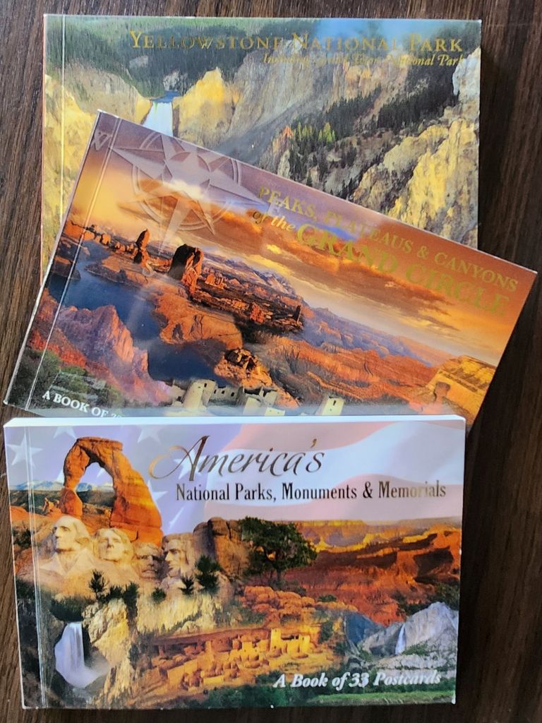
Vintage postcards reveal America’s enduring love affair with wild spaces. Through war, depression, and social upheaval, we’ve preserved these sanctuaries of peace.
On an autumn morning in 1935, Eleanor Roosevelt walked alone through the woods at her personal retreat in Hyde Park, New York. The First Lady had just returned from touring poverty-stricken areas in West Virginia, where families struggled to survive the Great Depression.
These morning walks were her ritual for processing the weight of what she witnessed in her tireless work. The woods, she would later write, helped her find the clarity needed to transform empathy into action.
Decades earlier, John Muir had written to a friend. His words would become a rallying cry for the American conservation movement, adorning everything from park posters to backpack patches.
The mountains are calling and I must go.
But what exactly is this call we hear from nature? Why do we feel drawn to preserve wild spaces and to protect them for future generations? And what happens to us when we answer that call?
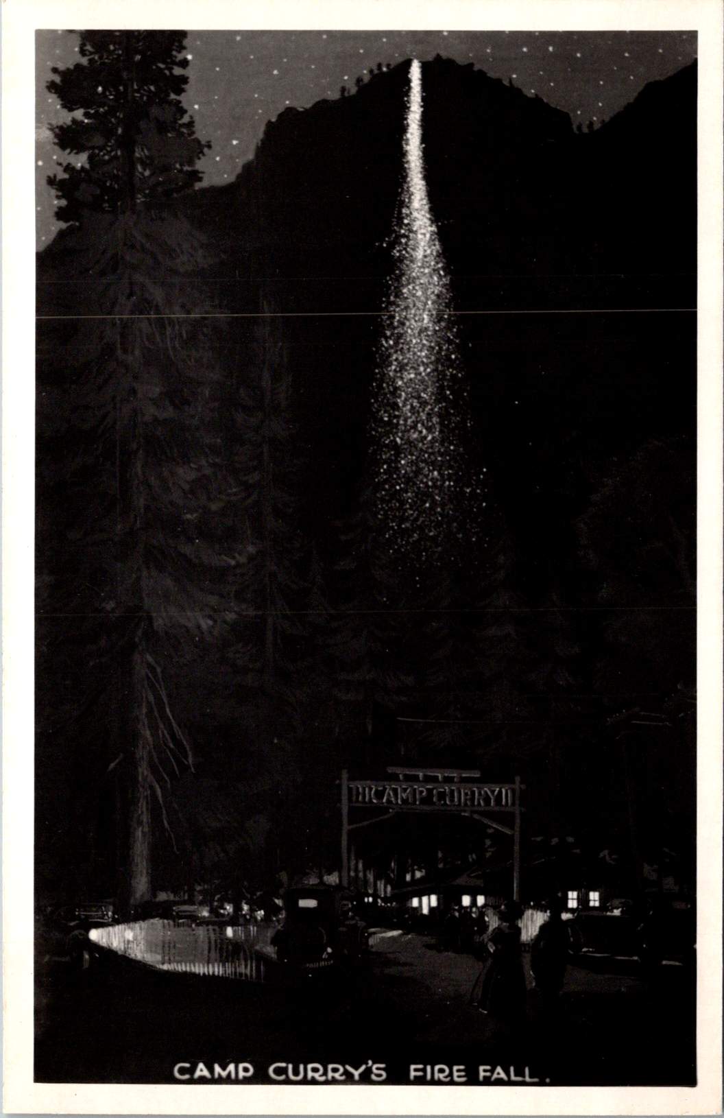
The ephemera spread across my desk capture America’s parks in saturated colors and earnest prose. Welcome to Yosemite and Camp Curry! The hope is that some special part of life is revealed.
These mass-produced mementos tell a story of democratic access to wilderness, of a shared heritage preserved through an unprecedented system of public lands. But they also hint at something deeper – our innate recognition that we need these spaces not just for recreation, but for restoration.
The same wisdom that guided Eleanor Roosevelt to seek solitude among the trees has been confirmed by modern science: nature calms us at a biological level.
Science of Serenity
When we step into a forest, our bodies respond immediately. Cortisol levels drop. Blood pressure decreases. Our parasympathetic nervous system – responsible for rest and recovery – becomes more active.
Even our visual processing changes: natural fractal patterns, like those found in tree branches and leaf veins, require less cognitive effort to process than the sharp angles and straight lines of human-made environments.
Trees release compounds called phytoncides that, when inhaled, enhance immune function and reduce stress hormones. Natural sounds – running water, rustling leaves, bird songs – engage our attention in a way that promotes neural restoration rather than fatigue.
Physiologically, exposure to diverse natural environments even affects our microbiome – the community of microorganisms living in and on our bodies. This microscopic ecosystem influences everything from mood regulation to stress response through the gut-brain axis. In a very literal sense, communion with nature changes who we are.
Preserving Peace
The story of how Americans came to preserve our wild spaces is, in many ways, a story about seeking peace – both personal and collective. The movement gained momentum after the Civil War, as a wounded nation looked westward not just for expansion, but for healing.
Frederick Law Olmsted, who fought depression throughout his life, designed public parks as democratic spaces where people of all classes could find restoration. His work on New York’s Central Park and other urban green spaces was guided by his belief that nature’s tranquility could help ease social tensions and promote civic harmony.
John Muir found his own peace in the Sierra Nevada after wandering the war-torn South as a young man. His passionate advocacy helped establish Yosemite National Park and inspired generations of conservationists.
But it was President Theodore Roosevelt, another seeker of nature’s consolation, who would transform individual inspiration into national policy. Roosevelt’s experience finding solace in the Dakota Territory after the deaths of his wife and mother shaped his approach to conservation. He understood viscerally that wilderness could heal, that it offered something essential to the human spirit.
During his presidency, he protected approximately 230 million acres of public land, establishing 150 national forests, 51 federal bird reservations, four national game preserves, five national parks, and 18 national monuments.
Women in the Woods
While Roosevelt’s dramatic expansion of public lands is well known, the role of women in American conservation deserves greater recognition.
Susan Fenimore Cooper, a student of her famous father, published Rural Hours in 1850 – a detailed natural history that influenced both Thoreau and the early conservation movement. Her careful observations helped Americans see local landscapes as worthy of preservation.
Marjory Stoneman Douglas fought to protect the Florida Everglades when most saw it as a worthless swamp. Her 1947 book The Everglades: River of Grass transformed public understanding of wetland ecosystems. She found that regular communion with nature sustained her through decades of advocacy work.
These leaders shared a practical approach to conservation, focusing on specific, achievable goals while maintaining remarkable equanimity in the face of opposition. Their work suggests that protecting nature and being protected by it can form a reciprocal relationship – the more we preserve wild spaces, the more they preserve something essential in us.
Dark Places
The path to peace often leads through our own shadows. While Americans preserve scenes of spectacular beauty, the relationship between nature and human resilience has been proven most powerfully in places of confinement and struggle. These dark places – prisons, exile, places of oppression – have paradoxically served as crucibles for some of humanity’s deepest insights about peace and connection to nature.
Nelson Mandela’s garden on Robben Island stands as a profound example. In the harsh environment of a maximum security prison, Mandela and his fellow prisoners created a garden in the courtyard where they crushed limestone. In his autobiography, he wrote: “A garden was one of the few things in prison that one could control. To plant a seed, watch it grow, to tend it and then harvest it, offered a simple but enduring satisfaction. The sense of being the custodian of this small patch of earth offered a small taste of freedom.”
This echoes the experience of Albie Sachs, who after surviving an assassination attempt that took his arm and the sight in one eye, found healing partly through his connection to the natural world. During his recovery, watching the ocean’s rhythms helped him develop the concept of his later book – Soft Vengeance – achieving justice through law rather than violence.
Martin Luther King Jr. often drew on natural imagery to maintain his equilibrium and express his vision during frequent detainment. From the Birmingham Jail, he wrote of the majestic heights of justice and used metaphors of storms and seasons to describe the civil rights struggle. His deep understanding of peace was shaped not just by moments of tranquility in nature, but by finding inner calm in places of confinement.
The Dalai Lama often speaks of how the Himalayas’ steady presence influenced Tibetan approaches to maintaining calm, even through decades of exile.
These experiences remind us that while we focus on America’s preserved wilderness spaces, the human need for connection to nature is universal. Peace is an American pursuit and a global birthright. When we protect natural spaces, we’re participating in something that transcends national boundaries – the preservation of humanity’s common sanctuary.
Paths to Peace
The leaders who shaped American conservation found different routes to and through nature. John Muir sought transcendent experiences, climbing trees in storms and walking thousands of miles in solitude. Gifford Pinchot, first chief of the U.S. Forest Service, took a more systematic approach, seeking balance between preservation and sustainable use. Rachel Carson combined meticulous scientific observation with poetic sensitivity to nature’s rhythms.
Their examples suggest there is no right way to find peace in nature. Some need solitude and silence. Others seek the raw tests of strengths and capacity, and find restoration in active engagement with the natural world. Some seek dramatic landscapes to ponder in awe, others find sufficient wonder in a city park or backyard garden.
Wild Wisdom
Ralph Waldo Emerson wrote in his essay on Nature, “…in the woods, we return to reason and faith.” His words point to something profound about nature’s effect on human consciousness – how it seems to restore us not just to calm, but to our truest selves.
Modern research into nature’s calming effects – the lowered cortisol, the enhanced immune function, the restored attention – helps explain the mechanisms behind what people have long intuited. For those who find great equanimity through connection with nature, there also seems to be an innate genius in each of us that emerges more fully in wild spaces.
We might experience this as artistic, spiritual, or intellectual – and perhaps even more fundamental – a capacity for presence, for wonder, for sensing our connection to something larger than ourselves. It’s what Eleanor Roosevelt accessed on her morning walks, what John Muir celebrated in his rhapsodic nature writing, what Jane Goodall tapped into during her patient observations of primates in Gombe.
The preservation of wild spaces represents more than conservation of natural resources or recreational opportunities. It preserves access to this deeper part of ourselves – the part that knows how to find peace, that remembers how to wonder, that recognizes our belonging in the larger community of life.
These vintage postcards capture more than just scenic views. They record moments when people felt called to share their experience of wonder, to say to friends and family that the experience mattered. The fact that we’ve preserved and share these places, despite constant pressure to exploit them, suggests we recognize they offer something essential to human flourishing.
Why the woods? Because something in us comes alive there. Because in preserving wild spaces, we preserve the possibility of encountering our own wild wisdom, and these revelations are too precious not to protect for future generations.
Each time we step into nature – whether it’s a national park or a neighborhood green space – we participate in this legacy of preservation. We join a long line of people who recognized that human flourishing depends on maintaining connection to places where we might find peace and that help us face whatever challenges await when we return.
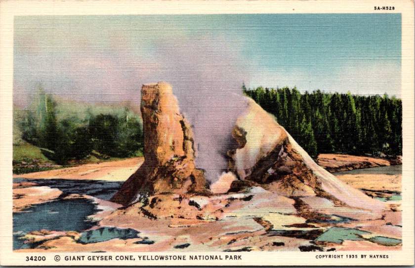
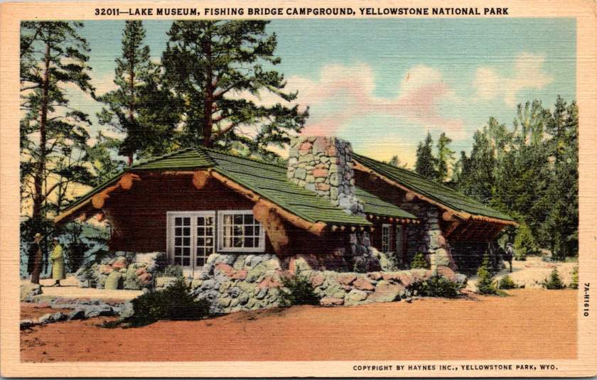
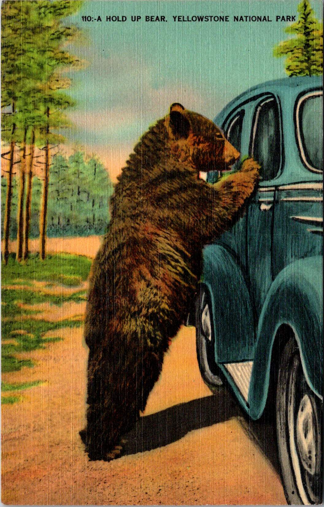
Old Faithful Inn stretches across the Yellowstone landscape, its distinctive roofline echoing the forested hills in a vintage linen postcard. Steam rises from the nearby geyser basin. The Civilian Conservation Corps built Yellowstone for their time and for future generations. In New York, a sister program blazed trails, too.
The story of our national parks is also a remarkable story of resilience and collaboration in hard times. Just as the national parks were becoming popular, the Depression brought unprecedented unemployment and bare scarcities at home, on the farm, and in cities. Leaders with optimistic vision were challenged to engage an illiterate and unskilled workforce or face severe cultural, social, and economic consequences.
The Civilian Conservation Corps’ work in Yellowstone exemplified an unprecedented partnership between federal agencies, orchestrated by a remarkable team. Robert Fechner, the program’s first director, brought his labor union experience to balance competing interests that might have limited the program. Harold Ickes, as Secretary of the Interior, ensured high standards for conservation work. The Department of Labor selected the men for service in the corps. The Army constructed and operated the camps. The National Park Service and Forest Service supervised the technical and construction work. This complex dance of bureaucracy somehow produced remarkable efficiency, with the CCC completing projects that had languished on drawing boards for decades.
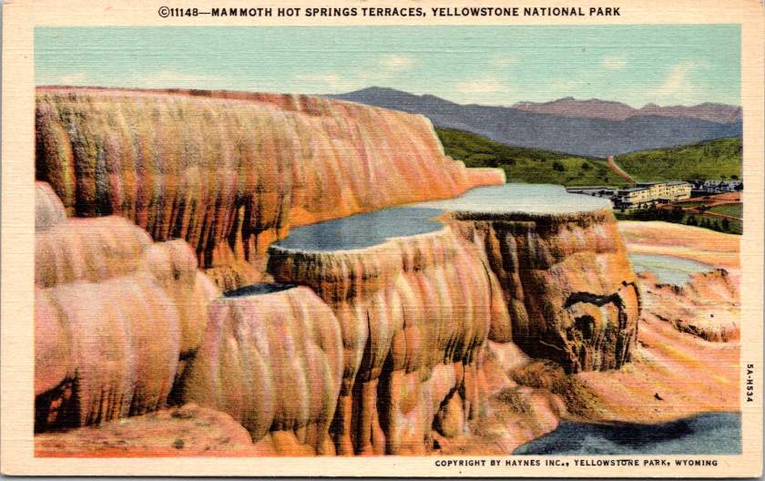
Take the terraced formations of Mammoth Hot Springs, for example, their delicate travertine steps descending the hillside in nature’s own architecture. CCC workers constructed the stone steps and walkways that would allow visitors to safely view these natural wonders. The careful integration of human infrastructure with natural features became a hallmark of CCC work. Now known as ‘parkitecture’, the philosophy would influence park design for generations.
Long before the federal programs, Frances Perkins coordinated closely with Roosevelt during his New York state governorship to protect workers and grow the workforce. She had witnessed the Triangle Shirtwaist Factory fire in 1911, an experience that drove her lifelong commitment to worker safety and labor reform. As New York’s Industrial Commissioner from 1929 to 1933, Perkins pioneered unemployment relief programs and worker protections that would later shape New Deal policies. When Roosevelt became president, he named her Secretary of Labor – the first woman to serve in a presidential cabinet – and she brought her New York experiences to Washington just in time.
Perkins understood the value of both job creation and job training, having seen their impact in New York. She helped shape the CCC, carefully navigating the political tensions around women’s employment programs. Her influence helped ensure that CCC and other programs included educational components, reflecting her belief that economic relief should build long-term capabilities, not just provide temporary aid. She also made sure the federal programs benefited her home state, and piloted important new programs there.
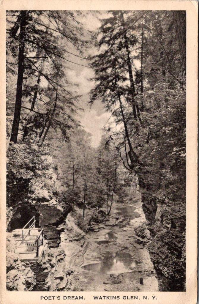
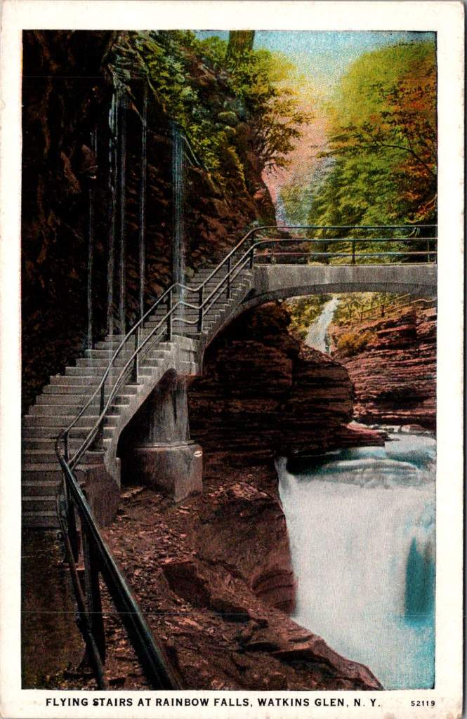
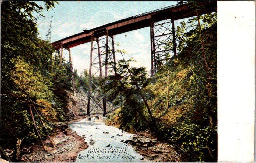
A 1905 hand-colored postcard of Watkins Glen in New York state shows Diamond Falls in the distance, framed by the narrow gorge’s layered rock walls. When the CCC arrived here in the 1930s, they found a park already famous for its natural beauty but in need of significant infrastructure. The Corps constructed the stone walkways that still guide visitors through the glen today, built overlooks at strategic points, and created a trail system that made the park’s dramatic features accessible while preserving their natural character.
The CCC’s work at Watkins Glen was particularly challenging given the varied landscape and unique natural formations. Jacob’s Ladder, a daunting stone staircase ascending the gorge wall, required precise engineering to integrate it naturally into the rock face. The Corps workers quarried stone and shaped the ascent, creating a path that appear to emerge organically from the cliff itself.
At Rainbow Falls, they constructed the “flying stairs” – suspended pathways that seem to float alongside the cascading water. This required not just skilled stonework but innovative engineering to ensure the structures could withstand the gorge’s frequent flooding and harsh winters. The Stairway to Lover’s Lane presented similar challenges, with workers having to carefully cut into the gorge wall while preserving its natural beauty.
The Corps also built the park’s amphitheater, transforming a natural hollow into a gathering space that would host generations of visitors for educational programs. Throughout these projects, workers had to move tons of stone while working in the confined space of the gorge. They developed specialized techniques for working in the narrow spaces, often suspended above the creek as they built pathways that had to withstand both regular flooding and freezing temperatures. The project showcased the Corps’ ability to combine heavy construction with delicate environmental consideration – skills that would prove valuable throughout the park system.
Yet while young men were building parks across America, another story was unfolding at Bear Mountain, New York. A smaller program called the Temporary Emergency Relief Administration (TERA) – nicknamed the She-She-She camps – was offering women their own opportunity for training and education. Eleanor Roosevelt championed this effort, collaborating closely with progressive educator Hilda Worthington Smith to create a program that emphasized both practical skills and broader education.
At Camp TERA, women learned furniture refinishing, bookbinding, typing, and business skills. They studied literature, current events, and public speaking. The curriculum reflected both practical needs and progressive educational ideals, emphasizing peer learning and leadership development. The camps created a college-like atmosphere, quite different from the military structure of CCC camps.
The economics of these programs tell their own story. Spending roughly $1,000 per enrollee annually (about $25,000 in today’s dollars) the CCC cost $3 billion over nine years – equivalent to about $60 billion today. In its time, the program returned an estimated $2.50 in measurable public benefits for every dollar spent. Each CCC enrollee earned $30 monthly, with $25 sent home to their families – enough to keep many families fed during the Depression’s darkest days. The TERA budget was much less and never achieved the scale that made the CCC so cost-effective, yet for some of the women who participated, the return on investment was significant in improving their health, caregiving capacities, and professional skill sets – many went on to careers in business, education, and public service.
The CCC employed three million men over nine years. TERA participants numbered just 8,500 women. Despite Eleanor Roosevelt’s advocacy and Frances Perkins’ support from the Labor Department, the women’s program expanded only briefly and never really got off the ground. The reasons echo familiar themes: limited funding, resistance to women working outside the home, and debates about appropriate roles for women in society.
These limitations weren’t unique to TERA. The CCC itself reflected America’s racial divisions, with segregated camps and discriminatory selection. Some local communities opposed Black CCC camps in their areas. The program’s focus on young, single men also excluded many who needed help.
Yet for all their limitations, the New Deal’s public works programs transformed America’s public spaces. Beyond the CCC and TERA, the Works Progress Administration built parks, schools, and community centers nationwide. WPA artists created murals that still enliven post offices and courthouses today. Collectively, WPA workers built communities, developed national infrastructure, and documented American life through photography and collected folk songs and stories that might otherwise have been lost.
The human legacy of these programs extends far beyond their physical achievements. Chuck Yeager, the pilot who would later break the sound barrier, learned mechanics in the CCC. Stan Musial developed his work ethic in a Pennsylvania CCC camp before becoming a baseball legend. Robert Mitchum and Raymond Burr worked in CCC camps before their Hollywood careers. From the TERA camps emerged teachers, business leaders, and community organizers who shaped their communities for decades to come.
Looking at these vintage postcards today, we can measure the value of these programs not just in the enduring infrastructure they created, but in the generational impact of providing education and opportunity to millions of Americans of modest means. Think of the families fed by CCC wages, the skills learned, the confidence built. Consider the children and grandchildren who grew up hearing stories of carving out Yellowstone’s trails or getting the chance to study at Bear Mountain, who inherited not just the physical legacy of these programs but their spirit of public service and possibility. Think of all of us today, who still climb the steps and set our sights on this same legacy.
The trails around Old Faithful, the stone steps at Watkins Glen, the walkways at Mammoth Hot Springs – all have weathered nearly ninety years now, crossed by millions of visitors. They stand as monuments not just to American craftsmanship, collaboration, and ingenuity but to the transformative power of public investment in both our spaces and our people. They give us examples of leadership and also remind us of the great many unknown men and women who preserved and protected the places we love. Their endurance challenges us to imagine what might be achieved in this generation if we again dared to think so boldly about developing our natural resources and our human potential together.
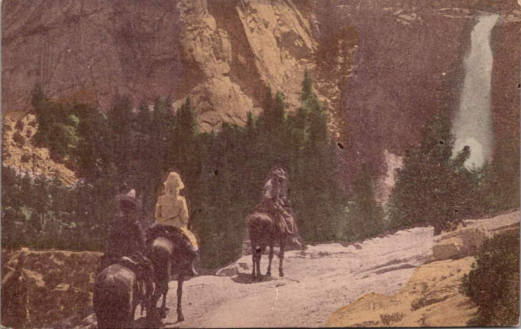
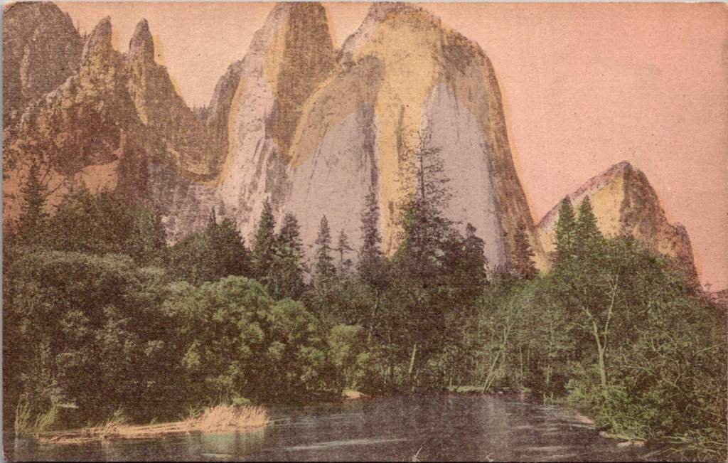
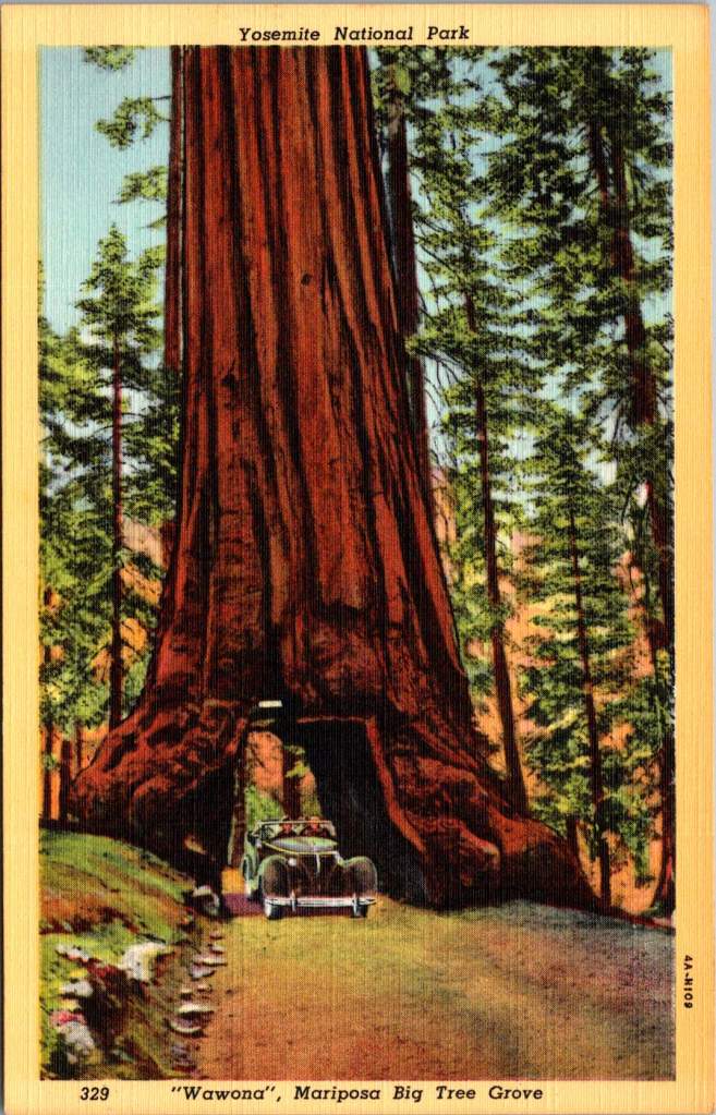
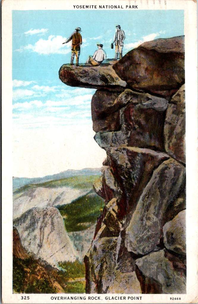
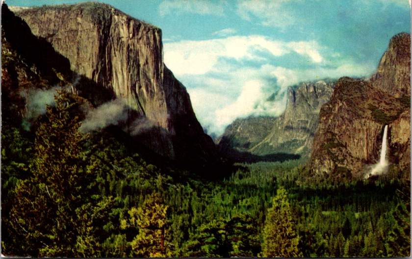
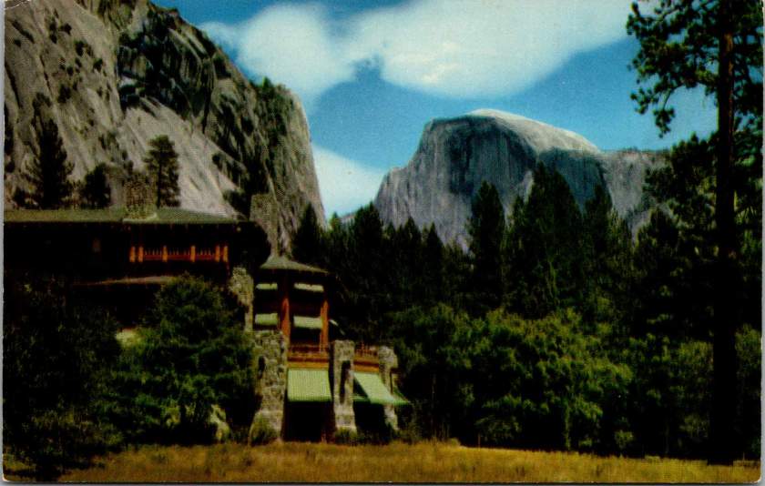
Three figures stand atop Glacier Point in Yosemite Valley, silhouetted against the sky. Horseback riders on a steep mountain trail glimpse a waterfall through the pines. A tunnel carved into a massive sequoia is big enough for a car to pass through. These postcards images tell the story of how Americans fell in love with their national parks.
When Abraham Lincoln signed legislation in 1864 protecting Yosemite Valley, few Americans had seen its wonders firsthand. The journey was arduous, expensive, and often dangerous. But photographs and artistic renderings began circulating, capturing public imagination. Carleton Watkins’ mammoth plate photographs of Yosemite’s towering cliffs and Albert Bierstadt’s luminous paintings suggested something almost mythical: a uniquely American paradise, waiting to be experienced.
By the 1880s, the Southern Pacific Railroad had begun marketing Yosemite as a must-see destination. Their promotional materials featured romantic images of pristine wilderness alongside luxury dining cars and comfortable accommodations. The message was clear: you could experience the sublime while maintaining the comforts of civilization. The railroad’s campaign to “See America First” tapped into both patriotic sentiment and growing concern about wealthy Americans choosing European vacations over domestic travel.
Stephen Mather, who would become the first director of the National Park Service in 1916, understood the power of imagery. A self-made millionaire from the borax industry, he approached park promotion with a marketer’s eye. Mather encouraged photographers to set up studios in Yosemite and actively supported the production of high-quality postcards, which he called his “little missionaries.” These cards, purchased for pennies and mailed across the country, did more than any official campaign to make Yosemite a part of the American imagination.
The postcards reveal changing patterns in how Americans experienced their parks. Early images show well-dressed visitors on guided tours, often on horseback. By the 1920s, automobiles appear, marking a democratic shift in park access. The famous Wawona Tree tunnel, carved through a giant sequoia in 1881, became a must-have photo opportunity. Each car passing through represented a family making their own way through the park, free to explore at their own pace.
The National Park Service itself emerged from a uniquely American compromise. Progressive Era conservationists like John Muir had argued for pure preservation, while others saw the parks as natural resources to be utilized. The 1916 Organic Act that created the NPS threaded this needle by mandating both conservation and public access – the parks would be preserved unimpaired, but explicitly for the enjoyment of the people.
This dual mandate shaped how Americans came to view their relationship with nature. The parks weren’t distant wilderness to be admired from afar, but rather public spaces to be actively experienced. In the 1930s Civilian Conservation Corps workers built trails and facilities, making the parks more accessible while maintaining their natural character. The message was clear: these were the people’s parks, and the people would help maintain them.
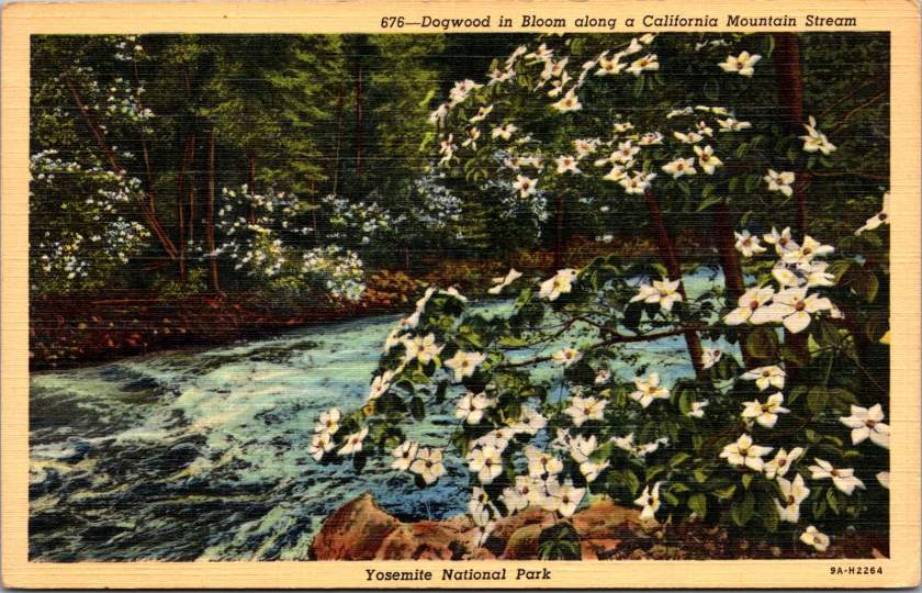
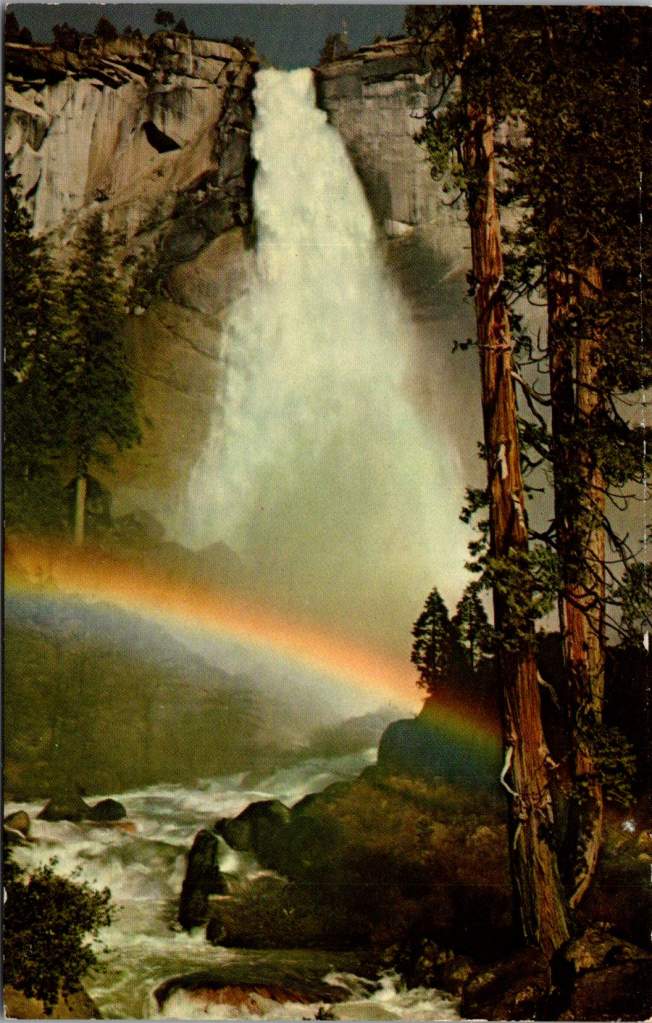
The advent of color photography in the 1940s and 50s brought new vibrancy to park imagery. Postcards from this era capture the brilliant white of dogwood blooms along mountain streams, the deep red of sequoia bark, and the rainbow mist of Yosemite Falls. The images suggested that black and white photography, no matter how artistic, had never quite captured the true glory of these places.
By the mid-20th century, the success of the national parks as tourist destinations began creating new challenges. Bumper-to-bumper traffic in Yosemite Valley became an ironic commentary on Americans’ enthusiasm for their natural heritage. The park service faced growing tension between access and preservation, leading to innovations like shuttle systems and visitor quotas.
Yet the fundamental appeal of the parks remained unchanged. Whether arriving by horse, train, automobile, or tour bus, visitors came seeking what Frederick Law Olmsted had described in his 1865 report on Yosemite, “The union of the deepest sublimity with the deepest beauty of nature.” The parks offered not just scenic views but a connection to something larger than themselves – a uniquely American inheritance.
Today’s visitors to Yosemite might share their experiences through Instagram rather than postcards, but they’re participating in the same tradition of witnessing and sharing America’s natural wonders. The early promoters of the national parks understood something fundamental: seeing these places wasn’t enough. The experience had to be shared to become part of our collective identity.
Those early postcards, with their hand-tinted colors and earnest captions, did more than advertise scenic views. They helped Americans understand these distant wonders as their own inheritance – places that belonged to everyone and therefore needed everyone’s protection. When we look at them today, we’re seeing how Americans fell in love with their national parks, and how that love affair helped define our relationship with the natural world.
The history of Yosemite and the National Park Service reminds us that conservation isn’t just about preserving scenic views. It’s about maintaining spaces where each generation can discover their own connection to the natural world. This fundamental mission remains as relevant as ever. The parks still offer what those early postcards promised: a chance to see the natural wonders of the United States, and to share the experience with friends and family miles away.
Gift shop postcards reveal how Americans get to know our presidents. Explore how pocket-sized portraits shape our understanding of leadership.
In the spring of 1865, Alexander Gardner made a series of photographs of Abraham Lincoln in a studio in Washington DC. Originally, the images were meant as source material for a later unremarkable oil portrait. Instead, one image would become a widely circulated presidential carte de visite (CDV, predecessor to the postcard) showing a contemplative Lincoln, his face bearing the weight of war.
This same series produced dozens of CDV variations, each emphasizing different aspects of Lincoln’s character – his determination, wisdom, and his ordinary humanity. These interpretations of presidential imagery etched his memory in time just after the assassination, have been reproduced in every decade since, and still shape our national memory today.
Consider how presidential postcards – those humble, democratic pieces of correspondence – have both reflected and shaped our understanding of presidential perspective and leadership. Looking at postcard collections from presidential libraries, let’s explore how these portable portraits reveal how certain leaders viewed the world and made decisions.
Memory Making in Presidential Libraries
The modern presidential library system began in 1939 when Franklin Roosevelt donated his papers to the federal government, establishing a revolutionary model for preserving presidential legacy. Before this, presidential papers were considered private property, often scattered, sold, or lost to history. Roosevelt’s innovation created a systematic approach to presidential preservation that transformed how Americans access their presidential past.
Today, fifteen presidential libraries, administered by the National Archives and Records Administration (NARA), serve multiple functions: archive, museum, research center, and public education facility. Each library manages large collections of documents, photographs, and artifacts, while their museums and visitor centers help interpret presidential legacies for millions annually.
These institutions also play a crucial role in postcard production and distribution. Their gift shops serve as primary retail outlets, while their archivists and curators help ensure historical accuracy in commemorative imagery. Tensions between history, educational mission, and commercial viability shape how presidential memory is packaged and sold.
Business of Memory
The story of presidential postcards is also the story of how American trades shape historical memory. In the late 19th century, innovations in printing technology coincided with the rise of mass tourism and the establishment of the postal service’s penny postcard rate. Companies like Curt Teich & Co. and the Detroit Publishing Company recognized an opportunity, creating catalogs of presidential imagery that would help standardize how Americans remember their leaders.
The economics were compelling: postcards could be produced for less than a cent, sold for 3-5 cents, and resold by retailers for 5-10 cents. This accessibility meant that average Americans could own and share pieces of presidential history. Later, the Presidential Libraries, the Smithsonian, and the National Park Service would become major distribution points, creating a government-private partnership in historical memory that continues today.
Postcard Power
Before diving into specific presidents, let’s remember why postcards matter. Unlike formal portraits or imposing statuary, postcards serve as intimate, portable connections to our leaders. Their very format – combining image with personal message, sold inexpensively and shared widely – makes them unique vehicles for democratic memory-making.
Consider the contrast: The Lincoln Memorial presents the 16th president as a marble deity, remote and perfect. But, period CDVs showed him in numerous human moments: reviewing troops, visiting battlefields, and playing with his sons. These cards, sold for pennies and passed hand to hand, helped Americans see their wartime leader as both extraordinary and approachable.
Lincoln: The Moral Realist
The Gardner series of photographs reveals Lincoln’s moral realist perspective in subtle ways. In one popular version, Lincoln’s gaze is directed slightly upward, suggesting moral vision, while his worn face acknowledges harsh realities. This duality perfectly captured Lincoln’s ability to hold fast to moral principles while grappling with very real human suffering.
Another influential series showed Lincoln visiting the Antietam battlefield. These cards, first published during the war and reprinted for decades after, highlighted his hands-on leadership style. One image shows him speaking with wounded soldiers from both sides – a visual representation of his “malice toward none” philosophy.
Theodore Roosevelt: The Progressive Naturalist
The postcards of Teddy Roosevelt present a striking contrast. The Detroit Publishing Company’s Yosemite series showed him with naturalist John Muir in various outdoor settings, emphasizing his connection to nature and physical vigor. These images perfectly aligned with his naturalistic-progressive worldview, which saw human advancement as part of natural evolution.
Perhaps most revealing were the Rough Rider postcards, mass-produced during and after his presidency. These action-oriented images showed Roosevelt leading charges, planning strategy, and bonding with his men. They captured his belief in the power of human will to shape both nature and society – a core tenet of his progressive philosophy.
Franklin Roosevelt: The Pragmatic Experimenter
FDR’s postcard imagery evolved significantly during his presidency, reflecting both personal and national transformation. Early cards showed him standing at podiums, emphasizing traditional presidential authority. But as the Depression deepened, a new style emerged.
Fireside Chat postcards, first released in 1933, showed Roosevelt in intimate settings, explaining complex policies to average Americans. These images matched the pragmatic instrumentalism they heard on the radio – his belief that truth and reality were tied to practical situations more than abstract principles.
The photographs from Warm Springs deserve special mention. While official imagery generally hid Roosevelt’s disability, these postcards showed him in the therapeutic pools, working to strengthen his legs. They humanized him while demonstrating his experimental, solution-oriented approach to problems, both personal and political.
Kennedy: The Dynamic Optimist
The Kennedy era revolutionized presidential imagery. Color photos from Hyannis Port show the president sailing or playing with his children, emphasizing youth and vitality. But more telling were the Space Race postcards, which showed Kennedy studying rocket models or meeting with astronauts. These captured his perspective of historical dynamism – his belief that reality itself was expandable through human initiative and technological advancement.
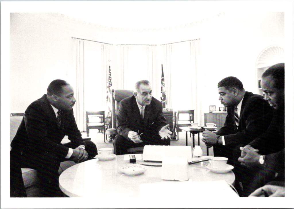
LBJ: Larger than Life
The LBJ Library’s postcard collection reveals another perspective entirely, showing Johnson’s complex relationship with power and persuasion. The collection captures Johnson in intimate conversations with civil rights leaders and in passionate speeches about poverty, reflecting his hands-on, domineering approach to domestic reform.
Carter: The Moral Engineer
Jimmy Carter’s postcard imagery often puzzled publishers. How to capture a president who combined technical expertise with moral conviction? The “Carter and Farmers” card showed him inspecting crops, and another shows him in front of solar panels on the White House roof. These images captured his unique moral-engineering perspective – his belief that problems required both technical solutions and ethical frameworks.
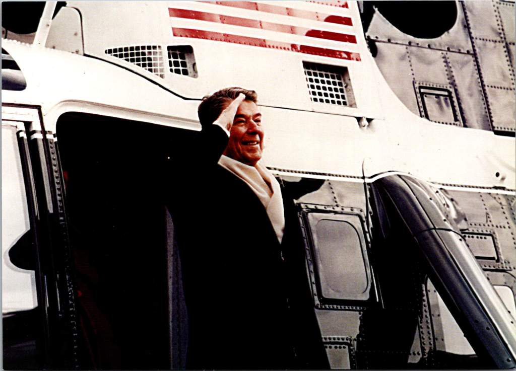
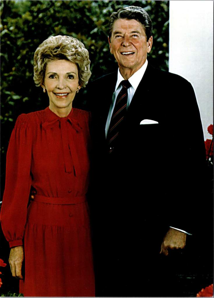
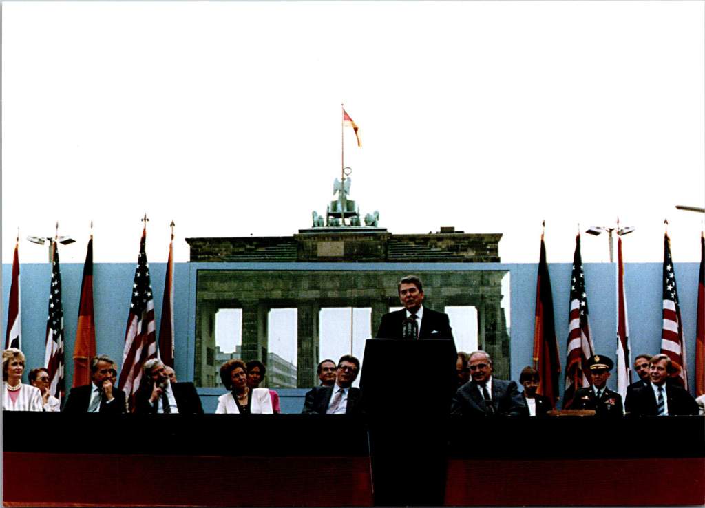
Reagan: The Moral Dualist
The Reagan Library’s postcard collections reflect his clear moral dualist worldview. The famous Brandenburg Gate series shows Reagan from multiple angles as he challenges Gorbachev to “tear down this wall.” These images emphasize his belief in clear moral absolutes – freedom versus tyranny, good versus evil.
Reagan’s unique gift for communication amplified the impact of these postcards. His ability to speak in accessible language while conveying profound ideas meant that the images resonated deeply with the public. When he spoke of America as a “shining city on a hill” or called the Soviet Union an “evil empire,” these phrases became powerful captions for postcard imagery, blending visual and verbal memory in the public mind.
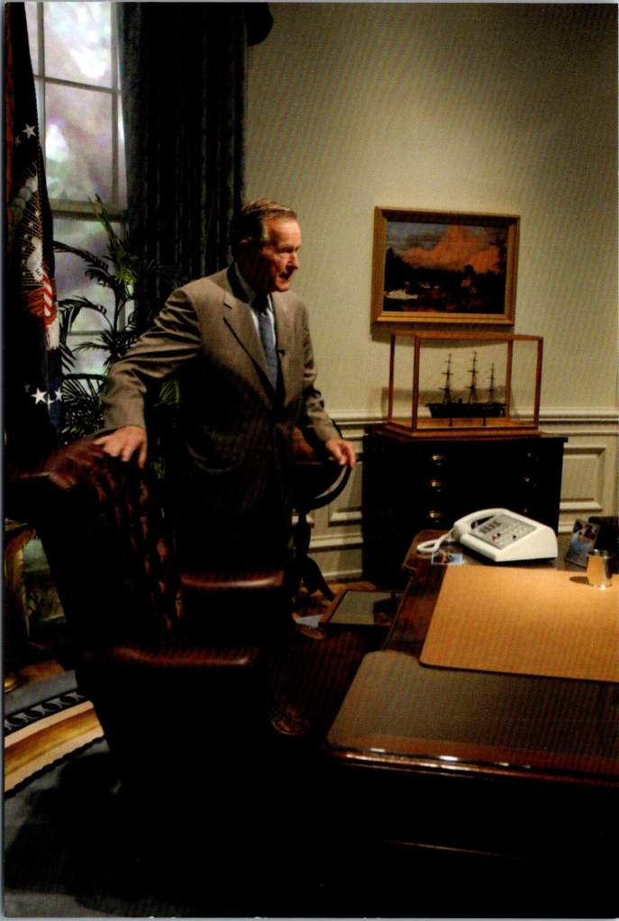
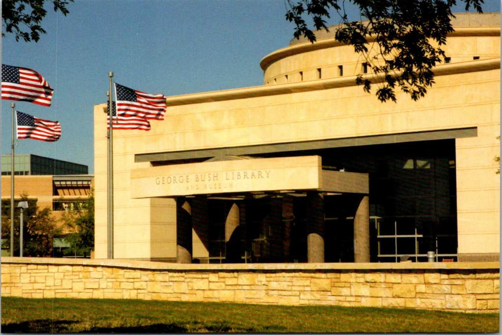
George H. W. Bush – Institutional Security
The George H.W. Bush Library’s postcards emphasize his diplomatic achievements, particularly during the Gulf War. These images often show Bush in military context and related to large institutions. The contrast with Reagan’s more populist imagery is striking – where Reagan is clearly a personality, Bush’s postcards frequently make the man matter less than the magnitude of his role.
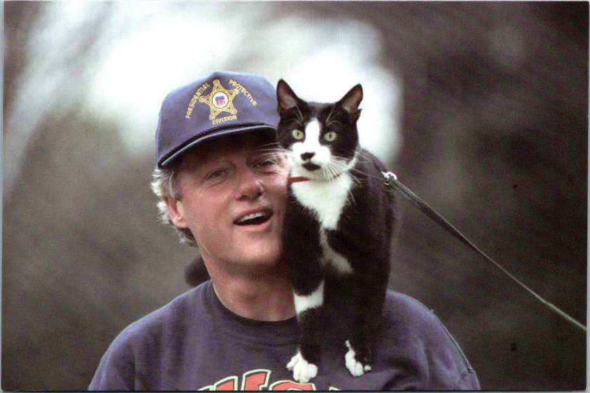
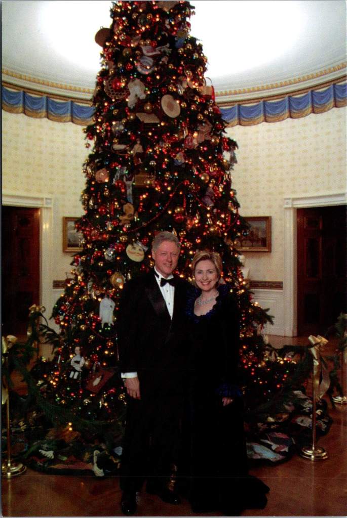
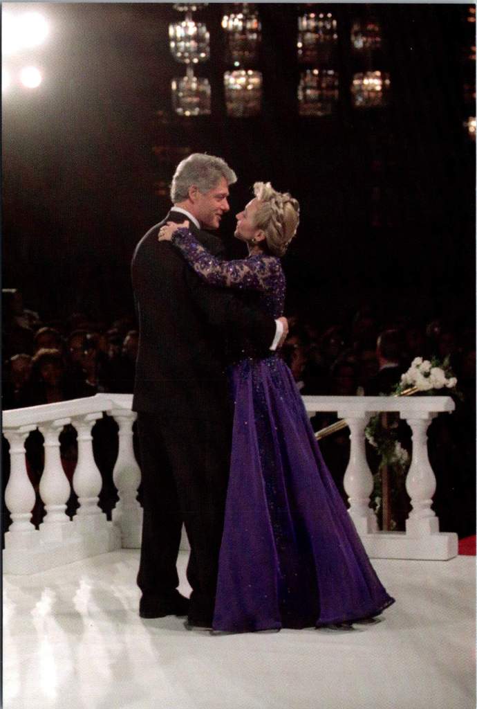
Clinton’s Casual Comport
The Clinton Library’s postcard collection breaks new ground in presidential imagery, showing Clinton with his daughter Chelsea, playing with Socks the cat, and capturing his forward-looking optimism in the post-Soviet era. These images demonstrate Clinton’s ability to relate to his constituents in casual terms, mirroring what Reagan had done with conservative principles.
The Persistence of Perspective
What emerges from this look at presidential postcards is the remarkable consistency with which each President projects his image in keeping with his worldview. Whether facing economic crisis, cold war, or civil war, these presidents tended to approach problems through a lens shaped by life circumstances as much as political philosophy. Lincoln’s moral realism helped him navigate both slavery and secession. FDR’s pragmatic experimentalism served him in depression and disability. Reagan’s moral dualism shaped his approach to both domestic policy and Soviet relations.
Yet the postcards reveal the human dimension of leadership, too. Through these small, shared images, Americans see their leaders as both exceptional and relatable. The very format of postcards – democratic, portable, personal – helps bridge the gap between presidential perspective and public understanding.
Presidential Perspective and Democratic Memory
Understanding presidential perspective remains crucial today. How leaders view reality shapes how they define problems, evaluate solutions, and make decisions. The enduring power of postcards lies in their ability to capture and communicate these perspectives in accessible ways.
Presidential postcards serve as more than souvenirs. They are vehicles of democratic memory, helping each generation understand not just what their leaders did, but who they were and how they thought. As we face contemporary challenges, these historical perspectives – preserved and transmitted through humble postcards – offer valuable insights into the relationship between worldview and leadership.
Look closer the next time you are in a museum shop or visitors center. In those mass-produced images lie clues to how our leaders view the world – and how they helped Americans see it too. Perspective is about how we view problems, and also how we view ourselves as a nation and a people.
In late May 1908, the Republican River forgot its modest nature. After days of relentless spring rains, the usually manageable waterway transformed into a destructive force that reshaped both the landscape and lives of north-central Kansas.
A collection of real photo postcards from this period captures these moments of crisis. One image shows the mill with its flooded surroundings, another the threatened railroad bridge. These weren’t just documentary photographs – they were messages sent between family members grappling with decisions about land and livelihood in the flood’s aftermath.
The Republican River, which meanders through Republic County past the iconic Table Rock formation, swelled beyond its banks, swallowing farmland, threatening towns, and severing the rail lines that served as lifelines for agricultural communities.
Concordia, the largest town along this stretch of the Republican River, watched as the waters rose. The town of 4,500 residents had built itself on agricultural promise, its grain elevators standing sentinel along the railroad tracks, its mill processing the bounty of surrounding farms. But the 1908 flood challenged this careful progress. Water lapped at the foundations of the mill, its twin smokestacks rising above the flood.
Railroad bridges proved vulnerable to the 1908 flood, too. The Chicago, Rock Island and Pacific Railroad, which had helped birth towns like Concordia and Republic City, found its tracks suspended over angry waters. Train service halted, leaving farmers isolated with their crops rotting and fields under water. The flood arrived at a particularly cruel time – late spring, when winter wheat was heavy with promise and corn was just reaching hopefully toward the Kansas sky.
The handwriting on one postcard tells of a man named Basil looking at land near Table Rock, that distinctive natural formation that had guided settlers for generations. What kind of optimism – or desperation – would drive someone to consider investing in farmland so soon after such devastating floods? Yet records suggest he wasn’t alone. Land transactions continued in Republic County through 1908 and 1909, some at distressed prices from farmers ready to seek fortune elsewhere, others at premium prices for higher ground.
The flood’s waters eventually receded, leaving behind debris and difficult deliberations. Farmers have always had to gamble with nature. The rich soils of river valleys are worth the risk of occasional flooding – until they’re not.
These brothers – the postcard photographers – couldn’t know that the 1908 flood was merely a prelude. The Republican River would prove its power again and again, most catastrophically in 1935, when a flood of biblical proportions would transform the valley once more. Families who chose to stay after 1908, who rebuilt and reinvested, would face nature’s judgment again.
Looking at these century-old images, we see more than just disaster photography. We see evidence of critical decisions made in the aftermath of catastrophe. Someone was behind that camera, documenting not just the destruction but the dilemma – to stay or go, to rebuild or retreat, to trust in the river’s bounty or fear its fury. The unknown photographer used the latest technology – AZO photo paper, a Kodak camera – to capture and distribute these images of nature’s disruption of human endeavor.
We don’t know if Basil bought that land near Table Rock. The brothers’ identities and their immediate choices are lost to history. But we know that farming continued and that people kept living along the Republican River despite all they had seen. Each generation seems to make its own peace with nature’s risks, balancing the promise of fertile valleys against a river’s wrath.
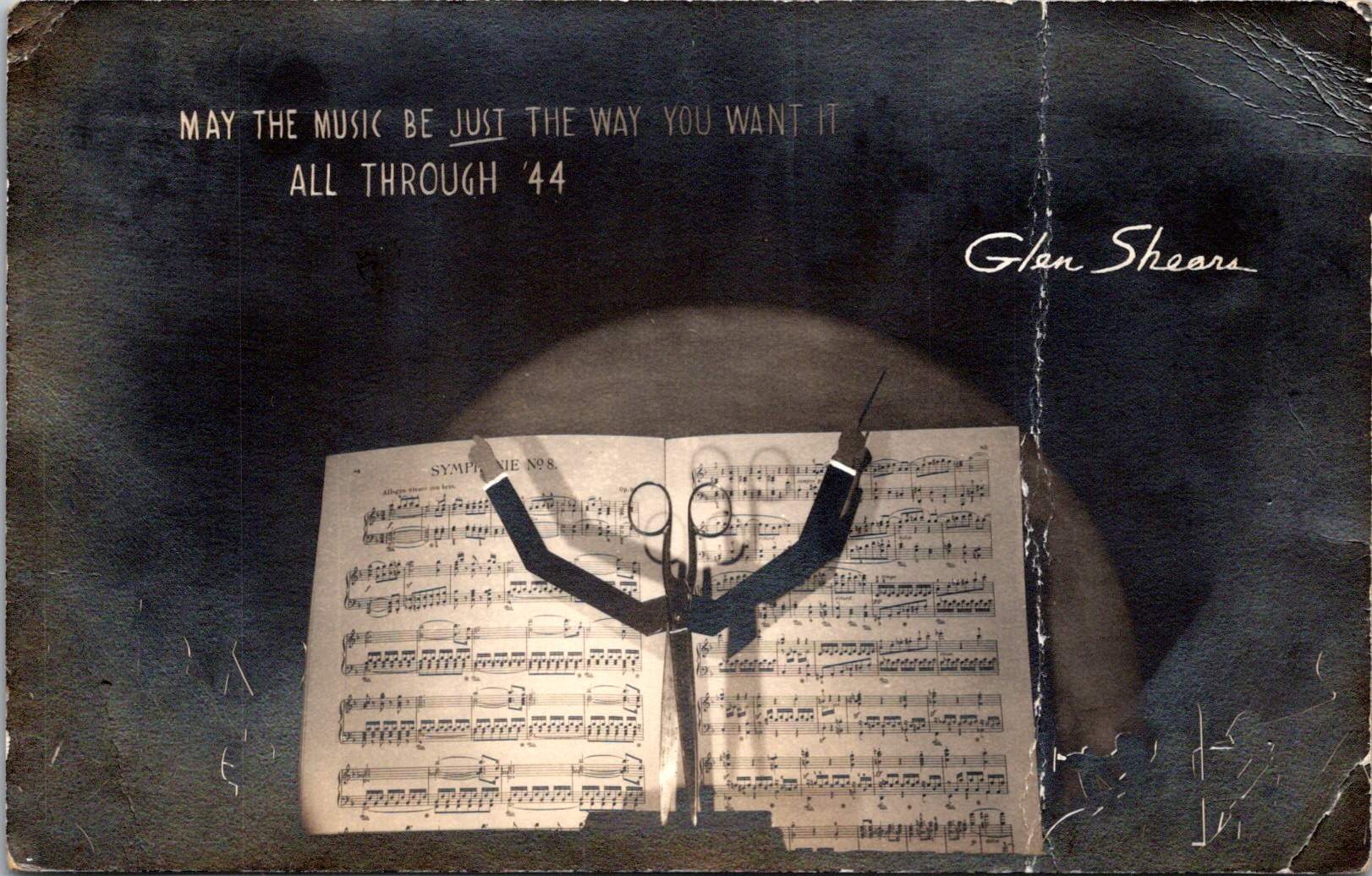
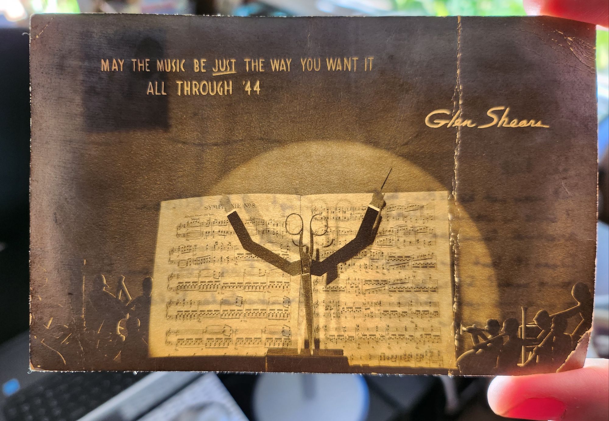
When held up to the light, this 1943 wartime postcard reveals a play on names and a hidden orchestra – but that’s just the beginning of its secrets.
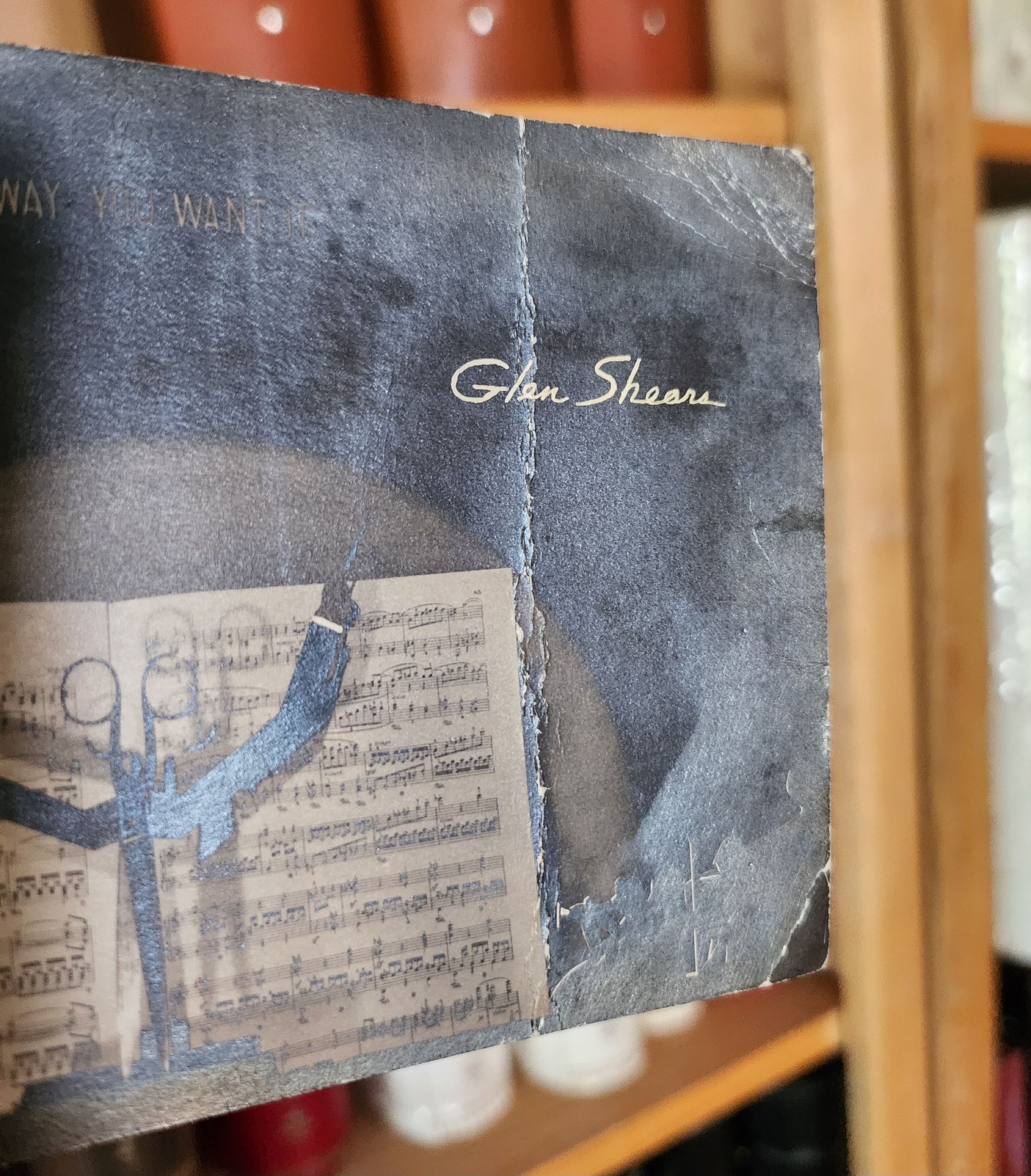
On a dark December day in 1943, someone in Chicago mailed an extraordinary postcard. At first glance, it appears to be a silver gelatin photograph of sheet music and a pair of scissors, artfully arranged and lit. But when held to the light, the card transforms – silhouetted orchestra members emerge from the shadows, and the scissors become a conductor’s upraised arms, creating a miniature theater of light and shadow. The message at the top reads MAY THE MUSIC BE JUST THE WAY YOU WANT IT ALL THROUGH ’44, signed playfully by Glen Shears – a silly pun referencing Glenn Miller, America’s most popular bandleader, and the scissors in the image.
The technical sophistication of this artifact presents an intriguing mystery. Its foundation is a silver gelatin photographic print, created using the same process that Eastman Kodak had popularized with their 1903 postcard camera. But the card’s creator went further, adding to the photograph a second iridescent overlay to create the hidden orchestral scene – a remarkable innovation combining two distinct images. During wartime rationing, when the War Production Board strictly controlled access to photographic papers and printing supplies, the mere existence of such an experimental piece raises questions about its origins.
Two theories emerge: The card might be the work of an individual artist-photographer, one of the creative practitioners who had embraced Kodak’s democratization of the postcard medium. The careful composition, masterful lighting, and precise registration of the overlay suggest someone with both technical expertise and artistic vision.
Or, it could be an experimental piece from the American Colortype Company of Chicago (or one of a handful other production houses) known for innovative printing techniques and possessing both the technical capabilities and wartime authorization to access restricted materials.
But as we look closer, deeper historical resonances emerge. The card was postmarked December 15, 1943, and addressed to Staff Sergeant J.M. Ellison of the 937th Engineer Aviation Combat Battalion at Barksdale Field, Louisiana. The sender’s casual inquiry – “Does it look as if you’re going over?” – hints at the imminent deployment of Ellison’s specialized unit.
The 937th was part of the Army Air Forces’ engineering force tasked with rapidly constructing and maintaining combat airfields. These Aviation Engineer Battalions could build a 5,000-foot runway in as little as 15 days, creating the infrastructure that would support the Allied advance across Europe. Following D-Day, units like the 937th pushed forward with combat operations, often working under fire to establish the forward airfields necessary for tactical air support and troop transport.
The card’s musical theme and playful signature unknowingly connected to another Army Air Forces mission. By December 1943, Glenn Miller had transformed his career from civilian bandleader to Captain in the Army Air Forces, modernizing military music through his Training Command Orchestra. In June 1944, Miller brought his band to England, where they performed hundreds of concerts for Allied forces preparing for the invasion of Europe.
As Allied forces advanced across France in late 1944, Miller became determined to bring his music to the troops at forward bases. He began planning an ambitious series of concerts at the very airfields being constructed by the Aviation Engineers. The precise coordination required for these performances – ensuring runways were operational and facilities ready – meant that Miller’s musical mission and the work of units like the 937th were deeply intertwined.
Here the card’s hidden theater of light and shadow takes on new meaning. The sender could not have known that exactly one year after posting this cheerful greeting – on December 15, 1944 – Glenn Miller would board a small Norseman aircraft in England, bound for Paris to arrange performances at forward bases. His plane disappeared over the English Channel in poor weather, creating one of World War II’s enduring mysteries.
The card’s wish for music “all through ’44” became both prophecy and elegy. Somewhere in France, Sgt. Ellison and his fellow engineers might have been preparing the very airfields where Miller hoped to perform. The innovative combination of photography and theatrical lighting effect, created in Chicago a year earlier, had unknowingly captured the intersection of American technical ingenuity, cultural influence, and the human tragedies of war.
Today, this hold-to-light card stands as both artistic innovation and historical artifact. Whether created by an individual photographer or a commercial outfit, it demonstrates the creative adaptation of pre-war techniques to serve wartime needs for connection and morale. In its transformation from simple photo to magical light-show, it embodied the same spirit of innovation that characterized both Glenn Miller’s military music and the rapid-deployment airfield construction of the Aviation Engineers.
More than just a technological curiosity, the card captures a moment when American creativity – musical, photographic, and engineering – was being mobilized for war. The coincidence of the postmark date and Glenn Miller’s final flight reminds us how individual stories weave together to create the larger narrative of history, sometimes in ways that only become apparent when held up to the light.
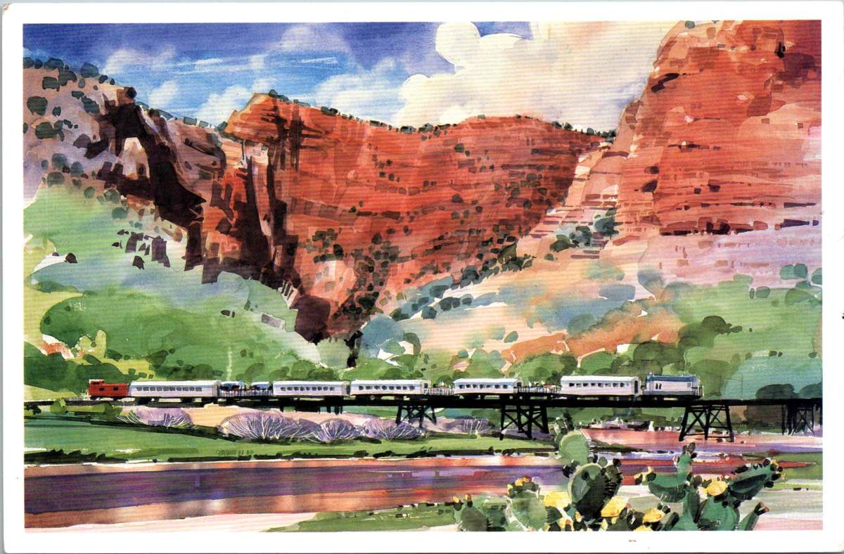
Arizona’s Verde Valley has inspired generations. Journey through this dramatic landscape where red cliffs greet green river valleys, and where an old mining railway now carries visitors through one of the Southwest’s most stunning canyons.
A striking watercolor dominates the front of a vintage postcard. The scene captures the essence of Arizona’s high desert: massive red rock canyon walls rise dramatically against a blue sky dotted with billowing clouds, while a silver passenger train glides across a trestle bridge below. The unknown artist’s watercolor brushwork renders the desert vegetation in soft greens, with prickly pear cactus dotting the foreground. The painting masterfully conveys both the monumental scale of the landscape and the delicate play of light across the rocky surfaces.
When the Verde Canyon Railroad winds through the high desert country of central Arizona, it follows ancient pathways. The Verde River carved this dramatic landscape over millennia, creating a riparian corridor that has attracted humans for thousands of years. Today’s passengers on the scenic railway see much the same view as the Sinagua people who built cliff dwellings here between 600 and 1400 CE, though the comfortable rail cars are a far cry from the precarious edges those early inhabitants deftly defied.
The river remains one of Arizona’s few perennial waterways, sustaining a complex ecosystem where desert meets riverbank. Towering cottonwoods and velvet ash trees create a canopy over the water, while sycamores and willows cluster along the banks. Native grape vines twist through the understory, and prickly pear cactus dot the rising canyon walls. This environment supports a rich variety of wildlife, from yellow-billed cuckoos and great blue herons to river otters and mule deer. Native fish species like the razorback sucker still navigate the waters their ancestors swam for millennia.
The human history of the valley reflects waves of settlement and industry. After the Sinagua, Yavapai and Apache peoples made their homes here. Spanish explorers gave the river its name – “verde” meaning green – marking the stark contrast between the river corridor and the surrounding desert. The late 1800s brought miners seeking copper, gold, and silver, transforming places like Jerome into boom towns. The railroad itself was built in 1912 to service the United Verde Copper Company’s mining operations, an engineering feat that mirrors our ancient ancestors.
Notable Arizona artists have interpreted this landscape. Ed Mell’s geometric, modernist approach emphasizes the monumental character of the canyon walls. Early pioneer Kate Cory combined artistic and ethnographic interests, documenting both landscape and culture during her years living among the Hopi. Merrill Mahaffey mastered the challenging medium of watercolor to capture the desert’s subtle light and atmosphere, teaching and inspiring so many along the way.
The artistic legacy of the region is inextricably linked to its unique quality of light. The clear, dry air creates what painters describe as crystalline clarity, especially during the “golden hours” of early morning and late afternoon. Artists employ various techniques to capture these effects: watercolorists leave areas of white paper untouched to suggest intense sunlight on rock faces, while building up transparent layers to show subtle color variations in shadowed canyon walls. The phrase ‘purple mountain majesties’ from Katharine Lee Bates’s “America the Beautiful” finds visual truth here, where the red rocks shift to deep purple at dawn and dusk, challenging artists to capture these dramatic transformations.
These artistic traditions remain vibrant today through institutions like the Sedona Arts Center, which hosts workshops, exhibitions, and the annual Sedona Plein Air Festival. These events draw artists from around the country to paint the red rock landscapes, continuing a legacy of artistic response to this unique environment.
The Verde Canyon Railroad itself represents a remarkable transformation from industrial resource to cultural attraction. When mining operations declined in the 1950s, the railroad continued operating for freight until the late 1980s. Its reinvention as a scenic railway in 1990 preserved both the industrial heritage and access to the canyon’s natural beauty, offering new generations a chance to experience this remarkable landscape where nature, history, and art converge.
In recent decades, the Verde Valley has emerged as a significant wine and food-producing region, adding another layer to its cultural landscape. The same mineral-rich soil that once yielded copper now nurtures vineyards, while ancient irrigation techniques inform modern water management practices. Local wineries have revived the area’s agricultural traditions, some of which reflect Spanish and Mexican heritage. The region’s restaurants increasingly reflect Native American heritage, too, combining indigenous ingredients with contemporary techniques. Native foods like prickly pear, mesquite, and local herbs appear on menus alongside wines produced from vineyards visible from the train’s windows.
Tourism in Arizona has evolved beyond simple sightseeing to embrace the complex tapestry of the region’s heritage. Visitors to the Verde Valley today might start their morning at an art gallery in Jerome, taste wines produced from hillside vineyards at lunch, and end their day watching the sunset paint the canyon walls from a vintage train car. This integration of historical preservation, artistic tradition, and culinary innovation exemplifies how the creative spirit that first drew people to these dramatic landscapes continues to evolve. The Verde Valley is home to each generation, who find new ways to interpret and celebrate the enduring connections between people and place.
Three postcards, yellowed with age, each capture a moment when someone paused in the middle of their story to reach out. Like a Venn diagram drawn in time, these missives overlap in that sacred space where human hearts seek connection across distances.
Through three preserved postcards from the early 1900s, we discover how every point of contact becomes a sacred center, a middle ground where hearts meet across distances both physical and emotional. Each yellowed card, with its carefully penned message, reminds us that we are all perpetually in the middle of things, reaching out across whatever distances separate us, making meaning in the spaces between hello and how are you?
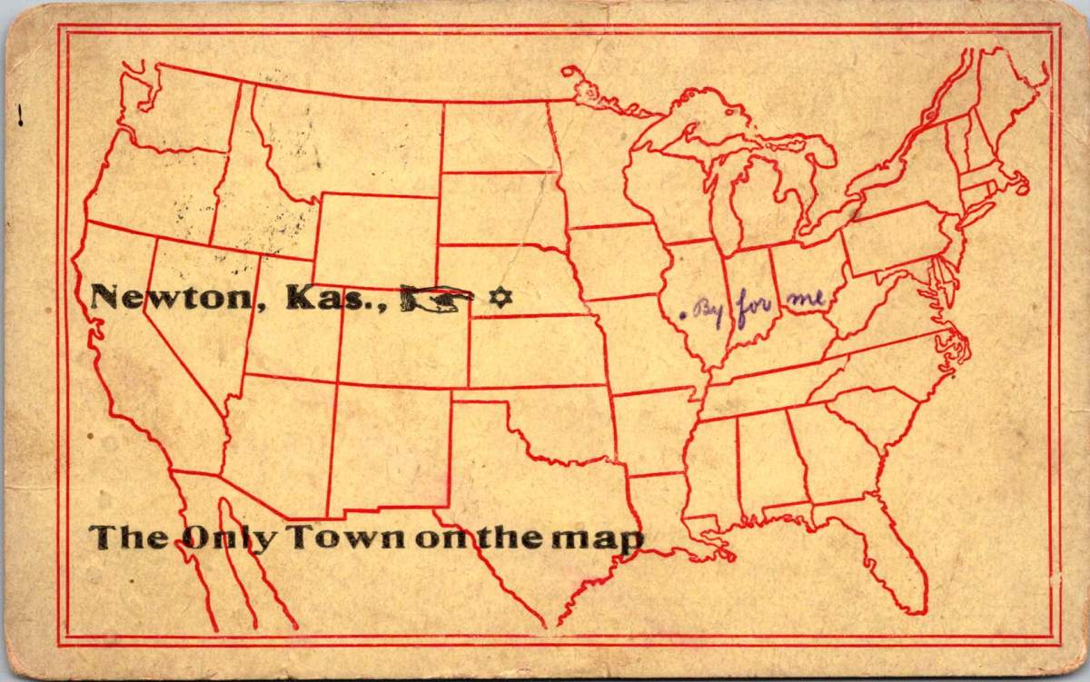
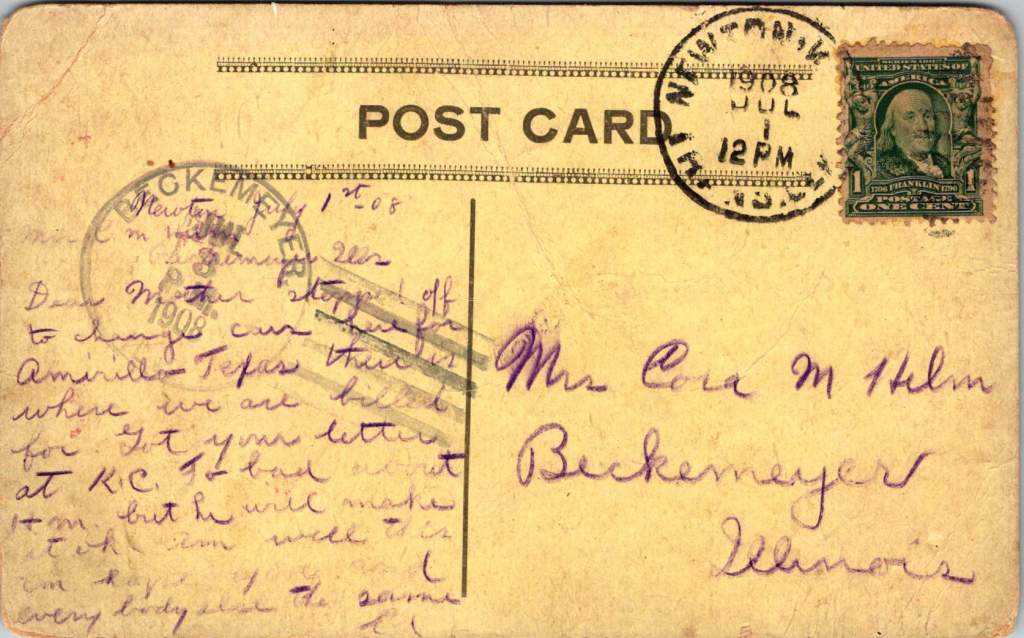
The Only Town on the Map
In Newton, Kansas, July 1908, Ed pauses between trains to write to his mother on playful postcard. A single dot on a stencil-drawn outline of the United States marks Newton as The Only Town on the map – a silly claim that also quietly captures a truth about human connection.
The humor lies in its absurdity – a blank continent save for this one dot in Kansas. Yet for Ed, in that moment, Newton truly is the center of everything, the pivot point between where he’s been and where he’s going.
Dear Mother, stopped off to change cars here for Amarillo Texas. There is where we are billed for. Got your letter at K.C. Too bad about him but he will make it ok. Am well this am, hope you and everybody else the same. Ed
He’s literally in the middle of the country, this railway town serving as his sacred center for just a few hours. There’s worry in his words about someone who’s unwell, balanced with reassurance about his own wellbeing. Even in transit, through immense uncertainty, he reaches for connection.
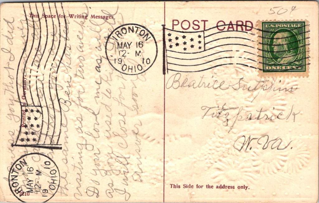
Long to Shake Your Hand Again
Two years later, in Ironton, Ohio, a young woman named Alma sends a card to Beatrice Sutphin in West Virginia. The card’s design speaks volumes: blue forget-me-nots and pink daisies frame a handshake, that polite, egalitarian gesture. Behind the clasped hands stretches a pastoral scene with water and a bridge – another symbol of connections that span distances.
“Do you love me as well as you used to, kid,” Alma writes, her playful tone reflecting the common courtesies of the day while masking a deeper yearning for reassurance. She’s navigating the creative tension of friendship across distance, using casual language and nudging humor to reach across the miles. The card itself becomes a bridge, a handshake in paper form.
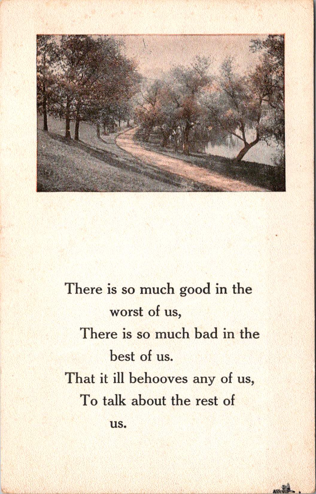
The Path Through the Trees
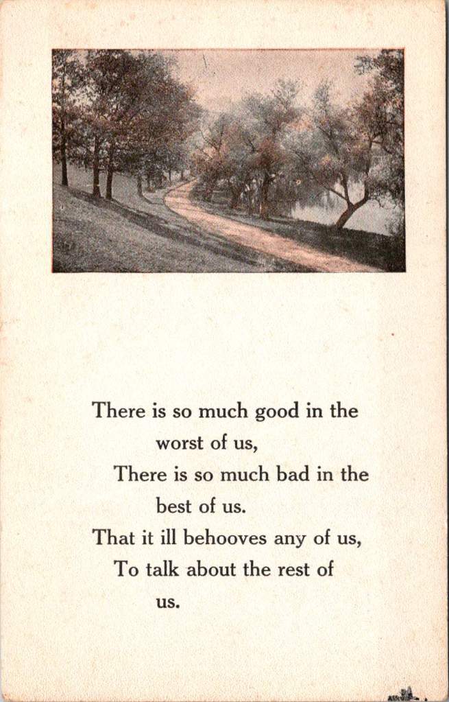
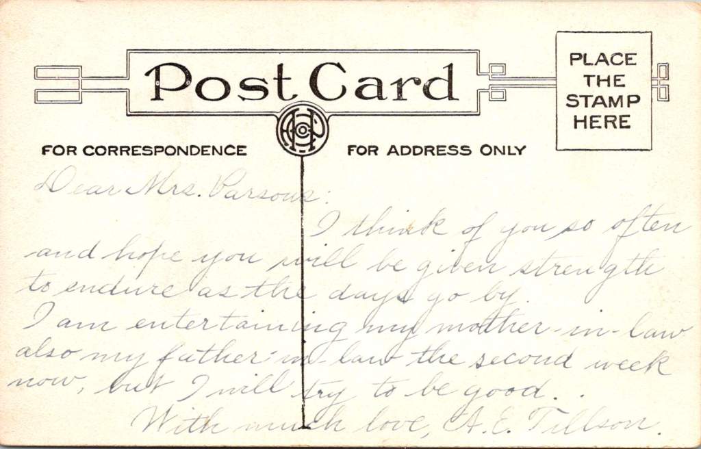
The third card, never mailed but carefully preserved, shows a winding path through trees, accompanied by verses about the complexity of human nature. A.E. Tillson writes to Mrs. Parsons with a note of formal sympathy, then adds a gentle joke about hosting in-laws. The message operates in that delicate middle ground between social obligation and genuine concern, between gravity and levity.
“I think of you so often,” she writes, “and hope you will be given strength to endure as the days go by.” Then, like a subtle change in musical key: “I am entertaining my mother-in-law and also my father-in-law for the second week now, but I will try to be good.”
All these years later, we are still inclined to gently inquire. Reading the messages between the lines, as they say. Do I sense a subtext here? What prevented her from sending this card? Why did she keep it long years on?
The Sacred Center
Something lies at the intersection of these three postcards, a sacred center they all circle around. It’s not serenity – each writer grapples with some form of creative tension. Ed worries about an unnamed “him” while trying to reassure his mother. Alma playfully demands affirmation of continuing friendship. A.E. Tillson balances sympathy with humor, formal phrases with personal asides.
The sacred center is the conversation itself – the eternal human drive to reach out, to connect, with even the most mundane facts. The center thrives on these noted perspectives, each writer offering their unique take, laden and layered with meaning though jotted out from a whistle stop.
These postcards are artifacts of appreciative inquiry in its most natural form. Each sender pauses in their own journey to ask: How are you? Are you well? Do you still care for me? Can I help you bear your burden? The questions themselves open up places where hearts meet and stories intertwine.
Some of us, like Ed in Newton, write from the middle of a physical journey. Others, like Alma, navigate the emotional journey of maintaining connections across distance. Still others, like A.E. Tillson, write from the complex shared ground of social obligations and genuine concerns, so often unspoken.
In Transit, In Place
Whatever the circumstance, we are always in the middle of things. There is always a before and after, always tension between where we’ve been and where we’re going, between who we were and who we hope to become. These postcards remind us that this center is not a void to be escaped but a sacred space packed with the very humble pieces of possibilities.
The verse on the unposted card speaks to this truth:
There is so much good in the worst of us, There is so much bad in the best of us, That it ill behooves any of us, To talk about the rest of us.
The middle is the best part – of our stories, of our journeys, of our complex relationships with others. As they say, if you’re not dead, it’s not over. The sacred center isn’t found in perfect serenity but in the creative tension of reaching out across whatever distances separate us, whether those distances are measured in railroad ties or handshakes.
These century-old postcards, with their careful penmanship and gentle inquiries, their jokes and worries and reassurances, remind us that the center holds not because it is static, but because it is constantly renewed through the sacred act of one person reaching out to another with a simple message. Here I am, in the middle of it all, thinking of you.
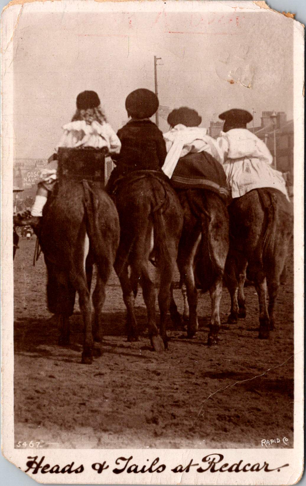
Four children are astride donkeys walking on the beach, clothed in Edwardian-style white blouses and all wearing caps. A century away (and still there today) kids on a delightful donkey ride near Redcar’s legendary seaside.
This real photo postcard with a memorable image bears the hand-scripted titled “Heads & Tails at Redcar.” One can still feel the April 18, 1910 embossed postmark on the card a century later. Addressed to Nurse Aird in Darlington from Redcar, the message is pragmatic.
Expect to arrive about 6.30 to-morrow evening. Love from Rennie
The seaside town of Redcar was transformed from a modest fishing village into a bustling resort town by the arrival of the railway in the mid-19th century, and became a beloved destination for working and middle-class families from throughout Britain’s industrial northeast.
In the 1910s, Redcar embodied the height of seaside grandeur. The impressive Coatham Hotel, built in 1871, dominated the seafront, its architecture expressing the optimism and ambition of the age. A pier stretched into the sea, its 1873 construction a testament to the engineering confidence of the era. Along the promenade, ornate gas lampposts cast their glow over evening strollers, while elaborate wooden shelters provided refuge from sudden showers.
The seafront architecture told a story of careful planning and civic pride. Victorian terraces, built of local sandstone or sturdy brick, were elegant facades looking at the sea. Behind them, a grid of streets housed seasonal workers, fishermen, and the growing permanent population drawn by the town’s prosperity. The Central Hall, opened in 1895, provided entertainment, while Methodist and Anglican churches with their reaching spires reminded visitors and residents alike of Victorian moral values.
Yet Redcar was never merely a tourist trap. The town’s proximity to mining linked it inextricably to Britain’s industrial might. The discovery of workable iron ore deposits in the Cleveland Hills in 1850 had sparked an industrial revolution in the region. By the 1910s, mines dotted the landscape, and the sight of industrial chimneys on the horizon reminded visitors of the region’s working heart. Many local people split their lives between seasonal tourist work and the demanding labor of the mines or ironworks.
This distinctive mixing of leisure and industry is part of Redcar’s character. Unlike some of Britain’s more exclusive seaside resorts, the community remained proudly connected to its working roots. The donkey rides captured in our postcard—a quintessential British seaside tradition—were an affordable pleasure for working families. The donkeys themselves, chosen for their gentle temperament and sturdy build, paralleled the town’s way: reliable, hardworking, and ready to provide joy to all comers.
On April 18, 1910, Rennie dashed off a quick note from Redcar to Nurse Aird, using one of Rapid Photo Company’s popular seaside postcards to announce a return to Darlington the following evening at 6:30pm. Such precise timing speaks to the reliability of the North Eastern Railway’s service between the coastal town and Darlington, where regular daily connections had become the lifeblood of the region.
The journey home would begin at Redcar’s Central Station, its Victorian architecture still relatively new and imposing in 1910. The late afternoon departure would catch the changing light over the North Sea, before the steam locomotive began its hour-long journey inland. As the train pulled through Middlesbrough and then west toward Darlington, the spring evening would be settling in, with the Cleveland Hills silhouetted against the dusk. Fellow passengers might have included ironworkers heading to night shifts, businessmen returning from coastal meetings, and perhaps other daytrippers who had enjoyed the seasonal pleasures of the seaside.
By evening, Rennie would step onto the platform at Darlington’s Bank Top station, the time at the coast already feeling like a distant memory. Perhaps a deliberate choice of train, selected to arrive after Nurse Aird’s duties were complete or to catch the end of visiting hours. Whatever prompted the journey, the postcard captures the easy mobility that the railway enabled, allowing residents of these northeastern towns to move between coast and country with a regularity that would have seemed remarkable just a generation earlier.
In 12 historic pictures: a day at the seaside at Redcar from The Northern Echo
The subsequent century would bring profound changes to Redcar. The pier, once a symbol of Victorian confidence, fell victim to storm damage and was demolished in 1981. The grand Central Hall disappeared. Many Victorian hotels were converted or demolished as tourism patterns changed. Most significantly, the industrial base that had provided much of the region’s wealth underwent dramatic transformation. The 2015 closure of the SSI steelworks marked the end of an era, dealing a devastating blow to the community.
Modern Redcar presents a complex picture of a community in transition. The Redcar Beacon opend in 2013 (locally dubbed the “Vertical Pier”) reaches skyward, its contemporary design contrasting with the Victorian architecture that remains. Victorian terraces continue to face the sea, their sandstone facades weathered but dignified. The Clock Tower, dating from 1913, remains a local landmark. The town center struggles with empty shops, a challenge faced by many British high streets. The loss of heavy industry has forced difficult economic adjustments.
The community’s response to these challenges reveals much about Redcar’s character. The Palace Hub, housed in a former amusement arcade, provides space for local artists and craftspeople. Local groups organize beach cleaning and heritage walks, maintaining the town’s connection with its past while protecting its future. Locally run kitchens and groceries address modern challenges of food poverty while building community connections.
Most remarkably, the donkeys still plod along the beach in summer months. The same gentle animals that carried kids a century ago now delight a new generation of visitors. Modern care standards ensure rest periods, weight limits, and veterinary checks, but the essential experience remains unchanged. Children still laugh with surprise at their first encounter with these patient beasts, parents still snap photographs (will box cameras make another comeback?) and the donkeys still take their slow and careful steps, connecting past and present.
Redcar reminds us that progress isn’t linear and that community change involves deep dynamics of loss and renewal. The town that grew wealthy on iron ore and Victorian tourism now seeks new paths forward in renewable energy and cultural heritage. What has remained is both quirky and reliable: a donkey ride on the beach on a summer’s day.
While the grand Victorian hotels and ore industries of the region have largely passed into history, the humble donkey ride endures. Sometimes the most modest traditions prove the most durable, and the true character of a place resides not only in grand achievements but also in simple, timeless pleasures.
Who indeed would have guessed that of all Redcar’s attractions, it would be the donkey rides we couldn’t live without? Perhaps it is fitting that these patient animals, who witnessed the town’s rise, decline, and ongoing reinvention, continue to reliably entertain (and endure) new generations.