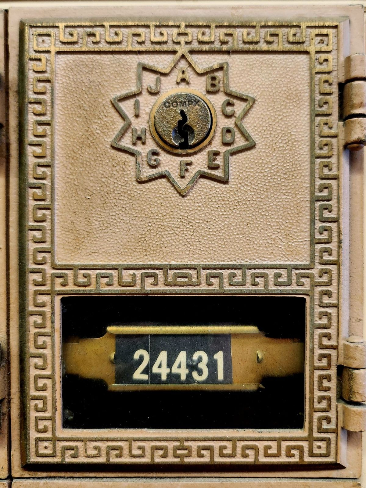
This is my new front door. Think of it as a study, a garden, a music room, and a studio. My aim is to make it the world’s smallest artist’s retreat.
Box #24431 measures only 3 x 5.5 inches. But like the best spaces, it’s about what happens inside. This little metal door represents a vision I have kept tucked away for a very long time.
Make a place where people want to be and become creative.
A place where creative lives unfold slowly, where stories accumulate over time, where the daily practice of writing becomes a way of being present to the world. In other words, I want to make a place for you (and me).
Maybe you have a book in you. Maybe your life feels like a book being written right around you. Maybe what is calling isn’t a workshop or deadline, but simply the habit of putting words on paper and sending them to someone who will read them with care and respond. Sometimes the most important writing happens in the margins of our days, in postcards and texts, in the small mechanics of turning experience into language and expressing it.
I love that place between sending and receiving, writing and reading, and the exchange of thoughts among people. It’s about circulation. Our stories are the lifeblood feeding and fueling our times. Cultural movements are made through the messages exchanged between us, much more than the headlines would have us believe. Word-of-mouth, greeting cards that travel door-to-door, book reviews, weather reports, hotel recommendations, and the whispered news—crossing distances for us, even over generations and through the delicate spaces of relationships as they go.
Writing is a practice. Like meditation, walking, and tending a garden, it is one way we examine our lives unfolding, sentence by sentence, year by year. Every little missive you write becomes part of that practice—a way of paying attention to what matters, of noticing the small moments strung together. Meanings that can be folded up like origami and written in haiku.
What kind of spaces do writers need? Spots to sit comfortably for a while, suitable room temperature, good lighting, and forgiving technology. Writers also lean on insight, desire, intention, or motivation, and before that, a well-worn habit or behavior. The daily practice of showing up to the page, even when the page is just a postcard.
I say, let’s start there. You handle the writing setup and the ideal conditions—I don’t have that kind of room yet! I’m here for the correspondence. Both of us engaged in noticing, finding the words (or not), and reaching out every so often.
Send me a postcard—the older and odd, please! Your card will be added to my collection and I’ll keep your particulars on file. No digital list here, just a vintage recipe card box on my desk where handwriting lives.
And, if you plan to finish that book? Yes, I am prepared to serve as your humble first reader. Use a typewriter or your finest small script, and you may need more than one postcard. Your story (or any moment from it) is welcome here.
Write to me at: The Posted Past, P.O. Box 24431, Tempe, AZ, 85285.
Include your address and I will respond in kind.
+++
We’re not Luddites 🙂 You can also hit the SUBSCRIBE button on this page to receive The Posted Past every Wednesday in your inbox. Your generosity is the difference between the free and the $5/month options. Thank you! New essays begin in September.
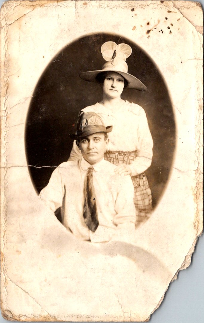
Is this a portrait of the couple or their hats? Feathers in the band. Fascinator with a wide brim. Stories behind their eyes and more clues in their clothes. The real photo postcard went unsent. Pasted inside an album once, and then lost for 100 years.
A sepia-toned oval portrait photograph from around 1910 showing a couple in formal attire. The woman stands behind the seated man, wearing a wide-brimmed hat decorated with a large bow or fabric flower. She’s dressed in a light-colored blouse with puffy sleeves and a geometric patterned skirt with a button at the waist. The man sits in front wearing a white long-sleeved collared shirt, striped tie, and a small hat with multiple feathers in the brim. Both subjects have neutral expressions typical of formal photography from this era. The real photo postcard shows significant age-related damage, with cracked and yellowed edges, stains, and deterioration around the borders, characteristic of an early 20th-century item previously collected in an album.
The Posted Past marks its one year anniversary with fun, facts, and cats!
A year ago, The Posted Past began with a simple quest—to explore the stories behind my family’s vintage postcard collection. These small windows into the past gave me the chance to be curious and brave as a writer. I wasn’t sure I could research and produce a short essay on a weekly schedule. Fifty-two weeks later, without a single miss, I am happily beyond those worries.
Thank you for joining me on this journey. Together, we’ve traveled from Osaka to Matoon. Looked at buffalos roaming in a Kansas field and donkeys on the English seaside. Iconic views of San Francisco came from its well-known chronicler, and we’ve been on a more recent search for a Mexican photographer who vanished in volcanic ash. Each postcard has taken us to unexpected corners of history—social movements, architectural trends, national parks, and the everyday lives of people who took the time to write, “Wish you were here.”
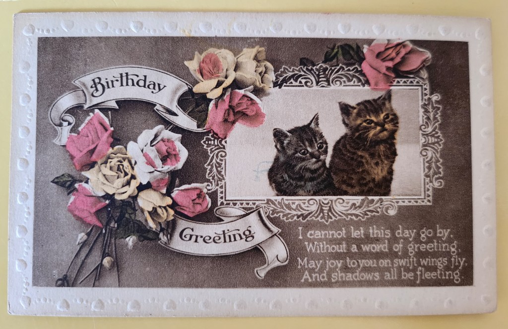
Today’s postcard reminds me why I love this work. The adorable kittens and lovely roses on the front never go out of style. On the flipside, Maude writes to her mum with a few sweet sentiments and concerns. In between lies a world of personal and cultural histories: the rise of the postcard era, the Victorian language of flowers, the printing techniques that made such colorful cards possible, and the universality of cats. Always, an exchange between people. What we’re really collecting are reminders of tender human connections across time.
What’s new for year two? July will bring a shift in weekly format while I take some vacation time—shorter Wednesday posts spotlighting single cards. After that, I’ll be expanding the eBay store, indulging in the nerdy work of adding captions and citations to old posts, and exploring how these weekly essays might become a book and a workshop series. Like any creative start-up, the first year came with a to-do list of dreams and ideas.
Before I sign off, may I ask: would you ever consider sending a vintage postcard as a gift? The mechanics are easy—choose the perfect card online, add a personal note, and we send it off with love through the post office. But is that something you’d enjoy giving or receiving? Leave me a note in the comments.
Thanks again, and meow for now 🙂 Enjoy the summer!
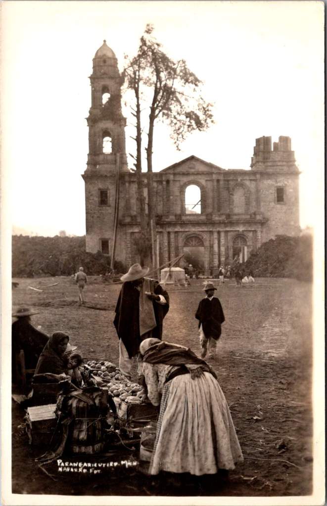
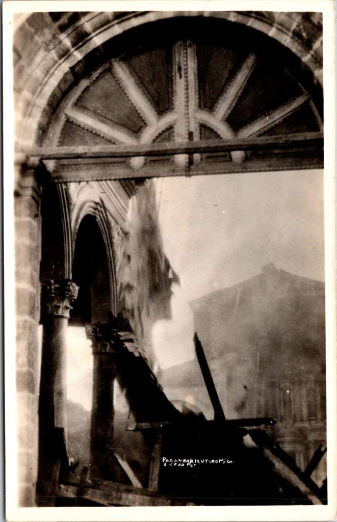
In February 1943, a photographer enigmatically known only as ‘Navarro’ documented Parícutin’s volcanic destruction of a Michoacán village and church, creating powerful postcards that circulated worldwide at the time and are highly collectible now. Then, Navarro vanished from history.
Parícutin erupted from Dionisio Pulido’s cornfield on February 20, 1943, becoming the first comprehensively documented volcanic birth in human history.
The response was immediate and international. Despite World War II, the Parícutin volcanic plumes commanded global coverage. The geological disruptions of fire and lava inspired scientific awe. Life Magazine dispatched photographers. Newsreels carried footage worldwide. Airlines altered flight paths for passenger viewing. By 1947, Hollywood used the still-active volcano as backdrop for the movie Captain from Castile, employing thousands of locals as extras.
In the extensive archives documenting Parícutin volcano’s nine-year life cycle, one name appears and vanishes: Navarro. His postcard images capture the most significant moment in the volcano’s terrifying story—when lava reached the 400-year-old church of San Juan Parangaricutiro. Despite meticulous record-keeping around this geological event, Navarro himself remains a mystery.
His photographs have more than survived. When story of the events at Parícutin are retold, one always finds a Navarro image. The photographer does appear in one other place: Folder 7 in Box 9 of the William F. Foshag archives.
The Day Lava Reached the Church
Navarro’s postcards document a sequence unfolding over a few crucial days in early 1943. For the year prior, the Purépecha community of San Juan Parangaricutiro had watched lava flows advance on their small village while praying their homes, farms, and colonial church would be spared.
Despite their pleas and processions, the lava flow had accelerated beyond divine intervention. President Lázaro Cárdenas and local priests convinced most residents to evacuate, carrying sacred objects and any moveable materials to the nearby town of Uruapan. One rare slice of film shows men removing clay tiles from a building roof.
When the lava reached the church, Navarro was there to document the destruction. Black lava creeping around the church’s perimeter. Intense heat causing wooden elements to combust. Steady accumulation of cooled volcanic rock against the baroque stone façade, contrasting human craftsmanship with geological force.
Two striking images captures the church’s wooden elements on fire—ornate arched stonework and columns holding the structure up while everything else is consumed. Extending the mystery further, these two images bear exactly the same mark and style of the others, but a different name is entirely obscured. Perhaps it makes sense, Navarro and another photographer would go together. Better than alone.
Foshag and the Official Record
William Frederick Foshag of the Smithsonian Institution’s National Museum led Parícutin’s scientific research and systematic documentation. A respected mineralogist and curator, Foshag had already spent his career studying volcanic minerals and processes. When Parícutin erupted, he was uniquely positioned to lead the most comprehensive study of a volcano’s complete life cycle.
Foshag arrived within weeks of the initial eruption and remained involved until the volcano’s dormancy in 1952. Working with Mexican geologist Dr. Jenaro González Reyna, he established a research station documenting every phase of development. Their collaboration produced detailed maps, temperature measurements, chemical analyses, and thousands of photographs fundamental to volcanic research today.
Navarro’s church sequence suggests either remarkable intuition, access to local knowledge, or information coming from scientific observers. The Purépecha community, drawing on generations of volcanic experience, provided crucial insights about timing and the landscape. Navarro’s ability to be there for the church’s final moments indicates he was plugged in.
Foshag’s archives reveal an extensive network of colleagues contributing to this documentation. Box 9, Folder 7 bears Navarro’s name alongside numerous other photographers, artists, and local and international contacts. It seems Foshag recognized the value of different perspectives in creating a complete record.
The official scientific documentation benefited from all the independent photography produced at the time. Their paths very likely crossed with many others at work during critical days when the lava and ash threatened San Juan Parangaricutiro.
Kodak in Mexico
The real photo postcard industry supporting photographers like Navarro was sophisticated. Entrepreneurs traveled with complete darkroom setups in automobiles, developing film and producing finished postcards within hours. They sold to tourists, sent copies to newspapers, and maintained distribution networks across Mexico and the United States.
By 1943, Kodak had established a robust business providing both cameras and materials throughout Mexico. Navarro’s postcards bear the EKC (Eastman Kodak Company) indicia and are marked Kodak Mexicana, LTD. Navarro had access to standardized, high-quality photographic paper specifically designed for postcard production. This infrastructure allowed photographers to work with consistent materials as they traveled to remote locations.
This commercial system created a parallel archive to official scientific record, prioritizing dramatic visual impact and human interest. While Foshag documented systematic geological processes, Navarro captured moments resonating with public imagination: the church under siege, displaced communities, civilization meeting unstoppable natural forces.
The quality and consistency in images suggests professional training and equipment. His compositions demonstrate understanding of the landscape and evoke pathos. Combined with his access to Kodak’s professional-grade materials, we may assume Navarro was more than a concerned observer.
History’s Mysteries
Navarro’s fade from historical records reflects broader patterns in how scientific events get remembered. Official histories preserve institutional participants while quietly forgetting the names and stories of independent contributors. This is notable with Parícutin, where local Purépecha knowledge proved crucial to understanding volcanic behavior, yet indigenous voices were largely excluded from formal documentation.
Still, Navarro gives us another chance to go there ourselves for a glimpse of those extraordinary hours. His postcards circulated broadly through the popular means of the era—family correspondence, tourist collections, commercial distributors—and are highly collectible today.
As researchers study Foshag’s extensive archives, Navarro’s name remains a tantalizing fragment—present enough to suggest significance, absent enough to resist interpretation. His postcards survive in collections across North America, carrying their maker’s vision but not his story.
This persistence of mystery tells us something about how we remember extraordinary events. While institutions preserve official records with careful attribution, the broader network of individual contributors often dissolves into anonymity. Navarro represents countless others who showed up when history was being made, pointed cameras at crucial moments, contributed to our understanding of the world, and then vanished back into the crowd.
The photographs of the church’s destruction remain powerful because they capture something beyond ecological process—the moment when human scale met geological time and a community’s sacred center became a monument to forces beyond human control. Navarro was there to see it, and that’s a chance for us to remember the event and to admire him.
This essay was inspired by Elena, Maria, and Sandy – with gratitude.
These vintage postcards from the 1972 Tourism Year of the Americas reveal fascinating questions about natural landscapes, heritage, monuments, and whose stories we remember and tell.
In summer 1972, the United States Postal Service issued commemorative postcards that would become enduring symbols of national identity. These postcards, part of the Tourism Year of the Americas campaign, featured iconic destinations with restrained elegance—their two-color printing was both artistic and economical. As America stood at a cultural crossroads, this postcard set tells a familiar American story. More than five decades later, they reveal even more about how a nation sees itself.
Commemorative Moments
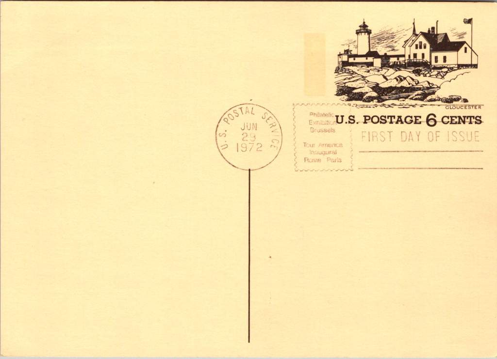
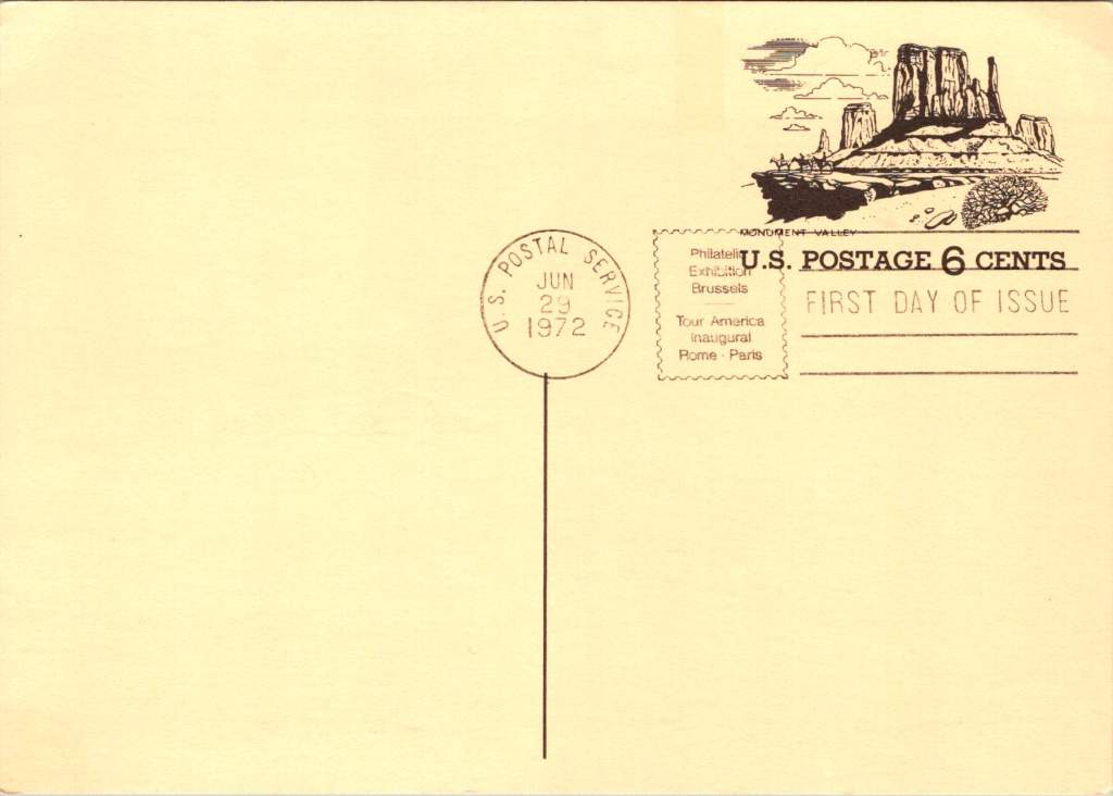
First Day of Issue cancellations mark a special moment in time, and signal that an item is expected to be collectible. The postcards were cancelled on June 29, 1972, bearing the commemorative text “Philatelic Exhibition Brussels” and “Tour America Inaugural Rome – Paris.” These international exhibitions promoted American tourism during the Cold War, when cultural diplomacy served as essential soft power.
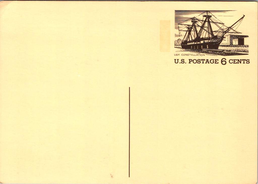
The carefully designed cancellation artwork includes USS Constellation (6¢), Gloucester (6¢), Monument Valley (6¢), and Niagara Falls (airmail 15¢). These rates reflected the newly reorganized United States Postal Service which had become its own entity the year prior. The 1972 Tourism Year of the Americas was an ambitious initiative from the new quasi-independent agency, emerging alongside Nixon’s opening to China and détente with the Soviet Union.
USS Constellation, the last sail-only warship built by the U.S. Navy (1853-1855), served as flagship of the Africa Squadron from 1859–1861. The ship captured three slave vessels, enabling liberation of 705 Africans. During the Civil War, Constellation deterred Confederate cruisers in the Mediterranean. The selection represented naval heritage and anti-slavery efforts, though it still centered the naval victory rather than those who gained freedom.
Niagara Falls has attracted visitors for 200 years, becoming the symbolic heart of American tourism. The 1883 Niagara Reservation became America’s first state park, influencing national park creation. Current visitor statistics show enduring appeal: 9.5 million tourists visited Niagara Falls State Park in 2023, with the region welcoming 12 million visitors yearly.
Monument Valley reflect the West’s central role in national identity by 1972, immortalized through Hollywood and environmentalism. Yet Monument Valley sits within Navajo Nation territory, while Grand Canyon encompasses land sacred to multiple tribes, including the Havasupai, whose reservation lies within park boundaries—reminders that park creation displaced Native communities.
Gloucester, America’s oldest seaport, sustained coastal communities for centuries. The lighthouse image evoked both practical maritime safety and romantic notions of New England’s rocky shores, while Gloucester’s working harbor embodied the intersection of heritage preservation and living tradition. By 1972, this historic fishing port faced the tension between maintaining its authentic maritime culture and adapting to tourism pressures—a challenge that made it a fitting symbol.
Artistic Vision
The front of the postcards render multiple iconic American locations in distinctive engravings in an economical two-color print run, an important factor for a the government printing office.
The collection showcases a deliberate balance. Yosemite represents natural power and America’s first national park. Missisippi Riverboats and the Rodeo embody western majesty central to national imagination. DC Monuments offer overt patriotism and Williamsburg and the Liberty Bell connect to the tremors and tolls of colonial democracy.
Even in 1972, these were selective narratives. All featured natural sites exist on traditional Indigenous lands, for example, while largely omitting Indigenous perspectives and enslaved people’s contributions to our cultural histories.
Many featured locations are sacred sites to Indigenous communities. Some of the most sacred places for American Indian nations are located in national parks, yet access to holy ground remains contentious. Park creation often involved displacing Native peoples from lands they had stewarded for millennia.
The year 1972 was tough in other ways: Vietnam War divisions, emerging Watergate scandal, and generational alienation over the military draft. These postcards presented a different kind of unity. Rather than contemporary political divisions, they emphasized natural wonders and historical sites that transcended partisan conflicts.
During the Cold War, these postcards served as miniature global ambassadors, too, often providing people’s first visual encounter with American landmarks. They projected America as worthy of visiting and learning about, countering negative impressions from political controversies.
The postcards themselves embody crucial democratic principles: making heritage accessible through affordable media; connecting tourism to conservation through revenue and public appreciation; and revealing how commemorative choices reflect national values. The geographic diversity suggests a desire for the fullest of American experiences, though these 1972 selections still privilege certain narratives.
New Memories
These postcards continue to offer insights into American values and heritage preservation evolution. USS Constellation still serves as a museum ship in Baltimore’s Inner Harbor. National parks have experienced tremendous visitation growth, raising questions about balancing access with preservation.
In what they don’t depict, the postcards show gaps in whose stories get told, whose lands get celebrated, whose experiences get centered. While 1972 selections emphasized traditional narratives, contemporary views increasingly include previously marginalized perspectives, acknowledging Indigenous heritage alongside colonial and national stories.
These artifacts remind us that commemorations reveal values and priorities. As our historical understandings evolve, it’s wise to look back and look again.
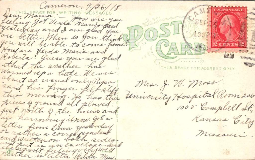
During the 1918 pandemic, daily postcards were lifelines between farm and hospital for the Moss clan in Missouri. Their words remind us that love weaves a way between two worlds.
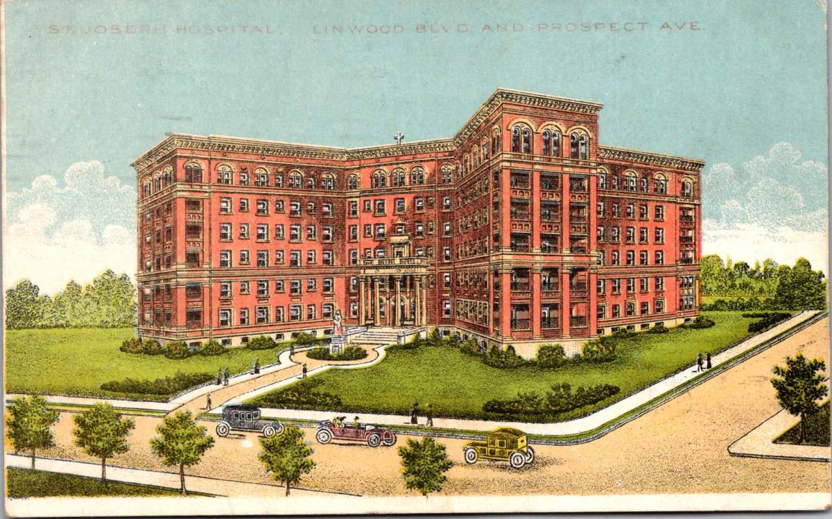
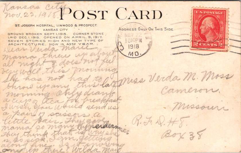
A postcard trembles in worried hands. On the front, St Joseph Hospital, Linwood & Prospect Streets in Kansas City, Missouri. Victorian landscaping, tree-shaded boulevards, a large, new hospital. It is a world of progress and prosperity frozen in glossy perfection.
Turn the card over. Faded ink bleeds across cream paper. “Dear Verda Marie, Mama threw up all night and does not feel well this morning… only drank a cup of tea for breakfast.”
Two worlds exist on a single postcard. The front celebrates America’s gleaming cities and grand institutions. The back reveals a family torn apart by pandemic and war, working together and staying in touch every day.
The Spanish flu arrived in Missouri like a thief. It followed railroad lines and river valleys, spreading from military camps across the heartland. By September, Kansas City reported its first cases. By October, the city’s hospitals overflowed with the gravely sick and dying.
Mama Moss checked into University Hospital on Campbell Street, one of several small places on Hospital Hill, where Kansas City built its first medical facility in 1870. Now every building overflowed with sick and strapped families seeking any treatment that promised relief or protection.
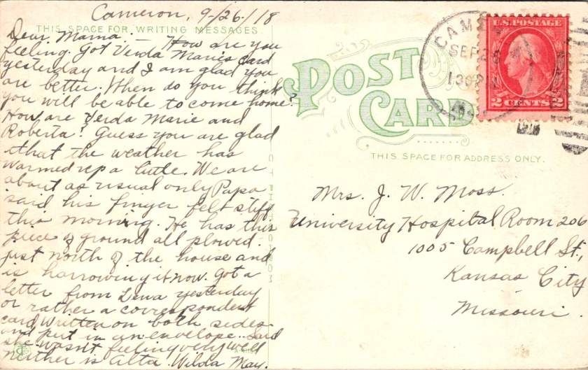
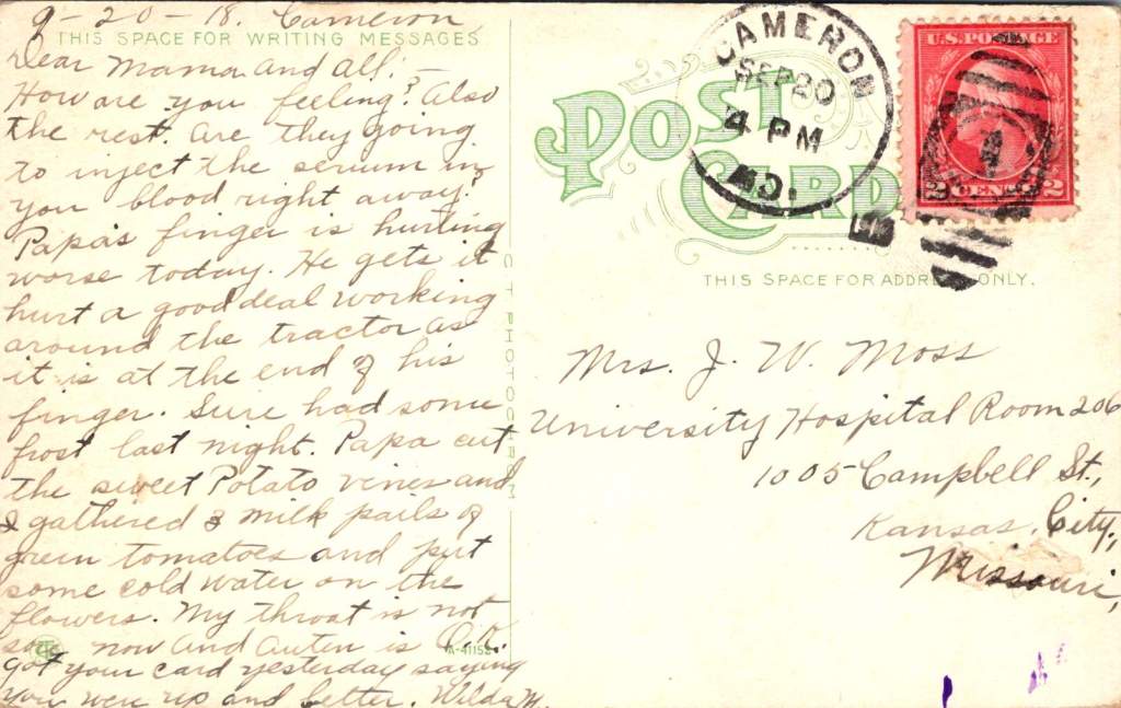
The postcards begin their daily journey between Cameron and Kansas City. Fifty miles of prairie separate farm from hospital, family from mother, routine from crisis. September 20th,Verda Marie writes from Cameron:
Dear Mama, and all. How are you feeling? And the rest. Are they going to inject the serum by your blood right away? Papa’s finger is hurting worse today. He gets it hurt a good deal working around the tractor.
The serum treatments represented medicine’s desperate gamble. Doctors extracted blood from recovered patients, believing their antibodies might save others. Transfusion methods were primitive—donor to patient through crude tubes, with minimal understanding of blood compatibility.
The front of her postcard shows Fourth Street looking west in Cameron—tree-lined and peaceful, houses with wraparound porches and manicured lawns. No hint of pandemic. No suggestion of families split between farm work and hospital vigils.
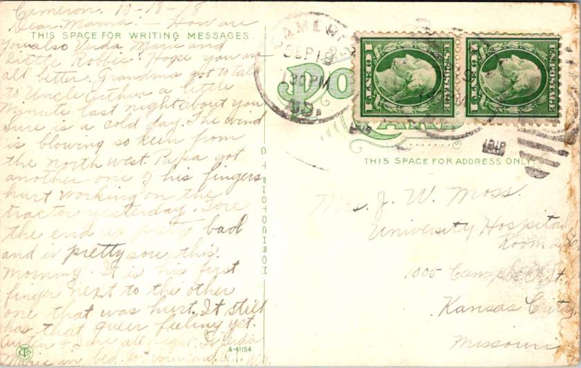
September 26, another postcard from daughter Wilda May in Cameron. Papa keeps working despite his damaged fingers. Farming cannot stop, even during plague, while war production and domestic demands for food are high. Families managed alone while the virus spread through communities like wildfire.
Dear Mama, got Verda Marie’s card yesterday. I am glad you are better. When do you think you will be able to come home? … Papa said his finger felt stiff this morning. He has this piece of ground plowed north of the house and is harrowing it now.
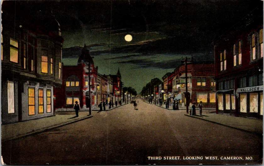
This card displays the Third Street business district looking East. The image suggests normalcy, prosperity, urban activity. The message tells a different story—injury, illness, fragmented family life.
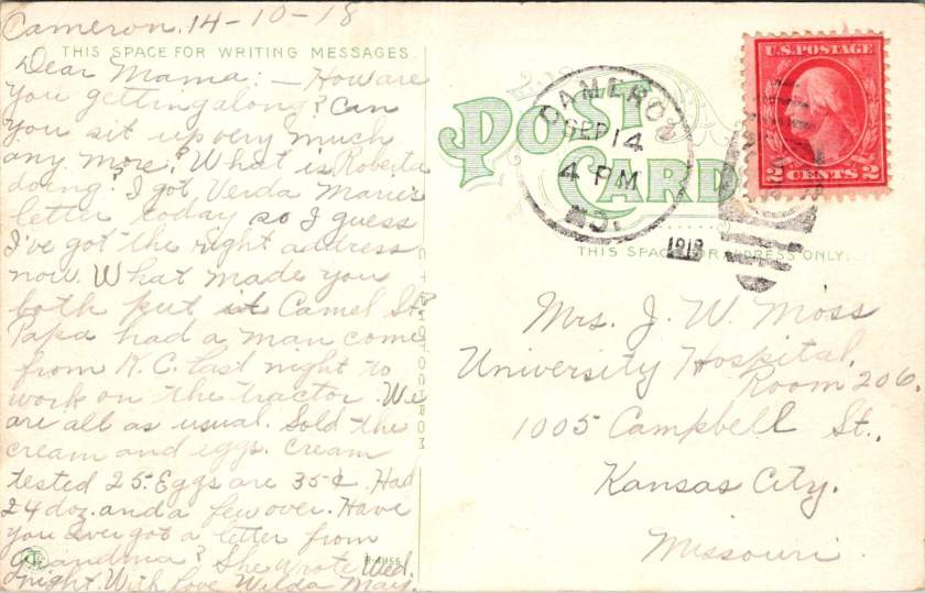
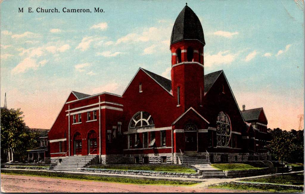
October 14th, from Cameron, Wilda May is writing to check in on Mama, Verda Marie, and little Roberta.
How are you getting along? Can you sit up very much any more? Papa had a man come from K.C. last night to work on the tractor. Sold the cream. Eggs are 35 cents. Had 24 dozen and a few left over.
The dramatic red brick architecture of the M.E. Church is featured on the front. The bell tower, archways, and stained glass, no doubt concealing a community in a moment of great challenge.
November arrives with mixed signals. The Great War ends with armistice celebrations flooding city streets. Victory parades march through Kansas City while Hospital Hill counts mounting dead.
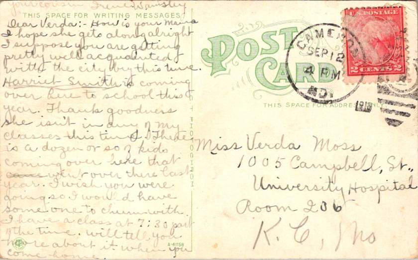
November 22nd, Wilda May is now in Kansas City and Verda Marie is back in Cameron. This is the card with St Joseph Hospital on the front and a report of Mama’s worsening condition on the back. Poignantly, a plea for simple materials.
I wish you would send us a pair of scissors, a little pair. They gave Mama so many hyperdermics (sic). They think that is why she is so sick.
The front shows St. Joseph Hospital—imposing, institutional, representing medical progress. The message reveals the grinding reality inside: nausea, sleepless nights, requests for basic supplies.
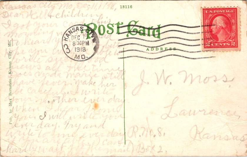
December 11, 1918. The last postcard in this series leaves Kansas City at 8:30 PM. Mabel Moss writes with exhaustion and desperate love.
Does Verda Marie still have a fever? Make her be careful. Write to your mother every day. I will write to you each day, too.
She repeats herself. Write every day. Every day, I will write to you.
These postcards have become more than communication. They serve as proof of life, wellness checks, emotional anchors in a world gone mad. Each delivery confirms another day fought forward, another family member still breathing.
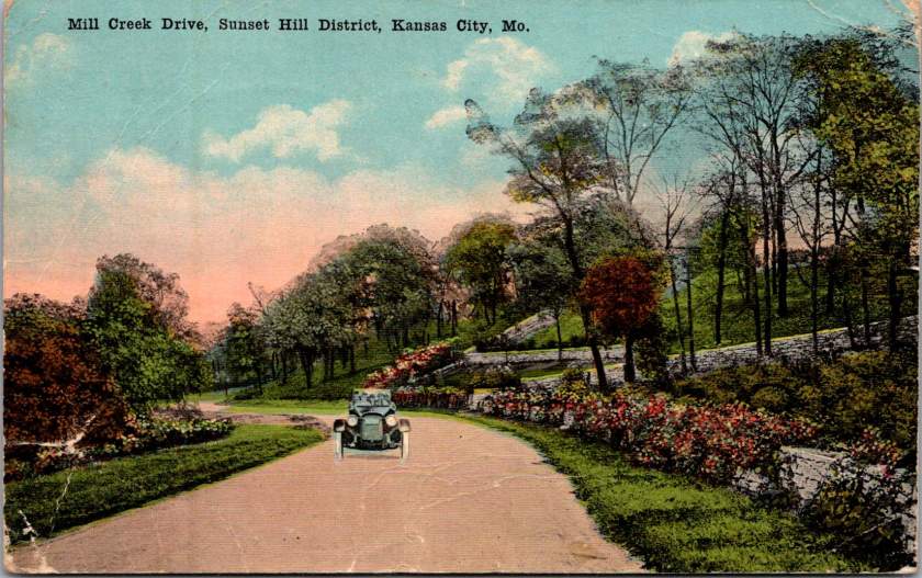
The front of the card features a swank soft top automobile on Mill Creek Drive, in the Sunset Hill district of Kansas City, Missouri. Lush foliage suggests it is a wonderful day to take in the fresh air.
Armistice brought celebration but not peace. Fighting continued in distant lands. The temporary ceasefire required renewal every thirty-six days. Victory was fragile, conditional, threatened by forces beyond control.
Also, influenza had no respect for borders. While diplomats negotiated peace terms, the 1918 pandemic waged its own relentless war. Families learned that health status changes cruelly and without warning. People woke well and died by nightfall.
These postcards preserve this tension between public aspiration and private desperation, helping us journey back to history as it happened. The fronts of the postcards celebrate civic pride—hospitals, colleges, tree-lined streets, architectural monuments. Their backs tell different stories. Experimental medical treatments. Daily fears about fever and death. Constant threat of injury from dangerous farm equipment. The grinding reality of families separated by crisis, held together by handwritten words.
This contrast defines the American experience during a period of dual catastrophes. Communities built beautiful institutions while individuals struggled for survival and missed hard earned opportunities. Cities planned grand boulevards while families split between hospital rooms and farm chores. America as it aspired to be, and as it actually existed for the Moss clan.
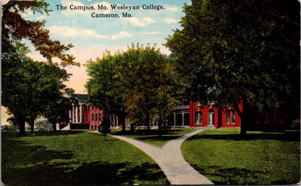
Just as her mother was getting sick, Verda Marie received a cheery postcard from a classmate with some gossip to share.
Harriet Smith is coming over here to school this year. Thank goodness she isn’t in any of my classes … I wish you were going so I would have someone to chum with…
The postcard front featured Missouri Wesleyan College campus—red brick buildings set among autumn trees. The front speaks to knowledge, tradition, the future of young minds. We can read between the lines on the back. Verda Marie would not be in class that semester, sadly.
Like Lazarus rising from his tomb, the world emerged from pandemic death to discover life transformed. The 1920s roared with celebration and renewal, and time went on. Hospital Hill expanded into Kansas City’s premier medical district. The red brick buildings where Mama received her serum treatments evolved into modern towers serving new generations. A century later, technological and medical innovations advance but essential human needs persist, too: connection, communication, proof that loved ones survive another day.
These particular postcards survived in a family archive. Stories of courage, love, determination tucked away to find a century later. Each card represents a day won against the odds, a family bond that transcended distance and disease.
The Moss family’s story continues in everyone separated by illness, every community battling invisible enemies, every healthcare worker risking their life to save others. The beautiful facades combined with harrowing messages remind us that hope and suffering coexist, flipped back and forth in our hands, repeated in every generation.
Native Hawaiian wisdom, mainland capitalism, an LDS mission, and the birth of Pacific tourism. At the center, a banyan tree that has watched Hawaii transform for 120 years. This 1921 real photo postcard reveals the complexities of cultural exchange, migration, and travel over time.
In the photograph we are looking at today, the Moana Hotel rises like a palace from Waikiki Beach, its elegant wings stretching toward Diamond Head. A wooden pier extends into the Pacific. The building’s Victorian details hint at mainland American grandeur transplanted to the tropics. The “First Lady of Waikiki” opened as the territory’s first luxury resort, transforming a landscape once dotted with taro ponds and royal summer homes into the birthplace of Pacific tourism.
Built by wealthy landowner Walter Chamberlain Peacock and designed by architect Oliver G. Traphagen, the Moana opened on March 11, 1901, with 75 rooms featuring Hawaii’s first electric elevator and the unique amenity of private bathrooms. The first guests were a group of Shriners, who paid $1.50 per night—about $50 today—to experience what was then a very remote luxury destination.
Three years later, Jared Smith, Director of the Department of Agriculture Experiment Station, planted what seemed like a simple landscaping choice in the hotel’s courtyard: a young Indian banyan tree, nearly seven feet tall and about seven years old when planted. In the image, the tree is seventeen years old and already creating the shaded sanctuary that is the hotel’s heart even today.
As we flip the postcard over, another dimension is revealed. On November 29, 1921, a simple message sent to Mabel Moss in Longanoxie, Kansas with the usual greetings. But this isn’t a holiday for Aunt Olive. Her return address, “Route 4 – Box 46,” tells its own story of how communities were connecting between ancient and modern, sacred and commercial.
A Mormon Pioneer’s Island Home
Aunt Olive likely lived in Laie, thirty-five miles north of the Moana Hotel, where the Mormon Church had established its Pacific sanctuary. Her Route 4 address would have been served by one of the Rural Free Delivery routes radiating out from Honolulu—a detail that places her among the settlers who were building new communities beyond the city’s tourist corridor.
The Mormon settlement at Laie represented a unique form of cultural encounter. Beginning in 1865, when Church president Brigham Young received permission from King Kamehameha V to establish an agricultural colony, the Latter-Day Saints purchased 6,000 acres of traditional land—a pie-shaped division that provided for sustainable living. The Mormon community tried to honor Hawaiian land practices, giving each family a loi (water garden) to cultivate kalo (taro), the traditional sustenance crop.
The Hawaii Temple, dedicated in 1919, was the first Mormon temple outside continental North America. Built with crushed local lava and coral, its structure embodied the meeting of mainland pioneer culture and Pacific Island materials. Polynesian Saints from across the Pacific were gathering in Laie to receive temple ordinances, creating a multicultural religious community where Hawaiian, Samoan, Maori, and haole (white) families lived side by side.
The LDS approach to missionary work emphasizes learning local languages and customs—not merely as conversion strategy, but as theological principle. One of the early missionaries mastered Hawaiian so thoroughly that he produced the first non-English translation of the Book of Mormon in 1855. The missionaries married into Hawaiian families, adopted local foods and farming methods, and incorporated Polynesian cultural elements into their worship. Even as they openly sought converts, they also saw themselves as students of Hawaiian wisdom.
Paradise Shared
Captured in our image are at least a few conflicting visions of paradise. The Moana Hotel itself represents economic prosperity through the commodification of tropical beauty. Its guests paid premium rates to experience “the ultimate playground,” complete with hula shows and exotic imagery designed for mainland consumption. By the time of this photo, the hotel’s success had already inspired expansion; wings added in 1918 doubled its capacity.
However, the hotel was built where Hawaiian royalty had once gathered, in a place that embodied the Native Hawaiian principles, very different than Western concepts of land as commodity, beauty as product, and culture as entertainment. Look again at the Banyan tree. Where tourists saw scenery, Native Hawaiians understood kino lau—the gods manifested in every plant, animal, and natural feature. But, Hawaiian language had been banned in schools since 1896, and traditional practices were actively discouraged as territorial authorities promoted “Americanization.”
The Mormon community at Laie offered a third way that, despite its evangelical aims, required genuine cultural engagement. Unlike tourists who consumed Hawaiian imagery, or territorial officials who suppressed Hawaiian practices, Mormon missionaries made learning local ways a theological priority. They understood that successful evangelism required fluency not just in Hawaiian language, but in Hawaiian concepts of kinship, land, and spirituality.
This approach created communities that were simultaneously foreign settlements and island adaptations—places where pioneer traditions mixed with Polynesian extended family structures, where American church hymns were sung in native dialects, and where temple architecture incorporated local materials and building techniques.
Time Travel
The tensions that were at work in 1921 continue today, but so do the possibilities for meaningful cultural exchange. Today’s mālama Hawaii movement invites travelers to participate in coral restoration, native forest planting, and beach cleanups. Visitors can learn about places like Waimea Valley, where ancient cultural sites are preserved alongside environmental restoration. The principle of pono—righteous action—guides travelers to maintain respectful distances from endangered monk seals and sea turtles, to support Native Hawaiian-owned businesses, and to understand that they are guests in a living culture, not a theme park.
The island time we seek now isn’t the vacation fantasy of escape from responsibility, but the deeper rhythm of understanding our place within larger cycles of care and connection. When we travel with curiosity rather than conquest, we discover that the most valuable treasures are the stories and perspectives we gather. Over time, we come to know that every place on Earth is someone’s sacred ground.
In Hawaiian tradition, banyan trees serve as gathering places for spirits, bridges between the physical and spiritual worlds. Perhaps this ancient wisdom explains why the Moana Hotel’s banyan courtyard remains a place of peace amid Waikiki’s transformation—a living reminder that some forms of growth honor rather than diminish what came before.
A lone Buffalo Soldier on horseback captures a moment of dignity in African American military history.
Real Photo Postcards (RPPCs) offer tangible connections to history, yet they often emerge from a family photo album or shoebox collection entirely without context. Piecing together their stories requires careful observation and historical research, picking up valuable clues along the way.
Today’s case is an image of a lone Buffalo Soldier on horseback, printed sometime between 1904 and 1918. This postcard captures a moment of dignity in African American military history. The soldier sits tall in the saddle, wearing a formal military dress cap (rather than the campaign hat often associated with frontier service) and a meticulously maintained uniform. The setting—featuring a substantial brick building and cement sidewalk—suggests an established military installation rather than a frontier outpost.
The man is likely from the 9th or 10th Cavalry, and two military posts stand out: Fort Robinson in Nebraska and Fort Myer in Virginia, both important locations in Buffalo Soldier history.
Western Bastion
From 1887 to 1898, Fort Robinson served as Regimental Headquarters for Buffalo Soldier cavalry and infantry units. The 9th Cavalry Regiment made its headquarters there beginning in 1887, serving with distinction and boasting ten Medal of Honor winners from the Indian Wars. The Buffalo Soldiers at Fort Robinson earned a reputation for discipline and effectiveness that would later influence their assignments to more prestigious postings.
The 10th Cavalry Regiment maintained a significant presence at Fort Robinson during the early 1900s. The substantial brick buildings and newly constructed cement sidewalks visible in the photograph align with Fort Robinson’s infrastructure during this period, as the fort underwent significant modernization around this time. The formal dress uniform and cap in the photograph suggest this might have been a commissioned officer or a non-commissioned officer in a ceremonial or garrison role at the fort.
Nation’s Capital
Troop K of the 9th Cavalry served at Fort Myer in Virginia from May 25, 1891, to October 3, 1894, under the command of Major Guy Henry, a Medal of Honor recipient. This prestigious assignment bears a direct link to Fort Robinson. The selection of Troop K for this assignment was a recognition of the outstanding performance at Fort Robinson and other western posts.
The post at Fort Myer was the first time after the Civil War that an African American unit was stationed east of the Mississippi River near a major metropolitan area. The dignified formal pose and military dress cap would be consistent with a soldier stationed at this prestigious posting adjacent to Arlington Cemetery and Washington D.C., where ceremonial duties would have been part of their responsibilities. Both geographic and symbolic, the lauded post demonstrates how the Buffalo Soldiers earned respect through excellence despite pervasive racial prejudice.
While the AZO markings suggest a 1904-1918 printing date for this postcard, it’s possible the photograph itself was taken earlier. Many soldiers had formal portrait photographs taken to commemorate their service, which were later reproduced as postcards. If this soldier served at Fort Myer with Troop K (1891-1894), the image could have been reproduced on AZO stock years later. Alternatively, if the image dates to the 1904-1907 period, it likely shows a 10th Cavalry soldier at Fort Robinson. Without identifying marks or annotations, we can only speculate.
In either case, the photograph reveals a poignant moment during a complex era of American history. The soldier’s strong gaze suggest a person aware of his place in this important legacy. The Buffalo Soldiers’ contributions to American military history invite deeper study, recognition, and remembrance.
Rare panoramic postcards from the Haines Photo Company capture Phoenix on the cusp of the century.
As American cities boomed in the early 1900s, panoramic postcards emerged to document their transformation. The Haines Photo Company of Conneaut, Ohio seized this opportunity, operating from about 1908 to 1917. Photographers crisscrossed the country capturing these distinctive wide-angle views of evolving American cityscapes, like Phoenix, a fledgling desert outpost poised for dramatic growth.
Phoenix in 1900 numbered just 5,554 residents. Though small, it already served as Arizona’s territorial capital with statehood just twelve years away. These panoramic postcards reveal a city establishing the foundation for its explosive future growth.
Washington and First Streets
The first panorama captures Phoenix’s commercial core at Washington and First Streets. Electric streetcar tracks cut through the unpaved road—these trolleys had replaced horse-drawn versions in 1893, modernizing city transit. Desert mountains loom in the distance while palm trees line parts of the street, evidence of successful irrigation in this arid landscape.
A prominent building with a tower dominates the background. Pedestrians stroll the sidewalks alongside horse-drawn carriages, as automobiles remained rare luxuries. Sturdy two and three-story commercial buildings reveal a city with ambitions beyond its frontier origins.
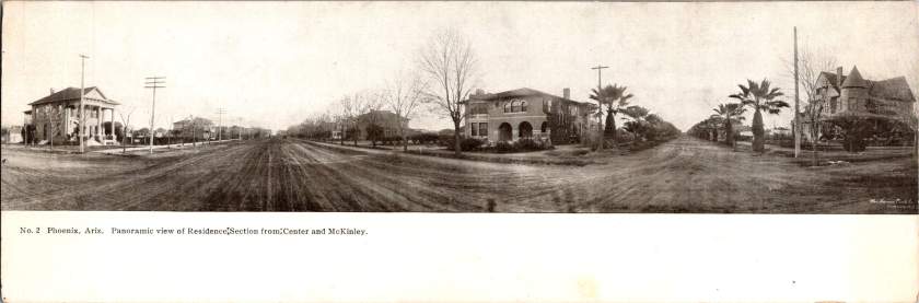
Residences at Center and McKinley
The second view shifts to Phoenix’s growing residential district at Center and McKinley. Here, successful merchants and professionals built impressive homes along wide, unpaved streets. Both palm trees and deciduous trees (some leafless in winter) frame the elegant residences.
These neighborhoods developed as streetcar suburbs, allowing prosperous residents to escape downtown congestion while maintaining business access. Homes display fashionable Colonial Revival and Craftsman styles with generous porches and elaborate details. Unlike cramped eastern cities, Phoenix boasted detached homes on spacious lots—a pattern that would define its future growth.
Washington and Second Avenues
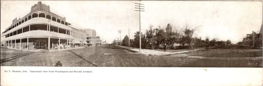
The third panorama returns us to the commercial district. A substantial three-story building with multiple balconies dominates the left side. Was it a hotel or major retailer? Streetcar tracks again slice through the broad dirt roadway. A park or green space appears across the street, providing rare desert shade.
Notice the shadow intruding on the lower left? It’s the silhouette of our photographer with tripod-mounted camera. Was this F.J. Bandholtz, a prominent panoramic photographer who worked with Haines?
Washington and First Avenues
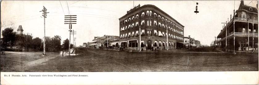
The fourth panorama captures Phoenix’s financial center. A four-story brick building with numerous arched windows dominates the scene. This building houses the Phoenix National Bank with law offices above, very likely belonging to Joseph H. Kibbey, a former Territorial Supreme Court Justice (1889-1893) and Arizona Territorial Governor (1905-1909).
Founded in 1892, the Phoenix National Bank had become Arizona’s largest by 1899, with deposits totaling $692,166. Telegraph and electrical poles with multiple crossbars line the street, demonstrating developing infrastructure. The dirt streets accommodate both pedestrians and horse-drawn vehicles, though automobiles were beginning to appear.
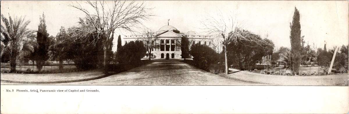
Capitol Grounds
The fifth panorama showcases Arizona’s territorial capitol. This impressive domed structure, completed in 1900 at a cost of $130,000, sits back from the road on a donated 10-acre plot at Washington Street’s western end. Formal gardens with cypress, palms, and ornamental plantings surround the building, irrigation transforming these arid landscapes.
Governor Murphy dedicated the building on February 25, 1901. At the time, the capitol complex embodied Phoenix’s civic ambitions and push toward statehood. Now the main building is home to the Arizona Capitol Museum, connecting present-day Phoenix to its territorial roots.
Phoenix Indian School
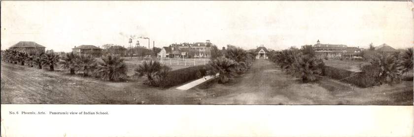
The final panorama depicts the Phoenix Indian School campus with its multiple buildings, some with smoking chimneys, surrounded by palm trees. Established in 1891, this federal boarding school implemented the government’s brutal and coercive Native American assimilation policies. Located on 160 acres north of downtown, the campus featured brick and frame buildings for classrooms, dormitories, workshops, and administration.
The school expanded rapidly from 42 students initially to 698 by 1900, representing 23 tribes from across the Southwest. Operating until 1990, the school’s complex history reflects the often painful relationship between the federal government and Native peoples, and Phoenix’s role in executing national policies.
The Haines Photo Company
These remarkable panoramic images came from the Haines Photo Company of Conneaut, Ohio. From 1908 for about a decade, they specialized in wide-angle photography of towns and cities across the United States. The Library of Congress preserves over 400 of their photographs documenting America’s evolving landscapes and cityscapes.
Technological innovations in cameras and film made panoramic photography possible. Companies like Haines used specialized equipment to capture expansive views with exceptional clarity. They printed these as postcards for both tourists and locals proud of their developing communities. The panoramic format perfectly suited sprawling western cities like Phoenix that grew horizontally rather than vertically.
Who actually pressed the shutter remains mysterious. The Library of Congress identifies F.J. Bandholtz (Frederick J. Bandholtz, born circa 1877) as a prominent panoramic photographer working with Haines. The shadow in the third image provides our only glimpse of the person behind the camera—a tantalizingly incomplete clue to their identity.
Fast Growth in Phoenix
The early 1900s transformed Phoenix through several key developments. Roosevelt Dam (completed 1911) secured reliable water and power for the Valley. The Santa Fe, Prescott and Phoenix Railway (1895) connected the city to northern Arizona while streetcars improved local mobility. Institutions like the Carnegie Free Library (1908) and Phoenix Union High School (1895) established cultural foundations. Economic activity diversified beyond the “Five Cs” (copper, cattle, climate, cotton, and citrus) to include banking, retail, and professional services.
Statehood on February 14, 1912 elevated Phoenix’s status as capital. These postcards hint at those century-old aspirations—a frontier town rapidly becoming a modern American city. Phoenix’s population doubled from 5,554 in 1900 to 11,134 by 1910, and surged to 29,053 by 1920, launching a growth trajectory that would eventually make it one of America’s largest cities.