The Posted Past found its merry mission (and so much more) among the postcard albums that lined the office walls of Robert L’Ecuyer.
Postcards often stand in when more elaborate words fail. A passionate love that could barely tumble off the lips, makes itself clear in the symbol of a deep red rose. We are filled with pride, and a giant cheer bursts out of the mailbox just to say congratulations and hurrah! Also, when the sorrow is so deep, a sympathy card avoids the risks of intrusion and protects the sacred quiet that helps us heal.
It’s one of those days here at The Posted Past as we lay to rest Robert L’Ecuyer, our father. His love of travel, passion for genealogy, excellent listening skills, and long memory — combined with a truly epic postcard collection — were the makings of an extraordinary experience over the past few years.
I will write more about his wit and wisdom in the weeks ahead. For tonight, a selection of cards just to hold a space for all the gifts of his life.
Here we go! The Posted Past heads into the fall season with rare cards, a new gallery, and a social mission to trade loneliness for connection.
featured postcard~ rare novelty card still holds a mystery
An early 20th century novelty postcard featuring humorous photography and personal correspondence from Missouri.
Front of the card: The photograph shows a young Black man in white shirt, suspenders, and dark trousers, grinning while holding a large broken umbrella overhead in a playful pose. Below reads the humorous caption “A little disfigured, but still in the ring”—typical novelty humor from the postcard craze era. A black border frames the photograph on cream cardstock.
Back details: The reverse bears “Carbon Photo Series No. 513” identifying the commercial publisher’s series. Addressed to Miss Grace Skillman in Pleasant Hill, Missouri, with a green 1-cent Franklin stamp and clear 1908 postmark. The handwritten message describes an exhausting early morning wait in Lee’s Summit for “Brother and Frank,” and promising a longer letter that evening.
“Still in L.S. haven’t slept but about ten minutes. My eyes looks like two burnt holes in a blanket. Brother and Frank hasn’t come yet. I will wait till 7.30 and then go home. Will write tonight. Just finished my breakfast. I will eat if not sleep. I got here ten till five.
Condition and Appeal: The sepia-toned image displays characteristic early photography with some age spots, and a nicked corner. The image and reverse side remain in good condition with clear photography and legible handwriting. The “Carbon Photo Series” indicates premium production using carbon-based printing methods prized for superior image quality and archival stability. Grace Andre Skillman was born in Pleasant Hill in 1889, making her nineteen when she received this card. The message and the lack of formal salutation and signature suggest this is casual ongoing family correspondence. As a result, the author of the postcard remains a mystery.
Vintage novelty postcards are increasingly collectible, especially numbered commercial series with documented recipients. Collectors of African-Americana may find the image appealing and relatively rare. The combination of carbon printing technology, humorous subject matter, and personal correspondence is of interest to collectors of vintage photography, postcard enthusiasts, genealogy researchers, and those focused on early 20th century American social history and communication.
Introducing~ The Posted Past Art Card Gallery
A selection of Larry L’Ecuyer’s watercolor landscapes are on display in our Online Art Card Gallery. Fitting as our first show. Enjoy!
Countdown to a Lakeside Getaway, 2025, Larry L’Ecuyer, watercolor on postcard
NEWS & UPDATES~ art card call for submissions is open
The World’s Smallest Artist Retreat (our P.O. Box) is awaiting your art card submission. Follow one rule to join the next open show. Details here!
Art card kits now in stock
Our Art Card Kits are perfectly-packaged as a fun, creative activity for you and a friend to complete in as little as an hour or made into a lovely afternoon.
The kit includes two postcard blanks, six vintage finds curated to the chosen theme, and a bundle of collage goodies for your whimsy. There is a free gift inside, too!
Once you’re done, surprise someone with an original art card in their mailbox. Or, send it back to us to include in the next online show. Either way, you’ll have cultivated a little joy in your garden.
A vibrant Buff-Bellied Hummingbird hovering near a red tubular flower, showcasing its iridescent green head and back, rusty-orange belly, and needle-like bill in a classic feeding pose.
Detailed illustration of a Ferruginous Hawk perched on a branch, displaying its characteristic rusty-brown and white plumage with distinctive feathered legs and robust build typical of North America’s largest hawk.
Depicts a Gray Jay (now called Canada Jay) perched on a snow-dusted branch with small green lichens, showing its fluffy gray and white plumage, black cap, and compact songbird form.
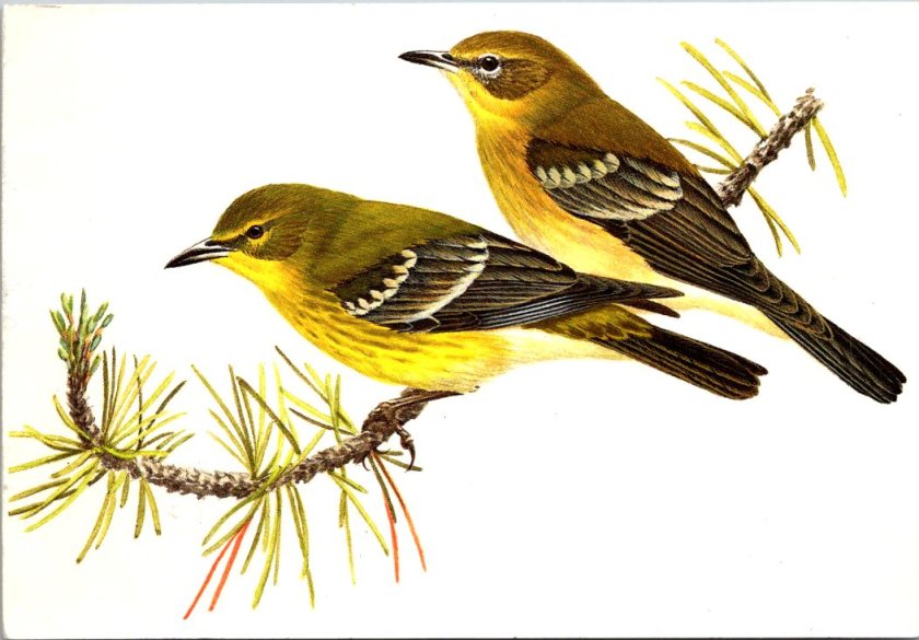
A pair of Pine Warblers on coniferous branches, displaying their olive-yellow plumage with white wing bars and the subtle dimorphism between the brighter male and more subdued female.
A Cattle Egret in breeding plumage with golden-buff crest and back feathers, bright orange-red bill and legs, posed in the elegant stance typical of these large birds.
A set of five Reader’s Digest Association postcards from their Book of North American Birds series. High-quality illustrations and professional production from the 1970s-1980s era of educational materials. Particularly appealing to birders and natural history enthusiasts. Good condition, unposted with no marks. See photos for actual condition. Vintage items – writing, stains, color changes, and wear are part of charm and provenance.
[Note: Summer focus is on detailed captions. Essays return in September!]
The news these days deserves a long silent stare. Here is one from a horse. A century or more later… still no.
[Note: Summer focus is on detailed captions. New essays return in September!]
A vintage real photo postcard shows a dappled gray horse standing in a farmyard setting. The well-built animal is wearing a halter and is positioned in profile to show its conformation. A person in a hat and dark clothing stands beside the horse, likely the owner or handler. The American rural backdrop includes wooden farm buildings and bare winter trees. The ground is packed earth typical of a working farm. The photograph has the characteristic appearance of an early 20th century image, with some evidence of a stylized border in the exposure. The postcard is in excellent condition front and back, unposted with no writing, and an AZO indicia dating the item between 1904 and 1918. The subject matter and production method suggest this is a unique image and object, with no known duplicate.
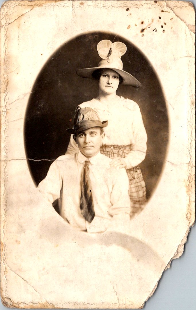
Is this a portrait of the couple or their hats? Feathers in the band. Fascinator with a wide brim. Stories behind their eyes and more clues in their clothes. The real photo postcard went unsent. Pasted inside an album once, and then lost for 100 years.
A sepia-toned oval portrait photograph from around 1910 showing a couple in formal attire. The woman stands behind the seated man, wearing a wide-brimmed hat decorated with a large bow or fabric flower. She’s dressed in a light-colored blouse with puffy sleeves and a geometric patterned skirt with a button at the waist. The man sits in front wearing a white long-sleeved collared shirt, striped tie, and a small hat with multiple feathers in the brim. Both subjects have neutral expressions typical of formal photography from this era. The real photo postcard shows significant age-related damage, with cracked and yellowed edges, stains, and deterioration around the borders, characteristic of an early 20th-century item previously collected in an album.
The Posted Past marks its one year anniversary with fun, facts, and cats!
A year ago, The Posted Past began with a simple quest—to explore the stories behind my family’s vintage postcard collection. These small windows into the past gave me the chance to be curious and brave as a writer. I wasn’t sure I could research and produce a short essay on a weekly schedule. Fifty-two weeks later, without a single miss, I am happily beyond those worries.
Thank you for joining me on this journey. Together, we’ve traveled from Osaka to Matoon. Looked at buffalos roaming in a Kansas field and donkeys on the English seaside. Iconic views of San Francisco came from its well-known chronicler, and we’ve been on a more recent search for a Mexican photographer who vanished in volcanic ash. Each postcard has taken us to unexpected corners of history—social movements, architectural trends, national parks, and the everyday lives of people who took the time to write, “Wish you were here.”
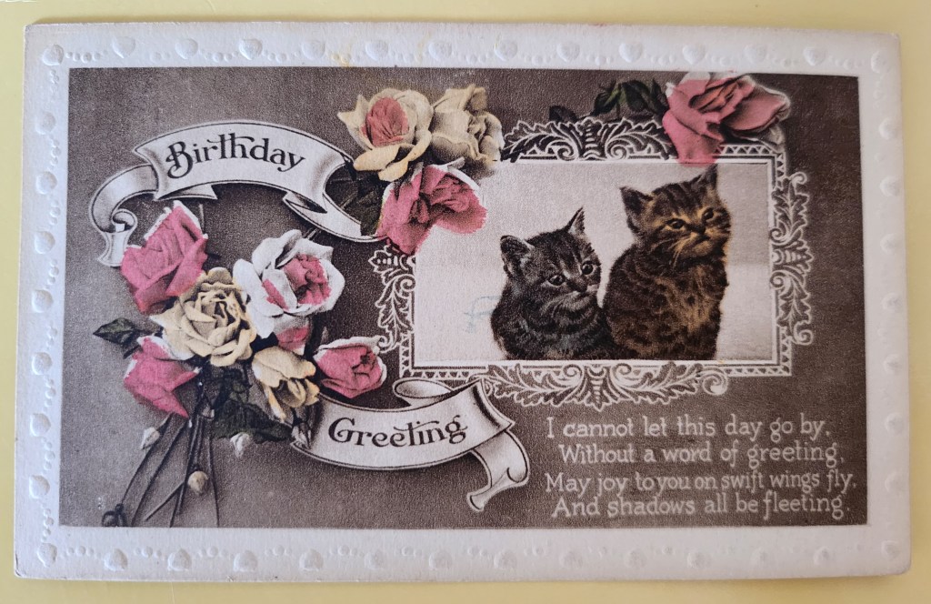
Today’s postcard reminds me why I love this work. The adorable kittens and lovely roses on the front never go out of style. On the flipside, Maude writes to her mum with a few sweet sentiments and concerns. In between lies a world of personal and cultural histories: the rise of the postcard era, the Victorian language of flowers, the printing techniques that made such colorful cards possible, and the universality of cats. Always, an exchange between people. What we’re really collecting are reminders of tender human connections across time.
What’s new for year two? July will bring a shift in weekly format while I take some vacation time—shorter Wednesday posts spotlighting single cards. After that, I’ll be expanding the eBay store, indulging in the nerdy work of adding captions and citations to old posts, and exploring how these weekly essays might become a book and a workshop series. Like any creative start-up, the first year came with a to-do list of dreams and ideas.
Before I sign off, may I ask: would you ever consider sending a vintage postcard as a gift? The mechanics are easy—choose the perfect card online, add a personal note, and we send it off with love through the post office. But is that something you’d enjoy giving or receiving? Leave me a note in the comments.
Thanks again, and meow for now 🙂 Enjoy the summer!
These vintage postcards from the 1972 Tourism Year of the Americas reveal fascinating questions about natural landscapes, heritage, monuments, and whose stories we remember and tell.
In summer 1972, the United States Postal Service issued commemorative postcards that would become enduring symbols of national identity. These postcards, part of the Tourism Year of the Americas campaign, featured iconic destinations with restrained elegance—their two-color printing was both artistic and economical. As America stood at a cultural crossroads, this postcard set tells a familiar American story. More than five decades later, they reveal even more about how a nation sees itself.
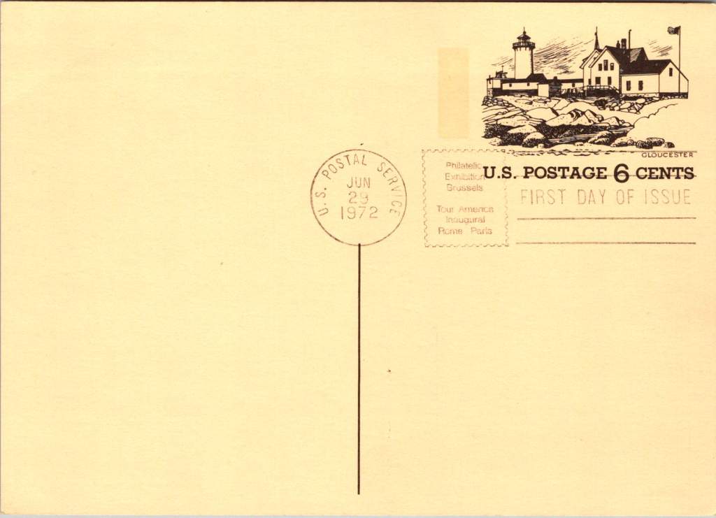
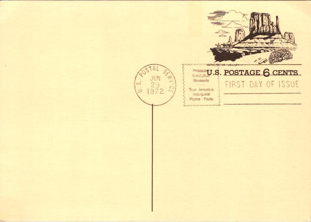
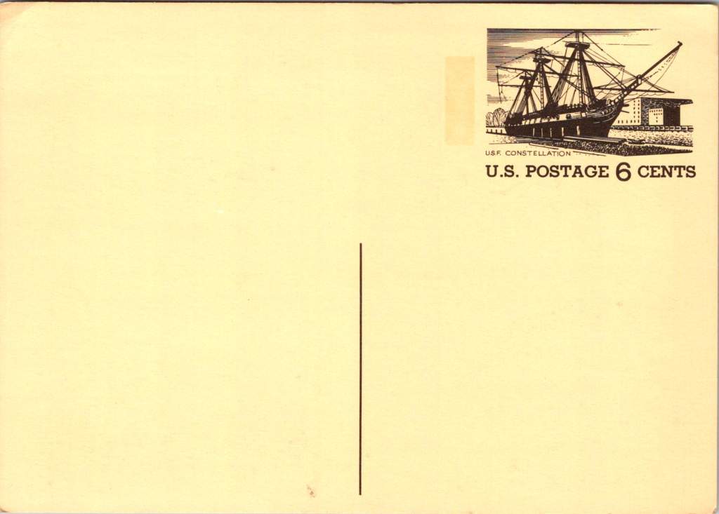
Commemorative Moments
First Day of Issue cancellations mark a special moment in time, and signal that an item is expected to be collectible. The postcards were cancelled on June 29, 1972, bearing the commemorative text “Philatelic Exhibition Brussels” and “Tour America Inaugural Rome – Paris.” These international exhibitions promoted American tourism during the Cold War, when cultural diplomacy served as essential soft power.
The carefully designed cancellation artwork includes USS Constellation (6¢), Gloucester (6¢), Monument Valley (6¢), and Niagara Falls (airmail 15¢). These rates reflected the newly reorganized United States Postal Service which had become its own entity the year prior. The 1972 Tourism Year of the Americas was an ambitious initiative from the new quasi-independent agency, emerging alongside Nixon’s opening to China and détente with the Soviet Union.
USS Constellation, the last sail-only warship built by the U.S. Navy (1853-1855), served as flagship of the Africa Squadron from 1859–1861. The ship captured three slave vessels, enabling liberation of 705 Africans. During the Civil War, Constellation deterred Confederate cruisers in the Mediterranean. The selection represented naval heritage and anti-slavery efforts, though it still centered the naval victory rather than those who gained freedom.
Niagara Falls has attracted visitors for 200 years, becoming the symbolic heart of American tourism. The 1883 Niagara Reservation became America’s first state park, influencing national park creation. Current visitor statistics show enduring appeal: 9.5 million tourists visited Niagara Falls State Park in 2023, with the region welcoming 12 million visitors yearly.
Monument Valley reflect the West’s central role in national identity by 1972, immortalized through Hollywood and environmentalism. Yet Monument Valley sits within Navajo Nation territory, while Grand Canyon encompasses land sacred to multiple tribes, including the Havasupai, whose reservation lies within park boundaries—reminders that park creation displaced Native communities.
Gloucester, America’s oldest seaport, sustained coastal communities for centuries. The lighthouse image evoked both practical maritime safety and romantic notions of New England’s rocky shores, while Gloucester’s working harbor embodied the intersection of heritage preservation and living tradition. By 1972, this historic fishing port faced the tension between maintaining its authentic maritime culture and adapting to tourism pressures—a challenge that made it a fitting symbol.
Artistic Vision
The front of the postcards render multiple iconic American locations in distinctive engravings in an economical two-color print run, an important factor for a the government printing office.
The collection showcases a deliberate balance. Yosemite represents natural power and America’s first national park. Missisippi Riverboats and the Rodeo embody western majesty central to national imagination. DC Monuments offer overt patriotism and Williamsburg and the Liberty Bell connect to the tremors and tolls of colonial democracy.
Even in 1972, these were selective narratives. All featured natural sites exist on traditional Indigenous lands, for example, while largely omitting Indigenous perspectives and enslaved people’s contributions to our cultural histories.
Many featured locations are sacred sites to Indigenous communities. Some of the most sacred places for American Indian nations are located in national parks, yet access to holy ground remains contentious. Park creation often involved displacing Native peoples from lands they had stewarded for millennia.
The year 1972 was tough in other ways: Vietnam War divisions, emerging Watergate scandal, and generational alienation over the military draft. These postcards presented a different kind of unity. Rather than contemporary political divisions, they emphasized natural wonders and historical sites that transcended partisan conflicts.
During the Cold War, these postcards served as miniature global ambassadors, too, often providing people’s first visual encounter with American landmarks. They projected America as worthy of visiting and learning about, countering negative impressions from political controversies.
The postcards themselves embody crucial democratic principles: making heritage accessible through affordable media; connecting tourism to conservation through revenue and public appreciation; and revealing how commemorative choices reflect national values. The geographic diversity suggests a desire for the fullest of American experiences, though these 1972 selections still privilege certain narratives.
New Memories
These postcards continue to offer insights into American values and heritage preservation evolution. USS Constellation still serves as a museum ship in Baltimore’s Inner Harbor. National parks have experienced tremendous visitation growth, raising questions about balancing access with preservation.
In what they don’t depict, the postcards show gaps in whose stories get told, whose lands get celebrated, whose experiences get centered. While 1972 selections emphasized traditional narratives, contemporary views increasingly include previously marginalized perspectives, acknowledging Indigenous heritage alongside colonial and national stories.
These artifacts remind us that commemorations reveal values and priorities. As our historical understandings evolve, it’s wise to look back and look again.
Rare panoramic postcards from the Haines Photo Company capture Phoenix on the cusp of the century.
As American cities boomed in the early 1900s, panoramic postcards emerged to document their transformation. The Haines Photo Company of Conneaut, Ohio seized this opportunity, operating from about 1908 to 1917. Photographers crisscrossed the country capturing these distinctive wide-angle views of evolving American cityscapes, like Phoenix, a fledgling desert outpost poised for dramatic growth.
Phoenix in 1900 numbered just 5,554 residents. Though small, it already served as Arizona’s territorial capital with statehood just twelve years away. These panoramic postcards reveal a city establishing the foundation for its explosive future growth.
Washington and First Streets
The first panorama captures Phoenix’s commercial core at Washington and First Streets. Electric streetcar tracks cut through the unpaved road—these trolleys had replaced horse-drawn versions in 1893, modernizing city transit. Desert mountains loom in the distance while palm trees line parts of the street, evidence of successful irrigation in this arid landscape.
A prominent building with a tower dominates the background. Pedestrians stroll the sidewalks alongside horse-drawn carriages, as automobiles remained rare luxuries. Sturdy two and three-story commercial buildings reveal a city with ambitions beyond its frontier origins.
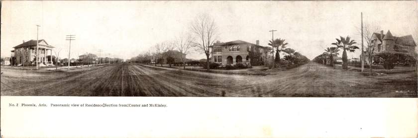
Residences at Center and McKinley
The second view shifts to Phoenix’s growing residential district at Center and McKinley. Here, successful merchants and professionals built impressive homes along wide, unpaved streets. Both palm trees and deciduous trees (some leafless in winter) frame the elegant residences.
These neighborhoods developed as streetcar suburbs, allowing prosperous residents to escape downtown congestion while maintaining business access. Homes display fashionable Colonial Revival and Craftsman styles with generous porches and elaborate details. Unlike cramped eastern cities, Phoenix boasted detached homes on spacious lots—a pattern that would define its future growth.
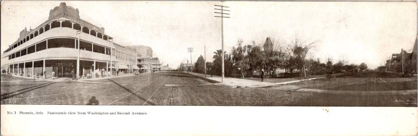
Washington and Second Avenues
The third panorama returns us to the commercial district. A substantial three-story building with multiple balconies dominates the left side. Was it a hotel or major retailer? Streetcar tracks again slice through the broad dirt roadway. A park or green space appears across the street, providing rare desert shade.
Notice the shadow intruding on the lower left? It’s the silhouette of our photographer with tripod-mounted camera. Was this F.J. Bandholtz, a prominent panoramic photographer who worked with Haines?
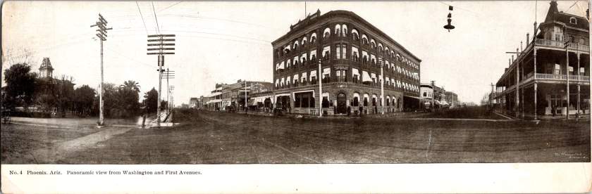
Washington and First Avenues
The fourth panorama captures Phoenix’s financial center. A four-story brick building with numerous arched windows dominates the scene. This building houses the Phoenix National Bank with law offices above, very likely belonging to Joseph H. Kibbey, a former Territorial Supreme Court Justice (1889-1893) and Arizona Territorial Governor (1905-1909).
Founded in 1892, the Phoenix National Bank had become Arizona’s largest by 1899, with deposits totaling $692,166. Telegraph and electrical poles with multiple crossbars line the street, demonstrating developing infrastructure. The dirt streets accommodate both pedestrians and horse-drawn vehicles, though automobiles were beginning to appear.
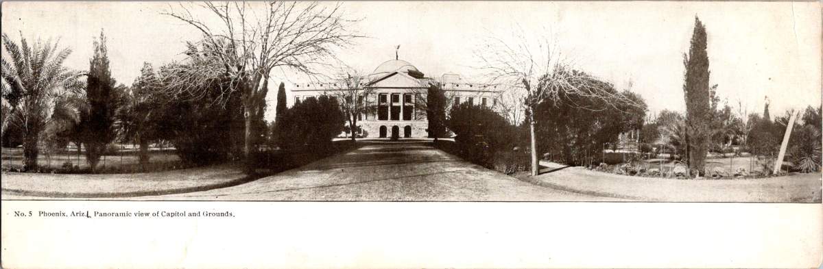
Capitol Grounds
The fifth panorama showcases Arizona’s territorial capitol. This impressive domed structure, completed in 1900 at a cost of $130,000, sits back from the road on a donated 10-acre plot at Washington Street’s western end. Formal gardens with cypress, palms, and ornamental plantings surround the building, irrigation transforming these arid landscapes.
Governor Murphy dedicated the building on February 25, 1901. At the time, the capitol complex embodied Phoenix’s civic ambitions and push toward statehood. Now the main building is home to the Arizona Capitol Museum, connecting present-day Phoenix to its territorial roots.
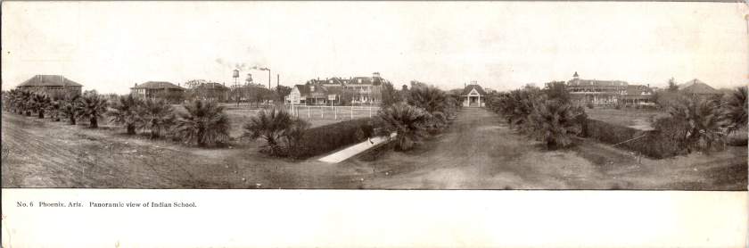
Phoenix Indian School
The final panorama depicts the Phoenix Indian School campus with its multiple buildings, some with smoking chimneys, surrounded by palm trees. Established in 1891, this federal boarding school implemented the government’s brutal and coercive Native American assimilation policies. Located on 160 acres north of downtown, the campus featured brick and frame buildings for classrooms, dormitories, workshops, and administration.
The school expanded rapidly from 42 students initially to 698 by 1900, representing 23 tribes from across the Southwest. Operating until 1990, the school’s complex history reflects the often painful relationship between the federal government and Native peoples, and Phoenix’s role in executing national policies.
The Haines Photo Company
These remarkable panoramic images came from the Haines Photo Company of Conneaut, Ohio. From 1908 for about a decade, they specialized in wide-angle photography of towns and cities across the United States. The Library of Congress preserves over 400 of their photographs documenting America’s evolving landscapes and cityscapes.
Technological innovations in cameras and film made panoramic photography possible. Companies like Haines used specialized equipment to capture expansive views with exceptional clarity. They printed these as postcards for both tourists and locals proud of their developing communities. The panoramic format perfectly suited sprawling western cities like Phoenix that grew horizontally rather than vertically.
Who actually pressed the shutter remains mysterious. The Library of Congress identifies F.J. Bandholtz (Frederick J. Bandholtz, born circa 1877) as a prominent panoramic photographer working with Haines. The shadow in the third image provides our only glimpse of the person behind the camera—a tantalizingly incomplete clue to their identity.
Fast Growth in Phoenix
The early 1900s transformed Phoenix through several key developments. Roosevelt Dam (completed 1911) secured reliable water and power for the Valley. The Santa Fe, Prescott and Phoenix Railway (1895) connected the city to northern Arizona while streetcars improved local mobility. Institutions like the Carnegie Free Library (1908) and Phoenix Union High School (1895) established cultural foundations. Economic activity diversified beyond the “Five Cs” (copper, cattle, climate, cotton, and citrus) to include banking, retail, and professional services.
Statehood on February 14, 1912 elevated Phoenix’s status as capital. These postcards hint at those century-old aspirations—a frontier town rapidly becoming a modern American city. Phoenix’s population doubled from 5,554 in 1900 to 11,134 by 1910, and surged to 29,053 by 1920, launching a growth trajectory that would eventually make it one of America’s largest cities.
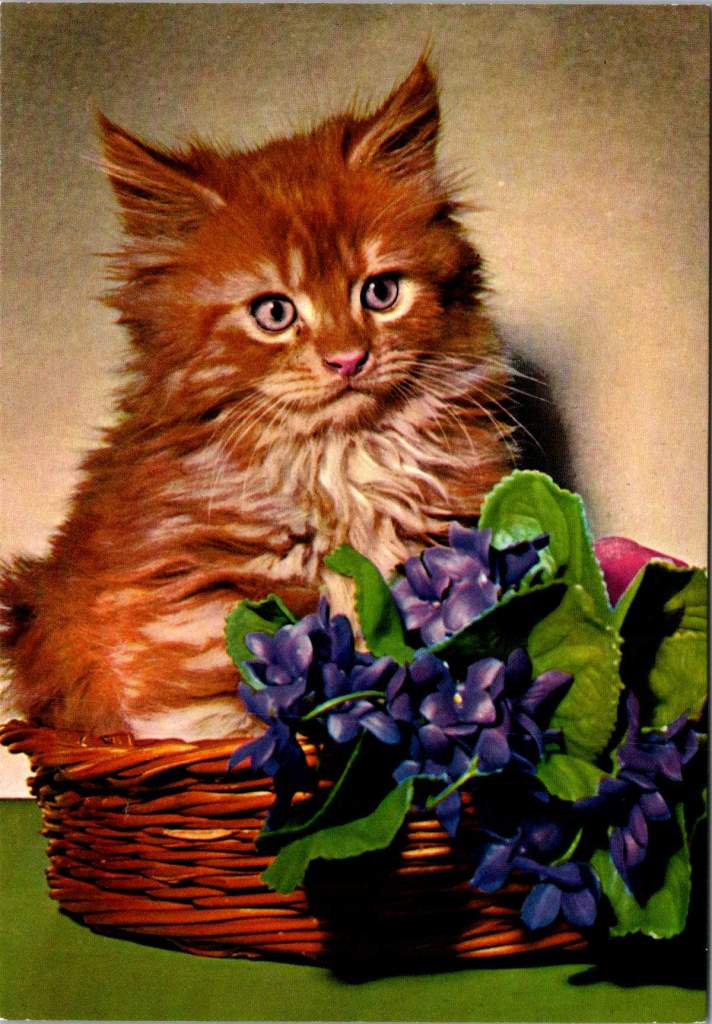
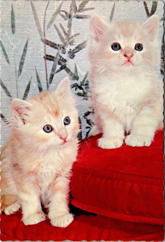
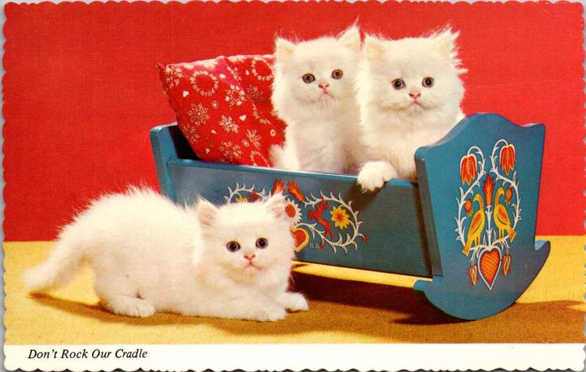
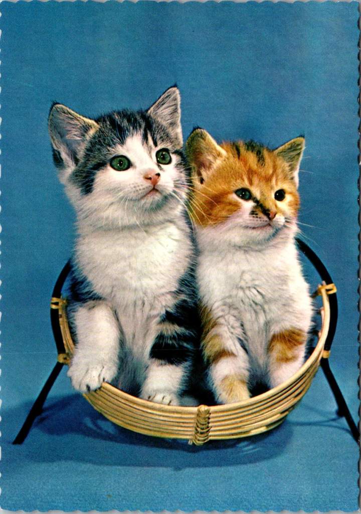
Science says gazing at adorable kitten pics can boost your mental health. But you don’t really need a reason, do you?
Life is tough. Bills pile up, deadlines loom, and some days it feels like the world is on fire. That’s precisely when we need something small, fuzzy, and adorable to remind us that not everything is terrible. First choice? Kitten photos, the internet’s gift to humanity’s collective mental health.
When the news cycle feels like a never-ending disaster movie, there’s something healing about a tiny fluffball curled up in a teacup or peering curiously from behind a houseplant. These miniature pouncers, with their disproportionate paws and earnest expressions, serve as nature’s meditation.
Scientific studies suggest that viewing cute animal content can improve focus, boost mood, and temporarily reduce anxiety. It’s a mental health break in fuzzy form—no prescription needed. Even better, we sent kitten postcards to each other long before the digital age. Proof that science is just catching up.
Cute kittens provide a guilt-free excuse to pause, smile, and recall that life’s greatest joys come in small packages. They remind us that it’s okay to be happy, and to hide toys in the couch.