In Shakespeare’s As You Like It, Jacques delivers his monologue in Act II, Scene VII, observing human life with world-weary detachment. He sketches out seven distinct chapters of a human life, from mewling infancy to toothless old age, with equal parts affection and irony. One of the most quoted passages in all of Shakespeare, by the 1880s it was deeply embedded in popular culture — the kind of verse that some households knew by heart.
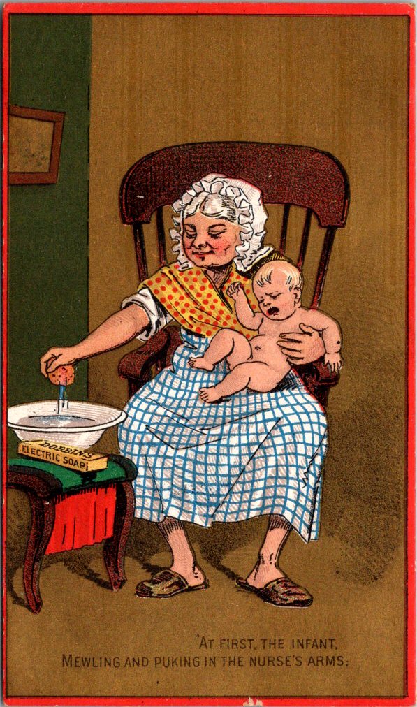
“All the world’s a stage, and all the men and women merely players.”
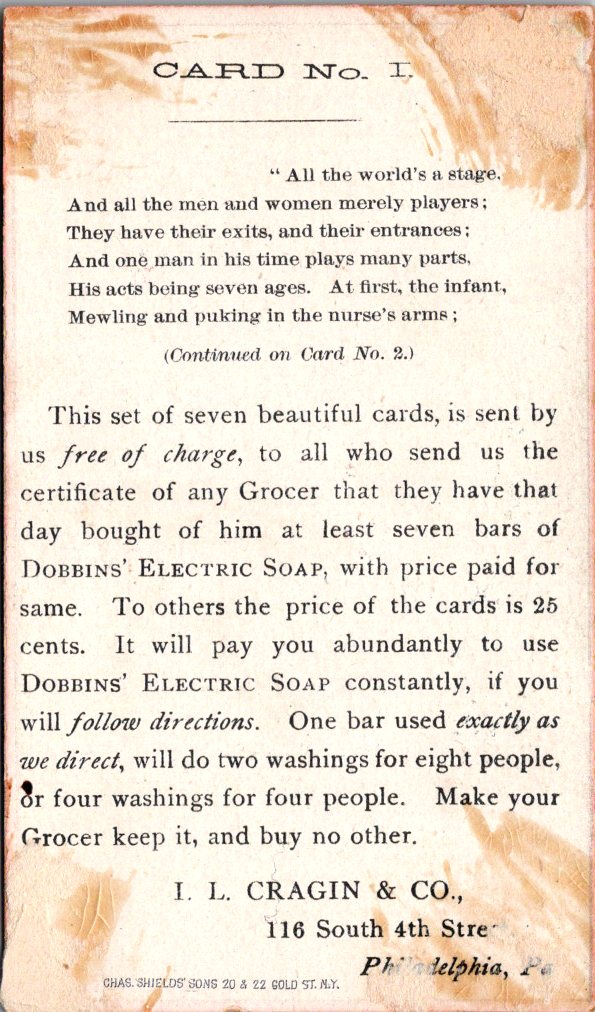
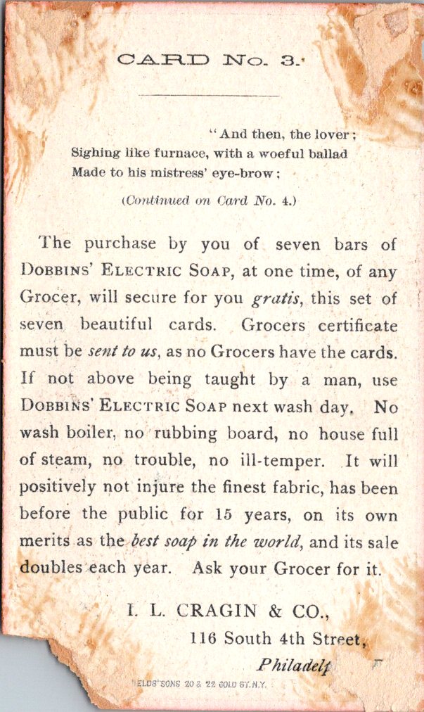
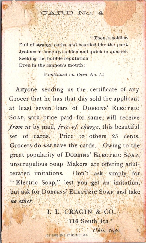
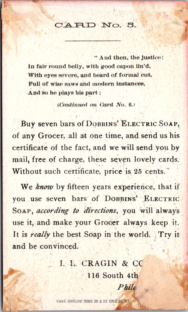
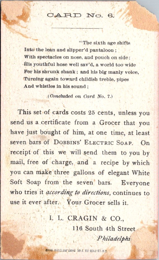
Dobbins’ Electric Soap was manufactured by I. L. Cragin & Co. of Philadelphia and had been on the market since the mid-1860s. By the early 1880s, the company was advertising heavily through trade cards, chromolithographic collectibles that matched the indulgences of the Gilded Age. Cragin’s innovation was to produce not a single card but a series of seven that required the collector to buy a bar of soap each time. Get the certificate from your grocer, and the full set arrived by mail free of charge.
Philly, 1880s. Shakespeare meets laundry.
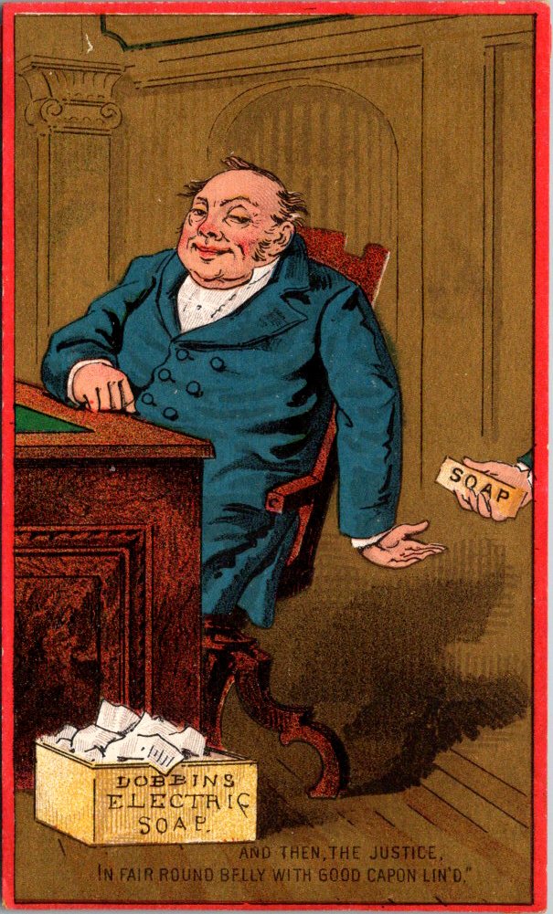
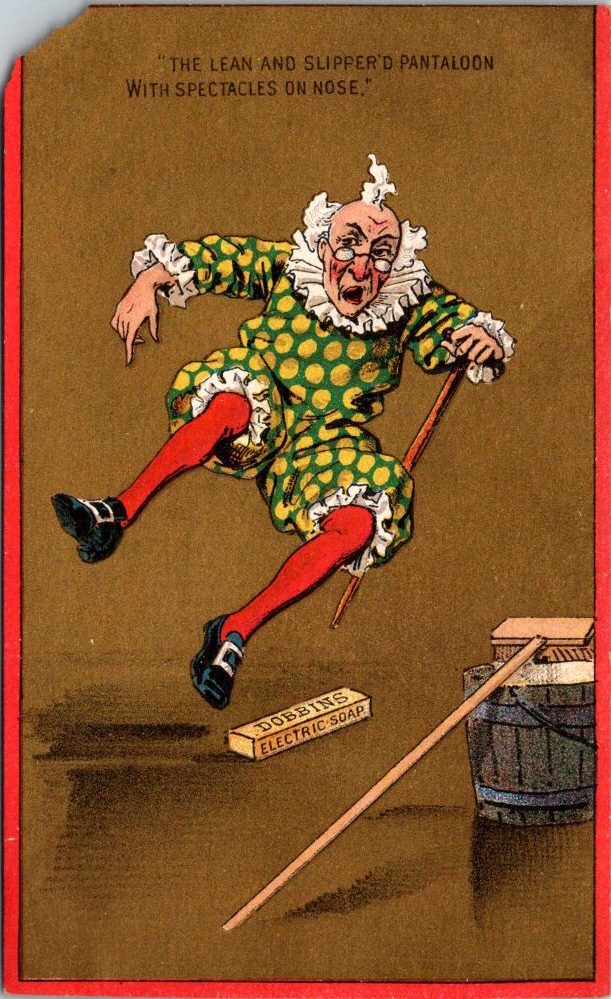
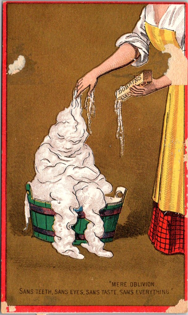
Front: Each card is a vivid chromolithograph on a warm gold ground with a bold red border, a consistent visual identity that makes the cards a set. The figures are drawn in a coarse comic style, expressive and exaggerated, with each character placed in a domestic or outdoor scene with a bar of Dobbins soap nearby.
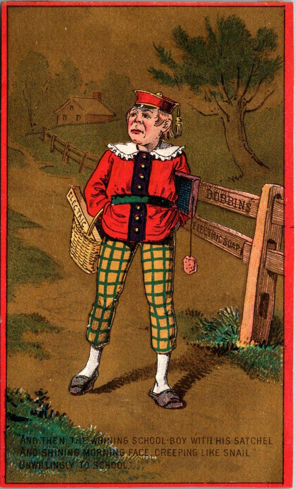
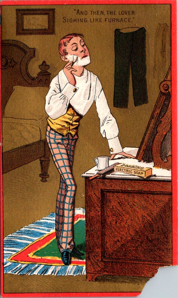
First, a round-faced nurse in a white mobcap seated in a rocking chair, holding a squirming naked infant over a washbasin. Card Two shows a sulky schoolboy in a red jacket and yellow-green plaid knickerbockers, satchel over one shoulder. The lover on Card Three is a lanky figure in a gold waistcoat and plaid trousers, leaning against a bureau in a disheveled bedroom.
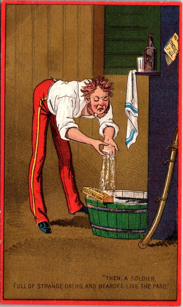
The soldier on Card Four is wild-haired and red-faced, bent over a green barrel-tub in his uniform trousers and braces, and a sword against the wall behind him. Card Five presents a rotund man in a blue coat, leaning back in his chair with the serene self-satisfaction of someone accustomed to receiving gifts. Card Six is an elderly Harlequin figure in a polka-dotted costume with red stockings, tumbling in mid-air. The final card is a woman in a yellow apron leaning over a green wooden tub, and a billowing human figure made entirely of suds.
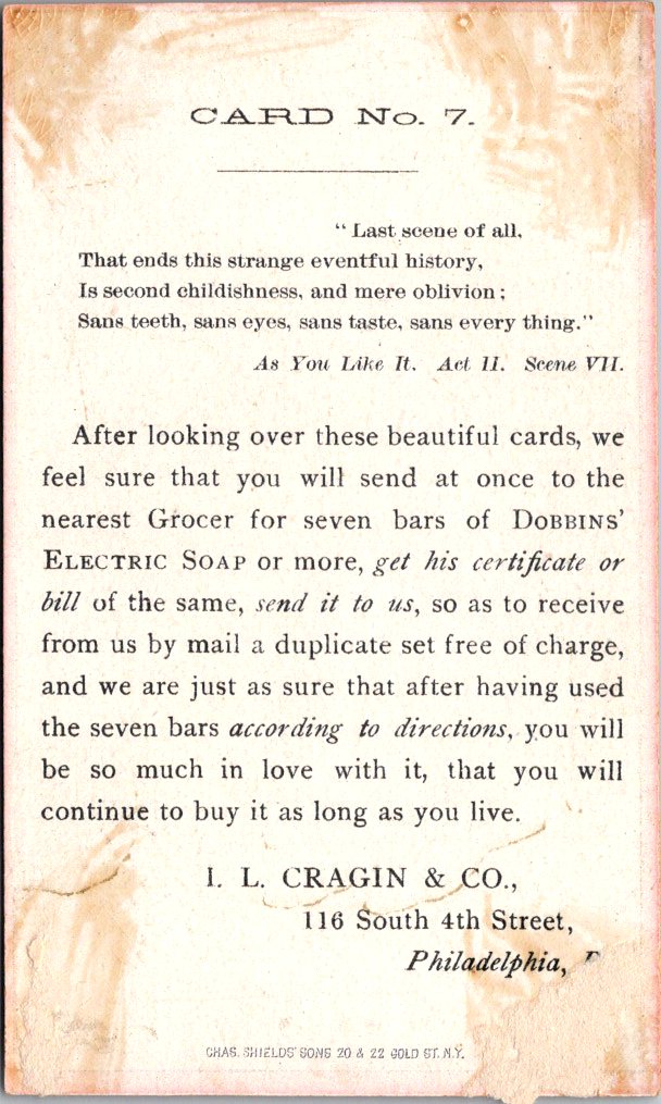
Reverse: Black text on cream stock with the full Shakespeare speech across all seven cards, each picking up the verse where the last left off. The final card identifies the source: As You Like It, Act II, Scene VII.
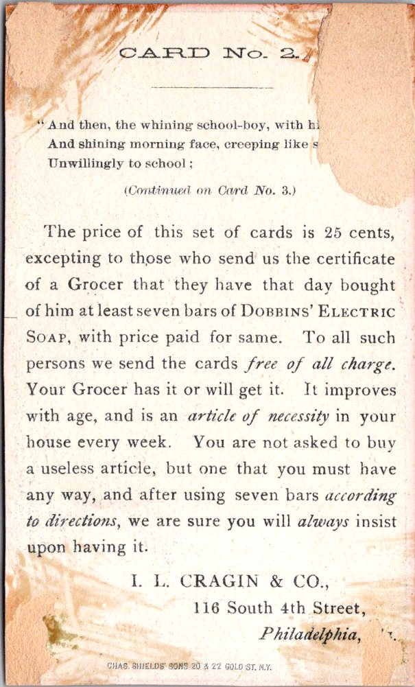
Below the verse, each card runs a version of the same offer in slightly varied language: collect a grocer’s certificate for each bar purchased and mail seven of them to 116 South 4th Street, Philadelphia. Without the certificate, the price for the set is 25 cents.
Each card presents a few product features: no wash boiler, no rubbing board, no house full of steam. Card Four warns against unscrupulous imitations and instructs buyers to ask for Dobbins’ Electric Soap by name. The printer’s imprint for Chas. Shields’ Sons, 20 & 22 Gold Street, New York appears at the foot of each reverse.
Production: These high-quality commercial chromolithographs likely date to the early 1880s, after the business had been in operation for more than a decade. The color registration is precise throughout, the figure work confident and expressive, and the gold-and-red palette gives the set a unified identity that still reads as a coherent series. The illustration style and rich production values mirror the opulent aspirations of the era.
Collectibility: Complete sets of themed trade card series are uncommon; most were distributed individually and rarely survived intact. The Shakespeare framework, the quality of the printing, and the conceptual ambition of the campaign make this set particularly distinctive. It appeals to trade card collectors, Victorian advertising historians, Shakespeare enthusiasts, and ephemera collectors with a taste for the literary and the delightfully absurd.
new Rarities Room
Our new space for the old stuff that no one ever threw away – yay!
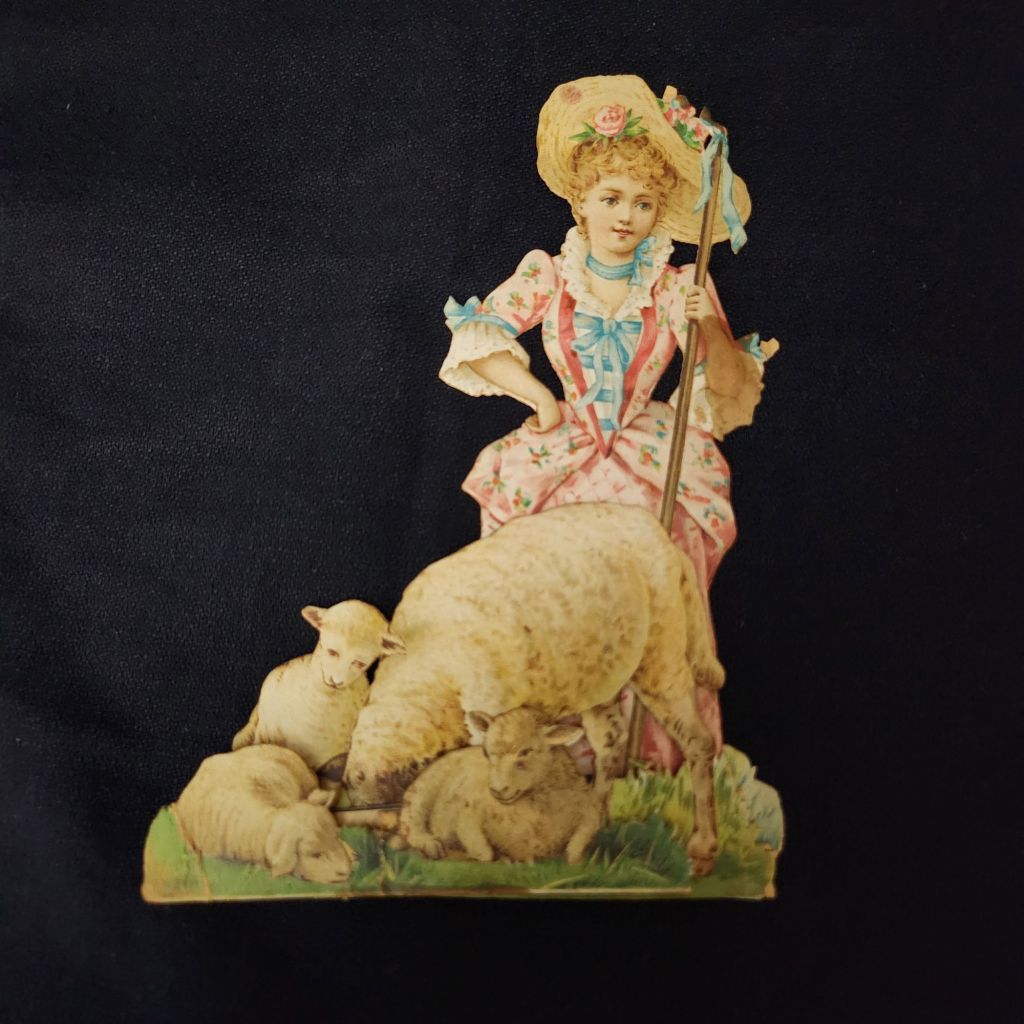
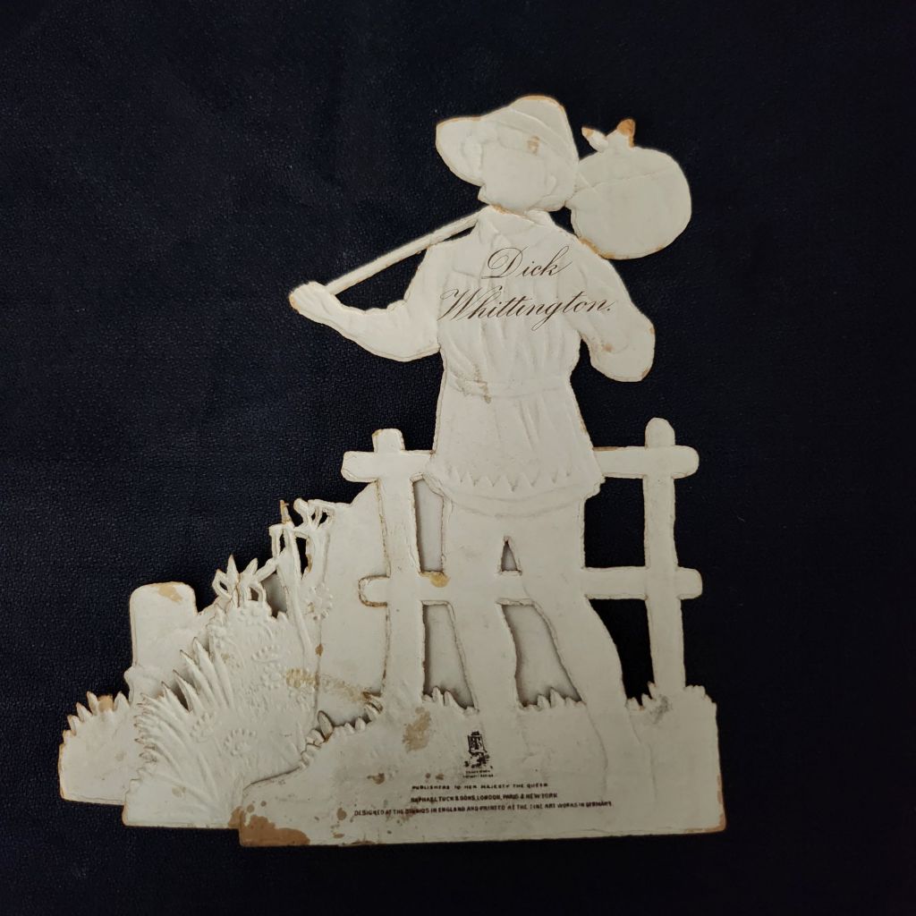
As the Harvest Moon wanes and the fall weather arrives, now is the time to cozy up with a few old nursery rhymes. These rare Raphael Tuck & Sons mechanical cards are an enchanting entrance to a magical season.
Published by Raphael Tuck & Sons of London, these elaborate die-cut pop-up cards feature beloved nursery rhymes and fairy tales including Little Bo Peep, Cinderella, Dick Whittington, and Three Little Kittens. Each piece showcases the exceptional craftsmanship and attention to detail that made Tuck one of the most prestigious names in Victorian publishing.
Vintage cards by raphael tuck & sons
Founded in the 1860s by German immigrant Raphael Tuck, the company quickly established itself as a leader in chromolithographic printing. By 1893, they had earned a Royal Warrant, becoming “Art Publishers to Her Majesty the Queen.” This royal endorsement reflected the superior quality of their work, which combined vibrant colors, intricate details, and innovative three-dimensional designs. These mechanical cards, likely produced between the 1880s and 1910s, represent the company at its creative peak.
In an era before mass media entertainment, these colorful, interactive pieces were technological marvels. The chromolithography process allowed for rich, multi-hued images that seemed almost magical to contemporary viewers. Their three-dimensional construction meant they weren’t merely viewed but displayed—transforming mantels into miniature theaters of beloved stories. Collecting and arranging these cards became a popular hobby. Many were preserved in elaborate scrapbooks, but relatively few have survived.
WWI widely disrupted the European paper and printing industries, and Raphael Tuck’s London facilities were destroyed during the WWII Blitz in 1940, losing 74 years of business records and thousands for illustrations and production files. Mid-century greeting card companies did continue to produce mechanical cards, but the more elaborate craft traditions largely faded in favor of modern design trends and less complicated manufacturing.
New technologies have revived the artform and inspired contemporary artists. Robert Sabuda elevated pop-up books and cards to fine art status with his extraordinary paper engineering. Lovepop creates elaborate 3D greeting cards for every occasion. The London company Roger la Borde produces wild and wonderful contemporary designs. Of course, independent artists worldwide create handcrafted die-cut cards that both honor and stretch well-beyond the Raphael Tuck legacy.
To Read More
The History of Raphael Tuck & Sons https://www.tuckdbpostcards.org/history Detailed company history from the TuckDB database, the premier online resource for Tuck collectors
A vibrant Buff-Bellied Hummingbird hovering near a red tubular flower, showcasing its iridescent green head and back, rusty-orange belly, and needle-like bill in a classic feeding pose.
Detailed illustration of a Ferruginous Hawk perched on a branch, displaying its characteristic rusty-brown and white plumage with distinctive feathered legs and robust build typical of North America’s largest hawk.
Depicts a Gray Jay (now called Canada Jay) perched on a snow-dusted branch with small green lichens, showing its fluffy gray and white plumage, black cap, and compact songbird form.
A pair of Pine Warblers on coniferous branches, displaying their olive-yellow plumage with white wing bars and the subtle dimorphism between the brighter male and more subdued female.
A Cattle Egret in breeding plumage with golden-buff crest and back feathers, bright orange-red bill and legs, posed in the elegant stance typical of these large birds.
A set of five Reader’s Digest Association postcards from their Book of North American Birds series. High-quality illustrations and professional production from the 1970s-1980s era of educational materials. Particularly appealing to birders and natural history enthusiasts. Good condition, unposted with no marks. See photos for actual condition. Vintage items – writing, stains, color changes, and wear are part of charm and provenance.
[Note: Summer focus is on detailed captions. Essays return in September!]
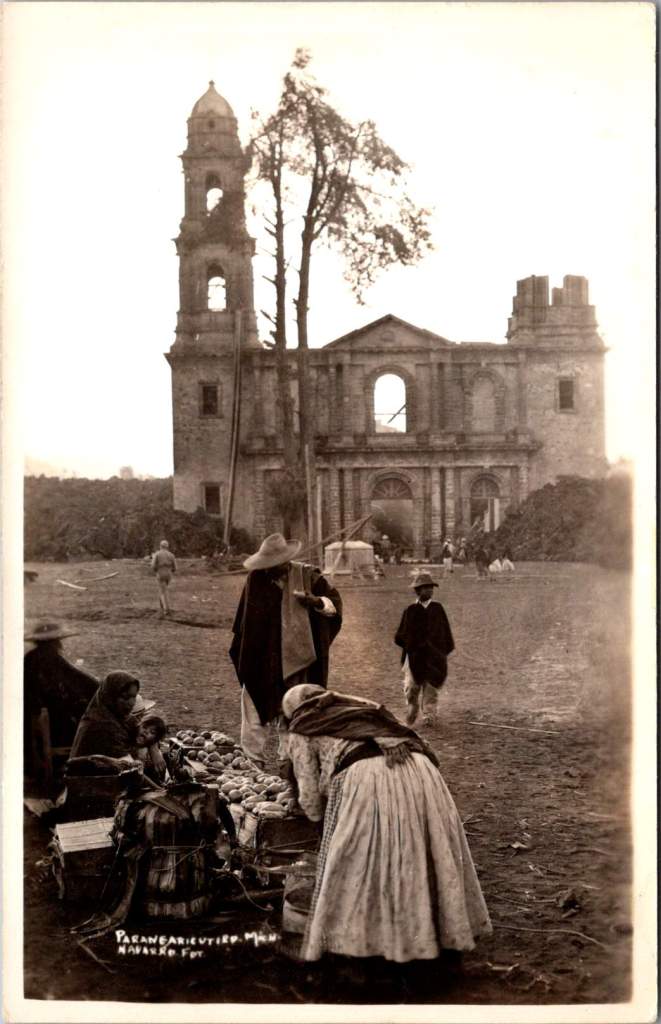
In February 1943, a photographer enigmatically known only as ‘Navarro’ documented Parícutin’s volcanic destruction of a Michoacán village and church, creating powerful postcards that circulated worldwide at the time and are highly collectible now. Then, Navarro vanished from history.
Parícutin erupted from Dionisio Pulido’s cornfield on February 20, 1943, becoming the first comprehensively documented volcanic birth in human history.
The response was immediate and international. Despite World War II, the Parícutin volcanic plumes commanded global coverage. The geological disruptions of fire and lava inspired scientific awe. Life Magazine dispatched photographers. Newsreels carried footage worldwide. Airlines altered flight paths for passenger viewing. By 1947, Hollywood used the still-active volcano as backdrop for the movie Captain from Castile, employing thousands of locals as extras.
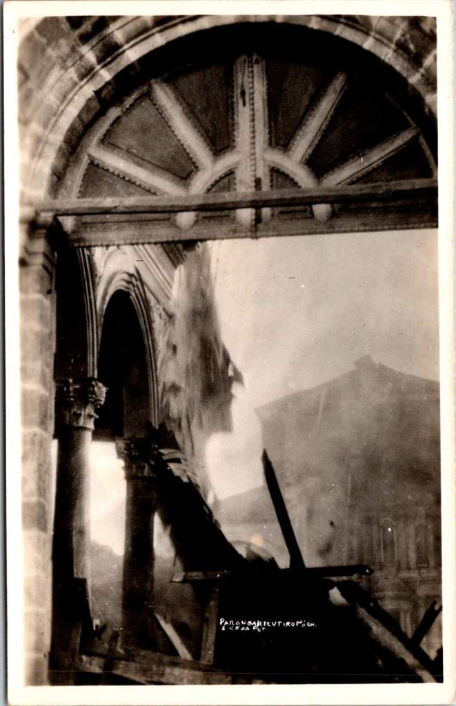
In the extensive archives documenting Parícutin volcano’s nine-year life cycle, one name appears and vanishes: Navarro. His postcard images capture the most significant moment in the volcano’s terrifying story—when lava reached the 400-year-old church of San Juan Parangaricutiro. Despite meticulous record-keeping around this geological event, Navarro himself remains a mystery.
His photographs have more than survived. When story of the events at Parícutin are retold, one always finds a Navarro image. The photographer does appear in one other place: Folder 7 in Box 9 of the William F. Foshag archives.
The Day Lava Reached the Church
Navarro’s postcards document a sequence unfolding over a few crucial days in early 1943. For the year prior, the Purépecha community of San Juan Parangaricutiro had watched lava flows advance on their small village while praying their homes, farms, and colonial church would be spared.
Despite their pleas and processions, the lava flow had accelerated beyond divine intervention. President Lázaro Cárdenas and local priests convinced most residents to evacuate, carrying sacred objects and any moveable materials to the nearby town of Uruapan. One rare slice of film shows men removing clay tiles from a building roof.
When the lava reached the church, Navarro was there to document the destruction. Black lava creeping around the church’s perimeter. Intense heat causing wooden elements to combust. Steady accumulation of cooled volcanic rock against the baroque stone façade, contrasting human craftsmanship with geological force.
Two striking images captures the church’s wooden elements on fire—ornate arched stonework and columns holding the structure up while everything else is consumed. Extending the mystery further, these two images bear exactly the same mark and style of the others, but a different name is entirely obscured. Perhaps it makes sense, Navarro and another photographer would go together. Better than alone.
Foshag and the Official Record
William Frederick Foshag of the Smithsonian Institution’s National Museum led Parícutin’s scientific research and systematic documentation. A respected mineralogist and curator, Foshag had already spent his career studying volcanic minerals and processes. When Parícutin erupted, he was uniquely positioned to lead the most comprehensive study of a volcano’s complete life cycle.
Foshag arrived within weeks of the initial eruption and remained involved until the volcano’s dormancy in 1952. Working with Mexican geologist Dr. Jenaro González Reyna, he established a research station documenting every phase of development. Their collaboration produced detailed maps, temperature measurements, chemical analyses, and thousands of photographs fundamental to volcanic research today.
Navarro’s church sequence suggests either remarkable intuition, access to local knowledge, or information coming from scientific observers. The Purépecha community, drawing on generations of volcanic experience, provided crucial insights about timing and the landscape. Navarro’s ability to be there for the church’s final moments indicates he was plugged in.
Foshag’s archives reveal an extensive network of colleagues contributing to this documentation. Box 9, Folder 7 bears Navarro’s name alongside numerous other photographers, artists, and local and international contacts. It seems Foshag recognized the value of different perspectives in creating a complete record.
The official scientific documentation benefited from all the independent photography produced at the time. Their paths very likely crossed with many others at work during critical days when the lava and ash threatened San Juan Parangaricutiro.
Kodak in Mexico
The real photo postcard industry supporting photographers like Navarro was sophisticated. Entrepreneurs traveled with complete darkroom setups in automobiles, developing film and producing finished postcards within hours. They sold to tourists, sent copies to newspapers, and maintained distribution networks across Mexico and the United States.
By 1943, Kodak had established a robust business providing both cameras and materials throughout Mexico. Navarro’s postcards bear the EKC (Eastman Kodak Company) indicia and are marked Kodak Mexicana, LTD. Navarro had access to standardized, high-quality photographic paper specifically designed for postcard production. This infrastructure allowed photographers to work with consistent materials as they traveled to remote locations.
This commercial system created a parallel archive to official scientific record, prioritizing dramatic visual impact and human interest. While Foshag documented systematic geological processes, Navarro captured moments resonating with public imagination: the church under siege, displaced communities, civilization meeting unstoppable natural forces.
The quality and consistency in images suggests professional training and equipment. His compositions demonstrate understanding of the landscape and evoke pathos. Combined with his access to Kodak’s professional-grade materials, we may assume Navarro was more than a concerned observer.
History’s Mysteries
Navarro’s fade from historical records reflects broader patterns in how scientific events get remembered. Official histories preserve institutional participants while quietly forgetting the names and stories of independent contributors. This is notable with Parícutin, where local Purépecha knowledge proved crucial to understanding volcanic behavior, yet indigenous voices were largely excluded from formal documentation.
Still, Navarro gives us another chance to go there ourselves for a glimpse of those extraordinary hours. His postcards circulated broadly through the popular means of the era—family correspondence, tourist collections, commercial distributors—and are highly collectible today.
As researchers study Foshag’s extensive archives, Navarro’s name remains a tantalizing fragment—present enough to suggest significance, absent enough to resist interpretation. His postcards survive in collections across North America, carrying their maker’s vision but not his story.
This persistence of mystery tells us something about how we remember extraordinary events. While institutions preserve official records with careful attribution, the broader network of individual contributors often dissolves into anonymity. Navarro represents countless others who showed up when history was being made, pointed cameras at crucial moments, contributed to our understanding of the world, and then vanished back into the crowd.
The photographs of the church’s destruction remain powerful because they capture something beyond ecological process—the moment when human scale met geological time and a community’s sacred center became a monument to forces beyond human control. Navarro was there to see it, and that’s a chance for us to remember the event and to admire him.
This essay was inspired by Elena, Maria, and Sandy – with gratitude.
These vintage postcards from the 1972 Tourism Year of the Americas reveal fascinating questions about natural landscapes, heritage, monuments, and whose stories we remember and tell.
In summer 1972, the United States Postal Service issued commemorative postcards that would become enduring symbols of national identity. These postcards, part of the Tourism Year of the Americas campaign, featured iconic destinations with restrained elegance—their two-color printing was both artistic and economical. As America stood at a cultural crossroads, this postcard set tells a familiar American story. More than five decades later, they reveal even more about how a nation sees itself.
Commemorative Moments
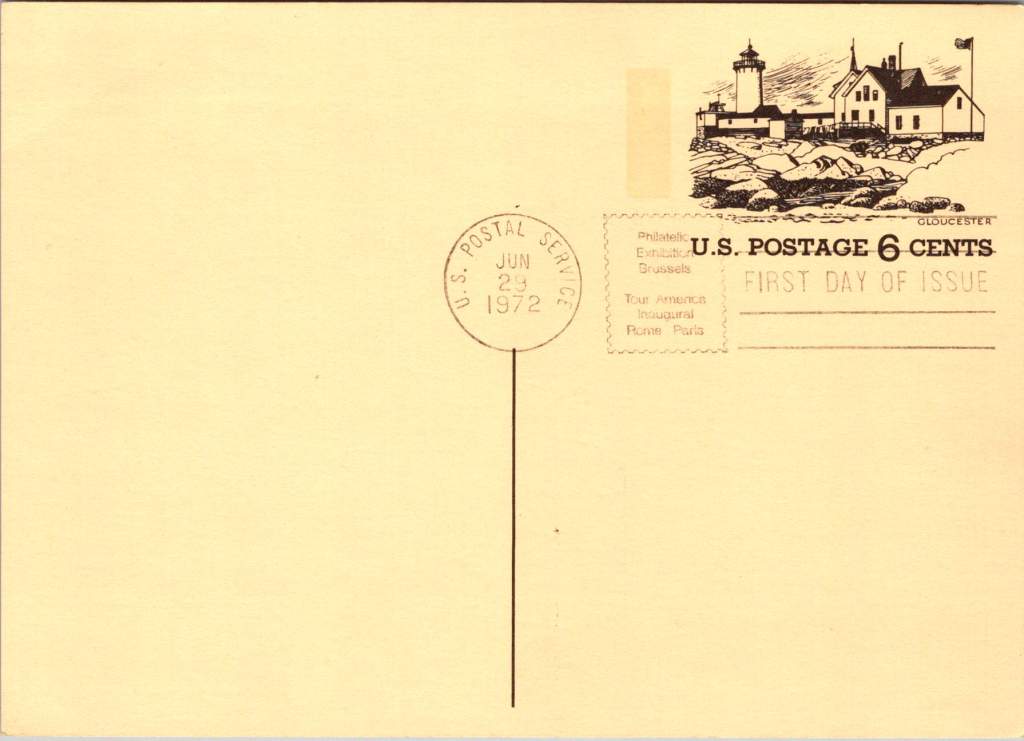
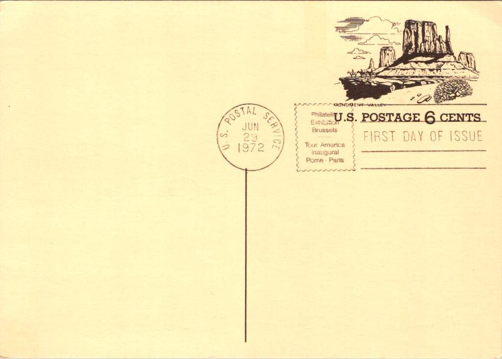
First Day of Issue cancellations mark a special moment in time, and signal that an item is expected to be collectible. The postcards were cancelled on June 29, 1972, bearing the commemorative text “Philatelic Exhibition Brussels” and “Tour America Inaugural Rome – Paris.” These international exhibitions promoted American tourism during the Cold War, when cultural diplomacy served as essential soft power.
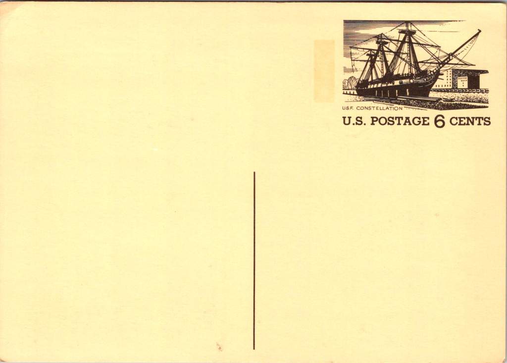
The carefully designed cancellation artwork includes USS Constellation (6¢), Gloucester (6¢), Monument Valley (6¢), and Niagara Falls (airmail 15¢). These rates reflected the newly reorganized United States Postal Service which had become its own entity the year prior. The 1972 Tourism Year of the Americas was an ambitious initiative from the new quasi-independent agency, emerging alongside Nixon’s opening to China and détente with the Soviet Union.
USS Constellation, the last sail-only warship built by the U.S. Navy (1853-1855), served as flagship of the Africa Squadron from 1859–1861. The ship captured three slave vessels, enabling liberation of 705 Africans. During the Civil War, Constellation deterred Confederate cruisers in the Mediterranean. The selection represented naval heritage and anti-slavery efforts, though it still centered the naval victory rather than those who gained freedom.
Niagara Falls has attracted visitors for 200 years, becoming the symbolic heart of American tourism. The 1883 Niagara Reservation became America’s first state park, influencing national park creation. Current visitor statistics show enduring appeal: 9.5 million tourists visited Niagara Falls State Park in 2023, with the region welcoming 12 million visitors yearly.
Monument Valley reflect the West’s central role in national identity by 1972, immortalized through Hollywood and environmentalism. Yet Monument Valley sits within Navajo Nation territory, while Grand Canyon encompasses land sacred to multiple tribes, including the Havasupai, whose reservation lies within park boundaries—reminders that park creation displaced Native communities.
Gloucester, America’s oldest seaport, sustained coastal communities for centuries. The lighthouse image evoked both practical maritime safety and romantic notions of New England’s rocky shores, while Gloucester’s working harbor embodied the intersection of heritage preservation and living tradition. By 1972, this historic fishing port faced the tension between maintaining its authentic maritime culture and adapting to tourism pressures—a challenge that made it a fitting symbol.
Artistic Vision
The front of the postcards render multiple iconic American locations in distinctive engravings in an economical two-color print run, an important factor for a the government printing office.
The collection showcases a deliberate balance. Yosemite represents natural power and America’s first national park. Missisippi Riverboats and the Rodeo embody western majesty central to national imagination. DC Monuments offer overt patriotism and Williamsburg and the Liberty Bell connect to the tremors and tolls of colonial democracy.
Even in 1972, these were selective narratives. All featured natural sites exist on traditional Indigenous lands, for example, while largely omitting Indigenous perspectives and enslaved people’s contributions to our cultural histories.
Many featured locations are sacred sites to Indigenous communities. Some of the most sacred places for American Indian nations are located in national parks, yet access to holy ground remains contentious. Park creation often involved displacing Native peoples from lands they had stewarded for millennia.
The year 1972 was tough in other ways: Vietnam War divisions, emerging Watergate scandal, and generational alienation over the military draft. These postcards presented a different kind of unity. Rather than contemporary political divisions, they emphasized natural wonders and historical sites that transcended partisan conflicts.
During the Cold War, these postcards served as miniature global ambassadors, too, often providing people’s first visual encounter with American landmarks. They projected America as worthy of visiting and learning about, countering negative impressions from political controversies.
The postcards themselves embody crucial democratic principles: making heritage accessible through affordable media; connecting tourism to conservation through revenue and public appreciation; and revealing how commemorative choices reflect national values. The geographic diversity suggests a desire for the fullest of American experiences, though these 1972 selections still privilege certain narratives.
New Memories
These postcards continue to offer insights into American values and heritage preservation evolution. USS Constellation still serves as a museum ship in Baltimore’s Inner Harbor. National parks have experienced tremendous visitation growth, raising questions about balancing access with preservation.
In what they don’t depict, the postcards show gaps in whose stories get told, whose lands get celebrated, whose experiences get centered. While 1972 selections emphasized traditional narratives, contemporary views increasingly include previously marginalized perspectives, acknowledging Indigenous heritage alongside colonial and national stories.
These artifacts remind us that commemorations reveal values and priorities. As our historical understandings evolve, it’s wise to look back and look again.
Native Hawaiian wisdom, mainland capitalism, an LDS mission, and the birth of Pacific tourism. At the center, a banyan tree that has watched Hawaii transform for 120 years. This 1921 real photo postcard reveals the complexities of cultural exchange, migration, and travel over time.
In the photograph we are looking at today, the Moana Hotel rises like a palace from Waikiki Beach, its elegant wings stretching toward Diamond Head. A wooden pier extends into the Pacific. The building’s Victorian details hint at mainland American grandeur transplanted to the tropics. The “First Lady of Waikiki” opened as the territory’s first luxury resort, transforming a landscape once dotted with taro ponds and royal summer homes into the birthplace of Pacific tourism.
Built by wealthy landowner Walter Chamberlain Peacock and designed by architect Oliver G. Traphagen, the Moana opened on March 11, 1901, with 75 rooms featuring Hawaii’s first electric elevator and the unique amenity of private bathrooms. The first guests were a group of Shriners, who paid $1.50 per night—about $50 today—to experience what was then a very remote luxury destination.
Three years later, Jared Smith, Director of the Department of Agriculture Experiment Station, planted what seemed like a simple landscaping choice in the hotel’s courtyard: a young Indian banyan tree, nearly seven feet tall and about seven years old when planted. In the image, the tree is seventeen years old and already creating the shaded sanctuary that is the hotel’s heart even today.
As we flip the postcard over, another dimension is revealed. On November 29, 1921, a simple message sent to Mabel Moss in Longanoxie, Kansas with the usual greetings. But this isn’t a holiday for Aunt Olive. Her return address, “Route 4 – Box 46,” tells its own story of how communities were connecting between ancient and modern, sacred and commercial.
A Mormon Pioneer’s Island Home
Aunt Olive likely lived in Laie, thirty-five miles north of the Moana Hotel, where the Mormon Church had established its Pacific sanctuary. Her Route 4 address would have been served by one of the Rural Free Delivery routes radiating out from Honolulu—a detail that places her among the settlers who were building new communities beyond the city’s tourist corridor.
The Mormon settlement at Laie represented a unique form of cultural encounter. Beginning in 1865, when Church president Brigham Young received permission from King Kamehameha V to establish an agricultural colony, the Latter-Day Saints purchased 6,000 acres of traditional land—a pie-shaped division that provided for sustainable living. The Mormon community tried to honor Hawaiian land practices, giving each family a loi (water garden) to cultivate kalo (taro), the traditional sustenance crop.
The Hawaii Temple, dedicated in 1919, was the first Mormon temple outside continental North America. Built with crushed local lava and coral, its structure embodied the meeting of mainland pioneer culture and Pacific Island materials. Polynesian Saints from across the Pacific were gathering in Laie to receive temple ordinances, creating a multicultural religious community where Hawaiian, Samoan, Maori, and haole (white) families lived side by side.
The LDS approach to missionary work emphasizes learning local languages and customs—not merely as conversion strategy, but as theological principle. One of the early missionaries mastered Hawaiian so thoroughly that he produced the first non-English translation of the Book of Mormon in 1855. The missionaries married into Hawaiian families, adopted local foods and farming methods, and incorporated Polynesian cultural elements into their worship. Even as they openly sought converts, they also saw themselves as students of Hawaiian wisdom.
Paradise Shared
Captured in our image are at least a few conflicting visions of paradise. The Moana Hotel itself represents economic prosperity through the commodification of tropical beauty. Its guests paid premium rates to experience “the ultimate playground,” complete with hula shows and exotic imagery designed for mainland consumption. By the time of this photo, the hotel’s success had already inspired expansion; wings added in 1918 doubled its capacity.
However, the hotel was built where Hawaiian royalty had once gathered, in a place that embodied the Native Hawaiian principles, very different than Western concepts of land as commodity, beauty as product, and culture as entertainment. Look again at the Banyan tree. Where tourists saw scenery, Native Hawaiians understood kino lau—the gods manifested in every plant, animal, and natural feature. But, Hawaiian language had been banned in schools since 1896, and traditional practices were actively discouraged as territorial authorities promoted “Americanization.”
The Mormon community at Laie offered a third way that, despite its evangelical aims, required genuine cultural engagement. Unlike tourists who consumed Hawaiian imagery, or territorial officials who suppressed Hawaiian practices, Mormon missionaries made learning local ways a theological priority. They understood that successful evangelism required fluency not just in Hawaiian language, but in Hawaiian concepts of kinship, land, and spirituality.
This approach created communities that were simultaneously foreign settlements and island adaptations—places where pioneer traditions mixed with Polynesian extended family structures, where American church hymns were sung in native dialects, and where temple architecture incorporated local materials and building techniques.
Time Travel
The tensions that were at work in 1921 continue today, but so do the possibilities for meaningful cultural exchange. Today’s mālama Hawaii movement invites travelers to participate in coral restoration, native forest planting, and beach cleanups. Visitors can learn about places like Waimea Valley, where ancient cultural sites are preserved alongside environmental restoration. The principle of pono—righteous action—guides travelers to maintain respectful distances from endangered monk seals and sea turtles, to support Native Hawaiian-owned businesses, and to understand that they are guests in a living culture, not a theme park.
The island time we seek now isn’t the vacation fantasy of escape from responsibility, but the deeper rhythm of understanding our place within larger cycles of care and connection. When we travel with curiosity rather than conquest, we discover that the most valuable treasures are the stories and perspectives we gather. Over time, we come to know that every place on Earth is someone’s sacred ground.
In Hawaiian tradition, banyan trees serve as gathering places for spirits, bridges between the physical and spiritual worlds. Perhaps this ancient wisdom explains why the Moana Hotel’s banyan courtyard remains a place of peace amid Waikiki’s transformation—a living reminder that some forms of growth honor rather than diminish what came before.
Copper maps. Wooden cards. Puzzle prints. Discover how obsolete technologies transform into art and craft, and explore why we can’t stop reinventing the perfect postcard.
In this age of instant digital communication, the persistence of physical postcards presents an intriguing contradiction. These rectangular pieces of cardstock—designed to carry both image and correspondence through postal systems without an envelope—serve as artifacts of a communication method that had its heyday a century ago. But rather than disappear entirely, postcards have evolved in novel ways that tell us even more about who we are.
Why We Seek the New
Humans have always been drawn to novelty. Our brains light up at the unfamiliar—it’s a survival mechanism that once helped our ancestors notice changes in their environment that might signal danger or opportunity. But our relationship with novelty runs deeper than vigilance. We seek out new experiences, objects, and sensations even when no practical threat or benefit is apparent.
This human attraction to novelty serves several purposes. First, it provides simple pleasure—the dopamine release that accompanies discovery keeps us engaged with our surroundings. Second, it helps us learn and adapt—new situations force us to develop new skills. Third, it offers social currency—being the first to discover, own, or report something novel (even if untrue!) gives us a kind of status within our communities.
Perhaps most fundamentally, novelty helps us fight against the deadening effect of habituation. We become blind to what remains constant around us, a psychological phenomenon called “sensory adaptation.” Think of how you stop noticing a persistent background sound, like traffic noise. Novelty jolts us back into conscious appreciation, like noticing the birdsong instead, making us sense the familiar differently.
With mass-produced consumer goods, we often pursue novelty through customization or unique variants—like these postcard alternatives. They satisfy our craving for something special while maintaining connection to recognizable forms. Even novelty doesn’t stray too far from the familiar.
Technology Becomes Art
As technologies age and are replaced by more efficient methods, something interesting happens—the displaced technology often shifts from the realm of utility to the realm of artistry and craft. What was once valued primarily for function becomes appreciated for form, precision, and the visible human touch.
Letterpress printing was an extraordinary innovation of its time and once the standard for all printed matter. It was largely replaced by offset printing in the 20th century and later the digital methods we use today. But rather than disappearing, letterpress evolved into a premium craft, prized for its tactile quality and visible impression on paper—characteristics that were originally just side effects of the technique, not its intended purpose.
The same transformation happens with many technologies: vinyl records, film photography, mechanical watches. As digital alternatives take over the functional role, the analog predecessors become vessels for history, craftsmanship, ritual, tactile pleasure. They move from being tools to being experiences.
This pattern helps explain our collection of novelty postcards. Somewhere in the middle of last century, the standard paper postcard was functionally superseded by digital communication, freeing it to evolve into these more elaborate, less practical forms. They represent a technology in its artistic phase—no longer bound by strict utility, but free to explore expressive and sensory possibilities, along with kitsch and commercialism.
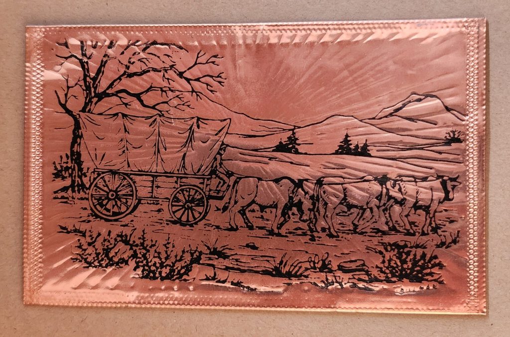
Utah in Copper Relief
The copper-embossed Utah souvenir represents one of the more elaborate departures from traditional postcard design. The metallic rectangular plate features a raised topographic outline of the state with embossed illustrations of regional landmarks and attractions. The word UTAH is prominently displayed at the top, while places like Vernal, Provo, Cedar City, and St. George are labeled at their approximate locations. The copper medium gives the piece warmth, with a decorative scalloped border framing the state’s geography and securing the paper card below.
The manufacturing process likely involved die-stamping or embossing thin copper sheeting, a technique that dates back to the late 19th century and regained popularity in mid-20th century souvenirs. The tactile nature of the raised elements invites touch, creating a multisensory experience unavailable in traditional flat postcards. The utility of this object as actual correspondence is significantly diminished—the copper surface resists easy writing, and its weight requires additional postage and hand-canceling. It’s more a miniature commemorative plaque that happens to maintain postcard dimensions.
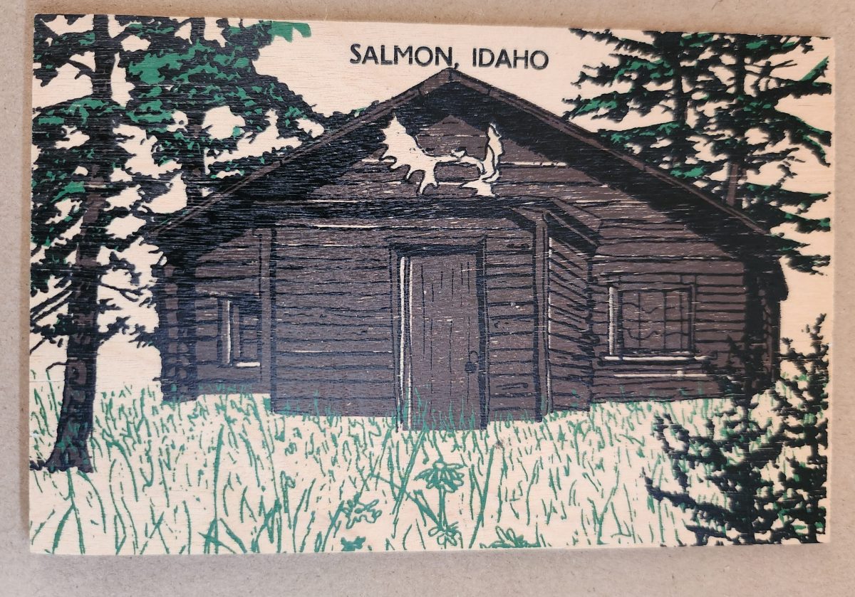
Woodsy Aesthetics
Let’s look closer now at a novelty postcard featuring a cabin in Salmon, Idaho, printed onto a thin wooden substrate and depicting a rustic cabin nestled among stylized pine trees. The scene employs a limited color palette—brown and black for the structure and green for the surrounding vegetation—lending it a deliberately simple aesthetic that echoes both woodcut prints and traditional lithography.
The simple text at the top identifies the location without intruding on the scene. The artwork itself employs minimal detail, capturing the essence of rural life rather than photographic accuracy. The manufacturing process of printing onto thin wood veneer allows for mass production, while adding a specific scene, location name, and ink color for customization.
This card’s rustic medium and subject matter work in harmony, creating a self-referential object where the material reinforces the message—a wooden card depicting a wooden structure set within a forested landscape. The medium becomes part of the message, suggesting authenticity through material consistency. Though mass-produced, it strongly evokes a rural sensibility.
Framed Vistas
Our souvenir from Yellowstone National Park adopts yet another approach. This card features a stylized illustration of Yellowstone’s grand canyon and waterfall printed on cardstock and mounted on a wooden backing.
The artwork employs a palette of oranges, purples, blues, and whites to capture the dramatic landscape, with the falls rendered as a white vertical streak against colorful canyon walls. Dark silhouettes of pine trees frame the scene, while puffy clouds hover in a light blue sky, held inside a purple border. The stylized typography echoes vintage travel posters from the early to mid-20th century. The entire image is mounted or printed on a natural wood base, visible as a frame around the illustration.
This card’s production combines offset printing with a wooden substrate—a look that recalls both traditional woodblock prints and mid-century travel advertisements. The design deliberately evokes an era of American national park tourism when artistic posters commissioned by the Works Progress Administration and the National Park Service established a distinctive aesthetic for natural landmarks.
Playful Puzzles
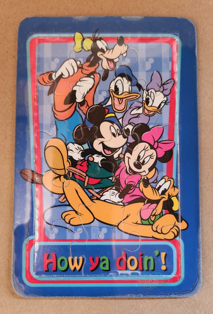
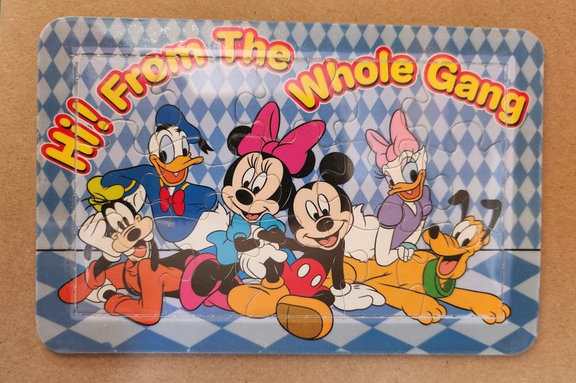
The Disney puzzle postcard introduces an element of interaction we haven’t seen before. This card features Mickey Mouse, Minnie Mouse, Donald Duck, Daisy Duck, Pluto, and Goofy arranged in a group pose against a blue-and-white checkered background. The message reading “Hi From The Whole Gang” in bubble text curves around the edge of the image.
This item turns a postcard into a simple jigsaw puzzle—die-cut pieces that can be jumbled and reassembled to reveal the printed image. The manufacturing process involved full-color printing followed by precision die-cutting to create interlocking puzzle pieces, then applying a thin adhesive film to maintaining the card’s overall integrity for mailing.
This souvenir represents a curious hybrid—a postcard that actively invites its own disassembly. The Disney characters themselves represent another layer of nostalgia, combining America’s animation icons with the traditional postcard format to create an object that references multiple forms of 20th-century popular culture simultaneously. But only modern technology could accomplish these manufacturing details, a playful combination of familiar and fresh.
Magnetic Memories
The Will’s Hardy Trees and Seeds magnetic card is the one in our set with the most layers of both meaning and making. See packets, postcards, fridge magnets, and agricultural Americana all combine in this take home treasure.
The 1909 seed catalog cover is a contemporary image inspired by the real-life Oscar H. Will & Co. of Bismarck, North Dakota. The vibrant illustration displays pansies in various colors—purple, yellow, orange, pink, and white—arranged in a bouquet. Text identifies the company’s 26th year of operation and describes their products as the “choicest and most beautiful on earth”.
A small purple circle overlay on the plastic film cover announces the item’s true nature: a magnetic postcard to send as a gift. Despite its historical appearance and postcard dimensions, the object is actually a refrigerator magnet that merely references seed catalog and postcard aesthetics. The production involved digital printing on magnetic sheet material, applying a printed paper backing, and slipping into a plastic cover with instructions to mail the gift in an envelope.
As a novelty item, it reveals a peculiar circularity. A reproduction of a commercial artifact (seed catalog) transformed into a correspondence medium (postcard) further transformed into a decorative household item (refrigerator magnet). Somehow, we love each iteration all the more.
Nostalgia Squared
What these examples share is a relationship with nostalgia that operates on multiple levels. They aren’t simply nostalgic; they engage in a looping nostalgia—nostalgic representations of already nostalgic forms.
The copper Utah relief draws upon mid-century tourist souvenirs, themselves designed to evoke frontier-era maps and territorial markers. The Salmon cabin employs modern production techniques to simulate traditional woodcuts nad print, which were themselves often romanticized depictions of rural life. The Yellowstone cards references mid-century national park posters that were already stylized interpretations of natural wonders. The Disney puzzle incorporates cartoon characters who have become nostalgic cultural icons, presented in the format of childhood games. The Will’s Seeds magnet reproduces early 20th-century commercial art that was, even in its original context, employing Victorian aesthetic sensibilities.
This layering of reference creates objects that are remarkably dense with cultural signifiers despite their modest physical dimensions. They offer not just a connection to place and time but to the ways we’ve represented ourselves and our interests through commercial souvenirs.
Our apparent need for novelty, then, might be better understood as a need for continual context. Each new postcard iteration doesn’t merely replace what came before; it absorbs and references it, creating objects that function as compact archives of our evolving relationship with the characters and places we cherish.
These novelty postcards sit at an interesting crossroads of commerce, craft, and communication. They represent what happens when a formerly utilitarian object—the humble postcard—is freed from its purely practical obligations and allowed to evolve along lines dictated by sentiment, aesthetics, and novelty.
In a world increasingly dominated by digital experiences, these physical novelties offer something screens cannot—texture, weight, presence. They satisfy our hunger for the tangible. Their quirky, sometimes impractical forms speak to a human need more fundamental than efficient communication: the need to hold something unique in our hands, and to feel a physical connection to places we’ve been and experiences we’ve had.
The postcard itself is and was a very simple concept and object that, over time, has become a medium for ongoing conversations about permanence and impermanence, about what we value over time, and about the tension between utility and sentiment. In their various novel forms, these more-than-postcards tell us about places we’ve been and how we’ve chosen to remember and delight in those places—a correspondence not just between people, but between past and present.
From the verdant hues of the rainforest to the toxic green pigments adorning Victorian wallpaper, green embodies our most profound contradictions. This single color represents both life and decay, wealth and envy, nature and artifice.
In the Amazon rainforest, vegetation thrives in countless green hues, symbolizing life’s abundance. Yet in Western art, sickly green often signifies death and corruption. How can one color embody such opposed concepts? This tension—between green as vitality and green as decay—forms the central paradox in humanity’s relationship with this enigmatic tertiary hue.
Green occupies a unique position in our visual lexicon. It bridges the cool tranquility of blue and the energetic warmth of yellow. This intermediate status perhaps explains its dual nature—a color of balance that simultaneously contains opposing forces.
Toxic Chemistry: From Wallpaper to Printer’s Ink
The story of green pigment drips with poison. For centuries, the most vibrant greens came from copper arsenite, creating infamous “Paris Green” that adorned Victorian wallpapers and allegedly contributed to Napoleon’s death through arsenic poisoning. Scheele’s Green, developed in the late 18th century, released deadly arsenic gas when dampened. Victorian walls literally “breathed” death through their verdant decorations.
This toxic history highlights a contradiction: the color most associated with natural life proved historically among the most unnatural and deadly to produce. Nineteenth century painters risked chronic arsenic poisoning for the perfect emerald tone.
Printing technology reveals another dimension of green’s complex nature. Traditional lithography treated green as a distinct entity. Master printers blended pigments to create precise green tones before applying them to printing stones. Toulouse-Lautrec’s lithographic posters featured carefully formulated green inks to capture the absinthe-tinged atmosphere of Parisian nightlife.
Modern CMYK printing creates green through optical mixing instead. Green isn’t a primary ink but emerges from combining yellow and cyan dots in precise patterns. This technique echoes Neo-Impressionist pointillism, where artists like Seurat placed distinct color dots side by side, allowing viewers’ eyes to blend them into a third color. A magazine’s solid green leaf reveals itself as an array of cyan and yellow dots under magnification.
This absence-made-present quality of green in modern printing mirrors its philosophical status: green exists at boundaries between colors and concepts. While our eyes perceive green as distinct (wavelength 495-570 nanometers), the printing process creates it through subtraction and combination—an illusion constructed from non-green components.
Green Means Go
One of green’s most recognized meanings emerged in the late 19th century with traffic signals. Green indicating “go” now transcends language barriers worldwide.
This standardization began with British railway signals in the 1830s, borrowing from maritime tradition where green lights indicated starboard. The first traffic light with red and green signals appeared outside London’s Parliament in 1868, predating automobiles. Gas-lit red and green lamps operated manually by police officers guided horse-drawn carriages.
The choice wasn’t arbitrary but built on psychological associations. Green’s connection to safety likely stems from evolutionary biology—natural green environments generally signal available food and absence of danger.
The 1949 Geneva Protocol formalized green’s role in traffic systems globally. Today, from Tokyo’s sophisticated networks to remote Indian intersections, green universally permits passage. This standardization extends to pedestrian crossings, airport runways, and maritime navigation.
This creates a fascinating contradiction: the color most associated with nature now primarily serves an urban, technological function. Times Square’s green traffic light and the Moscow Metro’s green signal represent perhaps green’s most recognized meaning—entirely disconnected from the natural world that gave the color its original significance.
Green’s role as “go” permeates language. “Getting the green light” implies permission and opportunity. Business reports use green to indicate positive metrics. This association with forward movement and progress creates another layer of meaning for this multivalent color.
Envy and Avarice
Perhaps nowhere is green’s paradoxical nature more evident than in its associations with money and envy. Shakespeare’s description of jealousy as “the green-eyed monster” in Othello connects the color to one of humanity’s most corrosive emotions. This association may stem from physiology—intense jealousy can produce a pallid, greenish complexion due to blood flow changes—the body manifesting emotion through color.
Currency, particularly American dollars, has become synonymous with green. “Greenback” entered common parlance as a synonym for money. The decision to print American currency in green stemmed from practical concerns—green ink resisted photographic counterfeiting and remained chemically stable. This pragmatic choice evolved into a powerful cultural symbol representing both opportunity and excess, freedom and materialism.
Medieval European art portrayed avarice through green-tinted figures clutching moneybags. Giotto’s 14th-century fresco “The Seven Deadly Sins” in Padua’s Scrovegni Chapel depicts Avarice with greenish skin, visually linking the color to unnatural desire for wealth.
Green Flags
Green features prominently in approximately 40 national flags, each instance carrying distinct cultural significance. Brazil’s verdant background represents the Amazon rainforest, directly linking national identity to landscape. Saudi Arabia’s entirely green flag connects the color to Islamic associations with paradise and the Prophet Muhammad.
Nigeria’s vertical bands with green on either side symbolize natural wealth and agricultural resources. Similarly, Pakistan’s predominantly green flag represents both Islamic heritage and agricultural prosperity. In Ireland, green in the tricolor evokes both the verdant landscape (“Emerald Isle”) and Catholic nationalist tradition.
Portugal’s green carries revolutionary significance, representing hope following the Republican revolution of 1910. The Italian tricolor uses green to complete its representation of the natural landscape—the Alps’ snow, Mount Etna’s lava, and the country’s fertile plains.
Green in many African nations’ flags—including Senegal, Cameroon, and Zimbabwe—often represents natural resources and agricultural wealth, while simultaneously nodding to Pan-African colors inspired by Ethiopia’s flag.
These varied uses in national symbolism show how green serves as canvas for diverse values: religious devotion, natural abundance, revolutionary hope, and cultural heritage—sometimes simultaneously within the same emblem.
Green Spaces
The concept of “green space” contains inherent tension. In urban planning, green spaces represent deliberate human interventions—parks and conservation areas that preserve nature within developed landscapes. New York’s High Line transforms an abandoned railway into a linear park, while Singapore’s Gardens by the Bay creates futuristic “supertrees” blending technology and nature.
In Bali’s rice terraces, agricultural practice created one of the world’s most striking green landscapes. These centuries-old terraced fields follow hillside contours, representing harmony between human needs and natural topography that has become iconic in travel photography.
“Greenwashing” introduces another tension—the superficial application of environmental imagery to mask environmentally harmful practices. The color once simply representing nature now carries political dimensions, conscripted into debates about sustainability and corporate responsibility.
Beyond Growth
The “green economy” represents perhaps the most significant modern appropriation of the color, embodying tension between environmental sustainability and economic development. Traditionally seen as opposing forces, the green economy concept attempts reconciliation, suggesting an economic system generating prosperity without degrading ecological systems.
This reconciliation attempts to resolve fundamental tension in green’s symbolism. The color representing both verdant growth and corruption of excess now stands for an economic model decoupling prosperity from environmental harm.
Yet the green economy concept contains internal contradictions. Critics argue “green growth” often represents contradiction in terms—attempting to maintain unsustainable consumption through marginal efficiency improvements. This criticism spawned more radical conceptions, including the circular economy model.
The circular economy transcends the linear “take-make-dispose” industrial model to envision economic activity mimicking natural cycles. In nature, nothing wastes—one organism’s decomposition nourishes another. Fallen leaves decay into soil feeding the next generation. This cyclical pattern contrasts with the ever-upward arrow of traditional economic growth charts.
Inspired by natural systems, circular economy advocates like Ellen MacArthur envision products designed for disassembly and reuse, with materials continuously circulated rather than discarded. The bright green growth arrow transforms into a green regeneration circle—emblematic in recycling symbols worldwide.
This shift from growth-as-expansion to growth-as-renewal reimagines green’s economic symbolism. Finland’s forests, supplying timber under strict regeneration requirements, exemplify this approach—harvested trees always replanted, creating sustainable cycles rather than mere extraction. This forest management system models how economic activity can align with natural regeneration.
The Color of Paradox
Green remains the color of paradox—simultaneously natural and artificial, life-giving and toxic, calming and unsettling, signifying unfettered growth and mindful circularity. This duality explains its enduring fascination. Unlike primary colors with straightforward associations, green exists in in-between spaces—a tertiary tone refusing simple categorization.
From deadly Victorian pigments to digital screens, from Islamic tradition to environmental movements, from envious emotions to regenerative economics, green continues evolving while maintaining fundamental tensions. In all its tertiary complexity, green continues defining spaces where human creativity engages with fundamental forces of growth, change, and renewal.
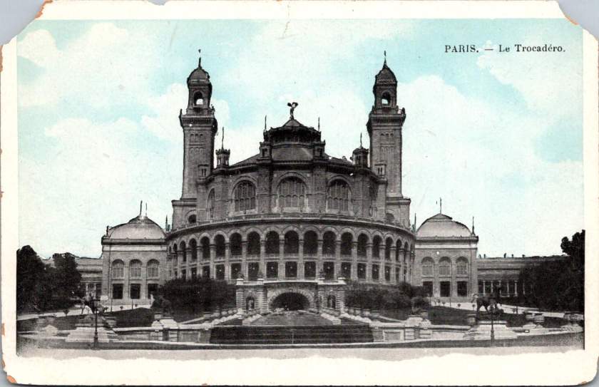
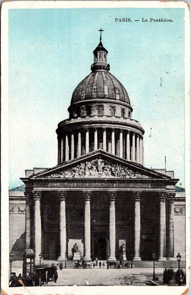
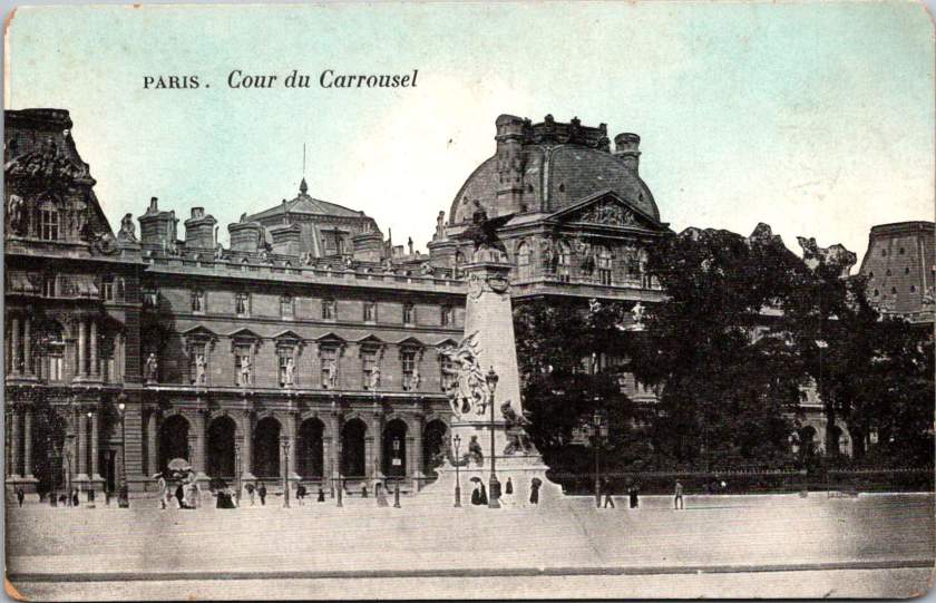
Early postcards represent a convergence of innovations in printing, photography, and postal delivery—each with its own players, craft, and history. The emergence of the simple picture postcard depended on a complex international network of industries, technologies, and regulations developed in the prior century.
Art for the Masses
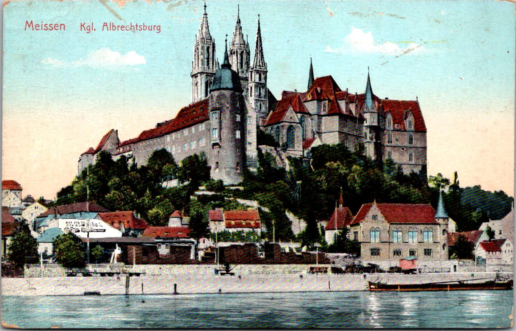
The development of chromolithography in the late 19th century provided the technological foundation for colorful mass-produced postcards. Though lithography itself dated back to 1796, when Alois Senefelder developed the process in Munich, the refinement of color lithography reached new heights in the 1870s-90s, with different national styles emerging.
German printers particularly mastered the technique of creating separate limestone printing plates for each color, allowing for vibrant multi-color images that previously would have required expensive hand-coloring. A typical color postcard might require five to fifteen separate printing runs, with perfect registration between colors. This level of precision required specialized equipment and highly trained craftsmen.
German chemical industries produced superior inks and dyes, giving their postcards more vibrant and stable colors than competitors. Companies like BASF and Bayer, originally founded as dye manufacturers, provided innovative colorants specifically formulated for printing applications.
The German city of Leipzig emerged as a center of printing excellence, with firms like Meissner & Buch establishing international reputations for quality. German chromolithography was so superior that even American publishers would often have their designs sent to Germany for printing, then shipped back to the United States for distribution—at least until tariff changes in 1909 made this practice less economical. Publishers like Raphael Tuck & Sons maintained offices in Germany despite being headquartered in London, simply to access German printing expertise.
While Germany led in technical quality, French postcards developed a reputation for artistic sophistication. Paris publishers like Bergeret and Levy et Fils produced cards featuring Art Nouveau styles and artistic photographic techniques. The French market also developed distinctive “Fantaisie” postcards featuring elaborate designs with silk applications, mechanical elements, or attached novelties. These cards pushed the boundaries of what a postcard could be, turning functional communication into miniature works of art.
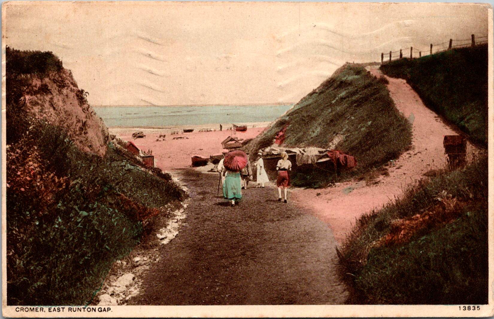
British publishers like Raphael Tuck & Sons, J. Valentine & Co., and Bamforth & Co. showed particular commercial acumen. While they didn’t match German printing quality or French artistic sensibility, British firms excelled at identifying market opportunities and consumer trends. The British pioneered specialized categories like the seaside postcard and led in developing postcards for specific holidays and occasions.
Photographic Reality
While lithographic postcards dominated the market, photography increasingly influenced postcard production. The collodion wet plate process (1851) and later the gelatin dry plate (1871) made photography more accessible. The development of halftone printing in the 1880s allowed photographs to be reproduced in print media without manual engraving, creating more realistic imagery.
A revolutionary moment came in 1903 when Eastman Kodak introduced “Velox” postcard paper. This pre-printed photographic paper had postcard markings on the back and a light-sensitive photo emulsion on the front. Combined with Kodak’s 3A Folding Pocket camera, which produced negatives exactly postcard size (3¼ × 5½ inches), this innovation created the Real Photo Postcard (RPPC).
The acquisition of Leo Baekeland’s Velox photographic paper company in 1899 for $1 million provided a crucial technological component. Velox paper could be developed in artificial light rather than requiring darkroom conditions, had faster developing times, and produced rich blacks and clear whites—all critical qualities for postcard production.
The RPPC format found particular success in America, where the vast geography meant many small towns would never appear on commercially printed postcards. Local photographers throughout the country created RPPCs of main streets, businesses, schools, and community events, documenting American life with unprecedented comprehensiveness.
International Postal Agreements
Even the most beautifully produced postcard would be meaningless without an efficient system to deliver it. The standardization of postal systems in the late 19th century created the infrastructure necessary for postcards to flourish.
A watershed moment for international mail came with the Treaty of Bern in 1874, establishing the General Postal Union (later renamed the Universal Postal Union or UPU). This organization created the first truly international postal agreement, initially signed by 22 countries, primarily European nations. The United States joined the UPU in July 1875, connecting the American postal system to the standardized European networks. The U.S. had introduced its own government-issued postal cards in 1873, but joining the UPU meant these could now be sent internationally under consistent regulations.
Several key UPU Congress developments shaped the postcard’s evolution. The 1878 Paris Congress renamed the organization to Universal Postal Union. The 1885 Lisbon Congress standardized the maximum size for postcards (9 × 14 cm). The 1897 Washington Congress set new international regulations for private postcards. The 1906 Rome Congress standardized the divided back format internationally.
Perhaps the most crucial postal development for postcard popularity was the divided back. Great Britain introduced this format in 1902, with France and Germany following in 1904, and the United States in 1907. Before the divided back, the entire reverse of a postcard was reserved for the address only, with messages having to be squeezed onto the front, often around the image. The new format allocated half the back for the address and half for a message, dramatically improving postcards’ utility as correspondence tools.
European Delivery Systems
European railway networks proved ideal for postal delivery, creating a remarkably efficient system. By the 1870s-80s, most European countries had developed comprehensive rail networks. Germany alone had over 24,000 miles of railway by 1895, despite having a land area smaller than Texas.
Railway mail cars (“bureaux ambulants” in France, “Bahnpost” in Germany) sorted mail en route. These mobile sorting offices made the system highly efficient, with mail sorted by destination while in transit. Railway timetables were coordinated to allow for mail transfers at junction points, creating an integrated system even across national borders.
Major routes often saw multiple mail trains per day. The Berlin-Cologne line, for example, had four daily postal services by 1900. This meant that postcards could be delivered between major cities within a day, creating a communication speed previously unimaginable.
For urban delivery, European cities developed even more innovative systems. Perhaps most remarkable were the pneumatic tube networks installed in several European capitals. Paris launched its “Pneumatique” in 1866, Vienna’s “Rohrpost” began in 1875, and Berlin built an extensive pneumatic network from 1865. These systems used compressed air pressure to propel cylindrical containers through networks of tubes. The carriers could hold several postcards or letters and traveled at speeds up to 35 kilometers per hour. Paris eventually developed a pneumatic tube network extending 467 kilometers, allowing for delivery times of under 30 minutes across the city. A morning postcard could receive an afternoon reply—creating a nearly conversational pace of written communication.
American Adaptations
The United States faced different geographical challenges. The vast distances between population centers meant that the same-day delivery common in Europe was impossible between major cities. Nevertheless, the American postal system developed impressive efficiency given these constraints.
The U.S. Railway Mail Service, officially established in 1869, became the backbone of American mail delivery. By 1900, more than 9,000 railway postal clerks were sorting mail on trains covering more than 175,000 miles of routes. While European countries measured mail routes in hundreds of miles, American routes stretched thousands of miles across the continent.
American cities also experimented with pneumatic tube systems, though they were less extensive than European counterparts. New York City’s system, operating from 1897 to 1953, eventually covered 27 miles with tubes connecting post offices in Manhattan and Brooklyn. At its peak, it transported 95,000 letters per day, or about 30% of all first-class mail in the city.
Within cities, frequent delivery became the norm. By 1900, many American urban areas offered at least four daily mail deliveries, with some business districts receiving up to seven deliveries per day. This made postcards a practical means of daily communication within city limits, much as they were in Europe.
The efficiency and economy of postcards made them ideal for routine business communications. Companies developed pre-printed postcards for order acknowledgments, shipping notifications, payment reminders, meeting confirmations, service calls, and appointment reminders. These standardized communications reduced clerical costs while providing a paper trail of business interactions. The divided back format was particularly valuable for business purposes, allowing for both a standardized message and customized details.
Perhaps no industry benefited more from postcards than tourism. Hotels, resorts, transportation companies, and local chambers of commerce all commissioned postcards that served as both souvenirs and advertisements. Visitor bureaus coordinated with publishers to ensure their destinations were well-represented in the marketplace. The economic impact was substantial—a scenic view postcard might cost a penny to produce, sell for a nickel, and generate hundreds of dollars in tourism revenue by inspiring visits. This multiplication effect made postcards perhaps the most cost-effective tourism marketing tool ever devised.
On the personal side, postcards fulfilled a spectrum of communication needs. In an era when the telephone was still a luxury and telegrams were expensive, postcards filled the gap between costly immediate communication and slower formal letters. Their affordability and efficiency made them ideal for routine messages. At half the postage rate of letters in many countries, postcards democratized written communication for working-class people who might otherwise limit correspondence due to cost. The postcard’s format encouraged brevity—a perfect medium for quick notes without the formality or length expected in a letter. In urban centers with multiple daily mail deliveries, postcards functioned almost like text messages, allowing people to make arrangements within hours.
Sending postcards from vacation destinations served as tangible proof of travel experiences. “Wish you were here” cards from resorts or tourist locations signaled social status and mobility. Recipients often displayed postcards on special racks or in parlor albums, using them as affordable decorative elements and evidence of their social connections. For people who rarely traveled, receiving postcards provided authentic glimpses of distant places through real photographs rather than artistic interpretations.
Perhaps most significantly for historical purposes, postcards—especially RPPCs—documented aspects of community life that would otherwise have gone unrecorded. Local events, buildings, streetscapes, and everyday activities were captured on postcards, creating a visual record of ordinary life at the turn of the century that has proven invaluable to historians. When natural disasters or significant events occurred, local photographers would quickly produce RPPCs documenting the situation. These cards spread visual news of floods, fires, celebrations, or notable visitors throughout the region, serving an early photojournalistic function.
While American postcard production initially lagged behind Europe in quality, US companies excelled at entrepreneurial adaptation. When the 1909 Payne-Aldrich Tariff Act increased import duties on foreign postcards, American firms rapidly expanded domestic production capabilities. When World War I cut off European imports entirely, American manufacturers stepped into the gap, developing new techniques and styles.
Beyond the Golden Age
Behind every seemingly simple postcard lies a complex history of industrial innovation, international cooperation, and social transformation—a paper-based predecessor to the digital networks that connect us today.
The Golden Age of postcards waned after World War I due to disruption of European production centers, rising postal rates, the growing popularity of telephones, and the emergence of new forms of mass media.
The era when postcards emerged was a crucial moment when ordinary people gained access to new visual communication tools. The democratization of image sharing pioneered by postcards foreshadowed later developments in visual communication. This visual history reminds us, from personal photographs to social media posts, the impulse to share visual snippets of our lives is a constant across time.