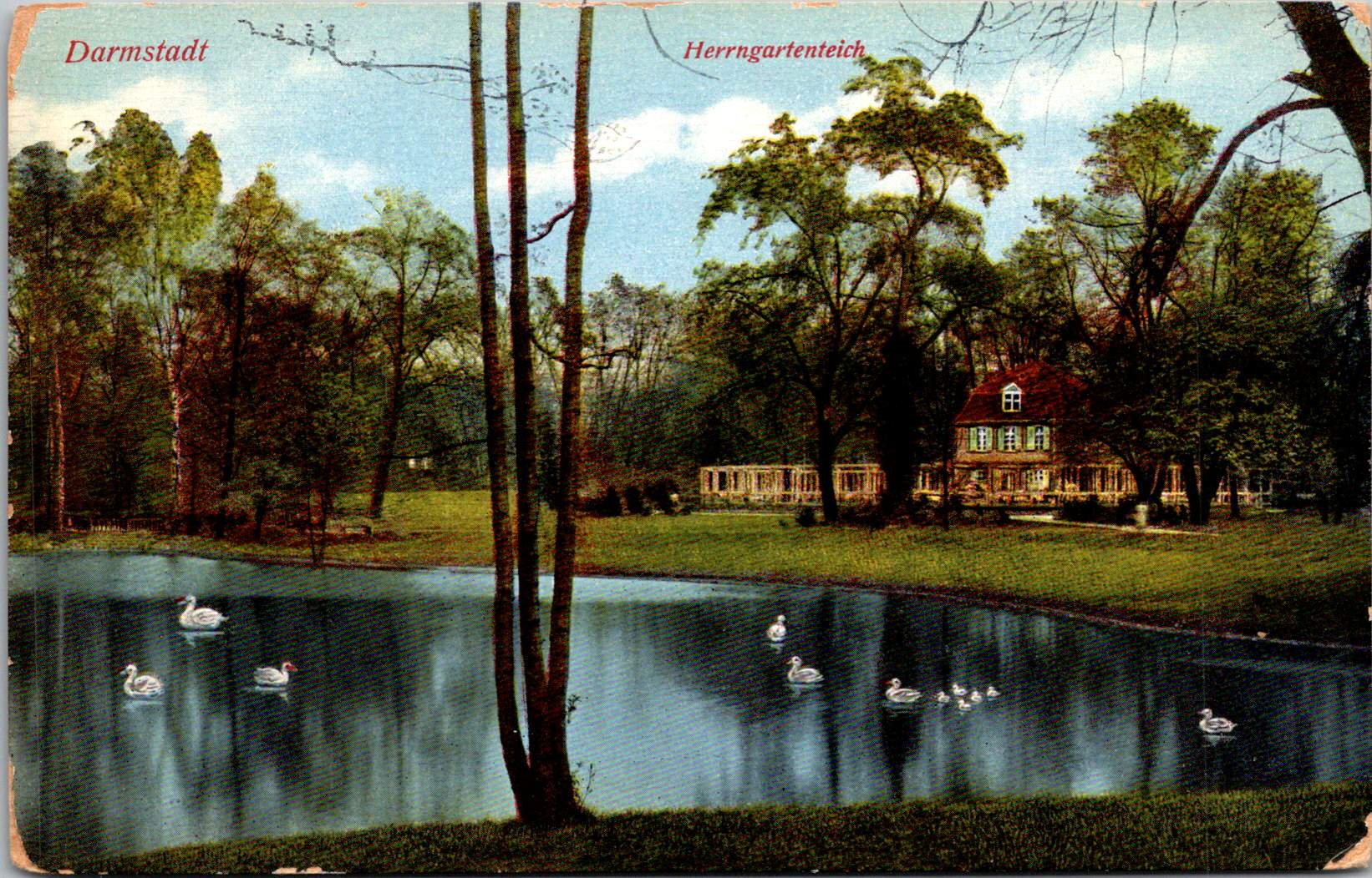
The Posted Past marks its one year anniversary with fun, facts, and cats!
A year ago, The Posted Past began with a simple quest—to explore the stories behind my family’s vintage postcard collection. These small windows into the past gave me the chance to be curious and brave as a writer. I wasn’t sure I could research and produce a short essay on a weekly schedule. Fifty-two weeks later, without a single miss, I am happily beyond those worries.
Thank you for joining me on this journey. Together, we’ve traveled from Osaka to Matoon. Looked at buffalos roaming in a Kansas field and donkeys on the English seaside. Iconic views of San Francisco came from its well-known chronicler, and we’ve been on a more recent search for a Mexican photographer who vanished in volcanic ash. Each postcard has taken us to unexpected corners of history—social movements, architectural trends, national parks, and the everyday lives of people who took the time to write, “Wish you were here.”
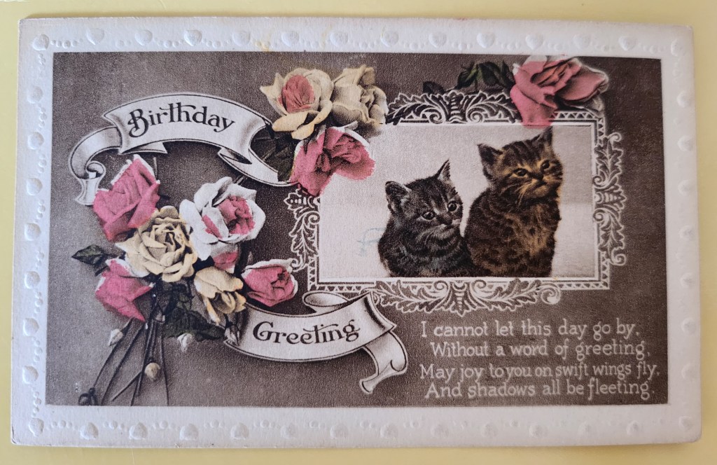
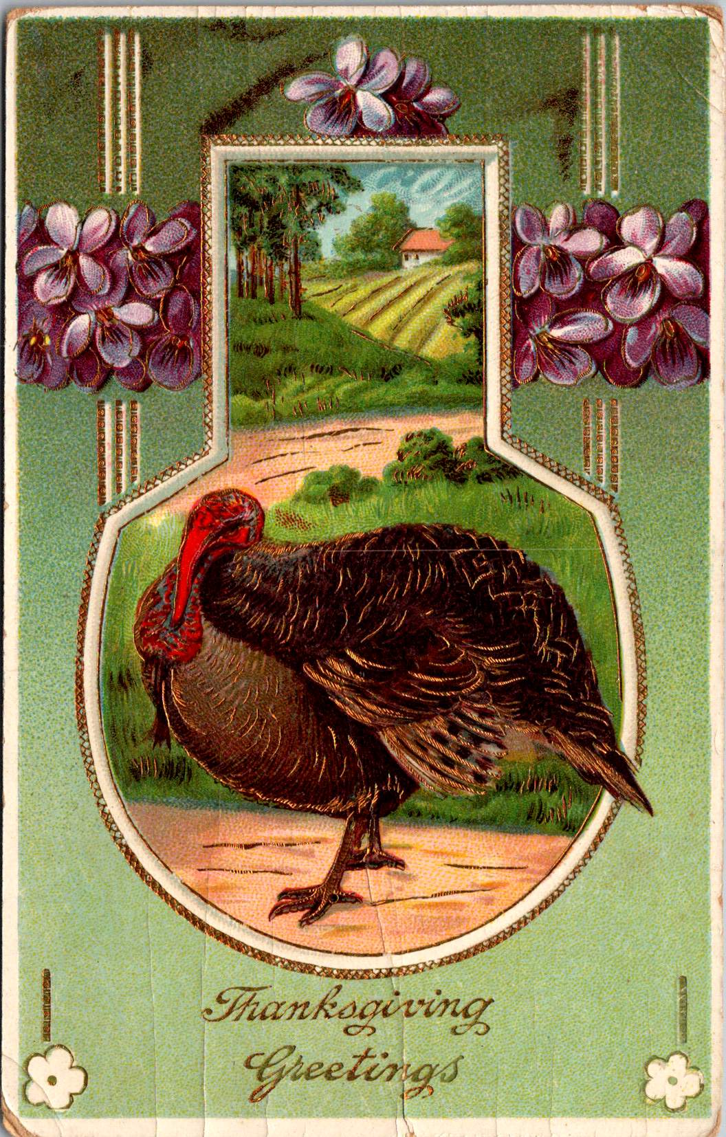
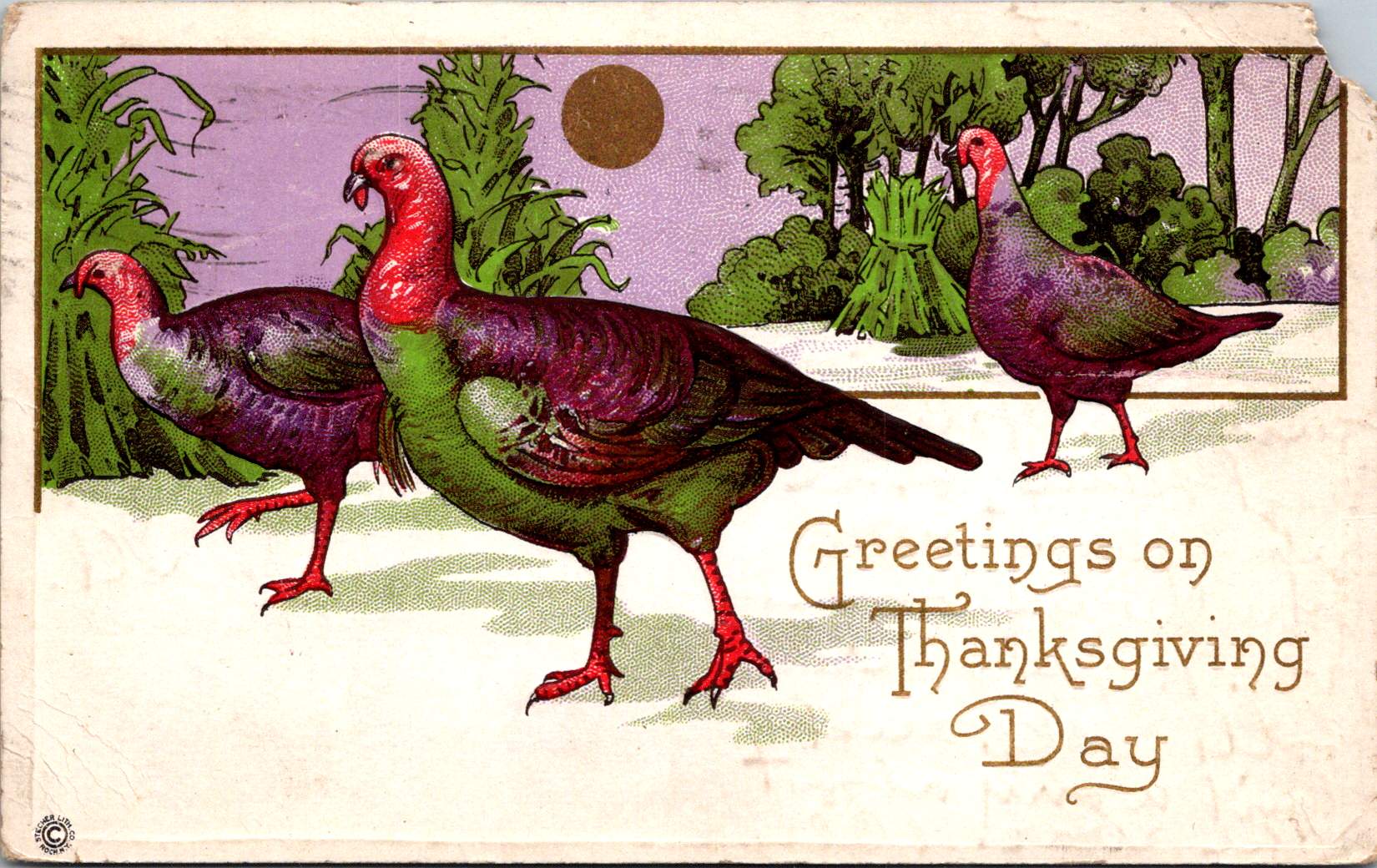
Today’s postcard reminds me why I love this work. The adorable kittens and lovely roses on the front never go out of style. On the flipside, Maude writes to her mum with a few sweet sentiments and concerns. In between lies a world of personal and cultural histories: the rise of the postcard era, the Victorian language of flowers, the printing techniques that made such colorful cards possible, and the universality of cats. Always, an exchange between people. What we’re really collecting are reminders of tender human connections across time.
What’s new for year two? July will bring a shift in weekly format while I take some vacation time—shorter Wednesday posts spotlighting single cards. After that, I’ll be expanding the eBay store, indulging in the nerdy work of adding captions and citations to old posts, and exploring how these weekly essays might become a book and a workshop series. Like any creative start-up, the first year came with a to-do list of dreams and ideas.
Before I sign off, may I ask: would you ever consider sending a vintage postcard as a gift? The mechanics are easy—choose the perfect card online, add a personal note, and we send it off with love through the post office. But is that something you’d enjoy giving or receiving? Leave me a note in the comments.
Thanks again, and meow for now 🙂 Enjoy the summer!
Native Hawaiian wisdom, mainland capitalism, an LDS mission, and the birth of Pacific tourism. At the center, a banyan tree that has watched Hawaii transform for 120 years. This 1921 real photo postcard reveals the complexities of cultural exchange, migration, and travel over time.
In the photograph we are looking at today, the Moana Hotel rises like a palace from Waikiki Beach, its elegant wings stretching toward Diamond Head. A wooden pier extends into the Pacific. The building’s Victorian details hint at mainland American grandeur transplanted to the tropics. The “First Lady of Waikiki” opened as the territory’s first luxury resort, transforming a landscape once dotted with taro ponds and royal summer homes into the birthplace of Pacific tourism.
Built by wealthy landowner Walter Chamberlain Peacock and designed by architect Oliver G. Traphagen, the Moana opened on March 11, 1901, with 75 rooms featuring Hawaii’s first electric elevator and the unique amenity of private bathrooms. The first guests were a group of Shriners, who paid $1.50 per night—about $50 today—to experience what was then a very remote luxury destination.
Three years later, Jared Smith, Director of the Department of Agriculture Experiment Station, planted what seemed like a simple landscaping choice in the hotel’s courtyard: a young Indian banyan tree, nearly seven feet tall and about seven years old when planted. In the image, the tree is seventeen years old and already creating the shaded sanctuary that is the hotel’s heart even today.
As we flip the postcard over, another dimension is revealed. On November 29, 1921, a simple message sent to Mabel Moss in Longanoxie, Kansas with the usual greetings. But this isn’t a holiday for Aunt Olive. Her return address, “Route 4 – Box 46,” tells its own story of how communities were connecting between ancient and modern, sacred and commercial.
A Mormon Pioneer’s Island Home
Aunt Olive likely lived in Laie, thirty-five miles north of the Moana Hotel, where the Mormon Church had established its Pacific sanctuary. Her Route 4 address would have been served by one of the Rural Free Delivery routes radiating out from Honolulu—a detail that places her among the settlers who were building new communities beyond the city’s tourist corridor.
The Mormon settlement at Laie represented a unique form of cultural encounter. Beginning in 1865, when Church president Brigham Young received permission from King Kamehameha V to establish an agricultural colony, the Latter-Day Saints purchased 6,000 acres of traditional land—a pie-shaped division that provided for sustainable living. The Mormon community tried to honor Hawaiian land practices, giving each family a loi (water garden) to cultivate kalo (taro), the traditional sustenance crop.
The Hawaii Temple, dedicated in 1919, was the first Mormon temple outside continental North America. Built with crushed local lava and coral, its structure embodied the meeting of mainland pioneer culture and Pacific Island materials. Polynesian Saints from across the Pacific were gathering in Laie to receive temple ordinances, creating a multicultural religious community where Hawaiian, Samoan, Maori, and haole (white) families lived side by side.
The LDS approach to missionary work emphasizes learning local languages and customs—not merely as conversion strategy, but as theological principle. One of the early missionaries mastered Hawaiian so thoroughly that he produced the first non-English translation of the Book of Mormon in 1855. The missionaries married into Hawaiian families, adopted local foods and farming methods, and incorporated Polynesian cultural elements into their worship. Even as they openly sought converts, they also saw themselves as students of Hawaiian wisdom.
Paradise Shared
Captured in our image are at least a few conflicting visions of paradise. The Moana Hotel itself represents economic prosperity through the commodification of tropical beauty. Its guests paid premium rates to experience “the ultimate playground,” complete with hula shows and exotic imagery designed for mainland consumption. By the time of this photo, the hotel’s success had already inspired expansion; wings added in 1918 doubled its capacity.
However, the hotel was built where Hawaiian royalty had once gathered, in a place that embodied the Native Hawaiian principles, very different than Western concepts of land as commodity, beauty as product, and culture as entertainment. Look again at the Banyan tree. Where tourists saw scenery, Native Hawaiians understood kino lau—the gods manifested in every plant, animal, and natural feature. But, Hawaiian language had been banned in schools since 1896, and traditional practices were actively discouraged as territorial authorities promoted “Americanization.”
The Mormon community at Laie offered a third way that, despite its evangelical aims, required genuine cultural engagement. Unlike tourists who consumed Hawaiian imagery, or territorial officials who suppressed Hawaiian practices, Mormon missionaries made learning local ways a theological priority. They understood that successful evangelism required fluency not just in Hawaiian language, but in Hawaiian concepts of kinship, land, and spirituality.
This approach created communities that were simultaneously foreign settlements and island adaptations—places where pioneer traditions mixed with Polynesian extended family structures, where American church hymns were sung in native dialects, and where temple architecture incorporated local materials and building techniques.
Time Travel
The tensions that were at work in 1921 continue today, but so do the possibilities for meaningful cultural exchange. Today’s mālama Hawaii movement invites travelers to participate in coral restoration, native forest planting, and beach cleanups. Visitors can learn about places like Waimea Valley, where ancient cultural sites are preserved alongside environmental restoration. The principle of pono—righteous action—guides travelers to maintain respectful distances from endangered monk seals and sea turtles, to support Native Hawaiian-owned businesses, and to understand that they are guests in a living culture, not a theme park.
The island time we seek now isn’t the vacation fantasy of escape from responsibility, but the deeper rhythm of understanding our place within larger cycles of care and connection. When we travel with curiosity rather than conquest, we discover that the most valuable treasures are the stories and perspectives we gather. Over time, we come to know that every place on Earth is someone’s sacred ground.
In Hawaiian tradition, banyan trees serve as gathering places for spirits, bridges between the physical and spiritual worlds. Perhaps this ancient wisdom explains why the Moana Hotel’s banyan courtyard remains a place of peace amid Waikiki’s transformation—a living reminder that some forms of growth honor rather than diminish what came before.
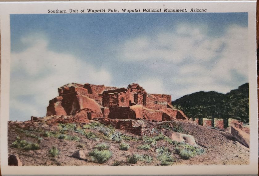
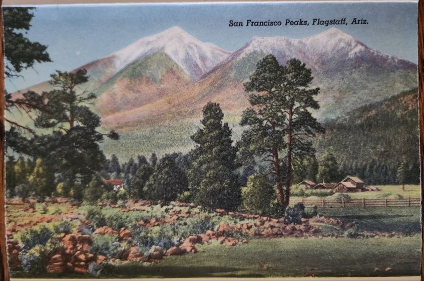
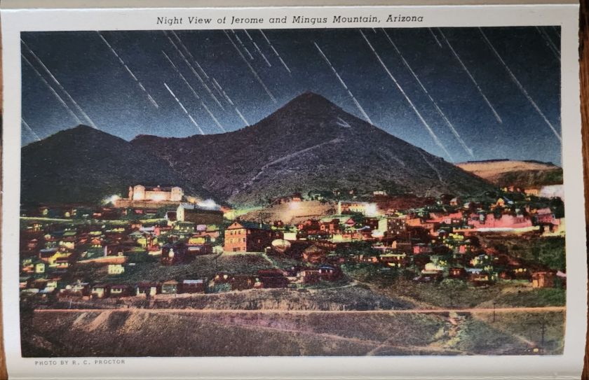
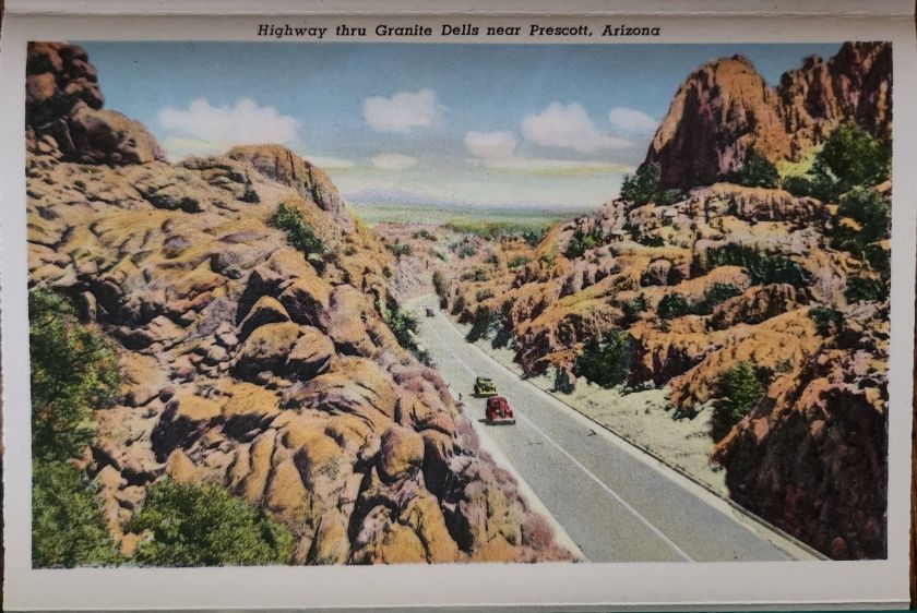
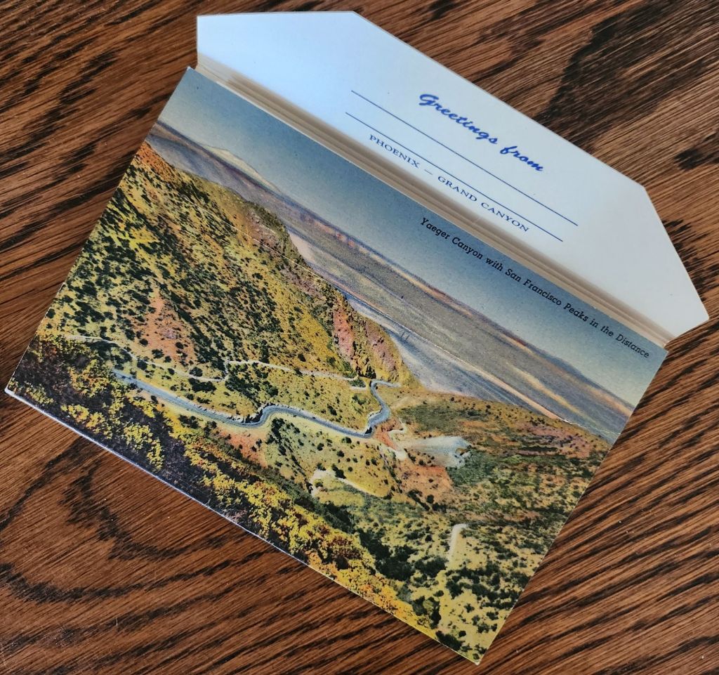
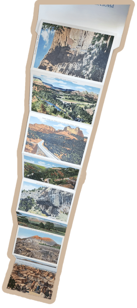
Mid-century postcards captured the wonder of American road trips in vivid color. This Phoenix to Grand Canyon collection reveals the story of car trips, roadside shops, and the natural landscape of Arizona.
Rural Route Arizona
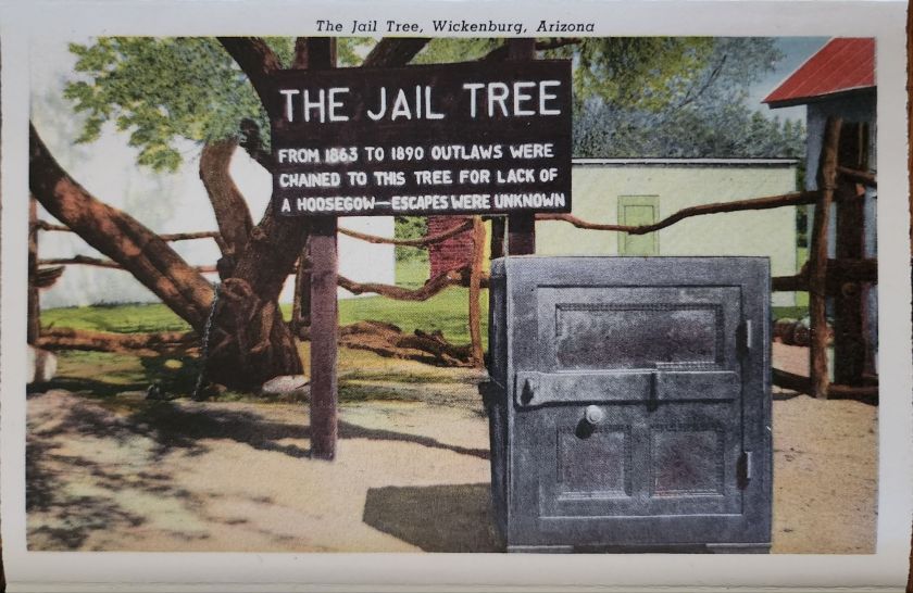
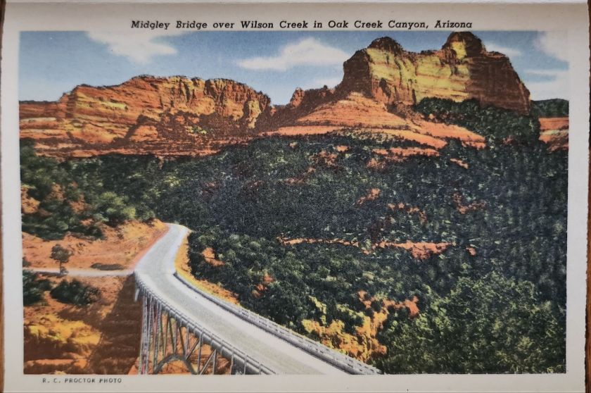
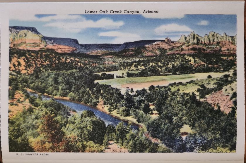
The Phoenix to Grand Canyon route via Oak Creek Canyon carved through America’s most scenic territory. In the 1940s and 1950s, this remained wild, undeveloped country. Starting in Phoenix, travelers navigated winding two-lane roads through Wickenburg, Yarnell, Prescott, Jerome, Clarkdale, Cottonwood, Flagstaff, and Williams.
Each stop pulsed with its own character. Jerome clung to mountainsides, mining copper. Prescott sprawled as a ranching center and former territorial capital. Wickenburg lured visitors with dude ranch culture. Williams crowned itself “Gateway to the Grand Canyon.” These weren’t pit stops but destinations, each welcoming tourist dollars from America’s growing car culture.
Postcard Economy
These postcards bear the stamp of Curt Teich & Co., a Chicago printing giant that drove America’s postcard industry from the 1930s through 1960s. German immigrant Curt Teich founded the company in 1898 and revolutionized postcard production. His linen postcards introduced soft textures and blazing colors.
Teich built an industrial empire through local connections. Photographers roamed America, documenting main streets and natural wonders. In Chicago, artists hand-colored black and white photographs, enhancing reality to seduce buyers and ultimately define a social aesthetic.
Behind every postcard rack stood a web of relationships, too. Hotel owners, gas station attendants, and gift shop operators ordered cards from Teich’s catalog or commissioned custom designs featuring their establishments. Postcards advertised businesses, provided affordable souvenirs, and satisfied the social duty to send word home.
Long-distance calls cost fortunes. Letter-writing devoured time. Postcards offered quick connection and proof of adventure. They were quick and easy evidence that the sender had escaped ordinary life for landscapes of impossible beauty. For travelers, buying and mailing postcards proved both pretty and practical.
The typical buyer belonged to America’s emerging middle class, newly mobile through car ownership and paid vacations. Families drove from California to see the Grand Canyon. Retirees took first cross-country trips. Young couples honeymooned across the Southwest. Many experienced the American West for the first time. Postcards helped them process and share encounters with the sublime.
Selecting, writing, and mailing postcards became part of American vacation ritual. Weather beautiful, wish you were here—heartfelt sentiments that bridge extraordinary experience and ordinary communication.
These postcards transcend tourist kitsch. They document a pivotal moment when the West was packaged and sold as leisure destination. Enhanced colors and idealized compositions reflect not just Arizona’s appearance, but how Americans wanted to see it—as endless possibility, natural wonder, and escape from urban routine.
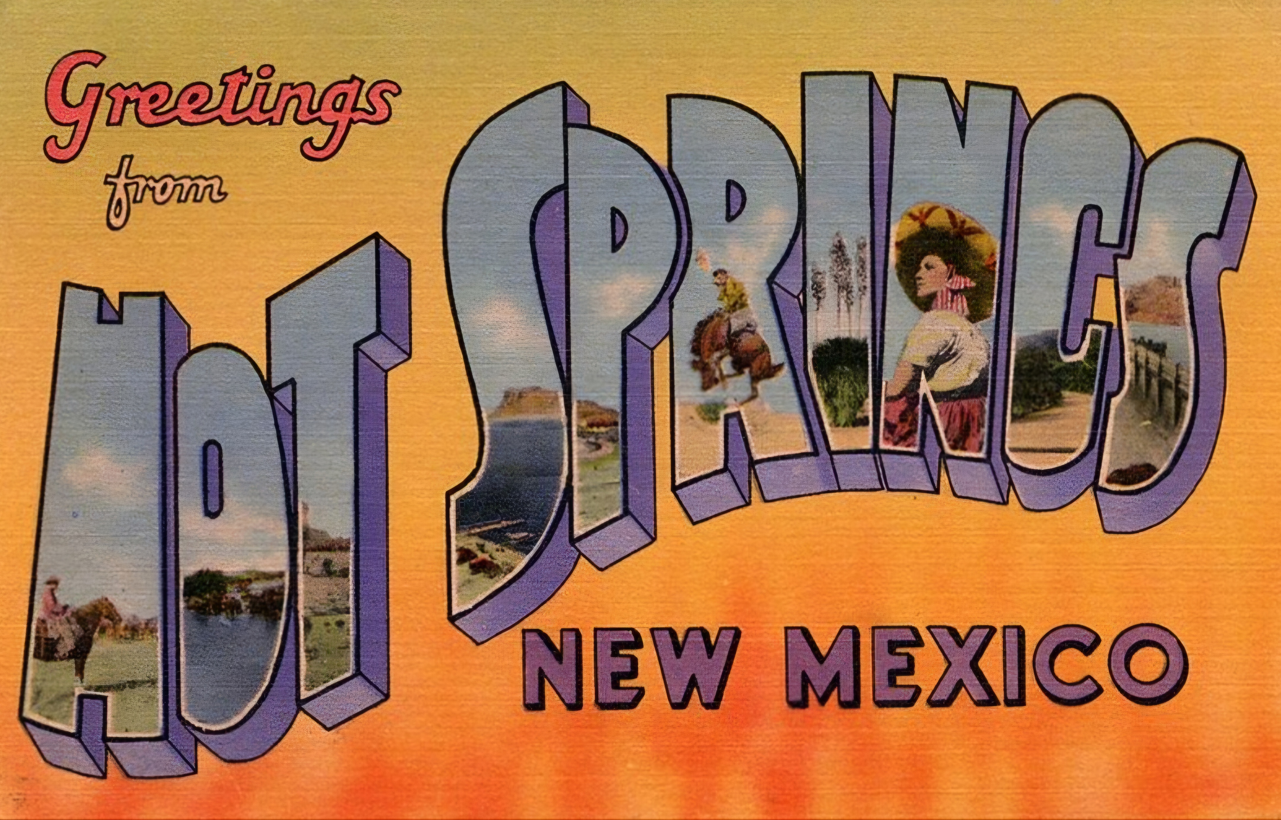
‘Greetings from…’ designs have rippled through visual culture for well over a century, telling the stories of how we see ourselves and our places.
A stone dropped into still water creates concentric circles that radiate outward. This physical phenomenon is a powerful metaphor for how cultural ideas spread through time and across media, especially visual motifs of place. Certain visual vocabularies persist, evolving with technologies while maintaining essential characteristics.
American statehood, regional identity, and natural heritage have rippled through various media over the past century. Iconic ‘large letter’ postcards, commemorative postal stamps, murals and more—all help us trace a fascinating journey of cultural transmission through the broader currents in American history, industrial development, and visual communication.
Gruss Aus… from Germany
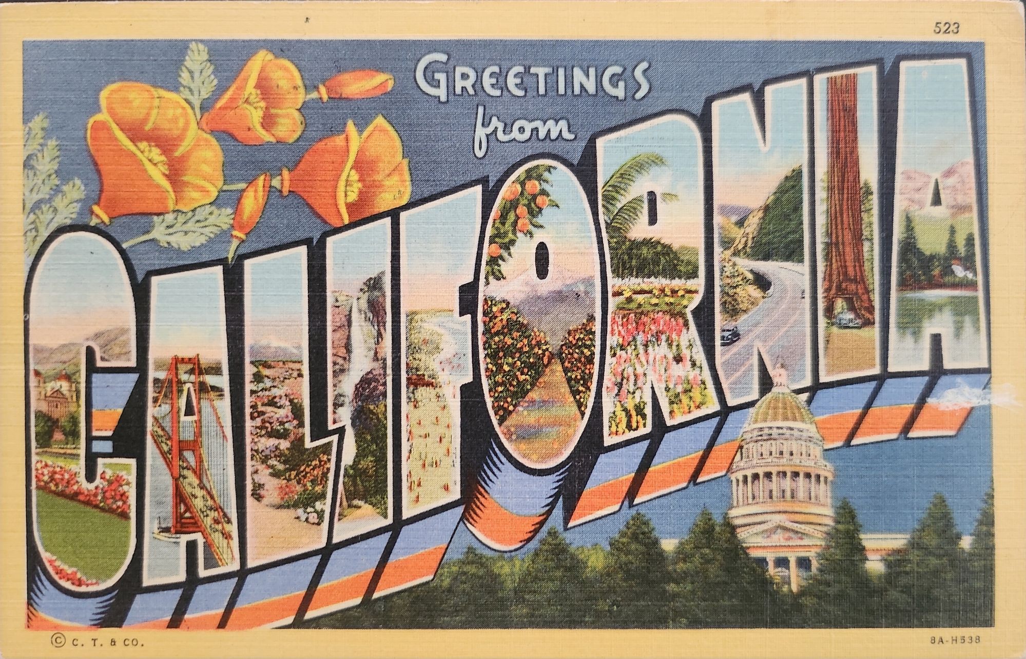
“Greetings From…” postcards emerged in 1890s Germany. The early examples of Gruss Aus cards featured the name of a location rendered in bold, three-dimensional letters with miniature scenes of local landmarks contained within. More common postcards of the day feature detailed illustrations of castles and later photographs. This new design cleverly packed maximum visual information into the limited space, creating an instantly recognizable format that would soon spread internationally.
New American Icons
The transmission of this visual language to America came through a German immigrant named Curt Teich, who arrived in the United States in 1895. After establishing his printing company in Chicago in 1898, Teich would transform American visual culture through the mass production of postcards. Following a visit to Germany in 1904, he successfully imported the Gruss Aus style to the American market, adapting it to suit American sensibilities and landscapes.
The true flowering of Teich’s vision came in 1931 with the introduction of his linen-textured postcards. Printed on high-quality paper with a distinctive fabric-like texture, these cards employed vibrant colors and airbrushing techniques that created a hyperreal aesthetic. The technical innovation of the linen card allowed for faster drying times and more saturated colors, resulting in postcards that depicted America in an optimistic, idealized light—a stark contrast to the harsh realities of the Great Depression era in which they first appeared.
Teich’s business savvy was as important as his technical innovations. He employed hundreds of traveling salesmen who photographed businesses and worked with owners to create idealized images for postcards. This approach not only generated business but also shaped how Americans visualized their own landscapes and communities. The Curt Teich Company would eventually produce over 45,000 different linen postcard subjects in just two decades.
The visual language of these postcards—bold lettering, vibrant colors, and idealized scenes—became firmly embedded in American visual culture during the 1930s through 1950s. As automobile ownership increased and the highway system expanded, these postcards played a crucial role in shaping Americans’ understanding of their own geography and national identity. They were both records of places visited and aspirational images of places to be seen.
State Birds and Flowers
Parallel to the development of the large letter postcard, another form of state-based visual identity was taking root—the formal designation of state birds and flowers. Most American states adopted these symbols between the 1920s and 1940s, often through campaigns involving schoolchildren, women’s clubs, and conservation organizations.
These officially designated natural symbols provided another vocabulary for expressing regional identity, one rooted in the natural world rather than the built environment. While large letter postcards typically highlighted human achievements—city skylines, hotels, roadways—state birds and flowers emphasized the distinctive natural heritage of each region. Together, these complementary systems of regional representation provided Americans with a rich visual language for their diverse nation.
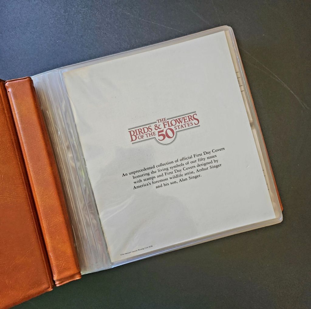
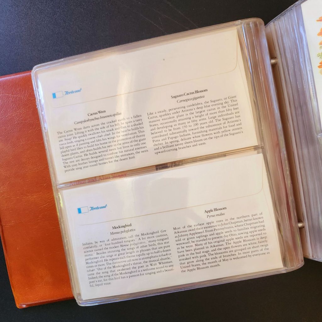
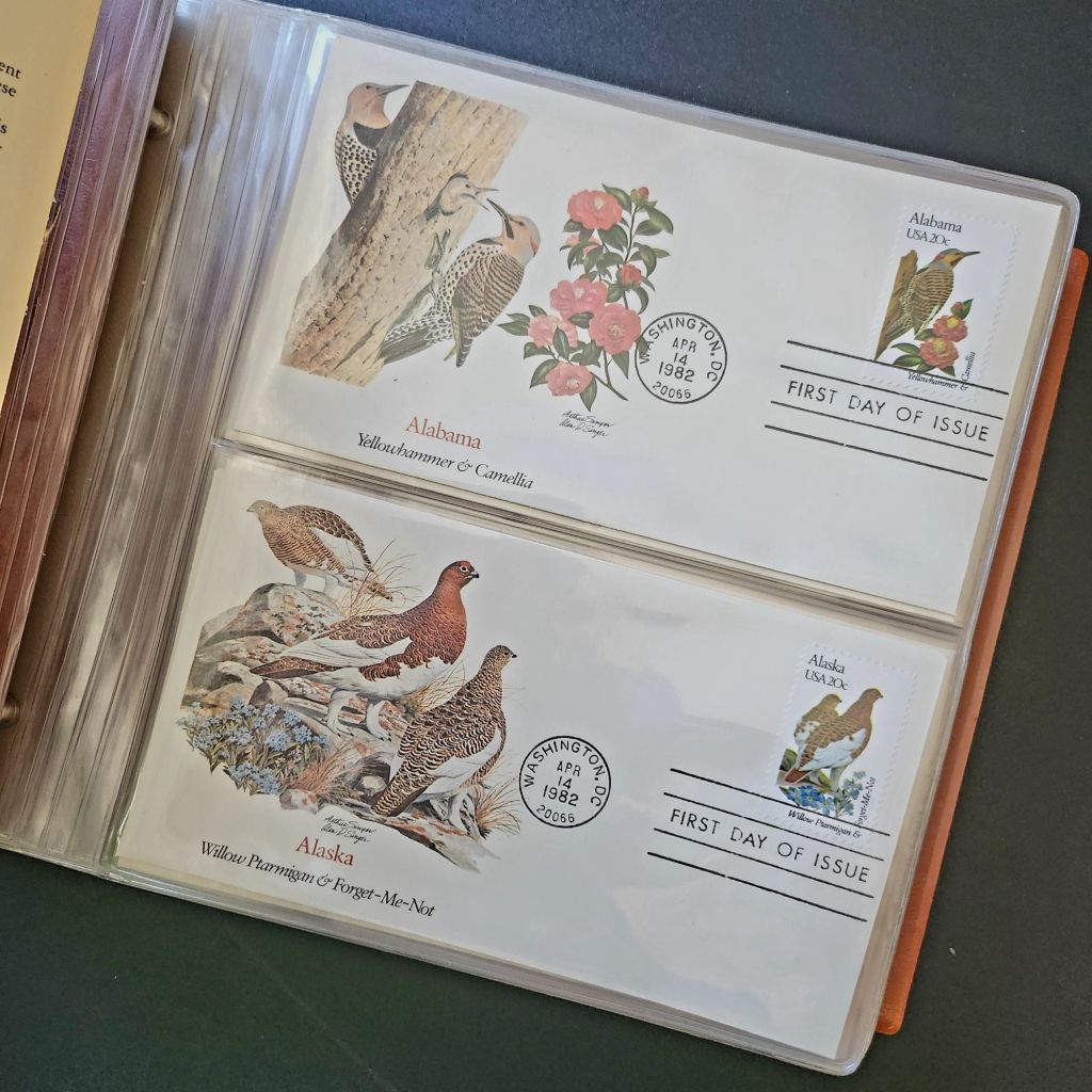
In 1978, the Fleetwood company commissioned father-son wildlife artists Arthur and Alan Singer to create 50 original paintings of state birds and flowers. These watercolor paintings caught the attention of U.S. Postal Service officials, who recognized their exceptional quality and decided to feature them on commemorative stamps. Released on April 14, 1982, the 20-cent State Birds and Flowers stamp collection was another big moment in the ripple effect.
Arthur Singer painted the birds while his son Alan rendered the flowers, creating unique artwork for each of the 50 stamps. The collaboration between father and son added another dimension to this cultural transmission—the passing of artistic traditions and approaches from one generation to the next.
The Fleetwood company published a complete album featuring First Day Covers of these stamps. These decorative envelopes included additional information about each state’s natural heritage, creating a beautifully bound volume that was both aesthetically pleasing and informative. The Birds & Flowers of the 50 States album is now a cherished collectible, a visual catalog of national natural heritage in a single, beautifully presented format.
Greetings from the Post Office
Twenty years later, the visual language of the large letter postcard experienced a revival through another stamp collection. On April 4, 2002, the USPS issued the ‘Greetings from America’ stamps, designed by Richard Sheaff and illustrated by Lonnie Busch. These stamps paid direct homage to the large letter postcards of the 1930s and 1940s, recreating their distinctive style for a new generation.
Each of the 50 stamps featured the name of a state in large, three-dimensional letters containing images of iconic landmarks and scenic vistas. The stamps were initially released as 34-cent denominations, but due to a rate change, they were reissued with 37-cent denominations on October 25, 2002. Here is another circular moment—a postal medium paying tribute to a postcard tradition that had itself been a popular means of commemorating places visited.
These stamps connected with older Americans who remembered the original postcards. Younger generations encountering the style for the first time recognized both the nostalgic and contemporary appeal. The vibrant colors and bold, three-dimensional lettering still effectively communicated a sense of place and regional pride, proving again the resilience of this visual vocabulary.
Even Larger Letters
Artists Victor Ving and Lisa Beggs took the large letter postcard to a whole new scale. Starting in 2015, the Greetings Tour has produced dozens of murals that transform the two-dimensional postcard design into monumental public art.
A grand dimensional leap—a design meant to be held in the hand scaled to the size of a building. The murals maintain the core visual elements of the large letter design while incorporating contemporary references and local touchstones. In a delightful twist, these murals have themselves become tourist attractions with visitors posing for social media. The postcard mural is now a backdrop for new images to be shared globally.
The artists also create custom digital designs for corporations, events, and retail spaces, maintaining the vintage aesthetic while adapting it to contemporary contexts. This commercialization represents another ripple in the cultural transmission of the large letter design, as it moves from public art back into the commercial realm that originally produced the linen postcards.
Digital Doppelgangers
As graphic design software became increasingly sophisticated and accessible in the late 20th and early 21st centuries, the visual language of large letter postcards found new life in digital recreations. Graphic design tools enable designers to quickly recreate the distinctive three-dimensional lettering and image-filled characters of the classic postcards.
AI Generation
Online design platforms have further opened access to this aesthetic, offering templates that approximate the large letter style without requiring specialized skills. Now small businesses, community organizations, and individuals can incorporate elements of this visual tradition into their communications, expanding the reach of this design vocabulary beyond professional designers.
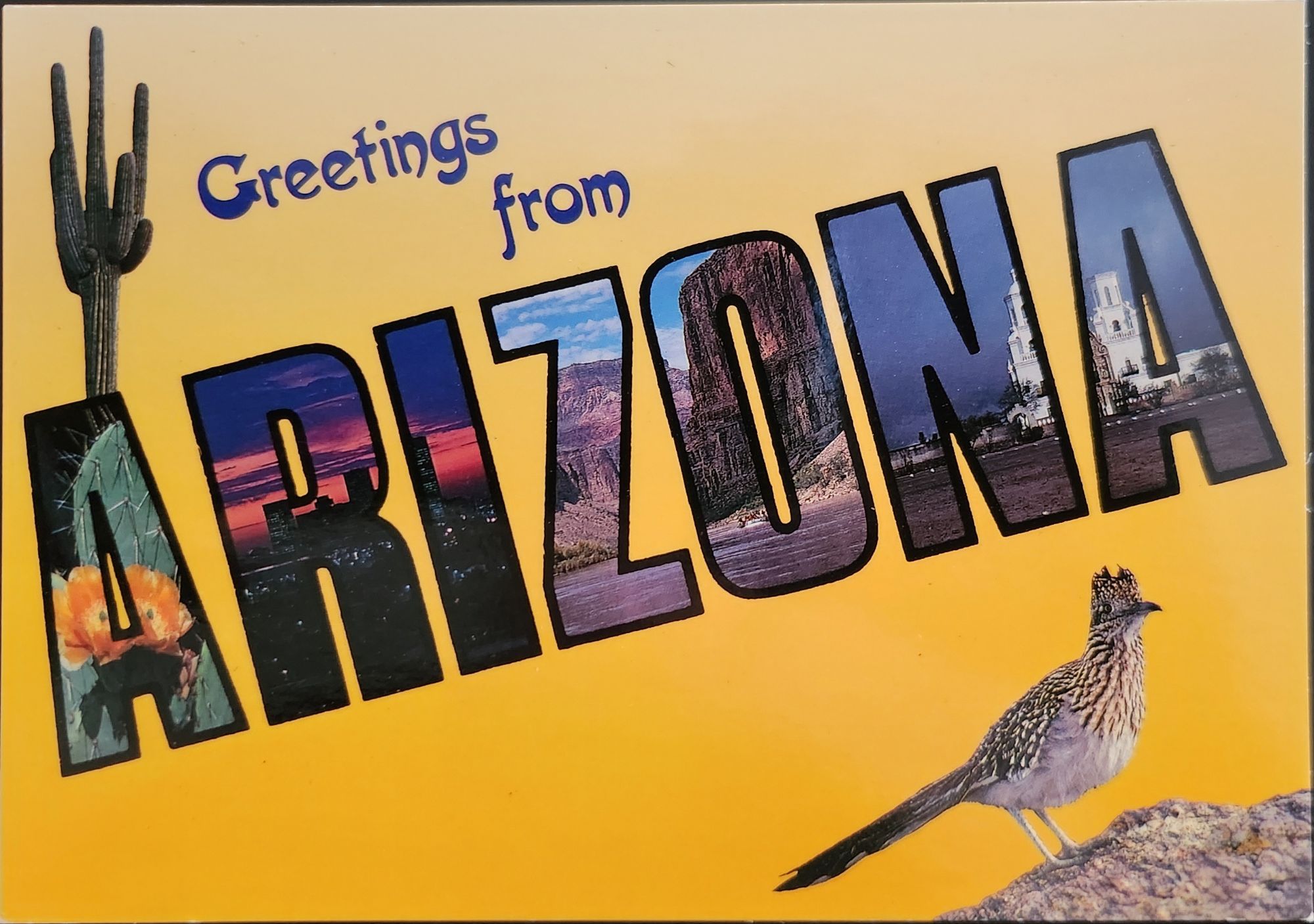
With a phrase like “create an image of a vintage large letter postcard from Arizona,” most anyone can generate a decent design in seconds. Like the old days of digital clip-art, the initial attempts lack craftsmanship and historical accuracy. Still, they are a new democratization of this visual vocabulary, making it more accessible to professional designers and enthusiasts alike, though perhaps for different reasons.
This latest development completes a fascinating loop—from specialized industrial printing processes that required substantial investment and technical expertise, to digital design tools requiring professional training, to AI generation requiring only the ability to formulate a design concept and the text prompt. With each technological advancement, the barriers to producing these distinctive visual representations have lowered, while the core elements of the design has persisted.
Visual Persistence
From German Gruss Aus postcards to AI-generated images—our journey demonstrates the remarkable resilience of certain visual vocabularies across time, technologies, and cultural contexts. Despite dramatic changes in production methods, from specialized lithographic presses to neural networks, the essential visual grammar of these designs remains recognizable.
This persistence has a woven quality—the ability to render and replicate a sense of place over time. Whether in linen postcards, commemorative stamps, public murals, or digital images, the large letter design and state symbol motifs combine to convey regional identity and pride over time. Their continued relevance suggests that certain visual solutions, once discovered, become an architecture that generations continue to appreciate and adapt for new uses.
We also feel the ripple effect in the broader patterns of American history— immigrants bringing skills and technology to American shores, industrial innovation creating new visual possibilities, the automobile age changing how Americans experienced nature and themselves, and digital technology transforming how we create and share images. Through it all, the distinctive visual language pioneered by Curt Teich and others continues to evolve.
What new ripples lie ahead? Perhaps augmented reality will allow us to step into these designs. Or new materials and technologies will adapt them yet again for uses we don’t yet comprehend. Whatever comes next, we know that cultural transmission does have a distinguishing mark—it ripples outward in both calculable and unexpected ways, influenced by technology, economics, and human inspiration, creating patterns that can be traced across generations.
For Additional Reading
Meikle, Jeffrey L. (2016). Postcard America: Curt Teich and the Imaging of a Nation, 1931-1950. University of Texas Press. Publisher’s page
“The Immigrant Story Behind the Classic ‘Greetings From’ Postcards.” Smithsonian Magazine. (2018). Read online
Early postcards represent a convergence of innovations in printing, photography, and postal delivery—each with its own players, craft, and history. The emergence of the simple picture postcard depended on a complex international network of industries, technologies, and regulations developed in the prior century.
Art for the Masses
The development of chromolithography in the late 19th century provided the technological foundation for colorful mass-produced postcards. Though lithography itself dated back to 1796, when Alois Senefelder developed the process in Munich, the refinement of color lithography reached new heights in the 1870s-90s, with different national styles emerging.
German printers particularly mastered the technique of creating separate limestone printing plates for each color, allowing for vibrant multi-color images that previously would have required expensive hand-coloring. A typical color postcard might require five to fifteen separate printing runs, with perfect registration between colors. This level of precision required specialized equipment and highly trained craftsmen.
German chemical industries produced superior inks and dyes, giving their postcards more vibrant and stable colors than competitors. Companies like BASF and Bayer, originally founded as dye manufacturers, provided innovative colorants specifically formulated for printing applications.
The German city of Leipzig emerged as a center of printing excellence, with firms like Meissner & Buch establishing international reputations for quality. German chromolithography was so superior that even American publishers would often have their designs sent to Germany for printing, then shipped back to the United States for distribution—at least until tariff changes in 1909 made this practice less economical. Publishers like Raphael Tuck & Sons maintained offices in Germany despite being headquartered in London, simply to access German printing expertise.
While Germany led in technical quality, French postcards developed a reputation for artistic sophistication. Paris publishers like Bergeret and Levy et Fils produced cards featuring Art Nouveau styles and artistic photographic techniques. The French market also developed distinctive “Fantaisie” postcards featuring elaborate designs with silk applications, mechanical elements, or attached novelties. These cards pushed the boundaries of what a postcard could be, turning functional communication into miniature works of art.
British publishers like Raphael Tuck & Sons, J. Valentine & Co., and Bamforth & Co. showed particular commercial acumen. While they didn’t match German printing quality or French artistic sensibility, British firms excelled at identifying market opportunities and consumer trends. The British pioneered specialized categories like the seaside postcard and led in developing postcards for specific holidays and occasions.
Photographic Reality
While lithographic postcards dominated the market, photography increasingly influenced postcard production. The collodion wet plate process (1851) and later the gelatin dry plate (1871) made photography more accessible. The development of halftone printing in the 1880s allowed photographs to be reproduced in print media without manual engraving, creating more realistic imagery.
A revolutionary moment came in 1903 when Eastman Kodak introduced “Velox” postcard paper. This pre-printed photographic paper had postcard markings on the back and a light-sensitive photo emulsion on the front. Combined with Kodak’s 3A Folding Pocket camera, which produced negatives exactly postcard size (3¼ × 5½ inches), this innovation created the Real Photo Postcard (RPPC).
The acquisition of Leo Baekeland’s Velox photographic paper company in 1899 for $1 million provided a crucial technological component. Velox paper could be developed in artificial light rather than requiring darkroom conditions, had faster developing times, and produced rich blacks and clear whites—all critical qualities for postcard production.
The RPPC format found particular success in America, where the vast geography meant many small towns would never appear on commercially printed postcards. Local photographers throughout the country created RPPCs of main streets, businesses, schools, and community events, documenting American life with unprecedented comprehensiveness.
International Postal Agreements
Even the most beautifully produced postcard would be meaningless without an efficient system to deliver it. The standardization of postal systems in the late 19th century created the infrastructure necessary for postcards to flourish.
A watershed moment for international mail came with the Treaty of Bern in 1874, establishing the General Postal Union (later renamed the Universal Postal Union or UPU). This organization created the first truly international postal agreement, initially signed by 22 countries, primarily European nations. The United States joined the UPU in July 1875, connecting the American postal system to the standardized European networks. The U.S. had introduced its own government-issued postal cards in 1873, but joining the UPU meant these could now be sent internationally under consistent regulations.
Several key UPU Congress developments shaped the postcard’s evolution. The 1878 Paris Congress renamed the organization to Universal Postal Union. The 1885 Lisbon Congress standardized the maximum size for postcards (9 × 14 cm). The 1897 Washington Congress set new international regulations for private postcards. The 1906 Rome Congress standardized the divided back format internationally.
Perhaps the most crucial postal development for postcard popularity was the divided back. Great Britain introduced this format in 1902, with France and Germany following in 1904, and the United States in 1907. Before the divided back, the entire reverse of a postcard was reserved for the address only, with messages having to be squeezed onto the front, often around the image. The new format allocated half the back for the address and half for a message, dramatically improving postcards’ utility as correspondence tools.
European Delivery Systems
European railway networks proved ideal for postal delivery, creating a remarkably efficient system. By the 1870s-80s, most European countries had developed comprehensive rail networks. Germany alone had over 24,000 miles of railway by 1895, despite having a land area smaller than Texas.
Railway mail cars (“bureaux ambulants” in France, “Bahnpost” in Germany) sorted mail en route. These mobile sorting offices made the system highly efficient, with mail sorted by destination while in transit. Railway timetables were coordinated to allow for mail transfers at junction points, creating an integrated system even across national borders.
Major routes often saw multiple mail trains per day. The Berlin-Cologne line, for example, had four daily postal services by 1900. This meant that postcards could be delivered between major cities within a day, creating a communication speed previously unimaginable.
For urban delivery, European cities developed even more innovative systems. Perhaps most remarkable were the pneumatic tube networks installed in several European capitals. Paris launched its “Pneumatique” in 1866, Vienna’s “Rohrpost” began in 1875, and Berlin built an extensive pneumatic network from 1865. These systems used compressed air pressure to propel cylindrical containers through networks of tubes. The carriers could hold several postcards or letters and traveled at speeds up to 35 kilometers per hour. Paris eventually developed a pneumatic tube network extending 467 kilometers, allowing for delivery times of under 30 minutes across the city. A morning postcard could receive an afternoon reply—creating a nearly conversational pace of written communication.
American Adaptations
The United States faced different geographical challenges. The vast distances between population centers meant that the same-day delivery common in Europe was impossible between major cities. Nevertheless, the American postal system developed impressive efficiency given these constraints.
The U.S. Railway Mail Service, officially established in 1869, became the backbone of American mail delivery. By 1900, more than 9,000 railway postal clerks were sorting mail on trains covering more than 175,000 miles of routes. While European countries measured mail routes in hundreds of miles, American routes stretched thousands of miles across the continent.
American cities also experimented with pneumatic tube systems, though they were less extensive than European counterparts. New York City’s system, operating from 1897 to 1953, eventually covered 27 miles with tubes connecting post offices in Manhattan and Brooklyn. At its peak, it transported 95,000 letters per day, or about 30% of all first-class mail in the city.
Within cities, frequent delivery became the norm. By 1900, many American urban areas offered at least four daily mail deliveries, with some business districts receiving up to seven deliveries per day. This made postcards a practical means of daily communication within city limits, much as they were in Europe.
The efficiency and economy of postcards made them ideal for routine business communications. Companies developed pre-printed postcards for order acknowledgments, shipping notifications, payment reminders, meeting confirmations, service calls, and appointment reminders. These standardized communications reduced clerical costs while providing a paper trail of business interactions. The divided back format was particularly valuable for business purposes, allowing for both a standardized message and customized details.
Perhaps no industry benefited more from postcards than tourism. Hotels, resorts, transportation companies, and local chambers of commerce all commissioned postcards that served as both souvenirs and advertisements. Visitor bureaus coordinated with publishers to ensure their destinations were well-represented in the marketplace. The economic impact was substantial—a scenic view postcard might cost a penny to produce, sell for a nickel, and generate hundreds of dollars in tourism revenue by inspiring visits. This multiplication effect made postcards perhaps the most cost-effective tourism marketing tool ever devised.
On the personal side, postcards fulfilled a spectrum of communication needs. In an era when the telephone was still a luxury and telegrams were expensive, postcards filled the gap between costly immediate communication and slower formal letters. Their affordability and efficiency made them ideal for routine messages. At half the postage rate of letters in many countries, postcards democratized written communication for working-class people who might otherwise limit correspondence due to cost. The postcard’s format encouraged brevity—a perfect medium for quick notes without the formality or length expected in a letter. In urban centers with multiple daily mail deliveries, postcards functioned almost like text messages, allowing people to make arrangements within hours.
Sending postcards from vacation destinations served as tangible proof of travel experiences. “Wish you were here” cards from resorts or tourist locations signaled social status and mobility. Recipients often displayed postcards on special racks or in parlor albums, using them as affordable decorative elements and evidence of their social connections. For people who rarely traveled, receiving postcards provided authentic glimpses of distant places through real photographs rather than artistic interpretations.
Perhaps most significantly for historical purposes, postcards—especially RPPCs—documented aspects of community life that would otherwise have gone unrecorded. Local events, buildings, streetscapes, and everyday activities were captured on postcards, creating a visual record of ordinary life at the turn of the century that has proven invaluable to historians. When natural disasters or significant events occurred, local photographers would quickly produce RPPCs documenting the situation. These cards spread visual news of floods, fires, celebrations, or notable visitors throughout the region, serving an early photojournalistic function.
While American postcard production initially lagged behind Europe in quality, US companies excelled at entrepreneurial adaptation. When the 1909 Payne-Aldrich Tariff Act increased import duties on foreign postcards, American firms rapidly expanded domestic production capabilities. When World War I cut off European imports entirely, American manufacturers stepped into the gap, developing new techniques and styles.
Beyond the Golden Age
Behind every seemingly simple postcard lies a complex history of industrial innovation, international cooperation, and social transformation—a paper-based predecessor to the digital networks that connect us today.
The Golden Age of postcards waned after World War I due to disruption of European production centers, rising postal rates, the growing popularity of telephones, and the emergence of new forms of mass media.
The era when postcards emerged was a crucial moment when ordinary people gained access to new visual communication tools. The democratization of image sharing pioneered by postcards foreshadowed later developments in visual communication. This visual history reminds us, from personal photographs to social media posts, the impulse to share visual snippets of our lives is a constant across time.
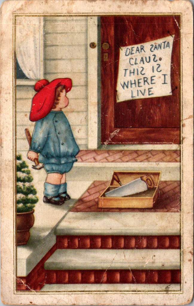
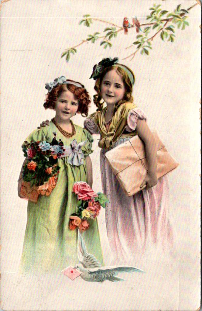
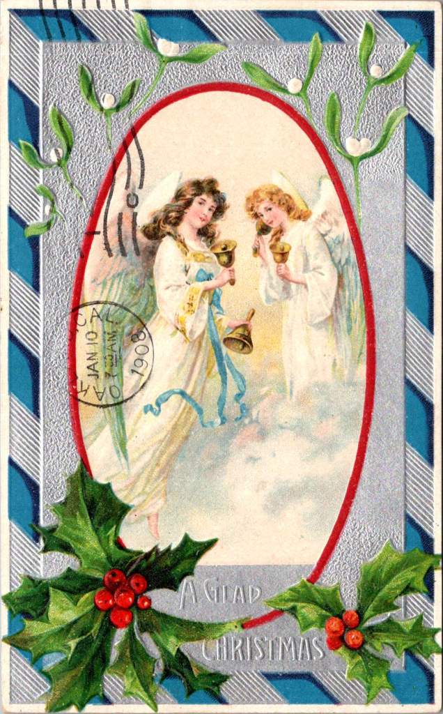
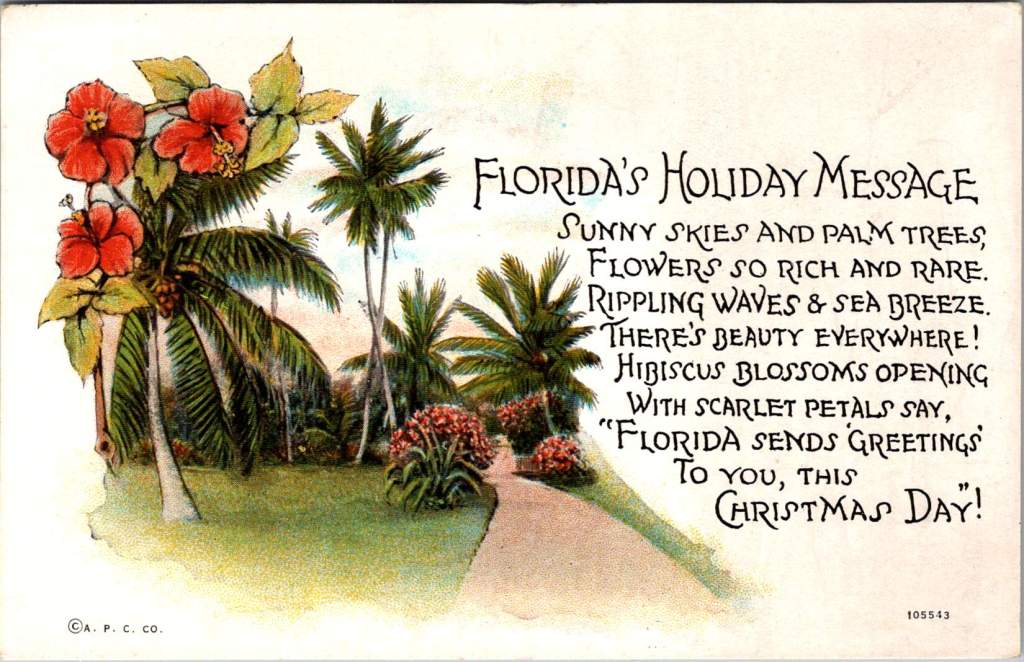
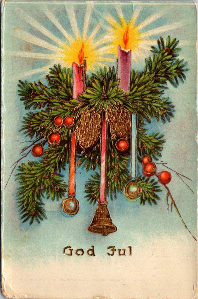
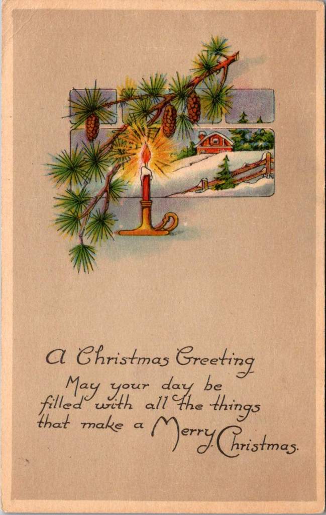
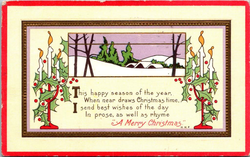
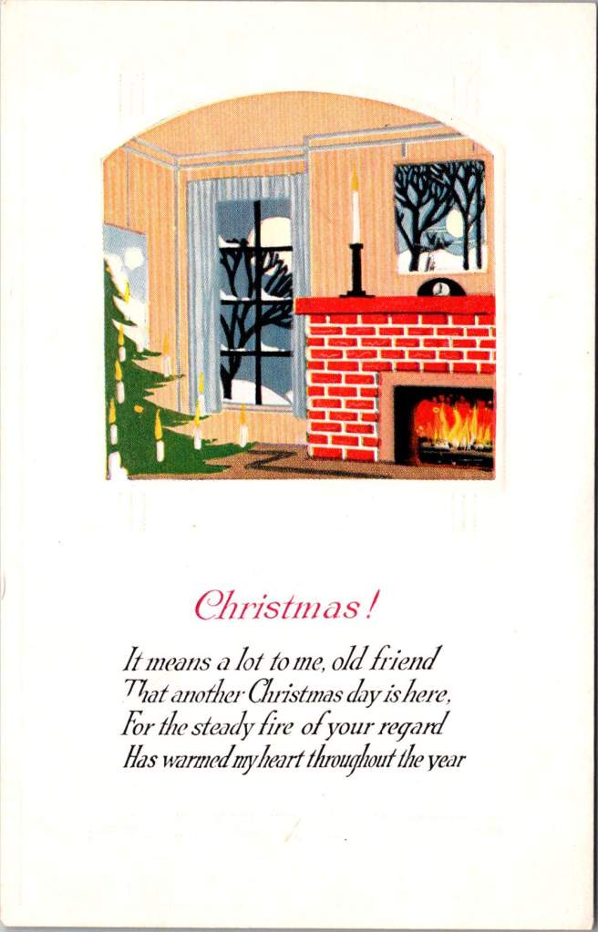
Enjoy this album of Christmas greetings from the Posted Past. Wishing you peace and prosperity in the years ahead.
It’s Christmas Day and maybe you have a stack of Christmas cards – not just from this year, but from many seasons past. Each one is a thread in the tapestry of your life, too precious to discard. Like treasured ornaments, they tell stories that span generations.
Christmas cards aren’t merely paper messengers of the season – they’re artifacts of connection, physical reminders of the hands that chose them, the words written inside, the relationships that flourished across years and miles. Each card is a small time capsule, preserving moments of joy, celebration, and remembrance.
It’s fine to recycle your greeting cards, let’s not be too precious. But why not try something new? String them into a garland, tuck them into a memory box, or preserve them in an album. Let them be your Christmas story, told in paper and ink, holly leaves and winter scenes, building year by year into a cherished archive of holiday memories.
For today, take in all the love and laughter enclosed, and enjoy this album of Christmas greetings from the Posted Past. Wishing you peace and prosperity in the years ahead.
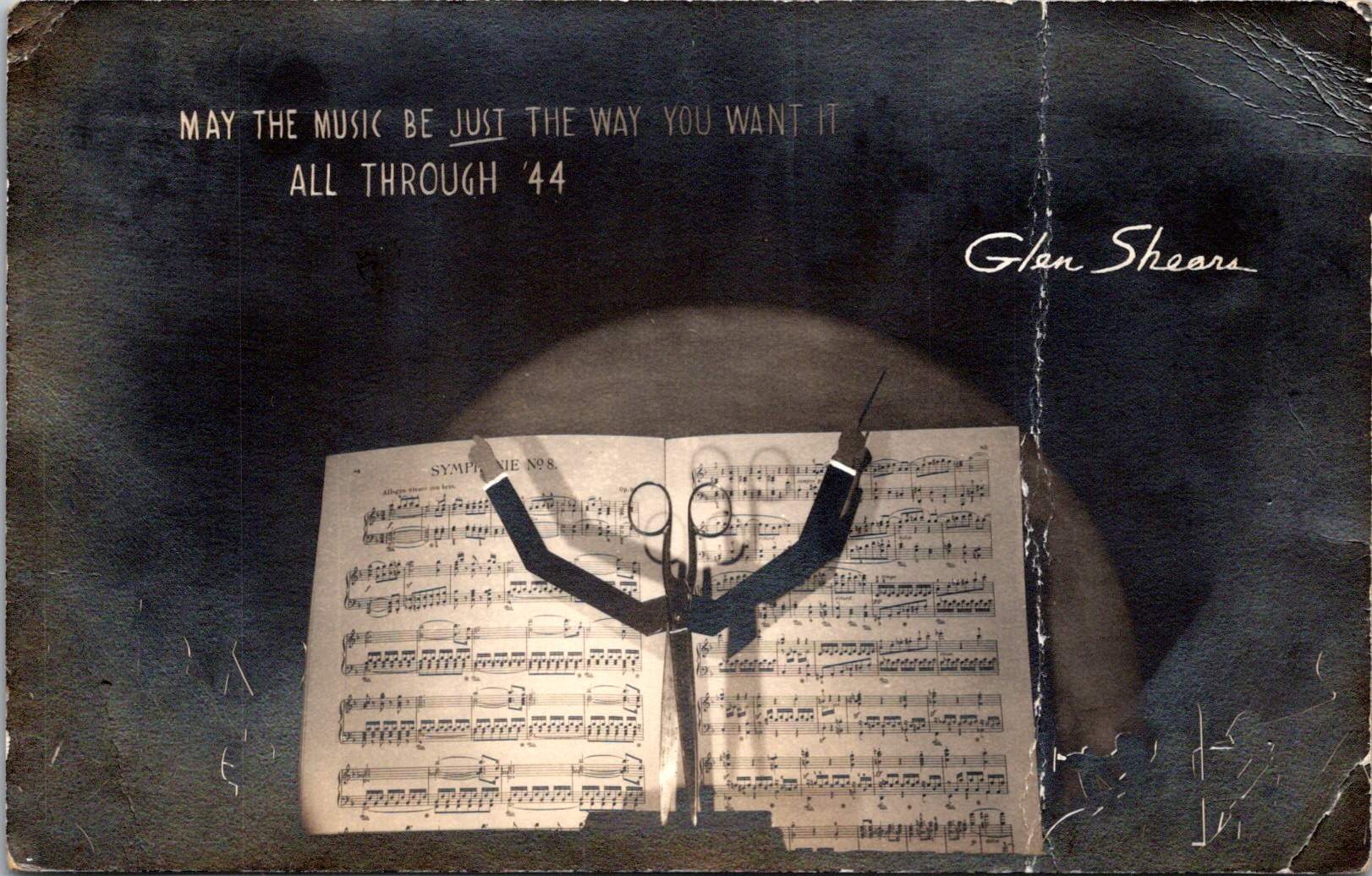
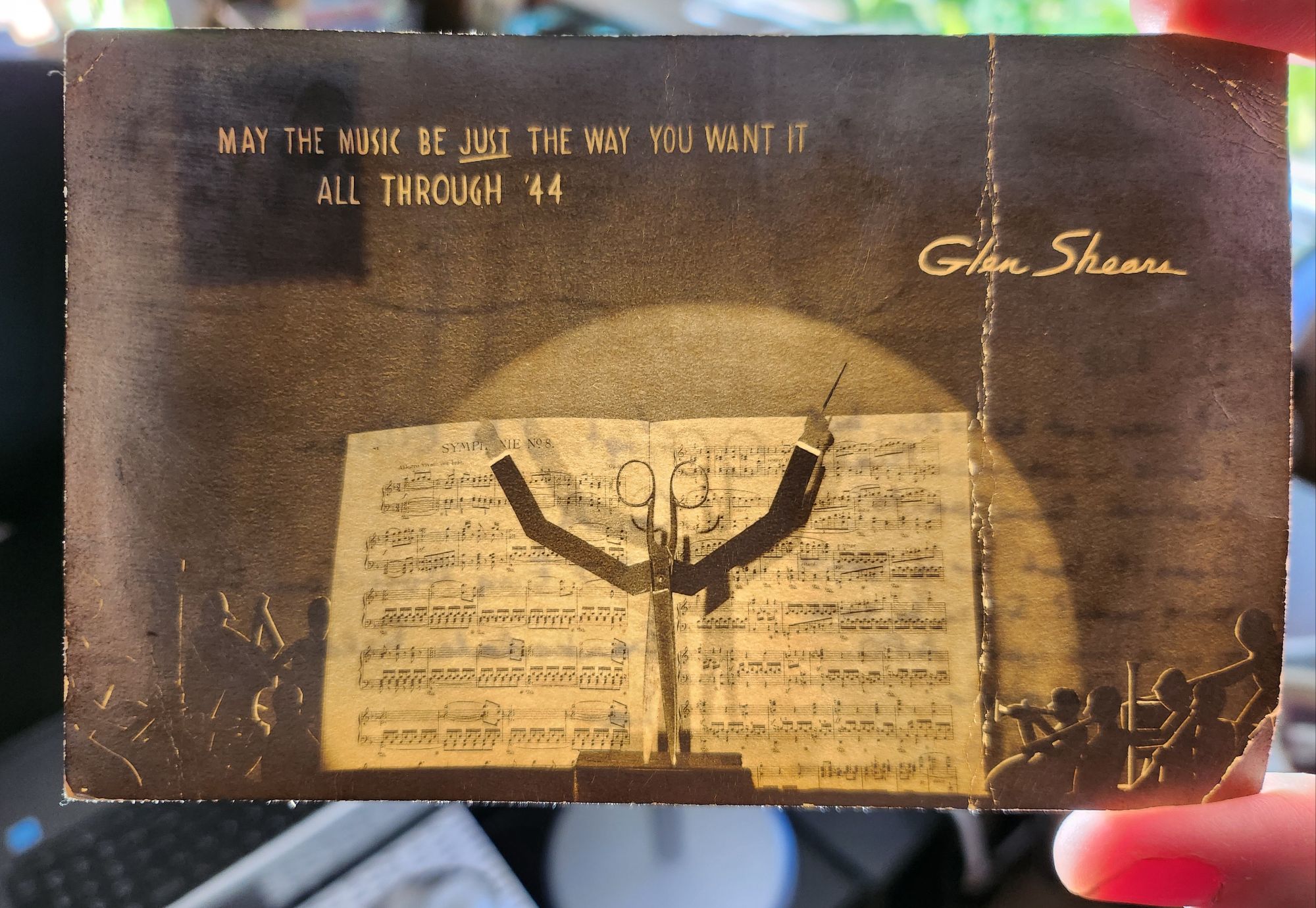
When held up to the light, this 1943 wartime postcard reveals a play on names and a hidden orchestra – but that’s just the beginning of its secrets.
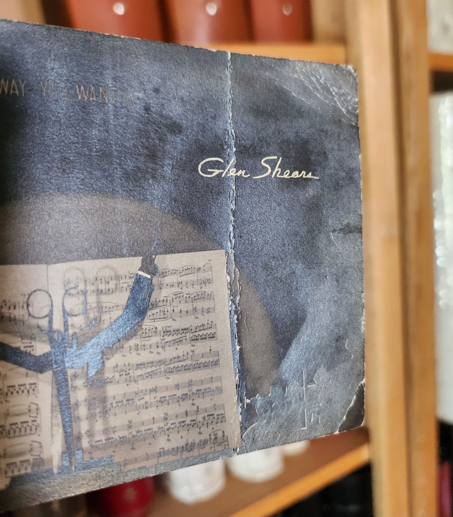
On a dark December day in 1943, someone in Chicago mailed an extraordinary postcard. At first glance, it appears to be a silver gelatin photograph of sheet music and a pair of scissors, artfully arranged and lit. But when held to the light, the card transforms – silhouetted orchestra members emerge from the shadows, and the scissors become a conductor’s upraised arms, creating a miniature theater of light and shadow. The message at the top reads MAY THE MUSIC BE JUST THE WAY YOU WANT IT ALL THROUGH ’44, signed playfully by Glen Shears – a silly pun referencing Glenn Miller, America’s most popular bandleader, and the scissors in the image.
The technical sophistication of this artifact presents an intriguing mystery. Its foundation is a silver gelatin photographic print, created using the same process that Eastman Kodak had popularized with their 1903 postcard camera. But the card’s creator went further, adding to the photograph a second iridescent overlay to create the hidden orchestral scene – a remarkable innovation combining two distinct images. During wartime rationing, when the War Production Board strictly controlled access to photographic papers and printing supplies, the mere existence of such an experimental piece raises questions about its origins.
Two theories emerge: The card might be the work of an individual artist-photographer, one of the creative practitioners who had embraced Kodak’s democratization of the postcard medium. The careful composition, masterful lighting, and precise registration of the overlay suggest someone with both technical expertise and artistic vision.
Or, it could be an experimental piece from the American Colortype Company of Chicago (or one of a handful other production houses) known for innovative printing techniques and possessing both the technical capabilities and wartime authorization to access restricted materials.
But as we look closer, deeper historical resonances emerge. The card was postmarked December 15, 1943, and addressed to Staff Sergeant J.M. Ellison of the 937th Engineer Aviation Combat Battalion at Barksdale Field, Louisiana. The sender’s casual inquiry – “Does it look as if you’re going over?” – hints at the imminent deployment of Ellison’s specialized unit.
The 937th was part of the Army Air Forces’ engineering force tasked with rapidly constructing and maintaining combat airfields. These Aviation Engineer Battalions could build a 5,000-foot runway in as little as 15 days, creating the infrastructure that would support the Allied advance across Europe. Following D-Day, units like the 937th pushed forward with combat operations, often working under fire to establish the forward airfields necessary for tactical air support and troop transport.
The card’s musical theme and playful signature unknowingly connected to another Army Air Forces mission. By December 1943, Glenn Miller had transformed his career from civilian bandleader to Captain in the Army Air Forces, modernizing military music through his Training Command Orchestra. In June 1944, Miller brought his band to England, where they performed hundreds of concerts for Allied forces preparing for the invasion of Europe.
As Allied forces advanced across France in late 1944, Miller became determined to bring his music to the troops at forward bases. He began planning an ambitious series of concerts at the very airfields being constructed by the Aviation Engineers. The precise coordination required for these performances – ensuring runways were operational and facilities ready – meant that Miller’s musical mission and the work of units like the 937th were deeply intertwined.
Here the card’s hidden theater of light and shadow takes on new meaning. The sender could not have known that exactly one year after posting this cheerful greeting – on December 15, 1944 – Glenn Miller would board a small Norseman aircraft in England, bound for Paris to arrange performances at forward bases. His plane disappeared over the English Channel in poor weather, creating one of World War II’s enduring mysteries.
The card’s wish for music “all through ’44” became both prophecy and elegy. Somewhere in France, Sgt. Ellison and his fellow engineers might have been preparing the very airfields where Miller hoped to perform. The innovative combination of photography and theatrical lighting effect, created in Chicago a year earlier, had unknowingly captured the intersection of American technical ingenuity, cultural influence, and the human tragedies of war.
Today, this hold-to-light card stands as both artistic innovation and historical artifact. Whether created by an individual photographer or a commercial outfit, it demonstrates the creative adaptation of pre-war techniques to serve wartime needs for connection and morale. In its transformation from simple photo to magical light-show, it embodied the same spirit of innovation that characterized both Glenn Miller’s military music and the rapid-deployment airfield construction of the Aviation Engineers.
More than just a technological curiosity, the card captures a moment when American creativity – musical, photographic, and engineering – was being mobilized for war. The coincidence of the postmark date and Glenn Miller’s final flight reminds us how individual stories weave together to create the larger narrative of history, sometimes in ways that only become apparent when held up to the light.
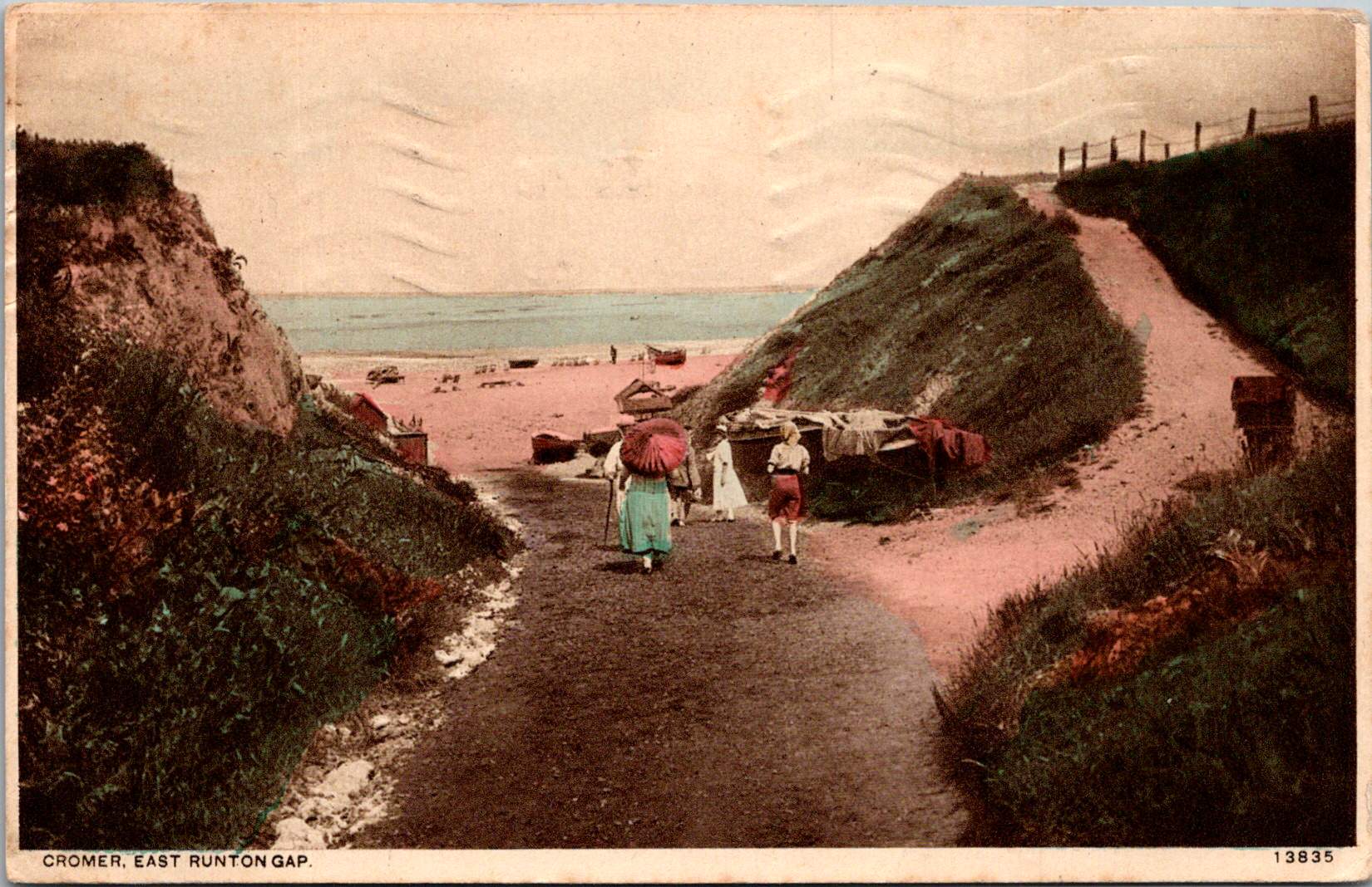
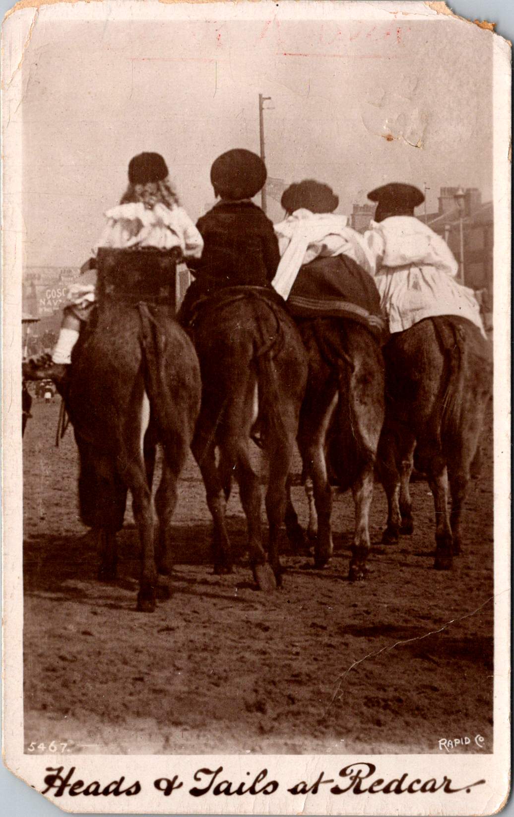
Four children are astride donkeys walking on the beach, clothed in Edwardian-style white blouses and all wearing caps. A century away (and still there today) kids on a delightful donkey ride near Redcar’s legendary seaside.
This real photo postcard with a memorable image bears the hand-scripted titled “Heads & Tails at Redcar.” One can still feel the April 18, 1910 embossed postmark on the card a century later. Addressed to Nurse Aird in Darlington from Redcar, the message is pragmatic.
Expect to arrive about 6.30 to-morrow evening. Love from Rennie
The seaside town of Redcar was transformed from a modest fishing village into a bustling resort town by the arrival of the railway in the mid-19th century, and became a beloved destination for working and middle-class families from throughout Britain’s industrial northeast.
In the 1910s, Redcar embodied the height of seaside grandeur. The impressive Coatham Hotel, built in 1871, dominated the seafront, its architecture expressing the optimism and ambition of the age. A pier stretched into the sea, its 1873 construction a testament to the engineering confidence of the era. Along the promenade, ornate gas lampposts cast their glow over evening strollers, while elaborate wooden shelters provided refuge from sudden showers.
The seafront architecture told a story of careful planning and civic pride. Victorian terraces, built of local sandstone or sturdy brick, were elegant facades looking at the sea. Behind them, a grid of streets housed seasonal workers, fishermen, and the growing permanent population drawn by the town’s prosperity. The Central Hall, opened in 1895, provided entertainment, while Methodist and Anglican churches with their reaching spires reminded visitors and residents alike of Victorian moral values.
Yet Redcar was never merely a tourist trap. The town’s proximity to mining linked it inextricably to Britain’s industrial might. The discovery of workable iron ore deposits in the Cleveland Hills in 1850 had sparked an industrial revolution in the region. By the 1910s, mines dotted the landscape, and the sight of industrial chimneys on the horizon reminded visitors of the region’s working heart. Many local people split their lives between seasonal tourist work and the demanding labor of the mines or ironworks.
This distinctive mixing of leisure and industry is part of Redcar’s character. Unlike some of Britain’s more exclusive seaside resorts, the community remained proudly connected to its working roots. The donkey rides captured in our postcard—a quintessential British seaside tradition—were an affordable pleasure for working families. The donkeys themselves, chosen for their gentle temperament and sturdy build, paralleled the town’s way: reliable, hardworking, and ready to provide joy to all comers.
On April 18, 1910, Rennie dashed off a quick note from Redcar to Nurse Aird, using one of Rapid Photo Company’s popular seaside postcards to announce a return to Darlington the following evening at 6:30pm. Such precise timing speaks to the reliability of the North Eastern Railway’s service between the coastal town and Darlington, where regular daily connections had become the lifeblood of the region.
The journey home would begin at Redcar’s Central Station, its Victorian architecture still relatively new and imposing in 1910. The late afternoon departure would catch the changing light over the North Sea, before the steam locomotive began its hour-long journey inland. As the train pulled through Middlesbrough and then west toward Darlington, the spring evening would be settling in, with the Cleveland Hills silhouetted against the dusk. Fellow passengers might have included ironworkers heading to night shifts, businessmen returning from coastal meetings, and perhaps other daytrippers who had enjoyed the seasonal pleasures of the seaside.
By evening, Rennie would step onto the platform at Darlington’s Bank Top station, the time at the coast already feeling like a distant memory. Perhaps a deliberate choice of train, selected to arrive after Nurse Aird’s duties were complete or to catch the end of visiting hours. Whatever prompted the journey, the postcard captures the easy mobility that the railway enabled, allowing residents of these northeastern towns to move between coast and country with a regularity that would have seemed remarkable just a generation earlier.
In 12 historic pictures: a day at the seaside at Redcar from The Northern Echo
The subsequent century would bring profound changes to Redcar. The pier, once a symbol of Victorian confidence, fell victim to storm damage and was demolished in 1981. The grand Central Hall disappeared. Many Victorian hotels were converted or demolished as tourism patterns changed. Most significantly, the industrial base that had provided much of the region’s wealth underwent dramatic transformation. The 2015 closure of the SSI steelworks marked the end of an era, dealing a devastating blow to the community.
Modern Redcar presents a complex picture of a community in transition. The Redcar Beacon opend in 2013 (locally dubbed the “Vertical Pier”) reaches skyward, its contemporary design contrasting with the Victorian architecture that remains. Victorian terraces continue to face the sea, their sandstone facades weathered but dignified. The Clock Tower, dating from 1913, remains a local landmark. The town center struggles with empty shops, a challenge faced by many British high streets. The loss of heavy industry has forced difficult economic adjustments.
The community’s response to these challenges reveals much about Redcar’s character. The Palace Hub, housed in a former amusement arcade, provides space for local artists and craftspeople. Local groups organize beach cleaning and heritage walks, maintaining the town’s connection with its past while protecting its future. Locally run kitchens and groceries address modern challenges of food poverty while building community connections.
Most remarkably, the donkeys still plod along the beach in summer months. The same gentle animals that carried kids a century ago now delight a new generation of visitors. Modern care standards ensure rest periods, weight limits, and veterinary checks, but the essential experience remains unchanged. Children still laugh with surprise at their first encounter with these patient beasts, parents still snap photographs (will box cameras make another comeback?) and the donkeys still take their slow and careful steps, connecting past and present.
Redcar reminds us that progress isn’t linear and that community change involves deep dynamics of loss and renewal. The town that grew wealthy on iron ore and Victorian tourism now seeks new paths forward in renewable energy and cultural heritage. What has remained is both quirky and reliable: a donkey ride on the beach on a summer’s day.
While the grand Victorian hotels and ore industries of the region have largely passed into history, the humble donkey ride endures. Sometimes the most modest traditions prove the most durable, and the true character of a place resides not only in grand achievements but also in simple, timeless pleasures.
Who indeed would have guessed that of all Redcar’s attractions, it would be the donkey rides we couldn’t live without? Perhaps it is fitting that these patient animals, who witnessed the town’s rise, decline, and ongoing reinvention, continue to reliably entertain (and endure) new generations.