Our journey begins with a stack of old locally-printed postcards, each capturing a nearby rural scene frozen in faded grayscale tones. Photographed by Clee Crawford in the early 1950s, these images were made into postcards sometime after 1983 by Larry’s Photography and Joe Graham Printing in Winterset, Iowa. Vintage collectibles themselves, they offer a glimpse of a bygone era when the now-famous bridges were simply part of the rural fabric of Madison County.

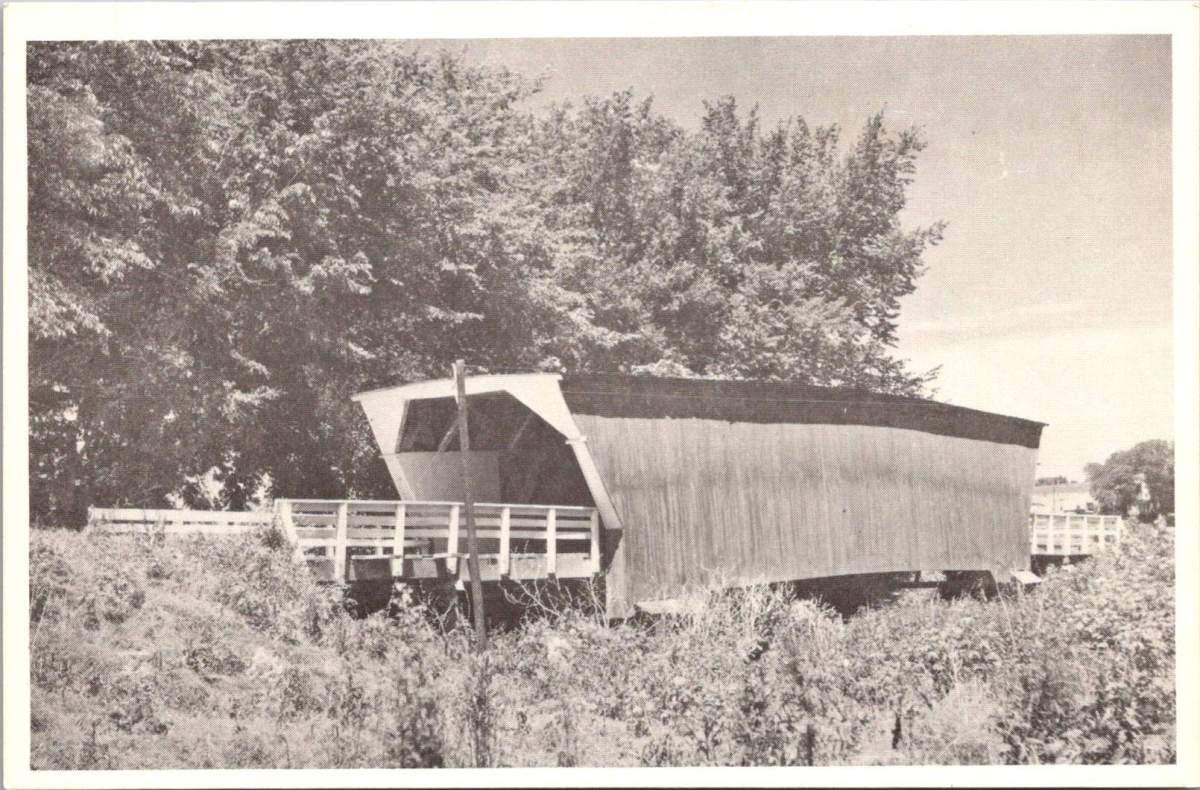
The Roseman Bridge, built in 1883 by H.P. Jones, spans the Middle River nine miles southwest of Winterset. In the postcard, it rises from a sea of cornstalks, its wooden siding weathered by countless Iowa summers and winters. Known locally as “The Haunted Bridge,” it whispers of ghost stories told around farmhouse tables and hushed conversations between young lovers seeking shelter from prying eyes. Little did the bridge know that it would one day become a star, playing a pivotal role in a story that would captivate millions.
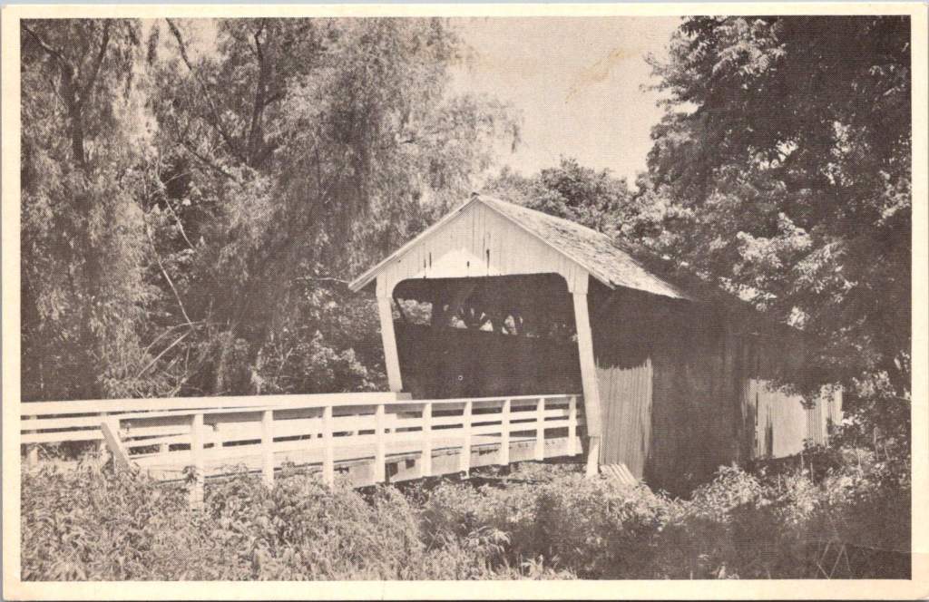
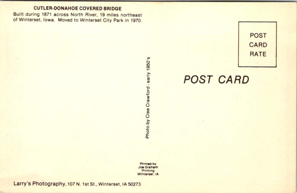
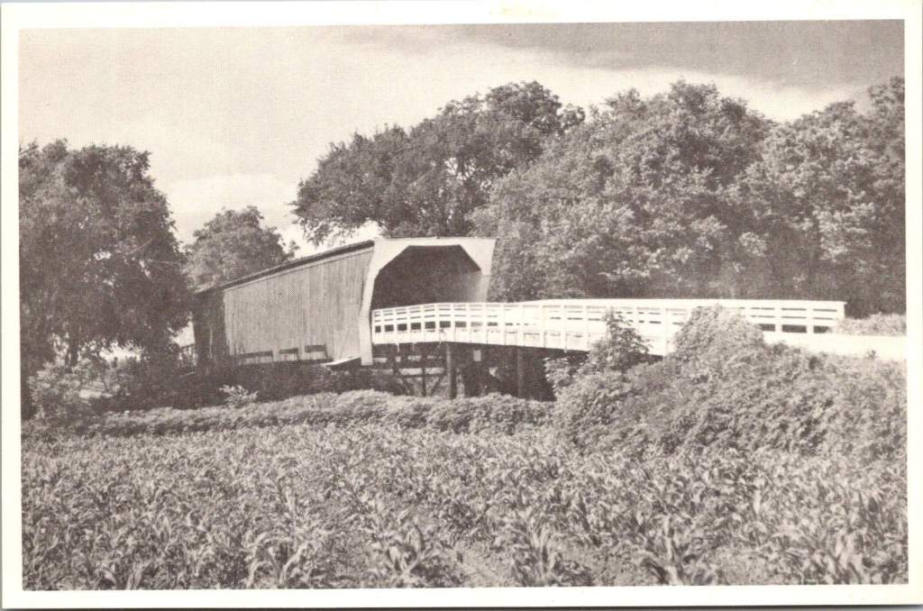
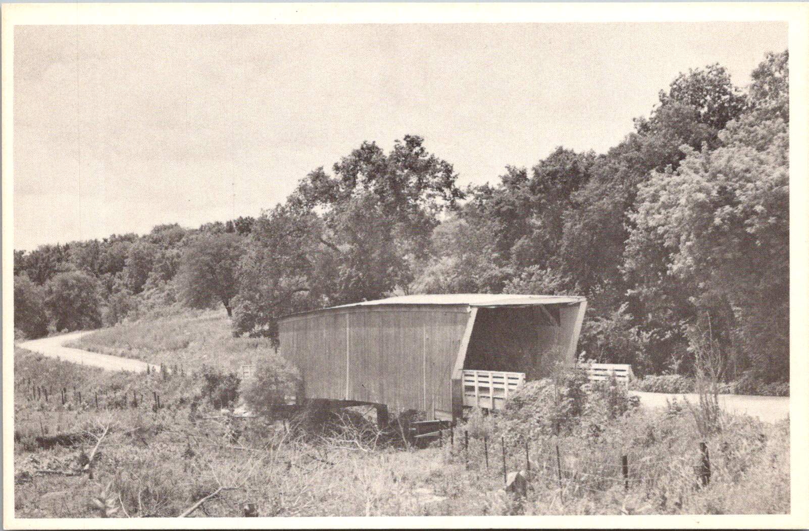
Moving northeast, we encounter the Cutler-Donahoe Bridge. Constructed in 1871, this structure originally crossed the North River. But like many of its counterparts, it found a new home as the winds of change swept through the county. In 1970, the same year the first Covered Bridge Festival was held, Cutler-Donahoe was carefully uprooted and transplanted to Winterset City Park. The postcard captures it in its original location, a sentinel standing guard over the river below, unaware of its future as a centerpiece of civic pride.

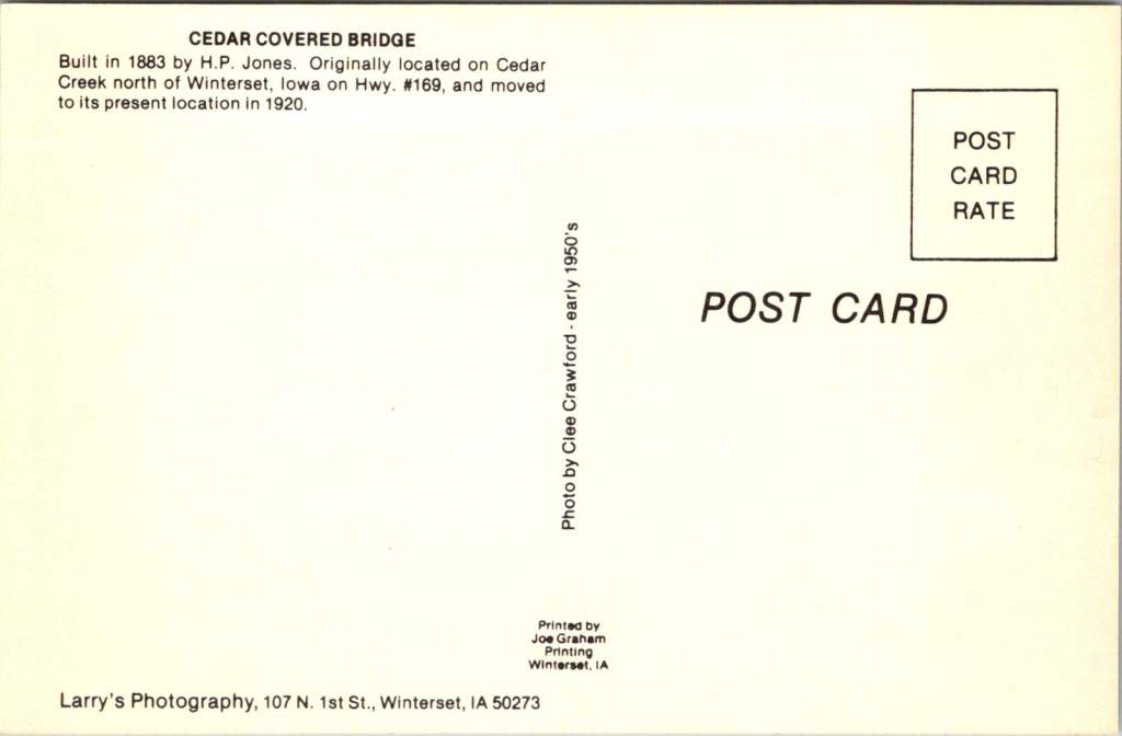
Our third postcard brings us to the Cedar Bridge, another creation of the prolific bridge-builder H.P. Jones. Erected in 1883 over Cedar Creek north of Winterset, it too would embark on a journey, moving to a new location in 1920. The image shows the bridge nestled in a picturesque rural setting, a dirt road winding its way to the entrance. What the postcard doesn’t reveal is the tumultuous future awaiting this particular bridge – a tale of destruction, rebirth, and the tenacity of a community unwilling to let go of its heritage.

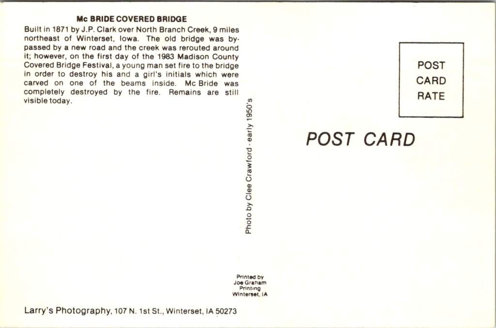
The final postcard in our collection tells a bittersweet tale. The McBride Bridge, built in 1871, appears proud and sturdy in the photograph. Yet the caption reveals its fate: destroyed by fire on September 3, 1983. This loss, occurring on the first day of the 1983 Madison County Covered Bridge Festival, served as a stark reminder of the fragility of these historical treasures and the importance of preservation efforts.
The destruction of the McBride Bridge is, unfortunately, not an isolated incident. Across the United States, covered bridges have long been targets of arson and accidental fires. According to data compiled by Covered Spans of Yesteryear, over 670 covered bridges have been lost to fire nationwide since the early 19th century. In Iowa alone, at least seven covered bridges have succumbed to flames, with arson being a common cause.
The Cedar Bridge, captured so peacefully in our postcard, has had a particularly tumultuous recent history. In 2002, it fell victim to arson, a loss that shook the community to its core. Demonstrating remarkable resilience, the bridge was rebuilt, only to suffer the same fate in 2017. The determination of Madison County residents prevailed once again, and a newly reconstructed Cedar Bridge opened in 2019 – a testament to the enduring significance of these structures in the local psyche.
As we shuffle these postcards, admiring the craftsmanship of both the bridges and the photographers who captured them, we’re drawn into a narrative that extends far beyond the borders of Madison County. These structures, once utilitarian crossings designed to protect travelers and livestock from the elements, have become characters in a much larger story – one that intertwines literature, film, tourism, and the very identity of a region.
The transformation began in 1992 with the publication of Robert James Waller’s novel, The Bridges of Madison County. Waller, an Iowa native, wove a tale of passion and missed chances against the backdrop of Madison County’s rural landscape. The Roseman Bridge, our “Haunted Bridge,” took center stage as the site where the story’s star-crossed lovers, Francesca Johnson and Robert Kincaid, first meet.
Suddenly, these bridges were no longer just local landmarks; they became symbols of romance, of roads not taken, of the bittersweet choices that shape our lives. The novel struck a chord with readers across the globe, selling millions of copies and landing on bestseller lists for over three years. But the story’s impact was only beginning.
In 1995, Hollywood came calling. Clint Eastwood directed and starred alongside Meryl Streep in the film adaptation of Waller’s novel. Once again, the bridges of Madison County found themselves in the spotlight, this time on the silver screen. The Roseman Bridge, in particular, became a character in its own right, its weathered boards and rustic charm providing the perfect setting for the unfolding drama.
The film’s success catapulted Madison County into the national consciousness. Tourists began flocking to Winterset and the surrounding areas, eager to walk in the footsteps of Francesca and Robert, to stand on the bridges where their fictional love blossomed, and to capture a piece of that romance for themselves.
This intersection of literature, cinema, and place created a perfect opportunity for cultural tourism. The bridges, which had stood for over a century as quiet witnesses to the ebb and flow of rural life, now found themselves at the center of a phenomenon that would reshape the economy and identity of Madison County.
The Covered Bridge Festival, which had begun in 1970 as a celebration of local history and craftsmanship, took on new significance. It became not just a community gathering, but a pilgrimage site for fans of the book and film, as well as history buffs, architecture enthusiasts, and romantics from all walks of life. Since then, the town itself has changed and adapted to the ongoing recognition.
As we fast forward, the allure of the bridges shows no signs of waning. The 2024 Covered Bridge Festival, held October 12-13 this year, continues to draw thousands of visitors to Madison County. For $3 admission (or two tickets for $5, with children under 11 entering free), attendees can immerse themselves in a weekend that bridges past and present.
The festival grounds, centered around the Winterset town square, buzz with activity. Vendors line the streets, offering handcrafted goods and local culinary delights. Sounds of live music fill the air, kids laughing in the Kids’ Zone, and the excited chatter of visitors from near and far.
For many, the highlight of the festival is the guided tour of the covered bridges, conducted by the Winterset Rotary Club. As buses wind their way through the countryside, visitors are treated to not just the sight of these historic structures, but also to tales of their construction, their role in local lore, and their journey from practical crossings to cultural icons.
The festival isn’t just about looking back, however. It’s a living, breathing celebration that continues to evolve. The 2024 event features a parade, a car show that turns the area around the courthouse into a chrome-and-steel wonderland, and a variety of demonstrations showcasing the craftsmanship and ingenuity that built these bridges in the first place.
At the Madison County Historical Complex, visitors can delve deeper into the area’s rich past. Here, the bridges are placed in context, their stories interwoven with those of the farmers, merchants, and families who have called this corner of Iowa home for generations.
As the festival has grown, so too has the need to balance tourism with preservation. The story of the Cedar Bridge serves as a poignant reminder of the challenges faced in preserving these landmarks. As we admire their beauty and revel in their romantic associations, we must also reckon with their vulnerability. Each bridge that remains standing is a victory – over time, over the elements, and sometimes over human destructiveness.
As the sun sets on this year’s festival, casting long shadows through the covered bridges, visitors and locals alike are reminded of the unique alchemy that has occurred here. What began as a practical solution to a transportation need has become a cultural touchstone, an economic driver, and a source of identity for an entire region.
The bridges of Madison County are physical manifestations of the power of storytelling, the appeal of nostalgia, and the human desire to connect – not just from one riverbank to another, but across time, across mediums, and across cultures. They are examples of 19th-century engineering that teach us more every future decade they exist.
These bridges offer something increasingly rare: a moment of pause, a chance to step out of the rush of modern life and into a space where time moves a little slower. Whether you’re a fan of Waller’s novel, a history enthusiast, or simply someone in search of a quiet moment of reflection, the covered bridges of Madison County have something to offer.
As we look to the future, the challenge for Madison County will be to continue balancing preservation with progress, nostalgia with innovation. The Covered Bridge Festival, with its blend of historical celebration and contemporary community spirit, serves as a model for how this might be achieved.
For now, as October winds whisper through the wooden beams of the Roseman, Cutler-Donahoe, Cedar, and the other three surviving bridges, they carry with them the echoes of all who have passed through before – from 19th-century farmers to 20th-century film stars to the tourists and locals of today. Each footstep, each photograph, each stolen moment adds another layer to the rich tapestry of stories that these bridges hold.


Our postcards, now decades old themselves, serve as a reminder of the power of image and imagination to transform the ordinary into the extraordinary. From simple river crossings to symbols of undying love, from local landmarks to international attractions, the covered bridges of Madison County have undergone a journey as winding and wonderful as the roads that lead to them. In the hearts and minds of all who have encountered them – whether through postcards, novels, films, or in person – these bridges have built connections far stronger and more enduring than wood and nails could ever achieve.
As we tuck our postcards away and the festival-goers return home, we’re left with an appreciation for these humble structures that have become so much more. The covered bridges of Madison County remind us that with a little imagination, a touch of serendipity, and year-after-year of care, even the most unassuming places can become the stuff of legend.
In the end, perhaps that’s the true magic of Madison County’s covered bridges – their ability to transport us not just from one side of a river to another, but from our everyday lives into a world where love, history, and community intertwine.