The beauty in gallows humor is how it strips away pretense. On days when everything feels like a steaming pile anyway, there’s dark comfort in knowing that at least we’re all finally honest about what’s being shoveled around.
This vintage postcard, simply titled “Training for Politics,” captures a brutal honesty that resonates well on days when the world stinks. A lone cowboy, shovel in hand, flinging horse manure (the raw material for politics). Of course we see the effort, but it’s also hard to miss the explosive spray of debris frozen mid-flight.
There’s something uniquely comforting about humor that doesn’t try to brighten our mood but instead acknowledges the absurdity of our circumstances. When we’re struggling, the last thing most of us want is forced positivity or silver linings. We want recognition that yes, this is indeed a pile, and yes, someone is actively shoveling more of it.
On the surface, it’s a simple visual gag – politics is bullsh*t. But dig deeper (pardon the pun), and you’ll find a more nuanced observation about the nature of political discourse and human coping mechanisms.
Dark humor serves as a pressure release valve for the soul. It’s the linguistic equivalent of opening a window in a foul-smelling room. It doesn’t solve the problem, but it makes it more bearable. When we can laugh at the darkness, we’re not surrendering to it – we’re claiming it, owning it, transforming it into something we can manage.
Someone looked at a man shoveling manure and saw not just the physical act but its perfect metaphorical parallel to politics. They recognized that sometimes the most profound truths come wrapped in the most pungent packages. That’s what gallows humor does – it finds the universal in the awful, the communal in the catastrophic.
This postcard’s enduring relevance speaks to another truth about dark humor: it ages well. While more wholesome jokes may grow stale, gallows humor often becomes more poignant with time. Perhaps because human suffering, like political maneuvering, remains remarkably consistent across generations. The tools may change, but the essential nature of the job remains the same.
In our current era of carefully curated social media positivity and inspirational quote overdose, there’s something refreshingly honest about this image. It doesn’t try to inspire or uplift. It simply says, “Here’s what’s happening, and it stinks.” Sometimes, that acknowledgment is more comforting than a thousand motivational posters.
For those of us having one of those days – when the pile is knee deep – this anonymous cowboy becomes an unlikely patron saint of perseverance. Not because he’s rising above his circumstances or transforming them into something beautiful, but because he’s right there in the muck, doing what needs to be done, probably muttering colorful commentary under his breath.
The image reminds us that sometimes the healthiest response to life’s challenges isn’t to seek the bright side but to acknowledge the darkness with a wry smile and a few choice words. There’s solidarity in shared cynicism, comfort in the collective cry. It’s the silent nod between people who recognize that while we can’t always clean up the mess, we can at least make a postcard about it. If nothing else, it gives future generations something to laugh darkly about while dealing with their own problems.
It’s no good to make light of serious situations, but it helps to find the light-heartedness within them. Even if it’s just the glint of sun off a well-worn shovel.
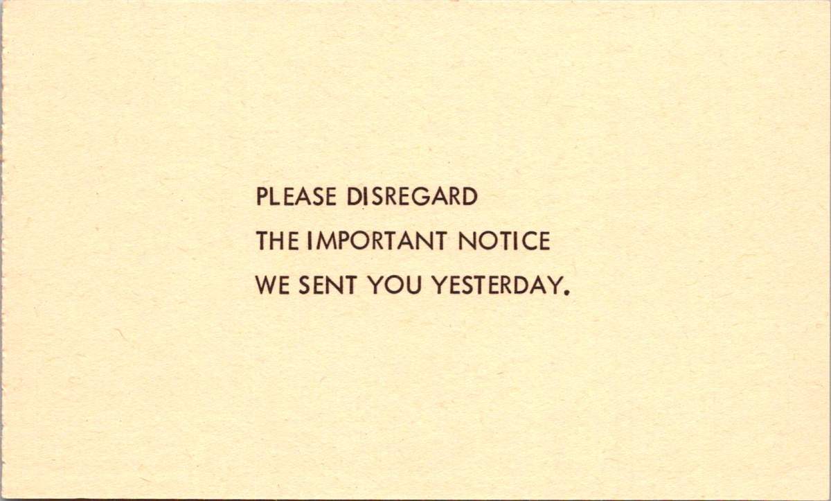
With just nine words, this 1964 parody postcard captures an era of bureaucratic absurdity. The genius lies in its perfect circularity: you can’t disregard a notice you never received. A logical paradox delivered in the stern capital letters of official communication.
This masterpiece of meta-humor was the centerpiece of “Nutty Notices,” a collection of satirical postcards published by Philadelphia’s GEM Publishing in 1964. The series went on to skewer everything from traffic enforcement to mattress tags, each card delivering bureaucratic absurdity like a stage clown wielding a rubber chicken.
Perfect for the spooky season, the next notice solemnly announces the recipient has won in an “Imminent Danger Sweepstakes” sponsored by a “Black Cat Society,” reassuring that previous recipients survived their subsequent accidents.
The collection unfolds like a greatest hits of paperwork problems. Another, from the stern-sounding “Bureau of Upholstery Tag Security,” threatens dawn raids over a removed mattress tag. A mock inheritance notice dangles a too-good-to-be-true fortune from a conveniently deceased fifth cousin, key details lost to a faulty typewriter.
These parodies emerged during a period of notable government expansion. The Great Society legislation of the Kennedy and Johnson administrations had launched numerous new agencies and programs, from the Peace Corps to Medicare. While many of these programs were popular, and have endured, they also generated unprecedented levels of paperwork and official communications in Americans’ daily lives.
The notices cleverly played on specific anxieties of the era: fear of government surveillance, concerns about traffic enforcement in the new Interstate era, and awareness of inheritance scams in an increasingly connected society.
The traffic violation notice, featuring President Lyndon B. Johnson, plays on LBJ’s notorious driving habits. The President was known for terrifying guests at his Texas ranch by driving his Amphicar (a German-made civilian amphibious vehicle) at high speeds toward the ranch’s lake, screaming about brake failure as his car plunged into the water. The vehicle was designed to float, but his unsuspecting passengers didn’t know that. This well-known presidential prank made the postcard’s joke particularly resonant with 1960s readers.
A good pun is still a kind of social capital, as all deadpanning dads know. The card below suggests an incredible win. The 1964 Plymouth Barracuda was a coveted car model, though overshadowed that year by the introduction of the Ford Mustang. The Barracuda featured a sloped fastback roofline and fold-down rear seats that created a large cargo area, making it both sporty and practical. The standard engine was a Slant-6, but buyers could opt for a more powerful V8 engine. Prices started at around $2,500 (approximately $22,000 in today’s dollars). By the end of the card, though, it’s all a bit fishy.
What makes these 1964 parodies fundamentally different from today’s deceptive communications is their clear satirical intent. The notices were obviously humorous, from their outlandish premises to their absurd escalations. They never attempted to deceive. The parodies didn’t seek to extract money, personal information, or action from recipients. The joke was the endpoint, and publishers and recipients understood these as entertainment, part of a broader tradition of bureaucratic satire.
Today’s deceptive communications often weaponize the same official-looking formats and bureaucratic language that these postcards once parodied. But modern scams aim to deceive rather than amuse, exploiting digital tools to create ever more convincing forgeries. Contemporary examples like phishing emails represent a darker evolution of institutional mimicry. While the 1964 notices laughed at authority’s pomposities, today’s deceptive communications abuse institutional authority for malicious purposes.
Long before memes spread political humor online, postcards served as a democratic medium for both serious political discourse and satirical commentary. During the Golden Age of postcards before World War I, suffragettes used them to promote women’s voting rights. The famous “Vinegar Valentines” of the Victorian era delivered stinging social critique through the mail. During World War II, patriotic postcards boosted morale while propaganda postcards spread messages both noble and nefarious.
These vintage parodies remind us that healthy skepticism toward official communications isn’t new—but the stakes have changed dramatically. In 1964, Americans could laugh at mock notices because real ones, while annoying, generally came through trusted channels with clear verification methods. Today’s digital landscape requires a more sophisticated type of visual and contextual literacy. We must balance healthy skepticism with the ability to recognize legitimate communications, while remaining alert to increasingly sophisticated forms of deception.
The “Nutty Notices” stand as charming artifacts of a time when bureaucratic busy-ness seemed worthy of laughter rather than alarm—when the worst thing a notice might do was create a paradox, not steal your identity. In an era of digital manipulation, we can look back nostalgically at a time when the most threatening official communication you might receive was a tongue-in-cheek warning about your mattress tags.
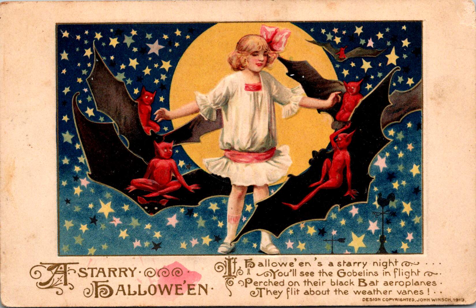
Against a star-strewn midnight sky, a girl in white stands fearless in front of a gleaming full moon while impish red devils perch on bat wings around her. This whimsical scene, printed in Germany in 1913, captures the magic of Halloween’s golden age, when postcards were miniature works of art and All Hallows’ Eve still balanced precariously between spooky and sweet.
The story of Halloween postcards mirrors the evolution of both holiday celebrations and the printing industry through the 20th century. Through these distinctive cards, we can trace changing artistic styles, printing technologies, and cultural attitudes toward this magical and mysterious holiday.
This century-old collection opens a window into an era when German printers, American artists, and local publishers like Salem Paper Company competed to create the perfect Halloween greeting. From dramatic witch flights to cheerful pumpkin-peeking children, these cards tell the story of a holiday—and an industry—in transformation.
A Starry Halloween in the Golden Age of Postcards
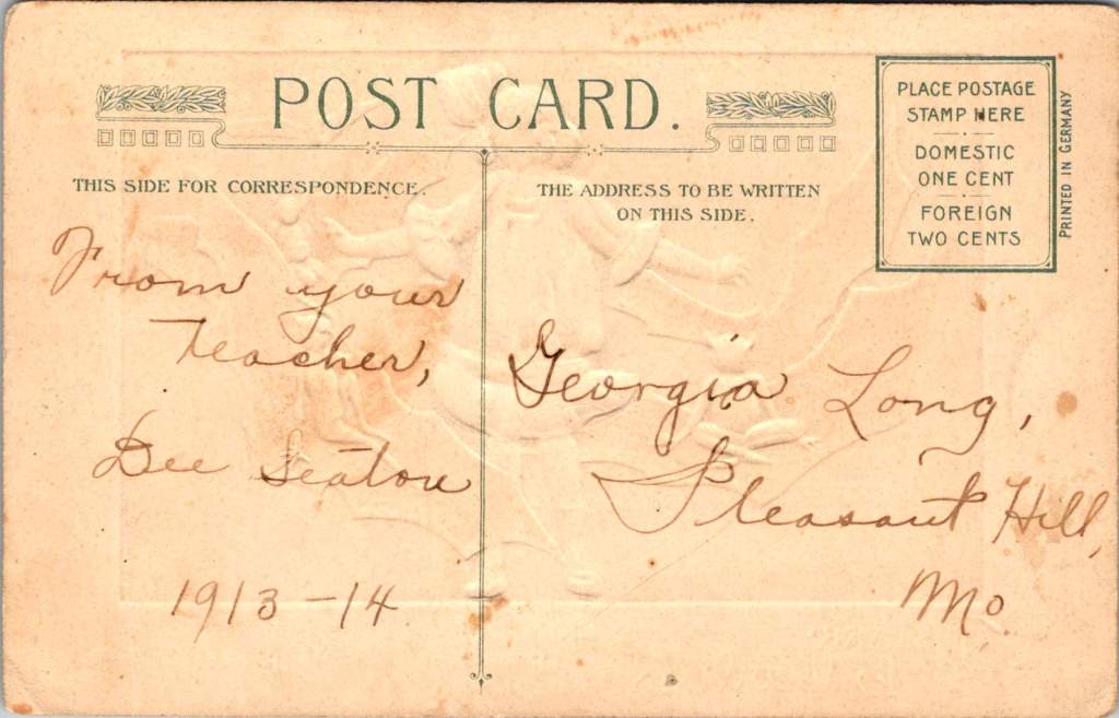
The John Winsch-published “A Starry Halloween” (1913) represents a pinnacle of German chromolithography and American holiday marketing. The card’s verse playfully describes “black Bat aeroplanes.”
“Hallowe’en’s a starry night, You’ll see the Goblins in flight, Perched on their black Bat aeroplanes, They flit about the weather vanes!”
This aeronautical reference demonstrates how postcards of the era incorporated modern technology into traditional Halloween imagery. This whimsical text combines traditional Halloween motifs with early aviation enthusiasm, placing the card squarely in the 1910s zeitgeist.
The card’s detailed execution showcases why German printers dominated the global market before World War I. The deep blue starry sky creates a dramatic backdrop, while the precise color registration and subtle shading of the figures demonstrate the technical excellence of German printing houses.
The postcard’s personal inscription—”From your Teacher, Dee Seaton, 1913-14″ to “Georgia Long, Pleasant Hill, Mo.”—reveals how these cards served as important social connections, particularly between teachers and students. The one-cent domestic postage rate, clearly marked on the divided back, reminds us of the affordability of this medium for everyday communication.
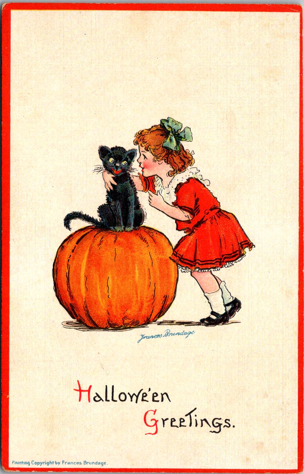
Frances Brundage’s Gentle Halloween
The Frances Brundage Halloween cards present a markedly different approach to the holiday in the same era. Known for her sweet-faced children and gentle compositions, Brundage brings her characteristic style to what could be frightening subject matter. The large orange pumpkin dominates the compositions, while a cheerful child with curly hair and a red bow plays with a black cat. The clean white background and red border create a bright, appealing presentation that contrasts with darker Halloween imagery.
Brundage (1854-1937) was among America’s most successful illustrators of children, and her distinctive style—rosy-cheeked, innocent-looking children with expressive faces—is immediately recognizable. Her work appeared on postcards, in children’s books, and in advertising, published by major companies including Raphael Tuck & Sons and Samuel Gabriel & Sons. This Halloween greeting card demonstrates how her gentle artistic approach could make potentially scary holiday themes appropriate for even the youngest children.
The Salem Witch: Local History Meets Holiday Trade
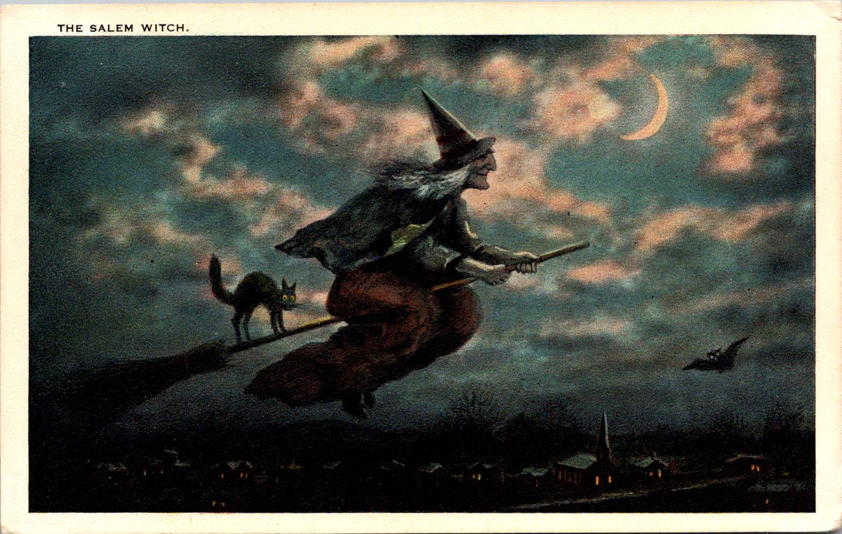
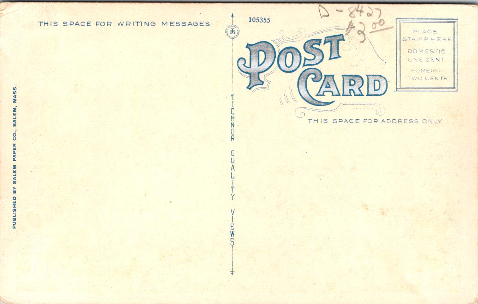
“The Salem Witch” postcard, published by the Salem Paper Company of Massachusetts, represents a fascinating intersection of local history, holiday celebration, and tourist commerce. The dramatic nighttime scene features a witch in traditional pointed hat and flowing cape, riding a broomstick across a turquoise sky filled with pink-tinged clouds and a crescent moon. A black cat balances behind her on the broomstick, while a bat flies nearby. Below, a small village with lit windows and a church spire creates a sense of scale and setting.
The publisher’s choice to produce this card in Salem was no accident. The city’s notorious witch trials of 1692-93 had by the early 20th century become a tourist draw, and the Salem Paper Company cleverly capitalized on this connection. The card’s dark, moody color palette of deep blues, blacks, and browns creates an appropriately spooky atmosphere.
The card’s reverse reveals additional historical details through its markings: PUBLISHED BY SALEM PAPER CO., SALEM, MASS., card number 105355, and the TICHNOR QUALITY VIEWS designation. Tichnor Brothers of Boston was renowned for high-quality postcards, particularly New England scenes, making them an ideal partner for Salem Paper Company’s locally themed Halloween products. The technical quality suggests it was likely also printed in Germany, as were many premium postcards of the era, even those designs that were distinctly American and regional.
The Spooked Kid: From Original to Reproduction
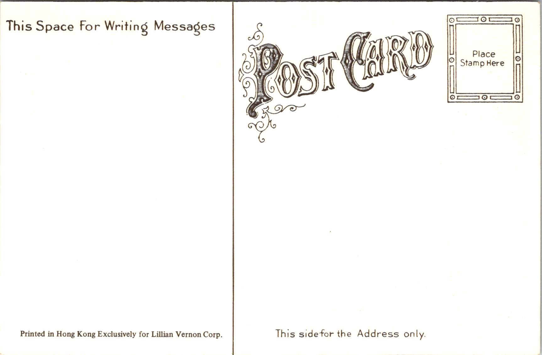
The final card, showing a startled child in white nightclothes against an orange-lit room, represents a later reproduction of Halloween imagery. Produced for Lillian Vernon and printed in Hong Kong, this card likely dates from the 1970s-1990s. But, it draws heavily on early 20th-century artistic conventions. The scene’s elements—a black cat in a window pane, yellow crescent moon, candlestick holder with lit candle, and fallen GHOST STORIES book—all reference classic Halloween postcard motifs. This card’s production history tells the story of significant changes in the postcard industry.
When Lillian Vernon, born in Leipzig, Germany, used her $2,000 wedding gift to launch a mail-order handbag business from her kitchen table in Mount Vernon, New York, in 1951, she could hardly have imagined she would revolutionize American gift retail. That first offering—a matching monogrammed handbag and belt set for $6.98—established the winning formula that would define her business: personalized items at affordable prices. The company name itself, taken from her new hometown, would become synonymous with accessible luxury and thoughtful gifting for generations of American shoppers.
Through the boom years of the 1980s and 1990s, Lillian Vernon catalogs were a fixture in American mailboxes, eagerly anticipated by parents and children alike. The company mastered the art of “catch-penny” items—small, impulse-buy treasures that seemed irresistible at their price points. Their most beloved offerings included personalized school supplies (from pencil cases to lunch boxes), holiday decorations, monogrammed doormats, and children’s toys. The company’s success made history in 1987 when Lillian Vernon became the first woman-owned company to be listed on the American Stock Exchange, a milestone in American business history.
By the time the company began sourcing products like Halloween postcards from Hong Kong printers, Lillian Vernon had transformed from a small mail-order business into a retail empire that included multiple specialized catalogs, retail stores, and eventually an online presence. The company’s choice to have the card printed in Hong Kong reflects the late 20th-century shift of printing operations from Europe and America to Asia, prioritizing cost-effective production over the artistic merit and technical excellence that characterized the German chromolithography era.
Though the company would ultimately close in 2016, unable to fully adapt to the digital age, its influence on American retail culture remains significant. The Lillian Vernon story represents both the American dream and the evolution of modern commerce—from kitchen-table startup to national brand, from personalized service to mass-market appeal, from mail-order catalogs to the small business opportunities of the internet era.
The Evolution of an Industry
These postcards trace the evolution of Halloween greetings from the golden age of German printing through the modern reproduction era. The Winsch card represents the height of pre-WWI German chromolithography and original holiday artwork. Frances Brundage’s contribution shows how established American artists adapted holiday themes for children. The Salem Witch card demonstrates the growing commercialization of local history and holiday traditions. Finally, the Lillian Vernon reproduction reveals how these vintage designs found new life in the mass-market retail era.
Together, they tell a story not just of changing printing technologies and business models, but of the evolving relationship with Halloween itself. From the elaborate artistic productions of the 1910s through the mass-market reproductions of the late 20th century, Halloween postcards have both reflected and shaped how Americans celebrate this fascinating holiday.
The Halloween postcard industry’s journey from German printing houses through American publishers to Asian manufacturers parallels larger trends in American commerce and holiday celebrations. These cards remain valuable historical documents, preserving not just artistic styles and printing techniques, but also the personal connections and social customs of their eras. Whether sent by a teacher to a student in 1913 or purchased as a souvenir in more recent decades, each card represents a tangible link to the holiday and shared heritage.
Weathered wooden structures still stand in the middle of Iowa, a testament to both engineering ingenuity and the power of storytelling. The covered bridges of Madison County have become more than mere crossings over babbling creeks; they are portals to the past, muses for artists, and anchors for a community’s identity. As the crisp autumn air settles over the rolling hills in October, thousands of visitors gather to celebrate these iconic structures at the annual Covered Bridge Festival, a tradition that has endured for over half a century.
Our journey begins with a stack of old locally-printed postcards, each capturing a nearby rural scene frozen in faded grayscale tones. Photographed by Clee Crawford in the early 1950s, these images were made into postcards sometime after 1983 by Larry’s Photography and Joe Graham Printing in Winterset, Iowa. Vintage collectibles themselves, they offer a glimpse of a bygone era when the now-famous bridges were simply part of the rural fabric of Madison County.
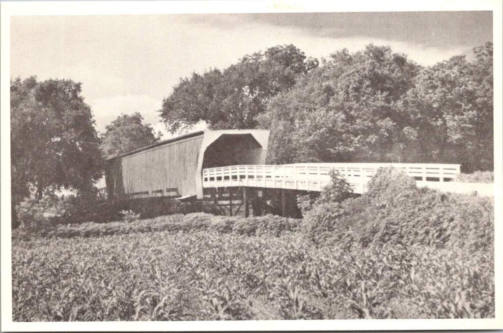
The Roseman Bridge, built in 1883 by H.P. Jones, spans the Middle River nine miles southwest of Winterset. In the postcard, it rises from a sea of cornstalks, its wooden siding weathered by countless Iowa summers and winters. Known locally as “The Haunted Bridge,” it whispers of ghost stories told around farmhouse tables and hushed conversations between young lovers seeking shelter from prying eyes. Little did the bridge know that it would one day become a star, playing a pivotal role in a story that would captivate millions.
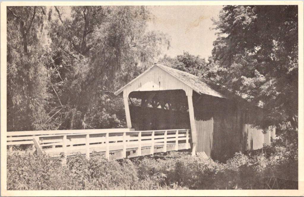
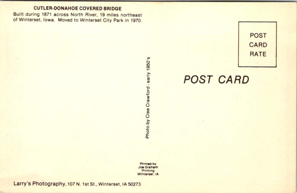
Moving northeast, we encounter the Cutler-Donahoe Bridge. Constructed in 1871, this structure originally crossed the North River. But like many of its counterparts, it found a new home as the winds of change swept through the county. In 1970, the same year the first Covered Bridge Festival was held, Cutler-Donahoe was carefully uprooted and transplanted to Winterset City Park. The postcard captures it in its original location, a sentinel standing guard over the river below, unaware of its future as a centerpiece of civic pride.
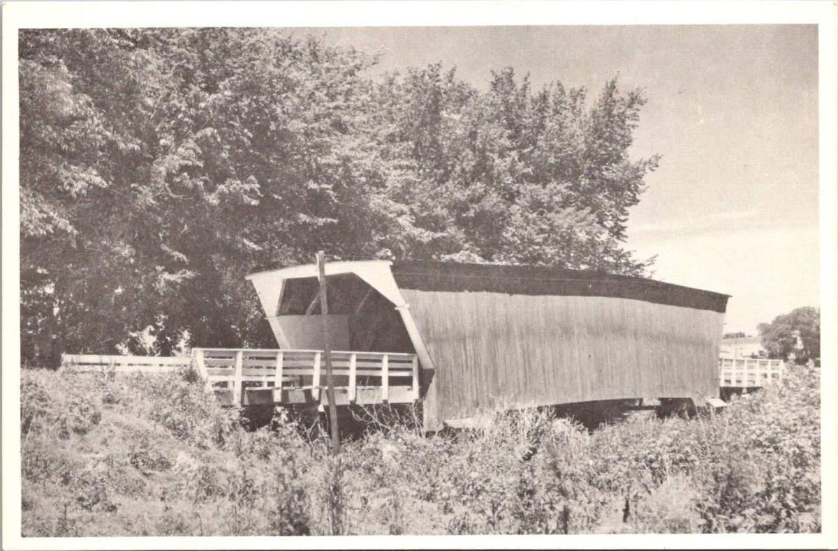
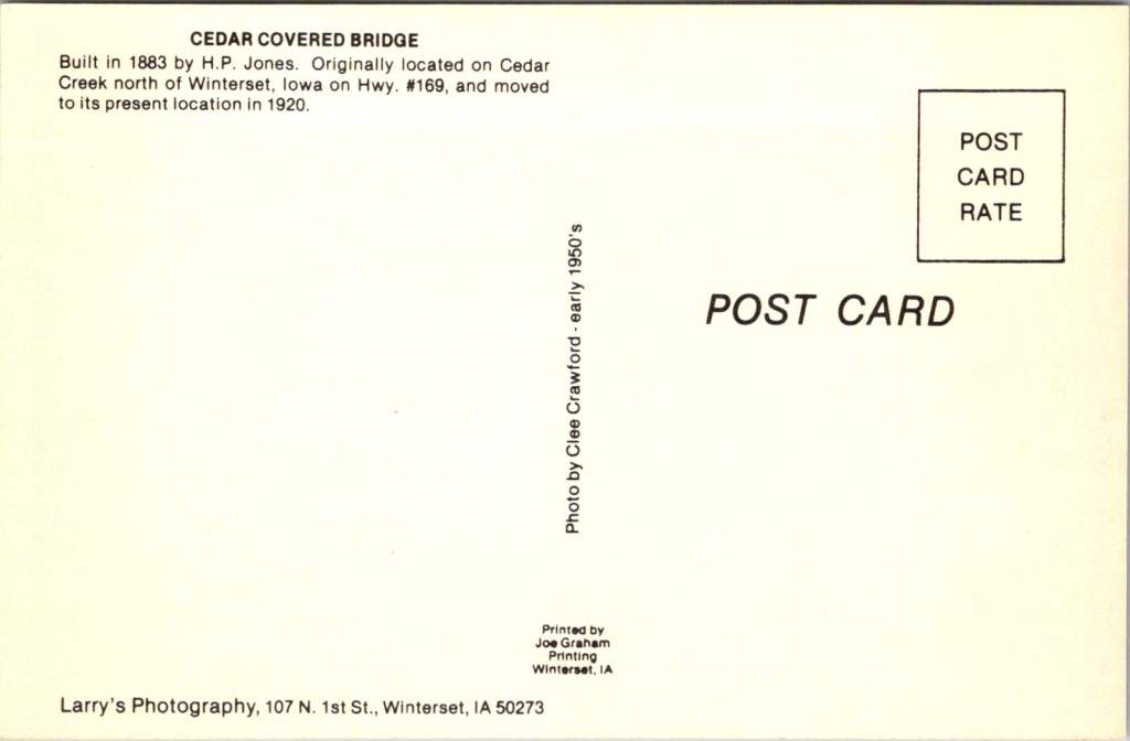
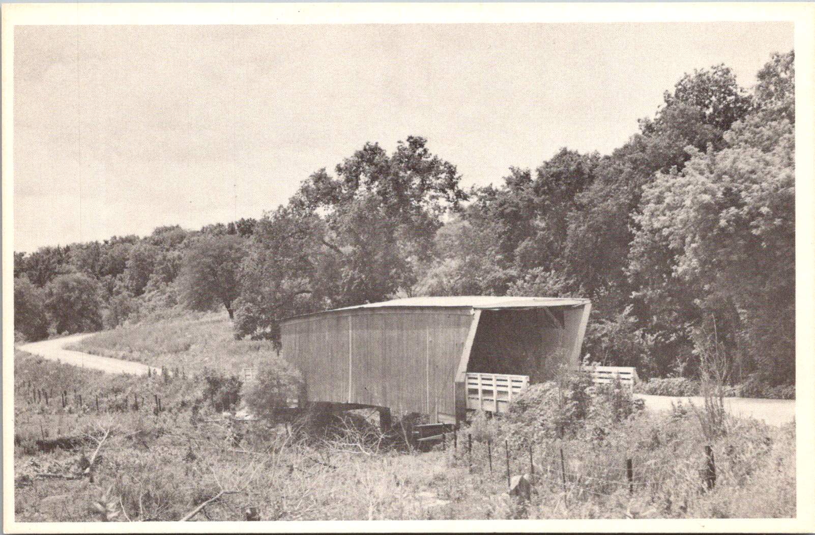
Our third postcard brings us to the Cedar Bridge, another creation of the prolific bridge-builder H.P. Jones. Erected in 1883 over Cedar Creek north of Winterset, it too would embark on a journey, moving to a new location in 1920. The image shows the bridge nestled in a picturesque rural setting, a dirt road winding its way to the entrance. What the postcard doesn’t reveal is the tumultuous future awaiting this particular bridge – a tale of destruction, rebirth, and the tenacity of a community unwilling to let go of its heritage.
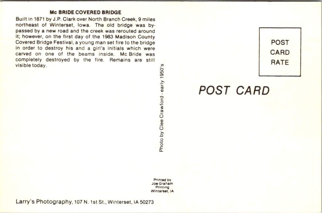
The final postcard in our collection tells a bittersweet tale. The McBride Bridge, built in 1871, appears proud and sturdy in the photograph. Yet the caption reveals its fate: destroyed by fire on September 3, 1983. This loss, occurring on the first day of the 1983 Madison County Covered Bridge Festival, served as a stark reminder of the fragility of these historical treasures and the importance of preservation efforts.
The destruction of the McBride Bridge is, unfortunately, not an isolated incident. Across the United States, covered bridges have long been targets of arson and accidental fires. According to data compiled by Covered Spans of Yesteryear, over 670 covered bridges have been lost to fire nationwide since the early 19th century. In Iowa alone, at least seven covered bridges have succumbed to flames, with arson being a common cause.
The Cedar Bridge, captured so peacefully in our postcard, has had a particularly tumultuous recent history. In 2002, it fell victim to arson, a loss that shook the community to its core. Demonstrating remarkable resilience, the bridge was rebuilt, only to suffer the same fate in 2017. The determination of Madison County residents prevailed once again, and a newly reconstructed Cedar Bridge opened in 2019 – a testament to the enduring significance of these structures in the local psyche.
As we shuffle these postcards, admiring the craftsmanship of both the bridges and the photographers who captured them, we’re drawn into a narrative that extends far beyond the borders of Madison County. These structures, once utilitarian crossings designed to protect travelers and livestock from the elements, have become characters in a much larger story – one that intertwines literature, film, tourism, and the very identity of a region.
The transformation began in 1992 with the publication of Robert James Waller’s novel, The Bridges of Madison County. Waller, an Iowa native, wove a tale of passion and missed chances against the backdrop of Madison County’s rural landscape. The Roseman Bridge, our “Haunted Bridge,” took center stage as the site where the story’s star-crossed lovers, Francesca Johnson and Robert Kincaid, first meet.
Suddenly, these bridges were no longer just local landmarks; they became symbols of romance, of roads not taken, of the bittersweet choices that shape our lives. The novel struck a chord with readers across the globe, selling millions of copies and landing on bestseller lists for over three years. But the story’s impact was only beginning.
In 1995, Hollywood came calling. Clint Eastwood directed and starred alongside Meryl Streep in the film adaptation of Waller’s novel. Once again, the bridges of Madison County found themselves in the spotlight, this time on the silver screen. The Roseman Bridge, in particular, became a character in its own right, its weathered boards and rustic charm providing the perfect setting for the unfolding drama.
The film’s success catapulted Madison County into the national consciousness. Tourists began flocking to Winterset and the surrounding areas, eager to walk in the footsteps of Francesca and Robert, to stand on the bridges where their fictional love blossomed, and to capture a piece of that romance for themselves.
This intersection of literature, cinema, and place created a perfect opportunity for cultural tourism. The bridges, which had stood for over a century as quiet witnesses to the ebb and flow of rural life, now found themselves at the center of a phenomenon that would reshape the economy and identity of Madison County.
The Covered Bridge Festival, which had begun in 1970 as a celebration of local history and craftsmanship, took on new significance. It became not just a community gathering, but a pilgrimage site for fans of the book and film, as well as history buffs, architecture enthusiasts, and romantics from all walks of life. Since then, the town itself has changed and adapted to the ongoing recognition.
As we fast forward, the allure of the bridges shows no signs of waning. The 2024 Covered Bridge Festival, held October 12-13 this year, continues to draw thousands of visitors to Madison County. For $3 admission (or two tickets for $5, with children under 11 entering free), attendees can immerse themselves in a weekend that bridges past and present.
The festival grounds, centered around the Winterset town square, buzz with activity. Vendors line the streets, offering handcrafted goods and local culinary delights. Sounds of live music fill the air, kids laughing in the Kids’ Zone, and the excited chatter of visitors from near and far.
For many, the highlight of the festival is the guided tour of the covered bridges, conducted by the Winterset Rotary Club. As buses wind their way through the countryside, visitors are treated to not just the sight of these historic structures, but also to tales of their construction, their role in local lore, and their journey from practical crossings to cultural icons.
The festival isn’t just about looking back, however. It’s a living, breathing celebration that continues to evolve. The 2024 event features a parade, a car show that turns the area around the courthouse into a chrome-and-steel wonderland, and a variety of demonstrations showcasing the craftsmanship and ingenuity that built these bridges in the first place.
At the Madison County Historical Complex, visitors can delve deeper into the area’s rich past. Here, the bridges are placed in context, their stories interwoven with those of the farmers, merchants, and families who have called this corner of Iowa home for generations.
As the festival has grown, so too has the need to balance tourism with preservation. The story of the Cedar Bridge serves as a poignant reminder of the challenges faced in preserving these landmarks. As we admire their beauty and revel in their romantic associations, we must also reckon with their vulnerability. Each bridge that remains standing is a victory – over time, over the elements, and sometimes over human destructiveness.
As the sun sets on this year’s festival, casting long shadows through the covered bridges, visitors and locals alike are reminded of the unique alchemy that has occurred here. What began as a practical solution to a transportation need has become a cultural touchstone, an economic driver, and a source of identity for an entire region.
The bridges of Madison County are physical manifestations of the power of storytelling, the appeal of nostalgia, and the human desire to connect – not just from one riverbank to another, but across time, across mediums, and across cultures. They are examples of 19th-century engineering that teach us more every future decade they exist.
These bridges offer something increasingly rare: a moment of pause, a chance to step out of the rush of modern life and into a space where time moves a little slower. Whether you’re a fan of Waller’s novel, a history enthusiast, or simply someone in search of a quiet moment of reflection, the covered bridges of Madison County have something to offer.
As we look to the future, the challenge for Madison County will be to continue balancing preservation with progress, nostalgia with innovation. The Covered Bridge Festival, with its blend of historical celebration and contemporary community spirit, serves as a model for how this might be achieved.
For now, as October winds whisper through the wooden beams of the Roseman, Cutler-Donahoe, Cedar, and the other three surviving bridges, they carry with them the echoes of all who have passed through before – from 19th-century farmers to 20th-century film stars to the tourists and locals of today. Each footstep, each photograph, each stolen moment adds another layer to the rich tapestry of stories that these bridges hold.
Our postcards, now decades old themselves, serve as a reminder of the power of image and imagination to transform the ordinary into the extraordinary. From simple river crossings to symbols of undying love, from local landmarks to international attractions, the covered bridges of Madison County have undergone a journey as winding and wonderful as the roads that lead to them. In the hearts and minds of all who have encountered them – whether through postcards, novels, films, or in person – these bridges have built connections far stronger and more enduring than wood and nails could ever achieve.
As we tuck our postcards away and the festival-goers return home, we’re left with an appreciation for these humble structures that have become so much more. The covered bridges of Madison County remind us that with a little imagination, a touch of serendipity, and year-after-year of care, even the most unassuming places can become the stuff of legend.
In the end, perhaps that’s the true magic of Madison County’s covered bridges – their ability to transport us not just from one side of a river to another, but from our everyday lives into a world where love, history, and community intertwine.
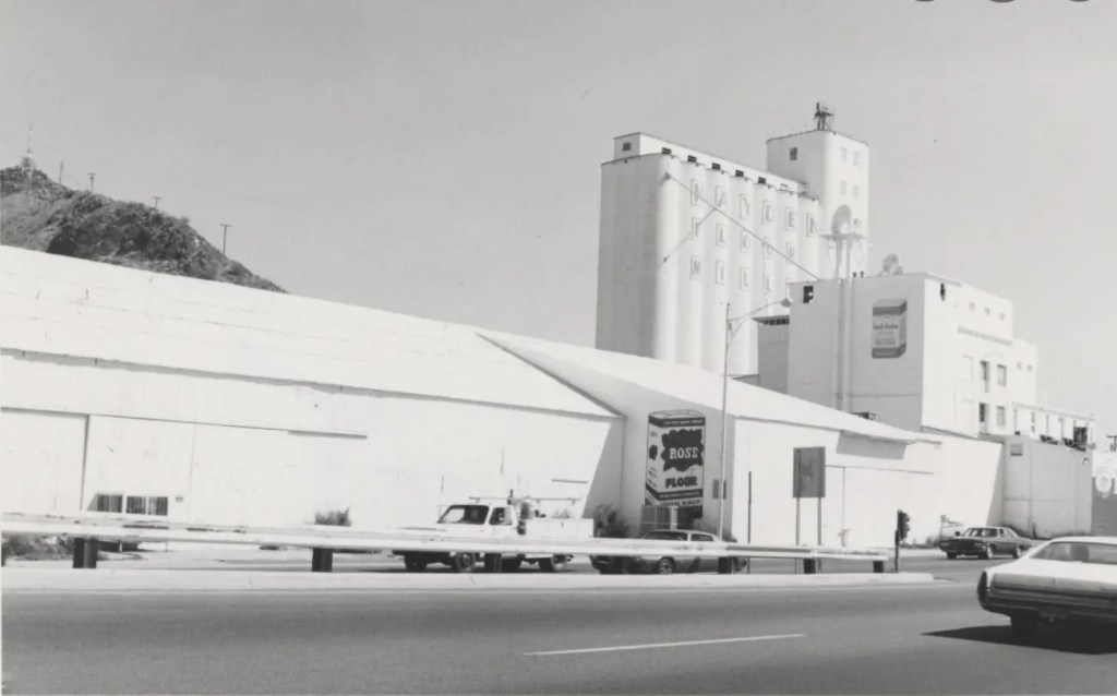
A set of postcards printed in the 1980s reflect Tempe’s history a century before. Now historical artifacts themselves, these images offer a window into the city’s past and future.
As we examine each postcard, we’ll uncover the story of Tempe’s development and explore how each generation has contributed to the city’s evolving landscape.
The Hackett House: Victorian Charm in the Desert
Today’s journey begins with a postcard depicting the Hackett House, a quaint building constructed in 1888. This red brick structure, Tempe’s oldest of its kind, stands as a testament to the city’s early days. With its distinctive turret and elegant design, it exemplifies the rare Arizona Territorial Victorian commercial style.
Originally built by German immigrant William Hilge as Tempe’s first bakery, the Hackett House’s location near the Hayden Flour Mill, the railroad, and the Territorial Normal School (now Arizona State University) nods to the earliest urban planning in Tempe. The postcard captures the building’s 1912 appearance, which was painstakingly restored in the 1970s.
The history of the Hackett House mirrors Tempe’s own evolution. After its days as a bakery, it served as a residence and later a boarding house. It earned its current name when Estelle Craig, Tempe’s first telephone operator, married Roy Hackett in the old bakery house. By the 1980s, when our postcards were likely printed, the Hackett House had already been recognized for its historical significance and placed on the National Register of Historic Places.
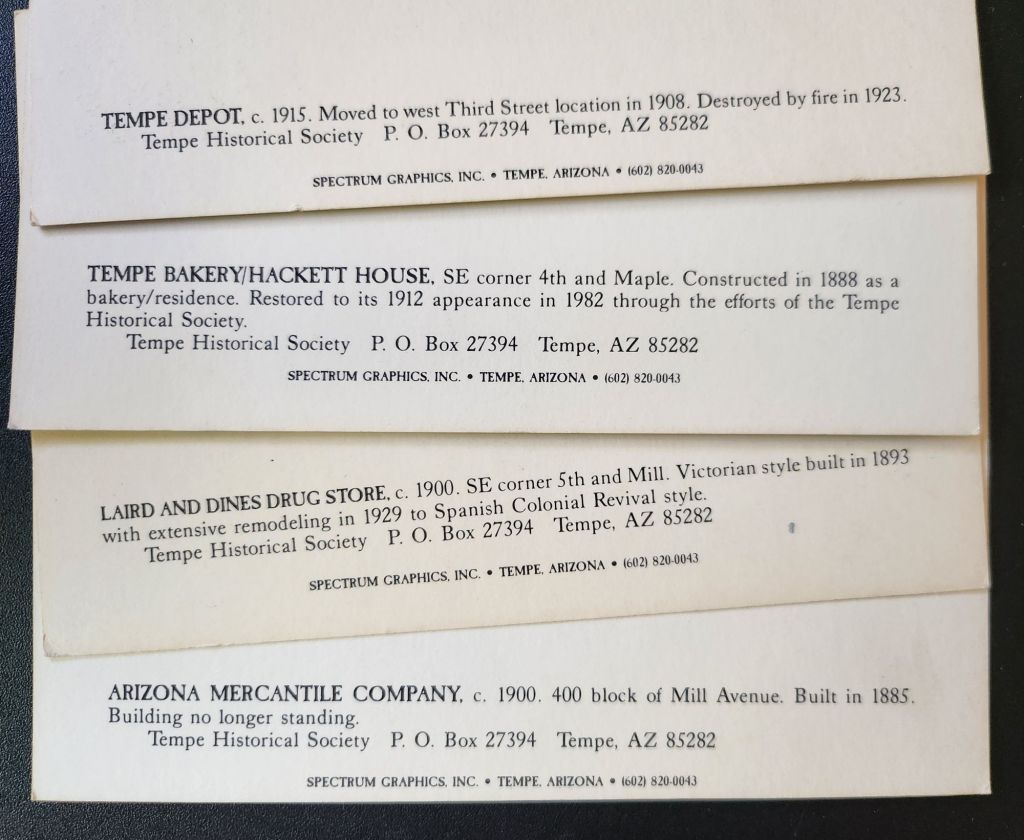
Tempe Depot: The Arrival of Progress
Our next stop is the Tempe Depot, captured in a postcard circa 1915. The image shows a steam locomotive at the station, a small group clustered for the photograph. This scene represents a pivotal moment in Tempe’s history, symbolizing the city’s connection to the wider world.
The arrival of the Maricopa and Phoenix Railroad in 1887 transformed Tempe from a small farming community into a thriving center of commerce. The depot, built in 1907, served as a vital link for both passengers and freight, fueling Tempe’s growth and prosperity. Though the original structure was lost to fire in 1923, this postcard preserves its memory and significance.
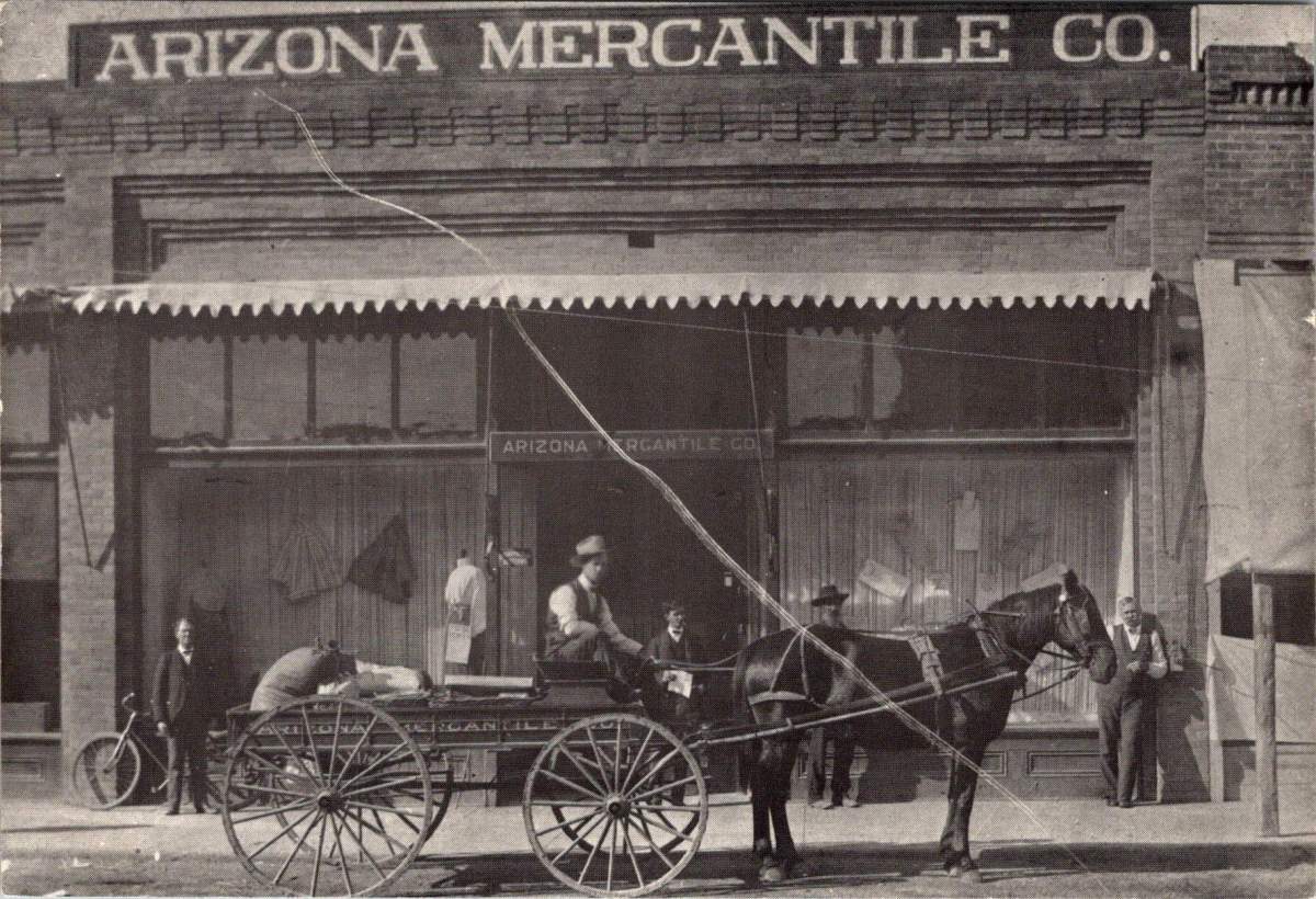
Arizona Mercantile: Commerce in Early Tempe
The next postcard features the Arizona Mercantile Co., a sturdy brick building constructed in 1898. With its large storefront and a horse-drawn carriage parked outside, this image encapsulates the commercial heart of early Tempe.
The Arizona Mercantile Co. played a crucial role in Tempe’s economy, providing essential goods and services to the growing community. The image itself, its preservation, and later reproduction underscores the importance of local businesses in shaping Tempe’s identity and meeting its residents’ needs.
Laird and Dines Drug Store: A Corner of History
Our final postcard depicts the Laird and Dines Drug Store, circa 1900. This Victorian-style corner building, with its prominent “DRUGS” signage, offers another glimpse into Tempe’s commercial past. The image shows the particulars of storefront business, with its ornate architecture, early signage, and shades to defend against the afternoon sun.
The building went on to serve as campaign HQ for Senator Carl Hayden and Governor Benjamin B. Moeur, as well as the first town hall and post office. Renovations reflected each successive era, including a few that were later reversed. Look closely today, and the old bones still show.
Preservation: Buildings vs. Postcards
As we explore Tempe’s history through these 1980s postcards, we encounter an interesting dichotomy in historical preservation. While some buildings depicted still stand today, others have long since disappeared from Tempe’s landscape.
The preservation of postcards offers a unique window into the past, allowing us to visually experience Tempe as it once was, even when the physical structures no longer exist. The Tempe Depot postcard, for instance, preserves the image and significance of a building lost to fire, serving as a tangible link to the city’s early railroad days.
On the other hand, the preservation of buildings like the Hackett House allows for a more immersive connection with history. Visitors can walk through the same spaces, touch the same walls, and experience the ambiance of a bygone era in a way that a two-dimensional image can’t replicate.
This dual approach to preservation provides a richer, more comprehensive understanding of Tempe’s history. The postcards fill in the gaps where physical preservation was lost, while the preserved buildings offer tactile and fertile connections to the past.
Hayden Flour Mill in operation, click for reference link
Tempe’s Historic Landscape
Tempe’s commitment to preserving its architectural heritage is evident in the numerous historic properties that dot its landscape. The Elias-Rodriguez House, built in 1882 using traditional adobe methods, stands as one of the oldest surviving buildings in Tempe, representing the early Hispanic influence on the city’s development.
The Niels Petersen House Museum, a Queen Anne Victorian style home built in 1892, offers visitors a glimpse into the life of a wealthy rancher in territorial Arizona. The Old Main building on Arizona State University’s campus, completed in 1898, continues to serve the university community while standing as a proud reminder of the institution’s long history.
These pristinely preserved buildings, along with others undergoing substantial redevelopment like the Hayden Flour Mill (1918) form a network of historical touchstones throughout Tempe. They create a physical timeline of the city’s development, allowing residents and visitors alike to trace Tempe’s growth from a small agricultural settlement to a thriving modern city.
Image courtesy of Jack D. Mount, click for reference link
Evolving Landscapes: Tempe Through the Decades
While our postcards capture Tempe’s early history, the city’s development didn’t stop in the early 20th century. Each subsequent generation has left its mark on Tempe’s landscape, contributing important and useful additions that have shaped the city we know today.
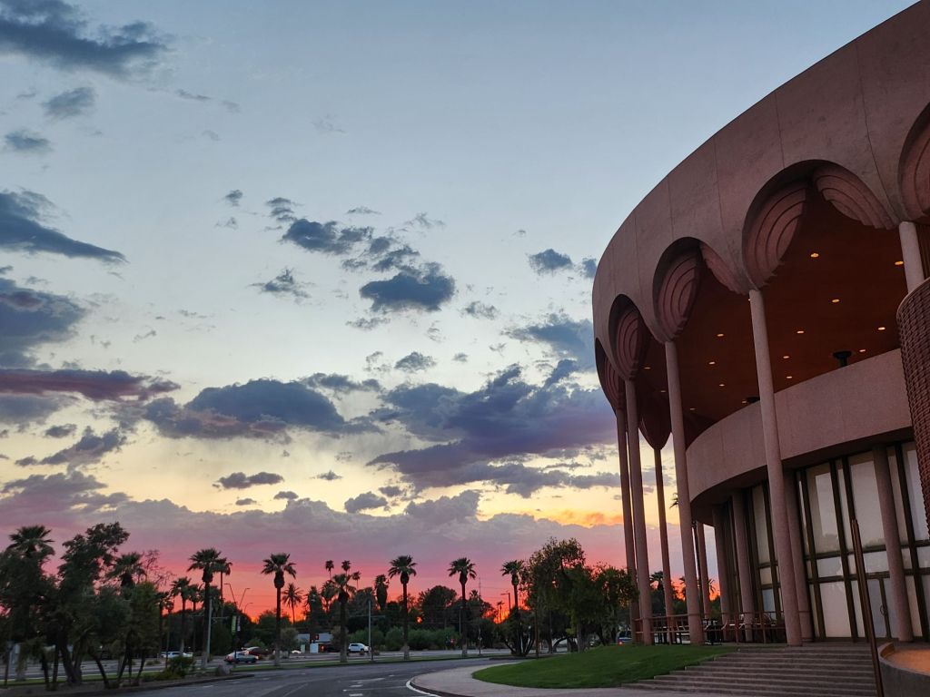
The 1960s saw the development of the Mid-Century Modern style that has since become iconic in Tempe. Grady Gammage Memorial Auditorium still defines Tempe’s landscape as a living example of Taliesin West design, inspired by Frank Lloyd Wright’s principles and aesthetic.
Another example, Shalimar Golf Course & Estates, built in 1961 combining a golf course with a mix of single-family and townhomes all featuring the golf lifestyle. This ambitious project represented a new approach to suburban living, offering residents a blend of recreational amenities and comfortable housing. The golf course continues to operate today, though its future faces the threat of redevelopment again in 2025.
As we consider the fate of mid-century developments like Shalimar, we’re confronted with a critical question: will these more recent historical landscapes be preserved in place or will they exist only as postcards, if at all? The answer may depend on how we value and interpret the architectural and cultural legacy of the mid-20th century, and how we balance preservation with the evolving needs of a growing city.
Generational Contributions to Tempe’s Landscape
These projects, spanning a century, demonstrate how each generation in Tempe has contributed something important and useful to the city’s landscape. Each of these developments responded to the needs and aspirations of its time while also shaping the future of Tempe. They’ve created new models for residential communities, transformed the city’s relationship with its natural environment, spurred economic growth, and positioned the city as a cultural hub in the region.
Moreover, these projects have often built upon or complemented earlier developments. For instance, Tempe Town Lake is a modern creation that in some ways echoes the water management innovations seen in earlier projects like the Roosevelt Dam. The Tempe Center for the Arts, with its lakeside location, takes advantage of the views and ambiance and extends the cultural campus of the city.
This layering of infrastructure and development over time creates a rich urban tapestry that tells the story of Tempe’s growth and evolution. From the historic buildings captured in our 1980s postcards to the modern landmarks of today, each generation has added its own chapter to Tempe’s ongoing narrative.
Image from Tempe History Museum collection, click for full citation.
Civic Priorities Across Eras
Examining Tempe’s history reveals how certain civic priorities persist across generations, forming a thread of continuity. The establishment of the Territorial Normal School in 1885 reflects an ongoing commitment to education that continues to shape the city’s identity today. Infrastructure development demonstrates the community’s long-standing recognition of the importance of resource management and large-scale planning.
The presence of telephone services in early Tempe, including Estelle Craig’s role as the city’s first telephone operator, reminds us the community’s need to embrace new technologies. This spirit of innovation has persisted through the decades, manifesting today in Tempe’s adoption of smart city technologies and its support for tech industry growth.
The growth of local businesses and transportation networks demonstrates a consistent focus on economic development that remains a key priority for Tempe. From the early mercantile stores to the bustling mill, and from the first railroad to modern light rail systems, Tempe has always recognized the importance of commerce and connectivity in building a thriving community.
The Past Informing Future Plans
Understanding our history plays a crucial role in shaping the future of our cities, and Tempe is no exception. The walkable, mixed-use nature of early Tempe, where residences, businesses, and civic institutions coexisted in close proximity, still exists as a memory and a footprint within contemporary urban planning that prioritizes regional accessibility and global interaction.
Preserved buildings like the Hackett House do more than just remind us of the past; they actively influence contemporary architectural styles. By maintaining these historical structures, Tempe creates a sense of continuity in its urban landscape. Modern buildings often incorporate elements inspired by these historical designs, creating a blend of old and new that gives the city its unique character over time.
Historic buildings also make spaces for modern vision and mission, as seen with the Hackett House’s current role as headquarters for Tempe Sister Cities. This practice of adaptive reuse not only preserves historical structures but also breathes new life into them, making global connections, welcoming visitors and ensuring Tempe’s relevance for future generations.
The Historic Hackett House today
History Today and Tempe’s Future
As we look at these 1980s postcards of even older Tempe landmarks, we’re reminded that the appreciation of history is itself a constant. Each generation recognizes the value of its heritage and works to preserve it for the future. In doing so, they contribute to the ongoing story of Tempe, creating a richer, more resilient urban fabric that honors the past while embracing the future.
The challenge – and opportunity – for Tempe and cities worldwide lies in maintaining this delicate balance between preservation and progress. By thoughtfully integrating historical elements into modern urban planning, we create spaces that are not only functional and innovative but also deeply rooted in the community’s unique identity and shared history.
Crucially, thinking about the past and future opens a window into creative solutions for present-day challenges. Some old ways of desert living offer valuable clues for sustainable life in modern Tempe. The walkable nature of early Tempe, for instance, provides inspiration for reducing car dependency. The adaptive reuse of buildings like the Hackett House demonstrates how we can minimize waste and preserve cultural heritage simultaneously. The large-scale water management projects of the past have to inform us in dealing with water scarcity in an era of climate change.
As Tempe faces new challenges and opportunities, these historical images and structures serve as both guideposts and inspirations. They remind us that every generation leaves its mark, and that by honoring our past, we can create a more meaningful and sustainable future. The story of Tempe, as told through these postcards and the buildings they depict, is about continuity amidst change and working together. It’s a story that continues to unfold, with each generation adding its own chapter.
In the end, Tempe’s effort to learn from its history while boldly innovating for the future reflects those shared concerns every community faces. It shows that progress and preservation are not mutually exclusive, Rather, they are complementary forces. When balanced thoughtfully, they can create vibrant, resilient, and deeply-rooted urban and suburban communities. As Tempe faces the future, it does so with the wisdom (and the failures!) of its history as a guide, each generation ensuring that the city’s unique character and community spirit will endure for the next.
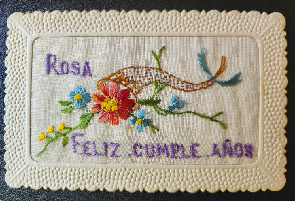
Imagine holding a piece of handmade history – a delicate blend of silk and paper that has traveled more than a century to tell its story.
This charming embroidered postcard from the early 20th century is a small and intricate greeting that speaks volumes about a bygone era. In the world of historical artifacts, sometimes a small stitch tells a rich story.
Burst of Blooms
The postcard we are examining today presents an interesting contrast to typical flat, printed cards. Its front features an embroidered design set within a scalloped, cream-colored frame. The embroidery displays a palette of purples, reds, blues, and greens against a light fabric background, forming a floral scene.
At the center is a red flower, its petals rendered in careful stitches to create a sense of depth. Blue blooms surround it, with green stems and leaves providing structure to the composition. Above the flowers, Rosa is embroidered in purple thread, while below, Feliz cumple años (Happy birthday in Spanish) completes the message.
The reverse side is more conventional, bearing the hallmarks of early 20th-century postcard design. “CARTE POSTALE” is printed at the top in both French and English, with the card divided for correspondence and address. A small line at the bottom reads “Printed in France « E.R. » Paris” – a clue to the card’s origins.
The card was produced by E. Rabus, a Parisian company founded in 1897. By the early 20th century, the company had become a leader in the French postcard industry, including active involvement in the Chambre Syndicale français des Editeurs de la Carte postale illustrée, the professional organization for French postcard publishers. In 1914, E. Rabus held the position of secretary-general in this organization, placing the company at the heart of the industry during a pivotal time.
Manufacturing Marvels
This particular postcard emerged during the postcard craze of the early 20th century, when millions of postcards of many great variety were produced and sent globally each year.
The postcard we’re examining likely dates between 1914 and 1920, a period that saw significant changes in the postcard industry. Creating this postcard involved a fascinating blend of traditional craftsmanship and industrial production techniques.
The silk thread may have been sourced from a renowned manufacturer like Dollfus-Mieg & Cie. DMC was a major producer of embroidery threads, founded in Mulhouse, Alsace in 1746. Thread may have also come from Lyon, France’s capital of silk, where workers known as Canuts supplied luxury goods markets. The use of high-quality silk thread indicates that this postcards was a premium product.
While hand embroidery was still practiced, the scale of postcard production in this era suggests that machine embroidery was more likely used. Skilled workers would have operated specialized machines manually set to create the intricate design.
Once complete, the embroidery needed to be affixed and sandwiched between two paper cards to create the final product. The distinctive scalloped edges on the front were created through embossing and die-cutting, a process using metal plates and a sharp blade to stamp and cut the card into its final shape, leaving a window for the fine fabric to show through. The reverse side was made using standard printing techniques of the era.
All of these processes – embroidery, backing, embossing, die-cutting, and printing – would have taken place at the E. Rabus factory in Nanterre, a suburb of Paris. The company’s ability to combine these various techniques in-house speaks to its sophistication as a manufacturer and helps explain its prominent position in the industry.
Messages for Global Markets
While this postcard was produced in France, its Spanish text hints at a broader marketplace and larger international relations. E. Rabus, like many successful companies of its time, was looking beyond French borders to sell its products.
The most likely target market for this Spanish-language card would have been Spain itself. Geographic proximity and cultural ties between France and Spain made this a natural choice. Spanish tourists visiting France might have purchased such cards as souvenirs, or French customers might have bought them to send to Spanish friends or relatives.
Another strong possibility is Argentina. In the early 20th century, Argentina had a significant French immigrant population and strong cultural ties with France. The Argentine upper classes, in particular, had an affinity for French culture and products. Or perhaps Cuba, a popular tourist destination for Europeans at the time.
It’s worth noting that World War I (1914-1918) had a significant impact on these global markets. The war disrupted trade routes and changed economic relationships. However, it also created new demands for postcards as a means of communication between soldiers and their loved ones. Spanish neutrality during WWI might have made Spain an even more important market for French postcard producers during this time.
Grand Greetings
Perhaps the most charming aspect of this postcard is the way it personalizes a mass-produced item. The name Rosa embroidered at the top of the card transforms it from a generic greeting to a personal message. We can appreciate the care in choosing this specific card with the recipient’s name woven into the birthday wish.
Postcards marry the universal with the personal. Paper and thread become a bridge – between industrial spaces and private life, between France and the Spanish-speaking world, and between the early 20th century and our own time. Human desire is to connect, to send our good wishes across distances, and to make even mass-produced items feel special and individual.
Feliz cumple años – in Spanish – reminds us that birthdays are celebrated across cultures and languages, and the wish for a happy birthday transcends borders and time.
As we examine this postcard today, we sense so many stories – the mysteriously named publisher, the factory workers in Nanterre, a birthday celebration, the joy of both the sender and the intended recipient. Every historical artifact, no matter how small, carries with it a web of human connections.
We send greetings with the tap of a screen today, and still we can appreciate the thought and effort that went into creating and choosing such a card. It invites us to consider how we express our good wishes today, and how modern methods carry the traditions forward from this centenarian birthday card.
This delicate embroidered postcard, with its silk threads and scalloped edges, its French origin and Spanish text, is a testament to human creativity, industrial ingenuity, and the enduring power of a simple wish for happiness, stitched in colored thread, preserved through time, and able to transcend borders.
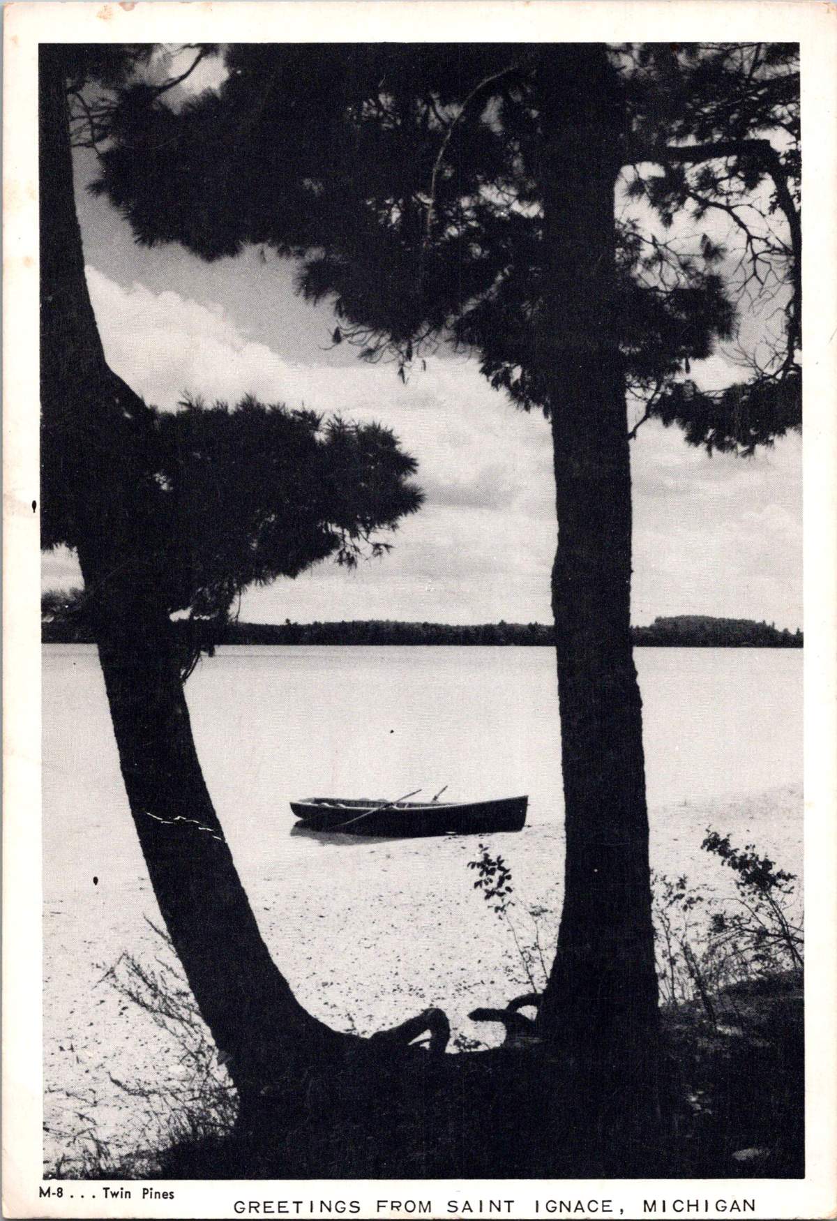
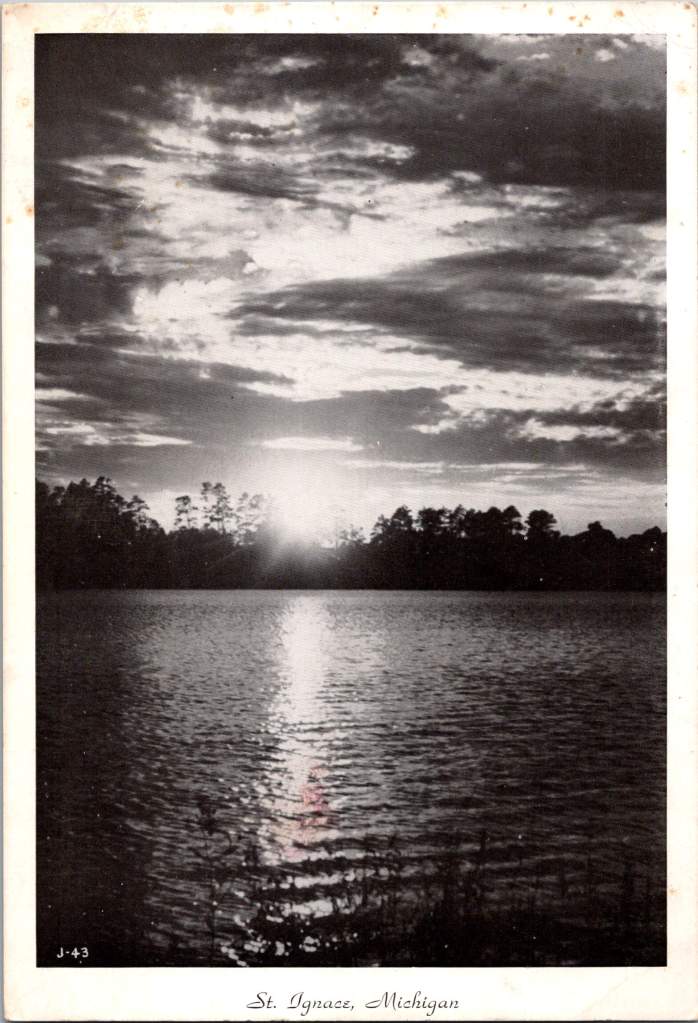
As the morning mist rises from the placid waters of Lake Huron, a solitary canoe rests on the sandy shore, framed by the silhouettes of towering pines. This scene, captured in a black and white photograph, speaks volumes about the timeless allure of summers spent in St. Ignace, Michigan.
These images, printed and shared as jumbo postcards, ignite a rainbow of memories in those who have experienced the magic of St. Ignace, or any summer escape. They help us remember those promising days filled with exploration, laughter, and the simple joys of nature.
Heartbeat of Summer
For many, summer is more than just a season—it’s a vital part of life’s rhythm. It’s a time when schedules loosen, adventures beckon, and memories are etched into our hearts. This is certainly true in St. Ignace, where the warm months transform the landscape and the community.
Founded in 1671 by French explorer and priest Father Jacques Marquette, St. Ignace is one of the oldest continuous settlements in Michigan. This small city, perched on the northern tip of Michigan’s Lower Peninsula, serves as a gateway to the rugged beauty of the Upper Peninsula. Connected by the mighty Mackinac Bridge, St. Ignace straddles two worlds—the familiar and the wild.
The importance of summer here cannot be overstated. As the last traces of winter melt away, the city comes alive. Tourism, a major industry in the area, kicks into high gear. Shops that stood quiet through the cold months throw open their doors, welcoming visitors in. Boats that were shrouded in protective covers all winter are lovingly prepared for a season on the water.
For families, summer in St. Ignace is a chance to break free from the constraints of everyday life. It’s an opportunity to trade screen time for green time, to swap the hum of air conditioning for the whisper of wind through trees. Here, summer isn’t just enjoyed—it’s celebrated.
Nature’s Vivid Canvas
While our vintage photographs may be in black and white, the reality of St. Ignace and Lake Huron in summer is anything but monochrome. Nature paints with a vibrant palette here, creating scenes that etch themselves into memory.
Picture yourself standing on the shore of Lake Huron as the sun dips below the horizon. The sky ignites in a spectacular array of oranges, pinks, and purples, their colors reflected in the lake’s surface. This daily show serves as nature’s reminder to pause and appreciate the beauty around us.
Lake Huron itself is a marvel of color and life. As the third-largest freshwater lake by surface area in the world, it covers an impressive 23,000 square miles. Its waters are remarkably clear, with visibility often exceeding 80 feet. This clarity reveals a underwater world teeming with life—over 80 species of fish call Lake Huron home, including the silvery flash of salmon and the speckled beauty of lake trout.
On land, the forests surrounding St. Ignace offer their own colorful display. In late spring and early summer, wildflowers dot the forest floor with splashes of yellow, purple, and white. As summer progresses, the deep greens of pine and spruce are complemented by the lighter shades of deciduous trees.
Even on overcast days, when the world seems cloaked in shades of gray, nature finds ways to surprise us with bursts of color. The vibrant red of a cardinal flitting between trees, the rich brown of a deer’s coat as it bounds through a clearing, or the pure white of a birch tree’s bark standing stark against darker pines—all serve as reminders of the vivid world around us.
Black and White Memories
There’s something poignant about viewing these summer scenes through the lens of black and white photography. These images, likely captured in the mid-20th century, serve as windows to a bygone era. They prompt us to reflect on summers past and the enduring appeal of this special place.
One such image shows a large boulder—known locally as “Lone Rock”—standing resolute in the shallows of Lake Huron. This natural landmark has been a favorite spot for generations of swimmers and a useful navigation point for boaters. In the photo, we can almost hear the laughter of children clambering over its sun-warmed surface or imagine a family picnicking in its shadow.
These black and white images make us yearn for those simpler times. They remind us of the importance of unplugging, of immersing ourselves in nature, and of creating memories that will sustain us through the colder, darker months. They challenge us to see beyond the surface, to find beauty in contrast and form, much as we must often do in life.
Rich History and Natural Wonders
St. Ignace and the surrounding area are steeped in history and natural marvels. The region has been home to Indigenous peoples, particularly the Ojibwe, for thousands of years. Their respect for and connection to the land and water continue to influence the area’s culture.
Lake Huron itself is a geological wonder. Formed over 10,000 years ago by glacial action, it is part of the largest group of freshwater lakes on Earth. The lake’s basin holds enough water to cover the entire state of Michigan in 14 feet of water.
One of Lake Huron’s most impressive features is Manitoulin Island—the largest freshwater island in the world. While it’s part of Ontario, Canada, its presence shapes the lake’s ecology and offers a tantalizing destination for those willing to venture further afield.
Closer to St. Ignace, the Straits of Mackinac offer their own allure. This narrow waterway connecting Lake Huron and Lake Michigan has been a crucial passage for centuries, first for Indigenous peoples in canoes, then for European fur traders, and now for massive freighters carrying goods across the Great Lakes.
Summer Traditions and Activities
Summer in St. Ignace is a time of tradition and adventure. Many families have been there for generations, staying in the same lakeside cabins or cottages year after year. These annual pilgrimages to the shores of Lake Huron are more than vacations—they’re a way of marking time, of connecting with loved ones, and of passing down a love for this special place to the next generation.
Boating is a way of life. From sleek sailboats to sturdy fishing vessels, the waters of Lake Huron are dotted with crafts of all sizes. Fishing is a popular pastime, with anglers trying their luck at catching walleye, perch, or the prized lake trout. For those new to fishing, local guides are always happy to share their knowledge and secret spots.
Beach activities are a daily staple of summer life. Families spread blankets on the sandy shores, building sandcastles, searching for pretty pebbles, or simply basking in the sun. The brave-hearted might venture into the chilly waters of Lake Huron for a swim—the lake’s average temperature in summer hovers around a brisk 65°F (18°C).
Hiking and camping in the nearby forests offer a chance to immerse oneself in nature. The North Country Trail, which passes through St. Ignace, provides hiking opportunities for all skill levels. More adventurous families might opt for a camping trip in Hiawatha National Forest, where the starry nights are as memorable as the sun-dappled days.
No summer in St. Ignace is complete without a trip to Mackinac Island. A short ferry ride away, this car-free island seems frozen in time. Horses and bicycles are the main forms of transportation, and the island’s famous fudge shops are a must-visit for anyone with a sweet tooth.
Bittersweet End of Summer
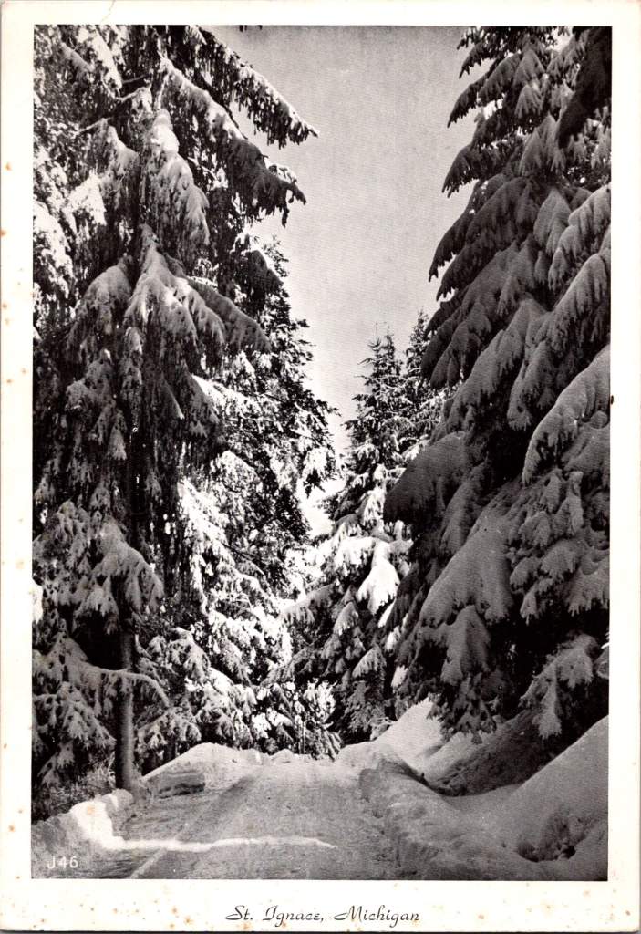
As August wanes and September approaches, a poignant mood settles over St. Ignace. Locals and longtime visitors recognize the signs—summer is drawing to a close. The sun sets a little earlier each evening, and a crispness creeps into the air. The lone winter scene in this postcard set predicts the coming cold.
But for now, the end of summer brings a flurry of activity to squeeze in one last adventure, one more swim, one final sunset. The Annual Labor Day Bridge Walk, where thousands of people walk the five-mile length of the Mackinac Bridge, serves as an unofficial farewell to summer.
Yet even as we bid goodbye to long, warm days and starry nights, there’s a sense of anticipation. For we know that Lake Huron and St. Ignace will be waiting for us next year, ready to once again provide the backdrop for cherished family memories.
In the end, it’s not just the natural beauty or the activities that make summers in St. Ignace so special. It’s the way this place allows us to connect—with nature, with each other, and with ourselves. As we look at these old black and white photographs, we’re reminded that while times may change, the essence of summer in St. Ignace remains the same. It’s a place where adventures are had, where memories are made, and where the spirit of summer lives on, vibrant and colorful in our hearts, and in black and white postcards.