Room enough for all of us to go from here to there, and back again.
Featured Postcard~ New Orleans French Market A CENTURY AGO
An early 20th century scenic postcard showcases the iconic French Market in New Orleans’ French Quarter.
Front of the card: The photograph shows the vestibule of the historic French Market, featuring tall, weathered French/Creole Colonial columns supporting a slatted roof. Perspective draws the eye down the long corridor, emphasizing the market’s impressive scale. The covered walkway displays produce, baskets, and merchandise on tables and in crates. The image captures a rare moment when the hallway of vendors face the camera. Hand-colored rose tones reflect the market’s timeless atmosphere with pops of green and blue artfully applied. Caption: Vestibule, French Market, New Orleans, La.
Back details: The left panel explains the market’s history:
This card shows the interesting old columns erected, 1822. While the roof of the market has been repaired many times, the old columns have stood as originally put, without fire aid to the injured.
Published by Lipsher Specialty Co., 320 Magazine St., New Orleans. Standard divided back format with decorative script and postage rates listed: Domestic One Cent, Foreign Two Cents.
Historical significance: The postcard documents the French Market’s appearance in the early 20th century. Established in the 1790s, the market served as a vital commercial hub where vendors sold fresh produce and handcrafted goods. Instructions to “Take French Market car from Canal St.” reflects the streetcar system and emphasis on tourism. This postcard dates to 1922-1925, based on combined evidence of one-cent postage, the specific streetcar reference, and hybrid halftone-collotype printing (Aquatone process was patented in 1922).
Condition and Appeal: The card displays excellent color saturation, with clear and interesting details and minimal defects. Tiny nicks on two corners, with yellowing on the reverse typical of age. Image and text provide valuable historical context, appealing to collectors of New Orleans memorabilia, architectural history enthusiasts, and those interested in early 20th century American commerce. The French Market remains active today, making this postcard a fascinating glimpse into its enduring legacy as a cornerstone of New Orleans culture.
Today’s Art Card & Gallery
The gallery features Landscapes by Larry L’Ecuyer, and here is a fun art card from Anne this week. Winner, winner, chicken dinner!
open call for art cards!
The World’s Smallest Artist Retreat (our P.O. Box) is awaiting your art card submission. Details here!
Art card kits ~ gift or fun for you!
Our Art Card Kits are perfectly-packaged as a fun, creative activity for you and a friend to complete in as little as an hour or made into a lovely afternoon.
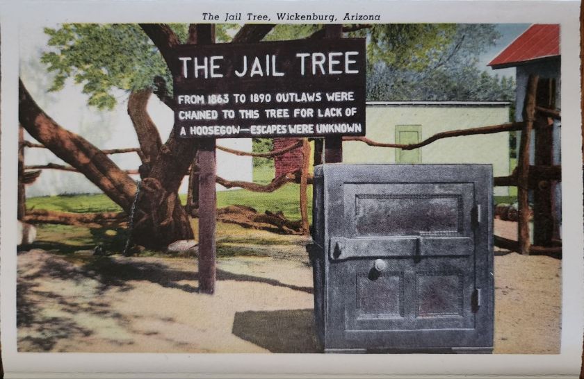
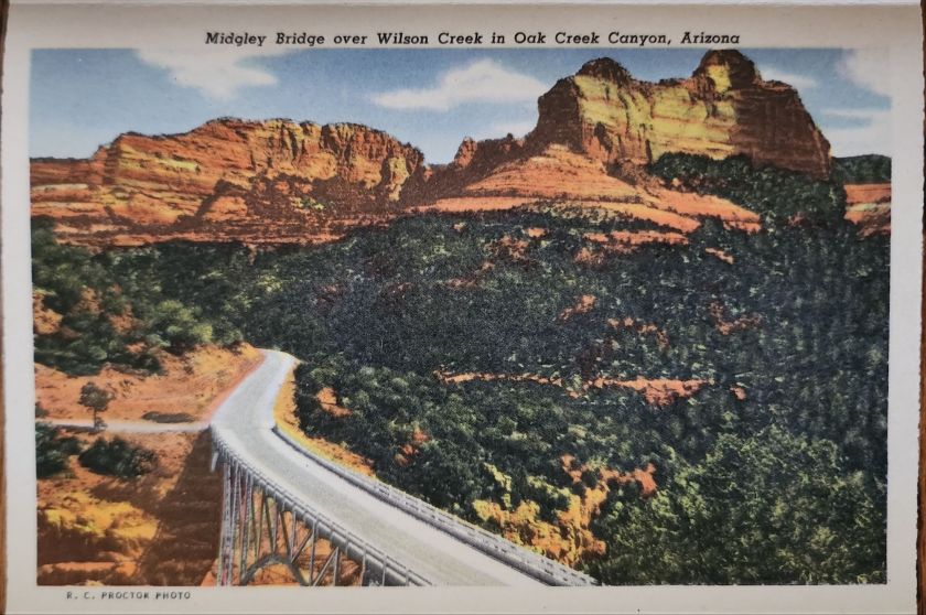
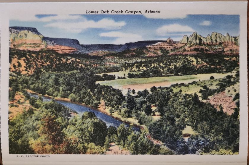
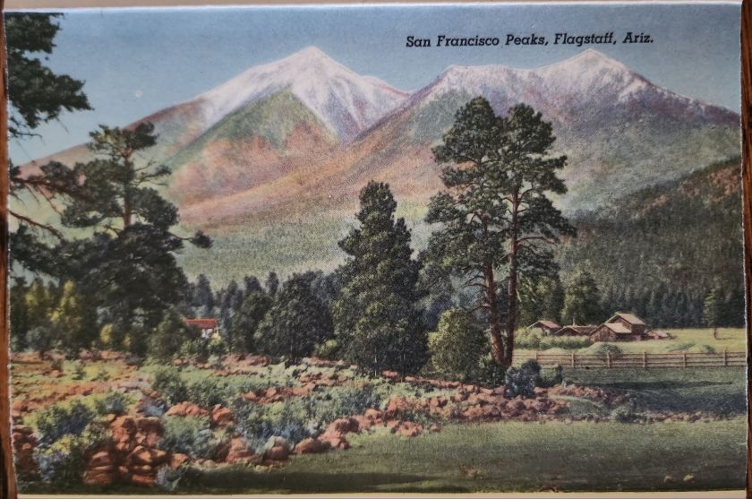
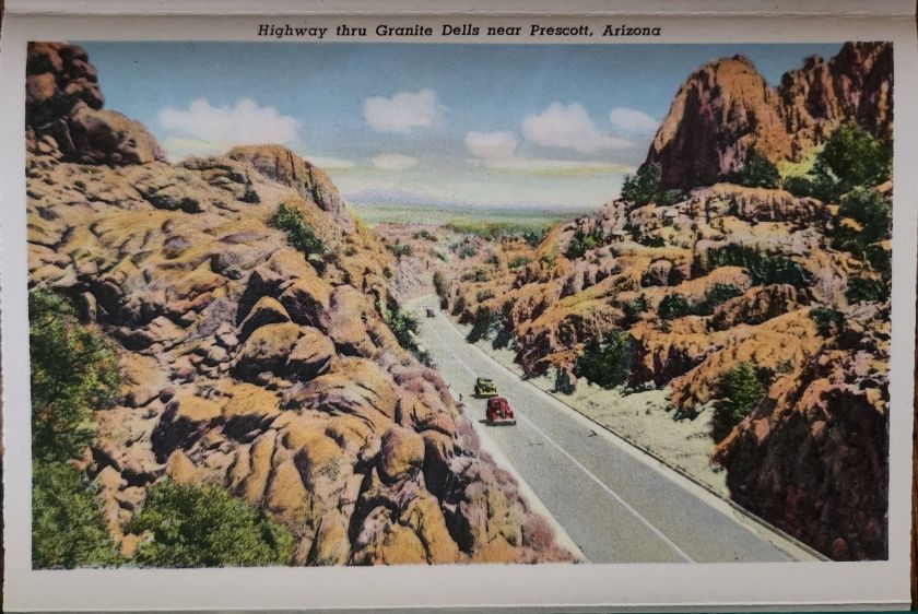
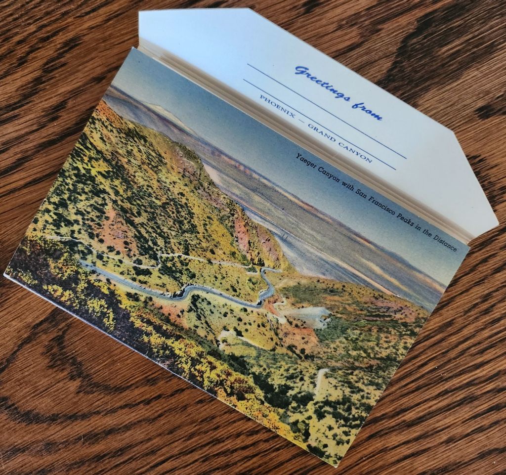
Mid-century postcards captured the wonder of American road trips in vivid color. This Phoenix to Grand Canyon collection reveals the story of car trips, roadside shops, and the natural landscape of Arizona.
Rural Route Arizona
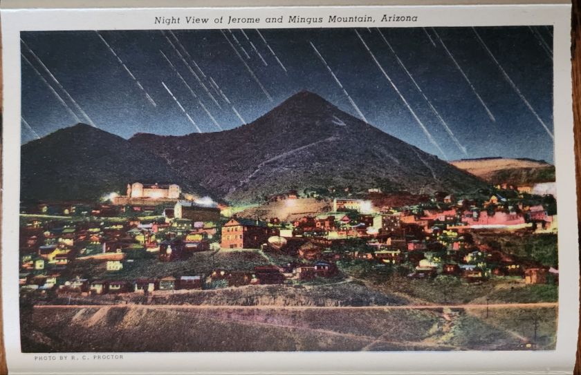
The Phoenix to Grand Canyon route via Oak Creek Canyon carved through America’s most scenic territory. In the 1940s and 1950s, this remained wild, undeveloped country. Starting in Phoenix, travelers navigated winding two-lane roads through Wickenburg, Yarnell, Prescott, Jerome, Clarkdale, Cottonwood, Flagstaff, and Williams.
Each stop pulsed with its own character. Jerome clung to mountainsides, mining copper. Prescott sprawled as a ranching center and former territorial capital. Wickenburg lured visitors with dude ranch culture. Williams crowned itself “Gateway to the Grand Canyon.” These weren’t pit stops but destinations, each welcoming tourist dollars from America’s growing car culture.
Postcard Economy
These postcards bear the stamp of Curt Teich & Co., a Chicago printing giant that drove America’s postcard industry from the 1930s through 1960s. German immigrant Curt Teich founded the company in 1898 and revolutionized postcard production. His linen postcards introduced soft textures and blazing colors.
Teich built an industrial empire through local connections. Photographers roamed America, documenting main streets and natural wonders. In Chicago, artists hand-colored black and white photographs, enhancing reality to seduce buyers and ultimately define a social aesthetic.
Behind every postcard rack stood a web of relationships, too. Hotel owners, gas station attendants, and gift shop operators ordered cards from Teich’s catalog or commissioned custom designs featuring their establishments. Postcards advertised businesses, provided affordable souvenirs, and satisfied the social duty to send word home.
Long-distance calls cost fortunes. Letter-writing devoured time. Postcards offered quick connection and proof of adventure. They were quick and easy evidence that the sender had escaped ordinary life for landscapes of impossible beauty. For travelers, buying and mailing postcards proved both pretty and practical.
The typical buyer belonged to America’s emerging middle class, newly mobile through car ownership and paid vacations. Families drove from California to see the Grand Canyon. Retirees took first cross-country trips. Young couples honeymooned across the Southwest. Many experienced the American West for the first time. Postcards helped them process and share encounters with the sublime.
Selecting, writing, and mailing postcards became part of American vacation ritual. Weather beautiful, wish you were here—heartfelt sentiments that bridge extraordinary experience and ordinary communication.
These postcards transcend tourist kitsch. They document a pivotal moment when the West was packaged and sold as leisure destination. Enhanced colors and idealized compositions reflect not just Arizona’s appearance, but how Americans wanted to see it—as endless possibility, natural wonder, and escape from urban routine.
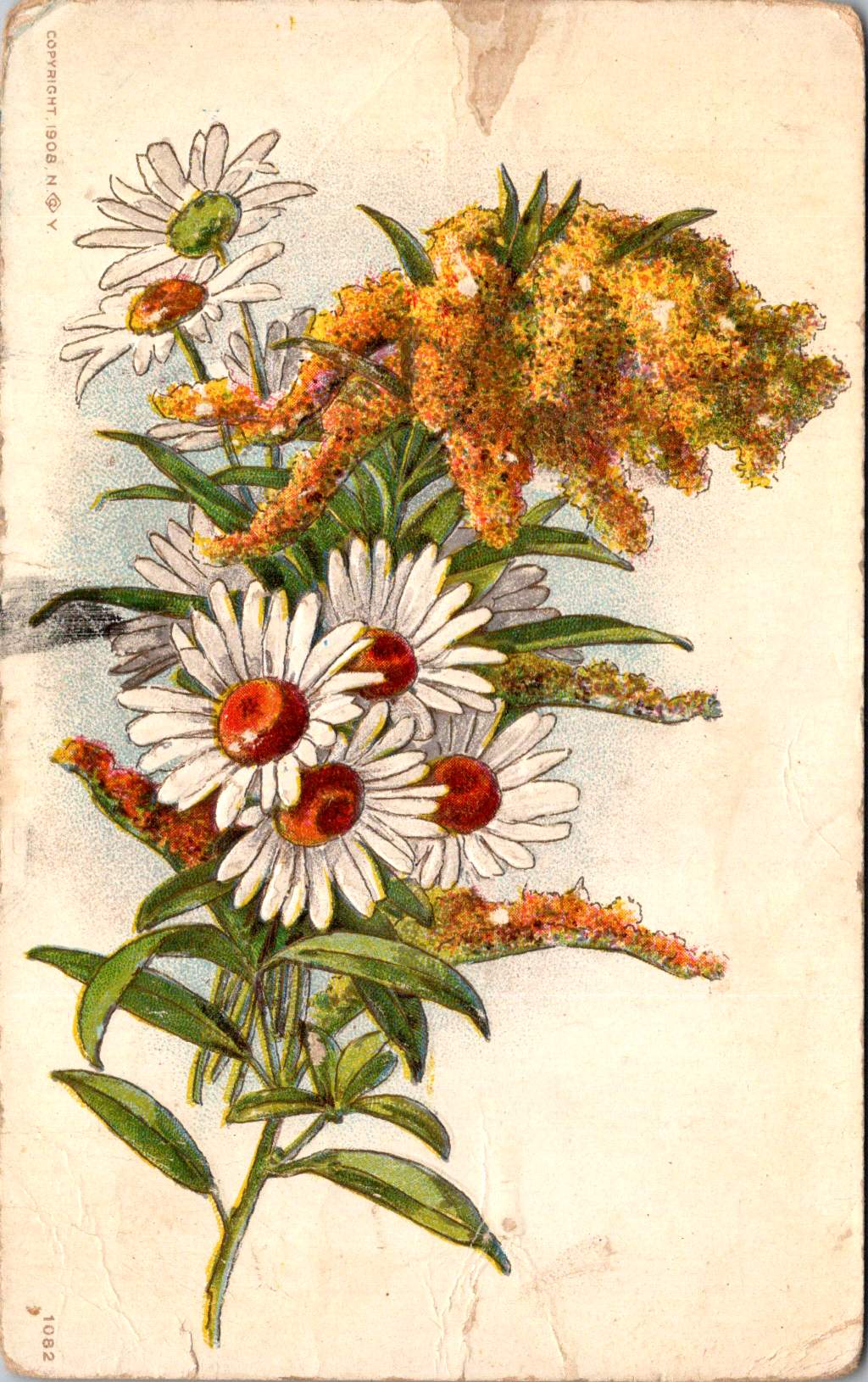
Vintage floral postcards—with golden backgrounds, symbolic flowers, and heartfelt messages—were a sophisticated social currency that connected people across distances.
At the intersection of the Victorian and Edwardian eras, the humble postcard emerged as a powerful medium for small aesthetic pleasures and meaningful social exchange. These postcards tell a story of artistic development and printing innovation, and how ordinary people wove beauty into the fabric of everyday communication.
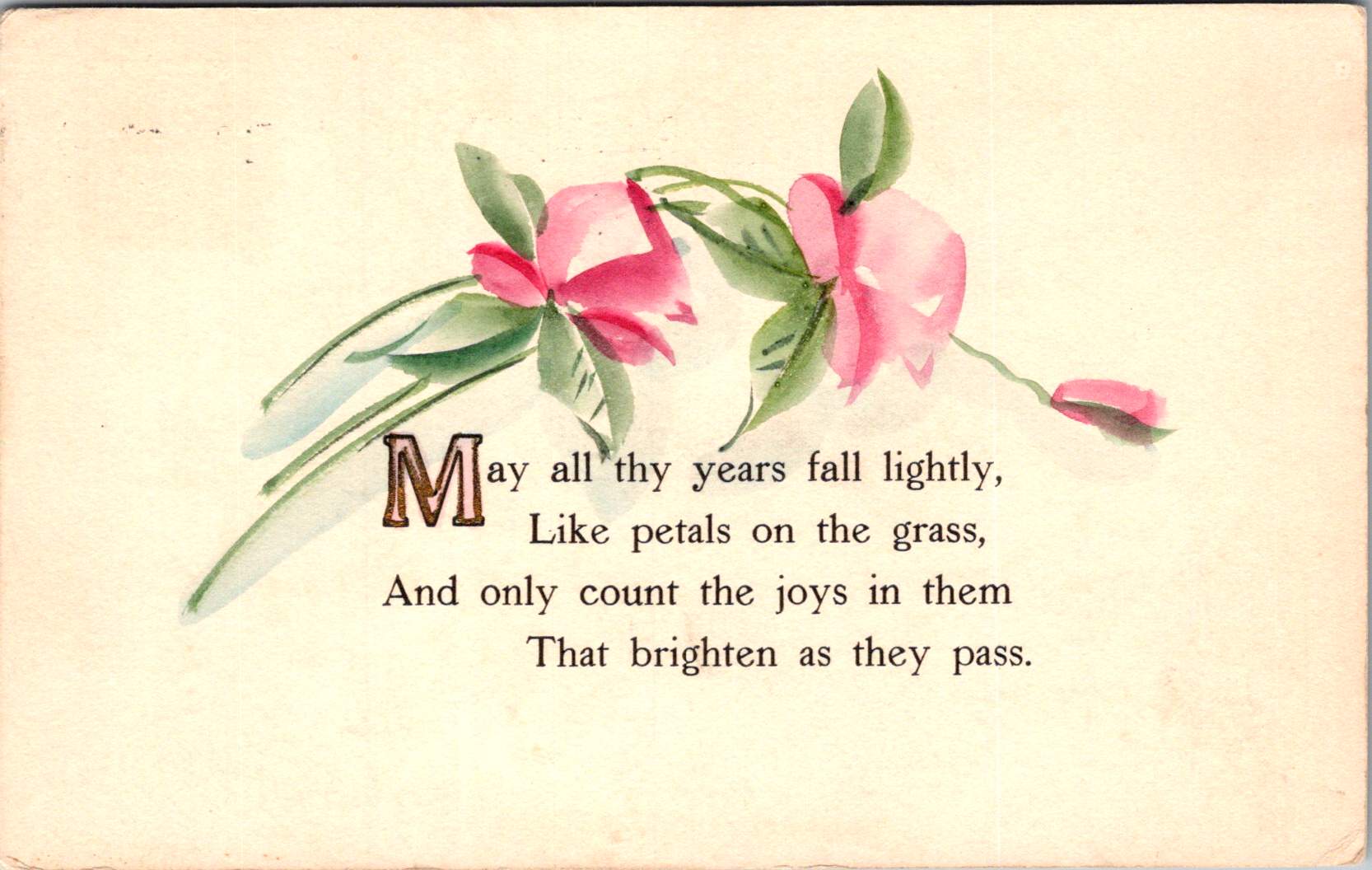
Delicate Blooms
One card in this selection features pristine white lilies and fern fronds against a luminous gold background. The lilies—rendered in striking detail with their trumpet-shaped blooms and distinctive stamens—create dramatic contrast against the warm gold, the iridescent ink catching light as the recipient tilted the card in their hands. An elegant blessing accompanies the illustration.
“No thorn beset the path you tread, No shadows glance upon your way, But flowers spring beneath your feet, And sunshine crown your every day.”
These cards encapsulate a pivotal moment in design history—the transition from Victorian to Edwardian sensibilities. The Victorian era (1837-1901) embraced ornamentation, sentiment, and symbolic complexity. Every element carried meaning: white lilies represented purity and virtue; ferns symbolized sincerity and shelter; the gold background evoked trust and value. These layers of meaning reflected the Victorian preoccupation with moral improvement through beauty, a philosophy championed by influential figures like John Ruskin and William Morris.
As Queen Victoria’s reign ended and Edward VII took the throne (1901-1910), aesthetic preferences gradually shifted. The new Edwardian sensibility maintained Victorian symbolic richness but introduced more restrained layouts with increased white space and cleaner compositions. This particular card, with its strategic emptiness and focused arrangement, demonstrates this evolution. The gold field creates breathing room that earlier Victorian designs would have filled with additional decorative elements.
The technology behind these gold backgrounds represented industrial innovation. Using metallic powders and varnish printed in the desired pattern, these effects made previously elite decorative elements available to middle-class consumers. During the Industrial Revolution, technical advancements in printing had transformed what was once painstaking handwork into mechanized production. German printers in particular had mastered these techniques, producing cards with exceptional color registration and metallic effects that remained unmatched until their trade was disrupted by World War I.
Other sophisticated production methods like embossing—creating raised areas that added tactile pleasure to the visual experience—required specialized equipment and expertise. Metal dies created by skilled engravers would press the design into the card after printing was complete. The visual effect was enhanced by different dimensions, making these technically perfect cards a testament to industrial craftsmanship.
Gold’s association with luxury stemmed from both its intrinsic properties and historical significance. The aptly named Gilded Age celebrated opulence, with gold becoming a visual shorthand across design disciplines. International Expositions like the 1900 Paris Exposition showcased luxury goods incorporating gold elements, popularizing these aesthetics globally. Archaeological discoveries in Egypt renewed interest in gold in design, while the Ballets Russes featured costume and set designs by artists like Léon Bakst who used vibrant colors and gold accents.
Floral Features
A striking card in the next selection features white and red striped “peppermint” carnations against a gold background. The distinctive white petals dramatically streaked with vibrant red markings create bold visual contrast against the metallic wash. Three perfectly rendered blooms cluster together on dark stems, with bright green sword-like leaves framing the arrangement. The word “Carnations” appears in red script in the upper right corner, identifying the botanical subject with elegant simplicity.
This stark compositional approach—focusing entirely on the botanical subject against a uniform background—represents a more modern, stripped-down aesthetic that emerged in the early 1900s. While maintaining the Victorian fascination with floral symbolism, these designs eliminate extraneous decorative elements in favor of dramatic contrast and botanical precision. This shift toward simplification prefigured design trends that would gain momentum in the following decades, showing how postcard aesthetics tracked broader movements in visual culture.
The symbolism remained rich: striped carnations carried specific meaning in the Victorian language of flowers, often representing regret that a sentiment could not be shared or a refusal/inability to accept someone’s affection. This sophisticated “language of flowers” had become codified in popular Victorian publications like Kate Greenaway’s “Language of Flowers” (1884), ensuring that recipients would understand these botanical messages. The high contrast between the red-streaked white blooms and the gold background created a visual drama that emphasized the emotional complexity carnations represented.
During this period, social practices around correspondence were evolving. The penny post, established in Britain in 1840 and adopted with variations throughout Europe and America, had revolutionized communication by making it affordable across social classes. What was once an expensive privilege became commonplace, leading to a boom in correspondence. The “Golden Age of Postcards” (approximately 1898-1918) coincided with changing postal regulations that allowed privately printed cards and preceded the widespread adoption of telephones. During this period, billions of postcards circulated globally.
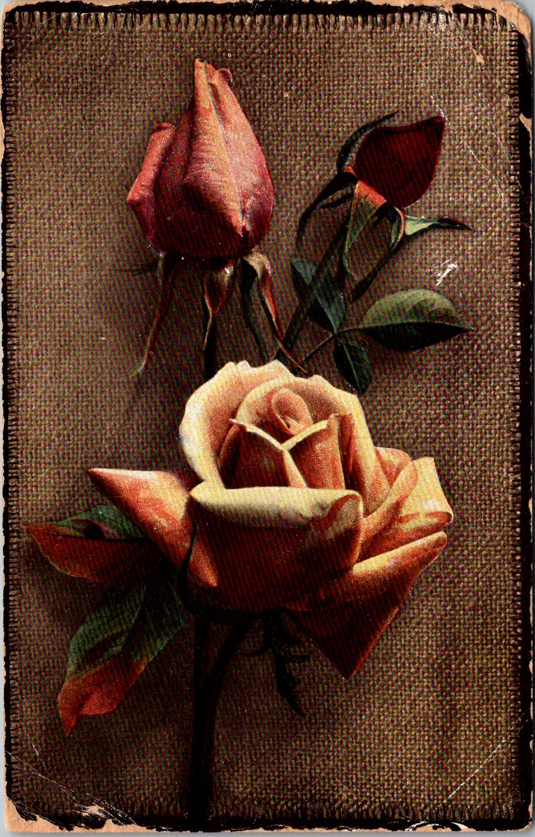
Rose to Crimson
The next group of cards represents another technological leap—an early photograph of light pink roses on a background of actual linen. The physical texture of the rough weave contrasts with the delicate subject matter—an open rose and two buds captured a new reality that only photography could provide. This mixed-media approach demonstrates how artists continued to experiment with both visual and tactile experiences.
The Victorian and Edwardian periods witnessed remarkable developments in image reproduction. Traditional chromolithography—where each color required a separate stone or plate—was being supplemented by photographic techniques. These innovations allowed the faithful reproduction of reality rather than artistic interpretation, though both approaches coexisted during this transitional period. The textures and images of this card created an interesting interplay between the natural subject and the material substrate, engaging multiple senses simultaneously.
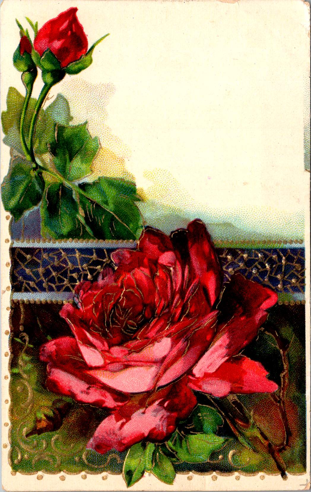
Rose symbolism operated on a similarly subtle gradient. In Victorian floral language, the exact shade of a rose communicated specific intentions: light pink roses signified admiration and grace—appropriate for relationships in earlier stages or those requiring emotional restraint. Medium pink suggested appreciation, while deeper crimson conveyed self-conscious beauty and passionate love. This color gradient functioned as a sophisticated social shorthand, with increasing saturation indicating increasing emotional intensity.
This coding system proved particularly valuable in an era when direct expressions of emotion were constrained by elaborate social conventions. Etiquette books like those published by Emily Post outlined proper behavior in minute detail, including appropriate subjects for correspondence and proper forms of address. Against this background of social restriction, postcards offered a safe channel for emotional expression. The carefully chosen rose color allowed for communication that could either be acknowledged or tactfully ignored, providing a social safety mechanism for expressing feelings that might be improper to state directly.
For Victorian and Edwardian women especially, whose social freedom was often limited, postcard exchange offered acceptable connection. Young women could receive cards from admirers without compromising propriety, as the public nature of postcards (visible to postal workers and potentially family members) ensured messages remained discreet. This “public privacy” created a unique social space where relationships could develop within accepted boundaries.
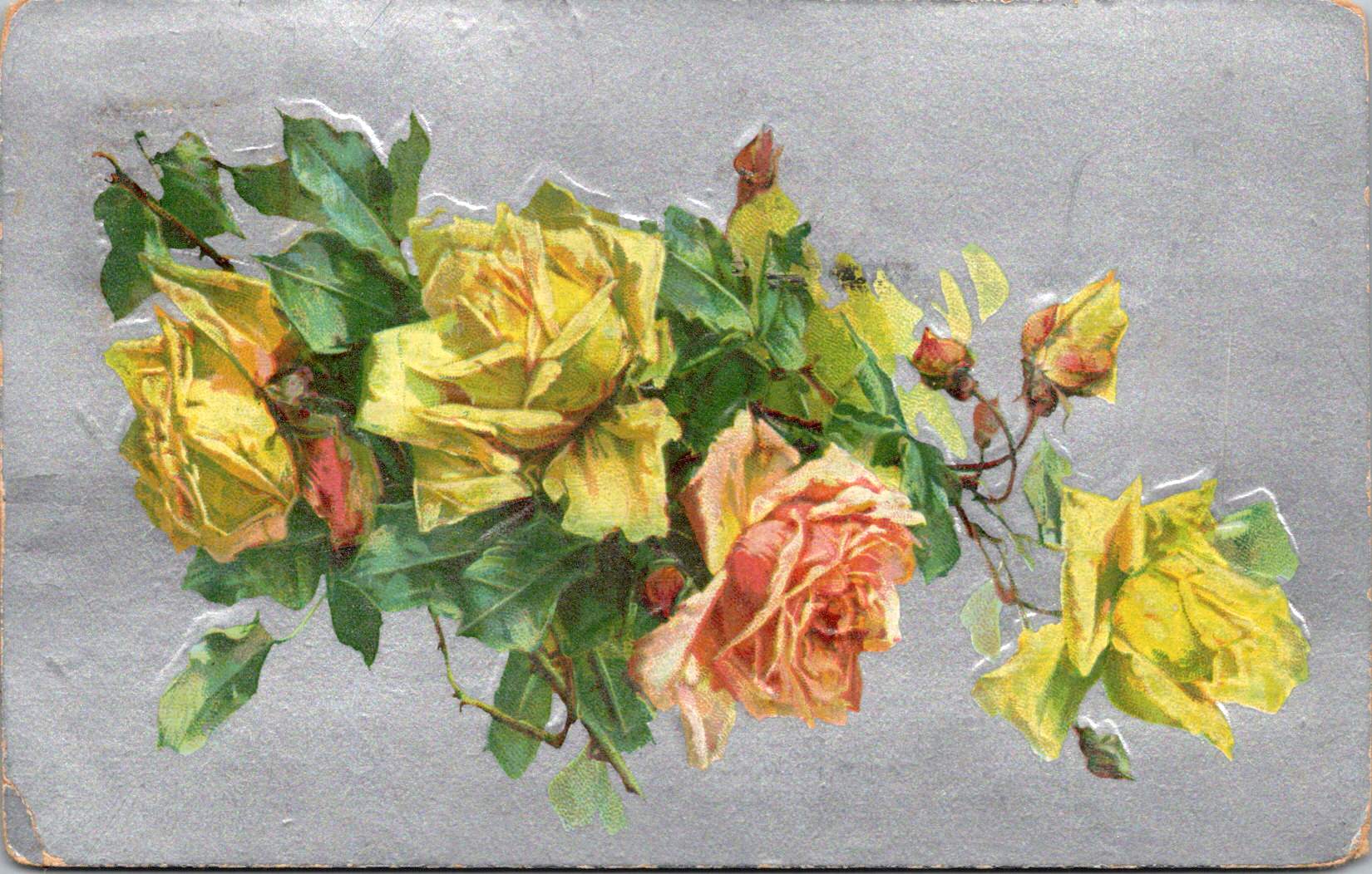
Color Craft
The final featured card offers yellow roses against a silver background, that creates a cooler, more modern luminosity. The yellow blooms—rendered with botanical precision—grow naturally on their stems, emphasizing an organic composition that represents changing sensibilities as the Edwardian era progressed toward what would become Art Deco and modernism.
While Victorian design had favored warm, rich gold tones suggestive of historical richness, the newer aesthetic embraced clarity, brightness, and forward-looking optimism. Yellow—the color of sunshine and vitality—symbolized friendship and joy rather than romantic love, expanding the emotional palette of postcard communication.
These changes in design paralleled broader social transformations. The early 20th century witnessed significant shifts in social mobility, women’s roles, and technological adoption. The rise of department stores democratized consumption of decorative goods, while increasing literacy rates expanded the audience for visual and textual communication. The suffragette movement gained momentum, challenging Victorian gender restrictions. These postcards, with their evolving aesthetics, tracked these social changes in material form.
Technology continued advancing as well. The integration of photography with traditional printing techniques created hybrid visual forms. German printers had pioneered many of these innovations before World War I. American and British printers subsequently developed their own techniques.
The social function of these postcards remained central to everyday life. In major cities, postal deliveries occurred multiple times daily—sometimes up to 12 deliveries in London—creating a communication rhythm somewhat like today’s text messages. This frequent exchange helped maintain connections across the increasing distances created by urbanization and industrialization. As families dispersed geographically, these tangible tokens of remembrance became increasingly important.
Recipients collected their postcards in specialized albums that became objects for social sharing in parlors. These albums—elaborately decorated themselves—transformed private communication into a form of social performance. Visitors could be shown new additions, creating occasions for storytelling about relationships and experiences. A well-filled album demonstrated one’s social connections and cultural participation, serving as a physical social network long before digital versions existed.
Simple Beauties
These postcards survive as artifacts of a time when beauty was considered essential rather than superficial. The Victorian belief that exposure to beautiful things could elevate character and promote virtue gave postcard exchange deeper purpose beyond mere communication. They offered sensory richness—tactile embossing, visual color, and the symbolic associations of flowers—that counterbalanced the sometimes harsh realities of industrial urban environments.
Unlike earlier periods when beautiful objects were primarily reserved for the wealthy, mass-produced postcards allowed people across social classes to exchange and possess small works of art. This democratization of aesthetic experience represented a significant shift in how beauty was distributed socially. The contrast between the expense suggested by the gold backgrounds and elaborate printing and the actual affordability of the postcards was part of their appeal—beauty without extravagance, pleasure without guilt.
These simple beauties represent a unique cultural moment when industrial technology enhanced rather than replaced artistic sensibility, when mass production made aesthetic pleasure more accessible rather than less meaningful.
Their legacy invites us to reconsider how we might integrate beauty into our own communication practices. While we have gained immediacy in our digital exchanges, how might we also retain the sensory richness these physical exchanges provided—the anticipation of delivery, the tactile pleasure of holding a beautiful object, the visual delight of color and form, and the knowledge that someone selected this specific image with you in mind.
The Victorian and Edwardian postcard tradition suggests that communication is enhanced, when wrapped in layers of beauty, symbolism, and care—tangible gestures that engage not just the mind but the senses and the heart.