Romans advised that fortune favors the bold. In Sweden, luck never gives, it only lends. In the United States, the harder you work, the luckier you get. The Arabic proverb says, “Throw a lucky man into the sea and he’ll come up with a fish in his mouth.” A Brit might be lucky at cards, unlucky in love. In Japan, the day you decide to act is your lucky day.
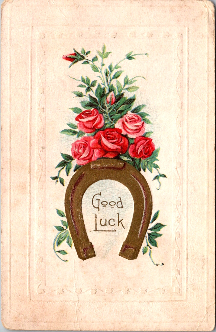
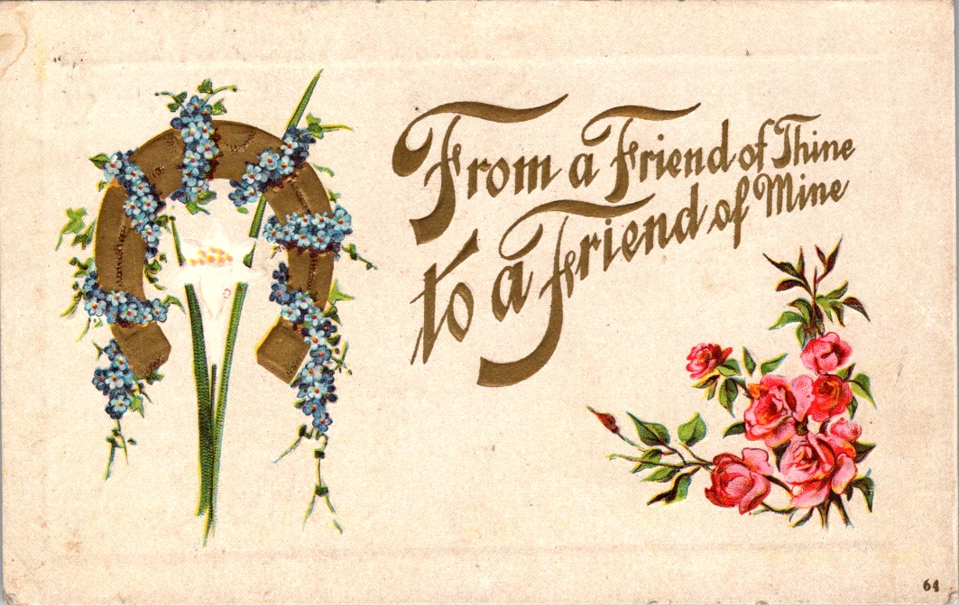
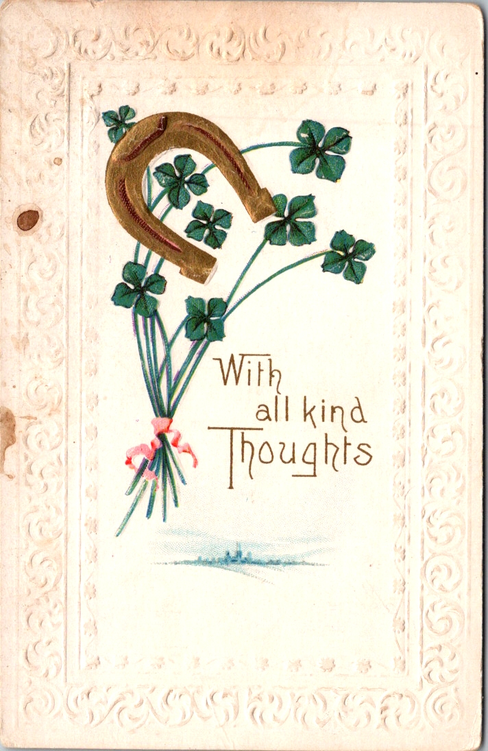
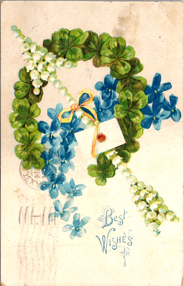
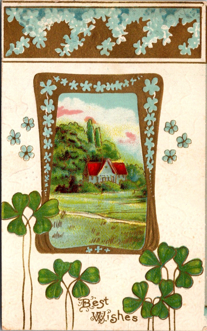
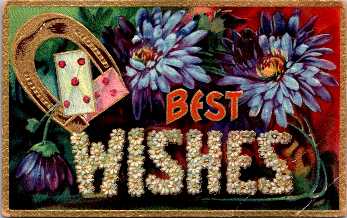
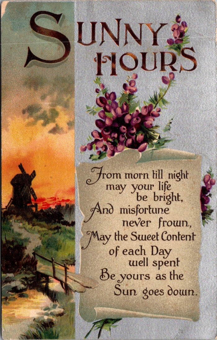
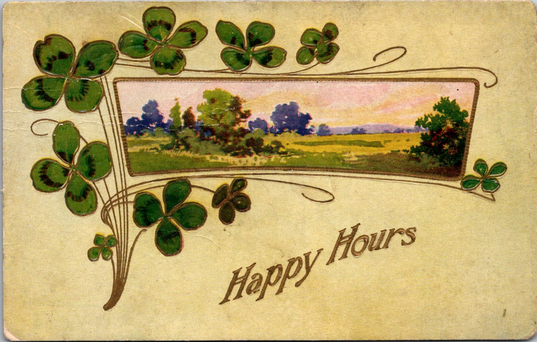
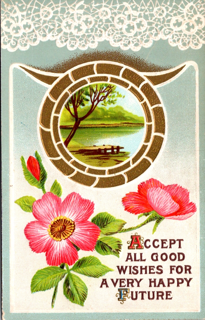
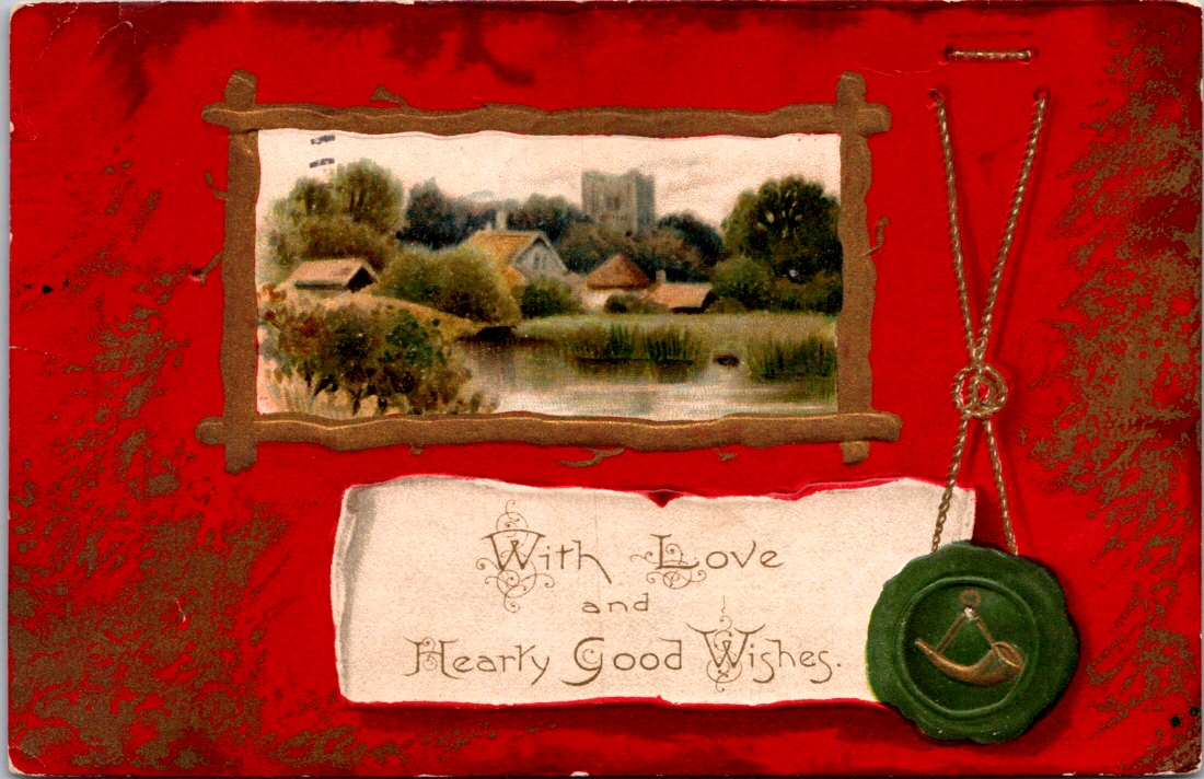
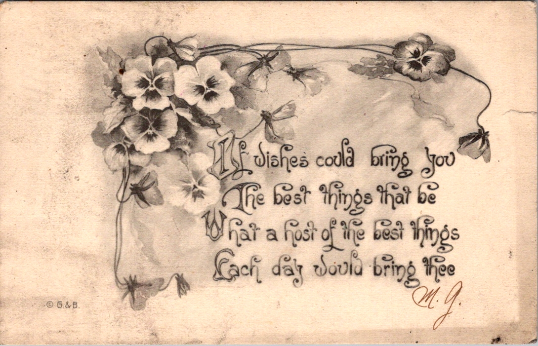
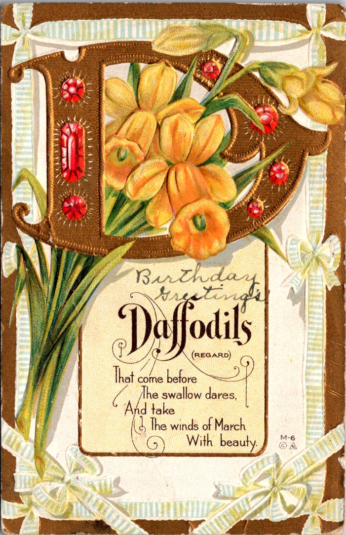
Edwardian postcards had a curious set of symbols to call forth fate and fortune. Horseshoes, shamrocks, roses, and playing cards. Small and slightly worn at the edges, these vintage greeting postcards have traveled more than a century carrying a providential wish.
Only one card in the collection actually says Good Luck. The rest offer best wishes, happy hours, and kind thoughts from me to you. As we’ll see, luck is borne of relationships (and circumstances) lifted by the charitable wish for health, wealth, and wisdom.
Some say that luck can be earned, but only a fool pursues it outright. We daydream about what fortunes may be in store, and sometimes ignore the simple sparkles that appear each day. We know, of course, that there are no free lunches. Yet, we are admonished to never look a gift horse in the mouth.
The bold assume they earned their lucky breaks. The humble suspect they’ve borrowed fortune temporarily. The superstitious are not entirely sure we should discuss it. Luck is where fate and intent find common cause, usually in the context of close friendships.
Old English had no luck. It used wyrd instead, which pointed to fate and destiny. Wyrd is the root of our word weird, which may indicate how people felt about fate. It was uncanny, inevitable, and perhaps divine. You didn’t pursue wyrd. You experienced it through awe and fear.
Somewhere around the 15th century, luk and gelucke drifted in from the Dutch and Low German. Luck was looser and more manual. Like weather, luck favored preparation and was possible to influence if you knew the right charms. The horseshoe went up above the door. The rock went in your pocket. If luck is not fate, if it is not fixed in advance, then perhaps you can do something about it. Perhaps it can be courted.
The lucky person is not the one who waits but the one who steps into the room. This is luck as a reward for courage, or at least for motion. Fate deals the cards, and we each have a hand to play.
Fortune favors the bold — fortes fortuna adiuvat ~ Terence, Roman playwright, around 151 BCE
Luck is what happens when preparation meets opportunity, and preparation is something you control. The solo pursuit of fortune is a genuine drive.
The harder I work, the luckier I get. ~ Samuel Goldwyn
But the shamrock gently disagrees. Four-leaf clovers are natural anomalies, not personal achievements. We can’t earn one, only discover it. Even if you can court luck, even if work and boldness can pull it toward you, it is never yours to fully command.
Luck never gives; it only lends. ~ Swedish proverb
Some people simply have it, inexplicably, in ways that have nothing to do with preparation or boldness or a rabbit’s foot.
Throw a lucky man into the sea, and he will come up with a fish in his mouth. ~ Arabic proverb
Some observe that luck is a finite resource and can be unwisely traded away. This may or may not be true, but as a matter of human priority it is clarifying. We each get chances to test our luck.
Lucky at cards, unlucky in love. ~ English proverb
The tension between fate and will, between earned luck and divine luck, is located in a moment of commitment. The lucky day is not the day something falls in your favor. It is the day you decide it might be worth the effort.
The day you decide to do it is your lucky day. ~ Japanese proverb
Whatever the senders intended and however the recipients replied, these cards demonstrate how providential language holds us together in anticipation of something wonderful just ahead. The possibility that things might go our way.
The symbols of luck nested together in relationship, in abundance, in the living world — a horseshoe wreathed in flowers, overflowing with roses, or flanked by shamrocks — is not an accident of Victorian design sensibility. It draws on the ancient wisdom that friends are the true source of life’s lucky breaks. Love does the work and luck gets the credit.
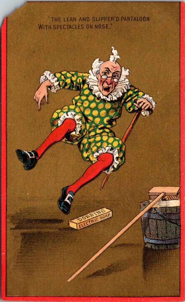
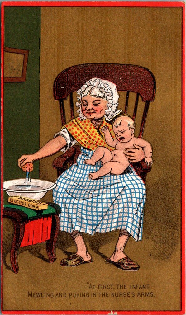
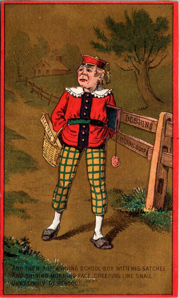
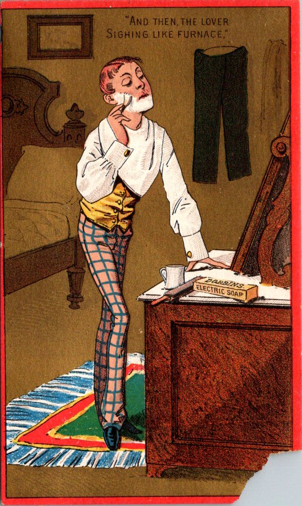
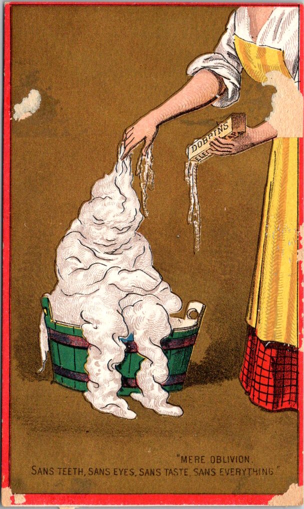
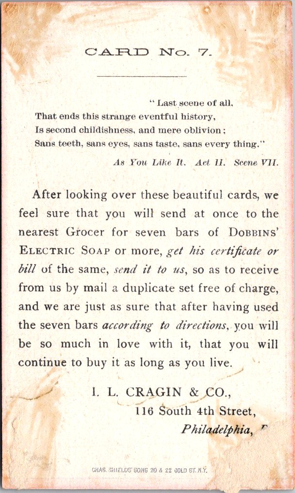
In Shakespeare’s As You Like It, Jacques delivers his monologue in Act II, Scene VII, observing human life with world-weary detachment. He sketches out seven distinct chapters of a human life, from mewling infancy to toothless old age, with equal parts affection and irony. One of the most quoted passages in all of Shakespeare, by the 1880s it was deeply embedded in popular culture — the kind of verse that some households knew by heart.
“All the world’s a stage, and all the men and women merely players.”
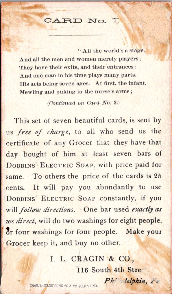
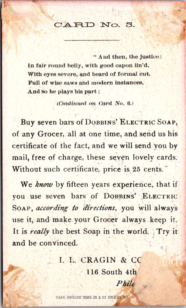
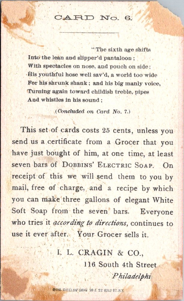
Dobbins’ Electric Soap was manufactured by I. L. Cragin & Co. of Philadelphia and had been on the market since the mid-1860s. By the early 1880s, the company was advertising heavily through trade cards, chromolithographic collectibles that matched the indulgences of the Gilded Age. Cragin’s innovation was to produce not a single card but a series of seven that required the collector to buy a bar of soap each time. Get the certificate from your grocer, and the full set arrived by mail free of charge.
Philly, 1880s. Shakespeare meets laundry.
Front: Each card is a vivid chromolithograph on a warm gold ground with a bold red border, a consistent visual identity that makes the cards a set. The figures are drawn in a coarse comic style, expressive and exaggerated, with each character placed in a domestic or outdoor scene with a bar of Dobbins soap nearby.
First, a round-faced nurse in a white mobcap seated in a rocking chair, holding a squirming naked infant over a washbasin. Card Two shows a sulky schoolboy in a red jacket and yellow-green plaid knickerbockers, satchel over one shoulder. The lover on Card Three is a lanky figure in a gold waistcoat and plaid trousers, leaning against a bureau in a disheveled bedroom.
The soldier on Card Four is wild-haired and red-faced, bent over a green barrel-tub in his uniform trousers and braces, and a sword against the wall behind him. Card Five presents a rotund man in a blue coat, leaning back in his chair with the serene self-satisfaction of someone accustomed to receiving gifts. Card Six is an elderly Harlequin figure in a polka-dotted costume with red stockings, tumbling in mid-air. The final card is a woman in a yellow apron leaning over a green wooden tub, and a billowing human figure made entirely of suds.
Reverse: Black text on cream stock with the full Shakespeare speech across all seven cards, each picking up the verse where the last left off. The final card identifies the source: As You Like It, Act II, Scene VII.
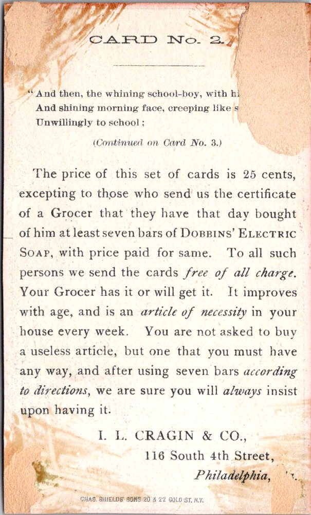
Below the verse, each card runs a version of the same offer in slightly varied language: collect a grocer’s certificate for each bar purchased and mail seven of them to 116 South 4th Street, Philadelphia. Without the certificate, the price for the set is 25 cents.
Each card presents a few product features: no wash boiler, no rubbing board, no house full of steam. Card Four warns against unscrupulous imitations and instructs buyers to ask for Dobbins’ Electric Soap by name. The printer’s imprint for Chas. Shields’ Sons, 20 & 22 Gold Street, New York appears at the foot of each reverse.
Production: These high-quality commercial chromolithographs likely date to the early 1880s, after the business had been in operation for more than a decade. The color registration is precise throughout, the figure work confident and expressive, and the gold-and-red palette gives the set a unified identity that still reads as a coherent series. The illustration style and rich production values mirror the opulent aspirations of the era.
Collectibility: Complete sets of themed trade card series are uncommon; most were distributed individually and rarely survived intact. The Shakespeare framework, the quality of the printing, and the conceptual ambition of the campaign make this set particularly distinctive. It appeals to trade card collectors, Victorian advertising historians, Shakespeare enthusiasts, and ephemera collectors with a taste for the literary and the delightfully absurd.
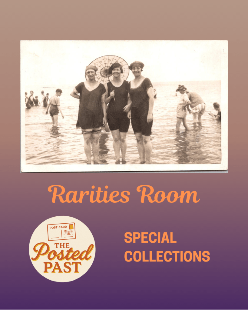
new Rarities Room
Our new space for the old stuff that no one ever threw away – yay!
Nina makes a long distance deal with a dear friend, and George finds a new use for old memories.
Nina arrived early at the coffee shop near campus in Tempe. The drive up from Tucson was faster than she expected. Nora slid into the booth at 9am sharp. “You’re glowing,” Nina said.
“Nerves.” Nora grinned. “Two years in Taipei, three weeks to learn Mandarin.”
They ordered. Nina nudged a package across the table. She’d wrapped the book of postcards the night before, Navajo Textiles, each page a detachable card with a different striking design. Almost too good to take apart.
Nora opened it and smiled. “These are perfect. They will remind me where I came from. And, we can keep them! I’ll send them back to you.”
She flipped through the cards. “My grandmother did this. Sent us postcards from every trip. Maybe that’s why I love to travel.”
“I want to hear all about it,” Nina said. “Something to look forward to in the mailbox.”
“Deal.”
They talked until Nora had to leave for meetings. Nina hugged her friend outside, watched her disappear into the parking garage. On the drive back to Tucson, she thought about when she might travel again. Someday.
In Minnesota, George came across a box of old stationery while cleaning out a drawer in the office. He’d been ignoring this stuff too long, but it had to be done. He was surprised to find a bunch of notecards and envelopes, postcards from their own travels, even some stamps. Jennie must have tucked them away years ago, then forgotten.
He shuffled through the stack, smiled, and thought about their grandchildren.
Emma, sixteen, newly licensed, texting him sunset photos. Jack, thirteen, reading everything, and his own library growing. Lily, nine, from whom he routinely received animal drawings in manila envelopes.
He wrote to Emma first:
Found this sunset and thought of you – keep your eyes on the horizon! Love, Grandpa
Then, to Jack:
You can find a library in every place. Hope you go some day, and your collection grows. Love, Grandpa
Finally, to Lily, though his hand was aching:
For my favorite artist: a cat to inspire your next drawing. Keep sending pictures. Love, Grandpa
He addressed the cards and peeled the Forever stamps from their yellowed backing. The afternoon sun was glinting off the glassy surface of the snow as George walked down the drive and out to the mailbox. These should get there before Christmas, he thought. Next he’d knock the icicles off the eves over the porch steps, then make dinner.
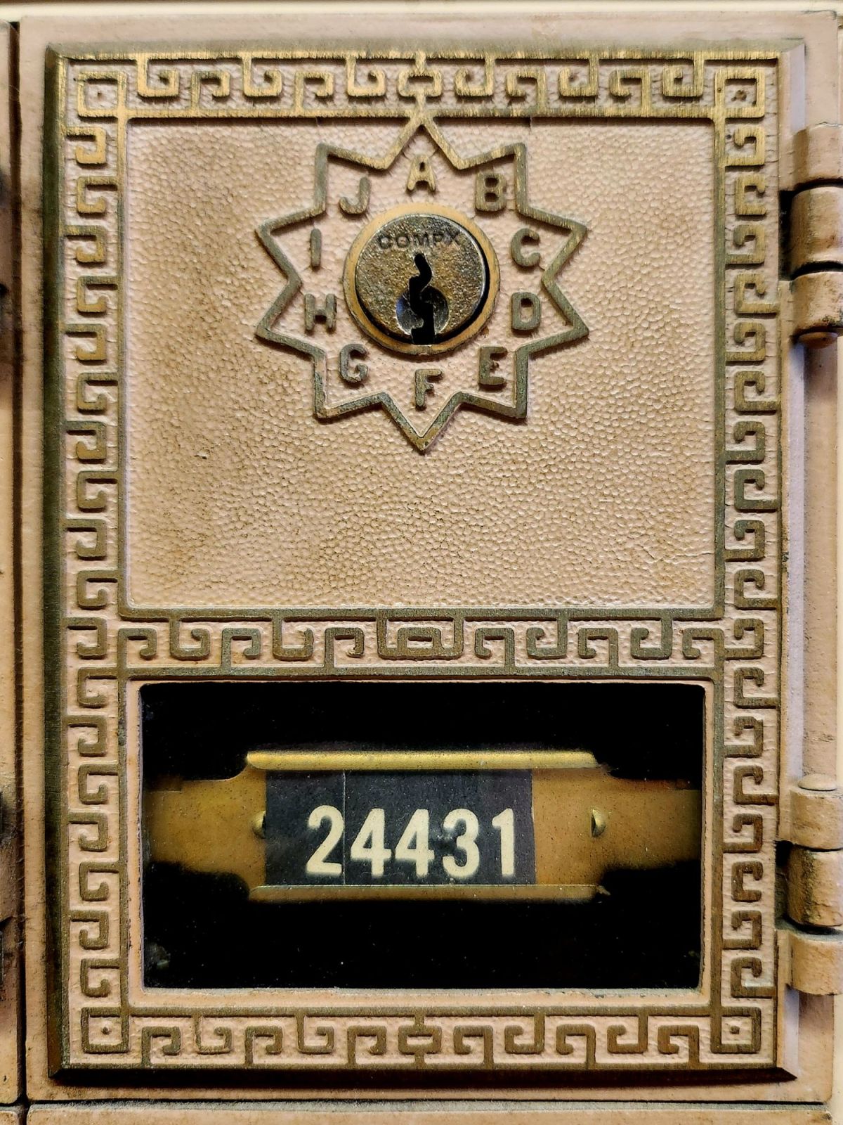
This is my new front door. Think of it as a study, a garden, a music room, and a studio. My aim is to make it the world’s smallest artist’s retreat.
Box #24431 measures only 3 x 5.5 inches. But like the best spaces, it’s about what happens inside. This little metal door represents a vision I have kept tucked away for a very long time.
Make a place where people want to be and become creative.
A place where creative lives unfold slowly, where stories accumulate over time, where the daily practice of writing becomes a way of being present to the world. In other words, I want to make a place for you (and me).
Maybe you have a book in you. Maybe your life feels like a book being written right around you. Maybe what is calling isn’t a workshop or deadline, but simply the habit of putting words on paper and sending them to someone who will read them with care and respond. Sometimes the most important writing happens in the margins of our days, in postcards and texts, in the small mechanics of turning experience into language and expressing it.
I love that place between sending and receiving, writing and reading, and the exchange of thoughts among people. It’s about circulation. Our stories are the lifeblood feeding and fueling our times. Cultural movements are made through the messages exchanged between us, much more than the headlines would have us believe. Word-of-mouth, greeting cards that travel door-to-door, book reviews, weather reports, hotel recommendations, and the whispered news—crossing distances for us, even over generations and through the delicate spaces of relationships as they go.
Writing is a practice. Like meditation, walking, and tending a garden, it is one way we examine our lives unfolding, sentence by sentence, year by year. Every little missive you write becomes part of that practice—a way of paying attention to what matters, of noticing the small moments strung together. Meanings that can be folded up like origami and written in haiku.
What kind of spaces do writers need? Spots to sit comfortably for a while, suitable room temperature, good lighting, and forgiving technology. Writers also lean on insight, desire, intention, or motivation, and before that, a well-worn habit or behavior. The daily practice of showing up to the page, even when the page is just a postcard.
I say, let’s start there. You handle the writing setup and the ideal conditions—I don’t have that kind of room yet! I’m here for the correspondence. Both of us engaged in noticing, finding the words (or not), and reaching out every so often.
Send me a postcard—the older and odd, please! Your card will be added to my collection and I’ll keep your particulars on file. No digital list here, just a vintage recipe card box on my desk where handwriting lives.
And, if you plan to finish that book? Yes, I am prepared to serve as your humble first reader. Use a typewriter or your finest small script, and you may need more than one postcard. Your story (or any moment from it) is welcome here.
Write to me at: The Posted Past, P.O. Box 24431, Tempe, AZ, 85285.
Include your address and I will respond in kind.
+++
We’re not Luddites 🙂 You can also hit the SUBSCRIBE button on this page to receive The Posted Past every Wednesday in your inbox. Your generosity is the difference between the free and the $5/month options. Thank you! New essays begin in September.
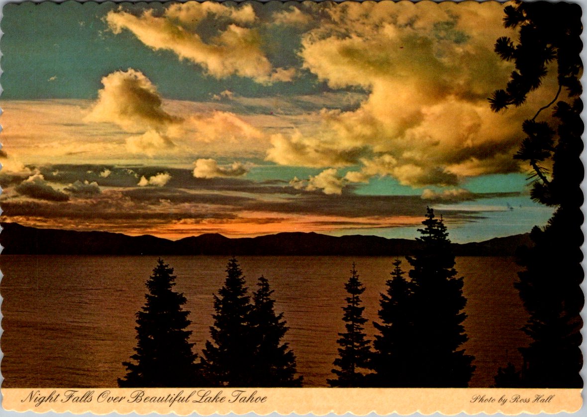
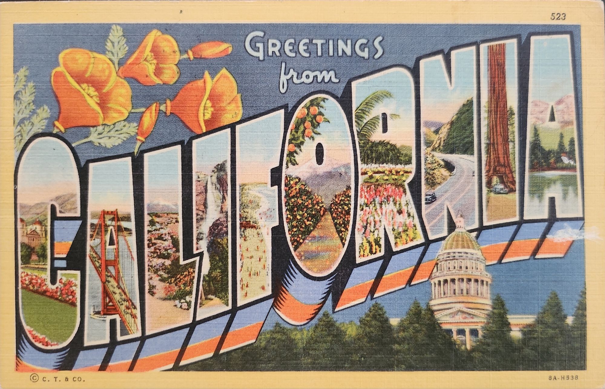
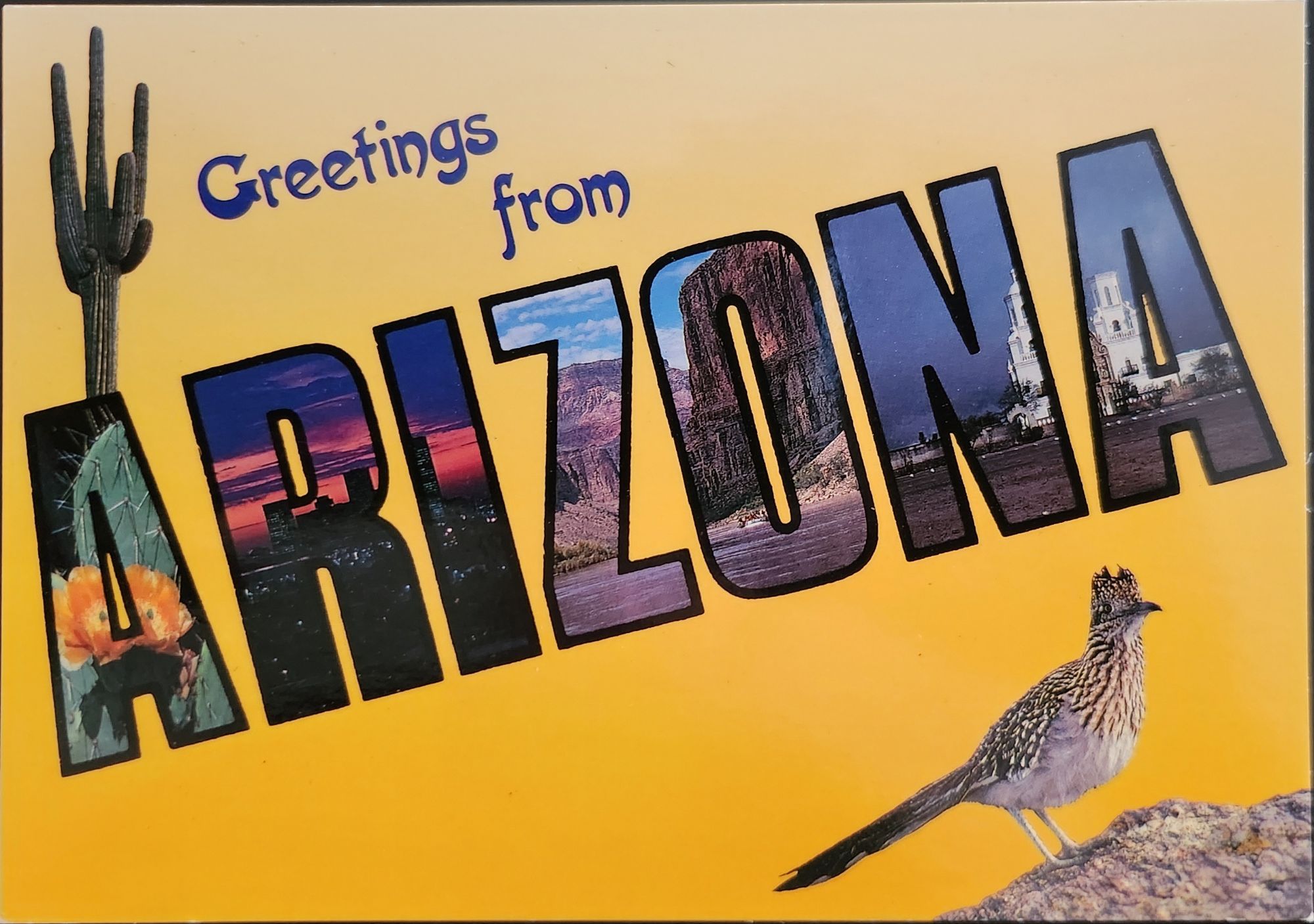
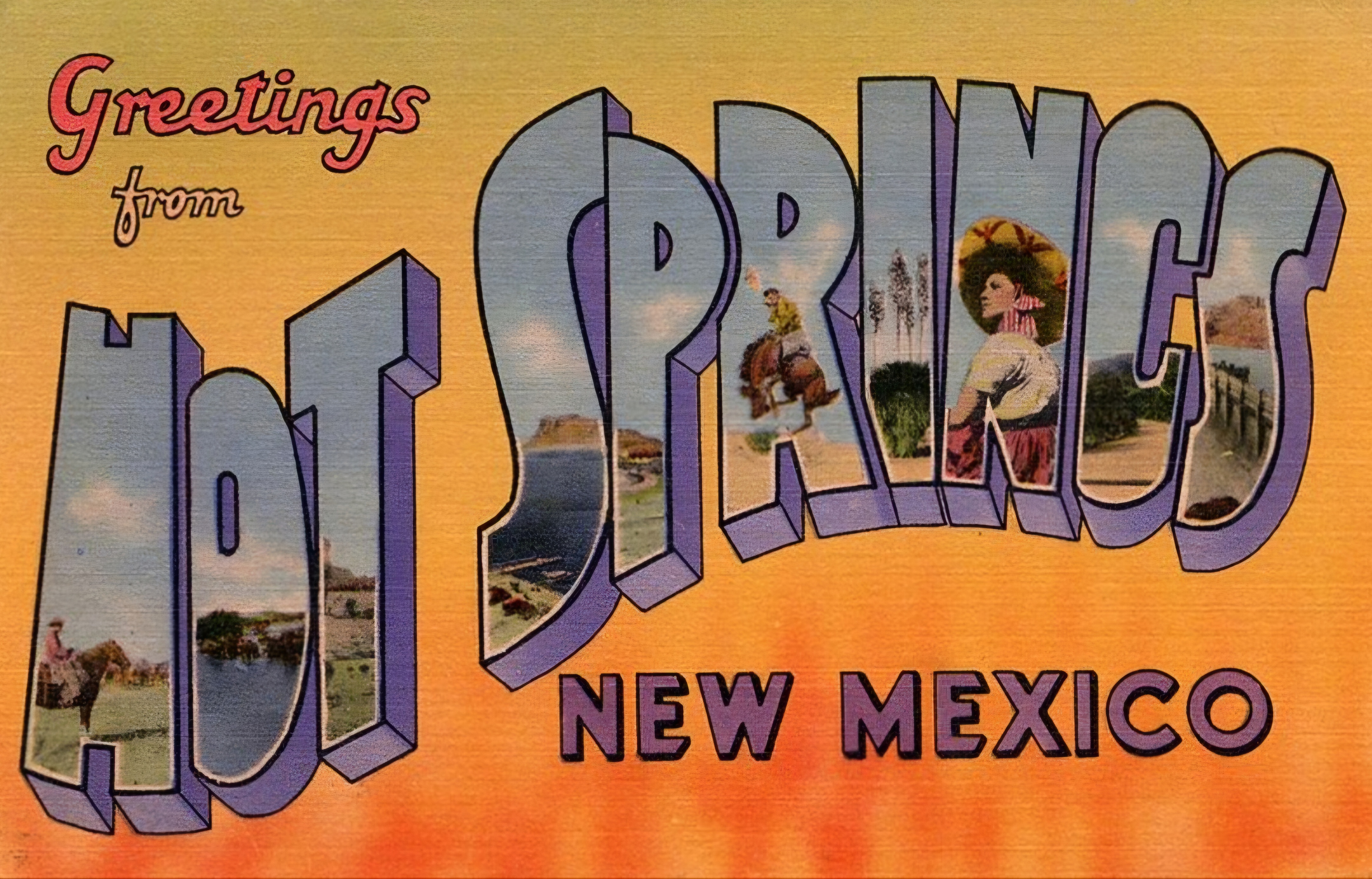
‘Greetings from…’ designs have rippled through visual culture for well over a century, telling the stories of how we see ourselves and our places.
A stone dropped into still water creates concentric circles that radiate outward. This physical phenomenon is a powerful metaphor for how cultural ideas spread through time and across media, especially visual motifs of place. Certain visual vocabularies persist, evolving with technologies while maintaining essential characteristics.
American statehood, regional identity, and natural heritage have rippled through various media over the past century. Iconic ‘large letter’ postcards, commemorative postal stamps, murals and more—all help us trace a fascinating journey of cultural transmission through the broader currents in American history, industrial development, and visual communication.
Gruss Aus… from Germany
“Greetings From…” postcards emerged in 1890s Germany. The early examples of Gruss Aus cards featured the name of a location rendered in bold, three-dimensional letters with miniature scenes of local landmarks contained within. More common postcards of the day feature detailed illustrations of castles and later photographs. This new design cleverly packed maximum visual information into the limited space, creating an instantly recognizable format that would soon spread internationally.
New American Icons
The transmission of this visual language to America came through a German immigrant named Curt Teich, who arrived in the United States in 1895. After establishing his printing company in Chicago in 1898, Teich would transform American visual culture through the mass production of postcards. Following a visit to Germany in 1904, he successfully imported the Gruss Aus style to the American market, adapting it to suit American sensibilities and landscapes.
The true flowering of Teich’s vision came in 1931 with the introduction of his linen-textured postcards. Printed on high-quality paper with a distinctive fabric-like texture, these cards employed vibrant colors and airbrushing techniques that created a hyperreal aesthetic. The technical innovation of the linen card allowed for faster drying times and more saturated colors, resulting in postcards that depicted America in an optimistic, idealized light—a stark contrast to the harsh realities of the Great Depression era in which they first appeared.
Teich’s business savvy was as important as his technical innovations. He employed hundreds of traveling salesmen who photographed businesses and worked with owners to create idealized images for postcards. This approach not only generated business but also shaped how Americans visualized their own landscapes and communities. The Curt Teich Company would eventually produce over 45,000 different linen postcard subjects in just two decades.
The visual language of these postcards—bold lettering, vibrant colors, and idealized scenes—became firmly embedded in American visual culture during the 1930s through 1950s. As automobile ownership increased and the highway system expanded, these postcards played a crucial role in shaping Americans’ understanding of their own geography and national identity. They were both records of places visited and aspirational images of places to be seen.
State Birds and Flowers
Parallel to the development of the large letter postcard, another form of state-based visual identity was taking root—the formal designation of state birds and flowers. Most American states adopted these symbols between the 1920s and 1940s, often through campaigns involving schoolchildren, women’s clubs, and conservation organizations.
These officially designated natural symbols provided another vocabulary for expressing regional identity, one rooted in the natural world rather than the built environment. While large letter postcards typically highlighted human achievements—city skylines, hotels, roadways—state birds and flowers emphasized the distinctive natural heritage of each region. Together, these complementary systems of regional representation provided Americans with a rich visual language for their diverse nation.
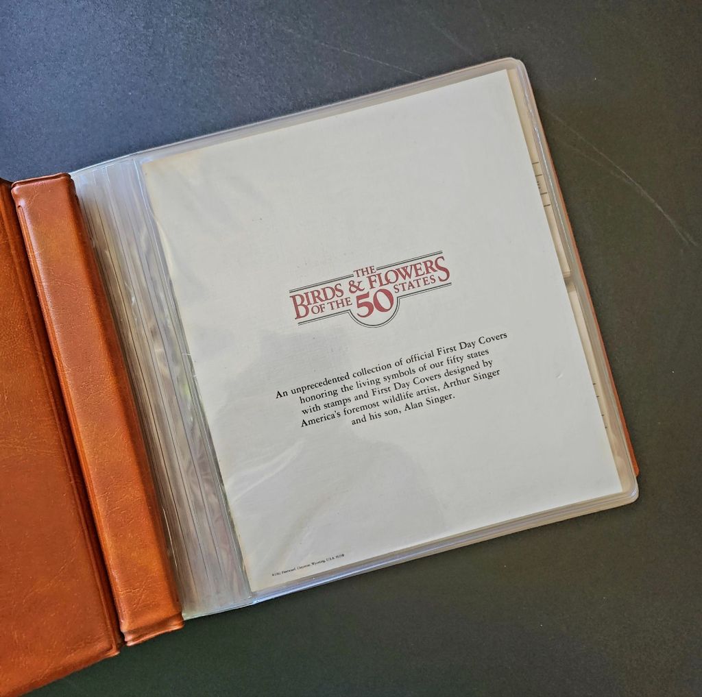
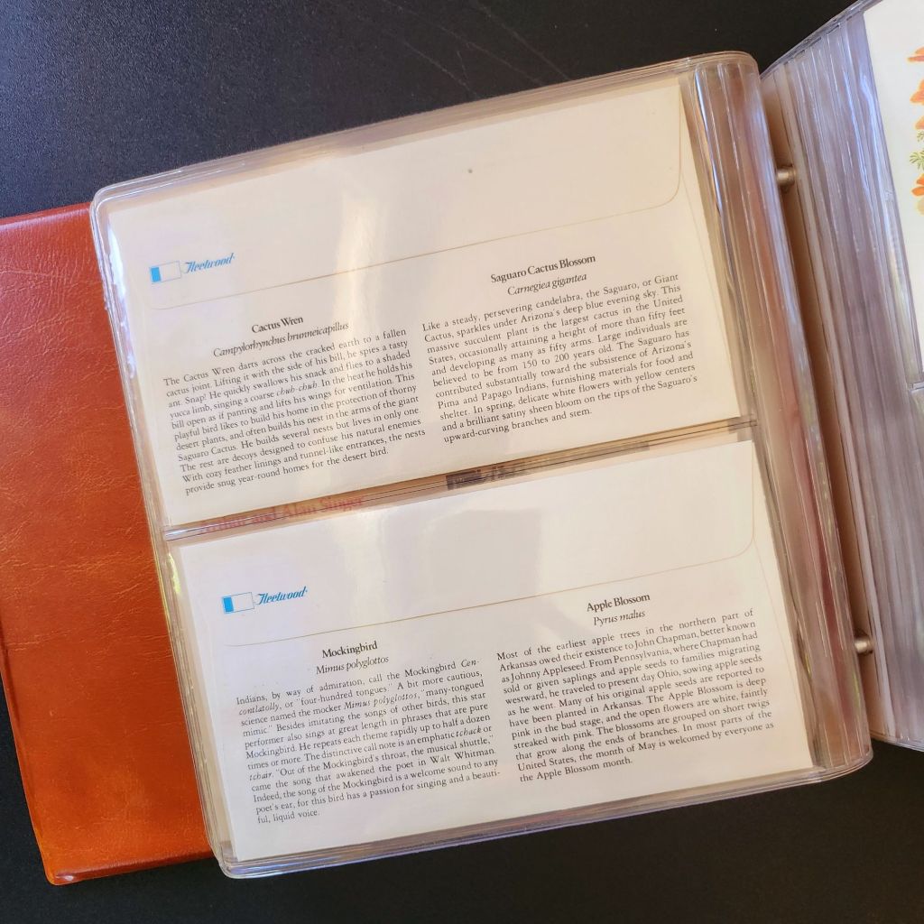
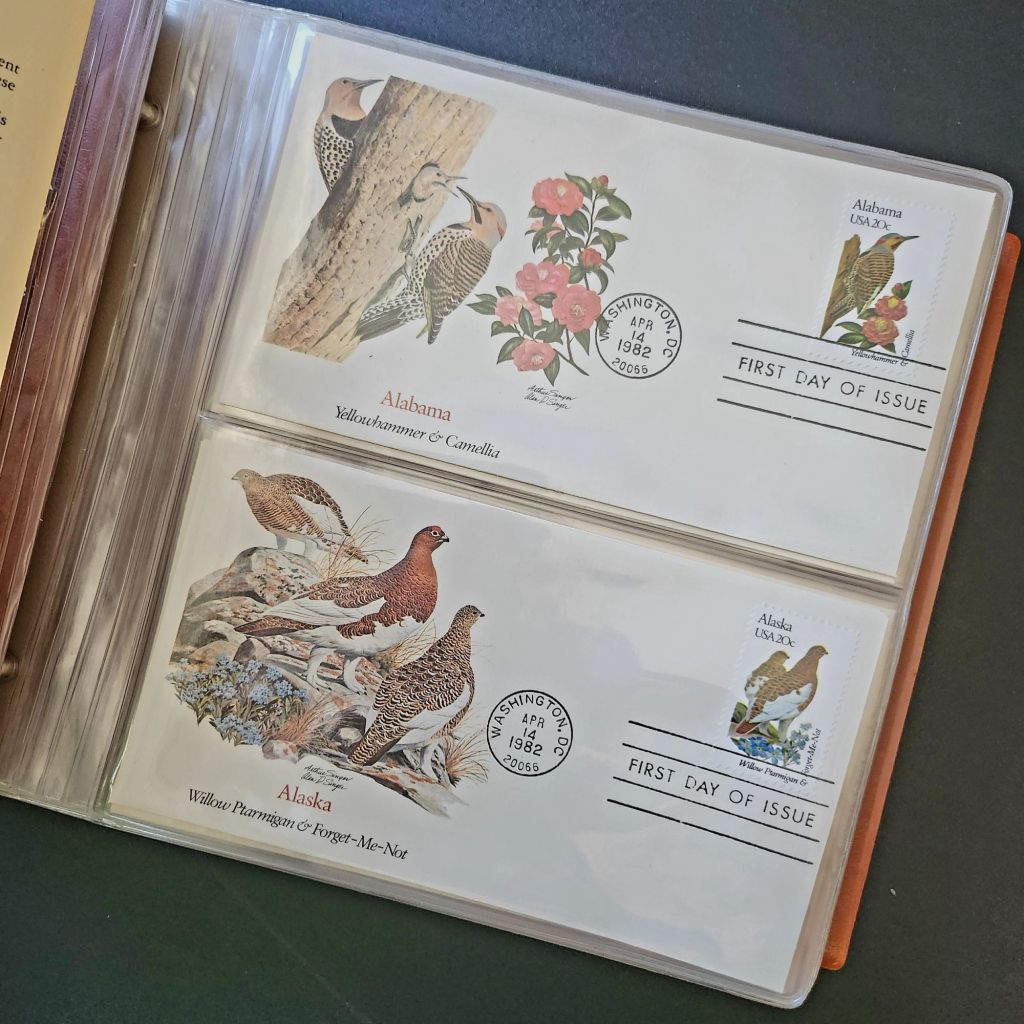
In 1978, the Fleetwood company commissioned father-son wildlife artists Arthur and Alan Singer to create 50 original paintings of state birds and flowers. These watercolor paintings caught the attention of U.S. Postal Service officials, who recognized their exceptional quality and decided to feature them on commemorative stamps. Released on April 14, 1982, the 20-cent State Birds and Flowers stamp collection was another big moment in the ripple effect.
Arthur Singer painted the birds while his son Alan rendered the flowers, creating unique artwork for each of the 50 stamps. The collaboration between father and son added another dimension to this cultural transmission—the passing of artistic traditions and approaches from one generation to the next.
The Fleetwood company published a complete album featuring First Day Covers of these stamps. These decorative envelopes included additional information about each state’s natural heritage, creating a beautifully bound volume that was both aesthetically pleasing and informative. The Birds & Flowers of the 50 States album is now a cherished collectible, a visual catalog of national natural heritage in a single, beautifully presented format.
Greetings from the Post Office
Twenty years later, the visual language of the large letter postcard experienced a revival through another stamp collection. On April 4, 2002, the USPS issued the ‘Greetings from America’ stamps, designed by Richard Sheaff and illustrated by Lonnie Busch. These stamps paid direct homage to the large letter postcards of the 1930s and 1940s, recreating their distinctive style for a new generation.
Each of the 50 stamps featured the name of a state in large, three-dimensional letters containing images of iconic landmarks and scenic vistas. The stamps were initially released as 34-cent denominations, but due to a rate change, they were reissued with 37-cent denominations on October 25, 2002. Here is another circular moment—a postal medium paying tribute to a postcard tradition that had itself been a popular means of commemorating places visited.
These stamps connected with older Americans who remembered the original postcards. Younger generations encountering the style for the first time recognized both the nostalgic and contemporary appeal. The vibrant colors and bold, three-dimensional lettering still effectively communicated a sense of place and regional pride, proving again the resilience of this visual vocabulary.
Even Larger Letters
Artists Victor Ving and Lisa Beggs took the large letter postcard to a whole new scale. Starting in 2015, the Greetings Tour has produced dozens of murals that transform the two-dimensional postcard design into monumental public art.
A grand dimensional leap—a design meant to be held in the hand scaled to the size of a building. The murals maintain the core visual elements of the large letter design while incorporating contemporary references and local touchstones. In a delightful twist, these murals have themselves become tourist attractions with visitors posing for social media. The postcard mural is now a backdrop for new images to be shared globally.
The artists also create custom digital designs for corporations, events, and retail spaces, maintaining the vintage aesthetic while adapting it to contemporary contexts. This commercialization represents another ripple in the cultural transmission of the large letter design, as it moves from public art back into the commercial realm that originally produced the linen postcards.
Digital Doppelgangers
As graphic design software became increasingly sophisticated and accessible in the late 20th and early 21st centuries, the visual language of large letter postcards found new life in digital recreations. Graphic design tools enable designers to quickly recreate the distinctive three-dimensional lettering and image-filled characters of the classic postcards.
AI Generation
Online design platforms have further opened access to this aesthetic, offering templates that approximate the large letter style without requiring specialized skills. Now small businesses, community organizations, and individuals can incorporate elements of this visual tradition into their communications, expanding the reach of this design vocabulary beyond professional designers.
With a phrase like “create an image of a vintage large letter postcard from Arizona,” most anyone can generate a decent design in seconds. Like the old days of digital clip-art, the initial attempts lack craftsmanship and historical accuracy. Still, they are a new democratization of this visual vocabulary, making it more accessible to professional designers and enthusiasts alike, though perhaps for different reasons.
This latest development completes a fascinating loop—from specialized industrial printing processes that required substantial investment and technical expertise, to digital design tools requiring professional training, to AI generation requiring only the ability to formulate a design concept and the text prompt. With each technological advancement, the barriers to producing these distinctive visual representations have lowered, while the core elements of the design has persisted.
Visual Persistence
From German Gruss Aus postcards to AI-generated images—our journey demonstrates the remarkable resilience of certain visual vocabularies across time, technologies, and cultural contexts. Despite dramatic changes in production methods, from specialized lithographic presses to neural networks, the essential visual grammar of these designs remains recognizable.
This persistence has a woven quality—the ability to render and replicate a sense of place over time. Whether in linen postcards, commemorative stamps, public murals, or digital images, the large letter design and state symbol motifs combine to convey regional identity and pride over time. Their continued relevance suggests that certain visual solutions, once discovered, become an architecture that generations continue to appreciate and adapt for new uses.
We also feel the ripple effect in the broader patterns of American history— immigrants bringing skills and technology to American shores, industrial innovation creating new visual possibilities, the automobile age changing how Americans experienced nature and themselves, and digital technology transforming how we create and share images. Through it all, the distinctive visual language pioneered by Curt Teich and others continues to evolve.
What new ripples lie ahead? Perhaps augmented reality will allow us to step into these designs. Or new materials and technologies will adapt them yet again for uses we don’t yet comprehend. Whatever comes next, we know that cultural transmission does have a distinguishing mark—it ripples outward in both calculable and unexpected ways, influenced by technology, economics, and human inspiration, creating patterns that can be traced across generations.
For Additional Reading
Meikle, Jeffrey L. (2016). Postcard America: Curt Teich and the Imaging of a Nation, 1931-1950. University of Texas Press. Publisher’s page
“The Immigrant Story Behind the Classic ‘Greetings From’ Postcards.” Smithsonian Magazine. (2018). Read online
Early postcards represent a convergence of innovations in printing, photography, and postal delivery—each with its own players, craft, and history. The emergence of the simple picture postcard depended on a complex international network of industries, technologies, and regulations developed in the prior century.
Art for the Masses
The development of chromolithography in the late 19th century provided the technological foundation for colorful mass-produced postcards. Though lithography itself dated back to 1796, when Alois Senefelder developed the process in Munich, the refinement of color lithography reached new heights in the 1870s-90s, with different national styles emerging.
German printers particularly mastered the technique of creating separate limestone printing plates for each color, allowing for vibrant multi-color images that previously would have required expensive hand-coloring. A typical color postcard might require five to fifteen separate printing runs, with perfect registration between colors. This level of precision required specialized equipment and highly trained craftsmen.
German chemical industries produced superior inks and dyes, giving their postcards more vibrant and stable colors than competitors. Companies like BASF and Bayer, originally founded as dye manufacturers, provided innovative colorants specifically formulated for printing applications.
The German city of Leipzig emerged as a center of printing excellence, with firms like Meissner & Buch establishing international reputations for quality. German chromolithography was so superior that even American publishers would often have their designs sent to Germany for printing, then shipped back to the United States for distribution—at least until tariff changes in 1909 made this practice less economical. Publishers like Raphael Tuck & Sons maintained offices in Germany despite being headquartered in London, simply to access German printing expertise.
While Germany led in technical quality, French postcards developed a reputation for artistic sophistication. Paris publishers like Bergeret and Levy et Fils produced cards featuring Art Nouveau styles and artistic photographic techniques. The French market also developed distinctive “Fantaisie” postcards featuring elaborate designs with silk applications, mechanical elements, or attached novelties. These cards pushed the boundaries of what a postcard could be, turning functional communication into miniature works of art.
British publishers like Raphael Tuck & Sons, J. Valentine & Co., and Bamforth & Co. showed particular commercial acumen. While they didn’t match German printing quality or French artistic sensibility, British firms excelled at identifying market opportunities and consumer trends. The British pioneered specialized categories like the seaside postcard and led in developing postcards for specific holidays and occasions.
Photographic Reality
While lithographic postcards dominated the market, photography increasingly influenced postcard production. The collodion wet plate process (1851) and later the gelatin dry plate (1871) made photography more accessible. The development of halftone printing in the 1880s allowed photographs to be reproduced in print media without manual engraving, creating more realistic imagery.
A revolutionary moment came in 1903 when Eastman Kodak introduced “Velox” postcard paper. This pre-printed photographic paper had postcard markings on the back and a light-sensitive photo emulsion on the front. Combined with Kodak’s 3A Folding Pocket camera, which produced negatives exactly postcard size (3¼ × 5½ inches), this innovation created the Real Photo Postcard (RPPC).
The acquisition of Leo Baekeland’s Velox photographic paper company in 1899 for $1 million provided a crucial technological component. Velox paper could be developed in artificial light rather than requiring darkroom conditions, had faster developing times, and produced rich blacks and clear whites—all critical qualities for postcard production.
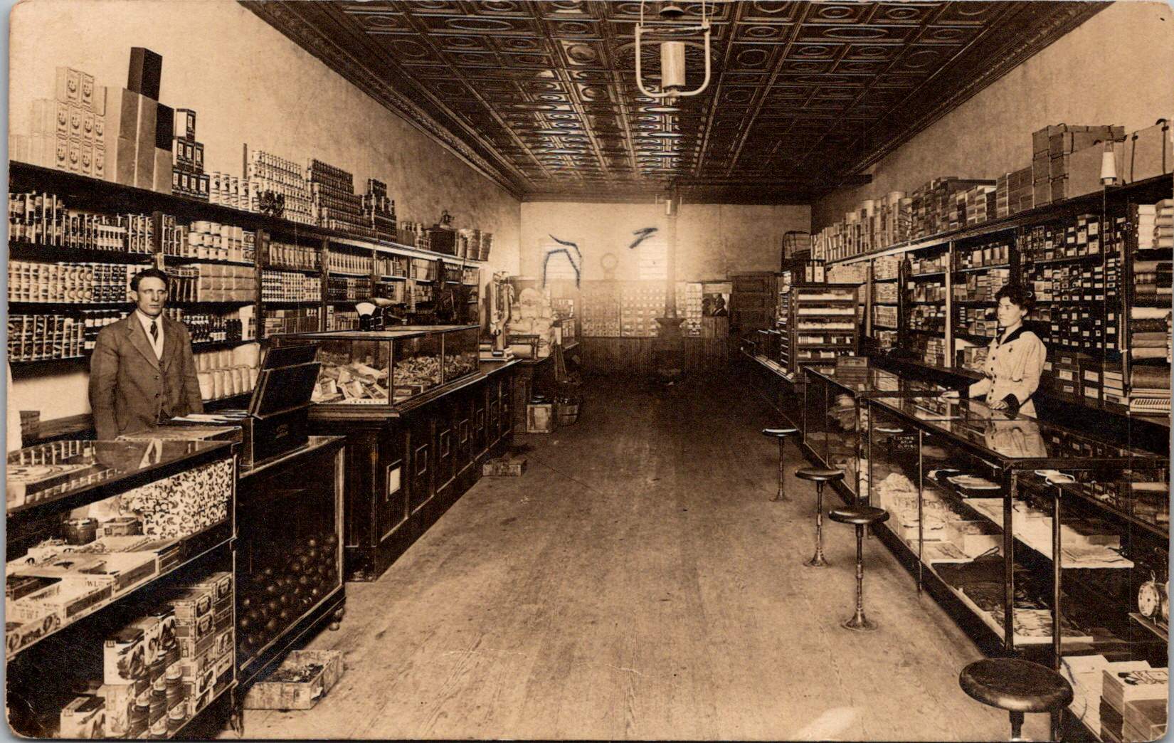
The RPPC format found particular success in America, where the vast geography meant many small towns would never appear on commercially printed postcards. Local photographers throughout the country created RPPCs of main streets, businesses, schools, and community events, documenting American life with unprecedented comprehensiveness.
International Postal Agreements
Even the most beautifully produced postcard would be meaningless without an efficient system to deliver it. The standardization of postal systems in the late 19th century created the infrastructure necessary for postcards to flourish.
A watershed moment for international mail came with the Treaty of Bern in 1874, establishing the General Postal Union (later renamed the Universal Postal Union or UPU). This organization created the first truly international postal agreement, initially signed by 22 countries, primarily European nations. The United States joined the UPU in July 1875, connecting the American postal system to the standardized European networks. The U.S. had introduced its own government-issued postal cards in 1873, but joining the UPU meant these could now be sent internationally under consistent regulations.
Several key UPU Congress developments shaped the postcard’s evolution. The 1878 Paris Congress renamed the organization to Universal Postal Union. The 1885 Lisbon Congress standardized the maximum size for postcards (9 × 14 cm). The 1897 Washington Congress set new international regulations for private postcards. The 1906 Rome Congress standardized the divided back format internationally.
Perhaps the most crucial postal development for postcard popularity was the divided back. Great Britain introduced this format in 1902, with France and Germany following in 1904, and the United States in 1907. Before the divided back, the entire reverse of a postcard was reserved for the address only, with messages having to be squeezed onto the front, often around the image. The new format allocated half the back for the address and half for a message, dramatically improving postcards’ utility as correspondence tools.
European Delivery Systems
European railway networks proved ideal for postal delivery, creating a remarkably efficient system. By the 1870s-80s, most European countries had developed comprehensive rail networks. Germany alone had over 24,000 miles of railway by 1895, despite having a land area smaller than Texas.
Railway mail cars (“bureaux ambulants” in France, “Bahnpost” in Germany) sorted mail en route. These mobile sorting offices made the system highly efficient, with mail sorted by destination while in transit. Railway timetables were coordinated to allow for mail transfers at junction points, creating an integrated system even across national borders.
Major routes often saw multiple mail trains per day. The Berlin-Cologne line, for example, had four daily postal services by 1900. This meant that postcards could be delivered between major cities within a day, creating a communication speed previously unimaginable.
For urban delivery, European cities developed even more innovative systems. Perhaps most remarkable were the pneumatic tube networks installed in several European capitals. Paris launched its “Pneumatique” in 1866, Vienna’s “Rohrpost” began in 1875, and Berlin built an extensive pneumatic network from 1865. These systems used compressed air pressure to propel cylindrical containers through networks of tubes. The carriers could hold several postcards or letters and traveled at speeds up to 35 kilometers per hour. Paris eventually developed a pneumatic tube network extending 467 kilometers, allowing for delivery times of under 30 minutes across the city. A morning postcard could receive an afternoon reply—creating a nearly conversational pace of written communication.
American Adaptations
The United States faced different geographical challenges. The vast distances between population centers meant that the same-day delivery common in Europe was impossible between major cities. Nevertheless, the American postal system developed impressive efficiency given these constraints.
The U.S. Railway Mail Service, officially established in 1869, became the backbone of American mail delivery. By 1900, more than 9,000 railway postal clerks were sorting mail on trains covering more than 175,000 miles of routes. While European countries measured mail routes in hundreds of miles, American routes stretched thousands of miles across the continent.
American cities also experimented with pneumatic tube systems, though they were less extensive than European counterparts. New York City’s system, operating from 1897 to 1953, eventually covered 27 miles with tubes connecting post offices in Manhattan and Brooklyn. At its peak, it transported 95,000 letters per day, or about 30% of all first-class mail in the city.
Within cities, frequent delivery became the norm. By 1900, many American urban areas offered at least four daily mail deliveries, with some business districts receiving up to seven deliveries per day. This made postcards a practical means of daily communication within city limits, much as they were in Europe.
The efficiency and economy of postcards made them ideal for routine business communications. Companies developed pre-printed postcards for order acknowledgments, shipping notifications, payment reminders, meeting confirmations, service calls, and appointment reminders. These standardized communications reduced clerical costs while providing a paper trail of business interactions. The divided back format was particularly valuable for business purposes, allowing for both a standardized message and customized details.
Perhaps no industry benefited more from postcards than tourism. Hotels, resorts, transportation companies, and local chambers of commerce all commissioned postcards that served as both souvenirs and advertisements. Visitor bureaus coordinated with publishers to ensure their destinations were well-represented in the marketplace. The economic impact was substantial—a scenic view postcard might cost a penny to produce, sell for a nickel, and generate hundreds of dollars in tourism revenue by inspiring visits. This multiplication effect made postcards perhaps the most cost-effective tourism marketing tool ever devised.
On the personal side, postcards fulfilled a spectrum of communication needs. In an era when the telephone was still a luxury and telegrams were expensive, postcards filled the gap between costly immediate communication and slower formal letters. Their affordability and efficiency made them ideal for routine messages. At half the postage rate of letters in many countries, postcards democratized written communication for working-class people who might otherwise limit correspondence due to cost. The postcard’s format encouraged brevity—a perfect medium for quick notes without the formality or length expected in a letter. In urban centers with multiple daily mail deliveries, postcards functioned almost like text messages, allowing people to make arrangements within hours.
Sending postcards from vacation destinations served as tangible proof of travel experiences. “Wish you were here” cards from resorts or tourist locations signaled social status and mobility. Recipients often displayed postcards on special racks or in parlor albums, using them as affordable decorative elements and evidence of their social connections. For people who rarely traveled, receiving postcards provided authentic glimpses of distant places through real photographs rather than artistic interpretations.
Perhaps most significantly for historical purposes, postcards—especially RPPCs—documented aspects of community life that would otherwise have gone unrecorded. Local events, buildings, streetscapes, and everyday activities were captured on postcards, creating a visual record of ordinary life at the turn of the century that has proven invaluable to historians. When natural disasters or significant events occurred, local photographers would quickly produce RPPCs documenting the situation. These cards spread visual news of floods, fires, celebrations, or notable visitors throughout the region, serving an early photojournalistic function.
While American postcard production initially lagged behind Europe in quality, US companies excelled at entrepreneurial adaptation. When the 1909 Payne-Aldrich Tariff Act increased import duties on foreign postcards, American firms rapidly expanded domestic production capabilities. When World War I cut off European imports entirely, American manufacturers stepped into the gap, developing new techniques and styles.
Beyond the Golden Age
Behind every seemingly simple postcard lies a complex history of industrial innovation, international cooperation, and social transformation—a paper-based predecessor to the digital networks that connect us today.
The Golden Age of postcards waned after World War I due to disruption of European production centers, rising postal rates, the growing popularity of telephones, and the emergence of new forms of mass media.
The era when postcards emerged was a crucial moment when ordinary people gained access to new visual communication tools. The democratization of image sharing pioneered by postcards foreshadowed later developments in visual communication. This visual history reminds us, from personal photographs to social media posts, the impulse to share visual snippets of our lives is a constant across time.