Halloween Greetings: From German Craft to American Commerce

Against a star-strewn midnight sky, a girl in white stands fearless in front of a gleaming full moon while impish red devils perch on bat wings around her. This whimsical scene, printed in Germany in 1913, captures the magic of Halloween’s golden age, when postcards were miniature works of art and All Hallows’ Eve still balanced precariously between spooky and sweet.

The story of Halloween postcards mirrors the evolution of both holiday celebrations and the printing industry through the 20th century. Through these distinctive cards, we can trace changing artistic styles, printing technologies, and cultural attitudes toward this magical and mysterious holiday.

This century-old collection opens a window into an era when German printers, American artists, and local publishers like Salem Paper Company competed to create the perfect Halloween greeting. From dramatic witch flights to cheerful pumpkin-peeking children, these cards tell the story of a holiday—and an industry—in transformation.

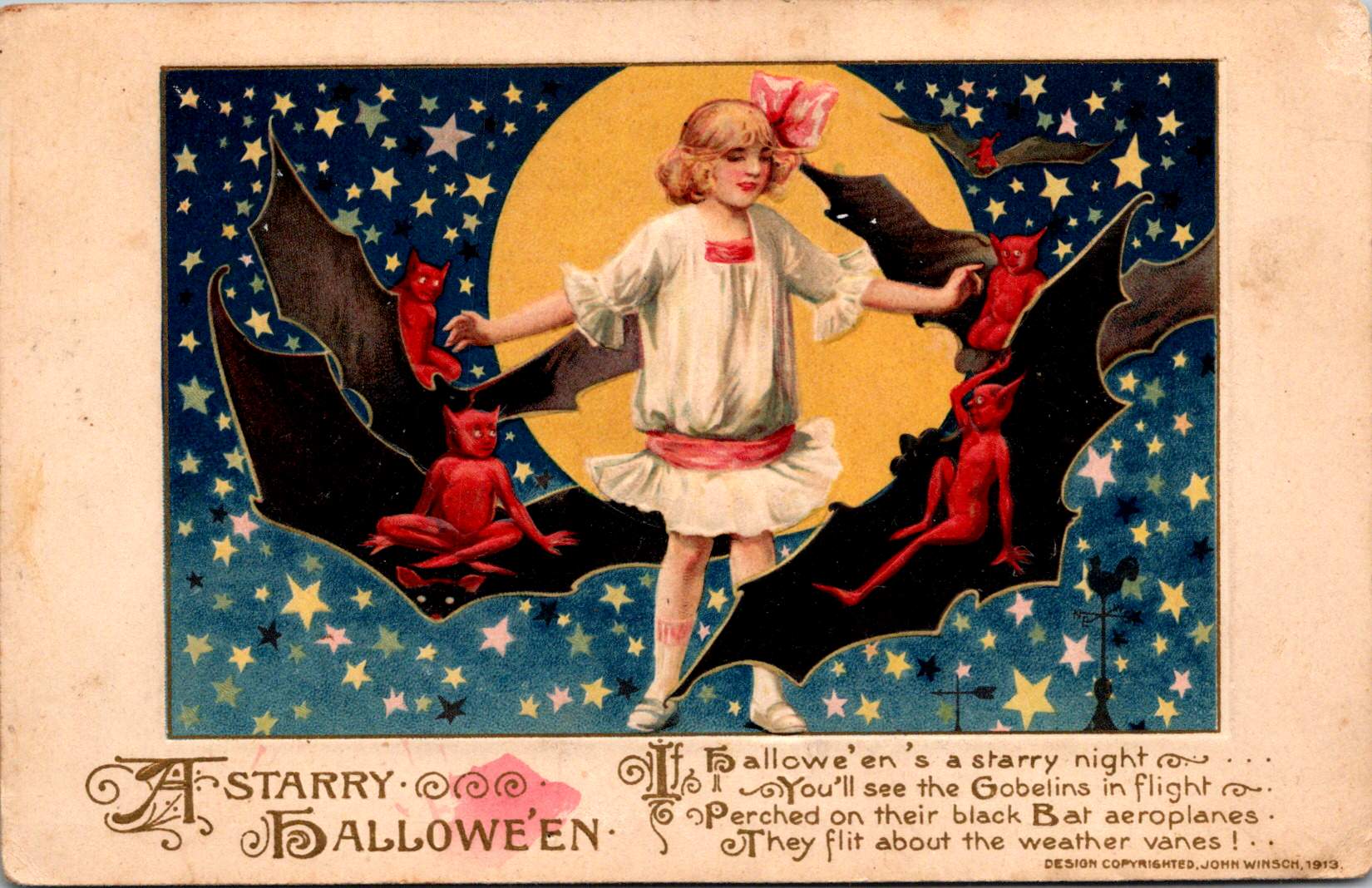
A Starry Halloween in the Golden Age of Postcards

The John Winsch-published “A Starry Halloween” (1913) represents a pinnacle of German chromolithography and American holiday marketing. The card’s verse playfully describes “black Bat aeroplanes.”

“Hallowe’en’s a starry night, You’ll see the Goblins in flight, Perched on their black Bat aeroplanes, They flit about the weather vanes!”

This aeronautical reference demonstrates how postcards of the era incorporated modern technology into traditional Halloween imagery. This whimsical text combines traditional Halloween motifs with early aviation enthusiasm, placing the card squarely in the 1910s zeitgeist.

The card’s detailed execution showcases why German printers dominated the global market before World War I. The deep blue starry sky creates a dramatic backdrop, while the precise color registration and subtle shading of the figures demonstrate the technical excellence of German printing houses.

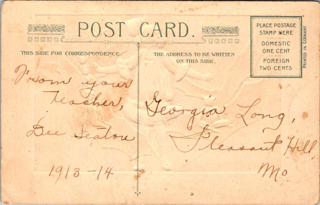
The postcard’s personal inscription—”From your Teacher, Dee Seaton, 1913-14″ to “Georgia Long, Pleasant Hill, Mo.”—reveals how these cards served as important social connections, particularly between teachers and students. The one-cent domestic postage rate, clearly marked on the divided back, reminds us of the affordability of this medium for everyday communication.

Frances Brundage’s Gentle Halloween

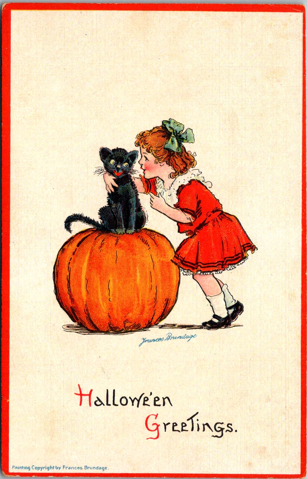
The Frances Brundage Halloween cards present a markedly different approach to the holiday in the same era. Known for her sweet-faced children and gentle compositions, Brundage brings her characteristic style to what could be frightening subject matter. The large orange pumpkin dominates the compositions, while a cheerful child with curly hair and a red bow plays with a black cat. The clean white background and red border create a bright, appealing presentation that contrasts with darker Halloween imagery.

Brundage (1854-1937) was among America’s most successful illustrators of children, and her distinctive style—rosy-cheeked, innocent-looking children with expressive faces—is immediately recognizable. Her work appeared on postcards, in children’s books, and in advertising, published by major companies including Raphael Tuck & Sons and Samuel Gabriel & Sons. This Halloween greeting card demonstrates how her gentle artistic approach could make potentially scary holiday themes appropriate for even the youngest children.

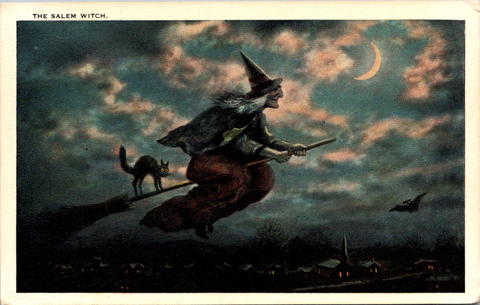
The Salem Witch: Local History Meets Holiday Trade

“The Salem Witch” postcard, published by the Salem Paper Company of Massachusetts, represents a fascinating intersection of local history, holiday celebration, and tourist commerce. The dramatic nighttime scene features a witch in traditional pointed hat and flowing cape, riding a broomstick across a turquoise sky filled with pink-tinged clouds and a crescent moon. A black cat balances behind her on the broomstick, while a bat flies nearby. Below, a small village with lit windows and a church spire creates a sense of scale and setting.

The publisher’s choice to produce this card in Salem was no accident. The city’s notorious witch trials of 1692-93 had by the early 20th century become a tourist draw, and the Salem Paper Company cleverly capitalized on this connection. The card’s dark, moody color palette of deep blues, blacks, and browns creates an appropriately spooky atmosphere.

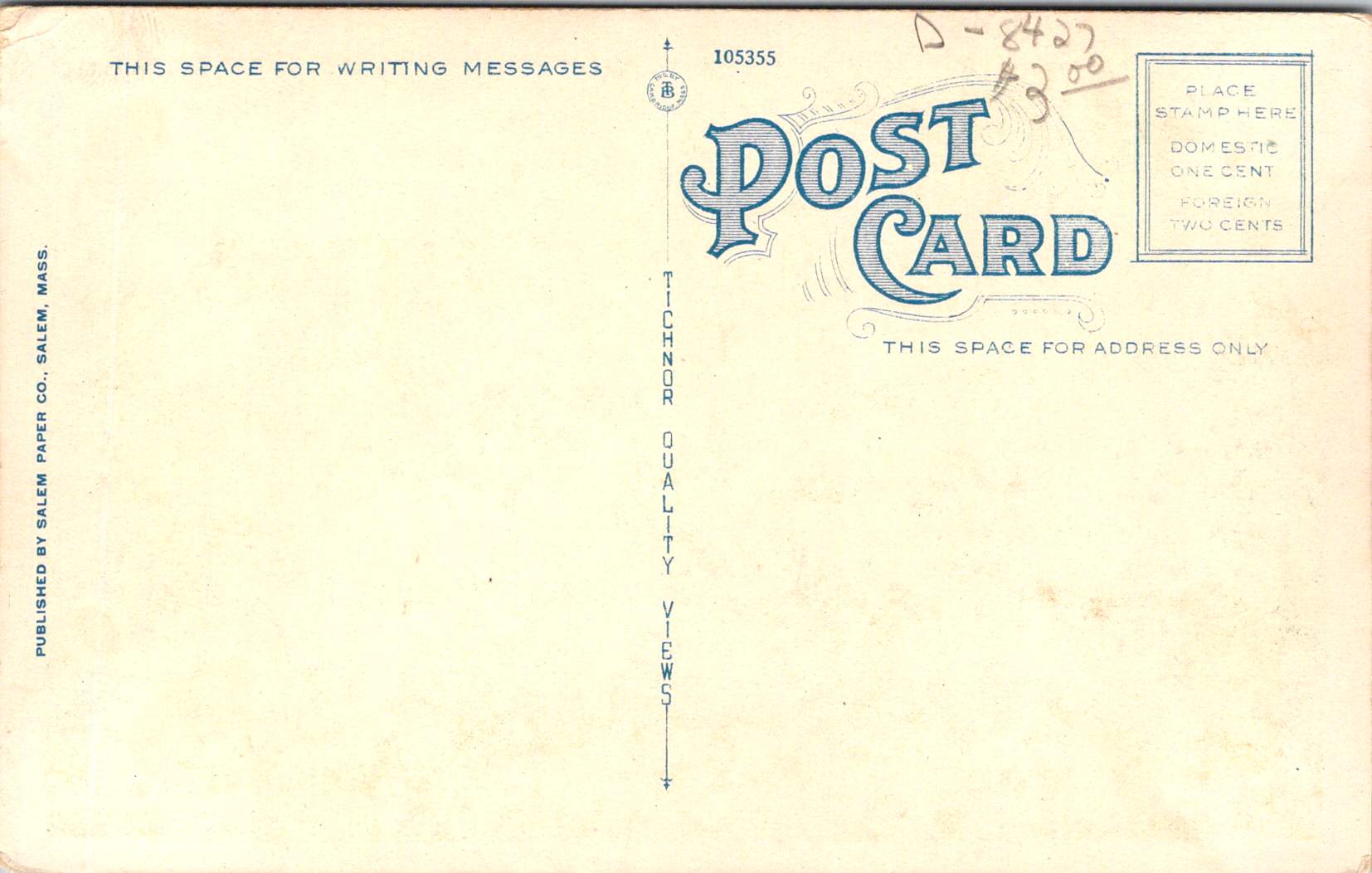
The card’s reverse reveals additional historical details through its markings: PUBLISHED BY SALEM PAPER CO., SALEM, MASS., card number 105355, and the TICHNOR QUALITY VIEWS designation. Tichnor Brothers of Boston was renowned for high-quality postcards, particularly New England scenes, making them an ideal partner for Salem Paper Company’s locally themed Halloween products. The technical quality suggests it was likely also printed in Germany, as were many premium postcards of the era, even those designs that were distinctly American and regional.

The Spooked Kid: From Original to Reproduction

The final card, showing a startled child in white nightclothes against an orange-lit room, represents a later reproduction of Halloween imagery. Produced for Lillian Vernon and printed in Hong Kong, this card likely dates from the 1970s-1990s. But, it draws heavily on early 20th-century artistic conventions. The scene’s elements—a black cat in a window pane, yellow crescent moon, candlestick holder with lit candle, and fallen GHOST STORIES book—all reference classic Halloween postcard motifs. This card’s production history tells the story of significant changes in the postcard industry.

When Lillian Vernon, born in Leipzig, Germany, used her $2,000 wedding gift to launch a mail-order handbag business from her kitchen table in Mount Vernon, New York, in 1951, she could hardly have imagined she would revolutionize American gift retail. That first offering—a matching monogrammed handbag and belt set for $6.98—established the winning formula that would define her business: personalized items at affordable prices. The company name itself, taken from her new hometown, would become synonymous with accessible luxury and thoughtful gifting for generations of American shoppers.

Through the boom years of the 1980s and 1990s, Lillian Vernon catalogs were a fixture in American mailboxes, eagerly anticipated by parents and children alike. The company mastered the art of “catch-penny” items—small, impulse-buy treasures that seemed irresistible at their price points. Their most beloved offerings included personalized school supplies (from pencil cases to lunch boxes), holiday decorations, monogrammed doormats, and children’s toys. The company’s success made history in 1987 when Lillian Vernon became the first woman-owned company to be listed on the American Stock Exchange, a milestone in American business history.

By the time the company began sourcing products like Halloween postcards from Hong Kong printers, Lillian Vernon had transformed from a small mail-order business into a retail empire that included multiple specialized catalogs, retail stores, and eventually an online presence. The company’s choice to have the card printed in Hong Kong reflects the late 20th-century shift of printing operations from Europe and America to Asia, prioritizing cost-effective production over the artistic merit and technical excellence that characterized the German chromolithography era.

Though the company would ultimately close in 2016, unable to fully adapt to the digital age, its influence on American retail culture remains significant. The Lillian Vernon story represents both the American dream and the evolution of modern commerce—from kitchen-table startup to national brand, from personalized service to mass-market appeal, from mail-order catalogs to the small business opportunities of the internet era.

The Evolution of an Industry

These postcards trace the evolution of Halloween greetings from the golden age of German printing through the modern reproduction era. The Winsch card represents the height of pre-WWI German chromolithography and original holiday artwork. Frances Brundage’s contribution shows how established American artists adapted holiday themes for children. The Salem Witch card demonstrates the growing commercialization of local history and holiday traditions. Finally, the Lillian Vernon reproduction reveals how these vintage designs found new life in the mass-market retail era.

Together, they tell a story not just of changing printing technologies and business models, but of the evolving relationship with Halloween itself. From the elaborate artistic productions of the 1910s through the mass-market reproductions of the late 20th century, Halloween postcards have both reflected and shaped how Americans celebrate this fascinating holiday.

The Halloween postcard industry’s journey from German printing houses through American publishers to Asian manufacturers parallels larger trends in American commerce and holiday celebrations. These cards remain valuable historical documents, preserving not just artistic styles and printing techniques, but also the personal connections and social customs of their eras. Whether sent by a teacher to a student in 1913 or purchased as a souvenir in more recent decades, each card represents a tangible link to the holiday and shared heritage.

Bridging Time: The Enduring Allure of Madison County’s Covered Bridges

Weathered wooden structures still stand in the middle of Iowa, a testament to both engineering ingenuity and the power of storytelling. The covered bridges of Madison County have become more than mere crossings over babbling creeks; they are portals to the past, muses for artists, and anchors for a community’s identity. As the crisp autumn air settles over the rolling hills in October, thousands of visitors gather to celebrate these iconic structures at the annual Covered Bridge Festival, a tradition that has endured for over half a century.

Our journey begins with a stack of old locally-printed postcards, each capturing a nearby rural scene frozen in faded grayscale tones. Photographed by Clee Crawford in the early 1950s, these images were made into postcards sometime after 1983 by Larry’s Photography and Joe Graham Printing in Winterset, Iowa. Vintage collectibles themselves, they offer a glimpse of a bygone era when the now-famous bridges were simply part of the rural fabric of Madison County.

The Roseman Bridge, built in 1883 by H.P. Jones, spans the Middle River nine miles southwest of Winterset. In the postcard, it rises from a sea of cornstalks, its wooden siding weathered by countless Iowa summers and winters. Known locally as “The Haunted Bridge,” it whispers of ghost stories told around farmhouse tables and hushed conversations between young lovers seeking shelter from prying eyes. Little did the bridge know that it would one day become a star, playing a pivotal role in a story that would captivate millions.

Moving northeast, we encounter the Cutler-Donahoe Bridge. Constructed in 1871, this structure originally crossed the North River. But like many of its counterparts, it found a new home as the winds of change swept through the county. In 1970, the same year the first Covered Bridge Festival was held, Cutler-Donahoe was carefully uprooted and transplanted to Winterset City Park. The postcard captures it in its original location, a sentinel standing guard over the river below, unaware of its future as a centerpiece of civic pride.

Our third postcard brings us to the Cedar Bridge, another creation of the prolific bridge-builder H.P. Jones. Erected in 1883 over Cedar Creek north of Winterset, it too would embark on a journey, moving to a new location in 1920. The image shows the bridge nestled in a picturesque rural setting, a dirt road winding its way to the entrance. What the postcard doesn’t reveal is the tumultuous future awaiting this particular bridge – a tale of destruction, rebirth, and the tenacity of a community unwilling to let go of its heritage.

The final postcard in our collection tells a bittersweet tale. The McBride Bridge, built in 1871, appears proud and sturdy in the photograph. Yet the caption reveals its fate: destroyed by fire on September 3, 1983. This loss, occurring on the first day of the 1983 Madison County Covered Bridge Festival, served as a stark reminder of the fragility of these historical treasures and the importance of preservation efforts.

The destruction of the McBride Bridge is, unfortunately, not an isolated incident. Across the United States, covered bridges have long been targets of arson and accidental fires. According to data compiled by Covered Spans of Yesteryear, over 670 covered bridges have been lost to fire nationwide since the early 19th century. In Iowa alone, at least seven covered bridges have succumbed to flames, with arson being a common cause.

The Cedar Bridge, captured so peacefully in our postcard, has had a particularly tumultuous recent history. In 2002, it fell victim to arson, a loss that shook the community to its core. Demonstrating remarkable resilience, the bridge was rebuilt, only to suffer the same fate in 2017. The determination of Madison County residents prevailed once again, and a newly reconstructed Cedar Bridge opened in 2019 – a testament to the enduring significance of these structures in the local psyche.

As we shuffle these postcards, admiring the craftsmanship of both the bridges and the photographers who captured them, we’re drawn into a narrative that extends far beyond the borders of Madison County. These structures, once utilitarian crossings designed to protect travelers and livestock from the elements, have become characters in a much larger story – one that intertwines literature, film, tourism, and the very identity of a region.

The transformation began in 1992 with the publication of Robert James Waller’s novel, The Bridges of Madison County. Waller, an Iowa native, wove a tale of passion and missed chances against the backdrop of Madison County’s rural landscape. The Roseman Bridge, our “Haunted Bridge,” took center stage as the site where the story’s star-crossed lovers, Francesca Johnson and Robert Kincaid, first meet.

Suddenly, these bridges were no longer just local landmarks; they became symbols of romance, of roads not taken, of the bittersweet choices that shape our lives. The novel struck a chord with readers across the globe, selling millions of copies and landing on bestseller lists for over three years. But the story’s impact was only beginning.

In 1995, Hollywood came calling. Clint Eastwood directed and starred alongside Meryl Streep in the film adaptation of Waller’s novel. Once again, the bridges of Madison County found themselves in the spotlight, this time on the silver screen. The Roseman Bridge, in particular, became a character in its own right, its weathered boards and rustic charm providing the perfect setting for the unfolding drama.

The film’s success catapulted Madison County into the national consciousness. Tourists began flocking to Winterset and the surrounding areas, eager to walk in the footsteps of Francesca and Robert, to stand on the bridges where their fictional love blossomed, and to capture a piece of that romance for themselves.

This intersection of literature, cinema, and place created a perfect opportunity for cultural tourism. The bridges, which had stood for over a century as quiet witnesses to the ebb and flow of rural life, now found themselves at the center of a phenomenon that would reshape the economy and identity of Madison County.

The Covered Bridge Festival, which had begun in 1970 as a celebration of local history and craftsmanship, took on new significance. It became not just a community gathering, but a pilgrimage site for fans of the book and film, as well as history buffs, architecture enthusiasts, and romantics from all walks of life. Since then, the town itself has changed and adapted to the ongoing recognition.

As we fast forward, the allure of the bridges shows no signs of waning. The 2024 Covered Bridge Festival, held October 12-13 this year, continues to draw thousands of visitors to Madison County. For $3 admission (or two tickets for $5, with children under 11 entering free), attendees can immerse themselves in a weekend that bridges past and present.

The festival grounds, centered around the Winterset town square, buzz with activity. Vendors line the streets, offering handcrafted goods and local culinary delights. Sounds of live music fill the air, kids laughing in the Kids’ Zone, and the excited chatter of visitors from near and far.

For many, the highlight of the festival is the guided tour of the covered bridges, conducted by the Winterset Rotary Club. As buses wind their way through the countryside, visitors are treated to not just the sight of these historic structures, but also to tales of their construction, their role in local lore, and their journey from practical crossings to cultural icons.

The festival isn’t just about looking back, however. It’s a living, breathing celebration that continues to evolve. The 2024 event features a parade, a car show that turns the area around the courthouse into a chrome-and-steel wonderland, and a variety of demonstrations showcasing the craftsmanship and ingenuity that built these bridges in the first place.

At the Madison County Historical Complex, visitors can delve deeper into the area’s rich past. Here, the bridges are placed in context, their stories interwoven with those of the farmers, merchants, and families who have called this corner of Iowa home for generations.

As the festival has grown, so too has the need to balance tourism with preservation. The story of the Cedar Bridge serves as a poignant reminder of the challenges faced in preserving these landmarks. As we admire their beauty and revel in their romantic associations, we must also reckon with their vulnerability. Each bridge that remains standing is a victory – over time, over the elements, and sometimes over human destructiveness.

As the sun sets on this year’s festival, casting long shadows through the covered bridges, visitors and locals alike are reminded of the unique alchemy that has occurred here. What began as a practical solution to a transportation need has become a cultural touchstone, an economic driver, and a source of identity for an entire region.

The bridges of Madison County are physical manifestations of the power of storytelling, the appeal of nostalgia, and the human desire to connect – not just from one riverbank to another, but across time, across mediums, and across cultures. They are examples of 19th-century engineering that teach us more every future decade they exist.

These bridges offer something increasingly rare: a moment of pause, a chance to step out of the rush of modern life and into a space where time moves a little slower. Whether you’re a fan of Waller’s novel, a history enthusiast, or simply someone in search of a quiet moment of reflection, the covered bridges of Madison County have something to offer.

As we look to the future, the challenge for Madison County will be to continue balancing preservation with progress, nostalgia with innovation. The Covered Bridge Festival, with its blend of historical celebration and contemporary community spirit, serves as a model for how this might be achieved.

For now, as October winds whisper through the wooden beams of the Roseman, Cutler-Donahoe, Cedar, and the other three surviving bridges, they carry with them the echoes of all who have passed through before – from 19th-century farmers to 20th-century film stars to the tourists and locals of today. Each footstep, each photograph, each stolen moment adds another layer to the rich tapestry of stories that these bridges hold.

Our postcards, now decades old themselves, serve as a reminder of the power of image and imagination to transform the ordinary into the extraordinary. From simple river crossings to symbols of undying love, from local landmarks to international attractions, the covered bridges of Madison County have undergone a journey as winding and wonderful as the roads that lead to them. In the hearts and minds of all who have encountered them – whether through postcards, novels, films, or in person – these bridges have built connections far stronger and more enduring than wood and nails could ever achieve.

As we tuck our postcards away and the festival-goers return home, we’re left with an appreciation for these humble structures that have become so much more. The covered bridges of Madison County remind us that with a little imagination, a touch of serendipity, and year-after-year of care, even the most unassuming places can become the stuff of legend.

In the end, perhaps that’s the true magic of Madison County’s covered bridges – their ability to transport us not just from one side of a river to another, but from our everyday lives into a world where love, history, and community intertwine.

St Helena Sanitarium a Century Ago

Sometimes, a single postcard reads like a dramatic novel. On September 5, 1914, Mrs. C.H. Jones received a cryptic message (just five drawn lines) from her husband at the St Helena Sanitarium in Napa Valley.

With a closer look, this mysterious correspondence reveals the unique influence of its author on Adventist history and early 20th century approaches to wellness, nature, and medicine.

image of the front of a postcard
C.H. Jones’ handwriting on a postcard from St Helena Sanitarium dated September 4, 1914

The front of the postcard offers a glimpse of the sanitarium’s picturesque surroundings. A color image shows a serene body of water flanked by lush greenery. Trees line the banks, their reflections shimmering on the water’s surface. In the distance, rolling hills rise, creating a sense of depth and showcasing the natural beauty of the Napa Valley. This image is accompanied by a pre-printed checklist of common sentiments a visitor might want to convey, such as “Arrived here safely” and “This is the best place to rest,” though Jones himself did not make a selection.

The words POST CARD are prominently displayed in green, capital letters across the back of the card with a divided section below. On the left, under the words “For Correspondence” appear five wavy blue lines drawn by hand, mysterious marks standing in for whatever personal message C.H. Jones might have penned to his wife. On the right side in the same elegant ink: “Mrs C.H. Jones, #305 Kenwood St., Glendale, Calif.” A green one-cent stamp featuring the profile of George Washington adorns the upper right corner, canceled by a postmark from Saint Helena, on Sep 5, 1914.

The St. Helena Sanitarium itself was a sight to behold. Nestled into the lush, forested hillside of the Napa Valley, the sanitarium complex was impressive and inviting. The main building, a grand structure of several stories with a white-painted exterior, stood out starkly against the dark green of the surrounding forest.

A series of covered verandas, visible on each level, offered patients and visitors alike the opportunity to take in the fresh air and stunning views of the valley. These outdoor spaces, so integral to the sanitarium’s health philosophy, wrapped around portions of the building, providing ample space for rest and contemplation.

The landscaping immediately surrounding the building was meticulous, with manicured lawns, ornamental shrubs, and small trees dotting the grounds. Palm trees hinted at the mild California climate. The entire complex exuded an air of tranquility and order, its gleaming white walls a beacon of health and hope set against the verdant backdrop of the Napa Valley.

The St. Helena Sanitarium played a significant role in both Adventist history and the broader health reform movement sweeping across America in the late 19th and early 20th centuries. This movement, driven by concerns about urbanization, industrialization, and changing diets, saw the rise of numerous health institutions known as sanitariums. These facilities, often located in picturesque natural settings, aimed to provide rest, rejuvenation, and health education to their patrons.

The most famous sanitarium was in Battle Creek, Michigan, led by Dr. John Harvey Kellogg. Kellogg, an Adventist physician, transformed the Western Health Reform Institute into a world-renowned health resort. The Battle Creek Sanitarium became a model for other such institutions, including St. Helena, with its emphasis on hydrotherapy, exercise, vegetarian diet, and the importance of fresh air and sunlight.

W.H. Kellogg, John’s brother, played a crucial role in developing health foods that became staples at the Battle Creek Sanitarium and beyond. The Kellogg brothers’ invention of corn flakes and other vegetarian foods aligned with the Adventist emphasis on a plant-based diet and had a lasting impact on American food culture.

The St. Helena Sanitarium, while smaller than Battle Creek, developed along similar lines. It was established in 1878 by a small group of Adventist believers who purchased the 10-acre Napa Valley property for $13,000. The initial facilities were modest, consisting of a small two-story building capable of accommodating about 40 patients. Dr. Merritt Kellogg, another brother of John Harvey Kellogg, was instrumental in its early development.

Like Battle Creek, St. Helena emphasized natural remedies and lifestyle changes. However, it had the added advantage of California’s mild climate and beautiful surroundings, which were seen as inherently health-promoting. The sanitarium quickly gained a reputation as a “Garden of Eden” for health seekers, attracting patients from across the country.

As the institution grew, it expanded its facilities and services. By the early 1900s, it had modern medical equipment, including X-ray machines and clinical laboratories, alongside its natural treatments. This blend of conventional and alternative therapies was characteristic of progressive sanitariums of the era.

The St. Helena Sanitarium also differed from Battle Creek in its continued close affiliation with the Seventh-day Adventist Church. While John Harvey Kellogg eventually separated from the church, St. Helena remained a central institution in Adventist health ministry. This was reinforced by Ellen G. White’s nearby residence at Elmshaven and her ongoing involvement in the sanitarium’s affairs.

By 1914, when C.H. Jones visited, the sanitarium had evolved significantly from its humble beginnings. Under the medical superintendence of Dr. George Thomason, who had been in charge since 1911, it had become a well-established medical institution, yet it remained true to its founding principles of natural healing and wholistic health.

The sanitarium’s mission was rooted in the Adventist health message, which emphasized prevention and natural remedies. Its philosophy, revolutionary for its time, promoted a holistic approach to health, treating the whole person – body, mind, and spirit. This was reflected in its services, which included hydrotherapy treatments, a vegetarian diet, exercise programs, and spiritual care.

One of the sanitarium’s key features was its use of natural springs on the property for hydrotherapy treatments. These water-based therapies were a cornerstone of the sanitarium’s approach to healing. The institution also boasted a nursing school, training professionals to carry the Adventist health message to other institutions and communities.

The sanitarium’s emphasis on health education extended beyond its walls. The Pacific Health Journal and Temperance Advocate, published by the “health retreat” at St. Helena, helped disseminate Adventist health principles to a wider audience.

The sanitarium’s reputation extended far beyond Adventist circles, attracting a diverse and often notable clientele. Among its reported visitors were William Jennings Bryan, the famous orator and three-time presidential candidate, and Jack London, the renowned author of “Call of the Wild.” Some sources even suggest that President Theodore Roosevelt may have visited, though this claim requires further verification. These high-profile guests, drawn by the sanitarium’s innovative treatments and serene environment, helped cement its status as a premier health institution.

Charles Harriman Jones, the sender of our postcard, was himself a significant figure in Adventist history. Born in 1850, he had dedicated his life to the publishing work of the Seventh-day Adventist Church. By 1914, he had been serving as the chief executive of the Pacific Press Publishing Association for over two decades, overseeing its growth and relocation from Oakland to Mountain View, California in 1904. His tireless efforts had helped establish the Press as a cornerstone of Adventist publishing.

Jones’ presence at the sanitarium is unsurprising given his close working relationship with Ellen G. White, who lived nearby at her Elmshaven home. White, a prolific author whose works were published by Pacific Press, took an active interest in the sanitarium’s affairs and often provided counsel on its operations. Her proximity allowed her to provide ongoing support, further cementing the institution’s importance within the Adventist framework.

While the St. Helena Sanitarium was thriving in 1914, the broader sanitarium movement was on the cusp of significant challenges. The early 20th century saw rapid advancements in medical science that would ultimately transform healthcare and challenge the sanitarium model.

The development of germ theory and its widespread acceptance in the medical community led to a greater emphasis on specific treatments for identified pathogens, rather than the natural remedies favored by sanitariums. The discovery of insulin in 1921 and the development of antibiotics in the 1930s and 1940s dramatically changed the treatment of many diseases, shifting focus away from the lifestyle and dietary approaches central to sanitarium care.

In the field of mental health, the rise of psychoanalysis and other forms of talk therapy began to challenge the sanitarium approach to treating nervous disorders. Sigmund Freud’s theories, gaining prominence in the early 1900s, offered new explanations for mental illness that went beyond the physical and environmental factors emphasized in sanitariums.

The standardization of medical education, following the influential Flexner Report of 1910, also played a role. This report led to more rigorous, science-based medical training and the closure of many schools that didn’t meet the new standards. As a result, newer generations of doctors were less likely to embrace the eclectic, nature-based approaches common in sanitariums.

The Great Depression of the 1930s dealt a significant blow to many sanitariums, as fewer people could afford extended stays at these facilities. World War II further accelerated the decline, as resources were diverted to the war effort and many sanitariums were converted into military hospitals.

By the 1950s and 1960s, many of the grand old sanitariums had closed or been converted into conventional hospitals or other facilities. The Battle Creek Sanitarium, once the flagship of the movement, closed its doors in 1957. However, some institutions, like the St. Helena Sanitarium, successfully transitioned into modern hospitals while retaining elements of their holistic health heritage.

The St. Helena Sanitarium, now known as Adventist Health St. Helena, stands as a testament to this evolution. While it has become a full-service hospital, it continues to emphasize whole-person care and lifestyle medicine, echoing its sanitarium roots. The continued operation of the St. Helena facility, albeit in a much-evolved form, speaks to the enduring value of some aspects of the sanitarium philosophy, even in an age of highly specialized modern medicine.

This 1914 postcard captures a moment just before the scientific and social changes that would reshape the medical landscape. At this late stage in his life, C.H. Jones would have seen firsthand the sanitarium’s significance and its role in promoting Adventist health principles but he may not have predicted the way medicine and healthcare would change. We can fill in the lines on the postcard to his wife with the details of a long career in Adventist publishing and health ministries, or perhaps more poignantly with the advice C.H. Jones would offer us today.

Postcards and Other Passions

Alongside any earnest effort to declutter, minimize, or embrace a modest lifestyle, there are delightful rebellions brewing in the corners of our homes, on our bookshelves, and in our hearts. Collecting – postcards, stamps, or any manner of curious objects – is among a great many pastimes that bring us joy.

Let’s start with a set of floral letter postcards that captured my heart and imagination recently. For me, they’re time capsules from the Edwardian era, each one a miniature masterpiece of design and sentiment.

Delicate flowers intertwine with bold capital letters, spelling out affectionate greetings to mothers and fathers, aunts and cousins, and more. Blue irises dance around pink and gold lettering, while red roses form the word ‘cousin’ against a dramatic dark background. It’s Victorian drama meets Art Nouveau flair, all condensed into a 3.5 x 5.5 inch rectangle. The colors are vibrant, defying the century they have traveled to meet our modern eyes.

But why do these particular postcards make my collector’s heart skip a beat? It’s not just their undeniable aesthetic appeal, though that’s certainly part of it. They’re windows into history, offering glimpses of a time when sending a beautifully designed card was a primary way of keeping in touch with loved ones. Each handwritten message on the back (like the one postmarked July 10, 1909) is a tiny slice of someone’s life, preserved for over a century.

Thrill of the Hunt and the Joy of Design

There’s also the thrill of the hunt. Finding a matching set among thousands of vintage postcards is like piecing together a particularly beautiful puzzle. Each new discovery brings an aha and a sense of completion. It’s a patience game, sure, but the payoff is worth it.

These postcards, with their intricate details and bold typography, have stood the test of time. They’re just as appealing now as they were when they were first printed. Collecting them isn’t just owning pretty objects – it’s a chance to examine, hold, preserve and share a piece of design history, a snapshot of the aesthetic sensibilities of a bygone era.

Collecting is deeply personal. While I pour over century-old postcards, my neighbor friend is curating an ever-expanding collection of adorable bird figurines. He’s particular about it too – they have to be a specific kind, from a specific place, at a specific price point. He watches the bird market, adds to his collection strategically. To a non-birder, it might seem quirky. But watch him arrange his birds, carefully considering where each one fits, and you’ll understand something profound about him: he’s a person who experiences quiet joys.

First and foremost, collecting is about falling in love with something uniquely suited to you. It’s about creating space in your life – physical and emotional – for the things that bring you joy. It’s about curating, admiring, and sharing a part of yourself through the objects you choose to surround yourself with. My friend curates his bird collection, brings them out by the seasons, delightful arrangements that invite family and friends to enjoy, too.

All the People, All the Collections

This philosophy extends far beyond postcards and bird figurines. Think about the philatelists out there, losing themselves in the minute details of postage stamps. Each tiny square is a work of art, a nugget of history, a passport to another time and place.

Or consider the sports enthusiasts, their shelves lined with signed jerseys and game-used equipment. For them, these aren’t just objects – they’re tangible connections to moments of athletic glory, to the heroes they admire.

History buffs might seek out Civil War relics or Space Age memorabilia, each artifact a physical link to events that shaped our world. And in our digital age, even contemporary collectibles are thriving. From limited edition vinyl figures to exclusive sneaker releases, people are finding new ways to express their passions through the objects they collect.

What unites all these diverse collecting interests? The deep connection to a particular passion or area of interest that only you can know. Whether it’s a century-old postcard or a just-released collectible figurine, these objects become repositories of personal meaning and cultural significance for their collectors.

Hobbies and Pastimes

Collecting, in its various forms, is just one of many popular ways Americans choose to spend their leisure time. Zoom out for a moment and consider the broader landscape of hobbies and pastimes in the United States.

Reading continues to be a widely enjoyed pastime, with many people diving into both physical books and digital formats. It’s an accessible hobby that caters to diverse interests and can be done almost anywhere.

Gardening has seen a surge in popularity, especially in recent years, as people seek to connect with nature and perhaps grow a bit of their own food. Cooking and baking remain perennially popular, with the rise of cooking shows and online recipes making it easier than ever for people to explore new cuisines and techniques at home.

Exercise and fitness activities, including running, cycling, and yoga, are on the rise as people focus more on health and wellness. Crafting hobbies like knitting, crocheting, and DIY projects have seen renewed interest, offering a creative outlet and the satisfaction of making something by hand.

Photography has become more widespread with the improvement of smartphone cameras, allowing more people to capture and share moments from their daily lives. Not only do I collect floral postcards, I take pictures of beautiful flowers every chance I get!

Hiking and outdoor activities are popular, and of course, sports – both playing and watching – continue to be a major part of American culture and a popular pastime for many.

Passion Has Purpose

What drives us to spend our precious free time on these pursuits? The benefits are numerous and far-reaching.

On a personal level, hobbies provide stress relief and relaxation. They offer an escape from daily pressures and can be a form of meditation, helping to reduce stress and anxiety. Many hobbies involve learning new skills or improving existing ones, which can boost self-confidence and cognitive function. They provide a creativity outlet, stimulating imagination and innovative thinking.

There’s also the sense of achievement that comes from completing projects or reaching milestones in a hobby. This can provide a significant boost to self-esteem and overall life satisfaction. Regular engagement in enjoyable activities can help combat depression and improve overall mood. Having a hobby encourages better time management as we carve out time for our interests. And perhaps most importantly, hobbies can become an integral part of our identity, providing a sense of purpose and self-definition outside of work or family roles.

Many hobbies involve communities of like-minded individuals, providing opportunities for social connection and friendship. Engaging with others who share your interests can help develop language, communication and interpersonal skills. Some hobbies, especially those involving arts, crafts, or cuisines from different cultures, can broaden cultural awareness and appreciation.

These pursuits can sometimes lead to unexpected networking opportunities, potentially beneficial for personal or professional growth. Shared hobbies can strengthen family relationships by providing common interests and shared experiences. Many hobbies appeal to people of all ages, facilitating connections across generations. And hobby communities often provide emotional support, advice, and encouragement, fostering a sense of belonging.

Many hobbies, particularly those involving physical activity, contribute to better overall health and fitness. Engaging in hobbies, especially those that challenge the mind, can help maintain cognitive function as we age. Skills learned through hobbies can sometimes translate into valuable job skills or even new career opportunities. Some hobbies can evolve into side businesses or income streams. And perhaps most importantly, hobbies provide a counterbalance to work and other responsibilities, contributing to a more well-rounded life.

So, whether you’re arranging a set of vintage postcards, nurturing a garden, mastering a new recipe, or climbing a mountain, know that you’re doing more than just passing time. You’re engaging in a fundamental human activity, one that brings joy, fosters growth, builds connections, and adds richness to life.

Finding Quiet Joys

In the end, our collections and hobbies are extensions of ourselves. They reflect our interests, our aesthetics, our values, and our histories. They give us a way to tangibly interact with our passions, to create order and meaning in a chaotic world, and to surround ourselves with objects and experiences that bring us joy and inspiration.

So the next time someone raises an eyebrow at your carefully curated collection of Star Wars figurines, or questions why you spend hours perfecting your sourdough technique, remember this: in pursuing your passions, you’re not just collecting things or passing time. You’re crafting your narrative, preserving memories, expressing your unique identity, and experiencing the quiet (or not so quiet) joys that make life rich and meaningful.

Tempe in Time: A Journey through Places and Postcards

A set of postcards printed in the 1980s reflect Tempe’s history a century before. Now historical artifacts themselves, these images offer a window into the city’s past and future.

As we examine each postcard, we’ll uncover the story of Tempe’s development and explore how each generation has contributed to the city’s evolving landscape.

The Hackett House: Victorian Charm in the Desert

Today’s journey begins with a postcard depicting the Hackett House, a quaint building constructed in 1888. This red brick structure, Tempe’s oldest of its kind, stands as a testament to the city’s early days. With its distinctive turret and elegant design, it exemplifies the rare Arizona Territorial Victorian commercial style.

Originally built by German immigrant William Hilge as Tempe’s first bakery, the Hackett House’s location near the Hayden Flour Mill, the railroad, and the Territorial Normal School (now Arizona State University) nods to the earliest urban planning in Tempe. The postcard captures the building’s 1912 appearance, which was painstakingly restored in the 1970s.

The history of the Hackett House mirrors Tempe’s own evolution. After its days as a bakery, it served as a residence and later a boarding house. It earned its current name when Estelle Craig, Tempe’s first telephone operator, married Roy Hackett in the old bakery house. By the 1980s, when our postcards were likely printed, the Hackett House had already been recognized for its historical significance and placed on the National Register of Historic Places.

Tempe Depot: The Arrival of Progress

Our next stop is the Tempe Depot, captured in a postcard circa 1915. The image shows a steam locomotive at the station, a small group clustered for the photograph. This scene represents a pivotal moment in Tempe’s history, symbolizing the city’s connection to the wider world.

The arrival of the Maricopa and Phoenix Railroad in 1887 transformed Tempe from a small farming community into a thriving center of commerce. The depot, built in 1907, served as a vital link for both passengers and freight, fueling Tempe’s growth and prosperity. Though the original structure was lost to fire in 1923, this postcard preserves its memory and significance.

Arizona Mercantile: Commerce in Early Tempe

The next postcard features the Arizona Mercantile Co., a sturdy brick building constructed in 1898. With its large storefront and a horse-drawn carriage parked outside, this image encapsulates the commercial heart of early Tempe.

The Arizona Mercantile Co. played a crucial role in Tempe’s economy, providing essential goods and services to the growing community. The image itself, its preservation, and later reproduction underscores the importance of local businesses in shaping Tempe’s identity and meeting its residents’ needs.

Laird and Dines Drug Store: A Corner of History

Our final postcard depicts the Laird and Dines Drug Store, circa 1900. This Victorian-style corner building, with its prominent “DRUGS” signage, offers another glimpse into Tempe’s commercial past. The image shows the particulars of storefront business, with its ornate architecture, early signage, and shades to defend against the afternoon sun.

The building went on to serve as campaign HQ for Senator Carl Hayden and Governor Benjamin B. Moeur, as well as the first town hall and post office. Renovations reflected each successive era, including a few that were later reversed. Look closely today, and the old bones still show.

Preservation: Buildings vs. Postcards

As we explore Tempe’s history through these 1980s postcards, we encounter an interesting dichotomy in historical preservation. While some buildings depicted still stand today, others have long since disappeared from Tempe’s landscape.

The preservation of postcards offers a unique window into the past, allowing us to visually experience Tempe as it once was, even when the physical structures no longer exist. The Tempe Depot postcard, for instance, preserves the image and significance of a building lost to fire, serving as a tangible link to the city’s early railroad days.

On the other hand, the preservation of buildings like the Hackett House allows for a more immersive connection with history. Visitors can walk through the same spaces, touch the same walls, and experience the ambiance of a bygone era in a way that a two-dimensional image can’t replicate.

This dual approach to preservation provides a richer, more comprehensive understanding of Tempe’s history. The postcards fill in the gaps where physical preservation was lost, while the preserved buildings offer tactile and fertile connections to the past.

Hayden Flour Mill in operation, click for reference link

Tempe’s Historic Landscape

Tempe’s commitment to preserving its architectural heritage is evident in the numerous historic properties that dot its landscape. The Elias-Rodriguez House, built in 1882 using traditional adobe methods, stands as one of the oldest surviving buildings in Tempe, representing the early Hispanic influence on the city’s development.

The Niels Petersen House Museum, a Queen Anne Victorian style home built in 1892, offers visitors a glimpse into the life of a wealthy rancher in territorial Arizona. The Old Main building on Arizona State University’s campus, completed in 1898, continues to serve the university community while standing as a proud reminder of the institution’s long history.

These pristinely preserved buildings, along with others undergoing substantial redevelopment like the Hayden Flour Mill (1918) form a network of historical touchstones throughout Tempe. They create a physical timeline of the city’s development, allowing residents and visitors alike to trace Tempe’s growth from a small agricultural settlement to a thriving modern city.

Image courtesy of Jack D. Mount, click for reference link

Evolving Landscapes: Tempe Through the Decades

While our postcards capture Tempe’s early history, the city’s development didn’t stop in the early 20th century. Each subsequent generation has left its mark on Tempe’s landscape, contributing important and useful additions that have shaped the city we know today.

The 1960s saw the development of the Mid-Century Modern style that has since become iconic in Tempe. Grady Gammage Memorial Auditorium still defines Tempe’s landscape as a living example of Taliesin West design, inspired by Frank Lloyd Wright’s principles and aesthetic.

Another example, Shalimar Golf Course & Estates, built in 1961 combining a golf course with a mix of single-family and townhomes all featuring the golf lifestyle. This ambitious project represented a new approach to suburban living, offering residents a blend of recreational amenities and comfortable housing. The golf course continues to operate today, though its future faces the threat of redevelopment again in 2025.

As we consider the fate of mid-century developments like Shalimar, we’re confronted with a critical question: will these more recent historical landscapes be preserved in place or will they exist only as postcards, if at all? The answer may depend on how we value and interpret the architectural and cultural legacy of the mid-20th century, and how we balance preservation with the evolving needs of a growing city.

Generational Contributions to Tempe’s Landscape

These projects, spanning a century, demonstrate how each generation in Tempe has contributed something important and useful to the city’s landscape. Each of these developments responded to the needs and aspirations of its time while also shaping the future of Tempe. They’ve created new models for residential communities, transformed the city’s relationship with its natural environment, spurred economic growth, and positioned the city as a cultural hub in the region.

Moreover, these projects have often built upon or complemented earlier developments. For instance, Tempe Town Lake is a modern creation that in some ways echoes the water management innovations seen in earlier projects like the Roosevelt Dam. The Tempe Center for the Arts, with its lakeside location, takes advantage of the views and ambiance and extends the cultural campus of the city.

This layering of infrastructure and development over time creates a rich urban tapestry that tells the story of Tempe’s growth and evolution. From the historic buildings captured in our 1980s postcards to the modern landmarks of today, each generation has added its own chapter to Tempe’s ongoing narrative.

Image from Tempe History Museum collection, click for full citation.

Civic Priorities Across Eras

Examining Tempe’s history reveals how certain civic priorities persist across generations, forming a thread of continuity. The establishment of the Territorial Normal School in 1885 reflects an ongoing commitment to education that continues to shape the city’s identity today. Infrastructure development demonstrates the community’s long-standing recognition of the importance of resource management and large-scale planning.

The presence of telephone services in early Tempe, including Estelle Craig’s role as the city’s first telephone operator, reminds us the community’s need to embrace new technologies. This spirit of innovation has persisted through the decades, manifesting today in Tempe’s adoption of smart city technologies and its support for tech industry growth.

The growth of local businesses and transportation networks demonstrates a consistent focus on economic development that remains a key priority for Tempe. From the early mercantile stores to the bustling mill, and from the first railroad to modern light rail systems, Tempe has always recognized the importance of commerce and connectivity in building a thriving community.

The Past Informing Future Plans

Understanding our history plays a crucial role in shaping the future of our cities, and Tempe is no exception. The walkable, mixed-use nature of early Tempe, where residences, businesses, and civic institutions coexisted in close proximity, still exists as a memory and a footprint within contemporary urban planning that prioritizes regional accessibility and global interaction.

Preserved buildings like the Hackett House do more than just remind us of the past; they actively influence contemporary architectural styles. By maintaining these historical structures, Tempe creates a sense of continuity in its urban landscape. Modern buildings often incorporate elements inspired by these historical designs, creating a blend of old and new that gives the city its unique character over time.

Historic buildings also make spaces for modern vision and mission, as seen with the Hackett House’s current role as headquarters for Tempe Sister Cities. This practice of adaptive reuse not only preserves historical structures but also breathes new life into them, making global connections, welcoming visitors and ensuring Tempe’s relevance for future generations.

The Historic Hackett House today

History Today and Tempe’s Future

As we look at these 1980s postcards of even older Tempe landmarks, we’re reminded that the appreciation of history is itself a constant. Each generation recognizes the value of its heritage and works to preserve it for the future. In doing so, they contribute to the ongoing story of Tempe, creating a richer, more resilient urban fabric that honors the past while embracing the future.

The challenge – and opportunity – for Tempe and cities worldwide lies in maintaining this delicate balance between preservation and progress. By thoughtfully integrating historical elements into modern urban planning, we create spaces that are not only functional and innovative but also deeply rooted in the community’s unique identity and shared history.

Crucially, thinking about the past and future opens a window into creative solutions for present-day challenges. Some old ways of desert living offer valuable clues for sustainable life in modern Tempe. The walkable nature of early Tempe, for instance, provides inspiration for reducing car dependency. The adaptive reuse of buildings like the Hackett House demonstrates how we can minimize waste and preserve cultural heritage simultaneously. The large-scale water management projects of the past have to inform us in dealing with water scarcity in an era of climate change.

As Tempe faces new challenges and opportunities, these historical images and structures serve as both guideposts and inspirations. They remind us that every generation leaves its mark, and that by honoring our past, we can create a more meaningful and sustainable future. The story of Tempe, as told through these postcards and the buildings they depict, is about continuity amidst change and working together. It’s a story that continues to unfold, with each generation adding its own chapter.

In the end, Tempe’s effort to learn from its history while boldly innovating for the future reflects those shared concerns every community faces. It shows that progress and preservation are not mutually exclusive, Rather, they are complementary forces. When balanced thoughtfully, they can create vibrant, resilient, and deeply-rooted urban and suburban communities. As Tempe faces the future, it does so with the wisdom (and the failures!) of its history as a guide, each generation ensuring that the city’s unique character and community spirit will endure for the next.

Thread & Paper: A Century-Old Silk Embroidered Postcard

Imagine holding a piece of handmade history – a delicate blend of silk and paper that has traveled more than a century to tell its story.

This charming embroidered postcard from the early 20th century is a small and intricate greeting that speaks volumes about a bygone era. In the world of historical artifacts, sometimes a small stitch tells a rich story.

Burst of Blooms

The postcard we are examining today presents an interesting contrast to typical flat, printed cards. Its front features an embroidered design set within a scalloped, cream-colored frame. The embroidery displays a palette of purples, reds, blues, and greens against a light fabric background, forming a floral scene.

At the center is a red flower, its petals rendered in careful stitches to create a sense of depth. Blue blooms surround it, with green stems and leaves providing structure to the composition. Above the flowers, Rosa is embroidered in purple thread, while below, Feliz cumple años (Happy birthday in Spanish) completes the message.

The reverse side is more conventional, bearing the hallmarks of early 20th-century postcard design. “CARTE POSTALE” is printed at the top in both French and English, with the card divided for correspondence and address. A small line at the bottom reads “Printed in France « E.R. » Paris” – a clue to the card’s origins.

The card was produced by E. Rabus, a Parisian company founded in 1897. By the early 20th century, the company had become a leader in the French postcard industry, including active involvement in the Chambre Syndicale français des Editeurs de la Carte postale illustrée, the professional organization for French postcard publishers. In 1914, E. Rabus held the position of secretary-general in this organization, placing the company at the heart of the industry during a pivotal time.

Manufacturing Marvels

This particular postcard emerged during the postcard craze of the early 20th century, when millions of postcards of many great variety were produced and sent globally each year.

The postcard we’re examining likely dates between 1914 and 1920, a period that saw significant changes in the postcard industry. Creating this postcard involved a fascinating blend of traditional craftsmanship and industrial production techniques.

The silk thread may have been sourced from a renowned manufacturer like Dollfus-Mieg & Cie. DMC was a major producer of embroidery threads, founded in Mulhouse, Alsace in 1746. Thread may have also come from Lyon, France’s capital of silk, where workers known as Canuts supplied luxury goods markets. The use of high-quality silk thread indicates that this postcards was a premium product.

While hand embroidery was still practiced, the scale of postcard production in this era suggests that machine embroidery was more likely used. Skilled workers would have operated specialized machines manually set to create the intricate design.

Once complete, the embroidery needed to be affixed and sandwiched between two paper cards to create the final product. The distinctive scalloped edges on the front were created through embossing and die-cutting, a process using metal plates and a sharp blade to stamp and cut the card into its final shape, leaving a window for the fine fabric to show through. The reverse side was made using standard printing techniques of the era.

All of these processes – embroidery, backing, embossing, die-cutting, and printing – would have taken place at the E. Rabus factory in Nanterre, a suburb of Paris. The company’s ability to combine these various techniques in-house speaks to its sophistication as a manufacturer and helps explain its prominent position in the industry.

Messages for Global Markets

While this postcard was produced in France, its Spanish text hints at a broader marketplace and larger international relations. E. Rabus, like many successful companies of its time, was looking beyond French borders to sell its products.

The most likely target market for this Spanish-language card would have been Spain itself. Geographic proximity and cultural ties between France and Spain made this a natural choice. Spanish tourists visiting France might have purchased such cards as souvenirs, or French customers might have bought them to send to Spanish friends or relatives.

Another strong possibility is Argentina. In the early 20th century, Argentina had a significant French immigrant population and strong cultural ties with France. The Argentine upper classes, in particular, had an affinity for French culture and products. Or perhaps Cuba, a popular tourist destination for Europeans at the time.

It’s worth noting that World War I (1914-1918) had a significant impact on these global markets. The war disrupted trade routes and changed economic relationships. However, it also created new demands for postcards as a means of communication between soldiers and their loved ones. Spanish neutrality during WWI might have made Spain an even more important market for French postcard producers during this time.

Grand Greetings

Perhaps the most charming aspect of this postcard is the way it personalizes a mass-produced item. The name Rosa embroidered at the top of the card transforms it from a generic greeting to a personal message. We can appreciate the care in choosing this specific card with the recipient’s name woven into the birthday wish.

Postcards marry the universal with the personal. Paper and thread become a bridge – between industrial spaces and private life, between France and the Spanish-speaking world, and between the early 20th century and our own time. Human desire is to connect, to send our good wishes across distances, and to make even mass-produced items feel special and individual.

Feliz cumple años – in Spanish – reminds us that birthdays are celebrated across cultures and languages, and the wish for a happy birthday transcends borders and time.

As we examine this postcard today, we sense so many stories – the mysteriously named publisher, the factory workers in Nanterre, a birthday celebration, the joy of both the sender and the intended recipient. Every historical artifact, no matter how small, carries with it a web of human connections.

We send greetings with the tap of a screen today, and still we can appreciate the thought and effort that went into creating and choosing such a card. It invites us to consider how we express our good wishes today, and how modern methods carry the traditions forward from this centenarian birthday card.

This delicate embroidered postcard, with its silk threads and scalloped edges, its French origin and Spanish text, is a testament to human creativity, industrial ingenuity, and the enduring power of a simple wish for happiness, stitched in colored thread, preserved through time, and able to transcend borders.

Postcards of Perseverance: Boom and Bust in Middle Missouri

On a crisp February morning in 1926, Fred Van Hooven of Americus, Missouri, reached into his mailbox to find a postcard. His calloused hands grasp the card, his eyes lit up at the news: “Prime steers $10.50 to $11.00. Choice $9.75 to $10.25.”

The postcard is colorful, smartly-designed and professionally printed, but it’s not a scenic view or a greeting from a distant relative. It’s a fold-over commercial mailer. Inside is a detailed cattle market report from Woodson-Fennewald Company at the National Stock Yards in Illinois.

For rural farmers and ranchers like Van Hooven, this small mailed card represented opportunity and prosperity. Today, it’s a window into a complex economic ecosystem that stretches from a small ranch in eastern central Missouri to the bustling stockyards of Chicago and beyond. This postcard and another one received a decade later bookend a period of dramatic change in rural America.

Van Hooven’s address in Americus draws us to a small community in in the eastern central part of Missouri. Founded in the 1860s Americus grew from a pre-Civil War settlement into a bustling village. By 1884, it boasted a dry goods store, a drug store, two blacksmith shops, a wagon shop, and a steam-powered saw and grist mill.

The town’s very existence was cemented when it gained its own post office, initially called Dry Fork Mills before town residents objected. The nobly-named Americus post office was a vital link to the outside world, enabling the flow of information that savvy rural ranchers relied on.

Van Hooven’s property likely sat in a landscape perfectly suited for a variety of livestock and farming operations. Nestled in the rolling hills near the Loutre River, his land would have been a patchwork of forests, streams, and fertile valleys. In this varied terrain, he may have run a sizable cattle herd while also providing habitat for a variety of wildlife – a fact that will prove crucial in the years to come.

A topographic map from 1974 shows this diverse landscape. Americus sits in a relatively flat area surrounded by hills, with numerous streams creating a dendritic pattern, like branching trees across the region. It’s easy to imagine cattle grazing in the lush river bottoms, while the forested hills provide shelter and resources.

Roaring Twenties on the Ranch

As Van Hooven studied the 1926 cattle prices, perhaps he was feeling his good fortune. The Roaring Twenties were in full swing, and the prosperity had reached even small towns like Americus. If he had invested in quality breeding stock, those “choice light weight steers and yearlings” were commanding premium prices. If he also had hogs and sheep, the the Woodson-Fennewald report would have mattered even more.

The postcard hints at the changing nature of transportation: “Good roads and bigger trucks” are increasing business. Maybe he should buy a truck? Despite the postcard’s offer, he could bypass middlemen and transport his cattle directly to the stockyards, increasing his profits.

This era of prosperity had allowed rural entrepreneurs to expand operations, explore new sources of revenue, and adopt new trades. Van Hooven and those like him were in a rapidly changing economic climate, keenly attuned to market forces. Subscribing to agricultural journals and almanacs, attending county fairs, and experimenting with new breeds of cattle would improve herd quality and potentially one’s livelihood.

As the 1920s progress, many rural farms and ranches began to feel the pinch of falling agricultural prices. The postwar boom that had inflated crop and livestock prices was ending, and rural people struggled with debt taken on during the good years.

Then came the stock market crash of 1929, sending shockwaves through the American economy. Rural communities like Americus were hit hard. Cattle prices plummet, and many farmers found themselves unable to make mortgage payments on land and equipment.

A conservative approach and diverse operations may have insulated ranching operations somewhat. But if not himself, Fred Van Hooven certainly would have seen his neighbors begin to struggle.

Rural Adaptation and Survival

Fast forward to a frosty January morning in 1936. Van Hooven, now a decade older and wiser, shuffled through his mail. Another postcard caught his eye, this one from David Blustein & Bro. in New York City. It’s a detailed price list for animal furs. Wolf pelts were fetching $8 for large, prime specimens, while muskrats, abundant in the streams around Americus, are listed at $1.40 for the best quality.

As the Great Depression deepens, Van Hooven’s adaptability must come to the fore. Years of reports and price lists have taught him to read the markets. While his cattle operation suffered, he must have looked for other opportunities.

The forests and streams around Americus, once seen mainly as grazing land, now represent a different kind of potential. Farmers and ranchers could supplement their income through trapping, a grueling work that involves checking traplines in the freezing pre-dawn hours. Van Hooven may have learned from older members of the community, who remembered the days when fur trading was a major part of Missouri’s economy.

For everyone in Americus, successful adaptation to the harsh realities of the Depression was required in one way or another. Expert trappers built upon older trapping techniques and learned how to properly prepare and grade furs to fetch the best prices. Chilled railcars brought the trade back for a while and made way for greater livestock shipping, too. The Blustein postcard listed nine different animal furs, each with three grade levels. Mink, marten, and beaver commanded the highest prices, but even the humble muskrat and possum contributed to the bottom line.

Changing Economic Ecosystems

Both postcards – the 1926 cattle report and the 1936 fur price list – highlight the surprisingly global nature of rural commerce in early 20th century America. From his small farm in central Missouri, Van Hooven was connected to markets in Chicago, New York, and beyond. The prices he received for his cattle or furs were influenced by national and international demand, linking the economy of Americus to the broader world.

This interconnectedness was facilitated by a complex communications network. Regular market reports and price lists delivered by mail kept rural entrepreneurs informed of distant market conditions. The level of detail in these reports – from specific cattle grades to fur sizes – shows the sophistication expected of ranchers, farmers and trappers.

The story behind these postcards is more than just a tale of one farmer’s adaptability woven out of the clues we have here. It’s a testament to the resilience and entrepreneurial spirit that has long characterized rural America. We would have to do more genealogical research to truly understand Fred Van Hooven’s story. For us, his name and address is just a place to start.

But we can assume that Van Hooven faced some of the same challenges confronting rural communities today. He would have had to navigate the boom of the 1920s and the bust of the 1930s. Van Hooven’s move from solely cattle ranching to include fur trapping highlights the ongoing need for rural businesses to diversify and adapt to changing markets. The shift from rail to road transport in Van Hooven’s time echoes the digital revolution of today, presenting both challenges and opportunities for rural businesses.

The postcards show how even in the 1920s and 1930s, rural businesses were connected to global markets. Today’s rural entrepreneurs face a rapidly changing economic landscape, from globalized markets to the impacts of climate change.

    Enduring Spirit in Rural America

    Today, Americus still appears on maps, a testament to the enduring spirit of rural communities. While fur trading and lone cattle drives have largely faded into history, the legacy of adaptability and connection to broader markets lives on. Modern farmers and rural entrepreneurs face their own set of challenges, but they approach these obstacles with the same resilience and ingenuity that characterized prior generations.

    The humble business postcards that once delivered vital market information have been replaced by smartphones and real-time digital updates. Yet the essential skills they represent – market awareness, adaptability, and entrepreneurial spirit – remain as crucial as ever for rural success.

    As we face the economic uncertainties ahead, let’s remember the lessons embodied in these postal relics. Rural America has always been a place of innovation and resilience where hard work and adaptability can turn challenges into opportunities. Next time you pass through a small Midwestern town, remember the papers and pricing that was once news traveling from the nation’s bustling cities to quiet rural routes – and consider how those connections continue to evolve and shape rural life today.

    The Past as Presence

    A postal card from 1883 offers a window into the past, revealing much about the society it came from. Old details touch on universal stories, transporting us back and forth in time.

    This humble artifact, an estate-related postal card from 1883, encapsulates significant historical information, touching on communication methods, postal services, business practices, and daily life in late 19th-century America.

    Evolution of Postal Communication

    The postal card we’re examining is a product of a revolution in communication that occurred in the United States in 1873. The U.S. Post Office Department introduced postal cards as a new, affordable means of correspondence. These cards, precursors to the picture postcards we know today, allowed people to send brief messages for just one cent, half the cost of a letter at the time. This innovation democratized written communication, making it more accessible to a broader segment of society and paving the way for more frequent and casual correspondence.

    The card’s design is a testament to the aesthetic sensibilities of the late 19th century. The header, with its ornate POSTAL CARD lettering, showcases the intricate Victorian typography popular during this period. Below this, we find the instruction: NOTHING BUT THE ADDRESS CAN BE PLACED ON THIS SIDE, a rule that would later be relaxed to allow for the development of picture postcards. The pre-printed one-cent stamp features the profile of Liberty, a common motif in American postal design of the era, symbolizing the freedom of communication.

    Postal Development in Small Towns

    The postmark, which reads HARRISONVILLE MO. APR 12 1883, provides valuable historical and geographical context. It places our artifact in a specific time and place – Harrisonville, Missouri, in the spring of 1883. This was a period of rapid westward expansion and economic growth in the United States, and even this small town in Missouri was part of the nation’s burgeoning postal network.

    Many such towns first received postal services through informal arrangements, often with a local store serving as a mail drop-off point along established routes. As towns grew, they typically gained official post office status. This progression usually coincided with the arrival of railroads, which revolutionized mail delivery speeds. Harrisonville would get its post office when local population growth, economic development, and transportation access added up. Local historical records or United States Postal Service archives would tell us more, especially how the town developed in the decades following the Civil War.

    19th Century Business and Personal Affairs

    The handwritten message on the reverse of the card offers a fascinating glimpse into 19th-century business practices and personal matters:

    “Sir, The amount of Probate cost now due on the Estate of Jefferson Long deceased is $34.73. Please remit the amount. Resptly, J.T. Lisle”

    This brief note reveals how postal cards were used for business communications, including matters as serious as estate settlements. The specific amount due, $34.73, gives us an idea of the costs involved in such proceedings at the time. Adjusting for inflation, this sum would be equivalent to approximately $950 in today’s dollars. This significant amount underscores the financial impact of settling an estate in the 19th century, a process that could be costly even for modest estates.

    For the recipient, Fred Long, this card likely carried emotional weight. Maybe it signified the final administrative tasks in laying someone to rest, a tangible reminder of his loss and the responsibilities he had completed. But we don’t really know how Fred felt or what the card meant to him. The card’s preservation suggests its importance to Fred in some way. Was Jefferson his father, or perhaps his son?

    Why do we keep such mundane mementos? These objects serve as anchors to our personal histories, tangible proof of lives lived and challenges overcome. It’s human nature to hold onto connections to our past, even when they represent difficult times. In a world of constant change, these small, unchanging artifacts provide a sense of continuity with our past selves and to those who came before us.

    Hints in the Handwriting

    In an age before typewriters were common and long before digital communication, handwriting was the primary means of written expression. The flowing script on this card is more than just words; it’s a personal mark of the writer, J.T. Lisle.

    The handwritten text and signature remind us of a time when a person’s handwriting was as distinctive and personal as their face. The ability to write at all was a professional skill, evidence of education at a time when it was not provided for the many. Modern handwriting analysis would reveal more insights into the writer’s social class and personality, adding even more information and intrigue.

    The fact that important business could be conducted via a simple handwritten note on a postal card speaks volumes about the trust placed in the postal system and the weight carried by a person’s handwriting.

    Past in Present Time

    While methods have changed dramatically, fundamental human practice remain the same. We still seek efficient ways to communicate, conduct business, and create legal records of our transactions. The postal card has evolved into emails, text messages, and digital documents, but the core purpose – to facilitate the facts – endures.

    This humble postal card from 1883 serves as a time capsule, more than just a relic of a bygone era. It is a window into our past, a mirror reflecting our progress, and a reminder of the life experiences we all endure in one way or another no matter our age or era. In our fast-paced digital world, it is a poignant reminder of the value of slowing down, examining the details, and appreciating the significance in the everyday artifacts around us.

    Life in Large Letter Postcards

    Among all our favorite postcard styles, large letter postcards stand out as evocative artifacts of memory, place, and time. What drives us to collect these small works of design, and what do they reveal about the places we’ve been—or dream of going?

    In an age of digital communication and instant photo sharing, there’s something uniquely captivating about large letter postcards. These brightly colored, design-driven place markers have been carrying snippets of the world from person to person – and into collections – for over a century.

    Postcard collecting, or deltiology, has been a popular hobby since the late 19th century. What makes postcards so appealing to collectors? For one, they’re relatively affordable and easy to store, making them accessible to collectors of all ages and means. But more than that, postcards offer a unique blend of visual appeal, historical significance, and personal connection.

    To Collect is Human

    Humans have been collectors for as long as we know. From prehistoric shells and stones to modern stamps and coins, the act of gathering and preserving token objects is a constant across cultures and eras. But why do we collect?

    For collectors of large letter postcards one might choose to focus on cards from a particular state or region, tracing how the depiction of that place changed over time. It’s an exploration of how places have marketed themselves to tourists, of changing aesthetic tastes, and of the evolution of printing technology. Each card is a time capsule, preserving a particular vision of a place at a specific moment in history.

    Alternatively, a collector might concentrate on the output of a specific publisher, such as Curt Teich & Co. or Tichnor Brothers, each of which had its own distinctive style. Serious collectors have checklists and databases, and keenly search for highly-prized cards that are known but still not found.

    One part of collecting is about finding a comforting order in a sometimes chaotic world. By curating a set of objects, we apply our own structures and meanings onto a small corner of the universe. It’s a way of making sense of the world around us, and also of understanding, exploring, and appreciating our experiences.

    Moreover, collections often serve as tangible links to our memories and experiences. Each item in a collection can evoke a specific moment in time, a particular place, or a cherished memory. In this way, our collections become autobiographies of sorts, telling the story of our lives through carefully curated objects.

    Collecting also taps into our innate desire for completion. There’s a profound satisfaction in filling gaps in a collection, in finding that elusive item that will make our set whole. This pursuit in itself can become a lifelong passion, providing a sense of purpose and achievement.

    Vicarious Views

    Large letter postcards are miniature ambassadors from distant lands, carrying with them not just images but also the tangible evidence of their journey—postmarks, stamps, and handwritten messages.

    The hunt for these postcards take collectors to antique shops, flea markets, and specialized postcard shows. Online marketplaces have made it easier to find specific cards, but for many collectors, the thrill of the hunt remains an important part of the hobby.

    Each postcard is a snapshot of a particular place at a specific moment, and a unique chance to travel in time. From architecture and fashion to social customs and technological advancements, postcards provide valuable insights into the evolution of society.

    The messages scrawled on their backs offer intimate glimpses into personal histories. A hurried “Wish you were here!” or a detailed account of a traveler’s adventures can be just as fascinating as the picture on the front.

    Personal Place Holders

    At the heart of collecting large letter postcards is our connections to place. Whether we’re collecting postcards from places we’ve visited or from far-flung locales we hope to see someday, each card in our collection represents a connection to a specific geographical location.

    This connection to place is a fundamental aspect of human psychology. We are, by nature, territorial creatures, and we form strong emotional bonds with the places that are significant to us. These bonds can be with our hometowns, favorite vacation spots, or even places we’ve only ever dreamed of visiting.

    Postcards allow us to carry a piece of these places with us. They serve as physical reminders of our travels, tangible links to the memories we’ve made in different corners of the world. For places we haven’t yet visited, postcards can fuel our wanderlust, providing glimpses of distant lands and cultures.

    But our relationship with place isn’t always straightforward. In our increasingly globalized world, many of us find ourselves with multiple place affinities. We might have roots in one city, work in another, and care for family in a third. Postcards offer a way to express and explore these multiple connections to place. A collection might include cards from one’s birthplace, current home, ancestral homeland, and favorite travel destinations, reflecting the complex geography of one’s life and identity.

    Design Dazzle

    Large letter postcards hold a special place in the hearts of many collectors. These distinctive cards, which feature the name of a place spelled out in oversized letters filled with local scenes, represent a perfect marriage of place celebration and graphic design.

    The heyday of large letter postcards was the mid-20th century, particularly in the United States. This was the era of automobile tourism, when families would pile into their cars for cross-country road trips. Large letter postcards became popular souvenirs, offering a bold, eye-catching way to say “I was here!”

    What makes large letter postcards so appealing is their clever integration of text and image. The large letters dominate the card, immediately identifying the location. But within these letters, we find a series of miniature scenes—local landmarks, natural wonders, or typical activities associated with the place. It’s like a visual summary of a destination, condensed into a single, striking image.

    From a design perspective, large letter postcards are a triumph of commercial art. They required considerable skill to create, with artists needing to balance the demands of legibility (the place name had to be easily readable) with the desire to include as many local scenes as possible. The result was often a masterpiece of composition and color, with every inch of the card put to effective use.

    The style of these postcards evolved over time. Early examples from the 1930s often featured more space between the letters, with scenes depicted in a realistic style. By the 1950s, the letters had typically grown to fill the entire card, with more stylized, graphic representations of local scenes. This evolution reflects broader trends in graphic design and commercial art of the period.

    Postcards in the Digital Age

    In our era of smartphones and social media, one might expect the appeal of postcards to have diminished. Yet postcards, including modern versions of large letter designs, continue to be produced and collected. Why do these physical artifacts still resonate in a digital world?

    Part of the answer lies in their tangibility. In a world where so much of our communication is ephemeral—tweets and status updates that scroll away into oblivion—there’s something deeply satisfying about holding a physical object that has traveled across distance to reach us.

    Moreover, the very characteristics that might make postcards seem outdated—their slowness, their limitations—can be seen as virtues. In a world of information overload, the postcard’s constrained format can be refreshing.

    For collectors, physical postcards offer a connection to history that digital images can’t quite match. The ability to hold a card that was printed decades ago, to see the handwriting of someone long gone, provides a visceral link to the past that resonates deeply with many people.

    Passionate Postal Pursuits

    Whether we’re talking about vintage large letter postcards or their modern equivalents, these small rectangular pieces of card stock are far more than just souvenirs. They are repositories of memory, snapshots of place, and artifacts of design history.

    For collectors, each postcard is a thread in a complex tapestry of place, time, and personal experience. A large letter postcard from Miami might evoke memories of a childhood vacation, appreciation for mid-century graphic design, and curiosity about how the city has changed since the card was printed.

    In a world where our connections to place are increasingly complex and multi-layered, postcard collections allow us to map our personal geographies. They give tangible form to our memories, our travels, and our dreams of future journeys.

    Moreover, in their celebration of specific places, postcards—and large letter postcards in particular—remind us of the rich diversity of the world. In an era of globalization, where many fear a homogenization of culture, these cards stand as colorful testimony to the unique character of different locations.

    So the next time you come across a rack of postcards in a gift shop, or spot a vintage large letter card in an antique store, take a moment to appreciate these small works of design. They are more than just pretty pictures or quaint relics. In their own small way, they help us make sense of our place in the world—and isn’t that, after all, what collecting is all about?

    Summers in St. Ignace

    As the morning mist rises from the placid waters of Lake Huron, a solitary canoe rests on the sandy shore, framed by the silhouettes of towering pines. This scene, captured in a black and white photograph, speaks volumes about the timeless allure of summers spent in St. Ignace, Michigan.

    These images, printed and shared as jumbo postcards, ignite a rainbow of memories in those who have experienced the magic of St. Ignace, or any summer escape. They help us remember those promising days filled with exploration, laughter, and the simple joys of nature.

    Heartbeat of Summer

    For many, summer is more than just a season—it’s a vital part of life’s rhythm. It’s a time when schedules loosen, adventures beckon, and memories are etched into our hearts. This is certainly true in St. Ignace, where the warm months transform the landscape and the community.

    Founded in 1671 by French explorer and priest Father Jacques Marquette, St. Ignace is one of the oldest continuous settlements in Michigan. This small city, perched on the northern tip of Michigan’s Lower Peninsula, serves as a gateway to the rugged beauty of the Upper Peninsula. Connected by the mighty Mackinac Bridge, St. Ignace straddles two worlds—the familiar and the wild.

    The importance of summer here cannot be overstated. As the last traces of winter melt away, the city comes alive. Tourism, a major industry in the area, kicks into high gear. Shops that stood quiet through the cold months throw open their doors, welcoming visitors in. Boats that were shrouded in protective covers all winter are lovingly prepared for a season on the water.

    For families, summer in St. Ignace is a chance to break free from the constraints of everyday life. It’s an opportunity to trade screen time for green time, to swap the hum of air conditioning for the whisper of wind through trees. Here, summer isn’t just enjoyed—it’s celebrated.

    Nature’s Vivid Canvas

    While our vintage photographs may be in black and white, the reality of St. Ignace and Lake Huron in summer is anything but monochrome. Nature paints with a vibrant palette here, creating scenes that etch themselves into memory.

    Picture yourself standing on the shore of Lake Huron as the sun dips below the horizon. The sky ignites in a spectacular array of oranges, pinks, and purples, their colors reflected in the lake’s surface. This daily show serves as nature’s reminder to pause and appreciate the beauty around us.

    Lake Huron itself is a marvel of color and life. As the third-largest freshwater lake by surface area in the world, it covers an impressive 23,000 square miles. Its waters are remarkably clear, with visibility often exceeding 80 feet. This clarity reveals a underwater world teeming with life—over 80 species of fish call Lake Huron home, including the silvery flash of salmon and the speckled beauty of lake trout.

    On land, the forests surrounding St. Ignace offer their own colorful display. In late spring and early summer, wildflowers dot the forest floor with splashes of yellow, purple, and white. As summer progresses, the deep greens of pine and spruce are complemented by the lighter shades of deciduous trees.

    Even on overcast days, when the world seems cloaked in shades of gray, nature finds ways to surprise us with bursts of color. The vibrant red of a cardinal flitting between trees, the rich brown of a deer’s coat as it bounds through a clearing, or the pure white of a birch tree’s bark standing stark against darker pines—all serve as reminders of the vivid world around us.

    Black and White Memories

    There’s something poignant about viewing these summer scenes through the lens of black and white photography. These images, likely captured in the mid-20th century, serve as windows to a bygone era. They prompt us to reflect on summers past and the enduring appeal of this special place.

    One such image shows a large boulder—known locally as “Lone Rock”—standing resolute in the shallows of Lake Huron. This natural landmark has been a favorite spot for generations of swimmers and a useful navigation point for boaters. In the photo, we can almost hear the laughter of children clambering over its sun-warmed surface or imagine a family picnicking in its shadow.

    These black and white images make us yearn for those simpler times. They remind us of the importance of unplugging, of immersing ourselves in nature, and of creating memories that will sustain us through the colder, darker months. They challenge us to see beyond the surface, to find beauty in contrast and form, much as we must often do in life.

    Rich History and Natural Wonders

    St. Ignace and the surrounding area are steeped in history and natural marvels. The region has been home to Indigenous peoples, particularly the Ojibwe, for thousands of years. Their respect for and connection to the land and water continue to influence the area’s culture.

    Lake Huron itself is a geological wonder. Formed over 10,000 years ago by glacial action, it is part of the largest group of freshwater lakes on Earth. The lake’s basin holds enough water to cover the entire state of Michigan in 14 feet of water.

    One of Lake Huron’s most impressive features is Manitoulin Island—the largest freshwater island in the world. While it’s part of Ontario, Canada, its presence shapes the lake’s ecology and offers a tantalizing destination for those willing to venture further afield.

    Closer to St. Ignace, the Straits of Mackinac offer their own allure. This narrow waterway connecting Lake Huron and Lake Michigan has been a crucial passage for centuries, first for Indigenous peoples in canoes, then for European fur traders, and now for massive freighters carrying goods across the Great Lakes.

    Summer Traditions and Activities

    Summer in St. Ignace is a time of tradition and adventure. Many families have been there for generations, staying in the same lakeside cabins or cottages year after year. These annual pilgrimages to the shores of Lake Huron are more than vacations—they’re a way of marking time, of connecting with loved ones, and of passing down a love for this special place to the next generation.

    Boating is a way of life. From sleek sailboats to sturdy fishing vessels, the waters of Lake Huron are dotted with crafts of all sizes. Fishing is a popular pastime, with anglers trying their luck at catching walleye, perch, or the prized lake trout. For those new to fishing, local guides are always happy to share their knowledge and secret spots.

    Beach activities are a daily staple of summer life. Families spread blankets on the sandy shores, building sandcastles, searching for pretty pebbles, or simply basking in the sun. The brave-hearted might venture into the chilly waters of Lake Huron for a swim—the lake’s average temperature in summer hovers around a brisk 65°F (18°C).

    Hiking and camping in the nearby forests offer a chance to immerse oneself in nature. The North Country Trail, which passes through St. Ignace, provides hiking opportunities for all skill levels. More adventurous families might opt for a camping trip in Hiawatha National Forest, where the starry nights are as memorable as the sun-dappled days.

    No summer in St. Ignace is complete without a trip to Mackinac Island. A short ferry ride away, this car-free island seems frozen in time. Horses and bicycles are the main forms of transportation, and the island’s famous fudge shops are a must-visit for anyone with a sweet tooth.

    Bittersweet End of Summer

    As August wanes and September approaches, a poignant mood settles over St. Ignace. Locals and longtime visitors recognize the signs—summer is drawing to a close. The sun sets a little earlier each evening, and a crispness creeps into the air. The lone winter scene in this postcard set predicts the coming cold.

    But for now, the end of summer brings a flurry of activity to squeeze in one last adventure, one more swim, one final sunset. The Annual Labor Day Bridge Walk, where thousands of people walk the five-mile length of the Mackinac Bridge, serves as an unofficial farewell to summer.

    Yet even as we bid goodbye to long, warm days and starry nights, there’s a sense of anticipation. For we know that Lake Huron and St. Ignace will be waiting for us next year, ready to once again provide the backdrop for cherished family memories.

    In the end, it’s not just the natural beauty or the activities that make summers in St. Ignace so special. It’s the way this place allows us to connect—with nature, with each other, and with ourselves. As we look at these old black and white photographs, we’re reminded that while times may change, the essence of summer in St. Ignace remains the same. It’s a place where adventures are had, where memories are made, and where the spirit of summer lives on, vibrant and colorful in our hearts, and in black and white postcards.

    The Posted Past

    We trade loneliness for connection, one postcard at a time.

    Skip to content ↓