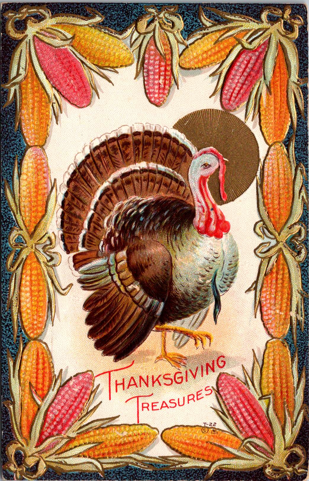


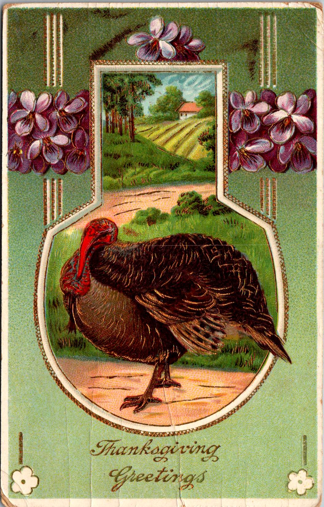


Perhaps like you, I’m whipping up goodies to be gobbled up tomorrow. So today, enjoy this visual feast for the eyes. Happy Thanksgiving!
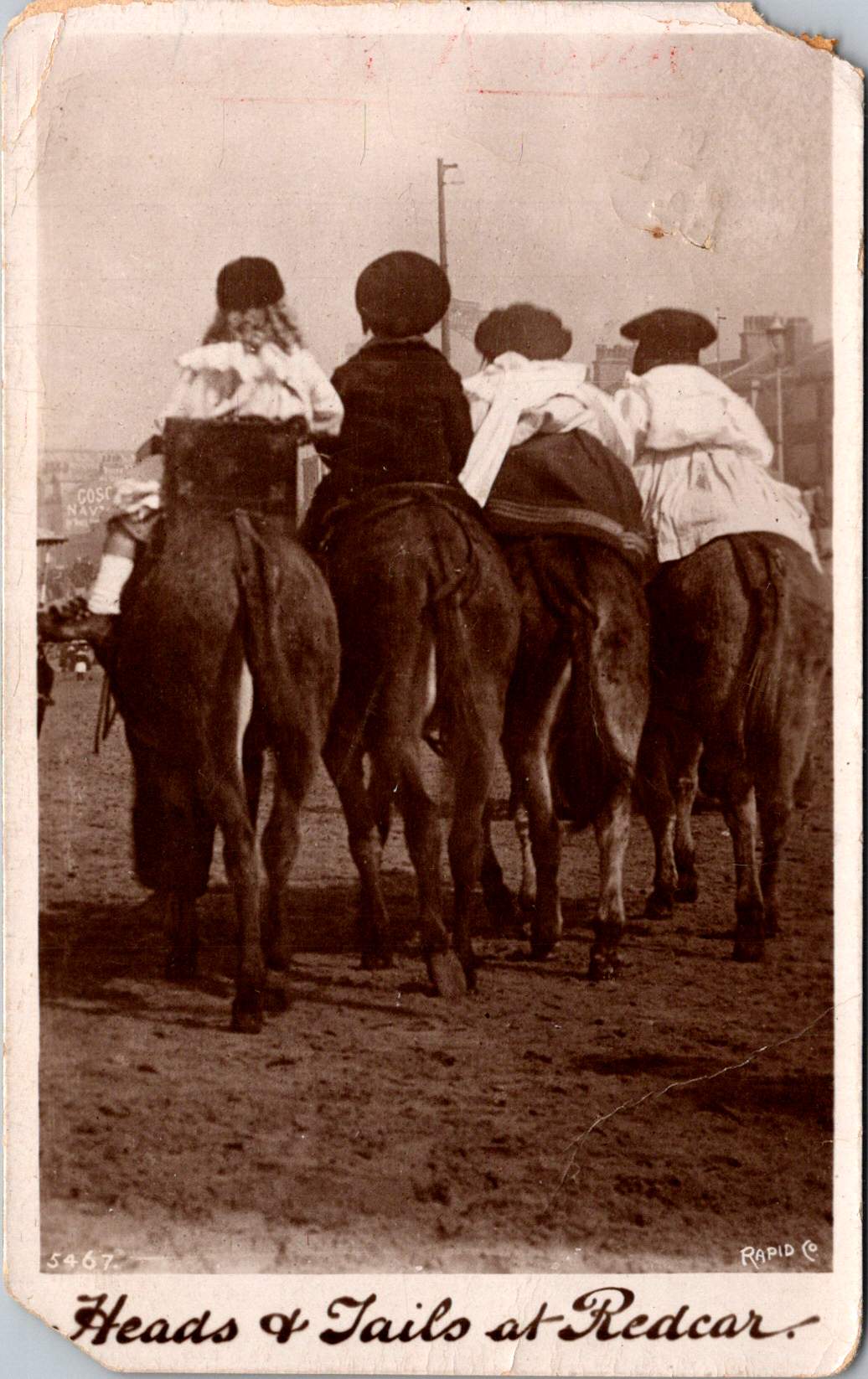
Four children are astride donkeys walking on the beach, clothed in Edwardian-style white blouses and all wearing caps. A century away (and still there today) kids on a delightful donkey ride near Redcar’s legendary seaside.
This real photo postcard with a memorable image bears the hand-scripted titled “Heads & Tails at Redcar.” One can still feel the April 18, 1910 embossed postmark on the card a century later. Addressed to Nurse Aird in Darlington from Redcar, the message is pragmatic.
Expect to arrive about 6.30 to-morrow evening. Love from Rennie
The seaside town of Redcar was transformed from a modest fishing village into a bustling resort town by the arrival of the railway in the mid-19th century, and became a beloved destination for working and middle-class families from throughout Britain’s industrial northeast.
In the 1910s, Redcar embodied the height of seaside grandeur. The impressive Coatham Hotel, built in 1871, dominated the seafront, its architecture expressing the optimism and ambition of the age. A pier stretched into the sea, its 1873 construction a testament to the engineering confidence of the era. Along the promenade, ornate gas lampposts cast their glow over evening strollers, while elaborate wooden shelters provided refuge from sudden showers.
The seafront architecture told a story of careful planning and civic pride. Victorian terraces, built of local sandstone or sturdy brick, were elegant facades looking at the sea. Behind them, a grid of streets housed seasonal workers, fishermen, and the growing permanent population drawn by the town’s prosperity. The Central Hall, opened in 1895, provided entertainment, while Methodist and Anglican churches with their reaching spires reminded visitors and residents alike of Victorian moral values.
Yet Redcar was never merely a tourist trap. The town’s proximity to mining linked it inextricably to Britain’s industrial might. The discovery of workable iron ore deposits in the Cleveland Hills in 1850 had sparked an industrial revolution in the region. By the 1910s, mines dotted the landscape, and the sight of industrial chimneys on the horizon reminded visitors of the region’s working heart. Many local people split their lives between seasonal tourist work and the demanding labor of the mines or ironworks.
This distinctive mixing of leisure and industry is part of Redcar’s character. Unlike some of Britain’s more exclusive seaside resorts, the community remained proudly connected to its working roots. The donkey rides captured in our postcard—a quintessential British seaside tradition—were an affordable pleasure for working families. The donkeys themselves, chosen for their gentle temperament and sturdy build, paralleled the town’s way: reliable, hardworking, and ready to provide joy to all comers.

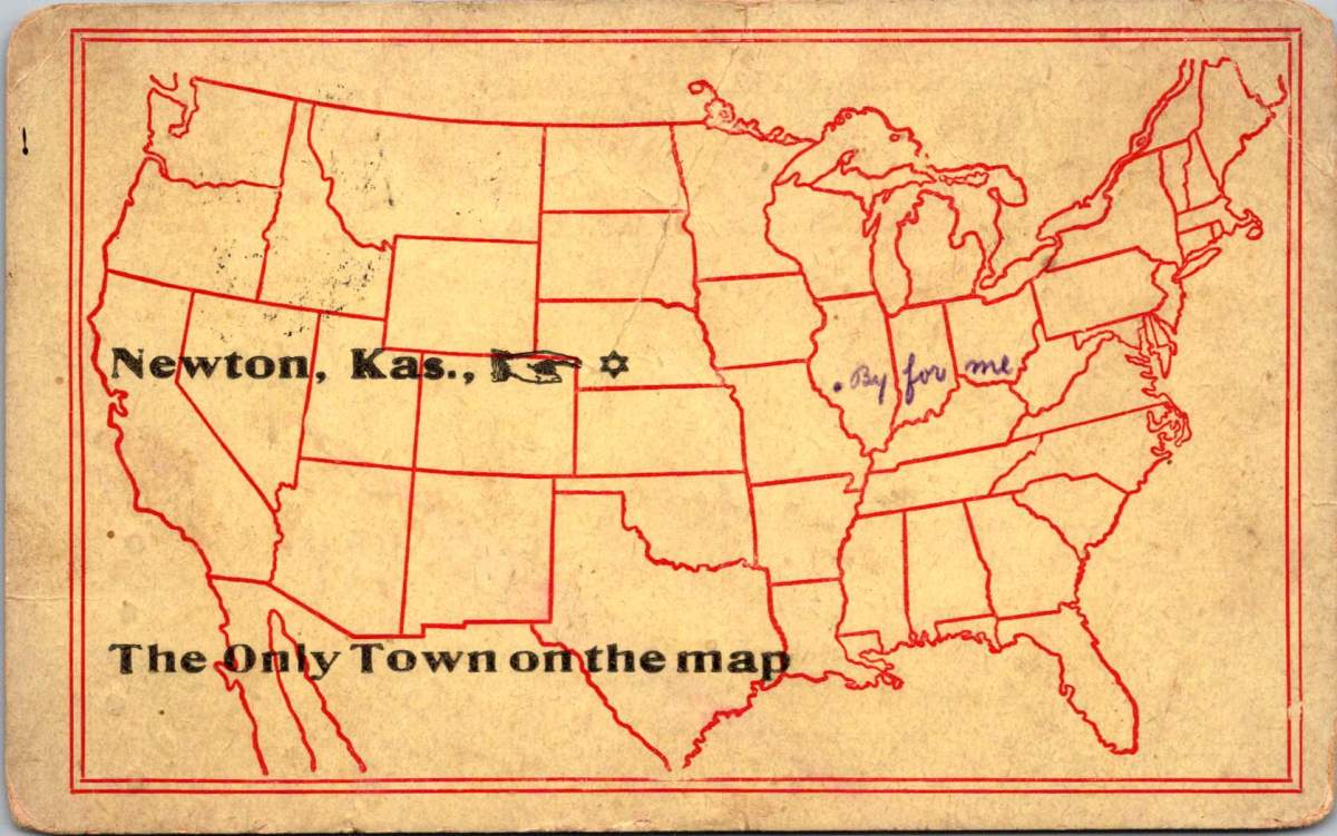
On April 18, 1910, Rennie dashed off a quick note from Redcar to Nurse Aird, using one of Rapid Photo Company’s popular seaside postcards to announce a return to Darlington the following evening at 6:30pm. Such precise timing speaks to the reliability of the North Eastern Railway’s service between the coastal town and Darlington, where regular daily connections had become the lifeblood of the region.
The journey home would begin at Redcar’s Central Station, its Victorian architecture still relatively new and imposing in 1910. The late afternoon departure would catch the changing light over the North Sea, before the steam locomotive began its hour-long journey inland. As the train pulled through Middlesbrough and then west toward Darlington, the spring evening would be settling in, with the Cleveland Hills silhouetted against the dusk. Fellow passengers might have included ironworkers heading to night shifts, businessmen returning from coastal meetings, and perhaps other daytrippers who had enjoyed the seasonal pleasures of the seaside.
By evening, Rennie would step onto the platform at Darlington’s Bank Top station, the time at the coast already feeling like a distant memory. Perhaps a deliberate choice of train, selected to arrive after Nurse Aird’s duties were complete or to catch the end of visiting hours. Whatever prompted the journey, the postcard captures the easy mobility that the railway enabled, allowing residents of these northeastern towns to move between coast and country with a regularity that would have seemed remarkable just a generation earlier.

The subsequent century would bring profound changes to Redcar. The pier, once a symbol of Victorian confidence, fell victim to storm damage and was demolished in 1981. The grand Central Hall disappeared. Many Victorian hotels were converted or demolished as tourism patterns changed. Most significantly, the industrial base that had provided much of the region’s wealth underwent dramatic transformation. The 2015 closure of the SSI steelworks marked the end of an era, dealing a devastating blow to the community.
Modern Redcar presents a complex picture of a community in transition. The Redcar Beacon opend in 2013 (locally dubbed the “Vertical Pier”) reaches skyward, its contemporary design contrasting with the Victorian architecture that remains. Victorian terraces continue to face the sea, their sandstone facades weathered but dignified. The Clock Tower, dating from 1913, remains a local landmark. The town center struggles with empty shops, a challenge faced by many British high streets. The loss of heavy industry has forced difficult economic adjustments.
The community’s response to these challenges reveals much about Redcar’s character. The Palace Hub, housed in a former amusement arcade, provides space for local artists and craftspeople. Local groups organize beach cleaning and heritage walks, maintaining the town’s connection with its past while protecting its future. Locally run kitchens and groceries address modern challenges of food poverty while building community connections.
Most remarkably, the donkeys still plod along the beach in summer months. The same gentle animals that carried kids a century ago now delight a new generation of visitors. Modern care standards ensure rest periods, weight limits, and veterinary checks, but the essential experience remains unchanged. Children still laugh with surprise at their first encounter with these patient beasts, parents still snap photographs (will box cameras make another comeback?) and the donkeys still take their slow and careful steps, connecting past and present.
Redcar reminds us that progress isn’t linear and that community change involves deep dynamics of loss and renewal. The town that grew wealthy on iron ore and Victorian tourism now seeks new paths forward in renewable energy and cultural heritage. What has remained is both quirky and reliable: a donkey ride on the beach on a summer’s day.
While the grand Victorian hotels and ore industries of the region have largely passed into history, the humble donkey ride endures. Sometimes the most modest traditions prove the most durable, and the true character of a place resides not only in grand achievements but also in simple, timeless pleasures.
Who indeed would have guessed that of all Redcar’s attractions, it would be the donkey rides we couldn’t live without? Perhaps it is fitting that these patient animals, who witnessed the town’s rise, decline, and ongoing reinvention, continue to reliably entertain (and endure) new generations.
The beauty in gallows humor is how it strips away pretense. On days when everything feels like a steaming pile anyway, there’s dark comfort in knowing that at least we’re all finally honest about what’s being shoveled around.
This vintage postcard, simply titled “Training for Politics,” captures a brutal honesty that resonates well on days when the world stinks. A lone cowboy, shovel in hand, flinging horse manure (the raw material for politics). Of course we see the effort, but it’s also hard to miss the explosive spray of debris frozen mid-flight.
There’s something uniquely comforting about humor that doesn’t try to brighten our mood but instead acknowledges the absurdity of our circumstances. When we’re struggling, the last thing most of us want is forced positivity or silver linings. We want recognition that yes, this is indeed a pile, and yes, someone is actively shoveling more of it.
On the surface, it’s a simple visual gag – politics is bullsh*t. But dig deeper (pardon the pun), and you’ll find a more nuanced observation about the nature of political discourse and human coping mechanisms.
Dark humor serves as a pressure release valve for the soul. It’s the linguistic equivalent of opening a window in a foul-smelling room. It doesn’t solve the problem, but it makes it more bearable. When we can laugh at the darkness, we’re not surrendering to it – we’re claiming it, owning it, transforming it into something we can manage.
Someone looked at a man shoveling manure and saw not just the physical act but its perfect metaphorical parallel to politics. They recognized that sometimes the most profound truths come wrapped in the most pungent packages. That’s what gallows humor does – it finds the universal in the awful, the communal in the catastrophic.
This postcard’s enduring relevance speaks to another truth about dark humor: it ages well. While more wholesome jokes may grow stale, gallows humor often becomes more poignant with time. Perhaps because human suffering, like political maneuvering, remains remarkably consistent across generations. The tools may change, but the essential nature of the job remains the same.
In our current era of carefully curated social media positivity and inspirational quote overdose, there’s something refreshingly honest about this image. It doesn’t try to inspire or uplift. It simply says, “Here’s what’s happening, and it stinks.” Sometimes, that acknowledgment is more comforting than a thousand motivational posters.
For those of us having one of those days – when the pile is knee deep – this anonymous cowboy becomes an unlikely patron saint of perseverance. Not because he’s rising above his circumstances or transforming them into something beautiful, but because he’s right there in the muck, doing what needs to be done, probably muttering colorful commentary under his breath.
The image reminds us that sometimes the healthiest response to life’s challenges isn’t to seek the bright side but to acknowledge the darkness with a wry smile and a few choice words. There’s solidarity in shared cynicism, comfort in the collective cry. It’s the silent nod between people who recognize that while we can’t always clean up the mess, we can at least make a postcard about it. If nothing else, it gives future generations something to laugh darkly about while dealing with their own problems.
It’s no good to make light of serious situations, but it helps to find the light-heartedness within them. Even if it’s just the glint of sun off a well-worn shovel.
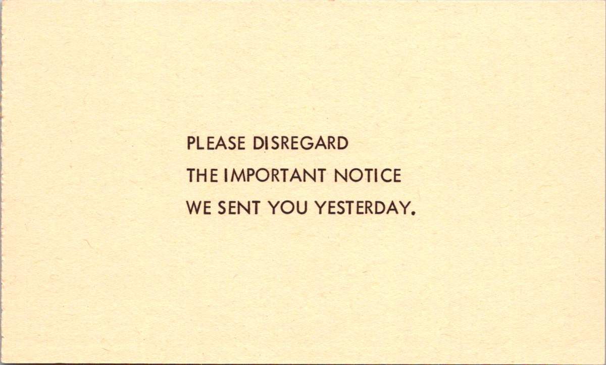
With just nine words, this 1964 parody postcard captures an era of bureaucratic absurdity. The genius lies in its perfect circularity: you can’t disregard a notice you never received. A logical paradox delivered in the stern capital letters of official communication.
This masterpiece of meta-humor was the centerpiece of “Nutty Notices,” a collection of satirical postcards published by Philadelphia’s GEM Publishing in 1964. The series went on to skewer everything from traffic enforcement to mattress tags, each card delivering bureaucratic absurdity like a stage clown wielding a rubber chicken.

Perfect for the spooky season, the next notice solemnly announces the recipient has won in an “Imminent Danger Sweepstakes” sponsored by a “Black Cat Society,” reassuring that previous recipients survived their subsequent accidents.
The collection unfolds like a greatest hits of paperwork problems. Another, from the stern-sounding “Bureau of Upholstery Tag Security,” threatens dawn raids over a removed mattress tag. A mock inheritance notice dangles a too-good-to-be-true fortune from a conveniently deceased fifth cousin, key details lost to a faulty typewriter.


These parodies emerged during a period of notable government expansion. The Great Society legislation of the Kennedy and Johnson administrations had launched numerous new agencies and programs, from the Peace Corps to Medicare. While many of these programs were popular, and have endured, they also generated unprecedented levels of paperwork and official communications in Americans’ daily lives.
The notices cleverly played on specific anxieties of the era: fear of government surveillance, concerns about traffic enforcement in the new Interstate era, and awareness of inheritance scams in an increasingly connected society.

The traffic violation notice, featuring President Lyndon B. Johnson, plays on LBJ’s notorious driving habits. The President was known for terrifying guests at his Texas ranch by driving his Amphicar (a German-made civilian amphibious vehicle) at high speeds toward the ranch’s lake, screaming about brake failure as his car plunged into the water. The vehicle was designed to float, but his unsuspecting passengers didn’t know that. This well-known presidential prank made the postcard’s joke particularly resonant with 1960s readers.
A good pun is still a kind of social capital, as all deadpanning dads know. The card below suggests an incredible win. The 1964 Plymouth Barracuda was a coveted car model, though overshadowed that year by the introduction of the Ford Mustang. The Barracuda featured a sloped fastback roofline and fold-down rear seats that created a large cargo area, making it both sporty and practical. The standard engine was a Slant-6, but buyers could opt for a more powerful V8 engine. Prices started at around $2,500 (approximately $22,000 in today’s dollars). By the end of the card, though, it’s all a bit fishy.

What makes these 1964 parodies fundamentally different from today’s deceptive communications is their clear satirical intent. The notices were obviously humorous, from their outlandish premises to their absurd escalations. They never attempted to deceive. The parodies didn’t seek to extract money, personal information, or action from recipients. The joke was the endpoint, and publishers and recipients understood these as entertainment, part of a broader tradition of bureaucratic satire.
Today’s deceptive communications often weaponize the same official-looking formats and bureaucratic language that these postcards once parodied. But modern scams aim to deceive rather than amuse, exploiting digital tools to create ever more convincing forgeries. Contemporary examples like phishing emails represent a darker evolution of institutional mimicry. While the 1964 notices laughed at authority’s pomposities, today’s deceptive communications abuse institutional authority for malicious purposes.
Long before memes spread political humor online, postcards served as a democratic medium for both serious political discourse and satirical commentary. During the Golden Age of postcards before World War I, suffragettes used them to promote women’s voting rights. The famous “Vinegar Valentines” of the Victorian era delivered stinging social critique through the mail. During World War II, patriotic postcards boosted morale while propaganda postcards spread messages both noble and nefarious.

These vintage parodies remind us that healthy skepticism toward official communications isn’t new—but the stakes have changed dramatically. In 1964, Americans could laugh at mock notices because real ones, while annoying, generally came through trusted channels with clear verification methods. Today’s digital landscape requires a more sophisticated type of visual and contextual literacy. We must balance healthy skepticism with the ability to recognize legitimate communications, while remaining alert to increasingly sophisticated forms of deception.
The “Nutty Notices” stand as charming artifacts of a time when bureaucratic busy-ness seemed worthy of laughter rather than alarm—when the worst thing a notice might do was create a paradox, not steal your identity. In an era of digital manipulation, we can look back nostalgically at a time when the most threatening official communication you might receive was a tongue-in-cheek warning about your mattress tags.
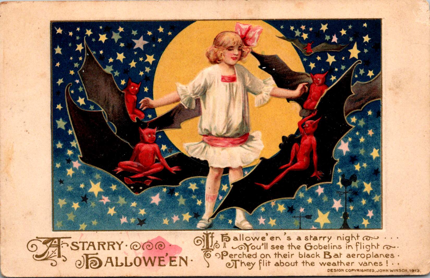
Against a star-strewn midnight sky, a girl in white stands fearless in front of a gleaming full moon while impish red devils perch on bat wings around her. This whimsical scene, printed in Germany in 1913, captures the magic of Halloween’s golden age, when postcards were miniature works of art and All Hallows’ Eve still balanced precariously between spooky and sweet.
The story of Halloween postcards mirrors the evolution of both holiday celebrations and the printing industry through the 20th century. Through these distinctive cards, we can trace changing artistic styles, printing technologies, and cultural attitudes toward this magical and mysterious holiday.
This century-old collection opens a window into an era when German printers, American artists, and local publishers like Salem Paper Company competed to create the perfect Halloween greeting. From dramatic witch flights to cheerful pumpkin-peeking children, these cards tell the story of a holiday—and an industry—in transformation.

The John Winsch-published “A Starry Halloween” (1913) represents a pinnacle of German chromolithography and American holiday marketing. The card’s verse playfully describes “black Bat aeroplanes.”
“Hallowe’en’s a starry night, You’ll see the Goblins in flight, Perched on their black Bat aeroplanes, They flit about the weather vanes!”
This aeronautical reference demonstrates how postcards of the era incorporated modern technology into traditional Halloween imagery. This whimsical text combines traditional Halloween motifs with early aviation enthusiasm, placing the card squarely in the 1910s zeitgeist.
The card’s detailed execution showcases why German printers dominated the global market before World War I. The deep blue starry sky creates a dramatic backdrop, while the precise color registration and subtle shading of the figures demonstrate the technical excellence of German printing houses.
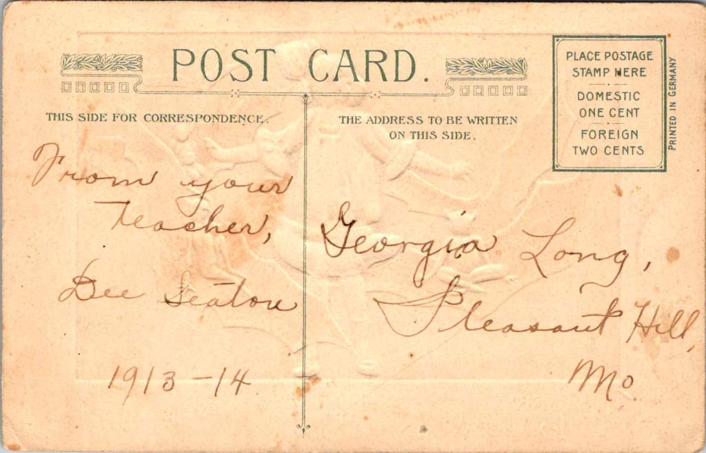
The postcard’s personal inscription—”From your Teacher, Dee Seaton, 1913-14″ to “Georgia Long, Pleasant Hill, Mo.”—reveals how these cards served as important social connections, particularly between teachers and students. The one-cent domestic postage rate, clearly marked on the divided back, reminds us of the affordability of this medium for everyday communication.
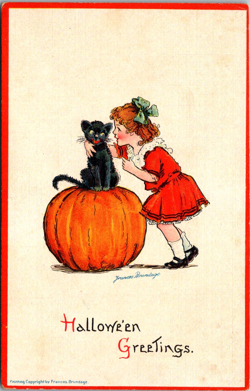


The Frances Brundage Halloween cards present a markedly different approach to the holiday in the same era. Known for her sweet-faced children and gentle compositions, Brundage brings her characteristic style to what could be frightening subject matter. The large orange pumpkin dominates the compositions, while a cheerful child with curly hair and a red bow plays with a black cat. The clean white background and red border create a bright, appealing presentation that contrasts with darker Halloween imagery.
Brundage (1854-1937) was among America’s most successful illustrators of children, and her distinctive style—rosy-cheeked, innocent-looking children with expressive faces—is immediately recognizable. Her work appeared on postcards, in children’s books, and in advertising, published by major companies including Raphael Tuck & Sons and Samuel Gabriel & Sons. This Halloween greeting card demonstrates how her gentle artistic approach could make potentially scary holiday themes appropriate for even the youngest children.
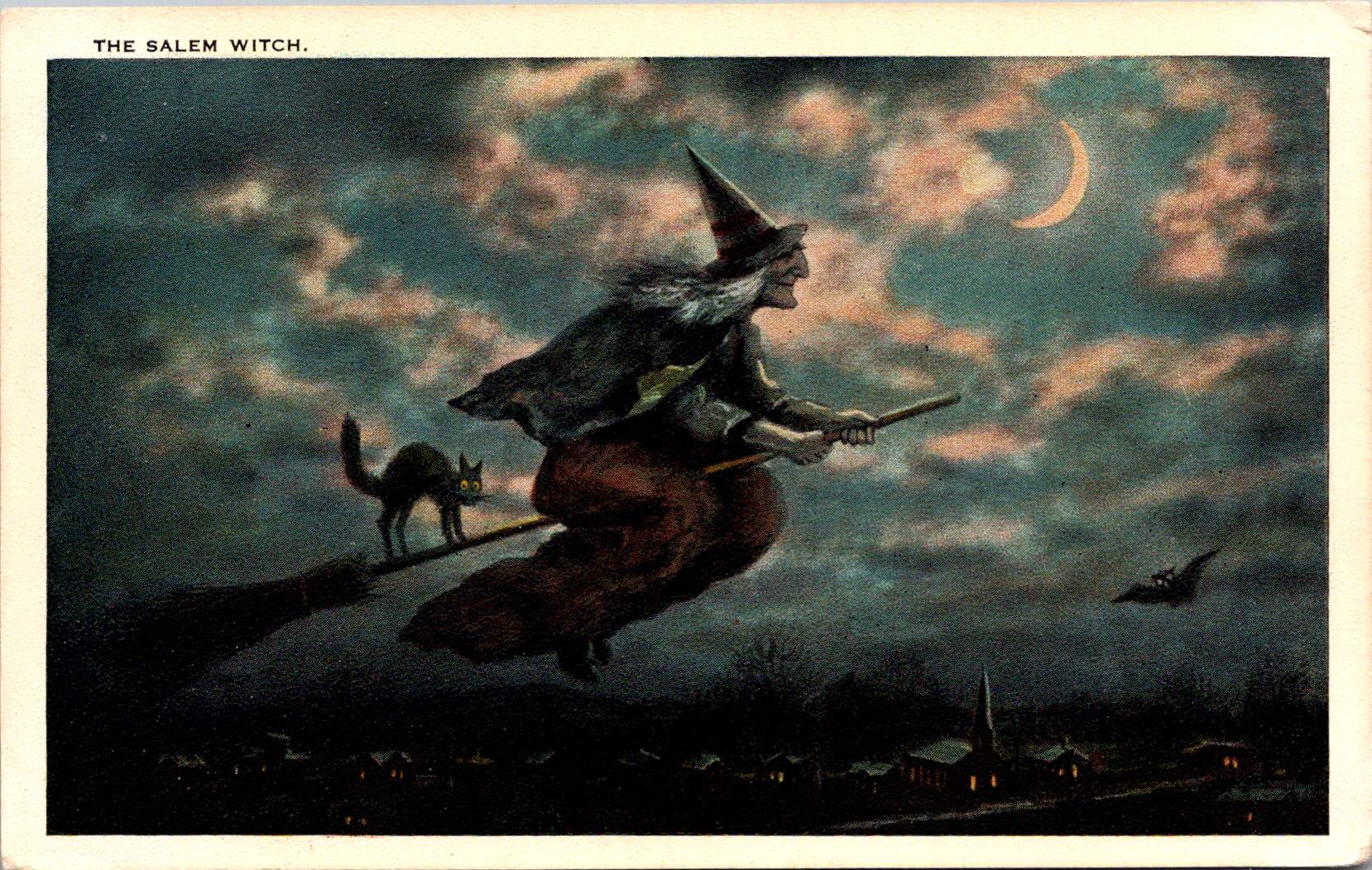
“The Salem Witch” postcard, published by the Salem Paper Company of Massachusetts, represents a fascinating intersection of local history, holiday celebration, and tourist commerce. The dramatic nighttime scene features a witch in traditional pointed hat and flowing cape, riding a broomstick across a turquoise sky filled with pink-tinged clouds and a crescent moon. A black cat balances behind her on the broomstick, while a bat flies nearby. Below, a small village with lit windows and a church spire creates a sense of scale and setting.
The publisher’s choice to produce this card in Salem was no accident. The city’s notorious witch trials of 1692-93 had by the early 20th century become a tourist draw, and the Salem Paper Company cleverly capitalized on this connection. The card’s dark, moody color palette of deep blues, blacks, and browns creates an appropriately spooky atmosphere.
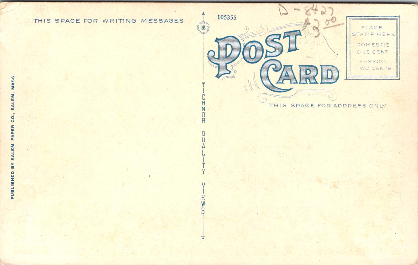
The card’s reverse reveals additional historical details through its markings: PUBLISHED BY SALEM PAPER CO., SALEM, MASS., card number 105355, and the TICHNOR QUALITY VIEWS designation. Tichnor Brothers of Boston was renowned for high-quality postcards, particularly New England scenes, making them an ideal partner for Salem Paper Company’s locally themed Halloween products. The technical quality suggests it was likely also printed in Germany, as were many premium postcards of the era, even those designs that were distinctly American and regional.

The final card, showing a startled child in white nightclothes against an orange-lit room, represents a later reproduction of Halloween imagery. Produced for Lillian Vernon and printed in Hong Kong, this card likely dates from the 1970s-1990s. But, it draws heavily on early 20th-century artistic conventions. The scene’s elements—a black cat in a window pane, yellow crescent moon, candlestick holder with lit candle, and fallen GHOST STORIES book—all reference classic Halloween postcard motifs. This card’s production history tells the story of significant changes in the postcard industry.
When Lillian Vernon, born in Leipzig, Germany, used her $2,000 wedding gift to launch a mail-order handbag business from her kitchen table in Mount Vernon, New York, in 1951, she could hardly have imagined she would revolutionize American gift retail. That first offering—a matching monogrammed handbag and belt set for $6.98—established the winning formula that would define her business: personalized items at affordable prices. The company name itself, taken from her new hometown, would become synonymous with accessible luxury and thoughtful gifting for generations of American shoppers.
Through the boom years of the 1980s and 1990s, Lillian Vernon catalogs were a fixture in American mailboxes, eagerly anticipated by parents and children alike. The company mastered the art of “catch-penny” items—small, impulse-buy treasures that seemed irresistible at their price points. Their most beloved offerings included personalized school supplies (from pencil cases to lunch boxes), holiday decorations, monogrammed doormats, and children’s toys. The company’s success made history in 1987 when Lillian Vernon became the first woman-owned company to be listed on the American Stock Exchange, a milestone in American business history.
By the time the company began sourcing products like Halloween postcards from Hong Kong printers, Lillian Vernon had transformed from a small mail-order business into a retail empire that included multiple specialized catalogs, retail stores, and eventually an online presence. The company’s choice to have the card printed in Hong Kong reflects the late 20th-century shift of printing operations from Europe and America to Asia, prioritizing cost-effective production over the artistic merit and technical excellence that characterized the German chromolithography era.
Though the company would ultimately close in 2016, unable to fully adapt to the digital age, its influence on American retail culture remains significant. The Lillian Vernon story represents both the American dream and the evolution of modern commerce—from kitchen-table startup to national brand, from personalized service to mass-market appeal, from mail-order catalogs to the small business opportunities of the internet era.
These postcards trace the evolution of Halloween greetings from the golden age of German printing through the modern reproduction era. The Winsch card represents the height of pre-WWI German chromolithography and original holiday artwork. Frances Brundage’s contribution shows how established American artists adapted holiday themes for children. The Salem Witch card demonstrates the growing commercialization of local history and holiday traditions. Finally, the Lillian Vernon reproduction reveals how these vintage designs found new life in the mass-market retail era.
Together, they tell a story not just of changing printing technologies and business models, but of the evolving relationship with Halloween itself. From the elaborate artistic productions of the 1910s through the mass-market reproductions of the late 20th century, Halloween postcards have both reflected and shaped how Americans celebrate this fascinating holiday.
The Halloween postcard industry’s journey from German printing houses through American publishers to Asian manufacturers parallels larger trends in American commerce and holiday celebrations. These cards remain valuable historical documents, preserving not just artistic styles and printing techniques, but also the personal connections and social customs of their eras. Whether sent by a teacher to a student in 1913 or purchased as a souvenir in more recent decades, each card represents a tangible link to the holiday and shared heritage.
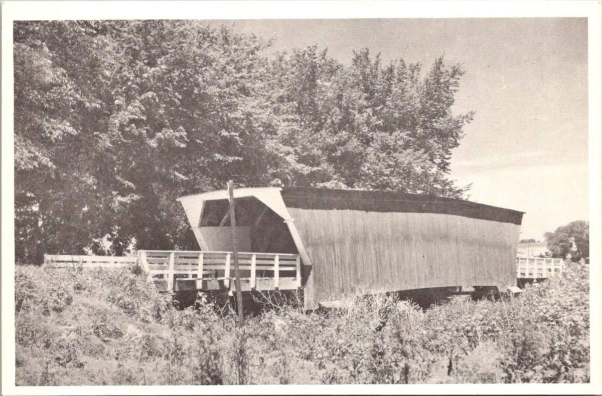
Weathered wooden structures still stand in the middle of Iowa, a testament to both engineering ingenuity and the power of storytelling. The covered bridges of Madison County have become more than mere crossings over babbling creeks; they are portals to the past, muses for artists, and anchors for a community’s identity. As the crisp autumn air settles over the rolling hills in October, thousands of visitors gather to celebrate these iconic structures at the annual Covered Bridge Festival, a tradition that has endured for over half a century.
Our journey begins with a stack of old locally-printed postcards, each capturing a nearby rural scene frozen in faded grayscale tones. Photographed by Clee Crawford in the early 1950s, these images were made into postcards sometime after 1983 by Larry’s Photography and Joe Graham Printing in Winterset, Iowa. Vintage collectibles themselves, they offer a glimpse of a bygone era when the now-famous bridges were simply part of the rural fabric of Madison County.
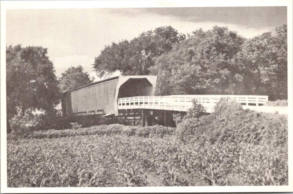

The Roseman Bridge, built in 1883 by H.P. Jones, spans the Middle River nine miles southwest of Winterset. In the postcard, it rises from a sea of cornstalks, its wooden siding weathered by countless Iowa summers and winters. Known locally as “The Haunted Bridge,” it whispers of ghost stories told around farmhouse tables and hushed conversations between young lovers seeking shelter from prying eyes. Little did the bridge know that it would one day become a star, playing a pivotal role in a story that would captivate millions.
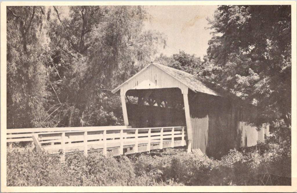
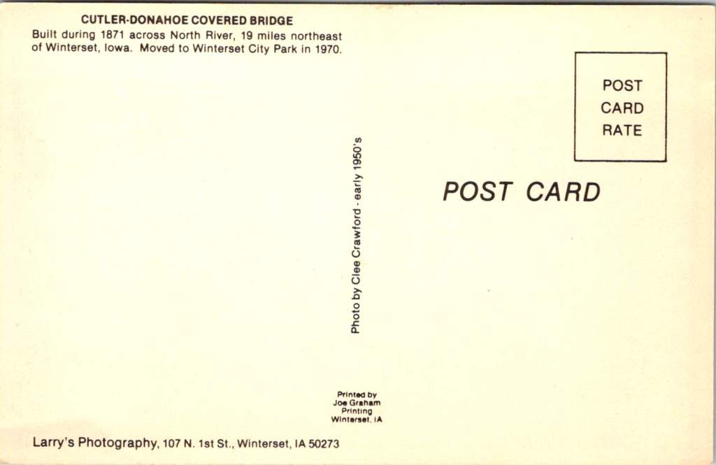
Moving northeast, we encounter the Cutler-Donahoe Bridge. Constructed in 1871, this structure originally crossed the North River. But like many of its counterparts, it found a new home as the winds of change swept through the county. In 1970, the same year the first Covered Bridge Festival was held, Cutler-Donahoe was carefully uprooted and transplanted to Winterset City Park. The postcard captures it in its original location, a sentinel standing guard over the river below, unaware of its future as a centerpiece of civic pride.

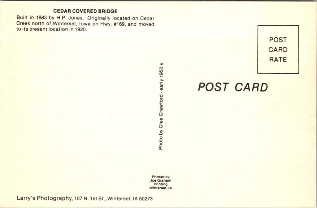
Our third postcard brings us to the Cedar Bridge, another creation of the prolific bridge-builder H.P. Jones. Erected in 1883 over Cedar Creek north of Winterset, it too would embark on a journey, moving to a new location in 1920. The image shows the bridge nestled in a picturesque rural setting, a dirt road winding its way to the entrance. What the postcard doesn’t reveal is the tumultuous future awaiting this particular bridge – a tale of destruction, rebirth, and the tenacity of a community unwilling to let go of its heritage.

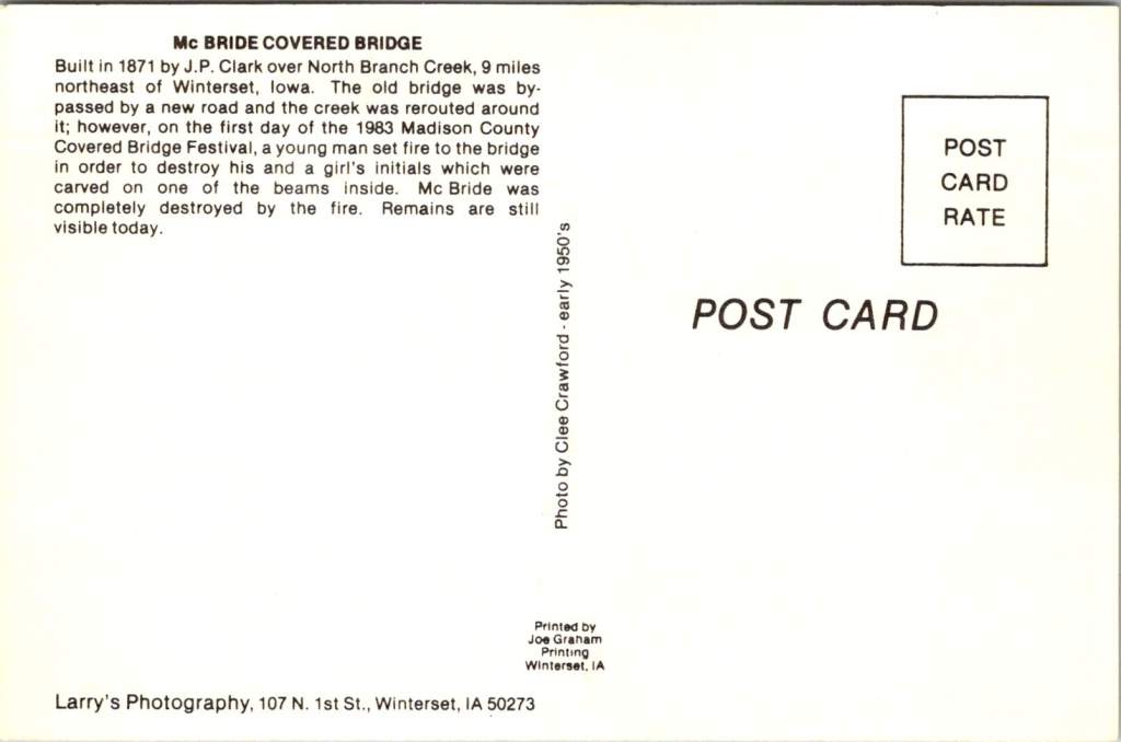
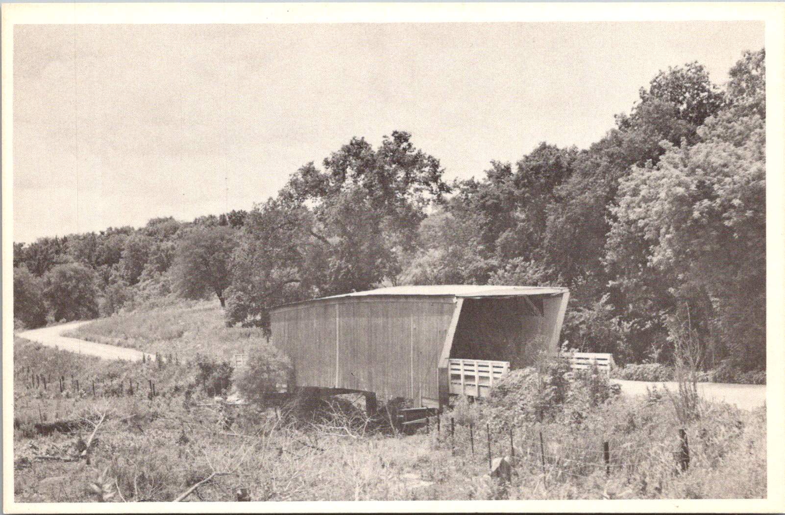
The final postcard in our collection tells a bittersweet tale. The McBride Bridge, built in 1871, appears proud and sturdy in the photograph. Yet the caption reveals its fate: destroyed by fire on September 3, 1983. This loss, occurring on the first day of the 1983 Madison County Covered Bridge Festival, served as a stark reminder of the fragility of these historical treasures and the importance of preservation efforts.
The destruction of the McBride Bridge is, unfortunately, not an isolated incident. Across the United States, covered bridges have long been targets of arson and accidental fires. According to data compiled by Covered Spans of Yesteryear, over 670 covered bridges have been lost to fire nationwide since the early 19th century. In Iowa alone, at least seven covered bridges have succumbed to flames, with arson being a common cause.
The Cedar Bridge, captured so peacefully in our postcard, has had a particularly tumultuous recent history. In 2002, it fell victim to arson, a loss that shook the community to its core. Demonstrating remarkable resilience, the bridge was rebuilt, only to suffer the same fate in 2017. The determination of Madison County residents prevailed once again, and a newly reconstructed Cedar Bridge opened in 2019 – a testament to the enduring significance of these structures in the local psyche.
As we shuffle these postcards, admiring the craftsmanship of both the bridges and the photographers who captured them, we’re drawn into a narrative that extends far beyond the borders of Madison County. These structures, once utilitarian crossings designed to protect travelers and livestock from the elements, have become characters in a much larger story – one that intertwines literature, film, tourism, and the very identity of a region.
The transformation began in 1992 with the publication of Robert James Waller’s novel, The Bridges of Madison County. Waller, an Iowa native, wove a tale of passion and missed chances against the backdrop of Madison County’s rural landscape. The Roseman Bridge, our “Haunted Bridge,” took center stage as the site where the story’s star-crossed lovers, Francesca Johnson and Robert Kincaid, first meet.
Suddenly, these bridges were no longer just local landmarks; they became symbols of romance, of roads not taken, of the bittersweet choices that shape our lives. The novel struck a chord with readers across the globe, selling millions of copies and landing on bestseller lists for over three years. But the story’s impact was only beginning.
In 1995, Hollywood came calling. Clint Eastwood directed and starred alongside Meryl Streep in the film adaptation of Waller’s novel. Once again, the bridges of Madison County found themselves in the spotlight, this time on the silver screen. The Roseman Bridge, in particular, became a character in its own right, its weathered boards and rustic charm providing the perfect setting for the unfolding drama.
The film’s success catapulted Madison County into the national consciousness. Tourists began flocking to Winterset and the surrounding areas, eager to walk in the footsteps of Francesca and Robert, to stand on the bridges where their fictional love blossomed, and to capture a piece of that romance for themselves.
This intersection of literature, cinema, and place created a perfect opportunity for cultural tourism. The bridges, which had stood for over a century as quiet witnesses to the ebb and flow of rural life, now found themselves at the center of a phenomenon that would reshape the economy and identity of Madison County.
The Covered Bridge Festival, which had begun in 1970 as a celebration of local history and craftsmanship, took on new significance. It became not just a community gathering, but a pilgrimage site for fans of the book and film, as well as history buffs, architecture enthusiasts, and romantics from all walks of life. Since then, the town itself has changed and adapted to the ongoing recognition.
As we fast forward, the allure of the bridges shows no signs of waning. The 2024 Covered Bridge Festival, held October 12-13 this year, continues to draw thousands of visitors to Madison County. For $3 admission (or two tickets for $5, with children under 11 entering free), attendees can immerse themselves in a weekend that bridges past and present.
The festival grounds, centered around the Winterset town square, buzz with activity. Vendors line the streets, offering handcrafted goods and local culinary delights. Sounds of live music fill the air, kids laughing in the Kids’ Zone, and the excited chatter of visitors from near and far.
For many, the highlight of the festival is the guided tour of the covered bridges, conducted by the Winterset Rotary Club. As buses wind their way through the countryside, visitors are treated to not just the sight of these historic structures, but also to tales of their construction, their role in local lore, and their journey from practical crossings to cultural icons.
The festival isn’t just about looking back, however. It’s a living, breathing celebration that continues to evolve. The 2024 event features a parade, a car show that turns the area around the courthouse into a chrome-and-steel wonderland, and a variety of demonstrations showcasing the craftsmanship and ingenuity that built these bridges in the first place.
At the Madison County Historical Complex, visitors can delve deeper into the area’s rich past. Here, the bridges are placed in context, their stories interwoven with those of the farmers, merchants, and families who have called this corner of Iowa home for generations.
As the festival has grown, so too has the need to balance tourism with preservation. The story of the Cedar Bridge serves as a poignant reminder of the challenges faced in preserving these landmarks. As we admire their beauty and revel in their romantic associations, we must also reckon with their vulnerability. Each bridge that remains standing is a victory – over time, over the elements, and sometimes over human destructiveness.
As the sun sets on this year’s festival, casting long shadows through the covered bridges, visitors and locals alike are reminded of the unique alchemy that has occurred here. What began as a practical solution to a transportation need has become a cultural touchstone, an economic driver, and a source of identity for an entire region.
The bridges of Madison County are physical manifestations of the power of storytelling, the appeal of nostalgia, and the human desire to connect – not just from one riverbank to another, but across time, across mediums, and across cultures. They are examples of 19th-century engineering that teach us more every future decade they exist.
These bridges offer something increasingly rare: a moment of pause, a chance to step out of the rush of modern life and into a space where time moves a little slower. Whether you’re a fan of Waller’s novel, a history enthusiast, or simply someone in search of a quiet moment of reflection, the covered bridges of Madison County have something to offer.
As we look to the future, the challenge for Madison County will be to continue balancing preservation with progress, nostalgia with innovation. The Covered Bridge Festival, with its blend of historical celebration and contemporary community spirit, serves as a model for how this might be achieved.
For now, as October winds whisper through the wooden beams of the Roseman, Cutler-Donahoe, Cedar, and the other three surviving bridges, they carry with them the echoes of all who have passed through before – from 19th-century farmers to 20th-century film stars to the tourists and locals of today. Each footstep, each photograph, each stolen moment adds another layer to the rich tapestry of stories that these bridges hold.


Our postcards, now decades old themselves, serve as a reminder of the power of image and imagination to transform the ordinary into the extraordinary. From simple river crossings to symbols of undying love, from local landmarks to international attractions, the covered bridges of Madison County have undergone a journey as winding and wonderful as the roads that lead to them. In the hearts and minds of all who have encountered them – whether through postcards, novels, films, or in person – these bridges have built connections far stronger and more enduring than wood and nails could ever achieve.
As we tuck our postcards away and the festival-goers return home, we’re left with an appreciation for these humble structures that have become so much more. The covered bridges of Madison County remind us that with a little imagination, a touch of serendipity, and year-after-year of care, even the most unassuming places can become the stuff of legend.
In the end, perhaps that’s the true magic of Madison County’s covered bridges – their ability to transport us not just from one side of a river to another, but from our everyday lives into a world where love, history, and community intertwine.
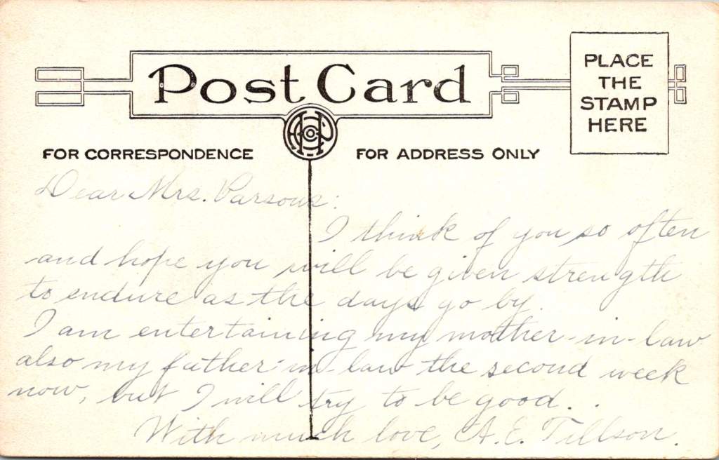
Sometimes, a single postcard reads like a dramatic novel. On September 5, 1914, Mrs. C.H. Jones received a cryptic message (just five drawn lines) from her husband at the St Helena Sanitarium in Napa Valley.
With a closer look, this mysterious correspondence reveals the unique influence of its author on Adventist history and early 20th century approaches to wellness, nature, and medicine.
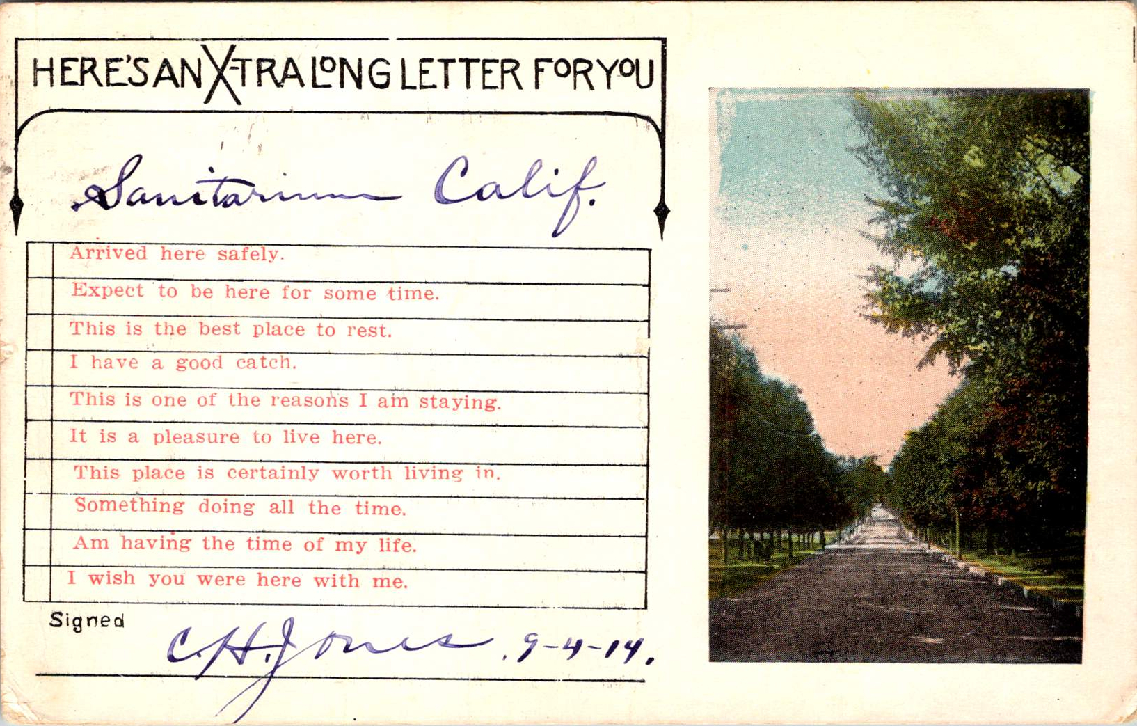
The front of the postcard offers a glimpse of the sanitarium’s picturesque surroundings. A color image shows a serene body of water flanked by lush greenery. Trees line the banks, their reflections shimmering on the water’s surface. In the distance, rolling hills rise, creating a sense of depth and showcasing the natural beauty of the Napa Valley. This image is accompanied by a pre-printed checklist of common sentiments a visitor might want to convey, such as “Arrived here safely” and “This is the best place to rest,” though Jones himself did not make a selection.
The words POST CARD are prominently displayed in green, capital letters across the back of the card with a divided section below. On the left, under the words “For Correspondence” appear five wavy blue lines drawn by hand, mysterious marks standing in for whatever personal message C.H. Jones might have penned to his wife. On the right side in the same elegant ink: “Mrs C.H. Jones, #305 Kenwood St., Glendale, Calif.” A green one-cent stamp featuring the profile of George Washington adorns the upper right corner, canceled by a postmark from Saint Helena, on Sep 5, 1914.

The St. Helena Sanitarium itself was a sight to behold. Nestled into the lush, forested hillside of the Napa Valley, the sanitarium complex was impressive and inviting. The main building, a grand structure of several stories with a white-painted exterior, stood out starkly against the dark green of the surrounding forest.
A series of covered verandas, visible on each level, offered patients and visitors alike the opportunity to take in the fresh air and stunning views of the valley. These outdoor spaces, so integral to the sanitarium’s health philosophy, wrapped around portions of the building, providing ample space for rest and contemplation.
The landscaping immediately surrounding the building was meticulous, with manicured lawns, ornamental shrubs, and small trees dotting the grounds. Palm trees hinted at the mild California climate. The entire complex exuded an air of tranquility and order, its gleaming white walls a beacon of health and hope set against the verdant backdrop of the Napa Valley.
The St. Helena Sanitarium played a significant role in both Adventist history and the broader health reform movement sweeping across America in the late 19th and early 20th centuries. This movement, driven by concerns about urbanization, industrialization, and changing diets, saw the rise of numerous health institutions known as sanitariums. These facilities, often located in picturesque natural settings, aimed to provide rest, rejuvenation, and health education to their patrons.

The most famous sanitarium was in Battle Creek, Michigan, led by Dr. John Harvey Kellogg. Kellogg, an Adventist physician, transformed the Western Health Reform Institute into a world-renowned health resort. The Battle Creek Sanitarium became a model for other such institutions, including St. Helena, with its emphasis on hydrotherapy, exercise, vegetarian diet, and the importance of fresh air and sunlight.
W.H. Kellogg, John’s brother, played a crucial role in developing health foods that became staples at the Battle Creek Sanitarium and beyond. The Kellogg brothers’ invention of corn flakes and other vegetarian foods aligned with the Adventist emphasis on a plant-based diet and had a lasting impact on American food culture.
The St. Helena Sanitarium, while smaller than Battle Creek, developed along similar lines. It was established in 1878 by a small group of Adventist believers who purchased the 10-acre Napa Valley property for $13,000. The initial facilities were modest, consisting of a small two-story building capable of accommodating about 40 patients. Dr. Merritt Kellogg, another brother of John Harvey Kellogg, was instrumental in its early development.
Like Battle Creek, St. Helena emphasized natural remedies and lifestyle changes. However, it had the added advantage of California’s mild climate and beautiful surroundings, which were seen as inherently health-promoting. The sanitarium quickly gained a reputation as a “Garden of Eden” for health seekers, attracting patients from across the country.
As the institution grew, it expanded its facilities and services. By the early 1900s, it had modern medical equipment, including X-ray machines and clinical laboratories, alongside its natural treatments. This blend of conventional and alternative therapies was characteristic of progressive sanitariums of the era.
The St. Helena Sanitarium also differed from Battle Creek in its continued close affiliation with the Seventh-day Adventist Church. While John Harvey Kellogg eventually separated from the church, St. Helena remained a central institution in Adventist health ministry. This was reinforced by Ellen G. White’s nearby residence at Elmshaven and her ongoing involvement in the sanitarium’s affairs.
By 1914, when C.H. Jones visited, the sanitarium had evolved significantly from its humble beginnings. Under the medical superintendence of Dr. George Thomason, who had been in charge since 1911, it had become a well-established medical institution, yet it remained true to its founding principles of natural healing and wholistic health.
The sanitarium’s mission was rooted in the Adventist health message, which emphasized prevention and natural remedies. Its philosophy, revolutionary for its time, promoted a holistic approach to health, treating the whole person – body, mind, and spirit. This was reflected in its services, which included hydrotherapy treatments, a vegetarian diet, exercise programs, and spiritual care.
One of the sanitarium’s key features was its use of natural springs on the property for hydrotherapy treatments. These water-based therapies were a cornerstone of the sanitarium’s approach to healing. The institution also boasted a nursing school, training professionals to carry the Adventist health message to other institutions and communities.
The sanitarium’s emphasis on health education extended beyond its walls. The Pacific Health Journal and Temperance Advocate, published by the “health retreat” at St. Helena, helped disseminate Adventist health principles to a wider audience.
The sanitarium’s reputation extended far beyond Adventist circles, attracting a diverse and often notable clientele. Among its reported visitors were William Jennings Bryan, the famous orator and three-time presidential candidate, and Jack London, the renowned author of “Call of the Wild.” Some sources even suggest that President Theodore Roosevelt may have visited, though this claim requires further verification. These high-profile guests, drawn by the sanitarium’s innovative treatments and serene environment, helped cement its status as a premier health institution.


Charles Harriman Jones, the sender of our postcard, was himself a significant figure in Adventist history. Born in 1850, he had dedicated his life to the publishing work of the Seventh-day Adventist Church. By 1914, he had been serving as the chief executive of the Pacific Press Publishing Association for over two decades, overseeing its growth and relocation from Oakland to Mountain View, California in 1904. His tireless efforts had helped establish the Press as a cornerstone of Adventist publishing.
Jones’ presence at the sanitarium is unsurprising given his close working relationship with Ellen G. White, who lived nearby at her Elmshaven home. White, a prolific author whose works were published by Pacific Press, took an active interest in the sanitarium’s affairs and often provided counsel on its operations. Her proximity allowed her to provide ongoing support, further cementing the institution’s importance within the Adventist framework.
While the St. Helena Sanitarium was thriving in 1914, the broader sanitarium movement was on the cusp of significant challenges. The early 20th century saw rapid advancements in medical science that would ultimately transform healthcare and challenge the sanitarium model.
The development of germ theory and its widespread acceptance in the medical community led to a greater emphasis on specific treatments for identified pathogens, rather than the natural remedies favored by sanitariums. The discovery of insulin in 1921 and the development of antibiotics in the 1930s and 1940s dramatically changed the treatment of many diseases, shifting focus away from the lifestyle and dietary approaches central to sanitarium care.
In the field of mental health, the rise of psychoanalysis and other forms of talk therapy began to challenge the sanitarium approach to treating nervous disorders. Sigmund Freud’s theories, gaining prominence in the early 1900s, offered new explanations for mental illness that went beyond the physical and environmental factors emphasized in sanitariums.
The standardization of medical education, following the influential Flexner Report of 1910, also played a role. This report led to more rigorous, science-based medical training and the closure of many schools that didn’t meet the new standards. As a result, newer generations of doctors were less likely to embrace the eclectic, nature-based approaches common in sanitariums.
The Great Depression of the 1930s dealt a significant blow to many sanitariums, as fewer people could afford extended stays at these facilities. World War II further accelerated the decline, as resources were diverted to the war effort and many sanitariums were converted into military hospitals.
By the 1950s and 1960s, many of the grand old sanitariums had closed or been converted into conventional hospitals or other facilities. The Battle Creek Sanitarium, once the flagship of the movement, closed its doors in 1957. However, some institutions, like the St. Helena Sanitarium, successfully transitioned into modern hospitals while retaining elements of their holistic health heritage.
The St. Helena Sanitarium, now known as Adventist Health St. Helena, stands as a testament to this evolution. While it has become a full-service hospital, it continues to emphasize whole-person care and lifestyle medicine, echoing its sanitarium roots. The continued operation of the St. Helena facility, albeit in a much-evolved form, speaks to the enduring value of some aspects of the sanitarium philosophy, even in an age of highly specialized modern medicine.
This 1914 postcard captures a moment just before the scientific and social changes that would reshape the medical landscape. At this late stage in his life, C.H. Jones would have seen firsthand the sanitarium’s significance and its role in promoting Adventist health principles but he may not have predicted the way medicine and healthcare would change. We can fill in the lines on the postcard to his wife with the details of a long career in Adventist publishing and health ministries, or perhaps more poignantly with the advice C.H. Jones would offer us today.
Alongside any earnest effort to declutter, minimize, or embrace a modest lifestyle, there are delightful rebellions brewing in the corners of our homes, on our bookshelves, and in our hearts. Collecting – postcards, stamps, or any manner of curious objects – is among a great many pastimes that bring us joy.
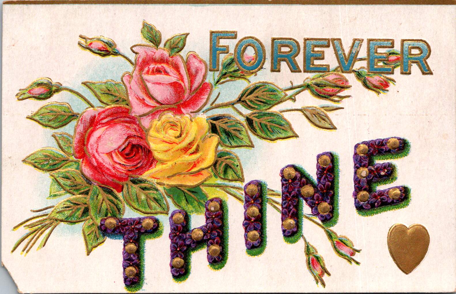
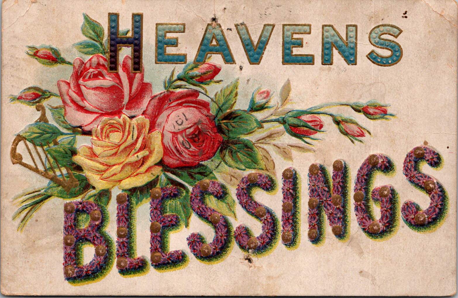
Let’s start with a set of floral letter postcards that captured my heart and imagination recently. For me, they’re time capsules from the Edwardian era, each one a miniature masterpiece of design and sentiment.
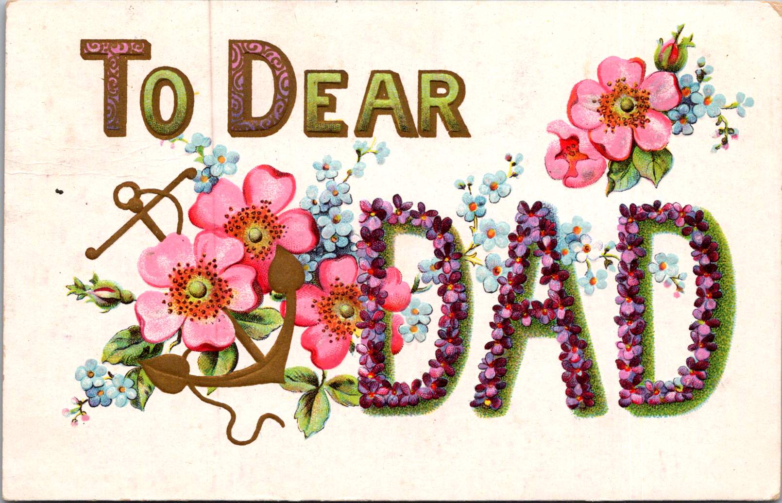

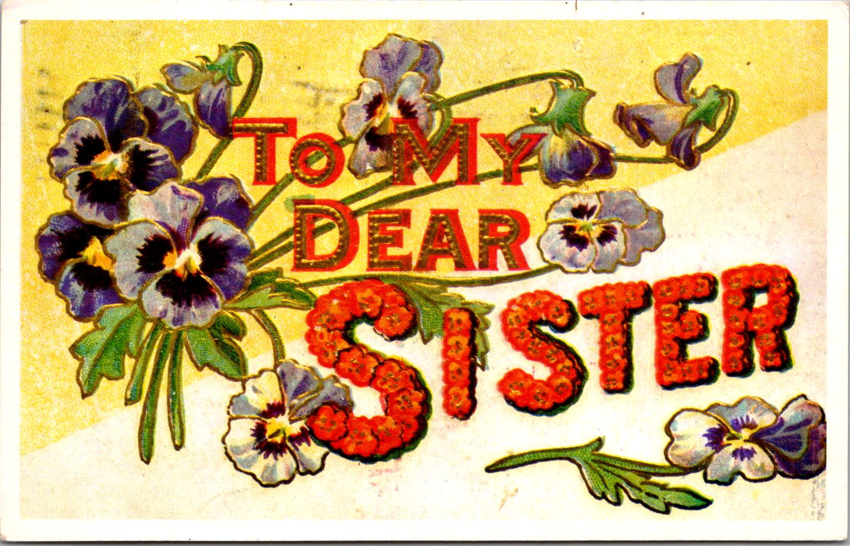

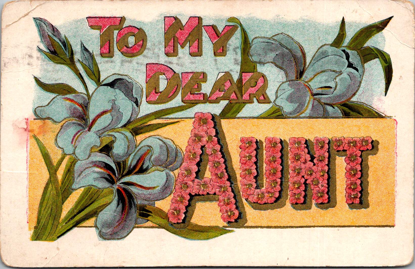
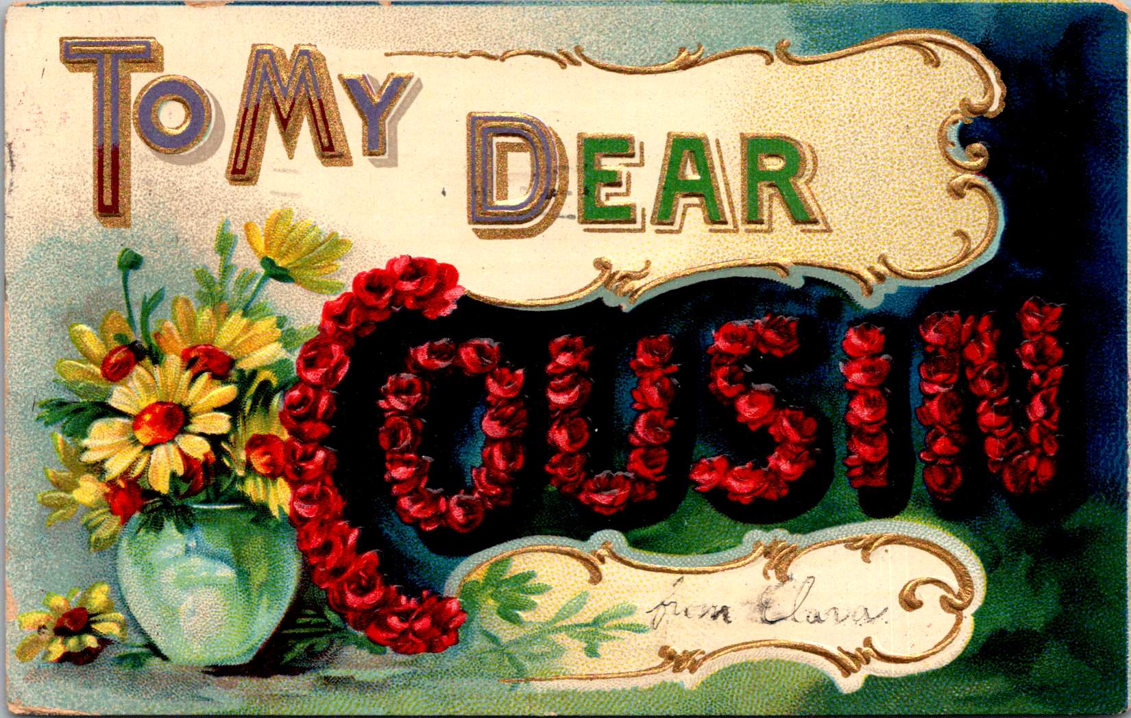
Delicate flowers intertwine with bold capital letters, spelling out affectionate greetings to mothers and fathers, aunts and cousins, and more. Blue irises dance around pink and gold lettering, while red roses form the word ‘cousin’ against a dramatic dark background. It’s Victorian drama meets Art Nouveau flair, all condensed into a 3.5 x 5.5 inch rectangle. The colors are vibrant, defying the century they have traveled to meet our modern eyes.
But why do these particular postcards make my collector’s heart skip a beat? It’s not just their undeniable aesthetic appeal, though that’s certainly part of it. They’re windows into history, offering glimpses of a time when sending a beautifully designed card was a primary way of keeping in touch with loved ones. Each handwritten message on the back (like the one postmarked July 10, 1909) is a tiny slice of someone’s life, preserved for over a century.

There’s also the thrill of the hunt. Finding a matching set among thousands of vintage postcards is like piecing together a particularly beautiful puzzle. Each new discovery brings an aha and a sense of completion. It’s a patience game, sure, but the payoff is worth it.
These postcards, with their intricate details and bold typography, have stood the test of time. They’re just as appealing now as they were when they were first printed. Collecting them isn’t just owning pretty objects – it’s a chance to examine, hold, preserve and share a piece of design history, a snapshot of the aesthetic sensibilities of a bygone era.
Collecting is deeply personal. While I pour over century-old postcards, my neighbor friend is curating an ever-expanding collection of adorable bird figurines. He’s particular about it too – they have to be a specific kind, from a specific place, at a specific price point. He watches the bird market, adds to his collection strategically. To a non-birder, it might seem quirky. But watch him arrange his birds, carefully considering where each one fits, and you’ll understand something profound about him: he’s a person who experiences quiet joys.
First and foremost, collecting is about falling in love with something uniquely suited to you. It’s about creating space in your life – physical and emotional – for the things that bring you joy. It’s about curating, admiring, and sharing a part of yourself through the objects you choose to surround yourself with. My friend curates his bird collection, brings them out by the seasons, delightful arrangements that invite family and friends to enjoy, too.

This philosophy extends far beyond postcards and bird figurines. Think about the philatelists out there, losing themselves in the minute details of postage stamps. Each tiny square is a work of art, a nugget of history, a passport to another time and place.
Or consider the sports enthusiasts, their shelves lined with signed jerseys and game-used equipment. For them, these aren’t just objects – they’re tangible connections to moments of athletic glory, to the heroes they admire.
History buffs might seek out Civil War relics or Space Age memorabilia, each artifact a physical link to events that shaped our world. And in our digital age, even contemporary collectibles are thriving. From limited edition vinyl figures to exclusive sneaker releases, people are finding new ways to express their passions through the objects they collect.
What unites all these diverse collecting interests? The deep connection to a particular passion or area of interest that only you can know. Whether it’s a century-old postcard or a just-released collectible figurine, these objects become repositories of personal meaning and cultural significance for their collectors.
Collecting, in its various forms, is just one of many popular ways Americans choose to spend their leisure time. Zoom out for a moment and consider the broader landscape of hobbies and pastimes in the United States.
Reading continues to be a widely enjoyed pastime, with many people diving into both physical books and digital formats. It’s an accessible hobby that caters to diverse interests and can be done almost anywhere.
Gardening has seen a surge in popularity, especially in recent years, as people seek to connect with nature and perhaps grow a bit of their own food. Cooking and baking remain perennially popular, with the rise of cooking shows and online recipes making it easier than ever for people to explore new cuisines and techniques at home.
Exercise and fitness activities, including running, cycling, and yoga, are on the rise as people focus more on health and wellness. Crafting hobbies like knitting, crocheting, and DIY projects have seen renewed interest, offering a creative outlet and the satisfaction of making something by hand.
Photography has become more widespread with the improvement of smartphone cameras, allowing more people to capture and share moments from their daily lives. Not only do I collect floral postcards, I take pictures of beautiful flowers every chance I get!
Hiking and outdoor activities are popular, and of course, sports – both playing and watching – continue to be a major part of American culture and a popular pastime for many.

What drives us to spend our precious free time on these pursuits? The benefits are numerous and far-reaching.
On a personal level, hobbies provide stress relief and relaxation. They offer an escape from daily pressures and can be a form of meditation, helping to reduce stress and anxiety. Many hobbies involve learning new skills or improving existing ones, which can boost self-confidence and cognitive function. They provide a creativity outlet, stimulating imagination and innovative thinking.
There’s also the sense of achievement that comes from completing projects or reaching milestones in a hobby. This can provide a significant boost to self-esteem and overall life satisfaction. Regular engagement in enjoyable activities can help combat depression and improve overall mood. Having a hobby encourages better time management as we carve out time for our interests. And perhaps most importantly, hobbies can become an integral part of our identity, providing a sense of purpose and self-definition outside of work or family roles.
Many hobbies involve communities of like-minded individuals, providing opportunities for social connection and friendship. Engaging with others who share your interests can help develop language, communication and interpersonal skills. Some hobbies, especially those involving arts, crafts, or cuisines from different cultures, can broaden cultural awareness and appreciation.
These pursuits can sometimes lead to unexpected networking opportunities, potentially beneficial for personal or professional growth. Shared hobbies can strengthen family relationships by providing common interests and shared experiences. Many hobbies appeal to people of all ages, facilitating connections across generations. And hobby communities often provide emotional support, advice, and encouragement, fostering a sense of belonging.
Many hobbies, particularly those involving physical activity, contribute to better overall health and fitness. Engaging in hobbies, especially those that challenge the mind, can help maintain cognitive function as we age. Skills learned through hobbies can sometimes translate into valuable job skills or even new career opportunities. Some hobbies can evolve into side businesses or income streams. And perhaps most importantly, hobbies provide a counterbalance to work and other responsibilities, contributing to a more well-rounded life.
So, whether you’re arranging a set of vintage postcards, nurturing a garden, mastering a new recipe, or climbing a mountain, know that you’re doing more than just passing time. You’re engaging in a fundamental human activity, one that brings joy, fosters growth, builds connections, and adds richness to life.

In the end, our collections and hobbies are extensions of ourselves. They reflect our interests, our aesthetics, our values, and our histories. They give us a way to tangibly interact with our passions, to create order and meaning in a chaotic world, and to surround ourselves with objects and experiences that bring us joy and inspiration.
So the next time someone raises an eyebrow at your carefully curated collection of Star Wars figurines, or questions why you spend hours perfecting your sourdough technique, remember this: in pursuing your passions, you’re not just collecting things or passing time. You’re crafting your narrative, preserving memories, expressing your unique identity, and experiencing the quiet (or not so quiet) joys that make life rich and meaningful.
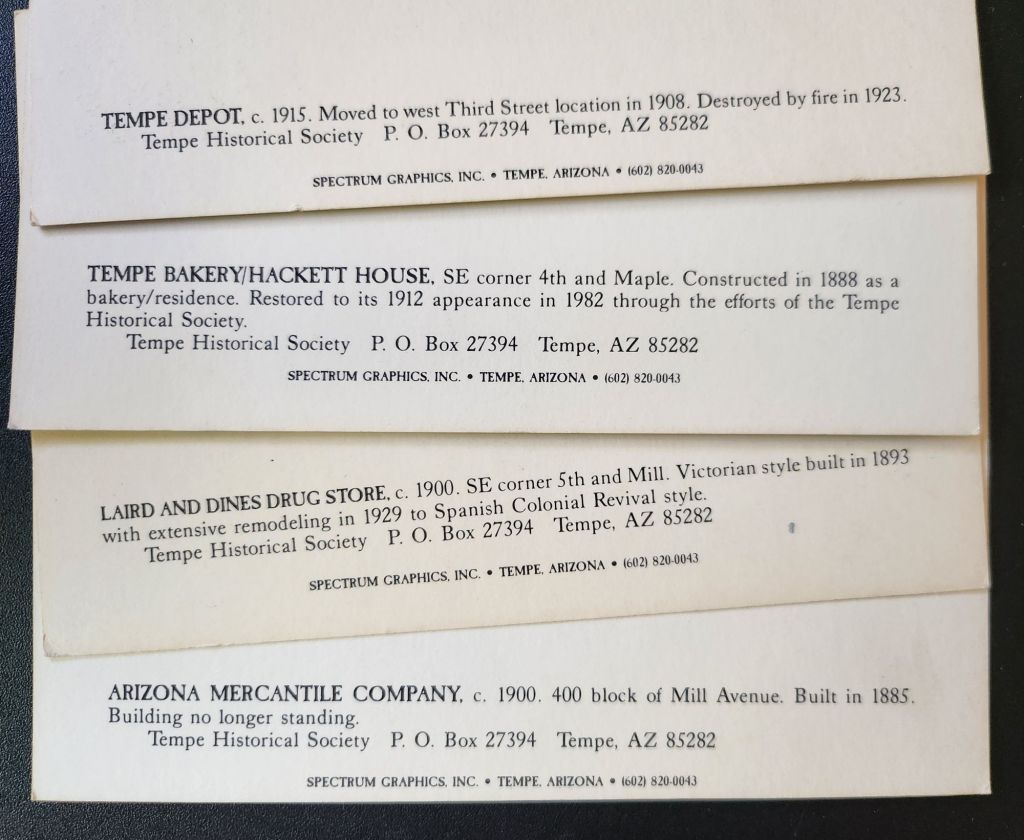
A set of postcards printed in the 1980s reflect Tempe’s history a century before. Now historical artifacts themselves, these images offer a window into the city’s past and future.
As we examine each postcard, we’ll uncover the story of Tempe’s development and explore how each generation has contributed to the city’s evolving landscape.

Today’s journey begins with a postcard depicting the Hackett House, a quaint building constructed in 1888. This red brick structure, Tempe’s oldest of its kind, stands as a testament to the city’s early days. With its distinctive turret and elegant design, it exemplifies the rare Arizona Territorial Victorian commercial style.
Originally built by German immigrant William Hilge as Tempe’s first bakery, the Hackett House’s location near the Hayden Flour Mill, the railroad, and the Territorial Normal School (now Arizona State University) nods to the earliest urban planning in Tempe. The postcard captures the building’s 1912 appearance, which was painstakingly restored in the 1970s.
The history of the Hackett House mirrors Tempe’s own evolution. After its days as a bakery, it served as a residence and later a boarding house. It earned its current name when Estelle Craig, Tempe’s first telephone operator, married Roy Hackett in the old bakery house. By the 1980s, when our postcards were likely printed, the Hackett House had already been recognized for its historical significance and placed on the National Register of Historic Places.

Our next stop is the Tempe Depot, captured in a postcard circa 1915. The image shows a steam locomotive at the station, a small group clustered for the photograph. This scene represents a pivotal moment in Tempe’s history, symbolizing the city’s connection to the wider world.
The arrival of the Maricopa and Phoenix Railroad in 1887 transformed Tempe from a small farming community into a thriving center of commerce. The depot, built in 1907, served as a vital link for both passengers and freight, fueling Tempe’s growth and prosperity. Though the original structure was lost to fire in 1923, this postcard preserves its memory and significance.

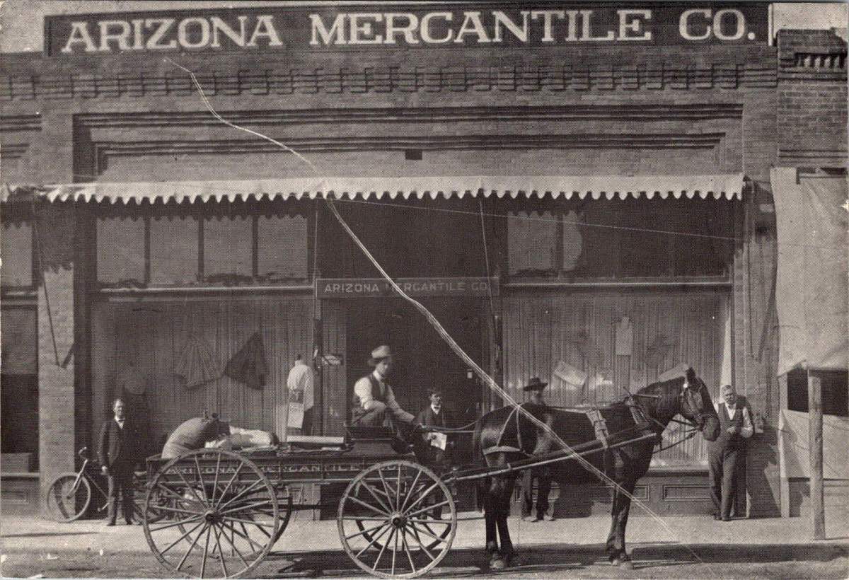
The next postcard features the Arizona Mercantile Co., a sturdy brick building constructed in 1898. With its large storefront and a horse-drawn carriage parked outside, this image encapsulates the commercial heart of early Tempe.
The Arizona Mercantile Co. played a crucial role in Tempe’s economy, providing essential goods and services to the growing community. The image itself, its preservation, and later reproduction underscores the importance of local businesses in shaping Tempe’s identity and meeting its residents’ needs.

Our final postcard depicts the Laird and Dines Drug Store, circa 1900. This Victorian-style corner building, with its prominent “DRUGS” signage, offers another glimpse into Tempe’s commercial past. The image shows the particulars of storefront business, with its ornate architecture, early signage, and shades to defend against the afternoon sun.
The building went on to serve as campaign HQ for Senator Carl Hayden and Governor Benjamin B. Moeur, as well as the first town hall and post office. Renovations reflected each successive era, including a few that were later reversed. Look closely today, and the old bones still show.
As we explore Tempe’s history through these 1980s postcards, we encounter an interesting dichotomy in historical preservation. While some buildings depicted still stand today, others have long since disappeared from Tempe’s landscape.
The preservation of postcards offers a unique window into the past, allowing us to visually experience Tempe as it once was, even when the physical structures no longer exist. The Tempe Depot postcard, for instance, preserves the image and significance of a building lost to fire, serving as a tangible link to the city’s early railroad days.
On the other hand, the preservation of buildings like the Hackett House allows for a more immersive connection with history. Visitors can walk through the same spaces, touch the same walls, and experience the ambiance of a bygone era in a way that a two-dimensional image can’t replicate.
This dual approach to preservation provides a richer, more comprehensive understanding of Tempe’s history. The postcards fill in the gaps where physical preservation was lost, while the preserved buildings offer tactile and fertile connections to the past.
Tempe’s commitment to preserving its architectural heritage is evident in the numerous historic properties that dot its landscape. The Elias-Rodriguez House, built in 1882 using traditional adobe methods, stands as one of the oldest surviving buildings in Tempe, representing the early Hispanic influence on the city’s development.
The Niels Petersen House Museum, a Queen Anne Victorian style home built in 1892, offers visitors a glimpse into the life of a wealthy rancher in territorial Arizona. The Old Main building on Arizona State University’s campus, completed in 1898, continues to serve the university community while standing as a proud reminder of the institution’s long history.
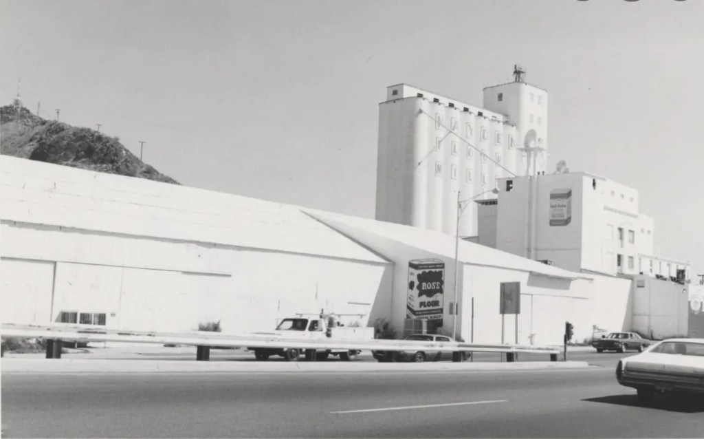
These pristinely preserved buildings, along with others undergoing substantial redevelopment like the Hayden Flour Mill (1918) form a network of historical touchstones throughout Tempe. They create a physical timeline of the city’s development, allowing residents and visitors alike to trace Tempe’s growth from a small agricultural settlement to a thriving modern city.

While our postcards capture Tempe’s early history, the city’s development didn’t stop in the early 20th century. Each subsequent generation has left its mark on Tempe’s landscape, contributing important and useful additions that have shaped the city we know today.
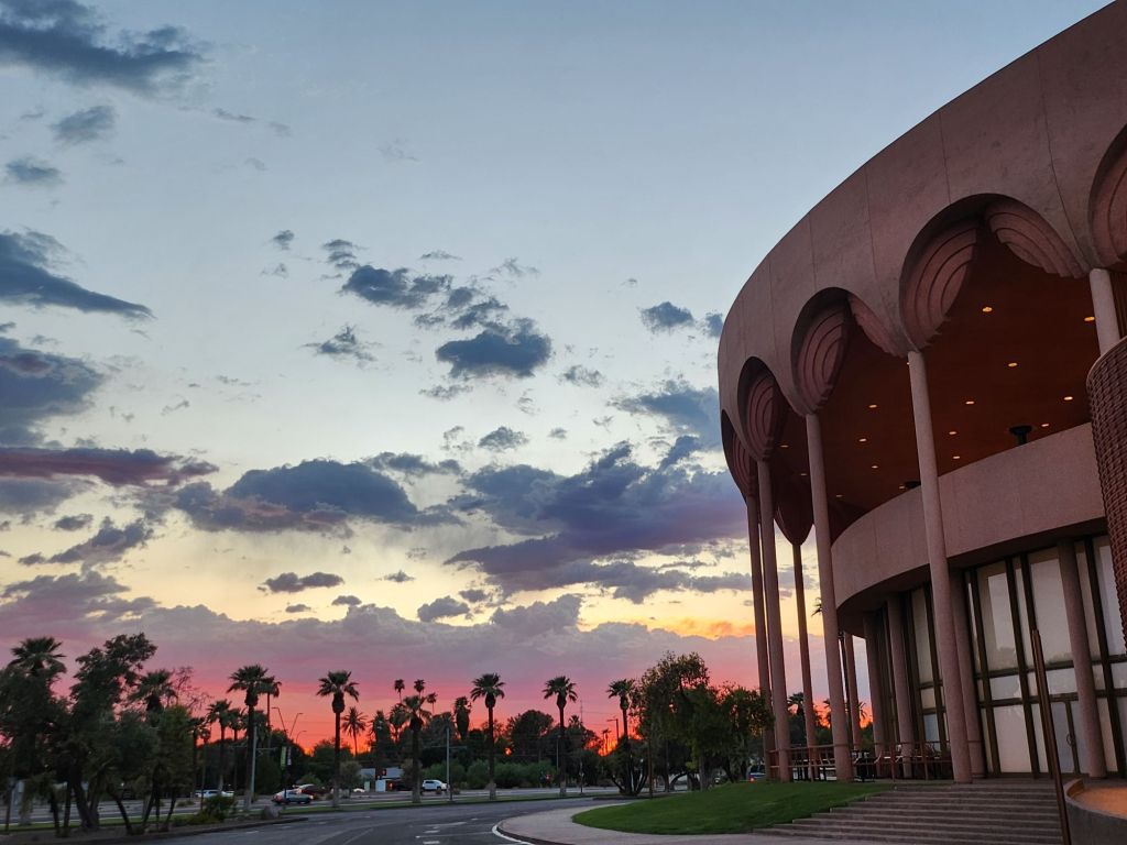
The 1960s saw the development of the Mid-Century Modern style that has since become iconic in Tempe. Grady Gammage Memorial Auditorium still defines Tempe’s landscape as a living example of Taliesin West design, inspired by Frank Lloyd Wright’s principles and aesthetic.
Another example, Shalimar Golf Course & Estates, built in 1961 combining a golf course with a mix of single-family and townhomes all featuring the golf lifestyle. This ambitious project represented a new approach to suburban living, offering residents a blend of recreational amenities and comfortable housing. The golf course continues to operate today, though its future faces the threat of redevelopment again in 2025.
As we consider the fate of mid-century developments like Shalimar, we’re confronted with a critical question: will these more recent historical landscapes be preserved in place or will they exist only as postcards, if at all? The answer may depend on how we value and interpret the architectural and cultural legacy of the mid-20th century, and how we balance preservation with the evolving needs of a growing city.
These projects, spanning a century, demonstrate how each generation in Tempe has contributed something important and useful to the city’s landscape. Each of these developments responded to the needs and aspirations of its time while also shaping the future of Tempe. They’ve created new models for residential communities, transformed the city’s relationship with its natural environment, spurred economic growth, and positioned the city as a cultural hub in the region.
Moreover, these projects have often built upon or complemented earlier developments. For instance, Tempe Town Lake is a modern creation that in some ways echoes the water management innovations seen in earlier projects like the Roosevelt Dam. The Tempe Center for the Arts, with its lakeside location, takes advantage of the views and ambiance and extends the cultural campus of the city.
This layering of infrastructure and development over time creates a rich urban tapestry that tells the story of Tempe’s growth and evolution. From the historic buildings captured in our 1980s postcards to the modern landmarks of today, each generation has added its own chapter to Tempe’s ongoing narrative.

Examining Tempe’s history reveals how certain civic priorities persist across generations, forming a thread of continuity. The establishment of the Territorial Normal School in 1885 reflects an ongoing commitment to education that continues to shape the city’s identity today. Infrastructure development demonstrates the community’s long-standing recognition of the importance of resource management and large-scale planning.
The presence of telephone services in early Tempe, including Estelle Craig’s role as the city’s first telephone operator, reminds us the community’s need to embrace new technologies. This spirit of innovation has persisted through the decades, manifesting today in Tempe’s adoption of smart city technologies and its support for tech industry growth.
The growth of local businesses and transportation networks demonstrates a consistent focus on economic development that remains a key priority for Tempe. From the early mercantile stores to the bustling mill, and from the first railroad to modern light rail systems, Tempe has always recognized the importance of commerce and connectivity in building a thriving community.

Understanding our history plays a crucial role in shaping the future of our cities, and Tempe is no exception. The walkable, mixed-use nature of early Tempe, where residences, businesses, and civic institutions coexisted in close proximity, still exists as a memory and a footprint within contemporary urban planning that prioritizes regional accessibility and global interaction.
Preserved buildings like the Hackett House do more than just remind us of the past; they actively influence contemporary architectural styles. By maintaining these historical structures, Tempe creates a sense of continuity in its urban landscape. Modern buildings often incorporate elements inspired by these historical designs, creating a blend of old and new that gives the city its unique character over time.
Historic buildings also make spaces for modern vision and mission, as seen with the Hackett House’s current role as headquarters for Tempe Sister Cities. This practice of adaptive reuse not only preserves historical structures but also breathes new life into them, making global connections, welcoming visitors and ensuring Tempe’s relevance for future generations.

As we look at these 1980s postcards of even older Tempe landmarks, we’re reminded that the appreciation of history is itself a constant. Each generation recognizes the value of its heritage and works to preserve it for the future. In doing so, they contribute to the ongoing story of Tempe, creating a richer, more resilient urban fabric that honors the past while embracing the future.
The challenge – and opportunity – for Tempe and cities worldwide lies in maintaining this delicate balance between preservation and progress. By thoughtfully integrating historical elements into modern urban planning, we create spaces that are not only functional and innovative but also deeply rooted in the community’s unique identity and shared history.
Crucially, thinking about the past and future opens a window into creative solutions for present-day challenges. Some old ways of desert living offer valuable clues for sustainable life in modern Tempe. The walkable nature of early Tempe, for instance, provides inspiration for reducing car dependency. The adaptive reuse of buildings like the Hackett House demonstrates how we can minimize waste and preserve cultural heritage simultaneously. The large-scale water management projects of the past have to inform us in dealing with water scarcity in an era of climate change.
As Tempe faces new challenges and opportunities, these historical images and structures serve as both guideposts and inspirations. They remind us that every generation leaves its mark, and that by honoring our past, we can create a more meaningful and sustainable future. The story of Tempe, as told through these postcards and the buildings they depict, is about continuity amidst change and working together. It’s a story that continues to unfold, with each generation adding its own chapter.
In the end, Tempe’s effort to learn from its history while boldly innovating for the future reflects those shared concerns every community faces. It shows that progress and preservation are not mutually exclusive, Rather, they are complementary forces. When balanced thoughtfully, they can create vibrant, resilient, and deeply-rooted urban and suburban communities. As Tempe faces the future, it does so with the wisdom (and the failures!) of its history as a guide, each generation ensuring that the city’s unique character and community spirit will endure for the next.