Heads & Tails: Redcar a Century Ago

Four children are astride donkeys walking on the beach, clothed in Edwardian-style white blouses and all wearing caps. A century away (and still there today) kids on a delightful donkey ride near Redcar’s legendary seaside.

This real photo postcard with a memorable image bears the hand-scripted titled “Heads & Tails at Redcar.” One can still feel the April 18, 1910 embossed postmark on the card a century later. Addressed to Nurse Aird in Darlington from Redcar, the message is pragmatic.

Expect to arrive about 6.30 to-morrow evening. Love from Rennie

The seaside town of Redcar was transformed from a modest fishing village into a bustling resort town by the arrival of the railway in the mid-19th century, and became a beloved destination for working and middle-class families from throughout Britain’s industrial northeast.

In the 1910s, Redcar embodied the height of seaside grandeur. The impressive Coatham Hotel, built in 1871, dominated the seafront, its architecture expressing the optimism and ambition of the age. A pier stretched into the sea, its 1873 construction a testament to the engineering confidence of the era. Along the promenade, ornate gas lampposts cast their glow over evening strollers, while elaborate wooden shelters provided refuge from sudden showers.

The seafront architecture told a story of careful planning and civic pride. Victorian terraces, built of local sandstone or sturdy brick, were elegant facades looking at the sea. Behind them, a grid of streets housed seasonal workers, fishermen, and the growing permanent population drawn by the town’s prosperity. The Central Hall, opened in 1895, provided entertainment, while Methodist and Anglican churches with their reaching spires reminded visitors and residents alike of Victorian moral values.

Yet Redcar was never merely a tourist trap. The town’s proximity to mining linked it inextricably to Britain’s industrial might. The discovery of workable iron ore deposits in the Cleveland Hills in 1850 had sparked an industrial revolution in the region. By the 1910s, mines dotted the landscape, and the sight of industrial chimneys on the horizon reminded visitors of the region’s working heart. Many local people split their lives between seasonal tourist work and the demanding labor of the mines or ironworks.

This distinctive mixing of leisure and industry is part of Redcar’s character. Unlike some of Britain’s more exclusive seaside resorts, the community remained proudly connected to its working roots. The donkey rides captured in our postcard—a quintessential British seaside tradition—were an affordable pleasure for working families. The donkeys themselves, chosen for their gentle temperament and sturdy build, paralleled the town’s way: reliable, hardworking, and ready to provide joy to all comers.

On April 18, 1910, Rennie dashed off a quick note from Redcar to Nurse Aird, using one of Rapid Photo Company’s popular seaside postcards to announce a return to Darlington the following evening at 6:30pm. Such precise timing speaks to the reliability of the North Eastern Railway’s service between the coastal town and Darlington, where regular daily connections had become the lifeblood of the region.

The journey home would begin at Redcar’s Central Station, its Victorian architecture still relatively new and imposing in 1910. The late afternoon departure would catch the changing light over the North Sea, before the steam locomotive began its hour-long journey inland. As the train pulled through Middlesbrough and then west toward Darlington, the spring evening would be settling in, with the Cleveland Hills silhouetted against the dusk. Fellow passengers might have included ironworkers heading to night shifts, businessmen returning from coastal meetings, and perhaps other daytrippers who had enjoyed the seasonal pleasures of the seaside.

By evening, Rennie would step onto the platform at Darlington’s Bank Top station, the time at the coast already feeling like a distant memory. Perhaps a deliberate choice of train, selected to arrive after Nurse Aird’s duties were complete or to catch the end of visiting hours. Whatever prompted the journey, the postcard captures the easy mobility that the railway enabled, allowing residents of these northeastern towns to move between coast and country with a regularity that would have seemed remarkable just a generation earlier.

In 12 historic pictures: a day at the seaside at Redcar from The Northern Echo

The subsequent century would bring profound changes to Redcar. The pier, once a symbol of Victorian confidence, fell victim to storm damage and was demolished in 1981. The grand Central Hall disappeared. Many Victorian hotels were converted or demolished as tourism patterns changed. Most significantly, the industrial base that had provided much of the region’s wealth underwent dramatic transformation. The 2015 closure of the SSI steelworks marked the end of an era, dealing a devastating blow to the community.

Modern Redcar presents a complex picture of a community in transition. The Redcar Beacon opend in 2013 (locally dubbed the “Vertical Pier”) reaches skyward, its contemporary design contrasting with the Victorian architecture that remains. Victorian terraces continue to face the sea, their sandstone facades weathered but dignified. The Clock Tower, dating from 1913, remains a local landmark. The town center struggles with empty shops, a challenge faced by many British high streets. The loss of heavy industry has forced difficult economic adjustments.

The community’s response to these challenges reveals much about Redcar’s character. The Palace Hub, housed in a former amusement arcade, provides space for local artists and craftspeople. Local groups organize beach cleaning and heritage walks, maintaining the town’s connection with its past while protecting its future. Locally run kitchens and groceries address modern challenges of food poverty while building community connections.

Most remarkably, the donkeys still plod along the beach in summer months. The same gentle animals that carried kids a century ago now delight a new generation of visitors. Modern care standards ensure rest periods, weight limits, and veterinary checks, but the essential experience remains unchanged. Children still laugh with surprise at their first encounter with these patient beasts, parents still snap photographs (will box cameras make another comeback?) and the donkeys still take their slow and careful steps, connecting past and present.

Redcar reminds us that progress isn’t linear and that community change involves deep dynamics of loss and renewal. The town that grew wealthy on iron ore and Victorian tourism now seeks new paths forward in renewable energy and cultural heritage. What has remained is both quirky and reliable: a donkey ride on the beach on a summer’s day.

While the grand Victorian hotels and ore industries of the region have largely passed into history, the humble donkey ride endures. Sometimes the most modest traditions prove the most durable, and the true character of a place resides not only in grand achievements but also in simple, timeless pleasures.

Who indeed would have guessed that of all Redcar’s attractions, it would be the donkey rides we couldn’t live without? Perhaps it is fitting that these patient animals, who witnessed the town’s rise, decline, and ongoing reinvention, continue to reliably entertain (and endure) new generations.

Shoveling Sh!t

The beauty in gallows humor is how it strips away pretense. On days when everything feels like a steaming pile anyway, there’s dark comfort in knowing that at least we’re all finally honest about what’s being shoveled around.

This vintage postcard, simply titled “Training for Politics,” captures a brutal honesty that resonates well on days when the world stinks. A lone cowboy, shovel in hand, flinging horse manure (the raw material for politics). Of course we see the effort, but it’s also hard to miss the explosive spray of debris frozen mid-flight.

There’s something uniquely comforting about humor that doesn’t try to brighten our mood but instead acknowledges the absurdity of our circumstances. When we’re struggling, the last thing most of us want is forced positivity or silver linings. We want recognition that yes, this is indeed a pile, and yes, someone is actively shoveling more of it.

On the surface, it’s a simple visual gag – politics is bullsh*t. But dig deeper (pardon the pun), and you’ll find a more nuanced observation about the nature of political discourse and human coping mechanisms.

Dark humor serves as a pressure release valve for the soul. It’s the linguistic equivalent of opening a window in a foul-smelling room. It doesn’t solve the problem, but it makes it more bearable. When we can laugh at the darkness, we’re not surrendering to it – we’re claiming it, owning it, transforming it into something we can manage.

Someone looked at a man shoveling manure and saw not just the physical act but its perfect metaphorical parallel to politics. They recognized that sometimes the most profound truths come wrapped in the most pungent packages. That’s what gallows humor does – it finds the universal in the awful, the communal in the catastrophic.

This postcard’s enduring relevance speaks to another truth about dark humor: it ages well. While more wholesome jokes may grow stale, gallows humor often becomes more poignant with time. Perhaps because human suffering, like political maneuvering, remains remarkably consistent across generations. The tools may change, but the essential nature of the job remains the same.

In our current era of carefully curated social media positivity and inspirational quote overdose, there’s something refreshingly honest about this image. It doesn’t try to inspire or uplift. It simply says, “Here’s what’s happening, and it stinks.” Sometimes, that acknowledgment is more comforting than a thousand motivational posters.

For those of us having one of those days – when the pile is knee deep – this anonymous cowboy becomes an unlikely patron saint of perseverance. Not because he’s rising above his circumstances or transforming them into something beautiful, but because he’s right there in the muck, doing what needs to be done, probably muttering colorful commentary under his breath.

The image reminds us that sometimes the healthiest response to life’s challenges isn’t to seek the bright side but to acknowledge the darkness with a wry smile and a few choice words. There’s solidarity in shared cynicism, comfort in the collective cry. It’s the silent nod between people who recognize that while we can’t always clean up the mess, we can at least make a postcard about it. If nothing else, it gives future generations something to laugh darkly about while dealing with their own problems.

It’s no good to make light of serious situations, but it helps to find the light-heartedness within them. Even if it’s just the glint of sun off a well-worn shovel.

Bridging Time: The Enduring Allure of Madison County’s Covered Bridges

Weathered wooden structures still stand in the middle of Iowa, a testament to both engineering ingenuity and the power of storytelling. The covered bridges of Madison County have become more than mere crossings over babbling creeks; they are portals to the past, muses for artists, and anchors for a community’s identity. As the crisp autumn air settles over the rolling hills in October, thousands of visitors gather to celebrate these iconic structures at the annual Covered Bridge Festival, a tradition that has endured for over half a century.

Our journey begins with a stack of old locally-printed postcards, each capturing a nearby rural scene frozen in faded grayscale tones. Photographed by Clee Crawford in the early 1950s, these images were made into postcards sometime after 1983 by Larry’s Photography and Joe Graham Printing in Winterset, Iowa. Vintage collectibles themselves, they offer a glimpse of a bygone era when the now-famous bridges were simply part of the rural fabric of Madison County.

The Roseman Bridge, built in 1883 by H.P. Jones, spans the Middle River nine miles southwest of Winterset. In the postcard, it rises from a sea of cornstalks, its wooden siding weathered by countless Iowa summers and winters. Known locally as “The Haunted Bridge,” it whispers of ghost stories told around farmhouse tables and hushed conversations between young lovers seeking shelter from prying eyes. Little did the bridge know that it would one day become a star, playing a pivotal role in a story that would captivate millions.

Moving northeast, we encounter the Cutler-Donahoe Bridge. Constructed in 1871, this structure originally crossed the North River. But like many of its counterparts, it found a new home as the winds of change swept through the county. In 1970, the same year the first Covered Bridge Festival was held, Cutler-Donahoe was carefully uprooted and transplanted to Winterset City Park. The postcard captures it in its original location, a sentinel standing guard over the river below, unaware of its future as a centerpiece of civic pride.

Our third postcard brings us to the Cedar Bridge, another creation of the prolific bridge-builder H.P. Jones. Erected in 1883 over Cedar Creek north of Winterset, it too would embark on a journey, moving to a new location in 1920. The image shows the bridge nestled in a picturesque rural setting, a dirt road winding its way to the entrance. What the postcard doesn’t reveal is the tumultuous future awaiting this particular bridge – a tale of destruction, rebirth, and the tenacity of a community unwilling to let go of its heritage.

The final postcard in our collection tells a bittersweet tale. The McBride Bridge, built in 1871, appears proud and sturdy in the photograph. Yet the caption reveals its fate: destroyed by fire on September 3, 1983. This loss, occurring on the first day of the 1983 Madison County Covered Bridge Festival, served as a stark reminder of the fragility of these historical treasures and the importance of preservation efforts.

The destruction of the McBride Bridge is, unfortunately, not an isolated incident. Across the United States, covered bridges have long been targets of arson and accidental fires. According to data compiled by Covered Spans of Yesteryear, over 670 covered bridges have been lost to fire nationwide since the early 19th century. In Iowa alone, at least seven covered bridges have succumbed to flames, with arson being a common cause.

The Cedar Bridge, captured so peacefully in our postcard, has had a particularly tumultuous recent history. In 2002, it fell victim to arson, a loss that shook the community to its core. Demonstrating remarkable resilience, the bridge was rebuilt, only to suffer the same fate in 2017. The determination of Madison County residents prevailed once again, and a newly reconstructed Cedar Bridge opened in 2019 – a testament to the enduring significance of these structures in the local psyche.

As we shuffle these postcards, admiring the craftsmanship of both the bridges and the photographers who captured them, we’re drawn into a narrative that extends far beyond the borders of Madison County. These structures, once utilitarian crossings designed to protect travelers and livestock from the elements, have become characters in a much larger story – one that intertwines literature, film, tourism, and the very identity of a region.

The transformation began in 1992 with the publication of Robert James Waller’s novel, The Bridges of Madison County. Waller, an Iowa native, wove a tale of passion and missed chances against the backdrop of Madison County’s rural landscape. The Roseman Bridge, our “Haunted Bridge,” took center stage as the site where the story’s star-crossed lovers, Francesca Johnson and Robert Kincaid, first meet.

Suddenly, these bridges were no longer just local landmarks; they became symbols of romance, of roads not taken, of the bittersweet choices that shape our lives. The novel struck a chord with readers across the globe, selling millions of copies and landing on bestseller lists for over three years. But the story’s impact was only beginning.

In 1995, Hollywood came calling. Clint Eastwood directed and starred alongside Meryl Streep in the film adaptation of Waller’s novel. Once again, the bridges of Madison County found themselves in the spotlight, this time on the silver screen. The Roseman Bridge, in particular, became a character in its own right, its weathered boards and rustic charm providing the perfect setting for the unfolding drama.

The film’s success catapulted Madison County into the national consciousness. Tourists began flocking to Winterset and the surrounding areas, eager to walk in the footsteps of Francesca and Robert, to stand on the bridges where their fictional love blossomed, and to capture a piece of that romance for themselves.

This intersection of literature, cinema, and place created a perfect opportunity for cultural tourism. The bridges, which had stood for over a century as quiet witnesses to the ebb and flow of rural life, now found themselves at the center of a phenomenon that would reshape the economy and identity of Madison County.

The Covered Bridge Festival, which had begun in 1970 as a celebration of local history and craftsmanship, took on new significance. It became not just a community gathering, but a pilgrimage site for fans of the book and film, as well as history buffs, architecture enthusiasts, and romantics from all walks of life. Since then, the town itself has changed and adapted to the ongoing recognition.

As we fast forward, the allure of the bridges shows no signs of waning. The 2024 Covered Bridge Festival, held October 12-13 this year, continues to draw thousands of visitors to Madison County. For $3 admission (or two tickets for $5, with children under 11 entering free), attendees can immerse themselves in a weekend that bridges past and present.

The festival grounds, centered around the Winterset town square, buzz with activity. Vendors line the streets, offering handcrafted goods and local culinary delights. Sounds of live music fill the air, kids laughing in the Kids’ Zone, and the excited chatter of visitors from near and far.

For many, the highlight of the festival is the guided tour of the covered bridges, conducted by the Winterset Rotary Club. As buses wind their way through the countryside, visitors are treated to not just the sight of these historic structures, but also to tales of their construction, their role in local lore, and their journey from practical crossings to cultural icons.

The festival isn’t just about looking back, however. It’s a living, breathing celebration that continues to evolve. The 2024 event features a parade, a car show that turns the area around the courthouse into a chrome-and-steel wonderland, and a variety of demonstrations showcasing the craftsmanship and ingenuity that built these bridges in the first place.

At the Madison County Historical Complex, visitors can delve deeper into the area’s rich past. Here, the bridges are placed in context, their stories interwoven with those of the farmers, merchants, and families who have called this corner of Iowa home for generations.

As the festival has grown, so too has the need to balance tourism with preservation. The story of the Cedar Bridge serves as a poignant reminder of the challenges faced in preserving these landmarks. As we admire their beauty and revel in their romantic associations, we must also reckon with their vulnerability. Each bridge that remains standing is a victory – over time, over the elements, and sometimes over human destructiveness.

As the sun sets on this year’s festival, casting long shadows through the covered bridges, visitors and locals alike are reminded of the unique alchemy that has occurred here. What began as a practical solution to a transportation need has become a cultural touchstone, an economic driver, and a source of identity for an entire region.

The bridges of Madison County are physical manifestations of the power of storytelling, the appeal of nostalgia, and the human desire to connect – not just from one riverbank to another, but across time, across mediums, and across cultures. They are examples of 19th-century engineering that teach us more every future decade they exist.

These bridges offer something increasingly rare: a moment of pause, a chance to step out of the rush of modern life and into a space where time moves a little slower. Whether you’re a fan of Waller’s novel, a history enthusiast, or simply someone in search of a quiet moment of reflection, the covered bridges of Madison County have something to offer.

As we look to the future, the challenge for Madison County will be to continue balancing preservation with progress, nostalgia with innovation. The Covered Bridge Festival, with its blend of historical celebration and contemporary community spirit, serves as a model for how this might be achieved.

For now, as October winds whisper through the wooden beams of the Roseman, Cutler-Donahoe, Cedar, and the other three surviving bridges, they carry with them the echoes of all who have passed through before – from 19th-century farmers to 20th-century film stars to the tourists and locals of today. Each footstep, each photograph, each stolen moment adds another layer to the rich tapestry of stories that these bridges hold.

Our postcards, now decades old themselves, serve as a reminder of the power of image and imagination to transform the ordinary into the extraordinary. From simple river crossings to symbols of undying love, from local landmarks to international attractions, the covered bridges of Madison County have undergone a journey as winding and wonderful as the roads that lead to them. In the hearts and minds of all who have encountered them – whether through postcards, novels, films, or in person – these bridges have built connections far stronger and more enduring than wood and nails could ever achieve.

As we tuck our postcards away and the festival-goers return home, we’re left with an appreciation for these humble structures that have become so much more. The covered bridges of Madison County remind us that with a little imagination, a touch of serendipity, and year-after-year of care, even the most unassuming places can become the stuff of legend.

In the end, perhaps that’s the true magic of Madison County’s covered bridges – their ability to transport us not just from one side of a river to another, but from our everyday lives into a world where love, history, and community intertwine.

Tempe in Time: A Journey through Places and Postcards

A set of postcards printed in the 1980s reflect Tempe’s history a century before. Now historical artifacts themselves, these images offer a window into the city’s past and future.

As we examine each postcard, we’ll uncover the story of Tempe’s development and explore how each generation has contributed to the city’s evolving landscape.

The Hackett House: Victorian Charm in the Desert

Today’s journey begins with a postcard depicting the Hackett House, a quaint building constructed in 1888. This red brick structure, Tempe’s oldest of its kind, stands as a testament to the city’s early days. With its distinctive turret and elegant design, it exemplifies the rare Arizona Territorial Victorian commercial style.

Originally built by German immigrant William Hilge as Tempe’s first bakery, the Hackett House’s location near the Hayden Flour Mill, the railroad, and the Territorial Normal School (now Arizona State University) nods to the earliest urban planning in Tempe. The postcard captures the building’s 1912 appearance, which was painstakingly restored in the 1970s.

The history of the Hackett House mirrors Tempe’s own evolution. After its days as a bakery, it served as a residence and later a boarding house. It earned its current name when Estelle Craig, Tempe’s first telephone operator, married Roy Hackett in the old bakery house. By the 1980s, when our postcards were likely printed, the Hackett House had already been recognized for its historical significance and placed on the National Register of Historic Places.

Tempe Depot: The Arrival of Progress

Our next stop is the Tempe Depot, captured in a postcard circa 1915. The image shows a steam locomotive at the station, a small group clustered for the photograph. This scene represents a pivotal moment in Tempe’s history, symbolizing the city’s connection to the wider world.

The arrival of the Maricopa and Phoenix Railroad in 1887 transformed Tempe from a small farming community into a thriving center of commerce. The depot, built in 1907, served as a vital link for both passengers and freight, fueling Tempe’s growth and prosperity. Though the original structure was lost to fire in 1923, this postcard preserves its memory and significance.

Arizona Mercantile: Commerce in Early Tempe

The next postcard features the Arizona Mercantile Co., a sturdy brick building constructed in 1898. With its large storefront and a horse-drawn carriage parked outside, this image encapsulates the commercial heart of early Tempe.

The Arizona Mercantile Co. played a crucial role in Tempe’s economy, providing essential goods and services to the growing community. The image itself, its preservation, and later reproduction underscores the importance of local businesses in shaping Tempe’s identity and meeting its residents’ needs.

Laird and Dines Drug Store: A Corner of History

Our final postcard depicts the Laird and Dines Drug Store, circa 1900. This Victorian-style corner building, with its prominent “DRUGS” signage, offers another glimpse into Tempe’s commercial past. The image shows the particulars of storefront business, with its ornate architecture, early signage, and shades to defend against the afternoon sun.

The building went on to serve as campaign HQ for Senator Carl Hayden and Governor Benjamin B. Moeur, as well as the first town hall and post office. Renovations reflected each successive era, including a few that were later reversed. Look closely today, and the old bones still show.

Preservation: Buildings vs. Postcards

As we explore Tempe’s history through these 1980s postcards, we encounter an interesting dichotomy in historical preservation. While some buildings depicted still stand today, others have long since disappeared from Tempe’s landscape.

The preservation of postcards offers a unique window into the past, allowing us to visually experience Tempe as it once was, even when the physical structures no longer exist. The Tempe Depot postcard, for instance, preserves the image and significance of a building lost to fire, serving as a tangible link to the city’s early railroad days.

On the other hand, the preservation of buildings like the Hackett House allows for a more immersive connection with history. Visitors can walk through the same spaces, touch the same walls, and experience the ambiance of a bygone era in a way that a two-dimensional image can’t replicate.

This dual approach to preservation provides a richer, more comprehensive understanding of Tempe’s history. The postcards fill in the gaps where physical preservation was lost, while the preserved buildings offer tactile and fertile connections to the past.

Hayden Flour Mill in operation, click for reference link

Tempe’s Historic Landscape

Tempe’s commitment to preserving its architectural heritage is evident in the numerous historic properties that dot its landscape. The Elias-Rodriguez House, built in 1882 using traditional adobe methods, stands as one of the oldest surviving buildings in Tempe, representing the early Hispanic influence on the city’s development.

The Niels Petersen House Museum, a Queen Anne Victorian style home built in 1892, offers visitors a glimpse into the life of a wealthy rancher in territorial Arizona. The Old Main building on Arizona State University’s campus, completed in 1898, continues to serve the university community while standing as a proud reminder of the institution’s long history.

These pristinely preserved buildings, along with others undergoing substantial redevelopment like the Hayden Flour Mill (1918) form a network of historical touchstones throughout Tempe. They create a physical timeline of the city’s development, allowing residents and visitors alike to trace Tempe’s growth from a small agricultural settlement to a thriving modern city.

Image courtesy of Jack D. Mount, click for reference link

Evolving Landscapes: Tempe Through the Decades

While our postcards capture Tempe’s early history, the city’s development didn’t stop in the early 20th century. Each subsequent generation has left its mark on Tempe’s landscape, contributing important and useful additions that have shaped the city we know today.

The 1960s saw the development of the Mid-Century Modern style that has since become iconic in Tempe. Grady Gammage Memorial Auditorium still defines Tempe’s landscape as a living example of Taliesin West design, inspired by Frank Lloyd Wright’s principles and aesthetic.

Another example, Shalimar Golf Course & Estates, built in 1961 combining a golf course with a mix of single-family and townhomes all featuring the golf lifestyle. This ambitious project represented a new approach to suburban living, offering residents a blend of recreational amenities and comfortable housing. The golf course continues to operate today, though its future faces the threat of redevelopment again in 2025.

As we consider the fate of mid-century developments like Shalimar, we’re confronted with a critical question: will these more recent historical landscapes be preserved in place or will they exist only as postcards, if at all? The answer may depend on how we value and interpret the architectural and cultural legacy of the mid-20th century, and how we balance preservation with the evolving needs of a growing city.

Generational Contributions to Tempe’s Landscape

These projects, spanning a century, demonstrate how each generation in Tempe has contributed something important and useful to the city’s landscape. Each of these developments responded to the needs and aspirations of its time while also shaping the future of Tempe. They’ve created new models for residential communities, transformed the city’s relationship with its natural environment, spurred economic growth, and positioned the city as a cultural hub in the region.

Moreover, these projects have often built upon or complemented earlier developments. For instance, Tempe Town Lake is a modern creation that in some ways echoes the water management innovations seen in earlier projects like the Roosevelt Dam. The Tempe Center for the Arts, with its lakeside location, takes advantage of the views and ambiance and extends the cultural campus of the city.

This layering of infrastructure and development over time creates a rich urban tapestry that tells the story of Tempe’s growth and evolution. From the historic buildings captured in our 1980s postcards to the modern landmarks of today, each generation has added its own chapter to Tempe’s ongoing narrative.

Image from Tempe History Museum collection, click for full citation.

Civic Priorities Across Eras

Examining Tempe’s history reveals how certain civic priorities persist across generations, forming a thread of continuity. The establishment of the Territorial Normal School in 1885 reflects an ongoing commitment to education that continues to shape the city’s identity today. Infrastructure development demonstrates the community’s long-standing recognition of the importance of resource management and large-scale planning.

The presence of telephone services in early Tempe, including Estelle Craig’s role as the city’s first telephone operator, reminds us the community’s need to embrace new technologies. This spirit of innovation has persisted through the decades, manifesting today in Tempe’s adoption of smart city technologies and its support for tech industry growth.

The growth of local businesses and transportation networks demonstrates a consistent focus on economic development that remains a key priority for Tempe. From the early mercantile stores to the bustling mill, and from the first railroad to modern light rail systems, Tempe has always recognized the importance of commerce and connectivity in building a thriving community.

The Past Informing Future Plans

Understanding our history plays a crucial role in shaping the future of our cities, and Tempe is no exception. The walkable, mixed-use nature of early Tempe, where residences, businesses, and civic institutions coexisted in close proximity, still exists as a memory and a footprint within contemporary urban planning that prioritizes regional accessibility and global interaction.

Preserved buildings like the Hackett House do more than just remind us of the past; they actively influence contemporary architectural styles. By maintaining these historical structures, Tempe creates a sense of continuity in its urban landscape. Modern buildings often incorporate elements inspired by these historical designs, creating a blend of old and new that gives the city its unique character over time.

Historic buildings also make spaces for modern vision and mission, as seen with the Hackett House’s current role as headquarters for Tempe Sister Cities. This practice of adaptive reuse not only preserves historical structures but also breathes new life into them, making global connections, welcoming visitors and ensuring Tempe’s relevance for future generations.

The Historic Hackett House today

History Today and Tempe’s Future

As we look at these 1980s postcards of even older Tempe landmarks, we’re reminded that the appreciation of history is itself a constant. Each generation recognizes the value of its heritage and works to preserve it for the future. In doing so, they contribute to the ongoing story of Tempe, creating a richer, more resilient urban fabric that honors the past while embracing the future.

The challenge – and opportunity – for Tempe and cities worldwide lies in maintaining this delicate balance between preservation and progress. By thoughtfully integrating historical elements into modern urban planning, we create spaces that are not only functional and innovative but also deeply rooted in the community’s unique identity and shared history.

Crucially, thinking about the past and future opens a window into creative solutions for present-day challenges. Some old ways of desert living offer valuable clues for sustainable life in modern Tempe. The walkable nature of early Tempe, for instance, provides inspiration for reducing car dependency. The adaptive reuse of buildings like the Hackett House demonstrates how we can minimize waste and preserve cultural heritage simultaneously. The large-scale water management projects of the past have to inform us in dealing with water scarcity in an era of climate change.

As Tempe faces new challenges and opportunities, these historical images and structures serve as both guideposts and inspirations. They remind us that every generation leaves its mark, and that by honoring our past, we can create a more meaningful and sustainable future. The story of Tempe, as told through these postcards and the buildings they depict, is about continuity amidst change and working together. It’s a story that continues to unfold, with each generation adding its own chapter.

In the end, Tempe’s effort to learn from its history while boldly innovating for the future reflects those shared concerns every community faces. It shows that progress and preservation are not mutually exclusive, Rather, they are complementary forces. When balanced thoughtfully, they can create vibrant, resilient, and deeply-rooted urban and suburban communities. As Tempe faces the future, it does so with the wisdom (and the failures!) of its history as a guide, each generation ensuring that the city’s unique character and community spirit will endure for the next.

Summers in St. Ignace

As the morning mist rises from the placid waters of Lake Huron, a solitary canoe rests on the sandy shore, framed by the silhouettes of towering pines. This scene, captured in a black and white photograph, speaks volumes about the timeless allure of summers spent in St. Ignace, Michigan.

These images, printed and shared as jumbo postcards, ignite a rainbow of memories in those who have experienced the magic of St. Ignace, or any summer escape. They help us remember those promising days filled with exploration, laughter, and the simple joys of nature.

Heartbeat of Summer

For many, summer is more than just a season—it’s a vital part of life’s rhythm. It’s a time when schedules loosen, adventures beckon, and memories are etched into our hearts. This is certainly true in St. Ignace, where the warm months transform the landscape and the community.

Founded in 1671 by French explorer and priest Father Jacques Marquette, St. Ignace is one of the oldest continuous settlements in Michigan. This small city, perched on the northern tip of Michigan’s Lower Peninsula, serves as a gateway to the rugged beauty of the Upper Peninsula. Connected by the mighty Mackinac Bridge, St. Ignace straddles two worlds—the familiar and the wild.

The importance of summer here cannot be overstated. As the last traces of winter melt away, the city comes alive. Tourism, a major industry in the area, kicks into high gear. Shops that stood quiet through the cold months throw open their doors, welcoming visitors in. Boats that were shrouded in protective covers all winter are lovingly prepared for a season on the water.

For families, summer in St. Ignace is a chance to break free from the constraints of everyday life. It’s an opportunity to trade screen time for green time, to swap the hum of air conditioning for the whisper of wind through trees. Here, summer isn’t just enjoyed—it’s celebrated.

Nature’s Vivid Canvas

While our vintage photographs may be in black and white, the reality of St. Ignace and Lake Huron in summer is anything but monochrome. Nature paints with a vibrant palette here, creating scenes that etch themselves into memory.

Picture yourself standing on the shore of Lake Huron as the sun dips below the horizon. The sky ignites in a spectacular array of oranges, pinks, and purples, their colors reflected in the lake’s surface. This daily show serves as nature’s reminder to pause and appreciate the beauty around us.

Lake Huron itself is a marvel of color and life. As the third-largest freshwater lake by surface area in the world, it covers an impressive 23,000 square miles. Its waters are remarkably clear, with visibility often exceeding 80 feet. This clarity reveals a underwater world teeming with life—over 80 species of fish call Lake Huron home, including the silvery flash of salmon and the speckled beauty of lake trout.

On land, the forests surrounding St. Ignace offer their own colorful display. In late spring and early summer, wildflowers dot the forest floor with splashes of yellow, purple, and white. As summer progresses, the deep greens of pine and spruce are complemented by the lighter shades of deciduous trees.

Even on overcast days, when the world seems cloaked in shades of gray, nature finds ways to surprise us with bursts of color. The vibrant red of a cardinal flitting between trees, the rich brown of a deer’s coat as it bounds through a clearing, or the pure white of a birch tree’s bark standing stark against darker pines—all serve as reminders of the vivid world around us.

Black and White Memories

There’s something poignant about viewing these summer scenes through the lens of black and white photography. These images, likely captured in the mid-20th century, serve as windows to a bygone era. They prompt us to reflect on summers past and the enduring appeal of this special place.

One such image shows a large boulder—known locally as “Lone Rock”—standing resolute in the shallows of Lake Huron. This natural landmark has been a favorite spot for generations of swimmers and a useful navigation point for boaters. In the photo, we can almost hear the laughter of children clambering over its sun-warmed surface or imagine a family picnicking in its shadow.

These black and white images make us yearn for those simpler times. They remind us of the importance of unplugging, of immersing ourselves in nature, and of creating memories that will sustain us through the colder, darker months. They challenge us to see beyond the surface, to find beauty in contrast and form, much as we must often do in life.

Rich History and Natural Wonders

St. Ignace and the surrounding area are steeped in history and natural marvels. The region has been home to Indigenous peoples, particularly the Ojibwe, for thousands of years. Their respect for and connection to the land and water continue to influence the area’s culture.

Lake Huron itself is a geological wonder. Formed over 10,000 years ago by glacial action, it is part of the largest group of freshwater lakes on Earth. The lake’s basin holds enough water to cover the entire state of Michigan in 14 feet of water.

One of Lake Huron’s most impressive features is Manitoulin Island—the largest freshwater island in the world. While it’s part of Ontario, Canada, its presence shapes the lake’s ecology and offers a tantalizing destination for those willing to venture further afield.

Closer to St. Ignace, the Straits of Mackinac offer their own allure. This narrow waterway connecting Lake Huron and Lake Michigan has been a crucial passage for centuries, first for Indigenous peoples in canoes, then for European fur traders, and now for massive freighters carrying goods across the Great Lakes.

Summer Traditions and Activities

Summer in St. Ignace is a time of tradition and adventure. Many families have been there for generations, staying in the same lakeside cabins or cottages year after year. These annual pilgrimages to the shores of Lake Huron are more than vacations—they’re a way of marking time, of connecting with loved ones, and of passing down a love for this special place to the next generation.

Boating is a way of life. From sleek sailboats to sturdy fishing vessels, the waters of Lake Huron are dotted with crafts of all sizes. Fishing is a popular pastime, with anglers trying their luck at catching walleye, perch, or the prized lake trout. For those new to fishing, local guides are always happy to share their knowledge and secret spots.

Beach activities are a daily staple of summer life. Families spread blankets on the sandy shores, building sandcastles, searching for pretty pebbles, or simply basking in the sun. The brave-hearted might venture into the chilly waters of Lake Huron for a swim—the lake’s average temperature in summer hovers around a brisk 65°F (18°C).

Hiking and camping in the nearby forests offer a chance to immerse oneself in nature. The North Country Trail, which passes through St. Ignace, provides hiking opportunities for all skill levels. More adventurous families might opt for a camping trip in Hiawatha National Forest, where the starry nights are as memorable as the sun-dappled days.

No summer in St. Ignace is complete without a trip to Mackinac Island. A short ferry ride away, this car-free island seems frozen in time. Horses and bicycles are the main forms of transportation, and the island’s famous fudge shops are a must-visit for anyone with a sweet tooth.

Bittersweet End of Summer

As August wanes and September approaches, a poignant mood settles over St. Ignace. Locals and longtime visitors recognize the signs—summer is drawing to a close. The sun sets a little earlier each evening, and a crispness creeps into the air. The lone winter scene in this postcard set predicts the coming cold.

But for now, the end of summer brings a flurry of activity to squeeze in one last adventure, one more swim, one final sunset. The Annual Labor Day Bridge Walk, where thousands of people walk the five-mile length of the Mackinac Bridge, serves as an unofficial farewell to summer.

Yet even as we bid goodbye to long, warm days and starry nights, there’s a sense of anticipation. For we know that Lake Huron and St. Ignace will be waiting for us next year, ready to once again provide the backdrop for cherished family memories.

In the end, it’s not just the natural beauty or the activities that make summers in St. Ignace so special. It’s the way this place allows us to connect—with nature, with each other, and with ourselves. As we look at these old black and white photographs, we’re reminded that while times may change, the essence of summer in St. Ignace remains the same. It’s a place where adventures are had, where memories are made, and where the spirit of summer lives on, vibrant and colorful in our hearts, and in black and white postcards.

Road to Renewal

In the fading light of day, a solitary road cuts through a rugged landscape, winding its way towards a majestic mountain looming in the distance. This haunting black and white image, captured on a vintage real photo postcard, speaks volumes about the human spirit’s eternal quest for meaning, adventure, and self-discovery.

Unlike typical postcards that showcase famous landmarks or bustling cityscapes, this image offers a mystery. There are no identifying features, no tourist attractions, no clues as to its specific location. It’s a departure from the usual, instead inviting the viewer to project their own interpretations and desires onto the scene. This anonymity makes the unsent postcard all the more powerful, transforming it from a specific place into a universal symbol of journey and possibility.

The mountain silhouette ahead, is its conical shape a barrier or a beacon? The viewer decides. The road leading to this natural monument becomes a metaphor for life’s journey – full of twists and turns, all leading towards some distant, often unclear destination.

In a word, it’s wanderlust, that inexplicable urge to explore the unknown. In our modern world, where much of the globe has been mapped and catalogued, this image from the past reminds us that there are always frontiers to be explored – if not in the physical realm, then certainly within ourselves.

Traveling Companions

The open road has long been a symbol of freedom and possibility in literature, music, and popular culture. It represents escape from the mundane, a chance to shed the skin of our daily lives and reinvent ourselves. On the road, we are no longer defined by our jobs, our relationships, or our past mistakes. We become travelers, observers, seekers – each mile putting distance between who we were and who we might become.

In Robert Frost’s 1916 poem “The Road Not Taken,” the diverging paths in a yellow wood become a powerful metaphor for life choices and the allure of the less traveled route. Moving beyond familiar literary references like Kerouac, Steinbeck, and films like Easy Rider, we can find the open road in many stories across different eras.

Zora Neale Hurston’s 1937 novel Their Eyes Were Watching God uses the road as a symbol of Janie’s journey towards self-discovery and independence, as she travels through Florida in search of her own voice and identity.

Cheryl Strayed’s 2012 memoir Wild chronicles her solo hike along the Pacific Crest Trail, using the physical journey as a means to process grief and reclaim her life after personal tragedy.

Tracy Chapman’s 1988 song “Fast Car” portrays the open road as both an escape from poverty and a path to a better life, highlighting the complex relationship between freedom and responsibility. The recent popular cover proves our point about the enduring metaphor (and Chapman’s empathetic genius).

Chloé Zhao’s 2020 film “Nomadland” explores the lives of modern nomads traversing America’s highways, presenting the open road as both a refuge from economic hardship and a space for forming unconventional communities.

The open road represents more than just physical movement in these examples. It’s a space of possibility, where identities can be shed and remade, where the constraints of society fall away, and where one can confront the self in all its complexity. These works, created by diverse voices across different time periods, show the enduring power of the road as a symbol of freedom, self-discovery, and transformation.

Heading Inward

This photograph also hints at the solitude and introspection that often accompany such journeys. There are no people visible, no signs of civilization beyond the road itself. It’s a reminder that true exploration – whether of the world or of oneself – often requires a willingness to be alone with one’s thoughts, to embrace the silence and see what emerges from within.

In that silence, in the space between heartbeats, we find the opportunity to think differently. Away from the noise and distractions of our usual environments, our minds are free to wander new paths, to make connections we might never have seen before. The mountain and the road challenge us to question our assumptions, to look at problems from new angles, to dream bigger dreams.

There’s a healing quality to such landscapes. The vastness of nature has a way of putting our problems into perspective, of reminding us that we are part of something much larger than ourselves. In geological time, up against that ancient mountain, our individual worries can seem trivial. But this realization can be profoundly liberating, too. It puts us in sync with our time here on earth, and gives us permission to let go of the things that no longer serve us, to forgive ourselves and others, and to keep going.

The road in the image doesn’t reveal its final destination. It curves out of sight, leaving us to wonder what lies beyond. This uncertainty is both thrilling and terrifying – much like life itself. It’s an invitation to embrace the unknown, to find joy in the journey rather than fixating on the destination.

As we contemplate this scene, we might feel our hearts stirring with a mixture of emotions: longing, excitement, perhaps a touch of fear. The world is full of beauty and mystery, waiting to be discovered by those brave enough to venture beyond their comfort zones.

It challenges us to ask ourselves: What mountains do we need to climb? What roads are we yearning to explore? What parts of ourselves have we left unexplored, and what might we find if we dare to look?

Outbound Imagination

In the end, the power of this image lies in its ability to spark our imagination, to awaken the dormant adventurer within each of us. It reminds us that every day is an opportunity to begin anew, to set out on a journey of discovery – whether that journey takes us to distant lands or deeper into our own hearts and minds.

As the sun sets behind the mountain, casting long shadows across the landscape, we are left with room to wonder and wander. The road awaits, ready to carry us towards new horizons, new understandings, and perhaps, towards unexpected versions of ourselves.

Precipice of Peace: Postcards from 1920 Antwerp Olympics

Sometimes a single image can capture the essence of an era. Such is the case with an extraordinary postcard, one of 18 rare images from the 1920 Antwerp Olympics. 

At first glance, it might seem like just another black-and-white snapshot of a bygone event. But look closer, and you’ll find yourself face to face with influential figures of the early 20th century. General John J. Pershing, commander of the American Expeditionary Forces during World War I, is captured in a crisp military salute. Baron Pierre de Coubertin, the father of the modern Olympic movement, instantly recognizable by his distinctive mustache.

This single frame tells a story far greater than the sum of its parts. Shot by an unknown photographer and made into a real photo postcard by Thomas Illingworth & Co., it shows a world emerging from the shadows of war and pandemic. 

A week earlier, US women won the vote and swimmer Ethelda Bleibtrey was about to bring home gold. The greats of the era – Duke Kahanamoku, Suzanne Lenglen, Paavo Nurmi, Frank Foss, and 72-year old Oscar Swahn – embodied the world’s tenuous progress through their excellence and effort in sport.

The accompanying 17 photos show the Parade of Athletes, including Australia, Belgium, Canada, Denmark, Egypt, France, Greece, Italy, Japan, Norway, South Africa, Spain, Sweden, Switzerland, and USA. Each delegation presented themselves to the Belgian King, sometimes with a wave or salute.

Window into 1920

Before we dive into the significance of the individuals captured in this image, let’s consider the medium itself. In 1920, the postcard was more than just a souvenir; it was a vital means of communication and a bearer of visual stories in a pre-digital age.

The postcards we’re examining used light-sensitive paper, a recently available technology in the marketplace. In this case, the Horse Shoe Brand from Thomas Illingworth & Co. – tells us exactly who produced the photographic prints directly from negatives. Each card, despite being a reproduction, was essentially a unique photograph, carrying subtle variations in exposure and tone that mass-printed cards could never match.

The quality of these postcards was remarkable for their time. The ability to clearly discern General Pershing’s salute and the details of de Coubertin’s mustache over a century later is a testament to the craftsmanship involved in their production. It’s also a stroke of luck for historians, providing us with invaluable visual evidence of this pivotal moment in Olympic history.

A General’s Salute: More Than a Gesture

The presence of General John J. Pershing at the 1920 Antwerp Olympics, captured mid-salute, is laden with symbolism. Just two years earlier, Pershing had been commanding millions of troops in the bloody fields of Europe. Now, here he was, saluting not to the drums of war, but to the peaceful competition of nations. The crowd was thrilled when Belgian soldiers released doves of peace to open the ceremonies.

Pershing’s salute was a powerful endorsement of the Olympic movement’s ideals, and a gesture of solidarity to the King of Belgium, who he is facing in the stands. It’s a military man’s acknowledgement that the battlefield is not the only place where nations can meet. The attendance of the two military commanders lent gravitas to the event, underlining the Games’ importance in post-war international relations.

Moreover, Pershing’s attendance highlighted the changing role of the United States on the world stage. The U.S. had emerged from World War I as a major global power, and Pershing’s presence at the Olympics signified America’s commitment to engaging with the international community not just through politics and economics, but through culture and sport as well.

Man Behind the Mustache: Pierre de Coubertin

Baron Pierre de Coubertin is easily identified in the front row by his long and gray mustache. The visionary behind the revival of the Olympic Games must have felt pride and vindication at this moment. For de Coubertin, whose Olympic ideal centered on promoting international understanding and peace through sport, the successful staging of the Antwerp Games was nothing short of a triumph.

The 1920 Antwerp Olympics were the first Games held after the cancellation of the 1916 Olympics due to World War I. The year prior, the Inter-Allied Games were hosted in France, mostly to keep WWI troops occupied in the sudden transition out of war. The fact that de Coubertin stands alongside Pershing, a military leader, in this peaceful setting, perfectly encapsulates the Olympic dream of turning swords into javelins, conflict into friendly competition.

De Coubertin’s presence also connects the ancient Olympic tradition with the modern era. Under his direction, the iconic Olympic rings and flag were introduced in 1920, along with other modernizations in sport, gear, and rules of the games. There were limitations, too, especially related to the post-war economy. Top athletes went unchallenged in some categories when other countries could not afford to compete. 

The choice of Antwerp as the host city was deeply significant. Belgium had suffered tremendously during World War I, with much of the country occupied and its people enduring great hardships. Hosting the Olympics was a statement of Belgium’s resilience and the international community’s support for its recovery. The stadium was more than just a sporting venue; it was a symbol of reconstruction and hope. Repurposed from the city’s hometown venue, it was transformed on short notice into the Olympisch Stadion.

The selection of Antwerp as host was not just a gesture of respect for the Olympic movement, but also an acknowledgment of Belgium’s sacrifices and its determination to rebuild. In the end, though, the city lost money on the Games due to low attendance.

Photo Paper to Digital Pixels: The Evolution of Olympic Memories

As we examine this postcard set today, we’re struck by how much has changed in the way we capture and share moments of global significance. The photographer who snapped this image must have thought carefully about each shot, knowing that film and processing were expensive and opportunities fleeting.

Today, a similar scene would be captured by thousands of smartphone cameras, instantly shared across the globe. The modern Olympic Games are documented in minute detail, with high-definition video capturing every bead of sweat and every emotional reaction.

Yet, there’s something special about this centenarian postcard. Its physical nature, the silver halide crystals that hold the image fast, give it a permanence that our digital memories often lack. It’s a tangible connection to a pivotal moment in history, one that we can hold and examine closely. It’s also remarkably detailed, given the age and technology at hand.

In our era of information overload, where countless images flood our screens daily, the rarity of this postcard becomes even more significant. While we don’t know exactly how many of these postcards were produced – estimates range from several hundred to a few thousand – we know that most have been lost to time.

Each surviving postcard is now a valuable historical artifact. They appear occasionally at auctions, eagerly sought after by collectors who understand their significance. But beyond their monetary value, these postcards are treasure troves of historical information.

The T.I.C. logo and the small ‘x’ between POST and CARD on the back, for instance, tell us not just who made the paper, but in what year. This level of detail allows historians to verify the authenticity of Olympic memorabilia and build a more detailed understanding of how the games were documented.

Finding Our Photographer

Who was the photographer? The mystery unraveled makes these rare images all the more interesting. Our research landed at the website for the official Olympic history, and a brief snippet of film from the 1920 opening ceremonies. In it we see a gaggle of photographers covering the proceedings. As the camera focuses, a sole figure breaks from the crowd and raises his camera for the perfect shot. The Denmark delegation is rounding the oval path and heading toward the risers. It’s the exact image we see in the postcard collection. Thrilling to have the photographic evidence, and travel through time to witness the moment!

Echoes Across Time

Seeing these images today, we can’t help but draw parallels between their time and ours. The world of 1920 was recovering from a pandemic and rebuilding after a major global conflict. The push for civil liberties was gaining strength in the U.S. and around the world. Today, we too are emerging from a global health crisis, facing international tensions, grappling with rapid technological change, and defending democracy.

The image of Pershing and de Coubertin, saluting the host country in an Olympic stadium, reminds us of the power of sport to bring people together. It shows us a world recovering after unimaginable hardship, finding unity in athletic achievement.

The Olympic Games continue to serve as a symbol of international cooperation and human achievement. As we look to the Olympics today, we might wonder: what form will our memories take? Will our digital images have the staying power of these centenarian postcards?

In an age where our memories are increasingly digital and ephemeral, these physical postcards serve as a poignant reminder of the value of tangible history. They urge us to consider how we document our own pivotal moments, and what legacy we will leave for future generations to discover. As we look to the future, may we carry forward the spirit of resilience, unity, and hope that these extraordinary images so powerfully illustrate.

Gabriel Moulin and San Francisco’s Postcard Past

City by the Bay captured by a beloved photographer and made into jumbo postcards. Cherished memories for tourists and now valuable historical documents.

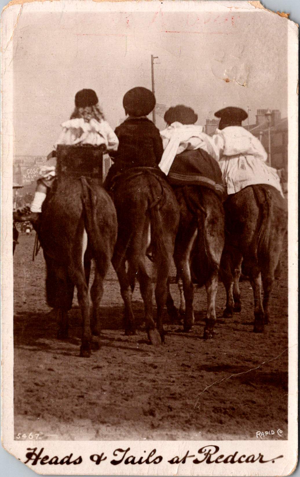
In the mid-20th century, San Francisco stood as a beacon of the American West, a city of hills and fog, of cable cars and sourdough bread. It was a place where the Gold Rush era’s pioneering spirit met the post-war optimism of a nation on the rise. Tourism, conservation, and a changing cultural landscape were among the mix of motivations for depicting the city in these jumbo postcards. At the heart of these images was a man whose name has become synonymous with San Francisco photography: Gabriel Moulin.

Gabriel Moulin: The Studio Behind the Lens

Gabriel Moulin (1872-1945) was more than just a photographer; he was a visual historian of San Francisco. Born in San Jose, California, Moulin moved to San Francisco as a young man and established his photography studio in 1892. For over five decades, his keen eye and steady hand documented the city’s growth, its triumphs, and its tragedies.

Moulin’s career spanned a period of immense change in San Francisco. He witnessed and recorded the aftermath of the devastating 1906 earthquake and fire, capturing images that would become iconic representations of the city’s resilience. As San Francisco rebuilt and expanded, Moulin was there, his camera at the ready, to document the rising skyline and the engineering marvels that would come to define the city’s landscape.

One of Moulin’s most significant contributions was his documentation of major construction projects. His photographs of the Golden Gate Bridge and the San Francisco-Oakland Bay Bridge, from their groundbreaking ceremonies to their final completion, provided a visual narrative of these monumental undertakings. These images not only served as historical records but also as symbols of American ingenuity and determination during the Great Depression era.

Moulin’s studio, located in the heart of San Francisco, became a hub for both commercial and artistic photography. While he was renowned for his architectural and landscape work, Moulin also excelled in portrait photography. His subjects ranged from everyday San Franciscans to visiting celebrities and dignitaries, creating a diverse portfolio that painted a comprehensive picture of the city’s social fabric.

The longevity and success of Moulin Studios spoke to the photographer’s skill and business acumen. Even after Gabriel’s death in 1945, his sons continued to operate the studio until 2000, maintaining the high standards set by their father. This continuity allowed the Moulin name to remain synonymous with quality San Francisco photography for over a century.

Today, the legacy of Gabriel Moulin lives on through the vast archive of his work. Over 500,000 negatives from Moulin Studios are now held by the San Francisco Public Library, a treasure trove of visual history that continues to provide insights into the city’s past. Researchers, historians, and photography enthusiasts alike pore over these images, each one a window into a moment in San Francisco’s rich history.

The Birth of the Jumbo Postcards

The set of jumbo postcards that we’re examining today represents a fascinating intersection of Moulin’s artistry, the booming post-war tourism industry, and the changing face of San Francisco. But how did these specific images come to be immortalized on oversized cardstock, ready to be sent across the country or tucked away as souvenirs?

The story likely begins in the late 1940s or early 1950s. World War II had ended, and America was entering a period of unprecedented prosperity. The rise of automobile culture and the expansion of the middle class meant more Americans than ever before were able to travel for leisure. San Francisco, with its iconic bridges, historic neighborhoods, and stunning natural beauty, was a prime destination for these new tourists.

Gabriel Moulin, or more likely his sons Irving and Raymond who were running the studio at this time, recognized the opportunity to capitalize on this tourism boom. They had a vast archive of high-quality images showcasing San Francisco’s most famous landmarks and neighborhoods. These images, some possibly dating back to Gabriel’s own work in the 1930s and 1940s, were perfect for reproduction as postcards.

Enter Smith’s News Company, a San Francisco-based publisher and distributor located on Ninth Street. Specializing in postcards and other printed materials, Smith’s News Company was well-positioned to turn Moulin’s photographs into sought-after souvenirs. The collaboration between Moulin Studios and Smith’s News Company was a natural fit – Moulin provided the artistic vision and photographic expertise, while Smith’s handled the printing, distribution, and sales.

The decision to produce these postcards in a “jumbo” 6×9 inch format was likely a strategic one. Larger than standard postcards, these jumbo versions allowed for more detail and visual impact, making them stand out in souvenir shops and newsstands. The bigger size also aligned with the grandiose, larger-than-life image that San Francisco sought to project to visitors.

The sepia tone of the postcards was another deliberate choice. Even if these images were taken in the 1940s or early 1950s, the sepia printing gave them a vintage feel, evoking a sense of history and timelessness. This aesthetic choice appealed to tourists’ desire for authentic, historical experiences, even as they engaged in modern travel.

San Francisco Through Moulin’s Lens

Let’s take a closer look at each of the images in this set of jumbo postcards, exploring what they reveal about San Francisco in the mid-20th century and how Moulin’s photographic style captured the essence of the city.

Chinatown: A Community in Transition

The image of Chinatown is perhaps the most intriguing of the set, offering a glimpse into the neighborhood’s complex social dynamics in the post-war period. The photograph was likely taken between 1946 and 1952, as evidenced by the styles of automobiles visible on the street.

In the foreground, we see a well-dressed Asian man, his dapper appearance speaking to the modernization and Americanization of the younger generation in Chinatown. Behind him, two men in military uniforms casually stroll in the opposite direction. This juxtaposition is rich with meaning, highlighting the multifaceted identity of Chinatown in the post-war era.

The presence of military personnel in Chinatown is significant. Following World War II, many Chinese Americans who had served in the U.S. military returned home with new skills, broader perspectives, and a strengthened sense of American identity. Their visible presence in the neighborhood symbolizes the increasing integration of Chinese Americans into mainstream society, a process accelerated by their wartime service.

The street itself is a vibrant scene of activity. Cars line the road, indicating the prosperity and mobility of the post-war period. The distinctive architecture of Chinatown is on full display, with pagoda-style roofs and Chinese signage creating a unique urban landscape. Lanterns hang across the street, likely in preparation for a festival or celebration, hinting at the community’s efforts to maintain cultural traditions.

This image captures Chinatown at a pivotal moment in its history. The repeal of the Chinese Exclusion Act in 1943 and the War Brides Act of 1945 had opened the doors to new immigrants, changing the demographic makeup of the community. The neighborhood was experiencing a population boom, with new arrivals from China joining established families and returning veterans.

The economic revival of the post-war years is evident in the bustling street scene. Many businesses in Chinatown were thriving, catering not only to the local community but increasingly to curious tourists drawn by the neighborhood’s exotic appeal. This tourism boom brought both opportunities and challenges, as the community navigated the commodification of their culture while striving to maintain authentic traditions.

Moulin’s composition of this photograph is masterful. By capturing both the traditional elements of Chinatown and signs of modernization and integration, he presents a nuanced view of the neighborhood. This image goes beyond the often stereotypical depictions of Chinatown common in tourist materials of the time, offering instead a glimpse of a dynamic community in the process of redefining itself in post-war America.

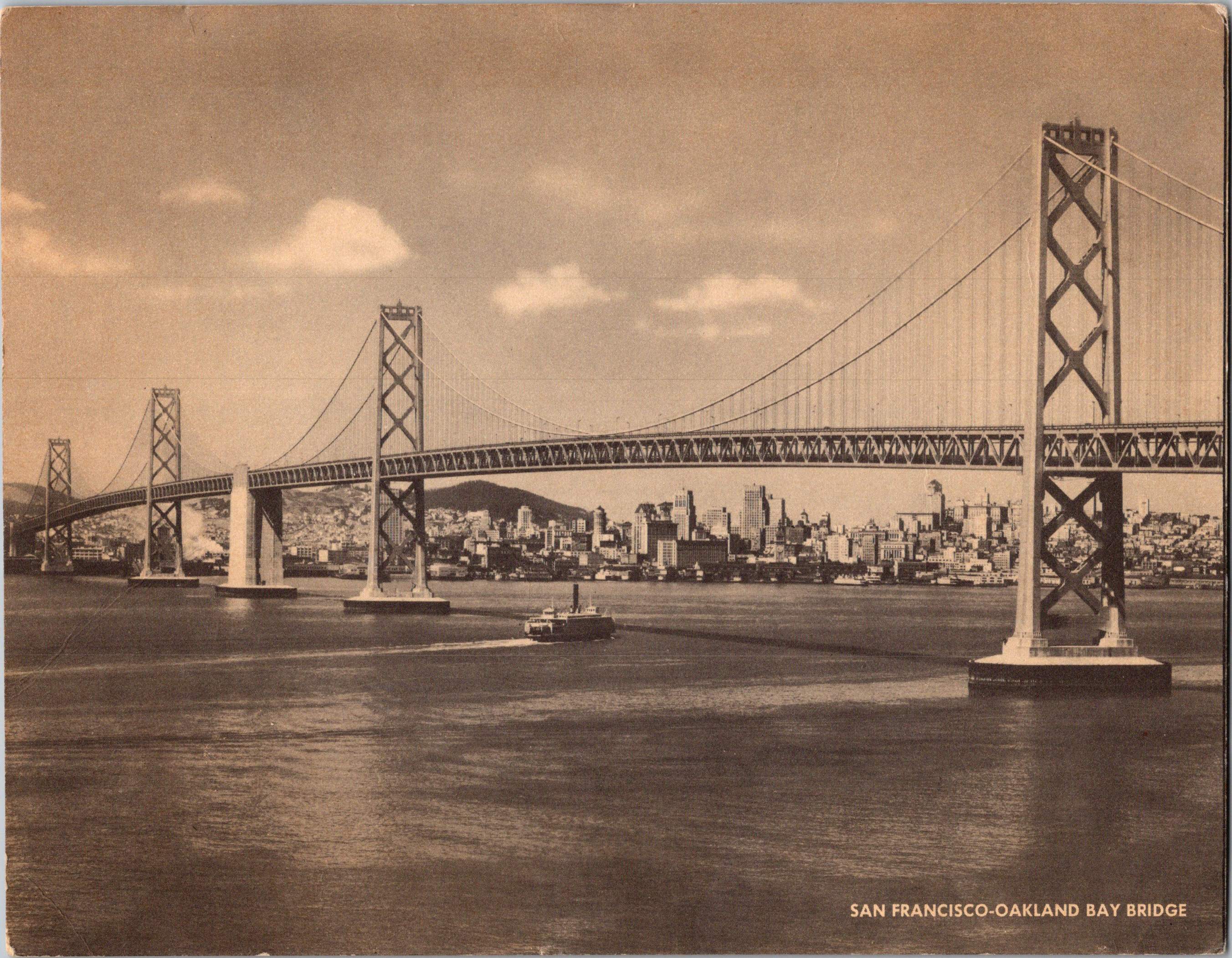
The Bay Bridge: A Symbol of Progress

The postcard featuring the San Francisco-Oakland Bay Bridge showcases one of the engineering marvels that transformed the Bay Area in the 1930s. Completed in 1936, the bridge was still a relatively new and awe-inspiring structure when this photograph was likely taken in the 1940s or early 1950s.

Moulin’s composition emphasizes the bridge’s grandeur and its impact on the San Francisco skyline. The photograph is taken from a vantage point that captures the entire span of the bridge, with San Francisco’s growing downtown visible in the background. This perspective underscores the bridge’s role in connecting the East Bay to San Francisco, a link that was crucial for the region’s economic development and urban growth.

The image also captures a moment of tranquility on the bay. A small boat, possibly a ferry, can be seen in the foreground, a reminder of the bay’s maritime history and the transportation methods that the bridge had largely superseded. The calm waters and soft light create a sense of serenity, contrasting with the industrial strength of the bridge itself.

In the context of the post-war era, this image of the Bay Bridge represented more than just an architectural achievement. It symbolized American ingenuity, the ability to overcome natural obstacles, and the promise of progress. For tourists visiting San Francisco, the bridge was a must-see attraction, a physical manifestation of the city’s modernity and its crucial role in connecting the various communities of the Bay Area.

Moulin’s photograph, reproduced as a postcard, allowed visitors to take home a piece of this marvel. The image likely resonated with the optimism of the post-war years, when large-scale infrastructure projects were seen as key to America’s continued growth and prosperity.

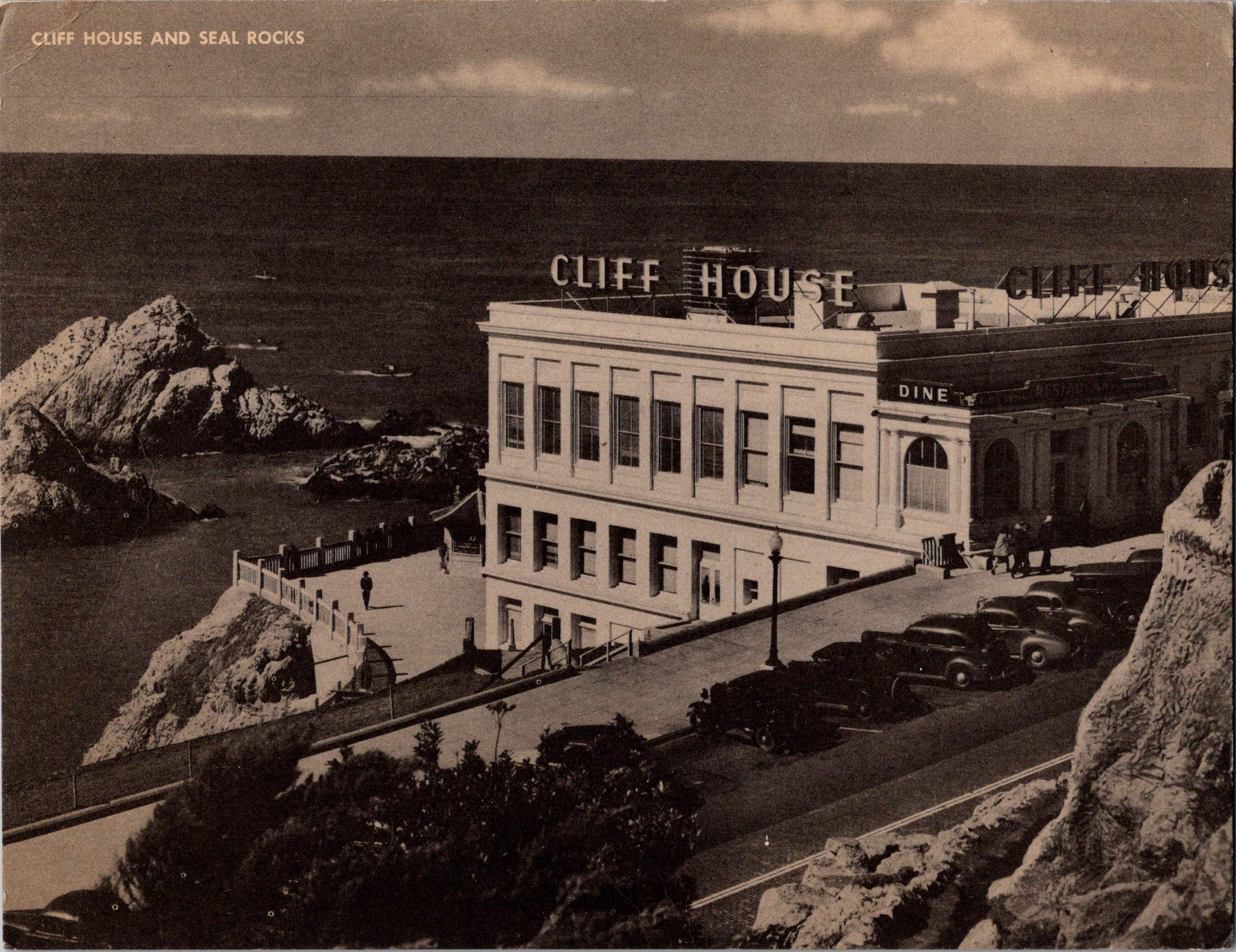
Cliff House: A San Francisco Institution

The postcard depicting Cliff House offers a view of one of San Francisco’s most enduring landmarks. Perched on the cliffs overlooking the Pacific Ocean, Cliff House has been a San Francisco institution since the 19th century, though the building in this image is not the original structure.

Moulin’s photograph captures the Cliff House in its mid-20th century incarnation. This version of the building, with its clean, modernist lines, was a stark contrast to the ornate Victorian structure that had previously occupied the site. The new Cliff House, opened in 1909 and remodeled in the 1930s, reflected changing architectural tastes and the city’s forward-looking attitude.

In the foreground of the image, we can see the rocky shoreline and the famous Seal Rocks. These natural features had long made this area a popular destination for San Franciscans and tourists alike. The juxtaposition of the sleek, modern building against the rugged natural landscape creates a compelling visual contrast.

The photograph also shows several automobiles parked near the Cliff House, indicating its popularity as a destination. In the post-war period, the Cliff House continued to be a beloved spot for dining, socializing, and enjoying spectacular ocean views. Its inclusion in this set of postcards speaks to its significance in the tourist imagination of San Francisco.

Moulin’s composition emphasizes the Cliff House’s dramatic setting. The building seems to rise organically from the rocky cliffs, a man-made extension of the natural landscape. This image likely appealed to tourists as a representation of San Francisco’s unique blend of urban sophistication and natural beauty.

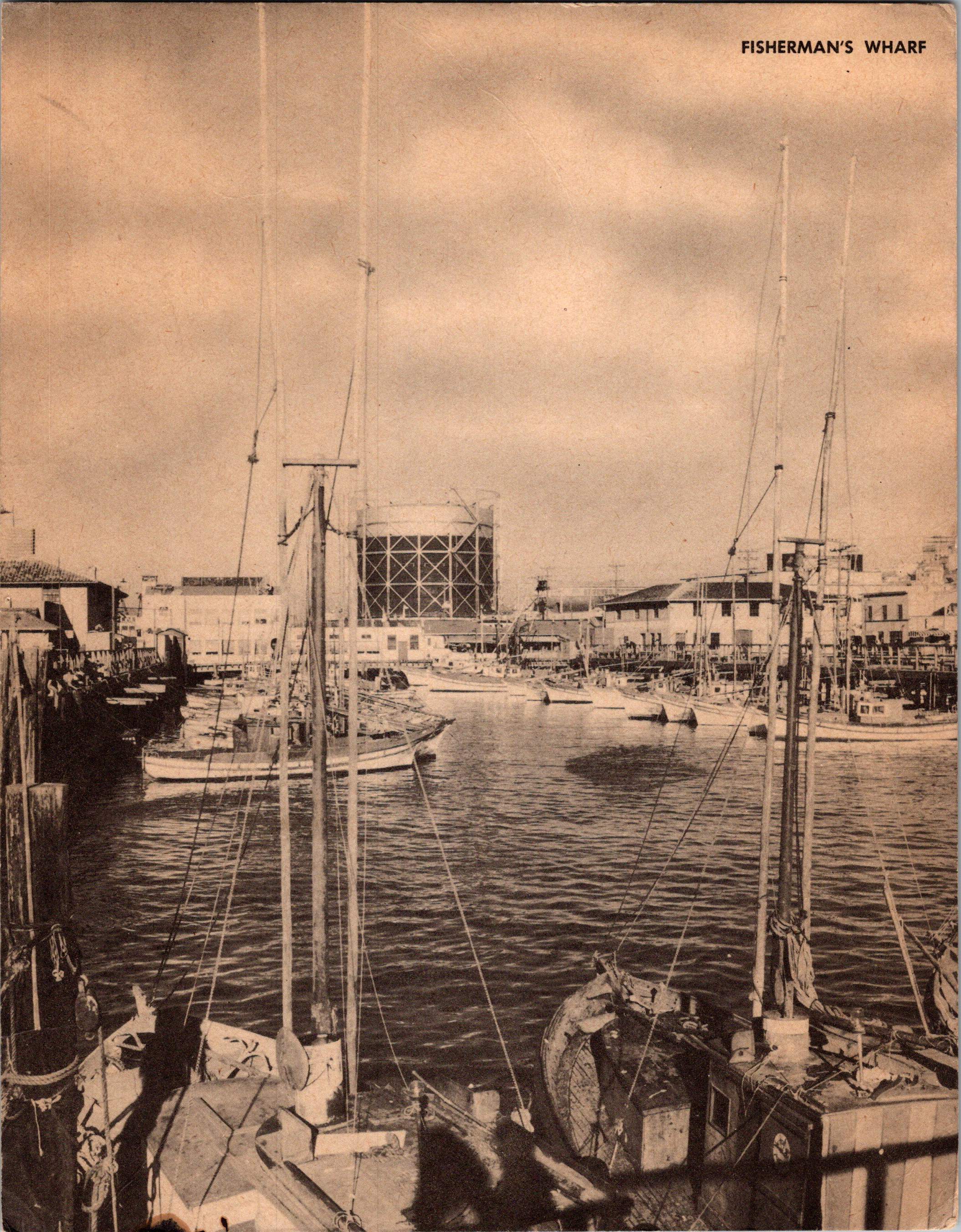
Fisherman’s Wharf: The Heart of Maritime Heritage

The postcard of Fisherman’s Wharf offers a glimpse into one of San Francisco’s most iconic neighborhoods. This image captures the working waterfront that has long been central to the city’s identity and economy.

In Moulin’s photograph, we see a forest of masts belonging to fishing boats docked in the harbor. The image conveys the bustling activity of the wharf, with boats of various sizes crowding the water. In the background, we can make out the buildings of the waterfront, including what appears to be a fish processing plant or warehouse.

This view of Fisherman’s Wharf represents a moment in time when the area was transitioning from a primarily industrial zone to a major tourist attraction. In the post-war years, while commercial fishing remained an important industry, the wharf was increasingly drawing visitors eager to experience its maritime atmosphere, fresh seafood, and picturesque views.

The image on the postcard is complemented by text on the reverse side, which provides context for the scene. It describes Fisherman’s Wharf as a “famous tourist center” where visitors can enjoy fresh seafood like crabs, bass, salmon, and shrimp. This description highlights how the working waterfront was being marketed as a unique cultural experience for tourists.

Interestingly, the text on the postcard also mentions that this view shows “a few of the many small fishing craft engaged in commercial fishing activities along the Pacific Coast.” This statement underscores the dual nature of Fisherman’s Wharf at this time – both a working port and a tourist destination.

The postcard credits the Redwood Empire Association for the photograph, indicating a collaborative effort between different organizations to promote San Francisco’s attractions. The Redwood Empire Association, founded in 1925, was primarily focused on promoting tourism in the coastal regions of Northern California. Their involvement in producing this postcard demonstrates the growing importance of tourism to San Francisco’s economy in the post-war period.

A Changing San Francisco

Taken together, these postcards offer a multifaceted view of San Francisco in the mid-20th century. From the cultural enclave of Chinatown to the engineering marvel of the Bay Bridge, from the storied Cliff House to the working waterfront of Fisherman’s Wharf, each image captures a different aspect of the city’s identity.

These postcards represent more than just tourist souvenirs; they are windows into a particular moment in San Francisco’s history. They show a city in transition, balancing its historical roots with post-war modernization and growth. The images capture the optimism and energy of the era, when San Francisco was cementing its place as a major American city and an international tourist destination.

The Art of Postcard Photography

Gabriel Moulin’s approach to photographing San Francisco for these postcards reveals much about the art of postcard photography in the mid-20th century. Each image is carefully composed to showcase the subject in its best light while also conveying a sense of place and atmosphere.

In the Chinatown image, Moulin (or his sons) made the deliberate choice to include people in the scene, unlike the other, more architecturally focused postcards. This human element brings the street to life, offering viewers a sense of the neighborhood’s vibrant culture and daily activities. The inclusion of both traditionally dressed individuals and those in more Western attire subtly communicates the neighborhood’s cultural complexity.

The Bay Bridge photograph demonstrates Moulin’s skill in capturing large-scale structures. The composition emphasizes the bridge’s sweeping lines and monumental scale, with the city skyline providing context and contrast. The small boat in the foreground adds a sense of scale and a touch of maritime romance.

The Cliff House image showcases Moulin’s ability to capture the interplay between natural and man-made environments. The framing of the building, perched on the edge of the continent, emphasizes its unique location and architectural drama.

In the Fisherman’s Wharf postcard, the photographer chose a viewpoint that emphasizes the dense forest of masts, creating a strong visual impression of a busy, thriving port. This image captures both the industrial nature of the area and its picturesque qualities that appealed to tourists.

Across all these images, we can see a consistent aesthetic that defines the postcard genre of this era. The compositions are clean and direct, presenting each subject clearly and attractively. The use of sepia toning adds a sense of nostalgia and timelessness, even to relatively modern scenes. This technique helped to present San Francisco as a city with a rich history, even as it embraced post-war modernity.

The production and distribution of these postcards represent a fascinating aspect of mid-20th century tourism and printing industries. The collaboration between Moulin Studios and Smith’s News Company exemplifies the specialized roles that developed in the postcard business.

Moulin Studios, with its vast archive of high-quality images and reputation for excellence in photography, was the ideal source for postcard imagery. The studio’s deep connection to San Francisco meant that it could provide not just beautiful pictures, but images that truly captured the essence of the city.

Smith’s News Company, as the publisher and distributor, played a crucial role in bringing these images to the public. Located on Ninth Street in San Francisco, Smith’s would have handled the technical aspects of postcard production, including printing, cutting, and distributing the cards to various retail outlets throughout the city.

The choice to produce these as jumbo postcards, larger than the standard size, was likely a marketing decision. The larger format allowed for more detail in the images and made the postcards stand out among other souvenir options. This size also aligned with the general trend towards “bigger and better” that characterized much of American consumer culture in the post-war years.

The postcards were more than just souvenirs; they were also a form of advertising for San Francisco. Tourists who bought and sent these postcards were essentially becoming ambassadors for the city, sharing enticing images of San Francisco with friends and family across the country and around the world.