A path appears underfoot every year around this time, with a slight softening of the ground and a change in the light. The road is old, but the way is new again.
Spring equinox arrives in just a few days, another moment when day and night stand in perfect balance. Nowruz, one of the world’s oldest celebrations, falls on the equinox itself, marking the moment the earth turns toward renewal. Observed for at least three thousand years across Persia, Central Asia, the Caucasus, and the diaspora communities that carry it around the world, Nowruz means new day and it begins precisely at the moment of the spring equinox.
Preparations are meticulous. The house is cleaned from top to bottom in a practice called khane-tekani, shaking out the house, to release the accumulated weight of winter. A ceremonial table is set with sprouted wheat for rebirth, vinegar for patience, garlic for health, and a goldfish in a bowl for life against all odds.
In Chinese Lunar New Year, it is the year of the horse. All the teachings of Ramadan have been quietly observed this month. Christians are entering the heart of Lent, when liturgical colors shift from penitential purple to radiant rose, and the invitation is to rejoice. World traditions share this central wisdom. To walk forward, one must first prepare.
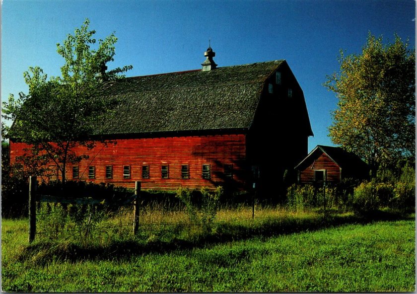
This morning my path runs along Sligo Creek near Washington DC, where the trail follows the water through an old urban forest. The snowdrops are done. Small and white and brave, they came and went in February. Crocuses are finishing now, purple and yellow scattered through the leaf litter. Daffodils line the path in both directions to proclaim the news of spring. Soon the cherry blossoms will arrive, carrying the Japanese mono no aware, bittersweet awareness as beautiful things pass.
For the next few weeks I’ll be traveling. Away from my desk and the collection. Being in motion feels at pace with the season. By early April I’ll be back in Arizona, where spring doesn’t linger the way it does in the East. The desert has its own brief, vivid version of the season. Sharp early light and cool mornings, palo verdes going yellow and the brittlebush blazing.
For me, it’s a time to toss off the heavy winter blankets, move furniture, dust out the corners, and feel all the motivations of the season. The Posted Past is making some new moves, too.
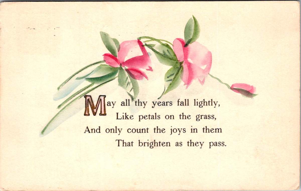
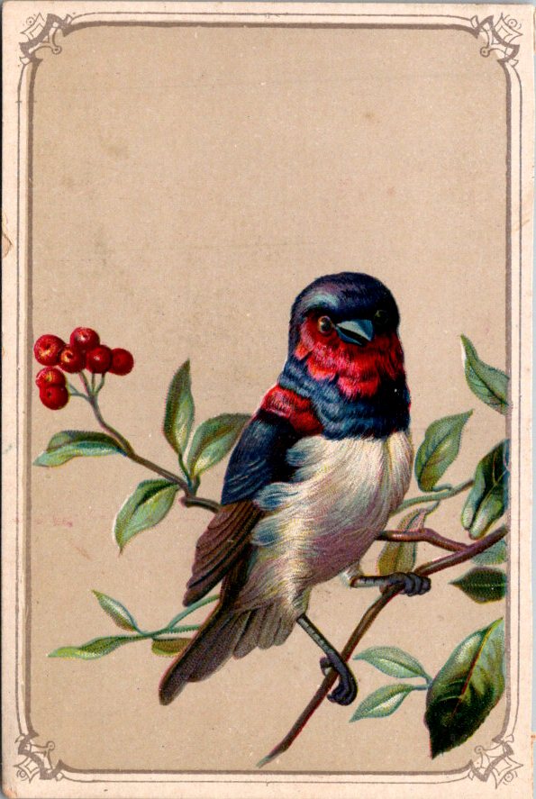
Spring greeting cards are full of flowers and fancy, and the messages give us gentle permission to start again. If you are grass-side up, count yourself among the living and the hopeful. Believe that what comes next might be better.
Take a walk this week, if you can. Clear an old task you’ve been putting off. Set the table. Notice what’s arising in your life. Greet the new day.
Valentine’s Day is over. The chocolates parceled out, consumed in a binge, or sweetly regifted. The cards are in a stack. Love trudges on.
Before we go, there is a word worth saying about silences and the quiet costs of delayed connections, and those missed entirely.
In May 2023, the Surgeon General issued an advisory that stopped me mid-scroll. Loneliness had reached epidemic levels in the United States. He was not describing the usual suspects—a widower, a loner, someone at the edge of class or condition. I had to admit, his warning rang a bell in my own heart. I was among a growing contingent of the ordinary, ambient, alarmingly average lonely. As a caregiver, days passed without anyone really seeing me, or me really wanting to be noticed.
The Surgeon General called it a public health crisis. He compared its effects on mortality to smoking fifteen cigarettes a day. Actual harm done.
Indeed, social isolation raises the risk of heart disease, stroke, dementia, and early death. The health research is not soft or sentimental. The body registers being unseen the same way it registers physical pain — same neural pathways, same hormonal alarm signals, same disrupted sleep, same compounding risks. We are living inside a paradox: more connected by technology than any humans in history, and perhaps lonelier than our ancestors.
In the golden age of the postcard — roughly 1900 to 1920 — Americans sent billions of them. A trip to the lake. A hello from the city. A heart, a name, a single line of longing, on full view to the mail carrier and anyone else who handled it along the way. The medium demanded brevity, levity, and a light touch.
That simple approach is worth noticing, because we tend to use the absence of time as our primary excuse for not reaching out. We sense there isn’t room in the average difficult day for a real conversation. So we wait. And the time doesn’t come. And the silence grows.
A postcard is a signal, not a report. It says: I haven’t forgotten. A brief message can make a big point. At times, the whispered delivery bears the full meaning.
The research on what makes people feel less alone points not to the depth of connection in any given moment, but to its consistency. There is comfort in the reliable sense that someone, somewhere, is holding you in mind. A brief, warm gesture, repeated, does more for that feeling than an overwrought or inconsistent one.
Simple gestures are not consolation prizes. They are the architecture of belonging.
Sadly true, is often easier to extend kindness to a stranger than to sustain the loving glow among the people you know best. A stranger on a difficult day can receive warmth without a complicated history. They don’t owe you a response and you likely won’t know how the gift was felt. You haven’t let them down in the small accumulated ways that life’s closeness allows.
The people we love most are the ones we are most likely to let drift or actively ignore. A peculiar paralysis comes with the familiar foibles, caring deeply, and feeling the gap widen.
So here is a gentle nudge, the week after the holiday, when the pressure is off and the expectations are low. Not because it’s February. Because it’s Wednesday, and someone who loves you needs to know. A postcard or a hug, a humble tug on the sleeve or a quiet walk. None of it asks or offers too much. A simple, “We are ok,” can be enough.
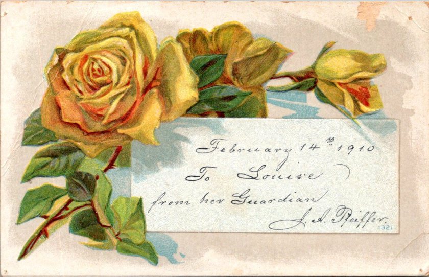
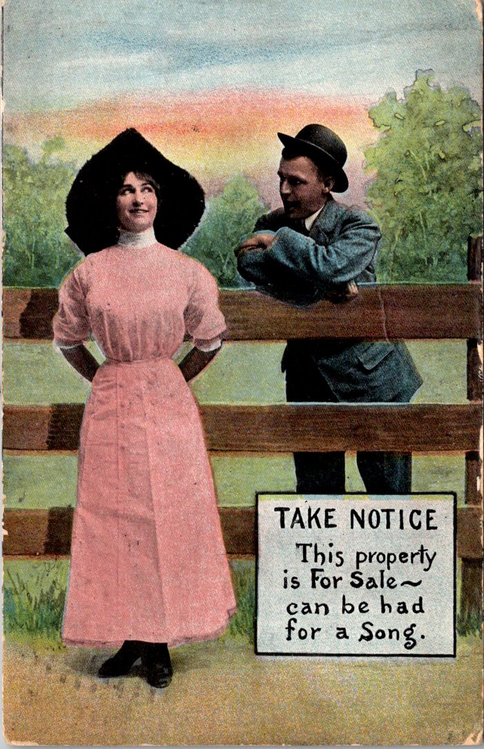
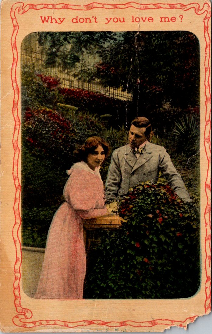
I don’t dare reveal the flipsides of the love-laced cards you’re about to see. What Ida, Minnie, or Gertrude sent or received isn’t for you or me.
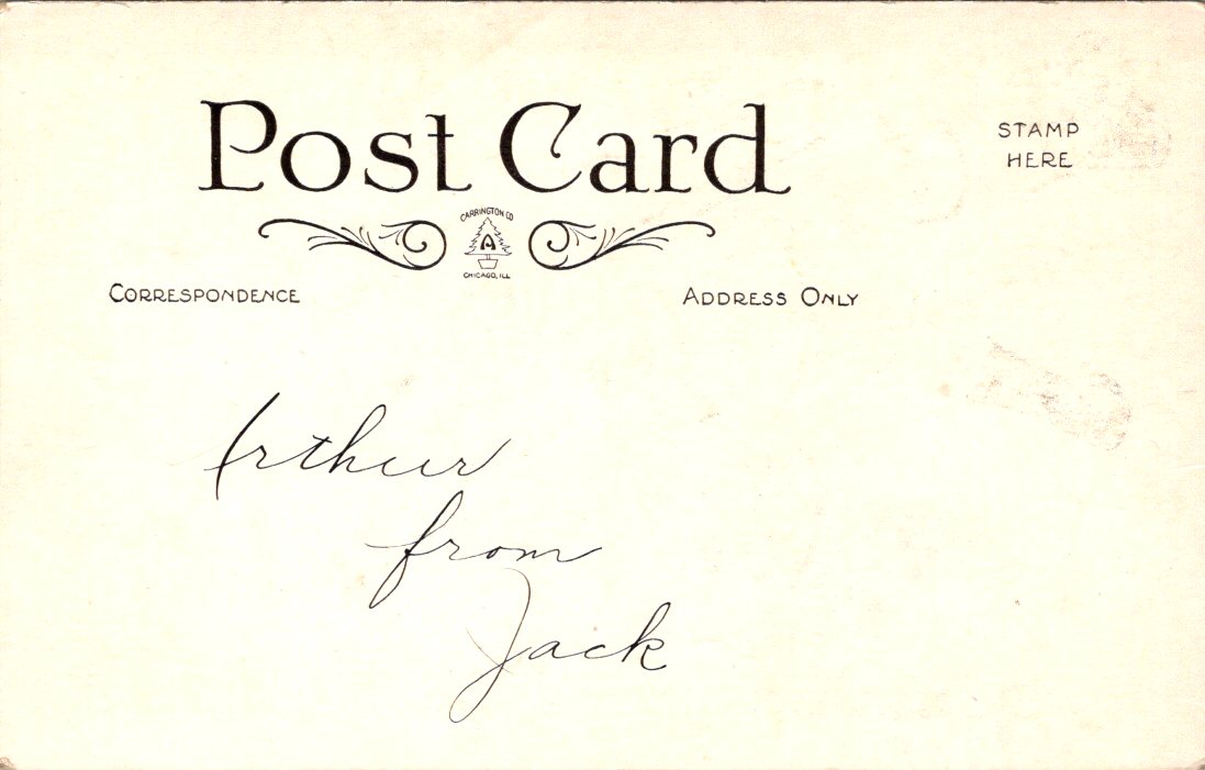
Hand-delivered to Arthur from Jack, this first example is our single exception. With a humble request and an elegant script, we can only hope the romance of a lifetime began, heated up, or settled in. Maybe it was placed on the pillow that morning, sometime before 1907 when postcards still featured undivided backs.
My own love is famously far afield. In the early days, our photograph appeared in a magazine alongside a short interview on the workings of our long-distance affair. We were an ocean away in those days, and on the adventure of a lifetime together. It could be a car drive now, albeit a very long one. Always tempting!
Obviously.
Yes, let’s do!
Finding here anywhere we meet.
Snowcrete!
Little Blue Carriage for Two
Future Flights
Love, Your Guardi-Anne.
Languages are a passion and a profession for my lady linguist. So a few more out of pure fun and fascination. Luf yah!
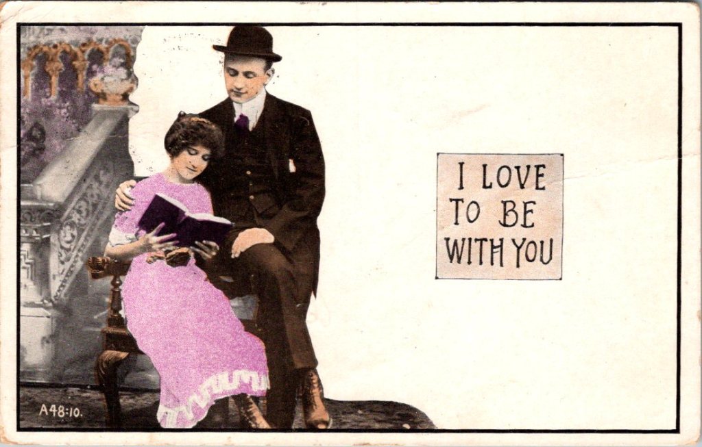
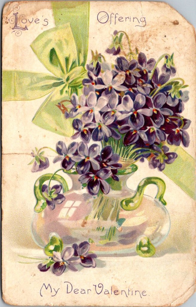
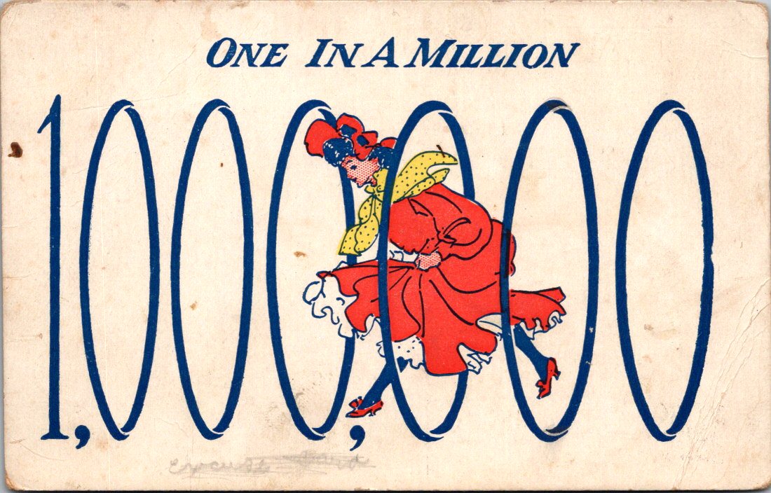
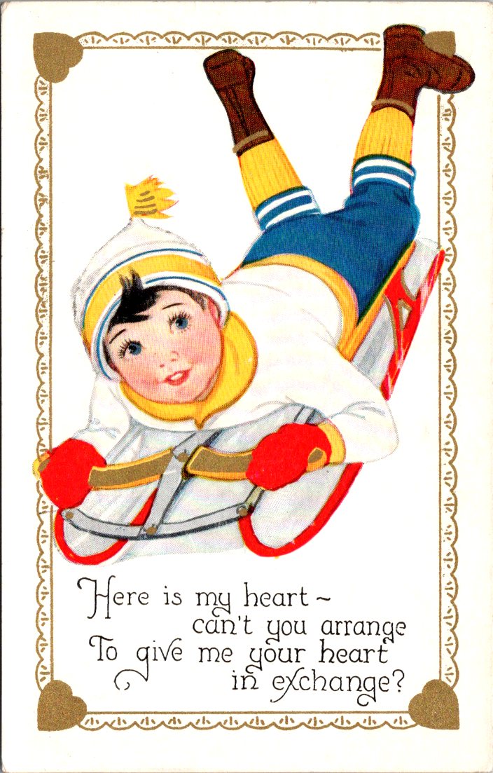
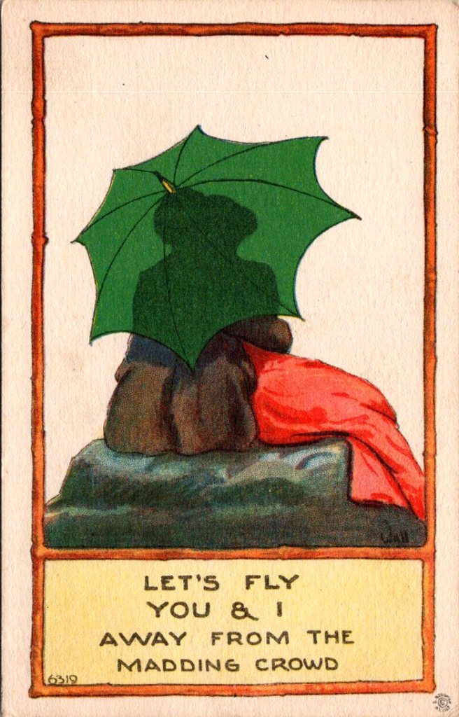
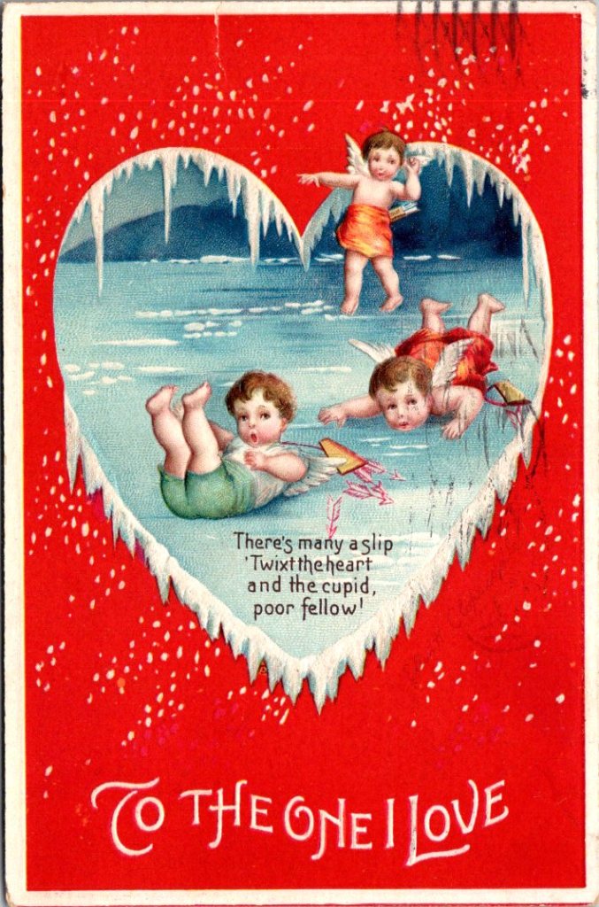
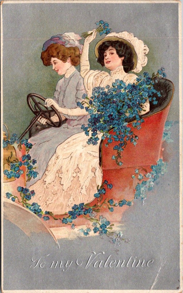
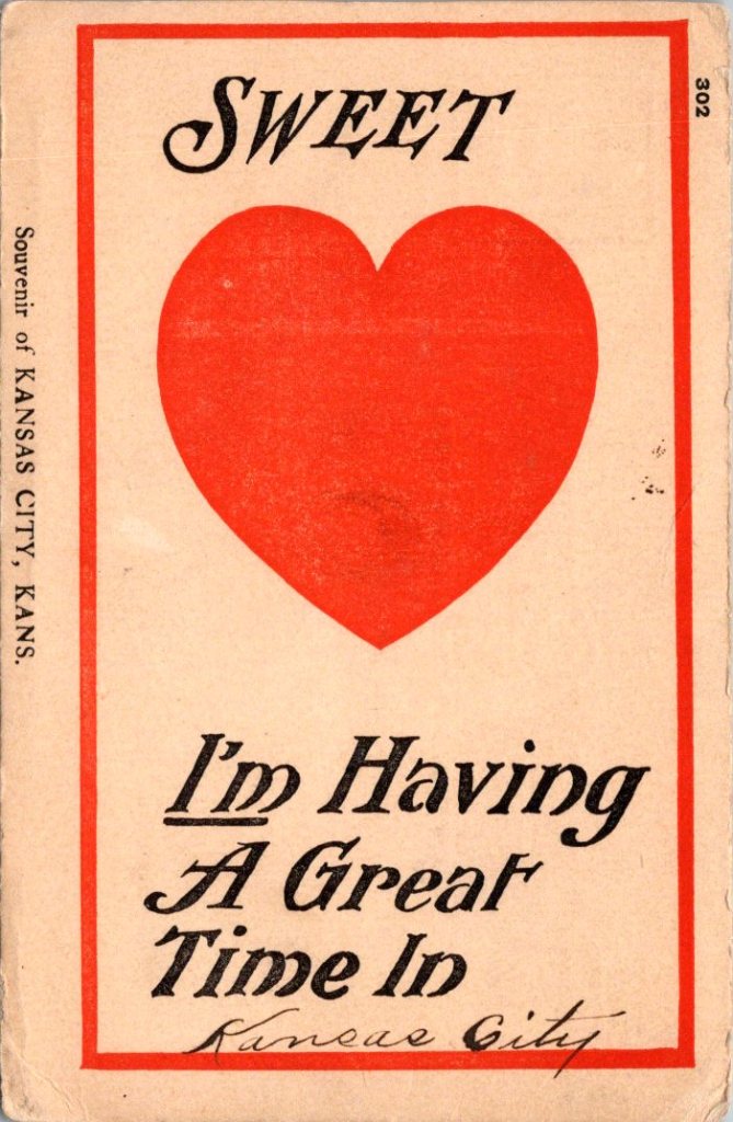
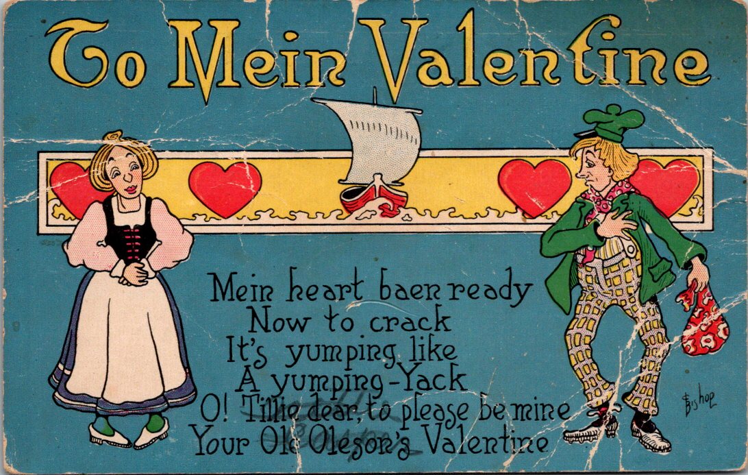
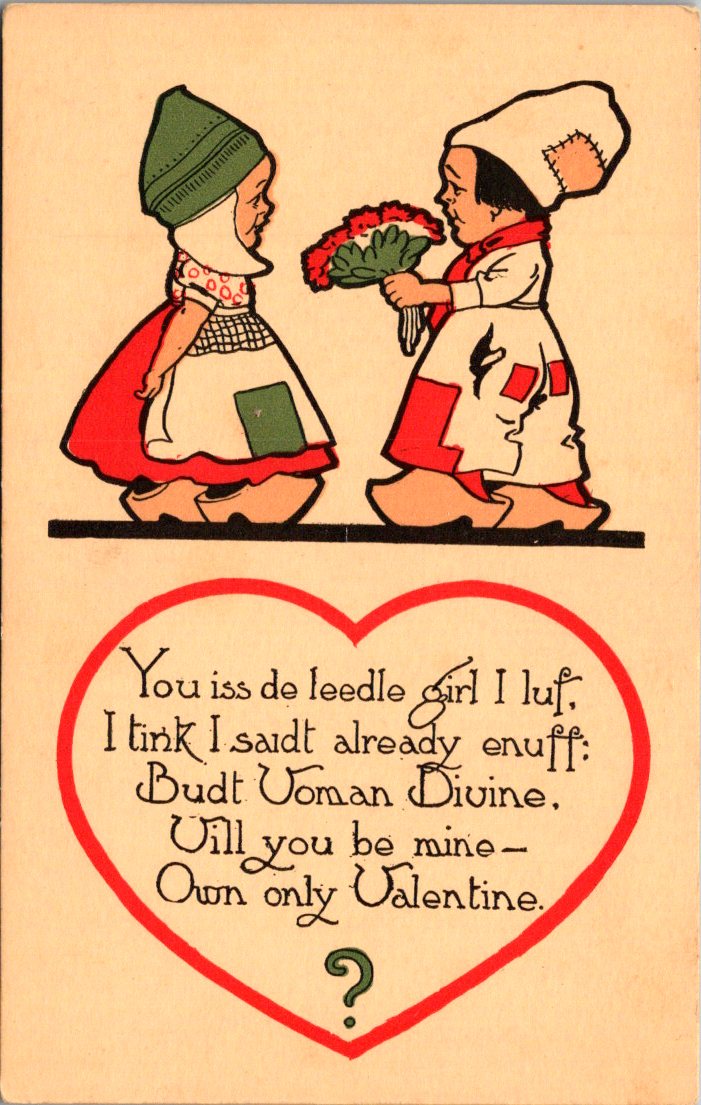
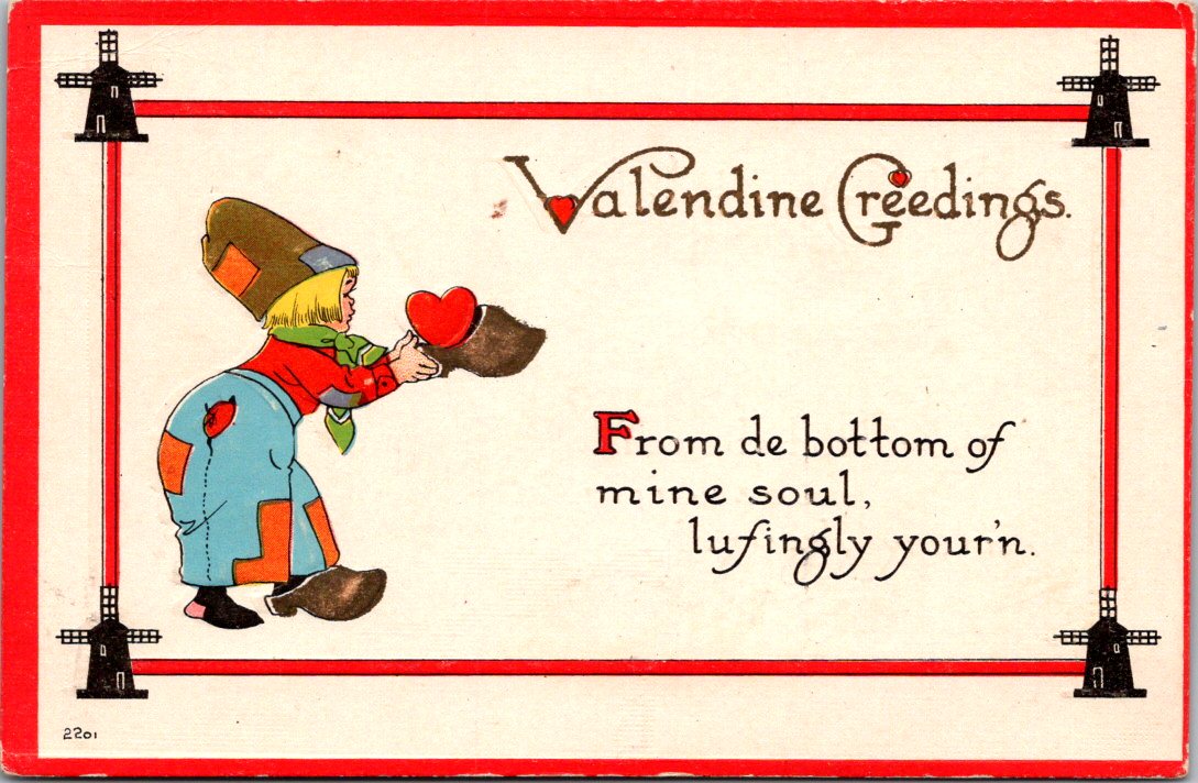
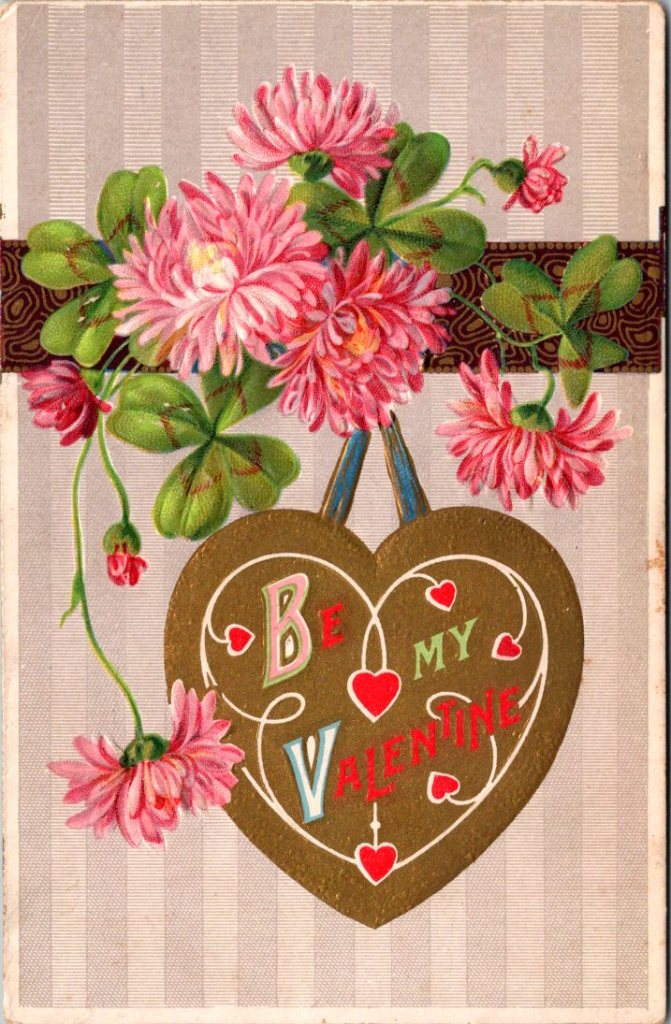
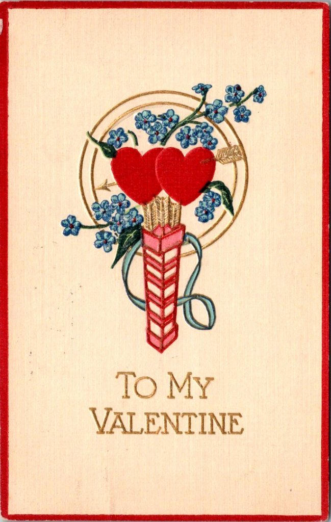
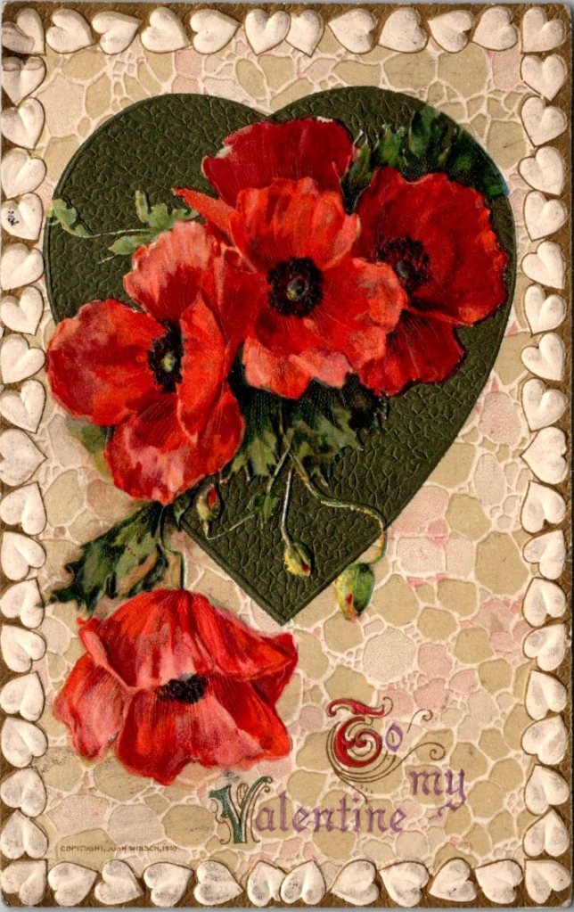
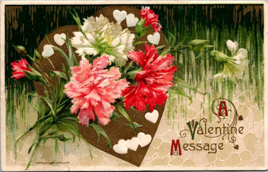
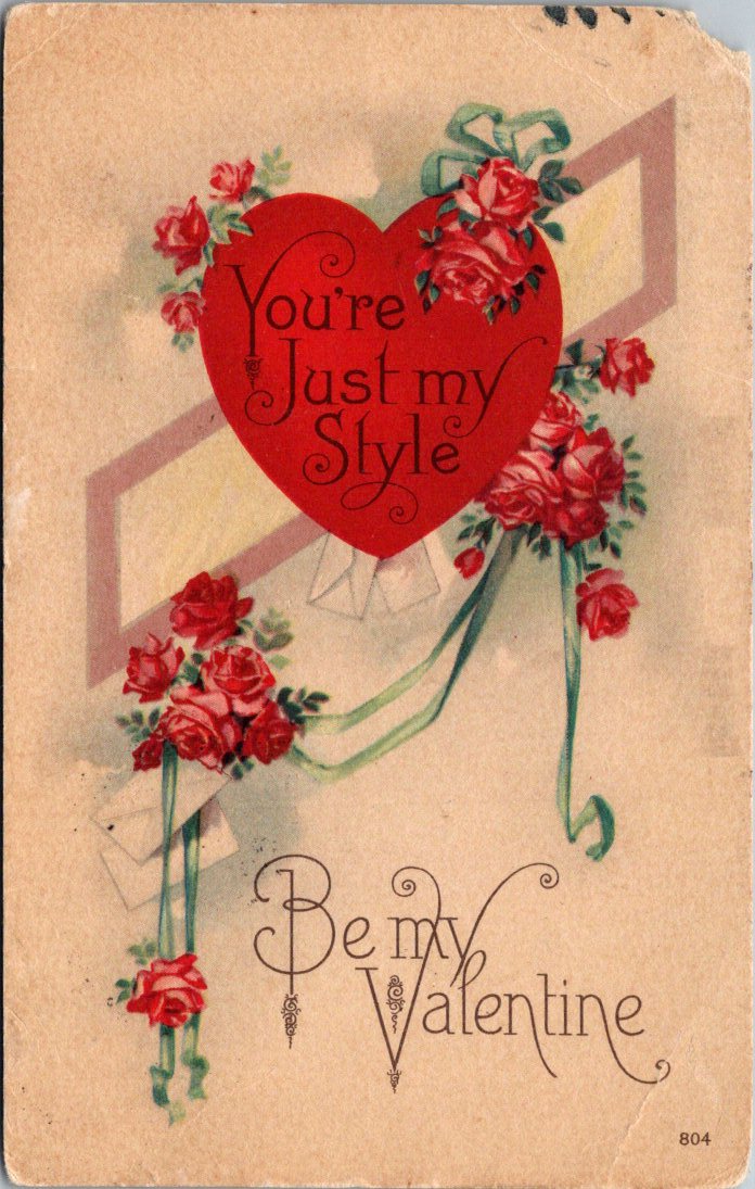
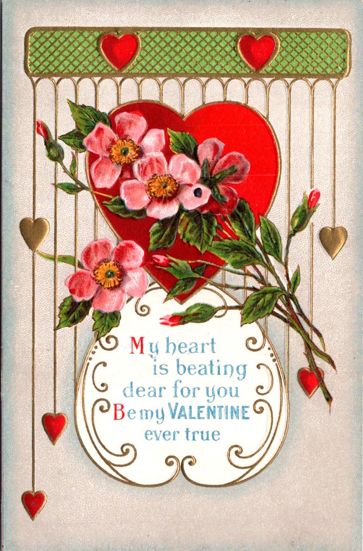
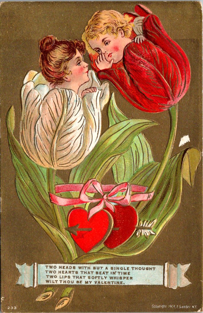
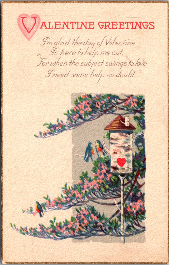
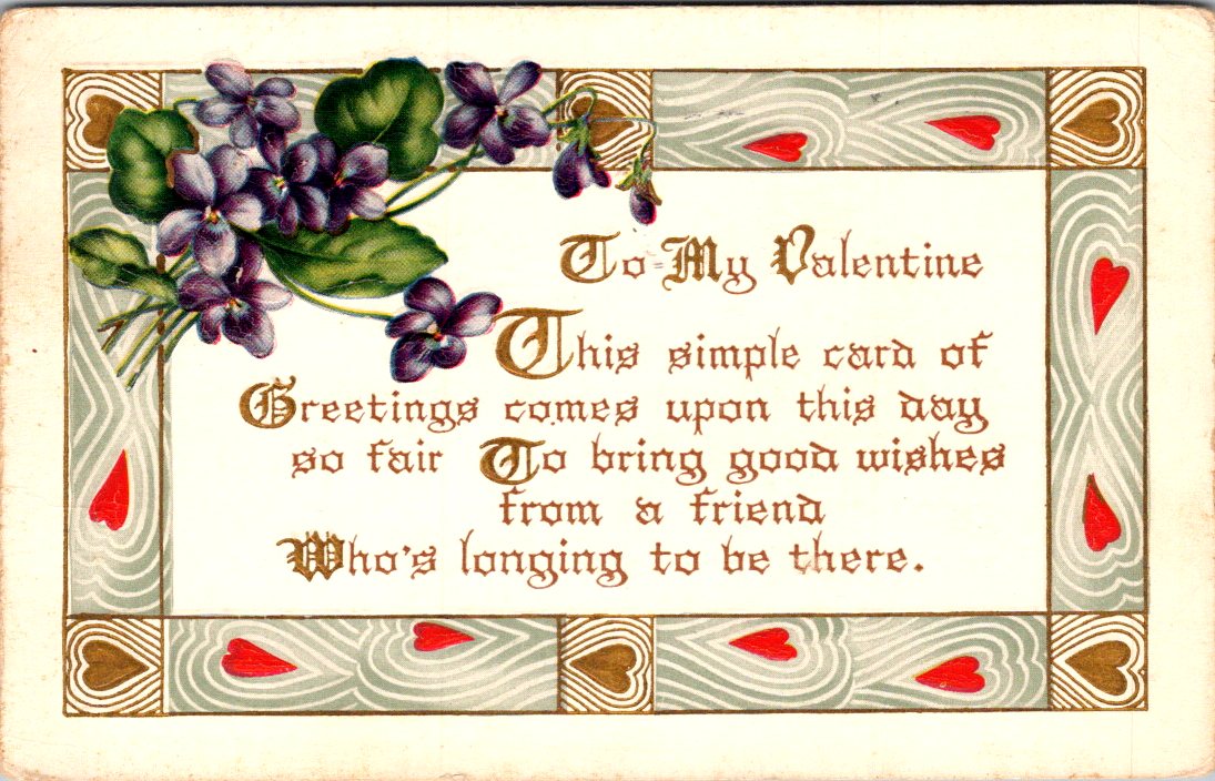
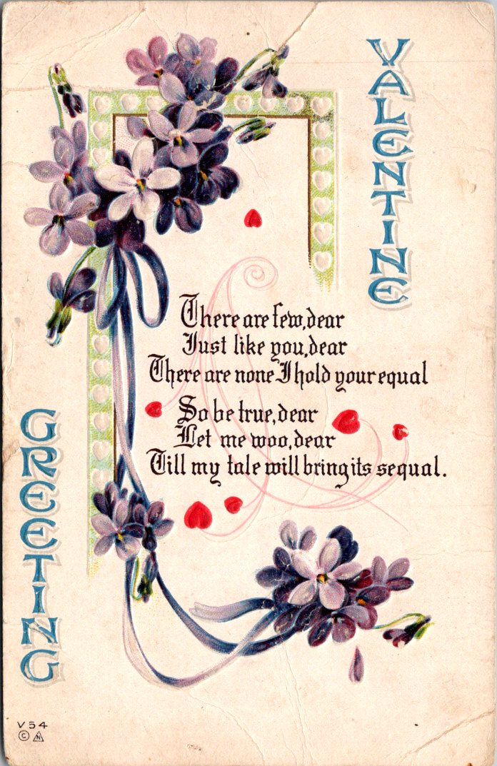
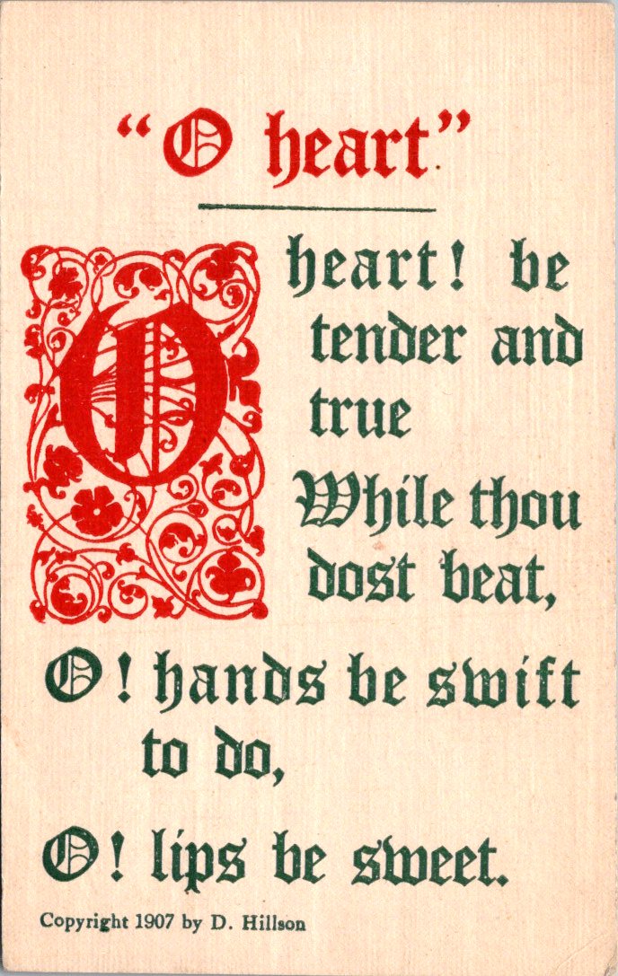
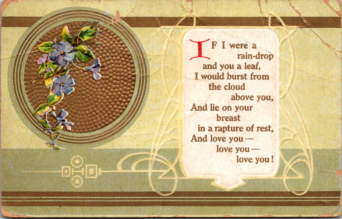
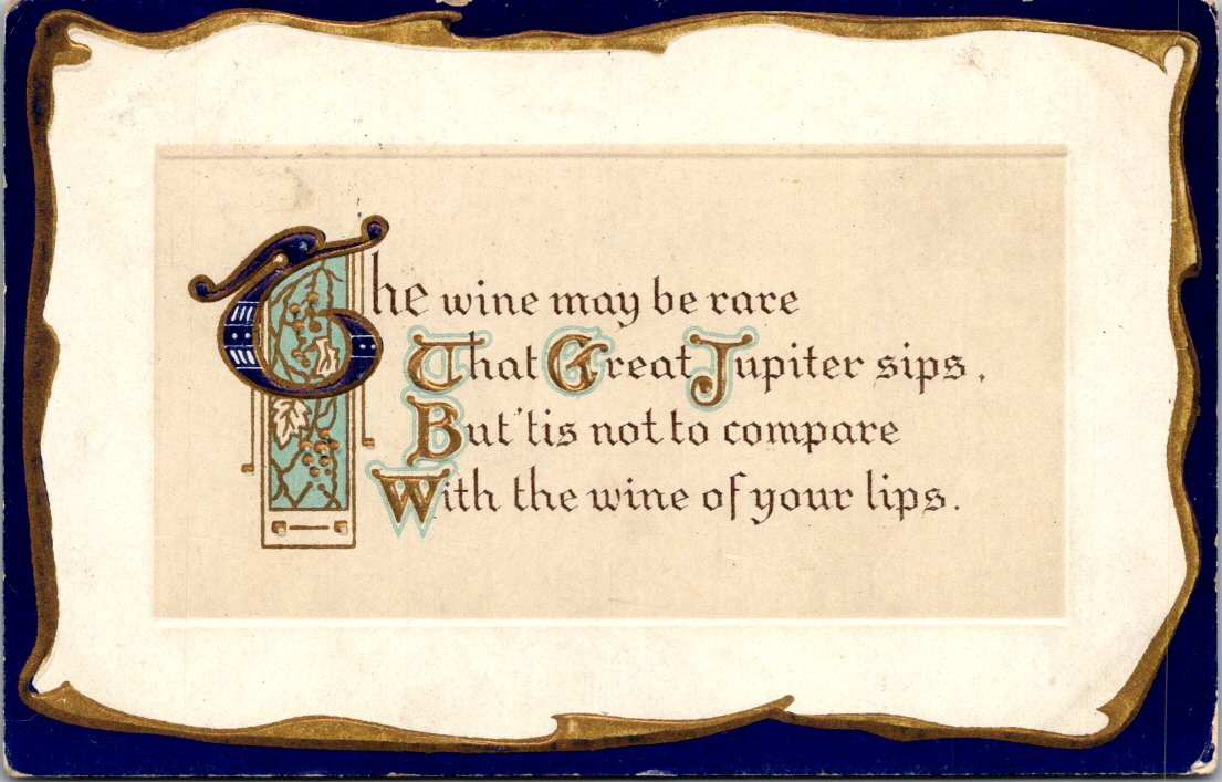
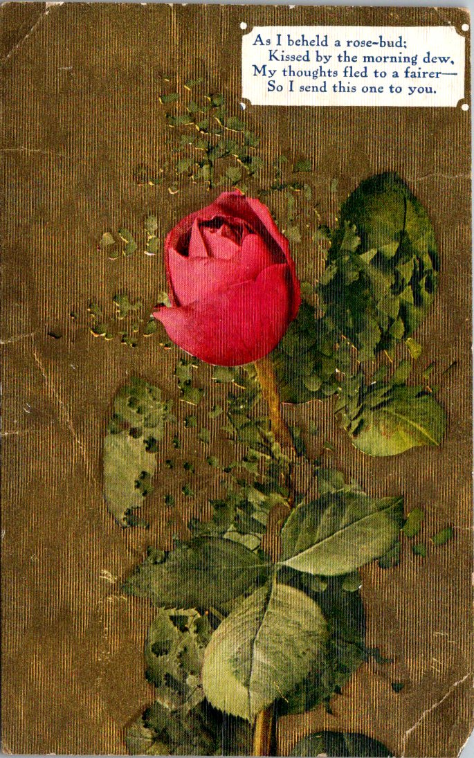
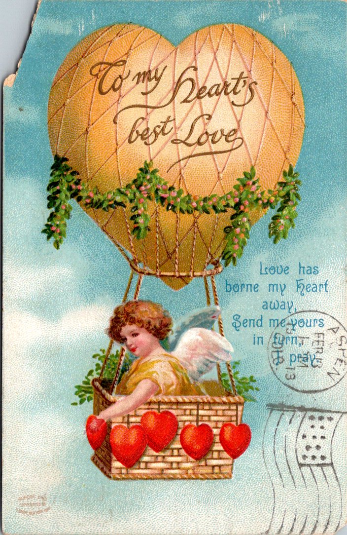
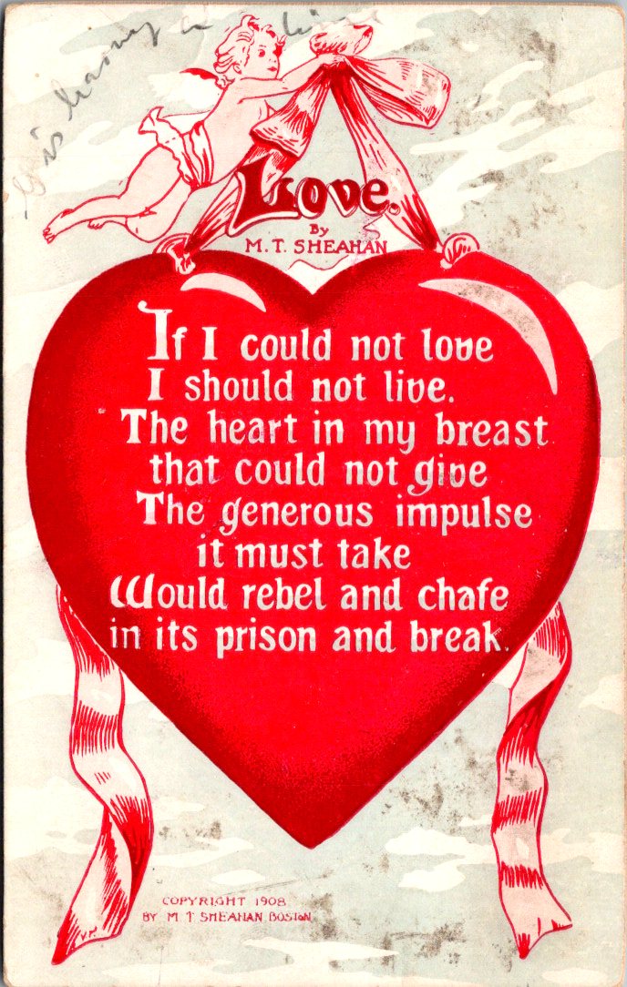
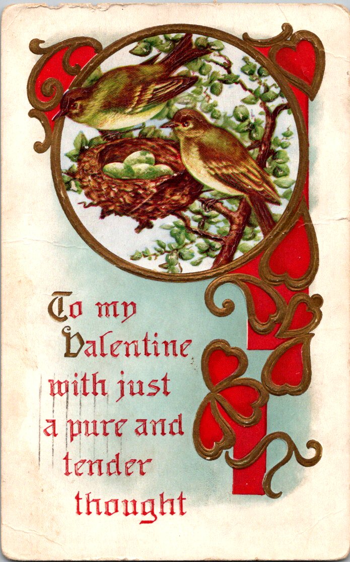
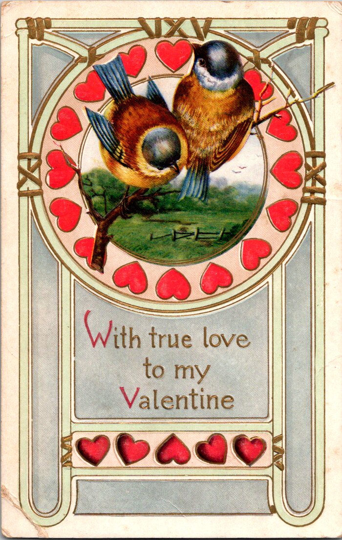
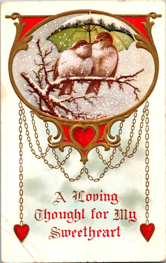
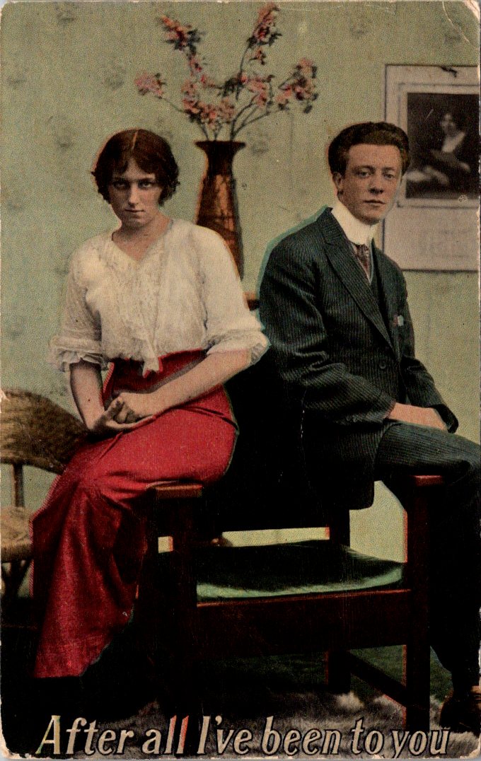
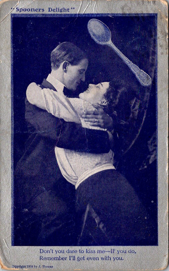
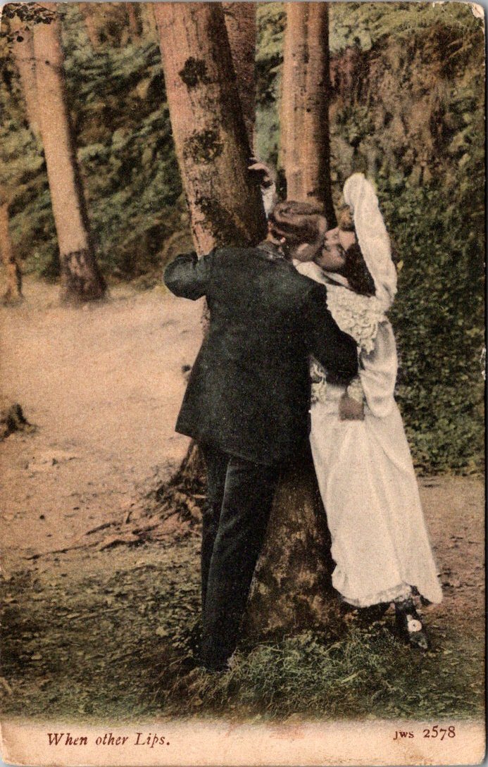
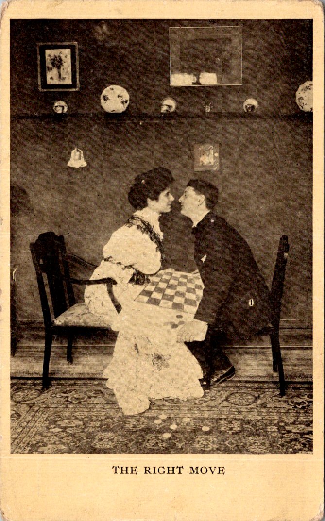
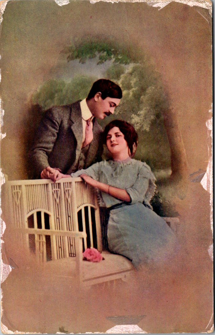
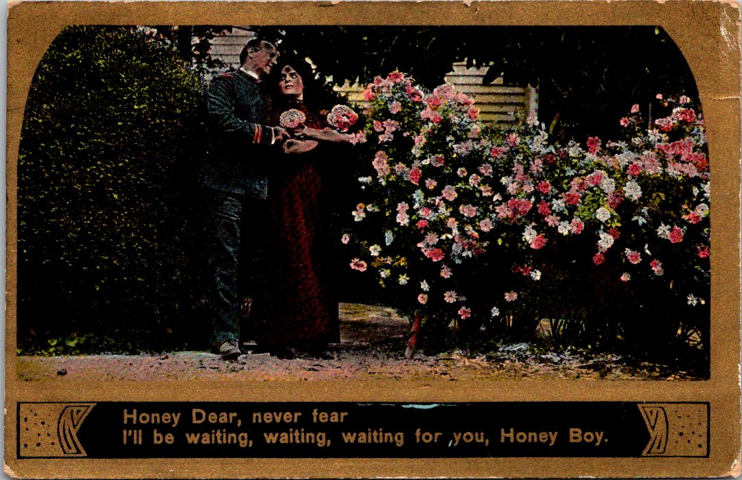
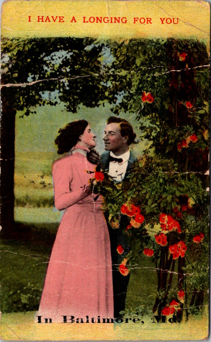
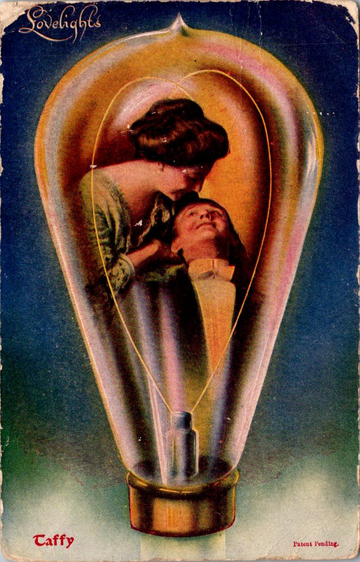
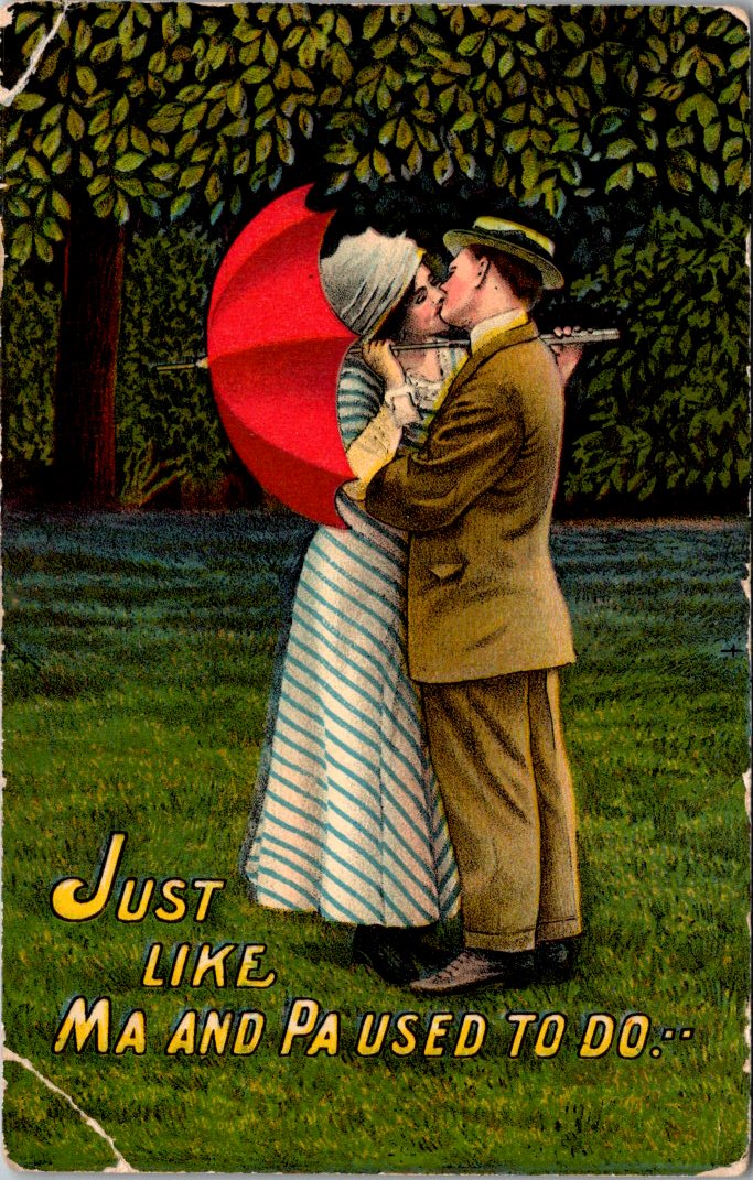
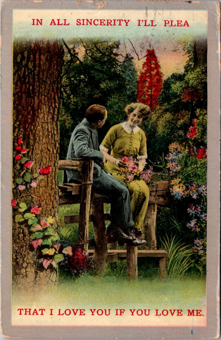
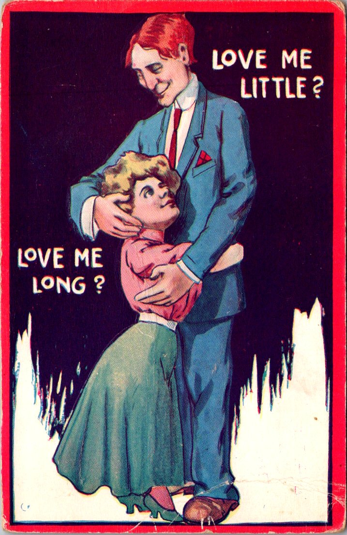
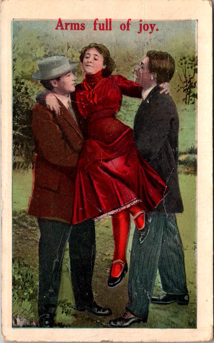
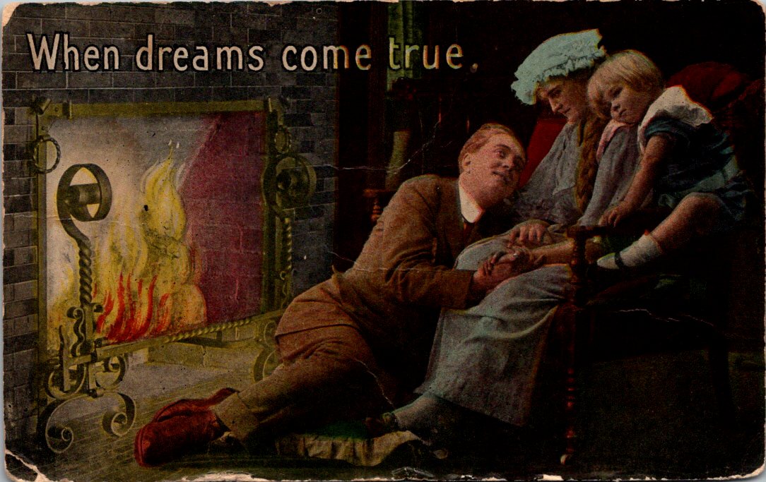
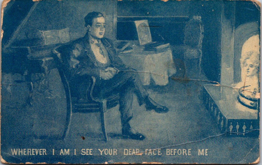
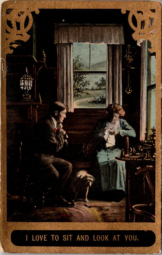
Dear readers, I promised you hearts and flowers after that awkward spell last week. First, a gallery carefully curated on the theme. Then, elucidations and another peek.
Made-for-you messages with showy sentiments on full view to your pa, your ma, and the mail carrier, too.
Some parts are still snowy, as love lamps flicker on in February. Hearts, words, and birds arrive in the quiet winter glow. Rest inside a circle of love. When you know, you know.
We’ll get to the hearts and flowers. But first, this is awkward.
It’s February. Congratulations if you have accomplished anything this year.
I spent the morning sorting through Valentine’s greetings. Love is in the air, and rest assured there are albums full of gorgeous arrangements and heartfelt sentiments in the weeks ahead.
But first, I need to bring up something awkward. Not everyone loves this sweetheart’s holiday. For the lovelorn, it’s excruciating. For the grieving, a sad set of reminders. For the wicked, a chance to lance the joy bubbles in the air.
In postcards, we have to acknowledge the neck strain.
Also, captions that might have meant exactly what they suggest.
Lastly, those with an anti-Valentine vibe, a bad bargain, or even a threat!
We will return next week to the regular schedule of sweetness and light, heart and flowers, charm and chocolate, passion and promises. How… delightful!
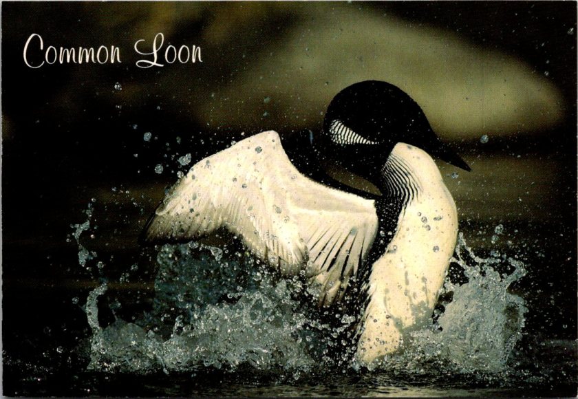
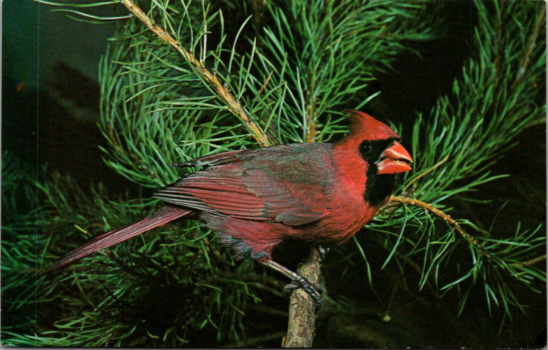
Like the flash of a red cardinal in the winter snow, both George and Nina suddenly see something that has been there all along.
George woke early in the day on New Year’s Eve. Light snow outside and the question he’d been turning over since Christmas: when to take Emma birding. He called before he could overthink it.
“Tomorrow morning?” Mai answered. “She’ll be ready at dawn.”
They met at Frontenac State Park at first light. Emma hopped out of Mai’s car already dressed for the cold—layers, boots, a hat George recognized as one of her mother’s favorites. Mai waved from the driver’s seat, smiled, pulled away.
“Just us?” George asked.
Emma’s eyes rolled slightly and smirked as she held up his binoculars. She’d already adjusted the strap. The green Audubon field guide was tucked under one arm, a new notebook in her other hand.
“Mom has to get ready for the party. Plus, she said it’s too cold.”
“Fair enough,” George smiled back and nodded toward the trailhead. “Binos up, move slowly, scan and listen. You go first.”
They walked the trail along the frozen river in tandem, as quietly and patiently as he had advised. Not looking for birds exactly, but for movement, for shapes that didn’t fit the pattern of branches and sky. Emma spotted the first cardinal.
“There,” she whispered.
George raised his older binoculars. He had kept them for Jennie on the rare occasion she wanted to come along.
“Tan body, red-orange bill, and a sort-of red crest,” Emma slowly described the bird.
“Good eye. Watch how she moves.”
The bird hopped branch to ground, ground to branch.
“How did you know it was female?” Emma asked.
“Colors and the song notes. Males are showier and louder. Females sing too. They’re just quieter about it.”
Emma opened her notebook.
Female cardinal. Frontenac State Park. New Year’s Day. Feeding on lower branches of sumac. Light song noted.
They found chickadees, a downy woodpecker, juncos, and stopped along the way to record and discuss each bird. Emma’s notes filled two pages. George watched her move through the stark and cold forest—confident, curious, at ease. Mai had been more careful at this age, tentative on the trails. Emma walked as though she belonged here. She did.
Driving her home, George said, “You’re a natural. Your mom was good, too. She could walk so slowly, make no noise at all.”
Emma smiled. “She says I get it from you.”
“Well, I got this for us,” George said as he pulled into the driveway.
He flashed his phone screen to reveal the app he had downloaded, the Audubon Society Field Guide to North American Birds but online and searchable. Right on the front, the very first photo was a male and female pair of Northern Cardinals.
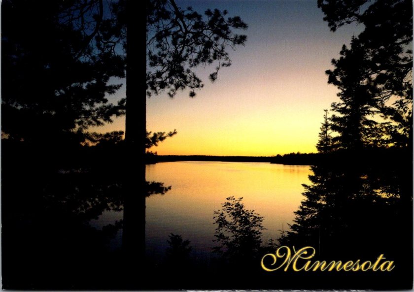
Emma’s eyes lit up. Quietly, she imagined how many they’d find all over Minnesota in the days and weeks and (hopefully) years ahead.
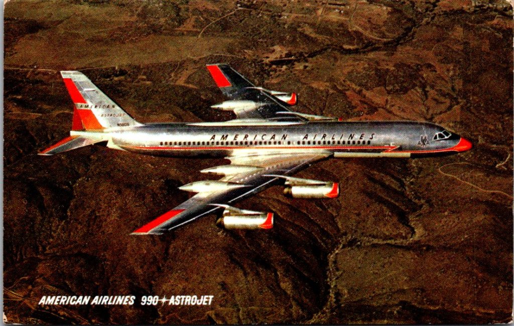
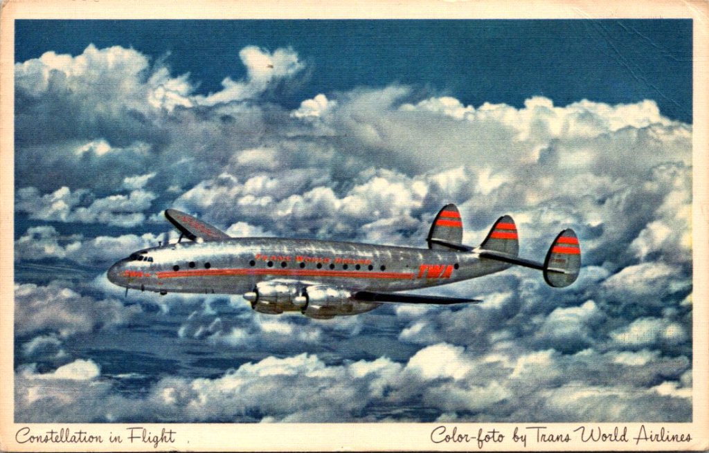
Back home, George leaned out of the window to pick up the mail before driving down the ice-packed drive. He tossed the stack on the seat. On top, a photo of an American Airlines plane. He knew who it was before he turned it over.
Flight delay. Thinking about you and Jennie. Can’t believe they’re both gone. —T
His younger brother, Tom, both of them widowers now. Their wives were gone within months of each other. At times, they both worried they would lose each other, too. Too much pain, way too much.
George had been waiting for Tom to call. He knew that constant work and distance was his way of coping, but how long was too long?
George looked at Tom’s card again, familiar but this time a sudden realization hit him. Tom sends postcards. He’d received at least a half a dozen over the years–all photos of old jets. George had never written back. Not once. He’d been waiting for the phone to ring. Now he remembered the little collection of airplanes in his desk drawer.
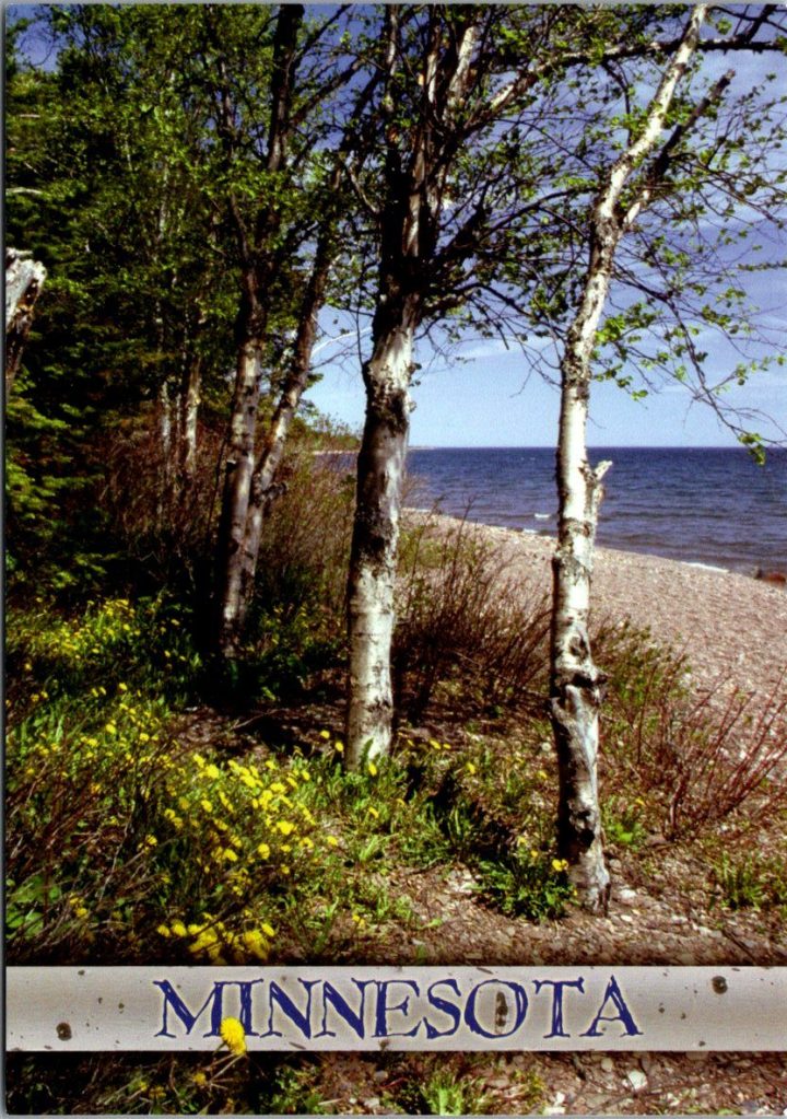
He sat down. Pulled a card from his own growing stack, a color photo of a trail like today’s but after the thaw. His message was short, with room for more later.
Got your card. Miss them every day. Miss talking to you. —George
He addressed it to Tom’s apartment in Phoenix, the one he’d moved to after Delia died, and rarely slept in. Stamped it. Put on his coat and walked back out to the mailbox, certain of what he’d been missing.
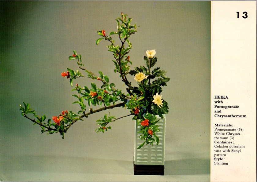
Nina found Mrs. Hanabusa arranging flowers in the common room—a small practical arrangement, simple stems in a shallow dish.
“For the holiday?” Nina asked.
“My own amusement.” Mrs. Hanabusa adjusted a branch. “Ikebana, flowers carry meaning. Not just pretty, it’s a message.”
“What does this one say?” Nina asked.
Mrs H pointed to the chrysanthemum. “This one means longevity, joy. Used in autumn arrangements and also at funerals. Pomegranate. Internal life, good luck, and natural cycles of life and death.”
Nina watched her work. The precise angles, the negative space.
Mrs. Hanabusa stood up and moved back to considered her creation. “New year. Endurance through winter. Joy waiting to flower. Life coming and going all the time.”
She looked at Nina. “What’s your story?”
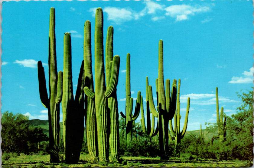
Nina placed her postcard on the table and sat down. A cluster of saguaro against a bright blue sky, blank on the other side.
“I don’t know what to say to him,” Nina whispered.
“Ikebana, we don’t fill all the space. We leave room. Leave room,” said Mrs. Hanabusa with some emphasis this time.
Nina thought for a moment, and wrote:
Got your note. Like the saguaro, I’m still here. Hug? —N
Not forgiveness. Not resolution. Presence and a little humor, with some room. She added her father’s address in Phoenix. Stamped it and set it by her keys, knowing that it still might take days to put it in the mail.
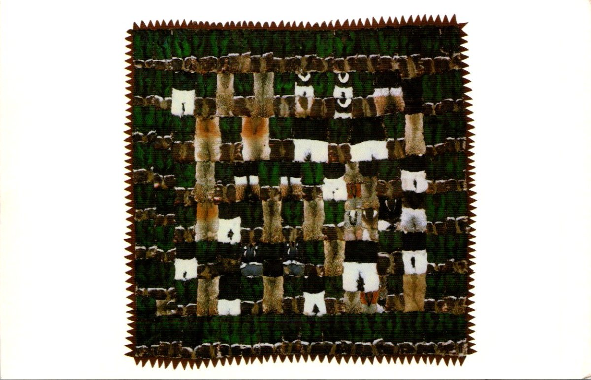
The next morning, a third card from Nora arrived—black and white geometric patterns, stark and beautiful. An Inuit quilt made of duck knecks.
Mrs. Hanabusa was at the window again when Nina came in. Nina showed her the card. Mrs. H studied the design, then turned it over to read the back.
Found a noodle shop I love. Made friends at work. Some days are hard, some surprise me by how easily I could stay longer. —N
Mrs. Hanabusa looked up. “She signs just ‘N.’ Like you do.”
Nina blinked. She’d never noticed.
“My sister and I had our own shorthand, too. Still do.” Mrs. Hanabusa handed the card back carefully. “Secret code.”
Nina looked at the card again. The simple N. The years of friendship.
On her way home, she stopped at the blue mailbox on the corner. Pulled out the cactus card she’d written to her father to look at how she’d signed it. Just N.
She dropped it in the slot, heard it fall, and said a humble prayer. What else had she not noticed along the way?
George’s gifts get a warm reception, while a note to Nina gives her a chill.
George’s daughter called on Tuesday evening. “The kids loved the postcards, Dad. Emma especially. She wants to start birding… with you.”
George felt a dial turn in his chest. “She does?”
“She’s been asking about your old field guide. The one you used to carry.”
After they hung up, George went right to the closet. Found the guide on a high shelf, spine cracked, pages marked with decades of pencil notes. He’d bought it in 1978. Carried it on weekend drives, on fishing trips, on the slow walks he took with each kid as they got adjusted.
He wiped dust from the cover. Flipped through. His handwriting tracked sightings—dates, locations, weather. A life measured in birds.
Emma would need binoculars, too. His old pair hung on a nail in the garage. He loved these trusty old binos. It would be hard to give them up. Maybe he should buy her a new pair? But George imagined seeing Emma out on the trail in front of him, patiently observing and tracking it all, just as Mai had. It was worth the heartache.
Lily needed art supplies—he remembered Jennie’s watercolor set, still good, stored in the craft closet. Paints and brushes. Clean paper. Save the easel and the satchel for next time.
Always books for Jack, but it was a hard choice. George searched his shelves. He found volumes he’d loved, but they were too intense for Jack right now. Shy and studious, he might like America, Land of Beauty and Splendor, a Reader’s Digest hardback with a handsome leather spine. Good chance he’d help Emma plan her birding trips with it.
By evening, the kitchen table was covered with brown paper and string. Three packages taking shape. The field guide and binoculars for Emma. The watercolor supplies for Lily. A stack of books for Jack.
George wrapped slowly, carefully. He wrote notes and tucked an old Christmas postcard in each one. He’d never been good at gifts. Always second-guessed himself. But these felt right. Things that had mattered to him, passed down. Things they’d actually use. He whispered to himself, “Old is still good.”
Christmas Eve morning, George loaded the packages into his truck. The drive to Wabasha took twenty minutes. The sky was gray, threatening snow.
Mai opened the door, flour on her hands. “Dad! Come in, it’s freezing.”
“Just wanted to drop these off.” George carried the packages inside, set them under the tree.
Emma appeared from the hallway. “Grandpa!”
Jack and Lily followed, voices overlapping. George let himself be pulled into the warm house, the noise, the aromas coming from the oven.
George didn’t look a thing like Santa—tall and thin, no beard, flannel shirt instead of red suit. But standing there with his grandchildren around him, he felt jolly. This was better than he’d imagined. Better than the quiet house and the empty days, anyway. Being a grandfather mattered more than anything now.
“Can we open them?” Lily asked.
“Christmas morning,” Mai said. “Dad, stay for coffee?”
George stayed for an hour. Drank coffee. Watched the kids. Drove home through the light snow feeling content, maybe even peaceful.
Nina pulled the stack of stuff from her mailbox. Bills. A grocery store circular, and two postcards.
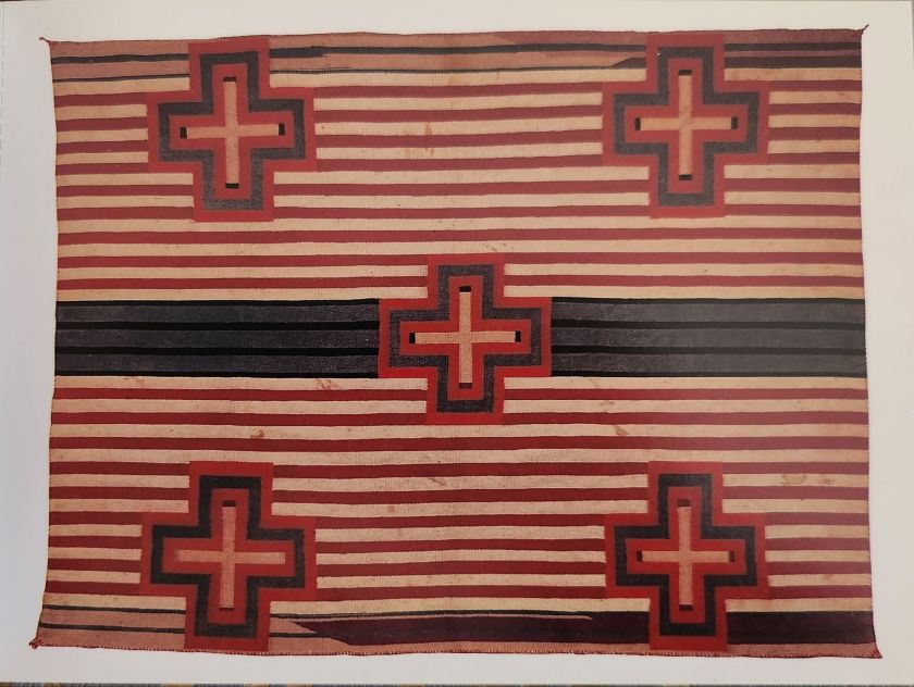
The first showed another Native textile—bold linear patterns in red, black, and cream with intense cross icons. Nora’s careful script on the back.
Hā lō. The words don’t come easily but people are kind. Cool and cloudy. I am floating in a haze between two languages and all the sights and sounds. —N
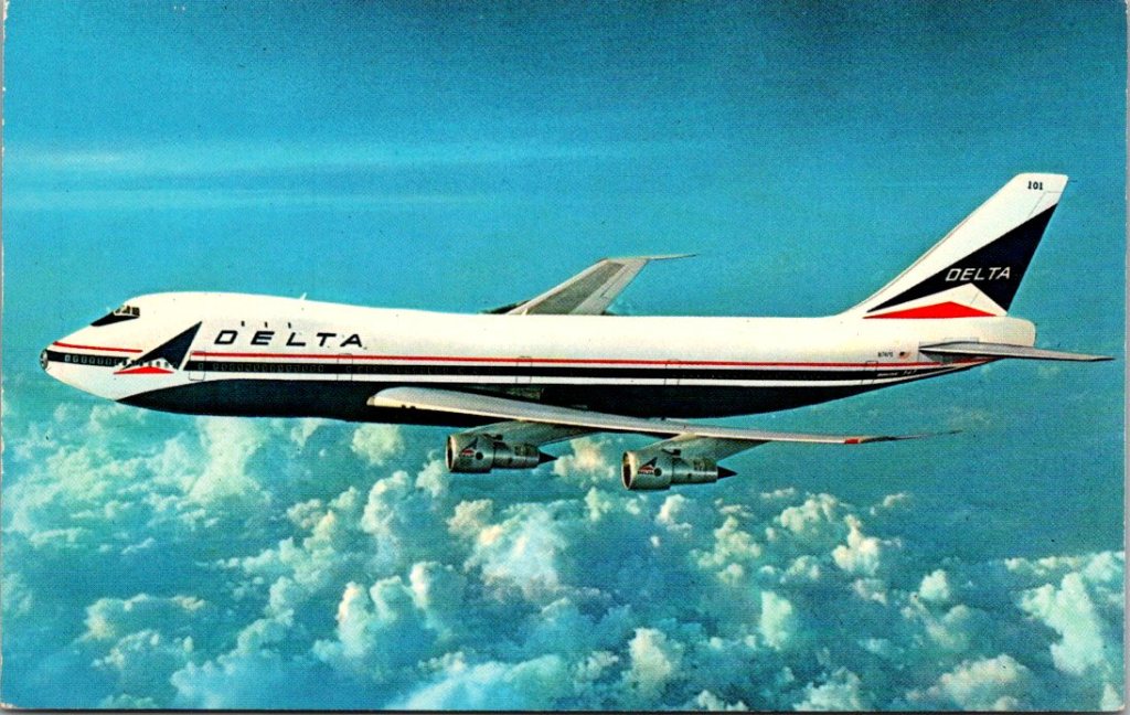
Nina flipped over the second card and took in a sharp breath. A generic Delta airplane photo. The handwriting slanted left, pressed hard into the faded card stock.
Layover. Thinking of you. -Dad
She hadn’t heard from her father in eight months. Not since he flew in for the funeral and left the next day.
Nina stood in the mailroom holding both cards. Nora’s textile and her father’s cardboard shrug. She whispered, “Merry Christmas, Dad,” and slipped them both into her bag.
Mrs. Hanabusa was by her window when Nina arrived for her shift. The older woman smiled. “You have mail.”
“How did you know?”
“The look you get.”
Nina pulled out Nora’s card. Showed her the textile pattern.
Mrs. Hanabusa took it carefully. Studied the bold lines, the sacred geometry. “Another one, but this is different, more dramatic.” She tilted it toward the light from outside and a mischievous grin washed across her calm visage. “My grandmother would have liked getting these back, too.”
Nina hesitated, then showed her the second card with the plane.
Mrs. Hanabusa looked at it, then at Nina, then waited.
“My father,” Nina said. “He’s a pilot. He sends almost the same card every time.”
Mrs. Hanabusa was quiet for another long moment. “My father came back from the camps different. Smaller and afraid. He couldn’t talk about what he’d lost. Some people need distance to be ok.” She paused. “But, that is not ok for you.”
“No,” Nina said. “It’s not.”
Nina looked at the card again. Thinking of you. Three words. A lifetime of absence compressed into a layover.
“I don’t know what to do with them,” she admitted.
“Keep it. Keep all of them, and figure out how to write back.”
Nina slipped both cards into her pocket. Nora’s textile and the latest of her father’s terminal attempts. Both efforts in their own ways, she had to agree.
Mrs. Hanabusa watched her. “These cards from your friend—they matter to me too, you know. Seeing which patterns she chooses next. What she wants you to know about her trip. That’s a kind of gift. Your friend is keeping her promise.”
“She said she’d send them all,” Nina said.
“Good,” Mrs. Hanabusa said. “You can show me each one.”
Time to Reconnect?
Though the story is fiction, a vintage postcard is still a great way to stay in touch. Browse our selection.
Nina makes a long distance deal with a dear friend, and George finds a new use for old memories.
Nina arrived early at the coffee shop near campus in Tempe. The drive up from Tucson was faster than she expected. Nora slid into the booth at 9am sharp. “You’re glowing,” Nina said.
“Nerves.” Nora grinned. “Two years in Taipei, three weeks to learn Mandarin.”
They ordered. Nina nudged a package across the table. She’d wrapped the book of postcards the night before, Navajo Textiles, each page a detachable card with a different striking design. Almost too good to take apart.
Nora opened it and smiled. “These are perfect. They will remind me where I came from. And, we can keep them! I’ll send them back to you.”
She flipped through the cards. “My grandmother did this. Sent us postcards from every trip. Maybe that’s why I love to travel.”
“I want to hear all about it,” Nina said. “Something to look forward to in the mailbox.”
“Deal.”
They talked until Nora had to leave for meetings. Nina hugged her friend outside, watched her disappear into the parking garage. On the drive back to Tucson, she thought about when she might travel again. Someday.
In Minnesota, George came across a box of old stationery while cleaning out a drawer in the office. He’d been ignoring this stuff too long, but it had to be done. He was surprised to find a bunch of notecards and envelopes, postcards from their own travels, even some stamps. Jennie must have tucked them away years ago, then forgotten.
He shuffled through the stack, smiled, and thought about their grandchildren.
Emma, sixteen, newly licensed, texting him sunset photos. Jack, thirteen, reading everything, and his own library growing. Lily, nine, from whom he routinely received animal drawings in manila envelopes.
He wrote to Emma first:
Found this sunset and thought of you – keep your eyes on the horizon! Love, Grandpa
Then, to Jack:
You can find a library in every place. Hope you go some day, and your collection grows. Love, Grandpa
Finally, to Lily, though his hand was aching:
For my favorite artist: a cat to inspire your next drawing. Keep sending pictures. Love, Grandpa
He addressed the cards and peeled the Forever stamps from their yellowed backing. The afternoon sun was glinting off the glassy surface of the snow as George walked down the drive and out to the mailbox. These should get there before Christmas, he thought. Next he’d knock the icicles off the eves over the porch steps, then make dinner.
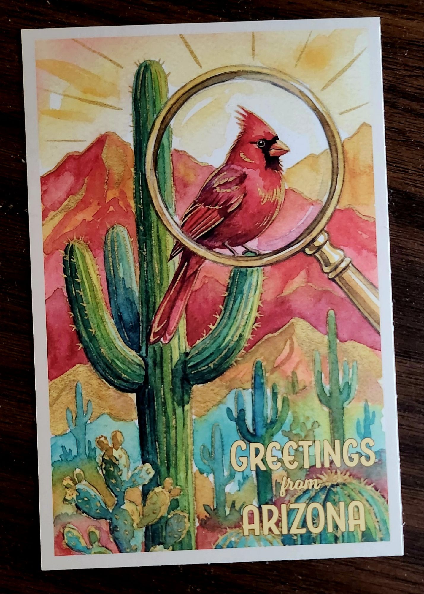
The Northern Cardinal’s migratory range is rather small. Unlike this postcard, sent from Nina in Tucson to Uncle George back home.
The postcard arrived on a Tuesday in December, slipped between the electric bill and a catalog he’d never seen before. George set it on the kitchen table while he made coffee, the red bird on its front catching the weak winter light through the window.
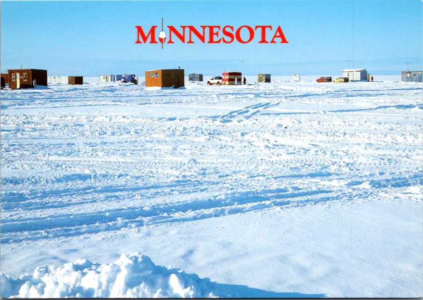
He’d lived seventy-three winters in Minnesota and he could remember nearly as many cardinals. One visited his mother’s feeder every winter morning. A pair of birds nested in the honeysuckle behind their first house, and a solitary male appeared each January at the cemetery where his wife rested.
The bird on the card was just ink and paper, a cheerful holiday visitor perched on a cactus. George smiled at all the memories. Standing at the kitchen window, watching that splash of red move through the frozen world.
He propped the card against the sugar bowl where he could see it while he drank his coffee. That small red bird sent from a warmer climate, it was good company.
Nina stepped onto her back patio in Tucson as the December sun softened toward an early evening. She was carrying her phone and the stack of work she was supposed to ignore. The hospice had been short-staffed for weeks, and even her days off felt heavy with other people’s grief. She sank into the patio chair and her eyes rested on the saguaro at the property line, its arms raised like a benediction against the pale sky. Then, an impossible red against the green ribs of the cactus, a cardinal turning its crested head to stare right at her.
She watched it hop from one arm to another, so vivid it seemed painted there, and suddenly thought of her uncle George. He’d be preparing for snow about now, making sure the feeder was stocked, the northern cardinals waiting through the bare branches. She’d bought that card weeks ago. She meant it to be funny, a little bit of desert sunshine for the cold country.
The bird tilted its head once more, then lifted away toward the neighbor’s tall gate. Nina set down her phone and went to find the card on the table inside. She’d send that postcard tonight. A small bright thing traveling north, carrying a moment of real rest and a reminder of the joys that appear in the landscape.
The connection between George and Nina, between Minnesota snow and Arizona sun, traces a geography that cardinals themselves understand.
The Northern Cardinal’s range stretches from southern Canada through the eastern United States and into Mexico, reaching west through Texas and into Arizona. Unlike many songbirds, cardinals don’t migrate. They remain year-round residents wherever they establish territory. A cardinal in Minneapolis endures the same winter as the people who watch it, while its southwestern cousins never know deep cold at all.
This winter persistence made cardinals natural companions to a tradition that took hold in late 19th century America: backyard bird feeding. As cities grew and winters seemed harsher, people began setting out suet and seed, transforming their yards into small refuges. The cardinal, bold and willing to visit feeders, became a regular presence at kitchen windows during the season when color disappeared from the world. That bit of red against white snow or dark evergreen wasn’t just beautiful—it was companionship. Nature’s daily offer of simple joy.
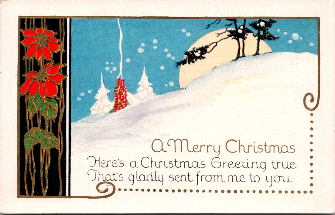
Holiday card publishers recognized this quiet bond. As postcards surged in popularity in the early 1900s, designers increasingly turned to the natural world for their winter imagery. American cards featured the birds people actually saw at feeders, perched on snow-laden branches, bright against winter skies. These cards created a secular holiday vocabulary, a way of marking the season that felt both celebratory and true to the world outside the window.
Nina was right. George had set out the feeders, with enough seed on hand to get through the cold months. He’d been to Jennie’s grave, and he’ll write back to Nina soon. Maybe visit Tucson. Maybe see a cardinal on a cactus.
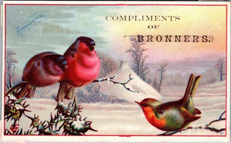
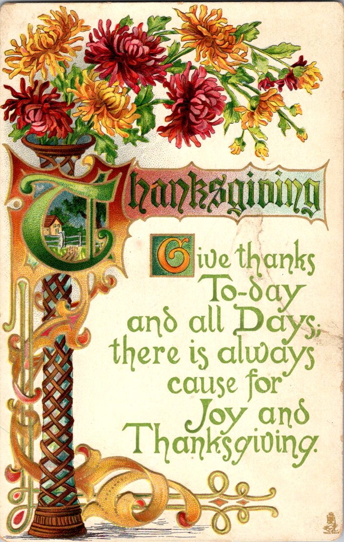
For a dip into distraction before the holiday, here’s a longer essay about Raphael Tuck & Sons, Mechanical Marvels, who were “Art Publishers to Her Majesty the Queen.” Today’s Thanksgiving selection by the same maker shows off their characteristic style and stamp.
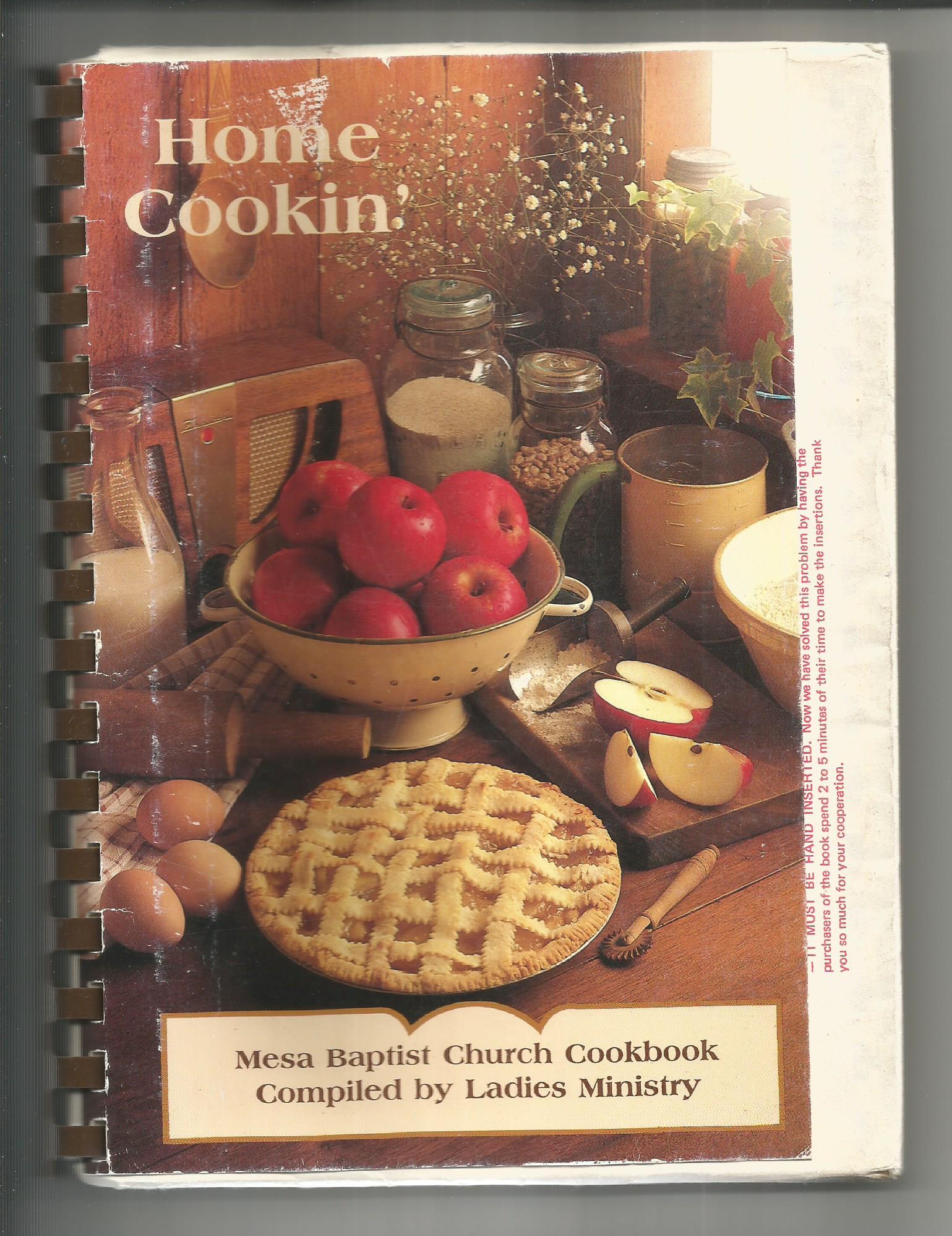
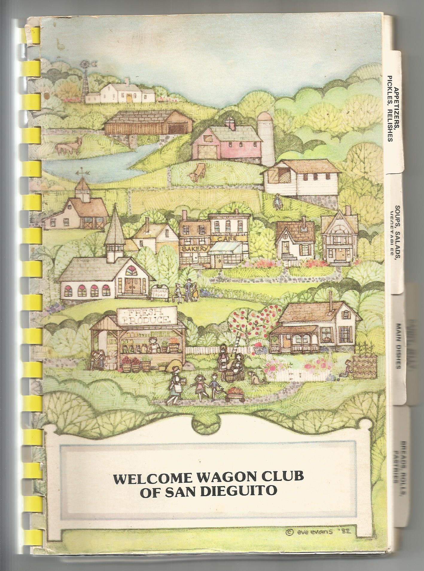
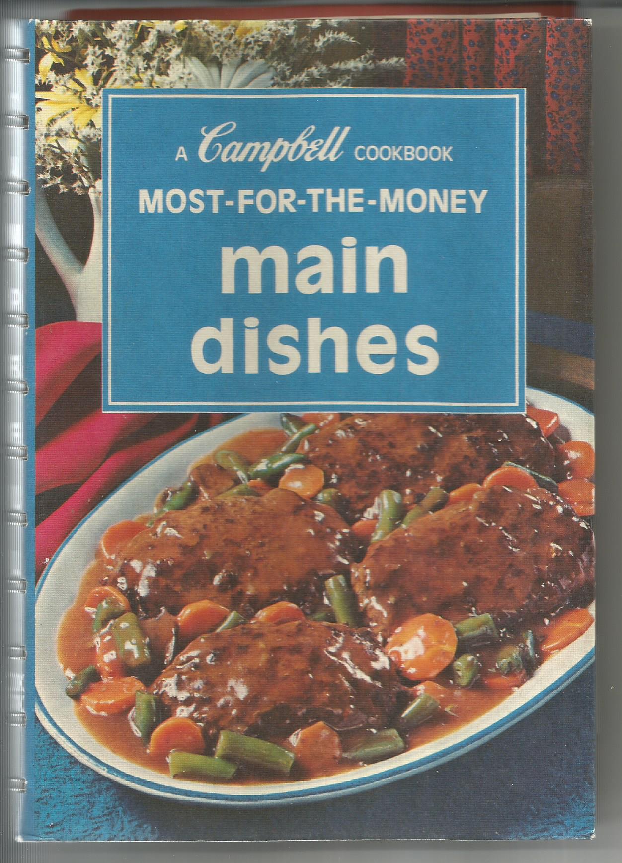
kitschy cookbooks
In time for the sumptuous season, these kitschy cookbooks remind us of this handy (and hilarious) pastime of sharing homecooked love and comfort.
Nice Gifts that are Kind to Your Budget
Add quirky fun to the gifting season with carefully curated vintage and resale finds. They are cost-conscious and climate-saving, too. Shop for vintage postcards, art card kits, and kitschy cookbooks at The Posted Past online shop.
Dial into this easy listening station from your heart.
In the quiet hours after he died, I heard Dad’s voice clear as a bell inside me. Left chest, near my heart, broadcasting from a heavenly radio station.
He’s not an advice line. More like a tinkling piano in an airport lounge where it’s always sunset or sunrise somewhere.
It’s not just him. My grandmothers have a talk show, conspiring on our behalf from the front porch of a woodsy cabin. Some of my aunts are traveling the span of the universe on magic carpets, and sending back reports.
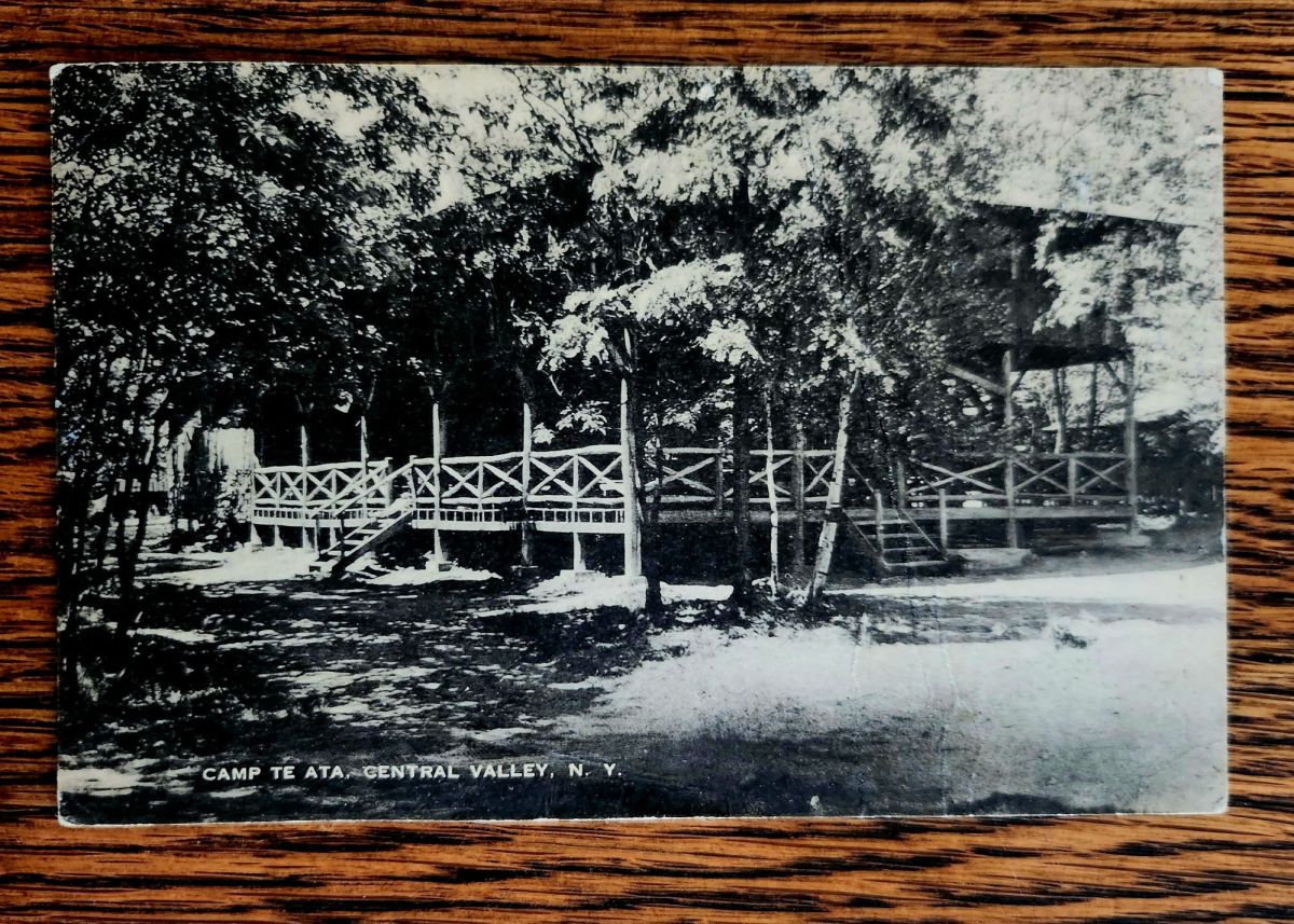
Dear Bob, Thank you very much for the card. I am in nature and a play now. Please Write Me. xo xo Love Sally xo
Sally writes to Bob from stayaway camp in upstate New York
Ancestors Radio is on in the background all the time. I put on piano music in the house to dial in. Humming along and half-listening, I grasp what I can, especially as it relates to family stories and postcards. Little magic carpet rides, too.
We’re into a new season of wonder, now. Awe is on the air. Stay tuned!
Holiday Gifts Under $15
A Book of Postcards Makes a Great Gift!Send Love from AZ this Season!