Tempe in Time: A Journey through Places and Postcards

A set of postcards printed in the 1980s reflect Tempe’s history a century before. Now historical artifacts themselves, these images offer a window into the city’s past and future.

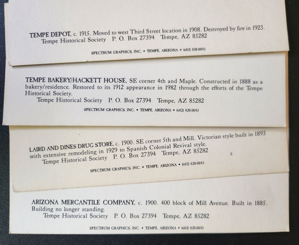
As we examine each postcard, we’ll uncover the story of Tempe’s development and explore how each generation has contributed to the city’s evolving landscape.

The Hackett House: Victorian Charm in the Desert

Today’s journey begins with a postcard depicting the Hackett House, a quaint building constructed in 1888. This red brick structure, Tempe’s oldest of its kind, stands as a testament to the city’s early days. With its distinctive turret and elegant design, it exemplifies the rare Arizona Territorial Victorian commercial style.

Originally built by German immigrant William Hilge as Tempe’s first bakery, the Hackett House’s location near the Hayden Flour Mill, the railroad, and the Territorial Normal School (now Arizona State University) nods to the earliest urban planning in Tempe. The postcard captures the building’s 1912 appearance, which was painstakingly restored in the 1970s.

The history of the Hackett House mirrors Tempe’s own evolution. After its days as a bakery, it served as a residence and later a boarding house. It earned its current name when Estelle Craig, Tempe’s first telephone operator, married Roy Hackett in the old bakery house. By the 1980s, when our postcards were likely printed, the Hackett House had already been recognized for its historical significance and placed on the National Register of Historic Places.

Tempe Depot: The Arrival of Progress

Our next stop is the Tempe Depot, captured in a postcard circa 1915. The image shows a steam locomotive at the station, a small group clustered for the photograph. This scene represents a pivotal moment in Tempe’s history, symbolizing the city’s connection to the wider world.

The arrival of the Maricopa and Phoenix Railroad in 1887 transformed Tempe from a small farming community into a thriving center of commerce. The depot, built in 1907, served as a vital link for both passengers and freight, fueling Tempe’s growth and prosperity. Though the original structure was lost to fire in 1923, this postcard preserves its memory and significance.

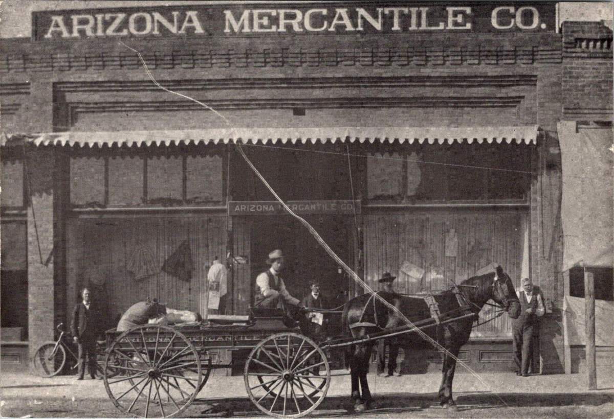
Arizona Mercantile: Commerce in Early Tempe

The next postcard features the Arizona Mercantile Co., a sturdy brick building constructed in 1898. With its large storefront and a horse-drawn carriage parked outside, this image encapsulates the commercial heart of early Tempe.

The Arizona Mercantile Co. played a crucial role in Tempe’s economy, providing essential goods and services to the growing community. The image itself, its preservation, and later reproduction underscores the importance of local businesses in shaping Tempe’s identity and meeting its residents’ needs.

Laird and Dines Drug Store: A Corner of History

Our final postcard depicts the Laird and Dines Drug Store, circa 1900. This Victorian-style corner building, with its prominent “DRUGS” signage, offers another glimpse into Tempe’s commercial past. The image shows the particulars of storefront business, with its ornate architecture, early signage, and shades to defend against the afternoon sun.

The building went on to serve as campaign HQ for Senator Carl Hayden and Governor Benjamin B. Moeur, as well as the first town hall and post office. Renovations reflected each successive era, including a few that were later reversed. Look closely today, and the old bones still show.

Preservation: Buildings vs. Postcards

As we explore Tempe’s history through these 1980s postcards, we encounter an interesting dichotomy in historical preservation. While some buildings depicted still stand today, others have long since disappeared from Tempe’s landscape.

The preservation of postcards offers a unique window into the past, allowing us to visually experience Tempe as it once was, even when the physical structures no longer exist. The Tempe Depot postcard, for instance, preserves the image and significance of a building lost to fire, serving as a tangible link to the city’s early railroad days.

On the other hand, the preservation of buildings like the Hackett House allows for a more immersive connection with history. Visitors can walk through the same spaces, touch the same walls, and experience the ambiance of a bygone era in a way that a two-dimensional image can’t replicate.

This dual approach to preservation provides a richer, more comprehensive understanding of Tempe’s history. The postcards fill in the gaps where physical preservation was lost, while the preserved buildings offer tactile and fertile connections to the past.

Hayden Flour Mill in operation, click for reference link

Tempe’s Historic Landscape

Tempe’s commitment to preserving its architectural heritage is evident in the numerous historic properties that dot its landscape. The Elias-Rodriguez House, built in 1882 using traditional adobe methods, stands as one of the oldest surviving buildings in Tempe, representing the early Hispanic influence on the city’s development.

The Niels Petersen House Museum, a Queen Anne Victorian style home built in 1892, offers visitors a glimpse into the life of a wealthy rancher in territorial Arizona. The Old Main building on Arizona State University’s campus, completed in 1898, continues to serve the university community while standing as a proud reminder of the institution’s long history.

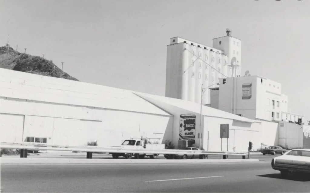
These pristinely preserved buildings, along with others undergoing substantial redevelopment like the Hayden Flour Mill (1918) form a network of historical touchstones throughout Tempe. They create a physical timeline of the city’s development, allowing residents and visitors alike to trace Tempe’s growth from a small agricultural settlement to a thriving modern city.

Image courtesy of Jack D. Mount, click for reference link

Evolving Landscapes: Tempe Through the Decades

While our postcards capture Tempe’s early history, the city’s development didn’t stop in the early 20th century. Each subsequent generation has left its mark on Tempe’s landscape, contributing important and useful additions that have shaped the city we know today.

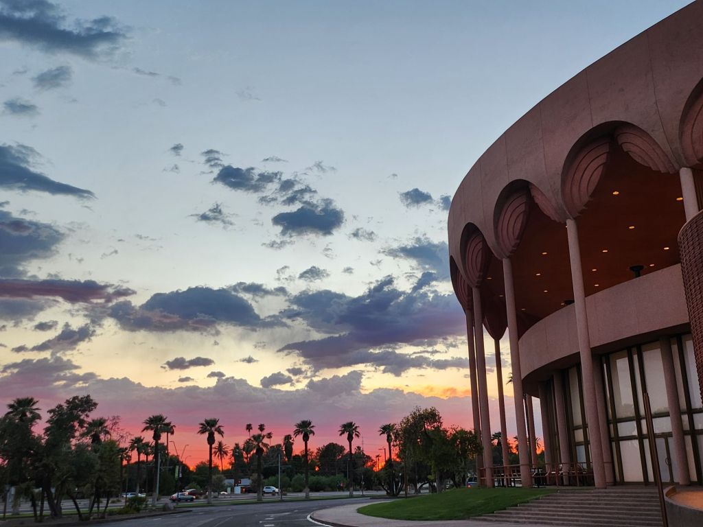
The 1960s saw the development of the Mid-Century Modern style that has since become iconic in Tempe. Grady Gammage Memorial Auditorium still defines Tempe’s landscape as a living example of Taliesin West design, inspired by Frank Lloyd Wright’s principles and aesthetic.

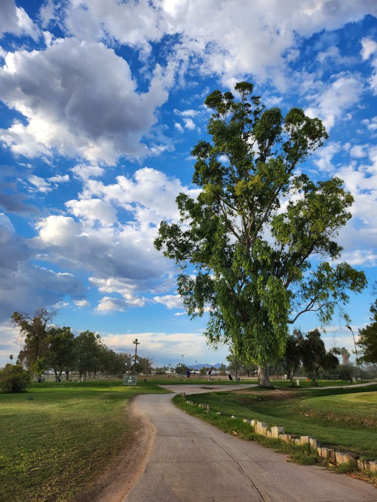
Another example, Shalimar Golf Course & Estates, built in 1961 combining a golf course with a mix of single-family and townhomes all featuring the golf lifestyle. This ambitious project represented a new approach to suburban living, offering residents a blend of recreational amenities and comfortable housing. The golf course continues to operate today, though its future faces the threat of redevelopment again in 2025.

As we consider the fate of mid-century developments like Shalimar, we’re confronted with a critical question: will these more recent historical landscapes be preserved in place or will they exist only as postcards, if at all? The answer may depend on how we value and interpret the architectural and cultural legacy of the mid-20th century, and how we balance preservation with the evolving needs of a growing city.

Generational Contributions to Tempe’s Landscape

These projects, spanning a century, demonstrate how each generation in Tempe has contributed something important and useful to the city’s landscape. Each of these developments responded to the needs and aspirations of its time while also shaping the future of Tempe. They’ve created new models for residential communities, transformed the city’s relationship with its natural environment, spurred economic growth, and positioned the city as a cultural hub in the region.

Moreover, these projects have often built upon or complemented earlier developments. For instance, Tempe Town Lake is a modern creation that in some ways echoes the water management innovations seen in earlier projects like the Roosevelt Dam. The Tempe Center for the Arts, with its lakeside location, takes advantage of the views and ambiance and extends the cultural campus of the city.

This layering of infrastructure and development over time creates a rich urban tapestry that tells the story of Tempe’s growth and evolution. From the historic buildings captured in our 1980s postcards to the modern landmarks of today, each generation has added its own chapter to Tempe’s ongoing narrative.

Image from Tempe History Museum collection, click for full citation.

Civic Priorities Across Eras

Examining Tempe’s history reveals how certain civic priorities persist across generations, forming a thread of continuity. The establishment of the Territorial Normal School in 1885 reflects an ongoing commitment to education that continues to shape the city’s identity today. Infrastructure development demonstrates the community’s long-standing recognition of the importance of resource management and large-scale planning.

The presence of telephone services in early Tempe, including Estelle Craig’s role as the city’s first telephone operator, reminds us the community’s need to embrace new technologies. This spirit of innovation has persisted through the decades, manifesting today in Tempe’s adoption of smart city technologies and its support for tech industry growth.

The growth of local businesses and transportation networks demonstrates a consistent focus on economic development that remains a key priority for Tempe. From the early mercantile stores to the bustling mill, and from the first railroad to modern light rail systems, Tempe has always recognized the importance of commerce and connectivity in building a thriving community.

The Past Informing Future Plans

Understanding our history plays a crucial role in shaping the future of our cities, and Tempe is no exception. The walkable, mixed-use nature of early Tempe, where residences, businesses, and civic institutions coexisted in close proximity, still exists as a memory and a footprint within contemporary urban planning that prioritizes regional accessibility and global interaction.

Preserved buildings like the Hackett House do more than just remind us of the past; they actively influence contemporary architectural styles. By maintaining these historical structures, Tempe creates a sense of continuity in its urban landscape. Modern buildings often incorporate elements inspired by these historical designs, creating a blend of old and new that gives the city its unique character over time.

Historic buildings also make spaces for modern vision and mission, as seen with the Hackett House’s current role as headquarters for Tempe Sister Cities. This practice of adaptive reuse not only preserves historical structures but also breathes new life into them, making global connections, welcoming visitors and ensuring Tempe’s relevance for future generations.

The Historic Hackett House today

History Today and Tempe’s Future

As we look at these 1980s postcards of even older Tempe landmarks, we’re reminded that the appreciation of history is itself a constant. Each generation recognizes the value of its heritage and works to preserve it for the future. In doing so, they contribute to the ongoing story of Tempe, creating a richer, more resilient urban fabric that honors the past while embracing the future.

The challenge – and opportunity – for Tempe and cities worldwide lies in maintaining this delicate balance between preservation and progress. By thoughtfully integrating historical elements into modern urban planning, we create spaces that are not only functional and innovative but also deeply rooted in the community’s unique identity and shared history.

Crucially, thinking about the past and future opens a window into creative solutions for present-day challenges. Some old ways of desert living offer valuable clues for sustainable life in modern Tempe. The walkable nature of early Tempe, for instance, provides inspiration for reducing car dependency. The adaptive reuse of buildings like the Hackett House demonstrates how we can minimize waste and preserve cultural heritage simultaneously. The large-scale water management projects of the past have to inform us in dealing with water scarcity in an era of climate change.

As Tempe faces new challenges and opportunities, these historical images and structures serve as both guideposts and inspirations. They remind us that every generation leaves its mark, and that by honoring our past, we can create a more meaningful and sustainable future. The story of Tempe, as told through these postcards and the buildings they depict, is about continuity amidst change and working together. It’s a story that continues to unfold, with each generation adding its own chapter.

In the end, Tempe’s effort to learn from its history while boldly innovating for the future reflects those shared concerns every community faces. It shows that progress and preservation are not mutually exclusive, Rather, they are complementary forces. When balanced thoughtfully, they can create vibrant, resilient, and deeply-rooted urban and suburban communities. As Tempe faces the future, it does so with the wisdom (and the failures!) of its history as a guide, each generation ensuring that the city’s unique character and community spirit will endure for the next.

Thread & Paper: A Century-Old Silk Embroidered Postcard

Imagine holding a piece of handmade history – a delicate blend of silk and paper that has traveled more than a century to tell its story.

This charming embroidered postcard from the early 20th century is a small and intricate greeting that speaks volumes about a bygone era. In the world of historical artifacts, sometimes a small stitch tells a rich story.

Burst of Blooms

The postcard we are examining today presents an interesting contrast to typical flat, printed cards. Its front features an embroidered design set within a scalloped, cream-colored frame. The embroidery displays a palette of purples, reds, blues, and greens against a light fabric background, forming a floral scene.

At the center is a red flower, its petals rendered in careful stitches to create a sense of depth. Blue blooms surround it, with green stems and leaves providing structure to the composition. Above the flowers, Rosa is embroidered in purple thread, while below, Feliz cumple años (Happy birthday in Spanish) completes the message.

The reverse side is more conventional, bearing the hallmarks of early 20th-century postcard design. “CARTE POSTALE” is printed at the top in both French and English, with the card divided for correspondence and address. A small line at the bottom reads “Printed in France « E.R. » Paris” – a clue to the card’s origins.

The card was produced by E. Rabus, a Parisian company founded in 1897. By the early 20th century, the company had become a leader in the French postcard industry, including active involvement in the Chambre Syndicale français des Editeurs de la Carte postale illustrée, the professional organization for French postcard publishers. In 1914, E. Rabus held the position of secretary-general in this organization, placing the company at the heart of the industry during a pivotal time.

Manufacturing Marvels

This particular postcard emerged during the postcard craze of the early 20th century, when millions of postcards of many great variety were produced and sent globally each year.

The postcard we’re examining likely dates between 1914 and 1920, a period that saw significant changes in the postcard industry. Creating this postcard involved a fascinating blend of traditional craftsmanship and industrial production techniques.

The silk thread may have been sourced from a renowned manufacturer like Dollfus-Mieg & Cie. DMC was a major producer of embroidery threads, founded in Mulhouse, Alsace in 1746. Thread may have also come from Lyon, France’s capital of silk, where workers known as Canuts supplied luxury goods markets. The use of high-quality silk thread indicates that this postcards was a premium product.

While hand embroidery was still practiced, the scale of postcard production in this era suggests that machine embroidery was more likely used. Skilled workers would have operated specialized machines manually set to create the intricate design.

Once complete, the embroidery needed to be affixed and sandwiched between two paper cards to create the final product. The distinctive scalloped edges on the front were created through embossing and die-cutting, a process using metal plates and a sharp blade to stamp and cut the card into its final shape, leaving a window for the fine fabric to show through. The reverse side was made using standard printing techniques of the era.

All of these processes – embroidery, backing, embossing, die-cutting, and printing – would have taken place at the E. Rabus factory in Nanterre, a suburb of Paris. The company’s ability to combine these various techniques in-house speaks to its sophistication as a manufacturer and helps explain its prominent position in the industry.

Messages for Global Markets

While this postcard was produced in France, its Spanish text hints at a broader marketplace and larger international relations. E. Rabus, like many successful companies of its time, was looking beyond French borders to sell its products.

The most likely target market for this Spanish-language card would have been Spain itself. Geographic proximity and cultural ties between France and Spain made this a natural choice. Spanish tourists visiting France might have purchased such cards as souvenirs, or French customers might have bought them to send to Spanish friends or relatives.

Another strong possibility is Argentina. In the early 20th century, Argentina had a significant French immigrant population and strong cultural ties with France. The Argentine upper classes, in particular, had an affinity for French culture and products. Or perhaps Cuba, a popular tourist destination for Europeans at the time.

It’s worth noting that World War I (1914-1918) had a significant impact on these global markets. The war disrupted trade routes and changed economic relationships. However, it also created new demands for postcards as a means of communication between soldiers and their loved ones. Spanish neutrality during WWI might have made Spain an even more important market for French postcard producers during this time.

Grand Greetings

Perhaps the most charming aspect of this postcard is the way it personalizes a mass-produced item. The name Rosa embroidered at the top of the card transforms it from a generic greeting to a personal message. We can appreciate the care in choosing this specific card with the recipient’s name woven into the birthday wish.

Postcards marry the universal with the personal. Paper and thread become a bridge – between industrial spaces and private life, between France and the Spanish-speaking world, and between the early 20th century and our own time. Human desire is to connect, to send our good wishes across distances, and to make even mass-produced items feel special and individual.

Feliz cumple años – in Spanish – reminds us that birthdays are celebrated across cultures and languages, and the wish for a happy birthday transcends borders and time.

As we examine this postcard today, we sense so many stories – the mysteriously named publisher, the factory workers in Nanterre, a birthday celebration, the joy of both the sender and the intended recipient. Every historical artifact, no matter how small, carries with it a web of human connections.

We send greetings with the tap of a screen today, and still we can appreciate the thought and effort that went into creating and choosing such a card. It invites us to consider how we express our good wishes today, and how modern methods carry the traditions forward from this centenarian birthday card.

This delicate embroidered postcard, with its silk threads and scalloped edges, its French origin and Spanish text, is a testament to human creativity, industrial ingenuity, and the enduring power of a simple wish for happiness, stitched in colored thread, preserved through time, and able to transcend borders.

Postcards of Perseverance: Boom and Bust in Middle Missouri

On a crisp February morning in 1926, Fred Van Hooven of Americus, Missouri, reached into his mailbox to find a postcard. His calloused hands grasp the card, his eyes lit up at the news: “Prime steers $10.50 to $11.00. Choice $9.75 to $10.25.”

The postcard is colorful, smartly-designed and professionally printed, but it’s not a scenic view or a greeting from a distant relative. It’s a fold-over commercial mailer. Inside is a detailed cattle market report from Woodson-Fennewald Company at the National Stock Yards in Illinois.

For rural farmers and ranchers like Van Hooven, this small mailed card represented opportunity and prosperity. Today, it’s a window into a complex economic ecosystem that stretches from a small ranch in eastern central Missouri to the bustling stockyards of Chicago and beyond. This postcard and another one received a decade later bookend a period of dramatic change in rural America.

Van Hooven’s address in Americus draws us to a small community in in the eastern central part of Missouri. Founded in the 1860s Americus grew from a pre-Civil War settlement into a bustling village. By 1884, it boasted a dry goods store, a drug store, two blacksmith shops, a wagon shop, and a steam-powered saw and grist mill.

The town’s very existence was cemented when it gained its own post office, initially called Dry Fork Mills before town residents objected. The nobly-named Americus post office was a vital link to the outside world, enabling the flow of information that savvy rural ranchers relied on.

Van Hooven’s property likely sat in a landscape perfectly suited for a variety of livestock and farming operations. Nestled in the rolling hills near the Loutre River, his land would have been a patchwork of forests, streams, and fertile valleys. In this varied terrain, he may have run a sizable cattle herd while also providing habitat for a variety of wildlife – a fact that will prove crucial in the years to come.

A topographic map from 1974 shows this diverse landscape. Americus sits in a relatively flat area surrounded by hills, with numerous streams creating a dendritic pattern, like branching trees across the region. It’s easy to imagine cattle grazing in the lush river bottoms, while the forested hills provide shelter and resources.

Roaring Twenties on the Ranch

As Van Hooven studied the 1926 cattle prices, perhaps he was feeling his good fortune. The Roaring Twenties were in full swing, and the prosperity had reached even small towns like Americus. If he had invested in quality breeding stock, those “choice light weight steers and yearlings” were commanding premium prices. If he also had hogs and sheep, the the Woodson-Fennewald report would have mattered even more.

The postcard hints at the changing nature of transportation: “Good roads and bigger trucks” are increasing business. Maybe he should buy a truck? Despite the postcard’s offer, he could bypass middlemen and transport his cattle directly to the stockyards, increasing his profits.

This era of prosperity had allowed rural entrepreneurs to expand operations, explore new sources of revenue, and adopt new trades. Van Hooven and those like him were in a rapidly changing economic climate, keenly attuned to market forces. Subscribing to agricultural journals and almanacs, attending county fairs, and experimenting with new breeds of cattle would improve herd quality and potentially one’s livelihood.

As the 1920s progress, many rural farms and ranches began to feel the pinch of falling agricultural prices. The postwar boom that had inflated crop and livestock prices was ending, and rural people struggled with debt taken on during the good years.

Then came the stock market crash of 1929, sending shockwaves through the American economy. Rural communities like Americus were hit hard. Cattle prices plummet, and many farmers found themselves unable to make mortgage payments on land and equipment.

A conservative approach and diverse operations may have insulated ranching operations somewhat. But if not himself, Fred Van Hooven certainly would have seen his neighbors begin to struggle.

Rural Adaptation and Survival

Fast forward to a frosty January morning in 1936. Van Hooven, now a decade older and wiser, shuffled through his mail. Another postcard caught his eye, this one from David Blustein & Bro. in New York City. It’s a detailed price list for animal furs. Wolf pelts were fetching $8 for large, prime specimens, while muskrats, abundant in the streams around Americus, are listed at $1.40 for the best quality.

As the Great Depression deepens, Van Hooven’s adaptability must come to the fore. Years of reports and price lists have taught him to read the markets. While his cattle operation suffered, he must have looked for other opportunities.

The forests and streams around Americus, once seen mainly as grazing land, now represent a different kind of potential. Farmers and ranchers could supplement their income through trapping, a grueling work that involves checking traplines in the freezing pre-dawn hours. Van Hooven may have learned from older members of the community, who remembered the days when fur trading was a major part of Missouri’s economy.

For everyone in Americus, successful adaptation to the harsh realities of the Depression was required in one way or another. Expert trappers built upon older trapping techniques and learned how to properly prepare and grade furs to fetch the best prices. Chilled railcars brought the trade back for a while and made way for greater livestock shipping, too. The Blustein postcard listed nine different animal furs, each with three grade levels. Mink, marten, and beaver commanded the highest prices, but even the humble muskrat and possum contributed to the bottom line.

Changing Economic Ecosystems

Both postcards – the 1926 cattle report and the 1936 fur price list – highlight the surprisingly global nature of rural commerce in early 20th century America. From his small farm in central Missouri, Van Hooven was connected to markets in Chicago, New York, and beyond. The prices he received for his cattle or furs were influenced by national and international demand, linking the economy of Americus to the broader world.

This interconnectedness was facilitated by a complex communications network. Regular market reports and price lists delivered by mail kept rural entrepreneurs informed of distant market conditions. The level of detail in these reports – from specific cattle grades to fur sizes – shows the sophistication expected of ranchers, farmers and trappers.

The story behind these postcards is more than just a tale of one farmer’s adaptability woven out of the clues we have here. It’s a testament to the resilience and entrepreneurial spirit that has long characterized rural America. We would have to do more genealogical research to truly understand Fred Van Hooven’s story. For us, his name and address is just a place to start.

But we can assume that Van Hooven faced some of the same challenges confronting rural communities today. He would have had to navigate the boom of the 1920s and the bust of the 1930s. Van Hooven’s move from solely cattle ranching to include fur trapping highlights the ongoing need for rural businesses to diversify and adapt to changing markets. The shift from rail to road transport in Van Hooven’s time echoes the digital revolution of today, presenting both challenges and opportunities for rural businesses.

The postcards show how even in the 1920s and 1930s, rural businesses were connected to global markets. Today’s rural entrepreneurs face a rapidly changing economic landscape, from globalized markets to the impacts of climate change.

    Enduring Spirit in Rural America

    Today, Americus still appears on maps, a testament to the enduring spirit of rural communities. While fur trading and lone cattle drives have largely faded into history, the legacy of adaptability and connection to broader markets lives on. Modern farmers and rural entrepreneurs face their own set of challenges, but they approach these obstacles with the same resilience and ingenuity that characterized prior generations.

    The humble business postcards that once delivered vital market information have been replaced by smartphones and real-time digital updates. Yet the essential skills they represent – market awareness, adaptability, and entrepreneurial spirit – remain as crucial as ever for rural success.

    As we face the economic uncertainties ahead, let’s remember the lessons embodied in these postal relics. Rural America has always been a place of innovation and resilience where hard work and adaptability can turn challenges into opportunities. Next time you pass through a small Midwestern town, remember the papers and pricing that was once news traveling from the nation’s bustling cities to quiet rural routes – and consider how those connections continue to evolve and shape rural life today.

    The Past as Presence

    A postal card from 1883 offers a window into the past, revealing much about the society it came from. Old details touch on universal stories, transporting us back and forth in time.

    This humble artifact, an estate-related postal card from 1883, encapsulates significant historical information, touching on communication methods, postal services, business practices, and daily life in late 19th-century America.

    Evolution of Postal Communication

    The postal card we’re examining is a product of a revolution in communication that occurred in the United States in 1873. The U.S. Post Office Department introduced postal cards as a new, affordable means of correspondence. These cards, precursors to the picture postcards we know today, allowed people to send brief messages for just one cent, half the cost of a letter at the time. This innovation democratized written communication, making it more accessible to a broader segment of society and paving the way for more frequent and casual correspondence.

    The card’s design is a testament to the aesthetic sensibilities of the late 19th century. The header, with its ornate POSTAL CARD lettering, showcases the intricate Victorian typography popular during this period. Below this, we find the instruction: NOTHING BUT THE ADDRESS CAN BE PLACED ON THIS SIDE, a rule that would later be relaxed to allow for the development of picture postcards. The pre-printed one-cent stamp features the profile of Liberty, a common motif in American postal design of the era, symbolizing the freedom of communication.

    Postal Development in Small Towns

    The postmark, which reads HARRISONVILLE MO. APR 12 1883, provides valuable historical and geographical context. It places our artifact in a specific time and place – Harrisonville, Missouri, in the spring of 1883. This was a period of rapid westward expansion and economic growth in the United States, and even this small town in Missouri was part of the nation’s burgeoning postal network.

    Many such towns first received postal services through informal arrangements, often with a local store serving as a mail drop-off point along established routes. As towns grew, they typically gained official post office status. This progression usually coincided with the arrival of railroads, which revolutionized mail delivery speeds. Harrisonville would get its post office when local population growth, economic development, and transportation access added up. Local historical records or United States Postal Service archives would tell us more, especially how the town developed in the decades following the Civil War.

    19th Century Business and Personal Affairs

    The handwritten message on the reverse of the card offers a fascinating glimpse into 19th-century business practices and personal matters:

    “Sir, The amount of Probate cost now due on the Estate of Jefferson Long deceased is $34.73. Please remit the amount. Resptly, J.T. Lisle”

    This brief note reveals how postal cards were used for business communications, including matters as serious as estate settlements. The specific amount due, $34.73, gives us an idea of the costs involved in such proceedings at the time. Adjusting for inflation, this sum would be equivalent to approximately $950 in today’s dollars. This significant amount underscores the financial impact of settling an estate in the 19th century, a process that could be costly even for modest estates.

    For the recipient, Fred Long, this card likely carried emotional weight. Maybe it signified the final administrative tasks in laying someone to rest, a tangible reminder of his loss and the responsibilities he had completed. But we don’t really know how Fred felt or what the card meant to him. The card’s preservation suggests its importance to Fred in some way. Was Jefferson his father, or perhaps his son?

    Why do we keep such mundane mementos? These objects serve as anchors to our personal histories, tangible proof of lives lived and challenges overcome. It’s human nature to hold onto connections to our past, even when they represent difficult times. In a world of constant change, these small, unchanging artifacts provide a sense of continuity with our past selves and to those who came before us.

    Hints in the Handwriting

    In an age before typewriters were common and long before digital communication, handwriting was the primary means of written expression. The flowing script on this card is more than just words; it’s a personal mark of the writer, J.T. Lisle.

    The handwritten text and signature remind us of a time when a person’s handwriting was as distinctive and personal as their face. The ability to write at all was a professional skill, evidence of education at a time when it was not provided for the many. Modern handwriting analysis would reveal more insights into the writer’s social class and personality, adding even more information and intrigue.

    The fact that important business could be conducted via a simple handwritten note on a postal card speaks volumes about the trust placed in the postal system and the weight carried by a person’s handwriting.

    Past in Present Time

    While methods have changed dramatically, fundamental human practice remain the same. We still seek efficient ways to communicate, conduct business, and create legal records of our transactions. The postal card has evolved into emails, text messages, and digital documents, but the core purpose – to facilitate the facts – endures.

    This humble postal card from 1883 serves as a time capsule, more than just a relic of a bygone era. It is a window into our past, a mirror reflecting our progress, and a reminder of the life experiences we all endure in one way or another no matter our age or era. In our fast-paced digital world, it is a poignant reminder of the value of slowing down, examining the details, and appreciating the significance in the everyday artifacts around us.

    Life in Large Letter Postcards

    Among all our favorite postcard styles, large letter postcards stand out as evocative artifacts of memory, place, and time. What drives us to collect these small works of design, and what do they reveal about the places we’ve been—or dream of going?

    In an age of digital communication and instant photo sharing, there’s something uniquely captivating about large letter postcards. These brightly colored, design-driven place markers have been carrying snippets of the world from person to person – and into collections – for over a century.

    Postcard collecting, or deltiology, has been a popular hobby since the late 19th century. What makes postcards so appealing to collectors? For one, they’re relatively affordable and easy to store, making them accessible to collectors of all ages and means. But more than that, postcards offer a unique blend of visual appeal, historical significance, and personal connection.

    To Collect is Human

    Humans have been collectors for as long as we know. From prehistoric shells and stones to modern stamps and coins, the act of gathering and preserving token objects is a constant across cultures and eras. But why do we collect?

    For collectors of large letter postcards one might choose to focus on cards from a particular state or region, tracing how the depiction of that place changed over time. It’s an exploration of how places have marketed themselves to tourists, of changing aesthetic tastes, and of the evolution of printing technology. Each card is a time capsule, preserving a particular vision of a place at a specific moment in history.

    Alternatively, a collector might concentrate on the output of a specific publisher, such as Curt Teich & Co. or Tichnor Brothers, each of which had its own distinctive style. Serious collectors have checklists and databases, and keenly search for highly-prized cards that are known but still not found.

    One part of collecting is about finding a comforting order in a sometimes chaotic world. By curating a set of objects, we apply our own structures and meanings onto a small corner of the universe. It’s a way of making sense of the world around us, and also of understanding, exploring, and appreciating our experiences.

    Moreover, collections often serve as tangible links to our memories and experiences. Each item in a collection can evoke a specific moment in time, a particular place, or a cherished memory. In this way, our collections become autobiographies of sorts, telling the story of our lives through carefully curated objects.

    Collecting also taps into our innate desire for completion. There’s a profound satisfaction in filling gaps in a collection, in finding that elusive item that will make our set whole. This pursuit in itself can become a lifelong passion, providing a sense of purpose and achievement.

    Vicarious Views

    Large letter postcards are miniature ambassadors from distant lands, carrying with them not just images but also the tangible evidence of their journey—postmarks, stamps, and handwritten messages.

    The hunt for these postcards take collectors to antique shops, flea markets, and specialized postcard shows. Online marketplaces have made it easier to find specific cards, but for many collectors, the thrill of the hunt remains an important part of the hobby.

    Each postcard is a snapshot of a particular place at a specific moment, and a unique chance to travel in time. From architecture and fashion to social customs and technological advancements, postcards provide valuable insights into the evolution of society.

    The messages scrawled on their backs offer intimate glimpses into personal histories. A hurried “Wish you were here!” or a detailed account of a traveler’s adventures can be just as fascinating as the picture on the front.

    Personal Place Holders

    At the heart of collecting large letter postcards is our connections to place. Whether we’re collecting postcards from places we’ve visited or from far-flung locales we hope to see someday, each card in our collection represents a connection to a specific geographical location.

    This connection to place is a fundamental aspect of human psychology. We are, by nature, territorial creatures, and we form strong emotional bonds with the places that are significant to us. These bonds can be with our hometowns, favorite vacation spots, or even places we’ve only ever dreamed of visiting.

    Postcards allow us to carry a piece of these places with us. They serve as physical reminders of our travels, tangible links to the memories we’ve made in different corners of the world. For places we haven’t yet visited, postcards can fuel our wanderlust, providing glimpses of distant lands and cultures.

    But our relationship with place isn’t always straightforward. In our increasingly globalized world, many of us find ourselves with multiple place affinities. We might have roots in one city, work in another, and care for family in a third. Postcards offer a way to express and explore these multiple connections to place. A collection might include cards from one’s birthplace, current home, ancestral homeland, and favorite travel destinations, reflecting the complex geography of one’s life and identity.

    Design Dazzle

    Large letter postcards hold a special place in the hearts of many collectors. These distinctive cards, which feature the name of a place spelled out in oversized letters filled with local scenes, represent a perfect marriage of place celebration and graphic design.

    The heyday of large letter postcards was the mid-20th century, particularly in the United States. This was the era of automobile tourism, when families would pile into their cars for cross-country road trips. Large letter postcards became popular souvenirs, offering a bold, eye-catching way to say “I was here!”

    What makes large letter postcards so appealing is their clever integration of text and image. The large letters dominate the card, immediately identifying the location. But within these letters, we find a series of miniature scenes—local landmarks, natural wonders, or typical activities associated with the place. It’s like a visual summary of a destination, condensed into a single, striking image.

    From a design perspective, large letter postcards are a triumph of commercial art. They required considerable skill to create, with artists needing to balance the demands of legibility (the place name had to be easily readable) with the desire to include as many local scenes as possible. The result was often a masterpiece of composition and color, with every inch of the card put to effective use.

    The style of these postcards evolved over time. Early examples from the 1930s often featured more space between the letters, with scenes depicted in a realistic style. By the 1950s, the letters had typically grown to fill the entire card, with more stylized, graphic representations of local scenes. This evolution reflects broader trends in graphic design and commercial art of the period.

    Postcards in the Digital Age

    In our era of smartphones and social media, one might expect the appeal of postcards to have diminished. Yet postcards, including modern versions of large letter designs, continue to be produced and collected. Why do these physical artifacts still resonate in a digital world?

    Part of the answer lies in their tangibility. In a world where so much of our communication is ephemeral—tweets and status updates that scroll away into oblivion—there’s something deeply satisfying about holding a physical object that has traveled across distance to reach us.

    Moreover, the very characteristics that might make postcards seem outdated—their slowness, their limitations—can be seen as virtues. In a world of information overload, the postcard’s constrained format can be refreshing.

    For collectors, physical postcards offer a connection to history that digital images can’t quite match. The ability to hold a card that was printed decades ago, to see the handwriting of someone long gone, provides a visceral link to the past that resonates deeply with many people.

    Passionate Postal Pursuits

    Whether we’re talking about vintage large letter postcards or their modern equivalents, these small rectangular pieces of card stock are far more than just souvenirs. They are repositories of memory, snapshots of place, and artifacts of design history.

    For collectors, each postcard is a thread in a complex tapestry of place, time, and personal experience. A large letter postcard from Miami might evoke memories of a childhood vacation, appreciation for mid-century graphic design, and curiosity about how the city has changed since the card was printed.

    In a world where our connections to place are increasingly complex and multi-layered, postcard collections allow us to map our personal geographies. They give tangible form to our memories, our travels, and our dreams of future journeys.

    Moreover, in their celebration of specific places, postcards—and large letter postcards in particular—remind us of the rich diversity of the world. In an era of globalization, where many fear a homogenization of culture, these cards stand as colorful testimony to the unique character of different locations.

    So the next time you come across a rack of postcards in a gift shop, or spot a vintage large letter card in an antique store, take a moment to appreciate these small works of design. They are more than just pretty pictures or quaint relics. In their own small way, they help us make sense of our place in the world—and isn’t that, after all, what collecting is all about?

    Summers in St. Ignace

    As the morning mist rises from the placid waters of Lake Huron, a solitary canoe rests on the sandy shore, framed by the silhouettes of towering pines. This scene, captured in a black and white photograph, speaks volumes about the timeless allure of summers spent in St. Ignace, Michigan.

    These images, printed and shared as jumbo postcards, ignite a rainbow of memories in those who have experienced the magic of St. Ignace, or any summer escape. They help us remember those promising days filled with exploration, laughter, and the simple joys of nature.

    Heartbeat of Summer

    For many, summer is more than just a season—it’s a vital part of life’s rhythm. It’s a time when schedules loosen, adventures beckon, and memories are etched into our hearts. This is certainly true in St. Ignace, where the warm months transform the landscape and the community.

    Founded in 1671 by French explorer and priest Father Jacques Marquette, St. Ignace is one of the oldest continuous settlements in Michigan. This small city, perched on the northern tip of Michigan’s Lower Peninsula, serves as a gateway to the rugged beauty of the Upper Peninsula. Connected by the mighty Mackinac Bridge, St. Ignace straddles two worlds—the familiar and the wild.

    The importance of summer here cannot be overstated. As the last traces of winter melt away, the city comes alive. Tourism, a major industry in the area, kicks into high gear. Shops that stood quiet through the cold months throw open their doors, welcoming visitors in. Boats that were shrouded in protective covers all winter are lovingly prepared for a season on the water.

    For families, summer in St. Ignace is a chance to break free from the constraints of everyday life. It’s an opportunity to trade screen time for green time, to swap the hum of air conditioning for the whisper of wind through trees. Here, summer isn’t just enjoyed—it’s celebrated.

    Nature’s Vivid Canvas

    While our vintage photographs may be in black and white, the reality of St. Ignace and Lake Huron in summer is anything but monochrome. Nature paints with a vibrant palette here, creating scenes that etch themselves into memory.

    Picture yourself standing on the shore of Lake Huron as the sun dips below the horizon. The sky ignites in a spectacular array of oranges, pinks, and purples, their colors reflected in the lake’s surface. This daily show serves as nature’s reminder to pause and appreciate the beauty around us.

    Lake Huron itself is a marvel of color and life. As the third-largest freshwater lake by surface area in the world, it covers an impressive 23,000 square miles. Its waters are remarkably clear, with visibility often exceeding 80 feet. This clarity reveals a underwater world teeming with life—over 80 species of fish call Lake Huron home, including the silvery flash of salmon and the speckled beauty of lake trout.

    On land, the forests surrounding St. Ignace offer their own colorful display. In late spring and early summer, wildflowers dot the forest floor with splashes of yellow, purple, and white. As summer progresses, the deep greens of pine and spruce are complemented by the lighter shades of deciduous trees.

    Even on overcast days, when the world seems cloaked in shades of gray, nature finds ways to surprise us with bursts of color. The vibrant red of a cardinal flitting between trees, the rich brown of a deer’s coat as it bounds through a clearing, or the pure white of a birch tree’s bark standing stark against darker pines—all serve as reminders of the vivid world around us.

    Black and White Memories

    There’s something poignant about viewing these summer scenes through the lens of black and white photography. These images, likely captured in the mid-20th century, serve as windows to a bygone era. They prompt us to reflect on summers past and the enduring appeal of this special place.

    One such image shows a large boulder—known locally as “Lone Rock”—standing resolute in the shallows of Lake Huron. This natural landmark has been a favorite spot for generations of swimmers and a useful navigation point for boaters. In the photo, we can almost hear the laughter of children clambering over its sun-warmed surface or imagine a family picnicking in its shadow.

    These black and white images make us yearn for those simpler times. They remind us of the importance of unplugging, of immersing ourselves in nature, and of creating memories that will sustain us through the colder, darker months. They challenge us to see beyond the surface, to find beauty in contrast and form, much as we must often do in life.

    Rich History and Natural Wonders

    St. Ignace and the surrounding area are steeped in history and natural marvels. The region has been home to Indigenous peoples, particularly the Ojibwe, for thousands of years. Their respect for and connection to the land and water continue to influence the area’s culture.

    Lake Huron itself is a geological wonder. Formed over 10,000 years ago by glacial action, it is part of the largest group of freshwater lakes on Earth. The lake’s basin holds enough water to cover the entire state of Michigan in 14 feet of water.

    One of Lake Huron’s most impressive features is Manitoulin Island—the largest freshwater island in the world. While it’s part of Ontario, Canada, its presence shapes the lake’s ecology and offers a tantalizing destination for those willing to venture further afield.

    Closer to St. Ignace, the Straits of Mackinac offer their own allure. This narrow waterway connecting Lake Huron and Lake Michigan has been a crucial passage for centuries, first for Indigenous peoples in canoes, then for European fur traders, and now for massive freighters carrying goods across the Great Lakes.

    Summer Traditions and Activities

    Summer in St. Ignace is a time of tradition and adventure. Many families have been there for generations, staying in the same lakeside cabins or cottages year after year. These annual pilgrimages to the shores of Lake Huron are more than vacations—they’re a way of marking time, of connecting with loved ones, and of passing down a love for this special place to the next generation.

    Boating is a way of life. From sleek sailboats to sturdy fishing vessels, the waters of Lake Huron are dotted with crafts of all sizes. Fishing is a popular pastime, with anglers trying their luck at catching walleye, perch, or the prized lake trout. For those new to fishing, local guides are always happy to share their knowledge and secret spots.

    Beach activities are a daily staple of summer life. Families spread blankets on the sandy shores, building sandcastles, searching for pretty pebbles, or simply basking in the sun. The brave-hearted might venture into the chilly waters of Lake Huron for a swim—the lake’s average temperature in summer hovers around a brisk 65°F (18°C).

    Hiking and camping in the nearby forests offer a chance to immerse oneself in nature. The North Country Trail, which passes through St. Ignace, provides hiking opportunities for all skill levels. More adventurous families might opt for a camping trip in Hiawatha National Forest, where the starry nights are as memorable as the sun-dappled days.

    No summer in St. Ignace is complete without a trip to Mackinac Island. A short ferry ride away, this car-free island seems frozen in time. Horses and bicycles are the main forms of transportation, and the island’s famous fudge shops are a must-visit for anyone with a sweet tooth.

    Bittersweet End of Summer

    As August wanes and September approaches, a poignant mood settles over St. Ignace. Locals and longtime visitors recognize the signs—summer is drawing to a close. The sun sets a little earlier each evening, and a crispness creeps into the air. The lone winter scene in this postcard set predicts the coming cold.

    But for now, the end of summer brings a flurry of activity to squeeze in one last adventure, one more swim, one final sunset. The Annual Labor Day Bridge Walk, where thousands of people walk the five-mile length of the Mackinac Bridge, serves as an unofficial farewell to summer.

    Yet even as we bid goodbye to long, warm days and starry nights, there’s a sense of anticipation. For we know that Lake Huron and St. Ignace will be waiting for us next year, ready to once again provide the backdrop for cherished family memories.

    In the end, it’s not just the natural beauty or the activities that make summers in St. Ignace so special. It’s the way this place allows us to connect—with nature, with each other, and with ourselves. As we look at these old black and white photographs, we’re reminded that while times may change, the essence of summer in St. Ignace remains the same. It’s a place where adventures are had, where memories are made, and where the spirit of summer lives on, vibrant and colorful in our hearts, and in black and white postcards.

    Road to Renewal

    In the fading light of day, a solitary road cuts through a rugged landscape, winding its way towards a majestic mountain looming in the distance. This haunting black and white image, captured on a vintage real photo postcard, speaks volumes about the human spirit’s eternal quest for meaning, adventure, and self-discovery.

    Unlike typical postcards that showcase famous landmarks or bustling cityscapes, this image offers a mystery. There are no identifying features, no tourist attractions, no clues as to its specific location. It’s a departure from the usual, instead inviting the viewer to project their own interpretations and desires onto the scene. This anonymity makes the unsent postcard all the more powerful, transforming it from a specific place into a universal symbol of journey and possibility.

    The mountain silhouette ahead, is its conical shape a barrier or a beacon? The viewer decides. The road leading to this natural monument becomes a metaphor for life’s journey – full of twists and turns, all leading towards some distant, often unclear destination.

    In a word, it’s wanderlust, that inexplicable urge to explore the unknown. In our modern world, where much of the globe has been mapped and catalogued, this image from the past reminds us that there are always frontiers to be explored – if not in the physical realm, then certainly within ourselves.

    Traveling Companions

    The open road has long been a symbol of freedom and possibility in literature, music, and popular culture. It represents escape from the mundane, a chance to shed the skin of our daily lives and reinvent ourselves. On the road, we are no longer defined by our jobs, our relationships, or our past mistakes. We become travelers, observers, seekers – each mile putting distance between who we were and who we might become.

    In Robert Frost’s 1916 poem “The Road Not Taken,” the diverging paths in a yellow wood become a powerful metaphor for life choices and the allure of the less traveled route. Moving beyond familiar literary references like Kerouac, Steinbeck, and films like Easy Rider, we can find the open road in many stories across different eras.

    Zora Neale Hurston’s 1937 novel Their Eyes Were Watching God uses the road as a symbol of Janie’s journey towards self-discovery and independence, as she travels through Florida in search of her own voice and identity.

    Cheryl Strayed’s 2012 memoir Wild chronicles her solo hike along the Pacific Crest Trail, using the physical journey as a means to process grief and reclaim her life after personal tragedy.

    Tracy Chapman’s 1988 song “Fast Car” portrays the open road as both an escape from poverty and a path to a better life, highlighting the complex relationship between freedom and responsibility. The recent popular cover proves our point about the enduring metaphor (and Chapman’s empathetic genius).

    Chloé Zhao’s 2020 film “Nomadland” explores the lives of modern nomads traversing America’s highways, presenting the open road as both a refuge from economic hardship and a space for forming unconventional communities.

    The open road represents more than just physical movement in these examples. It’s a space of possibility, where identities can be shed and remade, where the constraints of society fall away, and where one can confront the self in all its complexity. These works, created by diverse voices across different time periods, show the enduring power of the road as a symbol of freedom, self-discovery, and transformation.

    Heading Inward

    This photograph also hints at the solitude and introspection that often accompany such journeys. There are no people visible, no signs of civilization beyond the road itself. It’s a reminder that true exploration – whether of the world or of oneself – often requires a willingness to be alone with one’s thoughts, to embrace the silence and see what emerges from within.

    In that silence, in the space between heartbeats, we find the opportunity to think differently. Away from the noise and distractions of our usual environments, our minds are free to wander new paths, to make connections we might never have seen before. The mountain and the road challenge us to question our assumptions, to look at problems from new angles, to dream bigger dreams.

    There’s a healing quality to such landscapes. The vastness of nature has a way of putting our problems into perspective, of reminding us that we are part of something much larger than ourselves. In geological time, up against that ancient mountain, our individual worries can seem trivial. But this realization can be profoundly liberating, too. It puts us in sync with our time here on earth, and gives us permission to let go of the things that no longer serve us, to forgive ourselves and others, and to keep going.

    The road in the image doesn’t reveal its final destination. It curves out of sight, leaving us to wonder what lies beyond. This uncertainty is both thrilling and terrifying – much like life itself. It’s an invitation to embrace the unknown, to find joy in the journey rather than fixating on the destination.

    As we contemplate this scene, we might feel our hearts stirring with a mixture of emotions: longing, excitement, perhaps a touch of fear. The world is full of beauty and mystery, waiting to be discovered by those brave enough to venture beyond their comfort zones.

    It challenges us to ask ourselves: What mountains do we need to climb? What roads are we yearning to explore? What parts of ourselves have we left unexplored, and what might we find if we dare to look?

    Outbound Imagination

    In the end, the power of this image lies in its ability to spark our imagination, to awaken the dormant adventurer within each of us. It reminds us that every day is an opportunity to begin anew, to set out on a journey of discovery – whether that journey takes us to distant lands or deeper into our own hearts and minds.

    As the sun sets behind the mountain, casting long shadows across the landscape, we are left with room to wonder and wander. The road awaits, ready to carry us towards new horizons, new understandings, and perhaps, towards unexpected versions of ourselves.

    Crazy Cat Postcards and a Case of Mistaken Identity

    Mainzer Cats graced millions of postcards in their heyday. But the man whose name became synonymous with these charming, anthropomorphic animals was not their creator.

    In the colorful world of mid-20th century postcards, a peculiar case of mistaken identity has long intrigued collectors and art enthusiasts. The charming, anthropomorphic cats that graced millions of postcards, known widely as “Mainzer Cats,” have a secret. Alfred Mainzer, the man whose name became synonymous with these whimsical felines, was not their creator. This tale of artistic attribution, commercial success, and enduring popularity offers a fascinating glimpse into the intersection of art, commerce, and our enduring love of cats.

    Buy this Postcard!

    Hartung-Mainzer Mystery

    At the heart of this story are two men: Eugen Hartung, a Swiss artist born in 1897, and Alfred Mainzer, an American publisher. Hartung, the true artist behind the beloved cat illustrations, worked in relative obscurity, while Mainzer, through a twist of fate and business acumen, became the name associated with these popular images.

    Eugen Hartung developed his artistic skills early in life, studying at the School of Applied Arts in Zürich. His background as a lithographer and graphic designer laid the foundation for his later work, which would prove ideal for reproduction on postcards and other printed materials. In the 1940s, perhaps inspired by the need for joy and whimsy in the aftermath of World War II, Hartung began painting his signature anthropomorphic animal scenes.

    Hartung’s cats, engaged in human activities ranging from attending school to getting married, captured the imagination of viewers with their charm and humor. These illustrations, painted in delicate watercolors, featured cats with expressive faces and human-like postures, placed in everyday scenarios that resonated with people’s daily experiences.

    Enter Alfred Mainzer, a businessman and publisher based in Long Island City, New York. Alfred Mainzer Inc. specialized in greeting cards and postcards. With a keen eye for marketable content, Mainzer imported the Belgium-printed postcards to distribute to the American market.

    This business decision would lead to both the widespread popularity of the cat postcards and the confusion surrounding their creator. As the postcards gained fame in the United States, they became known as “Mainzer Cats” or “Alfred Mainzer postcards.” Over time, many people assumed Alfred Mainzer was the artist behind these charming illustrations.

    The misattribution persisted for years, with Mainzer’s name becoming increasingly associated with the artwork. Meanwhile, Hartung, described by some sources as a quiet and modest individual, who was recognized in his native Switzerland, but not beyond.

    This case of mistaken identity highlights the complex relationship between artists and publishers in the world of commercial art. While Mainzer’s business acumen brought Hartung’s work to a broader audience, it also inadvertently obscured the original artist’s identity. Today, collectors and art historians are working to properly attribute the artwork to Hartung while acknowledging Mainzer’s role in popularizing these images in the United States.

    Enduring Appeal of Hartung’s Cats

    The popularity of Hartung’s cat postcards, published by Mainzer, can be attributed to several factors. Their charm and humor, depicting cats in comical human situations, resonated with viewers. The illustrations were relatable, mirroring familiar human experiences through a feline lens. They also evoked a sense of nostalgia, particularly as they gained popularity in the 1950s and 1960s.

    From a practical standpoint, postcards offered an affordable way for people to enjoy and share art. The wide variety of scenes depicted made the postcards highly collectible, with enthusiasts eager to acquire different designs. Moreover, the enduring popularity of cats as pets and subjects in art likely contributed to the appeal of Hartung’s work.

    Cats in Art: A Rich History

    While Hartung’s cats gained unique popularity through Mainzer’s postcards, the feline form has long been a subject of study for artists. Throughout history, artists have turned their attention to cats, each bringing their unique style and perspective to feline representation.

    One of the most famous cat artists of the late 19th and early 20th centuries was Théophile Steinlen. This Swiss-French Art Nouveau painter became renowned for his cat illustrations, particularly his iconic “Chat Noir” (Black Cat) poster. Steinlen’s work, while more realistic and less anthropomorphic than Hartung’s, shared a focus on cats in daily life settings. Both artists imbued their feline subjects with personality and character, though Steinlen’s approach was less whimsical than Hartung’s.

    Louis Wain, an English artist active in the same period, is another notable figure in the world of cat art. Wain’s early works bear some stylistic similarities to Hartung’s, featuring anthropomorphic cats engaged in human activities. However, Wain’s style evolved dramatically over his lifetime, influenced by his mental health. His later works became increasingly abstract and psychedelic, diverging significantly from the style of artists like Hartung. Fans will enjoy the 2021 movie starring Claire Foy and Benedict Cumberbatch, The Electrical Life of Louis Wain.

    Léonard Tsuguharu Foujita, a Japanese-French painter of the early 20th century, was renowned for his drawings and paintings of cats. Foujita’s cats, often white with delicate, fine lines, showcased a different aesthetic from Hartung’s more colorful and active felines. Nonetheless, both artists shared a deep appreciation for the feline form and its expressive potential.

    In the realm of fine art, artist Suzanne Valadon included cats in portraits and still life compositions. Valadon’s realistic depictions contrast with Hartung’s more stylized approach, yet both artists recognized the cat’s potential as a compelling subject.

    The tradition of anthropomorphic animal art, of which Hartung’s work is a part, has roots that stretch back centuries. In Japan, for instance, Kuniyoshi Utagawa created many woodblock prints featuring cats in humorous or fantastical situations during the 19th century. While working in a very different medium and cultural context, Utagawa’s depictions of cats in unexpected scenarios share thematic similarities with Hartung’s work.

    More recently, contemporary artists like Ai Weiwei have incorporated cats into their work, demonstrating the enduring appeal of felines as artistic subjects. Ai’s Cats and Dogs series of ceramic sculptures offers a modern take on feline representation, far removed from the whimsical postcards of Hartung yet part of the same long tradition of cats in art.

    Legacy of Hartung and Mainzer

    The story of Eugen Hartung and Alfred Mainzer illustrates the complex interplay between art and commerce. Hartung’s artistic talent and Mainzer’s business acumen combined to create a cultural phenomenon that has endured for decades.

    Hartung’s legacy lies in his charming, whimsical artwork that continues to delight viewers today. His anthropomorphic cats, with their human-like expressions and activities, offer a unique blend of humor and familiarity. The enduring popularity of these images speaks to Hartung’s skill in capturing the essence of both feline and human nature in his illustrations.

    Mainzer’s legacy, on the other hand, is one of successful commercialization and distribution. By recognizing the potential of Hartung’s work and bringing it to a wider audience, Mainzer played a crucial role in popularizing these images. The “Mainzer Cats” became a recognized brand, even if the attribution was misplaced.

    Today, both Hartung and Mainzer are remembered in the world of postcard collecting and vintage art enthusiasts. Efforts to correctly attribute the artwork to Hartung have increased in recent years, bringing deserved recognition to the original artist. At the same time, the Mainzer name remains closely associated with these beloved postcards, a testament to the company’s role in their popularization.

    Collecting Hartung/Mainzer Postcards

    Despite the passage of time, Hartung’s cat postcards, often still referred to as Mainzer postcards, continue to captivate collectors. The market for these vintage pieces remains active, with enthusiasts ranging from dedicated deltiologists (postcard collectors) to cat lovers and nostalgia enthusiasts.

    The appeal of these postcards extends beyond their original format. The enduring charm of Hartung’s designs has led to reproductions on various products, including calendars, notebooks, and home decor items. This expanded market has introduced Hartung’s whimsical cats to new generations of admirers.

    Interestingly, some collectors and historians value these postcards not just for their artistic merit, but for their depiction of mid-20th century social norms and daily life, albeit in a whimsical, anthropomorphized form. This adds an educational dimension to their collectible status.

    Cats in Art and Popular Culture

    The enduring interest with cats that fueled the popularity of Hartung’s postcards is far from a thing of the past. In fact, felines have only grown in popularity as artistic subjects and cultural icons in the digital age.

    Social media platforms have become showcases for cat-related art and imagery. Instagram accounts dedicated to cat art boast millions of followers, while viral cat videos and memes have become a staple of internet culture. This digital proliferation of cat content echoes the widespread appeal of Hartung’s postcards in a new medium.

    Contemporary artists continue to find inspiration in felines. From traditional mediums like painting and sculpture to digital art and animation, cats remain a popular subject. Artists like Vanessa Stockard have gained recognition for their whimsical style that echoes some of the charm found in Hartung’s work. Stockard’s most famous work mimics the Old Masters while inserting her cat, Kevin, into traditional compositions.

    The popularity of cats in art has also translated into commercial success in various industries. Cat-themed products, from clothing to home decor, are widely available and popular. This echoes the commercial success of Mainzer’s postcards, demonstrating the enduring marketability of feline-inspired art.

    In the world of high art, cats continue to make appearances. Exhibitions dedicated to feline art have been held in major museums and galleries around the world. For instance, the Japan Society in New York hosted an exhibition titled “Life of Cats” in 2015, showcasing cats in Japanese art from the 1615 to 1868.

    More than Mistaken Identity

    The story of Eugen Hartung and Alfred Mainzer, and the beloved cat postcards they brought to the world, is more than just a tale of mistaken identity. It’s a narrative that touches on the nature of artistic creation, the power of commercial distribution, and the enduring appeal of a subject that has captivated humans for millennia.

    Hartung’s artistic vision, brought to a wide audience through Mainzer’s business acumen, created a cultural phenomenon that continues to resonate today. The charming, anthropomorphic cats that populate these postcards speak to our enduring fascination with felines and our ability to see ourselves reflected in their actions and expressions.

    As we unravel the mystery of the Hartung-Mainzer cats, we gain insight into the complex world of commercial art and the ways in which attribution can become confused over time. Yet, we also see how the power of the art itself can transcend issues of authorship, creating a legacy that endures for decades.

    In our current era, where cat memes reign supreme and feline influencers command millions of followers, the popularity of Hartung’s cats seems almost prophetic. From fine art galleries to internet forums, our fascination with cats as artistic subjects continues unabated.

    The Hartung-Mainzer story reminds us of the timeless appeal of art that captures the whimsy and charm of everyday life, whether through the lens of anthropomorphic cats or other creative interpretations. It stands as a testament to the power of art to connect with people across generations, and the enduring allure of our feline friends in the realm of human creativity.

    Pick out a Hartung-Mainzer Postcard for yourself or a friend!

    Precipice of Peace: Postcards from 1920 Antwerp Olympics

    Sometimes a single image can capture the essence of an era. Such is the case with an extraordinary postcard, one of 18 rare images from the 1920 Antwerp Olympics. 

    At first glance, it might seem like just another black-and-white snapshot of a bygone event. But look closer, and you’ll find yourself face to face with influential figures of the early 20th century. General John J. Pershing, commander of the American Expeditionary Forces during World War I, is captured in a crisp military salute. Baron Pierre de Coubertin, the father of the modern Olympic movement, instantly recognizable by his distinctive mustache.

    This single frame tells a story far greater than the sum of its parts. Shot by an unknown photographer and made into a real photo postcard by Thomas Illingworth & Co., it shows a world emerging from the shadows of war and pandemic. 

    A week earlier, US women won the vote and swimmer Ethelda Bleibtrey was about to bring home gold. The greats of the era – Duke Kahanamoku, Suzanne Lenglen, Paavo Nurmi, Frank Foss, and 72-year old Oscar Swahn – embodied the world’s tenuous progress through their excellence and effort in sport.

    The accompanying 17 photos show the Parade of Athletes, including Australia, Belgium, Canada, Denmark, Egypt, France, Greece, Italy, Japan, Norway, South Africa, Spain, Sweden, Switzerland, and USA. Each delegation presented themselves to the Belgian King, sometimes with a wave or salute.

    Window into 1920

    Before we dive into the significance of the individuals captured in this image, let’s consider the medium itself. In 1920, the postcard was more than just a souvenir; it was a vital means of communication and a bearer of visual stories in a pre-digital age.

    The postcards we’re examining used light-sensitive paper, a recently available technology in the marketplace. In this case, the Horse Shoe Brand from Thomas Illingworth & Co. – tells us exactly who produced the photographic prints directly from negatives. Each card, despite being a reproduction, was essentially a unique photograph, carrying subtle variations in exposure and tone that mass-printed cards could never match.

    The quality of these postcards was remarkable for their time. The ability to clearly discern General Pershing’s salute and the details of de Coubertin’s mustache over a century later is a testament to the craftsmanship involved in their production. It’s also a stroke of luck for historians, providing us with invaluable visual evidence of this pivotal moment in Olympic history.

    A General’s Salute: More Than a Gesture

    The presence of General John J. Pershing at the 1920 Antwerp Olympics, captured mid-salute, is laden with symbolism. Just two years earlier, Pershing had been commanding millions of troops in the bloody fields of Europe. Now, here he was, saluting not to the drums of war, but to the peaceful competition of nations. The crowd was thrilled when Belgian soldiers released doves of peace to open the ceremonies.

    Pershing’s salute was a powerful endorsement of the Olympic movement’s ideals, and a gesture of solidarity to the King of Belgium, who he is facing in the stands. It’s a military man’s acknowledgement that the battlefield is not the only place where nations can meet. The attendance of the two military commanders lent gravitas to the event, underlining the Games’ importance in post-war international relations.

    Moreover, Pershing’s attendance highlighted the changing role of the United States on the world stage. The U.S. had emerged from World War I as a major global power, and Pershing’s presence at the Olympics signified America’s commitment to engaging with the international community not just through politics and economics, but through culture and sport as well.

    Man Behind the Mustache: Pierre de Coubertin

    Baron Pierre de Coubertin is easily identified in the front row by his long and gray mustache. The visionary behind the revival of the Olympic Games must have felt pride and vindication at this moment. For de Coubertin, whose Olympic ideal centered on promoting international understanding and peace through sport, the successful staging of the Antwerp Games was nothing short of a triumph.

    The 1920 Antwerp Olympics were the first Games held after the cancellation of the 1916 Olympics due to World War I. The year prior, the Inter-Allied Games were hosted in France, mostly to keep WWI troops occupied in the sudden transition out of war. The fact that de Coubertin stands alongside Pershing, a military leader, in this peaceful setting, perfectly encapsulates the Olympic dream of turning swords into javelins, conflict into friendly competition.

    De Coubertin’s presence also connects the ancient Olympic tradition with the modern era. Under his direction, the iconic Olympic rings and flag were introduced in 1920, along with other modernizations in sport, gear, and rules of the games. There were limitations, too, especially related to the post-war economy. Top athletes went unchallenged in some categories when other countries could not afford to compete. 

    The choice of Antwerp as the host city was deeply significant. Belgium had suffered tremendously during World War I, with much of the country occupied and its people enduring great hardships. Hosting the Olympics was a statement of Belgium’s resilience and the international community’s support for its recovery. The stadium was more than just a sporting venue; it was a symbol of reconstruction and hope. Repurposed from the city’s hometown venue, it was transformed on short notice into the Olympisch Stadion.

    The selection of Antwerp as host was not just a gesture of respect for the Olympic movement, but also an acknowledgment of Belgium’s sacrifices and its determination to rebuild. In the end, though, the city lost money on the Games due to low attendance.

    Photo Paper to Digital Pixels: The Evolution of Olympic Memories

    As we examine this postcard set today, we’re struck by how much has changed in the way we capture and share moments of global significance. The photographer who snapped this image must have thought carefully about each shot, knowing that film and processing were expensive and opportunities fleeting.

    Today, a similar scene would be captured by thousands of smartphone cameras, instantly shared across the globe. The modern Olympic Games are documented in minute detail, with high-definition video capturing every bead of sweat and every emotional reaction.

    Yet, there’s something special about this centenarian postcard. Its physical nature, the silver halide crystals that hold the image fast, give it a permanence that our digital memories often lack. It’s a tangible connection to a pivotal moment in history, one that we can hold and examine closely. It’s also remarkably detailed, given the age and technology at hand.

    In our era of information overload, where countless images flood our screens daily, the rarity of this postcard becomes even more significant. While we don’t know exactly how many of these postcards were produced – estimates range from several hundred to a few thousand – we know that most have been lost to time.

    Each surviving postcard is now a valuable historical artifact. They appear occasionally at auctions, eagerly sought after by collectors who understand their significance. But beyond their monetary value, these postcards are treasure troves of historical information.

    The T.I.C. logo and the small ‘x’ between POST and CARD on the back, for instance, tell us not just who made the paper, but in what year. This level of detail allows historians to verify the authenticity of Olympic memorabilia and build a more detailed understanding of how the games were documented.

    Finding Our Photographer

    Who was the photographer? The mystery unraveled makes these rare images all the more interesting. Our research landed at the website for the official Olympic history, and a brief snippet of film from the 1920 opening ceremonies. In it we see a gaggle of photographers covering the proceedings. As the camera focuses, a sole figure breaks from the crowd and raises his camera for the perfect shot. The Denmark delegation is rounding the oval path and heading toward the risers. It’s the exact image we see in the postcard collection. Thrilling to have the photographic evidence, and travel through time to witness the moment!

    Echoes Across Time

    Seeing these images today, we can’t help but draw parallels between their time and ours. The world of 1920 was recovering from a pandemic and rebuilding after a major global conflict. The push for civil liberties was gaining strength in the U.S. and around the world. Today, we too are emerging from a global health crisis, facing international tensions, grappling with rapid technological change, and defending democracy.

    The image of Pershing and de Coubertin, saluting the host country in an Olympic stadium, reminds us of the power of sport to bring people together. It shows us a world recovering after unimaginable hardship, finding unity in athletic achievement.

    The Olympic Games continue to serve as a symbol of international cooperation and human achievement. As we look to the Olympics today, we might wonder: what form will our memories take? Will our digital images have the staying power of these centenarian postcards?

    In an age where our memories are increasingly digital and ephemeral, these physical postcards serve as a poignant reminder of the value of tangible history. They urge us to consider how we document our own pivotal moments, and what legacy we will leave for future generations to discover. As we look to the future, may we carry forward the spirit of resilience, unity, and hope that these extraordinary images so powerfully illustrate.

    Ikebana, Cultural Exchange, and the 1970 Osaka Expo

    Explores the pivotal events and cultural shifts surrounding a humble set of Ikebana postcards, taking us on a journey from ancient Japanese traditions to the futuristic visions of the 1970 Osaka Expo, and beyond.

    In the late 1960s, a set of postcards made its way from Tokyo to Hawaii, and then onto the American mainland. At first glance, these look like simple instructional cards about flower arranging. But a deeper dive reveals a fascinating story of cultural exchange, artistic tradition, and a pivotal moment in post-war Japanese history.

    A Window into Cultural Exchange

    Our story begins with a set of twenty postcards, published in 1969 by Shufunotomo Co., Ltd. in Tokyo and distributed by M. Dacal Enterprises in Hawaii. Titled in bold IKEBANA OF JAPAN, these cards weren’t only pretty pictures. They were a practical guide to Moribana, a style of Ikebana (Japanese flower arranging) developed by the Ohara School. Each card provided detailed instructions and diagrams, allowing anyone to try their hand at this ancient Japanese art form.

    The very existence of these postcards tells us much about the cultural climate of the time. That a Japanese publisher would create such a set, and an American company would distribute it, speaks volumes about the growing Western fascination with Japanese culture in the post-war era. But why was this happening, and why then?

    Post-War Cultural Curiosity

    Let’s step back and look at the broader picture of US-Japan relations in the decades after World War II. The war had left deep scars on both sides, but the post-war years saw a remarkable transformation in the relationship between these former enemies.

    As Japan rebuilt and its economy began to grow at an astounding rate (the so-called “Japanese economic miracle”), Americans became increasingly curious about this nation that was rapidly becoming an economic powerhouse. This curiosity extended beyond economics to encompass Japanese culture, arts, and traditions.

    Rise of Japanese Cultural Influence

    By the 1960s, various aspects of Japanese culture were gaining traction in the United States. The first anime series broadcast in the US, “Astro Boy,” aired in 1963, marking the beginning of what would become a major cultural import. Traditional Japanese arts like Ikebana, the tea ceremony, and martial arts were also gaining popularity among Americans interested in Eastern philosophy and aesthetics.

    This interest was part of a broader trend. The counterculture movement of the 1960s often looked to Eastern philosophies and practices as alternatives to mainstream Western culture. Zen Buddhism, in particular, captured the imagination of many Americans, bringing with it an appreciation for Japanese aesthetics and art forms.

    In academia, American universities were expanding their Asian Studies programs, fostering scholarly exchange and increased understanding of Japanese culture. This academic interest helped to deepen and contextualize the growing popular fascination with Japan.

    Ikebana: More Than Just Flower Arranging

    At the heart of our postcard set is Ikebana, an art form that encapsulates much of what attracted Westerners to Japanese culture. Ikebana is not merely decorative; it’s a profound artistic practice deeply rooted in Japanese aesthetics and philosophy.

    Originating in the 6th century as a Buddhist ritual of offering flowers to the spirits of the dead, Ikebana evolved over centuries into a highly refined art form. It emphasizes the beauty of simplicity, the importance of space and form, and a deep appreciation for the impermanence of nature.

    The Moribana style featured in our postcard set is particularly significant. Developed in the late 19th century by Unshin Ohara, founder of the Ohara School, Moribana represented a significant departure from more rigid traditional styles. The name “Moribana” translates to “piled-up flowers,” referring to its more naturalistic, abundant appearance compared to earlier styles.

    Moribana was a response to the introduction of Western flowers to Japan and the influence of Western floral arrangement concepts. It uses a shallow, flat container called a suiban, which allows for more freedom in the arrangement and can include water as a visible element. This style aims to recreate natural landscapes or garden scenes in miniature, allowing for a wider variety of materials and a three-dimensional approach that can be viewed from all angles.

    The development of Moribana reflects the broader changes happening in Japan during the Meiji era (1868-1912), a time of rapid modernization and Western influence. Just as Japan was finding ways to blend traditional culture with Western influences in politics, economics, and social structures, Moribana represented a similar synthesis in the world of art.

    1970 Osaka Expo: Japan’s Global Coming Out Party

    As our postcards were making their way across the Pacific, Japan was preparing for an event that would mark its definitive re-emergence on the global stage: the 1970 World Expo in Osaka.

    The choice of Japan as the host for the 1970 World Expo was significant. It was the first World Expo to be held in Asia, symbolizing Japan’s reintegration into the international community and its new status as an economic powerhouse. The theme of the Expo, “Progress and Harmony for Mankind,” reflected an optimistic vision of technology and international cooperation that resonated in the post-war era.

    The Osaka Expo was a massive undertaking and a resounding success. It attracted over 64 million visitors, making it the most attended expo in history at that time. The event showcased Japan’s technological advancements and cultural heritage side-by-side, presenting a vision of a country that had successfully modernized while maintaining its unique cultural identity.

    It would take more research to learn about Ikebana displays at the Expo, but it’s highly likely that this traditional art form was featured prominently. The Expo was, after all, Japan’s opportunity to show its best face to the world, and traditional arts like Ikebana would have been important in representing Japan’s cultural heritage alongside its technological achievements.

    The Expo is known for its architectural marvels, including Kenzo Tange’s Festival Plaza and the iconic Tower of the Sun by Taro Okamoto. These structures embodied the futuristic optimism of the event while also incorporating elements of traditional Japanese aesthetics. In this context, traditional arts like Ikebana would have provided a counterpoint to the futuristic exhibits, demonstrating the continuity of Japanese culture amidst rapid change.

    Legacy of the Osaka Expo

    The 1970 Osaka Expo left a lasting impact on Japan and its relationship with the world. It cemented Japan’s image as a technologically advanced nation while also showcasing its rich cultural heritage. The event contributed to the growing global interest in Japanese culture, arts, and design philosophy.

    In the years after the Expo, Japan’s cultural exports increased dramatically. Japanese electronics became synonymous with high quality and cutting-edge technology. Japanese management practices were studied and emulated around the world. And Japanese popular culture, from anime and manga to fashion and cuisine, began to exert a growing influence globally.

    This was the context in which our Ikebana postcards were circulating. They were part of a larger wave of Japanese cultural influence that was washing over the Western world, particularly the United States. The postcards represented more than just a guide to flower arranging; they were a tangible connection to a culture that was increasingly capturing the American imagination.

    Ikebana in the Modern World

    Today, Ikebana continues to be practiced both in Japan and around the world, though like many traditional arts, it faces challenges in the modern era.

    In Japan, Ikebana remains an important part of cultural education. Many schools and universities offer Ikebana courses, and other schools like Ikenobo, Ohara, and Sogetsu have headquarters and branches throughout the country. Regular exhibitions showcase both traditional and contemporary Ikebana, and the art form is often featured in cultural festivals and events.

    Internationally, organizations like Ikebana International, which has many chapters in the U.S., play a crucial role in promoting and preserving the art form. These groups organize exhibitions, workshops, and lectures, helping to keep the tradition alive and introduce it to new audiences.

    Many cities with significant Japanese-American populations have cultural centers that offer Ikebana classes. Botanical gardens and art museums occasionally host Ikebana exhibitions, providing broader exposure to the art form. Some cities have local Ikebana clubs or study groups, creating communities of practitioners and enthusiasts.

    The COVID-19 pandemic accelerated the trend of online Ikebana classes and virtual exhibitions, making the art form more accessible to people around the world. Social media platforms like Instagram have also provided new ways for Ikebana practitioners to share their work and connect with others, helping to popularize the art form among younger generations.

    Challenges and Evolutions

    Despite its enduring appeal, Ikebana faces challenges in the modern world. In both Japan and internationally, there’s concern about attracting younger generations to the art. The meditative, time-consuming nature of Ikebana can be at odds with the fast-paced, digital-first lifestyles of many young people.

    There’s also an ongoing discussion within the Ikebana community about how to balance tradition and innovation. While some practitioners strictly adhere to traditional forms and rules, others are exploring new approaches, blending Ikebana with contemporary art concepts or fusing it with other cultural flower-arranging traditions.

    Environmental concerns are also influencing the practice of Ikebana. There’s a growing emphasis on sustainable practices, with some practitioners focusing on using local, seasonal materials or incorporating found objects and recycled materials into their arrangements.

    Enduring Appeal of Ikebana

    Despite these challenges, the core principles of Ikebana continue to resonate with many people around the world. In an era of constant digital stimulation and environmental anxiety, the practice offers a way to slow down, connect with nature, and create beauty with one’s own hands.

    The philosophy behind Ikebana – with its emphasis on simplicity, asymmetry, and the appreciation of natural forms – aligns well with contemporary interests in mindfulness and sustainability. As a meditative practice, Ikebana offers a form of stress relief and a way to cultivate presence and attention to detail.

    Moreover, as our lives become increasingly virtual, there’s a growing appreciation for tangible, physical arts like Ikebana. The act of carefully selecting and arranging natural materials provides a tactile, sensory experience that many find grounding and rejuvenating.

    From Postcards to the Present

    Our journey began with a set of postcards – a modest gesture to bridge cultures through careful examples and explanations of the art of flower arranging. These cards, with their detailed instructions and diagrams, were more than just a guide to Ikebana. They were ambassadors of Japanese culture, part of a broader wave of cultural exchange that helped reshape the relationship between Japan and the West in the post-war era. It’s a story of how art can transcend cultural boundaries, fostering understanding and appreciation between formerly adversarial nations.

    Today, as we face global challenges that need international cooperation and mutual understanding, the lessons of this cultural exchange are still relevant. The practice of Ikebana, with its focus on harmony, balance, and the appreciation of nature, offers not just aesthetic pleasure but a philosophy that resonates with contemporary concerns.

    From those mid-century postcards to today’s Instagram posts, Ikebana continues to evolve while remaining true to its core principles. It stands as a testament to the enduring power of art to connect people across cultures and generations, inviting us all to pause, observe, and create beauty in our own corners of the world.

    As we look to the future, the story of Ikebana reminds us of the importance of preserving traditional arts while remaining open to innovation and cross-cultural exchange. In a world that often seems chaotic and divided, perhaps we can all learn something from the thoughtful, harmonious approach of Ikebana – arranging the elements of our lives and our global community with care, respect, and an eye for beauty.