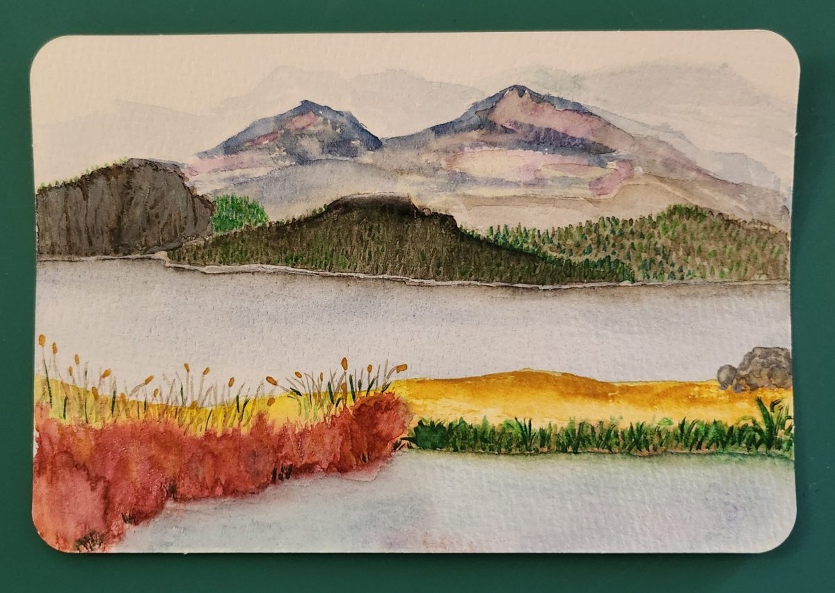
This watercolor postcard depicts a tranquil lakeside landscape rendered in soft, muted tones. The composition is divided into three distinct layers: the foreground features delicate tall grasses and reeds painted in warm golden and green hues that sway gently along the water’s edge. The middle ground shows a calm, reflective lake rendered in pale blue and gray washes that mirror the sky above. The background reveals a range of mountains painted in subtle purple and blue tones that fade into the misty distance.
Larry L’Ecuyer, the artist, has used the watercolor medium’s natural transparency to create atmospheric depth, with colors bleeding gently into one another. The overall mood is peaceful and contemplative, capturing the quiet beauty of a lakeside morning or evening.
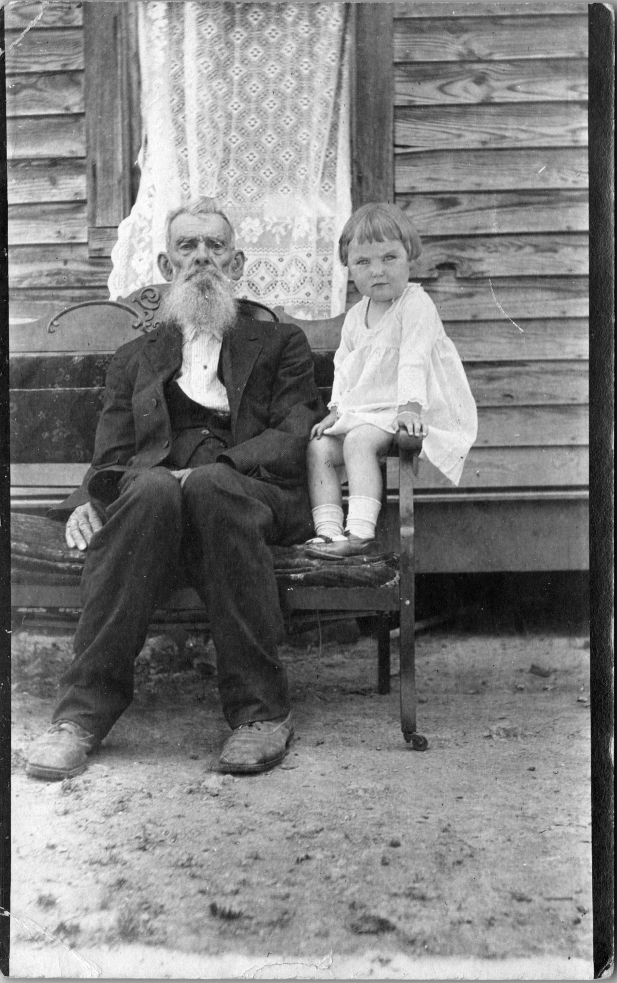
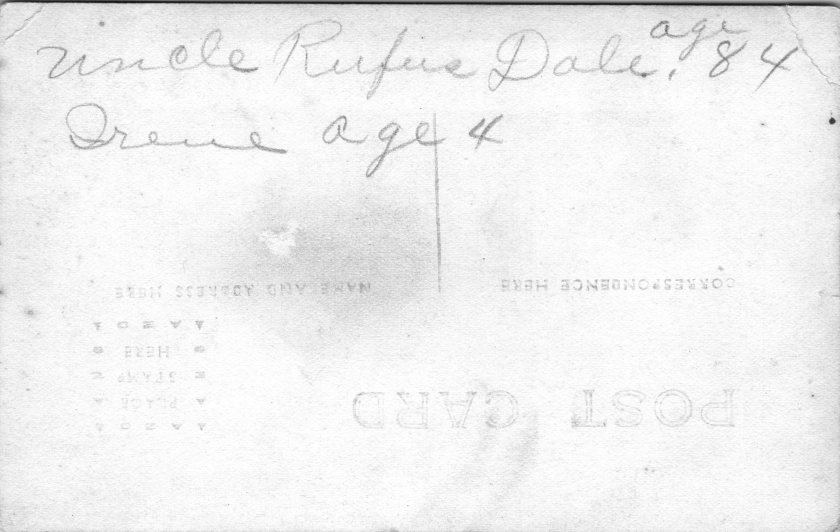
Flip the card over and a quiet story unfolds. An adult son’s note to his mother in anticipation of a cool summer getaway.
Landscapes, by Larry L’Ecuyer


As I curated this show of my brother’s painted postcards, I found three facts about the artist that help to put this small selection of his work in context. One, Larry loves long distance bike rides. Two, he has always doodled. Three, sometimes he paints when he can’t sleep.
I suspect watercolor landscapes are a welcome choice for an outdoorsman. Beauty on the road whizzes by at miles per hour. Fish moving below the surface are mesmerizing in the moment. A chance to reflect comes later, with enough time to figure out light, color, and form in that same solo flow he finds on a bike or in a kayak.
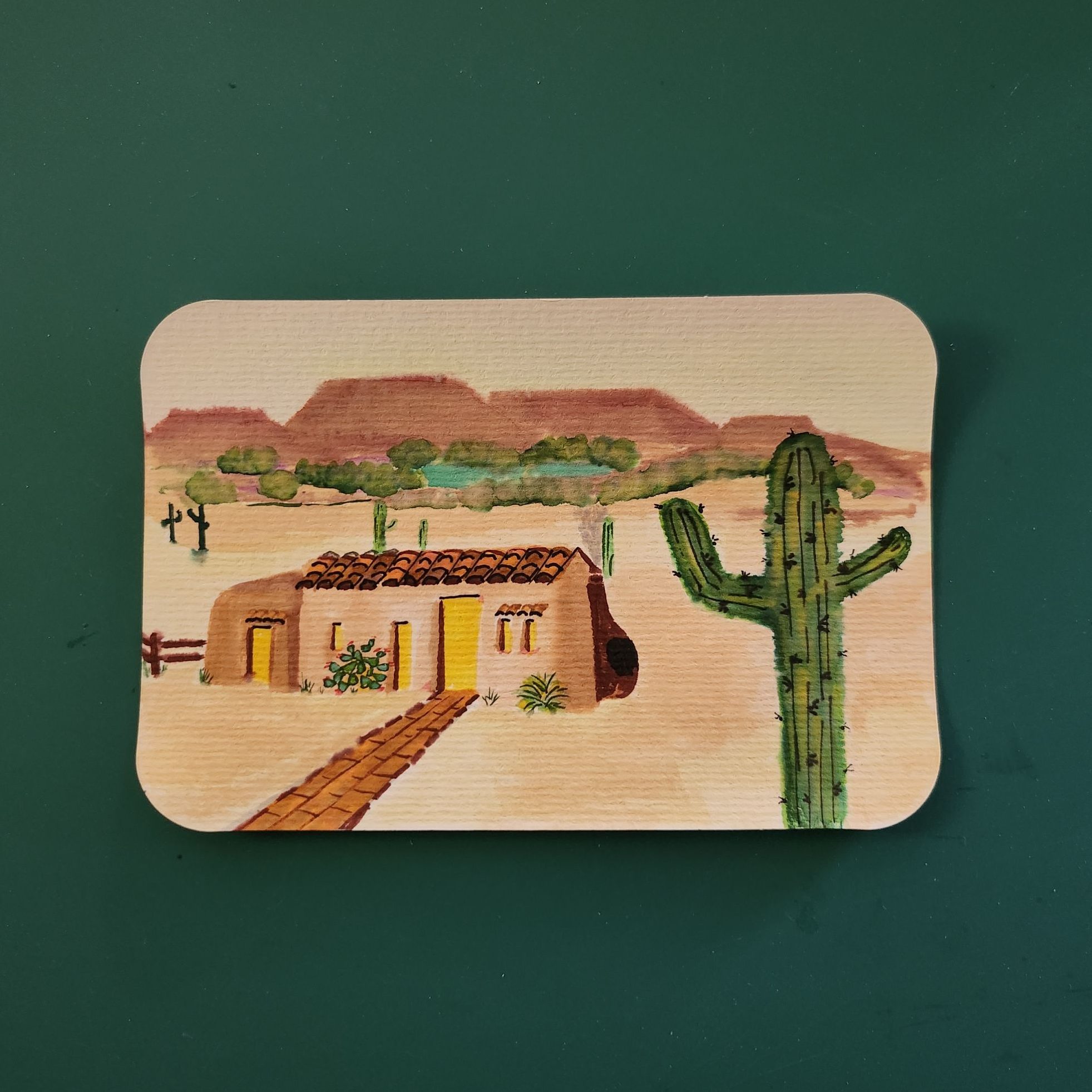
Both the humor and graphic techniques of doodling show up in Larry’s houses, trees, and cacti, which almost always hint at a face, gesture, or mood. On the back, his notes to our parents include the puns and word play that are part of our family culture.
Larry’s art cards started arriving in Dad’s mailbox when discomfort and displacement were real worries for our elderly father. These painted palettes delivered smiles instead. We have learned a thousand times again that life’s difficulties (including insomnia) must be met with simple joys. He sends cards to Mom, too, and who knows all the other mailboxes he graces.
Larry’s cards are painted, mailed, and delivered to individual people, and they ripple out in countless ways. This Posted Past show is inspired by the reminder: Art has a sneaky way of getting right to you.