A stone dropped into still water creates concentric circles that radiate outward. This physical phenomenon is a powerful metaphor for how cultural ideas spread through time and across media, especially visual motifs of place. Certain visual vocabularies persist, evolving with technologies while maintaining essential characteristics.
American statehood, regional identity, and natural heritage have rippled through various media over the past century. Iconic ‘large letter’ postcards, commemorative postal stamps, murals and more—all help us trace a fascinating journey of cultural transmission through the broader currents in American history, industrial development, and visual communication.

Gruss Aus… from Germany
“Greetings From…” postcards emerged in 1890s Germany. The early examples of Gruss Aus cards featured the name of a location rendered in bold, three-dimensional letters with miniature scenes of local landmarks contained within. More common postcards of the day feature detailed illustrations of castles and later photographs. This new design cleverly packed maximum visual information into the limited space, creating an instantly recognizable format that would soon spread internationally.
New American Icons
The transmission of this visual language to America came through a German immigrant named Curt Teich, who arrived in the United States in 1895. After establishing his printing company in Chicago in 1898, Teich would transform American visual culture through the mass production of postcards. Following a visit to Germany in 1904, he successfully imported the Gruss Aus style to the American market, adapting it to suit American sensibilities and landscapes.
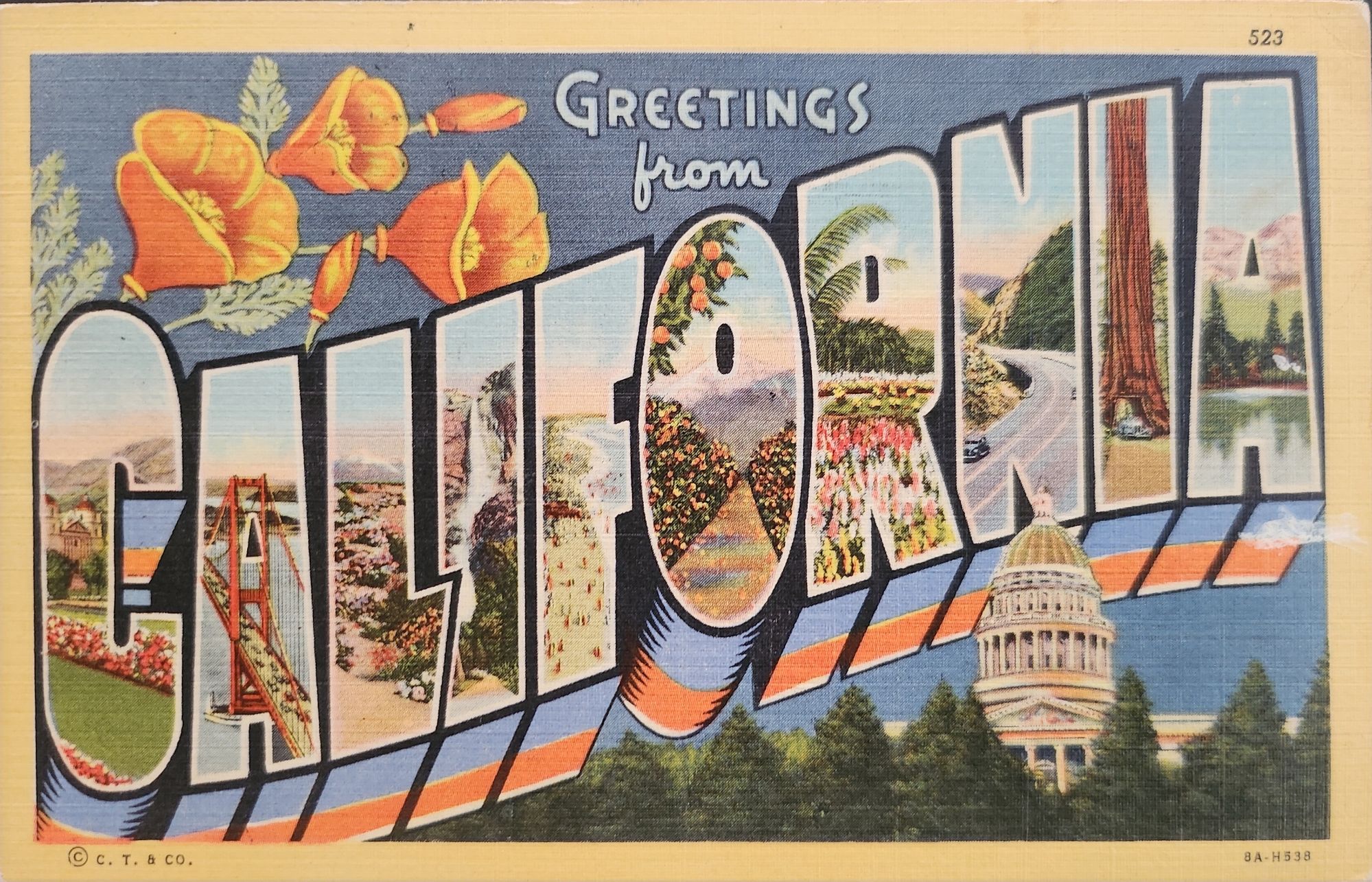


The true flowering of Teich’s vision came in 1931 with the introduction of his linen-textured postcards. Printed on high-quality paper with a distinctive fabric-like texture, these cards employed vibrant colors and airbrushing techniques that created a hyperreal aesthetic. The technical innovation of the linen card allowed for faster drying times and more saturated colors, resulting in postcards that depicted America in an optimistic, idealized light—a stark contrast to the harsh realities of the Great Depression era in which they first appeared.
Teich’s business savvy was as important as his technical innovations. He employed hundreds of traveling salesmen who photographed businesses and worked with owners to create idealized images for postcards. This approach not only generated business but also shaped how Americans visualized their own landscapes and communities. The Curt Teich Company would eventually produce over 45,000 different linen postcard subjects in just two decades.

The visual language of these postcards—bold lettering, vibrant colors, and idealized scenes—became firmly embedded in American visual culture during the 1930s through 1950s. As automobile ownership increased and the highway system expanded, these postcards played a crucial role in shaping Americans’ understanding of their own geography and national identity. They were both records of places visited and aspirational images of places to be seen.
State Birds and Flowers
Parallel to the development of the large letter postcard, another form of state-based visual identity was taking root—the formal designation of state birds and flowers. Most American states adopted these symbols between the 1920s and 1940s, often through campaigns involving schoolchildren, women’s clubs, and conservation organizations.
These officially designated natural symbols provided another vocabulary for expressing regional identity, one rooted in the natural world rather than the built environment. While large letter postcards typically highlighted human achievements—city skylines, hotels, roadways—state birds and flowers emphasized the distinctive natural heritage of each region. Together, these complementary systems of regional representation provided Americans with a rich visual language for their diverse nation.

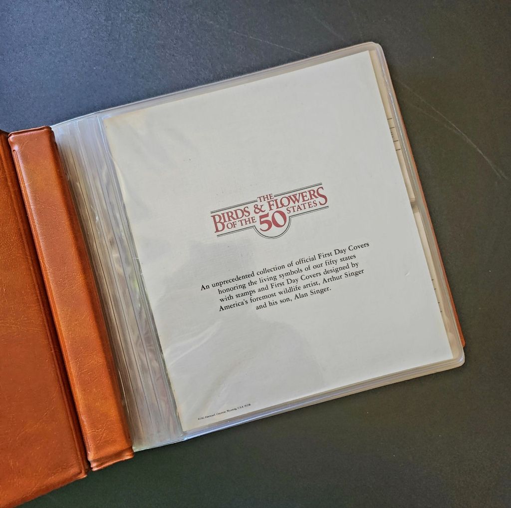


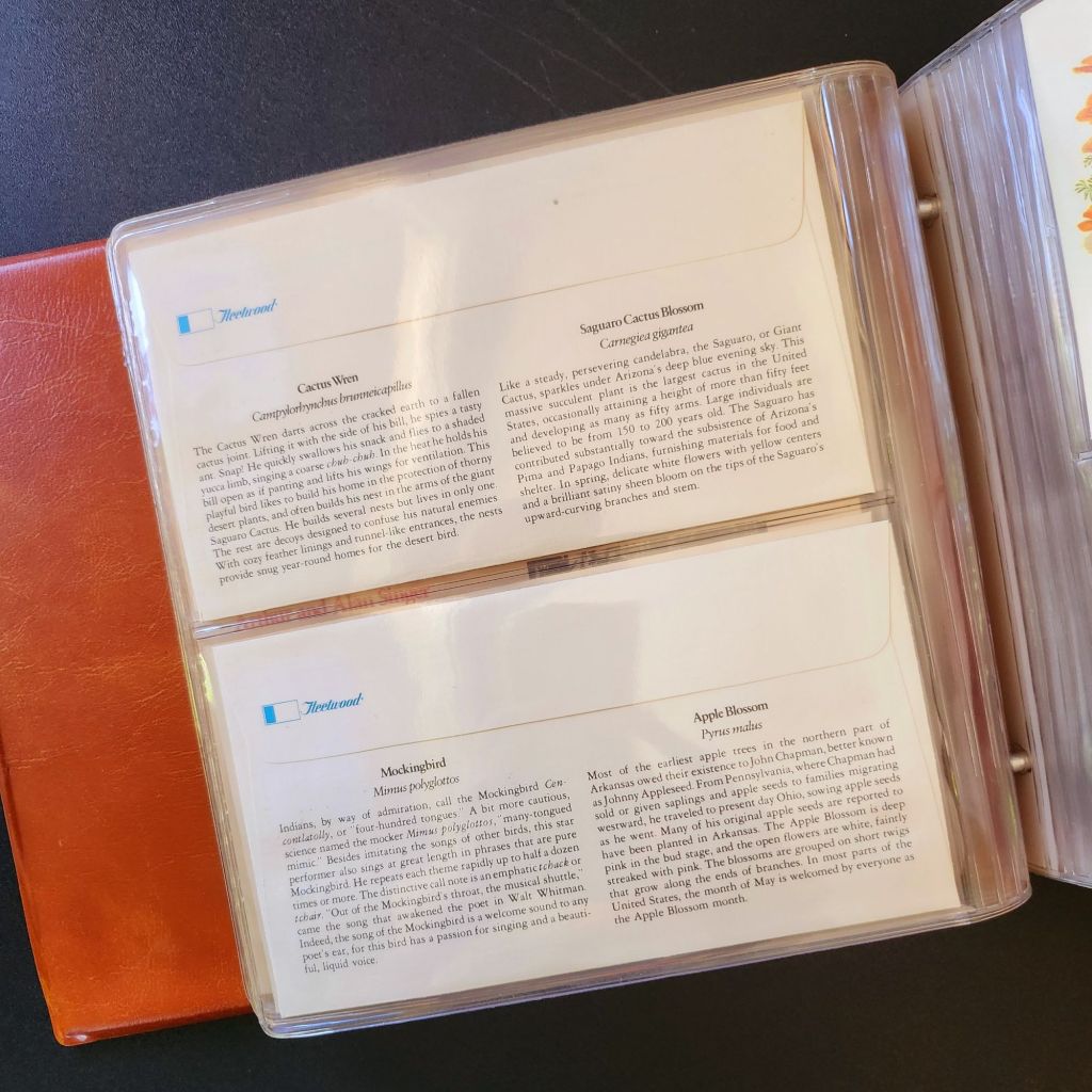
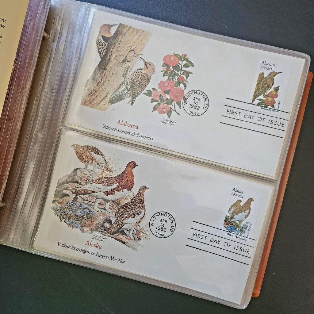


In 1978, the Fleetwood company commissioned father-son wildlife artists Arthur and Alan Singer to create 50 original paintings of state birds and flowers. These watercolor paintings caught the attention of U.S. Postal Service officials, who recognized their exceptional quality and decided to feature them on commemorative stamps. Released on April 14, 1982, the 20-cent State Birds and Flowers stamp collection was another big moment in the ripple effect.
Arthur Singer painted the birds while his son Alan rendered the flowers, creating unique artwork for each of the 50 stamps. The collaboration between father and son added another dimension to this cultural transmission—the passing of artistic traditions and approaches from one generation to the next.
The Fleetwood company published a complete album featuring First Day Covers of these stamps. These decorative envelopes included additional information about each state’s natural heritage, creating a beautifully bound volume that was both aesthetically pleasing and informative. The Birds & Flowers of the 50 States album is now a cherished collectible, a visual catalog of national natural heritage in a single, beautifully presented format.

Greetings from the Post Office
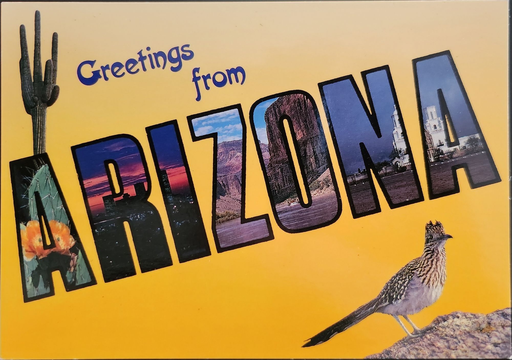
Twenty years later, the visual language of the large letter postcard experienced a revival through another stamp collection. On April 4, 2002, the USPS issued the ‘Greetings from America’ stamps, designed by Richard Sheaff and illustrated by Lonnie Busch. These stamps paid direct homage to the large letter postcards of the 1930s and 1940s, recreating their distinctive style for a new generation.
Each of the 50 stamps featured the name of a state in large, three-dimensional letters containing images of iconic landmarks and scenic vistas. The stamps were initially released as 34-cent denominations, but due to a rate change, they were reissued with 37-cent denominations on October 25, 2002. Here is another circular moment—a postal medium paying tribute to a postcard tradition that had itself been a popular means of commemorating places visited.
These stamps connected with older Americans who remembered the original postcards. Younger generations encountering the style for the first time recognized both the nostalgic and contemporary appeal. The vibrant colors and bold, three-dimensional lettering still effectively communicated a sense of place and regional pride, proving again the resilience of this visual vocabulary.

Even Larger Letters
Artists Victor Ving and Lisa Beggs took the large letter postcard to a whole new scale. Starting in 2015, the Greetings Tour has produced dozens of murals that transform the two-dimensional postcard design into monumental public art.
A grand dimensional leap—a design meant to be held in the hand scaled to the size of a building. The murals maintain the core visual elements of the large letter design while incorporating contemporary references and local touchstones. In a delightful twist, these murals have themselves become tourist attractions with visitors posing for social media. The postcard mural is now a backdrop for new images to be shared globally.
The artists also create custom digital designs for corporations, events, and retail spaces, maintaining the vintage aesthetic while adapting it to contemporary contexts. This commercialization represents another ripple in the cultural transmission of the large letter design, as it moves from public art back into the commercial realm that originally produced the linen postcards.
Digital Doppelgangers
As graphic design software became increasingly sophisticated and accessible in the late 20th and early 21st centuries, the visual language of large letter postcards found new life in digital recreations. Graphic design tools enable designers to quickly recreate the distinctive three-dimensional lettering and image-filled characters of the classic postcards.

AI Generation
Online design platforms have further opened access to this aesthetic, offering templates that approximate the large letter style without requiring specialized skills. Now small businesses, community organizations, and individuals can incorporate elements of this visual tradition into their communications, expanding the reach of this design vocabulary beyond professional designers.
With a phrase like “create an image of a vintage large letter postcard from Arizona,” most anyone can generate a decent design in seconds. Like the old days of digital clip-art, the initial attempts lack craftsmanship and historical accuracy. Still, they are a new democratization of this visual vocabulary, making it more accessible to professional designers and enthusiasts alike, though perhaps for different reasons.
This latest development completes a fascinating loop—from specialized industrial printing processes that required substantial investment and technical expertise, to digital design tools requiring professional training, to AI generation requiring only the ability to formulate a design concept and the text prompt. With each technological advancement, the barriers to producing these distinctive visual representations have lowered, while the core elements of the design has persisted.
Visual Persistence
From German Gruss Aus postcards to AI-generated images—our journey demonstrates the remarkable resilience of certain visual vocabularies across time, technologies, and cultural contexts. Despite dramatic changes in production methods, from specialized lithographic presses to neural networks, the essential visual grammar of these designs remains recognizable.
This persistence has a woven quality—the ability to render and replicate a sense of place over time. Whether in linen postcards, commemorative stamps, public murals, or digital images, the large letter design and state symbol motifs combine to convey regional identity and pride over time. Their continued relevance suggests that certain visual solutions, once discovered, become an architecture that generations continue to appreciate and adapt for new uses.
We also feel the ripple effect in the broader patterns of American history— immigrants bringing skills and technology to American shores, industrial innovation creating new visual possibilities, the automobile age changing how Americans experienced nature and themselves, and digital technology transforming how we create and share images. Through it all, the distinctive visual language pioneered by Curt Teich and others continues to evolve.
What new ripples lie ahead? Perhaps augmented reality will allow us to step into these designs. Or new materials and technologies will adapt them yet again for uses we don’t yet comprehend. Whatever comes next, we know that cultural transmission does have a distinguishing mark—it ripples outward in both calculable and unexpected ways, influenced by technology, economics, and human inspiration, creating patterns that can be traced across generations.
For Additional Reading
Meikle, Jeffrey L. (2016). Postcard America: Curt Teich and the Imaging of a Nation, 1931-1950. University of Texas Press. Publisher’s page
“The Immigrant Story Behind the Classic ‘Greetings From’ Postcards.” Smithsonian Magazine. (2018). Read online
“Curt Teich & Co., est. 1898.” Made-in-Chicago Museum. (2020). Read online
“How Linen Postcards Transformed the Depression Era Into a Hyperreal Dreamland.” Collectors Weekly. Read online
“Curt Teich Postcard Archives Collection.” Newberry Library. Collection information
“1953-2002 – 1982 20c State Birds and Flowers.” Mystic Stamp Company. Product page
Singer, Paul and Alan Singer. (2017). Arthur Singer: The Wildlife Art of an American Master. RIT Press. Publisher’s page
“3696-3745 – 2002 37c Greetings From America.” Mystic Stamp Company. Product page
Greetings Tour – The Original Postcard Mural Artists. Official website
“How To Create a Vintage Style Large Letter Postcard Design.” Spoon Graphics. (2022). Tutorial