Heads & Tails: Redcar a Century Ago

Four children are astride donkeys walking on the beach, clothed in Edwardian-style white blouses and all wearing caps. A century away (and still there today) kids on a delightful donkey ride near Redcar’s legendary seaside.

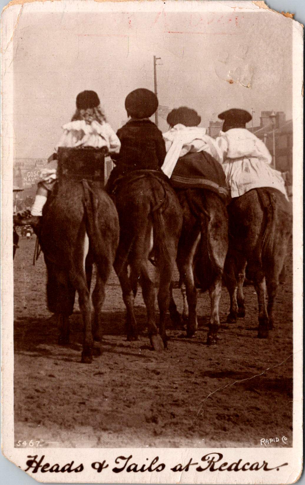
This real photo postcard with a memorable image bears the hand-scripted titled “Heads & Tails at Redcar.” One can still feel the April 18, 1910 embossed postmark on the card a century later. Addressed to Nurse Aird in Darlington from Redcar, the message is pragmatic.

Expect to arrive about 6.30 to-morrow evening. Love from Rennie

The seaside town of Redcar was transformed from a modest fishing village into a bustling resort town by the arrival of the railway in the mid-19th century, and became a beloved destination for working and middle-class families from throughout Britain’s industrial northeast.

In the 1910s, Redcar embodied the height of seaside grandeur. The impressive Coatham Hotel, built in 1871, dominated the seafront, its architecture expressing the optimism and ambition of the age. A pier stretched into the sea, its 1873 construction a testament to the engineering confidence of the era. Along the promenade, ornate gas lampposts cast their glow over evening strollers, while elaborate wooden shelters provided refuge from sudden showers.

The seafront architecture told a story of careful planning and civic pride. Victorian terraces, built of local sandstone or sturdy brick, were elegant facades looking at the sea. Behind them, a grid of streets housed seasonal workers, fishermen, and the growing permanent population drawn by the town’s prosperity. The Central Hall, opened in 1895, provided entertainment, while Methodist and Anglican churches with their reaching spires reminded visitors and residents alike of Victorian moral values.

Yet Redcar was never merely a tourist trap. The town’s proximity to mining linked it inextricably to Britain’s industrial might. The discovery of workable iron ore deposits in the Cleveland Hills in 1850 had sparked an industrial revolution in the region. By the 1910s, mines dotted the landscape, and the sight of industrial chimneys on the horizon reminded visitors of the region’s working heart. Many local people split their lives between seasonal tourist work and the demanding labor of the mines or ironworks.

This distinctive mixing of leisure and industry is part of Redcar’s character. Unlike some of Britain’s more exclusive seaside resorts, the community remained proudly connected to its working roots. The donkey rides captured in our postcard—a quintessential British seaside tradition—were an affordable pleasure for working families. The donkeys themselves, chosen for their gentle temperament and sturdy build, paralleled the town’s way: reliable, hardworking, and ready to provide joy to all comers.

On April 18, 1910, Rennie dashed off a quick note from Redcar to Nurse Aird, using one of Rapid Photo Company’s popular seaside postcards to announce a return to Darlington the following evening at 6:30pm. Such precise timing speaks to the reliability of the North Eastern Railway’s service between the coastal town and Darlington, where regular daily connections had become the lifeblood of the region.

The journey home would begin at Redcar’s Central Station, its Victorian architecture still relatively new and imposing in 1910. The late afternoon departure would catch the changing light over the North Sea, before the steam locomotive began its hour-long journey inland. As the train pulled through Middlesbrough and then west toward Darlington, the spring evening would be settling in, with the Cleveland Hills silhouetted against the dusk. Fellow passengers might have included ironworkers heading to night shifts, businessmen returning from coastal meetings, and perhaps other daytrippers who had enjoyed the seasonal pleasures of the seaside.

By evening, Rennie would step onto the platform at Darlington’s Bank Top station, the time at the coast already feeling like a distant memory. Perhaps a deliberate choice of train, selected to arrive after Nurse Aird’s duties were complete or to catch the end of visiting hours. Whatever prompted the journey, the postcard captures the easy mobility that the railway enabled, allowing residents of these northeastern towns to move between coast and country with a regularity that would have seemed remarkable just a generation earlier.

In 12 historic pictures: a day at the seaside at Redcar from The Northern Echo

The subsequent century would bring profound changes to Redcar. The pier, once a symbol of Victorian confidence, fell victim to storm damage and was demolished in 1981. The grand Central Hall disappeared. Many Victorian hotels were converted or demolished as tourism patterns changed. Most significantly, the industrial base that had provided much of the region’s wealth underwent dramatic transformation. The 2015 closure of the SSI steelworks marked the end of an era, dealing a devastating blow to the community.

Modern Redcar presents a complex picture of a community in transition. The Redcar Beacon opend in 2013 (locally dubbed the “Vertical Pier”) reaches skyward, its contemporary design contrasting with the Victorian architecture that remains. Victorian terraces continue to face the sea, their sandstone facades weathered but dignified. The Clock Tower, dating from 1913, remains a local landmark. The town center struggles with empty shops, a challenge faced by many British high streets. The loss of heavy industry has forced difficult economic adjustments.

The community’s response to these challenges reveals much about Redcar’s character. The Palace Hub, housed in a former amusement arcade, provides space for local artists and craftspeople. Local groups organize beach cleaning and heritage walks, maintaining the town’s connection with its past while protecting its future. Locally run kitchens and groceries address modern challenges of food poverty while building community connections.

Most remarkably, the donkeys still plod along the beach in summer months. The same gentle animals that carried kids a century ago now delight a new generation of visitors. Modern care standards ensure rest periods, weight limits, and veterinary checks, but the essential experience remains unchanged. Children still laugh with surprise at their first encounter with these patient beasts, parents still snap photographs (will box cameras make another comeback?) and the donkeys still take their slow and careful steps, connecting past and present.

Redcar reminds us that progress isn’t linear and that community change involves deep dynamics of loss and renewal. The town that grew wealthy on iron ore and Victorian tourism now seeks new paths forward in renewable energy and cultural heritage. What has remained is both quirky and reliable: a donkey ride on the beach on a summer’s day.

While the grand Victorian hotels and ore industries of the region have largely passed into history, the humble donkey ride endures. Sometimes the most modest traditions prove the most durable, and the true character of a place resides not only in grand achievements but also in simple, timeless pleasures.

Who indeed would have guessed that of all Redcar’s attractions, it would be the donkey rides we couldn’t live without? Perhaps it is fitting that these patient animals, who witnessed the town’s rise, decline, and ongoing reinvention, continue to reliably entertain (and endure) new generations.

Halloween Greetings: From German Craft to American Commerce

Against a star-strewn midnight sky, a girl in white stands fearless in front of a gleaming full moon while impish red devils perch on bat wings around her. This whimsical scene, printed in Germany in 1913, captures the magic of Halloween’s golden age, when postcards were miniature works of art and All Hallows’ Eve still balanced precariously between spooky and sweet.

The story of Halloween postcards mirrors the evolution of both holiday celebrations and the printing industry through the 20th century. Through these distinctive cards, we can trace changing artistic styles, printing technologies, and cultural attitudes toward this magical and mysterious holiday.

This century-old collection opens a window into an era when German printers, American artists, and local publishers like Salem Paper Company competed to create the perfect Halloween greeting. From dramatic witch flights to cheerful pumpkin-peeking children, these cards tell the story of a holiday—and an industry—in transformation.

A Starry Halloween in the Golden Age of Postcards

The John Winsch-published “A Starry Halloween” (1913) represents a pinnacle of German chromolithography and American holiday marketing. The card’s verse playfully describes “black Bat aeroplanes.”

“Hallowe’en’s a starry night, You’ll see the Goblins in flight, Perched on their black Bat aeroplanes, They flit about the weather vanes!”

This aeronautical reference demonstrates how postcards of the era incorporated modern technology into traditional Halloween imagery. This whimsical text combines traditional Halloween motifs with early aviation enthusiasm, placing the card squarely in the 1910s zeitgeist.

The card’s detailed execution showcases why German printers dominated the global market before World War I. The deep blue starry sky creates a dramatic backdrop, while the precise color registration and subtle shading of the figures demonstrate the technical excellence of German printing houses.

The postcard’s personal inscription—”From your Teacher, Dee Seaton, 1913-14″ to “Georgia Long, Pleasant Hill, Mo.”—reveals how these cards served as important social connections, particularly between teachers and students. The one-cent domestic postage rate, clearly marked on the divided back, reminds us of the affordability of this medium for everyday communication.

Frances Brundage’s Gentle Halloween

The Frances Brundage Halloween cards present a markedly different approach to the holiday in the same era. Known for her sweet-faced children and gentle compositions, Brundage brings her characteristic style to what could be frightening subject matter. The large orange pumpkin dominates the compositions, while a cheerful child with curly hair and a red bow plays with a black cat. The clean white background and red border create a bright, appealing presentation that contrasts with darker Halloween imagery.

Brundage (1854-1937) was among America’s most successful illustrators of children, and her distinctive style—rosy-cheeked, innocent-looking children with expressive faces—is immediately recognizable. Her work appeared on postcards, in children’s books, and in advertising, published by major companies including Raphael Tuck & Sons and Samuel Gabriel & Sons. This Halloween greeting card demonstrates how her gentle artistic approach could make potentially scary holiday themes appropriate for even the youngest children.

The Salem Witch: Local History Meets Holiday Trade

“The Salem Witch” postcard, published by the Salem Paper Company of Massachusetts, represents a fascinating intersection of local history, holiday celebration, and tourist commerce. The dramatic nighttime scene features a witch in traditional pointed hat and flowing cape, riding a broomstick across a turquoise sky filled with pink-tinged clouds and a crescent moon. A black cat balances behind her on the broomstick, while a bat flies nearby. Below, a small village with lit windows and a church spire creates a sense of scale and setting.

The publisher’s choice to produce this card in Salem was no accident. The city’s notorious witch trials of 1692-93 had by the early 20th century become a tourist draw, and the Salem Paper Company cleverly capitalized on this connection. The card’s dark, moody color palette of deep blues, blacks, and browns creates an appropriately spooky atmosphere.

The card’s reverse reveals additional historical details through its markings: PUBLISHED BY SALEM PAPER CO., SALEM, MASS., card number 105355, and the TICHNOR QUALITY VIEWS designation. Tichnor Brothers of Boston was renowned for high-quality postcards, particularly New England scenes, making them an ideal partner for Salem Paper Company’s locally themed Halloween products. The technical quality suggests it was likely also printed in Germany, as were many premium postcards of the era, even those designs that were distinctly American and regional.

The Spooked Kid: From Original to Reproduction

The final card, showing a startled child in white nightclothes against an orange-lit room, represents a later reproduction of Halloween imagery. Produced for Lillian Vernon and printed in Hong Kong, this card likely dates from the 1970s-1990s. But, it draws heavily on early 20th-century artistic conventions. The scene’s elements—a black cat in a window pane, yellow crescent moon, candlestick holder with lit candle, and fallen GHOST STORIES book—all reference classic Halloween postcard motifs. This card’s production history tells the story of significant changes in the postcard industry.

When Lillian Vernon, born in Leipzig, Germany, used her $2,000 wedding gift to launch a mail-order handbag business from her kitchen table in Mount Vernon, New York, in 1951, she could hardly have imagined she would revolutionize American gift retail. That first offering—a matching monogrammed handbag and belt set for $6.98—established the winning formula that would define her business: personalized items at affordable prices. The company name itself, taken from her new hometown, would become synonymous with accessible luxury and thoughtful gifting for generations of American shoppers.

Through the boom years of the 1980s and 1990s, Lillian Vernon catalogs were a fixture in American mailboxes, eagerly anticipated by parents and children alike. The company mastered the art of “catch-penny” items—small, impulse-buy treasures that seemed irresistible at their price points. Their most beloved offerings included personalized school supplies (from pencil cases to lunch boxes), holiday decorations, monogrammed doormats, and children’s toys. The company’s success made history in 1987 when Lillian Vernon became the first woman-owned company to be listed on the American Stock Exchange, a milestone in American business history.

By the time the company began sourcing products like Halloween postcards from Hong Kong printers, Lillian Vernon had transformed from a small mail-order business into a retail empire that included multiple specialized catalogs, retail stores, and eventually an online presence. The company’s choice to have the card printed in Hong Kong reflects the late 20th-century shift of printing operations from Europe and America to Asia, prioritizing cost-effective production over the artistic merit and technical excellence that characterized the German chromolithography era.

Though the company would ultimately close in 2016, unable to fully adapt to the digital age, its influence on American retail culture remains significant. The Lillian Vernon story represents both the American dream and the evolution of modern commerce—from kitchen-table startup to national brand, from personalized service to mass-market appeal, from mail-order catalogs to the small business opportunities of the internet era.

The Evolution of an Industry

These postcards trace the evolution of Halloween greetings from the golden age of German printing through the modern reproduction era. The Winsch card represents the height of pre-WWI German chromolithography and original holiday artwork. Frances Brundage’s contribution shows how established American artists adapted holiday themes for children. The Salem Witch card demonstrates the growing commercialization of local history and holiday traditions. Finally, the Lillian Vernon reproduction reveals how these vintage designs found new life in the mass-market retail era.

Together, they tell a story not just of changing printing technologies and business models, but of the evolving relationship with Halloween itself. From the elaborate artistic productions of the 1910s through the mass-market reproductions of the late 20th century, Halloween postcards have both reflected and shaped how Americans celebrate this fascinating holiday.

The Halloween postcard industry’s journey from German printing houses through American publishers to Asian manufacturers parallels larger trends in American commerce and holiday celebrations. These cards remain valuable historical documents, preserving not just artistic styles and printing techniques, but also the personal connections and social customs of their eras. Whether sent by a teacher to a student in 1913 or purchased as a souvenir in more recent decades, each card represents a tangible link to the holiday and shared heritage.